
05
The Art of Capture and Process
Image Processing
Developing images is the most personal part of the photographer’s workflow. A hundred photographers could use precisely the same steps for managing their assets, and in doing so there would be no consequence. But this would not be the case with raw file and image development workflow. If everyone developed their images in the same way, photography and craft would quickly become stale and boring. Nevertheless, as important as it is to foster your own style, you first need to become accustomed to the tools at hand. Thus, this section of the book deals with showing you the tools in our creative arsenal.
What Are Raw Files, or RAW Files?
This is probably of little surprise to most of you, but I recommend shooting raw files. They are just a better way to go, and there are many reasons as to why. To help us wrap our heads around why, let’s talk about the format’s spelling because it actually helps us understand what raw or RAW is. I’d say most books, articles, and manuals have adopted the spelling of the file type as “RAW,” and not “raw” today—and this is done to maintain consistency in the world of image formats. JPEG, TIFF, PSD, NEF, CRW, and PNG are all acronyms for image formats and are thus typically capitalized, so raw is usually spelled as RAW. But this implies that RAW is an acronym and a format, which it is not: RAW is an adjective, not a noun. Clarifying this distinction is important because the word raw actually describes the state of the data, much like uncooked food is raw because it has not gone through a processing phase of preparation. It’s true that NEF is the Nikon raw format, CRW is the Canon raw format, and DNG stands for “digital negative,” but these are formats that house raw data and metadata. Shooting raw means you are capturing data that still needs to be processed—or better yet, data that needs to be developed. But to understand how this all works, and how to best take advantage of this technology, we need an understanding of how digital cameras capture light and what it means to “process” a file.
Color Filter Arrays
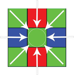
It’s safe to say that most shutterbugs today know what a pixel is, or at least have a vague idea what one is. In a nutshell, the individual pixel on a camera sensor is a light-sensitive photo diode that reads the amount of light coming into the camera, which is later transposed into data. However, pixels are also blind to color. They only register the amount of light coming in at a particular point, and can’t interpret anything else about it. Therefore a big piece to the image-processing puzzle is to not only read the light but to also translate it, and the first step in that process is the Color Filter Array (CFA). The CFA is placed in front of the camera and is made up of the primary colors—red, green, and blue—which in turn designates a specific color for each individual pixel (see Figure 5.1). Thus, the basic workflow for camera sensors has light first travel through a micro lens to focus the light. Then the light is filtered by the CFA, so it can be gathered by the pixel array and color identified on the individual pixel level.
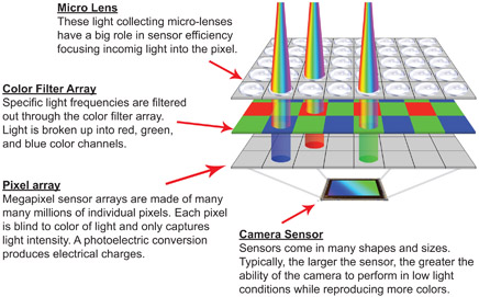
5.1
Here is a sensor’s workflow, so to speak: Light travels through a micro lens to help maximize light capture, it travels though a color filter, and then is captured by a pixel. The light energy is converted into an electrostatic charge, which is then stored as raw unprocessed data.
Like variety in the world of sensors, there’s also variety with CFAs in photography (see Figure 5.2). The vast majority of digital cameras and video cameras use the Bayer filter array developed by Bryce Bayer of Eastman Kodak. The Bayer array was patented in 1976 and is mostly made up of green filters, or as he called them luminance-sensitive elements; the remaining blue and red filters he referred to as chrominance-sensitive elements. The logic behind the Bayer CFA architecture is to mimic the makeup of the human eye, which has more green than red and blue photosensitive cone cells. Specifically, 50% of the pixels on digital sensors are dedicated to green light, 25% to red light, and 25% to blue light. What this means is that individual pixels can grab only the light of a specific color. There are a few variations in CFAs used in digital photography. Sigma, along with many high-end video cameras, actually forgoes the use of color filters by using three sensors, each dedicated to a specific color channel. Fuji is one of the exceptions in still photography, incorporating the X-Trans color filter array into many of its consumer cameras to combat an unwanted artifact in digital image processing called moiré. However, they are a rare exception, as it’s mostly a Bayer CFA world.
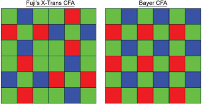
5.2
Color filter arrays assist camera sensors in constructing a color image. The configuration on the left is used by Fuji in a few of its cameras, but the Bayer filter array on the right is used in the vast majority of cameras made and used today.
Processing Raw Data
Once light has traveled through your camera, passed your CFA, and been captured by the sensor, the raw data is stored. But in order to see a rendering of our raw data, whether it’s on the back of our camera or in Lightroom, the data needs processing. The file needs to go through some intense math to be demosaiced (pronounced deemoe-zay-icked), or interpolated, and have a color profile applied to it. Without such steps the raw data just sits in its unviewable raw state.
5.3
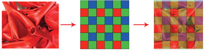
When photographing a subject that is all red, green and blue light doesn’t make its way to the sensors’ pixels nearly as much. Because 75% of the sensor is blue or green, those areas need to be interpolated to reconstruct an image with seamless tonality and detail. The word interpolation literally means to introduce something between other things or parts.
CFA demosaicing, or interpolation algorithms, quite literally rebuilds a full-color image from the incomplete raw data. For example, only 25% of my pixels can capture red light, but if I take a picture of, and fill the frame with red balloons as shown in Figure 5.3, I can see seamless tonality and detailed edges in my processed image. Since my camera sensor sees the world in mostly blue and green, the missing information needs to be reconstructed or interpolated. There are many kinds of demosaicing algorithms, but the magic of the whole thing is accomplished through the basic idea of being able to obtain any color through a set of primary colors— red, green, and blue (RGB) being our primary set.
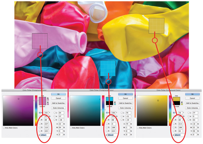
5.4
Averaging neighboring pixels during processing creates the color of each pixel, and combining red, green, and blue primary colors in different ways can produce any color variation. The color of the pink pixel has a red value of 227, a green value of 110, and a blue value of 225. The blue and the yellow pixels are also combinations of different red, green, and blue values.
Figure 5.4 shows a smattering of differently colored balloons, with a look at pixels within three specific sections of that image. Each pixel is actually a combination of three different values of red, green, and blue. In essence, demosaicing math isolates a cell from the Bayer filter array and analyzes it in different ways and in different directions to average out the color of each individual pixel (see Figure 5.5). Again, the math that pulls this off from a sensor with tens of megapixels is intense, but it’s all done very quickly in our cameras or when exporting images out of Lightroom. And yes, Lightroom demosaics, just like our cameras—well, not just like our cameras.
5.5
To determine the true color of individual pixels, neighboring pixels are analyzed to calculate a color average
Process Versions and Profiles
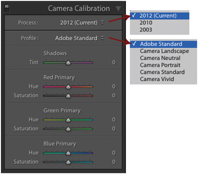
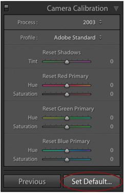
Cameras from all the makers—Nikon, Canon, Sony, Olympus, Leica and others—process raw files with a specific processing technology and then apply a color profile. Naturally, since we are developing raw files in Lightroom, Adobe has its own processing technology and profiles that are applied to our raw files, and this “starting point” for our raw data is evident in Lightroom’s Camera Calibration subpanel.
5.6a
The Process is the method by which the image preview is processed, and the Profile sets the parameters for the color and contrast for the image preview.
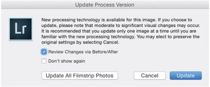
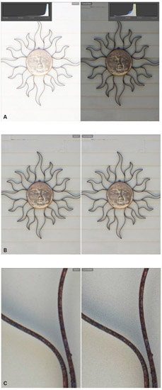
The Camera Calibration subpanel is located at the bottom of the Right Panel in the Develop Module. At the very top you’ll find both Process and Profile as shown in Figure 5.6a. The Process is the rendering (demosaicing) technology, the method by which a preview of our raw data is generated, giving us something to see and work with in Lightroom. You can choose between 2003, 2010, or 2012 Process versions. The 2003 Process is technology that was introduced with Adobe Camera Raw (ACR) several years before Lightroom was released, and the more evolved 2010 Process was released with Lightroom 3. The current Process was released in 2012 with the release of Lightroom 4. All of the new files you import into Lightroom will default to the 2012 Process. However, if you have been using Lightroom for a while, files that have been developed of the 2010 or 2003 Process will not automatically convert to the new process when you upgrade your catalog to a newer version of Lightroom—and this is a good thing. The look of your images could change when moving from one Process version to another, as shown in Figure 5.6b.
If you have images that you suspect are using older Process versions, simply glance at your histogram and look for a small lightning bolt badge in the lower right corner of the panel. You can update your image to the new Process version by either clicking on that badge or by clicking on the Process drop-down in the Camera Calibration Panel. Either choice will then launch a warning dialog (shown in Figure 5.7) that asks if you want to just update the one photo or all of the photos in your Filmstrip. I suggest updating only one at a time if the images have been previously developed because changing the Process can change the look of the image. However, if the images in your Filmstrip have not been developed, than I absolutely suggest using the current 2012 Process version.
5.6b
These two images show raw files with two different Process versions. The one on the left shows the 2012 version and the one on the right shows the 2010 version. The differences are noticeable with some images, but not so much with others. As you upgrade your catalogs or import images that have been processed with older versions, Lightroom will not automatically update your files to the Process version, but will instead notify you that it is out of date.
5.7
As you attempt to update your image’s Process version, Lightroom will ask you if you want to Update just the one image, or if you want to Update All Filmstrip Photos.
The Profile defines the quality of color applied to the photo: it determines the richness of color, the tone curve applied, and the detail handling. I will go into greater detail with color profiles in Chapter 6 in the “Consistency With Devices” section, but they basically set the parameters for color values in a given photo. Like Process versions, there are choices for profiles. By default, Lightroom applies the Adobe Standard color profile to raw files. Understandably, the preview image on the back of our cameras is not showing an image with an Adobe profile. Nikon cameras show an image with a Nikon profile, Canon with a Canon profile, and so on for the other camera manufacturers. Consequently, the look of some of your images can change as you import them into Lightroom and as Lightroom generates previews. It depends on the image, but sometimes you’ll see no change, sometimes a small change, and sometimes you’ll see a big change (see Figure 5.8). This change bothers some photographers, and not others. Personally, I like the default profile—or I’ve learned to work with it, depending on your perspective. Either way, you can choose to use the Adobe Standard Profile, or you can choose different looks as shown in Figure 5.6a. There are profiles with vivid color, neutral color, or profiles designed for portraits, or landscapes. In addition to Lightroom’s prepackaged profiles, you may have noticed the different color Hue and Saturation sliders. Well, you can customize a profile by moving the sliders around to your liking, which is cool. Cooler still is that Lightroom allows you to apply either a Profile choice or a customized profile to a single image, or you can calibrate a specific camera with your Profile choice.
5.8
As Lightroom generates preview files, during or right after import, the files are applied with the Adobe Standard color profile, which can change the look of the photos depending on their inherent colors. The images on the bottom have the Adobe Standard profile, while the images on the top show the original previews that the camera generated.
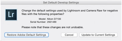
To calibrate a camera, first make your profile choice or customize a profile to your liking. Simply play with the sliders while analyzing an image to see what works and what doesn’t. Once you’re set, look below the Camera Calibration panel to the Reset button. Hold down the Option key for Mac, or the Alt key for PC and you’ll notice the button change to Set Default as shown in Figure 5.9a on the following page. If you click on Set Default, then the Set Default Develop Settings dialog will appear and you’ll be asked if you want to Update to Current Settings as shown in Figure 5.9b. Notice that Lightroom auto detects the camera model and serial number by looking at the EXIF metadata. Thus, if you have three Nikon D700s in your camera bag, you can calibrate your color differently for each camera. After you click Update, all of the images you import from that camera will have previews generated with your chosen or custom profile. Of course, the big takeaway from all this is knowing that we have a say in the matter. We are not at the mercy of accepting the color that the camera and software manufacturers stamp on our photos. Not only do we get to choose what the starting point is, but we can also choose whatever we want.
5.9a
After you configure a camera profile to your liking using the various sliders, you can set your configuration to be automatically applied to your images as they are imported instead of using the Adobe Standard Profile. But remember this is a camera-specific profile, so if you have many cameras in your gear bag, your set configuration will be applied only to the camera you are working with.
5.9b
Lightroom identifies your specific camera by the serial number stored in the EXIF metadata.
NOTE: Most cameras have the ability to choose between embedding files with either an Adobe RGB or an sRGB color profile. I’m often asked which one is better. Well, although I have a lot to say on color profiles in Chapter 9, for this chapter and section, the answer is: it doesn’t matter when you are shooting raw. Raw files have no color applied to them. They are raw, so embedding a color profile is irrelevant. However, if you are shooting JPEGs, then choosing a color profile does matter. In short, sRGB is a smaller color profile than Adobe RGB, but it is more universally compatible with computer monitors and distributing images through social media outlets.
Freedom of Choice
It’s clear that one of the big benefits of digital photography is that it gives us the ability to see images immediately on the back of our cameras. We get instant feedback, and can respond to it on the fly instead of waiting for a roll of film to come back from the lab. But as true as this is, I believe there is a grander benefit for the creative photographer, and that’s the freedom of choice we get with raw file workflows.
As we’ve discussed, an image isn’t technically done (or processed) until we’ve exported it out of Lightroom as a TIFF, JPEG, or PSD. Exported images are rasterized, processed, or finished versions where the individual pixels are set and defined with specific color and brightness values. As a result, raw conversion isn’t just an important step of a photographer’s workflow; it is, in fact, a required one. Even if you take no part in developing your photos, you should understand that you are instead turning your creative choices over to Adobe and to the look of the default Adobe Standard color profile. I certainly won’t say that you are wrong if you do this, but I will say it’s the equivalent of going into a photo store and telling the person behind the counter to sell you the film they think is best. Naturally, the film clerk has no idea what the vision for your work is, so that doesn’t make sense. The good film salesperson would likely ask questions such as: what are you shooting, and under what conditions? The salesperson knows that choice in film is dependent on the vision of the photographer and the environment in which the images are taken. To say this another way: when shooting with film, choices in the palette and the look and feel of an image are determined long before the shutter is hit.
The reason why there were so many kinds of film on the market is because each kind of film did something different. There was black and white film, color film, high-contrast color slide film, and color negative film with neutral colors. Fuji films favored the blue-green palette, while Kodak films leaned toward warmer tones. You could buy tungsten film, or infrared film, or portrait film—the choices felt endless to me when I was shooting a film camera. Nevertheless, a look and feel for a palette had to be decided before the shutter was hit. This is not the case today. Today we can take a picture, and as a second step decide if we want a black and white image, a color image, a neutral toned photo, or any kind of look or style that we want. Figure 5.10 shows a series of the same image developed in a myriad of ways, but none are wrong. They are interpretations, just as much as it would be an interpretation to buy a certain type of film to support a narrative in a particular way. I suggest not ignoring the creative possibilities here. Don’t leave your file at the Adobe Standard default color profile. Instead, you decide on palette, you decide on contrast, and you decide how your image feels and is experienced by your audience. Again, developing files isn’t just an important step, it’s a required one.
Yet, one of the coolest things with all of this is that all the changes we make to a file in Lightroom’s Develop Module aren’t made to the source file. In fact we can make as many versions or renditions of the same file as we like without affecting the data in the original raw file. The adjustments are stored as Developmental Metadata along with your Organizational Metadata in the XMP (see the Chapter 1 section “Extensible Metadata Platform (XMP)”). Bearing this in mind, I like to think of developments as being akin to test prints, or mockups: they are not a final version until they are exported. Needless to say, we can always revert to the original version of our image or make many developed versions.
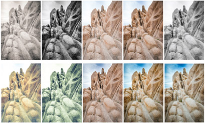
5.10
Unlike a roll of film, raw files can be developed many times without ever affecting the integrity of the source file. In terms of potential styles and designs, there are boundless possibilities.
Setting the Stage for Developing
What Are Histograms?
A basic understanding of digital capture can help us approach working in the Develop Module more comfortably and creatively, but it should also shift the way we make an exposure when shooting raw. For starters, it’s more accurate to say that we are creating a digital capture rather than making an exposure. Light is captured, or read, by our sensors and is converted to data, which then requires a series of processing steps. We need to develop the file before Lightroom processes it. Thus, we shouldn’t be overly concerned with if we are getting the “right” exposure. Instead, we should consider if we are getting enough data since data ultimately provides our file quality. Furthermore, our picture taking workflow should shift when working within this framework. One big shift in my workflow is that I rarely use my camera’s light meters any more. Histograms are now the tool of choice for me.
The histogram is arguably the most important tool to understand when proofing our photos on the back of our cameras and in knowing if we’ve captured enough data. Essentially, histograms are graphs that display the exposed pixels along the range of luminosity. Or to say it another way, histograms show the tonal distribution of an image ranging from black to white. Histogram data comes in all kinds of shapes, and if we know how to read a histogram, we can tell if an image is bright or dark, flat or with high contrast, or overexposed or underexposed, without even looking at our actual photo.
Histogram Anatomy
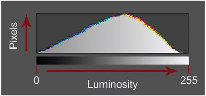
The x-axis of a histogram represents the range of luminosity from black to white. In turn, the y-axis tells you how many pixels in the photo are at a certain level of brightness (see Figure 5.11). Therefore the histogram we see on the back of our camera shows us how much shadow, midtones, and highlights our image actually has.
5.11
The histogram is essentially a graph telling us where pixels are along the range of luminosity, or brightness values. The horizontal axis (x-axis) represents the range of luminosity, and the vertical axis (y-axis) represents the pixels.
Of course, the standard histogram on the back of our cameras is just part of the picture, albeit a very important part. Since our sensors are filtering red, green, and blue light through the Bayer CFA, the standard histogram shows an average of the three color channels—which is why it’s just showing a range from black to white or brightness values. If you ever want to see more than the average, it’s safe to say that all digital cameras sold today give you the ability to see and analyze histograms specific to each color channel (see Figure 5.12).
NOTE: Keep in mind as you are proofing images on the back of your camera, the histogram you’re seeing is a histogram that corresponds to the 8-bit JPEG preview file—even if you are shooting raw. And since 8-bit files have a tonal range of 256 possibilities, the histogram on the back of our cameras has a range of 256 tonal possibilities. Naturally, the farthest point to the left is black and equals 0; the farthest point to the right is white and equals 255; and everything in between are shades of gray that fall between those two values.
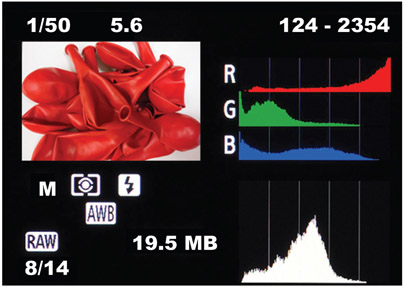
5.12
The vast majority of digital cameras sold today offer the ability to show histograms specific to each color channel, allowing for the ability to further analyze where any clipping might be occurring.
The Image to Histogram Connection
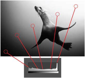
Figure 5.13 helps us understand where the tones of an image correspond to specific positions on the histogram’s x- axis. Since this image has its share of darks, shadows, lights, and highlights, the histogram is distributed somewhat evenly throughout the range of luminosity. In one section of the histogram there’s a vertical spike that hits the ceiling of the graph. Pay no mind to that, as it’s only showing that you have a lot of pixels at that brightness level. There is no such thing as vertical clipping.
5.13
With this diagram, we can see were the tones from the image correspond to certain points in the histogram.
High- and Low-Key Histograms
A high-key image is an image where the majority or all of the tones in the photo are above middle gray. In turn, the tones in a low-key image are below middle gray. Figure 5.14 illustrates the histograms for each kind of image. Notice that the low-key image shows that the majority of the pixels are to the left of middle gray, and the high-key image shows most of the pixels are to the right. However, with either image there is very little going on in the middle, which tells us—without looking at the image—that each image has very few pixels positioned in the midtones.
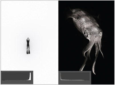
5.14
High-key vs. low-key images, or bright vs. dark images, have very different looking histograms.
Contrast and histograms
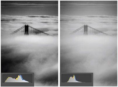
5.15
A high-contrast image will have a histogram that fully spans the range of luminosity, while the low-contrast image is compressed into the midtones and lacks definition in the highlights and shadows.
In Figure 5.15, we can see two histograms that correspond to the same image file. This image was captured on an overcast day and the light was diffused, producing a flat image with little contrast. After I applied contrast to the image, the histogram spread apart: the image appears less flat and is richer in its tonality. Bearing that in mind, notice that contrast is a function of the compression or expansion of the midtones. The more the midtones of an image are spread apart, lending themselves to the darker and brighter areas of an image, the more contrast becomes present and the richer the feel of the image. Of course, richness is a subjective thing, and may or may not work for the vision of your individual photo.
Clipping
Figure 5.16 shows two images: one that is clipped in the highlight region and one that is clipped in the dark region. Clipping means that you have a number of pixels that are falling on the 0 mark or the 255 mark of the histogram. The more pixels you have in either position, the more your tones are getting “clipped.” The term refers to the concern that those areas of the image are so white or black that they are without discernible detail. Areas of the image with black clipping become “inky,” and finding separation in shadow areas of the images could be challenging. In turn, clipped highlights can also lack detail, and attempts to recover them can easily produce posterized synthetic digital looks that don’t translate well to a final print.
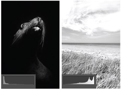
5.16
Clipping on either end of the histogram indicates that there are a number of pixels at the blackest or whitest point of graph. These zones should be used with caution as they lack detail, and can be unrecoverable in the Develop Module.
Deciphering an Appropriate Histogram
I was careful with the wording for the title of this section. I purposely didn’t want to use the term, a “good histogram.” There’s no such thing, really. The appropriate histogram depends on the goals of the individual photographer for the individual image. Of course, you’ll have to decipher that on your own; I just suggest making sure you are getting as much light captured as possible when you do it. Enough light is key to maximizing the quality of a digital photograph. And to dance the dance between photographic vision and getting enough light, I suggest three specific workflow steps: push your histogram as far to the right as you can without clipping; if clipping occurs, look to the “Blinkies” to determine if the placement of the clipping is acceptable; when shooting saturated colors, check your color-specific histograms for clipping and determine if clipping is acceptable.
Step 1. Expose to the right (ETTR): Push the histogram as far to the right as you can without clipping your highlights in critical areas in your composition. I’ll say it again: light translates to data, and data equals tonality and detail. I keep emphasizing this because it’s a hugely important point.
Digital sensors capture light in a linear fashion—meaning that individual pixels cannot make sense of a change in light occurring in a frame, they can only detect the amount of photons hitting their very specific location. Therefore, the amount of “possible tones” in any given area of the image corresponds directly to the amount of light captured by each individual pixel. No light, no data, no depth of tonality or clarity of detail. The histogram in Figure 5.17 is broken up into seven stops of light, which is a typical dynamic range for most modern DSLRs. Also typical is their ability to shoot 14-bit raw files, which can render 16,384 tones per color channel. The thing is, if you underexpose your images just a couple stops, you’ll lose half of your potential tonal information. And in doing so, you run the risk of introducing digital noise into your midtones and shadow areas. So let ETTR be your guide. Push your histogram as far to the right as you can to maximize the amount of data, color, and fine detail possible. If tones appear too bright on the back of your camera screen, you can normalize them in the Develop Module, and because you ETTR, you’ll have more latitude when playing with brightness values, color saturation, and contrast.
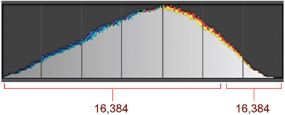
5.17
Most of the data associated with image files rests in the higher tonal range of a file. When shooting with a 14-bit camera, for example, if you underexpose your image less than two stops, you could lose as much as half of your potential tonal data, which is clearly NOT a good idea.
Step 2. Identify where clipping occurs and discern if it is appropriate for your individual photograph: The “Blinkies,” as they are affectionately called, are easily the best tools to help us with ETTR. The goal is capture enough light as you can in a given scene, but you need to be careful not to clip your highlights. Or more specifically, you don’t want to clip highlights in parts of your composition that you care about. Naturally, certain areas of your frame may be okay if they are white with no detail, or white with no detail may be unavoidable depending on what you are shooting. Thus, while histograms can show us if we are clipping highlights while ETTR, the Blinkies show us where they are clipping to determine if the location in our composition is acceptable. In Figure 5.18, clipping in the image with trees is perfectly acceptable in the areas of the sky that I actually intend to be white without detail. The image on the right has clipping on the head of pelican, which is a critical area of the image, and is thus not acceptable. A lot of camera menus simply refer to the Blinkies in their playback menus as “Highlights,” or “Clipping,” but if you don’t already have them turned on, put the book down and go turn them on now. Some cameras will even show you the Blinkies for specific color channels.
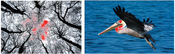
5.18
Clipping is not always bad. The trick is in knowing where clipping is occurring to determine whether or not you care about its presence. Sometimes it’s necessary if you need to shoot into shadows.
Step 3. Check your channel-specific histograms for clipping when shooting saturated colors: As mentioned in the section “What Are Histograms?” earlier in this chapter, most cameras offer the ability to show color-channel histograms, in addition to the regular histogram that averages the color channels. I suggest analyzing these extra histograms when shooting scenes and subjects that have saturated color, and that especially lean toward one color channel or another. Looking at the photo of the red balloons again, Figure 5.12 shown earlier in this chapter illustrates how the photo of the balloon has an average histogram that looks perfectly fine, but when looking at the RGB histograms the red channel is clipped. The consequence of this is the same as clipping a standard histogram. A clipped color channel runs the risk of creating nondiscernable detail in those specific colors. Likewise, if the clipped color is in a critical area of the composition, simply back off on your exposure until that specific histogram look good. Basically, if you are shooting saturated colors—especially colors rich in red, green, or blue—I suggest looking at your camera’s color specific histograms to see if any clipping is occurring. If so, the same rule applies to fix it. Back off your exposure until you notice no clipping.
Signal-to-Noise Ratio
Exposing to the right to maximize the amount of data that we capture also helps maximize our signal-to-noise ratio. Signal-to-noise ratios compare an incoming signal to the level of background noise. Visible light is part of the electromagnetic spectrum, and virtually all devices that transmit and receive electromagnetic signals are susceptible to underlying noise patterns. We can actually hear it in a radio if we are not tuned into a radio station with a good, strong signal. We will hear audible “noise” interfering with or even masking our music. If our televisions are not receiving a good signal, we can see a “snow pattern,” or visual noise on our screens. Of course, if a good signal is present, then we get a clearer TV picture or radio station. The same goes for digital cameras: if we are getting a good strong signal, or if our sensors are receiving a lot of light, than noise is much less visible.
However, good, strong light signals are not always present. Sometimes photographers shoot in low-light situations and have to increase their ISO (their camera’s sensitivity to light) to get the shot. Still, the signal is weaker in low light: even though we can get the picture, we also get more noise when using higher ISOs.
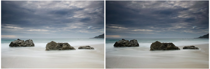
So, ETTR helps make sure we are maximizing our light signal, and a great byproduct of that is less noise and more defined edges with our photos. Take for example Figure 5.19a, which shows a couple images of the same subject. The first image was ETTR, and the second was purposely underexposed. Each was brought into the Lightroom Develop Module and the tones were normalized for each—meaning the tones were brought to something more visually normal. The result, shown in Figure 5.19b, is a noticeable difference in the quality of the detail. The detail of the image that was underexposed is much noisier than then one where the image was exposed to the right (see Figure 5.19c). Needless to say, you can always fix underexposed images by moving the Exposure slider around in the Develop Module, but the byproduct of that is you reveal underlying noise patterns as well.
The Digital Proof
With this understanding of histograms, we can begin to talk about the process for analyzing that preview on that back of our cameras. First, I would suggest treating your preview like a digital proof. Your preview should be viewed as an interpretation of your photograph, much like your histogram. Furthermore, the goal with your digital proof is to verify that you are getting a set of things in camera, with the idea that the proof is a crude rendering of what is to come. It’s really no different to how and why photographers have been making Polaroid proofs for decades.
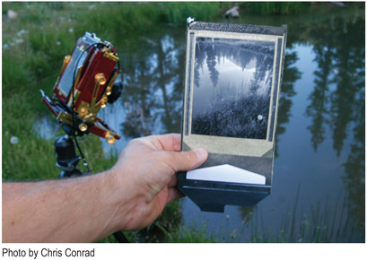
Photographers who use medium- and large-format film cameras often shoot a Polaroid proof of a scene before making an exposure to film. One reason is that the amount of possible exposures is limited compared to the 36 frames on a roll of 35mm film. You can take only shoot one sheet of film at a time with
5.19
When comparing an image that was exposed-to-the-right of the histogram vs. one that was underexposed, you can see a noticeable difference in the tones and detail of the images after they’ve been normalized in the Develop Module.
large-format cameras, so it helps to make sure you are getting it right with a Polaroid before exposing the actual film. In fact, taking a Polaroid proof (as shown in Figure 5.20) is essential practice for professional film photographers who work with that medium and who hire assistants, work with on-site art directors, rent equipment, and work on deadline. These photographers must be absolutely sure they are getting the shot before they take it. It is an exposure insurance policy if you will. But it is also understood that a Polaroid is a makeshift version of the film actually intended for the shoot. Regardless of the reason for making it, a proof validates the exposure settings; it helps analyze sharpness, composition, or how the light is behaving from one part of the frame to another. Likewise, your digital proof is a makeshift of what’s to come.
5.20
A large-format photographer makes a Polaroid proof before shooting film sheets. The proof provides a preview of what the final version will look like and allows the photographer to check sharpness, composition, and lighting. However, like a digital proof, it is a crude version of the final image.
The Steps of a Raw File Workflow
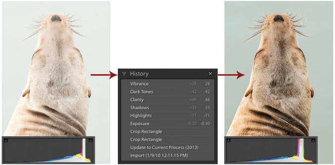
Admittedly, ETTR and viewing a digital proof as a makeshift of what’s to come will require a bit of faith—at first. The logical workflow of taking a picture and looking at the back of your camera to see if it looks good, if the colors are saturated to your liking, if the contrast is pleasing, is actually the illogical approach. One reason for this is because what we see on the back of our small camera screens can look very different than what we’ll may see on our nice, wide-gamut, calibrated monitors in our digital darkroom. But the big reason is that a histogram pushed to the right can often create an image that doesn’t look pleasing at all (see Figure 5.21)—and that can be hard to trust initially. But have faith, my brothers and sisters. Follow the steps of a raw file workflow, put some time into developing your images and normalizing your tones, and you will eventually see the light—pun intended.
5.21
The image on the left is exposed to the right (ETTR). As a result, the image is bright and arguably not pleasing, or at the least not what I was seeing or envisioning. But after just a few simple adjustments, as shown with the History panel, tones are normalized revealing a more natural looking photograph. Ignoring color and contrast and trusting or having faith in the histogram is the way to go.
Step 1. Analyze your Digital Proof
- Ignore brightness.
- Ignore color.
- Ignore contrast.
- Check tonal balance.
- Check image sharpness.
- Check composition.
- Determine if your histogram is appropriately pushed to the right.
- Analyze your Blinkies to see where clipping is occurring.
- Look at color channel histograms when shooting saturated colors.
Step 2. Develop Your Raw File
- Images and histograms that have been exposed to the right should be normalized.
- Brightness levels, colors, and contrast should be shown as natural.
- Consider and play with creative interpretations of your work.
Step 3. Keep The Editing Process in Lightroom as Much as Possible
- Do as much editing as you can in Lightroom.
- Minimize your use of Photoshop, third-party photo developing programs, and other destructive photo editors as much as possible.
Destructive and Nondestructive Processing
The terms destructive editing and nondestructive editing are relative in their meaning. For example, compared to using Lightroom, using Photoshop can be considered a destructive editing process. However, you can have a nondestructive editing workflow while working with images in Photoshop. Either way, the term refers to the ability to make changes to something without making permanent changes to the original. In Photoshop, you can achieve this by doing things like working with Layers or with Smart Objects. But when comparing the math between Photoshop and Lightroom, when looking at how images are darkened or brightened, how color is saturated or desaturated, or the method by which processing happens, Lightroom is by far the less destructive of the two.
To put it in simple terms, when you are developing images in Lightroom, no changes are being made to the raw data. Your raw file is your raw file, and no processing or demosaicing occurs until you export a raw file out of Lightroom. Any alterations you are making to an image in the Develop Module are saved as Developmental Metadata, and no pixel restructuring is actually occurring. You can do as many edits as you want, and always, and I mean always be able to hit the Reset button in the Develop Module to revert back to the original version created when you first imported the image into Lightroom. It is true that if you use layers in Photoshop you can always erase those layers to go back to the original image, but the layers themselves are making actual changes to your image.
In order for an image to be worked on in Photoshop, that image has to be processed or rasterized. It has to be demosaiced; the color of all of the individual pixels has to be defined. Thus, if you are taking a chunk of red pixels in Photoshop and adding a saturation layer to make those reds richer, you are changing the nature of those defined pixels. It is nondestructive in the sense that you can dump the layers whenever you want, but the nature of the pixels is still being altered. And depending on the order of how things are edited in Photoshop, changes, even layered changes can have a corrosive effect. For example, Figure 5.22 illustrates an image that has been edited in Lightroom and in Photoshop. Each has had the Exposure increased with a numerical value of +4, and then decreased with a numerical value of −4. I did this in Photoshop by adding two Exposure Adjustment Layers, and in Lightroom I layered two Gradient Filters over the image. The difference in the result is striking. With Lightroom they just cancel each other out, but with Photoshop, they don’t: the pixels are clearly destroyed with this kind of process. Now don’t get me wrong, I love Photoshop, have Photoshop, and use Photoshop, but I don’t use it nearly as much as I used to. And now that Lightroom 6 offers the ability to merge images for HDR, and stitch panoramas, I’ll likely use it even less. Ultimately, I want you to see value in sticking with Lightroom, and in the nondestructive raw environment as long as you can.
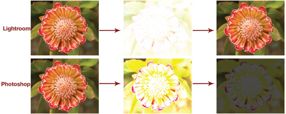
5.22
The order in which we edit photos in Photoshop can matter a great deal, while in Lightroom it doesn’t matter at all. Lightroom is considered a nondestructive editor as no changes are being made to the source file when adjustments are set in the Develop Module. The Lightroom flower was given a +4 Exposure adjustment with a Gradient Filter, and then a second Gradient Filter was added with a −4 adjustment. The effect is they cancel each other out. If a similar thing is done with Photoshop using adjustment layers, the final result is much different.
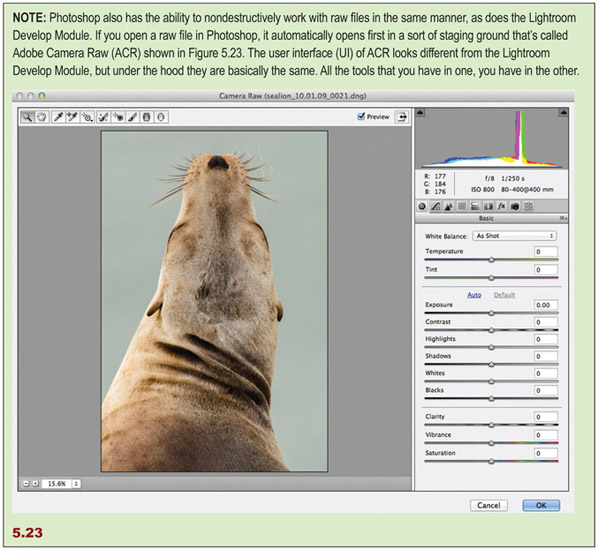
NOTE: Photoshop also has the ability to nondestructively work with raw files in the same manner, as does the Lightroom Develop Module. If you open a raw file in Photoshop, it automatically opens first in a sort of staging ground that’s called Adobe Camera Raw (ACR) shown in Figure 5.23. The user interface (UI) of ACR looks different from the Lightroom Develop Module, but under the hood they are basically the same. All the tools that you have in one, you have in the other.
Third-Party Editors
There are lots of third-party programs available for developing images, and many are sold as plug-ins to work directly with Lightroom. Nik Software, Photomatix, Alien Skin, and Topaz Labs are just a few companies that design software for external editing. A question I often get is whether or not they should be used, and if so which ones. My answer is two pronged, and I think that there are pros and cons to using them.
On the down side, whenever you take an image out of Lightroom to an external editor, you are taking that photo out of the nondestructive environment. This may or may not be a big deal depending on how and how much you edit a photo. Nevertheless, it is a consideration. The fact of the matter is, the more you can keep your image in the Lightroom environment, the better. However, I think there is great benefit for a lot of photographers to play with other editors outside of Lightroom.
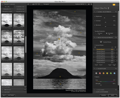
Most external editors are designed to specialize in taking photographers down a particular creative path. For example, Silver Effects is for creating black-and-white photos, Photomatix is for creating HDR images, Viveza is for playing with color photographs—and honestly, I think each one of these is a great program. You can find and download trial versions of external editors right from this link at Adobe’s Web site: http://www.adobe.com/products/photoshop-lightroom/plugins-presets.html#external-editingplugins. Although I typically suggest that photographers stay in Lightroom as much as possible, such programs are great for photographers who are new to editing digital photos. They act as guides revealing what the creative possibilities are for your images. I believe the more a photographer understands what the possibilities are, the better the prospect of finding their own personal style and sense of design. Moreover, I think some external editors are more intuitive than what Lightroom offers for a specific application. Take Nik Software for example. All Nik products like Silver Effects and Viveza use something they call “U-point” technology. Essentially, U-points are “smart” selection tools that allow you to affect specific areas of a photograph without the need of pesky things such as manually selecting or affecting specific areas. Lightroom offers wonderful tools for localized adjustments, and I use Wacom tablets (www.Wacom.com) to have precise brush control by working with a pen and tablet. However, U-point is very easy and intuitive to use (see Figure 5.24). I actually wish Adobe would adopt something as easy to use as U-point. Either way, I’m all for playing with third-party editors, but I suggest eventually learning to limit their use or doing away with them completely as you get more comfortable with your creative goals and the tools available in the Lightroom Develop Module. Staying in Lightroom as much as you can is not a bad rule to live by.
5.24
Here is a screenshot of Nik’s Silver Efex. Nik Software offers tools that teach developing locally, or in specific areas of an image, in a simple and easy-to-understand manner.
5.25
Here is a screenshot of Iridient Developer, which is an alternative raw developing platform that can sync images with the Lightroom Catalog.
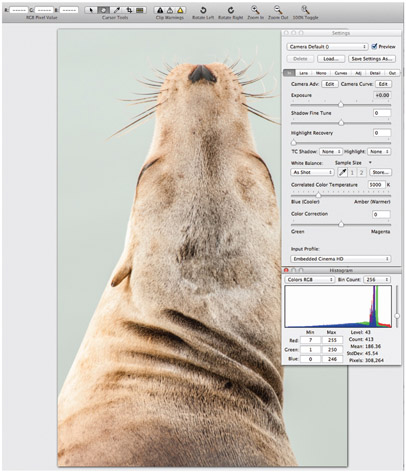
Of course there is an exception to the rule. Iridient Developer (see Figure 5.25) is a highly regarded raw developer that offers an alternative to working with Lightroom’s Develop Module, and the folks at Iridient have some clever ways of integrating their developer into a Lightroom workflow. The buzz regarding the difference between the Lightroom and Iridient Developer as of late regards owners of many of Fuji’s new cameras using the X-Trans CFA (see Figure 5.2). Iridient has pulled off some impressive results in revealing the crisp details supposedly inherent in the cameras that use these CFAs. The company is generally known for being a leader in processing raw files with crisp details. Sorry PC folk, Iridient is available for Mac users only.
Smart Previews and Developing Offline
5.26
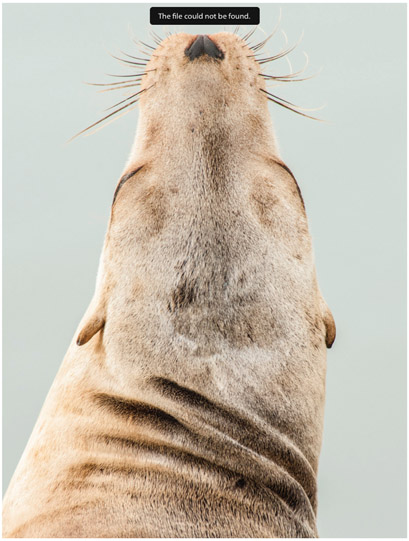
If the hard drive containing a source file is not connected, we cannot render a preview of the raw file to work within the Develop Module— unless a Smart Preview is created.
In order to develop our images in the Develop Module, we typically need to have our hard drives where our images reside plugged into our computer. If they are not, and we try to develop an image, we’ll get a warning that says The file could not be found, as shown in Figure 5.26. However, Adobe did create a loophole in this system with the invention of the Smart Preview. Essentially, Smart Previews are a kind of preview that we can generate in addition to our regular or normal previews, and they provide the ability for us to develop our images while our images are offline. Admittedly, this feature only matters to photographers with a specific kind of workflow. It’s not a big deal to have your hard drives plugged into your computer, but it does provide more options for portability. Eventually, it paved the way for the ability to sync our catalogs with Lightroom Mobile.
Smart Previews can be made while we are importing or anytime thereafter. We can generate them during import through the File Handling subpanel as shown previously in Chapter 2 (see Figure 2.19), and by checking the Build Smart Previews check box. Of course, Smart Previews do take up extra room on a hard drive, so you may not want or need to create Smart Previews for all of your images. Smart Previews use a compressed DNG format and are about 20% to 25% of your source file’s actual size. So even though they are much smaller than your actual files, generating Smart Previews for all of your images is not something I would suggest for most workflows. Additionally, if we generate Smart Previews while importing our images, it will slow down our import. So if you’re a photographer who decides to import and Copy as DNG, create 1:1 Previews, and then Build Smart Previews all while importing, your import wait times will be, well, annoying.
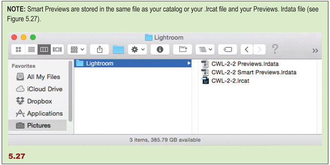
NOTE: Smart Previews are stored in the same file as your catalog or your .lrcat file and your Previews. lrdata file (see Figure 5.27).
I suggest creating Smart Previews later and only for sets of images that you’re sure you need to work on while your files are offline, or for files that you intend to sync with Lightroom Mobile. To create Smart Previews through the Main Menu, select a set of images and go to Library Menu > Previews > Build Smart Previews. But if you’re like me, and the only time you need Smart Previews is when you’re working with Lightroom Mobile, then you can have Lightroom build them automatically as you sync your images with Lightroom Mobile.
Raw vs. JPEG
JPEG files are compressed files that use a “lossy” compression algorithm. Lossy compression is a class of data encoding wherein partial data discarding methods for making files smaller for storage and transport are used. Indeed, this means that in addition to a smaller color gamut, JPEGs are lesser quality because we lose some image information during compression. This is why JPEGs are typically the ideal format for fast workflows, and for putting images onto Web sites, Facebook, Flickr, or email. It’s simply a tighter package. JPEG is a useful file format; it just isn’t the better capture format.
Raw files inherently have more to offer. JPEGs are naturally 8-bit files, and 8-bit color files have 256 possible tones per color channel: if you shoot a JPEG file, you are creating an image with 256 possible red, 256 possible green, and 256 possible blue tones, which calculates to 16.7 million color combinations. Not too shabby, right? Well, most modern consumer cameras can shoot as much as 12-bit or 14-bit raw files, while higher-end cameras can shoot 16-bit raw files. A 14-bit file has 16,384 tonal possibilities instead of 256 per color channel, and a 16-bit file has a whopping 65,536 tonal possibilities. Canon and Nikon digital SLRs typically shoot 14-bit raw files, which offers trillions of possible color combinations. So, not too shabbier!
So, does it ever make sense to shoot JPEG images? There are clearly times when JPEG workflows make sense. However, I suggest a JPEG workflow for rare and specific kinds of applications. There are photographers and there are photo shoots where it’s clear that time and staff are in insufficient supply, but the shoots require a lot of images, and it requires them quickly. And getting the most out of tonality by using raw files may not be the priority for such shoots. For example, I’ve been part of photo shoots where we would photograph 3,000 kids over the course of a week, and the main goal was getting quick and easy access to files for viewing and sale. Since none of the images would be sold as large fine-art prints, using a faster JPEG format was the way to go. But outside of such shoots where speed is needed and resources for postproduction scarce, I see little reason to stick with JPEG. I also see little reason to set a camera to shoot raw and JPEG files simultaneously—unless those JPEGs are needed for immediate access for sharing, of course. Essentially, JPEGs are much more limited than raw files, so use them only if the job requires it.