
CHAPTER 3
Data Visualization
In this chapter, we describe a set of plots that can be used to explore the multidimensional nature of a data set. We present basic plots (bar charts, line graphs, and scatter plots), distribution plots (boxplots and histograms), and different enhancements that expand the capabilities of these plots to visualize more information. We focus on how the different visualizations and operations can support data mining tasks, from supervised tasks (prediction, classification, and time series forecasting) to unsupervised tasks, and provide a few guidelines on specific visualizations to use with each data mining task. We also describe the advantages of interactive visualization over static plots. The chapter concludes with a presentation of specialized plots suitable for data with special structure (hierarchical, network, and geographical).
3.1 Introduction1
The popular saying “a picture is worth a thousand words” refers to the ability to condense diffused verbal information into a compact and quickly understood graphical image. In the case of numbers, data visualization and numerical summarization provide us with both a powerful tool to explore data and an effective way to present results (Few, 2012).
Where do visualization techniques fit into the data mining process, as described so far? They are primarily used in the preprocessing portion of the data mining process. Visualization supports data cleaning by finding incorrect values (e.g., patients whose age is 999 or − 1), missing values, duplicate rows, columns with all the same value, and the like. Visualization techniques are also useful for variable derivation and selection: they can help determine which variables to include in the analysis and which might be redundant. They can also help with determining appropriate bin sizes, should binning of numerical variables be needed (e.g., a numerical outcome variable might need to be converted to a binary variable if a yes/no decision is required). They can also play a role in combining categories as part of the data reduction process. Finally, if the data have yet to be collected and collection is expensive (as with the Pandora project at its outset, see Chapter 7), visualization methods can help determine, using a sample, which variables and metrics are useful.
In this chapter, we focus on the use of graphical presentations for the purpose of data exploration, particularly with relation to predictive analytics. Although our focus is not on visualization for the purpose of data reporting, this chapter offers ideas as to the effectiveness of various graphical displays for the purpose of data presentation. These offer a wealth of useful presentations beyond tabular summaries and basic bar charts, which are currently the most popular form of data presentation in the business environment. For an excellent discussion of using charts to report business data, see Few (2012). In terms of reporting data mining results graphically, we describe common graphical displays elsewhere in the book, some of which are technique-specific [e.g., dendrograms for hierarchical clustering (Chapter 15), network charts for social network analysis (Chapter 19), and tree charts for classification and regression trees (Chapter 9)] while others are more general [e.g., receiver operating characteristic (ROC) curves and lift charts for classification (Chapter 5) and profile plots and heatmaps for clustering (Chapter 15)].
Note: The term “graph” can have two meanings in statistics. It can refer, particularly in popular usage, to any of a number of figures to represent data (e.g., line chart, bar plot, histogram, etc.). In a more technical use, it refers to the data structure and visualization in networks (see Chapter 19). Using the term “plot” for the visualizations we explore in this chapter avoids this confusion.
Data exploration is a mandatory initial step whether or not more formal analysis follows. Graphical exploration can support free-form exploration for the purpose of understanding the data structure, cleaning the data (e.g., identifying unexpected gaps or “illegal” values), identifying outliers, discovering initial patterns (e.g., correlations among variables and surprising clusters), and generating interesting questions. Graphical exploration can also be more focused, geared toward specific questions of interest. In the data mining context, a combination is needed: free-form exploration performed with the purpose of supporting a specific goal.
Graphical exploration can range from generating very basic plots to using operations such as filtering and zooming interactively to explore a set of interconnected visualizations that include advanced features such as color and multiple-panels. This chapter is not meant to be an exhaustive guidebook on visualization techniques, but instead discusses main principles and features that support data exploration in a data mining context. We start by describing varying levels of sophistication in terms of visualization, and show the advantages of different features and operations. Our discussion is from the perspective of how visualization supports the subsequent data mining goal. In particular, we distinguish between supervised and unsupervised learning; within supervised learning, we also further distinguish between classification (categorical outcome variable) and prediction (numerical outcome variable).
Python
There are a variety of Python libraries for data visualizations. The oldest, but also most flexible library is matplotlib. It is widely used and there are many resources available to get started and to find help. A number of other libraries are built around it and make the generation of plots often quicker.
Seaborn and pandas are two of the libraries that are wrappers around matplotlib. Both are very useful to create plots quickly. However, even if these are used, a good knowledge of matplotlib helps to have more control over the final plot.
The ggplot library is modeled after the equally named R package by Hadley Wickham. It is based on the “Grammar of Graphics,” a term coined by Leland Wilkinson to define a system of plotting theory and nomenclature. Learning ggplot effectively means becoming familiar with this philosophy and technical language of plotting.
Bokeh is an interesting new development to create interactive plots, dashboards and data applications for web browers.
In this chapter, we mainly use pandas for data visualizations and cover possible customization of the plots using matplotlib commands. A few other packages are used for specialized plots: seaborn for heatmaps, gmaps and cartopy for map visualizations.
![]() import required functionality for this chapter
import required functionality for this chapter
import os
import calendar
import numpy as np
import networkx as nx
import pandas as pd
from pandas.plotting import scatter_matrix, parallel_coordinates
import seaborn as sns
from sklearn import preprocessing
import matplotlib.pylab as plt
3.2 Data Examples
To illustrate data visualization, we use two datasets used in additional chapters in the book.
Example 1: Boston Housing Data
The Boston Housing data contain information on census tracts in Boston2 for which several measurements are taken (e.g., crime rate, pupil/teacher ratio). It has 14 variables. A description of each variable is given in Table 3.1 and a sample of the first nine records is shown in Table 3.2. In addition to the original 13 variables, the dataset also contains the additional variable CAT.MEDV, which was created by categorizing median value (MEDV) into two categories: high and low. With pandas, it is more convenient to have columns names that contain only characters, numbers, and the ‘_’. We therefore rename the column in the code examples to CAT_MEDV.
Table 3.1 Description of Variables in Boston Housing Dataset
| CRIM | Crime rate |
| ZN | Percentage of residential land zoned for lots over 25,000 ft2 |
| INDUS | Percentage of land occupied by nonretail business |
| CHAS | Does tract bound Charles River (= 1 if tract bounds river, = 0 otherwise) |
| NOX | Nitric oxide concentration (parts per 10 million) |
| RM | Average number of rooms per dwelling |
| AGE | Percentage of owner-occupied units built prior to 1940 |
| DIS | Weighted distances to five Boston employment centers |
| RAD | Index of accessibility to radial highways |
| TAX | Full-value property tax rate per $10,000 |
| PTRATIO | Pupil-to-teacher ratio by town |
| LSTAT | Percentage of lower status of the population |
| MEDV | Median value of owner-occupied homes in $1000s |
| CAT.MEDV | Is median value of owner-occupied homes in tract above $30,000 (CAT.MEDV = 1) or not (CAT.MEDV = 0) |
Table 3.2 First Nine Records in the Boston Housing Data
housing_df = pd.read_csv('BostonHousing.csv')
# rename CAT. MEDV column for easier data handling
housing_df = housing_df.rename(columns='CAT. MEDV': 'CAT_MEDV')
housing_df.head(9)
Output CRIM ZN INDUS CHAS NOX RM AGE DIS RAD TAX PTRATIO LSTAT MEDV CAT_MEDV 0 0.0063 18.0 2.31 0 0.538 6.575 65.2 4.090 1 296 15.3 4.98 24.0 0 1 0.0273 0.0 7.07 0 0.469 6.421 78.9 4.967 2 242 17.8 9.14 21.6 0 2 0.0273 0.0 7.07 0 0.469 7.185 61.1 4.967 2 242 17.8 4.03 34.7 1 3 0.0324 0.0 2.18 0 0.458 6.998 45.8 6.062 3 222 18.7 2.94 33.4 1 4 0.0691 0.0 2.18 0 0.458 7.147 54.2 6.062 3 222 18.7 5.33 36.2 1 5 0.0299 0.0 2.18 0 0.458 6.430 58.7 6.062 3 222 18.7 5.21 28.7 0 6 0.0883 12.5 7.87 0 0.524 6.012 66.6 5.561 5 311 15.2 12.43 22.9 0 7 0.1446 12.5 7.87 0 0.524 6.172 96.1 5.951 5 311 15.2 19.15 27.1 0 8 0.2112 12.5 7.87 0 0.524 5.631 100.0 6.082 5 311 15.2 29.93 16.5 0 |
We consider three possible tasks:
- A supervised predictive task, where the outcome variable of interest is the median value of a home in the tract (MEDV).
- A supervised classification task, where the outcome variable of interest is the binary variable CAT.MEDV that indicates whether the home value is above or below $30,000.
- An unsupervised task, where the goal is to cluster census tracts.
(MEDV and CAT.MEDV are not used together in any of the three cases).
Example 2: Ridership on Amtrak Trains
Amtrak, a US railway company, routinely collects data on ridership. Here, we focus on forecasting future ridership using the series of monthly ridership between January 1991 and March 2004. The data and their source are described in Chapter 16. Hence, our task here is (numerical) time series forecasting.
3.3 Basic Charts: Bar Charts, Line Graphs, and Scatter Plots
The three most effective basic plots are bar charts, line graphs, and scatter plots. These plots are easy to create in Python using pandas and are the plots most commonly used in the current business world, in both data exploration and presentation (unfortunately, pie charts are also popular, although they are usually ineffective visualizations). Basic charts support data exploration by displaying one or two columns of data (variables) at a time. This is useful in the early stages of getting familiar with the data structure, the amount and types of variables, the volume and type of missing values, etc.
The nature of the data mining task and domain knowledge about the data will affect the use of basic charts in terms of the amount of time and effort allocated to different variables. In supervised learning, there will be more focus on the outcome variable. In scatter plots, the outcome variable is typically associated with the y-axis. In unsupervised learning (for the purpose of data reduction or clustering), basic plots that convey relationships (such as scatter plots) are preferred.
Figure 3.1 a displays a line chart for the time series of monthly railway passengers on Amtrak. Line graphs are used primarily for showing time series. The choice of time frame to plot, as well as the temporal scale, should depend on the horizon of the forecasting task and on the nature of the data.

Figure 3.1 Basic plots: line graph (a), scatter plot (b), bar chart for numerical variable (c), and bar chart for categorical variable (d)
![]() code for creating Figure 3.1
code for creating Figure 3.1
## Load the Amtrak data and convert them to be suitable for time series analysis
Amtrak_df = pd.read_csv('Amtrak.csv', squeeze=True)
Amtrak_df['Date'] = pd.to_datetime(Amtrak_df.Month, format='%d/%m/%Y')
ridership_ts = pd.Series(Amtrak_df.Ridership.values, index=Amtrak_df.Date)
## Boston housing data
housing_df = pd.read_csv('BostonHousing.csv')
housing_df = housing_df.rename(columns='CAT. MEDV': 'CAT_MEDV')
Pandas version
## line graph
ridership_ts.plot(ylim=[1300, 2300], legend=False)
plt.xlabel('Year')  # set x-axis label
plt.ylabel('Ridership (in 000s)')  # set y-axis label
## scatter plot with axes names
housing_df.plot.scatter(x='LSTAT', y='MEDV', legend=False)
## barchart of CHAS vs. mean MEDV
# compute mean MEDV per CHAS = (0, 1)
ax = housing_df.groupby('CHAS').mean().MEDV.plot(kind='bar')
ax.set_ylabel('Avg. MEDV')
## barchart of CHAS vs. CAT_MEDV
dataForPlot = housing_df.groupby('CHAS').mean()['CAT_MEDV'] * 100
ax = dataForPlot.plot(kind='bar', figsize=[5, 3])
ax.set_ylabel('
matplotlib version
## line graph
plt.plot(ridership_ts.index, ridership_ts)
plt.xlabel('Year')  # set x-axis label
plt.ylabel('Ridership (in 000s)')  # set y-axis label
## Set the color of the points in the scatterplot and draw as open circles.
plt.scatter(housing_df.LSTAT, housing_df.MEDV, color='C2', facecolor='none')
plt.xlabel('LSTAT'); plt.ylabel('MEDV')
## barchart of CHAS vs. mean MEDV
# compute mean MEDV per CHAS = (0, 1)
dataForPlot = housing_df.groupby('CHAS').mean().MEDV
fig, ax = plt.subplots()
ax.bar(dataForPlot.index, dataForPlot, color=['C5', 'C1'])
ax.set_xticks([0, 1], False)
ax.set_xlabel('CHAS')
ax.set_ylabel('Avg. MEDV')
## barchart of CHAS vs. CAT.MEDV
dataForPlot = housing_df.groupby('CHAS').mean()['CAT_MEDV'] * 100
fig, ax = plt.subplots()
ax.bar(dataForPlot.index, dataForPlot, color=['C5', 'C1'])
ax.set_xticks([0, 1], False)
ax.set_xlabel('CHAS'); ax.set_ylabel('
Bar charts are useful for comparing a single statistic (e.g., average, count, percentage) across groups. The height of the bar (or length in a horizontal display) represents the value of the statistic, and different bars correspond to different groups. Two examples are shown in Figure 3.1 c,d. Figure 3.1 c shows a bar chart for a numerical variable (MEDV) and Figure 3.1 d shows a bar chart for a categorical variable (CAT.MEDV). In each, separate bars are used to denote homes in Boston that are near the Charles River vs. those that are not (thereby comparing the two categories of CHAS). The chart with the numerical output MEDV (Figure 3.1 c) uses the average MEDV on the y-axis. This supports the predictive task: the numerical outcome is on the y-axis and the x-axis is used for a potential categorical predictor.3 (Note that the x-axis on a bar chart must be used only for categorical variables, because the order of bars in a bar chart should be interchangeable.) For the classification task (Figure 3.1 d), the y-axis indicates the percent of tracts with median value above $30K and the x-axis is a binary variable indicating proximity to the Charles. This plot shows us that the tracts bordering the Charles are much more likely to have median values above $30K.
Figure 3.1 b displays a scatter plot of MEDV vs. LSTAT. This is an important plot in the prediction task. Note that the output MEDV is again on the y-axis (and LSTAT on the x-axis is a potential predictor). Because both variables in a basic scatter plot must be numerical, it cannot be used to display the relation between CAT.MEDV and potential predictors for the classification task (but we can enhance it to do so—see Section 3.4). For unsupervised learning, this particular scatter plot helps study the association between two numerical variables in terms of information overlap as well as identifying clusters of observations.
All three basic plots highlight global information such as the overall level of ridership or MEDV, as well as changes over time (line chart), differences between subgroups (bar chart), and relationships between numerical variables (scatter plot).
Distribution Plots: Boxplots and Histograms
Before moving on to more sophisticated visualizations that enable multidimensional investigation, we note two important plots that are usually not considered “basic charts” but are very useful in statistical and data mining contexts. The boxplot and the histogram are two plots that display the entire distribution of a numerical variable. Although averages are very popular and useful summary statistics, there is usually much to be gained by looking at additional statistics such as the median and standard deviation of a variable, and even more so by examining the entire distribution. Whereas bar charts can only use a single aggregation, boxplots and histograms display the entire distribution of a numerical variable. Boxplots are also effective for comparing subgroups by generating side-by-side boxplots, or for looking at distributions over time by creating a series of boxplots.
Distribution plots are useful in supervised learning for determining potential data mining methods and variable transformations. For example, skewed numerical variables might warrant transformation (e.g., moving to a logarithmic scale) if used in methods that assume normality (e.g., linear regression, discriminant analysis).
A histogram represents the frequencies of all x values with a series of vertical connected bars. For example, Figure 3.2 a, there are over 150 tracts where the median value (MEDV) is between $20K and $25K.

Figure 3.2 Distribution charts for numerical variable MEDV. (a) Histogram, (b) Boxplot
![]() code for creating Figure 3.2
code for creating Figure 3.2
## histogram of MEDV
ax = housing_df.MEDV.hist()
ax.set_xlabel('MEDV'); ax.set_ylabel('count')
# alternative plot with matplotlib
fig, ax = plt.subplots()
ax.hist(housing_df.MEDV)
ax.set_axisbelow(True)  # Show the grid lines behind the histogram
ax.grid(which='major', color='grey', linestyle='–')
ax.set_xlabel('MEDV'); ax.set_ylabel('count')
plt.show()
## boxplot of MEDV for different values of CHAS
ax = housing_df.boxplot(column='MEDV', by='CHAS')
ax.set_ylabel('MEDV')
plt.suptitle(”)  # Suppress the titles
plt.title(”)
# alternative plot with matplotlib
dataForPlot = [list(housing_df[housing_df.CHAS==0].MEDV),
		list(housing_df[housing_df.CHAS==1].MEDV)]
fig, ax = plt.subplots()
ax.boxplot(dataForPlot)
ax.set_xticks([1, 2], False)
ax.set_xticklabels([0, 1])
ax.set_xlabel('CHAS'); ax.set_ylabel('MEDV')
plt.show()
A boxplot represents the variable being plotted on the y-axis (although the plot can potentially be turned in a 90° angle, so that the boxes are parallel to the x-axis). Figure 3.2 b, there are two boxplots (called a side-by-side boxplot). The box encloses 50% of the data—for example, in the right-hand box, half of the tracts have median values (MEDV) between $20,000 and $33,000. The horizontal line inside the box represents the median (50th percentile). The top and bottom of the box represent the 75th and 25th percentiles, respectively. Lines extending above and below the box cover the rest of the data range; outliers may be depicted as points or circles. Sometimes the average is marked by a + (or similar) sign. Comparing the average and the median helps in assessing how skewed the data are. Boxplots are often arranged in a series with a different plot for each of the various values of a second variable, shown on the x-axis.
Because histograms and boxplots are geared toward numerical variables, their basic form is useful for prediction tasks. Boxplots can also support unsupervised learning by displaying relationships between a numerical variable (y-axis) and a categorical variable (x-axis). To illustrate these points, look again at Figure 3.2. Figure 3.2 a shows a histogram of MEDV, revealing a skewed distribution. Transforming the output variable to log(MEDV) might improve results of a linear regression predictor.
Figure 3.2 b shows side-by-side boxplots comparing the distribution of MEDV for homes that border the Charles River (1) or not (0), similar to Figure 3.1. We see that not only is the average MEDV for river-bounding homes higher than the non-river-bounding homes, but also the entire distribution is higher (median, quartiles, min, and max). We can also see that all river-bounding homes have MEDV above $10K, unlike non-river-bounding homes. This information is useful for identifying the potential importance of this predictor (CHAS), and for choosing data mining methods that can capture the non-overlapping area between the two distributions (e.g., trees).
Boxplots and histograms applied to numerical variables can also provide directions for deriving new variables, for example, they can indicate how to bin a numerical variable (e.g., binning a numerical outcome in order to use a naive Bayes classifier, or in the Boston Housing example, choosing the cutoff to convert MEDV to CAT.MEDV).
Finally, side-by-side boxplots are useful in classification tasks for evaluating the potential of numerical predictors. This is done by using the x-axis for the categorical outcome and the y-axis for a numerical predictor. An example is shown in Figure 3.3, where we can see the effects of four numerical predictors on CAT.MEDV. The pairs that are most separated (e.g., PTRATIO and INDUS) indicate potentially useful predictors.
The main weakness of basic charts and distribution plots, in their basic form (i.e., using position in relation to the axes to encode values), is that they can only display two variables and therefore cannot reveal high-dimensional information. Each of the basic charts has two dimensions, where each dimension is dedicated to a single variable. In data mining, the data are usually multivariate by nature, and the analytics are designed to capture and measure multivariate information. Visual exploration should therefore also incorporate this important aspect. In the next section, we describe how to extend basic charts (and distribution plots) to multidimensional data visualization by adding features, employing manipulations, and incorporating interactivity. We then present several specialized charts that are geared toward displaying special data structures (Section 3.5).
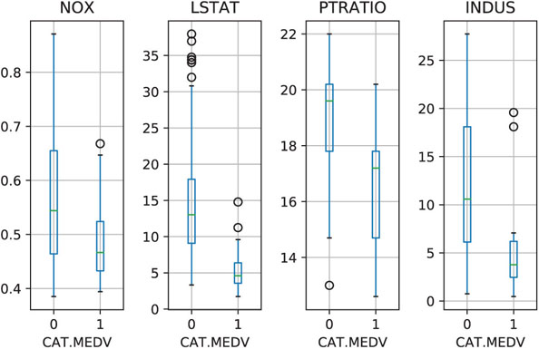
Figure 3.3 Side-by-side boxplots for exploring the CAT.MEDV output variable by different numerical predictors. IN A SIDE-BY-SIDE BOXPLOT, ONE AXIS IS USED FOR A CATEGORICAL VARIABLE, AND THE OTHER FOR A NUMERICAL VARIABLE. Plotting a CATEGORICAL OUTCOME VARIABLE and a numerical predictor compares the predictor’s distribution across the outcome categories. Plotting a NUMERICAL OUTCOME VARIABLE and a categorical predictor displays THE DISTRIBUTION OF THE OUTCOME VARIABLE across different levels of the predictor
![]() code for creating Figure 3.3
code for creating Figure 3.3
## side-by-side boxplots
fig, axes = plt.subplots(nrows=1, ncols=4)
housing_df.boxplot(column='NOX', by='CAT_MEDV', ax=axes[0])
housing_df.boxplot(column='LSTAT', by='CAT_MEDV', ax=axes[1])
housing_df.boxplot(column='PTRATIO', by='CAT_MEDV', ax=axes[2])
housing_df.boxplot(column='INDUS', by='CAT_MEDV', ax=axes[3])
for ax in axes:
    ax.set_xlabel('CAT.MEDV')
plt.suptitle(”)  # Suppress the overall title
plt.tight_layout()  # Increase the separation between the plots
Heatmaps: Visualizing Correlations and Missing Values
A heatmap is a graphical display of numerical data where color is used to denote values. In a data mining context, heatmaps are especially useful for two purposes: for visualizing correlation tables and for visualizing missing values in the data. In both cases, the information is conveyed in a two-dimensional table. A correlation table for p variables has p rows and p columns. A data table contains p columns (variables) and n rows (observations). If the number of rows is huge, then a subset can be used. In both cases, it is much easier and faster to scan the color-coding rather than the values. Note that heatmaps are useful when examining a large number of values, but they are not a replacement for more precise graphical display, such as bar charts, because color differences cannot be perceived accurately.
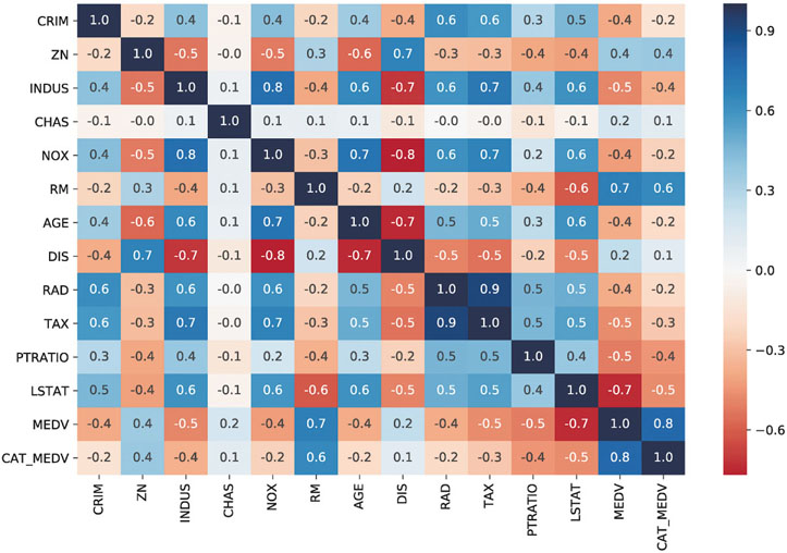
Figure 3.4 Heatmap of a correlation table. Darker values denote stronger correlation. Blue/red represent positive/negative values, respectively
![]() code for creating Figure 3.4
code for creating Figure 3.4
## simple heatmap of correlations (without values)
corr = housing_df.corr()
sns.heatmap(corr, xticklabels=corr.columns, yticklabels=corr.columns)
# Change the colormap to a divergent scale and fix the range of the colormap
sns.heatmap(corr, xticklabels=corr.columns, yticklabels=corr.columns, vmin=-1, vmax=1, cmap=”RdBu”)
# Include information about values (example demonstrate how to control the size of
# the plot
fig, ax = plt.subplots()
fig.set_size_inches(11, 7)
sns.heatmap(corr, annot=True, fmt=”.1f”, cmap=”RdBu”, center=0, ax=ax)
An example of a correlation table heatmap is shown in Figure 3.4, showing all the pairwise correlations between 13 variables (MEDV and 12 predictors). Darker shades correspond to stronger (positive or negative) correlation. It is easy to quickly spot the high and low correlations. The use of blue/red is used in this case to highlight positive vs. negative correlations.

Figure 3.5 Heatmap of missing values in a dataset on motor vehicle collisions. Grey denotes missing value
![]() code for generating a heatmap of missing values similar to Figure 3.5
code for generating a heatmap of missing values similar to Figure 3.5
df = pd.read_csv('NYPD_Motor_Vehicle_Collisions_1000.csv').sort_values(['DATE'])
# given a dataframe df create a copy of the array that is 0 if a field contains a
# value and 1 for NaN
naInfo = np.zeros(df.shape)
naInfo[df.isna().values] = 1
naInfo = pd.DataFrame(naInfo, columns=df.columns)
fig, ax = plt.subplots()
fig.set_size_inches(13, 9)
ax = sns.heatmap(naInfo, vmin=0, vmax=1, cmap=[”white”, ”#666666”], cbar=False, ax=ax)
ax.set_yticks([])
# draw frame around figure
rect = plt.Rectangle((0, 0), naInfo.shape[1], naInfo.shape[0], linewidth=1, edgecolor='lightgrey', facecolor='none')
rect = ax.add_patch(rect)
rect.set_clip_on(False)
plt.xticks(rotation=80)
In a missing value heatmap, rows correspond to records and columns to variables. We use a binary coding of the original dataset where 1 denotes a missing value and 0 otherwise. This new binary table is then colored such that only missing value cells (with value 1) are colored. Figure 3.5 shows an example of a missing value heatmap for a dataset on motor vehicle collisions.4 The missing data heatmap helps visualize the level and amount of “missingness” in the dataset. Some patterns of “missingness” easily emerge: variables that are missing for nearly all observations, as well as clusters of rows that are missing many values. Variables with little missingness are also visible. This information can then be used for determining how to handle the missingness (e.g., dropping some variables, dropping some records, imputing, or via other techniques).
3.4 Multidimensional Visualization
Basic plots can convey richer information with features such as color, size, and multiple panels, and by enabling operations such as rescaling, aggregation, and interactivity. These additions allow looking at more than one or two variables at a time. The beauty of these additions is their effectiveness in displaying complex information in an easily understandable way. Effective features are based on understanding how visual perception works (see Few, 2009 for a discussion). The purpose is to make the information more understandable, not just to represent the data in higher dimensions (such as three-dimensional plots that are usually ineffective visualizations).
Adding Variables: Color, Size, Shape, Multiple Panels, and Animation
In order to include more variables in a plot, we must consider the type of variable to include. To represent additional categorical information, the best way is to use hue, shape, or multiple panels. For additional numerical information, we can use color intensity or size. Temporal information can be added via animation.
Incorporating additional categorical and/or numerical variables into the basic (and distribution) plots means that we can now use all of them for both prediction and classification tasks. For example, we mentioned earlier that a basic scatter plot cannot be used for studying the relationship between a categorical outcome and predictors (in the context of classification). However, a very effective plot for classification is a scatter plot of two numerical predictors color-coded by the categorical outcome variable. An example is shown in Figure 3.6 a, with color denoting CAT.MEDV.

Figure 3.6 Adding categorical variables by color-coding and multiple panels. (a) Scatter plot of two numerical predictors, color-coded by the categorical outcome CAT.MEDV. (b) Bar chart of MEDV by two categorical predictors (CHAS and RAD), using multiple panels for CHAS
![]() code for creating Figure 3.6
code for creating Figure 3.6
# Color the points by the value of CAT.MEDV
housing_df.plot.scatter(x='LSTAT', y='NOX', c=['C0' if c == 1 else 'C1' for c in housing_df.CAT_MEDV])
# Plot first the data points for CAT.MEDV of 0 and then of 1
# Setting color to 'none' gives open circles
_, ax = plt.subplots()
for catValue, color in (0, 'C1'), (1, 'C0'):
  subset_df = housing_df[housing_df.CAT_MEDV == catValue]
  ax.scatter(subset_df.LSTAT, subset_df.NOX, color='none', edgecolor=color)
ax.set_xlabel('LSTAT')
ax.set_ylabel('NOX')
ax.legend([”CAT.MEDV 0”, ”CAT.MEDV 1”])
plt.show()
## panel plots
# compute mean MEDV per RAD and CHAS
dataForPlot_df = housing_df.groupby(['CHAS','RAD']).mean()['MEDV']
# We determine all possible RAD values to use as ticks
ticks = set(housing_df.RAD)
for i in range(2):
	for t in ticks.difference(dataForPlot_df[i].index):
	    dataForPlot_df.loc[(i, t)] = 0
# reorder to rows, so that the index is sorted
dataForPlot_df = dataForPlot_df[sorted(dataForPlot_df.index)]
# Determine a common range for the y axis
yRange = [0, max(dataForPlot_df) * 1.1]
fig, axes = plt.subplots(nrows=2, ncols=1)
dataForPlot_df[0].plot.bar(x='RAD', ax=axes[0], ylim=yRange)
dataForPlot_df[1].plot.bar(x='RAD', ax=axes[1], ylim=yRange)
axes[0].annotate('CHAS = 0', xy=(3.5, 45))
axes[1].annotate('CHAS = 1', xy=(3.5, 45))
plt.show()
In the context of prediction, color-coding supports the exploration of the conditional relationship between the numerical outcome (on the y-axis) and a numerical predictor. Color-coded scatter plots then help assess the need for creating interaction terms (e.g., is the relationship between MEDV and LSTAT different for homes near vs. away from the river?).
Color can also be used to include further categorical variables into a bar chart, as long as the number of categories is small. When the number of categories is large, a better alternative is to use multiple panels. Creating multiple panels (also called “trellising”) is done by splitting the observations according to a categorical variable, and creating a separate plot (of the same type) for each category. An example is shown in Figure 3.6 b, where a bar chart of average MEDV by RAD is broken down into two panels by CHAS. We see that the average MEDV for different highway accessibility levels (RAD) behaves differently for homes near the river (lower panel) compared to homes away from the river (upper panel). This is especially salient for RAD = 1. We also see that there are no near-river homes in RAD levels 2, 6, and 7. Such information might lead us to create an interaction term between RAD and CHAS, and to consider condensing some of the bins in RAD. All these explorations are useful for prediction and classification.
A special plot that uses scatter plots with multiple panels is the scatter plot matrix. In it, all pairwise scatter plots are shown in a single display. The panels in a matrix scatter plot are organized in a special way, such that each column and each row correspond to a variable, thereby the intersections create all the possible pairwise scatter plots. The scatter plot matrix is useful in unsupervised learning for studying the associations between numerical variables, detecting outliers and identifying clusters. For supervised learning, it can be used for examining pairwise relationships (and their nature) between predictors to support variable transformations and variable selection (see Correlation Analysis in Chapter 4). For prediction, it can also be used to depict the relationship of the outcome with the numerical predictors.
An example of a scatter plot matrix is shown in Figure 3.7, with MEDV and three predictors. Below the diagonal are the scatter plots. Variable name indicates the y-axis variable. For example, the plots in the bottom row all have MEDV on the y-axis (which allows studying the individual outcome–predictor relations). We can see different types of relationships from the different shapes (e.g., an exponential relationship between MEDV and LSTAT and a highly skewed relationship between CRIM and INDUS), which can indicate needed transformations. Along the diagonal, where just a single variable is involved, the frequency distribution for that variable is displayed. The scatterplots above the diagonal contain the correlation coefficients corresponding to the two variables.
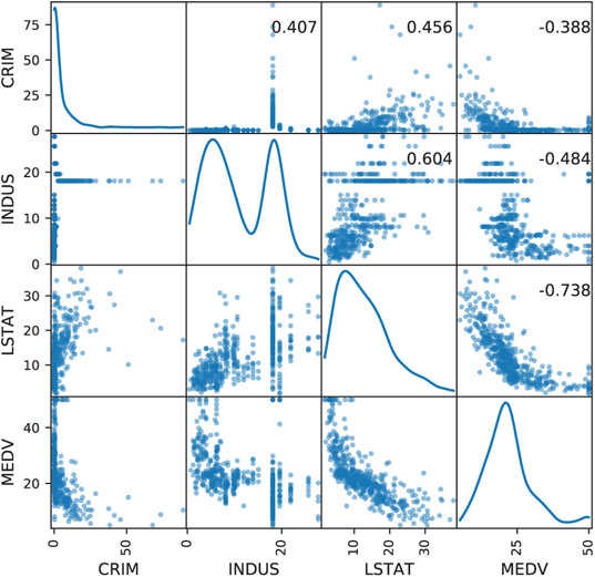
Figure 3.7 Scatter plot matrix for MEDV and three numerical predictors
![]() code for creating Figure 3.7
code for creating Figure 3.7
# Display scatterplots between the different variables
# The diagonal shows the distribution for each variable
df = housing_df[['CRIM', 'INDUS', 'LSTAT', 'MEDV']]
axes = scatter_matrix(df, alpha=0.5, figsize=(6, 6), diagonal='kde')
corr = df.corr().as_matrix()
for i, j in zip(*plt.np.triu_indices_from(axes, k=1)):
	axes[i, j].annotate('
			xycoords='axes fraction', ha='center', va='center')
plt.show()
Once hue is used, further categorical variables can be added via shape and multiple panels. However, one must proceed cautiously in adding multiple variables, as the display can become over-cluttered and then visual perception is lost.
Adding a numerical variable via size is useful especially in scatter plots (thereby creating “bubble plots”), because in a scatter plot, points represent individual observations. In plots that aggregate across observations (e.g., boxplots, histograms, bar charts), size and hue are not normally incorporated.
Finally, adding a temporal dimension to a plot to show how the information changes over time can be achieved via animation. A famous example is Rosling’s animated scatter plots showing how world demographics changed over the years (www.gapminder.org). However, while animations of this type work for “statistical storytelling,” they are not very effective for data exploration.
Manipulations: Rescaling, Aggregation and Hierarchies, Zooming, Filtering
Most of the time spent in data mining projects is spent in preprocessing. Typically, considerable effort is expended getting all the data in a format that can actually be used in the data mining software. Additional time is spent processing the data in ways that improve the performance of the data mining procedures. This preprocessing step in data mining includes variable transformation and derivation of new variables to help models perform more effectively. Transformations include changing the numeric scale of a variable, binning numerical variables, and condensing categories in categorical variables. The following manipulations support the preprocessing step as well the choice of adequate data mining methods. They do so by revealing patterns and their nature.

Figure 3.8 Rescaling can enhance plots and reveal patterns. (a) original scale, (b) logarithmic scale
![]() code for creating Figure 3.8
code for creating Figure 3.8
# Avoid the use of scientific notation for the log axis
plt.rcParams['axes.formatter.min_exponent'] = 4
## scatter plot: regular and log scale
fig, axes = plt.subplots(nrows=1, ncols=2, figsize=(7, 4))
# regular scale
housing_df.plot.scatter(x='CRIM', y='MEDV', ax=axes[0])
# log scale
ax = housing_df.plot.scatter(x='CRIM', y='MEDV', logx=True, logy=True, ax=axes[1])
ax.set_yticks([5, 10, 20, 50])
ax.set_yticklabels([5, 10, 20, 50])
plt.tight_layout(); plt.show()
## boxplot: regular and log scale
fig, axes = plt.subplots(nrows=1, ncols=2, figsize=(7, 3))
# regular scale
ax = housing_df.boxplot(column='CRIM', by='CAT_MEDV', ax=axes[0])
ax.set_xlabel('CAT.MEDV'); ax.set_ylabel('CRIM')
# log scale
ax = housing_df.boxplot(column='CRIM', by='CAT_MEDV', ax=axes[1])
ax.set_xlabel('CAT.MEDV'); ax.set_ylabel('CRIM'); ax.set_yscale('log')
# suppress the title
axes[0].get_figure().suptitle(”); plt.tight_layout(); plt.show()
Rescaling
Changing the scale in a display can enhance the plot and illuminate relationships. For example, in Figure 3.8, we see the effect of changing both axes of the scatter plot (top) and the y-axis of a boxplot (bottom) to logarithmic (log) scale. Whereas the original plots (a) are hard to understand, the patterns become visible in log scale (b). In the histograms, the nature of the relationship between MEDV and CRIM is hard to determine in the original scale, because too many of the points are “crowded” near the y-axis. The re-scaling removes this crowding and allows a better view of the linear relationship between the two log-scaled variables (indicating a log–log relationship). In the boxplot, displaying the crowding toward the x-axis in the original units does not allow us to compare the two box sizes, their locations, lower outliers, and most of the distribution information. Rescaling removes the “crowding to the x-axis” effect, thereby allowing a comparison of the two boxplots.
Aggregation and Hierarchies
Another useful manipulation of scaling is changing the level of aggregation. For a temporal scale, we can aggregate by different granularity (e.g., monthly, daily, hourly) or even by a “seasonal” factor of interest such as month-of-year or day-of-week. A popular aggregation for time series is a moving average, where the average of neighboring values within a given window size is plotted. Moving average plots enhance visualizing a global trend (see Chapter 16).
Non-temporal variables can be aggregated if some meaningful hierarchy exists: geographical (tracts within a zip code in the Boston Housing example), organizational (people within departments within units), etc. Figure 3.9 illustrates two types of aggregation for the railway ridership time series. The original monthly series is shown in Figure 3.9 a. Seasonal aggregation (by month-of-year) is shown in Figure 3.9 b, where it is easy to see the peak in ridership in July–August and the dip in January–February. The bottom-right panel shows temporal aggregation, where the series is now displayed in yearly aggregates. This plot reveals the global long-term trend in ridership and the generally increasing trend from 1996 on.

Figure 3.9 Time series line graphs using different aggregations (b,d), adding curves (a), and zooming in (c)
![]() code for creating Figure 3.9
code for creating Figure 3.9
fig, axes = plt.subplots(nrows=2, ncols=2, figsize=(10, 7))
Amtrak_df = pd.read_csv('Amtrak.csv')
Amtrak_df['Month'] = pd.to_datetime(Amtrak_df.Month, format='%d/%m/%Y')
Amtrak_df.set_index('Month', inplace=True)
# fit quadratic curve and display
quadraticFit = np.poly1d(np.polyfit(range(len(Amtrak_df)), Amtrak_df.Ridership, 2))
Amtrak_fit = pd.DataFrame({'fit': [quadraticFit(t) for t in range(len(Amtrak_df))]})
Amtrak_fit.index = Amtrak_df.index
ax = Amtrak_df.plot(ylim=[1300, 2300], legend=False, ax=axes[0][0])
Amtrak_fit.plot(ax=ax)
ax.set_xlabel('Year'); ax.set_ylabel('Ridership (in 000s)')  # set x and y-axis label
# Zoom in 2-year period 1/1/1991 to 12/1/1992
ridership_2yrs = Amtrak_df.loc['1991-01-01':'1992-12-01']
ax = ridership_2yrs.plot(ylim=[1300, 2300], legend=False, ax=axes[1][0])
ax.set_xlabel('Year'); ax.set_ylabel('Ridership (in 000s)')  # set x and y-axis label
# Average by month
byMonth = Amtrak_df.groupby(by=[Amtrak_df.index.month]).mean()
ax = byMonth.plot(ylim=[1300, 2300], legend=False, ax=axes[0][1])
ax.set_xlabel('Month'); ax.set_ylabel('Ridership (in 000s)')  # set x and y-axis label
yticks = [-2.0,-1.75,-1.5,-1.25,-1.0,-0.75,-0.5,-0.25,0.0]
ax.set_xticks(range(1, 13))
ax.set_xticklabels([calendar.month_abbr[i] for i in range(1, 13)]);
# Average by year (exclude data from 2004)
byYear = Amtrak_df.loc['1991-01-01':'2003-12-01'].groupby(pd.Grouper(freq='A')).mean()
ax = byYear.plot(ylim=[1300, 2300], legend=False, ax=axes[1][1])
ax.set_xlabel('Year'); ax.set_ylabel('Ridership (in 000s)')  # set x and y-axis label
plt.tight_layout()
plt.show()
Examining different scales, aggregations, or hierarchies supports both supervised and unsupervised tasks in that it can reveal patterns and relationships at various levels, and can suggest new sets of variables with which to work.
Zooming and Panning
The ability to zoom in and out of certain areas of the data on a plot is important for revealing patterns and outliers. We are often interested in more detail on areas of dense information or of special interest. Panning refers to the operation of moving the zoom window to other areas (popular in mapping applications such as Google Maps). An example of zooming is shown in Figure 3.9 c, where the ridership series is zoomed in to the first two years of the series.
Zooming and panning support supervised and unsupervised methods by detecting areas of different behavior, which may lead to creating new interaction terms, new variables, or even separate models for data subsets. In addition, zooming and panning can help choose between methods that assume global behavior (e.g., regression models) and data-driven methods (e.g., exponential smoothing forecasters and k-nearest-neighbors classifiers), and indicate the level of global/local behavior (as manifested by parameters such as k in k-nearest neighbors, the size of a tree, or the smoothing parameters in exponential smoothing).
Filtering
Filtering means removing some of the observations from the plot. The purpose of filtering is to focus the attention on certain data while eliminating “noise” created by other data. Filtering supports supervised and unsupervised learning in a similar way to zooming and panning: it assists in identifying different or unusual local behavior.
Reference: Trend Lines and Labels
Trend lines and using in-plot labels also help to detect patterns and outliers. Trend lines serve as a reference, and allow us to more easily assess the shape of a pattern. Although linearity is easy to visually perceive, more elaborate relationships such as exponential and polynomial trends are harder to assess by eye. Trend lines are useful in line graphs as well as in scatter plots. An example is shown in Figure 3.9 a, where a polynomial curve is overlaid on the original line graph (see also Chapter 16).
In displays that are not overcrowded, the use of in-plot labels can be useful for better exploration of outliers and clusters. An example is shown in Figure 3.10 (a reproduction of Figure 15.1 with the addition of labels). The figure shows different utilities on a scatter plot that compares fuel cost with total sales. We might be interested in clustering the data, and using clustering algorithms to identify clusters that differ markedly with respect to fuel cost and sales. Figure 3.10, with the labels, helps visualize these clusters and their members (e.g., Nevada and Puget are part of a clear cluster with low fuel costs and high sales). For more on clustering and on this example, see Chapter 15.

Figure 3.10 Scatter plot with labeled points
![]() code for creating Figure 3.10
code for creating Figure 3.10
utilities_df = pd.read_csv('Utilities.csv')
ax = utilities_df.plot.scatter(x='Sales', y='Fuel_Cost', figsize=(6, 6))
points = utilities_df[['Sales','Fuel_Cost','Company']]
_ = points.apply(lambda x:
	  ax.text(*x, rotation=20, horizontalalignment='left',
		  verticalalignment='bottom', fontsize=8), axis=1)
Scaling Up to Large Datasets
When the number of observations (rows) is large, plots that display each individual observation (e.g., scatter plots) can become ineffective. Aside from using aggregated charts such as boxplots, some alternatives are:
- Sampling—drawing a random sample and using it for plotting
- Reducing marker size
- Using more transparent marker colors and removing fill
- Breaking down the data into subsets (e.g., by creating multiple panels)
- Using aggregation (e.g., bubble plots where size corresponds to number of observations in a certain range)
- Using jittering (slightly moving each marker by adding a small amount of noise)
An example of the advantage of plotting a sample over the large dataset is shown in Figure 12.2 in Chapter 12, where a scatter plot of 5000 records is plotted alongside a scatter plot of a sample. Figure 3.11 illustrates an improved plot of the full dataset by using smaller markers, using jittering to uncover overlaid points, and more transparent colors. We can see that larger areas of the plot are dominated by the grey class, the black class is mainly on the right, while there is a lot of overlap in the top-right area.

Figure 3.11 Scatter plot of Large Dataset with reduced marker size, jittering, and more transparent coloring
![]() code for creating Figure 3.11
code for creating Figure 3.11
def jitter(x, factor=1):
	””” Add random jitter to x values ”””
	sx = np.array(sorted(x))
	delta = sx[1:] - sx[:-1]
	minDelta = min(d for d in delta if d > 0)
	a = factor * minDelta / 5
	return x + np.random.uniform(-a, a, len(x))
universal_df = pd.read_csv('UniversalBank.csv')
saIdx = universal_df[universal_df['Securities Account'] == 1].index
plt.figure(figsize=(10,6))
plt.scatter(jitter(universal_df.drop(saIdx).Income),
	    jitter(universal_df.drop(saIdx).CCAvg),
	    marker='o', color='grey', alpha=0.2)
plt.scatter(jitter(universal_df.loc[saIdx].Income),
	    jitter(universal_df.loc[saIdx].CCAvg),
	    marker='o', color='red', alpha=0.2)
plt.xlabel('Income')
plt.ylabel('CCAvg')
plt.ylim((0.05, 20))
axes = plt.gca()
axes.set_xscale(”log”)
axes.set_yscale(”log”)
plt.show()
Multivariate Plot: Parallel Coordinates Plot
Another approach toward presenting multidimensional information in a two-dimensional plot is via specialized plots such as the parallel coordinates plot. In this plot, a vertical axis is drawn for each variable. Then each observation is represented by drawing a line that connects its values on the different axes, thereby creating a “multivariate profile.” An example is shown in Figure 3.12 for the Boston Housing data. In this display, separate panels are used for the two values of CAT.MEDV, in order to compare the profiles of homes in the two classes (for a classification task). We see that the more expensive homes (bottom panel) consistently have low CRIM, low LSAT, and high RM compared to cheaper homes (top panel), which are more mixed on CRIM, and LSAT, and have a medium level of RM. This observation gives indication of useful predictors and suggests possible binning for some numerical predictors.
Parallel coordinates plots are also useful in unsupervised tasks. They can reveal clusters, outliers, and information overlap across variables. A useful manipulation is to reorder the columns to better reveal observation clusterings.

Figure 3.12 Parallel coordinates plot for Boston Housing data. Each of the variables (shown on the horizontal axis) is scaled to 0–100%. Panels are used to distinguish CAT.MEDV (top panel = homes below $30,000)
![]() code for creating Figure 3.12
code for creating Figure 3.12
# Transform the axes, so that they all have the same range
min_max_scaler = preprocessing.MinMaxScaler()
dataToPlot = pd.DataFrame(min_max_scaler.fit_transform(housing_df), columns=housing_df.columns)
fig, axes = plt.subplots(nrows=2, ncols=1)
for i in (0, 1):
    parallel_coordinates(dataToPlot.loc[dataToPlot.CAT_MEDV == i], 'CAT_MEDV', ax=axes[i], linewidth=0.5)
    axes[i].set_title('CAT.MEDV = {}'.format(i))
    axes[i].set_yticklabels([])
    axes[i].legend().set_visible(False)
plt.tight_layout()  # Increase the separation between the plots
Interactive Visualization
Similar to the interactive nature of the data mining process, interactivity is key to enhancing our ability to gain information from graphical visualization. In the words of Few (2009), an expert in data visualization:
We can only learn so much when staring at a static visualization such as a printed graph …If we can’t interact with the data …we hit the wall.
By interactive visualization, we mean an interface that supports the following principles:
- Making changes to a chart is easy, rapid, and reversible.
- Multiple concurrent charts and tables can be easily combined and displayed on a single screen.
- A set of visualizations can be linked, so that operations in one display are reflected in the other displays.
Let us consider a few examples where we contrast a static plot generator (e.g., Excel) with an interactive visualization interface.
Histogram Rebinning
Consider the need to bin a numerical variables and using a histogram for that purpose. A static histogram would require replotting for each new binning choice. If the user generates multiple plots, then the screen becomes cluttered. If the same plot is recreated, then it is hard to compare different binning choices. In contrast, an interactive visualization would provide an easy way to change bin width interactively (see, e.g., the slider below the histogram in Figure 3.13), and then the histogram would automatically and rapidly replot as the user changes the bin width.
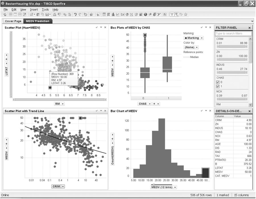
Figure 3.13 Multiple inter-linked plots in a single view (using Spotfire). Note the marked observation in the top-left panel, which is also highlighted in all other plots
Aggregation and Zooming
Consider a time series forecasting task, given a long series of data. Temporal aggregation at multiple levels is needed for determining short- and long-term patterns. Zooming and panning are used to identify unusual periods. A static plotting software requires the user to compute new variables for each temporal aggregation (e.g., aggregate daily data to obtain weekly aggregates). Zooming and panning requires manually changing the min and max values on the axis scale of interest (thereby losing the ability to quickly move between different areas without creating multiple charts). An interactive visualization would provide immediate temporal hierarchies which the user can easily switch between. Zooming would be enabled as a slider near the axis (see, e.g., the sliders on the top-left panel in Figure 3.13), thereby allowing direct manipulation and rapid reaction.
Combining Multiple Linked Plots That Fit in a Single Screen
To support a classification task, multiple plots are created of the outcome variable vs. potential categorical and numerical predictors. These can include side-by-side boxplots, color-coded scatter plots, and multipanel bar charts. The user wants to detect possible multidimensional relationships (and identify possible outliers) by selecting a certain subset of the data (e.g., a single category of some variable) and locating the observations on the other plots. In a static interface, the user would have to manually organize the plots of interest and resize them in order to fit within a single screen. A static interface would usually not support inter-plot linkage, and even if it did, the entire set of plots would have to be regenerated each time a selection is made. In contrast, an interactive visualization would provide an easy way to automatically organize and resize the set of plots to fit within a screen. Linking the set of plots would be easy, and in response to the users selection on one plot, the appropriate selection would be automatically highlighted in the other plots (see example in Figure 3.13).
In earlier sections, we used plots to illustrate the advantages of visualizations, because “a picture is worth a thousand words.” The advantages of an interactive visualization are even harder to convey in words. As Ben Shneiderman, a well-known researcher in information visualization and interfaces, puts it:
A picture is worth a thousand words. An interface is worth a thousand pictures.
The ability to interact with plots, and link them together turns plotting into an analytical tool that supports continuous exploration of the data. Several commercial visualization tools provide powerful capabilities along these lines; two very popular ones are Spotfire (http://spotfire.tibco.com) and Tableau (www.tableausoftware.com); Figure 3.13 was generated using Spotfire.
Tableau and Spotfire have spent hundreds of millions of dollars on software R&D and review of interactions with customers to hone interfaces that allow analysts to interact with data via plots smoothly and efficiently. It is difficult to replicate the sophisticated and highly engineered user interface required for rapid progression through different exploratory views of the data in a programming language like Python. The need is there, however, and the Python community is moving to provide interactivity in plots. The widespread use of JavaScript in web development has led some programmers to combine Python with JavaScript libraries such as Plotly or Bokeh (see Plotly Python Library at https://plot.ly/python/ or Developing with JavaScript at http://bokeh.pydata.org/en/latest/docs/user_guide/bokehjs.html). As of the time of this writing, interactivity tools in Python were evolving, and Python programmers are likely to see more and higher level tools emerging. This should allow them to develop custom interactive plots quickly and deploy these visualizations for use by other non-programming analysts in the organization.
3.5 Specialized Visualizations
In this section, we mention a few specialized visualizations that are able to capture data structures beyond the standard time series and cross-sectional structures—special types of relationships that are usually hard to capture with ordinary plots. In particular, we address hierarchical data, network data, and geographical data—three types of data that are becoming increasingly available.
Visualizing Networked Data
Network analysis techniques were spawned by the explosion of social and product network data. Examples of social networks are networks of sellers and buyers on eBay and networks of users on Facebook. An example of a product network is the network of products on Amazon (linked through the recommendation system). Network data visualization is available in various network-specialized software, and also in general-purpose software.
A network diagram consists of actors and relations between them. “Nodes” are the actors (e.g., users in a social network or products in a product network), and represented by circles. “Edges” are the relations between nodes, and are represented by lines connecting nodes. For example, in a social network such as Facebook, we can construct a list of users (nodes) and all the pairwise relations (edges) between users who are “Friends.” Alternatively, we can define edges as a posting that one user posts on another user’s Facebook page. In this setup, we might have more than a single edge between two nodes. Networks can also have nodes of multiple types. A common structure is networks with two types of nodes. An example of a two-type node network is shown in Figure 3.14, where we see a set of transactions between a network of sellers and buyers on the online auction site www.eBay.com [the data are for auctions selling Swarovski beads, and took place during a period of several months; from Jank and Yahav (2010)]. The black circles represent sellers and the grey circles represent buyers. We can see that this marketplace is dominated by a few high-volume sellers. We can also see that many buyers interact with a single seller. The market structures for many individual products could be reviewed quickly in this way. Network providers could use the information, for example, to identify possible partnerships to explore with sellers.

Figure 3.14 Network plot of eBay sellers (black circles) and buyers (grey circles) of Swarovski beads
![]() code for creating Figure 3.14
code for creating Figure 3.14
ebay_df = pd.read_csv('eBayNetwork.csv')
G = nx.from_pandas_edgelist(ebay_df, source='Seller', target='Bidder')
isBidder = [n in set(ebay_df.Bidder) for n in G.nodes()]
pos = nx.spring_layout(G, k=0.13, iterations=60, scale=0.5)
plt.figure(figsize=(10,10))
nx.draw_networkx(G, pos=pos, with_labels=False,
                 edge_color='lightgray',
                 node_color=['gray' if bidder else 'black' for bidder in isBidder],
                 node_size=[50 if bidder else 200 for bidder in isBidder])
plt.axis('off')
plt.show()
Figure 3.14 was produced using Python’s networkx package. Another useful package is python-igraph. Using these packages, networks can be imported from a variety of sources. The plot’s appearance can be customized and various features are available such as filtering nodes and edges, altering the plot’s layout, finding clusters of related nodes, calculating network metrics, and performing network analysis (see Chapter 19 for details and examples).
Network plots can be potentially useful in the context of association rules (see Chapter 14). For example, consider a case of mining a dataset of consumers’ grocery purchases to learn which items are purchased together (“what goes with what”). A network can be constructed with items as nodes and edges connecting items that were purchased together. After a set of rules is generated by the data mining algorithm (which often contains an excessive number of rules, many of which are unimportant), the network plot can help visualize different rules for the purpose of choosing the interesting ones. For example, a popular “beer and diapers” combination would appear in the network plot as a pair of nodes with very high connectivity. An item which is almost always purchased regardless of other items (e.g., milk) would appear as a very large node with high connectivity to all other nodes.
Visualizing Hierarchical Data: Treemaps
We discussed hierarchical data and the exploration of data at different hierarchy levels in the context of plot manipulations. Treemaps are useful visualizations specialized for exploring large data sets that are hierarchically structured (tree-structured). They allow exploration of various dimensions of the data while maintaining the hierarchical nature of the data. An example is shown in Figure 3.15, which displays a large set of auctions from eBay.com,5 hierarchically ordered by item category, sub-category, and brand. The levels in the hierarchy of the treemap are visualized as rectangles containing sub-rectangles. Categorical variables can be included in the display by using hue. Numerical variables can be included via rectangle size and color intensity (ordering of the rectangles is sometimes used to reinforce size). In Figure 3.15, size is used to represent the average closing price (which reflects item value) and color intensity represents the percent of sellers with negative feedback (a negative seller feedback indicates buyer dissatisfaction in past transactions and is often indicative of fraudulent seller behavior). Consider the task of classifying ongoing auctions in terms of a fraudulent outcome. From the treemap, we see that the highest proportion of sellers with negative ratings (black) is concentrated in expensive item auctions (Rolex and Cartier wristwatches). Currently, Python offers only simple treemaps with a single hierarchy level and coloring or sizing boxes by additional variables. Figure 3.16 shows a treemap corresponding to Figure 3.15 that was created in R.

Figure 3.15 Treemap showing nearly 11,000 eBay auctions, organized by item category, subcategory, and brand. Rectangle size represents average closing price (reflecting item value). Shade represents percentage of sellers with negative feedback (darker = higher). This graph was generated using R; for a Python version see Figure 3.16
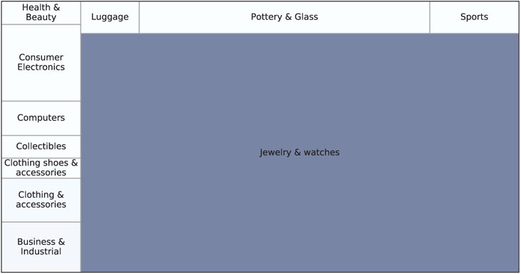
Figure 3.16 Treemap showing nearly 11,000 eBay auctions, organized by item category. Rectangle size represents average closing price. Shade represents % of sellers with negative feedback (darker = higher)
![]() code for creating Figure 3.16
code for creating Figure 3.16
import squarify
ebayTreemap = pd.read_csv('EbayTreemap.csv')
grouped = []
for category, df in ebayTreemap.groupby(['Category']):
    negativeFeedback = sum(df['Seller Feedback'] < 0) / len(df)
    grouped.append({
        'category': category,
        'negativeFeedback': negativeFeedback,
        'averageBid': df['High Bid'].mean()
    })
byCategory = pd.DataFrame(grouped)
norm = matplotlib.colors.Normalize(vmin=byCategory.negativeFeedback.min(),
                                   vmax=byCategory.negativeFeedback.max())
colors = [matplotlib.cm.Blues(norm(value)) for value in byCategory.negativeFeedback]
fig, ax = plt.subplots()
fig.set_size_inches(9, 5)
squarify.plot(label=byCategory.category, sizes=byCategory.averageBid, color=colors,
              ax=ax, alpha=0.6, edgecolor='grey')
ax.get_xaxis().set_ticks([])
ax.get_yaxis().set_ticks([])
plt.subplots_adjust(left=0.1)
plt.show()
Ideally, treemaps should be explored interactively, zooming to different levels of the hierarchy. One example of an interactive online application of treemaps is currently available at www.drasticdata.nl. One of their treemap examples displays player-level data from the 2014 World Cup, aggregated to team level. The user can choose to explore players and team data.
Visualizing Geographical Data: Map Charts
Many datasets used for data mining now include geographical information. Zip codes are one example of a categorical variable with many categories, where it is not straightforward to create meaningful variables for analysis. Plotting the data on a geographic map can often reveal patterns that are harder to identify otherwise. A map chart uses a geographical map as its background; then color, hue, and other features are used to include categorical or numerical variables. Besides specialized mapping software, maps are now becoming part of general-purpose software, and Google Maps provides APIs (application programming interfaces) that allow organizations to overlay their data on a Google map. While Google Maps is readily available, resulting map charts (such as Figure 3.17) are somewhat inferior in terms of effectiveness compared to map charts in dedicated interactive visualization software.
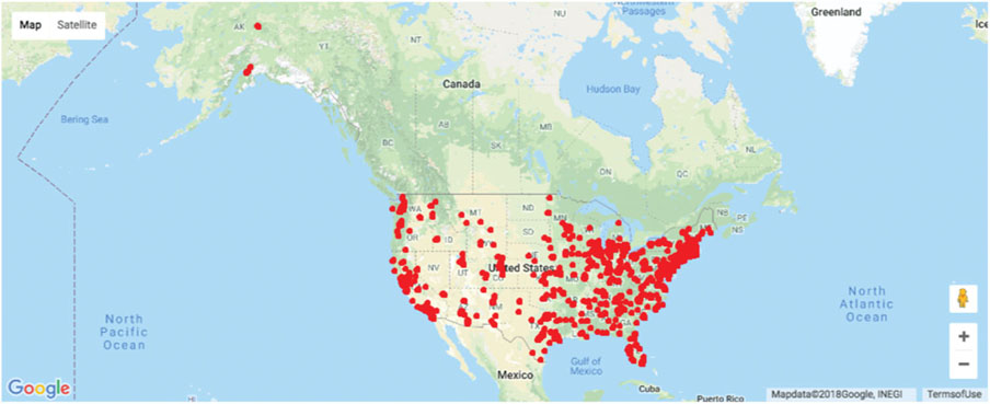
Figure 3.17 Map chart of students’ and instructors’ locations on a Google Map. Source: data from Statistics.com
![]() code for creating Figure 3.17
code for creating Figure 3.17
import gmaps
SCstudents = pd.read_csv('SC-US-students-GPS-data-2016.csv')
gmaps.configure(api_key=os.environ['GMAPS_API_KEY'])
fig = gmaps.figure(center=(39.7, -105), zoom_level=3)
fig.add_layer(gmaps.symbol_layer(SCstudents, scale=2,fill_color='red', stroke_color='red'))
fig
Figure 3.18 shows two world map charts comparing countries’ “well-being” (according to a 2006 Gallup survey) in the top map, to gross domestic product (GDP) in the bottom map. Lighter shade means higher value.

Figure 3.18 World maps comparing “well-being” (a) to GDP (b). Shading by average “global well-being” score (a) or GDP (b) of country. Lighter corresponds to higher score or level. Source: Data from Veenhoven’s World Database of Happiness
![]() code for creating Figure 3.18
code for creating Figure 3.18
import matplotlib.pyplot as plt
import cartopy
import cartopy.io.shapereader as shpreader
import cartopy.crs as ccrs
gdp_df = pd.read_csv('gdp.csv', skiprows=4)
gdp_df.rename(columns={'2015': 'GDP2015'}, inplace=True)
gdp_df.set_index('Country Code', inplace=True)  # use three letter country code to
                                                  access rows
# The file contains a column with two letter combinations, use na_filter to avoid
# converting the combination NA into not-a-number
happiness_df = pd.read_csv('Veerhoven.csv', na_filter = False)
happiness_df.set_index('Code', inplace=True)  # use the country name to access rows
fig = plt.figure(figsize=(7, 8))
ax1 = plt.subplot(2, 1, 1, projection=ccrs.PlateCarree())
ax1.set_extent([-150, 60, -25, 60])
ax2 = plt.subplot(2, 1, 2, projection=ccrs.PlateCarree())
ax2.set_extent([-150, 60, -25, 60])
# Create a color mapper
cmap = plt.cm.Blues_r
norm1 = matplotlib.colors.Normalize(vmin=happiness_df.Score.dropna().min(),
                                    vmax=happiness_df.Score.dropna().max())
norm2 = matplotlib.colors.LogNorm(vmin=gdp_df.GDP2015.dropna().min(),
                                  vmax=gdp_df.GDP2015.dropna().max())
shpfilename = shpreader.natural_earth(resolution='110m', category='cultural',
                                      name='admin_0_countries')
reader = shpreader.Reader(shpfilename)
countries = reader.records()
for country in countries:
    countryCode = country.attributes['ADM0_A3']
    if countryCode in gdp_df.index:
        ax2.add_geometries(country.geometry, ccrs.PlateCarree(),
                           facecolor=cmap(norm2(gdp_df.loc[countryCode].GDP2015)))
    # check various attributes to find the matching two-letter combinations
    nation = country.attributes['POSTAL']
    if nation not in happiness_df.index: nation = country.attributes['ISO_A2']
    if nation not in happiness_df.index: nation = country.attributes['WB_A2']
    if nation not in happiness_df.index and country.attributes['NAME'] == 'Norway':
        nation = 'NO'
    if nation in happiness_df.index:
        ax1.add_geometries(country.geometry, ccrs.PlateCarree(),
                           facecolor=cmap(norm1(happiness_df.loc[nation].Score)))

ax2.set_title("GDP 2015")
sm = plt.cm.ScalarMappable(norm=norm2, cmap=cmap)
sm._A = []
cb = plt.colorbar(sm, ax=ax2)
cb.set_ticks([1e8, 1e9, 1e10, 1e11, 1e12, 1e13])
ax1.set_title("Happiness")
sm = plt.cm.ScalarMappable(norm=norm1, cmap=cmap)
sm._A = []
cb = plt.colorbar(sm, ax=ax1)
cb.set_ticks([3, 4, 5, 6, 7, 8])
plt.show()
3.6 Summary: Major Visualizations and Operations, by Data Mining Goal
Prediction
- Plot outcome on the y-axis of boxplots, bar charts, and scatter plots.
- Study relation of outcome to categorical predictors via side-by-side boxplots, bar charts, and multiple panels.
- Study relation of outcome to numerical predictors via scatter plots.
- Use distribution plots (boxplot, histogram) for determining needed transformations of the outcome variable (and/or numerical predictors).
- Examine scatter plots with added color/panels/size to determine the need for interaction terms.
- Use various aggregation levels and zooming to determine areas of the data with different behavior, and to evaluate the level of global vs. local patterns.
Classification
- Study relation of outcome to categorical predictors using bar charts with the outcome on the y-axis.
- Study relation of outcome to pairs of numerical predictors via color-coded scatter plots (color denotes the outcome).
- Study relation of outcome to numerical predictors via side-by-side boxplots: Plot boxplots of a numerical variable by outcome. Create similar displays for each numerical predictor. The most separable boxes indicate potentially useful predictors.
- Use color to represent the outcome variable on a parallel coordinate plot.
- Use distribution plots (boxplot, histogram) for determining needed transformations of numerical predictor variables.
- Examine scatter plots with added color/panels/size to determine the need for interaction terms.
- Use various aggregation levels and zooming to determine areas of the data with different behavior, and to evaluate the level of global vs. local patterns.
Time Series Forecasting
- Create line graphs at different temporal aggregations to determine types of patterns.
- Use zooming and panning to examine various shorter periods of the series to determine areas of the data with different behavior.
- Use various aggregation levels to identify global and local patterns.
- Identify missing values in the series (that will require handling).
- Overlay trend lines of different types to determine adequate modeling choices.
Unsupervised Learning
- Create scatter plot matrices to identify pairwise relationships and clustering of observations.
- Use heatmaps to examine the correlation table.
- Use various aggregation levels and zooming to determine areas of the data with different behavior.
- Generate a parallel coordinates plot to identify clusters of observations.
Problems
-
Shipments of Household Appliances: Line Graphs. The file ApplianceShipments.csv contains the series of quarterly shipments (in millions of dollars) of US household appliances between 1985 and 1989.
- Create a well-formatted time plot of the data using Python.
- Does there appear to be a quarterly pattern? For a closer view of the patterns, zoom in to the range of 3500–5000 on the y-axis.
- Using Python, create one chart with four separate lines, one line for each of Q1, Q2, Q3, and Q4. In Python, this can be achieved by add column for quarter and year. Then group the data frame by quarter and then plot shipment versus year for each quarter as a separate series on a line graph. Zoom in to the range of 3500–5000 on the y-axis. Does there appear to be a difference between quarters?
- Using Python, create a line graph of the series at a yearly aggregated level (i.e., the total shipments in each year).
-
Sales of Riding Mowers: Scatter Plots. A company that manufactures riding mowers wants to identify the best sales prospects for an intensive sales campaign. In particular, the manufacturer is interested in classifying households as prospective owners or nonowners on the basis of Income (in $1000s) and Lot Size (in 1000 ft2). The marketing expert looked at a random sample of 24 households, given in the file RidingMowers.csv.
- Using Python, create a scatter plot of Lot Size vs. Income, color-coded by the outcome variable owner/nonowner. Make sure to obtain a well-formatted plot (create legible labels and a legend, etc.).
-
Laptop Sales at a London Computer Chain: Bar Charts and Boxplots. The file LaptopSalesJanuary2008.csv contains data for all sales of laptops at a computer chain in London in January 2008. This is a subset of the full dataset that includes data for the entire year.
- Create a bar chart, showing the average retail price by store. Which store has the highest average? Which has the lowest?
- To better compare retail prices across stores, create side-by-side boxplots of retail price by store. Now compare the prices in the two stores from (a). Does there seem to be a difference between their price distributions?
-
Laptop Sales at a London Computer Chain: Interactive Visualization. The next exercises are designed for using an interactive visualization tool. The file LaptopSales.csv is a comma-separated file with nearly 300,000 rows. ENBIS (the European Network for Business and Industrial Statistics) provided these data as part of a contest organized in the fall of 2009.
Scenario: Imagine that you are a new analyst for a company called Acell (a company selling laptops). You have been provided with data about products and sales. You need to help the company with their business goal of planning a product strategy and pricing policies that will maximize Acell’s projected revenues in 2009. Using an interactive visualization tool, answer the following questions.
- Price Questions:
- At what price are the laptops actually selling?
- Does price change with time? (Hint: Make sure that the date column is recognized as such. The software should then enable different temporal aggregation choices, e.g., plotting the data by weekly or monthly aggregates, or even by day of week.)
- Are prices consistent across retail outlets?
- How does price change with configuration?
-
Location Questions:
- Where are the stores and customers located?
- Which stores are selling the most?
- How far would customers travel to buy a laptop?
- Hint 1: You should be able to aggregate the data, for example, plot the sum or average of the prices.
- Hint 2: Use the coordinated highlighting between multiple visualizations in the same page, for example, select a store in one view to see the matching customers in another visualization.
- Hint 3: Explore the use of filters to see differences. Make sure to filter in the zoomed out view. For example, try to use a “store location” slider as an alternative way to dynamically compare store locations. This might be more useful to spot outlier patterns if there were 50 store locations to compare.
- Try an alternative way of looking at how far customers traveled. Do this by creating a new data column that computes the distance between customer and store.
-
Revenue Questions:
- How do the sales volume in each store relate to Acell’s revenues?
- How does this relationship depend on the configuration?
-
Configuration Questions:
- What are the details of each configuration? How does this relate to price?
- Do all stores sell all configurations?
- Price Questions:
Notes
- 1This and subsequent sections in this chapter copyright ©2019 Statistics.com and Galit Shmueli. Used by permission.
- 2 The Boston Housing dataset was originally published by Harrison and Rubinfeld in “Hedonic prices and the demand for clean air”, Journal of Environmental Economics & Management, vol. 5, p. 81–102, 1978.
- 3 We refer here to a bar chart with vertical bars. The same principles apply if using a bar chart with horizontal lines, except that the x-axis is now associated with the numerical variable and the y-axis with the categorical variable.
- 4 The data were obtained from https://data.cityofnewyork.us/Public-Safety/NYPD-Motor-Vehicle-Collisions/h9gi-nx95.
- 5 We thank Sharad Borle for sharing this dataset.