
CHAPTER 4
Dimension Reduction
In this chapter, we describe the important step of dimension reduction. The dimension of a dataset, which is the number of variables, must be reduced for the data mining algorithms to operate efficiently. This process is part of the pilot/prototype phase of data mining and is done before deploying a model. We present and discuss several dimension reduction approaches: (1) incorporating domain knowledge to remove or combine categories, (2) using data summaries to detect information overlap between variables (and remove or combine redundant variables or categories), (3) using data conversion techniques such as converting categorical variables into numerical variables, and (4) employing automated reduction techniques, such as principal components analysis (PCA), where a new set of variables (which are weighted averages of the original variables) is created. These new variables are uncorrelated and a small subset of them usually contains most of their combined information (hence, we can reduce dimension by using only a subset of the new variables). Finally, we mention data mining methods such as regression models and classification and regression trees, which can be used for removing redundant variables and for combining “similar” categories of categorical variables.
Python
In this chapter, we will use pandas for data handling, scikit-learn for data transformations, and matplotlib for visualization.
![]() import required functionality for this chapter
import required functionality for this chapter
import numpy as np
import pandas as pd
from sklearn.decomposition import PCA
from sklearn import preprocessing
import matplotlib.pylab as plt
4.1 Introduction
In data mining, one often encounters situations where there is a large number of variables in the database. Even when the initial number of variables is small, this set quickly expands in the data preparation step, where new derived variables are created (e.g., dummies for categorical variables and new forms of existing variables). In such situations, it is likely that subsets of variables are highly correlated with each other. Including highly correlated variables in a classification or prediction model, or including variables that are unrelated to the outcome of interest, can lead to overfitting, and accuracy and reliability can suffer. A large number of variables also poses computational problems for some supervised as well as unsupervised algorithms (aside from questions of correlation). In model deployment, superfluous variables can increase costs due to the collection and processing of these variables.
4.2 Curse of Dimensionality
The dimensionality of a model is the number of predictors or input variables used by the model. The curse of dimensionality is the affliction caused by adding variables to multivariate data models. As variables are added, the data space becomes increasingly sparse, and classification and prediction models fail because the available data are insufficient to provide a useful model across so many variables. An important consideration is the fact that the difficulties posed by adding a variable increase exponentially with the addition of each variable. One way to think of this intuitively is to consider the location of an object on a chessboard. It has two dimensions and 64 squares or choices. If you expand the chessboard to a cube, you increase the dimensions by 50%—from two dimensions to three dimensions. However, the location options increase by 800%, to 512 (8 × 8 × 8). In statistical distance terms, the proliferation of variables means that nothing is close to anything else anymore—too much noise has been added and patterns and structure are no longer discernible. The problem is particularly acute in Big Data applications, including genomics, where, for example, an analysis might have to deal with values for thousands of different genes. One of the key steps in data mining, therefore, is finding ways to reduce dimensionality with minimal sacrifice of accuracy. In the artificial intelligence literature, dimension reduction is often referred to as factor selection or feature extraction.
4.3 Practical Considerations
Although data mining prefers automated methods over domain knowledge, it is important at the first step of data exploration to make sure that the variables measured are reasonable for the task at hand. The integration of expert knowledge through a discussion with the data provider (or user) will probably lead to better results. Practical considerations include: Which variables are most important for the task at hand, and which are most likely to be useless? Which variables are likely to contain much error? Which variables will be available for measurement (and what will it cost to measure them) in the future if the analysis is repeated? Which variables can actually be measured before the outcome occurs? For example, if we want to predict the closing price of an ongoing online auction, we cannot use the number of bids as a predictor because this will not be known until the auction closes.
Example 1: House Prices in Boston
We return to the Boston Housing example introduced in Chapter 3. For each neighborhood, a number of variables are given, such as the crime rate, the student/teacher ratio, and the median value of a housing unit in the neighborhood. A description of all 14 variables is given in Table 4.1. The first nine records of the data are shown in Table 4.2. The first row represents the first neighborhood, which had an average per capita crime rate of 0.006, 18% of the residential land zoned for lots over 25,000 ft2, 2.31% of the land devoted to nonretail business, no border on the Charles River, and so on.
Table 4.1 Description of Variables in the Boston Housing Dataset
| CRIM | Crime rate |
| ZN | Percentage of residential land zoned for lots over 25,000 ft2 |
| INDUS | Percentage of land occupied by nonretail business |
| CHAS | Does tract bound Charles River? (= 1 if tract bounds river, = 0 otherwise) |
| NOX | Nitric oxide concentration (parts per 10 million) |
| RM | Average number of rooms per dwelling |
| AGE | Percentage of owner-occupied units built prior to 1940 |
| DIS | Weighted distances to five Boston employment centers |
| RAD | Index of accessibility to radial highways |
| TAX | Full-value property tax rate per $10,000 |
| PTRATIO | Pupil-to-teacher ratio by town |
| LSTAT | Percentage of lower status of the population |
| MEDV | Median value of owner-occupied homes in $1000s |
| CAT.MEDV | Is median value of owner-occupied homes in tract above $30,000 (CAT.MEDV = 1) or not (CAT.MEDV = 0)? |
Table 4.2 First Nine Records in the Boston Housing Data
| CRIM | ZN | INDUS | CHAS | NOX | RM | AGE | DIS | RAD | TAX | PTRATIO | LSTAT | MEDV | CAT.MEDV |
| 0.00632 | 18.0 | 2.31 | 0 | 0.538 | 6.575 | 65.2 | 4.09 | 1 | 296 | 15.3 | 4.98 | 24.0 | 0 |
| 0.02731 | 0.0 | 7.07 | 0 | 0.469 | 6.421 | 78.9 | 4.9671 | 2 | 242 | 17.8 | 9.14 | 21.6 | 0 |
| 0.02729 | 0.0 | 7.07 | 0 | 0.469 | 7.185 | 61.1 | 4.9671 | 2 | 242 | 17.8 | 4.03 | 34.7 | 1 |
| 0.03237 | 0.0 | 2.18 | 0 | 0.458 | 6.998 | 45.8 | 6.0622 | 3 | 222 | 18.7 | 2.94 | 33.4 | 1 |
| 0.06905 | 0.0 | 2.18 | 0 | 0.458 | 7.147 | 54.2 | 6.0622 | 3 | 222 | 18.7 | 5.33 | 36.2 | 1 |
| 0.02985 | 0.0 | 2.18 | 0 | 0.458 | 6.43 | 58.7 | 6.0622 | 3 | 222 | 18.7 | 5.21 | 28.7 | 0 |
| 0.08829 | 12.5 | 7.87 | 0 | 0.524 | 6.012 | 66.6 | 5.5605 | 5 | 311 | 15.2 | 12.43 | 22.9 | 0 |
| 0.14455 | 12.5 | 7.87 | 0 | 0.524 | 6.172 | 96.1 | 5.9505 | 5 | 311 | 15.2 | 19.15 | 27.1 | 0 |
| 0.21124 | 12.5 | 7.87 | 0 | 0.524 | 5.631 | 100.0 | 6.0821 | 5 | 311 | 15.2 | 29.93 | 16.5 | 0 |
4.4 Data Summaries
As we have seen in the chapter on data visualization, an important initial step of data exploration is getting familiar with the data and their characteristics through summaries and graphs. The importance of this step cannot be overstated. The better you understand the data, the better the results from the modeling or mining process.
Numerical summaries and graphs of the data are very helpful for data reduction. The information that they convey can assist in combining categories of a categorical variable, in choosing variables to remove, in assessing the level of information overlap between variables, and more. Before discussing such strategies for reducing the dimension of a data set, let us consider useful summaries and tools.
Summary Statistics
The pandas package offers several methods that assist in summarizing data. The DataFrame method describe() gives an overview of the entire set of variables in the data. The methods mean(), std(), min(), max(), median(), and len() are also very helpful for learning about the characteristics of each variable. First, they give us information about the scale and type of values that the variable takes. The min and max statistics can be used to detect extreme values that might be errors. The mean and median give a sense of the central values of that variable, and a large deviation between the two also indicates skew. The standard deviation gives a sense of how dispersed the data are (relative to the mean). Further options, such as the combination of .isnull().sum(), which gives the number of null values, can tell us about missing values.
Table 4.3 shows summary statistics (and Python code) for the Boston Housing example. We immediately see that the different variables have very different ranges of values. We will soon see how variation in scale across variables can distort analyses if not treated properly. Another observation that can be made is that the mean of the first variable, CRIM (as well as several others), is much larger than the median, indicating right skew. None of the variables have missing values. There also do not appear to be indications of extreme values that might result from typing errors.
Table 4.3 Summary statistics for the Boston housing data
bostonHousing_df = pd.read_csv('BostonHousing.csv')
bostonHousing_df = bostonHousing_df.rename(columns={'CAT. MEDV': 'CAT_MEDV'})
bostonHousing_df.head(9)
bostonHousing_df.describe()
# Compute mean, standard deviation, min, max, median, length, and missing values of
# CRIM
print('Mean : ', bostonHousing_df.CRIM.mean())
print('Std. dev : ', bostonHousing_df.CRIM.std())
print('Min : ', bostonHousing_df.CRIM.min())
print('Max : ', bostonHousing_df.CRIM.max())
print('Median : ', bostonHousing_df.CRIM.median())
print('Length : ', len(bostonHousing_df.CRIM))
print('Number of missing values : ', bostonHousing_df.CRIM.isnull().sum())
# Compute mean, standard dev., min, max, median, length, and missing values for all
# variables
pd.DataFrame({'mean': bostonHousing_df.mean(),
              'sd': bostonHousing_df.std(),
              'min': bostonHousing_df.min(),
              'max': bostonHousing_df.max(),
              'median': bostonHousing_df.median(),
              'length': len(bostonHousing_df),
              'miss.val': bostonHousing_df.isnull().sum(),
             })
Partial Output mean sd min max median length miss.val CRIM 3.613524 8.601545 0.00632 88.9762 0.25651 506 0 ZN 11.363636 23.322453 0.00000 100.0000 0.00000 506 0 INDUS 11.136779 6.860353 0.46000 27.7400 9.69000 506 0 CHAS 0.069170 0.253994 0.00000 1.0000 0.00000 506 0 NOX 0.554695 0.115878 0.38500 0.8710 0.53800 506 0 RM 6.284634 0.702617 3.56100 8.7800 6.20850 506 0 AGE 68.574901 28.148861 2.90000 100.0000 77.50000 506 0 DIS 3.795043 2.105710 1.12960 12.1265 3.20745 506 0 RAD 9.549407 8.707259 1.00000 24.0000 5.00000 506 0 TAX 408.237154 168.537116 187.00000 711.0000 330.00000 506 0 PTRATIO 18.455534 2.164946 12.60000 22.0000 19.05000 506 0 LSTAT 12.653063 7.141062 1.73000 37.9700 11.36000 506 0 MEDV 22.532806 9.197104 5.00000 50.0000 21.20000 506 0 CAT_MEDV 0.166008 0.372456 0.00000 1.0000 0.00000 506 0 |
Next, we summarize relationships between two or more variables. For numerical variables, we can compute a complete matrix of correlations between each pair of variables, using the pandas method corr(). Table 4.4 shows the correlation matrix for the Boston Housing variables. We see that most correlations are low and that many are negative. Recall also the visual display of a correlation matrix via a heatmap (see Figure 3.4 in Chapter 3 for the heatmap corresponding to this correlation table). We will return to the importance of the correlation matrix soon, in the context of correlation analysis.
Table 4.4 Correlation table for Boston Housing data
> bostonHousing_df.corr().round(2) CRIM ZN INDUS CHAS NOX RM AGE DIS RAD TAX PTRATIO LSTAT MEDV CAT_MEDV CRIM 1.00 -0.20 0.41 -0.06 0.42 -0.22 0.35 -0.38 0.63 0.58 0.29 0.46 -0.39 -0.15 ZN -0.20 1.00 -0.53 -0.04 -0.52 0.31 -0.57 0.66 -0.31 -0.31 -0.39 -0.41 0.36 0.37 INDUS 0.41 -0.53 1.00 0.06 0.76 -0.39 0.64 -0.71 0.60 0.72 0.38 0.60 -0.48 -0.37 CHAS -0.06 -0.04 0.06 1.00 0.09 0.09 0.09 -0.10 -0.01 -0.04 -0.12 -0.05 0.18 0.11 NOX 0.42 -0.52 0.76 0.09 1.00 -0.30 0.73 -0.77 0.61 0.67 0.19 0.59 -0.43 -0.23 RM -0.22 0.31 -0.39 0.09 -0.30 1.00 -0.24 0.21 -0.21 -0.29 -0.36 -0.61 0.70 0.64 AGE 0.35 -0.57 0.64 0.09 0.73 -0.24 1.00 -0.75 0.46 0.51 0.26 0.60 -0.38 -0.19 DIS -0.38 0.66 -0.71 -0.10 -0.77 0.21 -0.75 1.00 -0.49 -0.53 -0.23 -0.50 0.25 0.12 RAD 0.63 -0.31 0.60 -0.01 0.61 -0.21 0.46 -0.49 1.00 0.91 0.46 0.49 -0.38 -0.20 TAX 0.58 -0.31 0.72 -0.04 0.67 -0.29 0.51 -0.53 0.91 1.00 0.46 0.54 -0.47 -0.27 PTRATIO 0.29 -0.39 0.38 -0.12 0.19 -0.36 0.26 -0.23 0.46 0.46 1.00 0.37 -0.51 -0.44 LSTAT 0.46 -0.41 0.60 -0.05 0.59 -0.61 0.60 -0.50 0.49 0.54 0.37 1.00 -0.74 -0.47 MEDV -0.39 0.36 -0.48 0.18 -0.43 0.70 -0.38 0.25 -0.38 -0.47 -0.51 -0.74 1.00 0.79 CAT_MEDV -0.15 0.37 -0.37 0.11 -0.23 0.64 -0.19 0.12 -0.20 -0.27 -0.44 -0.47 0.79 1.00 |
Aggregation and Pivot Tables
Another very useful approach for exploring the data is aggregation by one or more variables. For aggregation by a single variable, we can use the pandas method value_counts(). For example, Table 4.5 shows the number of neighborhoods that bound the Charles River vs. those that do not (the variable CHAS is chosen as the grouping variable). It appears that the majority of neighborhoods (471 of 506) do not bound the river.
Table 4.5 Number of neighborhoods that bound the Charles River vs. those that do not
> bostonHousing_df = pd.read_csv('BostonHousing.csv')
> bostonHousing_df = bostonHousing_df.rename(columns='CAT. MEDV': 'CAT_MEDV')
> bostonHousing_df.CHAS.value_counts()
0    471
1     35
Name: CHAS, dtype: int64 |
The groupby() method can be used for aggregating by one or more variables, and computing a range of summary statistics (count, mean, median, etc.). For categorical variables, we obtain a breakdown of the records by the combination of categories. For instance, in Table 4.6, we compute the average MEDV by CHAS and RM. Note that the numerical variable RM (the average number of rooms per dwelling in the neighborhood) should be first grouped into bins of size 1 (0–1, 1–2, etc.). Note the empty values, denoting that there are no neighborhoods in the dataset with those combinations (e.g., bounding the river and having on average 3 rooms).
Table 4.6 Average MEDV by CHAS and RM
# Create bins of size 1 for variable using the method pd.cut. By default, the method
# creates a categorical variable, e.g. (6,7]. The argument labels=False determines
# integers instead, e.g. 6.
bostonHousing_df['RM_bin'] = pd.cut(bostonHousing_df.RM, range(0, 10), labels=False)
# Compute the average of MEDV by (binned) RM and CHAS. First group the data frame
# using the groupby method, then restrict the analysis to MEDV and determine the
# mean for each group.
bostonHousing_df.groupby(['RM_bin', 'CHAS'])['MEDV'].mean()
Output RM_bin CHAS 3 0 25.300000 4 0 15.407143 5 0 17.200000 1 22.218182 6 0 21.769170 1 25.918750 7 0 35.964444 1 44.066667 8 0 45.700000 1 35.950000 Name: MEDV, dtype: float64 |
Another useful method is pivot_table() in the pandas package, that allows the creation of pivot tables by reshaping the data by the aggregating variables of our choice. For example, Table 4.7 computes the average of MEDV by CHAS and RM and presents it as a pivot table.
Table 4.7 Pivot tables in Python
bostonHousing_df = pd.read_csv('BostonHousing.csv')
bostonHousing_df = bostonHousing_df.rename(columns='CAT. MEDV': 'CAT_MEDV')
# create bins of size 1
bostonHousing_df['RM_bin'] = pd.cut(bostonHousing_df.RM, range(0, 10), labels=False)
# use pivot_table() to reshape data and generate pivot table
pd.pivot_table(bostonHousing_df, values='MEDV', index=['RM_bin'], columns=['CHAS'],
aggfunc=np.mean, margins=True)
Output CHAS 0 1 All RM_bin 3 25.300000 NaN 25.300000 4 15.407143 NaN 15.407143 5 17.200000 22.218182 17.551592 6 21.769170 25.918750 22.015985 7 35.964444 44.066667 36.917647 8 45.700000 35.950000 44.200000 All 22.093843 28.440000 22.532806 |
In classification tasks, where the goal is to find predictor variables that distinguish between two classes, a good exploratory step is to produce summaries for each class. This can assist in detecting useful predictors that display some separation between the two classes. Data summaries are useful for almost any data mining task and are therefore an important preliminary step for cleaning and understanding the data before carrying out further analyses.
4.5 Correlation Analysis
In datasets with a large number of variables (which are likely to serve as predictors), there is usually much overlap in the information covered by the set of variables. One simple way to find redundancies is to look at a correlation matrix. This shows all the pairwise correlations between variables. Pairs that have a very strong (positive or negative) correlation contain a lot of overlap in information and are good candidates for data reduction by removing one of the variables. Removing variables that are strongly correlated to others is useful for avoiding multicollinearity problems that can arise in various models. (Multicollinearity is the presence of two or more predictors sharing the same linear relationship with the outcome variable.)
Correlation analysis is also a good method for detecting duplications of variables in the data. Sometimes, the same variable appears accidentally more than once in the dataset (under a different name) because the dataset was merged from multiple sources, the same phenomenon is measured in different units, and so on. Using correlation table heatmaps, as shown in Chapter 3, can make the task of identifying strong correlations easier.
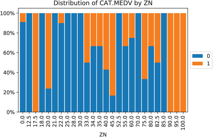
Figure 4.1 Distribution of CAT.MEDV (blue denotes CAT.MEDV = 0) by ZN. Similar bars indicate low separation between classes, and can be combined
![]() code for creating Figure 4.1
code for creating Figure 4.1
# use method crosstab to create a cross-tabulation of two variables
tbl = pd.crosstab(bostonHousing_df.CAT_MEDV, bostonHousing_df.ZN)
# convert numbers to ratios
propTbl = tbl / tbl.sum()
propTbl.round(2)
# plot the ratios in a stacked bar chart
ax = propTbl.transpose().plot(kind='bar', stacked=True)
ax.set_yticklabels(['{:,.0\%}'.format(x) for x in ax.get_yticks()])
plt.title('Distribution of CAT.MEDV by ZN')
plt.legend(loc='center left', bbox_to_anchor=(1, 0.5))
plt.show()
4.6 Reducing the Number of Categories in Categorical Variables
When a categorical variable has many categories, and this variable is destined to be a predictor, many data mining methods will require converting it into many dummy variables. In particular, a variable with m categories will be transformed into either m or m − 1 dummy variables (depending on the method). This means that even if we have very few original categorical variables, they can greatly inflate the dimension of the dataset. One way to handle this is to reduce the number of categories by combining close or similar categories. Combining categories requires incorporating expert knowledge and common sense. Pivot tables are useful for this task: We can examine the sizes of the various categories and how the outcome variable behaves in each category. Generally, categories that contain very few observations are good candidates for combining with other categories. Use only the categories that are most relevant to the analysis and label the rest as “other.” In classification tasks (with a categorical outcome variable), a pivot table broken down by the outcome classes can help identify categories that do not separate the classes. Those categories too are candidates for inclusion in the “other” category. An example is shown in Figure 4.1, where the distribution of outcome variable CAT.MEDV is broken down by ZN (treated here as a categorical variable). We can see that the distribution of CAT.MEDV is identical for ZN = 17.5, 90, 95, and 100 (where all neighborhoods have CAT.MEDV = 1). These four categories can then be combined into a single category. Similarly, categories ZN where all neighborhoods have CAT.MEDV = 0 can be combined. Further combination is also possible based on similar bars.
In a time series context where we might have a categorical variable denoting season (such as month, or hour of day) that will serve as a predictor, reducing categories can be done by examining the time series plot and identifying similar periods. For example, the time plot in Figure 4.2 shows the quarterly revenues of Toys “R” Us between 1992 and 1995. Only quarter 4 periods appear different, and therefore, we can combine quarters 1–3 into a single category.
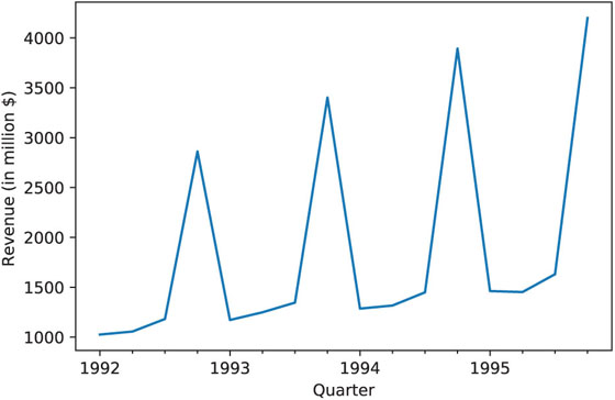
Figure 4.2 Quarterly Revenues of Toys “R” Us, 1992–1995
4.7 Converting a Categorical Variable to a Numerical Variable
Sometimes the categories in a categorical variable represent intervals. Common examples are age group or income bracket. If the interval values are known (e.g., category 2 is the age interval 20–30), we can replace the categorical value (“2” in the example) with the mid-interval value (here “25”). The result will be a numerical variable which no longer requires multiple dummy variables.
4.8 Principal Components Analysis
Principal components analysis (PCA) is a useful method for dimension reduction, especially when the number of variables is large. PCA is especially valuable when we have subsets of measurements that are measured on the same scale and are highly correlated. In that case, it provides a few variables (often as few as three) that are weighted linear combinations of the original variables, and that retain the majority of the information of the full original set. PCA is intended for use with numerical variables. For categorical variables, other methods such as correspondence analysis are more suitable.
Example 2: Breakfast Cereals
Data were collected on the nutritional information and consumer rating of 77 breakfast cereals.1 The consumer rating is a rating of cereal “healthiness” for consumer information (not a rating by consumers). For each cereal, the data include 13 numerical variables, and we are interested in reducing this dimension. For each cereal, the information is based on a bowl of cereal rather than a serving size, because most people simply fill a cereal bowl (resulting in constant volume, but not weight). A snapshot of these data is given in Table 4.8, and the description of the different variables is given in Table 4.9.
Table 4.8 Sample from the 77 breakfast cereals dataset
| Cereal name | mfr | Type | Calories | Protein | Fat | Sodium | Fiber | Carbo | Sugars | Potass | Vitamins |
| 100% Bran | N | C | 70 | 4 | 1 | 130 | 10 | 5 | 6 | 280 | 25 |
| 100% Natural Bran | Q | C | 120 | 3 | 5 | 15 | 2 | 8 | 8 | 135 | 0 |
| All-Bran | K | C | 70 | 4 | 1 | 260 | 9 | 7 | 5 | 320 | 25 |
| All-Bran with Extra Fiber | K | C | 50 | 4 | 0 | 140 | 14 | 8 | 0 | 330 | 25 |
| Almond Delight | R | C | 110 | 2 | 2 | 200 | 1 | 14 | 8 | 25 | |
| Apple Cinnamon Cheerios | G | C | 110 | 2 | 2 | 180 | 1.5 | 10.5 | 10 | 70 | 25 |
| Apple Jacks | K | C | 110 | 2 | 0 | 125 | 1 | 11 | 14 | 30 | 25 |
| Basic 4 | G | C | 130 | 3 | 2 | 210 | 2 | 18 | 8 | 100 | 25 |
| Bran Chex | R | C | 90 | 2 | 1 | 200 | 4 | 15 | 6 | 125 | 25 |
| Bran Flakes | P | C | 90 | 3 | 0 | 210 | 5 | 13 | 5 | 190 | 25 |
| Cap’n’Crunch | Q | C | 120 | 1 | 2 | 220 | 0 | 12 | 12 | 35 | 25 |
| Cheerios | G | C | 110 | 6 | 2 | 290 | 2 | 17 | 1 | 105 | 25 |
| Cinnamon Toast Crunch | G | C | 120 | 1 | 3 | 210 | 0 | 13 | 9 | 45 | 25 |
| Clusters | G | C | 110 | 3 | 2 | 140 | 2 | 13 | 7 | 105 | 25 |
| Cocoa Puffs | G | C | 110 | 1 | 1 | 180 | 0 | 12 | 13 | 55 | 25 |
| Corn Chex | R | C | 110 | 2 | 0 | 280 | 0 | 22 | 3 | 25 | 25 |
| Corn Flakes | K | C | 100 | 2 | 0 | 290 | 1 | 21 | 2 | 35 | 25 |
| Corn Pops | K | C | 110 | 1 | 0 | 90 | 1 | 13 | 12 | 20 | 25 |
| Count Chocula | G | C | 110 | 1 | 1 | 180 | 0 | 12 | 13 | 65 | 25 |
| Cracklin’ Oat Bran | K | C | 110 | 3 | 3 | 140 | 4 | 10 | 7 | 160 | 25 |
Table 4.9 Description of the Variables in the Breakfast Cereal Dataset
| Variable | Description |
| mfr | Manufacturer of cereal (American Home Food Products, General Mills, Kellogg, etc.) |
| type | Cold or hot |
| calories | Calories per serving |
| protein | Grams of protein |
| fat | Grams of fat |
| sodium | Milligrams of sodium |
| fiber | Grams of dietary fiber |
| carbo | Grams of complex carbohydrates |
| sugars | Grams of sugars |
| potass | Milligrams of potassium |
| vitamins | Vitamins and minerals: 0, 25, or 100, indicating the typical percentage of FDA recommended |
| shelf | Display shelf (1, 2, or 3, counting from the floor) |
| weight | Weight in ounces of one serving |
| cups | Number of cups in one serving |
| rating | Rating of the cereal calculated by consumer reports |
We focus first on two variables: calories and consumer rating. These are given in Table 4.10. The average calories across the 77 cereals is 106.88 and the average consumer rating is 42.67. The estimated covariance matrix between the two variables is
Table 4.10 Cereal Calories and Ratings
| Cereal | Calories | Rating | Cereal | Calories | Rating |
| 100% Bran | 70 | 68.40297 | Just Right Fruit & Nut | 140 | 36.471512 |
| 100% Natural Bran | 120 | 33.98368 | Kix | 110 | 39.241114 |
| All-Bran | 70 | 59.42551 | Life | 100 | 45.328074 |
| All-Bran with Extra Fiber | 50 | 93.70491 | Lucky Charms | 110 | 26.734515 |
| Almond Delight | 110 | 34.38484 | Maypo | 100 | 54.850917 |
| Apple Cinnamon Cheerios | 110 | 29.50954 | Muesli Raisins, Dates & Almonds | 150 | 37.136863 |
| Apple Jacks | 110 | 33.17409 | Muesli Raisins, Peaches & Pecans | 150 | 34.139765 |
| Basic 4 | 130 | 37.03856 | Mueslix Crispy Blend | 160 | 30.313351 |
| Bran Chex | 90 | 49.12025 | Multi-Grain Cheerios | 100 | 40.105965 |
| Bran Flakes | 90 | 53.31381 | Nut&Honey Crunch | 120 | 29.924285 |
| Cap’n’Crunch | 120 | 18.04285 | Nutri-Grain Almond-Raisin | 140 | 40.69232 |
| Cheerios | 110 | 50.765 | Nutri-grain Wheat | 90 | 59.642837 |
| Cinnamon Toast Crunch | 120 | 19.82357 | Oatmeal Raisin Crisp | 130 | 30.450843 |
| Clusters | 110 | 40.40021 | Post Nat. Raisin Bran | 120 | 37.840594 |
| Cocoa Puffs | 110 | 22.73645 | Product 19 | 100 | 41.50354 |
| Corn Chex | 110 | 41.44502 | Puffed Rice | 50 | 60.756112 |
| Corn Flakes | 100 | 45.86332 | Puffed Wheat | 50 | 63.005645 |
| Corn Pops | 110 | 35.78279 | Quaker Oat Squares | 100 | 49.511874 |
| Count Chocula | 110 | 22.39651 | Quaker Oatmeal | 100 | 50.828392 |
| Cracklin’ Oat Bran | 110 | 40.44877 | Raisin Bran | 120 | 39.259197 |
| Cream of Wheat (Quick) | 100 | 64.53382 | Raisin Nut Bran | 100 | 39.7034 |
| Crispix | 110 | 46.89564 | Raisin Squares | 90 | 55.333142 |
| Crispy Wheat & Raisins | 100 | 36.1762 | Rice Chex | 110 | 41.998933 |
| Double Chex | 100 | 44.33086 | Rice Krispies | 110 | 40.560159 |
| Froot Loops | 110 | 32.20758 | Shredded Wheat | 80 | 68.235885 |
| Frosted Flakes | 110 | 31.43597 | Shredded Wheat ’n’Bran | 90 | 74.472949 |
| Frosted Mini-Wheats | 100 | 58.34514 | Shredded Wheat spoon size | 90 | 72.801787 |
| Fruit & Fibre Dates, Walnuts & Oats | 120 | 40.91705 | Smacks | 110 | 31.230054 |
| Fruitful Bran | 120 | 41.01549 | Special K | 110 | 53.131324 |
| Fruity Pebbles | 110 | 28.02577 | Strawberry Fruit Wheats | 90 | 59.363993 |
| Golden Crisp | 100 | 35.25244 | Total Corn Flakes | 110 | 38.839746 |
| Golden Grahams | 110 | 23.80404 | Total Raisin Bran | 140 | 28.592785 |
| Grape Nuts Flakes | 100 | 52.0769 | Total Whole Grain | 100 | 46.658844 |
| Grape-Nuts | 110 | 53.37101 | Triples | 110 | 39.106174 |
| Great Grains Pecan | 120 | 45.81172 | Trix | 110 | 27.753301 |
| Honey Graham Ohs | 120 | 21.87129 | Wheat Chex | 100 | 49.787445 |
| Honey Nut Cheerios | 110 | 31.07222 | Wheaties | 100 | 51.592193 |
| Honey-comb | 110 | 28.74241 | Wheaties Honey Gold | 110 | 36.187559 |
| Just Right Crunchy Nuggets | 110 | 36.52368 |
It can be seen that the two variables are strongly correlated with a negative correlation of
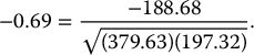
Roughly speaking, 69% of the total variation in both variables is actually “co-variation,” or variation in one variable that is duplicated by similar variation in the other variable. Can we use this fact to reduce the number of variables, while making maximum use of their unique contributions to the overall variation? Since there is redundancy in the information that the two variables contain, it might be possible to reduce the two variables to a single variable without losing too much information. The idea in PCA is to find a linear combination of the two variables that contains most, even if not all, of the information, so that this new variable can replace the two original variables. Information here is in the sense of variability: What can explain the most variability among the 77 cereals? The total variability here is the sum of the variances of the two variables, which in this case is 379.63 + 197.32 = 577. This means that calories accounts for 66% = 379.63 / 577 of the total variability, and rating for the remaining 34%. If we drop one of the variables for the sake of dimension reduction, we lose at least 34% of the total variability. Can we redistribute the total variability between two new variables in a more polarized way? If so, it might be possible to keep only the one new variable that (hopefully) accounts for a large portion of the total variation.
Figure 4.3 shows a scatter plot of rating vs. calories. The line z1 is the direction in which the variability of the points is largest. It is the line that captures the most variation in the data if we decide to reduce the dimensionality of the data from two to one. Among all possible lines, it is the line for which, if we project the points in the dataset orthogonally to get a set of 77 (one-dimensional) values, the variance of the z1 values will be maximum. This is called the first principal component. It is also the line that minimizes the sum-of-squared perpendicular distances from the line. The z2-axis is chosen to be perpendicular to the z1-axis. In the case of two variables, there is only one line that is perpendicular to z1, and it has the second largest variability, but its information is uncorrelated with z1. This is called the second principal component. In general, when we have more than two variables, once we find the direction z1 with the largest variability, we search among all the orthogonal directions to z1 for the one with the next-highest variability. That is z2. The idea is then to find the coordinates of these lines and to see how they redistribute the variability.
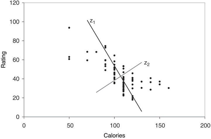
Figure 4.3 Scatter plot of rating vs. calories for 77 breakfast cereals, with the two principal component directions
Running PCA in scikit-learn is done with the class sklearn.decomposition.PCA. Table 4.11 shows the output from running PCA on the two variables calories and rating. The value components_ of this function is the rotation matrix, which gives the weights that are used to project the original points onto the two new directions. The weights for z1 are given by (−0.847, 0.532), and for z2 they are given by (0.532, 0.847). The summary gives the reallocated variance: z1 accounts for 86% of the total variability and z2 for the remaining 14%. Therefore, if we drop z2, we still maintain 86% of the total variability.
Table 4.11 PCA on the two variables calories and rating
cereals_df = pd.read_csv('Cereals.csv')
pcs = PCA(n_components=2)
pcs.fit(cereals_df[['calories', 'rating']])
pcsSummary = pd.DataFrame({'Standard deviation': np.sqrt(pcs.explained_variance_),
'Proportion of variance': pcs.explained_variance_ratio_,
'Cumulative proportion': np.cumsum(pcs.explained_
variance_ratio_)})
pcsSummary = pcsSummary.transpose()
pcsSummary.columns = ['PC1', 'PC2']
pcsSummary.round(4)
pcsComponents_df = pd.DataFrame(pcs.components_.transpose(), columns=['PC1', 'PC2'],
index=['calories', 'rating'])
pcsComponents_df
scores = pd.DataFrame(pcs.transform(cereals_df[['calories', 'rating']]),
columns=['PC1', 'PC2'])
scores.head()
Output # pcsSummary PC1 PC2 Standard deviation 22.3165 8.8844 Proportion of variance 0.8632 0.1368 Cumulative proportion 0.8632 1.0000 # Components PC1 PC2 calories -0.847053 0.531508 rating 0.531508 0.847053 # Scores PC1 PC2 0 44.921528 2.197183 1 -15.725265 -0.382416 2 40.149935 -5.407212 3 75.310772 12.999126 4 -7.041508 -5.357686 |
The weights are used to compute principal component scores, which are the projected values of calories and rating onto the new axes (after subtracting the means). The transform method of the PCS object can be used to determine the score from the original data. The first column is the projection onto z1 using the weights (0.847, −0.532). The second column is the projection onto z2 using the weights (0.532, 0.847). For example, the first score for the 100% Bran cereal (with 70 calories and a rating of 68.4) is ( − 0.847)(70 − 106.88) + (0.532)(68.4 − 42.67) = 44.92.
Note that the means of the new variables z1 and z2 are zero, because we’ve subtracted the mean of each variable. The sum of the variances var(z1) + var(z2) is equal to the sum of the variances of the original variables, var(calories) + var(rating). Furthermore, the variances of z1 and z2 are 498 and 79, respectively, so the first principal component, z1, accounts for 86% of the total variance. Since it captures most of the variability in the data, it seems reasonable to use one variable, the first principal score, to represent the two variables in the original data. Next, we generalize these ideas to more than two variables.
Principal Components
Let us formalize the procedure described above so that it can easily be generalized to p > 2 variables. Denote the original p variables by X1, X2, …, Xp. In PCA, we are looking for a set of new variables Z1, Z2, …, Zp that are weighted averages of the original variables (after subtracting their mean):
where each pair of Z’s has correlation = 0. We then order the resulting Z’s by their variance, with Z1 having the largest variance and Zp having the smallest variance. The software computes the weightsai, j, which are then used in computing the principal component scores.
A further advantage of the principal components compared to the original data is that they are uncorrelated (correlation coefficient = 0). If we construct regression models using these principal components as predictors, we will not encounter problems of multicollinearity.
Let us return to the breakfast cereal dataset with all 15 variables, and apply PCA to the 13 numerical variables. The resulting output is shown in Table 4.12. Note that the first three components account for more than 96% of the total variation associated with all 13 of the original variables. This suggests that we can capture most of the variability in the data with less than 25% of the original dimensions in the data. In fact, the first two principal components alone capture 92.6% of the total variation. However, these results are influenced by the scales of the variables, as we describe next.
Table 4.12 PCA output using all 13 numerical variables in the breakfast cereals dataset. The table shows results for the first five principal components
pcs = PCA()
pcs.fit(cereals_df.iloc[:, 3:].dropna(axis=0))
pcsSummary_df = pd.DataFrame({'Standard deviation': np.sqrt(pcs.explained_variance_),
'Proportion of variance': pcs.explained_variance_ratio_,
'Cumulative proportion': np.cumsum(pcs.explained_variance_ratio_)})
pcsSummary_df = pcsSummary_df.transpose()
pcsSummary_df.columns = ['PC{}'.format(i) for i in range(1, len(pcsSummary_df.columns) + 1)]
pcsSummary_df.round(4)
PC1      PC2      PC3      PC4     PC5     PC6   Standard deviation      83.7641  70.9143  22.6437  19.1815  8.4232  2.0917
Proportion of variance   0.5395   0.3867   0.0394   0.0283  0.0055  0.0003
Cumulative proportion    0.5395   0.9262   0.9656   0.9939  0.9993  0.9997
PC7     PC8     PC9    PC10    PC11   PC12  PC13
Standard deviation      1.6994  0.7796  0.6578  0.3704  0.1864  0.063   0.0
Proportion of variance  0.0002  0.0000  0.0000  0.0000  0.0000  0.000   0.0
Cumulative proportion   0.9999  1.0000  1.0000  1.0000  1.0000  1.000   1.0
[fontsize=]
pcsComponents_df = pd.DataFrame(pcs.components_.transpose(), columns=pcsSummary_df.columns,
index=cereals_df.iloc[:, 3:].columns)
pcsComponents_df.iloc[:,:5]
PC1       PC2       PC3       PC4       PC5
calories -0.077984 -0.009312  0.629206 -0.601021  0.454959
protein   0.000757  0.008801  0.001026  0.003200  0.056176
fat       0.000102  0.002699  0.016196 -0.025262 -0.016098
sodium   -0.980215  0.140896 -0.135902 -0.000968  0.013948
fiber     0.005413  0.030681 -0.018191  0.020472  0.013605
carbo    -0.017246 -0.016783  0.017370  0.025948  0.349267
sugars   -0.002989 -0.000253  0.097705 -0.115481 -0.299066
potass    0.134900  0.986562  0.036782 -0.042176 -0.047151
vitamins -0.094293  0.016729  0.691978  0.714118 -0.037009
shelf     0.001541  0.004360  0.012489  0.005647 -0.007876
weight   -0.000512  0.000999  0.003806 -0.002546  0.003022
cups     -0.000510 -0.001591  0.000694  0.000985  0.002148
rating    0.075296  0.071742 -0.307947  0.334534  0.757708
Use method dropna(axis=0) to remove observations that contain missing values. Note the use of the transpose() method to get the scores |
Normalizing the Data
A further use of PCA is to understand the structure of the data. This is done by examining the weights to see how the original variables contribute to the different principal components. In our example, it is clear that the first principal component is dominated by the sodium content of the cereal: it has the highest (in this case, positive) weight. This means that the first principal component is in fact measuring how much sodium is in the cereal. Similarly, the second principal component seems to be measuring the amount of potassium. Since both these variables are measured in milligrams, whereas the other nutrients are measured in grams, the scale is obviously leading to this result. The variances of potassium and sodium are much larger than the variances of the other variables, and thus the total variance is dominated by these two variances. A solution is to normalize the data before performing the PCA. Normalization (or standardization) means replacing each original variable by a standardized version of the variable that has unit variance. This is easily accomplished by dividing each variable by its standard deviation. The effect of this normalization is to give all variables equal importance in terms of variability.
When should we normalize the data like this? It depends on the nature of the data. When the units of measurement are common for the variables (e.g., dollars), and when their scale reflects their importance (sales of jet fuel, sales of heating oil), it is probably best not to normalize (i.e., not to rescale the data so that they have unit variance). If the variables are measured in different units so that it is unclear how to compare the variability of different variables (e.g., dollars for some, parts per million for others) or if for variables measured in the same units, scale does not reflect importance (earnings per share, gross revenues), it is generally advisable to normalize. In this way, the differences in units of measurement do not affect the principal components’ weights. In the rare situations where we can give relative weights to variables, we multiply the normalized variables by these weights before doing the PCA.
Thus far, we have calculated principal components using the covariance matrix. An alternative to normalizing and then performing PCA is to perform PCA on the correlation matrix instead of the covariance matrix. Most software programs allow the user to choose between the two. Remember that using the correlation matrix means that you are operating on the normalized data.
Returning to the breakfast cereal data, we normalize the 13 variables due to the different scales of the variables and then perform PCA (or equivalently, we use PCA applied to the correlation matrix). The output is given in Table 4.13.
Table 4.13 PCA output using all normalized 13 numerical variables in the breakfast cereals dataset. The table shows results for the first five principal components
pcs = PCA()
pcs.fit(preprocessing.scale(cereals_df.iloc[:, 3:].dropna(axis=0)))
pcsSummary_df = pd.DataFrame({'Standard deviation': np.sqrt(pcs.explained_variance_),
'Proportion of variance': pcs.explained_variance_ratio_,
'Cumulative proportion': np.cumsum(pcs.explained_variance_ratio_)})
pcsSummary_df = pcsSummary_df.transpose()
pcsSummary_df.columns = ['PC{}'.format(i) for i in range(1, len(pcsSummary_df.columns) + 1)]
pcsSummary_df.round(4)
PC1     PC2     PC3     PC4     PC5     PC6   Standard deviation      1.9192  1.7864  1.3912  1.0166  1.0015  0.8555
Proportion of variance  0.2795  0.2422  0.1469  0.0784  0.0761  0.0555
Cumulative proportion   0.2795  0.5217  0.6685  0.7470  0.8231  0.8786
PC7     PC8     PC9    PC10    PC11    PC12  PC13
Standard deviation      0.8251  0.6496  0.5658  0.3051  0.2537  0.1399   0.0
Proportion of variance  0.0517  0.0320  0.0243  0.0071  0.0049  0.0015   0.0
Cumulative proportion   0.9303  0.9623  0.9866  0.9936  0.9985  1.0000   1.0
pcsComponents_df = pd.DataFrame(pcs.components_.transpose(), columns=pcsSummary_df.columns,
index=cereals_df.iloc[:, 3:].columns)
pcsComponents_df.iloc[:,:5]
PC1       PC2       PC3       PC4       PC5
calories -0.299542 -0.393148  0.114857 -0.204359  0.203899
protein   0.307356 -0.165323  0.277282 -0.300743  0.319749
fat      -0.039915 -0.345724 -0.204890 -0.186833  0.586893
sodium   -0.183397 -0.137221  0.389431 -0.120337 -0.338364
fiber     0.453490 -0.179812  0.069766 -0.039174 -0.255119
carbo    -0.192449  0.149448  0.562452 -0.087835  0.182743
sugars   -0.228068 -0.351434 -0.355405  0.022707 -0.314872
potass    0.401964 -0.300544  0.067620 -0.090878 -0.148360
vitamins -0.115980 -0.172909  0.387859  0.604111 -0.049287
shelf     0.171263 -0.265050 -0.001531  0.638879  0.329101
weight   -0.050299 -0.450309  0.247138 -0.153429 -0.221283
cups     -0.294636  0.212248  0.140000 -0.047489  0.120816
rating    0.438378  0.251539  0.181842 -0.038316  0.057584
Use preprocessing.scale to normalize data prior to running PCA. |
Now we find that we need seven principal components to account for more than 90% of the total variability. The first two principal components account for only 52% of the total variability, and thus reducing the number of variables to two would mean losing a lot of information. Examining the weights, we see that the first principal component measures the balance between two quantities: (1) calories and cups (large negative weights) vs. (2) protein, fiber, potassium, and consumer rating (large positive weights). High scores on principal component 1 mean that the cereal is low in calories and the amount per bowl, and high in protein, and potassium. Unsurprisingly, this type of cereal is associated with a high consumer rating. The second principal component is most affected by the weight of a serving, and the third principal component by the carbohydrate content. We can continue labeling the next principal components in a similar fashion to learn about the structure of the data.
When the data can be reduced to two dimensions, a useful plot is a scatter plot of the first vs. second principal scores with labels for the observations (if the dataset is not too large2). To illustrate this, Figure 4.4 displays the first two principal component scores for the breakfast cereals.

Figure 4.4 Scatter plot of the second vs. first principal components scores for the normalized breakfast cereal output (created using Tableau)
We can see that as we move from right (bran cereals) to left, the cereals are less “healthy” in the sense of high calories, low protein and fiber, and so on. Also, moving from bottom to top, we get heavier cereals (moving from puffed rice to raisin bran). These plots are especially useful if interesting clusters of observations can be found. For instance, we see here that children’s cereals are close together on the middle-left part of the plot.
Using Principal Components for Classification and Prediction
When the goal of the data reduction is to have a smaller set of variables that will serve as predictors, we can proceed as following: Apply PCA to the predictors using the training data. Use the output to determine the number of principal components to be retained. The predictors in the model now use the (reduced number of) principal scores columns. For the validation set, we can use the weights computed from the training data to obtain a set of principal scores by applying the weights to the variables in the validation set. These new variables are then treated as the predictors.
One disadvantage of using a subset of principal components as predictors in a supervised task, is that we might lose predictive information that is nonlinear (e.g., a quadratic effect of a predictor on the outcome variable or an interaction between predictors). This is because PCA produces linear transformations, thereby capturing linear relationships between the original variables.
4.9 Dimension Reduction Using Regression Models
In this chapter, we discussed methods for reducing the number of columns using summary statistics, plots, and PCA. All these are considered exploratory methods. Some of them completely ignore the outcome variable (e.g., PCA), whereas in other methods we informally try to incorporate the relationship between the predictors and the outcome variable (e.g., combining similar categories, in terms of their outcome variable behavior). Another approach to reducing the number of predictors, which directly considers the predictive or classification task, is by fitting a regression model. For prediction, a linear regression model is used (see Chapter 6) and for classification, a logistic regression model (see Chapter 10). In both cases, we can employ subset selection procedures that algorithmically choose a subset of predictor variables among the larger set (see details in the relevant chapters).
Fitted regression models can also be used to further combine similar categories: categories that have coefficients that are not statistically significant (i.e., have a high p-value) can be combined with the reference category, because their distinction from the reference category appears to have no significant effect on the outcome variable. Moreover, categories that have similar coefficient values (and the same sign) can often be combined, because their effect on the outcome variable is similar. See the example in Chapter 10 on predicting delayed flights for an illustration of how regression models can be used for dimension reduction.
4.10 Dimension Reduction Using Classification and Regression Trees
Another method for reducing the number of columns and for combining categories of a categorical variable is by applying classification and regression trees (see Chapter 9). Classification trees are used for classification tasks and regression trees for prediction tasks. In both cases, the algorithm creates binary splits on the predictors that best classify/predict the outcome variable (e.g., above/below age 30). Although we defer the detailed discussion to Chapter 9, we note here that the resulting tree diagram can be used for determining the important predictors. Predictors (numerical or categorical) that do not appear in the tree can be removed. Similarly, categories that do not appear in the tree can be combined.
Table 4.14 Principal Components of Non-normalized Wine Data
wine_df = pd.read_csv('Wine.csv')
wine_df = wine_df.drop(columns=['Type'])
pcs = PCA()
pcs.fit(wine_df.dropna(axis=0))
pcsSummary_df = pd.DataFrame({'Standard deviation': np.sqrt(pcs.explained_variance_),
'Proportion of variance': pcs.explained_variance_ratio_,
'Cumulative proportion': np.cumsum(pcs.explained_variance_ratio_)})
pcsSummary_df = pcsSummary_df.transpose()
pcsSummary_df.columns = ['PC{}'.format(i) for i in range(1, len(pcsSummary_df.columns) + 1)]
pcsSummary_df.round(4)
PC1      PC2     PC3     PC4     PC5     PC6   Standard deviation      314.9632  13.1353  3.0722  2.2341  1.1085  0.9171
Proportion of variance    0.9981   0.0017  0.0001  0.0001  0.0000  0.0000
Cumulative proportion     0.9981   0.9998  0.9999  1.0000  1.0000  1.0000
PC7     PC8     PC9    PC10    PC11    PC12    PC13
Standard deviation      0.5282  0.3891  0.3348  0.2678  0.1938  0.1452  0.0906
Proportion of variance  0.0000  0.0000  0.0000  0.0000  0.0000  0.0000  0.0000
Cumulative proportion   1.0000  1.0000  1.0000  1.0000  1.0000  1.0000  1.0000
pcsComponents_df = pd.DataFrame(pcs.components_.transpose(), columns=pcsSummary_df.columns, index=wine_df.columns) pcsComponents_df.iloc[:,:5] PC1 PC2 PC3 PC4 PC5 Alcohol 0.001659 0.001203 -0.016874 -0.141447 0.020337 Malic_Acid -0.000681 0.002155 -0.122003 -0.160390 -0.612883 Ash 0.000195 0.004594 -0.051987 0.009773 0.020176 Ash_Alcalinity -0.004671 0.026450 -0.938593 0.330965 0.064352 Magnesium 0.017868 0.999344 0.029780 0.005394 -0.006149 Total_Phenols 0.000990 0.000878 0.040485 0.074585 0.315245 Flavanoids 0.001567 -0.000052 0.085443 0.169087 0.524761 Nonflavanoid_Phenols -0.000123 -0.001354 -0.013511 -0.010806 -0.029648 Proanthocyanins 0.000601 0.005004 0.024659 0.050121 0.251183 Color_Intensity 0.002327 0.015100 -0.291398 -0.878894 0.331747 Hue 0.000171 -0.000763 0.025978 0.060035 0.051524 OD280_OD315 0.000705 -0.003495 0.070324 0.178200 0.260639 Proline 0.999823 -0.017774 -0.004529 0.003113 -0.002299 |
Problems
-
Breakfast Cereals. Use the data for the breakfast cereals example in Section 4.8.1 to explore and summarize the data as follows:
- Which variables are quantitative/numerical? Which are ordinal? Which are nominal?
- Compute the mean, median, min, max, and standard deviation for each of the quantitative variables. This can be done using pandas as shown in Table 4.3.
- Plot a histogram for each of the quantitative variables. Based on the histograms and summary statistics, answer the following questions:
- Which variables have the largest variability?
- Which variables seem skewed?
- Are there any values that seem extreme?
- Plot a side-by-side boxplot comparing the calories in hot vs. cold cereals. What does this plot show us?
- Plot a side-by-side boxplot of consumer rating as a function of the shelf height. If we were to predict consumer rating from shelf height, does it appear that we need to keep all three categories of shelf height?
-
Compute the correlation table for the quantitative variable (method corr()). In addition, generate a matrix plot for these variables (see Table 3.4 on how to do this using the seaborn library).
- Which pair of variables is most strongly correlated?
- How can we reduce the number of variables based on these correlations?
- How would the correlations change if we normalized the data first?
- Consider the first PC of the analysis of the 13 numerical variables in Table 4.12. Describe briefly what this PC represents.
-
University Rankings. The dataset on American college and university rankings (available from www.dataminingbook.com) contains information on 1302 American colleges and universities offering an undergraduate program. For each university, there are 17 measurements that include continuous measurements (such as tuition and graduation rate) and categorical measurements (such as location by state and whether it is a private or a public school).
- Remove all categorical variables. Then remove all records with missing numerical measurements from the dataset.
- Conduct a principal components analysis on the cleaned data and comment on the results. Should the data be normalized? Discuss what characterizes the components you consider key.
-
Sales of Toyota Corolla Cars. The file ToyotaCorolla.csv contains data on used cars (Toyota Corollas) on sale during late summer of 2004 in the Netherlands. It has 1436 records containing details on 38 attributes, including Price, Age, Kilometers, HP, and other specifications. The goal will be to predict the price of a used Toyota Corolla based on its specifications.
- Identify the categorical variables.
- Explain the relationship between a categorical variable and the series of binary dummy variables derived from it.
- How many dummy binary variables are required to capture the information in a categorical variable with N categories?
- Use Python to convert the categorical variables in this dataset into dummy variables, and explain in words, for one record, the values in the derived binary dummies.
- Use Python to produce a correlation matrix and matrix plot. Comment on the relationships among variables.
-
Chemical Features of Wine. Table 4.14 shows the PCA output on data (non-normalized) in which the variables represent chemical characteristics of wine, and each case is a different wine.
- The data are in the file Wine.csv. Consider the rows labeled “Proportion of Variance.” Explain why the value for PC1 is so much greater than that of any other column.
- Comment on the use of normalization (standardization) in part (a).
Notes
- 1 The data are available at http://lib.stat.cmu.edu/DASL/Stories/HealthyBreakfast.html.
- 2 Python’s labeled scatter plots currently generate too much over-plotting of labels when the number of markers is as large as in this example.