
Chapter 5: Designing Consistently Using Grids, Colors, and Typography
Well, you've done a great job learning the most basic Figma tools and even applying them to the wireframe of our application. In this chapter, you'll take a big step by getting started with the actual interface while discovering more advanced features. But before diving into the topic, you should know that when it comes to mastering any software or tool, it is important that your learning process is not just about memorizing all the functions but also trying to understand what is behind each feature, what benefits it gives you, and how best to use it. After all, your main goal is not to apply as many functions as possible but to make them work well and efficiently.
The set of tools that you are going to learn in this chapter is very important, and you need to not only be able to use them but also to use them correctly, since you will most likely need them in every future design project. In this chapter, you will also learn how to set up and apply these tools consistently across all your layouts. Excited? Let's get started!
In this chapter, we are going to cover the following main topics:
- Getting started with grids
- Working with typography, colors, and effects
- Introducing styles
Getting started with grids
At this stage, we understand that the design of any interface consists of technical and analytical solutions aimed at satisfying a user's needs. Remember that a good designer will never let personal taste affect a product. Therefore, the design of an interface, except for the initial stages of creating sketches and wireframes, must be done with precision for every detail. Figma has a whole bunch of dedicated tools to help you achieve this successfully.
Starting from this chapter, you will no longer have random frame sizes, colors, fonts, and other elements in your design files. From now on, you have to move forward only when you are confident in every step of creating the interface of your application. Therefore, you will need tools to help you minimize or eliminate possible errors. One of these is grids, and the first section of this chapter will be devoted to this amazing function.
Grids are everywhere
Grids are a very old design tool, dating back to the 13th century. At that time, all books were handwritten and therefore very expensive and valuable, and it took a lot of effort to create one book. Grids were invented to harmonize each page of a book by neatly positioning handwritten text on the paper and ensuring that content appeared evenly on each page. From then on, the grid system remained indispensable in publishing houses, as it was used to organize the layout of printed pages. Publishers, editors, and writers looked to grids for the perfect harmony of displaying content on pages. Grids are usually made up of columns and rows placed on a page, with a set spacing and padding from the page edges. Because the same grid was applied to all pages, text and images were consistent throughout the book or magazine. Thus, a reader was attracted to the visuals of the printed pages, but most importantly, it was easier to focus on the content. The following diagram shows an example of a layout grid:

Figure 5.1 – An example of a book layout grid
The method of grids was then used in graphic design, and grids still form the basis of any simple or complex composition. If you look at any artwork for the first time, you may not notice right away that the elements are arranged according to some positioning rules, but there are certainly grids behind every self-respecting design project, from books to posters, and even photoshoots.
Because virtual pages have a lot in common with printed pages, grids are also widely used in creating websites, apps, and other digital products that we use on a daily basis. However, digital pages cannot be permanent, as they can be displayed differently and the screen sizes of devices can vary significantly. But the basic principle of grids still remains the same – all elements must be organized with harmony and consistency throughout all pages so that the user is not distracted from the content.
Since we previously established that our hypothetical audience will primarily use our application on smartphones, we will first determine the correct grid for the mobile screen, and then, based on the properties of this grid, move to higher resolutions. We'll come back to this later, but now let's learn about grids in Figma.
Guides and layout grids
Now that you know why designers use grids, it's time to learn how to create and operate a grid system in Figma. In addition to the grids function, Figma also has another tool for aligning elements nested within the same frame – Guides. Let's talk about them first before moving on to grids.
You will need guides when you need to relate elements and check their alignment, position, and size. Unlike grids with columns and rows, guides look like thin horizontal and vertical lines, which are quicker and easier to move and reposition than grids. To better understand how guides work, let's try them out on the canvas:
- First, you need to activate the rulers in your file. To do this, simply use the Shift + R keyboard shortcut. You will see that two rulers appear at the top and left of your working area, as you can see in the following screenshot (Figure 5.2).
- Create a frame of any size you like, which you'll delete right after using guides, on your canvas.
- To add a horizontal guides, click and drag the horizontal ruler. You will see a red line that you can drag towards your work area. Likewise, to have a vertical guides, you need to click and drag a vertical ruler. Note that when a ruler is placed on a frame, it gets automatically cut to the frame's borders:

Figure 5.2 – Text snapping with guides
- To remove the guides, drag it back to the ruler or simply use the Delete key after selecting it.
You can add as many guides as you like and move them manually anywhere on the canvas. This makes them a very versatile tool, but guides have their limitations, as it is difficult to create a flexible, efficient grid just using them. For this, Figma has layout grids.
Note
With a single Shift + R keyboard shortcut, you can toggle the ruler on and off in your working area.
As a more complex function than Guides, layout grids open up new possibilities for designers to create consistent product designs across multiple platforms. First of all, you need to know that layout grids can only be applied on frames – and therefore on components – both main and nested. To apply a layout grid to a frame, select one on your canvas, and, with selection active, click + next to Layout grid in the right sidebar. This action will enable this feature, and the default layout grid will be applied to the frame:
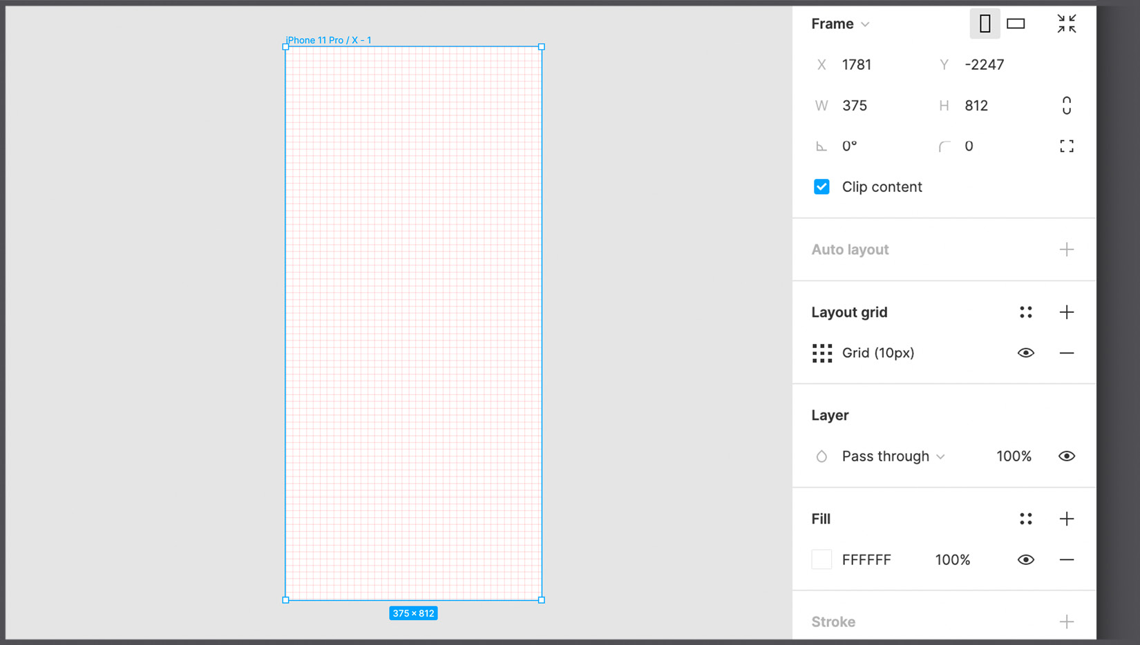
Figure 5.3 – The default layout grid
Before changing the grid settings, you need to understand what grid properties will fit the contents of this frame. The columns and rows of the grid must not be randomly arranged in the frame. You need to select the correct properties for them so that the grid becomes an effective design assistant when working on the interface for different screen sizes. Many web development frameworks such as Bootstrap, Tailwind, and Materialize use 12-column grids to better organize content within them, and what's more, this structure allows you to change the layout depending on the device and its resolution with a little effort. Therefore, at this stage, it is very important to find out, based on the needs of the project, which technologies will be used by the developers in your team. This can help in choosing a grid system that can then be efficiently converted to code without much difficulty.
To change the settings for the layout grid and update its properties, you should click the Grid icon under Layout grid in the right sidebar when frame selection is active. Here, in the drop-down menu at the top, you can see three options of layout grids – uniform square Grid, Columns, and Rows:

Figure 5.4 – The layout grid types
While the settings for a uniform grid are limited only by the size in pixels of each resulting cell and the grid color, columns and rows allow you to select, respectively, the column or row Count value you want to apply, as well as set Margin, Gutter (the distance between each row or column) and Type. With the grid type feature, you can align the grid Right, Left, or Center. But if you want the grid to adapt to the size of the frame, there is a Stretch option that automatically sets the column/row widths and makes your grid responsive.
It is important to know that the layout grid can be applied not only to the outer frame but also to the nested ones; thus, you can create inner grids that can be very useful – for example, when designing a small icon in your interface. Alternatively, you can add more than one layout grid for a frame, meaning you can apply a column-based layout grid and then add a row-based grid on top of it, having an even more customizable structure.
From the moment you apply the grid to any frame, it will always be visible on top of all other elements. While working, you will certainly need to turn off the grid visibility sometimes to reduce visual noise on your interface. You can do this with one click by selecting the frame to which the grid is applied and clicking the Eye icon in the layout grid section in the right panel, or alternatively, by pressing Ctrl + G (macOS) / Ctrl + Shift + 4 (Windows).
As with any tool, you will have a better understanding of its use in practice. So, feel free to try guides and grids by setting different properties for them. For your personal practice exercises, you can create a separate file in the draft area. And when you're ready, you can move on to the next section, where we will learn about typography, colors, and effects.
Working with typography, colors, and effects
This section of the chapter will be dedicated to the fonts, colors, and effects in Figma. At first glance, these functions may seem more creative than what you have done before – and they certainly are – but you should never forget that every choice, including elements of style, should always be based on analytical conclusions. Therefore, you will need to refer to your artifacts to make the right choice, but for now, let's take a closer look at each tool.
Typography matters
Typography is one of the most important aspects of design and one of the most overlooked by newbies. However, the wrong typography choices instantly render a product non-functional and aesthetically unpleasant. This is because choosing the right font is not easy, and only experience, study, and practice can help you master this aspect. To learn more about typography, it is recommended that you read Just My Type: A Book About Fonts by Simon Garfield, which will help you better understand the uniqueness of each font and therefore determine when it is appropriate to use them.
Typographic choice can be dictated by several factors. If, for example, if you want to build an app exclusively for iOS, it might be a good choice to use a system font such as San Francisco (sans-serif) or New York (serif) in order for the product to comply with Apple's visual guidelines (which you can consult here: https://developer.apple.com/design/human-interface-guidelines). Likewise, when building an Android app, the Roboto font might be a safe choice. In the following figure, you can see a visual comparison of these famous fonts:

Figure 5.5 – The differences between serif and sans-serif typefaces
Another important factor is, of course, context. A font may be more appropriate for one use and less appropriate for another. In general, with sans-serif fonts being more readable by the human eye, they are suitable for menus, buttons, and so on. And if you need to display very long text content, a serif font may be more appropriate. It may also be that the brand you are working for already has its own brand book with particular recommended fonts for digital use.
There are times when it is possible, or even necessary, to use more than one font in an interface. In this case, you should first check whether there are any technical limitations on the development side – each integrated font has weight and can consequently slow down the loading of an application. After that, you need to make sure that the selected fonts match well.
Note
If you need useful suggestions, you can find some functional font pairing here: https://www.figma.com/google-fonts.
Typically, software that has a text-editing function has a list of fonts installed on the computer and ready to use. But in Figma, things are a little different. Firstly, Figma provides a huge selection of Google fonts (be sure that Show Google Fonts is enabled in Preferences), ready to operate in design files. Google fonts are also well designed (which is an important aspect when choosing a font) and complete in terms of the weight available for each font family. In addition, they are web fonts, which means they load quickly and are easy to implement during product development.
Therefore, because of the simplicity and flexibility of Google Fonts, it is highly recommended to use them. However, it may be that you have to use fonts that are not listed inside Figma. In this case, you should use the desktop version of Figma, where in addition to Google fonts, you will have at your disposal all the fonts installed on your computer. Optionally, you can also access local fonts through the Figma web app, but this requires an extra step, namely installing the font service (available here at https://www.figma.com/downloads for both macOS and Windows).
Now that you know what fonts you have at your disposal, let's take a look at the Text tool. You have already used it before, but now you will find out all the possibilities that it offers. The first thing you need to know is that the Text tool lets you insert two different types. If you select the Text tool (T), and then just click somewhere on the canvas and start typing, you will get text with an automatic width that will isn't limited. This means that the width of the text container will be growing indefinitely as you type until you start a new paragraph with the Enter key. The width of this container can then be reduced by clicking outside of it and manually using the cursor to adjust its size, both horizontally and vertically, within which the text will be contained. There is another way to place text on the canvas. Instead of just typing, you can draw a text container right after selecting the Text tool (T). This way, your container will keep the width you set earlier, and the text will not go beyond it and only change the height as you type. You can then modify the width of the container manually.
Regardless of which method you prefer, both will have the same result, namely creating a new text layer in the Layers panel. If you select any text layer, the Design panel automatically adjusts to your selection and displays functionality exclusively for texts and paragraphs in the Text section.
In the following screenshot (Figure. 5.6), you can see all the available options for working with text layers. Let's take a closer look at each of them:
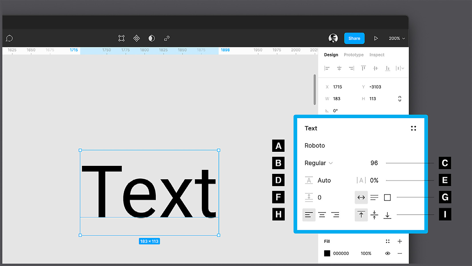
Figure 5.6 – The text options
The first parameter (A) is the already mentioned list of all available fonts. You can click the drop-down menu and see a great variety of different fonts for any occasion. To quickly check for a specific font that you might need, instead of scrolling through this long list, you can start typing the name of the font, and the autocomplete system will suggest the best search results for you.
Note
If you use local fonts, make sure that the other people working on the same file also have these fonts installed on their computers; otherwise, Figma will show them a yellow alert with an A? symbol next to the missing font name.
In addition to a font family, you can choose a specific Weight (B) for it – for example, Light, Regular, Bold, and Extra bold – and styles (for example, Italic) of the same font. Not all fonts have the same number of options for adjusting weight and styles, so it's best to consider this when choosing the main font for your project. It is recommended to use the one that has enough options to play with in order to be able to create a visual hierarchy of interface elements, highlight important text information, and so on. For similar purposes, different Sizes (C) of the selected font are also used.
The following options for working with a text layer can be better understood by having a multi-line block of text on the canvas. Line height (D), also called leading, is the spacing between each line of text in a paragraph. In the default mode of any selected font, the lines will not overlap, but you can manually change this value to improve the readability of the text. Here, you can enter a value in pixels or a percentage, and in both cases, it is closely related to the font size. A standard paragraph with font size 18 has a line height of 21 (or 115%). Paragraph spacing (F) works in much the same way as line height, with the difference that only complete paragraphs are separated, not individual lines of text.
Letter spacing (E), or kerning, is used to separate individual characters in text from each other to make small optical adjustments. You can add or decrease the spacing between all letters in your block of text by simply selecting the entire layer and changing its letter-spacing value. But what's more, you can also separate any two single characters in a paragraph from each other by placing the text cursor between them and changing the spacing in the panel.
As you can see, Figma provides many options for working with the text layers. However, if you are a beginner, you should not overuse these functions, as the most famous fonts, made by experienced designers, are already worked out to the millimeter, and any careless modification can break this harmony. With time and experience, you will train your eyes, and you will know when it is worth making any such modifications to the selected font.
Finally, there are three sets of toggle parameters, each of which only has one option. The first group of functions (G), mentioned earlier, allows you to change the behavior of the text layer itself. If you are creating auto width text (with a simple click after selecting the Text tool), for example, the first option will be active, then you can easily switch to fixed size, and then the text area will have the specified size. The last option, automatic height, is a combination of the two. If you select it, the width of your text container will remain fixed and defined by you, but its height will automatically adapt based on the amount of text you enter. The second group (H) concerns the alignment of the text relative to the area in which it is contained. Here, you can choose one of the following text alignment options – left, center, or right. The third group (I) is also for aligning the text relative to its area but this time vertically, and you can choose between top, middle, and bottom alignment.
So, the changes you can make to the text are very numerous, but if that's not enough, you have a More (...) button. If you click on it, you will see many additional features, such as underling and strikethrough, numbered or bulleted lists, or converting an entire text box to uppercase, lowercase, and so on. This expanded panel also has a practical preview window, the contents of which change, depending on which of the available options you hover over. The preview is shown to help you better understand all the features in this panel. In the following screenshot, you can see this panel with the preview and some additional functions:
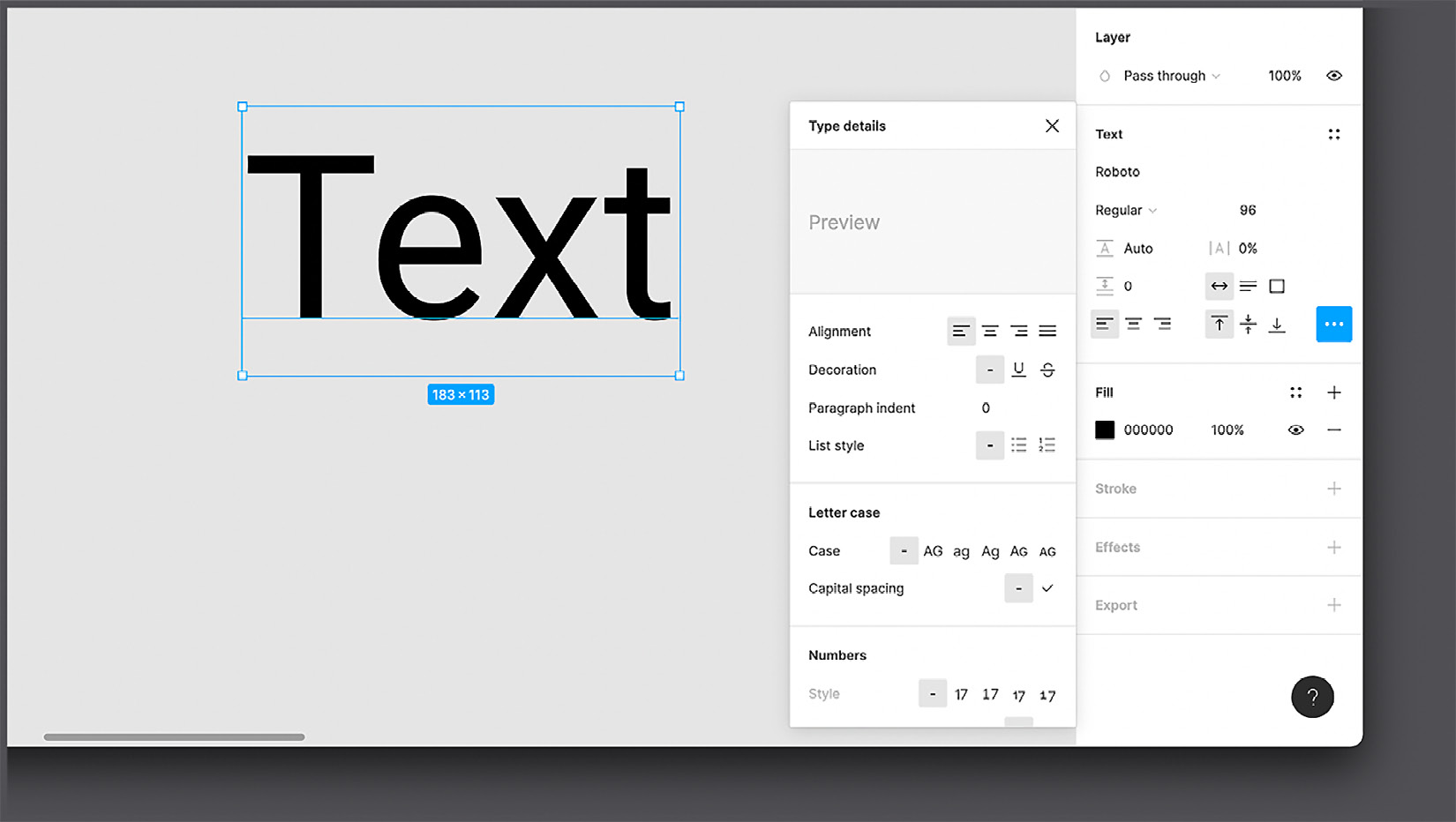
Figure 5.7 – Advanced text options
So far, we have explored all the specific and exclusive features of text layers. But don't overlook the fact that other common features we've already applied to shape layers are also available here for text. Therefore, you can change the position and size of the text box by editing the corresponding values at the top of the Design panel, apply any color to the text using the Fill options, or even add a stroke to it using the Stroke options.
As you can see, all the settings for working with text layers in Figma are pretty simple. But the real difficulty lies in choosing one or more fonts for your projects. But don't worry – there are tons of resources to help you learn this skill. Later in this chapter, we will choose a font that suits the content and functionality of our application, but first, we will learn about colors in Figma.
Choosing a palette
Like typography, color is an important design aspect of any project that should never be overlooked. You can have a great user experience in your application, but the perception of this can be spoiled by the wrong choice of color palette, and all your efforts will be wasted. Each color has its own message and has a particular impact on people, so you need to make sure that your product interacts properly with the user. Before starting the actual UI design, you should have a clear idea of which direction to go in terms of colors, or at least enough data to easily figure it out. We'll make color choices together later, but first, let's figure out how to work with colors in Figma.
The most important tool for working with colors, as you can imagine, is the color picker, which we already tried out in Chapter 4, Wireframing a Mobile-First Experience Using Vector Shapes, while learning about shapes. Whether it's a background color, fill color, stroke color, or anything else, the Design panel will always display a preview of that color, so you can simply click on it to open a dedicated window:

Figure 5.8 – The color picker
To learn more about each color picker option, either select any element with a color on the canvas, create any shape, or add a fill or stroke to the created element. Then, just open the expanded window in the Design panel by clicking the square with the element's color.
A – color modes
From this drop-down menu, you can choose from several color modes. All of these modes are quite different, but they can be grouped into three categories, each of which partially or completely affects the contents of the color picker. The first category includes the default option, Solid, that allows you to simply select a solid color using the appropriate visual selector. The second category includes Linear, Radial, Angular, and Diamond, which are gradient options, each with a different diffusion. If you choose any of those gradient options, you will be prompted to choose not one but two or more colors, the combination of which will smoothly transition from one color to another. To change one of the colors, simply click on it in the gradient bar and then use the classic color picker. To apply any additional color to your gradient, click on any empty spot in the gradient bar, and a new colored square will appear. You can move the markers of individual colors to determine how smooth the color transition will be, as you can see in the following screenshot:

Figure 5.9 – The Linear gradient
You can also change a specific gradient trend by moving the start and end points of the gradient strip that appears directly on the selected element on the workspace. Take time to experiment with gradients to see how any changes you make produce different results.
Finally, the last Image option falls into the last category and allows you to import static or dynamic images in .GIF format from your computer and use them as an element's fill property. To import an image, click the Select Image button while hovering over the preview field, or drag any image into this space:

Figure 5.10 – Image Fill
This mode completely changes the color picker window, turning it into a small but functional image-editing center with the ability to retouch Exposure, Contrast, and so on. Keep in mind that the imported image is the fill of your element. This means that if you select a star shape and set an Image fill, it will be inserted into the shape, and above all, the layer will continue to be a shape type. Thus, importing an image on the canvas and inserting an image fill are completely different operations. For this reason, with the Image fill option, you will find various settings in the color picker – you can fill the space, adapt to it, crop the image, or repeat it in tiles.
B – blend modes
With this tool, you can blend the two layers in different ways. All the options are listed in the drop-down menu. Depending on the selected mode, the blending is calculated for each individual pixel of this layer and the layer below it.
C – the color palette
In this area, you can visually pick whatever color you want. Moving the lower hue slider (D) changes the displayed color tones. The opacity slider (E) adjusts the opacity of the color, or you can manually enter the opacity's percentage value (F). A circle with a white outline represents the currently selected color.
G – the eyedropper tool
This is a standard tool found in every design software. The eyedropper tool allows you to sample a color from any element on the screen, whether it's a vector object or a raster image.
Note
By pressing the I key on your keyboard, you can activate the eyedropper tool at any time. If you click on any object with a fill or stroke color – that is, activate its selection – and then use the eyedropper tool, the original element's color will be replaced with the sampled one. With no active selections, it is still a valid tool for displaying the color code of the color you hover over on the screen.
H – color models
By default, the reference color model will be the Hex code, which is the hexadecimal alphanumeric representation of the color. This mode is most popular in digital design and is equally convenient for web developers. But if needed, you can switch modes in the dropdown and choose RGB or CSS (which is also RGB but formatted in a web-friendly way). RGB, which stands for red, green, and blue, allows you to assign a value from 0 to 255 to individual channels. Finally, there are HSB (hue saturation brightness) and HSL (hue saturation luminance), which are very similar to each other, as they generate color by changing their respective parameters.
I – color styles
In Document colors, you can quickly access the entire color palette ever used in your current file. You can also access color from shared libraries using the drop-down menu. We will learn more about how libraries work later.
We have explored all the tools that can help you work effectively with the colors. There is one more thing to clarify before moving on to the next tool. As you already know, the Design panel, being contextual, displays settings according to the selected element, and the color tools work the same way. But what if you select more than one object at a time? Well, if the fill or stroke of the selected elements matches in color, you will not notice anything unusual, as the unique value will be displayed in the panel as before. However, if the colors of the elements were different, a new section called Selection Colors will appear in the panel. In this section, you can see all the colors present on the selected objects, and you can change every property individually:

Figure 5.11 – Selection colors
Colors are a big topic to learn, but Figma makes them easy to, giving you a set of tools that are easy to master. Always remember that before adding any color to your design, you must make sure that your choice is correct. We'll pick a color palette for our app a little later in this chapter, but now, feel free to play with colors in your drafts if you like.
Creating effects
In the Design panel, you may have noticed a section not yet mentioned, namely Effects. This is definitely a tool that deserves an in-depth study, as you can apply various effects with it to elements, such as Inner shadow, Drop shadow, Layer shadow, Layer blur, and Background blur.
Each of these effects has its own characteristic behavior. Drop shadow, for example, replicates the depth of Material Design (which is the official design system made by Google for its apps and services; you can check it out here: https://material.io/design) or cards in general, and Background blur simulates the iOS opaque glass effect. To change the effect's settings, simply click the sun icon, and you will see all the properties that can be modified, such as positioning, Spread for outer/inner shadows, or Blur levels for blur effects:

Figure 5.12 – The Drop shadow effect
As you can imagine, Effects has many properties, and describing each of them would take too many pages of this book, which is rather irrational, given that our main goal is to learn how to design a fully fledged interface in Figma. So, try exploring the effects in more detail in your draft file, setting different effect properties and watching the results. But you should know that it is better not to overuse effects when working on real projects. The main purpose of this feature is to highlight elements to make them more visible to the user. Especially in your first steps in design, it's best to stick to the well-known guidelines for effect recommendations. As your experience grows, you can experiment and create your own effects.
In this section, we have enriched our knowledge of Figma with three main functions, without which it would be difficult to imagine design. If you are concerned that you have not used any of these functions in our interface so far, don't worry, as in the next topic, we will learn how to do it in the simplest and smartest way.
Introducing styles
Well, we've successfully mastered the basics of grids, typography, colors, and effects, but now it's time to learn how to effectively manipulate these tools. And that is what we will practice in this section. As you can imagine, it would be incredibly irrational to apply our chosen font to every text layer in our design. In this hypothetical situation, you risk changing the fonts of every text on all screens in your application if you ever decide to replace the selected font with a different one. To prevent this from happening, Figma provides you with a simple and flexible feature called styles.
Styles in Figma is an incredibly powerful feature that allows you to save and reuse color palettes, fonts, and effect attributes in your design project. This means that you can apply the approved style properties to any element with a single click. And if you ever need to change any property, you can do it just as quickly in all layers of your file, or even across multiple files!
Preparing your file
So, let's see how to style our application in practice. This step is very important because it is the transition from a Low-Fidelity (Lo-Fi) wireframe to a High-Fidelity (Hi-Fi) final design, so you need to prepare your file in the best possible way:
- In the upper-right corner of the Layers panel, there is a drop-down label that shows and hides all the pages in your file. At this point, you only have one page in your design file that contains the wireframe, which Figma has automatically named Page 1. Let's rename it Lo-Fi by double-clicking the page name.
- Duplicate the page by right-clicking its name and choosing Duplicate Page from the drop-down menu. A second one with the same name will appear right under the first page.
- Rename the duplicate page to Hi-Fi – this is where we will be working on the actual UI of our application. Remember, a Starter plan can contain up to three pages in one team file. As a result, you should have a similar structure:
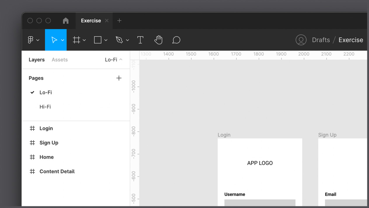
Figure 5.13 – Lo-Fi and Hi-Fi pages
As you have probably figured out, the first page of your file will only contain the wireframe you have already created, and the second will be dedicated to the actual design of our application.
Creating and managing grid styles
As you probably already figured out, duplicating any page means copying all of its content, so can you see all the same wireframes created earlier on the Hi-Fi page. Let's not change the elements inside the frames for now but start by setting layout grids as a first style property. To do that, follow these steps:
- Select the Login frame.
- Add Layout grid from the right sidebar by clicking on the + icon.
- By default, the uniform grid will be applied. Click on the grid icon and select Columns from the dropdown.
- From the grid settings, we set the column Count value to 12, the Type value to Stretch, the Margin value to 16, and Gutter to 8:

Figure 5.14 – The grid settings
Obviously, the values that you have just entered for your grid cannot be random. In our case, as mentioned earlier, the 12-column structure is one of the most commonly used in well-known development frameworks. The Gutter value is set for a design with an 8-point system, in which everything will be a multiple of 8, starting with a Margin of 16px. This system of multiples makes it much easier to keep spacing consistent. This grid system is very simple and effective, but it is not the only one, right? So, feel free to experiment with new options as soon as you feel more confident.
Since you applied the grid to the Login frame only, you need to do the same for all other screens for consistency. But doing it manually for each frame is clearly an inconvenient operation, especially if you have many more views than in our work area. To simplify, speed up, and optimize this process, let's save this grid as our first style:
- Select the Login view with the layout grid you've just created.
- Click the Style icon (see the following screenshot).
- Create a new style by clicking on the + icon of the Grid Styles dialog.
- Give a proper name to this grid style, such as 12-column-fluid, which quickly makes it recognizable as a stretchy 12-column grid:

Figure 5.15 – A new grid style
Done! The layout grid you created has just been converted to a style, and you can see it in the right sidebar. Now, all that remains is to apply this grid style to all the other frames:
- Select all the frames with no grids (Sign Up, Home, and Content Detail).
- This time, instead of pressing +, click the Styles button, and you will see the grid style that you just created.
- Select your grid style to apply it to all the views in your file with one click.
Now, you can see how easy it is to complete this operation with minimal effort. However, you should always remember that after applying the same style to multiple frames, you will no longer be able to change the layout grids of individual views, as they all relate to the same source of truth. If you want to change your grid style, you can do so in the Styles dialog box by selecting the style you want to edit and clicking the Edit Style icon:
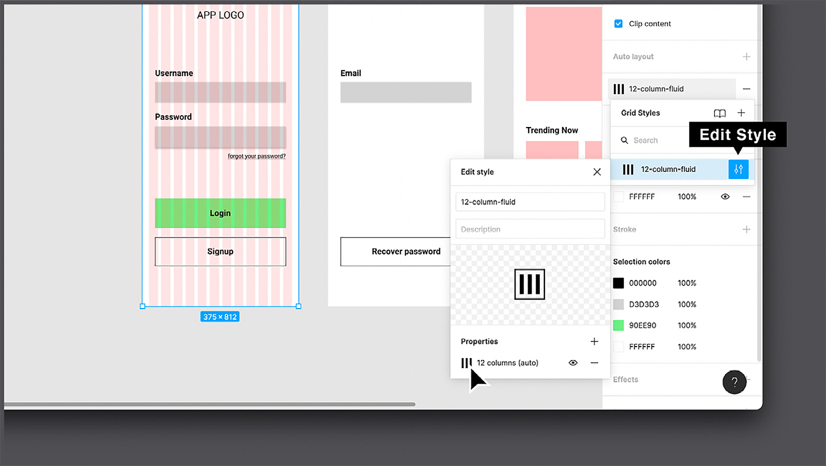
Figure 5.16 – Editing a grid style
After you have saved your changes, all the views to which the style was applied will undergo the same modification. See how easy it is, and again in a few clicks!
Note
You can still change an individual grid. To do this, select the frame you need and click Detach Style, the broken chain icon next to the applied style. It will unlink the selected frame's grid from the grid style.
So, you've just created your first style, which will be one of many – great work! Now, let's select a font for our project and convert it to a style as well.
Creating and managing text styles
In creating a grid style, we saw all the advantages and possibilities that the style function can provide. Our application will contain quite a lot of text on each page, so we need to have text styles as well. As before, the first thing you do is create a foundation for the text styles that you will apply to the text layers in our interface. If you're feeling overwhelmed right now, remember that you don't need to create all the text styles at once. It is normal practice to integrate new styles later if the original core of the style is well organized.
The choice of fonts for any project should, of course, be based on research and analysis. You may want to consider one or more fonts (try not to use too many) for the interface. For the current project, we will be using Source Sans Pro, a modern yet simple font that suits interfaces very well and remains incredibly legible even at small sizes.
When working with styles, it is best to have all of the style properties visually displayed somewhere outside of the interface layouts. We can allocate one page for this. So, create the third (and final) page in the file. This time, the page will not be duplicated but new and empty. Rename this new page Styles / Components – here, you will collect all the reusable parts of the UI. On this new page, create a new frame with a preset desktop size (1440 x 1024) and rename it Typography. This frame will be the container for all the text styles you will add soon:

Figure 5.17 – The Typography page
You don't need to add a lot of styles for this project, only the ones that you really need for the app layouts. As for the text style, we'll use multiples of eight and start with the body text (the one used for standard paragraphs). We'll then move on to other text styles in terms of their importance. Follow the next few steps to get it done easily:
- On the Styles + Components page, create five new text layers. It is best to use a pangram as a sample text. A pangram is a sentence that contains all the letters of the alphabet. This way, you will always have a visual display of all the characters of the selected font. One of the most famous pangrams is The quick brown fox jumps over the lazy dog.
- Place these text layers vertically one after the other.
- Starting with the top text layer, assign the following parameters to each text layer:

Figure 5.18 – Styled text layers
After you've finished formatting all the text layers, you can align them if the result looks messy. You can easily do this in the alignment section of the Design panel. Just select all the text layers, click the Align left button, and then in the right drop-down list with a few more options, click Distribute vertical spacing. After these two clicks, the contents of the frame should be arranged perfectly.
Note
If you want to select multiple elements from the Layer panel, you can do so by holding the Command (macOS) or Ctrl (Windows) key.
To finish tidying up your text style container, you can add a label next to each sentence, which is a simple overview of the rules applied to each text layer. It's even better if you combine labels and related texts into groups:

Figure 5.19 – Styled and ordered text layers with labels
It's time to finally create text styles based on this structure, and it won't be much different from how you did it earlier with grids:
- Select the top text layer.
- Click on the Style button next to the Text section label in the right sidebar.
- In the Text Styles dialog, click the + button.
- Give this first text style a name. It can be the same as the label (such as Large Title/ 32px / Bold).
- Repeat the process for every successive text layer.
So, the text styles are set up and ready to be used in our app design. It is important to know that each text style can contain a set of rules regarding font family, font weight and size, line height, letter spacing, text decoration, text transformation, and so on. But unlike other design tools, text styles do NOT include alignment and color. This feature makes text styles incredibly flexible to use, eliminating the need to create text styles for each alignment or color. In the following screenshot, you can see the display of text styles in the right panel of Figma:
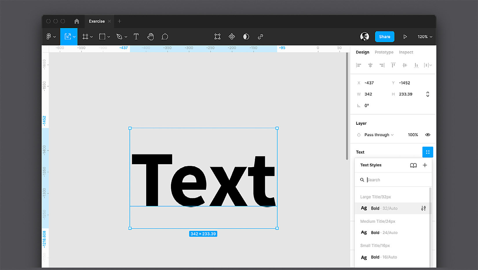
Figure 5.20 – Text Styles
When you feel more confident about your design, you can experiment with creating a complete UI kit that includes styles for any need and can be reused as a basis for your future projects. The rhythm of the font scale is actually a much more complex subject than it might seem. To get the most harmonious scales, you can use ratios, but since not every creative is in love with math, here is a convenient site that can help you with that and take care of all the mathematical aspects: type-scale.com.
Creating and managing color and effect styles
At the moment, our project has styles that consist of a layout grid and typography, so it's time to add the third essential property – colors. Again, in order to make the right choice of color palette of any application or site that you develop, it is important to refer to the artifacts that you collected in the process of research and analysis, namely the mood board in this case. You will see which colors are suitable for our video streaming app project in a moment. But first, let's add a new Desktop frame to the Styles + Components page, next to the Typography frame, and rename the new frame Colors. Then, follow a few simple steps to create color styles:
- In the new Colors frame, add five rectangle shapes of 130 x130 px.
- Place them vertically, at a short distance from each other. To arrange them neatly and make the vertical spacing between elements equal, select them all and use Figma's auto-alignment feature.
- Starting with the top shape layer, assign the following parameters to each rectangle:
- FF5959 as the fill: This will be our accent color, which we will use for calls to action and other important operations.
- 272B45 as the fill: This will be our secondary color, which we'll eventually use on a secondary user's actions.
- 0F1022 as the fill: This will be our background color, which we'll apply to the interface background.
- 8A8C99 as the fill: This will be our inactive color, applied to elements that are disabled for some reason.
- FFFFFF as the fill: This is pure white. This one will be our text color, since the background will be dark, and it will be needed if we want to change all the text colors in one click.
As with the text, take some time to add labels to the side of each square, containing brief descriptions of the color use cases. In addition, you can add a 1px-thin black stroke to all the colored squares to make the light colors stand out from the background easily:

Figure 5.21 – The color palette
Now, as you have probably guessed, all the colors need to be converted to styles. Therefore, you need to select colored squares one by one and create a corresponding style for each of them. You can name each color style the same as its label (such as Accent color). Note that creating a style from the Fill section does not mean that this color can only be used for fill. If you ever want to apply it to a trace or shadow, it can be done without a problem. As with fonts, you may need more colors than you chose at the beginning, so you can include new color styles later. You can add new color styles at any time, if necessary, but it is very important that all colors that are used in your file are always linked to styles, except for a few special cases.
Choosing the right color palette is a skill that comes with experience. Once you have mastered the basics, you can learn more about colors. There are many resources that can explain the psychological meaning of colors, as well as their relationship to different cultures. It is also very important to study the subject of accessibility in depth, which also includes the use of sufficiently contrasting colors to a set of rules so that legibility is adequate, especially for people with visual impairments.
Last but not least, you need to style the effects, following the same pattern. Follow these steps:
- Select the white square in the Colors frame.
- Add an effect from the right sidebar by clicking the + button near the Effects label.
- Click the sun icon to the left of the Drop shadow dropdown.
- Set X to 0, Blur to 15, Y to 4, Spread to 5, color to 82B2DE, and opacity to 22%:

Figure 5.22 – The Drop shadow settings
- Save this effect as a style and name it Light Drop Shadow.
- Now, you can apply this effect style to each of the colored squares, removing the black stroke for a nicer look:

Figure 5.23 – The color palette with drop shadow
This effect can be applied to any layer you want.
Well, you have finally created all the sources of truth needed for our project. In the next chapter, you will learn how to make the best use of styles. Let's take a look at everything you've created so far. To do this, simply click on any empty space on the canvas of the page. When nothing is selected, you can see the list of styles in the Design panel, and from here, you can quickly edit any of them. After making changes to a style, all elements to which it was applied undergo the same change:

Figure 5.24 – grid, color, text, and effect styles
So, your design file now contains three pages, one of which is completely dedicated to styles. Later, you will add other elements, such as reusable components, and after working on the design of our application, you can even reuse this library of styles and components in other projects. You will learn about this and everything else as you travel along this exciting journey!
Summary
As stated earlier, the main goal of a UX/UI designer is not to be creative but to provide an interface in which every user will feel confident, and nothing will distract them from the functionality of any digital product. Thus, you need to make sure your design is intuitive and inclusive. This means you have to be well aware of your user's needs and pains, and anticipate specific cases where your app or website might be used to keep your design consistent and accessible. As you learned in this chapter, even when choosing typography, colors, and effects, you must follow these principles.
Aside from practicing these tools, we now have an idea of how to make the best use of them by converting them to styles. Styles are one of the most important features in Figma, and you've done a great job learning them. From now on, you will discover and practice even more advanced features, and later you will add other properties to your Styles + Components page, such as extra styles and reusable UI elements. Now that you feel more confident using Figma, you are ready to explore its unique and incredibly powerful features. One of them will be auto layout, which you will learn about right away – in the next chapter!