
Chapter 11: Exporting Assets and Managing the Handover Process
At the moment, you have successfully completed the stage of building a prototype of our interface, which you configured and tested in Presentation view and possibly within the Figma mobile application. You have come a long way to get where you are, all the while mastering Figma and comprehending the principles of the design working process. Therefore, we can safely say that your future projects will be easier in terms of working with Figma since you can now not only use all the necessary functions of this design tool but also the more complicated ones, since real projects require much more detailed work at each stage of interface design.
Speaking about working on the really complex products, you need to understand that there is a large team of professionals behind each product, and designers are one of the key players, involved in frequent communication with their colleagues. And this aspect is just as important as what you have studied so far. You can create excellent layouts with a strong user experience, but if things are never fully developed or are released with serious problems due to misunderstandings in the team, your work will instantly turn out to be meaningless. To minimize these kinds of issues, Figma has a set of functions for quickly exporting and preparing assets for handover to developers. This is what this chapter will focus on, and beyond that, you will also learn how to make your design files easily accessible and understandable to both you and others.
In this chapter, we are going to cover the following main topics:
- Exporting from Figma
- Exploring the Inspect tab
- Handing the project over for development
By the end of the chapter, you will have learned how to distinguish Figma's save and export formats, export assets and code snippets, and apply best practices for smooth handover to the development team.
Exporting from Figma
At this point, you have a pretty clear overview of the exact work behind analysis, design, interactive prototyping, and product testing. Now you will focus on the very last stage – working on the handover of all resources and assets, which happens after you have made sure that your design is absolutely ready for it. The first thing that you need to know about is the Figma tools: these allow you to prepare and export the file and individual elements to everyone who will then work on the actual development of the application or website. There are several ways to do this, as well as several formats that Figma offers for it. This and more will be presented to you in this section of the chapter.
What formats are supported?
First, we need to define an important difference between saving and exporting in Figma, as well as other design tools. By clicking on File in the menu bar (desktop version only) or on the Figma logo in the upper left corner and then File, you can save a local version of the project:

Figure 11.1 – Save As .fig… and Save local copy…
This will be a real backup of the source of the project, which you can store locally or possibly share with third parties by transferring the product from one account to another on a permanent basis. Thus, saving is equivalent to working with source files that support the ability to open and edit whatever you have created in Figma (excluding file comments, rules/permissions, and version history – these won't be included in the saved .fig files). Exported assets, as opposed to saved assets, will be completely independent of Figma, and therefore, when you export part of a project or the entire project, you create a copy that is no longer native to Figma.
The export option is available from the same File menu, just below the save options. The first function, Export..., allows you to specify your choice, and you will explore it in more detail later in this chapter. Another option, Export frames to PDF, exports a single PDF file containing all the frames of the current page, even if they are of different sizes. PDF (Portable Document Format), as you probably already know, is an extremely versatile format type, but above all it is absolutely compatible with any system, old or new. This format is very convenient as it can collect text, fonts, vectors, and images.
In addition to PDF, Figma allows you to export some of the most common formats, such as these:
- Portable Network Graphics (PNG) – a lossless raster format that keeps eventual layer transparency.
- Joint Photographic Group (JPG) – a compressed raster format that gives a smaller file size but reduces quality.
- Scalable Vector Graphics (SVG) – a vector format that can be scaled without loss of quality since it is based on numeric values and coordinates. It is not pixel-based and does not work with bitmaps.
Now, after this brief overview of the formats available in Figma, let's move from theory to practice and learn how to export single and multiple assets.
Single- and multiple-assets export
Besides the function of exporting an entire document or entire pages of a file, you can also export only some parts of a design and collect assets used in a composition to pass on to the development team or for any other purpose. This operation can be performed by selecting items individually or in bulk according to your needs. Let's start by exporting a single element.
It happens quite often that you need to provide the development team with a set of icons used in your design, so now you will try to simulate this action with a single icon. To do this, go to your Hi-Fi page and follow these steps:
- Open your layouts and select any icon, such as the star, provided in our Content Detail view. Pay attention to the right panel, where the Export section will appear, which is currently inactive. To activate this feature, click the + next to it.
- Now Figma will show you some of the options available for exporting this single asset. Since this icon is vector, you can choose the SVG format to keep it editable, or alternatively, you can save its bitmap but preserve transparency by choosing PNG:

Figure 11.2 – The Export section
- Next to the format selector, you can see the scale setting. Click 1x to open a list with some asset scaling presets.
There are several choices with different letters at the end of each value. Values with an X at the end act as a multiplier, and those with a W and H set the object to a fixed width and height, respectively. For example, if you now choose 2x, the icon will be proportionally twice its current size and therefore heavier in terms of file size. This may be required to avoid visual artifacts and blurring for some devices that actually have a higher pixel density with the same screen. You can also enter your own scale value in this field.
- When you're done, just click the Export (+ Layer Name) button, choose where to save this individual asset, and confirm, and your file will appear right there in just a few seconds.
Note
You can add more than one Export option to each item by simply clicking the + button in the appropriate section on the right sidebar. This allows you to easily export the asset in different formats with one click, or export in the same format but at different scales, such as 1x and 2x.
However, after you have exported an icon, you will notice that the export settings remain active with all fields filled in, which is certainly handy if you want to re-export the same icon later. But what's even more useful is the ability to customize the export options directly during the design process, so that all the elements will be immediately ready for the export phase. Thus, you can preconfigure the export parameters for you and anyone else who would like to export assets from the file, even with view-only permissions:

Figure 11.3 – Export section for users with view-only permissions
One of the main benefits of this feature is that developers can remain autonomous in exporting assets directly from Figma. And this is not the only advantage of this.
If you set the correct export options for each asset (for example, PNG format with 1x and 2x scales – for each icon, for all card images – PNG and maybe some full parent frames in PDF to have a quick preview of the interface), each element will be ready to be extrapolated from Figma, and you can even do it with one click. Exactly for this purpose, there is the previously mentioned Export... function, which you can find by clicking the Figma icon menu at the top left and choosing File. To access it faster, you can press Shift + Command + E (macOS) or Shift + Ctrl + E (Win) and a bulk export window will appear. This dialog collects all the assets on the current page with relative settings set for each and performs a bulk export:
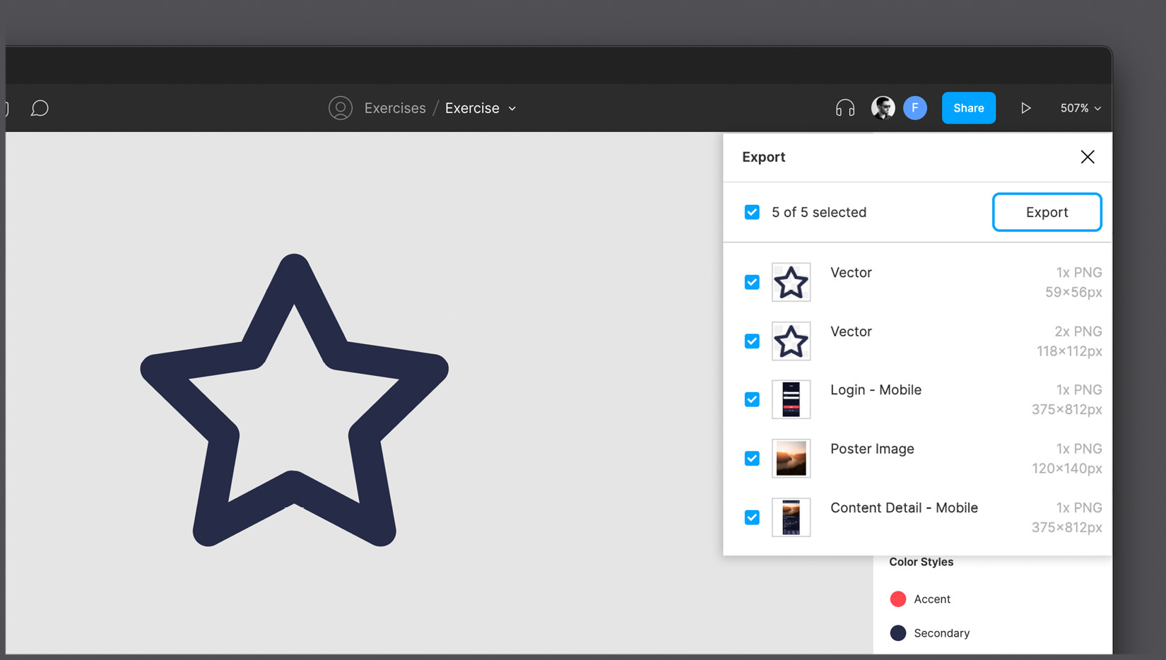
Figure 11.4 – Bulk exporting assets
As you can see, the list is presented as checkboxes, so you can optionally also deselect some of the assets that you do not want to export at the moment. Alternatively, you can select one or more items on your canvas, and then run the Export... function, and the window will contain only those selected items. It also works for selecting a single layer that can contain multiple assets inside. For example, if you select the Content Detail frame and then open the Export dialog box, it will show only the exportable assets contained in that view.
Let's recap all the possibilities Figma offers you for your assets and files. So, there are five formats – FIG, PDF, PNG, JPG, and SVG – for saving or exporting the elements you want. The first one is for downloading a local copy of your file, and its further use can be exclusively in Figma. Other formats are easy to open outside of Figma and are completely independent after export, so you can share them without any special restrictions. Each format has both advantages and limitations, and your choice depends on your needs and the goals of that export. Also, you can export items individually or in large quantities, as well as exporting the same item in several formats and scales with one click, if you have configured everything correctly beforehand. Finally, you have learned how to make it easier to work with elements that you might need to share by setting all the Export options for them right at the interface design stage. Moreover, in this way, you open up the ability to others to freely save these elements from Figma, even for viewers.
Take the time to explore export functions a little more on your own if you need to. When you're done, you'll move on to exploring the last tab of the right panel, namely Inspect.
Exploring the Inspect tab
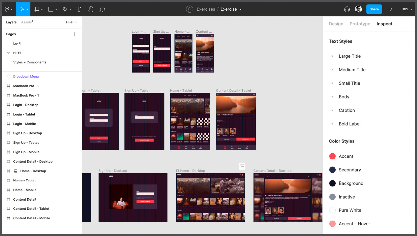
As you can see, the right panel contains a huge number of functions, settings, and tools. It took you several chapters and a lot of practice to get to know it at a good level. All that's left for now is the last tab of this panel, namely Inspect, and in this section, you will fill this missing gap and explore it in detail. The main peculiarity of this tab is that, unlike Design and Prototype, it is also available to those with only view permissions, so it is a great tool for developers and external collaborators. This is what this tab looks like without any active selections:
It basically consists of two parts: one is dedicated to Styles and Interactions and the other is about Code snippets, and now we will dive into both.
Styles overview
Let's start right off with part of a complete overview of the entire Styles library, which you can see in the Inspect panel with no active selections. This is a complete collection of Grid, Text, Color, and Effect styles present in the current file. This overview makes the Inspect tab incredibly valuable, especially when you consider that it is visible even without file edit permissions.
Note
If you have set any interactions on a particular frame before, in addition to styles, the Inspect panel will display an overview of the transition properties.
By clicking on the Edit button (it appears when you hover over any listed style name), regardless of the style's type, you can view its detailed information, that is, the associated parameters and any descriptions you added during the style creation stage, which helps you understand when it is best to use each style:

Figure 11.6 – Adding a description to a color style
The Inspect tab can not only display information about the entire file as a whole but also, above all, about individual layers as well. Let's now see what will happen in the Inspect tab if you select any item on your canvas. Click on any layer and Figma will show you a quick summary of all properties applied to it. For example, after selecting a Button element, Inspect looks something like this:

Figure 11.7 – Inspecting a button
Of course, there is no new information that you cannot get in the Design tab, but what Inspect does is organize it in a simple way, and, above all, this summary is available to anyone with access to the file. This way, you can get information for each individual layer in the file, from the simplest to the most complex. And, as you might have guessed, depending on the type of item selected, the summary will contain different properties. Here's what you'll see about a Text layer, for example:

Figure 11.8 – Inspecting a Text layer
Remember that the Inspect tab is for informational purposes only and is read-only, regardless of your file permissions. This means that it is impossible to change any value here or adjust any settings, except for the name and description of the styles in the library (for editors).
Design to code
As a designer, you will most likely rarely use the Inspect tab, as it is primarily intended for developers. Of course, the property summary can be useful in other cases as well, but its main purpose is to provide the development team with all the values they might need to write the actual code. At the beginning of your journey, it was mentioned that Figma may seem limited in comparison to, for example, Adobe Illustrator, but the truth is that these products are slightly different and complementary. In Figma, the limitations are dictated by a specific need, namely the ability to easily convert everything we design into code. All elements you create in Figma are automatically converted to the best, mostly web, rules using the latest HTML5 and CSS3 standards. So, if, for example, you can't find a specific filter or effect in a code snippet, it might not be possible to reproduce it in HTML and CSS, so Figma won't reflect that.
Does this mean that what designers create in Figma is already automatically turned into a complete and functional web product? No. For these purposes, there are, for example, plugins that export entire interfaces in HTML/CSS, React, and other programming languages, but this way is still recommended exclusively for really basic products such as quick landing pages or simple testing prototypes. In this context, automatic systems never guarantee high quality as with what we can achieve with targeted development.
However, what is really useful in the Inspect tab is the ability to select specific items and inspect, copy, and use the same properties for different purposes. For example, after clicking on any Button element, the following will be displayed immediately below the summary of properties:

Figure 11.9 – Code snippets for the Button element
In the Code section of the Inspect panel, CSS rules are set by default, as this is the most useful and commonly used option. CSS stands for Cascading Style Sheet and is a style rule sheet that combines the structure created in HTML (which serves to create the "skeleton," the foundation of your layout) to structure and style a website or web application. What is especially remarkable about it is that the highest-quality code is achieved here when using Auto Layout at the design stage. In fact, Auto Layout corresponds to a 1:1 Flexbox web system and therefore allows you to already have at your disposal all the rules you need to create the prototyped layout. If you didn't use Auto Layout, values would be suggested with absolute value coordinates in Frames, which should be avoided where possible, as this results in unresponsive interfaces. The CSS rules that we have access to range from color rules to rules about text, effects, sizing, and positioning. Each property and function presented in the Design tab is equivalent to a rule that you will find here later.
As you can see, the Code section can make web development a bit easier. But what if instead of a website, we need to develop mobile applications? It is also possible to get the code for these purposes, just click on the CSS option and a dropdown will appear where you will find both the iOS and Android options and thus access small snippets – based on the selected level – of the code in Swift and XML respectively:

Figure 11.10 – Switching to iOS and Android code snippets
But nowadays, these specific mobile languages, including SwiftUI and Flutter, are constantly undergoing major changes due to their rapid development, and therefore are less interesting and useful than their CSS counterparts.
Now you can see why the Inspect panel is made primarily for developers who typically use Figma to get the information they need to write code. But still, this does not mean that you should not explore this tab and just ignore it in your work, because the better you know its functionality and capabilities, the better you will be in communicating with the developers on your team. A good exercise would be to study Inspect as a viewer to see how things look through this lens. To do this, you can open your file in incognito mode in your browser using an extra Figma account and the generated shared link. It may be that you come across new discoveries and surprises!
In the next section, you'll learn how to make your design project in Figma even more development-friendly, and you'll find out why it's important to keep it that way even if the product is already on the market.
Handing over the project for development
Your journey was as exciting and interesting as it was intense, wasn't it? You have gone through the important steps in designing a generic product. Of course, all phases have been minimized to keep the overview for you as complete as possible. Nevertheless, we can say that at the moment, you have keys with which you can approach any other projects on your future path, which will be devoted to the creation of real products, and therefore the designs will be much more detailed and elaborate. In addition, it is likely that you will be a part of a whole team working on a complex digital product, and it will also be a very interesting journey in which you will combine tools that you already know and discover new, more advanced features.
So, does our work really end here? Can we really consider the project closed? Of course, even after testing the product, getting approval, and providing the developers with the necessary resources, there are still very few cases where a designer actually "stops" working on something that has been created. So, what will happen next?
Of course, there are no universal answers to this question, and it all depends on the type of your job and whether you are a freelancer or an in-house designer. But while there can be many scenarios, this section will give you a general overview of how things usually work if the designer is part of the team that manages the entire product or a part of it.
What's next?
In the early days of digital technology, professionals were only hired to design a product, and once it was developed, it was no longer necessary to maintain a working relationship. Often, designers were not even providing the source files of the project; instead, they were only sending representative images of how the product should look in the end. Year after year, the value of digital products increased, companies began to invest more and more in them, and with that, the approach to design and development completely changed.
A digital product today represents a full-fledged ecosystem. Research and analysis are its foundation, and the design and prototyping phases are constant aspects that make it come alive as the product will always be updated and improved. This is what defines a successful product – one that is built based on flexibility, modularity, and continuity in its development.
And for this reason, more and more companies and agencies are no longer starting with the product itself, but with a design system, or rather, a system of building blocks that helps create one or more products with scalability in mind. We have also built the foundation for a modest design system, chapter by chapter, by structuring typography, colors, grids, and components. The design system grows with the product; it is constantly expanding and evolving through the creation of new blocks and may even contain more abstract aspects of the product, such as tone of voice, accessibility, inclusivity, and more. In addition, the design system can be used to create a range of products that fit together to provide more than one service without making the user feel pushed into an unfamiliar environment.
Speaking of design systems, we must differentiate it from UI kits. This comparison would require a separate book, and we won't go into too much of it, but you should have an idea of the main principles of both. A UI kit is a collection of design elements such as components and styles, and at this point, you might think that this is quite the same as a design system. However, there is a fundamental difference between them, which is important for you as a designer to understand. As mentioned earlier, a design system grows in parallel with the product and includes both standard and specific elements created exclusively for it. Moreover, a design system can go further and provide rules for more aspects, such as the means of communication with the user, tone of voice, and others. Apart from the design team, other professionals can contribute to it, such as copywriters, psychologists, marketers, and so on. UI kits usually have little to do with a specific product, although a UI kit can also offer a set of text styles, colors, grids, and components, all of which can be easily reused for various apps or websites, perhaps with some style customization or other minor changes. A UI kit is often used as a quick way to create generic digital products, or as a starting point for building and customizing your own design system.
Thus, a UI kit can speed up the initial process, but as your product gets more complex, you run into tough constraints, so it is worth investing in the creation of a design system.
Documenting, reiterating, and improving
It is normal that while a project is growing, improving, and developing, the composition of the team that works on it may change, and the number of professionals can also increase. At these times, project files and resources are frequently and repeatedly passed from hand to hand among other designers and developers. You should never underestimate this aspect and always take it into account in your future work process. What you can do is organize your projects, files, and folders, always clear them of useless items, and rename layers, styles, and components in the best way. However, this is not always enough. Especially when you are working on a product that has a design system based on styles, components, and variants, it is very important that they are all clear, transparent, and documented.
But what exactly does this mean? Well, you can make it easy for anyone new to the project by specifying when to use each library item specifically. Thus, if you go to the Styles + Components page and select any element – for example, Carousel Item – you can add a code snippet for it, or perhaps indicate the use case in a few words or sentences for this component:
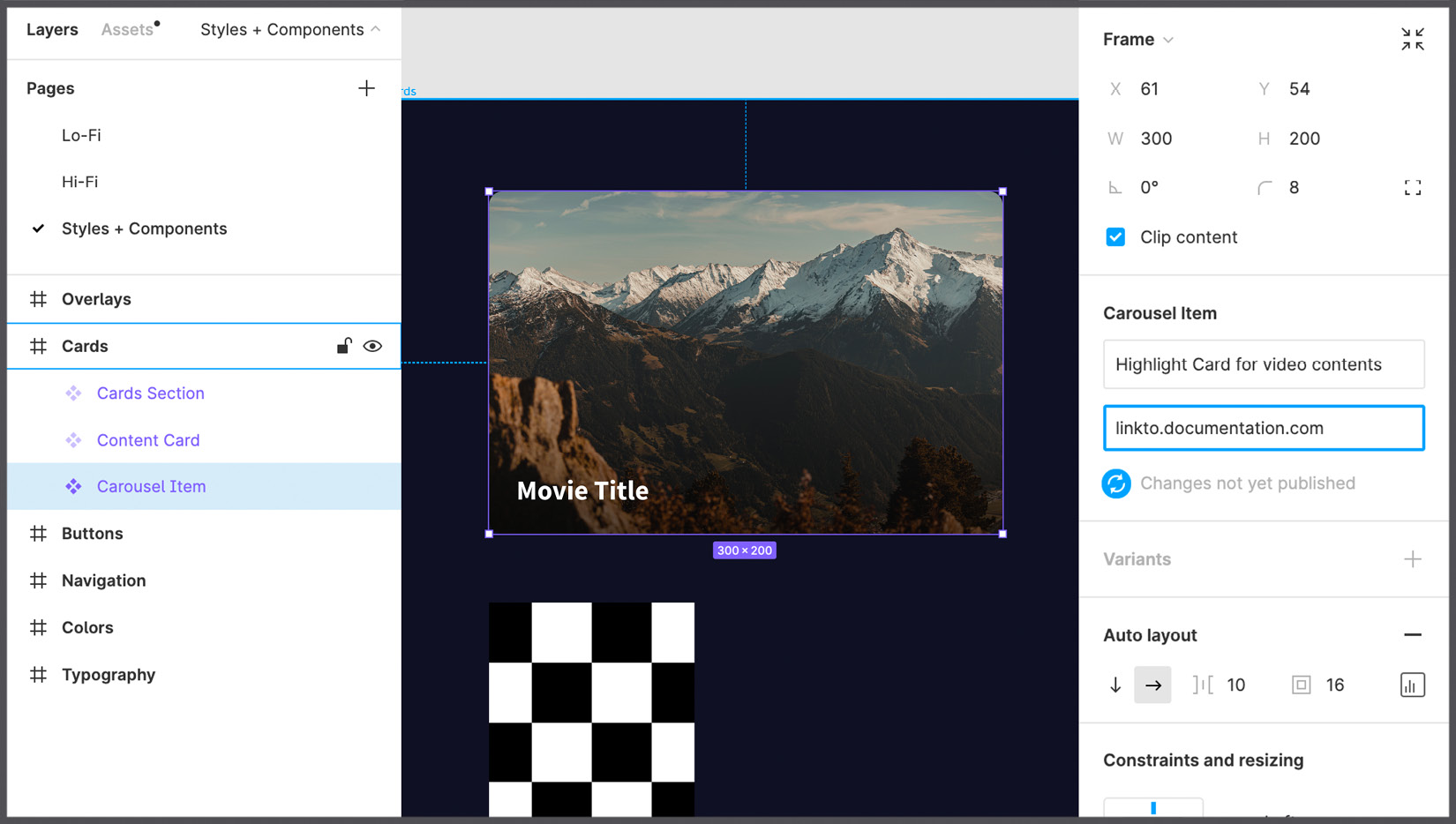
Figure 11.11 – Adding external documentation to a component
For more complex cases, you can add a direct link to any more extensive documentation that can be created in an external platform, such as Notion, Zeroheight, or even in a separate Figma file, depending on the needs of the project.
In addition to components, it is best to apply accompanying information to styles as well, where you can describe the purpose of a specific typography or color. In larger projects, even text styles, colors, and spacing are converted into so-called design tokens. In fact, thanks to design tokens, Figma styles can be converted to code in real time and, in the case of some changes, they are automatically replaced in all instances of them in the actual source of the application. This is a very advanced concept, but it's worth exploring with the developers on your team.
As you can imagine, there is always room for improvement for any product, which is great because you, as a designer, can strengthen your skills, get new ones, and grow professionally. And even when you've created a mature product with an incredible design system (which itself takes years of work), there will always be something to change, develop, and improve. This is due to the fact that user needs are constantly changing, technology is developing at a tremendous speed, and standards are often revised. Therefore, it is useless to try to create the perfect product right away, as you risk never going into the release phase. When you feel that a product is well designed, it's important to launch it to market, study user reactions, conduct market research with your target audience after launch, and see if everything is working as expected. Your preliminary analysis may seem perfect in theory even after a few tests, but in practice it may fail due to unforeseen events or miscalculated variables. But you should always use this as an opportunity to take advantage of the new data that the market is providing to solve critical problems.
That way, even when a product is doing well in the market, the designer's job is never over, and you will continually repeat the design process and try to improve what you already have. There will always be many questions and problems to be solved. Is there any way to improve the conversion rate? Can it be influenced if you move a button or change its color? At this point, there is a great way to get useful data – an A/B test, that is, creating another version of the interface that will be compared with the current one and presented to a group of people belonging to the target audience in order to understand whether it will perform better or worse in the market. Large companies conduct such experiences in an expensive way, releasing slightly different versions of the same product. You can see for yourself by opening the Facebook mobile app on your device and on a friend's one: do you have the same interface, the same icons, the same arrangement of the elements on the tab bar? Probably not. As you can see, the designer always has something to do, and design in general has a huge impact on the life of the product and its users.
As you can see, being a designer means always being ready to take on challenges, knowing that there is always a way to improve the user experience and meet the users' needs on a deeper level. It's also important to empathize not only with your audience but also with your teammates by giving them your files in an organized and understandable way. Thus, it will be much easier for you and other designers as well to navigate through documented and descriptive resources rather than through something messy, especially if you need to create a design system, which is almost inevitable and is indeed necessary if your product is constantly evolving.
Summary
In this chapter, you discovered that Figma can not only be an efficient and fast design tool but goes beyond that, considering the needs of other team members who might work in collaboration with designers. Thus, you learned how to export a whole file or its individual elements from Figma in several possible formats, as well as how to set up elements for subsequent export while still at the active design stage. Also, you have finally explored the functionality of the last tab of the right panel, namely Inspect. In addition, you learned about what a design system is and how to document and assign descriptions for styles and components in your projects so that everything is well organized and easy to use.
In the next and final chapter, you'll see how to extend Figma by discovering the amazing Figma Community, where you can explore hundreds of cool UI kits, templates, and plugins from creators around the world. Using Figma Community resources, you can not only speed up and optimize your workflow but also find inspiration to create something amazing yourself!