Chapter 3: Getting to Know Your Design Environment
In the previous chapter, you discovered the basic concepts of the UX process, which is without a doubt an essential part of any design project. As you work, it's best to keep all research results, analysis data, and other attributes nearby so you can always check if you're on your planned design path. Remember that the usability and clarity of your final user interface will directly depend on the quality of your UX work.
However, creating a user interface is also a tricky and time-consuming part of design work. You might have done some excellent research and collected enough relevant data, but your actual design work may not always be smooth and easy. In real life, anything can happen – maybe the chosen style will not be approved by the customer, or maybe your team decides to add a tablet version of your product. This book cannot anticipate all the challenges a designer might face, but you will definitely learn how to make your user interface work faster and more efficiently.
One of the key components of optimizing your workflow is knowing as much as possible about the capabilities of your design tool so you can get the most out of it. What basic and advanced features can it provide? Where can I find all the possible operations with elements? How to organize all layers and assets and get quick access to them? This and more is what you'll learn about using Figma in this chapter.
In this chapter, we are going to cover the following main topics:
- Starting a new project from scratch
- Overviewing the tools in the toolbar of Figma
- Learning the functionality of the left panel in Figma
- Exploring the right panel in Figma
Starting a new design project
In this chapter, you will temporarily step away from analysis and research work in FigJam files and instead discover Figma's essential tools and functions. You will find a lot of material to learn, and it's completely normal to feel overwhelmed by all this new information. But the good thing about this chapter is that you can refer to it from time to time when you're unsure of any of the basics of Figma. So don't worry about memorizing all the concepts of each function; you will see how everything works later on in the book, and each tool and feature will be explained in a more practical way.
Design files
You already know that Figma has two types of files – FigJam and design. You've learned about FigJam files in detail in the previous chapter. This time you will go back to the file selection and make another choice, namely to create a new design file.
To create a new blank design file, you have to open the welcome screen and click on New design file right on the top.
If you still have FigJam open with the previously created files, to go to the welcome screen, we just need to click on the Figma logo in the upper left corner and select Back to Files from the drop-down menu. Then, just proceed as previously described. However, if you are using the Figma desktop app, you can skip returning to the welcome screen and immediately press the + button to the right of the current file tab. Figma will prompt you to open a new project page where you can choose the type of new file – FigJam or design. You can also hit Command + T (macOS) or Ctrl + T (Windows) to quickly open a new tab, like in your browser, and you will be given a choice for your desired file type:

Figure 3.1 – A new file from the tab menu
Once you open a new design file, you can finally see Figma as it is, which is significantly different from what you had earlier with FigJam. It is a much more complex yet powerful working area that will allow you to create truly stunning masterpieces.
Note
Design and FigJam files can be easily recognized in the Drafts and Recent folders by their different colors and icons.
Frames and groups
When you first launch a design file, you see an empty gray space in front of you, framed by panels on either side and a toolbar at the top. At first glance, so many areas of different functionalities may seem complicated and almost intimidating. It is normal to feel that way because it is not a simple canvas but a place where you will create the entire interface of your project. Don't worry, you will explore all the sets of tools in Figma step by step. For now, the only thing you can interact with in an empty file is the top toolbar, which will be your starting point.
To start using Figma to its fullest, you need to create an artboard. You may be familiar with this concept from other design tools. However, Figma does not have standard artboards but rather something similar yet much more powerful – frames. While they share basic traits with artboards, frames differ in functionality. They can be nested, and also have auto layout, layout grids, and all prototyping functions set. You will learn more about this later, but for now, let's stop here.
What is a frame? In fact, it is a container. Your design must contain something, and it is frames that provide this opportunity. You can use custom-sized frames or choose practical presets for the most common standards, such as mobile devices, tablets, and desktop resolutions. So, it all starts with a single frame:
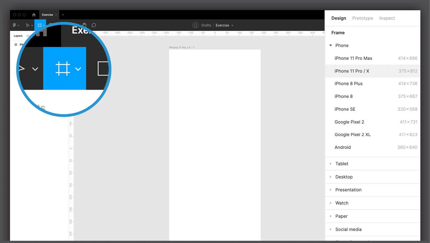
Figure 3.2 – The Frame tool's presets
To create a frame, you can use the Frame tool from the top toolbar (using the F or A shortcuts) and proceed in three different ways:
- Click any blank area on your workspace to create a default 100 x 100 frame.
- Click and drag with your cursor to create a custom-sized frame.
- Click on any preset size on the right panel to automatically create a frame of the appropriate size.
As you can imagine, the third option is most useful for immediately starting your design without having to search the internet for screen sizes of various devices. For example, clicking Phone | iPhone 11 Pro / X will immediately create a 375 x 812 frame. You can add more than one frame in your workspace, and no matter how many there are in your file, it is unlikely to slow down Figma.
But frames are not just artboards. They can act as containers as well, letting you nest as many elements or any other frame as you like. To quickly create a frame around one or more objects, simply select whatever you want to put together and press Alt + Command + G (macOS) or Shift + Ctrl + G (Windows). However, there is an alternative way to combine objects, and this method is called groups. Understanding the difference between frames and groups can be very confusing, as they share some basic functions, and you may think they are interchangeable, but this is mostly untrue. You will likely be using frames more often, since they offer a bunch of extra features, but there may be situations where you don't really need their advanced capabilities. Instead, you will be satisfied with something simpler, such as a group, that just combines several objects into one layer without flattening them and allowing you to maintain a fixed relationship between inner elements when scaling. If you want to create a group of objects, we just press Command + G (macOS) or Ctrl + G (Windows) after selecting the desired elements on the canvas. We can ungroup at any time by pressing Shift + Command + G (macOS) or Shift + Ctrl + G (Windows).
To visually understand frames and groups, combine two shapes into one frame and do the same with a group, and then try resizing the two containers. In the group, the shapes will be resized accordingly, while in the frame, what is scaled is only the frame itself, while the shapes retain their original size and position. Over time, as you progress through the chapters, you will fully understand the potential of frames, one of Figma's exclusive features, and this will lead you to have a clearer view of concepts that may now seem very complex.
Interface overview
Now that you've added the first frame on a gray backdrop, you may have noticed that the interface now provides you with a lot of new functions to explore. Now, it may seem more similar to many other design tools you may have used. However, compared to Adobe Photoshop, for example, Figma may seem like a tool that offers a rather limited number of features, and this may undermine your belief that Figma is still the best choice.
Of course, as mentioned earlier, it is also possible to create interfaces using Photoshop, but you will inevitably run into limitations, such as poor smoothness with numerous artboards and, above all, a lack of tools dedicated to prototyping. If you, for example, want to apply a watercolor effect to an image in your design, Figma will not be suitable for such purposes. However, it's important to emphasize that Figma has the essentials, and in most cases, that's pretty much all you need to create a complete interface. As a flexible collaboration tool, Figma can easily convert anything you create in it into web or mobile app development code, which is the point:

Figure 3.3 – Figma effects versus CSS effects
For example, if Figma allows you to apply a blur effect to an image, it's only because that effect can be applied in the same way with a CSS rule. However, there is no filter that can be applied with the code to apply the watercolor effect. This way, Figma guarantees that everything you design can actually be reproduced in code without much difficulty. Does this mean you can never apply a watercolor filter? Not at all. Without any problem, you can directly import an image that has been previously filtered into Figma. Adobe Photoshop, as well as Adobe Illustrator, are tools that can be perfectly combined with Figma to get more impressive results. However, using Figma as our main tool saves you from mistakes in design that can lead to problems in product development. As a result, you don't need to have any coding skills or worry about any technical constraints to create reliable layouts.
In addition, to make the experience even more user-friendly, Figma makes the most of a context-sensitive interface. This means that you will never see, for example, a left-align text icon unless you have selected text that can be aligned at that point. It is a methodology that more and more software has implemented in recent years, providing the user with the right tools and functions at the right time. Of course, for those of us new to this kind of UX, it can be difficult to find what they expect, but it really is only a matter of hours until you can no longer live without it:

Figure 3.4 – An example of context-sensitive options
So, if you can't find a specific feature, it probably isn't available to you at the moment. In such cases, you should check whether you missed any steps or selected the wrong element. Everything becomes extremely simple and clear, and errors are minimized as much as possible.
Now, let's get down to exploring the interface piece by piece to get an idea of the tools and functions that Figma provides.
Exploring the toolbar
You'll start by exploring the top toolbar – this is where you'll find all of Figma's basic tools and settings. For the most commonly used basic tools, try to use right from the beginning as many shortcuts as possible because it will greatly improve your workflow.
Main tools
Figma divides its core tools into several sections, all of which you can see in the top bar. You will get an overview of all the sections in order, from left to right, and start by exploring the main set of features.
A – menu
The Figma logo in the upper left corner hides a significant drop-down menu that opens when you click on it:

Figure 3.5 – Figma's main menu
This is the real main control center where you can find import, export, select, display, and many other functions. However, most of these features can be accessed in other ways. For example, anything on the Text menu is usually displayed in the context-sensitive panel (on the right) when any text is selected. It is not necessary to open each of the points contained here now, but you will try them in practice from time to time in the corresponding activities.
B – Move
This is the main tool that you will undoubtedly use the most. You can use it to select, move, resize, and rotate any element on the screen, including frames. By clicking and dragging, you can draw an area that will include and select all items inside it. The Move tool is quickly accessible with the V key on your keyboard, but you'll notice that Figma itself will automatically return you to this tool when you're done with any other tool:
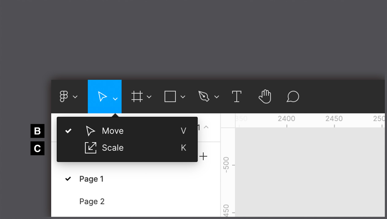
Figure 3.6 – The Move and Scale tools
C – Scale
Like the Move tool, the Scale tool (to quickly switch to this function, use the K shortcut) is used to resize any element in your working area. But the Scale tool works differently – it resizes any object in proportion to its original dimensions or the frame in which it is nested. To understand this better, type some text by pressing the T key, and then select and enlarge it with the Move tool. You can see that only the textbox will be larger and not the text itself. Instead, if you use the Scale tool, the font-size property will resize to fit the textbox.
D – Frame
As you know, with the Frame tool you can create a container by choosing from the available presets or by drawing a custom rectangle. Since this is one of Figma's core tools, you will be using it very often. You already have an understanding of frames in Figma, but you still have a lot more to learn about them, which you will do later in this book. For now, remember the useful keyboard shortcut for quickly adding a frame onto your canvas; there are two options – the F and A keys. Regardless of which one you choose, the result will be the same:
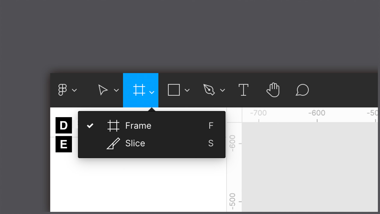
Figure 3.7 – The Frame and Slice tools
E – Slice
This is perhaps the least used of all tools, except in very special cases. The Slice tool allows you to select any areas in your workspace and export them with everything they visually contain. This tool comes from some old website design methods, so don't give it too much of your attention.
F, G, H, I, J, and K – shapes
This is a set of tools useful for creating all kinds of shapes, from simple lines to star shapes. Each of them has its own specific editing properties. For example, a line can become an arrow by changing the appropriate option in the context-sensitive right panel. Also, you should keep in mind that all shapes created this way are vectors, so you can easily modify them manually any way you want. You will explore shapes in detail in the next chapter:

Figure 3.8 – The shape tools
L – Place image…
If you need to quickly add an image to your workspace, click the Place Image… tool and a dialog box will appear, where you can select an image to import from your computer. Alternatively, you can directly drag and drop an image from a folder on your computer to your workspace.
M – Pen
This one is as easy as it is powerful. With the Pen tool, you can draw any shape using so-called Bézier curves, from a simple line to any abstract element. And all this will be strictly in the vector. While a traditional raster image is composed of a grid of pixels, a vector creates shapes using primitives and mathematical calculations. This allows you to draw simple or complex illustrations that can be scaled to any size without loss of resolution. The P keyboard shortcut for the Pen tool is undoubtedly worth remembering:

Figure 3.9 – The Pen tool with a Bézier curve example
N – Pencil
This is a vector tool like the Pen tool, but it doesn't have a curve system for drawing shapes. The Pencil tool is actually for freehand drawing but with the advantage that lines and curves are automatically enhanced and softened after you stop pressing the mouse button to end drawing. This can be useful, especially if you want to use Figma as a digital whiteboard or take quick freehand notes.
O – Text
The Text tool does exactly what you'd expect, allowing you to add text to your design. A shortcut for inserting any text is the T key on your keyboard, which you should definitely keep in mind. What's important to note about the Text tool is that there are two different methods for entering text. When you click anywhere on the canvas, the variable-width text is inserted into an external box that is sized based on the amount of text it contains. If you click and drag instead of a short click you will have a fixed-width textbox, and the entered text will not extend beyond the fixed space:

Figure 3.10 – The Text, Hand, and Comment tools
P – Hand
This tool allows you pan around the workspace using your mouse or trackpad, preventing accidental selection, repositioning, or any other impact on objects on the canvas. To activate the Hand tool, you can select it from the toolbar, but there is an easier and faster way to switch to it. To do this, you can press and hold the spacebar on your keyboard. This is a much more practical method that will definitely save you time. Imagine that you are currently using the Move tool, but from time to time you need to move around the board without affecting objects on the screen. In this case, you can simply hold down the spacebar to temporarily switch to the Hand tool. As soon as you release the key, you will automatically return to the Move tool. Also, if you are working on a trackpad, just swiping on it with two fingers will allow you to pan over your canvas.
Q – Comment
You should already know this one from working with FigJam. The Comment tool, which can be recalled with the C key, lets you click anywhere on the workspace and leave a text comment. All other users who have access to this project will receive a notification and therefore read what you have written at any time. All comments in the currently open file are visible only when the Comment tool is activated.
Settings and more
Now that you are familiar with all the basic tools, let's move on to looking at the rest of the functions located on the toolbar.
R – project title
"Untitled" is not the best name for a good organization of work, is it? To rename a file, just click on the current heading and enter a more appropriate and descriptive one. By clicking the drop-down arrow to the right of the title, you can access a number of additional actions, such as duplicating and deleting a file, or changing the path, which allows you to convert the file from a draft to a team project. Here you will also find version control – that is, the ability to access all saved files created in the current project and, if necessary, restore the old version. This feature saves up to 30 days of history when using the free starter plan, while there is no limit for the paid ones:

Figure 3.11 – A project's settings
S – active users
Here you will always have a real-time overview of the online users who are currently in this file. If you click the avatar of another active user, you activate observer mode for yourself, in which you can no longer independently move around the workspace, but you will see exactly what the selected user sees and does:

Figure 3.12 – The Collaboration, Testing, and View tools
T – share
This is a gateway to the many sharing opportunities that Figma offers. When you click on the Share button, a special dialog box will open where you can not only check the complete list of people who have access to this file and the permissions they have but also add new ones, or get a sharable link that allows you to invite anyone to the project. From here you can also make your project publicly available to the Figma Community. You will explore this opportunity in the last chapter of the book.
U – present
This is a function that will bring your design to life, allowing you to view both static previews of your chosen frames and complex interactive prototypes. The viewer opens in a separate tab and acts as a separate file, so you can share the preview with selected people or publicly while keeping the project source safe for yourself.
V – zoom/view
What you see here numerically is the current zoom value set in your workspace, and it changes in real time as you zoom in/out with your mouse wheel, pinching and zooming on a trackpad or with + and - keys on your keyboard. Clicking on it opens a drop-down menu dedicated to zooming and display settings, where you can not only use predefined functions to change zoom values but also manually set them by entering a number. There are also several toggles for options, such as the ability to activate or deactivate rulers.
Quick shortcuts
As you can see, Figma's top bar is the source of its core tools, some of which help you add elements to your design; others are for working with in your workspace. No doubt you can call this area very feature-rich. But the more you practice, the more you will understand how easy it is to find and switch from one tool to another. Your workflow will speed up even more if you implement the use of keyboard shortcuts in your daily work. Start with the easy ones and then little by little add more complex ones.
You can always check out all of the available keyboard shortcuts listed right in Figma, so you don't even need to consult the tutorials on the website or google anything. Just click ? in the bottom right corner and select Keyboard shortcuts, or use the Ctrl + Shift + ? key combination, and you will see a hotkeys panel sorted by the functions they run. Those filled with blue mean that you have already used them at least once; the gray shortcuts are those that you have not yet tested out:

Figure 3.13 – The shortcut helper panel
So, now that you have a basic understanding of the general features of Figma and can add something to your workspace, it's time to see where you can access all the layers in your files.
Exploring the left panel
Learning Figma's tool sets can be challenging, but it is important to have at least a basic understanding of the features so you can quickly get started using them. Don't worry if you still feel insecure every time you launch Figma. You will soon learn the concept of each tool in a real workflow. However, tools are just one part of everything to learn in Figma. It is equally important to know how to work with layers and assets in your project. All of these will be displayed in the left sidebar, so let's take a deeper look at its interface.
Layers and pages
Every time you create a new text layer, shape, or any other element, its name is immediately displayed in the Layers panel. Likewise, when you delete an object from the work area (you can do this simply with the Backspace key on macOS or the Delete key on Windows), it will also be removed from the sidebar. So, think of the Layers panel as a container that collects everything in your project and helps you organize all the elements better:

Figure 3.14 – The Layers and Pages panels
First of all, you should pay attention to the visual meaning of the icons in the panel and how they differ depending on the type of layer you are creating. A shape layer, for example, has a thumbnail of the shape itself. Don't worry if some of the layer types are not be familiar to you, you will soon be working with all of them, and as a result, you will remember every icon that appears in the panel.
The number of layers grows faster than you might imagine, so it's important to always keep them in order. It is very good practice to give each layer a suitable and meaningful name. However, be careful when moving the layers, because the hierarchy present in the Layers panel also reflects their order of depth on the canvas.
When there are too many layers to organize properly, pages come into play. Essentially, pages are separate workspaces, almost like independent files, but in fact, if they are placed in the same file, they belong to the same ecosystem, so you can freely use styles, resources, and more on all the pages. They are very useful for organizing, for example, different design stages in the same file. You will soon see how to build this kind of page structure in a file as efficiently as possible.
Assets
The Assets panel is an indispensable tab of the left panel that is used to organize all the elements of your design project for reuse. You haven't encountered components on your journey yet, which is one of the most important concepts in Figma, but this is not the place to get to know them. For now, you should just keep in mind that this is where you will soon be able to find them:

Figure 3.15 – The Assets panel
The more the Assets area begins to fill, the more difficult it becomes to visually search for the required components from the list. In this case, you should use the search bar at the top, which filters the results by the names assigned to the components. This is another good reason to choose the correct names for all of the elements – to make them easier to find.
Finally, in Assets, you can also find the team library (under the book-shaped icon), an incredible feature that lets you use styles and components from other files, personal or from the Figma Community.
So, now you know that on that left sidebar in Figma, you can see and organize your layers, add new pages, and find your assets quickly. This is still just a general overview of this panel, and you will inevitably get to know it deeper as you practice. Now, let's move on to the next section of the chapter, which will be devoted to the context-sensitive panel.
Exploring the right panel
Last but not least, you will explore the right panel, commonly referred to as the Properties panel. This area is context-sensitive, so it changes every time you click on something in your design file. Depending on the selected object, you can see different options, functions, and parameters. Therefore, it is better to learn and remember the functionality of the right panel in practice, and this section is just a short guide to it, which will simplify your further work. As you can see, the right sidebar is split into three tabs: Design, Prototype, and Inspect. Let's start and proceed in order.
Design
This is the panel tab that Figma opens by default, which makes sense, since you will no doubt use it the most. Whatever you're looking for about visual edits, you'll always find it in the Design panel. It sounds promising, but is it really so? If nothing is selected in your workspace, the panel may seem empty. But as soon as you click on any element on the canvas, you will see the required functions magically appearing there:

Figure 3.16 – The context-sensitive options of a frame
At first glance, this may seem tricky. So, to get a better understanding of the concept, ask yourself – would it be helpful to see the font size settings every time when working with a vector shape? Not at all. And therefore, in Figma, you will never see any function that is not needed or not usable at the moment.
Let's click on the frame you created earlier, which represents the screen size of the iPhone 11 Pro / X, and see what happens in the Design panel. Functions you've never seen before came out of nowhere. And if you look closely, you can see that all the options are absolutely consistent with the functionality of the frames. This way, you can change its size (manually or using the usual list of presets), the background color, corner rounding, and many other advanced features that you will discover later.
If you now try to deselect the frame by clicking anywhere outside the element, the Design panel will remove the display of all previous settings. You see that it is almost empty again and only offers you the option to change the background color of the workspace itself. You can do that if you ever need to increase the contrast between the design and the background.
It won't take you long to learn to appreciate the benefits of using context-sensitive functions, and soon you won't be able to imagine your workflow without them. But in case you're looking for a particular setting and can't find it, remember that most of the basic functionalities can also be accessed from the drop-down menu under the Figma icon in the upper left corner, or by right-clicking on any object in your workspace.
Prototype
The Prototype panel is fully consistent with the Design panel, allowing you to add interactions to your elements and presenting everything dynamically:

Figure 3.17 – The Prototype panel
This panel is also context-sensitive, so the settings you find here are related to the currently selected item and will be exclusively applicable to it. But in this case, however, not all elements really have functionality available upon selection. If you click on the text, for example, nothing will appear in the Prototype panel, just like clicking on a shape or image. This is because not all elements need to be made interactive.
Thus, the Prototype panel also has two states: inactive (after clicking anywhere outside of your elements in the workspace) and another state when frames or components are selected.
Inactive state
In the first state, as before, you are only allowed to change the background color of the canvas, plus you can see general project settings that are not specific to an individual element.
The first option presented in this panel is the Device section, which allows you to choose how the prototype will be displayed. If you open the drop-down list under the name of the section, you will see various presets for commonly used devices. You can choose any of the devices on the list, and for some models, there are even colors to choose from. As you remember, you previously selected the iPhone 11 Pro / X to set the size of your frame, but this does not mean that you will see this device in presentation mode. You can set this only by selecting the desired model in the Device section:

Figure 3.18 – The Frame Preview window
The next setting you'll notice is the background. Here you can set the background color for the prototyping screen if you want to change the color behind the selected device. You can also change the orientation of your device from portrait to landscape or vice versa.
When a frame or component is selected
Like the Design panel, Prototype is also context-sensitive. Thus, after selecting any frame or component on the canvas, instead of the device and background settings, the panel will display other more advanced features. In this case, Figma will not prompt you to make any changes to your objects but will offer functions for interacting with your elements on the screen, such as what follows a button press or the choice of scrolling direction:

Figure 3.19 – The Prototype panel with an active selection
At first glance, the Prototype section might not seem as equipped with various settings as the Design panel. But its simplification is justified by the fact that everything here is done extremely intuitively. The entire interaction system plays on the mechanics of "if this, then that", allowing you to select an element, assign it an action type (touch, click, hover, and so on), and determine the result that this action will produce – for example, moving to another page, or opening or closing an overlay.
One of the most recent additions to the Prototype panel is the Flows section, which was a very significant upgrade. This feature allows you to create more than one flow in the same project file to compare or test different realizations of the same scenario.
Are you curious to know more about all this? Don't worry – in Chapter 9, Prototyping with Transitions, Smart Animate and Interactive Components, and Chapter 10, Testing and Sharing your Prototype on Browsers and Real Devices, you will have the opportunity to explore in depth the amazing power of prototyping in Figma.
Inspect
As mentioned earlier, the tabbing of the right sidebar is logical and consistent across the phases of the project, and the Inspect panel comes in useful mostly when your design is complete and the flow is approved:

Figure 3.20 – The Inspect panel
The Inspect panel will be your bridge for effective communication with developers who are responsible for transforming your design into code. Here you can not only find the necessary raw data about element sizing, positioning, and so on but also see how to convert some of this data directly into code snippets.
Figma offers three available code transformations – CSS (web development), iOS (Swift), and Android (XML). But be careful in relying too much on this function, as it does not guarantee the exact implementation of your design in code. Think of it more as a tool to support developers, who will have quick access to an overview of information such as size, color, and position of any element, or even font size, font family, and font weight in the case of text layers. Instead of spending a lot of time to determine the correct attributes, they can check the Inspect panel and see everything displayed in code.
Help Center
As you can see, the right sidebar contains three tabs that represent the three phases of the user interface – design, prototyping, and exporting. It is in this order that you will get more and more practice, and as a result, you will learn how to use each function in the all panels in this area.
If you have any difficulty finding information about any Figma tool or want to refer to official resources, you can always do this in the Help Center by clicking the floating circle button with ? in the lower right corner. Here you can find links to content from the official website, Figma YouTube videos, the support forum, and so on. So, all you need now is a bit of patience and a willingness to further explore Figma!
Summary
Well, if you feel like all the new information you've just received is too much to remember, you're probably right. When getting started in Figma especially, it takes time to get used to its interface and become fluent with its features. That's why it is highly recommended to return to this chapter from time to time to refresh your memory about the toolbar, and the left and right panels.
Now that you've successfully completed this chapter, you can see the true capacity of Figma and how powerful it can be in many ways. To help you create high-quality designs in the best possible way, Figma never stops working on introducing new features into its own interface. Stay tuned to the official Figma Twitter profile (@figmadesign) for new features and releases, and try testing them and incorporating them into your work routine so that Figma's tools will have nothing mysterious or unknown to you.
From now on, with each next chapter, you will get more and more practice with Figma! In the next chapter, you'll start working on your first wireframe, using shapes and other basic elements. Get ready for an exciting new challenge!