
Chapter 6: Creating a Responsive Mobile Interface Using Auto Layout
In the previous chapter, you already started the transition from lo-fi to hi-fi, which is the actual design of our video streaming app. It is important to know that this is the stage of the project where you need to be focused, precise, and clear, since your hi-fi files will be used by the developers. It may take you a while to achieve this, which is perfectly fine, but thanks to Figma's awesome tools, you can avoid inaccuracy as much as possible. In this chapter, you will discover one of those tools, namely auto layout.
The topic you are about to explore in this chapter can be defined as advanced. So, you will first start with theory, and then smoothly move on to practicing on our project file. But this does not mean that you cannot complement the process of learning new principles in this chapter with your own practice in your draft files. It would be even better if you include in this practice some of the tools that you have already learned, especially those that you may not feel very confident with yet. The more you experiment, the faster you learn. So, open up your Figma, and let's get started!
In this chapter, we are going to cover the following main topics:
- Introducing auto layout
- Resizing and constraints
- Applying auto layout to our interface
By the end of this chapter, you will have a good understanding of the auto layout, resizing, and constraint features in Figma and will be able to create responsive views using them.
Introducing auto layout
In this section, you'll start by discovering the powerful Figma auto layout feature. Its use covers many aspects of a designer's work, from improving your interface to speeding up your workflow. At first, auto layout may seem similar to the grids you explored in Chapter 5, Designing Consistently Using Grids, Colors, and Typography, as they are both used for precisely aligning elements in your designs. As you know, grids are incredibly useful for ensuring that all elements follow the same harmony and layout logic. However, in many cases, relying only on them is a very risky decision, which cannot be said about auto layout. The word "auto" gives you a hint that once you set properties, you don't need to worry about checking whether everything is positioned correctly. With this feature, you can save yourself from mistakes that are sometimes difficult to track down. But auto layout goes beyond that and does a lot more, and you'll soon find out about all of its amazing capabilities.
Before diving into the massive topic of auto layout, let's take a look at where you are in your journey right now. At this point, you've already seen that the process of creating a good interface is not as easy as expected. It is not enough to have an idea and then implement it by simply placing elements on the screen and coloring them. So, after the research phase, you started working on the wireframe interface in Chapter 4, Wireframing a Mobile-First Experience Using Vector Shapes. Wireframes are made up of simple shapes and lines where you don't have to pay too much attention to detail and be too precise. Now that you have successfully completed that task and have already started preparing the base with styles and grids for your layouts in the previous chapter, it's time to create a real design. So, let's finally take a look at what auto layout is and how it will help you in your future work on the interface.
What is auto layout?
Auto layout is one of the most significant features in Figma. Once you apply this function to any frame, it will become dynamic – that is, it will shrink or grow according to the size of the element (or elements) that it contains. This means, for example, that if you have an auto layout frame containing a text layer and then add another layer to it, that frame automatically resizes itself to easily fit both elements. Moreover, auto layout is great for creating lists and menus, as any new element triggers a responsive frame adaptation, as you can see in the following figure:

Figure 6.1 – Auto layout affecting a list of items
Auto layout is a huge and difficult topic to explore, but once you learn how it works, it can greatly simplify your workflow and improve the quality of your design. You will discover more about this in the next section of this chapter, but for now, let's start with a general overview of this tool. All the auto layout settings are presented in the contextual right sidebar. But as you have already seen in other typical cases, it will only be shown and activated after the element with auto layout is selected. You can add auto layout to frames (whether empty or full), to components (which you will explore in the next chapter), groups, and multiple layer selections.
Note
Auto layout can only be applied to frames (or components), which means that if you select a group and activate auto layout, the group will be automatically converted to a frame with auto layout properties.
From the moment auto layout is activated – by clicking the + buttons next to the Auto layout label on the right sidebar, or simply using the Shift + A keyboard shortcut – the frame automatically resizes to fit the content inside it. If it has no elements inside it, it will be adjusted as soon as you add anything to this frame. Activating auto layout opens up a whole range of new options in a dedicated section, as shown in the following figure:
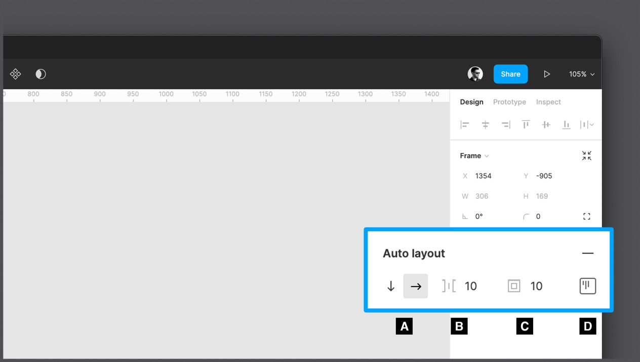
Figure 6.2 – The Auto layout section
Let's take a closer look at each of these settings in the Auto layout section.
A – Direction
With this option, you can set the direction of your layout, namely horizontal or vertical. Depending on the option selected, the layout will automatically align to a row or column, readapting all the elements contained in the frame.
B – Spacing
When a frame with an active auto layout contains more than one element, whether horizontally or vertically, there will be equal spacing between them. You can change this property if necessary, as you can see here:

Figure 6.3 – The Spacing between items option
C – Padding
Padding is a common design concept. If you already know what it is, this parameter should be quite clear to you, since it simply applies a numeric padding value to each side of the frame (not to an individual element but the entire content of the frame). If you don't know what it is, the following figure explains the subtle difference between padding (inner spacing before the stroke) and a margin (outer spacing after the stroke):

Figure 6.4 – Padding and margin differences
D – Alignment and padding
This parameter may seem unnecessary, since you see a padding value here again, but in this case, you can set different padding values for each side of the frame. You can easily navigate through each of these values using the Tab key. When you set different values, the previous universal padding parameter will change its value to Mixed because it is no longer uniform.
But that's not all. In addition to the numerical values, you can interact with the visual grid by clicking on each of its points, including the diagonal points. This way, you can align and arrange all the elements contained in the frame. From the moment the auto layout is activated, you can no longer change the position and alignment of an individual element, only in relation to the whole group of all elements, positioning it in relation to the outer frame. To understand this function better, take a look at the following figure:
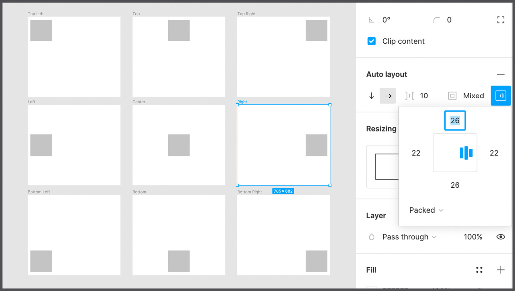
Figure 6.5 – The different alignments on a fixed size frame
Under the interactive grid are the distribution options. By default, you have the Packed option, which means that all objects in the frame are grouped together with a specified precise spacing between them. If you click the dropdown and select Space between, the items will move apart from each other, filling the entire space of the parent frame and maintaining an equal spacing, the value of which will be calculated automatically. You can see an example in the following figure:

Figure 6.6 – Space between horizontal properties
Moving from the Packed option to the Space between option significantly reduces the number of alignments available in the interactive grid, as elements are now positioned differently. The options also differ depending on the direction of the auto layout. Also, note that distribution and alignment have a visible effect on the frame only if it is not adapted to the elements it contains and is larger. You may be confused at this point, but you will learn more about these cases in the Resizing and constraints section.
Adding, removing, and rearranging elements
Once auto layout is applied to a frame, you can no longer freely position the inner elements, as they will all follow the set auto layout rules. On the other hand, from this point on, the frame becomes more flexible and stable, which allows you to quickly create complex but very accurate layouts, so you can be sure that everything is consistent with the logic.
If, at any point, you need to add a new element to the horizontal or vertical stack, all you have to do is simply drag that element into the auto layout frame. What's more, you can choose exactly where to insert the new element. As you drag your element and move it over the existing ones, a blue indicator appears to help you place the object where you want it to be:

Figure 6.7 – A blue indicator showing where the new item will be added
Note
You can also duplicate any element in the auto layout frame by selecting it and pressing Command + D (macOS) or Ctrl + D (Windows). The new element will be placed right next to the original one.
Deleting elements is also very easy. Just select one and press Backspace on your keyboard. If you want to just remove it from the current frame without deleting it, you can simply drag it out of the container. Your stack will change accordingly.
It's just as easy to reorder elements in an auto layout frame. For example, to swap the positions of the second and third elements of the stack, simply drag the second element onto the third. You can also do this by selecting the element and using the Arrow keys on your keyboard. Without auto layout, moving elements and keeping the correct spacing between them would be much more time-consuming and risky.
Nesting auto layout
Since a set of elements combined with auto layout is actually a frame, it acts exactly the same way. This means that you can nest an auto layout frame within another auto layout frame as much as you like. With this in mind, you can create incredibly complex layouts using auto layout from top to bottom. This is what makes auto layout an incredibly powerful feature.
Let's take a classic card layout as an example. It can be composed vertically from an image, text, and two buttons. Thus, the outer stack is vertical, and the two buttons themselves are combined into a horizontal stack with auto layout:

Figure 6.8 – A vertical auto layout frame containing a horizontal one
This design mode makes it easy to change the layout at any time and really makes Figma a high-end design tool.
Of course, you can get the same result by creating a frame each time and then inserting the merged elements inside each time, but as you've already seen, it is much easier to just select the elements you want and add an auto layout from the right sidebar. Alternatively, you can use the Shift + A shortcut, which activates the auto layout function for the current selection (with one or more elements).
Using and mastering auto layout is certainly not an easy task for both beginners and more experienced designers who are used to other tools without this feature, but the more you use it, the more you'll understand how this tool can make your workflow easy and enjoyable. Later in this chapter, you will practice more with auto layout, and your understanding of this function will become much clearer for you. But first, you need to explore other important features directly related to auto layout, namely resizing and constraints.
Resizing and constraints
In this section, you will learn about the resizing and constraint features, which, like auto layout, are used to create responsive designs. If there was only one screen resolution in the world, everything would be incredibly simple, and there would be no need to implement anything further. However, in the real digital world, things are different, and you should consider all resolutions, if possible, as well as the cases of switching from portrait to landscape mode with devices, or even from a mobile phone to a tablet or a desktop. Fortunately, modern design tools aim to help designers with this problem by providing incredible features for creating responsive interfaces that can automatically adjust based on resolution and screen size. Later in this book, you will dive deeper into the process of converting mobile interfaces to tablets and desktops, but it's important to start with a foundation and structure to get your design ready for future adaptation.
Resizing elements
As you already know, using auto layout allows the outer frame to automatically adjust based on the size of its inner content. But this is only part of the possible behavior of this function, and it can be changed in the Resizing section. You can see this just below the Auto layout function:

Figure 6.9 – The Resizing section
By default, you have the Hug contents behavior, which means that the outer frame resizes in real time, depending on what it contains. This feature is set in two drop-down lists and also appears in the interactive grid on the left, which has the same editing capabilities. This way, you can choose different behavior for the width and height of the selected frame. For example, it can hug contents in width but have a fixed height in pixels.
Note
In an auto layout frame, padding is counted as part of the nested elements, which means that if the frame adjusts based on the size of these elements, it will also take the padding into account.
Setting the Hug contents parameter for your frame means that its width and height will be automatically determined by the content inside it. But if you manually change the width or height of this frame in your workspace, the properties will change to the Fixed width or the Fixed height values respectively. This may seem confusing to you at this point, and you might be wondering when you need to use a fixed-size auto layout instead of hug contents, so let's take a look at a few examples in the following figure to get a better understanding of this:

Figure 6.10 – Hug contents and fixed sizes
Depending on the case, fixed width and variable height can be useful, or vice versa. What's especially surprising about the resizing function is the possibility to assign the Fill container property not only to the outer frame but to one of its inner elements (or their group/inner frame). This allows the nested element to be flexible and stretch to the width and/or height of the parent frame. In the following figure, you can see the behavior of the Fill container property compared to Hug contents in both the horizontal and vertical axes:

Figure 6.11 – A Fill container example
Among the many Figma features you've seen so far, auto layout is the most complex one, and there is only one way to fully master it – a lot of practice. It will be even more effective if you can combine what you have already learned to find out how different tools can work together and impact one another. For example, try nesting multiple auto layout frames and applying a specific behavior to each one, or set different Resizing properties for the elements in the group – one can be flexible in size and the other fixed. Remember that experimenting with the tools is extremely important because it is the only way to get the most out of them.
Differences with constraints
You've seen how auto layout allows you to change the outer frame based on the elements it contains, but is there a reverse way? Is it possible to resize the inner content by increasing or decreasing the size of the outer frame? You can get the answer with Constraints.
To better understand what constraints are, let's create a frame, this time without auto layout, and insert any type of element inside it. After you select the inserted element, the Constraints section appears in the right sidebar instead of Resizing:

Figure 6.12 – The Constraints section
When using a constraint, you are essentially locking the inner object at a specific position. This means that when the outer frame is resized, the element inside will keep its absolute position. In the following figure, you can see a visual representation:

Figure 6.13 – Resizing a frame with Right and Bottom constraints
This way, you can choose whether to block the element vertically or horizontally, on one side only, on both sides, or in the center. If you deactivate all the constraints instead, the default behavior will be Scale, which means that the inner element will be scaled the same way as the outer frame.
Last but not least, in the Constraints section on the right sidebar, you can activate the Fix position when scrolling checkbox. You may need it if the frame cannot completely fit the device screen, but you want this element to always be visible. Therefore, when you scroll this frame in the prototyping window, your element remains fixed.
Now we know enough about auto layout, resizing, and constraints to get started on the interface of our application and structure the elements in the best possible way. You'll do this in the next section, but you will also have the opportunity to practice these functions more in Chapter 8, User Interface Design on Tablet, Desktop, and the Web.
Applying auto layout to our interface
In this section, you will apply the functions you have learned in this chapter to a couple of screens in our interface. As always, you will be guided by step-by-step instructions, but try not only to follow them but also to understand and analyze what actions each of your operations cause. In this part of the chapter, you will work with the Hi-Fi page and learn the best practices for auto layout. Without further ado, let's get straight to it and apply auto layout to your interface!
Shaping a button
For now, all you can see on the Hi-Fi page in your project file are four wireframed views. As you might have guessed, this page will contain the actual layouts, and this is the one that will be delivered for further development. So, here you have to be very focused and make the best of what you have learned, and also organize your layers well for yourself and developers. But don't worry – you will start working on your layout by creating the simplest elements that will allow you to summarize what you have learned so far. Basically, you will replace placeholder elements with ones that you will be final. Usually, the order of building an interface is from top to bottom, but this time, you will start with the smallest parts so that you can create an incredibly modular layout, especially when using the components that you will explore in the next chapter.
Let's start with the Login page first and create a Login button. To do this, follow these simple steps:
- Make sure you are on the Hi-Fi file page. Since you are going to fill the frame with new elements and want to keep a visual reference of them, select all the elements of the Login frame and move them aside to the left:

Figure 6.14 – Preparing a blank frame on the Hi-Fi page
Note
To make the illustrations more readable, the layout grids will be hidden on them. However, for real work, it's a good practice to always keep them active in your layouts, especially in the initial stages when you have to be very accurate. You can turn off grids from time to time to see your progress better.
- Select the Login frame and apply your first color style to it. To do that, go to the Fill section, click the Style icon, and select the previously created Background color option. Remember that you can quickly check the color names by hovering them over the panel for a few seconds. You can also change the view mode by clicking the Show as list icon next to the Color Styles dialog header so that the color appears in the list along with their names.
- Create a new text layer by clicking anywhere inside the Login frame and enter Login.
- This text has default properties, so you need to apply the style you created earlier for the texts. To do this, select this text layer, click the Style icon next to the Text section, and select Medium Title / 24 Px / Bold. Then, apply a color style to it of Pure White. The result should look like this:

Figure 6.15 – A text layer placed on the Login page
It's time to create a real button. To do this, you can hypothetically draw a rectangle under the text, as you did in the wireframe, but there is a much better and simpler way – create a new frame and nest the text inside it, as explained in the following steps:
- Right-click the text layer and choose Frame selection to quickly wrap the text in a new frame. Rename this frame layer Button / Primary / Default (you will learn more about this naming convention in the next chapter):

- Select this new button frame and add the auto layout to it by clicking the + button next to the auto layout section heading. Then, add some padding so that the text stays exactly in the middle of the frame. To do this, click the Padding around items value (the universal one) and enter 16 (remember that we are working with a grid in multiples of 8). Lastly, click on the Alignment and padding interactive area and set the alignment to Center.

- Now, apply a Fill style to the button to make it visible. Since this will be the primary user action in this view, let's use an Accent color.

Figure 6.18 – Applying a previously created color style
Note
There is also a faster way to create your button! Select the element, then press Shift + A, and a new auto layout frame will automatically be created around it. By default, it will also have a 10px padding all around. This is a great way to save time when working on complex projects with multiple elements, and we'll use this a lot from now on.
What you have been doing so far has not been difficult, has it? And with time and practice, it will become even easier for you! You now have the perfect Login button, so let's go a little further and work on a secondary action button, which is Sign Up. This time, you won't just repeat all the previous steps to create it; there is another quick and easy way:
- Select the Login button frame you just created.
- Press Shift + A on your keyboard to quickly wrap the button in another auto layout frame.
- Rename this new outer frame Button Group in the Layers panel.
- Make sure the direction in the new auto layout frame is Vertical and set the Spacing between items value within the Auto layout properties to 16.
- Now comes the fun part. Select the Button / Primary / Default layer and press Command + D (macOS) or Ctrl + D (Win).
The result should look like this:

Figure 6.19 – Duplicating an element with auto layout
As you can see, auto layout helps you get the job done so quickly with minimal effort! There are just a few more steps left to do before the button is finally ready:
- Select the bottom button and rename it Button / Secondary / Default in the Layers panel.
- Now, change the text in the new button – by double-clicking it – to Sign Up. Note how the wrapper frame automatically adapts based on what you type. This happens because of the default Hug contents option, and it is the real magic of auto layout.
- With the Sign Up button selected, open the list of the color styles in the Fill section. Since this is a secondary action, choose the Secondary color style:

Figure 6.20 – The Sign Up button styled as a secondary button
Looks good enough already, doesn't it? You will take a few additional steps to make your layout even better:
- Increase the size of the Button Group layer so that it is the same width as your outer frame:

Figure 6.21 – Resizing Button Group to fill the parent frame
- You may notice that your design doesn't fit the layout grid. Let's solve this problem by changing the general padding of Button Group to 16px.
- Now, click on the Alignment and padding interactive area and set the alignment to Center. This way, the buttons are perfectly aligned to the center of the view:

- Select both Button / Primary / Default and Button / Secondary / Default and change their horizontal resizing options to Fill container. You should get this:

Figure 6.23 – Applying Fill container to our child elements
Great! The buttons look much better now! With the functions you have tried out so far, you we have created a piece of the interface with the ultimate precision in a short time. Moreover, what you have just created is a real modular block of elements, in which you can add, delete, and invert objects at any time without worrying about losing spacing, alignment, and size.
However, you have not yet practiced constraints. To understand the best use case for them, first, select a Login screen frame and try to manually enlarge it in width. Here's what you will see:

Figure 6.24 – Resizing the outer frame to reveal unexpected behavior
This is not what you expected, or at least not exactly what you want your layouts to be. This is about responsive design, and as mentioned earlier, you will explore this topic in more detail later in the book. Anyway, to fix the problem at this point, we can use the constraints feature:
- Select the Button Group frame.
- In the Constraints and resizing section on the right sidebar, change the horizontal behavior from Left to Left and right. Basically, this is how you tell Figma to anchor the elements on both sides and scale them proportionally. The result should now be more solid:

Figure 6.25 – A proper resizing
Now your design not only scales proportionally horizontally and looks nicer but also fits perfectly into the basic layout grid structure you created earlier. Be aware that you still don't need to resize your frame's width – we'll do that in a later chapter – so before proceeding to the next section, bring back the previous 375px width to your Login frame.
Completing the view
The first view of our application is starting to take on a finished look, but there are still some fundamental elements missing. In this section, you will replace the lo-fi text fields and labels with the elements of the actual design. The next steps will not be very difficult for you as they are more or less similar. So, let's move on to the final part of working on the interface of the first screen:
- Create a new Rectangular shape vertically in the center of the interface. Make sure its height is 50px (the width value is not important for now). Rename this layer Text Field.
- Apply Pure White as the Fill style of the new element:

Figure 6.26 – Creating a text field
- Create a new Text layer just above the text field and enter Username. Apply a Pure White color and a Medium Heading/24px/Bold text style to it.
- Select both the text label and the text field, and then add an auto layout to this selection by clicking the + icon next to the Auto layout label on the right sidebar, or, more simply, using the Shift + A keyboard shortcut.
- As a result, you should have a new frame containing both elements, which should be left-aligned by default. Rename this new frame Form Element.
- Set Spacing between items with the corresponding auto layout property to 8:

Figure 6.27 – Adding a text label
- Now, wrap the Form Element layer in another auto layout frame. This will again create a new frame around the selection, and you will soon see why this is relevant.
- Rename this new frame Form (since this will be our parent form container) and change its global padding to 16 to fit your layout grid:

Figure 6.28 – Structuring our form element
- Select the Form Element layer, set its width to 375px and change its horizontal resizing property to Fill container instead of Hug contents.
- Now, select the Text Field layer and change its horizontal resizing property to Fill container instead of Fixed width:

Figure 6.29 – Applying Fill container to the child elements
The first of your text fields is ready, and now it's time to create the second. Since you've used auto layout correctly, the following step will be incredibly simple:
- Select the Form Element layer and duplicate it by pressing Command + D (macOS) or Ctrl + D (Windows).
- Double-click the Username label in the lower field and replace it with Password.
- Select the Form layer and change its Spacing between items property to 32 to create a proper spacing between all the form fields.
- Move the Form layer up a bit so that it does not overlap Button Group. To do this, you can change the Y value on the right sidebar, setting it to about 180px. The following figure shows the end result of these operations:

Figure 6.30 – The resulting Login view
- Don't forget to add the Left and right constraint to the Form layer so that it will quickly adapt to any resizing of the outer frame.
So, how easy was that? Of course, this is not the limit of all the capabilities of Figma, but you can already see how advanced features can speed up your design process. Using auto layout is, of course, optional but still highly recommended, as the result will be easily editable and scalable. It is also handy for code because all the auto layout frames in your files will automatically be converted to flexbox items for web development.
Adding the Forgot your password? label will be the last task for now to complete the Login page. It seems very simple at first, but it's actually more complicated than you expect. Anyway, this is a great occasion for you to discover new auto layout properties, as this element will be right-aligned text in the left-aligned auto layout container. To create this interface element, follow these steps:
- Select the Password text layer in Form Element and duplicate it.
- Click the duplicated text layer and move it below using the Down key, or drag with your mouse.
- Replace the text with Forgot your password? and apply the Caption / 16px / Light text style to it.
- Add an auto layout frame to this new text layer and change the horizontal resizing from Hug contents to Fill container.
- Set its padding to 0 and its alignment to Right:

Figure 6.31 – Adding a nested auto layout frame
Nesting auto layout frames may seem tricky at first, but it can help you create complex interfaces in a very short time with exceptional precision.
The view is almost done, and all you need to do now is just polish it up a bit to achieve a more convincing visual result. So, what can you do to accomplish this? Well, it might be a good idea to add a logo at the top of the page and tweak the vertical spacing of the elements. Also, if the text labels seem too large, you can create a new text style on the Styles / Components page, just as you did in the previous chapter. For example, you can go with Bold Label / 20px / Bold, as shown here:

Figure 6.32 – Inserting a new text style
Feel free to experiment with your first interface to practice your skills better. Before moving on to the next chapter, try converting the Sign Up page from lo-fi to hi-fi, which shouldn't be much different from what you just achieved. Your final result should be something like this:

Figure 6.33 – The Login and Sign Up views
Summary
As stated earlier, the topic of this chapter is quite complex, and the Figma features presented here can be considered advanced. But you've successfully overcome this challenge, and now you know what auto layout is and how it can take your design to a whole new level. You have also learned about two more incredible features – resizing and constraints. Proper use of all three of these makes any layout flexible, responsive, and highly structured. And that's exactly what you did in the hands-on part of this chapter by creating two views for our application – great job!
Obviously, all the other views will also be created using auto layout, so you will practice this function many more times throughout the book to discover even more incredible design options. The learning process will become even more effective if you experiment from time to time with different automatic layout properties and elements in drafts.
So, using auto layout, resizing, and constraints in your design makes it a lot easier and faster to create an interface. But what if there was another feature that could further improve our workflow? There is – Components (which has already been mentioned several times in this book)! Soon, this feature will no longer be a mystery to you, as you will learn all about it in the next chapter!