In his book The Tipping Point, Malcolm Gladwell describes a rare type of person he calls a “connector.” Connectors play a special role in society: they act like hubs of a network, spreading information from one node to another. They are the social conduit that keeps everyone up to date and informed.[1]
The main role of connectors is to spread ideas. They have wide social circles—much wider than the average person—and when they get excited about a new idea, they share it with everyone they come into contact with. That’s just the way they are. Connectors love to be the first to tell their friends about a great new thing. They gain social capital as they do this. Their reputation grows. Their goal is your goal: to spread the idea. As Gladwell would say: connectors share information like it’s a disease. And if that sharing reaches epidemic levels, you have yourself a tipping point.
Connectors are key enablers of word of mouth: they’re super sharers. And to anyone building a social web application, they are like gold. If you can get a connector to talk about your application, then it stands a better chance of success, because more people will find out about it.
Of course, not everyone is a connector. Only a small number of people are going to go really nuts and tell everyone about you. By designing for connectors, however, we can support anyone who wants to share, whether it is a one-time event or one in a long line of shares.
Sharers are great for several reasons:
Sharers advertise for you. When sharing works well, other people are doing a very important function for you: advertising. You don’t have to spend as much money on regular advertising or other forms of attention-grabbing if sharers are spreading your word.
What sharers say is more powerful than what you say. No matter how well you communicate the value of your application, it’s not as powerful as something a sharer (or any fan) can say about you. If someone says, “that service is great, I highly recommend it,” there is little you can do to improve on that message.
Sharers tell you why you’re great. Sometimes what a sharer says about you is different than what you say about yourself. Listening to them can give you insight into why other people get passionate about your application. Then in your future communications, you can emphasize those particulars.
The ultimate goal of designing for sharers is a virtuous cycle of sharing, where people who are happy using your application tell other folks who haven’t yet entered the fold. They become sharers, and before long you have a sharer factory.

Sharing on the web generally falls into one of two camps.
Implicit sharing happens when an item is shared as a byproduct of participation. On Del.icio.us, for example, your bookmarks are shared by default, so that others can see them even if your original intention was to simply save it for later. This provides value to others without your explicit decision to do so.
Explicit sharing is how we usually share: on purpose. The most common way to explicitly share is by sending someone an email containing the shared item or a link to it. But now we’re seeing many more ways to share. You can now send a shared item to your MySpace or Facebook account or submit shared items to social news services like Digg and Reddit.
Explicit sharing can be either one-to-one or one-to-many. When you send an email to a single recipient, it’s one-to-one and therefore private. When you send an email to many recipients, or share an item with a social networking service, it’s one-to-many and often public. Explicit sharing is what we’re focusing on in this chapter.
Wait a minute, you say. This all sounds well and good, but isn’t this overkill? When the content is good, won’t people share things no matter what? Shouldn’t we focus on creating great content, instead?
This is a fair concern, and the answer is YES! There is nothing more powerful than great content and a compelling experience. If you had to choose between focusing on content and focusing on sharing features, you should definitely focus on great content.
However, this isn’t a zero-sum game. Most teams have both content producers and designers. So it’s OK for designers to focus on creating sharing features. Even better, the designers and content producers should work together to come up with the best possible display for information.
Furthermore, it does help to prompt people to share. Consider this comment by Gina Trapani, editor of the popular blog Lifehacker, responding to a blog post where folks questioned whether sharing features even work at all while calling for specific evidence of their effectiveness:
Actually, Lifehacker’s traffic has gone through the roof since we started placing the Digg button on select featured posts. We go in and out of the Technorati top 10 regularly (at number 11 right now.)
Forgive me if this sounds like horn-tooting. I bring it up only because you asked for evidence. Here it is.[2]
As with any design concern, good judgment is best. Focus on a small number of effective sharing features for your sharers, and they will share more.
Here are just a few things you can share online:
news articles, blog posts, web pages, videos, pictures, wish lists, music, documents, calendars, reading lists, bookmarks, slideshows, spreadsheets...
Of course, this list isn’t exhaustive; almost any digital object can be shared. Your design might introduce a new type of digital object that can be shared. For example, when Slideshare.net was launched in 2006, they made it simple and easy to share slideshows.
Sharing is a simple activity made up of several steps. For design purposes it helps to break it down and examine each step. Here’s what a typical sharing process looks like:
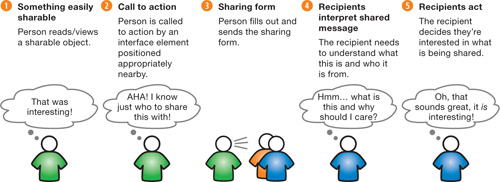
In the following sections we go through each step, talking about the design considerations that affect each one.
The first step in the sharing process is someone discovering an item worth sharing. Sharing works best for distinct items like movies, songs, articles, and blog posts. These are perfect for sharing.
Here are some ways to make something easily sharable.
Give it a permanent URL. URLs are core to the web. Give your item a URL and then people can refer to it anywhere. And never, never change that URL. For a rundown of the intricacies of URL creation, read Tim Berners-Lee’s “Cool URLs don’t change.”[3] (You won’t believe the gory technical details—or the benefits—of writing a good URL. For example, writing better URLs will actually get you better search result placement!)
Make it embeddable. In addition to giving the item a permanent URL, make it embeddable, as long as it makes sense to do so. This was key to the explosive growth of YouTube. Social objects are the easiest to embed, like YouTube videos, Flickr photos, and Slideshare slideshows.
Make it a PDF. PDFs are interesting things. They create the impression that their contents are more valuable than other formats like HTML pages. It’s not entirely clear why, but people do love to share them.
Make it printer-friendly. Make your content printer-friendly so that people can print it out and give it to others.
The call to action can be an interface element that signals the ability to share an item with others. In many cases the call to action will be the nudge that gets people to share.
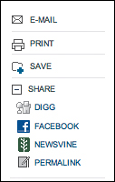
Articles on the New York Times web site contain a typical set of calls to action for sharing news articles.
Notice the designers at the Times have separated out the one-to-one “E-Mail” option rather than including it under the list of “Share” options (even though they are both for sharing). Most sites and apps group these together.
YouTube is one such example. Their share feature is located directly under each video, and combines email sharing with sharing to services under a single “Share” link.

Of course, some people might share without using the feature you’ve provided. That’s OK—you don’t need to force people to use your tools (just be thankful they’re sharing in the first place). However, as in most interaction design, prompting people helps: by providing a clear call to action, you make it much more likely to happen, and you do remind folks who didn’t know it was an option or don’t have an immediate need for it.
Increase the odds of sharing by placing the call to action close to the thing being shared.
One of the more innovative ways to keep the call to action close is to do what YouTube has done: actually replace the content with the sharing element. When a video is done playing, the view area is replaced by several features, including a share button. This draws extra attention to the feature.

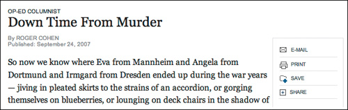
Articles, unlike videos, don’t have a time dimension. So the Times places their sharing box immediately to the right of an article, actually cutting into the article itself. This makes it hard to miss.
Contrast the New York Times layout with Wired magazine’s, which places the sharing tools farther up on the right of the page. These are not easily seen in the normal flow of reading, as they are above the horizontal line created when someone starts reading the article. (I actually looked around for a while before I found them here, as their position in the right column separates them unexpectedly.) Unless readers are proactively looking for them, they may not see them.

Another alternative to placing the toolbar to the side of the article is to have a horizontal toolbar just below the article head. If it is distinctive enough yet not visually heavy, readers can quickly scan over it, see what’s there, and not be distracted. Figure 7.8 shows an example from a site I designed called Publishing2.com.

You’ll notice that the sharing call to action on the Times site is at the top of the article, where it supports two contexts.
People who have just started reading
People who are returning to the article at some later point
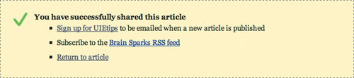
This placement leaves a crucial context underserved: what about the people who have just finished reading the article? People who have just finished reading an article are the most likely to share, and the most qualified, since they have just finished getting value from it. Now they are ready for a new task. Yes, they might scroll back to the top, but many times they won’t, and sometimes the top of the article will be on a different page. So place the call to action at the end of the article as well, where it is most timely. (It’s perfectly fine to have a share feature in two places.)
Blogs tend to get this right, and offer sharing features at the end of articles. A good example is the bottom of articles on the GigaOm blog.
While email is the primary way of sharing, people are using lots of tools to manage their online content as well. These include bookmarking services like Del.icio.us and Ma.gnolia, social news sites like Digg and Newsvine, as well as social network sites like Facebook and MySpace.
For example, at Seth Godin’s blog, lots of people used the Del.icio.us link at the bottom of each post to save his blog entries (the number of saves is displayed). Providing support for the larger of these services makes sense, as there’s a good chance readers will be familiar with them.
It would also make sense to support tools that you know your audience happens to use. A good example is on an intranet: lots of intranets now have their own bookmarking tools, so supporting “Save” features for those makes sense.
In the excitement of providing options for sharing, it’s tempting to offer every option. This happened on blogs, where some designers created a set of options for sharing that included, in some cases, dozens of applications. The result was a set of icons that simply overwhelmed.

Notice that the call to action is severely weakened with a long array of icons. Since there are so many icons, it doesn’t make sense to include text, which is often the most powerful call to action. Therefore, this design leaves it up to the viewer to pick out their service by recognizing the icon, which may be difficult.
The sharing form is the form people must fill out in order to specify with whom they wish to share.
Here is a typical sharing form that I designed for UIE.com.

This form contains four form elements: two input boxes, one textarea, and the submit button. It’s a simple form, but only because we followed the universal principle of form design:
Don’t ask for any information other than you need.
A good thing to keep in mind for any web form is to try to reduce the number of items you request—as much as possible. The only field absolutely required for sharing in most cases (this one included) is the recipient’s email. With that single piece of information you can send the sharing email. Still, I added two more fields. Why?
Well, I added “your email” for two reasons. One was familiarity. My team wanted the share to come from a familiar address, so recipients would be more likely to read it. Two, SPAM. We could have used the email [email protected] or something similar and forgone asking for the sharer’s email, but with so much SPAM out there we decided that it was good to try to identify who was sending. Many SPAM filter programs are trained to allow email from friendly addresses.
I also added an optional “message” that people could use to write anything they wanted. We found this to be tremendously useful in creating context around the email. They could say something like “this is the article I was talking about,” or “check out this viewpoint in regards to our current project,” or something similar.
If there were no personal message option, the sharing wouldn’t have been as valuable. However, I explicitly made this field optional so that it didn’t slow down those folks who weren’t interested in it.
Note: I could have made it even more personal by asking for each person’s name. In fact, an earlier version I designed had those fields. However, the form seemed daunting for such a simple task, with quite a bit more friction than the above version.
IBM, on the other hand, asks for such information.

There are several problems with IBM’s sharing form:
This looks like work. With six fields presented all in a column, this form is daunting. The user came here wanting to simply send a web page to someone else, and this seems like they’re taking a test.
Too many required fields. There is only one field that is absolutely required to send this form! However, IBM makes all six required for submission.
Completely unnecessary fields. Another thing, why does IBM ask for last names here? What value is it adding? For someone sharing a page with another, there is no reason to add a last name. You could argue that the sender’s last name is possibly a good thing to ask, to make certain the receiver knows exactly which Robert is sending the email. But there is absolutely no reason to have the last name of the recipient.
Poor copywriting. If you do need to explain what the form is about (and it’s questionable in this case), reinforce the value of sending the form. The line “if you do not want to provide us with the required information please use the back button” does the opposite. There is no need for this explanation (obviously) and its presence raises concerns. Imagine if all forms on the web had that text! In IBM’s case, their best hope is that people don’t read the text! (The text at the end of the form is better: letting people know that their email is not being used for any other purpose is really important in this day and age.)
Don’t treat sharing like it’s the last thing someone wants to do. In fact, they might just be getting warmed up. Here is the follow-up message for the form I designed above. It clearly communicates that the sharing was successful, but also presents other options that might interest people on the site.
Remember, at this point the person is very special. They’ve just shared your content with someone else! Give them every opportunity to participate further.
As we watched people share articles, we noticed that some people would share with each of their team members, one by one, creating separate emails for each person. This surprised us. We even had a few people share a single article seven or eight times!
Support multiple sharing. When the sharing process is complete, show the sharing form again near the place where you confirm success. Make it easy to share again: pre-populate with the message they already entered, so all the sharer has to do is change the name of the recipient.
How many times have you received an email from a friend or relative only to discover that it was one of those “forward me and you’ll get good luck” emails? While we probably like that person, we don’t appreciate their readiness to share this type of email with us. This is the sad state of sharing on the web. Even when people do share something with us, we still have to evaluate it just as we would any other type of information.
That’s why the email sent during sharing is so critical. It needs to immediately signal to the receiver that it’s authentic and worthy of their attention.
Consider the sharing email sent on MSNBC.com in figure 7.14.
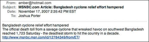
There are several problems with this email:
It looks like SPAM. This email looks like SPAM, the kiss of death. Even though it is a completely legitimate email, it will likely be ignored.
It’s not personal. Other than the sender’s email, there is nothing that identifies this email as being shared by two people who know each other. Part of the problem here is that MSN did not provide a message box in which sharers could write a personal message. Even if they did, they would still have to do something with that information in the email.
It’s not authoritative. MSNBC is a reputable news organization, and this email makes no effort to leverage that fact other than a mention in the subject line. Referring to the organization in the body of the email would lend more credibility to the message.
The email does do a good job of describing what the shared object is about. But that’s all it does, and it risks being ignored.
The email I designed helped solve the above problems.

Once someone shares with someone else, that recipient has to recognize and interpret the thing being shared.
If possible, use both parties’ names. This comes down to how much you know. If the person sharing is logged in, you probably know their name or other information already. Pre-populate the form with any information you know, and filling out the rest of the form will seem easier for them.
Also, it’s OK to give people a message that is pre-written, as long as people can easily change it before it’s sent out. Surprisingly, Amazon gets this wrong by providing a message that people cannot edit.

Amazon has really gotten it wrong with this email, for several reasons:
This form literally puts words into people’s mouths, as they can’t change the text.
The copywriting is painful. It creates a fake history for the person and sounds like it was written by someone desperate to make a sale.
It is obvious that nobody would write this to a friend. Do friends sign their last names? No.
Amazon’s odd design choice to prevent people from personalizing the sharing email makes the act of sharing a wish list impersonal. Any advantage they could gain by allowing people to send it in their own identity is lost.
The last step in the activity of sharing is that the recipients do something. If the sharer sent them an article, they’ll read it. If it was a video, they’ll watch it.
Presumably, you have already designed these objects to be easily used. But it’s extremely important to pay attention to this act, so you can find out if the sharing is working. If a hundred people share your stuff, and only one is then using your application, it may mean there’s a problem in the sharing process. Compare the sharing sends to the incoming actions. This percentage should be high—almost everybody. If the percentage is low, your email could be getting seen as SPAM.
The New York Times has a list of the most-shared articles. It counts the number of times an article has been shared and ranks them over three time frames: the last twenty-four hours, the last seven days, and the last month.

This list is very valuable for the people using the site, who can use it to find the most popular content quickly, without having to search through each directory to find it. On a site as large as the New York Times, this is a real time saver.
In addition, the New York Times itself can learn a lot from a list like this. Not only do they learn what people find most valuable, but they can also track topics over time. Do some topics get shared more or less often? If so, the writers can use that information to plan future content around those topics people seem to enjoy most. By watching the trends that emerge in the sharing patterns over time, the Times can tweak its future content strategy when necessary.
In order to highlight the five steps of sharing, we focused on sharing content with others. But there are other ways to enable people to help share their enthusiasm about your service with others.
Affiliate programs. Affiliate programs let people who use your software share it with others by offering them a way to refer people. For example, Amazon has an affiliate program, which allows people to embed shopping links in their web pages that send surfers directly to Amazon’s site for purchase. This drives more traffic to Amazon, while giving affiliates a small percentage of sales.
Simple Invitations. Many applications offer a simple invitation feature. Facebook, for example, asks you to “Invite your friends.” They allow you to import all of your addresses from web-based mail systems such as Hotmail, Gmail, and Yahoo Mail. This makes it easy for people to share their excitement about the service with others.
Testimonials. As we mentioned in Chapter 4, Design for Sign-up, testimonials are a powerful way to expose the passion of the people who use your service. Leverage them not just for sign-up, but for all aspects of your customer-facing activities. Include them in emails, articles, and any other place where potential users might be hiding.
Perhaps the best way to have people share their enthusiasm about your application is to simply engage in dialogue with them. If they are passionate about your service, it will show through in their comments. Others will pick up on this and become interested as well. Passion is hard to hide.
Sharing is a fundamental human activity, and digitized content makes it easier than ever. Whether people are sharing news articles, recipes, pictures of their kids, or funny videos, they’re helping to spread good will about your application, product or service.
So take advantage of the sharing tendency and enable those people who love to share. In some cases you’ll get lucky and they’ll be super sharers. Even if they aren’t, their word is still gold, worth way more than anything you can say.
By focusing on the separate steps of the activity of sharing, we can design more appropriately for any given situation. By optimizing each step of sharing, we’ll lose fewer folks along the way. Pretty soon you might just have a sharer factory on your hands.