“If you want to build a ship, don’t drum up the men to gather wood, divide the work and give orders. Instead, teach them to yearn for the vast and endless sea.” | ||
| --ANTOINE DE SAINT-EXUPERY | ||
In a theoretically perfect world, the people who try your software for the first time have unlimited time on their hands: they hear about your web application, they go and find out more about it, and, discovering how valuable it is, they sign up for the service immediately. They appreciate the time and energy you’ve put into your work. The end result is a real, valuable connection between the maker and user.
In practice, however, we’ve got about eight seconds to make that connection.
Yep, we’ve got only the tiniest fraction of time to have the most important conversation of all: why someone should use our software. Of all the moments of interaction, this is the most important one, because it is when a person decides to start a relationship with you. It’s the moment of decision, when someone answers the question: is this software worth my time?
Given how important this moment is, it’s surprising how often what we imagine people are thinking differs from what they’re actually thinking. Here’s a typical disconnect:

Ok, this is a slight exaggeration (but only slight). Our imagination is so powerful that we imbue our audience with the characteristics we want them to have: confidence, decisiveness, and passion. We want them to be really excited by our software. But, realistically, they’re probably not. Most likely, even people who are interested in our software still have to be convinced before taking the plunge.
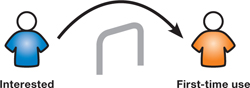
Once you have people interested, the next major challenge is to convince those interested people to actually sign up to use your software for the first time.
The importance of this step cannot be understated. It is crucial for several reasons:
The first, and lasting, impression. The first impression someone has of your software is your best chance to start a person down the road of becoming a loyal user. If you lose someone in this initial transaction, they’re very unlikely to return, having convinced themselves that your application isn’t worth using.
All questions, few answers. At this stage people have the most questions of all, and in answering those questions you can use the the opportunity to tell the story of your software.
Potential to kinetic energy. At this stage people are getting ready to take their first actual steps in using your software. It’s a big deal to change from the potential energy of being interested in software to the kinetic energy of actually using it.
Critical choice. If you make a living through your web application (and many of us do), the choice people are making of whether or not to use your software is anything but trivial. They’re choosing to either start a relationship with you or have it with someone else. This will undoubtedly affect your future in a big way. Therefore, it is serious business.
Each person who visits your web application has their own agenda: they’re trying to do something specific. While we don’t always know what that something is, we can identify recurring roles that seem to crop up again and again. Here are some roles to watch out for:
Ready to Go. This is the role most people design for. This is the role we hope for. These people are ready to start using your application. The key to designing for them is to get out of their way. They’re already convinced your software is worth trying, so make it as easy as possible to sign up by eliminating usability problems and unnecessary friction in the interface.
Interested but Unsure. These people are interested in your software but are unsure if it is for them. There are a lot of these people. They need to be reassured they’re making the right decision in trying your software. They have specific questions about what your software can do. The key to designing for them is to provide multiple levels of detail (see section below) so that they can find appropriate answers to their questions.
Fact-finders. These folks are doing reconnaissance and don’t plan on using your software just yet. They want enough detail so they can report back to others (perhaps their colleagues, or perhaps their readership). Design for them by providing a solid summary and how-it-works information.
Skeptical. These folks basically want to prove to themselves that your software isn’t what they want. They want to find out that the software they’re currently using is a better solution, so they don’t have to go through the pain of switching. These folks present an interesting opportunity. Design for them by providing lots of evidence that other people are happy using your software.
A sign-up framework is the set of information and resources we provide to people who are going to be signing up for our application. It may contain one or more of the following:
An elevator pitch, a tagline, or some other pithy explanation of service
Graphics or illustrations that show how your software works
Carefully crafted copywriting that describes your software
In-depth feature tour or feature pages
Video or screencast showing actual use
Get people started using the software as early as possible
Evidence of other people using your software successfully
The job of a sign-up framework is to help people make the jump from being interested in your software to being a first-time user.
A good sign-up framework maintains and hopefully increases any momentum a person brings with them to your application.
To maintain that momentum, a sign-up framework must do the following:
Clearly communicate the capabilities of the software
Allow a person to decide if the software is right for them
Answer any outstanding questions people have about the software
Confirm or refute any preconceptions people have about the application
Get people actually using the application to get stuff done
Let people connect with any other people who they might collaborate or work with
Give people an idea of the type of relationship they’ll have with you
The techniques below explain these issues in depth.
Sometimes the most obvious techniques are the most effective. I’ve found that when designing a sign-up framework, it is useful to pretend you’re a journalist. As every good journalist knows, when writing a news article you have to answer the questions Who?, What?, Where?, When?, Why?, and How? You have to pretend that your readers have never heard about the subject you’re writing on.
Like journalists, web designers have a core task when designing for sign-up: they have to answer the basic inquiry questions.
The basic questions of inquiry are the most basic questions that someone has about... well, almost anything:
Who is it for? Who is going to use it? (increasingly the answer is not “just me”)
What is it? What does it do? What are its capabilities?
Where? Where can I use it? Is there a mobile version for using on the road?
When can I use it? Is it browser-based, so I can access it at any time?
Why is it important to me? Why will my life be better as a result of using this?
How does it work? How can I take advantage of this? How do I get started?
We’ll go over each one of these in turn.
Steve Krug, in his wonderful book Don’t Make Me Think,[1] laments that too often web designs don’t convey the big picture: what the site is about. Steve’s right: there just isn’t enough description about what applications are and what they do.
Sometimes, as is the case with online invoicing application Blinksale, the answer is wonderfully obvious: “the easiest way to send invoices online.” The beauty of this simple statement is that now the reader can make a decision based on whether or not sending invoices online is important to them. If it is, they can keep reading or sign up immediately. If it isn’t, they’ve wasted at most five seconds.

In addition to the simple statement of what it does, Blinksale then gets into more detail: you can send elegantly formatted invoices to anyone with an email address, use an invoice template, or import your client records. Done. You know most of what there is to know about what this application does. That is the point of a simple description like this: to drive people into learning more about it.
Now, invoicing isn’t a very complicated process and Blinksale keeps it remarkably easy. So why does their competitor, billmyclients.com, make it seem so complicated?
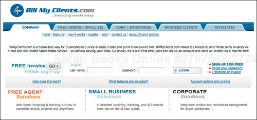
A complicated interface suggests a complicated service.
Most of the people who see this screen are immediately drawn to the input fields asking them to log in. “Uh-oh,” they think. “I don’t have a login.”
The funny thing is that billmyclients.com provides the same service that Blinksale does. They just aren’t communicating it as clearly. You have to actually read the fine print to know what’s going on. (It is there, believe me.) It says, in the small black text in the middle of the screen, that first-time users can set up an account and send an invoice for free. That’s super-important information, but it’s hidden in the design.
To their credit, the billmyclients site has a pretty obvious tagline: “invoicing made easy.” But it’s completely obscured by the design. It’s not what you see first on the page, like you do on Blinksale.
So the first step is to describe what it is. The second step, just as crucial, is to put that information front and center in your design. Make it obvious like Blinksale does. Don’t hide it, like Bill My Clients does.
And that’s just sending invoices by email. Any more complicated web sites (i.e. most of them) are going to have an even harder time communicating what they are. Try to do this in the most straightforward, basic way possible.
When Apple released their iPhone in the summer of 2007, they touted its touchscreen as a revolutionary new input device. They said it would change the way people interacted with computers forever.
Not everyone was convinced, however. Many people worried that the smooth-surfaced touchscreen couldn’t replace the tactile feel of an actual keyboard. Understandably, people wondered if it might be difficult to type.
The speculation mounted. Would it be easy to type if there weren’t physical buttons? Would you be able to type without looking? What happens when you can’t feel the pressure underneath your finger? How do you correct errors?
But Apple had an answer for all this speculation: a set of videos that showed people using the iPhone. It showed people pressing buttons, dialing phone numbers, sending SMS messages. Apple called this a “Guided Tour.”[2]

As prospective buyers watched the video, all doubt of whether or not the keyboard was usable dissolved instantly. Here was video proof that you can easily type without keys—there were people doing it!
When how-it-works features work well, like the Apple video, they do several things:
Make it absolutely clear what the steps are to make it work
Allay fears about the design being difficult or confusing
Serve as a guide to people who want to follow step by step
Illustrate how easy it can be to use your stuff
Become something that your audience can pass around and share
Prove that people have had success
Nudge those folks who are on the fence
A good “How It Works” graphic is short and sweet, explaining the major points of your application and nothing more. Just the facts, ma’am.
On the homepage of Netflix they have done a great job of this.

This graphic does several things very well:
Explains what Netflix is all about in a super-fast way
Embeds text within the graphic for additional clarity
Assigns ownership to the viewer—“your list of movies”
Shows the progression of service—what steps happen in what order
Gives a clear indication of how long each step takes
Explains who does what (You: create list and return movies, We: send you movies)
Explains in user’s language why service is different/better (no late fees)
Now, I’ve worked on projects where a graphic like the Netflix graphic was voted down. Here is how the discussion went:
<dialog> <speaker>Designer:</speaker>I think a graphic showing how the service works would help to make it really clear for people who aren’t quite sure about signing up yet.
<speaker>Manager:</speaker>Well, we’re an easy service to begin with, and most people know about us. Let’s not muck up the homepage with information that people already know. Let’s promote our latest movies instead.
</dialog>This manager obviously deals in generalities, believing that “most” people already know about their service. But the designer knows that there are people who won’t be gung-ho about signing up for the service, and wants to help that specific group of people. Designing for sign-up is about planning for these contingencies, asking “what questions do people have?” and “have we provided answers for them?”
So the answer to the manager would be: “How do you think Netflix got to the point where everyone knew how easy the service was? With graphics like this, of course!”
Nobody, not even a genius, minds something being communicated absolutely clearly.
Like Netflix, TripIt has an excellent graphic on their homepage that quickly conveys how the service works.

In three panes the designers at TripIt have explained the gist of the service. Many people who were double-checking that this was the service they thought it was or were on the fence will gladly sign up after confirming how easy it is. They can simply follow the instructions to “forward your travel confirmation emails to [email protected].”
But TripIt doesn’t stop there. They go on to provide a second level of detail for those folks still needing to know more. This illustrates an important principle.
Good how-it-works features provide multiple levels of detail, at increasing depth of description, allowing people to dig deeper as needed.
To get to this second level of detail, they provide two options. One option is labeled “Learn More.” It’s a huge orange button that follows the three-pane “How It Works” section. For folks wanting to learn more about how it works, that’s the clear call to action.
The second option is the more interesting one. The link is entirely different even though it goes to the same place as the other option. It communicates a completely different call to action.

Since it is not as prominent as the other call to action, this second option might not get huge numbers of people clicking on it. But for those folks who didn’t follow the first path, this option offers a slightly different message.
When you do select one of these options, you’re taken to what’s called the “Learn more about TripIt” page. This is the second level of detail, providing deeper information about the topics already presented on the homepage.
Providing this second level of detail has several effects:
Keeps the user’s momentum while reinforcing the main message
Answers any questions that may be left after viewing the graphic
Provides more details for people still unconvinced of the service’s value or wanting to know more
Gives you permission to really explain in-depth some important details (i.e. you have their attention)
Provides an opportunity to start naming specific features of the service. You can link to an even deeper level of detail, such as a feature tour or examples of the service in use.

Notice that TripIt used the same graphic on their “Learn More” screen as they did on their homepage. They simply cut it up into three pieces and explained each piece. This clearly demonstrates that second level of detail.
Showing how your application works is even more effective when you can show the end result. The end result of using the TripIt application, for example, is a one-page travel itinerary. This helps to make all the how-it-works information concrete. People can now see exactly how their travel information is aggregated and displayed.

For years, copywriters have made the important distinction between features and benefits. Unfortunately, copywriters are often left out of the writing stages of web site development, so developers end up trying to pitch their apps on their features, not their more powerful benefits.
Features are capabilities of the system, and although they are very important, they don’t explain why someone might use them.
Let’s imagine we were building a social bookmarking tool. The features might be those in the left column of the following table, while the benefits are those things in the right column: the actual value you get from the feature.
Features | Benefits |
|---|---|
Unlimited server space | Access from any browser, anytime |
Add tags your bookmarks | Organize your bookmarks in any way you want |
Add friends and see their bookmarks | Collaborate and share bookmarks with friends |
Sort by tag or date | Easily refind important bookmarks later |
See related bookmarks | Find relevant related content |
Wufoo, an online form creation tool, has an excellent way of explaining the benefits of the application. It’s a simple screen called “Top 10 Reasons to Use Wufoo.”
In general, it is better to explain the benefits more than the features. However, there is one group of people who often responds better to features: techies. Techies intuitively grasp the linkage between features and benefits, and are often interested in the features because they know all about how they affect the benefits. Still, it never hurts to make those connections clear.


Figure 4.12. Social proof is the tendency to base our decisions on the activities of others. A crowded restaurant tends to stay that way because people assume that it is crowded for a good reason.
Many times we make decisions based on social cues that we might not be fully aware of. Do you ever walk by a restaurant, see a long line at the door, and think “we should probably try that out sometime”? Or, do you ever walk by a restaurant, see that it’s empty, and think “that’s probably not worth going to”? Most people do. Restaurants know this too—they’ll seat early customers close to windows and encourage long lines so that passers-by see them and assume the place is worth going to.
People respond to the activity of others. So give a sense that real people are using your social web application. Show that others are there. Make it seem like a crowded restaurant. This leverages the powerful notion of “social proof.”
So to make a person’s decision easier, show them how others have made the same decision and succeeded. Give evidence that others are using it.
Some ways to do this are described below.
While social proof works even when we’re observing perfect strangers, it is most influential when the people doing the activity in question are people we know. When someone knows that their friend is already using an application, they’ll likely be undeterred in signing up. In those cases your job is easy—just get out of their way.
In some cases, people will want to know if their friends are already a part of the service before they sign up. Provide an easy and powerful search for those who want to find their friends.
Facebook is really good at this. They give two options to find friends: looking them up with your existing web-based email accounts, or doing a name search.
Facebook is clever. In addition to search functionality, they offer a “Find Your Friends” feature that takes an email address from a web-based email account (like Gmail, Yahoo! Mail, or Hotmail), goes out and looks at your contacts on that email platform, and then gives you results.
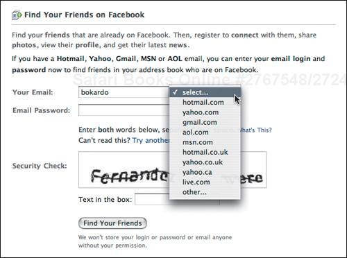
Their search feature works really well. If one of my friends were considering signing up for the service but wanted to know if I was already there, they might type in “joshua porter,” and Facebook, recognizing both variants of the name, returns results for both “joshua porter” and “josh porter.”

In addition, Facebook only shows you partial search results for these queries. For example, they only show 30 of the 171 results available. This gives a tantalizing preview to the number of people you can find on the service, and increases your momentum to sign up. So even if your friend isn’t on the service, you won’t know until you sign up. Very clever design.
What someone else says about you is more important than what you say about yourself. Testimonials have long been known in advertising as gold. Even so, testimonials are still under-utilized by almost all sites.
A great example of the prodigious use of testimonials is the Basecamp site. Basecamp is project management software for groups. The designers of the site separate the testimonials onto their own page called “Buzz.” It is hard to view this page and not be drawn in by the sheer number of positive comments. You can’t help but think “if so many people are so positive about this software, it’s got to be good.”
This page, which contains 90! testimonials, also raises the question “how many testimonials is too many?” And, judging by the effectiveness of the page, maybe even ninety isn’t too many.

Notice the designers place the most compelling testimonials at the top. The first testimonial is actually from a competitor! The second one is a testimonial with ties to a recognized authority (Microsoft—also a possible competitor), which carries more weight than a person from a company you’ve never heard about.

Here are some other insights that the Basecamp Buzz page gives us to use when displaying testimonials:
Place the most seductive at the top
Place recognized authorities in more prominent places
Leverage strong brands
Give interesting details about the person
Pull testimonials from reviews and then link to the reviews
Emphasize the most compelling part of the testimonial
So, elicit testimonials. Ask people for them. More often than not, your users will be happy to share their opinion of your software. Write them down and put them on your web site. It’s such a simple thing to do that it simply gets overlooked.
In addition, this also shines some attention on the people who gave you the testimonial, showing them that you value their opinion. They might even reference your acknowledgement with others, driving even more people to your highly effective page. So imagine that two in ten people you acknowledge are going to link to you if you publish their testimonial. Wouldn’t it be better to have a hundred testimonials and get twenty incoming links than having five testimonials and one incoming link?
Question: Who is the audience you’re targeting?
Wrong Answer: Well, anyone, really. Our application has a broad set of uses.
Right Answer: People who do this very specific activity...
This is a discussion I had with an entrepreneur who was starting a new software company. He was targeting his software at what he called “the general public.” And on the surface of things, this makes sense. He didn’t want to limit his software by saying that it was for a particular audience, as that would make it harder to swim with the current if that strategy didn’t work out. (Investors like flexibility, too.) For whatever reason, his software ended up being for all audiences.
In practice, however, software built for the masses rarely works. Even in cases where software has gone to the masses, it started off in a niche and then grew outward, as people realized that it doesn’t have to be used in any one way.
Targeting a broad audience is precisely the wrong approach. The more specific you can get about how to use your application, the more your software will resonate with your potential audience.
Del.icio.us, the social bookmarking tool, is about as broad a tool as you can get. Anybody who wants to bookmark web pages can use it. That is to say that their potential audience is everyone on the web.
But Del.icio.us doesn’t fall into the trap of designing for everyone. They do a very good job providing specific use cases.
And, if your software is flexible and can be used by many different types of audiences, choose a few profitable/big ones and be specific about each. The more specific you can get, the better.

Even more powerful than suggesting what people can use your software for is actually showing how someone has successfully used it. Any activity seems easier if someone else has done it first.
Apple does a good job with case studies with the “profiles” feature on their professional site. They profile a successful professional and explain how that person uses Apple computers in their work. This is not a hard sell: Apple simply explains what the person uses Macs for.
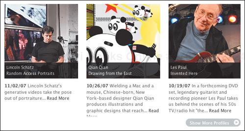
Successful case studies tend to:
Show how real people (even famous ones) use your application successfully
Sound like a genuine study of use, rather than an advertisement
Talk in depth about the activity at hand, without resorting to generalities
Can get really technical about how the application is used (the text of Apple’s profiles goes into good depth about what the person uses their software and hardware for.)

Case studies are the ultimate in detail. They are where you can dive into more complicated issues than most people, except those few who are interested in the very specific activity, will understand.
“99 Billion Served.” Most McDonald’s restaurants claim that unfathomable number of people served. It says “an amazing number of people have eaten here.”
Software companies can do this as well. AdaptiveBlue uses the number of downloads of their software effectively. They proudly advertise that their toolbar has been downloaded over one million times. It suggests that lots of people are downloading — and they are!

If someone with authority uses your software, it makes sense to leverage that fact by talking about how they use it. On the AdaptiveBlue site, for example, they promote their software by explaining how Seth Godin, an authority in the marketing world, uses their SmartLinks feature.

Authority works because it makes people pay attention. The mere fact that Seth Godin uses this software is impressive. But notice, too, that this element doesn’t overplay Godin’s involvement. It simply states that he uses the software. More importantly, it describes what he uses it for: to promote his books. That’s enough information to grab those folks who might use it for the same purpose. You can bet that people who are interested in promoting their books are very interested in how Seth Godin uses this product.
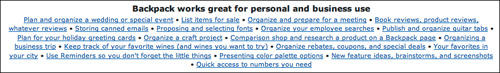
If you’re early on in launching your software, you may not yet have many people using it. In this case it might make sense to give people hypothetical ways to use it.
A good example is Backpack (created by 37signals, who also created Basecamp). In promoting Backpack, the design team came up with a bunch of hypothetical example uses. This is a great way to get people thinking about how best to use the software if they aren’t sure.
Sometimes it seems as if all web software is free nowadays. But if you offer a pay-for application, consider offering a way for people to try it out for free. This is a great way for people to get excited about your service without first having to make a hard decision about budgeting or pricing.
Letting people try out your application also has an interesting effect. By giving people something for free, you’ve evoked the feeling of reciprocation: people are much more likely to stick with you for it. You’ve given them something for free, and they’re more likely to give something in return (their business).
Goplan, a project management application, offers a version of their software that anybody can try for free. It is a limited version without some of the bells and whistles of the more expensive plans, but is enough to get you started and pique your interest. Sometimes people don’t realize the value of something until they’ve actually used it.
Until recently, the question of “where” you can use web applications wasn’t that interesting. However, expanding mobile phone use is changing that, allowing people to use web applications anywhere they can use their phone.
In some cases, mobile access changes the entire value proposition of social software. Consider the case of Google Maps, a mapping platform that becomes much more useful when you’re on the go.
The Maps design team has done a good job of explaining the benefits of using their application while on the move.
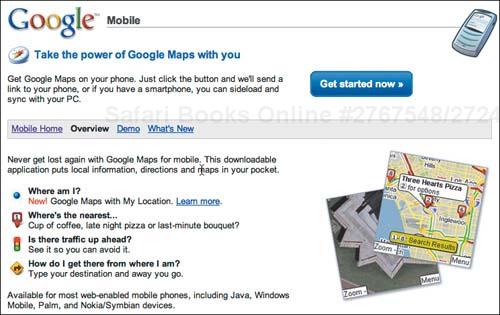
The secret to designing for mobile use is context. What sorts of activities are people going to use your software for when they’re on the move? If the answer is a specific set of activities like on Google Maps, it makes sense to call these out specifically.
So now we’ve answered a person’s basic questions about our web application. In some cases we focused on what value the application provides, while in others we focused on more social issues like who is using it. The journalism technique covers most of those bases.
If we’ve done our job right, people are motivated to take the next step and use the application. With luck we’ve now got everyone in the “Ready to Go” mindset. The key at this point is to reduce sign-up friction as much as possible.
TripIt.com has an excellent way to get started using their service with very little friction. Say you book at flight at Orbitz.com. You’ll get an email from them confirming your flight details. Simply forward that email to [email protected] and they create a page for your itinerary. They send you an email back with a link to your newly-created page. You’ve essentially started using their application without creating an account, or even visiting the site!

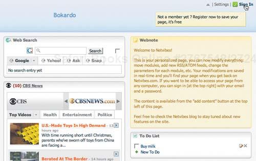
Another great example is Netvibes, a web-based desktop application. They invite you to start using their service immediately by configuring your own desktop.
Netvibes makes creating an account seem almost like an afterthought. They provide value way before they make you sign up. Here’s the text:
This is your personalized page, you can now modify everything: move modules, add new RSS/ATOM feeds, change the parameters for each module, etc. Your modifications are saved in real-time and you’ll find your page when you get back on Netvibes.com. If you want to be able to access your page from any computer, you can sign in (at the top right) with your email and a password.
The Netvibes example highlights a larger principle of form design. I don’t know if it is written in stone somewhere, but it should be:
Upon signup, ask only for information that’s absolutely necessary
In the case of Netvibes, nothing is required to start using their application. Talk about a frictionless process. Only after you start using it do they remind you that if you want to save what you’ve done, you have to sign up.
Interface designer Luke Wroblewski calls this technique progressive engagement.[5] Progressive engagement allows people to get started using software without committing fully or filling out a sign-up form. They engage with the software slowly instead of having to scale the hurdle of a sign-up form before engaging.
Both Netvibes and Tripit practice progressive engagement. Contrast the experience of those sites with that of the Wall Street Journal. When reading an article snippet on wsj.com, you’re asked to subscribe to the service for full access. When you press “subscribe,” you’re presented with a daunting form. Not only do you have to pay money (a hurdle in itself), not only does this form contain more fields than necessary, but it’s only one of four pages!
Now, someone might argue that “It’s the Wall Street Journal, the most respected newspaper in the world, so they can do what they want.” Not so. What the Wall Street Journal has done is to increase signup friction. The only way to overcome that increased friction is to increase motivation by using the techniques mentioned above. While readers of the Wall Street Journal might be highly motivated, that shouldn’t be a requirement just to fill out a form!

The moment a person signs up for your software is crucial: it’s the moment when they decide to start a relationship with you. If it’s a bad experience and they can’t quite muster up the motivation to sign up, they may never return.
By using the simple and effective journalism technique to answer the basic questions of inquiry, you can go a long way to getting (or keeping) people motivated to use your software.
In the next chapter we’ll talk about keeping that momentum during actual use of your software and helping people get up to speed with regular use.
[1] Steve Krug, Don’t Make Me Think, 2nd Edition. New Riders, 2006.
[2] See http://www.apple.com/iphone/gettingstarted/guidedtour_large.html for the Guided Tour video.
[3] See http://en.wikipedia.org/wiki/Milgram_experiment for the fascinating details of the Milgram experiment.
[4] Robert Cialdini, Influence: The Psychology of Persuasion. Quill William Morrow, 1984.
[5] Luke explores progressive engagement in his book: Web Form Design: Filling in the Blanks http://www.rosenfeldmedia.com/books/webforms/