
“It is not the strongest of the species that survives, nor the most intelligent, but the one most responsive to change.” | ||
| --—CHARLES DARWIN | ||
As we have noted through much of this book, there are important benefits to talking about your site in terms of the usage lifecycle.
In this chapter, we use the lifecycle to start measuring the effectiveness of your web site. It allows us to create a robust ecosystem for data-driven design.
A good way to find out what’s broken in your web app is a funnel analysis.[1] A funnel analysis can show how effective your site is at moving people along the usage lifecycle from Interested to Passionate.
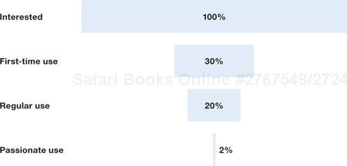
So picture your site as a funnel. At the top of the funnel is everyone who is interested in your software. At the bottom of the funnel is everyone who is a passionate user of your software. Here’s how it might look:
The way to read this funnel diagram is as follows: of those people who get interested in your application, only some will actually use it for the first time. Of those people who use it once, only some will continue on and use your software regularly. Of those regulars, only some will become passionate users. Those passionate people make up only two percent of that original, interested group.
The key to the funnel analysis is the recognition that you will have leaks at every level. No matter how good your design, you’ll lose people as they progress through your application. While it is theoretically possible to keep everyone from top to bottom, in practice you won’t. There is no way around this: all funnels are leaky.
The funnel in figure 8.1 describes a generic lifecycle of use for most web applications. However, to do an actual funnel analysis with real numbers you’ll want to get more fine-grained with the levels of your particular application. Each site will have a slightly different funnel, as each site has a slightly different purpose, a different set of screens, and a different flow.
For example, “Passionate Use” is going to change depending on what activities your application supports. Passionate use could apply to someone who is a long-time paying customer or someone who creates lots of posts on their blog. Each site will be different.
To do an actual analysis, you need to figure out which metrics are important to you, and then construct a funnel made of those metrics.
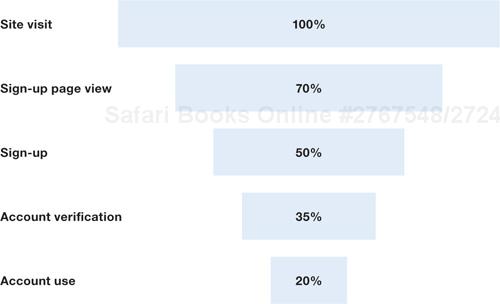
For the following analysis, we’re assuming a common scenario: a web site that allows for a trial period with upgrading to paid membership.
So let’s reformulate our funnel accordingly. We now have five levels, particular to our scenario. In this example, “Regular Use,” becomes “Paying Use,” which is when people sign up, and pay for the service.

Using something measurable, preferably something whose meaning is obvious, create a metric to represent each level in the funnel. The following table describes each level in the funnel diagram.
Metric | What this means | How to measure |
|---|---|---|
Visit | Visiting the site for the first time | Analytics program such as Google Analytics |
Trial Sign-Up | Confirming a trial registration | Analytics program |
Active Use | Logging in a certain number of times (five in a month, say) | In-house analytics |
Paying Use | Completing a paid transaction | In-house analytics |
Recurring Use | Creating several paid transactions | In-house analytics |
Mike McDerment, the CEO of Freshbooks, describes the benefits of using in-house analytics for the lower levels of the funnel:
We don’t use our stats to track anything but the first two steps in our conversion funnel: visitors and trials.... I like the accuracy of database tracking—especially when your numbers are low (i.e. you are just getting started) and inaccuracies can really throw you off.... Also, and I would say this is much more important, analytics do not give you good active user counts. What does give you good active user counts is tracking the number of times a user logs in.[2]
With all this data to analyze, the question immediately arises: where do we see this information? How do we report on it? The most common way is to run periodic reports on your database by creating queries that expose the information. You run a query every week and analyze the funnel. Another alternative is to create an application dashboard that shows these numbers in real-time. (This type of management application is sometimes referred to as a shadow application.)
So now we have our funnel, and we’re collecting data. We know what metrics we’re going to capture. Now what?
How do we turn this data into actual design decisions?
The procedure for making changes is as follows:
Create a baseline. In order to know what numbers you’re dealing with you need to create a baseline. This is simply the funnel data for the current design, before you make any changes. It’s important to collect data for a baseline long enough so that you can tell when your number is being affected by spikes in traffic and when it is stable.
Choose a level of the funnel to improve. Do any of your baseline numbers look out of whack? A level that is especially leaky? If so, turn your attention there. If you don’t see any glaring holes, then start at the top of the funnel. Changes there will have a bigger effect on throughput than changes on lower levels. Don’t worry if the numbers are just plain weird at first. It may take a while to get used to your particular funnel. You might not even know what a leaky level looks like until you’ve used the analysis for a while.
Investigate level for leaks. If you are intimately familiar with your interface, you might immediately know what to address. Sometimes you’ll look at a screen and immediately see a way to improve it. Other times, you won’t. So find any data you can for that level: watch people use your software, talk to your community manager, pore over your support emails. Even the most polished software has little holes to fill. You’ll find something to improve.
If the level in question is made up of more than one screen, and your research into the problem isn’t providing a clear answer, then consider doing a more fine-grained analysis. See the next section for an example.
Make design changes. Make a design change to the screen or screens on that level. Try to keep your changes relatively small, so that you can accurately tell if they had an effect. This is similar to setting up a scientific experiment: you only want to test a single variable in each test. On the web, development moves so fast that changing a single variable is often impossible. But it’s better to make more, smaller, changes than a couple of big ones. You’ll have a better idea of how well they worked.
Measure change and compare to baseline. Re-collect your funnel data after the change is made. You’ll want to wait long enough so that you have a decent amount of traffic after the change. This will tell you if your design change had a positive or negative effect. If fewer people are lost on that level of the funnel, then your changes were positive and you should keep them. If more people are lost, then you might consider rolling back the changes or making different ones.
Rinse and repeat. Repeat this sequence of steps until you can’t improve your site any more (is that even possible?), or until the effort of making changes doesn’t warrant the tiny improvements you’re seeing. In general, however, there are always ways to improve some part of your application.
The time it takes to figure out how well a design change worked depends on the sample size of interactions. If your site is big and thousands of people are using it every day, then you can see the results of design changes faster. If your site is smaller, with fewer interactions, then you’ll need to run tests longer to be able to compare against your baseline.
Huge sites like Amazon and Google, which have millions of visitors per day, have a distinct advantage here. They can run tests for very short periods of time and see clear results.
Let’s imagine for a moment that that funnel analysis told us to take a closer look at the “Trial Sign-Up” level. Unfortunately, sign-ups are often a multi-step process, involving several screens of our site as well as a confirmation email. If our data were pointing to a really leaky sign-up process, how would we know what to fix?
The answer is a to apply funnel analysis to a specific series of steps. Take the level that interests you and break it down into its own funnel for analysis. Here is an example:
The goal with this finer-grained analysis is to break down the sign-up process into discrete steps. This is easiest if we can map screens to levels, where every screen in our application matches a level in the funnel.
Analyzing individual steps will allow us to pinpoint exactly what is wrong with sign-up. Is it the sign-up page? The sign-up form? Or the verification email?
Sign-up is a bugbear in almost all web applications. But there are other important funnels as well. Figure 8.4 shows a social funnel we can investigate to improve how frequently people are sharing your content. For more, see Chapter 7, Design for Sharing.

Of those people who read an article, for example, how many access the sharing form and send the article to someone else? I’ve highlighted in green the places where a second person is involved.
The analysis for all funnels is the same. The important thing is to get as accurate a measurement as possible of each level.
You’ll also note that design changes aren’t always intuitive. For example, if you’re sending out a sharing email and you add the shared content right in the email, you might get fewer visits to the site. However, if you don’t add the shared content right in the email, you might get more visits to the site, but also more people complaining about it. Design is, in part, managing these trade-offs.
Funnel analysis is a good way to get a handle on what’s happening in your web application, but it’s far from foolproof. Here are some issues to watch out for.
The baseline data is crucial to good analysis. If you don’t change your design, your funnel percentages shouldn’t change much, either. Traffic will fluctuate, but your screens should have approximately the same throughput every day, in terms of percentage. If they don’t, then get your data consistent before moving on to the other steps in the funnel analysis. It can take some serious investigation and tracking, but it’s definitely worth it.
Part of getting a solid baseline is paying attention to where people come from. People from different sources act differently. If, one day, eight thousand people come to your site from Digg, they’re going to skew your numbers. (Digg visitors are notorious for doing drive-bys, where thousands of people hammer your site for a few hours, mostly window shopping.) So make sure that you identify regular traffic and spikes in traffic to get cleaner numbers. This will help you get a better baseline.
Unless you’re measuring a process with defined steps that must be completed in a specific order, your data is going to include people doing some odd things. People don’t take a direct, linear path through your screens. Instead, they might click “back” a few times, reload a page, go to the home page and start over, or any number of other odd navigational behaviors.
This will add some noise to your numbers. They won’t always make perfect sense. But being aware of how truly non-linear navigation paths are will help you determine when you’re seeing normal behavior and when you’re seeing something out of the ordinary. This is another reason why establishing a clear baseline is important. Most of all, you’re looking for changes in traffic that correspond to design changes.
The numbers depend on your type of site. If you’re offering a web-based tool, then your sign-up percentage should be higher than if you’re running, say, Wikipedia. Wikipedia sees millions of visitors for every one that makes a change on the site. In general, if you provide free content that people don’t have to sign up for, your percentages will be much lower than if your site exists to sign people up.
The numbers I’ve shown so far might sound low, but they are very generous. Most applications will have much lower percentages. The numbers are different on every site.
Here is a table of actual numbers from feedback Mike McDerment of Freshbooks got. Notice that most are in the single digits. This is normal. Ninety percent of all visits are simply that—visits.
Percent of first-time visitors sign up | Percent of sign-ups become paying users | Percent of paying users cancel each month | |
|---|---|---|---|
App 1 | 8.0 | 3.3 | 5.0 |
App 2 | 6.76 | 3.75 | 0.02 |
App 3 | 4.7 | 4.5 | 7.71 |
App 4 | 16.0 | 11.0 | 0.4 |
App 5 | 0.003 | 7.8 | 0 |
Hopefully, these numbers give you the impression that numbers can be quite small. The eleven percent for App 4 seems quite high here. But even changes in numbers this small have a huge impact if you’re getting thousands of hits per day. On large sites, even a change of one percent can mean a huge increase in the population.
The funnel analysis depends on accurate numbers. If you can accurately measure what’s happening, you can make really solid design decisions. Here are a few ways to tighten your analysis.
Create landing pages. Landing pages are special pages where people from a particular source land and start viewing your site. These pages are often specially tailored for the situation, with focus on a particular audience. People can’t browse to them from your regular site. The key to landing pages is that they are shown only for very specific audiences. They may come from an email you send out, an advertisement on another site, or a specific link from your blog. Landing pages essentially segment your audience for you.
Measure sets of pages. In the sign-up funnel as well as the sharing funnel, it makes sense to measure sets of pages at a level. So, for example, the “Site Visit” level on the sign-up funnel would include the homepage, a how-it-works page, and any other page that people learn from before reaching the sign-up page. In the sharing funnel, all the article pages on your site should be included, so if people share from any one of them, you’ll know. This makes it easier to track funnels because you’re allowing flexibility in the navigation paths of your visitors, but still getting the information you need for funnel analysis.
Segment your funnel. Another way to improve the clarity of your funnel numbers is to segment general traffic into three categories: organic search traffic, direct traffic from other sites, and direct traffic (traffic with no referrals). This will allow you to get better numbers for each segment, and focus on those segments that are most valuable.
Use in-house metrics. If you set up your own data-collection system, you’ll know exactly what it is measuring. If you rely on a third-party system, you might get into guessing games about what the numbers mean, because you don’t know the particulars of how they work and what they track. Invariably, if you don’t control your own collection process, you won’t know all there is to know about what you are measuring.
The worst way to measure your traffic is by third-party companies who aggregate traffic for the whole web. Their numbers just aren’t accurate.
Marc Andreessen, who co-founded Netscape and is now working on social network site Ning, is very much against using these companies:
You can’t believe any of the Internet measurement companies for any kind of accurate external analysis of Ning usage and traffic—or, for that matter, usage and traffic of any web site other than perhaps the very largest.
I’m talking about Compete, Quantcast, Alexa, and even Comscore—none of their data maps in any way to numbers or patterns we see in our own server logs and activity metrics.
This is a well-known problem in the Internet startup world and isn’t discussed often enough.[3]
The metrics that you use in the funnel analysis are crucial to success. If you weigh certain metrics over others, like prioritizing sign-ups over comments left on your blog, then your design will change accordingly. So it is key to choose the appropriate metrics.
The core analysis tool for processes on your site will be the funnel analysis. But for those things that aren’t easily broken into a funnel view, you’ll want a broader set of metrics to measure the health of your application.
For many years page views were the primary metric by which traffic was measured on the web. As we mentioned in the opening chapter, in the beginning the web was mostly pages full of text. Now, sites have pages or screens with widgets, ads, or other elements that we’ve added over time. Page views have slowly become meaningless, for several reasons:
Always different. Page views change depending on how the site is designed. For example, many online news sites split stories up on several pages to increase ad impressions, although others don’t. Making any sense of page views is incredibly difficult for this reason.
Ajax. Ajax-enabled interfaces dramatically reduce page views because they allow developers to refresh parts of a page without reloading. If one site uses Ajax and another doesn’t, the one that doesn’t will have up to an order of magnitude more page views.
RSS. RSS also changes the value of page views. If your readers are accessing content via RSS, then their views aren’t counted as page views even though they’re still reading the full content. If you provide RSS through your application, then your page view numbers will not reflect actual content consumption.
For all these reasons, the page view metric is no longer useful or widely used. Page views are more of an artifact of design choices than an indicator of success. The way you build your site, the technologies you use, and the way you distribute content shape the page view numbers so that they no longer represent a true picture of the people visiting and viewing pages.
This far-from-exhaustive list can help get you started investigating metrics. You might just discover a metric for your own application that makes more sense than any of these.
Unique visitors. Measures the number of unique people who visit. This metric gauges how many people are visiting, but gives no insight into what people are doing once they are there.
Repeat visits. How often people return to your site. A high number of repeat visits suggests that people are well-engaged.
Time on site. Time on site is the amount of total time a person spends on a site. High numbers may automatically seem better, but there are exceptions. Google, for example, doesn’t want time on site to be very high. They want people to find the best search result as soon as possible—repeat visits is what they’re after.
Pagerank. Pagerank is the metric created by Google that informs their measure of relevancy for your site. The higher your pagerank, the more relevant Google thinks your site is. Since Google is a powerful force on the web that can send a lot of traffic your way, pagerank cannot be ignored.
Sign-ups. Number of sign-ups. A high number of sign-ups suggests that your design is doing well to convince people that your app is worth it.
Feed subscribers. Number of people subscribed to a feed (usually to a blog feed). This is a good indicator of how much attention you are getting.
Clickthrough. When your site sends traffic to other sites, it makes sense to count the number of clicks. Google and other search engines do this to measure how effective their ads are. Clicks in general are more accurate than page views, but still suffer from being gamed.
No matter what metrics you choose, you’ll probably have a short list of extremely important ones. You may even only have a single metric that defines what you do.
Evan Williams, co-creator of Blogger.com, one of the first blogging applications, explains why the Blogger team focused on the number of posts as the important metric for success:
At Blogger, we determined that our most critical metric was number of posts. An increase in posts meant that people were not just creating blogs, but updating them, and more posts would drive more readership, which would drive more users, which would drive more posts.[4]
Notice that there are several things going on here. Returning traffic (often split out as its own metric) is implicit in this metric, as people who post more will come back to their site more. Also, Evan assumed that more posts meant more readers, which isn’t necessarily true but pragmatically so. Your application will no doubt have its own intricacies. Identify what activities are most important for your population, and pay attention to metrics that measure them.
The funnel analysis makes each stage of the usage lifecycle concrete by explicitly calling out metrics that drive adoption and success. Each web site will be slightly different, but once you get your baseline metrics in place, you can confidently measure and make changes going forward.
Yes, there are a lot of steps that each person goes through in using your application. What the funnel analysis helps illustrate is that each step is no less important than those that come before or after it, because each step must be completed in turn.
[1] I learned the basics of this technique reading this article on funnel analysis by Mike McDerment (Mike knows his stuff: he’s the CEO of the successful app Freshbooks): http://www.thinkvitamin.com/features/webapps/how-to-measure-the-success-of-your-web-app