By now, I’m hoping I’ve convinced you on the argument of why accessibility and inclusion are essential. And we’ve covered what each platform is capable of and why. But when and how should you use each of the tools Google and Apple have created for you? In this chapter, we’ll discuss some of the techniques you can use to improve your app’s experience for different people. In no specific order, we’ll cover different groups of people and discuss some of the ways you can make your app more inclusive. We’ll combine elements of graphic design, service design, and mobile programming.
The ultimate aim is to make our apps a truly inclusive experience. As you read through, you’ll likely notice some themes appear. This is no accident. To aim to fix your app for one group of people is not inclusive but exclusive. By sticking to principles of around design, flexibility, and respect for our customer, we can create software that works better for everyone.
Dyslexia, Autism, and Learning Difficulties
People who fit into this category, along with people with other disorders such as ADHD, bipolar disorder, and others, are often known as neurodiverse. I like the framing this word provides; it shifts away from the idea that neurodiverse people have something to be overcome. People who consider themselves neurodiverse feel that their brain works in a way different to the rest of us. I am dyslexic, and while this does cause me issues, namely, reading and math, I feel the difference in how my brain processes information provides me with unique perspectives. It has taken me many years, and I’ll always be learning something new, but I feel I have a grasp on how I can use these differences as an advantage. There are a few things you can do to make your app’s experience for neurodiverse people, including me, a happier one.
Design Simplicity
Sticking to sound design principles will have a significant impact on many people with learning difficulties. Keep your design consistent, simple, clean, and uncluttered. Stick to platform norms for added consistency.
Any moving or animating content must include a mechanism for your customer to pause the animation, including video, but not transitions. Moving content should only ever trigger as a response to a user action.
Typography
Don’t use too many fonts, text sizes, or colors. Having too much variation will make your app look messy and inconsistent. But for some people with learning difficulties, too many differences can make reading harder. Avoid bold, underline, italic, and all caps text.
For body text, use black text on a light colored, but not white, background. If possible, allowing users to select a background color is ideal. Body text should always be naturally justified (left in most languages). If your design calls for center- or right-justified text, this is OK, but avoid fully justified text as this creates a wall of text that can be hard to decipher.
Clear Written Content
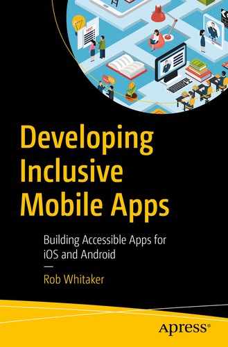
Keep written content concise and descriptive. Be explicit about the consequence of any action. Use these same principles for buttons and other controls. Avoid the use of idioms, acronyms, and abbreviations as these can be difficult to comprehend.
Hemmingway highlighting areas I can improve my writing for readability. Most of this book featured less red highlighting than this paragraph, honest
Alternatives to Text
Don’t present solely text-based information. Provide redundancy in the form of an image, graph, or video. For larger groups of text, or for text that you can’t easily convert into a visual form, provide an audio recording.
Both iOS and Android provide screen readers – Select to Speak on Android and Speak Selection and Speak Screen on iOS. Note that these are not the same as VoiceOver and Talk Back. VoiceOver and TalkBack include a navigation element and are designed for users with visual impairments. Screen readers read only text content. They don’t read or facilitate interaction with controls. You should test your app with the screen reader enabled to ensure it reads your content in a meaningful and understandable way. You may need to change your app’s accessibility tree to give the best experience.
Color
For some people with learning difficulties, specific color combinations can make text appear jumbled or to strobe. Avoid bright, vivid color, especially around content. Use black for text rather than a shade of gray or color, regardless of how close to black that color may be. The background for text content should be a pale color; pastel colors work well. Avoid white or other bright colors. Ideally, allow your customer to choose a background color that suits them.
Accuracy
Don’t insist on accuracy for written input. Instead, provide options. With limited options, allow your customer to select from a spinner or by pressing a button. Where options are broader, such as a text box, provide the opportunity for auto-completion or suggestions to reduce the amount of typing. As much as possible, try to ensure these suggestions don’t need perfect spelling to appear.
For longer passages, allow entering text by dictation. Dictation is supported by default on both platforms but can be disabled if your app is providing its own keyboard, so prefer the system keyboard where possible. Enable autocorrection for any standard text entry. Always allow the opportunity for your user to review and edit any content they have entered before they commit to submitting.
Full Disclosure
User experience specialist Harry Brignull coined the phrase dark patterns in 2010 to identify hostile design patterns intended to make users do things they hadn’t intended to. Harry defined some common dark patterns on his web site, darkpatterns.org.2 These include, but are not limited to, trick questions, confirm shaming, and misdirection. 2019 research from Cornell University identified a total of 15 different types of dark pattern across popular online shopping web sites. The researchers found over 11% of the highest ranked commerce sites featuring at least one example.3 Let’s be clear on this: dark patterns intended to trick your user show contempt for all your users and are always unethical. For your customers with learning difficulties, these traps are even more upsetting and confusing.
Be clear about the consequences of performing an action, and don’t then change consequences later without explicit consent. If you’re collecting phone numbers for 2FA, for example, don’t then use this to start sending SMS spam. The sudden arrival of unexpected messages for an unknown reason could be worrying.
Anxiety and Mental Health
Many headlines are covering the health effects of smartphones: “Putting Down Your Phone May Help You Live Longer,”4 endless opinion pieces such as “How I Ditched My Phone and Unbroke My Brain,5 and a wealth of health guides like “5 ways your phone is affecting your anxiety.”6 Seeing these headlines, it may be tempting to believe we mobile devs have created a monster.
Panics about information overload and new technologies are older than technology itself. In around 360 BC, Socrates warned the written word would “create forgetfulness” and that readers would struggle to differentiate fantasy from reality.7 It is true that Internet or mobile phone addiction exists and that it can be as damaging as any other addiction. It’s also true that overuse of smartphones can cause stress, depression, sleeping problems, anxiety, and loneliness.8
While overuse of technology is an indicator of poor mental health, so is technology underuse. Bélanger and colleagues in a 2010 study found a “U-shaped association” between Internet use and mental health.9 Their oft-cited research discovered that those with little or no Internet use had increased levels of depression resulting from feeling isolated. So, while our chosen platform may cause the effects listed above for some, for the majority, it has the exact opposite effect. By creating immersive experiences, we allow people to enrich their lives and find belonging. This is something we should celebrate.
Determining what areas of smartphone use are risk factors for mental health is all but impossible. The wide range of tasks that we can perform on smartphones, combined with the fact that heavy smartphone use is a societal norm, make it very difficult to identify patterns.10 But we can apply some more general research into mental health risk factors to create some guidelines.
Guide
The feeling of being lost or trapped can be catalysts for anxiety. A common occurrence of this in mobile is forcing your customer to perform actions at a time chosen by us, for example, showing an interstitial, rather than allowing our customer to make the decision when they’re ready. Attempting to make our users choose our preferred outcome by hiding alternative options is another pattern I see all too often.
You can combat feelings of disorientation by guiding and signposting. Display your customer’s progress to them when they are performing a task to reiterate what they have achieved and how much they have left.11 Allow your customer to progress at their own pace. And, if possible, allow your customer to advance in their order, skipping, or returning to steps as necessary.
When your customer has completed a task, before they commit, offer the opportunity to check what they’ve done. Allow the chance to change their responses as necessary. If any action is going to make a noticeable change in service, such as a destructive action, explain the consequences in an easy-to-follow manner before allowing your customer to commit. We often have the aim of speeding up our customer’s interactions within our app, but consider employing positive friction if your flow could result in a significant change or a negative outcome. Positive friction provides a pause allowing your customer chance to double check their actions.12
Make sure your app’s look and feel are consistent, sticking with system controls where possible to aid consistency with the platform. Changes in the way something works, especially unexpected ones, can cause feelings of discomfort and increase anxiety.
Communicate
Visibility is vital for anxiety, and communicating clearly and timely to your customer has a positive effect.13 Investing in a good copywriter will provide a significant benefit to the clarity of your app. Intelligible, concise communication about the consequences of actions before your user has made them is essential. If you are making changes to a service, such as a redesign, be sure to communicate these in advance.14
If your app features paid services in the form of in-app purchases or subscriptions, don’t hide any costs. Make any options for paid services transparent upfront, and make it explicit what the services do and don’t include. Allow your customers to cancel at any time, without jumping through hoops. As with informing your customer before they begin a paid service, make sure you’re clear about what they will lose if they cancel. An option to pause a paid service is a great addition.15
Aim to do all this while keeping in mind not to bombard your customer with information. Provide them with clear, easy-to-understand relevant information, but keep it short and quick to read at a glance. If your customer needs more information, direct them to where they can access it. Ideally, provide support with a real person. Set expectations about what support can offer, when it’s available, and how long it will take to respond.16
Self-control
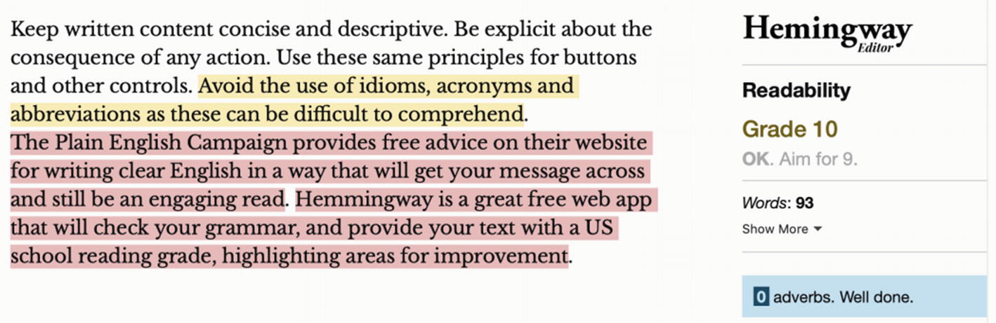
Many people with anxiety, mental disorders, or learning difficulties will often find the ability to add restrictions on themselves a positive action. A 2019 study from Noë and colleagues found that apps that don’t provide a defined endpoint to content, for example, infinite scrolling, can lead to smartphone addiction.17 Forcing a stop to our smartphone use allows us to take a break and refocus. Implementing these controls in your app will vary greatly depending on your app’s purpose. I have included some examples here for inspiration.

Setting a limit to social media use with iOS’ Screen Time feature
Setting an overnight downtime period with iOS’ Screen Time feature
Social Interaction
Digital services are an invaluable tool for allowing people to become social and find belonging. Adding a social aspect to your app can be a great way for like-minded people to discover each other and greatly benefit their mental well-being.
But as we cover in the section on Gender and Sexuality below, any way users can interact with each other can also be just as much of a detriment, to both your customer’s well-being and your business. It’s essential to prove a mechanism for customers to block content and users, and preferably a moderation system, for any form of interaction between your users.
Gamification
At its best, gamification is the digital experiences fork of nudge theory. Nudge theory is the behavioral science field that investigates using positive reinforcement to encourage positive actions. The most quoted example is that of adding images of house flies into urinals at Amsterdam’s Schiphol Airport. By adding the fly in the right spot of the urinal, it was discovered that men’s aim was significantly improved and spillage reduced by 80%.18 Gamification can be used as a means of making experiences more positive and has been shown to work well in patients with severe mental illness.19
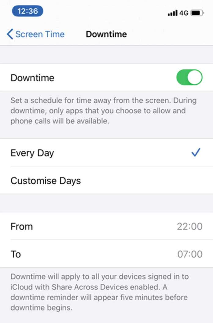
Achievements in Duolingo
While we can certainly criticize the increasingly needy, anxiety-inducing, push notifications Duolingo sends when you haven’t been paying enough attention; Duolingo, for the most part, is an excellent example of gamification done well. It’s colorful, friendly, and fun and importantly doesn’t push users into paying.
Gamification is all too often a euphemism for psychological manipulation, making your users do something they otherwise wouldn’t, be that spending money, performing tasks, sharing personal data or one of many other examples. Both app stores are full of “freemium” games, Candy Crush and Clash of Clans being famous examples. Many of these such games, while appearing free, require substantial real money investment to make significant progress.
UK mobile network GiffGaff has replaced some of their core business operations such as support and sales with customers, or “community members” as GiffGaff calls them. Points are earned for each task completed, like replying to a fellow customer’s support query in app. GiffGaff rewards community members with lower prices for everyone. Any points earned are redeemable for credit against customer’s bills. Providing rewards for positive customer behavior can be a great way of increasing customer loyalty, encouraging the practices your app needs and making your experience more enjoyable. But for me, outsourcing core business functions to your customers crosses an ethical labor boundary.
It’s a subtle but important line between engaging your customers with gamification and seeding bad habits. Noë and colleagues suggest that gamification in the form of competing against friends online can be a cause of smartphone addiction.21 Noë’s team uses the example of Snapchat’s Snapstreak feature. Snapstreak rewards regular posting with a fire emoji and the number of days the streak has been maintained. Users are encouraged to keep this streak alive. But this can cause users to feel pressured into posting and can result in high levels of stress and anxiety.
Financially Disadvantaged
A computer, tablet, or smartphone along with an Internet connection is not an insignificant financial outlay, and a recurring one too. For an estimated 20% of Internet users, a smartphone is their only access to the Internet.22 Smartphone-only Internet users are far more likely to live in deprived areas. 40% of them say their reason for using a smartphone because of the cost involved with other options.
We then have a responsibility as mobile developers to ensure we maintain feature parity with desktop experiences. There is a delicate balance to be struck too around the devices we support. Dropping support for older devices and operating systems can bring us benefits like reduced complexity and exciting new features. But the users we may be leaving without apps are commonly those who are most disadvantaged and may struggle to upgrade.
Consider too that people with disabilities often have a more substantial cost burden than those without — UK Disability charity Scope estimates this to be over $750US extra per month.23 People with disabilities are also more likely to be out of full-time employment. The United States has an employment rate of 3.7%; this rises to 8% among people with disabilities.24 So, people with disabilities are more likely to fall into the financially disadvantaged category.
Digital Literacy
You’re an expert. While we all have our own specialisms in software engineering, you’re still an expert. There are many people for whom anything digital is a mystery, perhaps because they lack the financial means. Perhaps they grew up at a time when computers were not ubiquitous and found no reason to learn. As a regular, long-time digital citizen, it’s easy to forget about, or look down on, the many people who don’t use the Internet, maybe even people who are scared of the Internet. But worries about online banking, for example, are genuine and one that 80% of us share.25
Essential Digital Skills
The UK Government, in consultation with groups such as Amazon and Microsoft, has produced a list of Essential Digital Skills.26 The government considers these skills to be the benchmark for any person to be able to use the Internet competently.
As you’re reading this book, I’m going to guess that you can do all these essential digital skills. Indeed, many of them may seem so basic they’re barely worth mentioning. The reality for many people in the United Kingdom, however, is that they can’t do these things we’d consider obvious. 21% of the UK adult population, 11.3 million people, don’t have these skills.27 More concerning is that 8% of the UK adult population, 4.3 million, don’t have any of these skills – not a single one. I have summarized some of the key skills and some of those most relevant to mobile.
Communicating
I can set up a group on messaging platforms, such as WhatsApp or Messenger, to talk to friends or family members.
I can post appropriately on social media and visit and post to forums such as Mumsnet or Reddit.
I can send photographs and other documents to friends and family as an email attachment.
I understand the importance of communicating securely.
Handling Information and Content
I understand that not all online information and content that I see is reliable.
I can use search engines to find information and make use of search terms to generate better results.
I understand that the Cloud is a way that I can store information and content in a remote location.
I can stream music from legal sites such as Spotify or Apple Music or watch streamed movies from legal sources such as Netflix or Amazon Prime.
Transacting
I can set up online accounts for public services.
I can set up online accounts for government services and retailers to order and pay for goods online such as through Amazon or eBay.
I can use travel web sites and apps to book tickets and make reservations.
I can securely manage my money and transactions online.
Problem-Solving
I can use online tutorials, FAQs, and advice forums to solve problems and improve my skills in using devices, software, and applications.
I can find out how to do something by using a tutorial video such as those found on YouTube.
I can use the Internet to find specific information related to life tasks that need to be carried out, for example, finding a recipe or finding information that helps plan travel.
Being Safe and Legal Online
I keep the information I use to access my online accounts secure, using different and secure passwords for web sites and accounts, and make sure that I don’t share this with anyone.
I can recognize suspicious links in email, web sites, social media messages, and pop ups and know that clicking these links or downloading unfamiliar attachments could put me and my computer at risk.
I understand the risks and threats involved in carrying out activities online and the importance of working securely.
I understand why it is important to keep my computer systems and security software up to date, and I allow them to be updated when prompted.
Findings
Of the five areas outlined above, the most highly skilled area is handing information and content. 91% of the population have adequate skills in this category. Yet, 21% of respondents weren’t able to download or save a photo they found online.
Despite an increasing amount of our interactions with organizations being digital, between 2015 and 2018, there has only been around a 1–2% growth in these skills. Only 87% of people were able to complete an online application form, and 85% were able to buy an item or service online. Of particular interest to us in mobile is that only 76% of people were able to install an app on their device.
You ≠ Your Users
In the past 25 years we have been designing [software] mostly for people who design [software].
—Vasilis van Gemert, Exclusive Design 28
As people who make a living, one way or another, from computers, it’s easy for us to forget that we are in a privileged position when it comes to knowing how to use the products we create. In reality, our customers are not like us; they’re not even that likely to be like our friends.
I’m sure we can all think of a family member who doesn’t use technology. If they needed to pick up a device today to do a task, will they know that the frying pan icon means they can search? Will they care about the cutesy names you’ve given to things, like “the cloud” when you mean storage? I remember a time from working in an Apple reseller. A customer believed AirPort, Apple’s brand name for Wi-Fi, meant they could only use Wi-Fi on flights.
We can’t be there to hold our customer’s hands. And I don’t think either us or our customers would want that either. There’s a fine line between thinking about what our customers are capable of and being patronizing. Avoiding jargon, both written and visual, is an excellent first step. To be successful at the rest, we need to know more about our users.
User Testing
When developing any product , it’s essential to know the market and who your customer base is. Why should this be any different when we’re creating software? There’s no reason why we, as developers, can’t talk to our users. Apart from that, many of us prefer as little human interaction as possible.
User testing can be time-consuming and expensive. But it can be the difference between a successful product and a failure, for any size of business. A product manager may be interested in user testing for identifying the product and its market. But as developers, we can use user testing to identify our market’s skills. This is precisely where the essential digital skills come in.

The UK Government’s digital inclusion scale
You can use this scale in two ways . If you are genuinely confident you have an accurate cross-section of your app’s user base as research participants, you can use the scale to get a read of your participants skills. The scale will help you learn how advanced and adventurous you can make your features. Just be confident that your users do follow.
Or, you can use this scale as a way to ensure your app is simple to follow. Check that, for those with lower digital skills, they can guide themselves through your app without you patronizing them .
Age
Technology has a generational gap. 99% of 11–18-year-olds have access to the Internet; 96% of them use the Internet every day. 28% of those aged over 60 are not online at all.29 This is a vast disparity between generations. Many of us grew up with the ubiquity of computing. Others had likely never heard of computers or knew them as an obscure industrial tool they would never use. Who among us, having not grown up on a farm, would feel confident, or even enjoy, learning the intricate details of sophisticated farming machinery in our thirties if this were suddenly to become part of our everyday lives? We cover many of the issues here in a broader context in the preceding section on digital skills.
While this skills gap is gradually closing, we can’t escape that the world has an aging population,30 and with aging comes changes to our body. As life expectancy grows, it’s a truism that most of us will live to see our body begin to fail us. So, although you might not use assistive technology now, in the future as your eyes, cognition, motor abilities, or any other physical facet begins to fail, you will begin to appreciate their presence. This is the same for your customers.
Text Sizes As a Gateway to Accessibility
The “gateway” accessibility feature for age is the ability to change text sizes. Supporting Dynamic Type on iOS and using scalable point sizes on Android is a must-have first step for accessibility in any app. Adjustable text sizes are commonly the first accessibility feature a customer may use, often without considering it an accessibility feature.
Customizable text sizes are on the cusp between what we might think of as an accessibility feature and a customization. So, supporting these helps to normalize the use of accessibility features. It also serves to educate your user that accessibility considerations are possible on their device.
There are no specific considerations that benefit the aged over the general population. But older people are more likely to benefit from accessibility features. Ensuring you’ve followed the guidelines elsewhere in this book will mean your app provides a better experience for older users.
Gender and Sexuality
I remember learning about basic data types in high school. The exercise was to create a data capture form for people to register for a party. Although anyone who required registration for a party in an Excel spreadsheet would be unlikely to have very many guests. We stored age as an integer, name as a string, and gender as a Boolean. From an engineering perspective, storing gender this way has never been an excellent example for the use of Boolean values.
We should generally never represent any real-world value as a Boolean. Life very rarely is a binary choice or decision. Limiting yourself to two options is limiting the scope for future refactoring. While I have seen a person’s life status represented as an enum, this is an extreme example. Although this would mean refactoring for the Night King’s army of the dead less of a project once winter inevitably does come. For anything other than life and death, I’d recommend an enum, allowing future changes.
Secondly, allowing only two options for anything involving identity means making assumptions about the people who are using your app. This is true whether you make this choice actively or passively. This assumption about your customers may not be correct, and many of your users won’t thank you for it.
Gender
Gender is a perfect example of why using a Boolean for real-world values is a bad idea. Gender is not, and never has been, a binary choice, but it was not too long ago that as a society, we considered it as such. Because of this societal norm, we created a lot of software to accept a binary choice of male or female.
Regardless of your personal view, there is an overriding technical software engineer perspective that tells us this was a poor choice. By programming all these systems to use an inflexible Boolean, we created a large amount of technical debt for when we inevitably change how our system works. In the example of gender identity, society is demanding that we change how the system works. This change now requires back-end database migration and front-end redesigns to allow for that expanded choice.
The software craftsperson view here is that by limiting to only two choices, we are excluding those who don’t identify as male or female. We are adding to their feeling of exclusion and creating a barrier for them to take part in society. Many gender nonbinary people have been excluded by their family as teenagers or young adults and, as a result, begin life believing they don’t belong. As many as 48% of nonbinary teens admit to attempting suicide.31 Allowing people to identify themselves to our software as they identify in life is much more than a decision between data types. It is a clear sign that everyone is welcome to be who they truly are and whoever that is, they are a valued member of our society. This doesn’t stop your users from identifying as male or female if that’s their choice.
Storing Gender
One solution to this as an engineering problem, while maintaining data validation is to store gender as an enum. As an essential minimum, I would suggest male, female, and nonbinary.
A more inclusive solution would be to present these options and more as auto-complete suggestions to a text field. We are thus allowing people to enter their own option.
Don’t offer a third option of “other” or hide options behind an “other” selection. “Other” is a clear sign you’re considering anyone not identifying as male or female as less important. And of course, make sure your system has an option to change gender options later.
A third, even more desirable option, is to consider why you are capturing gender at all. Unless your app covers health, I struggle to think of a genuine reason to require capturing this data.
Importantly, remember that gender ≠ pronouns.
Pronouns
Don’t assume he/him and she/her pronouns for male and female genders, respectively. If you’ve followed my advice above, you won’t be able to make this assumption anyway. The best option for pronouns is probably to question if you require them at all. But if your app does refer to your customers by a pronoun, make sure you provide the option separate to the option for gender. Offer a they/them option, and allow your customers to change their pronoun as they need to.
Titles
It shows basic respect for your customer to refer to them as they identify. This goes for name and pronouns too of course, but for titles, there are also other options.
Personally, I dislike being known as Mr. and would prefer to be addressed simply by my first name. Many people feel it is polite to use a title, especially in a situation where you are not friendly with the person you are addressing. Many people have rightly earned the title of Dr., Sir, Captain, etc., and not allowing these options can be disrespectful. Unfortunately, due to the now somewhat outdated class system that has generated these titles, many are gender-specific. For those that aren’t gender-specific, be sure not to assume gender. Include a non-gendered Mx and probably the option for no title too.
Preferred Names
A common requirement for software is to store a legal or birth name. We expect the requirement for “real” names in software for HR, banking, or government services, for example. But it’s not unusual for us to want to be known differently. My preference is to be called Rob, but my passport says Robert. This can cause me problems booking international travel through work, where the systems automatically book everything in the name Rob.
The ability to have my given name separate from my preferred name, for me, is just a convenience. I would neither have to ask colleagues to call me Rob nor correct travel bookings to match my passport. But for many, this is a crucial part of their identity. For anyone who has or is changing identity, being known by a name they no longer identify with can be hugely upsetting.
Chelsea Hostetter at the Pronoun Project observes that a “real name” policy can increase discrimination, specifically in situations where someone may be out to one group but not another.32 Facebook’s policy of flagging accounts they believe not to be using a “real” name can cause those flagged to feel like a fraud.
Allow your customers to be known by the name that they feel comfortable with, and allow them to change this as they need to. There may be apps where a birth or legal name is required, but only collect this and use it if this is essential.
Harassment
This section could equally apply to any minority section of society and indeed any category in this book. I choose to include it here as gender and sexuality, unfortunately, provide the starkest examples of how technology can enable harassment.
Gay dating app Grindr has been used by repressive regimes to identify and, in some cases, hunt down members of the LGBTQ+ community.33 In the United Kingdom, Grindr and other apps were used by serial killer Stephen Port to lure his victims.34
The reality is stark but simple. If your app provides any way for your users to interact with one another, your app can, and will, be used for harassment, regardless of your app’s primary purpose. There are examples of finance apps like Square35 and PayPal36 being used to harass people by sending small amounts of money along with a short note. A blocking mechanism is essential anywhere personal interaction is possible. You may also need a moderation and reporting system. All of this means we need to thoroughly consider the decision to add user interaction and its consequences into our apps.
Deafness and Hearing Impairments
Smartphones are predominantly a visual medium. As such, it can be easy to forget to consider hearing impairments when building apps. Especially if your app doesn’t use audio, you may think hearing impairments aren’t a consideration for you at all. But here are a couple of things to consider.
Clear Content
Language is complex and interconnected in the human brain. We don’t, and will probably never fully appreciate how our use and understanding of language develop. This is to say, it can be a common misconception that people with deafness can compensate in other ways, for example, a high standard of literacy. This is often not the case for a couple of reasons. Losing the context of hearing language retards learning literacy skills.37 Remember too, that spoken or written language will always be a second language for a deaf person who prefers sign language. Consequently, you should always prefer clear, concise language with a logical layout, free from idioms and sayings.
Captions
If your app uses audio in any way, you should always provide captions in one form. You can provide captions as a separately available transcript at its simplest. Ideally, embed closed captions in your videos as we covered in earlier chapters.
Remember that the same applies to audio content, not just video. If your app includes spoken voice overs, such as a game, for example, you should caption these too. Additionally, most appropriate for games, don’t rely on your customer having to determine the direction from which the audio is emanating. If your game pans audio to the left to hint at a bad guy to the left, provide a visual hint too.
Physical and Motor Skills
As with every impairment we have covered, physical and motor impairments cover a wide variety of abilities. This ranges anywhere from missing a digit, thus making multi-touch gestures harder, to having minimal movement. In later life, Stephen Hawking was limited to movement through a single cheek muscle yet was famously able to operate a computer. Much like any user, your customers with physical impairments will appreciate simplicity in your user interface.
Precision
Don’t insist on accuracy from your customer; all interactive elements should have a minimum size of 44 pixels in each direction. Google recommends on Android that interactive elements should be a minimum of 48 pixels. Importantly, remember to separate interactive elements too so you prevent accidental input.
Keyboard and Switch Access
Test if your application is navigable with each platform’s switch access features. There are two common pitfalls to look out for.
An unfortunately common effect on the Web is the phenomenon of the “keyboard trap.” Keyboard traps happen when navigating with the tab key. It is possible to navigate to an item but not to navigate away again. I have not seen this commonly on mobile platforms, but it does happen. On mobile, this can also happen with switch control and screen readers too.
Second, ensure the logical navigation order of elements. When you read through the elements on your page without switch control enabled, did you read it in the same order the switch control feature did? An app with poor accessibility will cause keyboard highlight to jump around the screen. This random movement is frustrating at best.
Both platforms are navigable with external keyboard input, without requiring any activation by your customer. iOS does require a little help with some standard features like paging, however. The open source project KeyboardKit38 should help with this. Where possible, implement keyboard shortcuts too.
Timeouts
People with motor issues can struggle to interact with their devices for many reasons. Using a smartphone with two steady hands will almost always be faster than anyone with any form of reduced dexterity, be that missing digits or limbs, conditions such as Parkinson’s disease which causes shaking, or people with severely limited moment who use switch or voice control. Requiring customers to act within a specific time will put a significant strain on customers with motor issues.
Remove any time limits that are not essential. Where you need time limits for your customer’s security or to prevent denial of service, for example, make sure these are as long as possible while maintaining security. If a time limit is due to expire, save progress and inform your customer the time limit is coming to an end. Offer them the option to extend or renew the time limit, and pick up where they left off.
Shortcuts
Wherever possible, provide shortcuts. Shortcuts could be a bypass to a common area of your app or a more straightforward way to fill out a form. As an example, if your app deals with e-commerce, you’ll need a shipping and billing address for each order. Making your customer fill out both addresses in full for every order they make is an excellent way to lose any repeat customers. But for people who find interacting with your app a chore, this is more than a minor frustration. A fix here can range from letting your customer duplicate the address for both billing and shipping, through to using a postal or zip code lookup tool and for repeat customers allowing them to save addresses for later use.
Automation
For people with physical impairments, any movement can be expensive. Depending on the person’s impairment, this could range from moving across a room to toggle a light switch to navigating around a smartphone screen. As such, anything that reduces the need for movement is desirable. Automation is a fantastic tool for this. Aside from automating smart homes, we can use automation to make everyday tasks within our apps and across apps touch-free.
In Android, Google provides App Actions. App Actions allow apps in specific categories to hook into the Google Assistant, which means fast access to everyday activities with a single voice command.
For iOS, Apple provides a fantastic framework for this with Siri Shortcuts. Siri intents allow your customers to not only control your app with a single voice command but also to chain activities together through the shortcuts app. Customers can then trigger shortcuts with a single tap, voice command, or even external triggers such as time, location, or tapping an NFC tag.
Visual Impairments
Adjustable text sizes and screen reader support are essential for including people with visual impairments. Supporting your customer’s chosen text size is table stakes for any mobile app. If you’re not listening to this setting, or if you’re truncating or overlapping text at larger sizes, you need to reconsider some of your development processes. Assuming you have supported this, other sound design principles will help include those with a visual impairment of any kind.
Careful Use of Color
Color is a powerful way of quickly conveying meaning, but not everyone experiences it in the same way. Some people have deficiencies in their color perception, making differentiation difficult. Some people with blurred or impaired vision will find colors close together will blend into each other. It is vital for choosing when, where, how, and what colors to use in your app that you pick colors disparate enough that they can be easily determined. The World Wide Web Consortium’s Web Content Accessibility Guidelines (Chapter 3) recommend text should have a contrast ratio of 4.5:1 against its background, or 3:1 for large text of around 18pt or larger. For higher-level compliance with WCAG, aim for a 7:1 contrast ratio.
And remember to not rely on color alone to convey meaning. While it’s a great way to show status, a green or red highlight won’t be visible to everyone. Remember too that different colors have different meanings across cultures. Always combine the color with shapes or text so you have a redundant way of presenting the information. Remember to add a meaningful label for TalkBack and VoiceOver.

Paciello Group’s free Colour Contrast Analyser software
Logical Layout
A good UX design for your app will make a big difference for people with visual impairments — present content in a flowing, logical, linear layout. Aim to keep content presented in a natural direction – left to right for most languages. Zoom or magnification users will navigate your app from the natural reading side, meaning they may miss any content presented from the right. Consider this if you are presenting a status icon next to text. If your icon is to the right of your text, a magnification user may never realize this status indicator is present.
Keep related controls linked together using semantic view techniques we discussed in Chapter 4 for Android and Chapter 6 for iOS. Linking elements will help to increase the context of your control while making navigation more straightforward.
Race and Nationality
Race is a perfect example of why it’s essential to involve people with a range of backgrounds throughout our development process. Ensure that your team includes talented engineers from different countries and cultures. This way, you’ll learn much more about your unconscious the assumptions around the people who use your app.
Machine Learning
Machine learning , unfortunately, provides us with some stark examples of where a lack of diverse thinking can backfire. Machine learning is another technology that would fit into any category we discuss in this chapter. But race has explicitly been an area machine learning has proved to be troublesome.
In 2017 AI-powered selfie app, FaceApp stumbled into several controversies as a result of using unchecked stereotypes. One filter they provided changed your face to appear as a different race.40 While most of us would probably question if this form of digital blackface was a good idea, FaceApp didn’t until after their users told them.
It is an unfortunate side-effect of the underlying neural network caused by the training set bias, not intended behavior.
—FaceApp CEO Yaroslav Goncharov, TechCrunch41
Machine learning models are indeed a cause for concern. But the models are not to blame. Machine learning is, despite any hype, like any other computer system – a product of our input. As a result, a significant function of a machine learning model is to reveal our biases. In the case of FaceApp, the group who trained the model had picked beauty based on a European ideal.
While the FaceApp example caused distress and offence, some examples go further. Machine learning systems in use by US courts routinely recommend longer sentences for black offenders compared to white.42 The black-box nature of machine learning models compounds this problem. It’s not truly possible to test or audit why a model has come to the decision it has.
It’s also the case that machine learning is an incredible technology that has helped to power many of the most exciting new features in mobile apps. Image processing filters like we’ve seen in FaceApp, Snapchat, and Instagram would not be possible without it, neither would the natural language processing that makes accessibility features like Voice Control and Voice Access possible. If you do choose to use machine learning models in your app, consider carefully the application. Have confidence in your data, and try to understand your data’s biases before starting. Test, as much as this is possible, to discover where your model is detecting your implicit, unconscious biases. Your model may even help you to improve your data collection.
Localization
Localization is a vast topic. We covered the basics of localizing an app for languages in earlier chapters. But localization is a topic that could comfortably fill a new book. As well as translating your text, remember right-to-left languages require you to consider your app’s layout, both in UX design and how you then build the design in your app. Using flowing layouts accommodating varying element sizes will help. Remember, formats are different across locales. Living in the United Kingdom, I am regularly confused when booking trips to the United States and have to double-check I have entered the correct month and day order for dates. If booking apps detected my locale, this would reduce the stress of my booking experience.
Even if your app is only available in a single market, we live in a global society. In 2017 the US Census Bureau found that nearly 22% of Americans spoke a language other than English when at home.43 That’s around 70 million people in the United States who would likely find your app less complicated to use if another language was available to them.
Developing Accessibility and Inclusion
I’m genuinely grateful you’ve chosen to pick up my book, not just because this book means a lot to me personally but because I’m always excited when people want to know more about mobile accessibility and inclusion. We have a privileged position as people who are shaping how the modern world works and progresses. And we have opportunities that colleagues in other fields don’t. If a building with step-only access finds people can’t access it, replacing the steps is a big job. In software, we can identify and fix similar issues rapidly. Then we can have the improved software in the hands of our customers within the time it takes for an app review.
Hopefully, with this new knowledge, you’ll begin to identify potential accessibility issues in your app. As you gain more knowledge, please pass this on as you gain confidence. Arrange workshops, or speak at a lunch-and-learn session. For larger teams, consider starting an accessibility community of practice program. Sharing potential issues and fixes will only result in a better outcome for your customer.
From my experience, most of our fellow developers are interested in accessibility and want to do the right thing. They’re sometimes just lacking the knowledge about how to do this.
A11y Community
Much like the iOS and Android communities as a whole, there’s a vibrant and dedicated digital accessibility community. This community generally uses the acronym A11y. We take the A and Y from accessibility, and the 11 refers to the 11 letters in between. It also creates a pleasing homonym for ally. Usefully this acronym also helps to differentiate people who are passionate about making accessible technology from those who use accessibility features. If you’re looking to find out more about the accessible technology community, try searching Twitter or LinkedIn for #A11y. I run a Twitter account, @MobileA11y, to share mobile-related accessibility content.
Meetups and Conferences
The A11y community hosts a range of conferences and meetups discussing best practices and advancements. These are great places to expand your knowledge and meet experts to ask for more information when you’ve met a particularly sticky accessibility bug. I also got the opportunity to learn British Sign Language at one event.
There are many accessibility meetups and conferences throughout the world, but I’ve attended, and can highly recommend, both Accessibility London44 and Accessibility Nottingham45 in the United Kingdom. While I’ve not had the opportunity to attend, mobile accessibility specialist Paul J. Adam is an organizer of Austin Accessibility and Inclusive Design meetup46 in Austin, Texas. And mobile accessibility expert Jon Gibbins is an organizer of Bristol Inclusive Design and Development meetup47 in Bristol, United Kingdom.
Accessibility Scotland48 in Edinburgh, United Kingdom, is a 1-day accessibility conference with some incredibly thought-provoking talks. You can find videos, transcripts, and slides for these talks on their blog.49