In this chapter, you’ll discover a little about the history of inclusive thinking and what this means. We’ll cover the fundamental tenets that hold up this thinking, and discuss the things that you should consider when creating software, such as the importance of remembering that your users are real people. We’ll cover the single most critical skill any software engineer can have that comes hand in hand with taking pride in your work.
The History of Inclusive Thinking
Digital inclusion has its roots in architecture and product design. In the process of creating mobile apps, good design is essential. But a significant part still of the accessible experience of an app is created by those of us who aren’t designers. Digital inclusion recognizes that everyone, including but not limited to designers, has a role to play in encouraging more accessible interactions.
Even if you’re not a designer, I think it’s worth our time covering some of the background of this school of design. This way, we can understand some of the mistakes that were made and steps taken to fix them. Plus, if you’re an engineer, your job is to make designs a reality. So knowledge of the work that has influenced those designs will help you realize them.
Universal Design
Digital inclusion has its roots in universal design, a movement that began in the late 1960s and led to many commonplace accessibility improvements we see around us today. Architect and designer Ronald Mace coined the phrase universal design. He used it to describe the concept of designing usable products and the built environment for the most people possible, while crucially remaining aesthetically pleasing.

A curb cut providing step-free access to the street
Equitable use
Flexibility in use
Simple and intuitive use
Perceptible information
Tolerance for error
Low physical effort
Size and space for approach and use
I have summarized very briefly what each of these principles cover here. I’ve also given a quick outline of how each principle might apply to mobile. Some of the concepts here might be new, but we’ll cover all of them in later chapters.
Equitable Use
Make the design appealing to all users. The design should be useful and marketable to people with diverse abilities. Avoid segregating or stigmatizing any users. Provide an identical experience for all users wherever possible. If you have to provide an alternative experience, make this equivalent. Consider privacy, security, and safety for all of your customers.

Flexibility in Use
Your design accommodates a wide range of individual preferences and abilities. Provide choice, facilitate the user, and adapt to them.

Google’s on screen keyboard allowing typing through dictation
Simple and Intuitive
Ensure your design is easy to understand, regardless of the user’s experience, knowledge, language skills, or current concentration level. Eliminate unnecessary complexity. Be consistent with user expectations and intuition. Accommodate a wide range of literacy and language skills. Arrange information in a manner that is consistent with its importance keeping the most critical information prominent. Provide effective prompting and feedback during and after task completion.
Stick to a standard design language throughout your app, including sticking with system-provided controls and conventions wherever possible. Summarize information carefully, but allow customers to drill down for detail if they would like more information. Keep the language simple and understandable. When your app requires user input, you should be explicit about what information you need and where. If your customer makes an error, make this clear and allow them to change it quickly.
Perceptible Information
Your design should communicate necessary information effectively to your user, regardless of ambient conditions or the user’s sensory abilities. Use different modes (pictorial, verbal, tactile) for redundant presentation of essential information. Provide adequate contrast between foreground and background – we cover this more in chapter 3. Provide compatibility with a variety of techniques or devices used by people with sensory limitations.

Android combining color, shape, text, and an image to convey meaning
Tolerance for Error
Minimize the hazards and the adverse consequences of accidental or unintended actions. Arrange elements to minimize risks and errors: Make commonly used controls prominent. Provide warnings of dangers and mistakes. Advise your customer in advance if they are making a destructive change and allow them to back out. If your customer makes an error, highlight this clearly in position and allow them to change it effortlessly. Before committing to any action, let your customer review their response, and allow them to change or revert. Provide safety features so destructive effects can’t happen by accident.
In mobile apps, this includes using clear and concise information on the consequences of each action when you ask your user to make a decision. Add friction to harmful or destructive actions and provide feedback to your customer on what to expect when they make the decision.
Low Physical Effort
Ensure customers can use your design efficiently and comfortably and with a minimum of fatigue. Minimize repetitive actions and sustained effort.
Shortcuts for common features within easy reach at the bottom of the screen
Size and Space for Approach and Use
The final principle is mostly appropriate for physical items. The principle states you should provide proper size and space for approach, reach, manipulation, and use regardless of user’s body size, posture, or mobility. Make reach to all components comfortable, and accommodate variations in hand and grip size.
Android’s Voice Access feature allowing navigation without touching the screen
These universal design principles have led to the creation of many items we would consider to be every day. We may not think of many of these products as “accessibility” features. Consider audiobooks, automatic doors, high-contrast signage, and flexible drinking straws. All of these products were created following universal design guidelines. They serve many people with different abilities but are improvements for everyone else as well. This is what we should be striving for in our apps. Our ideal aim is to create an experience that includes everyone.
Universal design considers disability and considers what you can achieve in modifying the design to help people experiencing that disability, thereby reducing the barriers for the use of the product. Reducing barriers widens the market for potential users. However, as universal design was developed in an era before digital, the approach has been tailored to physical products.
Inclusive Design
Inclusive design extends on the gains made by universal design. It is generally more tailored to digital interactions. While universal design considers disability, inclusive design considers individuals and tends towards a more accessible-first approach. Inclusive design takes a big step forward in recognizing that disability is not a permanent, binary state but a spectrum. Inequalities in people’s abilities are typical and vary as a function of time or situation. Inclusive design does this by considering people’s needs as permanent, temporary, situational, or changing. By improving an experience for people with specific needs and considering these needs in the first instance, we can extend this benefit to work for a broader population, therefore improving the experience for everyone at some point in their life.
Provide comparable experience
Consider situation
Be consistent
Give control
Offer choice
Prioritize content
Add value
I have outlined the principles and how they apply to mobile in the following.
Provide Comparable Experience
Ensure your interface provides a comparable experience for all. Allow people to accomplish tasks in a way that suits their needs without undermining the quality of the content. You can provide audio descriptions or a transcript of a video in your app. These would make your original content accessible. But does this alternative capture the essence and tone of the original? Mobile interactions have an exceptional quality to surprise and delight their users. You should make sure all of your users get such a rich experience, even if they are using an assistive technology.

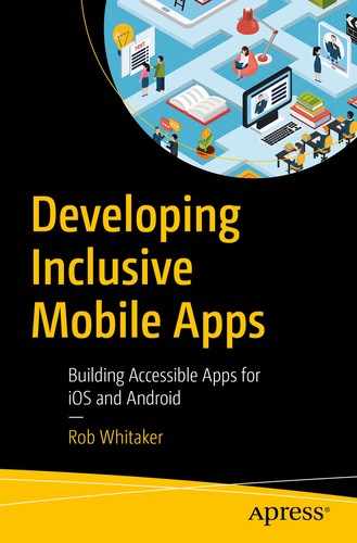
The “correct!”/”incorrect” area of the screen is a live region. TalkBack will automatically announce this content when it changes, without the user losing focus
Consider Situation
People use your interface in different situations. Make sure your interface delivers a valuable experience to people regardless of their circumstances.
Captions for videos allow people to watch video without disturbing others, as well as helping people with hearing impairments
Be Consistent
Use familiar conventions, and apply them consistently to promote familiarity and understanding. This consistency applies both within your app and against the system you’re running on.
Don’t reinvent the wheel in your design. When you’re building the design stand on the shoulders of giants by using the controls that Android and iOS provide for you, feel free to subclass the controls to add a feature or appearance you need, but starting with these as a base will give you so much extra for free. Your user will feel at home because their interactions will feel familiar, and Apple and Google already have you covered for many accessibility features.
Give Control
Ensure that people are in control. Your customers should be able to access and interact with content in their preferred way. Do not suppress or disable the ability to change standard platform settings such as orientation or font size (Figure 2-9). Additionally, avoid content changes that have not been initiated by your user unless there is a way to control it.
iOS dynamic test styles at their smallest and largest settings. Supporting these is important for your customer and requires a flexible design
Offer Choice
Consider providing different ways for people to complete tasks, especially tasks that are complex or nonstandard. There is often more than one way to complete a task. You cannot assume what someone’s preferred method might be. By providing alternatives for layout and task completion, you offer people choices that suit them and their circumstances at the time.
Deleting mail with a tap
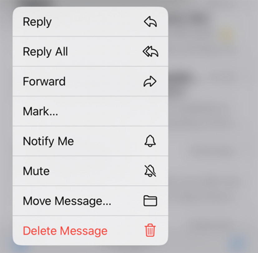
Deleting mail with a long press

Deleting mail with a swipe
Prioritize Content
Help users focus on core tasks, features, and information by prioritizing them within the content and layout. Identify the core purpose of the interface and then the content and features needed to fulfil that purpose. Interfaces can be challenging to understand when core features are not clearly exposed and prioritized.
Structure your content logically and mark headings with a heading trait or role. When you launch an email app, you’re not presented with a list of mailboxes and folders to pick from. You’re shown an inbox because this is the most essential feature. Standard features should be simple and always available. More complex actions should be possible but not prominent. Making everything available at once makes for a confusing interface. Consider placing advanced controls behind a secondary gesture such as a long press.
Add Value
Consider the value of features and how they improve the experience for different users. Consider device features such as voice, geolocation, camera, and vibration APIs and how integration with connected devices or a second screen could provide choice.

Setting an alarm on Android. Haptic feedback is provided when moving between minute/ hour intervals
Persona Spectrum
One of the greatest proponents of inclusive design in software is Microsoft.5 Microsoft has introduced a tool they call the Persona Spectrum (Figure 2-14).6 The Persona Spectrum helps us to consider what inclusive design means to the people who use our software.
Consider, as inclusive design does, that we class disability as permanent, temporary, or situational. An example of a permanent disability may be the loss of an upper extremity. Losing an arm would make many everyday interactions difficult, and some may be even impossible. For this person, improving your app might mean ensuring all your buttons are within easy reach of the thumb of the hand that is holding the phone. Or even better, add voice control features. In doing this, you would also help to make your app more usable for people who have recently experienced an arm injury and are using a sling. Arm injuries are a temporary impairment – we would hope at least. Our customer with a broken arm will regain full use of their limb in a month or so. With this improvement, you would also be helping new parents. New parents may spend much of their time with the use of one hand, while they use the other to hold or feed their infant, control a pushchair, or hold a hand. In this example, our new parent has a situational impairment. The use of their second limb is restored once their child falls asleep or is handed to another family member.
In the United States, 26,000 people a year suffer from loss of upper extremities. But when we include people with temporary and situational impairments, the number is greater than 20M.
—Microsoft Inclusive Design Toolkit Manual7
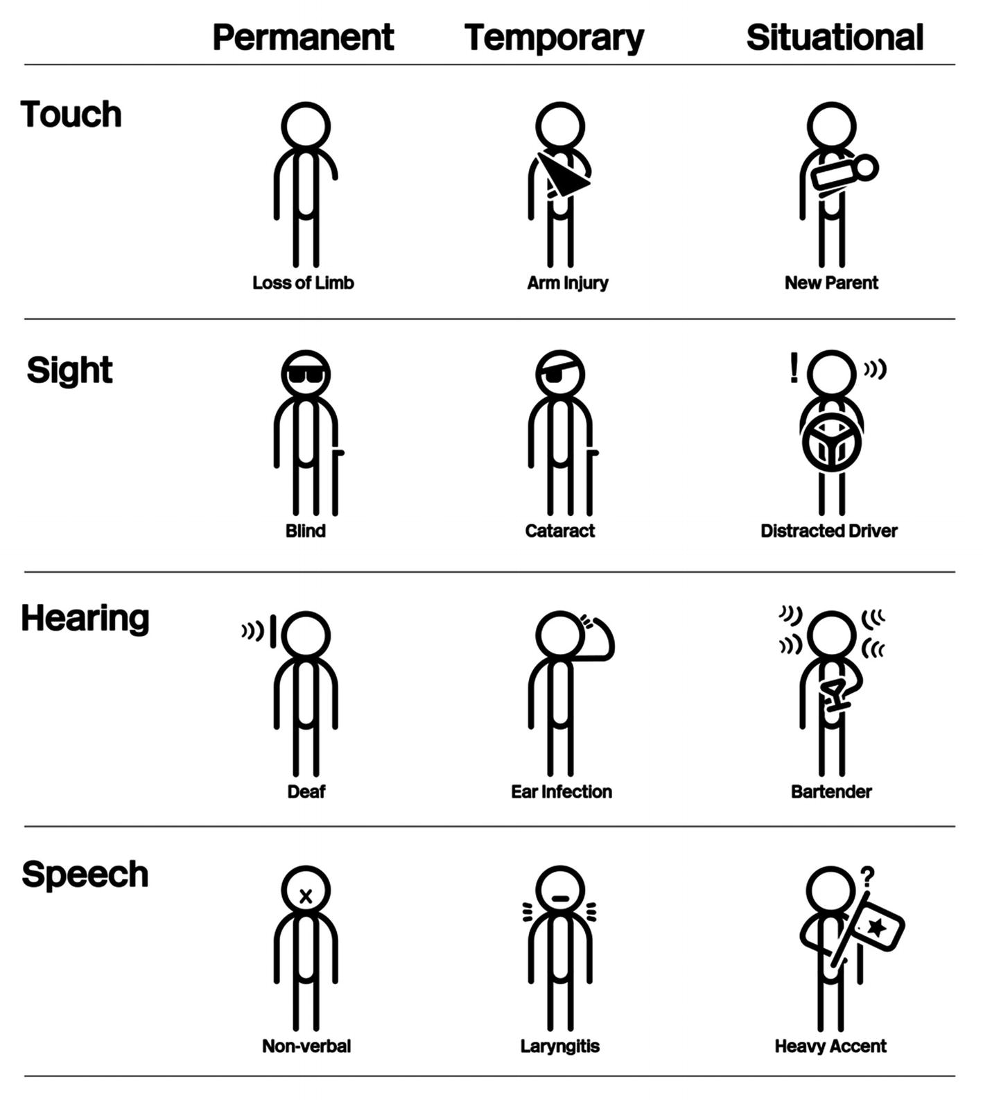
Examples of Persona Spectra
These examples provided by Microsoft also show examples of visual, auditory, and verbal persona spectra. A blind user would appreciate you considering how they would use your app without vision. This would also benefit someone who had recently had an eye operation, or someone who is currently driving and can’t look at their device’s screen.
Considering how your app functions for deaf people will help people with an ear infection or people who work in a noisy environment. A person who uses nonverbal communication would benefit from the same considerations as would help a temporary condition like laryngitis, or a situation like communicating with someone with a heavy accent.
Can your team create new examples of the Persona Spectrum ?
Consider one of your customers with a permanent disability. What temporary or situational scenarios you would solve for if you improve your app for those people?
Consider the situation of a customer being in the wilderness. What features can you add that would help this user? How would that help people with temporary or permanent impairments? What about a customer who suffers from anxiety? What improvements can you make to give this customer a better experience, and how will that benefit others?
Digital Inclusion
Making software in an agile organization consists of more than implementing a screen as a designer has prescribed. There is much we can take from the design approach to inclusion. But not all of it is relevant to those of us who aren’t designers, and much doesn’t directly apply to the modern digital world.
We need a digital-first approach to inclusion, one that constitutes for a more rounded, high-level set of convictions. A strategy that recognizes everyone within the organization has a role to play in ensuring the service created is suitable for the highest number of people possible. Developers, with their advanced platform knowledge, constitute a significant part of this process. An essential part of digital inclusion is realizing that people with disabilities, while important, are not the only minority who want to use our service. Other factors such as age, gender, education, social grouping, income, and sexual orientation can all have an effect on how we experience technology. I have summarized my suggestions on what would make up the principles of digital inclusion in the following.
Empathetic
Considering others and recognizing that everyone is an individual with different in knowledge, experience, and ability and acknowledging that this makes people’s experience of your app different – arguably, this is the most key tenet of digital inclusion, and we will cover this in its own section.
Situational
Not all barriers to using your app or service come from people’s physical abilities. Inclusion means considering people’s situation as a whole. This includes their skills but also other factors: financial, gender, digital literacy, mental health, and first language, among others. Realize that all these factors affect how someone may use your app.
Institutional
The software your organization creates mirrors your organization itself. Consider how the almost libertarian viewpoints of some social media leaders have led to platforms where almost anything goes, including at times racism, election interference, and harassment. Everyone in an organization can play a role in improving the accessibility of an app for the app’s users and arguably has a responsibility to do this. In the following section, we take a look at what we mean by users and who these people are.
Users
In software engineering, we usually create products for our “users.” It’s sometimes said, in a quote often attributed to data visualization pioneer Edward Tufte, that calling people “users” is a habit we exclusively share with drug dealers. Except that’s probably not true either. Drug dealers, I would imagine, still call their customers “customers” because that’s what they are. It’s really only the police and the media who employ the word “users.” I don’t intend to police the language you use, but let’s take a look at why we should have a second thought about using that word.
Individuals
I don’t believe there is anything inherently wrong in using the word users; in fact, I do use the term throughout this book. The problem is that this word can often hide who we’re really making software for – individuals. Each and every one of your users is an individual, each one with their own individual wants, needs, abilities, experiences, and requirements for your software.
Employing the word “users” can result in falling into the trap of thinking of users as one group – an amalgamation of people who are out there somewhere in the world using your app, a group of people that you’ll never meet and never know. This form of “group think” leads to creating a “one-size-fits-all” solution that, like everything claiming to be “one size fits all,” in reality fits no one.
The great thing about you is that no one else is you. No one else has your skills and experiences. In the same way, you have never met a “normal” person, because nobody is normal. Everybody sees and experiences the world differently because they have seen and done things differently. Remember that time you had a bizarre bug in your app that happened because one person was using your app in a way you could have never envisaged? We’ve all had that experience. People do unpredictable things precisely because they think and act differently. What may have been an inconceivable combination of actions to you may seem entirely reasonable to someone using your app. Conversely, things which may appear obvious to you are going to be incomprehensible to some of the people using your app.
It is entirely natural when creating anything to be consumed by others to build it for people based on our own experiences. The problem with doing this is that you, or any of the other people in your office, won’t be the main consumers of the product you are creating. While everyone is different, everyone working in a tech company office is, most likely, less different in some crucial ways than almost everyone else. There’s a good chance if you’re working in tech that you know tech pretty well and you’ve probably used quite a lot of it. Maybe you even enjoy using it; this is not the experience of a good many people.
In the past 25 years we have been designing [software] mostly for people who design [software].
—Vasilis van Gemert8
Your Experiences
Think about your group of friends and your colleagues, and think about your family. All of these groups you, hopefully, get on with, but there are subtle differences.
Your friends are likely to be similar to you because you’ve chosen to hang out with them, and because they’re your friends, I can already tell they’re going to be awesome. Perhaps they don’t work in tech, but there’s a good chance that because you do, they will have a pretty high level of digital literacy. They will usually be a similar age to you, come from a similar background, and crucially enjoy many of the same things you do.
Your work colleagues are likely to be more varied, but there will still be things you have in common that are not representative of most people. You’re all of working age and able to work. You all earn a similar amount of money (comparable to the general population). And you’ll all have experience and interest in the industry in which you’re working. Compare this to your family. Most of us will be able to think of at least one family member who doesn’t use the Internet, maybe a family member who has a disability or for whom English is not their first language. Your family will make up a much more varied group than your friends and probably even your colleagues.
If we use our own abilities as a baseline, we make things that are easy for some people to use, but difficult for everyone else.
—Microsoft Design10
The best way to fix this is to speak to real people. We discuss user testing in Chapter 11. Hopefully, your organization will already be doing some form of user testing. Don’t write this off as an activity for design or product. Engineering can learn a lot too.
Here’s a quick exercise to highlight why considering people you know is likely not representative of your customers. Make a list of the top five people you trust. These can be colleagues, friends, or family – people who you would go to for advice. Do this before reading on. Now add yourself to the list.
Now, list some of their traits. Use the same characteristics for each person. How old are they? What is their gender? List their race, sexual orientation, employment status, religion, and first language. Make a note of any disability you’re aware of. There are probably other examples of traits you can think of. It’s ok here to be honest and keep your answers private.
Take a look at your answers for each. My guess for most people is that these traits will look closely aligned. That’s ok. The purpose of this exercise is not to shame you into expanding your network, simply to highlight that the people who are close to you are likely closer to you than you may have thought.
Profile sections
Person name | Have fun choosing a name, but it’s essential to refer to this person by name once you’ve created the profile |
Age | Give an approximate age range |
Gender | Remember that approximately 2% of the US population doesn’t identify as either male or female11 |
Immediate family | Do they have dependents, either children or adults they care for? Are they married, live with family, or perhaps live alone? |
Job and income | Your person could be employed, unemployed, self-employed, underemployed, or hugely successful in their career. Perhaps they are a lottery winner |
Disability | Around 14% of people globally experience disability.12 You should aim for a range of profiles that reflect different disabilities and none at all |
Backstory | Go wild. Or not. Remember this profile is intended to represent a real person, but feel free to have some fun here |
Why does this person want to use your app? | What will your app do for them? Is this a choice, or do they have to use your app for some reason? |
Empathy
Software is not made up of cold, unthinking algorithms. Sometimes this is used as a weak defense for bad decisions made in software’s name. More importantly, it plays down your skills as a developer. It hides the reality that creating software is a craft and that those of us who make it are craftspeople in the most real sense of the word. We build beautiful software by hand and genuinely care about what goes into it as much as the end result. We’re always sharpening our skills and expanding our personal toolbox.
I want to propose that one of the greatest, and most overlooked, tools a software craftsperson can have is empathy – the ability to understand that many other people, unlike you, will be directly affected by the decisions you make when creating an app. This has to be the central tenet of digital inclusion. Empathy is not a skill you can learn by having the highest number of commits to a project or having the most stars on GitHub. It is a tool you can only improve by taking a genuine interest in people and your craft.
Openness toward feelings and esthetics
Dealing with people
Cooperative
Work–life balance13
The author of this list, however, never intended them as a guide for being a better engineer. Instead, precisely the opposite. These are all examples given by alt-right former Google employee James Damore in his notorious “Google memo.” This list was intended as criticism on female software engineers. Essential reading on gender subjects14 would tell you these examples are based on outdated, discredited research.
Conversely, they serve as a fantastic set of desirable skills for anyone working in software. By ensuring our teams have the highest possible range of life experience, we can use this experience to help inform our decisions. If you have a male-only team, you’re excluding the experiences of 50% of people.
I mention Damore because his false assertions on diversity are in many ways the antithesis to this book. In a section entitled “De-emphasize Empathy,” Damore states that empathy causes us to “favor individuals similar to us, and harbor other irrational and dangerous biases.” What I would like you to take away from this book is the exact opposite of what Damore is saying. We should emphasize empathy precisely because it helps us to recognize and overcome our subconscious bias toward those who are similar to us. It is only possible to do empathy with emotion and a deep personal understanding of what is right. With the expanded sphere of experience that empathetic feeling gives us, we can then unemotionally reason to overcome these challenges.
Empathy As a Motivation
So, you’re empathetic. You want to make a difference. You want to fix things for people with disabilities. This is a noble aim, but is it helping people with disabilities, or is it making you feel better? By saying you want to fix things for someone with a disability, consider what you are implying. Disability is not wrong and doesn’t need to be fixed.
Ask people with disabilities to be at your table. Most people are not interested in talking to disabled people, they prefer to empathize. But empathy is not helping us.
—Marie van Driessche16
People with disabilities want to have an equivalent experience. They want to be able to use your app just as anyone else does. Accessibility is not a gesture to make you feel better or to gain your brand influence. Accessibility is a tool to achieve inclusion within your software.
Bias
Unconscious bias is something we all have. It is an entirely natural part of being human that we have evolved as a survival mechanism. As such, to fight against unconscious biases can be counterproductive. Research on unconscious bias training shows that if anything, this makes biases worse and encourages stereotyping.17
The best option is to acknowledge and accept that we all have biases, and use them to help guide you. Ensure your team is as diverse as possible. This will help your team empathize with as many people as possible by using each other’s personal knowledge and experience in the form of your own biases. In this way, you can build up a broader base to examine the consequences of the decisions made in your software.
Move Fast and Break Things
Overall, I would like us to finally put to bed the philosophy that has caused a whole lot of bad in software – “Move fast and break things.” Even Mark Zuckerberg18 himself seems to now be realizing this is not a legitimate way of operating anything, let alone a consumer-focused business. I want to propose a new philosophy we can use to make software, one where we work in a considered and empathetic manner to progressively improve the experience for as many people as possible.
Summary
Inclusive thinking has its root in industrial design and architecture. But this doesn’t mean its guiding principles don’t apply to engineering too.
Accessibility is about inclusion. Make changes that will bring your customer into your app rather than making a separate experience for people with different abilities. Allow your customers to customize their experience to suit them.
Remember who your users are; they’re not always going to be like you, your colleagues, friends, or family. User testing is an essential tool to find out how people experience your app. Make sure your participants are varied.
Empathy is an essential quality of any software engineer. It helps you to remember to treat your users as unique individuals.
We now have a background on what accessibility and inclusion mean and what has driven thinking in these fields. Let’s begin to look at practical ways we can help different people who want to use our apps. Before we cover any specific technologies, we should look at what our aims are. The Web Content Accessibility Guidelines, or WCAG, form a definitive framework on what improvements we should make to our apps to make them more accessible.