2. Titans
The Great Midwest Mounted Valise
July 1974
I arrive in New York’s Penn Station. It’s a steamy morning. I am filled with the energy from my European experience and armed with examples of design unlike anything New York has ever seen. I carry them in a large sample case made of black bonded leather, quite possibly the largest sample case that can be carried by a single human; nothing less could hold the voluminous ideas I have to offer. My friend Otter Hallstein finds it comic, and dubs it “The Great Midwest Mounted Valise.” Something about the name fits: a dominant aesthetic that rides east and arrests the attention of New York. Absurd, impractical, and hi-yo, Silver!
To begin my assault on New York, I have three telephone numbers on an index card. The first is for Dan Small, a fellow creative squid from Cleveland, who, according to his mother, has a great job in the fashion industry and can undoubtedly get me some gigs. The second is that of Walter Papillion, a creative director in advertising whom I met at a university lecture and who will surely get me some interviews at top agencies. The third is for Ed Gottschall, the executive director of the American Institute of Graphic Arts (AIGA).
Penn Station becomes my office, my toehold in New York City. There is a telephone center: thirty telephone booths in two banks flanking a desk where one can obtain change and assistance with overseas calls. The booths have small, upholstered seats, and each booth has a bifold door with glass panels. Closing the door from the inside activates a light and a ventilation fan. The crucial amenity for a job seeker is a steel shelf, just big enough for taking notes.
In Pittsburgh finding my first job after graduation took two weeks, so with two years of professional experience under my belt, New York should be ... no big deal.
I enter Booth 6 confident that one of my three contacts will quickly lead to a great job with a slick office. Over the course of the next three minutes, I leave three messages. Not to worry, several things to do. First, find newspaper, review want ads. Next, examine the other phone booths. The portfolio that New York is breathlessly awaiting does not fit in Booth 6, and I wonder if perhaps one of the other booths might somehow accommodate it. I also need to explore Penn Station for food, a shoeshine stand, a street map, and some three-by-five cards.
Penn Station Booth 6
Booth 6, selected impulsively, is in fact about the best of the lot. Its upholstery is nearly new, the fan is quiet (other booths have fans that clatter), and the clock on the main departure board is visible. On my third visit, the phone center customer rep behind the desk asks if she can help me. She has observed my experimental efforts to fit The Valise into one of her phone booths. I explain the problem, probably distractedly, without thinking that countless other portfolios poured countless dimes into her phone center before me. Her name badge declares “SUSAN—MAY I HELP YOU?” in Micro-gramma Bold Extended. The Microgramma font—perfect for, say, a sumo wrestler or a bouncer in a biker bar—is incongruous with her soft voice and demure manners.
“May I?” she asks, and demonstrates how to fold the handles back, ease the top of The Valise into the back corner of the booth, curve the monstrosity just enough to rest a bottom corner on top of the phone, slip one’s person in, and carefully slide the bifold door closed; meanwhile pressing the bottom of The Valise into the hinge corner, so it stays diagonally in the top third of the booth, out of the way, adequately supported yet protected from the outside world. She steps out of the booth and hands me back my career in cowhide. I feel like an unsuspecting participant in a clown act.
“Try it,” she says with a glimmer of a smile, but not a trace of irony. She had listened to my explanation of the problem so patiently, even though she had seen it all before! I do try it, and amazingly, it works. With The Valise thus suspended above me, I settle into cold calling.
Dan Small is no longer at the number I have for him. I also learn that the number I have for Papillion is actually that of his traffic manager, whose job is to protect her boss and his department from a flood of wannabes like me. Gottschall, I am told with the great cordiality afforded card-carrying, unemployed AIGA members, sees portfolios on Tuesdays and Fridays, and can see me at 10:30 a.m., three Tuesdays hence.
Having transcribed some of the more promising want ads onto three-by-five cards, I begin calling. Susan Microgramma passes by while I am on the phone. She does not wave, but she does gesture ever so slightly with her nose at my suspended portfolio; her look seems to say, “Others made it through here, you can too.”
Somehow, I expected my arrival to have more impact. But the city sees ambitious kids wash up on its shores like so many pebbles and shells. Train ticket filling up with punches, pockets filled with index cards, I work the want ads, most of which turn out to be from employment agencies. I begin to place great hopes on my scheduled appointment with Ed Gottschall.
Answering help-wanted ads does not vary much. One is expected to wait a lot, fill out forms a lot, and smile through utterly impersonal treatment. None of the employment agencies even wants to look at The Great Midwest Mounted Valise!
The Valise Goes Awol
After three weeks of answering want ads and researching design firms I have wrangled an appointment—a real appointment—with an art director who is looking for design help and has agreed to review my portfolio. This may be my ticket out of the phone booth at Penn Station! I take the bus there, a bit euphoric.
Sixth Avenue, somewhere around 34th Street. I am frozen stock still, perhaps 12 inches from the brass door pull at the location of my appointment. Seeing my hand reach for the door brings about the realization that my other hand, which should be gripping my portfolio case, is empty. I have left my graphic design portfolio on the New York City bus that brought me here. My body is paralyzed because my mind is sprinting, darting from realization to conclusion.
If I were in Cleveland, I could go to the Transit Authority lost and found and probably get my portfolio back tomorrow. The New York Transit Authority may have a lost and found, but I know instinctively my portfolio will never get there. Without my portfolio I will never get a job.
After an eternal instant, I am able to move my eyes in the direction of traffic. There are several buses that might be the one I rode, now a few blocks away, merging with other buses into the immense river of Manhattan traffic.
The word “portfolio” means different things in different professions. For an investment manager, it is a selection of investment positions representing ideas about what will succeed at a particular price and time. For insurance companies, it may mean a pool of risks being underwritten. For people outside the creative arts, it is hard to understand the young designer’s attachment to his portfolio. In many professions, the newly educated practitioner passes tests and gains a license. The license means they are like their peers, having a certified professional status. Singers and actors must pass through the fiery furnace of auditions, but at least their talent resides within them. Graphic design is different. You may have a degree from Mount Olympus University, but if your portfolio sucks, your credentials don’t mean much. You may have no education at all, but if your portfolio is exceptional, well, come right on in! Of course, if your portfolio is exceptionally missing, you are really and truly naked.
My mind races to the inevitable conclusion: that Valise is my future. My body takes up the sprint. I cover the first block in a single step. The light at 35th Street is against me, but traffic is immaterial. Screech! Honk! Keep accelerating. 36th Street. I am wearing the Sunday-school clothing of a Presbyterian kid from Ohio: a blue worsted wool suit, black wingtip shoes with soles well worn but uppers buffed. The pain of sprinting in dress shoes is unable to make its way up my spine, drowned by the flood of adrenaline rushing downward. 37th Street melts behind me. If only my high school coach could see this performance! The street sign for 40th Street looms and disappears. I make the first quarter mile in what seems like 15 seconds. Twenty numbered streets to the mile in New York City. I am running after a group of identical buses. 41st Street. For an instant, my resolve weakens. I have, somewhere in my mother’s basement in Ohio, a set of slides of my portfolio. I could forget about it and reconstruct The Valise.
But the danger and the oxygen have me thinking clearly: C-prints from those slides would be of disappointing quality, and it would cost a lot! Find overdrive and catch that bus!
42nd Street is a torrent of traffic. I pick up a bruise on the bumper of some vehicle. I play chicken with a bicycle messenger breathing through the police whistle in his mouth. I have no idea how I am going to recognize the bus I was on, but I will only have to worry about that if I am not killed by a cabbie. Running full tilt, yet drifting back in time, I’m searching for an answer. How long have I been building up my dependence on this bundle of paper? When did it start? Surely I was not born with one? I look back to interviewing for my first job in Pittsburgh, to assembling my college portfolio, then to the portfolio I carried to get into college. Running, I think back further, to Avant Garde magazine and emulating the paintings of Dalí.
From somewhere in the cosmos, help arrives: there is road construction uptown, and a couple of lanes are blocked. I pull even with a half-dozen buses and slow to a trot. Bingo! I recognize the graffiti on the advertising placard on the side of my bus. It is at a slow roll. I bang on the side of the door. The driver does not stop, but opens the door; I catch the grab bar and swing on board. She clearly has not read the transit authority safety rules!
“I thought we would see you!” she says cheerfully. “Behind my seat. You run good!” I seize The Valise, thank her, and jump off; she never slows her pace.
I have to figure out what to do. Clearly, visiting the art director in the thirties is out of the question. I would be an hour late by the time I made it back there. I’ll dream up an excuse tomorrow in Booth 6. My next appointment is (Aha, I have not lost my prized three-by-five cards!) Ed Gottschall, at AIGA. I’m a twenty-minute walk from 63rd Street and Third Avenue, and I am due to see him in an hour. I sit on a bench, my pulse returning to normal. I am now the owner of The Great Midwest Mounted Dumpster. Its contents are scrambled; all the careful mounting and sequencing is askew. Whoever gave it to the bus driver must have pawed through it first—maybe looking for money? Worse, there are large gaps between the soles and the uppers of my wingtips, and they are scuffed and scraped. I am sweaty, and my suit is decidedly grotty. There is a rip in the pant leg where I grazed a bumper. I decide to push on. Maybe there’s a men’s room in the lobby of AIGA.
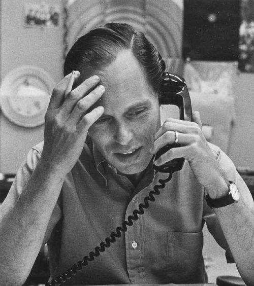
Ed Gottschall: Not Your Average Interview

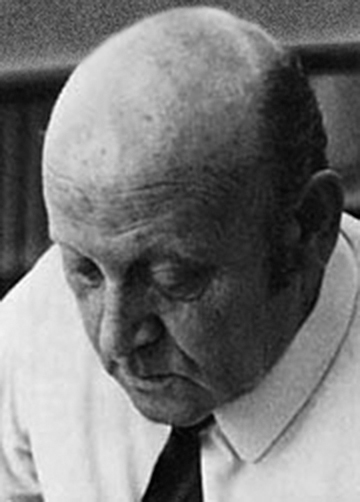
Edward Gottschall (1916– ) is a lifelong enthusiast in typography and design. He graduated from the City University of New York in 1937, and received a master’s degree from the Columbia School of Journalism in 1938. He served as editor of Art Direction magazine from 1969 to 1975 and executive director of AIGA from 1973 to 1976. Gottschall served for two years as president of the Type Directors Club, founding the TDC annual show, one of the longest-running exhibitions in the graphic design world. He was executive vice president of International Typeface Corporation for fifteen years, and served as senior editor of U&lc magazine, an experimental typography magazine founded by Herb Lubalin. Gottschall taught at New York University and Pratt Institute, retiring in 1990. He is the author of Typographic Communications Today, and coauthor of 18 other books.
June 1974
There is not, it turns out, a men’s room in the lobby of the AIGA offices. I arrive at the reception desk still sweaty, but cold. In the shiny door of the elevator, I see reflected a parody of a stereotype: a Midwestern stripling who got rolled in the Bowery. If they laugh out loud, it will be entirely understandable!
Ed Gottschall is a cordial, dark-haired man. He clearly loves people. I consider explaining my appearance and scrambled portfolio, but cannot begin. He does not bat an eye; in fact, he is incredibly gracious. He rotates each upside-down piece carefully and asks about it. He takes a full twenty minutes to go through The Valise, possibly a record.
“So, David, what are you in New York to do? Oh, book publishing, excellent. That I can help you with.” He reaches across his desk to one of four large rotary address files and starts browsing. “Anyone in particular you want to see?”
I name some names: Glaser, Chwast, Rand, Lubalin. Never mind that I am naming the most sought-after names in graphic design, Gottschall knows them and their dues pay his salary, so he figures out ways to be valuable to them all.
“Paul Rand’s phone is unlisted, and he says he doesn’t see portfolios anymore, but I know he does—just don’t tell him where you got his number. You may get lucky.”
I feel as though I’ve used up all the luck—bad and good—allocated to me for the decade. He is writing on a yellow pad, line after line, single-spaced. Name, company, phone, sometimes an asterisk.
He explains, “These are the publishers that care most about design—many don’t, you know. Whole art departments without a single AIGA member!” He rolls his eyes with a smile, without interrupting his writing. “Now mind, you can use my name with the ones with asterisks. You will get their gatekeepers, but you mention my name in the same breath as your own. If they don’t call you back, I want to hear about it. I send them business, I send them talent—they should know the score.”
Gottschall gets to the last line of the page, pauses to reread, adds another asterisk, and tears off the sheet. “Son, you have a ton of talent. You stick at it—you will have a great job. But mind, the town is crawling with talent. Where you are in your career right now, two years out of school, you have a lot of competition. Talent is a given; the jobs go to the persistent. Be charming, but by Jove don’t stop calling till they say yes!”
He continues, “You have a right to ask for referrals. Everyone will say they aren’t hiring—even if they’re desperate to fill a job. If they don’t ask how much money you want, don’t bring it up. But you should have your price in mind and say it without hesitating. Figure what you need to live and double it. They will beat you up on price, so have something to give up.” His advice is not exactly new, but there is sincerity and gnosis about him that makes him sound like the oracle at Delphi. He is about to hand me off to his receptionist, when I spot a page on his desk. It looks like an illustration made out of typography. I am unable to pass it by.
“You have talent, and you also have a lot of competition. Talent is a given; the good jobs go to the persistent. Be charming, but don’t stop calling till they see you.”
“Mr. Gottschall, what is this?” I have just hit the mother lode.
“Oh, Gottschall is working on a book about typography,” he says, as though he were talking about the inexplicable activities of a crazy uncle. His excitement for the project is impossible to contain. “Been working on it for some time.”
I am wowed, so I act wowed. “What’s the title? Where did you get all these fantastic examples? This wonderful old wood type? These old cigar box tops?” He’s delighted to talk about it; I am making his pet project come alive. A good 45 minutes later, he has given me a short course on typography, and in the process he has been reminded of all the people he knows who love books and typography. I now have a second sheet of names and asterisks, better than the first. My AIGA dues have delivered a jackpot payoff—just because I asked about something interesting on his desk!
A good interviewer will zero in on the faults of a portfolio and rank the talent by lowest common denominator. A really skilled interviewer sees past the faults, and looks at the potential.
I learn two things of great value: First, a good interviewer will zero in on the faults of a portfolio and rank the talent by lowest common denominator. A really skilled interviewer sees past the faults, and looks at the potential. If a kid shows up in tattered clothing with a ransacked portfolio, look at it carefully; you might see something really good that everyone else misses. I am fated to forget and relearn this valuable lesson numerous times. Second, when you finally get in someone’s door, you are getting a glimpse of their life and their interests. It is the mirror image of my first interview with Jim Burke—there he saw something in my portfolio that sparked the interest. Here, I found it on Gottschall’s desk.
Gottschall’s two pages of names become my treasure map and talisman. As I leave his office he says, “Now, don’t be a stranger. I want to know where you land!” What a great expression! It frames job hunting as a flight, as a trajectory. A newcomer to any profession can easily liken job hunting to being earthbound, stuck in the mud. Gottschall says, in effect, “You are a bird on the wing surveying the professional landscape—enjoy the view!” The value of this analogy comes back later, when I am employed and exploration is difficult.
Cold Calling 101
I hear from other designers that Herb Lubalin has a stable of talent with whom he works steadily, and though it’s well known that he never hires green talent, every art and design student who comes to New York wants to interview there.
Sitting in my office in Penn Station Booth 6, I make the first of many calls to Lubalin’s office. The secretary tells me—in what is really a very humane voice considering how many times she must have had to recite her speech—that he is not seeing portfolios or hiring. When I sat in Ed Gottschall’s office that first day at AIGA and he told me to be persistent, I imagined having to call back three or four times. I invest a call to Lubalin, Smith, and Carnase every few weeks. Lubalin’s receptionist learns my name, so I think I am making progress, but after a while she leaves and is replaced by someone new.
As the summer wears on, my book begins to feel tired. Really I am getting tired of showing it and getting praise and referrals but no job offers. I find odd freelance projects, which are not much use for demonstrating my value to the larger marketplace, but at least provide sustenance. I take the train into town and dutifully sit in my Penn Station office with a pack of notecards. I am now polished at hearing “no” and asking for ideas, names, and referrals, so that I always have new three-by-five cards and new names to call. Hope. Each card is scrap of hope. I am burnished by each indignity. Interviewers stand me up. At first I am angered, but no longer—next time I call they apologize and agree to see me. Rarely do they brush off the same person twice.
Herb Stern: The One Week Hence Test
Herb Stern (1930– ) was born in Frankfurt am Main. His family left Nazi Germany in 1938, relocating to New York City. Despite a fascination for art, Stern attended Bronx Science High School, and later studied Advertising Art at the Insititute for Applied Arts and Sciences, New York. Stern began his professional career at J.D. Tarcher & Co., working for Harry Pritchett, a talented art director who had worked with Paul Rand and Lou Dorfsman. The Tarcher agency folded while Stern was in the Marine Corps during the Korean War. Upon returning to civilian life, he worked at the William Weintraub Agency under Paul Rand, and then at Mel Richman Studios. He also had his own studio, serving mainly magazine publishers, before joining Ziff-Davis, where he stayed for thirty years. During that time, he rose from art director to VP Creative, and played a pivotal role in the company’s transition from magazines to technology and media. He retired from Ziff-Davis in 1999, and continues his work as a fine artist.
September 1974
Two hours a day on the train gives me a lot of time to read. George, Be Careful is the autobiography of George Lois, a brash and highly successful advertising art director. Lois describes his process of interviewing new creative talent. Sure, they have a great portfolio, but which ones can think on their feet? Lois devises tricks to startle his job applicants. He will pick up a glass ashtray and toss it at his unsuspecting applicant. If the applicant catches it, that’s a good sign. “Good hands!” A missed catch usually means broken glass. How does the interviewee react? Poised and snappy, well, OK, maybe the candidate is still worthy of consideration. If the reaction is embarrassment or anger, game over.
I begin to think about the interview process from the other side. What are the tests likely to be? What do I need to do to pass them? Suddenly I realize that I’m already being tested. Several people have taken my call, heard my pitch, and responded, “Sure, I’ll look at your book. Call me one week from today, at this exact time, and I’ll set up an appointment.” Up until now, I had noted it on the prospect’s card, figuring that I’d call them later. Nothing magic about that exact time—unless this is a test. I put down the book and flip through my index cards. I realize I have failed the test several times already.
An art director named Herb Stern, I notice, asked me to call back at 10:30 a.m., and today is the day! I make it to Penn Station and call, just a minute or two early. He picks up the phone. I remind him of his interest in seeing me if I called back. He says, “Sure, come in next Tuesday at 4:00.”
Tuesday arrives, and so do I. Between George Lois and Herb Stern, I have learned a new trick, and I vow I will be on the lookout for ways to pass tests with every phone call.
Stern is visible in the design community as the promotions designer for the magazines published by Ziff-Davis. He is a dapper fellow, with hair that lays down straight across the top of his head then erupts in curls at the side. Ziff-Davis is a crisp, professional place and Stern’s office is spartan, almost unnaturally neat. Stern looks at me intently, but the effect is not uncomfortable.
The One Week Hence Test: “Sure, I’ll look at your book. Call me one week from today, at this exact time, and I’ll set up an appointment.”
By this time I’ve learned that, as much as I want to control the interview, things work better if I sit back and let the interviewer go through the portfolio. I hand it over. He flips through it without a word, giving each item about two seconds. Then he looks at the resume, again a fast scan. He reviews the book again at about half speed, putting clips on three or four pages. It’s not uncommon for art directors to keep copies of a few pages of each book they see, so I feel honored when he hands the pieces he wants copied to an assistant. I don’t remember seeing anyone scan the book once fast, then a second time slowly. He turns his attention to me. He asks a few questions about the production details on a few of my designs: what font here, who printed that, who is the photographer, and so on. Those hurdles cleared, he asks about my career goals. I tell him publishing is the reason I’m moving to New York.
Stern raises an eyebrow. “Really.”
I’ve already learned that publishing is not the best-paid field, nor necessarily the place to win the most awards. You go into publishing because you believe in it. He turns to me more directly in his seat and relaxes a bit.
“All right, then, I’ll make a few suggestions.” He goes through my book, removing half the work. “You need not show more than ten pieces.” He continues with barely a pause. “Next, let me comment on your presentation. You kept your mouth shut while I was looking at the work. That’s uncommon for a designer your age.” I flash back to how many times I motormouthed my way through a portfolio showing. I manage to say thank you.
He asks if I have any questions, and I ask whether he is hiring anyone at my level anytime soon. He acknowledges the question with a nod, but continues his advice.
He is not hurrying, but neither is there a wasted word. “You should be here to interview me, too, you know. You should ask what we do, what we look for in new hires. You made it in here, so you have earned the right to ask for names. You should not leave without having harvested at least three leads. Ask, ‘Would you mind suggesting some other shops where you think my work would be well received?’ That way, you’re asking your contact to call your work to mind, and match it with the work of other employers with whom they have personal connections. Always ask for permission to use the contact’s name when you call.”
Stern is paying me a high compliment, coaching me like a rookie coming to the show. His voice takes on a serious tone. “You know why I asked you about production details?” I decide not to wing it, and confess I don’t know. He continues, “There are always young designers who want to break into the business so much that they slide a few pieces of finished work by other designers into their own books. They don’t realize that an experienced art director picks it up right away; so the questions about things like fonts and production are a sanity check, a way to see if the portfolio you are seeing is for real.”
The One Week Hence Test: “It’s an employer’s survival skill. Ninety percent of the first calls can’t make that second call. I don’t want disorganized help, no matter how great a portfolio they may have!”
I like this guy—he’s got one trick after another—so I hazard a question. “You asked me to call you back exactly a week later. Was that some kind of a test?”
He replies, “Perhaps. Really, it’s an employer’s survival skill. Ninety percent of the first calls can’t make that second call. I don’t want disorganized help, no matter how great a portfolio they may have!”
“I can’t make time to train you, but I want you to keep in touch, and send me new samples.” He scribbles several names on the back of his card, shakes my hand, and with his left hand he gives me the card.
To show I have been listening, I say, “May I use your name?” He nods, and at the same instant his assistant appears to show me out. He is already turning away to review his phone messages, and in seconds I am back on the chaotic Manhattan pavement. I send Stern an occasional note or sample, but the opportunity to work for him does not materialize. Yet his coaching quickly becomes a permanent part of my self-presentation.
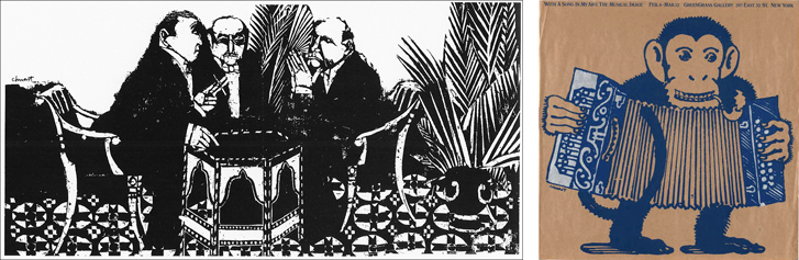
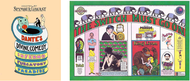
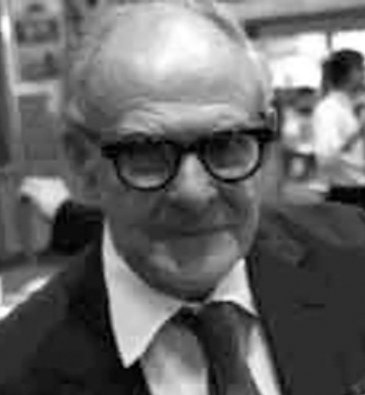
Seymour Chwast: Bad Luck, So Good Luck!
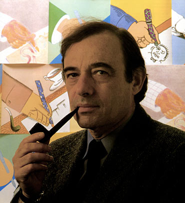
Seymour Chwast (1931– ) was born in the Bronx, New York, and educated at Cooper Union. After an early attempt at setting up a studio with his fellow students failed, Chwast worked at the New York Times promotion department, followed later by Esquire magazine and Condé Nast. He began soliciting freelance work with some fellow designers by publishing Push Pin Almanack, which showcased creative illustrations. (It was later renamed Push Pin Graphic.)
Push Pin Studios did for the graphic design what the electric guitar did for music. Their work seemed to proclaim “We are for pure, joyful expression: decorative, rich, inconsistent, polyglot, and exuberant! Design and illustration are inseparable, and by the way we can originate the font and write the headline if we feel like it. We can do anything for anybody; we can invent three new styles every day before breakfast!”
Chwast’s versatility in drawing, design, and typography, along with the fruits of his collaborative work with more than two dozen other Push Pin members, was honored with a retrospective exhibition at the Louvre. In 1984 Chwast was inducted into the Art Directors Club Hall of Fame; he was named an AIGA Medalist in 1985. He is the illustrator and originator of many books, including illustrated versions of Homer’s Odyssey, Chaucer’s Canterbury Tales, and Dante’s Divine Comedy.
October 1974
Twelve weeks and counting since I stormed Manhattan, and still no job. I train into Penn Station, check the want ads, make phone calls, and shuffle through my three-by-five cards to see whom to call when.
I try to schedule portfolio showings in the morning, pick up the odd freelance job, grab an early afternoon train out of the city to beat rush hour, then finish my freelance work in the wee hours. It has the regimentation of a job, but without the regular pay. The Presbyterian Sunday-school outfit gives way to a commuter’s shirt and tie. The intensity of work on new portfolio pieces tapers off. I am getting interviews, but no job appears. My new shoes—bought to replace the ones ruined chasing buses—look very worn. The Great Midwest Mounted Valise, purchased when my savings were ample and my optimism high, looks weary too. Discouragement is setting in, and I have to find ways to fight it.
What got me here was enthusiasm for big design, Push Pin, Chermayeff, Rand, and Lubalin, but none of them are interviewing. Sifting through my cards, I come across Push Pin Studios. I have calls logged weekly for the first ten weeks, then a gap. They have a receptionist, and she has a waiting list: you leave your name once and she confirms you are still on it, but they are not setting appointments. Someone is peering in the phone booth door at me, so I had better make a call. Push Pin it is.
“Push Pin Studios,” says a new voice, and hope stirs. Remember to smile before speaking.
“Hi, this is David Laufer. I’m on the waiting list to show my design portfolio.”
“I don’t see you, when did you call?” A nice voice.
“I called first in May, and have been calling on and off since . . .”
“Oh yes, I see you. You requested Mr. Glaser. He is still booked, but I just had a call canceling a morning meeting with Mr. Chwast. Can you be here in thirty minutes?”
What a combination of great luck and rotten luck. In my exhaustion from the previous night, I hadn’t rearranged or refreshed my portfolio, and I would have liked to refresh my memory on Chwast’s career and work. I have barely enough time to get there. An unhappy commuter mutters at me while I extricate The Valise from the phone booth and dash across Penn Station for the southbound subway. I stop in the men’s room. I look crummy! I splash my face with cold water. The paper towel dispenser is empty, so I dry off with toilet paper from a stall and scram.
The office is not glitzy, but it certainly is busy. There are several rows of cubicles, the surfaces of which are covered with reference material, clippings, sketches, and photos. There are a half-dozen large, black portfolios similar to mine, leaning up against the side of a cubicle. Are these other applicants’ work? I look closely, and see that the luggage tag has a Push Pin business card in it. Even the most published studio in the world has several portfolios ready to show to customers!
I announce myself to the receptionist, who appears to be marking up a large manuscript and monitoring a lot of packages coming and going. The workspace seems smaller than my expectation, but the atmospheric energy is immediate.
“Mr. Chwast says he will be with you in just a few minutes.
” The reception area is full of envelopes and boxes waiting to be picked up by couriers, and there is a table for inbound packages. I recognize the labels of several typesetters.
The receptionist motions me into a cubicle. After a few seconds I realize this is not a spare cubicle—this is Chwast’s workspace. It is crowded but orderly. There are project files laid out in envelopes, and a side table with markers, brushes, half a dozen swatch books for colored paper, film, and inks. These are the usual art supplies that I and everyone else have available, and yet what world-changing work has come from them.
“Hi. Seymour Chwast,” he introduces himself, extending his hand for a friendly shake. I’ve seen pictures of this man in magazines, smiling with his latest creation, holding this award or that. In person, he has a quiet demeanor. He has an air of mystery, which may be a result of my admiration for him, but I think it is real.
“Keep your seat. Give me just a minute,” he says, moving purposefully through the files on his desk. A young man with sandy hair dashes in with an illustration and pulls back the flap. Chwast locks his gaze on it. Without taking his eyes away, his fingers pop off a few strips of masking tape, and he attaches a piece of tracing paper on top of the illustration. I can’t see it well, but it’s a line illustration in gray, with the white areas filled in with flat areas of colored film, like pieces of stained glass shining around the metal frame. After lifting the tracing paper to view the work, he lays the paper back down and circles selected areas, then hands it back.
Chwast turns to me. Someone with that many projects in front of him should be stressed, but he seems quite relaxed. His manner is at once smiling and serious.
“Do we have a resume from you?”
I probably sent one a few months back, but I reach in the back pocket of The Valise for one. Nada. I have a stack of them sitting at home, but The Valise has none.
“I am really sorry, I appear to have given out my last one—I will have to send you one. This appointment came open just today...”
I am feeling worse by the second, but Chwast is cheerful and unfazed.
“Sure, send one on. Not important really.” He waves away the unimportant resume. “We use them to write notes on, is all,” he says as he finds a legal pad and pen. “So, let’s see your book!”
Here is a man who has probably seen thousands of portfolios, probably does not need to ever look at another one in his life, yet not only is he willing to see a drop-in, he still takes pleasure in the activity! He flips through the work quickly. My portfolio is loaded with watercolors and sketches as well as my finished work from Pittsburgh, and it is a bit of a hodgepodge. It does not look considered or organized, and I am cursing myself for not being better prepared. Note to self: Every day is your big chance!
In my mind I hear Herb Stern whisper, “Don’t apologize. Just let him see what interests him.”
Some interviewers engage their interviewee in small talk: where are you from, who have you been to see, how did you get my name. Chwast focuses intently on the work on his first pass through it, which takes perhaps 45 seconds. On his second pass, he makes a few comments without looking up.
“You draw well, but the mood of your work is very dark.” He is reacting to the watercolors I made of a series of urban scenes, influenced by my commuting. “There is a place in illustration for every mood, but sunshine sells better. Your industrial experience—where did you work?”
“Pittsburgh.” I give him a quick verbal resume. I am struggling to be cheerful and fighting the feeling that I have wasted the long-hoped-for opportunity of this meeting with this creative legend.
Chwast says, “When you draw for yourself, you can of course bring out your innermost feelings. When you draw for others, you must find expression for theirs.” He is looking intently at me now. He is addressing me not as a student or a street kid, but as a peer.
I see in an instant that the intensity and authenticity of his illustrations are a natural extension of his personality, his disposition.
“You can draw anything you perceive, you convince me of that. Now convince me you can draw someone else’s point of view.”
“There are a lot of times that we as hired guns have to feel an emotion or take a position that is not ours. I see here the work of a soul confronting raw truth with clear eyes. Not easy. You can draw anything you perceive, you convince me of that. Now convince me that you can draw someone else’s point of view.”
I don’t have a good response. He is right. I feel bleak, and my work shows it. I am not sure why I came; maybe I should go back to Ohio. I hope I am not looking like I feel.
Then Chwast’s voice dispels the cloud. “I want you to do something for me—well, for yourself really.”
“Sure!”
Chwast picks up the steam engine, drawn with a compass and ruling pen. It is the same one Jim Burke liked. I keep it in my portfolio even though it is student work. Superstition, I suppose. Chwast holds it in both hands with a bit of ceremony and puts it in my hands.
“Go to your studio, and make a dozen new works that are not steam engines, but that have the same joy and simplicity and wit that are lurking here.” He pauses to see my reaction. “I’m serious now—you have the skills to make this portfolio much more exciting, and the faster you prove it to yourself the more use you will be to the this community.”
The sandy-haired man ducks back in with the corrected illustration. Chwast looks at it quickly. He removes the tracing paper. He makes a circular motion with his index finger over one area and says, “This area needs another layer of yellow, then flap it and it can go back to Forbes.”
I have recovered my wits a bit and am able to remember some of the work of his that I especially admire. I ask him how he uses so many different media—most illustrators find a medium they like and beome expert at it. Chwast seems to be the master of a dozen.
“Oh, speed, you know, we have to produce so fast, we are always looking for ways to get the right emotion on the page quickly.” He talks about moving from wet media to flat, colored adhesive film, and then on to other media experiments, but it’s clear he is less interested in media and more in the emotional effects he can get across. A phone call breaks in. Cradling the phone in one hand and shaking my hand with the other, he summarizes, as if stating a homily, “The perceptions of the people who buy what we sell are more important than the truth. So—good luck!” There is an elfish animation in his face as he says it, but I know he is earnest about his encouragement.
“The perceptions of the people who buy what we sell are more important than the truth.”
I can’t help but wish I had I been better prepared for this meeting, but perhaps we get what we need. I make my rounds and head home to New Brunswick, New Jersey with the conviction that my portfolio needs a makeover, and Seymour Chwast has given me a powerful insight into how to do it. He has also added some clues to the art versus design dichotomy: something to do with expressing your feelings versus intuiting the feelings of others.
Ian Ballantine: A Short Course in Genre Publishing
Ian Ballantine (1916–1995) was active as a publisher for his entire career. He attended Columbia College and the London School of Economics. He wrote his thesis on paperback book publishing. He brought Penguin Books to the US. Ballantine and his wife, Betty, were part of a team that founded Bantam Books in 1945. In 1952 they established Ballantine Books, which they sold to Random House in 1973. The Ballantines continued as freelance editors and consultants to many publishers. They are most famous for their commitment to promoting science fiction as a literary genre. Their numerous awards include two World Fantasy Awards, in 1975 and 1984. Ballantine published the first authorized paperback edition of J.R.R. Tolkien’s Lord of the Rings, the H.P. Lovecraft series, and more than 160 titles on World War II. All told the Ballantine publication list is more than three thousand titiles.
October 1974
Interviewing involves a lot of waiting. Not infrequently I arrive for an interview only to be told that my interviewer is in a meeting, out for the day, has been called away, might be back in an hour. I note these things on my cards. I develop the habit of carrying a book with me to read while waiting. I happen to be reading Isaac Asimov’s Foundation Trilogy the day I am to interview with Ian Sommers, the art director for Ballantine Books.
“Let me see if I can find Mr. Sommers,” says the receptionist.
So, I open Asimov and, within a few sentences, am engrossed in a world far away.
“So, you are reading Asimov!”
The voice comes to me through a thick acoustical shield necessary for reading against a noisy environment. I have never met Ian Sommers, so I assume this must be him, coming to look at my work. I stand, and instinctively grasp for The Valise.
“You are young to be an Asimov reader. How did you get interested in him?”
“I—to be honest, I had heard of him, but didn’t know what to expect. I was intrigued by the illustration on the cover. I needed something to read for the train. I had no idea what I might be falling into.”
This answer pleases the gentleman and his smile broadens. “A lot of thought goes into those covers.” I am a bit confused, because he makes no move to lead me anywhere. I decide to relax a bit and put down The Valise. “He is one of our best authors—very fast, very deep.”
I have to hold up my end of this conversation. I sense that some sort of testing is going on, but different than that of Herb Stern, since I am already in the door. My interviewer knows about book jackets. I am interested in them too, so I go there. “The jacket of this edition did not prepare me for the seriousness of the subject. I thought it would be—”
“Oh, you are getting at the heart of the publisher’s problem! How to make a sale with very limited information, very little time. There is no way to give the reader a full description of the narrative. We seize upon style, color, writing, typography, symbolism—absolutely anything we can use to get to the right emotional place instantly. The jacket has to be a window into the author’s soul. So what made you decide to buy it?”
I consider. “It wasn’t so much the investment of money as the investment of time, for me.” I remember Heinz Edelmann talking about hooking the prospective buyer with curiosity.
“Yes, you are not alone there. We have to constantly look for a way to convince the reader that they will have a good read—that they will want to stick with it to the end.”
I look at the cover again. “I think it was the unusual color scheme—it piqued my curiosity.”
“Yes! Asimov is profound, but at bottom he is optimistic about humanity. We work to package him that way.”
I need more information about where this is going, but I am not sure how to steer it. I gesture toward The Valise. “As a graphic designer, I am especially interested in those types of cues. I hate to quit a book in the middle, and I hate to invest time finishing something that isn’t interesting. I feel an obligation to help people select what they will like and avoid what they won’t like.”
This apparently is a good thing to say. He begins walking, saying, “Let me show you.” We enter a smallish conference room with bookshelves across the long wall. All the books are paperbacks. Some of the books are turned spine out; others are displayed face out, in layers, the way they appear in racks in stores.
“The heart of the publisher’s problem: How to make a sale with limited information, very little time, and lots of distractions. We seize anything to get the reader to the right emotional place instantly. Design is like a window into the author’s soul.”
“Each cover is a little poster,” he says. He is animated, glad, perhaps, to have an audience for an evolving theory. “You have only the top three and a half inches to catch someone’s eye. Title, colors, maybe a bit of the illustration.
So your first job as a graphic designer is to get the browser interested enough to give it a little attention, to pick up the book out of the rack.”
This is a bit of a revelation. Even though I’ve lingered over paperbacks frequently, I have never thought to break down my decision-making process and apply it to my graphic design work.
I say, “So that is why titles are always at the top.”
He looks at me carefully. “We’re experimenting with that. With some genres we think we get more handling with only a picture visible at the top.”
“Genres,” I repeat, curious. “You mean like poetry, biography, reference?” I am parroting the categories of publishing from the Literary Market Place.
“Oh no, much more specific than that.” He hands me a book. “You know the book Jane Eyre?”
I read Jane Eyre in high school and have forgotten all but the flavor of it. “Of course,” I answer, a little confused because the book he hands me appears to be some sort of period romance, but the title is not Jane Eyre and the author is not Brontë.
“Hugely popular, so much so that publishers wish they had a dozen Jane Eyres every year.” I look at the cover more carefully. There is a woman in a white nightgown trimmed with lace, her long, dark hair somewhat disheveled, running toward the reader, away from a large mansion, English—maybe eighteenth century. It is night in the illustration; the sky is deep blue, mysterious with brooding clouds. The mansion has a tower with a window high up, glowing dimly yellow. Is there a figure in the window, or is it a ghost? A flame? The story of Jane Eyre comes back to me. I look up at him.
“So this is like a Jane Eyre sequel?”
“A Jane Eyre industry! The cover of a gothic novel is a formula. It tells a certain reader what type of story to expect. If I put no light in the window, nobody buys it. Yellow is hope. If I put a man with the woman, it means she finds tempestuous love. If the man is chasing her, that means one type of plot. If he is running with her, the story is more about their struggle to be together. If the man’s hands are touching her below the neck, then a handsome but mysterious stranger ravishes her. Of course, they both turn out to be royalty.”
I am astounded.
He is telling me that there is a very specific set of cues that publishers use and that regular readers understand. “We know—after a lot of false starts—how to satisfy the many types of readers who want romance.”
“The gothic novel.” I repeat seriously. “That’s what you mean by a genre?”
“This is how we solve the problem of helping the reader choose what they will like. Of course, it’s constantly evolving.” He hands me another book. “Western genre. You see? Indians in this one.”
He hands me more books. I hold half a dozen until I have to start putting them on the table to receive the next example.
“Here, weapons and a hangman’s noose in a tree. Western lovers know that this plot has struggle, killing, heroism, but no romance. Here, spaghetti western-type plot. Here, more romance, less gun fighting. Here, the townspeople struggle against landowners and East Coast bankers. Townspeople win, of course.”
He’s very serious, so I hazard a joke. “That’s why it’s called fiction?”
He makes a knowing gesture, something like a wink and nod.
“Now science fiction—completely new challenges here. So many types of writing, so many types of readers. Not as predictable as romance readers. That’s why I was interested in why you bought your Asimov. Some readers like formulaic science fiction with hordes of little green men invading, being beaten back by plucky human heroes. Some want to be whisked away to other planets with fantastic machines. Your Asimov there, much too deep to be reduced to a formula. He defines new genres; other people copy his successes. But we are finding some cover imagery to help the buyer find their way.”
The receptionist pokes her head in the door.
“Are you Mr. Laufer? Mr. Sommers says he has been held up at a photo shoot and can’t make it back to see you. He asked me to make an appointment for next week.”
I manage to reply, “Ah, OK, I will see you on my way out.” In confusion I turn to my companion. “Sorry, I thought you were Ian Sommers.” The spell has been broken, my lesson in the art of genre paperbacks ends abruptly.
“No, I should have introduced myself. I am Ian Ballantine. Pleasure to talk with you. I’ll tell Ian we spoke.” He is gone. The receptionist books me next week with Ian Sommers, and I am back on the street. I am never to see Ian Ballantine again, but he has given me a crucial scrap of publishing education at a crucial time, helping me think and speak like a publishing insider.

Good packaging transcends decoration and sets an expectation that is consistent with what the product can deliver. A package both explains what is for sale and is part of the value of the item being purchased. In the case of cultural products—books, music, motion pictures, games, and so forth—the design challenge is to convey a highly nuanced idea of the cultural experience on offer. This requires an ability to empathize with many types of audiences. Modern cultural packaging can be traced to theater and circus posters of the 19th century; it developed into highly differentiated graphic languages in the 20th century. While genre marketing risks confining the appeal of a product that might otherwise find a wider audience, it can also be highly effective in cultivating a loyal audience.
Aha: Only in an economy where the consumer faces a staggering range of choice is graphic design a crucial service. Design is not just making things look good, it is making things look like what they really are, so that choosing and using are in harmony.
In college, it was fashionable to be suspicious of the dominant paradigm. Capitalism seems manipulative, controlling. And there are some people—capitalist or no—who do try to manipulate markets, to limit the choices, or to keep prices in their favor. But there are also capitalists whose success rests on their ability to see what people want, to differentiate slight variations in customer preferences, and to experiment until there is a profitable relationship. Ballantine’s intense curiosity about the fiction reader adds a nuance to the design definition. Graphic design is rarely about selling people a product they don’t want. It’s about helping people avoid what they don’t want and clearly presenting what’s offered. This means developing a dialogue with the marketplace, so that buyers can distinguish, from among too many choices, the things they do want.
After talking with Ballantine, I tinker with my definitions. Design is the science of understanding how humans make choices. Art describes the consequences of our choices and perhaps lets us glimpse the choices we never made. I am not sure Ballantine would agree with this—we discussed nothing about art—but I find myself thinking that graphic design is largely unnecessary in an economy of scarcity. Only in an economy where the citizen/consumer faces staggering choice is graphic design a crucial service. Graphic design—all design really—is about making things look like what they are, so that choosing and using are in harmony.
Singing to The Gatekeepers
October 1974
Eighteen weeks in, interviewing has bogged down to a slow grind. Working from Penn Station Booth 6, I can reach out to perhaps two dozen people a day. I get more interviews than I did in July, because I have more names to drop when I call, but things are still not working right. I take on some modest freelance projects that I execute in the evening so I can make calls and go to interviews during business hours.
After my chance meeting with Ian Ballantine, I have a new appreciation for paperbacks, and I begin to work my way through the Literary Market Place (LMP) list of art directors for paperback publishers. There are paperbacks on sale everywhere. I browse their covers in Penn Station. Bantam Books has the most consistently provocative covers. LMP lists Len Leone as the art director. I mail a few carefully chosen samples, and, of course, call his office and leave messages—trying a few days, skipping a few days, trying again. This goes on throughout September. I try various tactics so the receptionist remembers me.
She answers Leone’s line with his extension number. “3313,” she says. I decide she is probably a nice person, but saying that number a thousand times a week makes personalization impossible. I jot down my different lines each time I try one. They fill three cards, then four.
“Calling for Mr. Leone.”
“David Laufer for Mr. Leone.”
“David Laufer, graphic designer, freelance or staff.” On and on.
She usually says, “Thanks, Mr. Laufer, may I take your number for Len?” After a while it becomes, “Thanks, Mr. Laufer, I have your number from yesterday.”
Finally I try something new. She answers, “3313.”
“Hi, is this 3313?” I ask, grinning.
She chuckles in spite of herself and says, “No, this is 2698, can’t you hear?” Then I say my name. Variations of this game go on for a week. I try singing the number back to her using different tunes. Then, one day when I have dreamed up a clever new variation, I get:
“Leone here.”
Rarely have I been so unprepared for success. I have to stumble through a sentence about who I am and why he should see my portfolio. He is incredibly smooth, even cordial.
“Yes, David, I have the samples you sent. Very nice work. Forgive me for not calling you back. Since the Macmillan bloodbath I’ve had calls from more experienced talent than I can see. But I heard Barbara Bertoli is looking for someone; do you have her number?” This is the first time I have heard “Bertoli” pronounced by someone who knows her (BEAR-toll-ee), but I manage to remember that she is Leone’s counterpart at Avon Books.
The shock of getting through to Leone causes me to dump my address cards on the floor of Booth 6. Leone reads Bertoli’s number and I write it on the back of my hand. I will probably never get another shot, so I go for the throat.
“Mr. Leone, you’re the king of book jacket art directors, and you need to see my portfolio.”
He doesn’t disagree, but he doesn’t lower the drawbridge either. “Well, in normal times it would be a pleasure—call Barbara, and if that doesn’t work out, keep us on your list.”
“What’s the Macmillan bloodbath?” I venture.
“Oh, Macmillan laid off most of their art department. Rumor was they were trying to unionize—close to two hundred people I think.” His voice has a remarkable quality of caring, calm, assurance, and relaxed sincerity. “Early June. I knew some of them, and, you know, we try to help as many as we can.”
“Mr. Leone, I admire your work—I especially liked The Sleeping Murders—and I can’t thank you enough for your time.”
“Sure, David, good luck.”
Aha! His gatekeeper is away for just an instant, and I reach The Man himself—and I have two transcendent pieces of information. First, the reason it feels as though I’m swimming against a torrent is that I am swimming against a torrent! The week before I arrive in New York, two hundred competitors begin looking for the same job I want, and they all have experience on their side—not to mention contacts! Somehow I feel much better!
Second, I have a warm lead. There is not a moment to lose, yet I waver, superstitiously looking for just the right dime, a shiny one, to put in the slot.
A Trial Run
“Hi, Ms. BEAR-toll-ee, David Laufer here. Len Leone told me that you were looking for design—”
The effect is magical. I hear her voice smile. “Well, Joe Cool himself sent you! Let’s see,” Bertoli says briskly. “I have an 8:00 a.m. with my publisher. Can you be here at 7:40?”
The power of a name! No need to remind her what I do or that she has been receiving samples from me. Leone sent you, so come right on in.
The 6:02 is on time, and so am I. However, when I arrive at Hearst headquarters, it’s clogged with people. There are several camera crews, and the crowd is bristling with microphones. Randolph Hearst has been in the news for much of the past year since his daughter, Patricia, was taken hostage. Then, the young Ms. Hearst shows up on the news robbing banks with the Symbionese Liberation Army and now has been missing for months. Maybe they found her, or—I hesitate to think of the bad news that could be breaking. A voice reaches me from below the crowd.
“Are you David?”
My eyes travel across the crowd, until I look closer and down.
“Barbara Bertoli.” A tiny woman with dark hair and an exceptionally strong grip shakes my hand. “This way—we can go around the frenzy.” As we circle, I see a silver-haired man, hatless in the cold, speaking into a circle of microphones and lenses, calmly but resolutely giving a statement. “Our owner. Everyone in the company feels so badly for his family,” she says crisply. “His daughter gets kidnapped and they follow him around like he owes them a statement. And he owns newspapers! No professional courtesy.”
Up in the Avon offices, she sets aside her great coat and I see she is even smaller than my first impression, yet her personality fills the room with confidence and purpose. Her office appears quite cramped. Even though there is space for a table and chairs, the room is closed in on every wall with book jackets laid side to side. They are in wire racks, just like those in pharmacies. It’s a laboratory for comparing jackets. Even though my portfolio contains zero book experience, Ian Ballantine’s crash course, obtained by chance just a week before, helps me say the right things. Like the locomotive connection in my interview with Jim Burke, it is just enough of a hook to establish some dialogue. I develop a hunch now that design interviews require, in addition to the basics of being on time, not spilling the coffee, and having a reasonable command of language, a certain serendipity, an unpredictable detail that gives the interviewer a premonition of good chemistry. In neither case, so far, has it been factual—in both cases, it is an emotional bridge. I must work on systematizing and pre-arranging my serendipity!
The Serendipity Theory: successful design interviews require—in addition to being on time and other basics—some unpredictable detail that gives the interviewer a premonition of good chemistry.
Bertoli considers for a moment, then says, “I want you to come in tomorrow and work with us for a day. We’ll see how you apply your thinking.”
The next day, I’m shown to a drawing board that appears to have been salvaged from a Pacific island after an early nuclear test. It’s in a windowless cubicle piled with collapsed cardboard boxes stacked to the ceiling. But it is downright roomy compared with Booth 6, and I am so happy to be actually designing something that I crank out dozens of different jacket comps. One of the four staff designers gives me a clipboard with half a dozen single-page synopses on it. Each one describes a book that Avon has in process, with a modest summary of the plot, key features, genre, audience characteristics, price, sell copy, and awards won.
Across from me, in a slightly roomier cubicle with a window, sits a tall designer with jet-black hair, quite a luxurious black beard, and blazing white teeth smiling out from under a curled moustache. Richard Nebiolo joins Bertoli to look at the pencil tracings I am taping on the cubicle walls. He seems like a giant next to her, but there is no doubt who’s in charge.
Bertoli looks at my work and starts rearranging it. They discuss the merits of different ideas in a jargon I half understand. “This looks like a below-the-line title ...” “Not this, it sends warm and wonderful signals ...” “Too understated, too oriental ...” She stops to consider the first cut.
From under his moustache, Nebiolo smiles with a bit of mischief. “We got to get rid of this kid. He will put the rest of us out of work!” Bertoli spirits a few of my designs away to place on her racks.
Nebiolo says in a low voice, “I told her she is crazy if she doesn’t hire you.”
I am invited back for the rest of the week, but the following Monday I am back in Penn Station while Avon tries out some other designers. I tear into my remaining cards, determined not to sit around waiting for Avon to call.
James McMullan: Watercolor Wizard
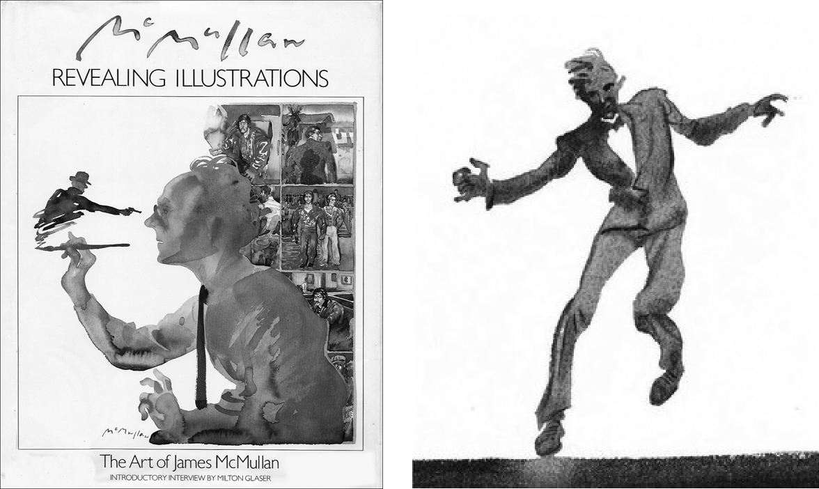
James McMullan was born in 1934 in Tsingtao, China. He studied at St. Paul’s School in Darjeeling, India, the Cornish College of the Arts in Seattle, and Pratt Institute in New York. McMullan is one of the most accomplished illustrators of his generation, combining a quick conceptual wit with an eye for color, pattern, facial expression, and gesture. His work is all the more remarkable because of his technical mastery of watercolor. He has produced more than fifty theater posters of exceptional quality, which are summarized in his book The Theater Posters of James McMullan. He has also contributed to magazines, books, and annual reports, and won numerous awards, including the Hamilton King Award from the Society of Illustrators.
October 1974
I notice James McMullan’s name among my cards and connect his name with an outpouring of exceptional illustrations I’ve been noticing in the media. I call his number and his assistant books a time for me that same week. I learn later that someone with whom I have interviewed recently sent him my name, though I never learn whom to thank. I’m torn whether to take my design portfolio or bring my paintings. I know I’m not in control of my wet media enough to sell illustration, but I want to paint and I want insight and encouragement. In the end I take two portfolios.
I gaze at the many examples of McMullan’s work in his lobby, and realize that I’ve seen much more of his work without realizing it was his. I remark on this and he pauses momentarily, considering a response.
“You have to respond to the market, of course. I realized early in my career I could do caricatures, and that magazine and newspaper editors always needed them. I like doing more thoughtful, painterly work, so that’s what I advertise—the work you have seen associated with my name.”
I show him some of my urban environment paintings, and we talk about watercolor as a medium. I tell him I find it hard to go from a drawing to watercolor paper because tracing paper leaves marks that show through the finished painting.
“You have to sketch in a medium that dissolves as you paint.” He shows me how he draws an outline of his subject with bright red watercolor in a crowquill pen and then paints right onto it. It explains the little flashes of bright red that appear and disappear like a thread sewn into the fabric of his work.
“Watercolor is a good illustrator’s medium,” McMullan tells me, “because it forces you to work at a furious pace. That suits the furious pace demanded by most clients!”
“What if it gets away from you?” I ask, referring to something that every watercolorist has experienced.
“Well, you do a sketch first. The sketch helps you get your composition, of course, and also helps you to decide in what order you’re going to lay down your washes, and what colors are going to work. Here’s a sketch.”
McMullan shows me an illustration for a caricature of the comedian Don Rickles and the finished work next to it, which was commissioned by New York magazine. It’s amazing how good the first one is; yet the second one, though not greatly different, has clearly benefited from the first.
“Sometimes the first one has more freshness. I’m taking more risk and working alla prima. Sometimes the second works better. I used to do a series, but now ...”
Seeing his sketches next to his finished work is worth a dozen lessons in watercolor. He takes in the two portfolios and nods.
“It’s tough to get started as an illustrator. There are very few places where you can earn a salary to illustrate. And when you find them, they want to control every aspect of your work.”
“I know your dilemma. It’s tough to get started as an illustrator. There are few places where you can earn a salary to illustrate. And when you find them, they want to control every aspect of your work. You have to figure out a way to get your style and your name paired in the minds of the media community. And once it gets popular, people ape your style immediately. You have to be prepared to move on to something new quickly to stay valuable. Now I go after more complex, thoughtful work that’s harder to copy.”
That’s the second time he’s used the word thoughtful to describe his work. I know from experience that interviews as rich and valuable as this one never last long enough, so I decide to be direct.
“Are you looking for an assistant?”
“Yes, always. I get a lot of requests for projects that pay reasonably well and that with some coaching could be done by someone less experienced. The trouble is, they don’t stay long enough to be profitable. Honestly, I think design is your most salable skill. You don’t have to be an illustrator to be creative and influential, you know. A lot of designers can’t draw. A lot of illustrators can’t design. You can be a bridge. Your drawing will serve you well, especially when you’re communicating with illustrators,” he says earnestly.
This short interview helps me tremendously. McMullan, an illustrator’s illustrator, uses a visual analogy—the bridge—to help me decide that I am probably a designer, not an illustrator. I keep drawing, but I begin to focus my portfolio toward design.
Barbara Bertoli: Strong, Yet Vulnerable

November 1974
Richard Nebiolo from Avon Books calls me to tell me how much they can offer me. I know I should negotiate, but it is November 1, five vertiginous months after I arrived in New York. The savings my wife and I brought to New York are all but gone, devoured by 115 round-trip train rides, several thousand pay phone calls, two pairs of Presbyterian dress shoes, and countless three-by-five cards.
I enter a new phase of my career. I am immersed in mass-market, rack-size books. I must see every event, every emotion, every sales pitch in a ![]() ×
× ![]() -inch frame. I quickly realize that my salary covers rent, commuting, tuition, and taxes, but I must do freelance work for food and clothing.
-inch frame. I quickly realize that my salary covers rent, commuting, tuition, and taxes, but I must do freelance work for food and clothing.
Bertoli is very demanding, and she works for editors and a publisher who expect us to perform. A title might cost the company millions of dollars, and a packaging mistake can cause mass marketers to drop it from their coveted rack space—reserved for what they are sure will sell.
When Ian Ballantine described the design of paperback covers, it seemed complex but predictable. Now I’m in the thick of it, evaluating dozens of cues—fonts, colors, illustrations—to communicate with a harried reader who has certain needs and understandings about how their reading material ought to be presented. The jacket designs that Bertoli requests and I sketch are made and remade; sell lines rewritten; many color combinations tried; illustrations bought, modified, repainted, restarted anew. The floors are often littered with scraps and rejects.
Even after the first proof comes back from the printers, modifications continue. Bertoli is self-taught as an art director and has a very open-ended way of working, which at first I find baffling. She often senses where she wants the cover to go, but cannot tell her staff specifically how to fix something.
She says, “This design needs more depth, more atmosphere. But is has an intimate quality I like. Don’t lose the intimacy.”
Or my favorite: “The gothic novel heroine is strong, yet vulnerable. Explain to the illustrator that he needs to discover that essential gothic dichotomy in our heroine.”
All this is to take place in the top half of the book jacket that is visible in the mass-market rack—a space less than 16 square inches!
Nebiolo, with probably ten more years experience than I have, becomes a valuable friend, teaching me shortcuts and introducing me to illustrators who come into the office. His best advice is about negotiating the creative process.
“When Barbara runs out of ideas, she yells. I find what she needs is dialogue. Give her the first wacky idea that comes to your head. She won’t like it, but she will react to it. As long as the finished design sells, the success sticks to you. Be careful about falling in love with your own work. I’m not saying you never get your own ideas approved, but if the team hasn’t seen it, I don’t trust it. Somehow when the group mauls an idea—it breaks the dialogue open and then we discover the essence, the meaning, the indefinable something that makes the product good.”
Nebiolo has a particular talent. He can take the title of a book, choose a font with a certain emotional resonance, and then exaggerate the letters to intensify the emotion. He works the letters in soft lead pencil on tracing paper, working back into the graphite characters with an eraser and a thin metal eraser shield until the grouping of letters has the right emotion. I watch in amazement as, with twenty minutes before a deadline, he lays a piece of treated acetate over his approved pencil drawing and draws the letters using India ink and a brush, then touches up with drafting curves and a technical pen. The result is typography with a special handcrafted quality. When I study the mass-market paperbacks on display in Penn Station, I see Nebiolo’s titles setting Avon apart from the competition in a subtle yet persuasive way.
“I’m not saying you shouldn’t defend your own ideas, but if the team hasn’t mauled it, I don’t trust it. Somehow it breaks the dialogue open and then we discover the indefinable something that makes the product good.”
From the standpoint of hours worked per employee, Avon could easily be categorized as a sweat-shop, but it is the opposite: the atmosphere is so exciting, everyone wants to be there. That excitement emanates from the office of our publisher, Peter Mayer, and flows to every department. In my first weeks at Avon I hear Mayer’s name breathed with the reverence with which the Lost Boys speak of their Peter Pan.
One morning, Bertoli hands me the briefing sheets, including a number of well-known Thornton Wilder books. Mayer likes to publish literature along with bestsellers. He has an eye for literature that can cross over and be big, and he picks up the paperback rights. And Bertoli has developed an eye for which of his pet projects he sees in this way.
I’m a bit intimidated by the assignment. Wilder is in print, so I stop into the public library on my way to Penn Station, pick up four of the Wilder titles in the series, and tear into them. I start to generate some designs and put them on my wall.
Bertoli scans them as she cruises by. “These Thornton Wilder sketches aren’t in below-the-line format.”
The meaning of what she is saying begins to sink in. The below-the-line formats are preapproved and therefore quick to design. I have screwed up, putting more time into them than was needed, and she won’t be able to show them at the meeting.
But then she says, “I like your treatment, though. It’s possible we could publish it outside our established formats.”
“Wilder has personality,” I venture. “I read the books before I started, then while they were fresh in my mind I started designing.”
Bertoli looks at me sharply. “I think you should sit in on the cover meeting and present this series yourself.”
Panic! I am going to have to present my ideas to Mayer, who chews up everything our department does and transmogrifies it. Even his failures work better than many publishers’ successes. The only fortunate thing is that the meeting starts in a few minutes, so my panic has no time to escalate.
Barbara opens the meeting briskly. “I asked David to join us so he could explain his approach to the Wilder titles.”
Mayer looks much different than I imagined. He has a boyish, casual stance and, underneath a head of unruly hair, a gaze so intense that it makes him seem closer to you than he is.
I put up my three series of Wilder titles. Out of terror, I say nothing, which is the perfect thing to do. Bertoli, four senior editors, and Mayer are looking at them carefully.
Paperback book art directors must be versatile, able to find the excitement in a subject and execute it within time, budget, and marketing parameters. Barbara Bertoli did not herself draw or make sketches, rather she used complex, emotional descriptions of the feeling she wanted, and called upon many exceptional illustrators and photographers to interpret her titles.
“David decided Wilder is too important to be lumped in under Bard format...,” she begins for me.
“He has such a unique voice,” I get from somewhere, “and we have four exceptional titles.”
“Six, now,” says Mayer. “Did you study Wilder?” I decide the folks in this room are too smart for me to bullshit.
“I read Our Town in high school, so I knew he was a writer of stature. When Barbara gave me this series, I got them out of the library and read these four. After a few chapters of Theophilus North, I became a fan; after The Eighth Day, a believer!”
Mayer has a dazzling smile, which I see for the first time now directed at Bertoli. “Where did you find a cover designer that likes to read?!” We all know this is unfair—everyone in the department loves reading—so he turns serious again; all eyes are back on the covers.
“So, David, you did three series, and they are different. Before I tell you what I am going to publish, tell me which one you like.” Mayer leads by putting people to the test, and it’s exhilarating.
I decide not to try to guess what he’s planning, so I say a few words about each series, then turn to face to the wall those designs I am not recommending. Bertoli looks on apprehensively. Either Mayer is going to throw them all out and insist on a Bard format, or we are on the verge of a breakthrough.
“Good,” says Mayer, studying them. “It’s a bit risky, but I like the chutzpah. If we play our cards right, it may migrate above the line.” I leave the meeting with a great feeling of accomplishment. In the past, I’ve had trouble explaining and defending my designs in group meetings—I thought I didn’t like being in the spotlight. Here, with the acute interest of our cultural commanding officer—and no chance to prepare my remarks ahead of time—I discover a more intense spotlight, and I am suddenly able to talk about the designs with conviction.
Aha: I didn’t like being in the spotlight. I had trouble defending my designs in group meetings. Here, under the intense spotlight of our cultural commanding officer, I discover that I am suddenly able to talk design with conviction.
Max Miedinger: Getting Helvetica Right
Max Miedinger (1910–1980) was born in Zurich. He trained as a typesetter and attended evening classes in design and typography at the Kunstgewerbeschule, then went on to set type for the Globus department store in Zurich. His natural affinity for typography led to a position as a sales representative for the Haas’sche Schriftgiesserei, a renowned type foundry near Basel. In 1956, he began an independent consulting career. Miedinger is principally known for creating the Neue Haas Grotesk typeface in 1957; the font was redrawn (with Edouard Hoffmann) and released as Helvetica in 1960. Despite the presence of numerous other sans serif fonts, Helvetica achieved a balance between simplicity and emotional purity that made it a worldwide standard.
February 1975
Photo-Lettering, Inc., is a high-end typesetting company. They are the premier repository for unusual fonts, including many exclusives, and their craft is excellent. Their type specimen book is a treasure; they don’t just give it out to anyone. Richard Nebiolo, who learned his craft working at Photo-Lettering, escorts me there on a lunch hour and introduces me to the owner, Ed Rondthaler, whom he describes as “a beautiful person.”
I visit Photo-Lettering several times a month to pick up, drop off, or review work in progress. On one occasion, Rondthaler is just passing the pickup desk. He doesn’t remember my name, but remembers we have met and associates me with Nebiolo.
Rondthaler says, with obvious satisfaction, “Guess who was just here?” and hands me a business card. The finely crafted card says “Max Miedinger.” Below, in Rondthaler’s handwriting, it says “Designer of Helvetica. Visited here,” and today’s date.
Just then, Miedinger himself comes back through the door. He asks Rondthaler if he might have an extra set of Photo-Lettering type books to take back with him. I am holding his business card. While Rondthaler gets the books, I introduce myself and strike up a conversation. Miedinger is a personable, intense little man whose eyes are constantly exploring; he is very taken with Photo-Lettering, and with all things American.
“We designers are sellers of subliminal details that the average viewer does not see, but they do feel. The message is somehow warmer, memorable. That is precisely what gives typography its power.”
Display type is set photographically, a couple bucks per word in most places, and the spacing is all manual. Photo-Lettering’s work commands a premium, and Bertoli is so particular about type that I usually trace the book titles out in Helvetica on tracing paper to get the exact size and spacing. Then we send the tracing by messenger for them to follow. Bard format uses Helvetica; I use it so much that within a few months I can draw the entire font very precisely without tracing or looking at a specimen.
I show him some of my tracings for Avon titles, and Miedinger nods. “Americans like to set their headlines so very tight! I am used to the spacing of foundry type, where the letters cannot touch.”
He tells me—not quite apologetically—that the foundry had made a mess of Helvetica. “They could not wait for us to refine our drawings. It does not look wrong to anyone until we show them something better. We designers are sellers of details too small to be seen—and that is precisely what gives typography its power. The average viewer does not see it, but they do feel it. The last little refinements are what make it sing.”
I’m a bit shocked. “To most of the world, Helvetica looks like precision made visible. What could you possibly want to improve?”
He says in his clipped accent, “It takes so many tries to get it right. There was too much hurry to get to market when they expanded the offering to include many weights. The appearance of simplicity, you see, is a very complex thing to achieve.”
I would like to learn more from him, but I have to rush off—Bertoli needs her type. Miedinger’s frustration with the imperfections in Helvetica, so widely regarded as perfect, must seem unreasonable to his employers. Yet he keeps pushing for a more precise realization! Sure enough, in 1983 Helvetica Neue appears. I study the refinements and conclude that, in Miedinger, I have met the most exacting perfectionist alive. He is right about details: I cannot say how, but the Neue version does look better!
“The appearance of simplicity, you see, is a very complex thing to achieve. It takes many tries.”

Foundry Helvetica, as originally released, circa 1961.
It takes close obesrvation to see the problems with the original Helvetica that were so troubling to Miedinger. The C, G, M, P, Q, R, U, and W are the most “noticeable,” though in truth every character is subtly redrawn and refined. Only a true perfectionist could have brought forth a font so durable and irreducibly simple as Helvetica, then revised it with such patience and attention to minute details of proportion. Many of the changes also involved drawing more weights of Helvetica and making the different weights as compatible and interchangeable as possible. The transition from foundry type, which was drawn with compensation for the “squish” of wet ink fattening the appearance of the printed character slightly, to photographic typesetting, where no squish occurred, necessitated the redrawing of most standard fonts, Helvetica included.
Helvetica Neue, 75 (Bold), released in 1983.
Arthur Tress: The Dream Collector
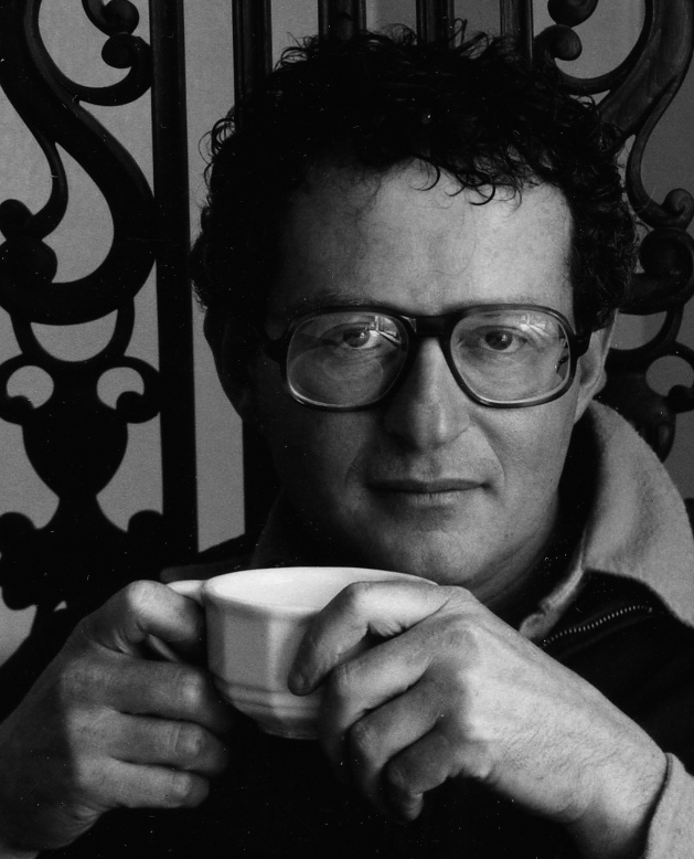
Arthur Tress was born in Brooklyn, New York in 1940. An artist and photographer, he received his BFA at Bard College, studied filmmaking in Paris, and traveled extensively in his twenties. His work first became visible with his book Open Space in the Inner City, published with a grant from the New York State Council on the Arts. His work has been published in more than a dozen books and included in exhibitions and museum collections worldwide, including the Museum of Modern Art, New York; the Metropolitan Museum of Art, New York; the International Museum of Photography, Rochester, New York; the Center for Contemporary Photography, Chicago; the Bibliothèque Nationale, Paris; the Stedelijk Museum, Amsterdam; and many others. Tress’s early influences include Duane Michals. His mature work is increasingly personal and visionary.
March 1975
A few weeks after my success at the cover meeting, Peter Mayer calls me in and explains, “I bought the rights to a photographic book that the hardcover houses passed up, and I asked Barbara if she would allow you to design it. We have seen a few photographic books skip hardcover and sell well as original paperbacks, so we’re going to test the waters.” He hands me a bright yellow box, stacked perhaps two inches high with 8 x 10 black-and-white prints. Above the Kodak logo is written in black marker “TRESS/SHADOW.”
“Arthur Tress?” I ask, “Of Dream Collector renown?” Mayer nods.
“What does the photographer want the book to look like?”
“Exactly the right question! Please call him. He lives in town.”
I flip through the photographer’s work prints, and they are quite enchanting. Then I understand. Management is always looking for ways to delegate work that will run smoothly. I got involved in the Thornton Wilder content, and this needs a designer’s involvement in the content as well as the cover. Mayer figures he can put a designer who likes to get involved in content together with a content producer, and things will run on wheels. He is gone before I can thank him. A light goes on: the designers I admire—from Papanek and Eames to Edelmann and Chwast—all seem to say, in their own ways, “Get involved in the content—design is about meaning.” But as a young designer, the superficial aspects of appearance are all I am given. Shadow represents a small but exciting step toward participation in the content as well as the appearance.
The briefing sheet that accompanies every Avon title usually has a plot summary. The briefing for Shadow describes Tress as an up-and-coming young photographer. Shadow is billed as a “novel in photographs.” Telling stories in pictures is of course a time-honored idea—as old as hieroglyphics, as popular as comic books—and one that will always be reinvented by each new generation. Tress’s images are not a narrative in the strict sense of the word; they are more like theme and variation. The images are all square. He photographs his own shadow, trailing into each picture, and artfully hides camera and tripod. The images add to one another until a cumulative sense of mysticism emerges.
I order some copy prints of his pictures and make some test layouts at several different trim sizes and bind them into a dummy book. A thought, maybe more of an instinctive observation, occurs to me: Projects that do not fit the normal workflow, that somehow defy the usual means of description, often represent great creative opportunities, since there are no expectations, no established formats. Projects such as Shadow, I realize, require new ideas.
A few days later I visit Tress in his studio on the Upper West Side. He lives like a monk; a costly Hasselblad camera and lenses are his only visible concessions to the material world.
Aha: Projects that do not fit the normal workflow often represent great creative opportunities, since the established formats don’t apply; these projects require new ideas.
“I asked our publisher how you want this book to look, and he suggested I call you,” I start.
“What do you get out of it?” says Tress before I can go any further. I hadn’t figured on this type of opening move from him, but I realize it is natural for a photographer to want to know how the work is being received, before coloring the thoughts with friendship or personal observations. He has an unusual countenance: a quiet, almost passive voice, yet the intense gaze of one whose mind is disciplined to capturing essence. It is not disconcerting, rather disarming. My short tenure in publishing has already made me more confident verbalizing about publications in progress, so I wade in: “I get a whole new direction from Open Space in the Inner City—less reportage, more mystical. There’s a quality of spiritual journey.”
Tress says, “Open Space is not really my style. It was done for the New York State Council on the Arts on a grant, so I had to do certain things to satisfy the grant. But it helped me arrive here.” Here, I assume, means Avon. But it’s bigger than that. Arrival means having his work published on its own terms: as Shadow, as an original cultural product, as art.
The old definitions game stirs: If art is work you create and put in the world on your own terms, design is work you create on negotiated terms—both the money and the creation. Actually, the money is negotiated on both sides of the fence.
I take out my sketch. I decide not to try to sell it; I just hand it to him. After a measured silence, I offer, “No numerals on the pages, no words appear on the same page with imagery. Your titles are isolated each on their own page.”
Tress nods. “This is the size.” He says it as a statement and a question.
“Yes. I could make the photographs larger and borders smaller, but after several experiments this seems like the right balance.” I have the other variations I made of photo size and trim size in my envelope, but leave them there.
“Yes, it is. The cover has a black border, the inside pages white,” he observes. I’m about to respond, but he adds. “It works. Black inside would be too ominous, but as a cover it sets the right tone.” So Herb Stern and I keep quiet and let him look.
“Seeing a book take shape—reimagined by a designer—it’s sort of shocking,” Tress observes. His voice is quiet, detached. “I live with this idea of a narrative told in shadows. I can’t predict where and when I will find the right light, the right place; I have to be alert every waking moment. I can go a week, shooting every day, and not find a worthwhile image. Then I’ll make six good ones in a day. I am so dependent on chance, finding the right light, being able to make a picture in adverse or ambivalent circumstances. At last, I can’t see any holes. There is nothing more to add. So then the creation phase ends, and you go through this long journey of marketing, negotiating, administering. You begin to lose touch with the original spark. Even when I have all the work prints assembled, it still seems unrealized. But just this step of having you design it makes it intensely real. Like—” he pauses to search out an analogy—“learning you had a love child, and meeting her, all grown up.”

Tress asks a few questions about paper and printing, and the design of Shadow is set. I send the design to the printer, and Shadow appears on the Avon production list.
The simplicity of this book is atypical. There are a few words for chapter titles, nothing else. The publisher puts designer and author directly together, and the simpatico makes the project happen. I think of Heinz Edelmann’s description of the struggle to make Yellow Submarine. Shadow is of course far less complex than Submarine, yet still the contrast is remarkable. There is no single way; every project has a unique backstory.
An aha moment has arrived. What Tress describes as “shocking” is the transformational nature of design. I want to stay in the eye of that storm and make it my life’s work. I like being an agent for the realization of ideas. Maybe this is what James McMullan was trying to tell me—illustration and design each have their own type of fulfillment. Authors, entrepreneurs, people of all stripes need to give expression to their ideas, but they can carry it only so far.
Aha! Authors, entrepreneurs, people of all stripes need to give expression to their ideas, but they can carry it only so far. Graphic design is a window between author and public. Transparent, yet crucial.
Graphic design is like a window between author and public, between content and consciousness. The window itself is invisible, yet without the transparency of the window, no illumination passes in either direction. I realize how much I like books—containers for cultural ideas. The design psychology of book jackets is very stimulating, so controlling the whole experience, cover to cover, seems a logical extension, and potentially much more lasting.
Tress and I do several more book projects together, including his Theater of the Mind and his limited-edition Dream Collector portfolio.
Aha: The Bertoli Toggle
Richard Nebiolo gets a job as an art director at another publisher. I am terribly sorry to see him go, but I take over his office and am delighted to inherit his window. Without his experienced eye, it’s very difficult for me to interpret Barbara Bertoli’s comments. Especially as release dates approach, more changes flood in. I am sometimes at a loss; the process feels like a guessing game. If I leave a cover design on my desk at the end of the day, Bertoli sits down and snips it apart, moving all the pieces around to see if more impact could be gleaned from the components. If she finds an arrangement she likes, she tapes it together. If not, I just have a pile of snippets. Sometimes I am able to gain an insight into her thinking, but it’s an unpredictable process that also causes a lot of extra work.
On a Tuesday in March 1975, ice is forming on the inside of my little window at Avon Books. I need to run for the train, but all my press-ready art has been snipped apart; I am further behind than when I came in ten hours ago. I perform triage, so the desperately late can get first attention in the morning, before the urgently late. I look at the press-ready artwork not yet approved, knowing if I leave it out it may be taken apart by the time I come in the next day. I try to visualize what she would do. A cynical inner voice says, “Whatever takes the most work to fix, that is what she will do.” I’m stuck in the mentality that my boss is an irrational creature, changing everything hundreds of times just to make life miserable. If I were the art director, I would not be concerned about the amount of repair work involved; I would just try to make the design more compelling. I arrive, quite unexpectedly, at an aha moment in my work as a designer. I divorce myself from how much work it requires, and just connect directly with the potential reader: seeing what she sees, wanting what he wants. As reader, I need to make the train in a few seconds, want something to read, don’t want to be stuck reading something different than the cover promises.
Instantly, I’m able to grasp what Bertoli would want changed. I see what must be simplified, how I might trade a little line space here for a slightly larger illustration, how a darker sky makes the title of the book more legible. I even see that the sell copy could be expressed in fewer words. In an hour I fix half a dozen jackets and take them in to her office.
“Whoa. Much better!” She signs her initial block on the first one so that it can be sent to the publisher for final approval. The next one is also a hit. “Did Peter ask for this change?” Mayer would occasionally drop in unannounced and make a comment that enlarged everyone’s understanding.
“No, I just figured out ‘strong, yet vulnerable.’”
She nods, pleased that someone made sense of her verbal dichotomies. Rather than half a dozen rounds of revisions, we have six boards approved at that one sitting. It was as though I had discovered a toggle switch in my head. Toggle right, I’m the art director, engaged in an intense dialogue with my audience. I click through a thousand conversations with all different imaginary readers—young, old, male, female. Then I toggle left; I’m the technician, making the changes requested by the art director.
My job changes dramatically once I discover the Bertoli toggle—it’s possibly the greatest labor-saving strategy I could imagine. I spend less time on mindless rounds of changes and more time critiquing ideas before they reach tangible form. I watch people in bookstores and observe how they reach for titles, how long they look at the front before looking at the description on the back, how they put books back in the rack, pick up another, go back to the first. One night, while waiting for several hours in Penn Station due to a train delay, I see a woman browse through the newest gothic novels and choose one of Bantam’s covers instead of one of Avon’s. She looks at the rack, grabs the book, opens it to the last chapter, reads a few lines, flips to the end, looks at front and back covers, and inside of 15 seconds heads for the cashier. Len Leone is one tough hombre!
The Bertoli Toggle: Toggle right, you’re the art director, engaged in an intense dialogue with your audience. Toggle left, you’re the technician, making the changes requested by the art director.
To fill my two-hour daily commute, I always carry books. Bertoli observes my reading about design, designers, arcane stuff. One day she drops a magazine on my desk, one page folded over. No explanation. The article is about George Nelson. I had heard him speak at Carnegie Mellon when he came to show his film, Planned Obsolescence, and to talk to us about the design of everything. He is a great storyteller, raconteur, and charmer. The article surveys his career: writing for Time-Life books, designing pavilions for world’s fairs, designing stylish clocks and chairs. Then a caption jumps off the page: Nelson teaches a class called Philosophy of Design at Pratt Institute. Pratt is nearby. It’s tempting, but where will I find the time?
Peter Mayer: How to Run a Sales Meeting

Peter Mayer (1936– ) was born in London in and immigrated to the United States in 1939. He received his BA in English literature at Columbia College on a Ford Foundation scholarship and in 1954 matriculated at Christ Church, Oxford University. He served in the US Merchant Marine before being granted a graduate fellowship in comparative literature at Indiana University, then in 1959 earned a Fulbright scholarship to study German literature at the Freie Universität in Berlin. In 1961 Mayer began as an editorial assistant at Orion Press, and in 1962 Mayer began a 14-year tenure at Avon Books, rising from education editor to editor-in-chief before becoming Avon’s publisher.
In the late 1970s Mayer was appointed publisher and president of Pocket Books (Simon and Schuster). As the Penguin group’s chairman and CEO (1978–97), he oversaw Penguin’s companies in the UK, US, Canada, Australia, New Zealand, Germany, the Netherlands, and India. His numerous industry honors include the Foundation of Indian Publishers’ and Booksellers’ Association Award for Outstanding Contribution to International Publishing (1996) and recognition as a Literary Market Place Most Distinguished Publisher. Mayer was named Chevalier and Officier of the Ordre des Arts et des Lettres by the French Ministry of Culture (1996) and received the Poor Richard’s Award for Lifetime Contribution to Independent Publishing (2007), a Lifetime Achievement Award from the London Book Fair (2008), and the Russian “Big Book Prize” for Distinguished International Achievement (2011).
Mayer is the president and publisher of Overlook Press, Ardis Publishers, and, in London, Gerald Duckworth Publishers, Ltd., and Nonesuch Press. He is the author and editor of four books and two translations.
April 1975
Most publishers, Avon included, hold company-wide sales meetings at which Editorial (who makes the books) presents new titles to Sales (who sells the books). The style of the meetings varies from one house to the next. Editorial tries to generate enthusiasm for the coming titles, while Sales brings back news from the front: the book buyers, stores, chains, book clubs, universities, and other outlets. I have heard it gets pretty boisterous. Junior-level creative people are usually invisible, but in Mayer’s organization we are each given a chance to introduce a few titles to the sales force. As a publisher, Mayer values articulate employees. He knows that the only way to become a good gladiator is to face the lions.
I’m asked to present at the meeting the book Black Holes: The End of the Universe? It’s a cover design I quite like and Bertoli thinks would sell. I am ten words into my first sentence and feeling confident when I am unexpectedly shut down by a wave of blunt remarks.
“Vacuous!” someone says.
“Right subject, but the presentation trivializes it!” I am wholly unprepared for this onslaught, and it shows.
“Might as well throw in a few flying saucers,” sneers a traveler in a blue Brooks Brothers suit.
Bertoli, who approved my cover, pipes up, “It is a very visible cover on the mass-market rack.” She has on her auditorium voice, which contrasts sharply with her tiny figure, but there are a few other terse criticisms. When it’s clear I’m in over my head, Mayer, from the back of the room, parts the waters. “About a third of our editorial staff is experiencing their first sales conference.” His sound is not as loud as Bertoli’s, yet he quiets the room. I imagine him as the revered guru in an ashram, bringing order among the disciples merely by intoning “om.” “For everyone’s benefit let me explain that our travelers have heard every reason there is not to order the books we publish. They are not criticizing our titles as much as they are bringing us into direct contact with the people who decide which books go in front of the public. Those book buyers are opinionated, they have no taste, and we listen to them because nobody on Earth knows more about what will sell.” The travelers are nodding, some vigorously.
Aha: Great bosses value articulate employees. They know that the only way to become a good gladiator is to face the lions.
“Many of you have experienced sales meetings at other publishing houses, where the sales force is expected to genuflect silently to the Great Editorial Acumen.” General mirth ripples forth. Mayer is displaying his greatest gift, in fact the essence of leadership: getting everyone focused on what matters, and feeling good about it. “Avon, as long as I am here, will be a place where Editorial and Sales tell each other what they think, candidly, for the purpose of putting out books that people want to buy.”
A mild applause arises and dies away quickly as he summarizes, “So, newcomers, this is possibly the most valuable and direct glimpse of the marketplace you are likely to get. Travelers, keep your own opinions aside and let us hear what you hear from the market. Editors, it is your job to provide an enthusiastic narrative that the travelers can use to overcome even their most skeptical buyers.” He pauses. He has united the workers and ennobled the task. “We have about three hours before we break up. I suggest we spend it determining the selling strategy for the half-dozen titles that will pay all of our salaries.” The meeting later devolves into cocktail hour, and everyone is mingling, renewing acquaintances. Since I am new and the Black Holes cover is my work, several critics seek me out, to add nuance and explain what they think would sell. Mayer glides by and adds to the discussion.
“You have to have good ideas, of course,” he tells both me and the travelers. “The story has to be good, the author has to be a salable personality, and the cover and the PR have to nail it. But that is only half the battle. The other half is convincing everyone else that your ideas are good. This you do by convincing them you have listened to them, then convincing them why you believe in the ideas, unshakably.” He makes it sound so easy!
“Having good ideas is important, but it’s only half the battle. The other half is convincing everyone else your ideas are good.”
Black Holes: The End of the Universe? was eventually published with the cover I designed. Although the cover had a few detractors, the subject was new, and, as Heinz Edelmann suggested, it made some readers curious enough to part with their money. It was not a bestseller, nor even the best-selling book on the subject. It was the last time I stood up to talk about my work without thinking about how to discuss its merits.
Boldness in The Face of Opportunity
Peter Mayer is a whirlwind of activity, yet he still makes time to talk to many of his staffers. He does criticize some of my covers very bluntly, but it is always about insight, never power. Some of the covers Bertoli entrusts to me are getting good initial results; Tress is pleased with Shadow, and Thornton Wilder has started to sell in the mass market.
At one point Mayer asks me how I like working with Bertoli. I tell him gingerly that it took me a while to figure out how to interpret her directions, but now she is a great boss. Mayer is so goal-directed, I think I know where this is going, but not so.
“Avon had an art director when I arrived. Good work, no problems. He hired an assistant, a seemingly meek Midwestern girl named Barbara Koontz—she had not yet acquired her married name, Bertoli. Then, abruptly, our art director left. I called my friend Milton Glaser—you have probably heard of him—and asked him to recommend a few people for the job. Milton’s office manager sent some resumes. Barbara figured out what was going on, and came to my office to ask for the job. She was bright and energetic, but I didn’t think she was experienced enough. And I didn’t want her there if she had been passed over. So I had to be very blunt. I said something like, “I will give you a try. But you have to sell books from the very first month. If things don’t work out right away, I will have to ask you to leave.
“Managing creative people: When someone steps forward, give them a shot. You can pick up experience more easily than motivation.”
“To my surprise, she was very confident, grateful for the chance, forceful enough that the editorial staff all respected her; and she turned out to be highly organized. So, I have to admit that to my further astonishment, she turns out to be terrific—the best Avon has had! So I’ve learned, when someone steps forward, give them a shot. You can pick up experience more easily than motivation.”
Mayer is holding out a powerful leadership tool for my observation: using a concise narrative to explain his criteria for staff development and promotion. He seems to be saying: “Advancement needs more than talent—it needs boldness in the face of opportunity.”
Penn Station Booth 6, Revisited
Because of the lack of privacy at work, I still visit Penn Station Booth 6 to work on my A-list of design greats, hoping for an audience. Why? The progress I’ve been able to make, I feel, has been built on insights from direct contact with towering figures like Eames and Ballantine and Chwast. Each new design example I add to The Valise makes me feel a bit closer to—to what? To attaining the flexibility and visibility that Edelmann described? To the body of work Chwast told me I was capable of? To the dream that one of them might scoop me up and teach me his secrets? Maybe it’s because my goal still seems imperfectly defined that continuing outreach seems vitally important.
If I take the 6:28, I can get to Booth 6 at 7:30 and get in a half hour of calling before I go to work. I learn that many of the top designers get to work before their gatekeepers, and sometimes they will pick up. A few get angry, a few blow me off, but I get an appointment now and again. It is harder now to respond quickly; I have to try to slide my portfolio showings in around working hours and not be obvious about it.
Herb Lubalin’s waiting list is still full. I call weekly, but it’s eternally the same story. With Lou Dorfsman at CBS, the drawbridge is up. I get in to see one of John Berg’s art directors at CBS Records, but he’s on the phone while I am there—not much chance for rapport building. The receptionist at Vignelli Associates is very polished and polite but firmly not looking.
Chermayeff & Geismar is not looking, not interviewing, not keeping a waiting list.
I have learned that the search takes patience, a sense of humor, luck, and timing. On days when the process grows tiresome, I draw on the lembas bread of encouragement from previous interviews and mentors.
Frederick Schneider: To Be Right ...

March 1975
In my deck of contact cards is one for Frederick Schneider, art director at Oxford University Press (OUP). He is listed in LMP, but is not on Ed Gottschall’s list, so I have no introduction. I have left messages, let it ride, and called again. I settle into work at Avon Books when Schneider unexpectedly leaves a message asking me to come in. Someone has actually been receiving my many calls and samples!
My appointment at OUP falls on a particularly busy day at Avon; good sense would suggest postponing, but I decide to chance it. I sit in the waiting room at Oxford’s New York branch at 35th Street and Madison Avenue. The lobby walls are lined with small wooden coats of arms, each for a different college at Oxford. There is a glass wall with a small but well-stocked library. An assistant carrying a stack of three-foot-long typeset galleys shows me to Schneider’s office. It is very spare, with no decor, no plants. It is populated by several dozen stacks of paper in shallow boxes, manuscripts for books.
Schneider is neat and thin, and looks at me as though he has only one chance to remember everything about me. He has a slight hesitation in his speech; he purses his lips, then a few seconds elapse before he speaks.
There’s something I like about this man immediately and deeply; I resolve to say less than he does. He looks at my work slowly. I watch to see what interests him, but my own attention is diverted. On his wall is a framed black-and-white photograph of a man with dark hair looking up, his gaze locked on the viewer with an intensity rarely captured in photography. Below the photograph is a quotation: “To be right is the most terrific personal state that nobody is interested in.” The photograph, the typography, the printing, the frame, the white space, the proportions have a nice balance—nothing missing, nothing extra.
He sees me me studying the piece and says, “Franz Kline.”
“Kline, the Abstract Expressionist? Where did you come by this photograph?”
“I took it.” He continues looking at my work; I fight to keep silent so he can finish his pauses and continue his thought.
“In my twenties, I was determined to be a painter. Kline held court in a café I frequented. It took about eight years of very concerted work to realize I was not going to succeed as a painter. Kline’s brilliance rendered that process bearable.” He says this very simply. Here is a kindred spirit: someone who knows first hand of the struggle with definitions of art and design.
A definition presents itself, unbidden: “All creative people set out to make art; some of us end up as designers.” I shudder and decide to reject this definition.
“I want to give you a jacket to design.”
The galley-carrying assistant knocks on the door and strides in. She hands him another manuscript, saying, “OLI format, red sticker. 2,000 hardcover, 10,000 paper.”
Just as the paperback world has cover formats, Oxford—and most university presses—has standard book design formats for certain subjects or series. This means a certain successful book design has been chosen as a format—certain metrics such as page size, typographic styling, and printer are all predetermined and so the book is produced quickly with a minimum of effort and very predictable expense. “Red sticker” means “Drop whatever you are doing and work on this till so that project makes the fastest possible progress.”
Schneider diverts his attention from me momentarily to the stack of paper. He fans through the pages, letting several hundred sheets flip by uniformly in several seconds. He looks at the last page number and hands it back to his production assistant, who is waiting expectantly.
“256 pages. Yankee can deliver galleys in three weeks.” She nods assuredly and exits. Schneider is the most economical person I have ever met. Not a word, not a motion is wasted. He hands me a printed book jacket, a synopsis of a book, and a purchase order.
“Call me with questions. I need your sketch a week from today. Sorry, have to send you off. Do this well and we can use you regularly.”
When I get back, Bertoli is furious, bellowing, “You picked a bad day to go AWOL!” I call Geri and tell her not to hold dinner, and by 9:30 p.m. Bertoli has most of the sketches and artwork she needs for her cover meeting tomorrow.
The book jacket Schneider assigns me is Wexley and Yukl’s Organizational Behavior and Industrial Psychology, a thick paperback in an established OUP format, but there is still room to make the cover exciting. I know Schneider uses the Optima font family for his own work, and it suits the book’s subject, so it is a safe bet. I have two colors to work with, no more. I execute four sketches that night and do a dozen more over the weekend.
My Bertoli toggle is tuned in to paperback readers, so working for a new art director and academic audience makes my decision making a little trickier. I’ve seen Oxford’s line. Jim Burke’s words pop into my head: Be sure to give Mr. Schneider a quart of milk along with all that milkshake!
I deliver two quarts of milk and a milkshake, two days early. I do not hear from Schneider, and as each day passes I am more convinced that I’ve missed the mark. Book editors are notoriously capricious, having their own preconceptions about an author and a book. How dare they!
I have not heard from Oxford for several weeks, and I’m reaching for the phone to call the next card in my stack when I get a voice message. He does not identify himself, but I recognize Schneider’s voice. “I have another job for you. Can you come over after work?”
Wexley and Yukl is approved. A new portfolio piece, and I can toss a piece of student work out of The Valise! I do several more book jackets for him.
Tress’s book Shadow comes out, and I show a copy to Schneider on one of my visits. Schneider studies it, pursing his mouth slightly, and begins, “Nice restraint. You like doing interiors?”
I say yes, thinking how best to elaborate.
Schneider saves me the trouble. “We are losing one of our designers. Would like you to sign on?”
He tells me how much he can pay; it’s a 25 percent raise. My savings are depleted from my long job hunt. On the other hand, I feel great affection and loyalty for my tough taskmasters at Avon Books, even though I have been there less than a year.
I agonize for a day, discuss the situation with Geri, and conclude that the prospect of a raise and a chance to do more whole books is too good to pass up. I make a detour on my way to work at Avon to tell Schneider I am coming. He seems to know ahead of time, and hands me a weighty manuscript.
“This will be your first job—I made a copy of the manuscript, but don’t lose it. Can you start the twenty-fifth?”
I like this style of communication. We read each other, we agree and discuss only what needs articulation. I’m not sure I can finish all that Avon expects from me by the twenty-fifthth, nine days away.
Bertoli scoffs, “And you really think you’ll be happy at a stodgy scholarly press?”
“It’s a 25 percent raise,” I tell her, “and I’m eager to try the challenge of longer texts to design.”
She says, with a good-natured exasperation, “Well, I don’t understand that!”
I leave Avon after only nine months, during which I strengthen my portfolio, and the number of printed impressions bearing my designs goes from several thousand to several hundred million. The intense learning begun under Barbara Bertoli continues, in completely different ways, at the deft hand of Frederick Schneider.
To Be Right ... Decoded
I visit Schneider’s office several times a day, and the Franz Kline statement that hangs on his wall seems by turns simple, utterly enigmatic, sarcastic, and alternately transcendent and nihilistic. What makes this saying important enough to hang on his wall? The fact that Schneider’s office is otherwise devoid of decor puts a focus on it, like the effect of a gallery hung with a single painting.
Kline’s enormous, dark, brooding canvases were so original and yet so universal that when they were first exhibited they caused shock and consternation as well as raves. They seemed to be landscapes of boulders that had collided in prehistoric times, but had only just been discovered by humans. I decide that Kline isn’t talking about being correct; he’s talking about being right with oneself, about doing the work that is yours alone to do. Kline’s work lets the viewer know what it means to be right. Yet his powerful sentence is ungrammatical! One could rewrite it: “To be right with oneself is the most important thing.” Dud. “To be right is the most personal state in which no one is interested.” Clunk. I have not discussed it with Schneider since my first visit to his office.
When I finally do bring it up, he remarks with characteristic brevity, “Be suspicious of any truth too plainly stated.”
I try again, “Do you think the incorrect grammar is intentional?”
He squints at me. This is Schneiderspeak for “Oh, yes, I see what you are saying.” He then answers.
“Kline believed that truth is so complex that it must be—can only be—stated as a conundrum, a collision of opposing forces. He’s not talking about being right in the sense of using correct grammar or following the norms. He is talking about being right with yourself, knowing who you are, why you are here, and having the courage to be both ambitious about where you can go and content with what you have. So perhaps he would say the grammar serves a dual purpose: making the sentence seem more spontaneous and approachable, and yet breaking rules to do so. It was there in his paintings: collisions, opposing forces, the struggle to be right. I would say, however, that colliding forces are great for painting, but best used sparingly in design.”
I think about Schneider’s decision to give up painting and earn his living as an art director. I had recently read, during a week of train rides, Somerset Maugham’s great Of Human Bondage, which contains a very poignantly articulated description of this very category of decision. Schneider did not give up because he couldn’t sell paintings, but because he realized, with the help of Kline’s mentorship, that he would not be a painter of the first rank. He gave up the opportunity to originate content and found a way to be at peace with being the form giver to the intellectual community of authors. Maybe Schneider has Kline’s saying on his wall to remind him that doing design was the “right” path for him, even if it meant putting aside a more expressive set of tools he loved.
“Kline believed that truth is so complex that it must be—can only be—stated as a conundrum, a collision of opposing forces. It’s truth to use sparingly in design.”
Schneider starts me off doing a half-dozen books that follow one of the OUP house formats. In that case, the designer does nothing original, but simply marks up the manuscript to conform to the style, then makes sure it gets set correctly as the proof goes back and forth from compositor to designer to editor to author, and then back again. Such formats also mean an experienced designer can handle about three times the workload.
Schneider can design books without making any sketches; he can go from a mental image to a set of specifications to the compositor. However, a mild nervous condition prevents him from drawing anything. Several times a day he asks me to handle something for him: drawing rules or ornaments, rendering ornate initials in pen and ink. One day he has me create a repeat pattern after the fashion of a William Morris textile to decorate the slipcase for the Oxford edition of Trollope’s The Palliser Novels.
There are any number of disparaging terms in graphic design jargon to describe a designer who merely executes orders from others: “wrist” or “grunt” are two of the more polite such names. Applying them to one’s self is a great confidence killer. I like helping Schneider, however, such tasks don’t add immediately to my future, my legacy, my portfolio. I am impatient to grow, and I don’t want to think I’ve left the energetic atmosphere of Hearst Corporation to become a grunt at, as Barbara Bertoli put it, “a stuffy old academic press.”
After a few months of this, I am drawing a complex diagram and worrying about having to postpone designing the titles assigned to me. Schneider stops by and begins his characteristic pause that precedes his speaking. “I apologize for loading you up with production work just now. I ... appreciate the attention you give those details. You do them ... as if they were your own.”
I am disarmed. I must think of the right response. In the spaces between his phrases, the nature of the larger bargain between us crystallizes before me.
“Well, Fred, it’s a two-way street. I appreciate every opportunity to design something and I learn a lot by observing the way you work.”
He says thoughtfully, “When you have experience, you have to barter it for access to young, nimble talent. The young talent takes the bargain to gain experience and opportunity. It’s a creaky, lopsided sort of arrangement, but with the right matchup, it works remarkably well.” Barter. I remember Ruedi Rüegg used that same word to describe his training under Müller-Brockmann.
That is just the cognitive adjustment I need: I’m doing wrist work, but there’s a payout. Bertoli, by snipping up my work and struggling with the pieces, teaches me the Bertoli toggle. Schneider, delegating carefully proscribed pieces of his book, lets me bargain my small motor skills for participation in a large, complex workflow. Both mentors require me to rise to the opportunity. That’s what he means by “the right matchup.”
With that conversation, I see the way to channel my impatience. I have to anticipate what each book will need in advance. At production meetings I begin to pay attention to what each book is about, and offer to handle production details that might otherwise become outside expenses, no matter which team is doing it.
“Wrist” and “grunt” are two of the more polite terms for graphic designers who merely execute orders from others. Having them applied to one’s self is a great confidence killer, and they miss the real point of mentoring.
Schneider notices, and pays me back in kind, announcing to me one day, “I’m assigning this book to your team. None of our standard formats are right for this, so you’ll have to design a new one.” He leaves me with a briefing sheet. Like the book Shadow, it is an outlier, a book that, because it does not fall easily into our workflow routine, represents a design opportunity. It’s a book about the history of American show business. There is a chapter on the Ziegfeld Follies, one on minstrels, one on Vaudeville, and still another on the traveling circus. Each of these periods also has its own typographic tradition, though that is not mentioned by the author. I read the entire manuscript that night and sit down with Schneider the next morning to discuss it.
Two covers produced under Schneider’s direction. The transition to university press expectations meant the use of pattern and symbol rather than illustration. Schneider strove to make books that were memorable—both interior and cover—that would stay in the reader’s mind as a residual pattern, to recall the reading experience months, even years later.
“How much am I allowed to do with this?”
I wait for his pause to end. Maybe he needs a more specific question. I try, “There’s a lot of opportunity to express each chapter with the typographic tradition of its ...” Schneider makes a minimalist motion with his free hand, sort of like he is wiping dust off a window between us, so I can see more clearly.
With his usual economy of expression he says, “You may consider it a plum project.” Without instructing me to do anything in particular, he seems to be saying, “Design what you think it needs. Show us what you can do!” I pour a lot of time into On with the Show, being careful to involve the author, making sure the team is OK with the “milkshake” instead of a “quart of milk.” Schneider rewards me with another plum project, designing new branding for OUP to commemorate the 500th anniversary of publishing at Oxford. The quincentenary gets a lot of publicity, and my graphics are picked up in many publications. Schneider has made good on his implicit promise to “barter youth for experience.” The wrist work pays off with projects that give my career visibility and momentum.
“When you have experience, you barter it for access to young, nimble talent. Young talent takes the bargain to gain experience and opportunity. It’s a lopsided sort of arrangement, but with the right matchup, it works quite well.”
George Nelson: Philosophy of Design

George Nelson (1908–1986) was born in Hartford, Connecticut, and educated in fine art and architecture at Yale University. He worked briefly doing renderings for Adams & Prentice in New York. In 1932 he entered and won the Rome Prize, then spent the next two years traveling Europe, where he met many important designers of the day including Mies Van der Rohe, Walter Gropius, Ettore Sottsass, and Gio Ponti. From his early days, Nelson wrote often and with great clarity about architects, design, and modern solutions to the problems of living. He wrote for Pencil Points, the precursor to Progressive Architecture, and was instrumental in founding Industrial Design magazine (now published as I.D.) He wrote for Architectural Forum and eventually wrote or co-authored eight books, including Tomorrow’s House and George Nelson on Design.
During his four-decade-long relationship with furniture maker Herman Miller, Nelson introduced to his client many other designers, including Charles and Ray Eames. This resulted in many exceptional designs. Nelson’s wide-ranging interests led to the production of furniture, world’s fair pavilions, branding systems, interior designs, product design, and several dozen playful designs for decorative modern clocks. His designs are in the collection of the Museum of Modern Art, New York. A strong believer in the power of design, Nelson wrote and spoke throughout his life with the objective of making design a natural, enjoyable part of life. Later in his career he became an advocate of “visual literacy,” the idea that knowing how to experience beauty is as important as proficiency in reading and mathematics. This he outlined in his book How to See.
January 1977
I rediscover the article on George Nelson that Barbara Bertoli had given me. It takes a few volleys of calls to Nelson’s office and Pratt to secure permission to audit Philosophy of Design, but it’s a breeze compared to job hunting. Or maybe it’s a breeze because of job-hunting boot camp. A new semester has begun, so it’s a good time to start. The class meets in a modest-size, second-story classroom on Pratt’s Manhattan campus. There are about twenty undergrad design students.
To my astonishment, several students sleep during the first half of his first lecture and disappear after the break, but Nelson keeps up a full head of steam. He has a great ability to take a question and elaborate on its meaning, weaving it into the rest of the discussion. I introduce myself after the first class. He remembers that his secretary mentioned someone wanting to audit his class, and suddenly he focuses sharply on me. I tell him about my education and career path in a sentence, and recall the article in I.D. magazine. “The title of the course, Philosophy of Design, really hooked me.”
He feigns despondency, “Well, I’m glad it kept someone awake!”
Nelson’s class becomes the high point of my week. Raconteur, storyteller, evangelist of good sense—here is a man who has assumed the role of spokesperson for the design profession, yet rarely mentions the word design. After several classes, I marvel to Nelson about his ability to talk about design so fluidly, to discuss complex design problems and make the solutions understandable. He squares his shoulders to me like Napoleon bucking up a scared young artillery-man before battle. “Public speaking is not an innate talent. It’s just practice,” he says matter-of-factly. I find this simple bit of mentoring very helpful. The extraordinary speaking skills of leaders like Eames, Bass, Fuller, and the more recent example of Peter Mayer make it look easy, but experience teaches otherwise. The idea that, with preparation and practice, I could become as eloquent as they about this profession lifts my courage. Nelson’s mission as a design spokesman is to convince his listeners that world-class design is within reach for anyone with good sense and a passion for quality. Nelson can get up in front of an audience and talk about design extemporaneously for several hours without repeating himself. The class has no reading list, no advance lesson plan. The occasional outside assignments are very open-ended. I am under a spell listening to Nelson. He talks about the social impact of products and places. One evening he begins with a discourse on how the invention of the elevator is responsible for exacerbating slums.
A world traveler, he sells his services as an architect not by showing his own buildings, but by screening his show The Civilized City, which consists of several hundred visuals of amenities that make urban spaces come alive.
Another night he talks about great architects of his youth, how he met Frank Lloyd Wright. I feel a link, through this man, of mentoring relations going back through the generations of design leaders. At the beginning of one class, a young architect asks about streamlining. Nelson pronounces it one of the master ideas of twentieth-century design, and proceeds to devote the rest of the two-hour lecture to that subject.
“Public speaking is not an innate talent. It’s just practice.”
“Streamlining began as an engineering technique, but quickly became a driver for style. Even things that did not need to move through air or water were subjected to wind tunnels—furniture, appliances, even parking meters! A style begins with a philosophical zeal, proclaiming a new relationship between form and meaning. As it is assimilated into the mainstream, it becomes a vernacular, something applied more and more carelessly. Eventually it becomes a form of visual pollution, and some new innovation captures the popular imagination with a new, world-changing design philosophy.”
Nelson is a captivating spokesman for design. His mission is to convince his listeners that world-class design is within easy reach for anyone with good sense.
Someone asks for another example. Nelson relates his own experience: Assigned to write for Time-Life the book that became Tomorrow’s House, he filled chapters easily but got stuck on storage. He recounts, “I found myself staring at the wall, idly wondering how thick it is. Six inches, maybe? Then, for no reason at all, it hits me: add three inches on either side and you have a cubic foot times the dimension of the wall, more volume than the average closet.” This line of inquiry leads to some quick prototypes, and he writes a chapter about “The Storage Wall,” which becomes the most influential part of the book and a signature of post–World War II interior design. As product designer and architect, Nelson is unabashedly consumerist. “I’m comfortable with my role helping people feel good about their material surroundings,” he says, “about helping them find an identity in the things they need to live.”
This contrasts sharply with Victor Papanek’s philosophy, and with Buckminster Fuller’s desire to redesign the world into a more harmonious system. I mention this contrast one evening, and Nelson momentarily stops in his tracks. I worry that I’ve offended him. But he reflects the question to the class. “Anyone have an answer for Mr. Laufer?”
There are a few good comments, which Nelson weaves together when he summarizes his thoughts. “Remember that design has only recently become an academic subject, taught in universities. It began as a survival skill, before recorded history. Design is a force for good, no one would argue with that. Both Fuller and Papanek rely on a large pool of students whose tuition pays for their theorizing, and whose assigned classwork becomes the validation of their theories. That does not mean it is bad work or that the theories are wrong. But industrial design is all about selling survival strategies—for countries, for companies, for products, but ultimately always for people.”
Nelson never tries to explain the aesthetics of design. He has learned that “people stories” are the most powerful drivers of clients’ hiring decisions. He talks process with his students, but to clients and the public he likes to dwell on benefits. He rarely talks about style. He is more interested in how lives get better when the built environment is created “as if people mattered.” That phrase he borrows from E. F. Schumacher’s book Small Is Beautiful. Nelson describes this book as “a slightly subversive critique of capitalism that ought to be required reading for all citizens.” Another evening, Nelson gets on a roll talking about Venice. “Venice was a unique collaboration. There were visionary designers there, capable of painting word pictures of things that had never been dreamt. They convinced their bankers that through design, they could establish a mercantile empire, drawing customers to their own, uniquely irresistible headquarters.” One of the students in the class asks if there will ever be another Venice. “It isn’t the bankers’ fault that New York isn’t as spectacular as Venice! Those boys down on Wall Street have the money to build Venice ten times over. If there’s a reason, we have to bear the responsibility. We in the design community must not be making a compelling enough case for the power of visionary design.”
“Remember that design has only recently become an academic subject, taught in universities. It began as a survival skill, before recorded history. Industrial design is all about selling survival strategies—for countries, for companies, for products, but ultimately always for people.”
One of the students asks Nelson how to decide which ideas are most worthy of developing. Nelson is emphatic!
“All the good ones! Often, you think you have too many ideas, but they are really variations on the same idea. Other times, you realize that of a hundred ideas, eighty have been done already and eighteen are original but on quick examination they fall somewhere between mediocre and stupid. That leaves you with two good, original ideas! You have an obligation to use yourself up! Don’t die with a single good idea left in you untried.”
Nelson gets started talking about the creative process, how one idea leads to the next. He is very animated on the science of heuristics, which he describes as an enthusiastic intellectual wandering. I have heard that definition before, then remember Nelson is a close friend of Charles and Ray Eames. The mind, Nelson contends, makes connections between things seemingly unrelated. Why, he poses to the class, when you are working on a problem, do unconnected thoughts pop into your head? He believes that these thoughts, far from being disruptive, are gifts. The connection may obvious, or may require time to puzzle out, but it’s there.
“Bucky Fuller describes [in Nine Chains to the Moon] his creative process as laying out a problem in his mind, then forgetting about it, and his ‘phantom captain’ solves the problem and leaves the solution lying on the table, for his conscious mind to pick up and execute. Charles and Ray Eames talk at length about ‘finding the connections’ as an enduring theme in their work.” Nelson has a storehouse of information about creative people; I ask him about this. He “went through a phase” where he couldn’t read enough biographies of famous creative people. He wanted to see the big patterns in their lives. This discussion period concludes with Nelson proposing a project: The class should undertake to do a visual demonstration of heuristic thinking. We are to try to explain how a creative idea develops. We will share them at the next class.
Oxford is in its busy season, right before the Frankfurt Book Fair, and everything is red sticker, front burner, short fuse. But this assignment is too good to pass up. Even though I’m auditing the class, I decide to do the assignment.
“You have an obligation to use yourself up! Don’t die with a single good idea left in you untried.”
I assemble a slide show from my existing collection of photographs. There is no theme or outline, except that each slide must have some direct visual connection to the next. The first picture has a subject that is red and round; the next slide has round but not red, and has a face in it. The next slide also has a face on the moon; the slide after that no face but a lunar theme, and so on. I throw in a quick title slide—“Philosophy of Design/Science of Heuristics”—and catch a few hours sleep before it is time to get up for the train. I worry that it’s too slapdash but I’m out of time, nervous that I may not show well against the other students, concerned that Nelson may decide I have no talent or am clueless. I worry that the other students will go first and there will be no time for my effort. At one point, I decide to skip it and go to class empty-handed. After all, I’m only auditing—no one would expect me to participate for no credit.
Nelson starts the class without mentioning the assignment, and the discussion meanders. At the break, Nelson asks me about the slide projector. I remind him of the heuristics assignment, and he is surprised I remember it. Oh, you have something? It turns out I’m the only one who took up the challenge! I’m astounded, but at least I have all the time I want. I screen my slides and make the first few connections verbally. The audience gets into it immediately, saying the connections out loud, racing to see who picks it up first. I’m surprised how many possible connections are latent in each pair of images. Nelson asks where I got the slides in the presentation. I tell the class cautiously, “I have this chronic photo habit. I have to shoot, sometimes without knowing why, except it’s fun.”
Nelson seems delighted with this. He exclaims, “Exactly! To succeed in design, you must develop your own resource library. Collect now, and make the connections later. The time you invest in processing the things you find intriguing will yield big dividends. You can, of course, begin with an intention to seek out and study certain things. But you can work the other way: keep your eyes open, and when something knocks you over, sketch it or photograph it or write in your diary. You don’t think your way to creative work. You work your way to creative thinking.”
I breathe a sigh of relief and click through the rest of the image chain, as the class continues to shout out ideas. It takes on the flavor of a game of charades. Although visual stimulation is a solitary event, it can also excite social interaction.
Nelson now takes an interest in me. The little initiative I put forward in the scrap of time I had available—combined with the energy stored in my random photographs—was enough to enlist his help. He invites me to visit his office so he can see my work.
“To succeed in design, you must develop your own resource library. Make the collections now, then make the connections later!”
The door to his office says “Nelson Design.” Next to it is another door that says “Nelson and Chadwick, Architects.” On closer examination, I see that the second door is meticulously painted on the wall, not a real door, but a trompe l’oeil rendering. The illusion is good—painted to match the lighting on the real door! Nelson’s office is an open plan. I’m surprised that it is not slick. No two chairs are the same. There are components of many different office systems. A menagerie of clocks and lamps can be seen. He sees me taking it all in.
“We do a lot of corporate interior design,” he explains. “I never like to specify something as intimate as a chair unless we have lived with it ourselves to make sure it sits properly.” I’m a bit puzzled. Here’s a man who lives and breathes the philosophical movements of design, and yet his own office, while comfortable and organized, is unlikely to appear in any design magazines.
“You don’t think your way to creative work. You work your way to creative thinking.”
I venture, “Having taken Philosophy of Design, I thought your office would be filled with Rietveld chairs and Futurist paintings!”
A smile appears fleetingly at the corner of his mouth. “Try to snuggle with your honey bun in one of those chairs! Who wants to sit on a manifesto?”
I suggest to Nelson, “‘Who wants to sit on a manifesto?’ could be a paraphrase of Mies van der Rohe’s maxim, ‘It’s more important to be good than to be original.’”
Nelson considers: “A wittier paraphrase, if I do say so myself! Both teachings hold across the whole range of creative activities. Design is first and foremost about serving the needs of the user; only then is it about expression. In the best design, the two appear effortlessly combined. But any seasoned designer knows it is rarely effortless.”
We make our way to his office. The Valise is bulging—Herb Stern’s advice notwithstanding, I have brought a lot to show Nelson, so he can help me pick my best work. It’s about 7:30 p.m. A few of his staff members have left, some are still studiously bent over drawing boards. He looks carefully at each sketch and sample I show him. From time to time one of his designers hovers at the door and he waves them in. They say little, holding up a drawing for him to see. He tells them nothing specific:

Nelson was trained as an architect, but came of age during the depression of the 1930s when, as he put it, “no architects were being called.” So he maintained a flexible attitude, designing everything from furniture and packaging to world’s fair pavilions and corporate headquarters. His clocks are a good example of the combination of playfulness and sophistication that characterizes his oeuvre. The storage wall concept–a category of furnishing now in use worldwide–was a Nelson innovation.
“Good, but simplify.” Another time, “The patterns will be more effective if balanced by some quiet space.” Then, on the next viewing, “Good, finis. Send it.” He says little about my work, and I struggle to keep my silence while he concentrates. At last he says, “I’m glad you brought all this. Now I see you better.” He offers to write a letter of introduction to anyone I might be interested in seeing. I have the sense of a door opening. I give him the names and addresses of my toughest and most desired targets: Paul Rand, Herb Lubalin, Ivan Chermayeff, Massimo Vignelli.”
“Design is first and foremost about serving the needs of the user; only then is it about expression. In the best design, the two appear effortlessly combined. But any seasoned designer knows it is rarely effortless.”
He nods. “Lubalin I don’t know, really. Is there anyone else?”
Dang. “Lou Dorfsman, at CBS?”
“Good, now tell me why you picked these four.” I have to admire this man. He is really a skilled mentor. His question forces me to articulate what I’ll need to have on the tip of my tongue when I meet these titans. I do pretty well explaining the first three, but stammer when I get to Vignelli.
Nelson interjects, “Telesis. Massimo and Lella’s work is all about planned progress... toward a future in which everything looks like what it means, and is uplifting to the human spirit. It would help if you were Italian. Since you aren’t, you must certainly show an appreciation for all things Italian. Massimo believes very strongly that Italy is, if not the source of modern culture, at least its nucleus. He argues—very persuasively—that the Italian system of design education is the best ever devised.”
A few days later Nelson’s receptionist calls me to suggest I come by to pick up the letters. It is exciting to have them, yet at the same time, I need to keep my expectations realistic. Will the doors that have been shut for so long suddenly open?
Portfolio Transitions, or Never Let a Good Crisis Go to Waste!
A week from the postmark of Nelson’s letter to Vignelli, I have heard nothing, so I visit Penn Station Booth 6 to call.
The receptionist at Vignelli Associates, whom I have called numerous times over the past year, has the smooth voice of a classical radio announcer. She answers as though it was our first conversation and she is delighted I have called.
“Yes, Mr. Laufer. Mr. Vignelli will see you.”
The appointment is several weeks away. I have got to do something about presenting my work. The Great Midwest Mounted Valise, as a presentation concept, is past its usefulness. I have some book designs and jackets of which I am proud, but the student work, industrial pieces from Pittsburgh, and small freelance jobs make an incoherent mélange. The oversize black case, purchased five years ago at the Carnegie Mellon Bookstore, is frayed from too many curbs, train rides, and from being stuffed into Penn Station Booth 6.
I am striding up Park Avenue, puzzling over how to solve this problem, when I see Herb Stern coming along. He is wearing his Big Apple blinders, seeing only what must be seen, probably thinking about his own career hurdles.
“Mr. Stern.” No response. “Herb!”
“Ah, hello!” His face lights up with recognition. “David, yes?”
I tell him I’m still hoping to work for him at Ziff-Davis, and that I’ve put his advice into daily practice. He asks how things are going and if I’m still at Avon Books. I tell him I’m trying to work up a better presentation of my portfolio for a big interview.
“I would say come up and show me the progress, but I’m just about to go on vacation. But the key to a great portfolio is simplify, simplify, simplify.”
He bids me call him in a few weeks, and continues on. Our encounter leaves me standing in front of a luxury luggage store. In the window is a leather briefcase: handsome, slightly larger than a standard briefcase, but also slightly thinner. I wonder how thick a stack of samples it will hold—perhaps two inches? I peer more closely to see the price: almost two weeks’ take-home pay. I draw a long breath.
“May I help you?” asks the elegantly groomed salesman, who has ventured outside. “That case is a beauty, and Monday it is going to be on sale. The savings will be significant.”
A thought stirs in the back of my mind. It would be really nice not to be dragging a giant case to the office; it’s bulky and it screams, “Hey, I’m job hunting!”
“Can I look at the case more closely, please?” I have a color swatch book with me; I use it to match the colors of the exterior leather, the linen highlights, and the dark slub in the linen. I measure the maximum size sheet that can go in the case without folding. There is a laminated display on the counter; the salesman tells me they are made at a local supply company called Laminall.
I leave a card with the salesman and he promises to call me when the case goes on sale. A freelance check arrives at the same time as his call, and I take the plunge. Simplify, simplify, simplify. A tight deadline, Herb Stern’s fleeting advice, and the leather goods store have intersected fortuitously. I spend several evenings figuring out the details of my new briefcase. The next few nights I painstakingly trim Pantone paper and mount a dozen book jackets and other samples. I get them to the laminator, and if their schedule holds true, I will have samples two days before I am to visit with Vignelli.
Several days later, a call comes from Laminall. The sound of the first few syllables foretells trouble. My samples have been ruined! It is apparently a problem with the adhesive I used to mount my samples; the Laminall rep is very matter of fact. If I bring them new materials, they will expedite, and so on. Brainfog! I am in trouble. It takes several seconds to think through the imperatives of the problem. There is physically not enough time to mount more samples and get them laminated. I have already paid for the case, and the old Valise is not an option. I have to put together something that can fit in the case and that will be of interest to Vignelli.
Fred Schneider cruises by. “Congratulations are in order,” he says with characteristic reserve. “Your work for On with the Show won an award in the AAUP book show!” He puts a familiar-looking package on my desk. It contains the sample pages we submitted some time back, and a letter from the Association of American University Presses with particulars. I pull out a tape measure; the boards are about a quarter inch too big on one dimension, but can be trimmed to fit the new case. A vague feeling of encouragement scuttles about, like a prisoner trying to remain unnoticed. I take the boards home with me. I spend the evening salvaging what I can of my remaining samples. This setback would have to happen before someone important like Vignelli! Why couldn’t it be any of the scores of interviews with less riding on them?!
With the interview a day away, Laminall calls, telling me my job is ready. What? Apparently they either misinformed me, or they figured out a way to salvage the first batch. I make the long subway ride and sure enough, there they are. I have a new confidence, and return to sort out my presentation once again.
As I leave Oxford and walk uptown to Vignelli Associates, I feel confident. By the time I reach my destination, however, I’m fighting a nervousness I don’t want to carry with me into the interview. No more Great Midwest Mounted Valise—now I have a sleek new Valise Cruiser, the glossy laminated samples, and a brand new AAUP award, along with a few sketchbook pages, some ideation drawings, and letterform tracings. Without a deadline and the chance meeting with Stern, I could never have whipped this together.
Massimo Vignelli: The Auteur Speaks

Massimo Vignelli (1931— ) and his lifelong partner, Lella (1934— ), are more often named together than individually. The Vignellis were both born and educated in northern Italy, he in Milan and she in Udine. Massimo’s forte is graphic design; Lella’s family tradition and training were “3-D”—architecture. They met at an architects’ convention and were married in 1957. The couple opened an office in Milan, and eventually relocated to New York. Massimo was a cofounder of Unimark, an early leader in the modern discipline of branding. They founded their own design office in 1971, and became AIGA Medalists in 1982. Charismatic and impeccably stylish, they find a startling array of emotional and intellectual effects with elegant simplicity. Their work includes premier-quality identity systems, maps, toys, tablewear, furniture, and interiors. The Vignelli collection, encompassing all their papers and work, resides at the Rochester Institute of Technology.
March 1977
Massimo Vignelli is visible in AIGA, but his work transcends classification as graphic design; his office can design anything. I am eager to know how he attained this exalted level. Sharing the same city with Push Pin Studios and George Nelson and so many other visible figures, Vignelli’s work seems to my novice eyes to be utterly simple while retaining a definite point of view, a subtle personality. Hundreds of design firms have embraced the international style, standardized on Helvetica, and turned out clean, fresh, homogeneous work. Vignelli’s oeuvre goes beyond: it is archetypal and it exudes optimism.
Vignelli’s reception area has fresh flowers that still look perky even though I am visiting him at 5:30. The receptionist is still there, and her polished, media-savvy voice is matched by a news anchor-woman’s grooming. Her smile is genuine and words few.
“Mr. Laufer, so good of you to come. Mr. Vignelli asked me to offer you a beverage?” She inflects the statement efficiently into a question and returns with water in a glass of perfect proportions. She observes as I lift it up to see the imprint on the bottom. It appears to be signed by Lella Vignelli, and its manufacture is of high Italian precision.
“You designers!” she says with a hint of affection. “You can’t enjoy anything until you know the provenance of it!”
This starts me musing, here in the office of these masters of branding. She is right, but why? When we sense something speaking—fine surfaces, pleasing proportions, materials that are fit for their purpose—we sense the convergence, the rightness of the thing, and we question: how did this come to be made so well? We want to add to our knowledge of sources; like the hunter-gatherers memorizing leaf shapes and studying minerals for their utility, our latter-day survival instinct wants to understand the source of the good experience, to make it repeatable. That is the essence of brand.
Objects of fine art have provenance when their authorship has been confirmed and the chain of ownership is well documented. For design, being mass produced, provenance means something different; it has to do with being made under the supervision of the brand or designer name, and perhaps the client for whom it was created. High provenance is being in a design museum collection. The Vignellis are masters of creating branding because they have created brandable products.
“Mr. Vignelli will see you now.”
There are enough people in the office to keep a definite hum of activity, but it is an after-hours hum. Vignelli rises enthusiastically from his chair and gives me a winning smile. His white teeth, salt-and-pepper hair, and perfect touch of tan all create the effect of instant friendliness.
“Forgive the wait; I had to finish briefing a sign manufacturer. The details are so critical. Let me give you a quick tour.”
It is in fact a very quick tour. I am not introduced to anyone, and he points out a few of his more visible projects for Knoll. The cubicles are just high enough to protect workers’ peripheral vision, but not too tall to peer above without standing. There is a sense of great intentionality about the placement of everything. Here are open spaces, punctuated by a single vase, or framed poster, or maquette. It is not a big office, but it feels spacious because the placement and proportion are so carefully balanced. I am struck by the contrast between the highly designed feeling of the Vignelli Associates office and George Nelson’s studio of experiments. There are a few enclosed spaces, and it is to one of these that we retreat.
Aha: When we sense a product speaking—fine surfaces, pleasing proportions, materials that are fit for their purpose—we sense the rightness of the thing, and our hunter-gatherer instinct wants to know, “What is the source?” That is the essence of brand.
“Let me take a quick look at your file—yes.” He has a wire caddy holding perhaps a dozen file folders: Last Name, First Name, then a space below on the tab. The space below my name says George Nelson. The receptionist’s words come back to me, about “wanting to know the provenance of everything.” I am not able to read any other names, but about half of the folders have names or notes on the second line. I muse on how many calls went into each of those folders, awaiting Vignelli’s attention, and how many hundreds of callers did not make this group. I begin to see the talent selection process from the other side. Such a flood of new talent, so few places.
He has my resume. “So, Pittsburgh, a good place to start!” He looks up at me with a scrutiny that is intense but somehow still very friendly. “The Bauhaus taught us much by beginning design training close to industry. It is ever so much easier to design well if you know how things are made! Hearst Corporation, then Oxford.” He is nodding and takes a slightly longer look. I sense that this is a man who misses no detail of grooming, mannerism, or vocabulary.
“From one side of the literary spectrum to the other!” he quips. “How did you come to know Nelson?” The question takes on a larger meaning for me, knowing how hard it is to get to see anyone in the top ranks. Is he is asking “Were you born to the elite, or are you clever enough to get here by your wits?” He’s already taken in my grooming, my best-you-can-do-with-no-money wardrobe, so he knows the answer; he must want to see how I tell the story.
“I worked for Barbara BEAR-toll-ee at Avon Books, and she gave me the I.D. magazine article about Nelson. He is teaching a class at Pratt called ‘Philosophy of Design’. Nelson let me audit the class, and once I started going, I couldn’t get enough. He makes the path to good design seem so natural, almost effortless!”
“Yes, it is rare and valuable to have a fine designer and an eloquent promoter of the whole design profession in the same person.” I seem to remember Nelson said something similar about Vignelli. The timing of the interview, the pace says “Now”; I open my spiffy new case, and I set it facing him on his conference table.
“I brought a few examples of older work, but most everything here is in the past 12 months.”
Vignelli now goes silent. He takes out the contents of the case, a stack of shiny laminated pieces, trimmed flush to a constant size, and flips through the deck in about ten seconds. He then begins spreading them out into several groups. His attention seems to gravitate toward the typographic examples in the Valise. “You like to draw your own letters!” he says. His voice is enthusiastic. I’m about to reply, but Herb Stern’s invisible hand on my shoulder says “Don’t interrupt when someone is paying you compliments!”
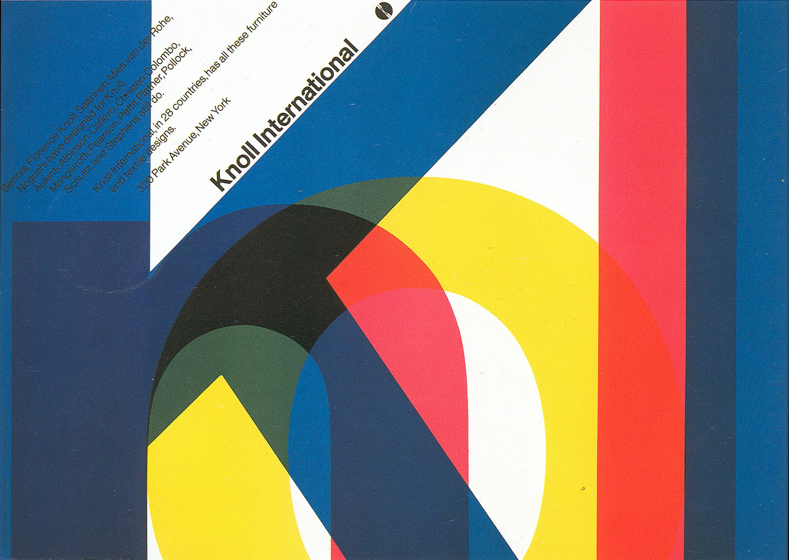
Vignelli’s designs achieve a timeless feeling, in which functionality and style find a seamless integration. His system maps for New York City’s public transit system were more readable than any that went before, and have been widely emulated worldwide. About Time, created for Champion International’s Imagination Series #24 (left), is certainly one of the most perfectly realized printed showpieces ever produced.
Vignelli continues, “But better still, you don’t ruin the letters you change. You have studied typographic history. Your modifications are respectful of the origin and the aesthetics of the workmen who went before you.”
I say, “I’ve been very lucky that Oxford has a longstanding relationship with the Pierpont Morgan Library, so I’m given a reader’s ticket to study the old books. Seeing the Gutenberg Bible up close is inspiring.”
My mind imagines an audible pop as Vignelli’s intense gaze breaks contact with the portfolio; he looks at me with renewed interest.
“You have certainly turned that opportunity into a great resource.”
This man has a knack for saying what makes you feel good in your soul. His perceptive mind is matched with a gift for expressing what people want the world to see of them. I theorize this is also the source of his exceptional design skill.
“How do you do it?” he asks, motioning a passerby carrying a roll of blueprints as thick as a tree trunk.
Before I answer he says in a curt, specifying tone, “Our friend David here draws letters and ligatures that match their master fonts. He knows the work of the masters. I will get his card for you in case we need him. He works very close by.”
The young man nods, looking from the work into Vignelli’s eyes with a practiced precision. He is being briefed on a resource and it is up to him to remember it when Vignelli calls on him.
“He has been with us just six weeks. I saw his work in Milan and I knew we had to bring him here. He understands English quite well, and his spoken English is coming along.”
“It is rare and valuable to have a fine designer and an eloquent promoter of the whole design profession in the same person”
I say, “I did not understand the reason why—” I almost say European, but Nelson’s words come to me at the last minute, reminding me to focus on Italy—“Italian design is so different, so refined. For too many American designers who don’t travel, Italian culture remains a mystery. In Italy, history is alive in every building, not just in books and museums. A week in Florence is, for an American, worth more than a semester in a classroom. In the old country, it seems that every building is revered for its heritage, and every archway, even if broken, still shows its noble origins.”
He takes me by the shoulders for an instant, to add emphasis to his thought. “Yes,” he agrees, “that is part of it. It is also education. Our intern, whom you just met, studied design the Italian way. In Italy, where—as you observe—the design standards are at least as good as anywhere in the world, all artists and designers are first trained as architects. Only then do they specialize. That is why we build nobly. That is why our graphic design has structure. Very few who study architecture can become great architects, but in this way we educate the future patrons as well as the practitioners.”
He comes back to the portfolio, “So, how do you do it? Get your ligatures so close to the originals?” Surely Vignelli knows full well how such ligatures are created, but, like Herb Stern, he wants to know I’m for real.
“I studied under Richard Nebiolo, who drew fonts at Photo-Lettering, and ...” I pause to see if he really does want a full explanation. His interest appears to be gaining so I brief him on Nebiolo’s technique of rendering letterforms.
Vignelli is listening intently, going back and forth between my face and the portfolio. He is stopped on one of the type posters in On with the Show. It uses the Bodoni family, a timeless classic of Italian origin; perhaps the redrawing of Bodoni has captured his attention? “I do not know this man Nebiolo, but I like him already!”
Vignelli seems pleased with the discourse. He makes no motion to go, but flips back through the work and asks for more detail on pieces he likes. Then, he asks permission to make copies of a few. “You have an amazing ability; I hope Oxford realizes it and is paying you for it.” He probably knows about the pay in book publishing. Maybe he is testing me again somehow—like the flexibility of my salary needs?
“In Italy, where the design standards are at least as good as anywhere in the world, all designers are first trained as architects. Only then do they specialize. That is why we build nobly. That is why our graphic design has structure.”
“They pay me in the access to their library and their antiquities. We have a Bruce Rogers pencil tracing for the Oxford Lectern Bible title page hanging on the wall outside my office.”
“The proximity to art and antiquities—things that move us aesthetically—is a form of riches.”
Vignelli affirms, “The proximity to art, antiquities—things that move us aesthetically—is a form of riches.” His expression changes, as though an internal timer has sounded. Vignelli closes with, “Well, it is wonderful to know you are so close by. We must find some ways to work together, and please tell George I send my special regards.”
As I walk back to Penn Station, I feel that I have failed in that I did not ask Vignelli more about his process and his work, yet I am so bouyed by his enthusiasm for my typography, it still feels successful. It strikes me that so many of the people who are in positions of creative leadership have something similar—Stern, Chwast, Gottschall, Ballantine, Mayer, Leone, Nelson, Vignelli—all seem to share an ability to establish very quickly a bond that feels strong and deep. It is not that they make you feel how valuable they are, it is that they make you feel so valued.
So, Nelson’s letter of introduction worked! And just as importantly the occasion forces me to make a new portfolio. I go away feeling that nothing went as expected, yet I feel I have crossed a great threshold in my design career.
James Craig: Keeping your Powder Dry
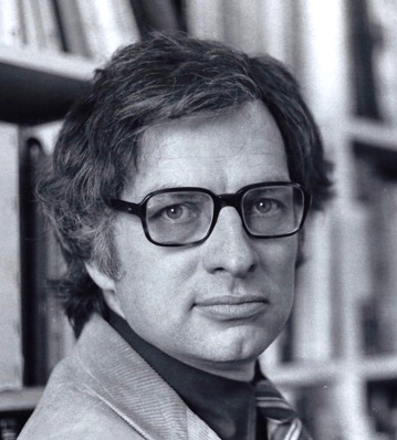
James Craig was born in 1937 in Montreal, and studied fine arts there and in Paris before immigrating to the United States. He received his BFA from Cooper Union and his MFA from Yale University. Craig was the design director for Watson-Guptill Publications for thirty years. He lectured widely and taught typography and design at Cooper Union and at the Academy of Design in Ljubljana, Slovenia. He is a member of the New York Art Directors Club, Type Directors Club, Typophiles, and a past member of the American Institute of Graphic Arts. His publications include Working with Graphic Designers, Graphic Design Career Guide, Production for the Graphic Designer, and Designing with Type: The Essential Guide to Typography. The remarkable thing about Craig’s books is that many have stayed in print and gone through multiple editions, a testament to his ability to simplify and communicate the essence of very subjective topics.
April 1977
The success of my interview with Massimo Vignelli gives me new impetus. I return to examine the names of those on Ed Gottschall’s list whom I have not yet reached. Some are famous, some are less well known. By others I have a few words of Gottschall’s scrawled to remind me what to say. A few I don’t recognize and have no note. One of these last, James Craig, I skip calling until I connect him with his book. Production for the Graphic Designer is neatly designed, restrained, and orderly. I see its bold Helvetica cover on many bookshelves in studios uptown and downtown. Finally, I just call, and am invited to visit.
Craig is the art director at Watson-Guptill. They publish quite a few visual books, and many bear Craig’s stamp, which is to say they are orderly and easy to navigate, with the design always serving the content well. There is a school of thought that holds this approach as the zenith of design.
Craig looks at my work. I look at his office for clues on how to relate. His workspace has no windows. Publishing houses in New York City usually reserve the window offices for editors. He has a lot of flat file drawers, all labeled in the economical block capitals of an architect’s hand. I compliment him on his book. He acknowledges that he wrote it because other Watson-Guptill employees encouraged him to do so, and he figured that it might bring a little extra money. Very self-deprecating. We run through the obligatory questions. What are you looking for? Freelance book design, jackets, contacts with other publishing people.
“Many ‘great’ designers are hit or miss; some days their talent makes great design look effortless. Other days, their fastball just can’t find the plate. Conversely, I’m not a great designer, yet I am capable of a great design. I believe we all are.”
“Why books?” he asks. “You have a flair for design that does not often find expression in books.”
I have to acknowledge this compliment. “I do like variety, yet I especially like doing books. They are perhaps not flashy, but they seem like the most permanently important thing a graphic designer can do. He nods; we share a bedrock belief there, no need for small talk. This is a very purposeful man. We discuss whom I have already seen, and a few of the design studios that might like my portfolio.
Then he says, “I’m not a great designer, in the sense that everything I touch goes into a design publication or wins an award. I don’t have the social connections or the oratory to sell. But many ‘great’ designers are hit or miss; some days their talent makes great design look effortless. Other days, their fastball just can’t find the plate. Conversely, I—as a designer of no special talent—am capable of a great design. I believe we all are. You have to hone your work skills so you can do good work day in and day out, and watch for the stars to align. If there were a recipe for the ideal design project, it would read something like this:
• Just enough time, but with a definite deadline.
• A budget that gives you a bit of running room.
• An encouraging client who trusts your abilities.
• A subject that hooks your personal interest.
And—here’s the important ingredient
• A designer to observe that the right ingredients are all there. “Combine ingredients in an atmosphere of excitement and optimism, serve hot.
“It may still not win awards, but you’ll know the perfection of your design the moment you get it roughed in. If you throw yourself into every project as though it were a gold medal candidate, you will dash yourself to pieces. Discipline yourself to do good, clean, sensible work day to day and keep your powder dry. Opportunities for great design come along in unexpected places. Be alert—live for those projects.”
This is not what I expect to hear from Craig. It does not fit the pattern of Heinz Edelmann, or Charles Eames, or Seymour Chwast. Craig is matter of fact, but he may have given me the single most practical piece of advice to come out of my New York years. Rarely do I begin a new project without thinking of Craig’s recipe and doing a quick inventory of the elements necessary for great work.
“If you throw yourself into every project as though it were a gold medal candidate, you will dash yourself to pieces. Opportunities for great design come along unexpectedly. Be alert—live for those projects.”
We talk a little further. Great clients are not the ones who spend the most money; they’re the ones who figure out they get more results with less control. Edelmann’s quest is for the flexible client, who may not always pay well but trusts his genius to let him do his flamboyant work. Craig’s work is completely different than Edelmann’s, maybe opposite: disciplined and spare, to the point of invisibility to the lay reader. Yet he too is alert to the right working conditions. Edelmann relies on an audacious self-confidence, walking away from relationships that don’t give him room to be explosive. Craig is willing to do orderly and professional work and wait for an opportunity for exceptional work. Yet both Craig and Edelmann are attempting to describe the same thing, something that can’t be fully explained—something personal yet universal. What is the common thread? I wonder, as I leave the Watson-Guptill offices. Both are seeking work that fits their criteria for success, but Edelmann fires his clients, burns his outdated samples, and does spectacular work. He does throw himself into every piece as though it were a gold medal winner. Craig goes with the flow, and waits for opportunity. As I swim in the sea of New York traffic, it hits me: it has to do with the number of opportunities available. A staffer cannot choose clients, and so the opportunity flow is relatively finite. Craig writes his own books to improve the odds. The independent designers who have been able to generate enough opportunities can uphold their quality by turning away the work that does not fit their personal recipe. Nelson uses public speaking and publishing; Edelmann uses motion pictures; everyone who succeeds in a big way has mastered the art of increasing the number of opportunities that flow his or her way.
Craig’s suite of books for graphic designers is valuable for both individual professionals and for the profession as a whole. They establish the idea that there are core disciplines for the communication process, ideas and relationships between form and content that apply, regardless of the medium. Craig has continued to reinforce this idea with updated editions as technology changes.
Aha: It’s disheartening to try to produce good design where it’s not wanted or remunerated. It is also wrong to let your expectations be lowered so that you miss the opportunity to do exceptional work when the time is ripe.
It’s disheartening to try to produce good design where it’s not wanted, not remunerated, sometimes not tolerated. Craig’s remarks suggest that the opposite is also true: It is also wrong to let your own expectations to be lowered, and thus miss the opportunity to do exceptional work when the time is ripe. Craig has—perhaps unintentionally—given me a vital idea. I can’t increase my native talent. I have limited control over opportunity. I can, however, adopt the discipline to make the most of the talent I do have, and to maximize those opportunities that do come my way.
Tipping Point on a Train
May 1977
New York is in a raw emotional state; there has been a bloody accident that is all over the news, involving a helicopter shuttle from Kennedy Airport to the top of the Pan Am building in midtown Manhattan. I am very familiar with this shuttle, because from my north-facing window at Oxford I feel the percussive whump, whump, whump as the copter settles several times a day onto the rooftop heliport ten blocks away. During a recent rush hour, one of the choppers had malfunctioned, and there was terrible carnage. People standing by were cut to pieces. The part of the story that gets the most buzz, though, is the tragedy of a commuter walking down Madison Avenue. Fifty-nine stories below and several blocks away from the accident site, she is struck by a piece of the helicopter’s rotor and killed without ever knowing what hit her. Numerous others are injured by what was described as a hailstorm of broken glass. I even hear that Ed Gottschall sustained an injury from this glass while walking in the area, though fortunately not too serious. In Manhattan, everyone is a pedestrian for part of the day, everyone identifies with this commuter. Everyone’s inner voice says, “That could have been me!”
I am in a muddle. I shuttle daily between New Brunswick and New York City. My job at Oxford pays for food, rent, and my train ticket. I make up the difference by staying up all night designing book jackets, so I am always exhausted. I calculate that I am making enough by freelancing to quit my day job, just barely, but letting go of the security of a regular paycheck is terrifying.
If I can get out of the shower by 5:20, I can catch the 6:02 Metro-liner out of New Brunswick and get to Midtown between 7:00 and 7:30. Oxford starts at 8:30, so this gives me an hour to deliver freelance projects or make calls from Penn Station Booth 6. The blue bloods from Princeton are on the 6:02 heading for Wall Street, and on one particular morning I sit behind a Princeton banking executive and his boss, the very picture of a British aristocrat, visiting the operations in the States.
My work at Oxford has attuned my ears to the fine points of the King’s English, so without intending to eavesdrop, I find myself drawn into their get-acquainted conversation.
The Princetonian is explaining, “No, I don’t come from a banking family; in fact I read economics with the intention of teaching, but a college chum convinced me to help him for a year at his start-up company. I became the bookkeeper and CFO and liaison with their bank—Rodney was our lending officer. After it took off, I decided I liked the thrill of companies in their go-go growth years. Rodney had just gotten kicked upstairs and I talked him into letting me start a unit to serve that market. I didn’t realize at the time how risky that was, but fortunately my friends brought me enough business to make my quotas until I learned what banking really is. So I fell into it because of enthusiasm, not training or competence!”
His British counterpart nods as if he knows this narrative, and responds, “You know, I’m in banking because it’s what my father’s family has always done, and I had to do what was expected of me. If I had announced that I wanted to be a soldier or a choreographer, he’d have discouraged me. If I did as you did, following my own interest, the Pater would have given me a stern thrashing. If I persisted, it would go without asking that I’d be disinherited.
“But here in the US, you have this amazing agreement amongst yourselves—you can just declare yourself to be whatever you want, and everyone says, ‘OK, fine, jolly good, carry on!’”
He turns to look his American counterpart squarely in the face. “Do you have any idea how extraordinary that appears to the rest of the world? How like an impossible dream? That anyone at any station in life can just decide their destiny and enjoy the support of family, government, and even get a tax incentive to do it? Is it any wonder that people are risking their lives stowing away in cargo containers, crossing oceans to immigrate to your ‘land of the free?’”
It seems this little paean to American exceptionalism is put in my ear by Providence for me to hear, at this hour, at this juncture in my career. I can’t really keep burning both ends of the candle, that’s for sure. The newsstand in Penn Station is a wall of tabloid photos of the recent helicopter crash. The sudden feeling of everyday danger somehow puts me over the top. The risk of freelancing seems small compared to the risk of doing nothing.
“Here in the US, you have this amazing agreement amongst yourselves—you can just declare whatever you want to be, and everyone says, ‘OK, fine, jolly good, carry on!’ Do you have any idea how extraordinary that appears to the rest of the world?”
I must find a way to tell Fred Schneider, who has become like a second father to me. I stammer my way through a sentence or two, but it seems he has expected to hear it for some time. In words remarkably like those still fresh in my ear from the bankers on the train, he tells me, “Well, OK, fine, go ahead. I’ll give you as much freelance work as I can—get an office close by.” He writes a recommendation letter that is as humbling as it is useful. It opens many doors. To complicate matters, I break my foot playing squash racquets the same week I begin freelancing, so I hobble to meetings with my leg in a cast and the Valise in a backpack. It generates a lot of sympathy, and work surges. Nevertheless, I don’t recommend the old “Break a leg” as a marketing strategy for a new business.
The feeling of everyday danger puts me over the top. Suddenly, the risk of freelancing is small compared to the risk of doing nothing.
Hermann Zapf: Your Soul’s Music
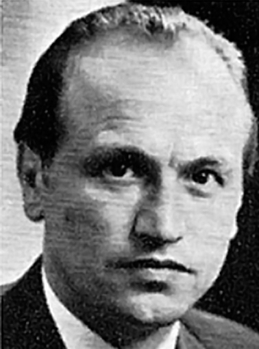
Born in 1918 in Nuremberg, Germany, Hermann Zapf survived a dangerous period in German history to become one of the greatest font designers of the twentieth century. Germany was struggling to rebuild after World War I. The Spanish flu pandemic took two of his siblings, and a great famine in Germany also hampered his education. Zapf’s father was sent to the Dachau concentration camp during the Third Reich; he was later released. Due to this political and economic hardship, Zapf was unable to attend a university, but rather was apprenticed as a retoucher. He was self-taught as a calligrapher, and was influenced by Rudolf Koch. Conscripted into World War II, he developed heart trouble and shuttled around various military roles, finally working as a cartographer. He taught calligraphy and became the artistic director for the Stempel foundry, where his excellent font designs became known worldwide. Zapf’s work includes many trademark designs, hundreds of lettering styles, and 30 font families of exceptional quality. His work is widely published in books, periodicals, and featured in a short film, The Art of Hermann Zapf.
Zapf was an early proponent of computerized typesetting and held the first professorship in the subject, at the Rochester Institute of Technology. While Zapf’s business ventures were sometimes hampered by theft (and by the long-standing legal bias against intellectual property protection for fonts), his creative endeavors were always world class. His classicism is a countervailing force to the ubiquity of Helvetica and the Swiss school, yet his typefaces are more modern than traditional. His writings have been translated into 18 languages. In 2010, Prof. Zapf was awarded Germany’s highest civilian honor, the Order of Merit.
May 1977
The person who booked the room for Hermann Zapf must have been unaware of Zapf’s global reputation. I arrive early and stake out a seat in the third row. Zapf, a highly polished lecturer, starts on time and leaves the seating problem to his hosts. Soon after he begins, I turn and see forty or fifty people standing shoulder to shoulder. More are milling about in the hall.
I give up my seat to gain a better view of Zapf’s demonstrations of lettering on the chalkboard. He is so experienced at teaching about letters that he’s mastered a technique of breaking chalk sticks into pieces of similar length then drawing calligraphic letters with the broad side of the chalk. Standing at this board he makes extraordinary O’s and Q’s half a meter high; each stroke is fast and the curves are more perfect than if they had been traced with a French curve.
“The secret is the speed,” says Zapf. “If you take time to think, to aim, to guide, you will wobble.” He makes his hand go at half speed and circles the few wobbles in the resulting letter. “Of course you have to go slowly and concentrate when you are a student, but when you get serious, you push for speed. If your eye is on the pen, it cannot see where it should be going. The eye should be visualizing the whole word—the complete calligraphic thought—and leading the hand.”
“When you get serious about your craft, you push for speed. If your eye is on the pen, it cannot see where it should be going. The eye should be visualizing the whole word—the whole thought—and leading the hand.”
Everyone is spellbound. His English is definitely that of a German; his grammar is occasionally bumpy, but his expressions are well studied—delightful companions to his enthusiastic personality.
“Yes, you are a very good class and very quiet, but you know, there is no test today and I cannot give you any academic credits—not even at a German school—for listening to me. So I am happy to draw letters for you, or you may ask questions.” Without waiting for any questions he continues his rhythm of drawing a few large characters, turning to address his audience first to the right and then to the left, often without lifting his chalk or missing a stroke.
“I learned most in my early years by looking at stone inscriptions. Here in the US you love your billboards,” Zapf says, waving his arms to indicate the overpowering size of Times Square graphics, “but in Germany we prefer carving letters on stone. Gravestones, cornerstones, cathedrals, public buildings, even flat rocks in the countryside—anywhere we can get a little space.”
The audience laughs at the contrast, as though even the German graffiti artists carved in stone. He motors on, drawing, warming us up with a sly remark while he mesmerizes us; a few large characters fill the board, are erased, new ones appear.
“So, I come across a stone when I am very young, with shapes like this,” he draws from memory a replica of the stone, “and they become the basis for many drawings that turn into my font Optima.” We applaud quietly in support of Optima as, with facility approaching legerdemain, he renders the full set of Optima capitals in three rows on the chalkboard, perfectly centered.
Now I see why Zapf is so successful. He is not only an artist, he’s a showman. He can make creativity appear effortless. I’d pay a hundred bucks for that drawing, which is erased as fast as it appears. I decide he is just entertaining us because we are not giving him any direction about our interest.
Since he gave us leave to ask, I venture a question the next time he turns in my direction. “Professor Zapf, would you mind talking about the business side of being a font designer? How do you present your ideas? How far do you have to develop the design of an alphabet before it is approved?”
I see why Zapf is so successful. He is not only a gifted artist, he’s a showman. He can make creativity appear effortless.
He is nodding and stops drawing mid-character. “Ah, here is a gentleman who gives his seat to ladies, and asks questions like a practical fellow!” he says good-naturedly, finishing his character without looking. A pregnant woman took the seat that I vacated, and Zapf, who controls the pace of the evening masterfully, gives me a very slight nod of approval and continues. In addition to drawing letters and lecturing, he is watching his audience’s every move! How many things can this guy do at once? My inner theorist suggests, “A designer demonstrates extraordinary skill. An artist convinces you that you have extraordinary gifts and that there is nothing preventing you from using them—starting today.”
Zapf answers my question: “For us, on the wet end of lettering, it is an art and we know when something looks right. But if you want to make a font, you work with rooms full of hardboiled businessmen.” Zapf pauses to consider his tale, then continues, “When you start out, they think you are a pair of hands, and they make you draw things their way. I could never tolerate that and I had a hard time with some bosses. I had to be double good to get them to trust me. That is where I learned the speed, I suppose. But for metal type, your designs have to be cut into metal punches, and for linotype the design of the letters is even more complex, because the brass matrices have mechanical limits. And now the photographic fonts require a new way of thinking, because they do not have to allow for the spread of the ink in letterpress. So there is a lot of decision making, and money tied up in the release of a new font. The foundry wants a return on its money!
“And me, you know, I have these needs. My wife is nicely dressed, and we have to have food—” he pauses to allow the audience a second of mirth—“every day, so I need to be paid. I worked on some fonts that were the designs of others, but when the first font of my own design was released it sold well. As soon as you can demonstrate that your work will sell, you need to press your advantage.
“You can’t let the hardboiled businesspeople change your idea. If they want me to hold the pencil for them, I tell them, ‘You have a good idea there—you should develop a font around that!’”
All the designers I meet who are at the top of their game talk about this tension between their world and the struggle for control. “Yes, I insist on ownership,” Zapf continues, “but I always listen to what they say. You know, if you let the hardboileds run everything, the work looks like dung. It makes a profit, but only an average profit. They know this, so they need what we do, but they hate to give up control.” Now Zapf proves he is a genius, as both an artist and a teacher. “But you know, we need them, too. If you don’t have them, counting your hours, reminding you how expensive everything is, you—well, me anyway—I will dally about, making a hundred variations of the smallest thing.” Here his chalk arm blurs to almost invisible speed as he dashes off a dozen ampersands, each a slight variation in design. He uses this superhuman display of virtuosity to drive home his point. “We need them to help us get down to what is really marketable, and get it out the door.” He stops drawing and looks around the room, seeming to make eye contact for an instant with every onlooker.
“If you fight just for control of something unimportant, you are ‘temperamental.’ If you have strong opinions that don’t make sales, you are ‘unfocused.’ But if you fail to insist on something really crucial, then they will say, ‘Why didn’t you speak up?’”
“So you have to learn—it takes time and there is no way to train for it—when to fight for what is right and when to give way to the talents of others. If you fight just for control, for something that does not really matter, you will be thought of as temperamental. If you have strong opinions that don’t pan out, commercially, they will dismiss your ideas. Worse, if you fail to insist on something that really is crucial, then they will say, ‘Why didn’t you speak up?’ For example, I did a font based on my own handwriting. The foundry was eager to release it, but they wanted to give it a different name. I called it Norse after my home region, but they were adamant and I decided that as long as I got to do a good font, I should let them handle the marketing.”
Zapf has not given the type of answer I wanted, but now others begin asking questions, and the session goes in a dozen directions. The soon-to-be mother raises her hand shyly, and Zapf coaxes her to ask her question by holding up his chalk hand and leaning toward her. She says something very softly, and Zapf nods, drawing a breath. “Our friend asks what advice I have for someone entering the working world who,” he thinks how to summarize, “wants to use her artistic talent to make money.” He looks back at her. “Yes?” She nods vigorously. Zapf pauses his lettering to give this answer his full attention.
“Nobody can give you specific advice about this. Talent is, by its nature, unique to each individual. There is a young lady, one of my first students, who has amazing gifts. Her portfolio has just a few pieces in it, but they are exquisite. She can draw and letter and play piano and sing, all beautifully. So what does she pick? None of them; they come to her too easily. She drops out of my class for a few weeks, then expects to be admitted again. I have lost touch with her now, but I hope she concentrates on something.” For an instant Zapf has a faraway look of compassion and loss, then he continues, “Another student applied to the same advanced-level class—good manual skills, but not gifted. In fact, the first two times she applied to my class, we did not admit her. But the third time, her work had improved, and there was a lot of it. She proved that she was very industrious and committed. I said, ‘This student does not give up easily—maybe my teaching will not be wasted on her as it was on the other, more gifted student.’”
“One of my first students has amazing gifts. Her portfolio has just a few pieces in it, but they are exquisite. She can draw and letter and play piano and sing, all beautifully. So what does she pick? None–they all come too easily.”
Zapf is offering a keen insight here; I jot in my notebook. It isn’t only about portfolio. People size you up in a great many ways. They want to know that their investment in you—whether as teacher or employer or client—will bear fruit. But Zapf is not done. He is building, one stroke upon the next.
“If you have talent, you have to decide what to do with it. Concentrate first on the thing that is most important to you. If making money is the most important, use your talent to take you where you can make the most money. Your expression will not be your own, but you will be comfortable sooner.
Aha: People size you up in a great many ways. Portfolio is only a part of it. They want to be sure that their investment in you—whether as teacher or employer or client—will bear fruit.
“If your muse insists that she must be first, that what you have is unique, and must be heard or seen on its own terms, then you must seek the employment that gives you the most room to grow and develop. You need a mentor who values your skill and who will teach you. They will still need to make money on you, but a very few places will place emphasis on developing talent. You find these places only by searching diligently, by talking to others—not by taking the first thing that comes along. You will have to live on what you can earn, and forego many things. If you have a talent for living cheaply, if you avoid debt, you can afford to wait for the right situation. Once you get good, then you can earn more money, and then it will be because your mastery of your talent draws opportunities to you.”

Zapf created several hundred exceptional lettering styles and fonts, as well as logotypes and books for an elite international clientele. Zapf lectured and taught widely; his chalkboard renderings, like the example below, demonstrated his virtuosity and enchanted many audiences. The sheer beauty of his designs revitalized interest in the classical history and practice of calligraphy as a basis for modern design.
An adult student asks for clarification. “Professor Zapf,” he says, raising his hand and speaking at the same time, “do you mean it is better not to take the highest-paying job?”
Zapf smiles at this simplification—he has heard this question before—then answers deftly, “What I mean is that you should be aware that every decision you make about your work determines something about your direction. If a job is offered to you, but the work coming from the employer is not exciting, if it is commerce but nothing more, you have a choice: ‘Do I take this money and learn what I can here and move on? Or is there nothing here for my talent, only a means to feed my body?’ It takes great courage to pass up a job that does not feel right. Finding a place where you can do the work you feel is most valuable, that is a bit of a holy grail. You may get lucky and find it early; you may search—as I did—for many years. I did not know where my career would lead, and there are always wars, depressions, inflations, illnesses. I initially thought I wanted to be an engineer, but politics prevented that. I was lucky to know what made me happy—I loved to draw letters. I went where I could do that. Work on what makes you happy, and the money will come, though never as fast as you need it to.” He paused, as if realizing he had meant to give the young man a simpler answer.
“You need to be clear about your goal, and then, like my second student, be steadfast in the pursuit.”
“Professor Zapf, please,” asks a tiny woman standing to be heard. “How do you know if your talent is really good enough to be worth so many sacrifices?” The room goes stone silent.
Zapf finishes a group of letters with a flourish and puts down the chalk. “The best answer I have for you is not mine. I think it is maybe Bach who says, ‘If going for a single day without giving expression to your soul’s music makes you miserable, then music is your calling.’”
I checked to see if any of the Bachs really said anything like this, but have not yet found the source of this impressive piece of wisdom. Whether it is Bach or Zapf himself, it stands as a challenge to confront every morning. What music does my soul yearn to play today?
Paul Rand: The Designer as Brand
Even people who know nothing about graphic design have heard of Paul Rand (1914–1996). His logo for IBM is probably the most copied—and the most impossible to copy—of all modern brand marks. His client portfolio included Westinghouse, El Producto, Cummins, UPS, and numerous others. Unlike most other designers in the top echelon, Rand worked alone for most of his career, utilizing at most an assistant or student intern. His work is characterized by a powerful directness, sometimes leavened with a disarming whimsy.
Born Peretz Rosenbaum to Orthodox Jewish parents in Brooklyn, New York, he studied at Pratt Institute, the Art Students League, and Parsons, yet described himself as “a self-taught designer.” In his early twenties his work for Esquire magazine attracted worldwide attention, and he built a portfolio by designing magazine covers—sometimes for no fee, in return for a “no alterations” agreement. This allowed him to do fresh, experimental work before a large, influential audience. An articulate spokesman for design, he is credited for giving graphic design, and particularly branding, legitimacy as a strategic business tool. He taught graduate-level classes in graphic design at Yale and and continued working until shortly before his death in 1996.
January 1978
I hold George Nelson’s letter of introduction to Paul Rand in my hand, rereading its four sentences, and decide to walk out of my way to use a good-quality Midtown copy shop, then post it. A week goes by and I receive a phone call from IBM.
A crisp, youthful, military-sounding voice begins without greeting or identification, “Mr. Laufer? Mr. Rand will be at the Manhattan office on Thursday next week. He can see you at 10:30 for about twenty minutes.” He is not asking for a reply; it doesn’t matter whether I can be there or not.
“Very good, thank you.” In a moment of lucidity, I remember to ask for the address and how to pass security.
“Just tell the guard you are visiting Paul Rand.” At IBM, Rand’s name is a security clearance! I take my gray Presbyterian suit to the dry cleaner, put the Valise Cruiser in order, and shine my shoes. I reread his writings and review everything I know about his clients and his work. I also call my classmate Geoff Fried, who went on to get a master’s at Yale and study under Rand.
“Rand,” he says in a tone of considered reflection, “has definite opinions about everything in design—and,” he pauses to choose his words, “his opinions are never wrong. He explains the way design is—conclusively. You know his work?”
I play back what I have just been studying: “Westinghouse, IBM, UPS, some of his magazine work. The stuff that is published regularly. Not in great detail.”
“Well, you will learn the most if you ask him about his decisions. You have to understand that he believes there is a best way, and that he alone knows it. Don’t make the mistake of dropping names with Rand. He’s a bit like Frank Lloyd Wright: he knows he’s great and he can’t bear the work of other famous designers, with the exception of a few great predecessors. Herbert Bayer, he likes. A. M. Cassandre.”
The security guard at IBM shows me to a small meeting room furnished with a Knoll table and a few chairs. Rand comes in with the confident stride of an impresario on stage. He is wearing a gray suit, a red tie, and black shoes. His close-cropped, salt-and-pepper hair and his glasses look like all the publicity pictures. I am seated, but rise to shake his hand. I stay semi-bent over and sit back down, conscious of the difference in our height and not wanting to tower over him. He is very commanding in his carriage, but he is short! Rand has a mild tic that causes him to squint frequently, but he is relaxed and businesslike.
Rand begins, “So, you are a student of Nelson’s; he thinks rather well of you, and you are working at Oxford. I have a few minutes before my next meeting. How shall we spend our time together?” I notice he has a folder with my name on it, with the resume I sent and Nelson’s letter in it. I’m on.
“I went to school in Pittsburgh, so I spent quite a lot of time watching your Westinghouse animated sign, waiting to see if it would ever repeat.”
His mouth curves up, almost imperceptibly. Print magazine did an article about the large outdoor installation Rand designed, a series of large neon Westinghouse logos set on one of Pittsburgh’s prominent hillsides. Each stroke of each logo could be illuminated independently. The article said that the sign was programmed with so many variations that it would not repeat for at least a thousand years.
“I studied under Dennis Ichiyama [also a student of Rand’s at Yale], who made no secret of using many of your assignments. We did a proportion book, a series of type posters, and we drew a Roman alphabet from scratch.”
“Ah, time to change my lessons again,” he says, matter-of-factly, “or there will be no reason for anyone to pay Yale’s tuition!”
“I brought a portfolio, and I would be happy to have your insights.” I put it on the table. “But I have to confess, that what I am most interested in is, how you ...”
“Became Rand?” he fills in.
“Just so!” I am glad he understands.
“Well, I publish. My books are my best marketing. I do shows of my work. The shows are also good visibility, though it is hard to measure how much they really benefit me. As far as how I came to be, I didn’t have a grand plan. I was working for a guy who stopped paying me, so I got a job in an agency, I learned as much as I could about advertising, then I left. I’m too opinionated to make a tolerable employee. I needed to know about ads, but I gravitated toward work where I could get involved in the subject matter as well as the form. Editorial work, especially magazines, and design.”
He looks at my design for the Oxford title On with the Show, set in linotype Caledonia supplimented with hand lettered chapter titles.
Rand’s design aesthetic is deceptively simple. One design utilizes a strict grid, the next design is casual brushwork. Many of his designs feature loose components or fragments of something familiar, and let the viewer’s eye assemble them. He can find meaning and emotion in small details and extract humor from the most elemental forms. Rand thought of himself as an artist, his quirky signature becoming a sought-after brand in its own right. In his writings, Thoughts on Design and Paul Rand, A Designer’s Art, he is as articulate and forceful in his prose as he is in his designs.
“You shouldn’t waste your time with Caledonia.” Fred Schneider uses the Caledonia font as a mainstay for some of Oxford’s most established formats, and I am about to ask why. “It’s just a mishmash of shapes from other, more successful fonts. Lacks clarity. Not in the same league as Bodoni, Garamond.”
He flips through my work, moving at a brisk pace, but very attentive. He lingers a minute on a jacket for Many Dimensional Man, an Oxford hardcover that uses a moiré pattern to define a human head.
“That’s good.” Note to self: call Schneider and tell him Paul Rand likes our cover!
He stops at my identity package for the Oxford quincentenary, and his jaw tenses.
“Mmm. Optima, problematic choice for an identity system.”
Hermann Zapf, the creator of Optima, is a European rival, commanding high fees and wielding influence similar to Rand’s. But where Zapf is a classicist, Rand is a modernist; Zapf is known primarily for his calligraphy and typography, Rand is known for identity systems and startling, symbolic statements. Fred Schneider loves Optima, so I use it a lot.
“It’s so classical in its origins—” I start to explain why I use it, why it is such a good choice for Oxford, but Rand will have none of it.
“I’m too opinionated to make a tolerable employee. I needed to know about ads, but I gravitated toward work where I could get involved in the subject matter as well as the form.”
“I already said I don’t like it.” Right, Geoff Fried had warned me that Rand doesn’t discuss design. He moves on smartly. “Now this makes a good layout,” he says, holding Arthur Tress’s Shadow out at arm’s length to flip the pages. “You stay out of sight as designer, and let your photographer shine. Important skill—augurs well for you that you learned that so young. Futura would have been a better font choice, but since you are using only the Avant Garde capitals in a light font, this works. Looks like your publisher changed your title page, though. You have to choose your battles, but when you come this close to perfection, it’s important to win.” I’m dismayed. He has picked up on exactly what happened: an editor threw in a single line of extra copy on the title page in a different font. It doesn’t look bad—I told myself at the time—but Rand sees immediately that it’s inconsistent with the rest of the book.
Remembering Geoff Fried’s advice, I decide to ask about his decisions. “I understand that you work mostly by yourself. How do you accomplish so much?”
“I’m very direct with my clients. I tell them that I will work out precisely what they need, and it will be excellent, but I don’t change my work and I expect them to implement exactly what I do. If they want to dink around, they can hire someone else.”
“Well, I usually have a grad student or two assisting, setting up content and managing the workflow for me,” Rand explains. “But I’m very direct with my clients. I tell them that I will work out precisely what they need, and it will be excellent, but I don’t change my work and I expect them to implement exactly what I do. If they want to dink around, they can hire someone else. That scares off the dilettantes, and allows me to work faster.”
The Rand aura sinks in further. His designs are nonnegotiable, even before he is hired. He dictates the terms of the relationship at the outset. Compared to Schneider’s soft-spoken give-and-take with his editors, even compared with Barbara Bertoli’s forcefulness, Rand is a commanding presence.
He is looking at a few of my illustrations. “You draw well,” he says, flipping through my sketchbook, “but you rarely use your drawings in your designs. Seems like a missed opportunity. In fact, your work is still a bit polite—maybe it’s your employer. But you should be more aggressive about becoming ‘Laufer’.” He says this with an eyebrow raised.
A young man in a dark blue suit pokes his head in the door. “Mr. Rand, two minutes.” Rand’s nod to him is barely perceptible. He continues in a smooth manner.
“Two minutes,” he reiterates under his breath, as if he wished for more time to go into detail. He flips back through my portfolio quickly. “I want you to send me a few samples. I have to take care of my students first, of course. I can’t make any promises, but things come up.” We shake hands and I try to express the type of gratitude I feel toward him—not just for seeing my work, but for “being Rand.” Rand nods with a silent cordiality and steps briskly out the door.
I came to New York thinking that if I could meet famous designers and find out how they planned their careers, I could follow their plans and be as successful as them. The interview with Rand is the beginning of the end of that youthful misconception, yet the insights gathered from my dialogues with creative legends are among my best navigational tools. Creative careers are difficult to map in advance. I learn later that Rand was born Peretz Rosenbaum, and that he “rebranded” himself Paul Rand. So ambition is a crucial ingredient—talent and drive too, certainly—yet neither Rand nor any of the heavy-hitting creative professionals I interviewed professed to have a career plan—at least not one that actually worked out. If there were any common threads to their stories, it was their ability to recognize their own shortcomings as well as their strengths, to act quickly on creative opportunities, and to employ strategies to build the trust and respect of their clients.
Rand represents one extreme in client relations: an autocratic style that insists on his control as a precondition. Nelson’s style was perhaps the opposite extreme: charming and storytelling and joking his way to his client’s trust. But both arrive at the real goal: the deep trust of their clients. Successful design requires control, and gaining control comes when the client willingly relinquishes control, entrusting the designer with the decision making, the budget, and the positive impact of the design in question.
Ivan Chermayeff: A Search for Essence
Ivan Chermayeff was born in 1932 in London. His father, Serge, was an influential architect, industrial designer, and writer. Chermayeff met Tom Geismar while studying at Yale. They began their partnership in 1957, and would go on to design such pervasive brands as Mobile, NBC, and Chase. Their firm has for decades occupied a unique position in design—with a handful of other design firms, they set a standard for how modern corporations control their public image worldwide, and how such identity systems can evolve.
Chermayeff and Geismar shared an AIGA Medal in 1979 and have collected numerous awards worldwide. Under a new generation of leadership, the firm continues to lead the profession. Chermayeff participated in leadership positions at many cultural institutions including the Museum of Modern Art, New York; Yale University; Harvard University; and the Aspen Design Conference.
February 1978
Walking to Chermayeff and Geismar, I reflect on the time and effort invested in George Nelson’s Philosophy of Design class. It was one of many efforts at self-education that could have been a dead end, but instead became a portal to the future. Design would be a much easier career if each day, each phone call, provided some evidence of progress. Instead, it often feels more like purchasing lottery tickets—all or nothing.
Nelson’s letter has worked its magic again; Chermayeff appears promptly to wave me through the C&G lobby. He’s impeccably dressed, has a ruddy, handsome quality, patrician yet personable. He has the almost hypnotic ability to give you the full breadth of his attention: hearing every word, meeting you where you are, and lifting you to a higher understanding. I wonder if this is an innate gift, or if, like Nelson’s public speaking, it can be learned with practice.
The interview with Rand is less than two weeks past, and the size of the Chermayeff and Geismar operation stands in sharp contrast. Chermayeff shows me hastily through their bullpen area, introducing me to one or two people in passing, but there is a buzz to the hive, and leisurely conversation seems out of the question.
“Thanks for coming to see us,” he says even before I can thank him. Could he be unaware that I have been calling him for several years? It’s more likely an acknowledgement; perhaps he is thanking me for thinking well enough of their work to persist so long. No way to know. Chermayeff sits down at a circular table in a small, white room with an original Saul Steinberg drawing on the wall.
“I consider your seeing me personally a great honor.” After I say it I wince—too formal, or fawning, or something. I take a sip of the water the gatekeeper has brought unasked. I open the case and pass it to Chermayeff. He spends two or three seconds on each piece of work, nodding as he goes.
“We are waiting on several large projects that we expect to be awarded. This might open up several new design positions,” he says with a confident air. “What we always look for is a solid basis of production experience—we find it is essential to know what process one is designing for—and an innate curiosity that leads to a robust background knowledge.”
“Do you mean background knowledge of design?” I ask.
“Actually, I mean everything else. Virtually every designer has learned about design—that is a given for anyone with a degree. We look for those with broad knowledge of business, culture, sports, politics—the world,” he clarifies, nodding his head slightly to each of the different compass points to convey wide knowledge. He is speed-reading my resume now. “Foreign residence and foreign languages are a plus.” I know now from experience: elite interviews are short.
Rand stated up front his twenty-minute limit; I was in and out of Push Pin in under half an hour. I have a few burning questions I want to cover before an abrupt ending.
“Virtually every designer has learned about design. We look for those with broad knowledge of business, culture, sports, politics—the world.
“Mr. Nelson was kind enough to give me an introduction to Paul Rand, whom I have just visited.” Chermayeff does not acknowledge my name dropping, and I hasten on. “He can maintain a personal vision by working alone, but how does an operation the size of C&G maintain such a recognizable style?”
Now Chermayeff sees where I am going, and responds, “You have to look at design from the client side, always. Rand is—” he pauses diplomatically—“a difficult guy. It takes a particular and patient client to work with someone like him.” He shifts direction. “We strive to make great design accessible. We don’t have a mystique. We don’t wrap it up in a personality cult or intractable processes. Our clients can call us, explain a problem or objective, and we take it from there.”
There is no hint of irritation, but it occurs to me for the first time that Rand may be a burr in the saddle of many firms. Without the overhead of large staff or offices, Rand cherry-picks certain high-visibility clients.
“Besides,” he continues, relaxing a bit, “you can’t take on a major identity campaign as a lone ranger, or do government work. You just can’t. Our work for the post office takes a lot of staff just to respond to the volume of their requests, let alone do the work.”
“And how . . . ,” I begin, but Chermayeff grins broadly now. He sets my samples back in their case, giving me full attention.
“We strive to make great design accessible. We don’t have a mystique. We don’t wrap it up in personality cult or intractable processes. Our clients can call us, explain an objective, and we take it from there.”
“I’m getting there,” he says, smiling amiably at my impatience and giving me a glimpse of the personal charisma that his clients enjoy. “Everything depends on having great people. I try never to hire anyone who isn’t a better designer than the previous hire. Rand may or may not have a personal ‘vision’ as you put it, but we certainly don’t. When my staff delves into a design exploration, my job is to be a transparent window to the client and to the larger audience beyond. I weed out the overly personal work. What you may see as a C&G ‘style’ is really just a search for essence. That essence always originates with the client’s audience relationships.” He motions to the Valise. “Your work is very influenced by the expectations of the publishing industry. Nothing wrong with that, but you will need some additional client perspective to grow into the fine designer I believe you can be,” he says. How different can design and publishing be? Maybe he means the scale of book design is smaller.
I decide to pursue this. “I’m used to design projects being given to small teams: one editorial assistant, one designer, one production artist. How do you structure a project with multiple designers working on the same problem?” I am not sure I am scoring any points by directing the interview toward him, away from his attention to my work, but I want to take advantage of the moment. I’ve waited so long to see into this rarefied world.
“Ah! A crucial question. I used to think there was a single method, but now I know better. We have to be flexible, and suit our teamwork.” Another midsentence change of expression signals a coming insight. “Tom and I look for ways to deliver the maximum value to a client. The trick is, every client has a unique value matrix. One client needs a good design in a week—miss it by a day and the design has no value. For that client, putting three people on a project and structuring their assignment so they cooperate is the ticket. Another client may be selling against a very sophisticated competitor. They can be a little more flexible on time, but good design won’t do it, they need spectacular. For that assignment, we might put five designers on the very same task, and foster some internal competition. This gets a lot of results, but requires the account manager to be a very judicious and sensitive referee. With five excellent designers, you can’t afford to have a winner and four losers. The competition has to build to joint ownership. I try never to say ‘the client picked this one’—that is a weak resolution; it abdicates my responsibility for overall excellence. I want to look at a wall of designs and be able to articulate exactly what makes a winning design.”
“When my staff delves into a design exploration, my job is to be a transparent window to the client and to the larger audience beyond. What looks like a ‘style’ is really a search for essence. That essence originates with the client’s audience relationships.”
“Does the client see the wall?”
“We rarely give the client a lot of designs. It’s confusing to them, and they pay us to remove confusion, not generate more. They pay us to recommend one design that will work.” I’m about to ask how he knows which is the winning design, but he has probably had this discussion many times. He knows this territory and takes the reins of the interview back firmly.
Chermayeff & Geismar’s designs are characterized by timeless simplicity and elegance. Many of their brandmarks are so familiar they appear not to be “designed” but rather seem to have always existed.
C&G’s oeuvre includes virtually every aspect of visual design: posters, exhibitions, interiors, publications, branding systems, packaging, architectural murals, and interactive. Their star design for the American Bicentennial is possibly the only brandmark ever to appear on 100 million postage stamps as well as on interplanetary spacecraft!
“One client needs a good design in a week—miss it by a day and the design has no value. Another client can be a little more flexible on time, but good design won’t do—they need spectacular. Every client has a unique value matrix.”
“I know instantly which design will work best. But—to your question before about the firm’s vision—I know that providing the client and audience perspective to my design team is the most likely way to build consensus around the strongest design. There’s a difference between strong leadership and autocracy. There are design firms where an autocrat reigns, but they lose their best talent regularly.”
The interview will be over soon. This is my last opportunity to go for the throat. I stand and square my stance to him. “You’ve been generous with your time, and these are invaluable insights. I would be honored to be a part of the C&G team. How soon can I sign on?”
Chermayeff acknowledges the correctness of asking the question directly, responding with a smile of his own. He extends his hand for a vigorous shake.
“I think you are better than this portfolio. We will certainly keep you in mind, but do send us new samples when you stay in touch. And please tell George we hope he will stop by for a visit. He is such a brilliant fellow.”
“You are better than this portfolio.”
I thank him and he leaves me to pack up my case. His gatekeeper appears to show me out. Chermayeff’s parting words—you are better than your portfolio—offer a multifaceted insight. It could be an insult: a suggestion that the portfolio falls short. It could be a challenge: You need to get in gear and do more and better work. It could be encouragement: I like you and I think you are capable of more than what I see here. It could be a dismissal: You are not ready to work here until your portfolio is. I leave as I arrived: thinking about what it all means. I reject any intention of insult, and think of it as encouragement, a challenge to be worthy of Nelson’s sponsorship. The heat reflecting from Manhattan’s pavement blasts my nostrils; a sharp contrast to the cool, oxygen-rich C&G atmosphere. I remember Robert Lepper saying “everyone is always worrying about portfolio.” Is anyone’s portfolio ever finished? When the portfolio is better than the designer, is that a triumph or a danger sign?
I resolve to respond to Chermayeff’s challenge by always being better than my portfolio, and never showing a portfolio that isn’t at least a little better than the last presentation.
Lou Dorfsman: I Just Try to Make it Look Great
Lou Dorfsman (1918–2008) was born in Manhattan and graduated from Cooper Union in 1939. His early experience included making signs for his father’s business and displays for the 1939 New York World’s Fair. Dorfsman served in the US Army during World War II, and after the war started work at CBS Radio. There he worked under the legendary William Golden, a self-taught designer who pioneered CBS’s persuasive visual style. Dorfsman became friends with Frank Stanton—also a strong believer in the power of a well-designed brand—who later became president of CBS. Dorfsman’s career at CBS spanned many world events, including the first moon landing and the assassination of President Kennedy, which gave him the designer’s most important raw material: electrifying subject matter.
Dorfsman’s successes led to increasing influence at CBS, until he eventually oversaw almost every aspect of advertising and corporate identity. In 1987, after more than 40 years with the network, Dorfsman retired from CBS and started his own design studio.
February 1978
The CBS branding is in millions of households every night, and it is always in the design annuals. CBS is the first major interview I have had on the corporate in-house side of the equation. Between attending Nelson’s Philosophy of Design class and reading design books on the train, my head is brimming with high-minded questions for Dorfsman.
CBS has an expansive lobby with glass walls, and people move about briskly, carrying things of great importance. I am shown to Dorfsman’s office. He has a long side table that spans the whole length of one wall. Above and below it are shelves. He has a large desk. He motions me to a chair and I sit. A large television is off to one side, showing a live feed of the current programming. The sound is audible, but does not interfere with conversation.
Dorfsman notices me looking at it. “I have it on all the time so I can see what we’re doing. I am always seeing things that don’t mesh, that need refinement or reversal.”
I open the Valise and hand him my lead sample. He opens a manila file folder an inch thick, extracts my resume, folds back Nelson’s letter, and scans it for ten seconds.
“Oh, right, you worked at Oxford. Because of your letter, I was thinking you worked for Nelson.” He rises, moves the case to his side table, and takes the work out of the portfolio. He leans each piece up against the wall, forming a continuous line along his table, and then steps back to review the whole. I do a quick mental inventory of dozens of interviewers; no one has ever done this before, and I realize this is the way a TV art director thinks: in sequences, storyboards, looking for connections between takes. Since I have no television experience, I put in as much variety as possible, and have more than twenty pieces in the case. Dorfsman walks up and down the line, saying nothing. On his third pass he moves in closer to look at typographic details.
“Well, David, I see you’ve had a chance to do some important individual pieces—jackets and journals and things. You have a fine eye for type. Nelson recommends you. Where do you want to take it from here?” I try to frame a big-picture question respectfully.
“Mr. Dorfsman, you are perhaps as influential as anyone in setting the direction of our culture, visually. In this century alone, we have had such a lot of major design philosophies competing for attention—Art Deco, Futurism, De Stijl, Bauhaus, International style, on and on. What’s the style that will carry us forward?”
Dorfsman shakes his head ever so slightly for the last half of my question, in consternation.
“The philosophical questions on design, that stuff embarrasses me. The folks I work for, you know, we move fast, we don’t theorize. I have to reassure them that what we’re putting in print and what we put on air are harmonious. I just try to make it look great.”
“The philosophical questions on design, that stuff embarrasses me. No disrespect to Nelson, but TV, you know, moves fast. The folks I work for—and those who work for me—don’t often have the time to theorize. If they see something they don’t like, I have to make a snap judgment whether they are reacting to content, which is outside my control for the most part, or the appearance, and what I can do to address their concern. I have to reassure them that what we’re putting in print and what we put on-air will be harmonious. The bigger questions, philosophy, pure design ...” He pauses, thinking about how to frame his feelings. “I just try to make it look great.”
He sees me looking at his wall of awards. “The guy I learned from, Bill Golden, used to say ‘the visual environment of advertising gets better when you and I do a good design—and in no other way.’” He picks up my jacket for On with the Show as an example. “You were given this book jacket to do. You couldn’t change the title, the author, the trim size. You had to work within the area open to you—visual design. You could propose colors, fonts, the layout, the style. You didn’t stop to think ‘How would the Futurists do this?’”
“It’s a book about a specific period in show business history, so it had to be a historical design,” I offer, trying not to sound apologetic.
Dorfsman brightens. “Exactly! Design has an audience and a message, a historical context and a purpose. You did what you could to help your publisher and your author develop an audience, and sell books. You helped your reader get an idea of the subject. How your book jacket—or my media kit”—he picks up a presentation board with a design on it, covered with corrections in red pen, from his side table and gives it a little huzzah—“may impact civilization is probably beyond us. At least, I can’t let that complicate my workflow.”
I realize I have asked a show-off question instead of answering Dorfsman’s question, so I retreat to safer ground. “You asked where I want to take it from here.” Dorfsman nods. “I want to work in a place where design is valued, for someone who really knows how to get great work done.”
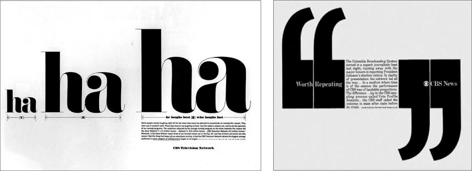
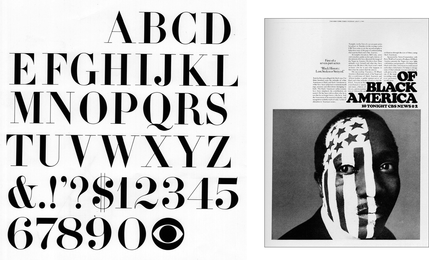
Dorfsman’s use of black and white as a house style continued for some years, even after color television became standard. The ultrasimple layouts, startling changes of scale, and masterful typography—especially their CBS Didot font—made the station’s communications among the most arresting and recognizable of the twentieth century.
“If you find one, let me know.”
“You’re kidding, right?”
“I think it’s very rare to find a company that values design for its own sake. When you do find an organization with excellent visual image, it is usually because someone there has demonstrated to mangement that they can achieve management objectives. You make design valuable by understanding your boss and, most importantly, by demonstrating that good design grows good audiences.”
Dorfsman takes a sidelong glance at his TV. “Who else in town have you seen?”
I name a few of the most important names; this might be a tacit offer to use his name to open a few doors.
“I’ve been wanting to see Lubalin, Smith, and Carnase, but their dance cards are always full.”
Dorfsman nods knowingly. “That is one I can probably help you with, in terms of an appointment. In terms of getting hired, I need to think for a few days about where you would be a good fit.”
“I’m interested in how the designers of the first rank get their approvals,” I tell him. “I feel as though, in spite of encouragement from some quarters, my best ideas are too often getting shot down. I’d like to be in an organization where I don’t have to haggle.”
“The natural tendency, if you’re presenting to a group, is to seize on the first person that gives you positive comments. A big turning point for me was when I realized that I needed to engage with my detractors as well as my supporters.”
Dorfsman looks at his TV and says “Ah, yes.” I’m not sure whether it’s to me or to the set. “I know what you mean. It’s especially difficult when you’re younger. Once you get a few big successes, people trust you more readily. A big turning point for me was when I realized that I needed to engage with and win over my detractors as well as my supporters. The natural tendency, if you’re presenting to a group, is to seize on the first person that gives you positive comments. But the ones who are silent, or who say something menacing or inexplicable—it’s important to cultivate their criticism. You never know why someone takes an opposing stance. They may feel threatened by the ‘creative types.’ They may have an axe to grind against the person who hired you. They may look at design as a frivolous expense. And they will rarely tell you the real reason.
“Their comments will come out in the form of sabotage like, ‘When I squint at it, it reminds me of a cow pie.’ Or ‘We tried something like that last year and it was a total flop.’ You have to try to figure out what that person’s real concern is. It may take some research into who they are and what they do in the organization. Now my old boss Bill Golden, he thrived on confrontation. He would go up against his detractors and try to flatten them. He had the support of management and he didn’t like to waste time. People said he got his way because he had the protection of Frank Stanton. But really it was the other way around: Golden believed so strongly in his work and in the power of good design that Stanton supported him. Sometimes he won, sometimes he didn’t, but people learned not to make idle criticism of what he was doing. TV is different now, the committees are larger and we...” Something on the TV screen has stopped his train of thought. He continues, as though perhaps a sentence was dropped.
“I have an idea in my head of how CBS should appear. The shows will change—must change—with the season. What I got from Golden and have—with management’s blessing—built on is that the station has an identity apart from the shows, apart from the news anchors. It’s an emotional space, really. I try to stay true to that, and I invest a lot of time in soliciting opinions from all quarters, to get their ideas before I present. When I present, I incorporate their language. It makes them feel part of the process. It’s slow. Not everyone has the temperament for it!”
Dorfsman’s phone rings; he answers, studying his TV while listening. “You’re right, I don’t like it,” he says and hangs up. Turning to me, he says, “David, forgive me, we have a design issue that I have been harping about that has got to be addressed.” I look at the screen, trying to figure out what has caught his attention.
I am puzzled. “What about this is amiss? Looks like vintage CBS.” He does not have time to explain the details, but he stands tall and addresses me as though he were going off to war and might never have another chance to impart all his wisdom. “You can get a design ninety-five percent of the way there, and it still doesn’t pop the way you see it in your mind. Then, you nudge the last few details into place. Bam! It doesn’t just look five percent better, is starts ringing all the bells. I have a reputation for being demanding, for wanting to fix details that are too small for other people to see. But we see it and we put it to work for us. We do it because those subliminal details give a design its punch, its staying power! Every font, every letter, every picture and sound, they are like the instruments in an orchestra. It is our job to envision how great it could really be, and to convince, to cajole, to demand, to coax until—I mean, you know instinctively when your design is working or not working. When you finally get all the details aligned, something extraordinary happens—the message bypasses the brain and goes right to the heart.” This is another speech in praise of perfection. It is similar to Miedinger’s and Zapf’s comments about their respective crafts, but never have I heard it said so convincingly.
“You can get a design ninety-five percent of the way there, and it still doesn’t pop the way you see it in your mind. Then, you nudge the last few details into place. Bam! It doesn’t just look five percent better, it starts ringing all the bells!”
Dorfsman shakes my hand and leaves the room abruptly. I put the Valise Cruiser away, jot a note to Dorfsman on the back of a business card, and depart. Dorfsman’s parting insight is far-reaching. He is saying, in effect, “Insist on high standards: It is better to have a reputation for being a demanding perfectionist who does great work than for being an agreeable schlub who does ordinary work.”
Another striking realization arises from this interview: Dorfsman considers good design innate; he thinks people who are oblivious and uneducated as to design are still affected by it. He believes—without theorizing—there is something about a harmonious presentation to which the brain responds below the level of conscious thought. Criticism and theory are valuable for learning and selling, but, at least for Dorfsman, creating visual communications is very visceral—you believe in it and you fight to make it visible to all.
Dorfsman is as good as his word; the next time I call Lubalin’s office, the receptionist puts me on the interview calendar, as though it was the easiest favor in the world.
Herb Lubalin: Superlatives and Schlock

Herb Lubalin (1918–1981), though he traveled widely, was born, lived, and died a New Yorker. He attended Cooper Union, and he scuffled after graduation, eventually getting a toehold working for Reiss Advertising. In 1944 Lubalin began working at Sudler and Hennessey, an advertising agency where he became a partner. In 1964 he started his own shop. He is best remembered for his expressive facility with type, his ability to find illustrative meaning and emotion in almost any word or headline. An irreverent and inventive magazine designer, Lubalin found a kindred spirit in editor/publisher/bad boy Ralph Ginzburg. The two pioneered richly visual magazines such as Eros, Fact, Avant Garde, and Moneysworth. Eventually Lubalin cofounded the International Typeface Corporation (ITC) to distribute their new generation of photographic and computer-generated fonts.
In 1971 Lubalin began publishing U&lc, a smart, sassy tabloid publication that became a playground for Lubalin, a showplace for ITC fonts, and a way to promote the design work of Lubalin, Smith, and Carnase. It also became one of the most avidly read design publications of the day; when the new U&lc arrived in the mail, work in design studios around the world stopped for everyone to savor Lubalin’s latest profundity and pranks. Lubalin won numerous awards from the Type Directors Club and the Art Directors Club, and he was an AIGA Medalist in 1980. He collaborated with Lou Dorfsman on many projects, including the celebrated “gastrotypographical assemblage” in the CBS lunchroom.
March 1978
It is winter by the time my appointment with Lubalin finally rolls around. I have spent the day working on freelance projects at my apartment in New Jersey. There is a major event at Madison Square Garden, colocated with Penn Station, so I take the bus into Manhattan at about the hour I am usually commuting in the opposite direction. I reach the curb outside Port Authority to catch a cab south, and make a shocking discovery. My wallet is not in my pocket! I’m a bit early for my appointment with Lubalin if I catch a cab, but I am late if I have to walk it. Today of all days! Either I’ve left my wallet on the bus, or my pocket has been picked. Without ID I can’t get cash. Port Authority is a mad throng of commuters beating a retreat out of town. Most of the phone booths are empty. Phone booths! I wonder. I step into a booth and check the change bin. As if to repay my many months of patronage, this phone yields a quarter and a dime. The next two are empty. In ten minutes I visit a couple dozen pay phones, collecting about $4.50, which is certainly enough to get me to LSC. I can walk back at my leisure. Based on that take, I could make $12 an hour doing this—20 percent more than my starting freelance rate at Avon!
I pay the cabbie with a handful of dimes and bound up the stairs to the Lubalin, Smith, and Carnase studio. I’m finally buzzed in, and I am pumped. I feel I have overcome every possible adversity and am finally going to stand in The Presence! I have shown the Valise Cruiser so many times now that I have honed it down to just the work that gets consistently high praise.
Lubalin accepts my handshake with a nod, and says, “Welcome.”
He sees all the best portfolios that come through New York, and it is 6:30 in the evening, so he breezes through mine, pausing only once or twice. I have an idea of this man as a warm, chatty guru, and I’m prepared for some insights and war stories. He says nothing about my work.
“So, why did you want to come here? They told you we aren’t hiring.” His bluntness is unexpected.
“Because, you are the greatest living graphic designer, and ...”
He raises a hand gently and wags two fingers, as if erasing an unnecessary phrase. “You think that because I spend $80,000 a month publishing a stupid magazine.”
I’m trying to apply my praise with a trowel, but the mortar just isn’t sticking.
I persist, “Herb, it may be a stupid magazine, but it’s still a lot smarter than anything else out there. I was a charter subscriber to Avant Garde, and that magazine is what got me started thinking about a graphic design career.”
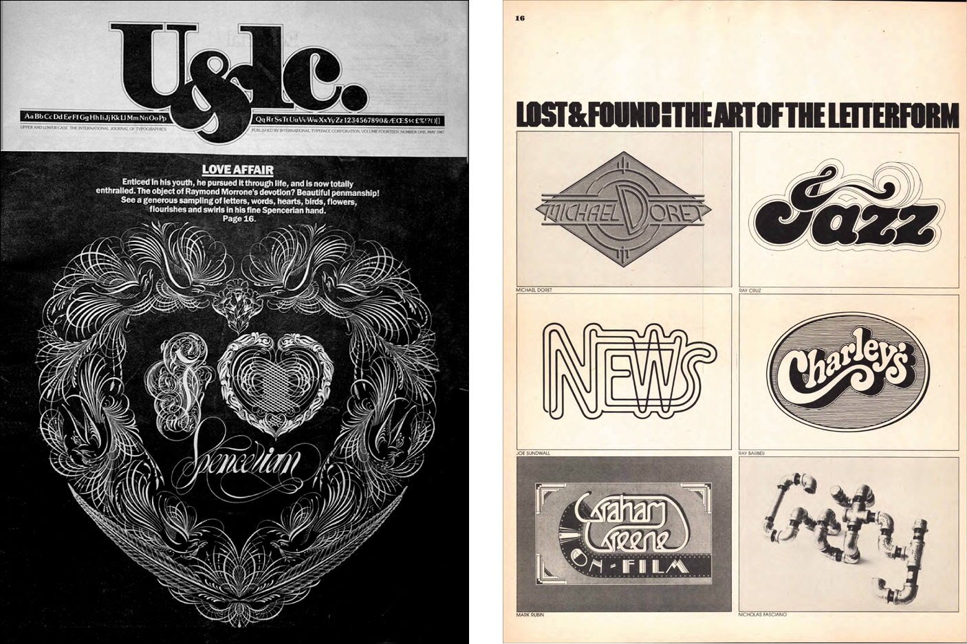
U&lc is by no means Lubalin’s only claim to fame, but was perhaps his most visible project, dedicated to the creative interplay of word and image. Like Graphis, U&lc was a showcase for award-winning work and a spotlight on new or special talent. But where Graphis provided the cool, neutral environment of an uptown art gallery, U&lc was more like a visit to a boisterous art festival. U&lc’s tabloid newsprint and exuberant layout proclaimed, “Rules are made to be broken!” U&lc made no secret of its connection to the International
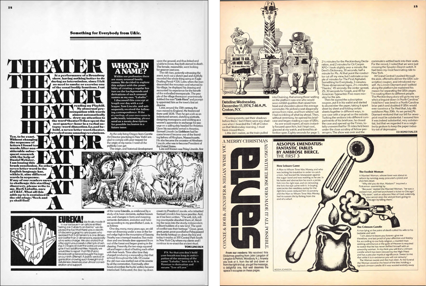
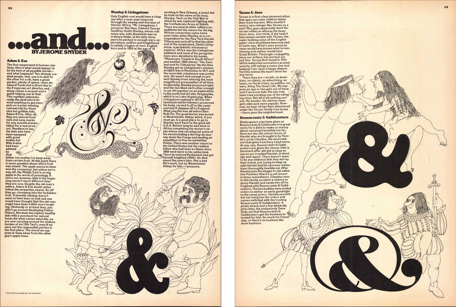
Typeface Corporation, giving exciting demonstrations of new ITC fonts, but always made room for anyone creating exciting or experimental typographic visuals. Editorial hijinks and humorous uses of language suffused every issue. U&lc began when typography was in transition from the rigidity of metal type. Much of the experimentation and freedom of expression that first appeared in U&lc influenced the highly nuanced typographic controls that became standard in the user interfaces for digital typography.
Lubalin softens slightly. “Look,” he says, “how many of my designs have you seen?” I start naming them, grasping a different finger for each one like a disciple reciting catechism: “Avant Garde, the SH&L logo, Moneysworth, Eros, U&lc, Mother & Child magazine.”
He nods slightly with each one. I stop at ten, thinking I have acquitted myself well enough to earn some pearls of his wisdom.
“Right.” Lubalin shifts his weight a bit, and I see that he looks more tired than he appears in his press photos and films. “Those are the only ten pieces I ever show.” Where is he going with this?
“Look,” he repeats. There is a pattern to his expression, a cadence. He uses a single-syllable word to focus your attention on his point to follow.
“Look,” he says again, this time gesturing behind me toward multiple banks of flat files with a hundred drawers, maybe more, neatly labeled. “I show only my best work. People never see the drawers and drawers of schlock work I have done all my life to pay the bills.”
In disbelief I hop off my stool and open a few drawers. They are full, although I am not really able to see the finished product. There are a lot of pencil roughs on tracing paper.
I can’t tell what’s wrong, but the interview is ending too soon. A couple years wait—hell, I have to learn something before I am shown the door.
“What’s the most important thing ...” I have a complete sentence cued up, but it seems he’s heard it many times.
“U&lc is important to me, because it’s the only project where the client, the designer, and the reader are the same person. I’ve been on a quest for years to eliminate the client from graphic design. I have created an environment where I can make up editorial content just to provide an opportunity for an inventive design, rather than having the design be the minion of the content. It’s very expensive, and what it comes down to is basically self-promotion.”
“You are doing good work. You are probably capable of great work. But it’s a fight. The world will tell you ‘that’s good enough.’ Don’t give up. Keep moving. Get faster.”
A voice comes from the back room: a project is ready for his supervision. He shakes my hand hurriedly, but looking me full in the face for an instant, with warmth, he says, “Don’t spend too much energy chasing people like me. There’s nothing I can tell you that you don’t already know. You are doing good work. You are probably capable of great work. But it’s a fight. The world will tell you ‘that’s good enough.’ But of course, the world has its head up its ass. Don’t give up. Keep moving. Get faster.” Then calling over his shoulder, “I hope that helps.”
I gather up my portfolio and leave a resume on his table. After such a long anticipation of enlightenment, I now feel a bit dazed. Since he’s given me leave to look through the flat files, I drift back and open a few more drawers. There are not many finished works, but the pencil sketches are amazing. Here is a fellow for whom even quick graphite scribbles on a piece of bumwad have poetic potential! There are a dozen sheets with minor variations of a single arrangement of type, taped together in sequence, each set out in minimal, purposeful strokes. I linger perusing the mother lode, hoping perhaps he will come back. After twenty minutes, I have seen all the Lubalin pencil tracings my brain can hold, and make my disappointed retreat.
Outside, a blast of cold night air hits me, and with it a shocking question: If the great Herb Lubalin does schlock work most of the time, what on Earth is going to be left for me?
The word schlock, derived from Yiddish, refers to something inferior, cheap, or shoddy. Like a lot of slang, it is very versatile, describing merchandise, literature, food, even neighborhoods. Shlock has an especially nuanced meaning in graphic design: Lubalin used it to describe design projects that have no potential for quality, often being for a customer that is more interested in fast and cheap than good. Therein lies a trap: in applying a label like “schlock” to a new project, one signals defeat before starting. Shlock is what Rand and Edelmann say they turn down, and what other designers say they handle with minimal effort. I know all this intellectually, but the sight of all those flat files—and the thought of my towering immortal hero having such a high schlock factor—it’s just too much to bear.
“I only show my ten best pieces. People never see the drawers of schlock work I have done all my life to pay the bills.”
If this towering immortal hero does schlock work, what on Earth is going to be left for me?
For a while the future seems very bleak. I am at the New York Public Library looking for a picture source when I hear my name.
“Hey, David, how’s it going?” I look up to find Ed Gottschall radiating his boundless optimism. Seeing his smile reminds me of our crazy first interview that started my odyssey in New York. I realize that the smile I am seeing reflects his personal pride in my progress. I have heard that he has left AIGA, and we talk about his book and his new role at ITC.
“I finally got to see Lubalin—thanks for all your help in setting it up.” It was really Dorfsman who set it up, but Gottschall brightens.
“Congrats—he doesn’t see just anyone.” Then he looks at me more closely. “And?”
I replay the gist of the conversation with Lubalin, now a week or so in the past. Gottschall can’t quite suppress an avuncular chuckle.
“Well, I’m not sure what you expected.” I guess I’m not sure what I expected either. His receptionist only told me five hundred times that he was not looking for help! Gottschall puts his hand on my shoulder reassuringly: “Look at it this way. Lubalin paid you perhaps the highest compliment he knew how; he skipped all the pleasantries, assumed that you’re going to have a career worth fighting for, and tried to prepare you for harsh reality. The life of a topflight graphic designer is a continual search for flexible clients who trust you enough to give you the control you need. It requires merciless self-appraisal and relentless self-promotion. And, yes, probably it does include doing some schlock work, some near misses, some things that aren’t worthy of your talent but that pay bills.”
“The life of a topflight design professional is a continual search for flexible clients who trust you enough to give you the control you need. It requires merciless self-appraisal and relentless self-promotion.”
I gradually warm up to this compliment, and eventually conclude that I caught Lubalin at the end of a hard day, when he really needed to finish up and get home. By the time I hear of his passing, barely three years later, I am grateful to him for every word.
An Arthur Tress Snapshot
Arthur Tress asks me to visit his new publisher, Morgan Press, with him. We meet in Grand Central Station for the train ride to the town of Dobbs Ferry, about an hour upstate from Manhattan. Tress is carrying his Hasselblad, and looks at everything with a prescient intensity, as though he were on the verge of a great photograph. Frequently he peers through his viewfinder, yet he shoots nothing. It is a mile or two from the train station to Morgan Press; we decide to walk along the tracks. Near the station, we come upon a sign with an icon of a man walking. The icon man’s head is tilted forward and the legs are straight. Originally, the sign read “Pedestrian Crossing.” Now the R in “crossing” is missing, and the adjacent O is damaged and rotated, so the sign appears to say “Pedestrian Cussing.” The crowding of the trains, their frequent delays combine with the stiff, almost bristling pedestrian icon to give “Pedestrian Cussing” an unintentional irony. Arthur smiles but walks by without touching his camera.
“When you get to a certain point in your career, you are defined as much by what you don’t do as what you actually do. You have an obligation to the things that you alone can do.”
“Aren’t you going to take that?”
He shakes his head without losing stride. “There are 50,000 new photographers every year—buying cameras, taking classes, having shows, and publishing. Every year! Most of them would come upon that sign and have the skills to make an amusing shot.” He pauses to reflect. “When you get to a certain point in your career, you are defined as much by what you don’t do as what you do. You have an obligation to the things that you alone can do.”