COLOR
This chapter deals with two different drawing media: colored pencil and pastel. This chapter is not meant to be a color theory or painting class, but rather a simple introduction to the beauty and pleasure that color can bring, as well as an introductory lesson in color application with drawing media. As we learned in the previous chapter, value can add drama to a drawing, and in the last chapter, we’ll see how perspective is the mathematics of drawing. But in this chapter, we’ll explore how color is the magic in drawing.
Colored Pencil
Colored pencil is a versatile drawing medium that can emulate watercolor, oil, or pastel effects. It can also be used successfully on its own or in conjunction with other dry media for high contrast, intense color, and value application.
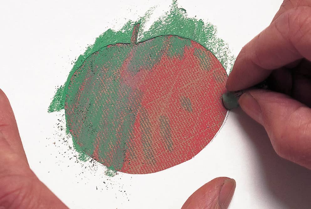
Student colored pencil drawing. Time: 12–15 hours.
The best and easiest way to develop high-contrast, high-chromatic drawings in colored pencil is to use gray marker as an initial value underpainting, with glazes of transparent and opaque colored pencil layered on top—a technique known as grisaille. Similarly, gray marker on gray toned paper acts as a monochromatic underpainting upon which transparent glazes of colored pencil can be applied, without a heavy buildup of wax—a key ingredient in most colored pencils. Too much waxy buildup on paper will limit the artist in the number of colors and layers that can be successfully used, which can be problematic when trying to build up color and value simultaneously with only colored pencil. By applying a marker underpainting, the value is already there, soaked into the paper without any changes in paper surface. At the end of the process, the brightest and lightest colors can be applied as strongly as desired with a technique called “burnishing,” which involves laying down heavier pressure with the opaque light colors.
Color Basics
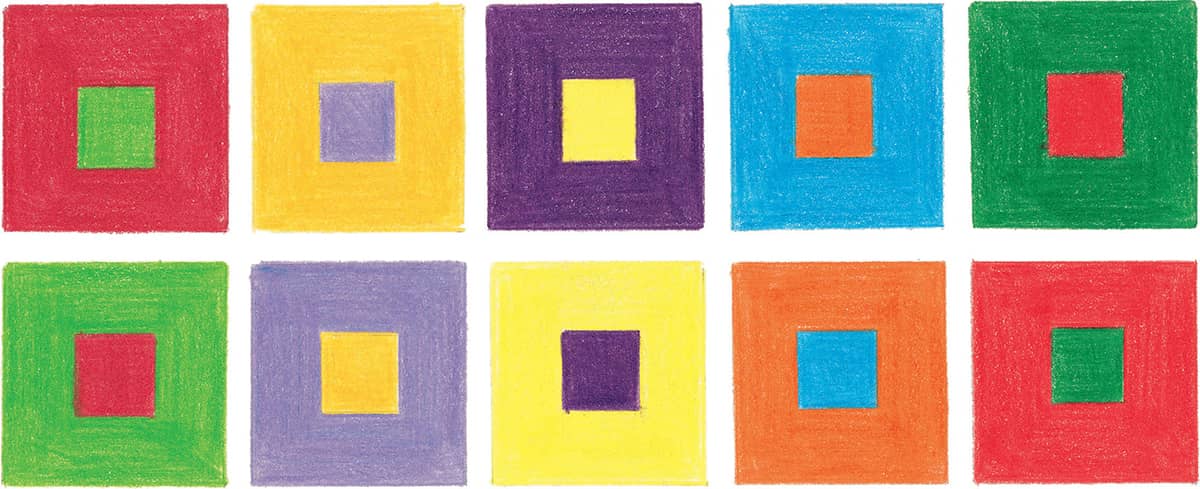
Colored pencils are transparent by nature, so instead of “mixing” colors as you would for painting, you layer colors on top of one another to create blends. Knowing a little about basic color theory can help you tremendously in drawing with colored pencils. The primary colors (red, yellow, and blue) are the three basic colors that can’t be created by mixing other colors; all other colors are derived from these three. Secondary colors (orange, green, and purple) are each a combination of two primaries, and tertiary colors (red-orange, red-purple, yellow-orange, yellow-green, blue-green, and blue-purple) are a combination of a primary color and a secondary color.
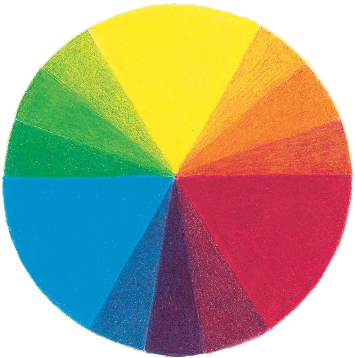
COLOR WHEEL A color wheel is a useful reference tool for understanding color relationships. Knowing where each color lies on the color wheel makes it easy to understand how colors relate to and react with one another.
Complementary Colors
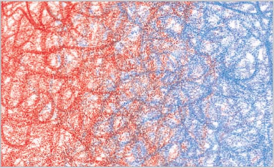
Complementary colors are any two colors directly across from each other on the color wheel (such as red and green, orange and blue, or yellow and purple). You can actually see combinations of complementary colors in nature—for instance, if you look at white clouds in a blue sky, you’ll notice a hint of orange in the clouds.
USING COMPLEMENTS When placed next to each other, complementary colors create lively, exciting contrasts. Using a complementary color in the background will cause your subject to seemingly “pop” off the paper. For example, you could place bright orange poppies against a blue sky or draw red berries amid green leaves.
Colored Pencil Techniques
Colored pencil is an amazingly satisfying medium to work with because it’s so easily manipulated and controlled. The way you sharpen your pencil, the way you hold it, and the amount of pressure you apply all affect the strokes you create. With colored pencils, you can create everything from soft blends to brilliant highlights to realistic textures. Once you get the basics down, you’ll be able to decide which techniques capture your subject’s unique qualities. There are as many techniques in the art of colored pencil as there are effects—and the more you practice and experiment, the more potential you will see in the images that inspire you.
Pressure
Colored pencil is not like paint: You can’t just add more color to the tip when you want it to be darker. Because of this, your main tool is the amount of pressure you use to apply the color. It is always best to start light so that you maintain the tooth of the paper for as long as possible. Eventually, you will develop the innate ability to change the pressure on the pencil in response to the desired effect.
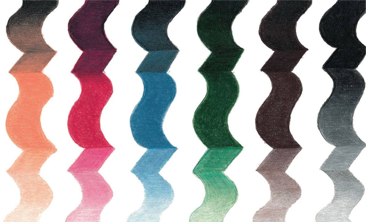
LIGHT PRESSURE Here color was applied by just whispering a sharp pencil over the paper’s surface. With light pressure, the color is almost transparent.
MEDIUM PRESSURE This middle range creates a good foundation for layering. This is also the pressure you might want to use when signing your drawings.
HEAVY PRESSURE Really pushing down on the pencil flattens the paper’s texture, making the color appear almost solid.
Strokes
The direction, width, and texture of each line you draw will contribute to the effects you create. Practice making different types of strokes. You may have a natural tendency toward one or two strokes in particular, but any stroke can help convey texture and emotion in your work.
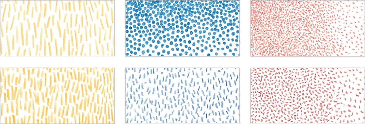
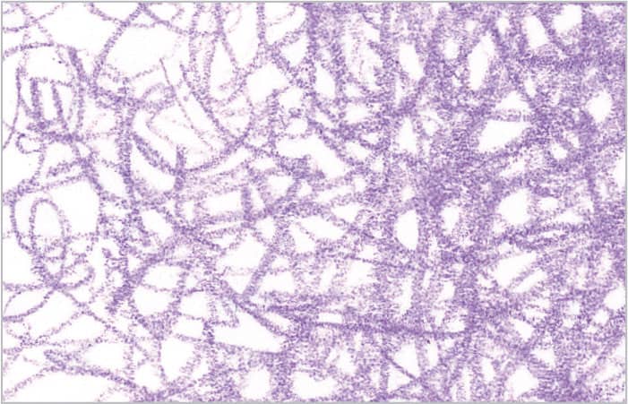
STROKES AND TEXTURE You can imitate a number of different textures by creating patterns of dots and dashes on the paper. To create dense, even dots, twist the point of your pencil on the paper.
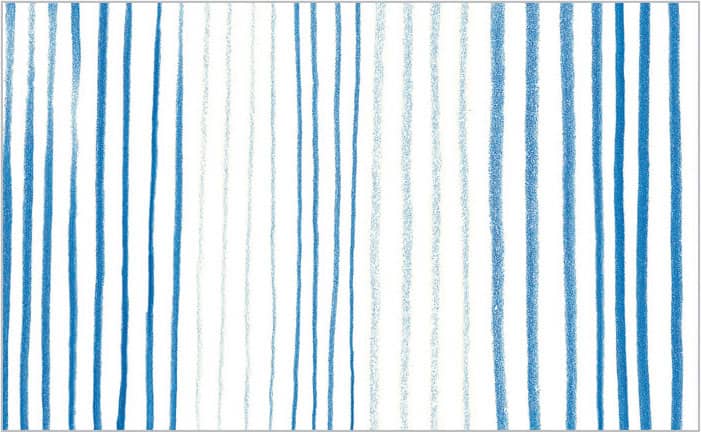
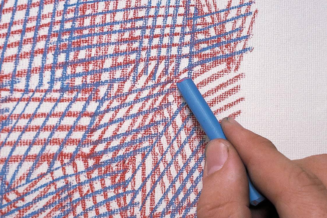
STROKES AND MOVEMENT While a group of straight lines can suggest direction (above left), a group of slightly curved lines (above right) conveys a sense of motion more clearly. Try combining a variety of strokes to create a more turbulent, busy design. These exercises can give you an idea of how lines and strokes can be expressive as well as descriptive.
VARIED LINE Vary the width and weight of the lines you create to make them more textured and interesting. These calligraphic lines can create a feeling of dimension in your drawing.
Types of Strokes
CIRCULAR Move your pencil in a circular motion, either in a random manner as shown here or in patterned rows. For denser coverage, as shown on the right side of the example, overlap the circles. You can also vary the pressure throughout for a more random appearance.
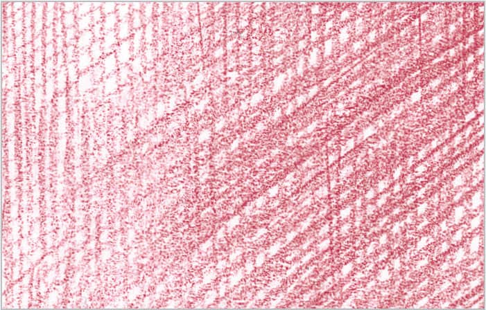
LINEAR Work in a linear fashion, depending on your preference: vertically, horizontally, or diagonally. Your strokes can be short and choppy or long and even, depending on the texture desired.
SCUMBLING Create this effect by scribbling your pencil over the surface of the paper in a random manner, creating an organic mass of color. Changing the pressure and the amount of time you linger over the same area can increase or decrease the value of the color.
HATCHING This term refers to creating a series of roughly parallel lines. The closer the lines are together, the denser and darker the color. Crosshatching is laying one set of hatched lines over another but in a different direction. You can use both of these strokes to fill in an almost solid area of color or to simply to create texture.
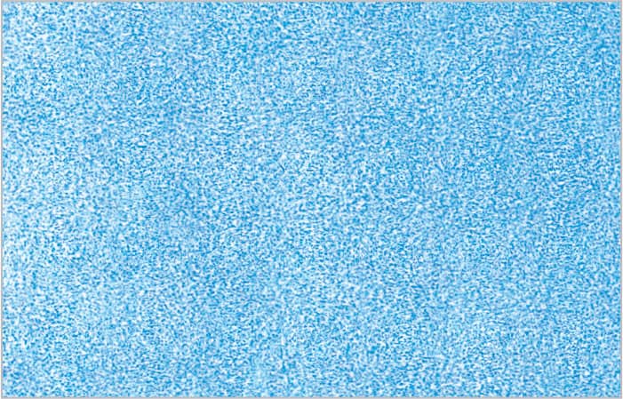
SMOOTH No matter what your favorite stroke is, strive to control the pencil and apply a smooth, even layer of color. I tend to use small circles, as shown in this example. Note that the color is so smooth you can’t tell how it was applied.
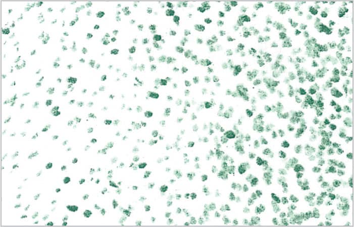
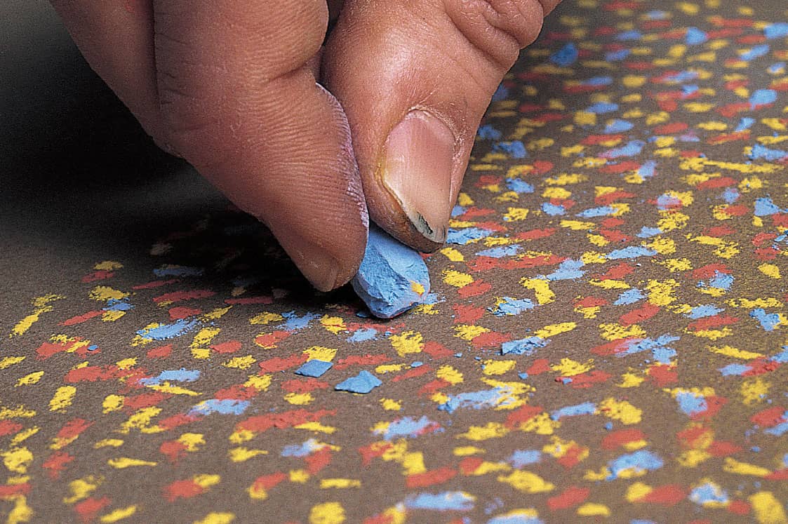
STIPPLING This is a more mechanical way of applying color, but it creates a very strong texture. Simply sharpen your pencil and create small dots all over the area. Make the dots closer together for denser coverage.
Layering & Blending
Painters mix their colors on a palette before applying them to the canvas. With colored pencil, all color mixing and blending occurs directly on the paper. By layering, you can either build up color or create new hues. To deepen a color, layer more of the same over it; to dull it, use its complement. You can also blend colors by burnishing with a light pencil or using a colorless blender.
LAYERING The simplest approach to blending colors together is to layer one color directly over the other. This can be done with as many colors as you think necessary to achieve the color or value desired. The keys to this technique are to use light pressure, work with a sharp pencil point, and apply each layer smoothly.
BURNISHING WITH A COLORLESS BLENDER Burnishing requires heavy pressure to meld two or more colors together for a shiny, smooth look. Using a colorless blender darkens the colors, whereas using a white or light pencil lightens the colors and gives them a hazy appearance.
BURNISHING LIGHT OVER DARK You can also burnish using light or white pencils. To create an orange hue, apply a layer of red and then burnish over it with yellow. Always remember to place the darker color first; if you place a dark color over a lighter color, the dark color will overpower and no real blending will occur.
OPTICAL MIXING In this method, the viewer’s eye sees two colors placed next to each other as blended. Scumble, hatch, stipple, or use circular strokes to apply the color, allowing the individual pencil marks to look like tiny pieces of thread. When viewed together, the lines form a tapestry of color that the eye interprets as a solid mass.
Creating Form
Value is the term used to describe the relative lightness or darkness of a color (or of black). By adding a range of values to your subjects, you create the illusion of depth and form. Color can confuse the eye when it comes to value, so a helpful tool can be a black-and-white copy of your reference photo (if you’re using one). This will take color out of the equation and leave only the shades of gray that define each form.
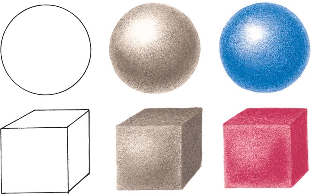
Creating Form with Value In this example, you can see that the gray objects seem just as three-dimensional as the colored objects. This shows that value is more important than color when it comes to creating convincing, lifelike subjects. To practice before you begin the projects, first draw the basic shape. Then, starting on the shadowed side, begin building up value, leaving the paper white in the areas where the light hits the object directly. Continue adding values to create the form of the object. As the object gets farther away from the light, the values become darker, so place the darkest values on the side directly opposite the light.

VALUE SCALE Another helpful tool for understanding value is a scale showing the progression from white (the lightest value) to black (the darkest value). Most colored pencil brands offer a variety of grays, distinguished with a name of either “warm” or “cool” and a percentage to indicate the concentration of color, such as “cool gray 20%.” (Lower percentages are lighter.)
Color Psychology
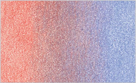
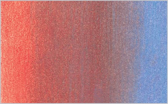
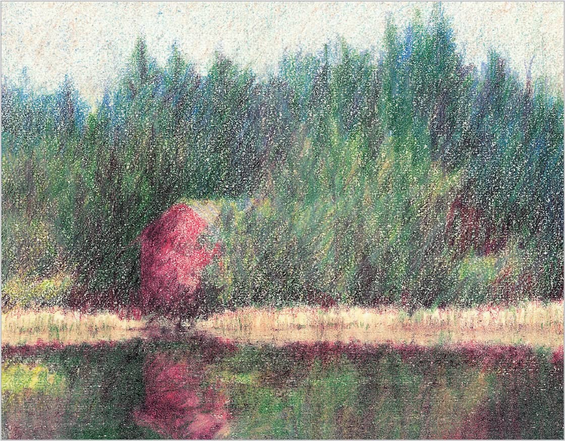
Colors are often referred to in terms of temperature, which can be understood by thinking of the color wheel divided into two halves: The colors on the red side are warm, and the colors on the blue side are cool. So colors with red or yellow in them appear warmer, and colors with more green or blue in them appear cooler. For instance, if a normally cool color (like green) has more yellow added to it, it will appear warmer; and if a warm color (like red) has a little more blue, it will seem cooler. Another important point to remember about color temperature is that warm colors appear to come forward and cool colors appear to recede; this knowledge is valuable when creating the illusion of depth in a scene.
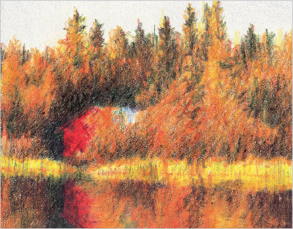
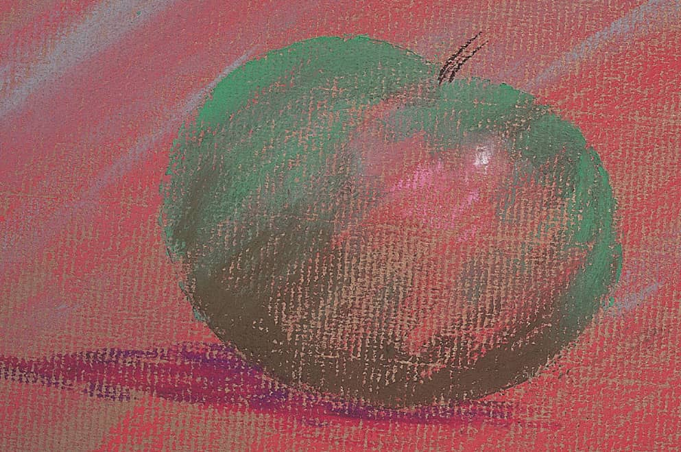
WARM VERSUS COOL Here the same scene is drawn with two different palettes: one warm (above) and one cool (below). Notice that the mood is strikingly different in each scene. This is because color arouses certain feelings; for example, warm colors generally convey energy and excitement, whereas cooler colors usually indicate peace and calm.
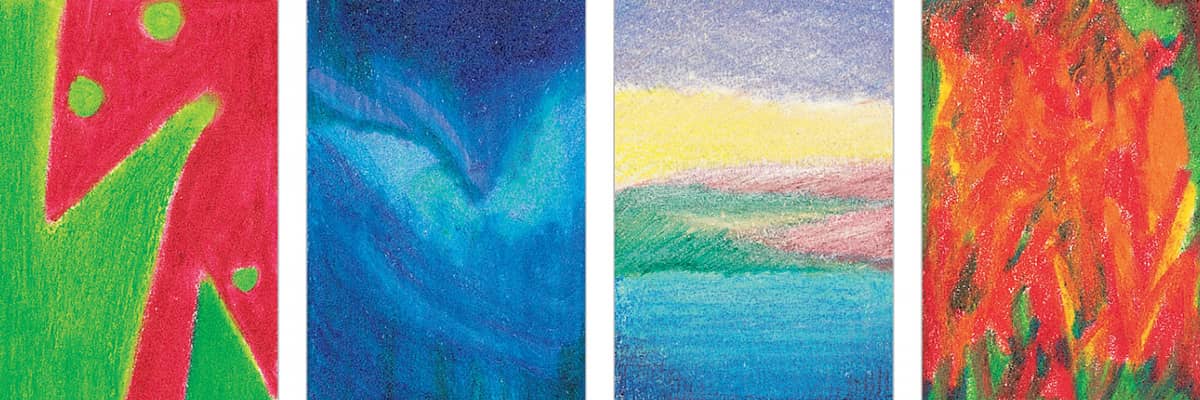
COLOR MOOD The examples here further illustrate how color can be used to create mood (left to right): Complements create a sense of tension; cool hues evoke a sense of mystery; light, cool colors provide a feeling of tranquility; and warm colors can create a sense of danger.
Tints, Shades, and Tones
Colors can be tinted with white to make them lighter, shaded with black to make them darker, or toned with gray to make them more muted. Here each color was applied using graduated pressure—light, then heavy, then light. Black was applied at the top and white at the bottom to tint and tone the colors, respectively. To tint a color without muting it, apply the white first and then the color.
Working from Photographs
Working from photographs is almost always inferior to working from life, but they are a necessary, practical alternative whenever there are complex arrangements with living subject matter or when referencing outside subjects. The negative aspect of working with photographs is that key information can get lost in deep shadow. Additionally, light and bright colors can be “blown out,” due to the insensitivity of a camera to low or bright lighting. Unlike a camera, our eyes can easily adjust to see light in dark shadows and interpret the accurate colors in any lighting situation. When working from a photograph, a thorough knowledge of the perspective structure of symmetrical objects can be very helpful. To paraphrase a noted plein-air painter, “Draw what you know, not what you see (or don’t see).”
Mixed-Media Colored Pencil Demonstration
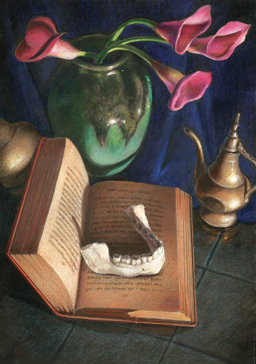
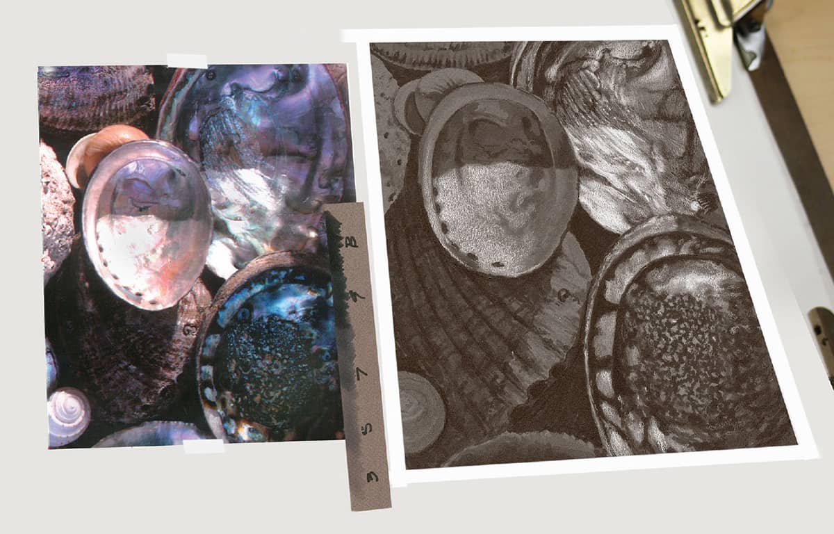
In this first demonstration of a still life of oyster shells, concentrate on the marker value application, which is really the foundation of most of the colored pencil drawings in this chapter. We’ll take a closer look at colored pencil techniques in the second and third demonstrations in this chapter. Work on gray paper. As a rule, avoid white paper because it takes much longer to achieve color buildup and requires lots of extra practice and skill.
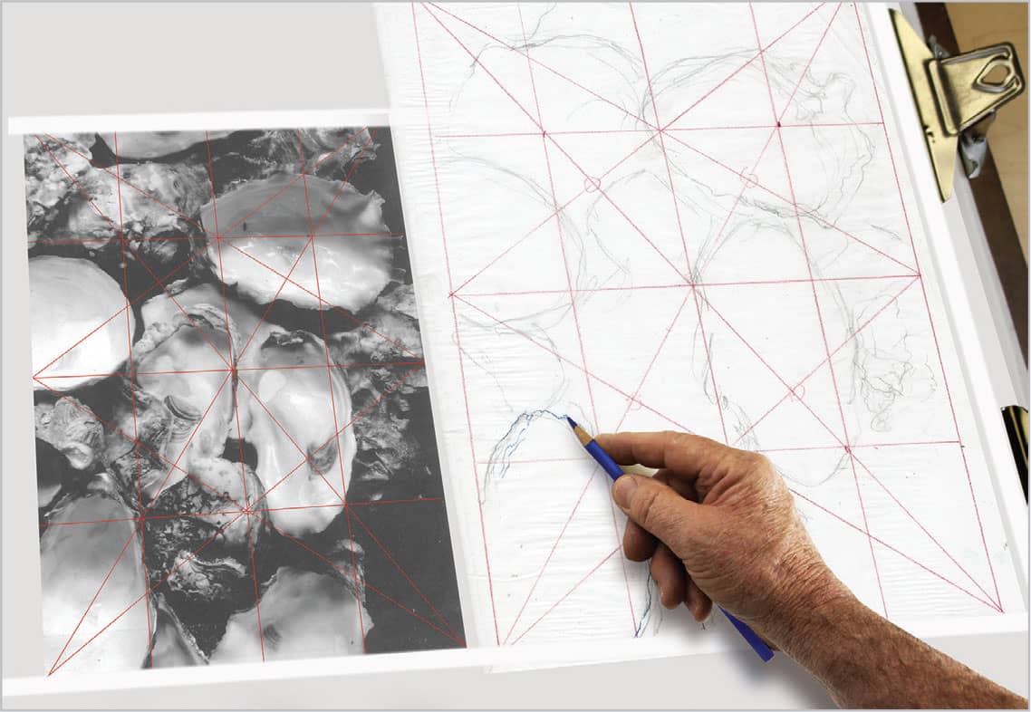
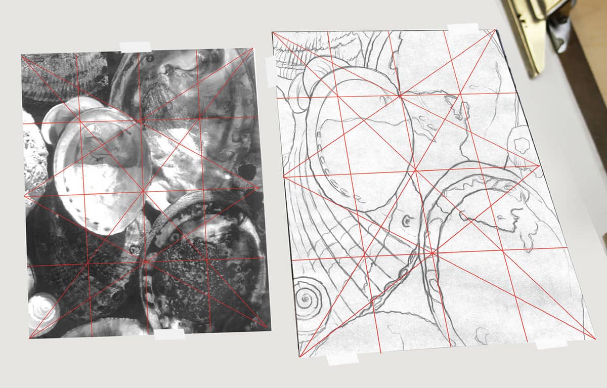
STEP 1 First place a grid on the grayscale photocopy of the reference photo and a slightly larger grid on the paper for the initial gesture sketch. After quickly and lightly blocking in the forms, refine each of the generalized subjects with stronger line.
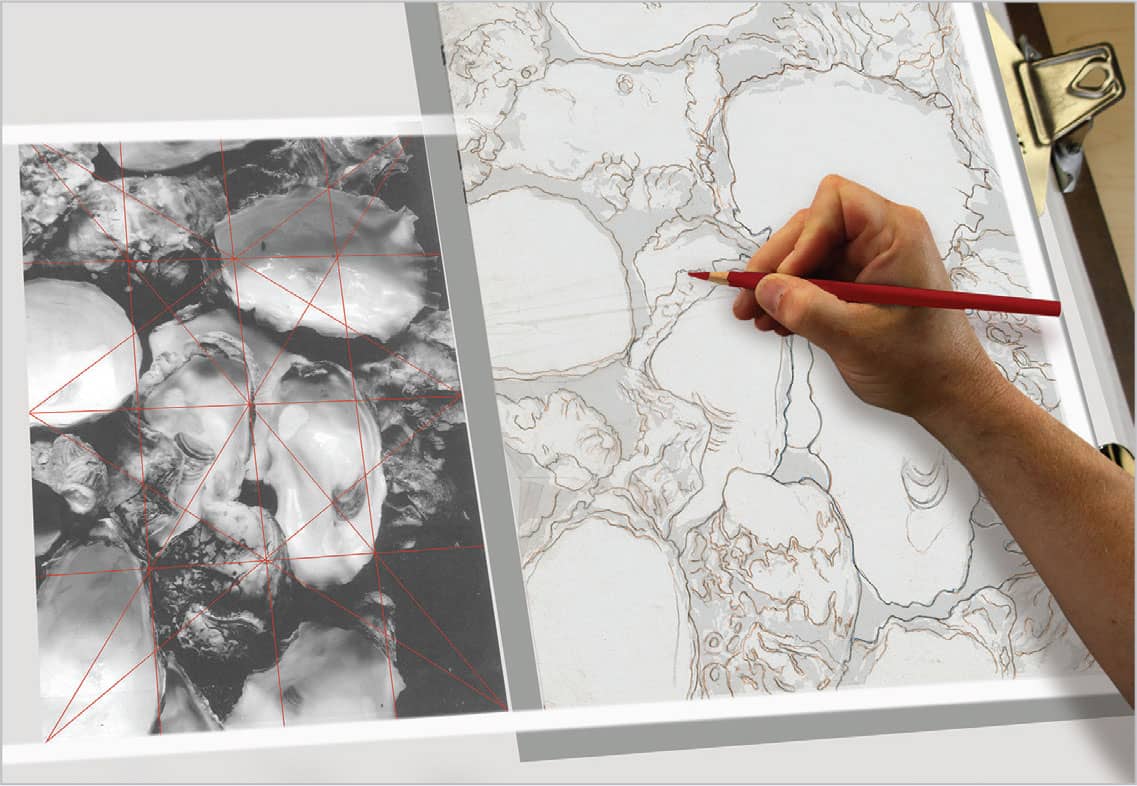
STEP 2 Place a second layer of tracing paper over the initial gesture drawing and create a clean contour line layer for the transfer. To transfer the drawing to art paper, rub brown pastel over the back of the drawing and smooth it with a tissue. Then turn the drawing right-side up, tape it to the art paper, and redraw the contour lines. Try using a different color of pencil to trace the contour lines so it is easy to see what has been transferred.
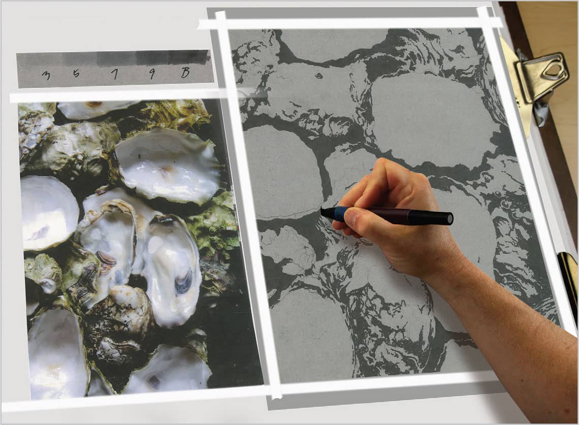
STEP 3 Now you’re ready to develop a grayscale underpainting with gray markers (including 30%, 50%, 70%, 90%, and black). Normally, it’s best to start with the lightest marker first and follow the scale up to the darkest value; however, start with black marker here, because the area between the shells is very dark. This is a good way to define the different shells. Switch to the color reference, which better illustrates the variety of values.
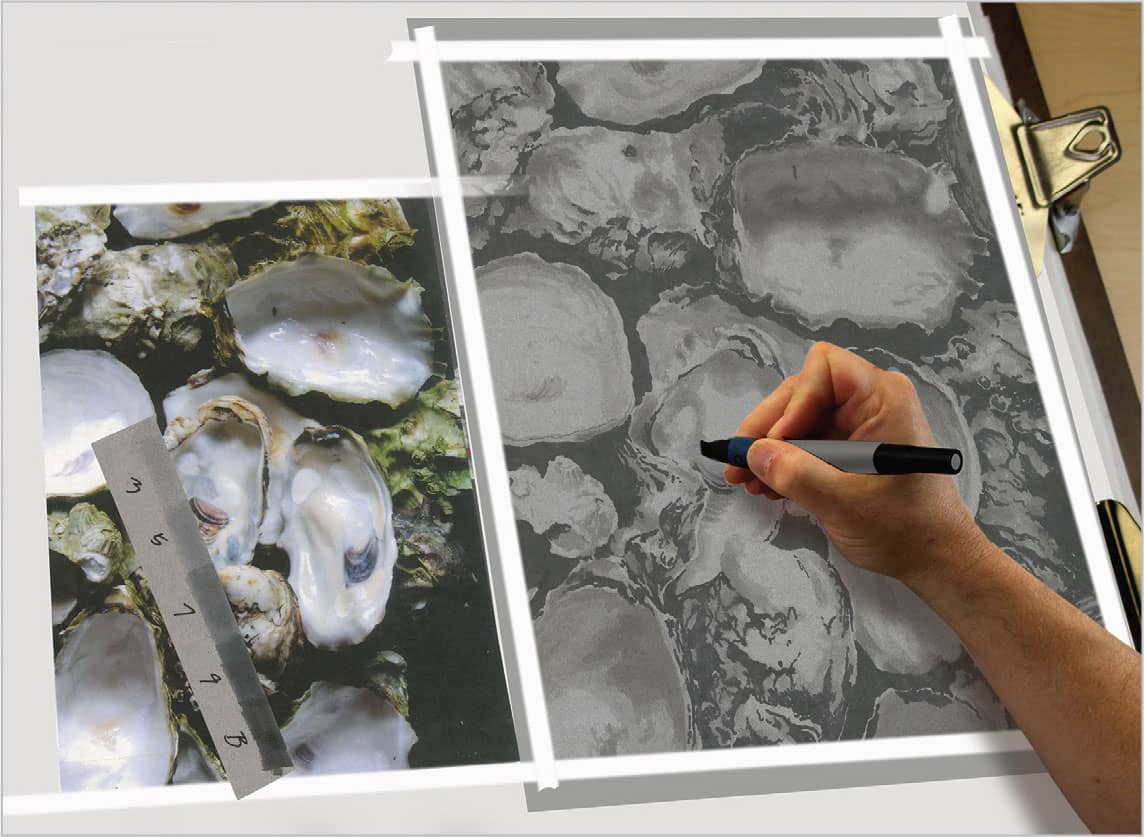
STEP 4 With the dark background established, work from the lightest to the darkest values, with the paper being the lightest of the gray tones. Use a value scale, labeled “3” through “B” for black, which represents the percentage of the marker ink. Work in small circular strokes, which blend into the paper well.
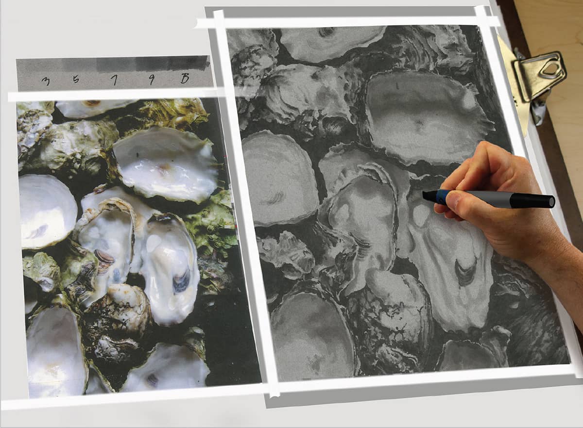
STEP 5 Next use the darkest, 90% gray marker to finish the underpainting. Once you complete the last dark values, the amount of time spent with each marker will reduce dramatically. Be patient in these early stages. An underpainting like this may take two to three hours, but the results are worth the time spent.
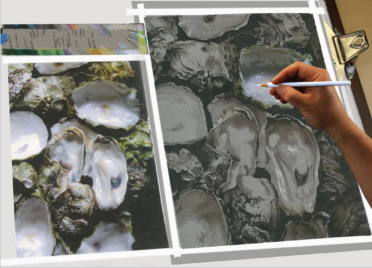
STEP 6 With the underpainting finished, start the colored pencil application. If there are strong highlights, draw them first, so you don’t have to worry about whether there will be enough paper surface at the end to accept them. Eventually, every inch of the drawing will be in colored pencil, with no visible marker on the surface of the finished artwork. However, the value applications, especially the darkest values, make their presence known in a substantial way.
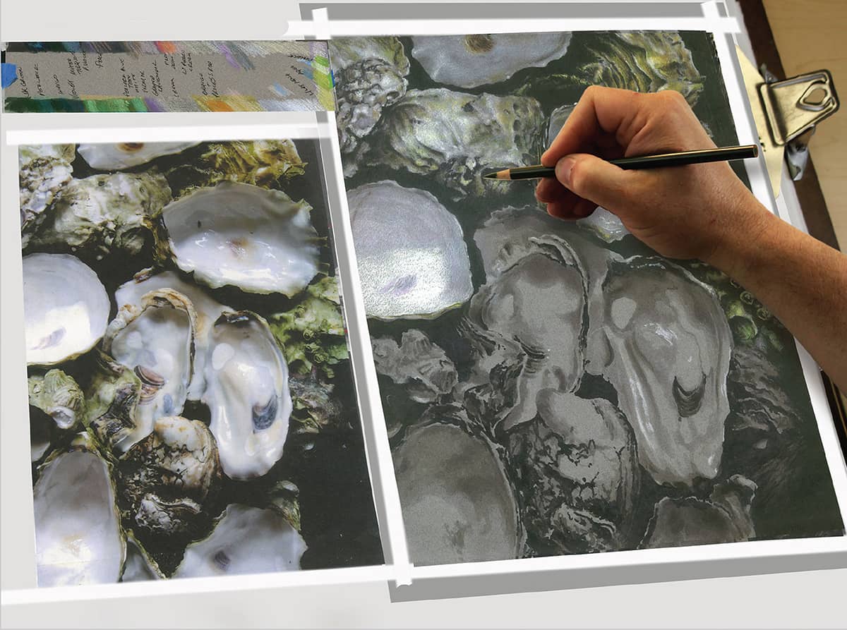
STEP 7 As you progress through the color development process, start with the light or middle colored pencils first and work up to the darkest colors to make sure that there will be enough paper texture for the lightest and brightest colors.
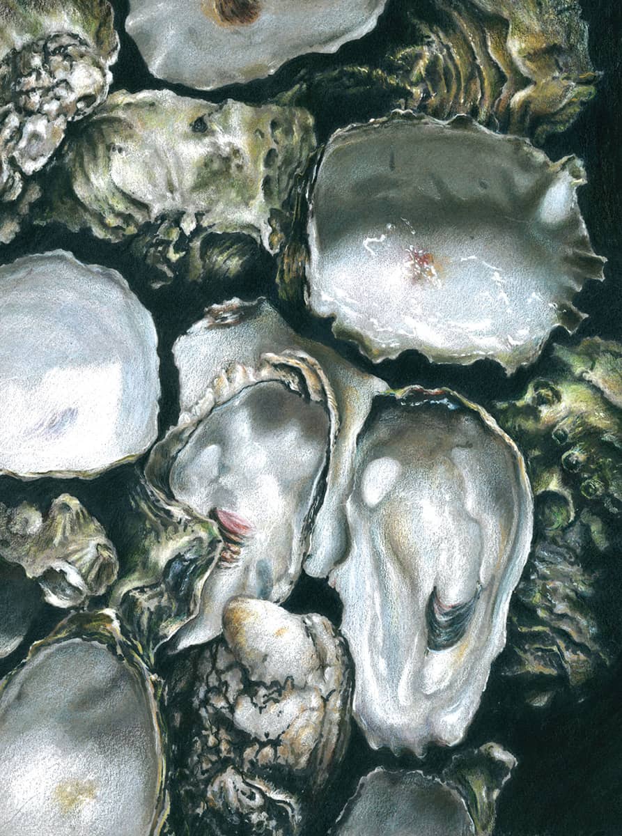
The final colored pencil drawing. Time: 8 hours.
Color Application
This second demonstration focuses on colored pencil application techniques, which can be used with or without marker and on white paper or a toned surface. Work on gray or neutral-toned art paper to get the most out of the brighter colors. You may also find that it is more difficult to develop dark values on white paper. Start the color build-up process from light to dark, leaving plenty of paper surface left at the end for the strongest, lightest, and brightest colors. There are always exceptions to any rule, but this method is usually the most successful.
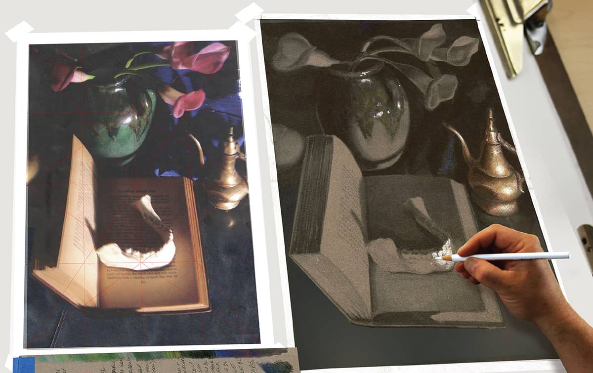
STEP 1 After sketching and transferring the drawing and creating a marker underpainting, begin applying color, working from light to dark.
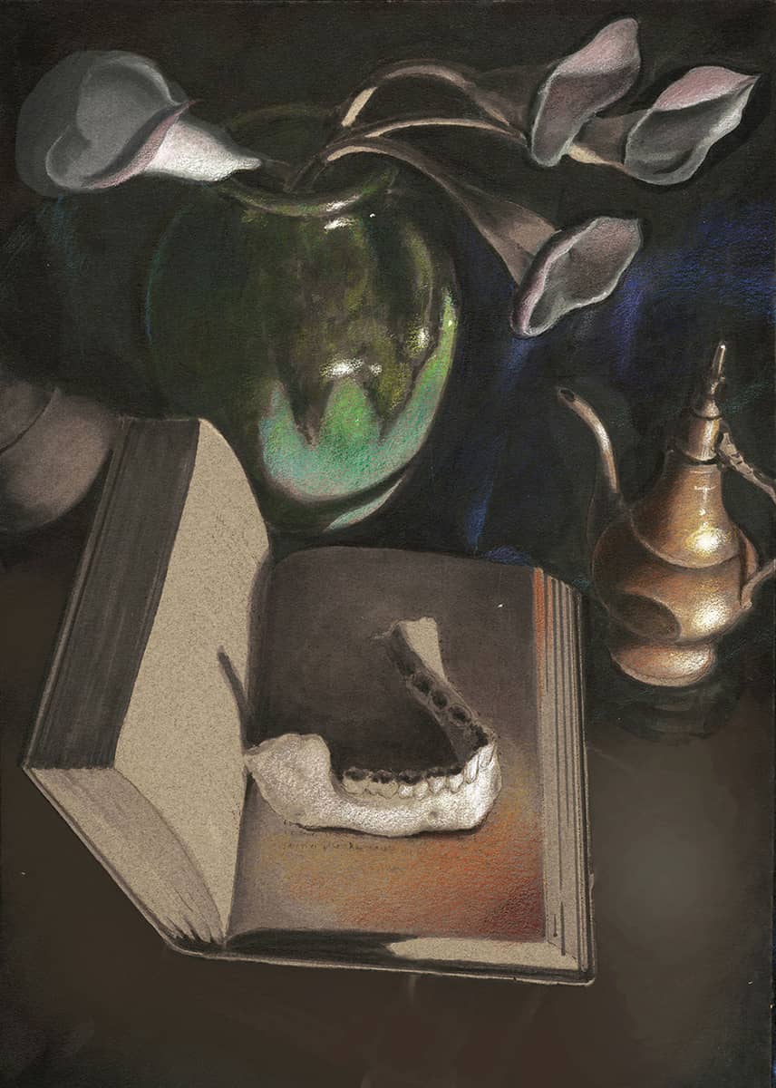
STEP 2 Lay on initial glazes of color in most still lifes from light to dark, planning to return to each object later for refinement and contrast.
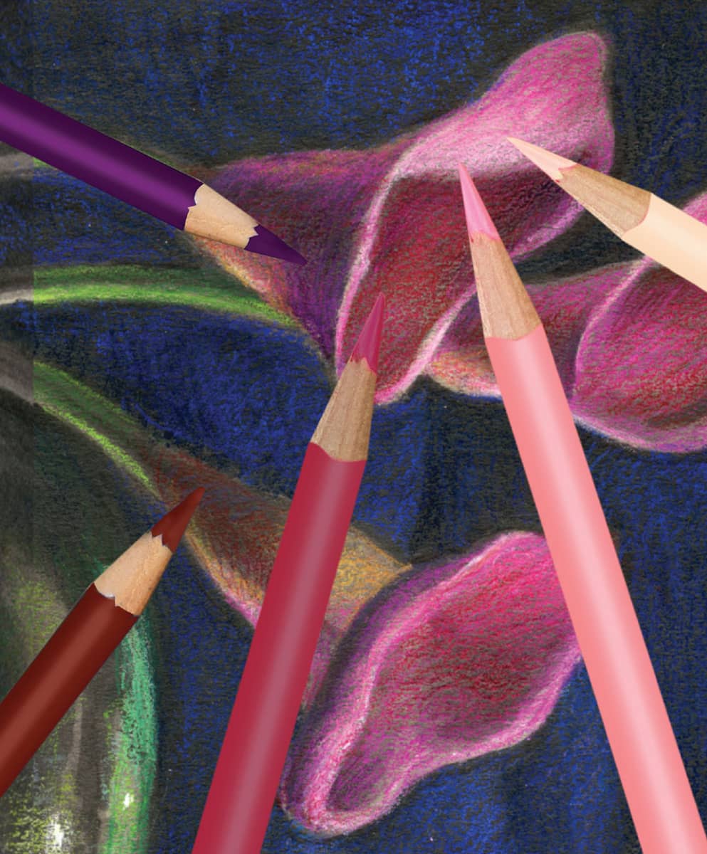
FLOWERS DETAIL Develop the flowers with a light layering of cream, pink, and red, in that order. Don’t use heavy applications; each layer is softly developed into the last with light circular, rotating strokes. You want soft gradations of color and value. For the shadows, use combinations of Tuscan red and black grape pencils.
DRAPE DETAIL To render the background drape, start with the middle color, blue violet. Then use indigo blue for the deepest shadows. Finish with a light cerulean blue, using very soft pressure, because you only need a small amount of highlight on the dark cloth. It’s easy to correct overdone highlights by softly applying a middle color to tone it back down.
TILE DETAIL Develop the tile with light circular strokes of color, starting with muted turquoise and following with espresso and dark umber. To render the brass pot reflection, use the same colors originally used on the brass pot, but with much less pressure and a glaze of espresso over the reflection.
STEP 3 I develop the rest of the drawing with layers of color. (See the details shown here.)
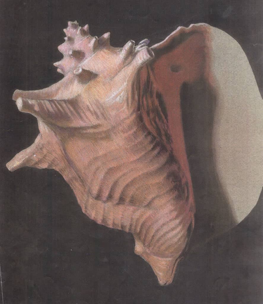
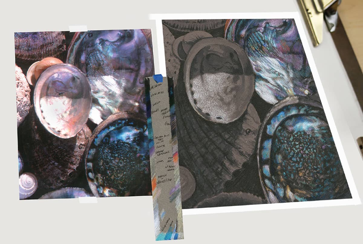
Burnishing the Brightest Colors
In this seashell demonstration, focus on the finishing burnished highlights. In a drawing such as this, save plenty of paper surface for the brightest colors. Use a felt-gray Canson paper—the smoother of the two sides—which still affords plenty of necessary texture.
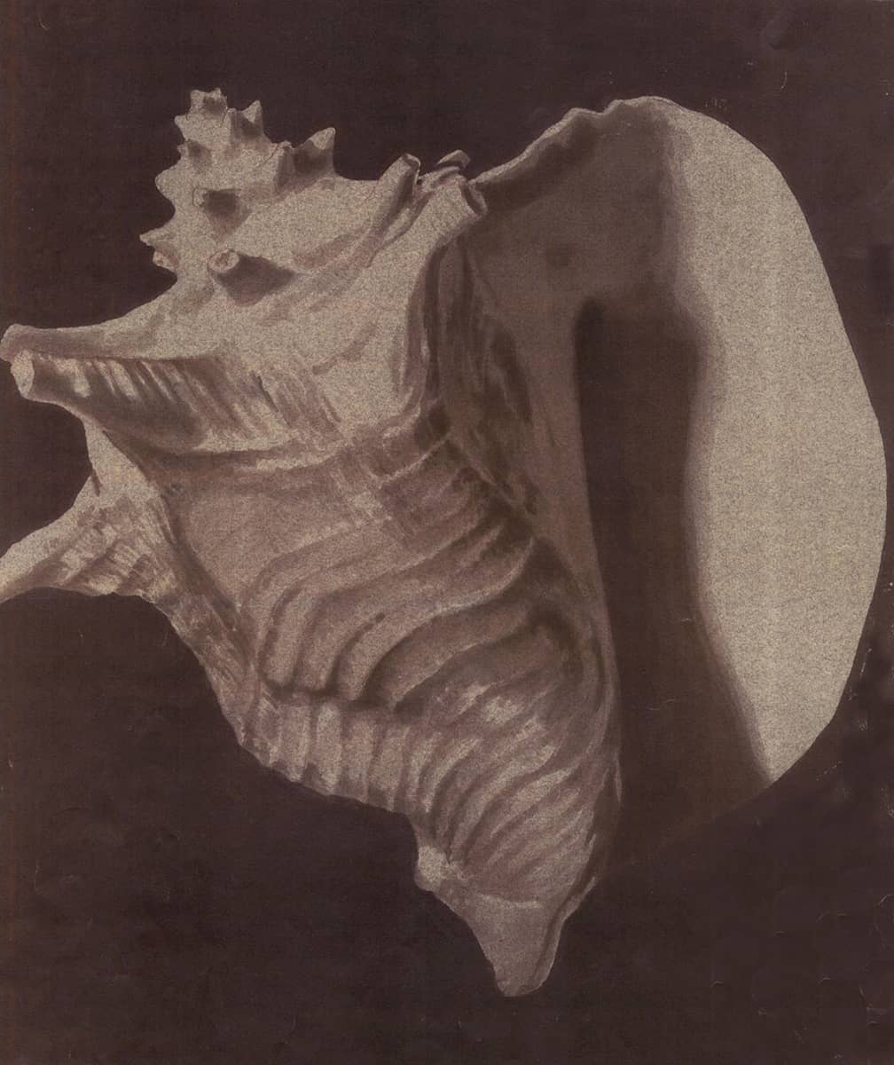
The initial value underpainting took 60 to 90 minutes to complete.
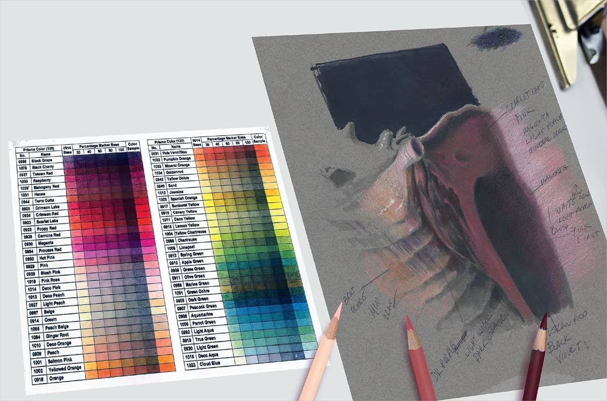
It is always a good idea to create a value/color scale before starting an extended drawing. This will help solve any glazing or layering problems before the process starts. A student created the colored pencil value chart at right. Notice that she even added marker values for comparison.
The shell in progress, working from left to right, with most of the light colors glazed in lightly.
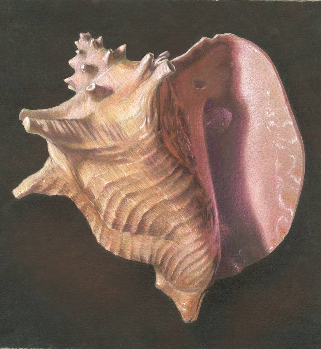
The finished shell, with the strongest highlights burnished in the appropriate areas. For a slightly brighter background, but still dark, glaze terra cotta, Tuscan red, and indigo blue pencils, light to dark, in light circular strokes. Each subsequent color subtly affects the previous layer. Time: 6 hours.
Monochromatic Artwork in Colored Pencil
When not working from a color reference or subject, black, white, and neutral colored pencils can be a great way to produce high-contrast, dramatic drawings.
Black colored pencil on a more textured white art paper, such as Bristol vellum or stipple paper (also known as coquille paper) is an effective, expedient way to build up a wide range of values without the need to layer different grades of graphite pencil. The rich, black, matte appearance of the black colored pencil is also a plus.
Conversely, white colored pencil on black illustration board or art paper can be as dramatic and beautiful as any typical drawing. The amount of pressure used with the pencils, as well as the textured surface of the paper, is a key factor, as is the sensitivity of the artist to the effects of light on the forms.
A combination of black and white colored pencils on gray-toned paper is also a logical and effective way to build up dark and light values efficiently and quickly, with the neutral paper acting as the middle value.
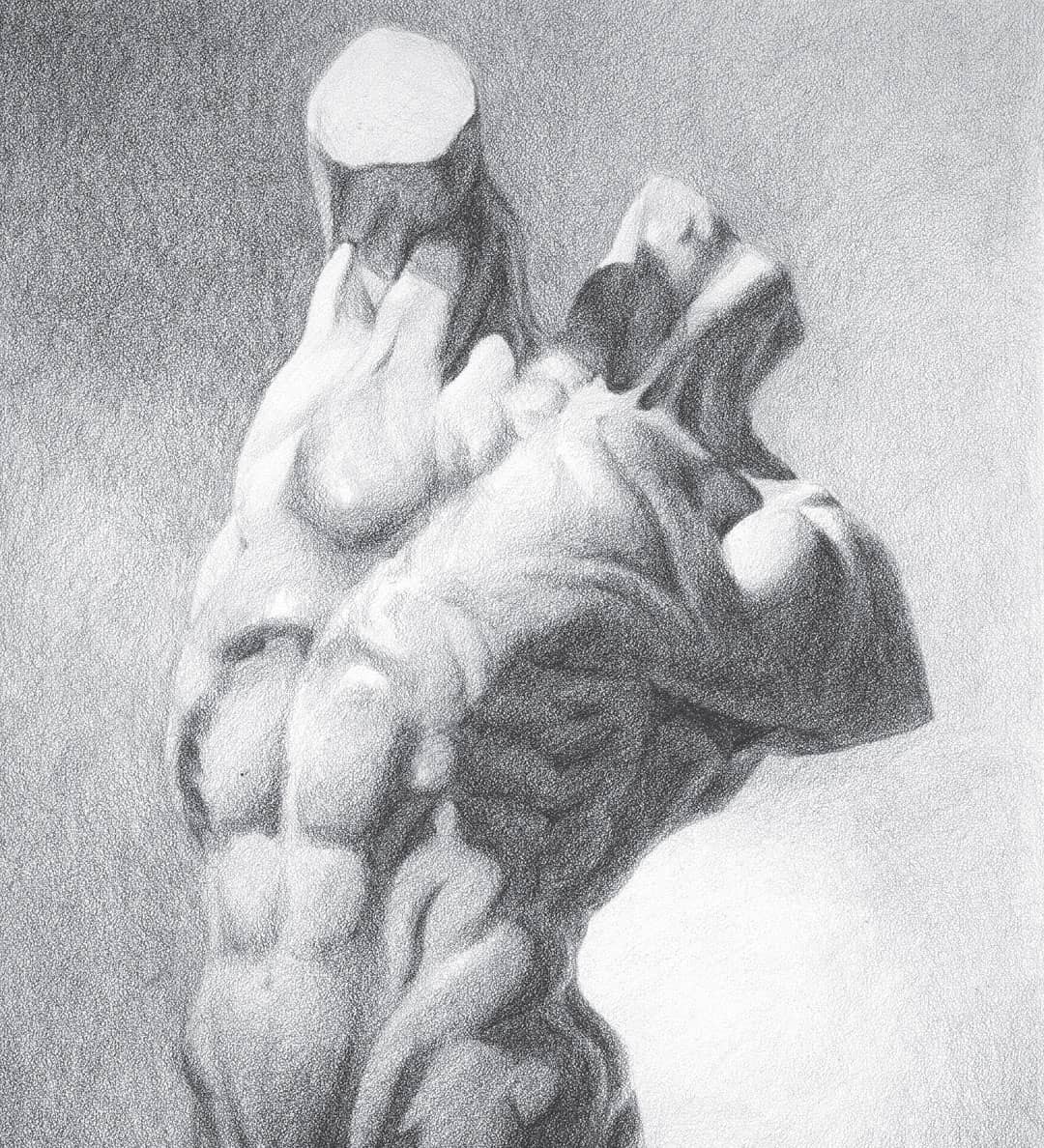
This torso was rendered with black colored pencil on white stipple board. The textured and pebble-like surface lends itself to creating a good range of values with black colored pencil, using a variety of pressure-sensitive strokes. Student drawing by Jason Slavin. Time: 6–8 hours.
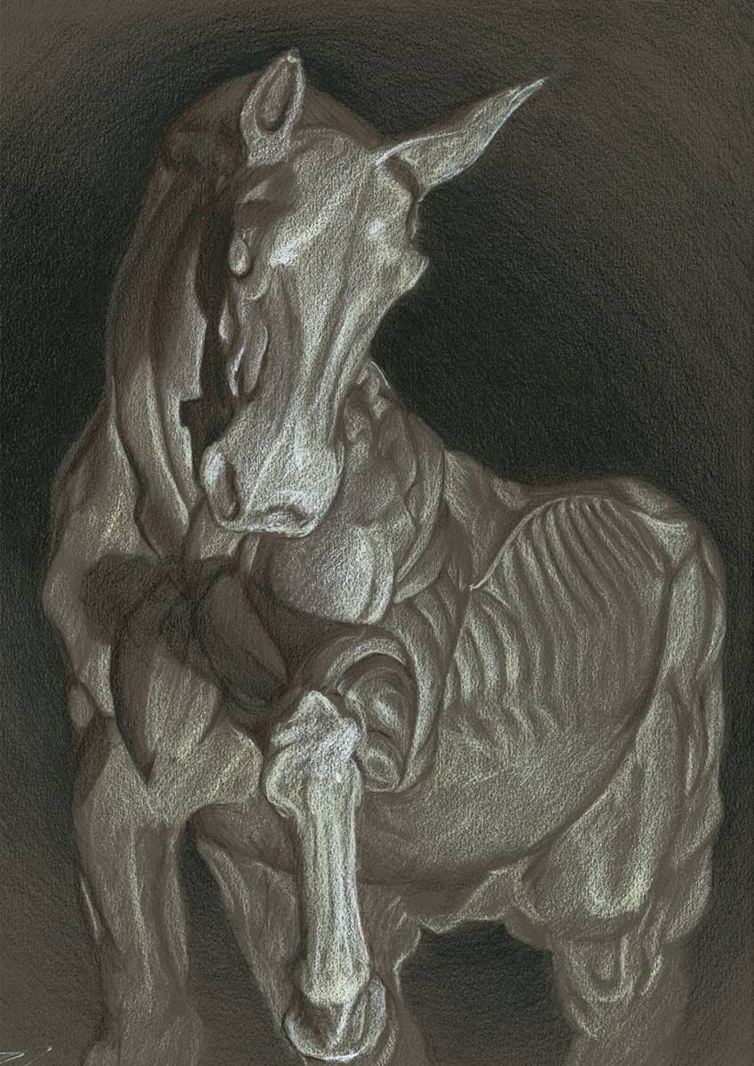
For this dramatic tonal drawing on dark Canson paper, black and white pencils were supplemented by subtle additions (as desired) of cream and dark umber pencils, which act as a subtle bridge for the white and black colored pencils, respectively. Student drawing by Huy Huynh. Time: 6–8 hours.
YOUR HOMEWORK
This homework project can be created using an actual still life or a color photograph of your choice.
Choose a still life to render in colored pencil; find subject matter that you prefer, but look for strong color and value choices in your subject.
If you’re working from a photo, try using the grid method to transfer a line drawing to art paper. Add marker value, with ranges of 20% to 80% and black, or 30% to 90% and black. Use a value scale for value development and a color-swatch scale for color development.
Try to work in the size range of 14" × 17" to 16" × 20" for your final drawing.
EXERCISES FOR PRACTICE
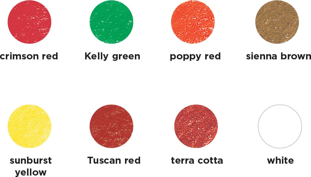
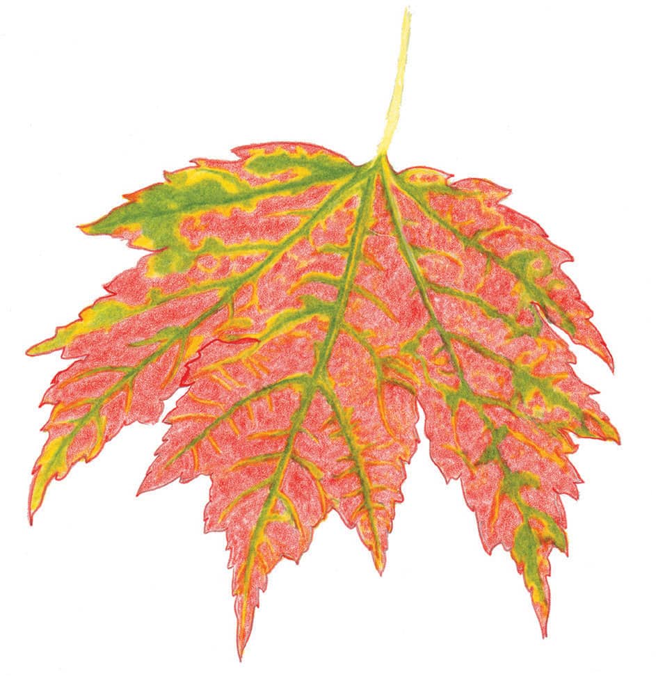
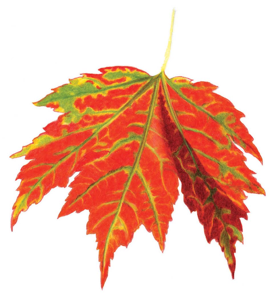
Complementary colors are two colors that are opposite each other on the color wheel. (See “Color Basics”.) While we may not understand why these color combinations work so well, we instinctively know that they do. In this project, we’ll use red and green, and you’ll learn how to accentuate and then subdue the vivid colors with several layers of blending and burnishing.
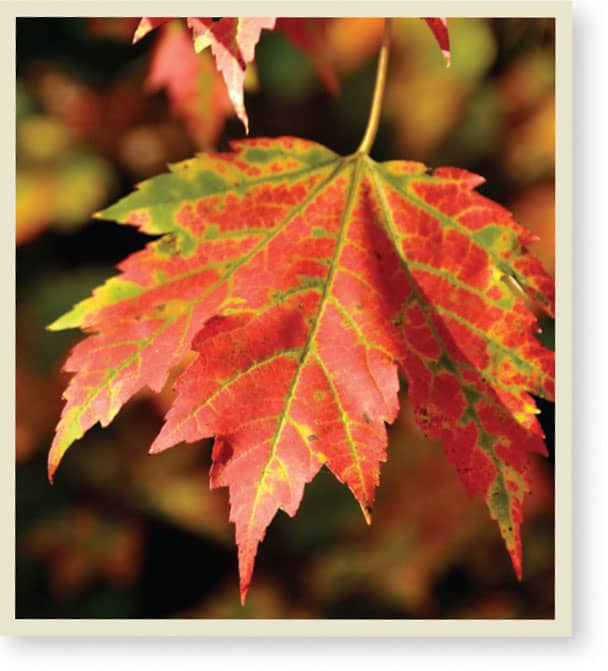
Autumn leaves near the peak of their splendor in the Northeast.
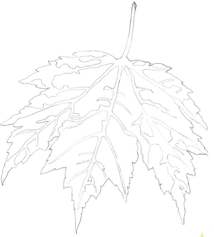
STEP 1 Sketch an outline of the bottom leaf with an H graphite pencil. You will later erase these lines as you work on each section so the graphite doesn’t show through the colored pencil.
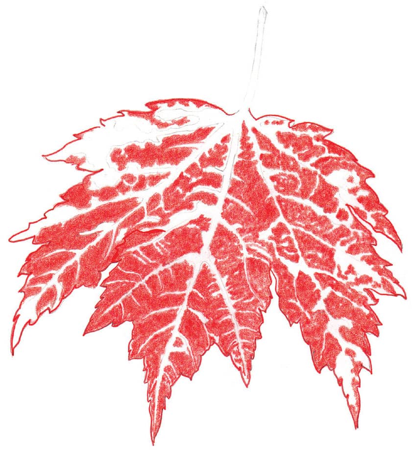
STEP 2 Outline the exterior of the leaf with crimson red. Then use circular strokes and light pressure to fill in the red sections. Leave space for the veins and the areas of yellow and green, which you’ll develop in the next steps.
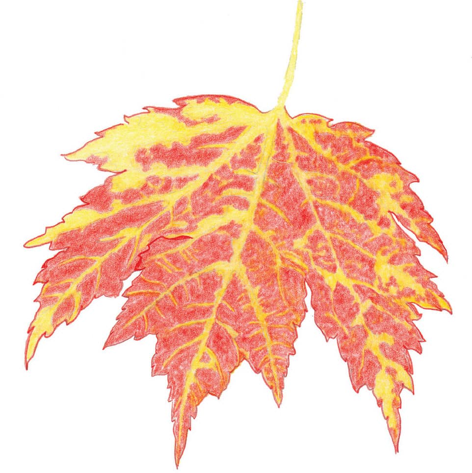
STEP 3 Fill in all of the uncolored areas, including the stem, with sunburst yellow. Use small circular strokes and medium pressure throughout.
STEP 4 With firm pressure, apply Kelly green over the sunburst yellow in areas that need to be green. This is the last of the three main colors you need to establish; now you can begin developing color intensity. To brighten the yellows and greens, burnish with sunburst yellow using heavy pressure and a blunt point, covering the yellow and green areas.
STEP 5 Enhance the reds with another layer of crimson red and a layer of poppy red. Then burnish the entire leaf with sunburst yellow. Line the darkest vein edges with sienna brown. For the dark shadow, apply Tuscan red. Use sunburst yellow and Kelly green to intensify the yellows and greens over the shadowed section. Also begin to burnish the sunlit sections with white.
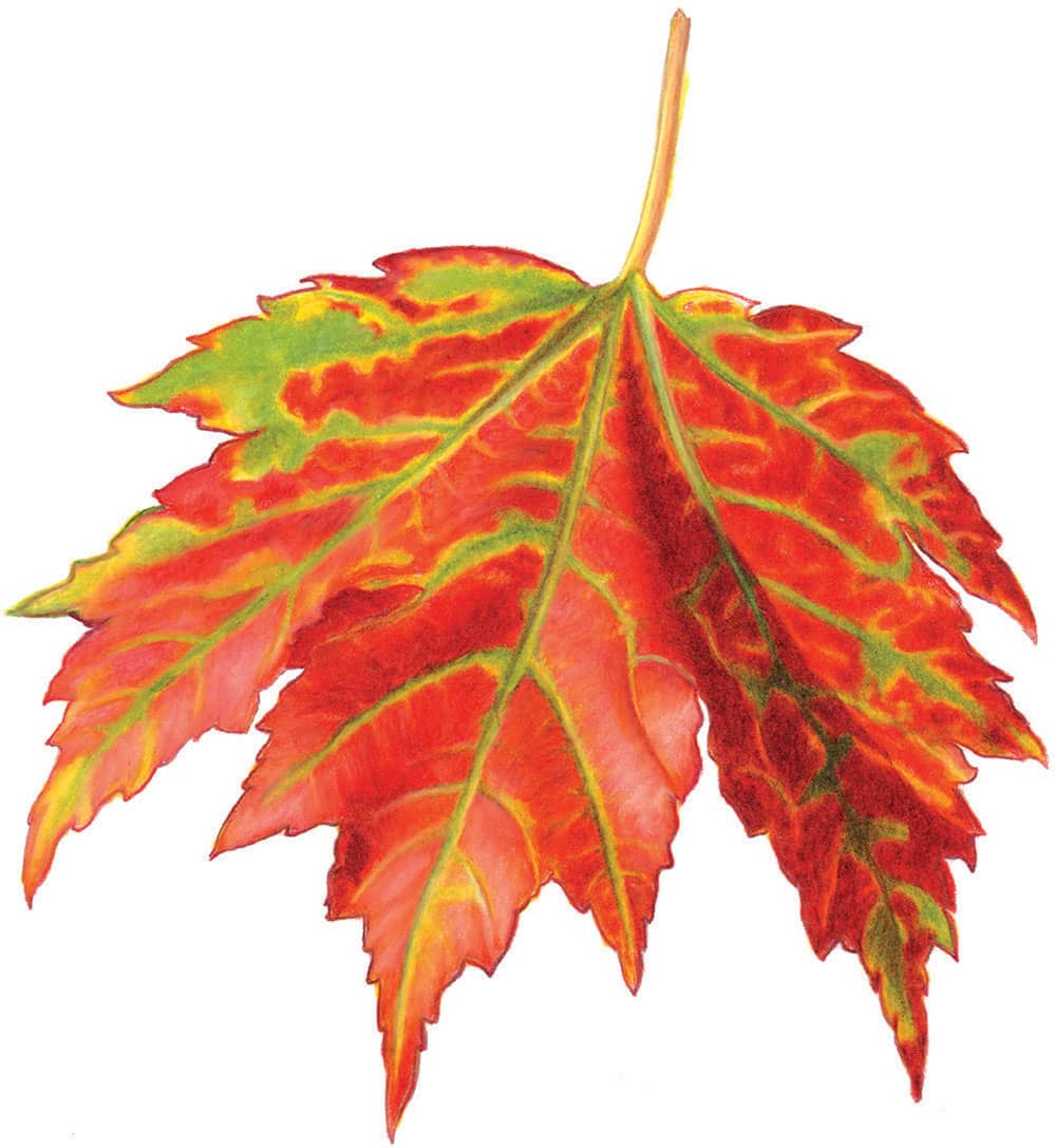
STEP 6 Using Tuscan red with firm pressure, intensify all of the dark red areas. Use Kelly green to darken and define the greens. Burnish the remaining sunlit sections with white, blending the colors together and pressing hard to bring out the highlights. Blend and burnish to restore the reds and yellows where needed. Then outline the leaf with a sharp Tuscan red. Color the stem with sunburst yellow, add terra cotta down the right side, and then burnish with white. Draw a thin line of terra cotta down the left side of the stem for definition. Finish by erasing all smudges and spraying with workable fixative.
When drawing subjects that are transparent like this fishbowl, you are actually rendering the reflections on its surface. Clear glass and water have little or no color of their own, so the colors you see and use are reflected from the objects around them. This example uses mostly grays and blues, but all the colors in the rainbow are possible options. Just draw what you see and be open to using all the colors you observe.
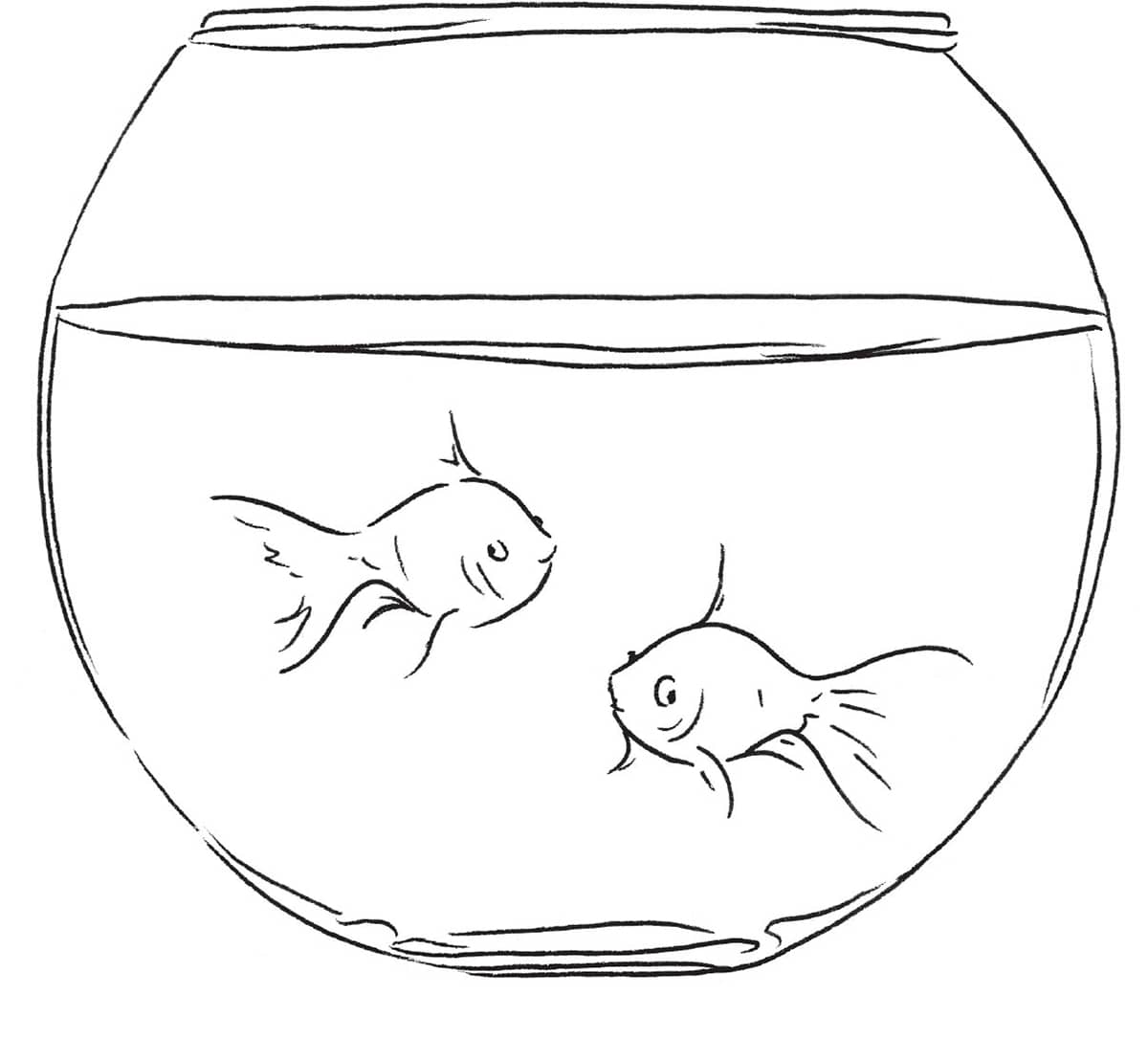
STEP 1 Use very light lines to transfer the basic outline onto drawing paper.
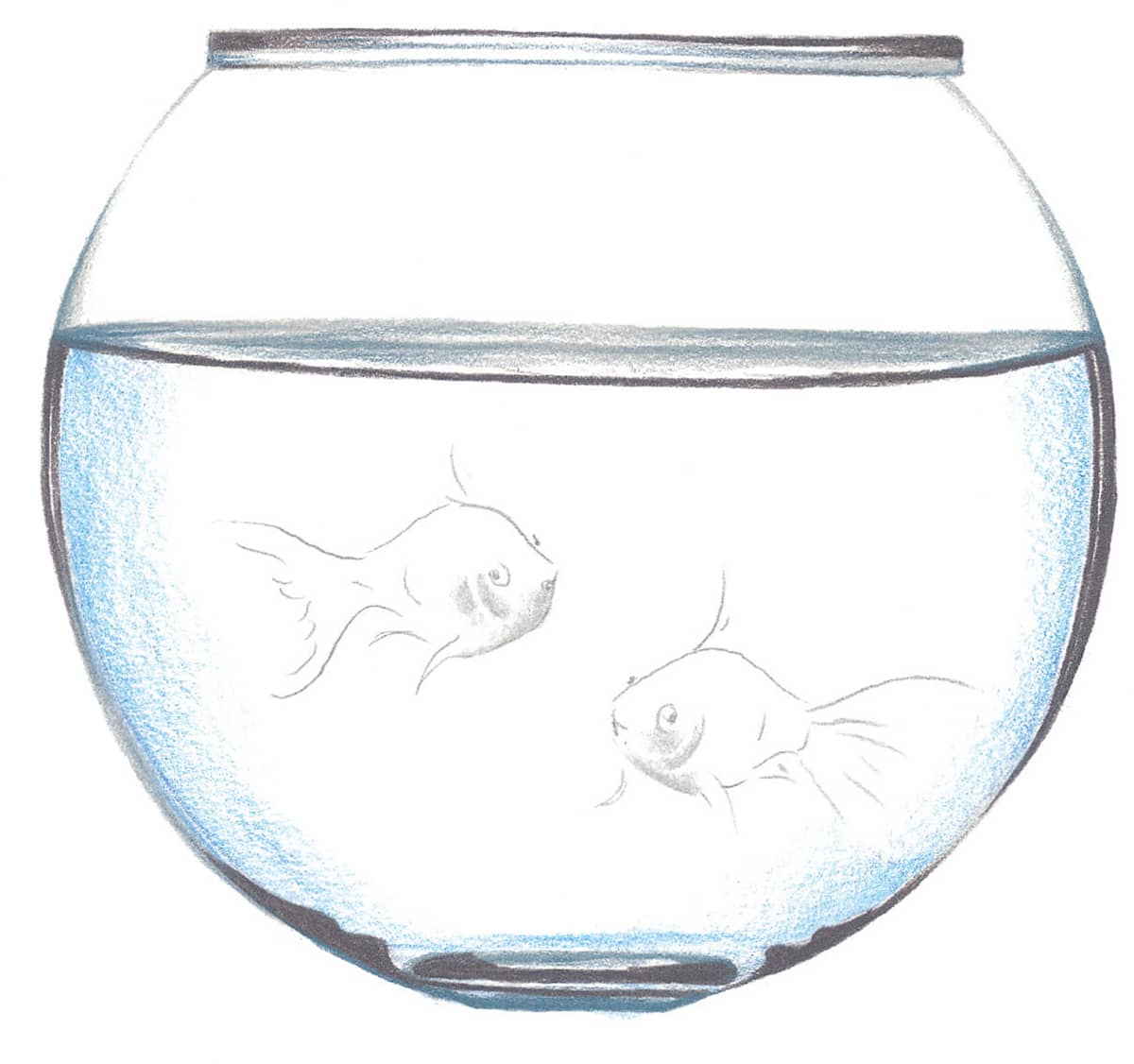
STEP 2 Use cool gray 30% to outline the shape of the fishbowl and shade areas of the goldfish. Then add darker outlines to the bowl using warm gray 50%. Bring in some light cerulean blue for the water. Next add slate gray to the bottom of the bowl and along the surface of the water.
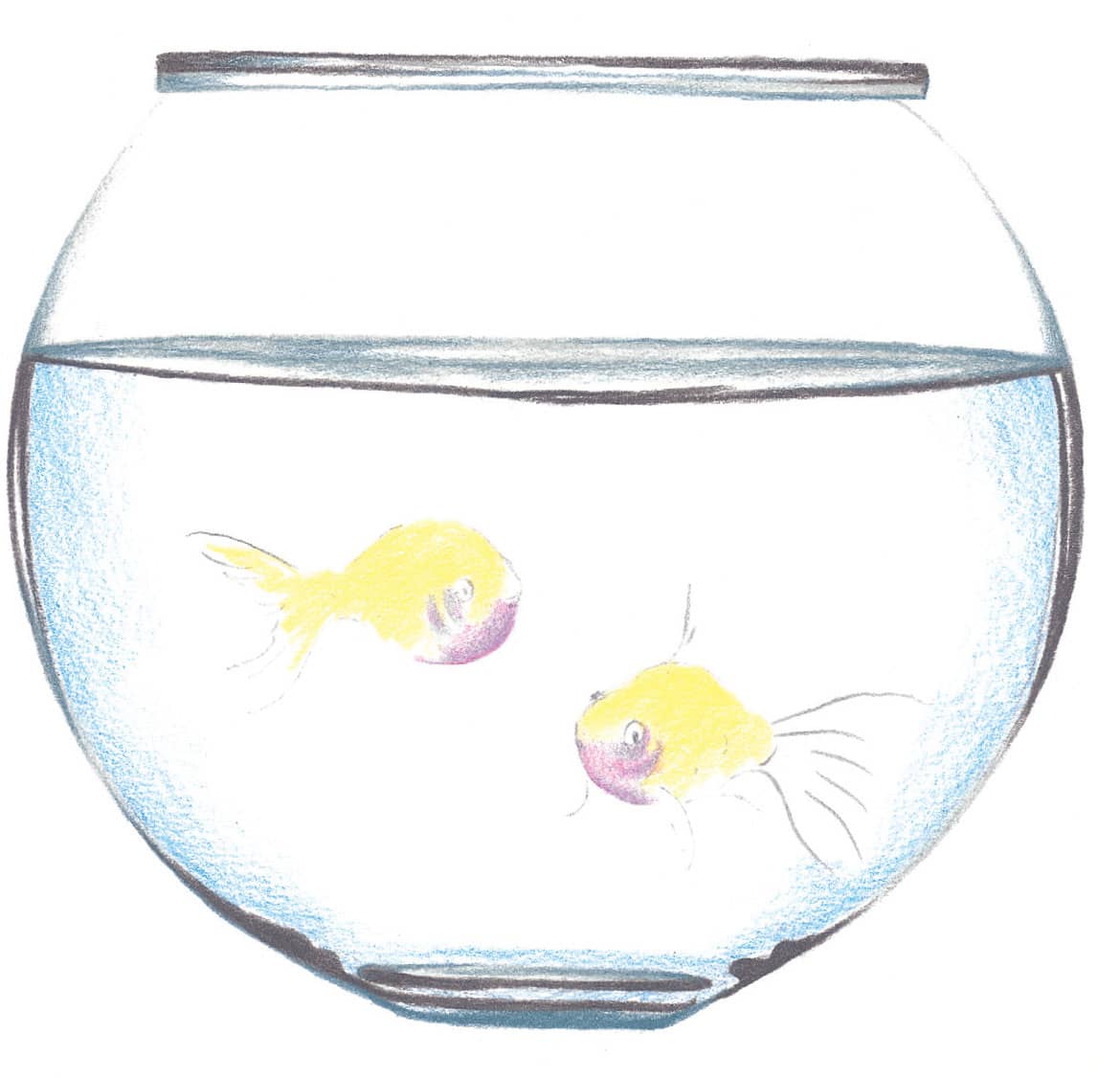
STEP 3 Lighten the outlines of the fish with an eraser; then fill them in with Deco yellow. Apply lavender over the gray areas on the fish.
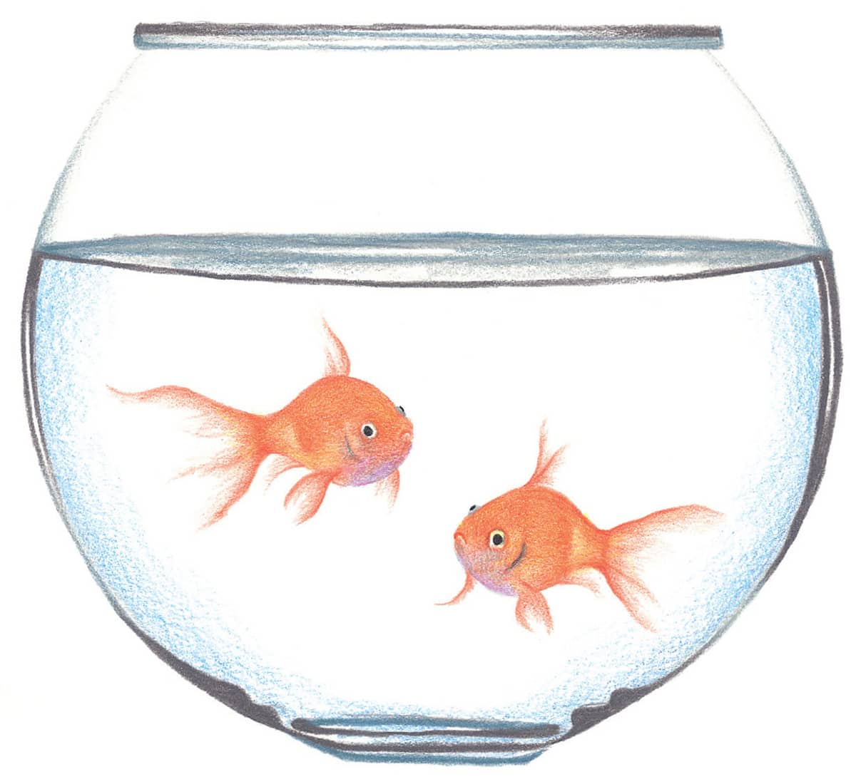
STEP 4 Cover the majority of both fish with pale vermilion, leaving some of the lavender showing through. Then use black to fill in the pupils and create the gill on the fish on the right.
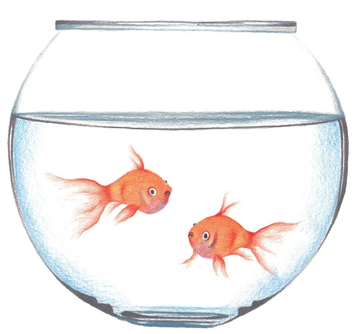
STEP 5 Create the mouths with black. Then accent the fish with scarlet lake and erase any remaining pencil lines.
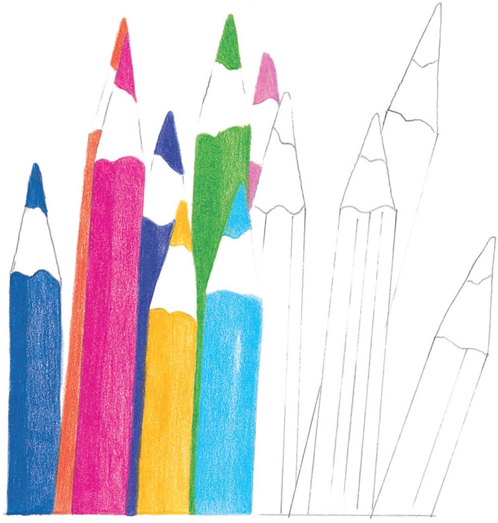
This project is just plain fun! It is a great opportunity to use a multitude of different colors in one drawing. You are not limited to the colors chosen, so feel free to experiment and explore your own color palette. In order to make your pencil barrels round, you need a light side and an opposite shadow side. For the shadow side you’ll simply apply your color with heavier pressure than on the light side. Another option for creating more complex shadows is to choose a slightly darker color and apply it to the shadow side of the pencil barrel; then place your final color over it for a deeper layered effect.
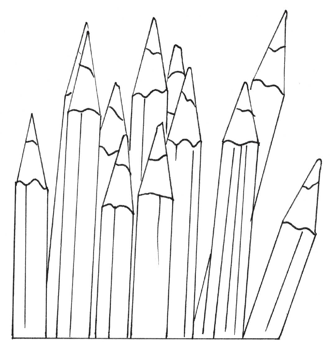
STEP 1 Lightly transfer the basic line drawing onto a sheet of smooth, acid-free drawing paper. It may help you to use a small ruler to keep your lines straight for this project.
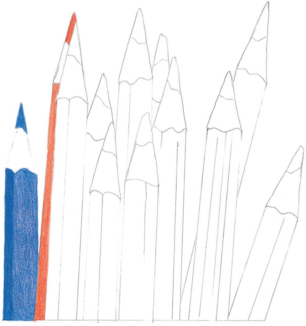
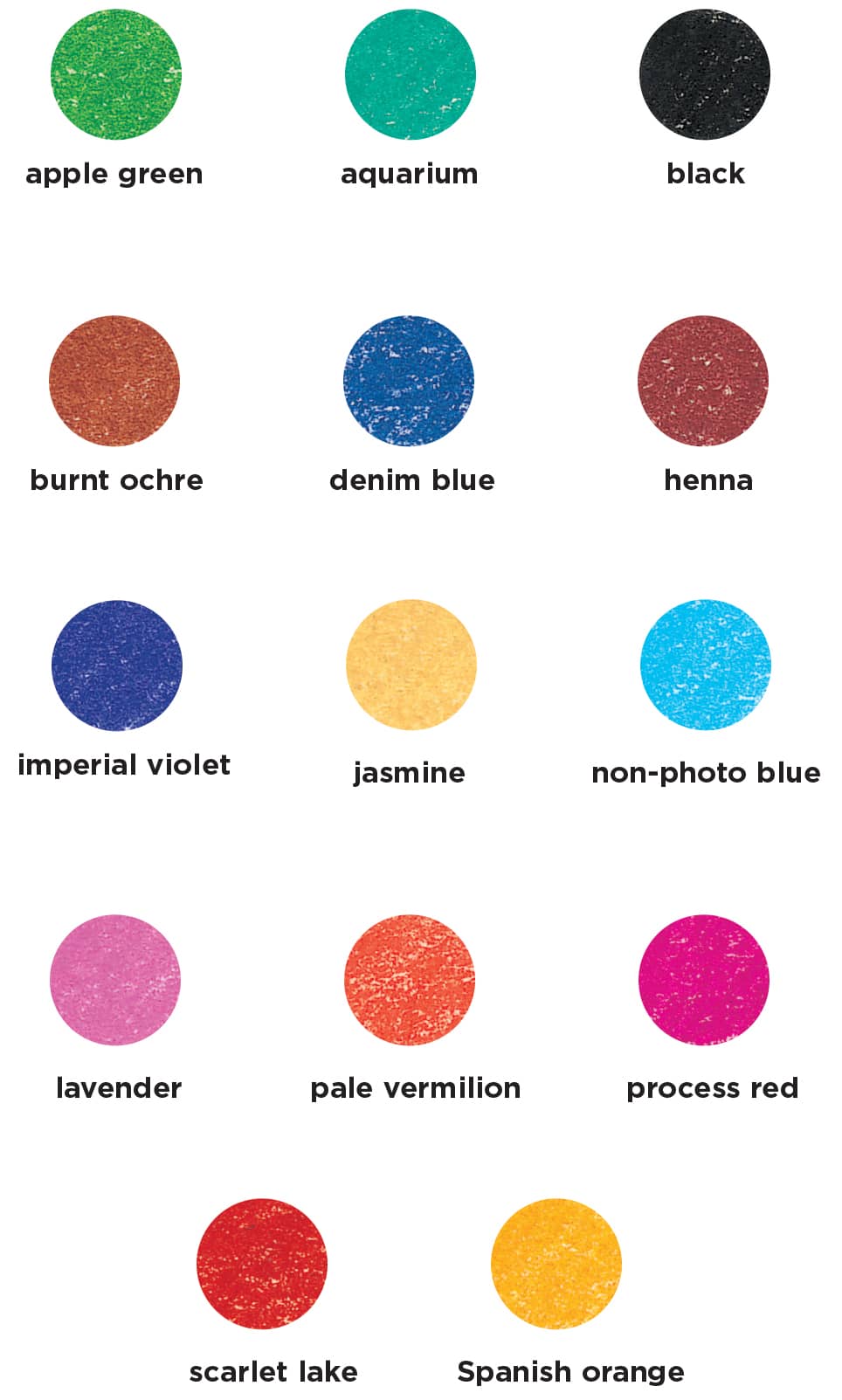
STEP 2 Use denim blue and pale vermilion to fill in the first two pencils. Apply heavier pressure on the left side of the barrels and lighter pressure on the right to indicate roundness.
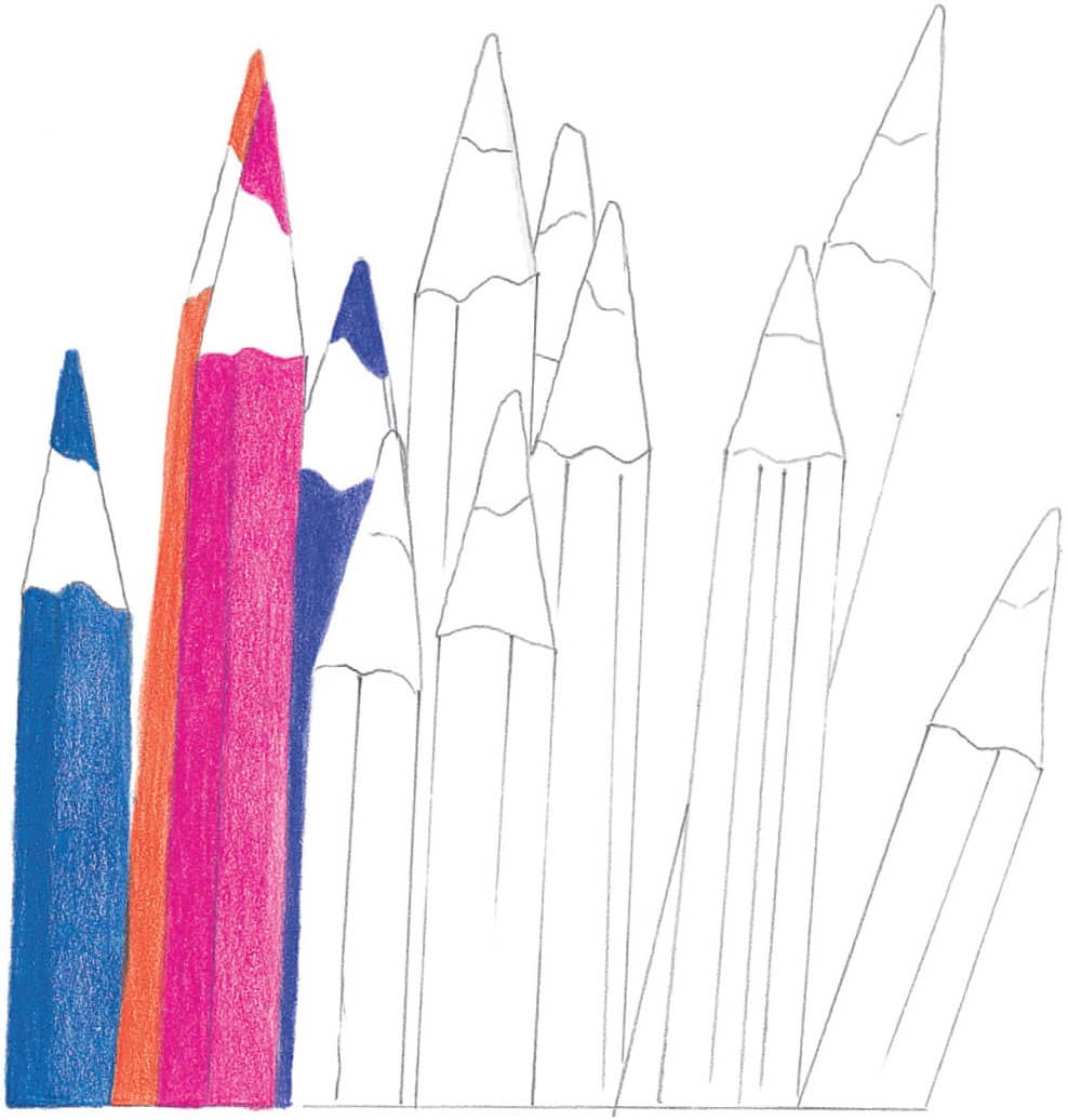
STEP 3 Use the same shading technique from step 2 for the next two pencils, this time using process red and imperial violet.
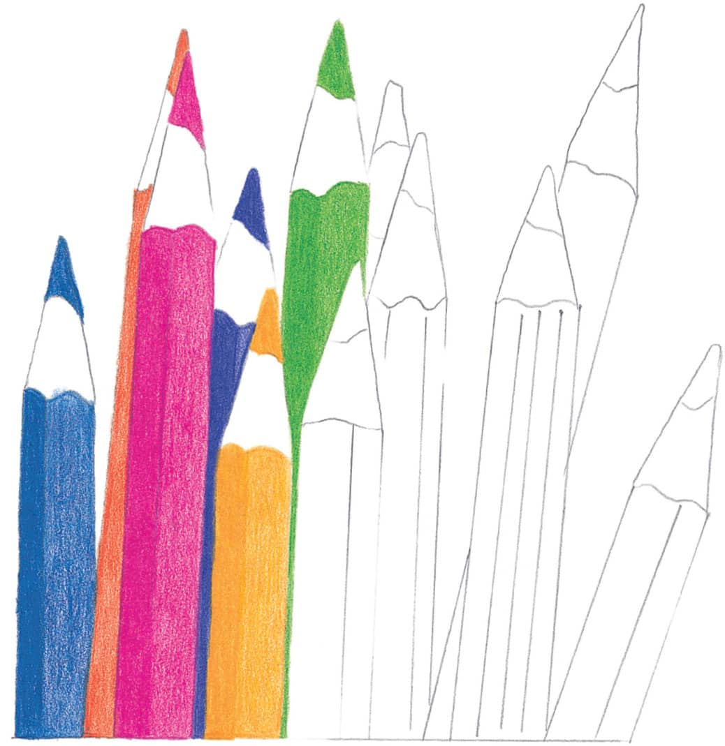
STEP 4 Use Spanish orange and apple green for the next set, remembering to keep my pressure varied.
STEP 5 Fill in the next two with non-photo blue and lavender.
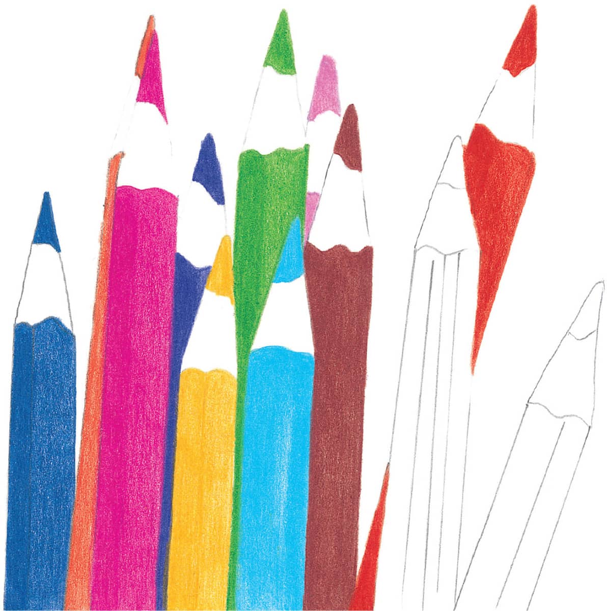
STEP 6 Now add the henna and scarlet lake pencils.
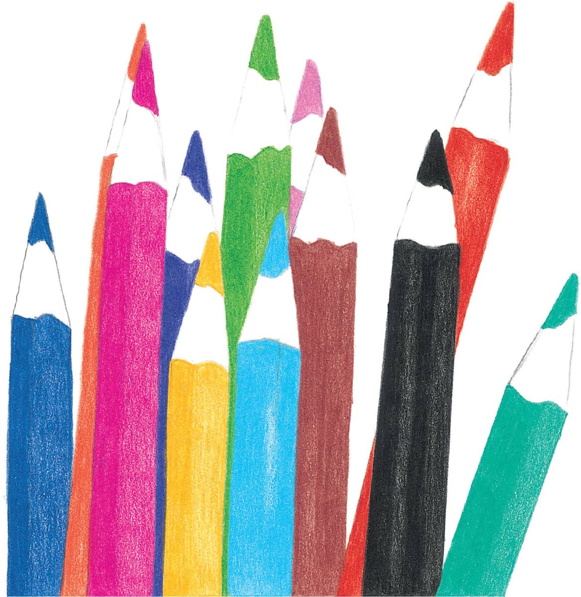
STEP 7 Using black and aquamarine, complete the line of pencils.
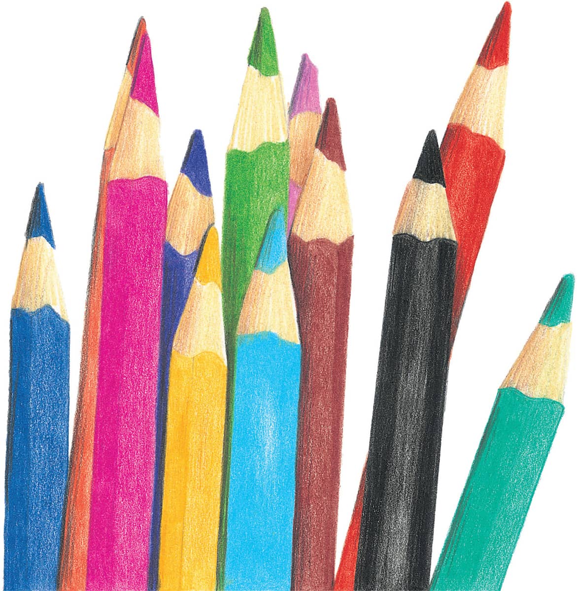
STEP 8 In the final step, place an even layer of jasmine on the sharpened end of each pencil to indicate the wood. Add burnt ochre on the left side of this area to create the shadow side and to make the wood appear round. Then add black to shadow the barrels of the pencils in the back row.
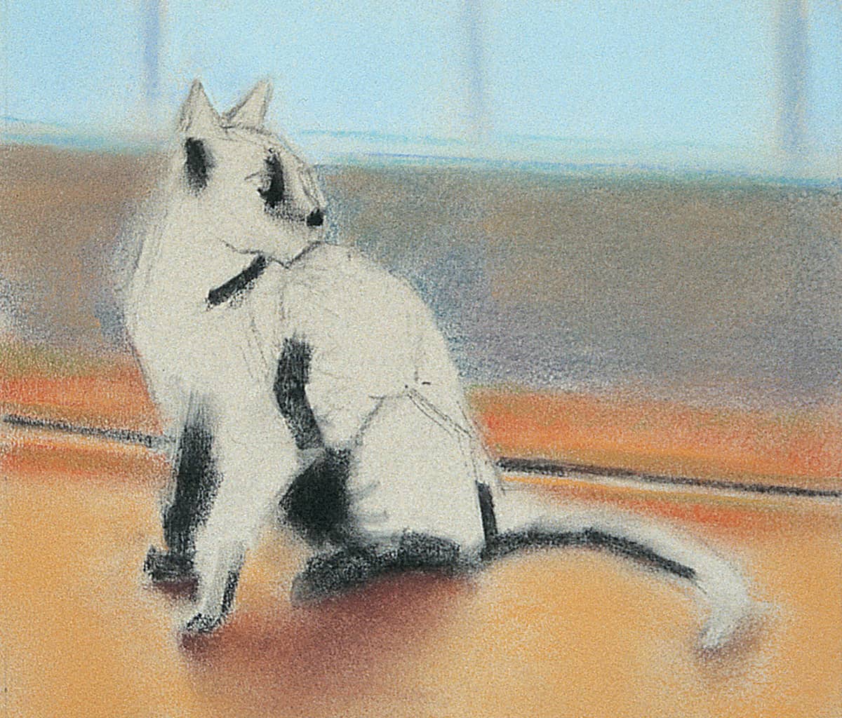
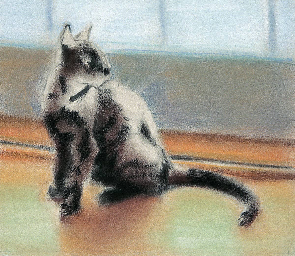
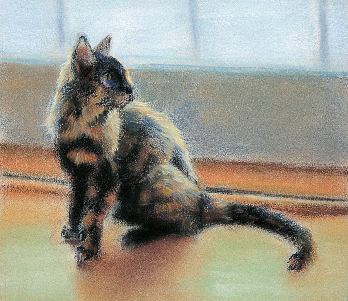
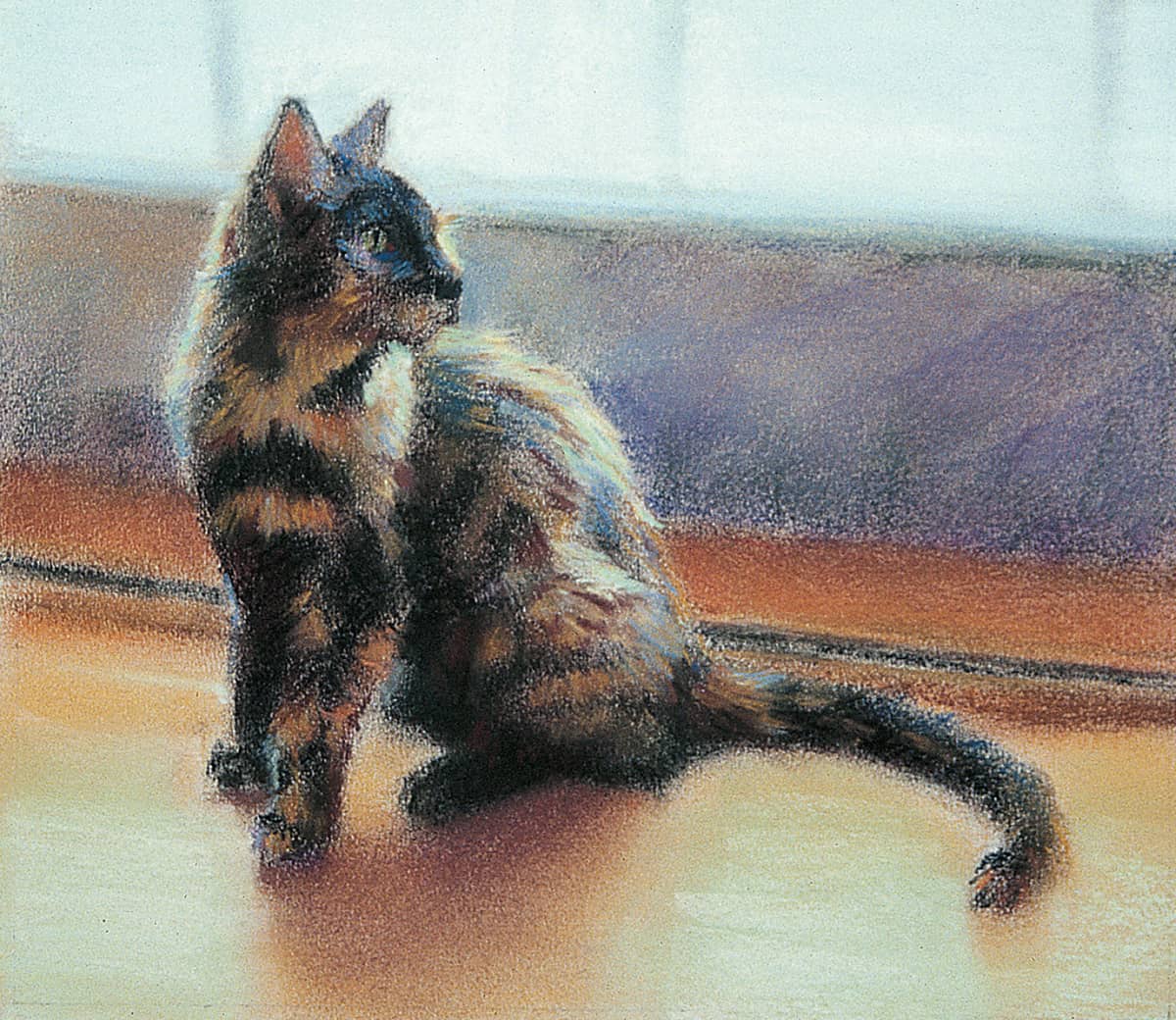
Pastel
Pastel lends itself very well to bold strokes of color, as well as subtle blends in value, color, and edge variety. Pastel is the softer side of color drawing media, with little to none of the hard, waxy binders that give colored pencils their hardness and permanence. Pastels range from just a bit softer than colored pencil to soft and buttery, easily crumbling to the touch. This section discusses techniques using both pastel sticks and pastel pencils.
Similar to colored pencils, when working with pastel, it’s best to use toned or colored paper, from a 50% value to darker, for dramatic, bright colors. Work on sanded pastel board, which, though expensive, can make a big difference in the success of the project. With pastel and its relative softness, the more texture the paper has, the better.
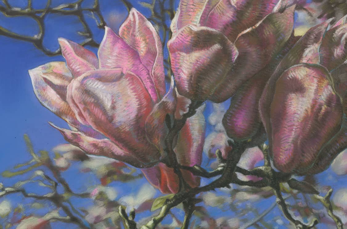
Student pastel drawing by Yea Jin Shin. Time: 6–8 hours.
Pastel Techniques
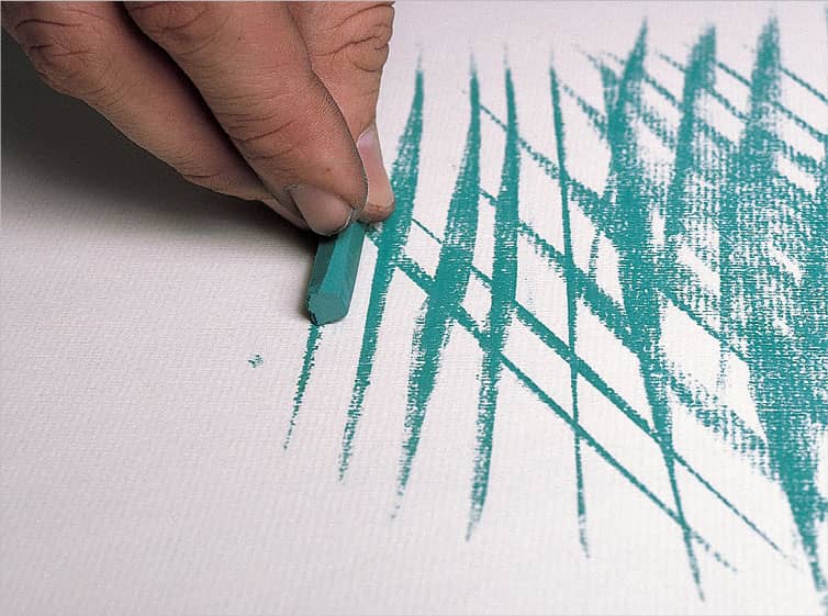
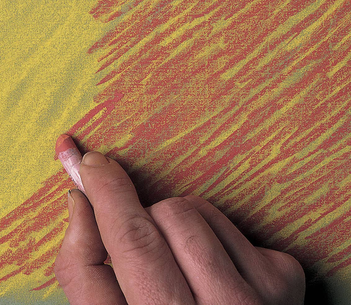
The way you hold and manipulate the pastel stick or pencil will directly affect the resulting stroke. Some grips will give you more control than others, making them better for detail work; some will allow you to apply more pigment to the support to create broad coverage. The pressure you exert will affect the intensity of the color and the weight of the line you create. Experiment with each of the grips described below to discover which are most comfortable and effective for you.
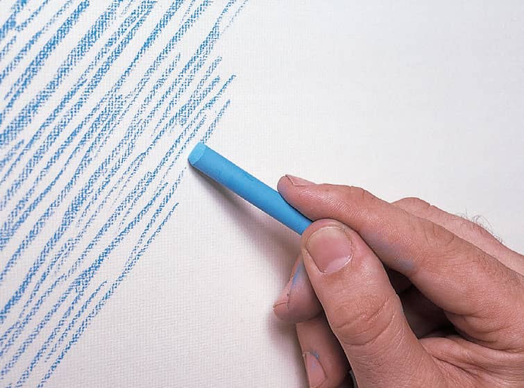
LINEAR STROKES To create linear strokes, grip the pastel stick toward the back end, and use your thumb and index finger to control the strokes. This grip is ideal for creating fine lines and details; however, it offers less control than the other grips.
BROAD STROKES Place the pastel flat on the paper and slide it back and forth to create broad linear strokes. This grip is also useful to create a “wash”; use the length of the pastel to cover large areas and create backgrounds quickly.
ROUND STROKES Turn the pastel stick on its end and grip it toward the front to create short, rounded strokes. This grip is perfect for creating texture quickly in large areas.
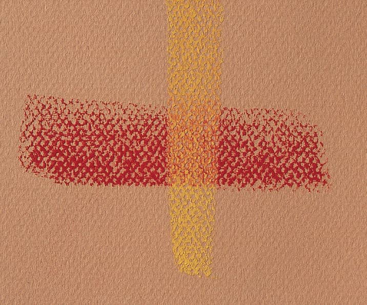
CROSSHATCHING Hatched strokes are a series of parallel lines; crosshatched strokes are simply hatched lines layered over one another, but in opposite directions. You can crosshatch strokes of the same color to create texture or use several different colors to create an interesting blend.
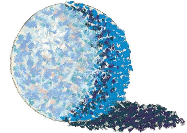
POINTILLISM Another way to build up color for backgrounds or other large areas of color is to use a series of dots, a technique called “pointillism.” This technique creates a rougher, more textured blend. When viewed from a distance, the dots appear to merge, creating one color.
REMOVING PIGMENT When you need to remove color from a given area, use a kneaded eraser to pick up the pigment. The more pressure you apply, the more pigment will be removed. Keep stretching and kneading the eraser to expose clean, new surfaces.
CREATING PATTERNS To create textures or patterns when rendering fabric or clothing, first lay down a solid layer of color using the side of the pastel stick or pencil. Then use the point of a pastel pencil to draw a pattern, using several different colors if you wish.
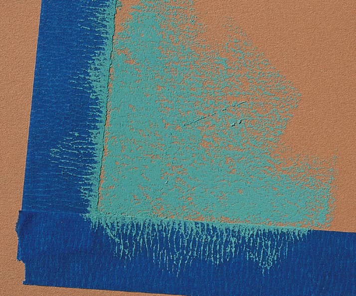
USING TAPE You can create straight, even edges by using house painter’s tape. Just apply it to your support, and make sure the edges are pressed down securely. Apply the pastel as you desire, and then peel off the tape to reveal the straight edges.
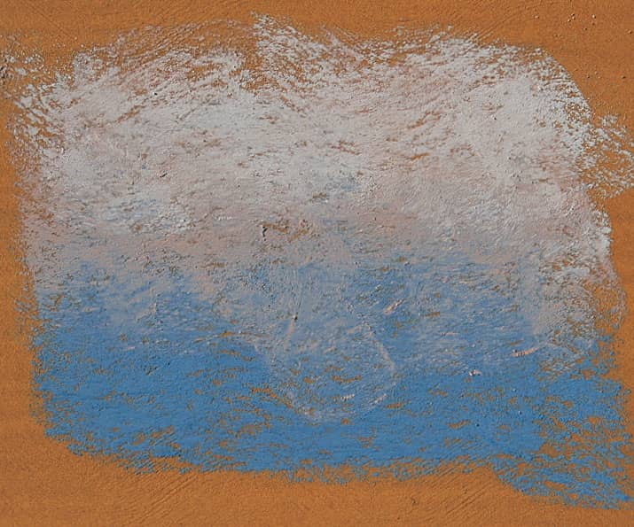
GRADATING Creating A smooth, even gradation on textured ground can be a little tricky. Add the colors one at a time, applying the length of the stick and letting it skip over the texture of the paper by using light pressure.
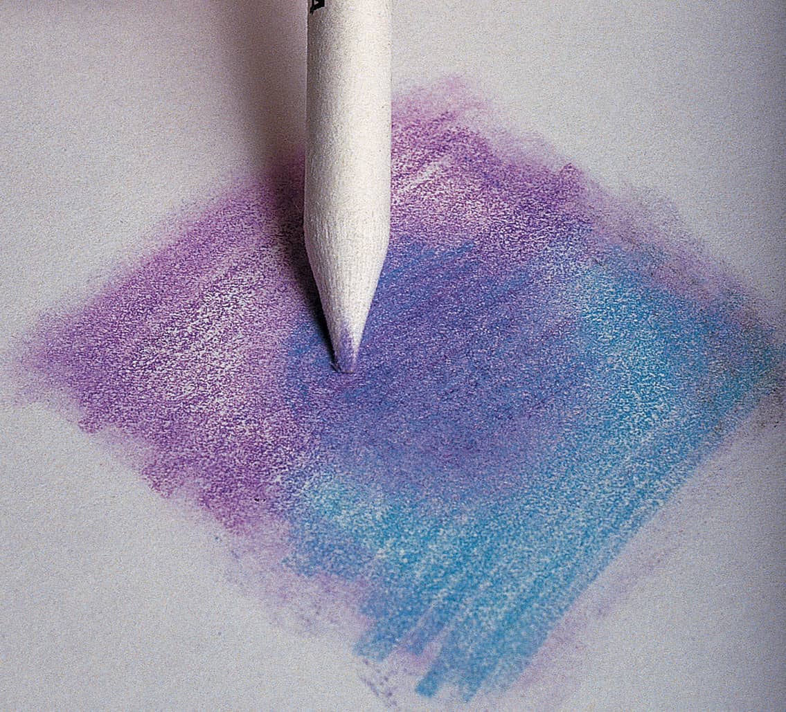
GLAZING Create a “glaze” just as you might with watercolor by layering one color over another. Use the length of the pastel stick with light pressure to skim over the paper lightly. The result is a new hue—a smooth blend of the two colors.
Blending Pastels
There are a number of ways to blend pastel, and the method you use depends on the effect you want to achieve and the size of the area you’re blending. Smooth, even blends are easy to achieve with a brush, a rag, or even your fingers. You can also use your finger or a paper blending stump to soften fine lines and details. Still another method is to place two or more colors next to each other on the support and allow the eye to visually blend them together.
UNBLENDED STROKES In this example, magenta is layered loosely over a yellow background. The strokes are not blended together, and yet from a distance the color appears orange—a mix of the two colors.
BLENDING WITH FINGERS Using your fingers or the side of your hand to blend gives you the softest blend and the most control, but be sure to wipe your hands after each stroke so you don’t muddy your work. Or use rubber gloves to keep your hands clean.
BLENDING WITH A TORTILLON For blending small areas, some artists use a paper blending stump, or tortillon. Use the point to soften details and to reach areas that require precise attention.
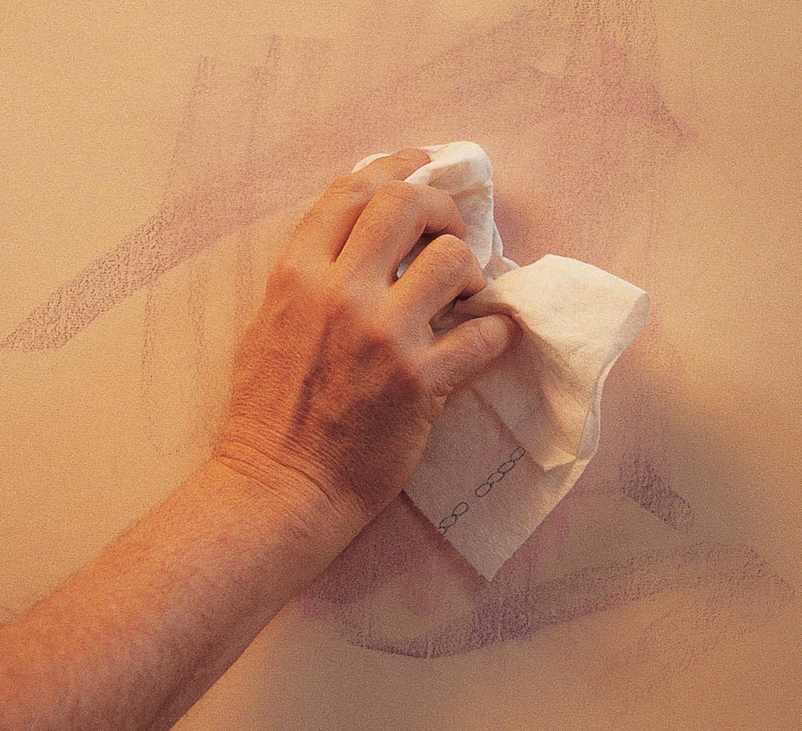
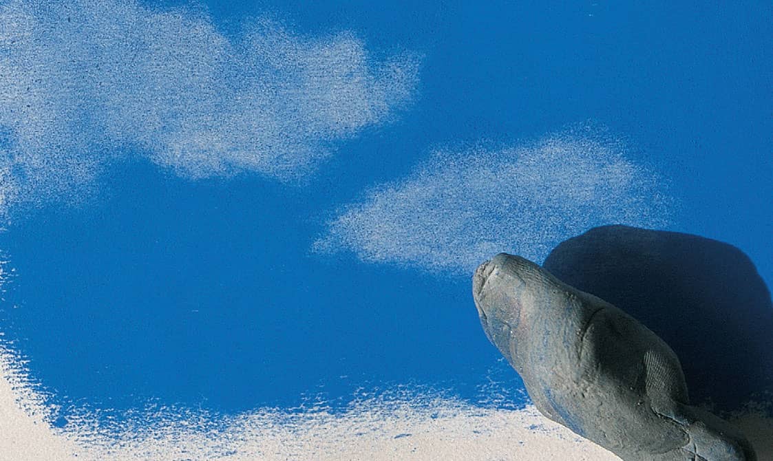
USING A CLOTH For a large background, it is sometimes helpful to use a cloth or a paper towel to blend the colors. To lighten an area, remove the powdery excess pastel by wiping it off with a soft paper towel.
Masking
The dusty nature of pastel makes it difficult to create clean, hard edges; but employing a simple masking technique is a great way to produce sharp edges. To mask, use a piece of paper or tape to create a straight edge, or create a clean-edged shape with a special mask you make yourself. Of course, you would use tape only to save the white of the paper; never apply it to a support that already has pigment on it.
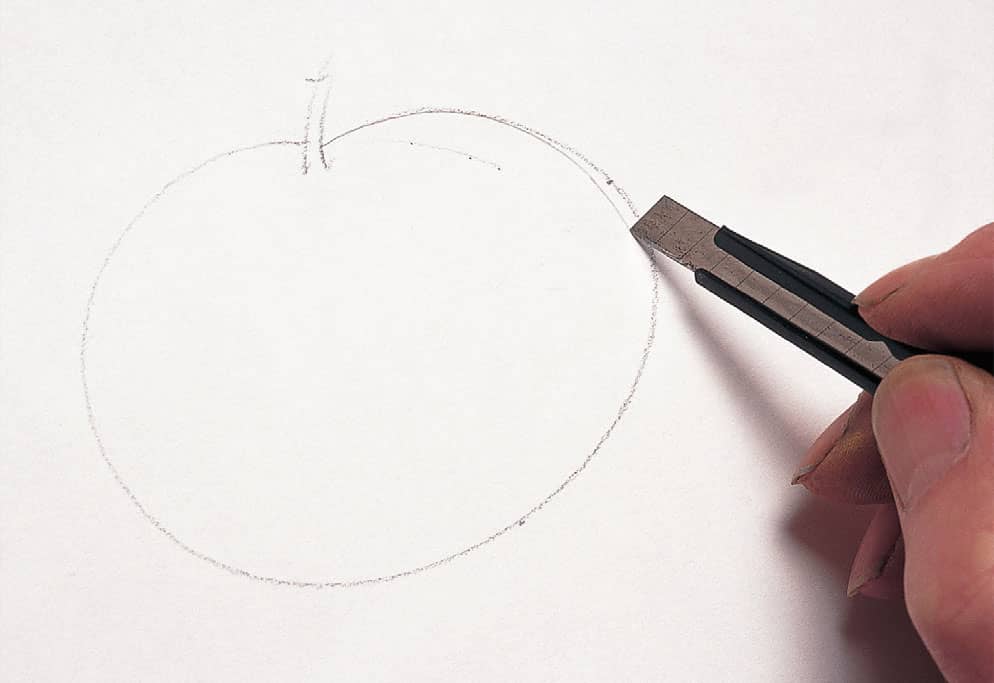
CUTTING THE SHAPE Begin by drawing the shape on a piece of tracing paper and cutting it out.
APPLYING THE COLOR After painting the background, place the mask on top and apply color.
REMOVING THE MASK Carefully peel away the mask to reveal the crisp shape underneath.
Using a Combination of Techniques
These techniques are useful in and of themselves, but you won’t truly understand the effects you can achieve until you apply them to an actual subject. Here you can see how the same subject is rendered using three different methods; notice the different look of each.
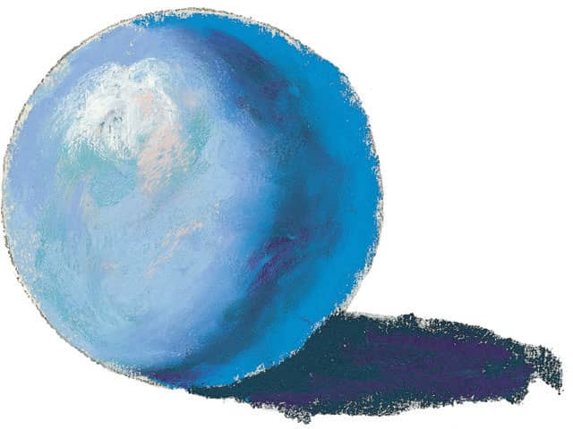
BLENDING Here the colors are applied thickly and smoothly. The even layers of color create the appearance of a slick, smooth object.
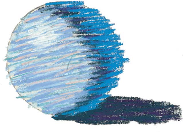
LINEAR STROKES Linear strokes are layered over one another to create a more textured appearance. From a distance, the colors still appear to blend together.
POINTILLISM Pointillism is used to create the form of the sphere. Although the same colors are used, the surface of the object appears much rougher.
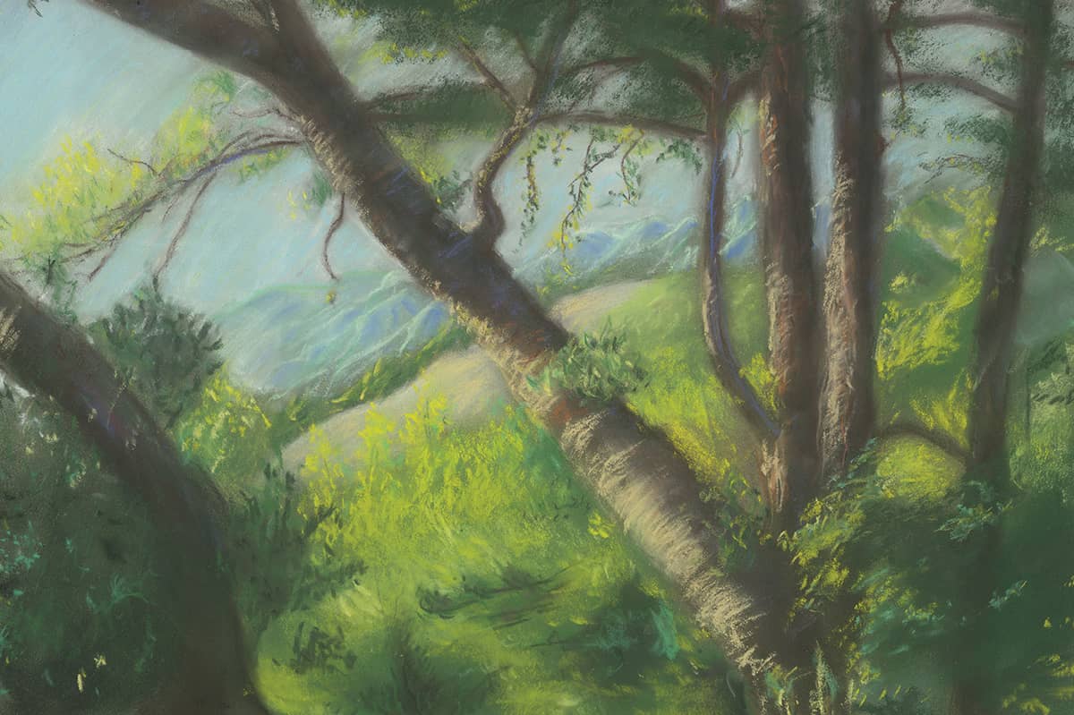
Pastel Pencil Demonstration
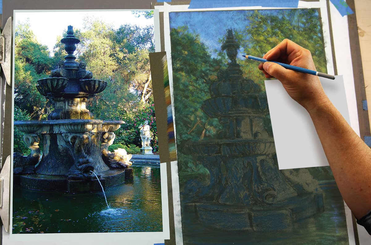
This demonstration uses a reference photo taken at the Huntington Museum and Gardens in San Marino, California. Similar to colored pencil application, after an initial block-in of dark values/colors, start with middle values and work up to darker colors, saving the lightest and brightest colors for the end. Other than the initial underpainting, only blend with strokes of the tip or the side of the pencil, one color against or over another.
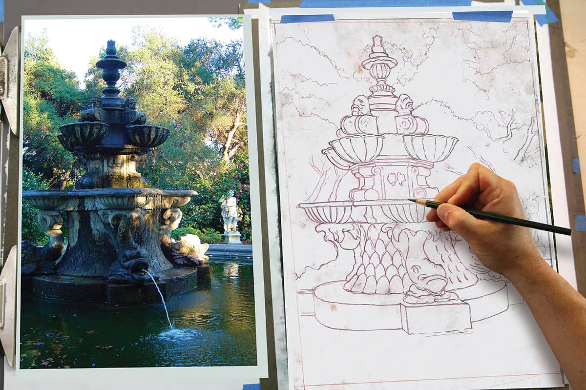
STEP 1 Transfer the drawing onto a sheet of dark green, sanded pastel paper. To transfer, rub a dark pastel stick on the back of the drawing, tape it upright onto the pastel paper, and redraw the image.
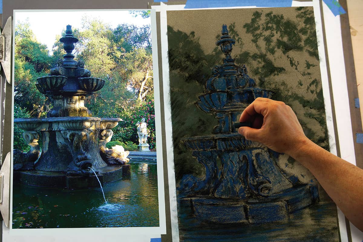
STEP 2 In the initial pastel application, use a large stick of soft pastel to create the dark shadow areas in the trees and on the fountain. Use large strokes of dark blue and black for the fountain and dark green in the trees.
STEP 3 Use a clean stump to blend and work these dark colors into the surface of the paper. Then spray several light coats of workable fixative over the surface to really adhere the dark colors into the paper. You want successive layers of lighter and brighter colors to stay clean and avoid muddy blending from the undercolor.
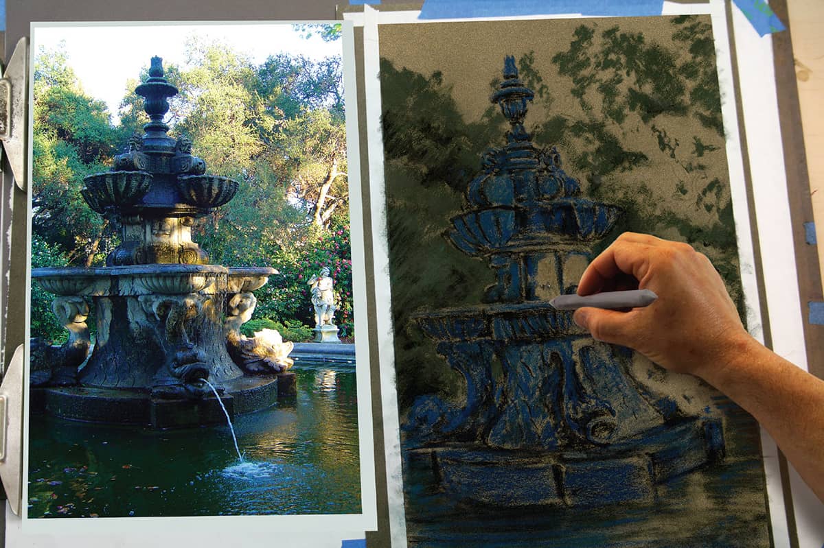
STEP 4 Generally work from top to bottom in order to avoid smearing any of the color. Try keeping a piece of paper under your hand while working. Build up initial layers of color in the trees and sky with strokes of color from pastel pencils. The only blending of color from this point on will come from pencil strokes, not from a finger or stump.
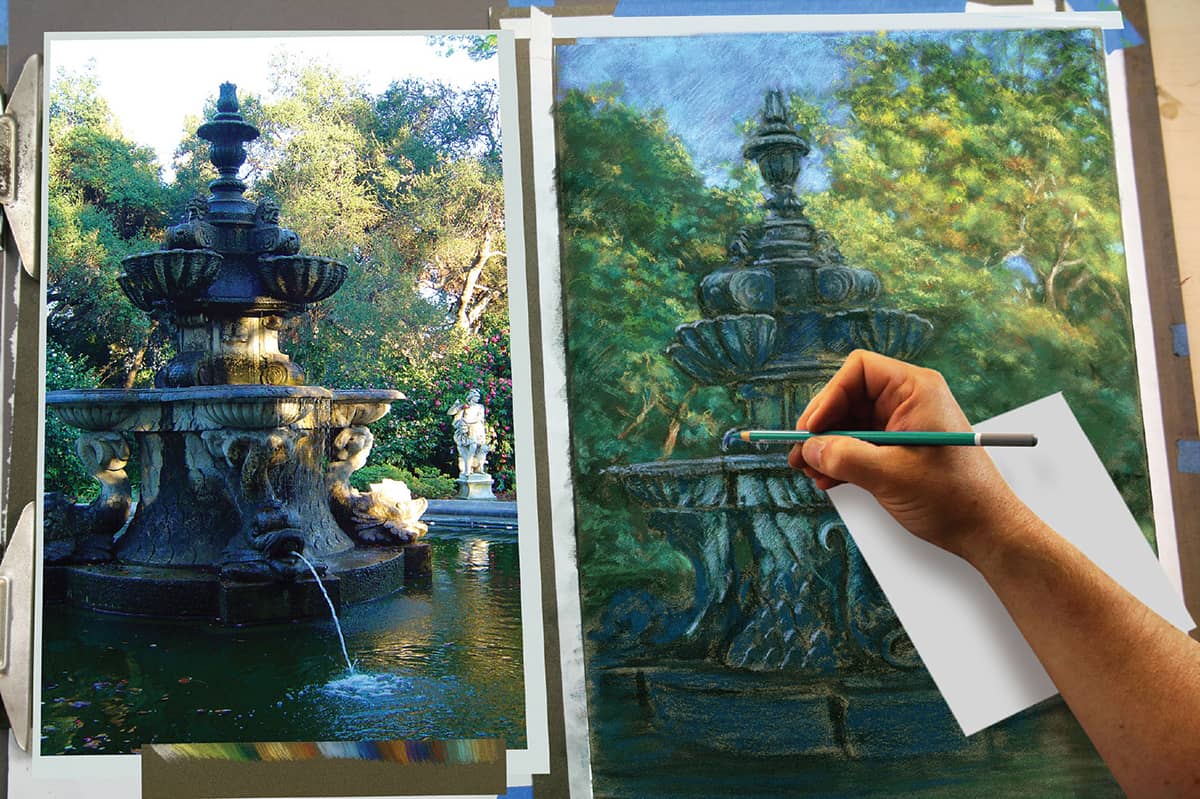
STEP 5 Working down the drawing, add brighter colors to the shadowed areas of the fountain. Use 6 to 8 different colors of greens, blues, and browns in these shadows alone!
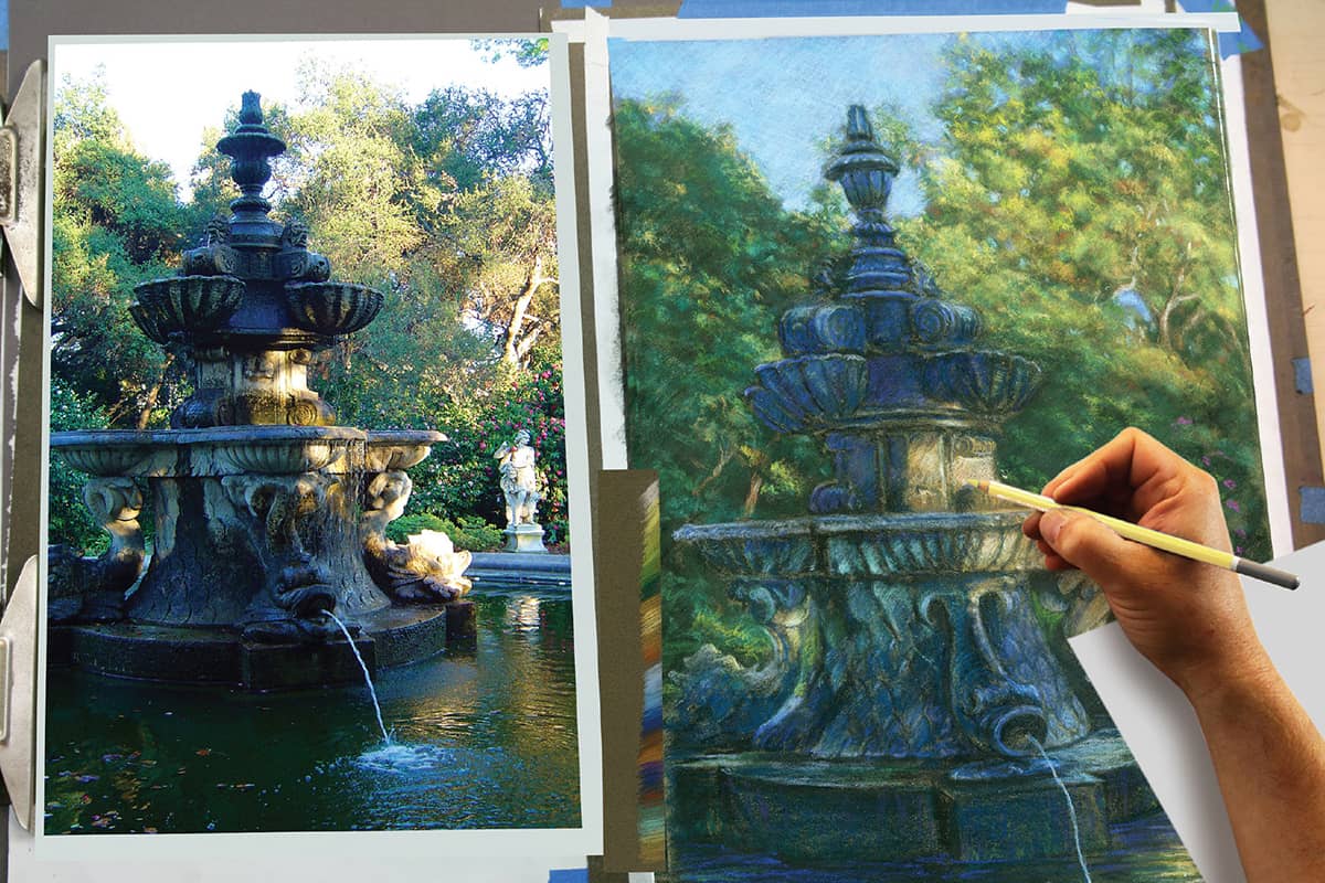
STEP 6 After establishing the values of most of the shadows on the fountain, you can more clearly judge how bright, or how subtle, the sunlight should be.
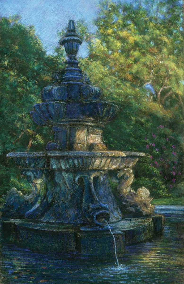
The final pastel drawing. Time: 8 hours.
Pastel Stick Demonstration
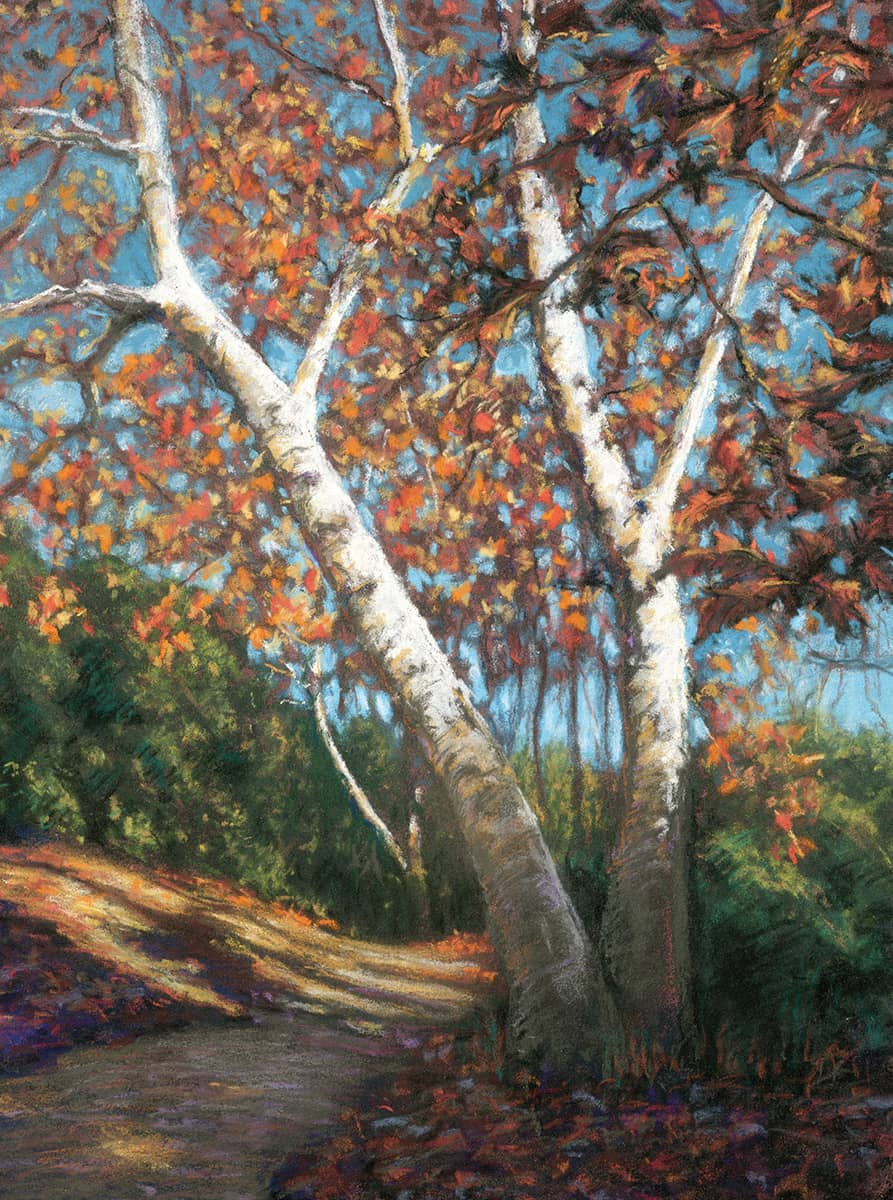
This idyllic autumn scene is influenced by the work of California Impressionists, both contemporary and past artists, and students should enjoy this joyful, artistic impulse to colorfully and creatively capture the color in the world around them. Even though this demonstration is not a true “plein-air” work created outdoors, it should have that same spontaneous feel.
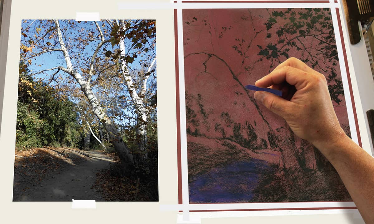
STEP 1 After using a grid to create the line drawing, transfer it onto medium-gray, sanded pastel paper. Drag a stick of red pastel lightly across the paper’s rough surface for tone and apply several coats of workable fixative to adhere the color. On top of the red background, add dark colors of blue violet and black to shadow areas.
STEP 2 Blend the dark colors into the paper with a large stump and apply several more light coats of workable fixative to seal them into the paper surface. Establishing the value and color of the sky is an important element in any landscape drawing or painting, as a daytime sky is usually the brightest value. You will eventually use three different blue pastels in the sky, from lightest near the horizon to a middle-value at the top.
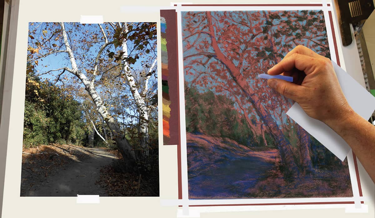
STEP 3 Once the sky and background trees are blocked in, start to develop the sunlit areas on the path and around the two foreground trees. The process for pastel color application is different than with colored pencil. In this case, start with the darkest color in any particular area and work up to the lightest colors at the end. Here finish the sunlit area with bright cream.
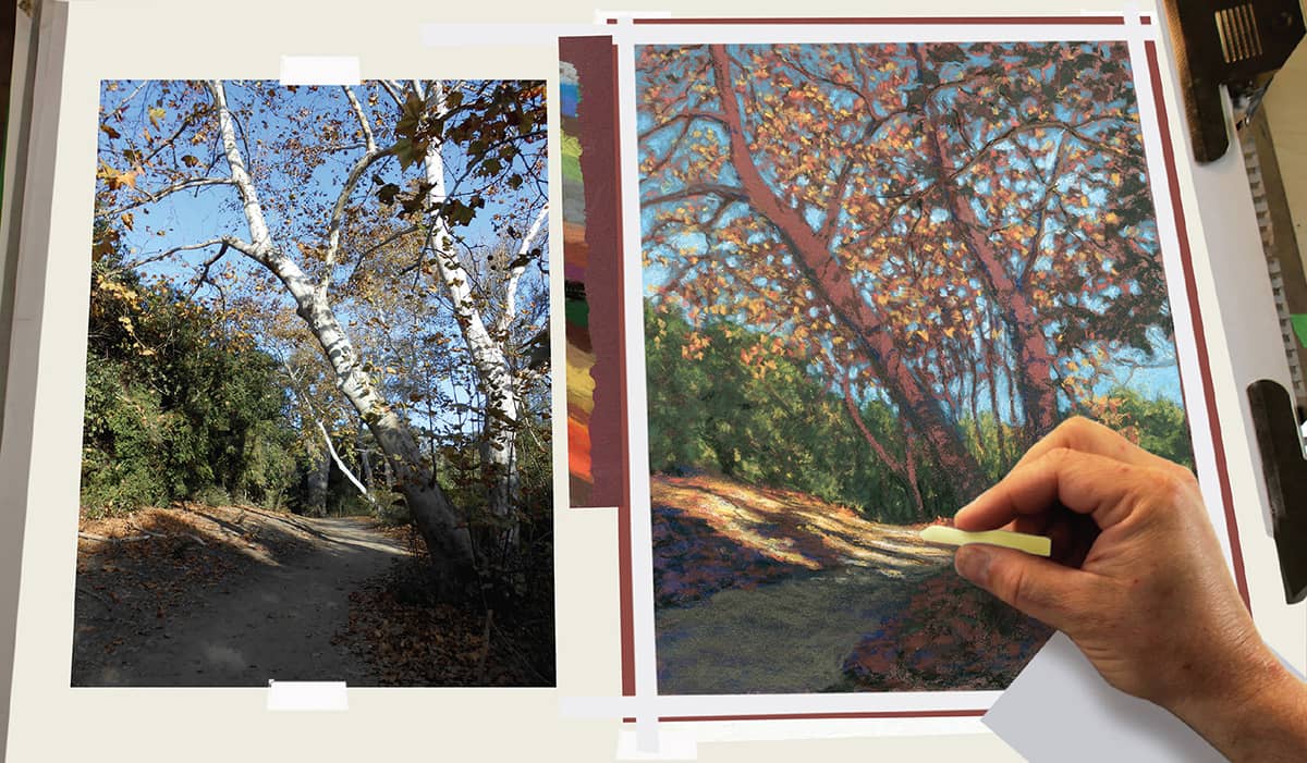
STEP 4 The main focus for this drawing is the bright trunks of the sycamore trees. Save these for last so you can best judge the colors and values in both the sunlit and shadowed areas. In the shadows, add subtle violets and warm neutral colors over the dark values beneath.
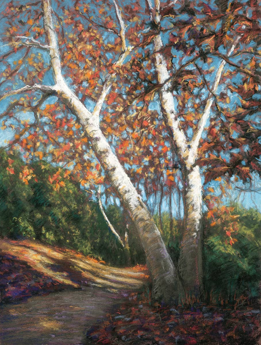
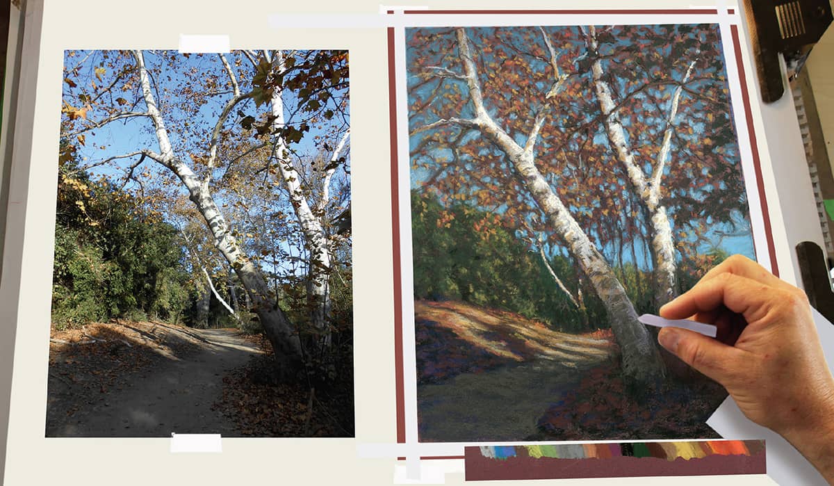
The finished pastel drawing, “El Dorado.” Time: 8 hours.
YOUR HOMEWORK
Using any landscape or floral photograph, create a contour drawing, and transfer the drawing to quality toned art paper—preferably one designed specifically for pastel. Then experiment with the techniques demonstrated in this chapter for pastel sticks and pencils. Work in the size range of 14" × 17" to 16" × 20" for your final drawing.
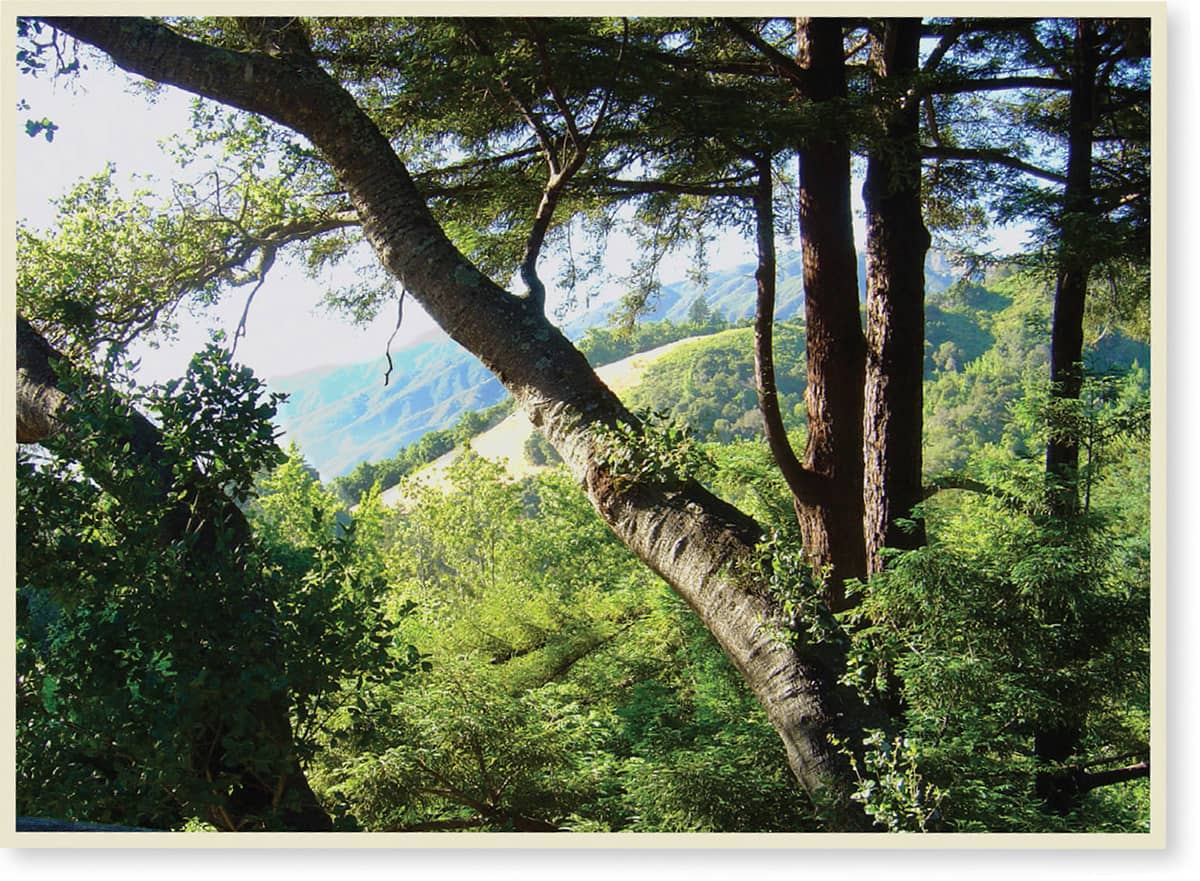
Photo reference and pastel drawing by student Huy Huynh. Time: 8 hours.
EXERCISES FOR PRACTICE
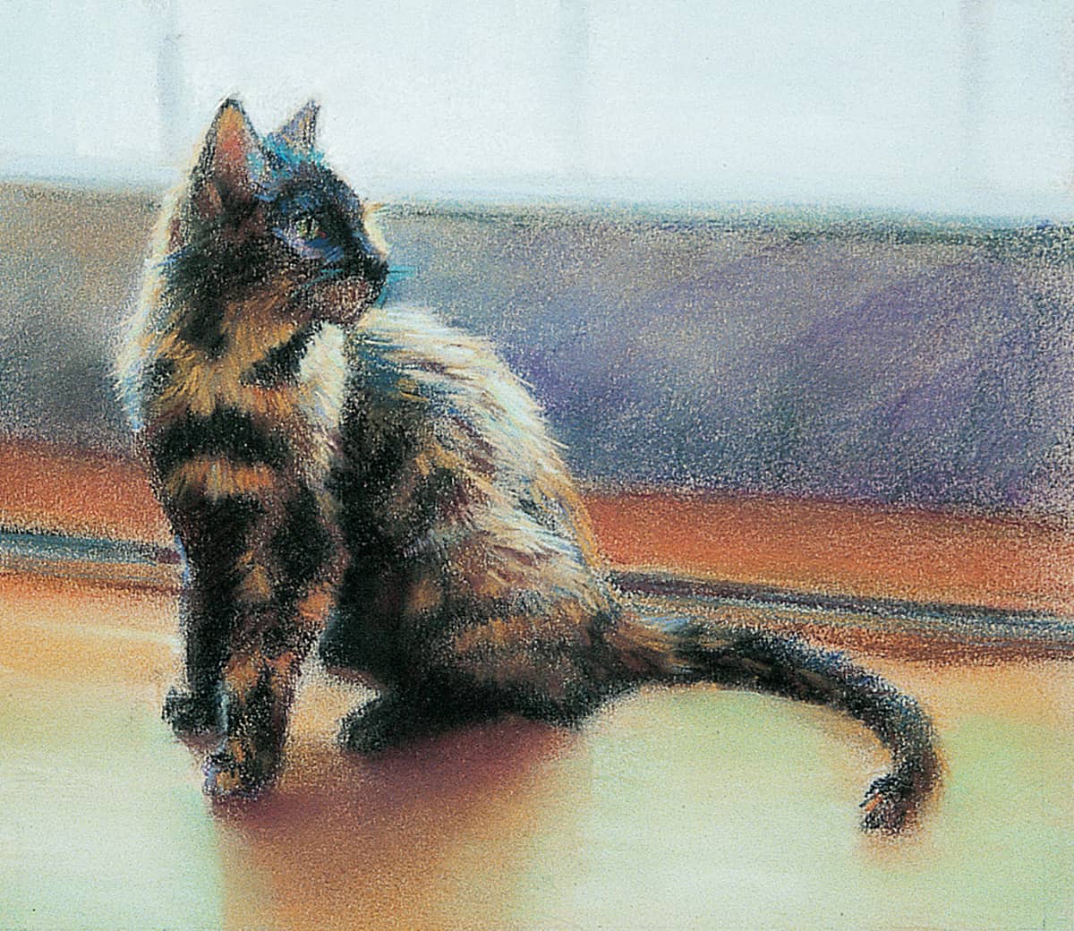
Painting animals is like painting anything else—you simply need to see shapes of color and put them in the correct place on paper. But when painting animals, you also want to capture the unique qualities of your subject, such as the animal’s skin or hair texture and its features and body type. Consult books or magazines for appealing photographs, or take pictures of your pet. Look for subtle types of movement, like the twist of the body or the direction of a gaze.
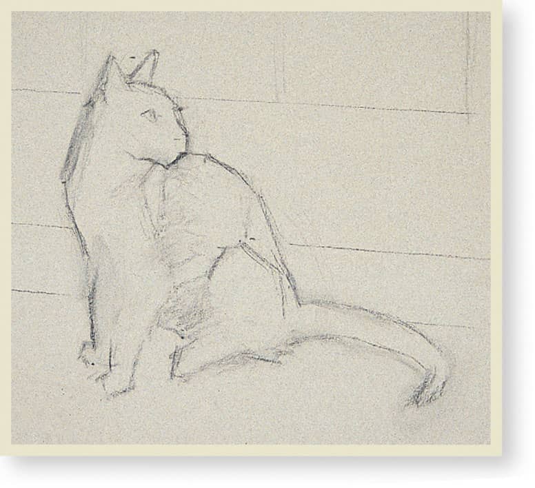
THE SKETCH The design of this painting is simple: The cat is silhouetted against the light of a patio door. Begin by drawing the main shapes, roughing in the outlines and sketching the lines of the glass and wood door. This pose shows movement even though the cat is sitting still.
STEP 1 First establish the light area of the window with cobalt blue; then mix black with denatured alcohol, and paint the darks in the fur with a brush. In order to blend the softness of the cat’s fur into the surroundings, paint the background first. Render the wall with blue-gray and gold ochre, blending them with your hand. Then use burnt sienna and chrome green for the molding. The basic tone of the floor is gold ochre. Next block in the shadow of the cat on the floor with light English red, carmine brown, and burnt sienna.
STEP 2 Lighten the floor with phthalo green, red-violet deep, and phthalo blue to show the reflected light from the door. Lighten the value on the window with permanent rose and use carmine for the dark of the molding. Next use a well-blended mix of carmine brown and bistre for the lighter colors in the fur and black for the deepest shadows in the fur.
STEP 3 Next use raw sienna to paint the shadows in the lighter areas of fur, making unblended strokes that follow the direction of the fur growth. For the eye, paint the pupil black; then draw around it with chrome green grayed with scarlet (its complement), touching lightly with my finger. Next use caput mortuum red for the warm color in the ear, and use gold ochre and yellow ochre for the highlighted fur.
STEP 4 Lighten the window with viridian green and darken the wall with purple and blue-gray. Then add vermilion and olive green to the molding. For the dark accents in the shadowed fur, add unblended strokes of carmine brown and bistre. Next add more detail with English red. Indicate the reflected light on the muzzle with cobalt blue and use scarlet for the light shining through the ear. Then add a little crimson to add depth to the corner of the eye.
STEP 5 Shorten the muzzle, using Mars violet to paint the background into the nose a bit to define its shape. Then go over the dark patches of fur with black, particularly in the tail. Use light English red and cobalt blue for details in the light areas, and add thin strokes of cobalt blue that trail off into the background to create the illusion of backlit fur. Then paint into the edge of the tail with the floor color (gold ochre and phthalo green).
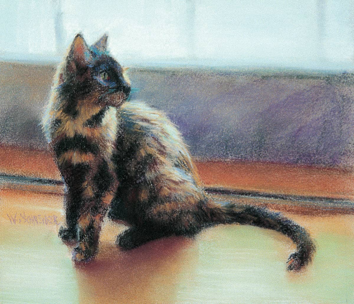
STEP 6 To complete the painting, lighten the window with white to create more contrast and make it appear as if the light were shining through it. Then add a little phthalo blue to the sunlit areas of the floor, and highlight the fur with yellow ochre and phthalo blue.
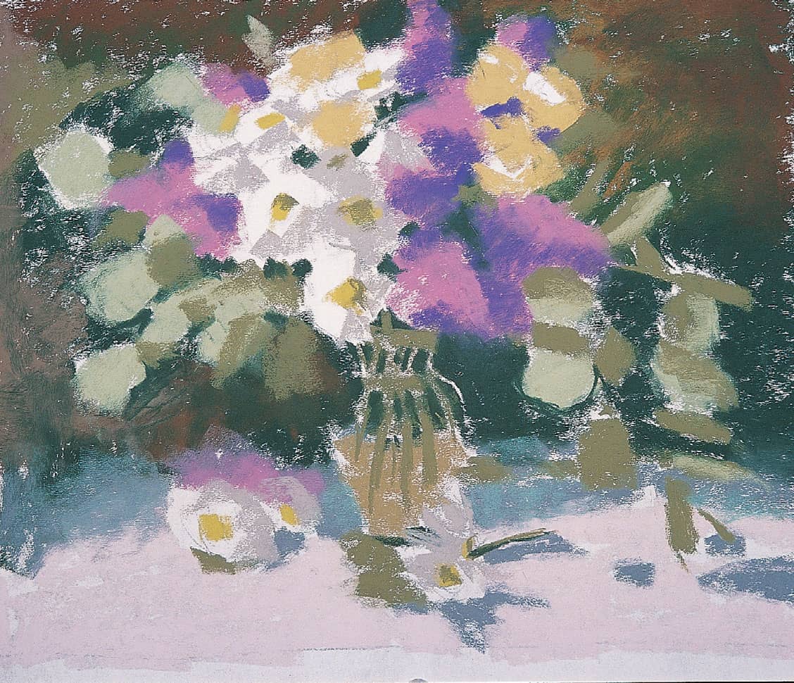
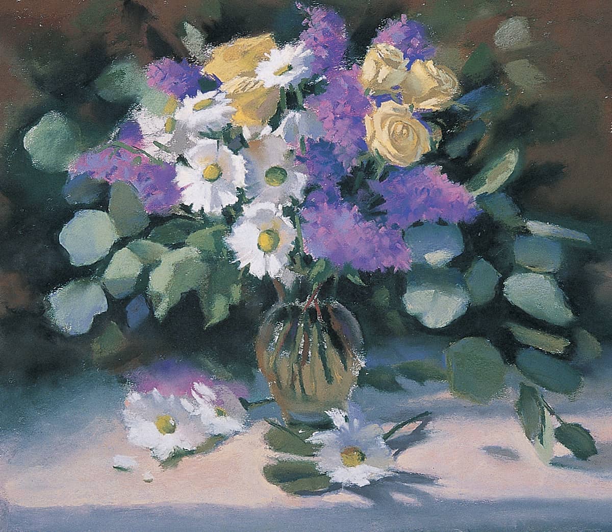
Flowers are timeless and attractive subjects for a painting a variety of shapes, colors, and textures. Rendering a floral bouquet gives you the chance to combine various types of flowers and foliage. Although it’s probably more convenient to paint from photos, It’s best to paint floral bouquets from life. That way, you can play around with different arrangements before settling on the one you like best. When setting up a bouquet, try to create a well-balanced color scheme; this painting features flowers with complementary colors: purple lilacs and yellow roses.
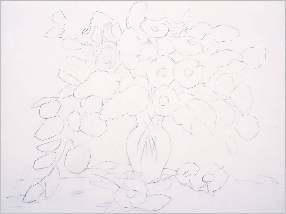
STEP 1 For this piece, choose a piece of white sanded pastel paper that will allow me to see my detailed drawing more clearly. First create a careful line drawing of the basic shapes with a light gray pastel pencil. Concentrate on the largest flower shapes and think of the daisies as concave disks, facing some toward the light and placing others in shadow.
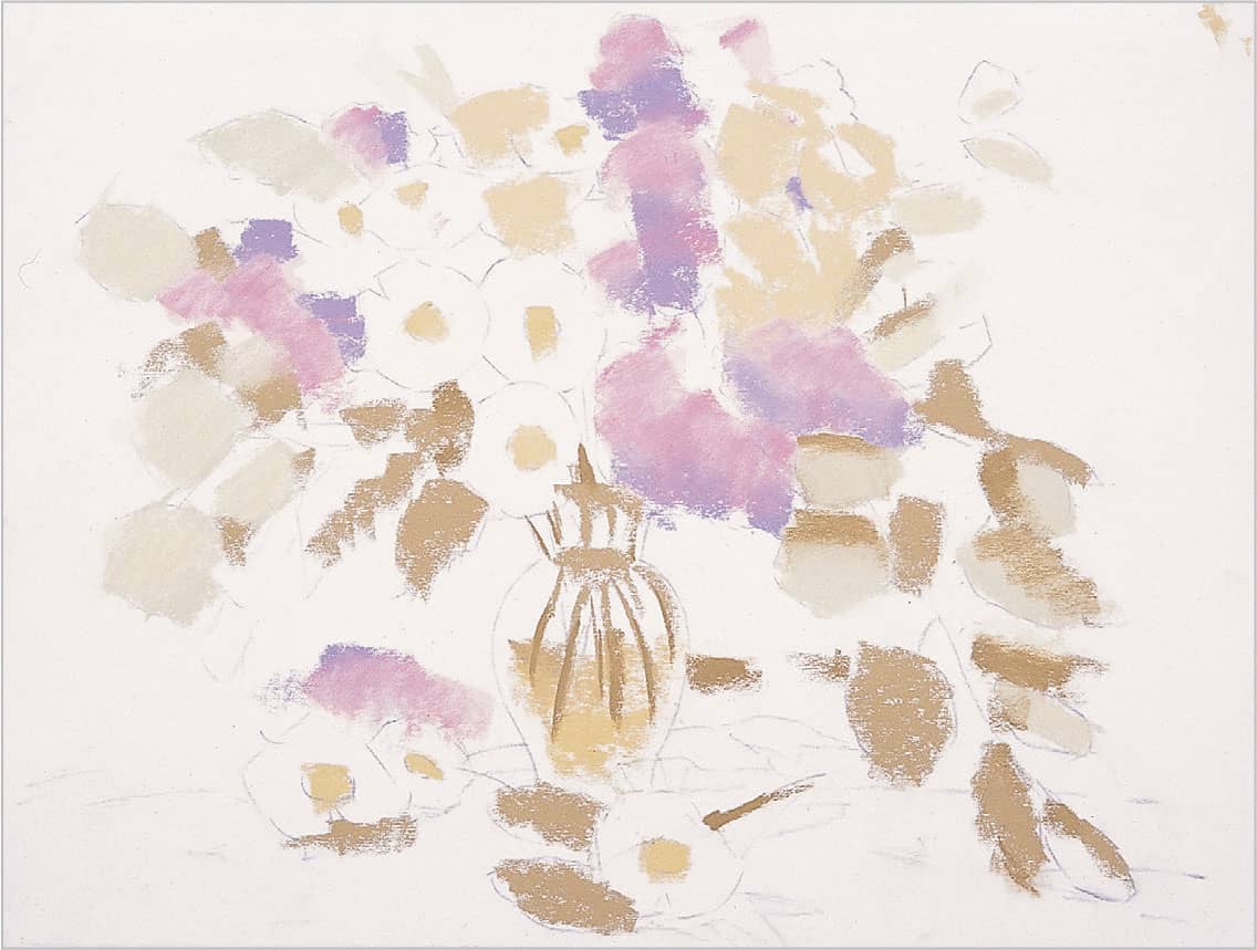
STEP 2 Use a lilac hard pastel for the middle tones of the lilacs and a hyacinth violet hard pastel for the darks. Then block in the roses with a light ochre hard pastel, using medium pressure. Use fern green for the eucalyptus leaves in the light and palm green for those in shadow. Place the shadows on the daisies with warm light gray, but leave the white of the paper showing for the light areas. The centers of the daisies are the same light ochre used for the roses.
STEP 3 Next block in the background with spruce blue, burnt umber, cold medium gray, and palm green. Then rough in the foreground with shell pink. Use neutral gray green inside the vase and palm green for the stems in the vase. Let some paper show through around the edge of the vase where the glass is the thickest, letting the white paper act as the highlight.
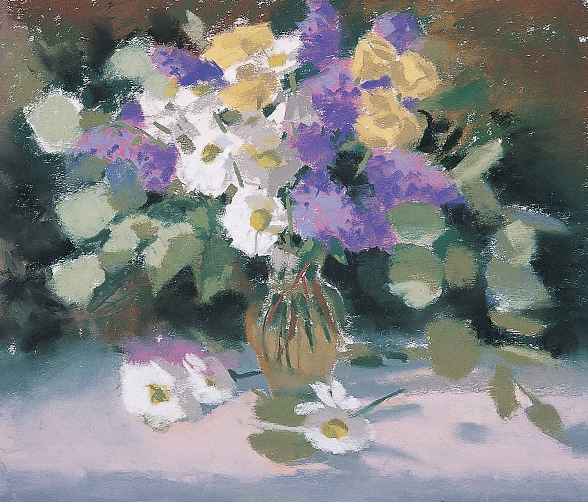
STEP 4 Next use spruce blue to draw the contours around the leaf shapes and “cut” into the lighter values to define them. Create some texture in the lilacs by using the square end of a blue-violet hard pastel to render the petals. Then add a layer of light blue in the same manner. Create shadows in the roses with gray phthalo blue-green, and add the edge of the table with cold medium gray. Then create some stems throughout the arrangement with palm green, adding more in the vase with rust.
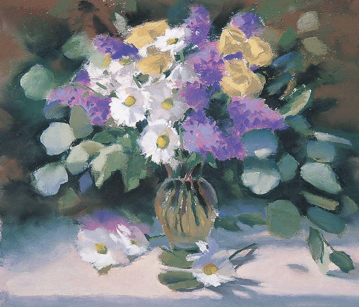
STEP 5 Blend in some Van Dyke brown on the right side of the vase to soften it and add some black to the background. Continue to refine the shapes of the leaves, and add some more leaves with light blue and light gray-green. Then focus on the daisies; try to capture each flower without using too much detail, keeping strokes loose. Add peach to the shadowed sides of the daisies, and then add a little white to the light sides, beginning to cover the paper.
STEP 6 Each flower has a light side, a shadowed side, a core shadow, and reflected light. In some instances this is more obvious than in others. To define the roses, use yellow ochre light to cut into the shapes, and use light gray-green to depict the reflected light on them. Then start to give the lilacs more texture, using the same colors as before but pressing harder and using a variety of strokes to shape them.
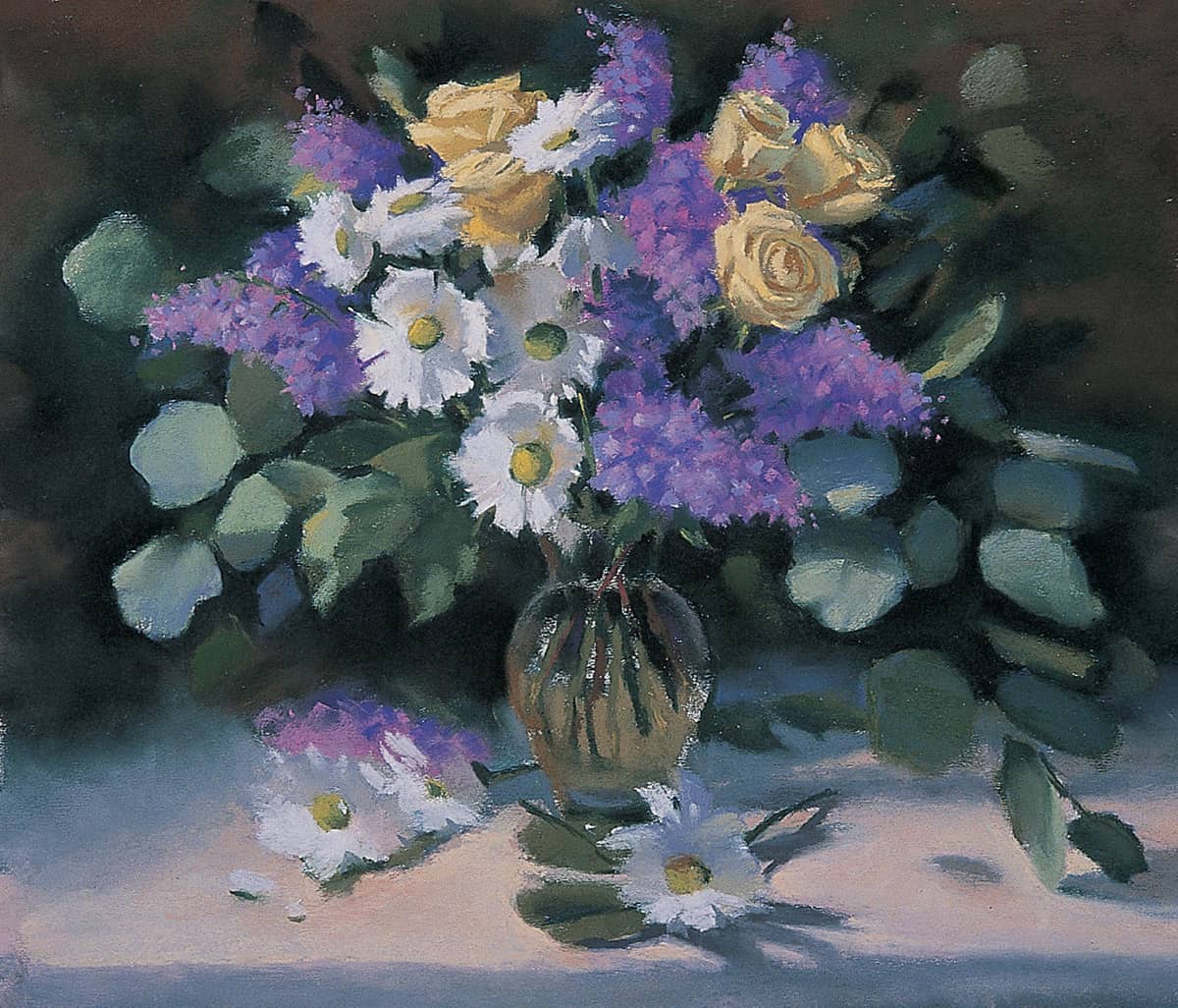
STEP 7 Next add warm ochre to the inside of the roses and continue to define the leaves and flower shapes. Add more texture to the lilacs, making the lilac on the table a little more solid by creating a dramatic contrast between the light and shadow.
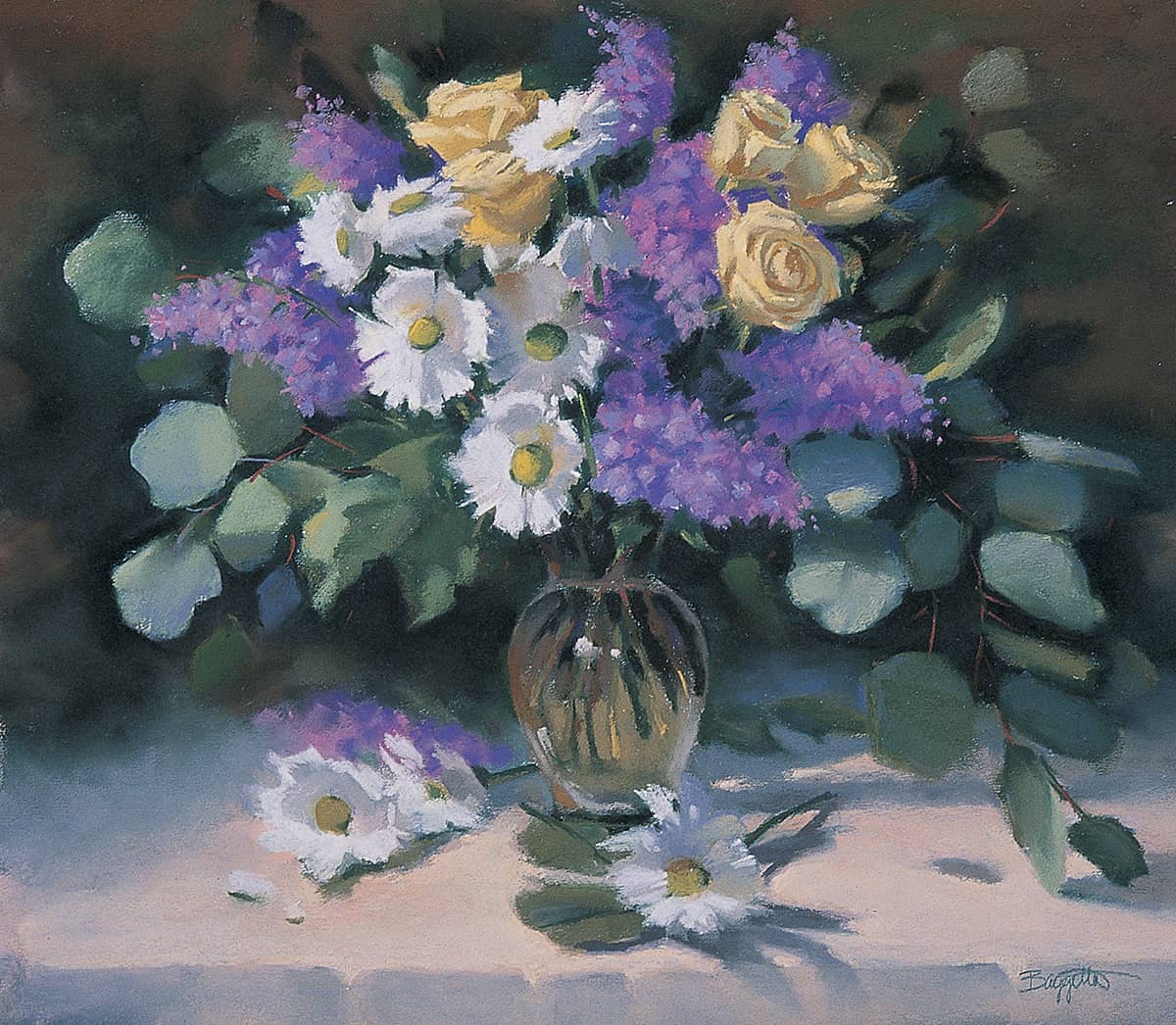
STEP 8 In this final stage, add some wispy branches on the eucalyptus with a sharpened rust pastel. Also add Van Dyke brown and cool gray to the vase, blending it smoothly with my finger.
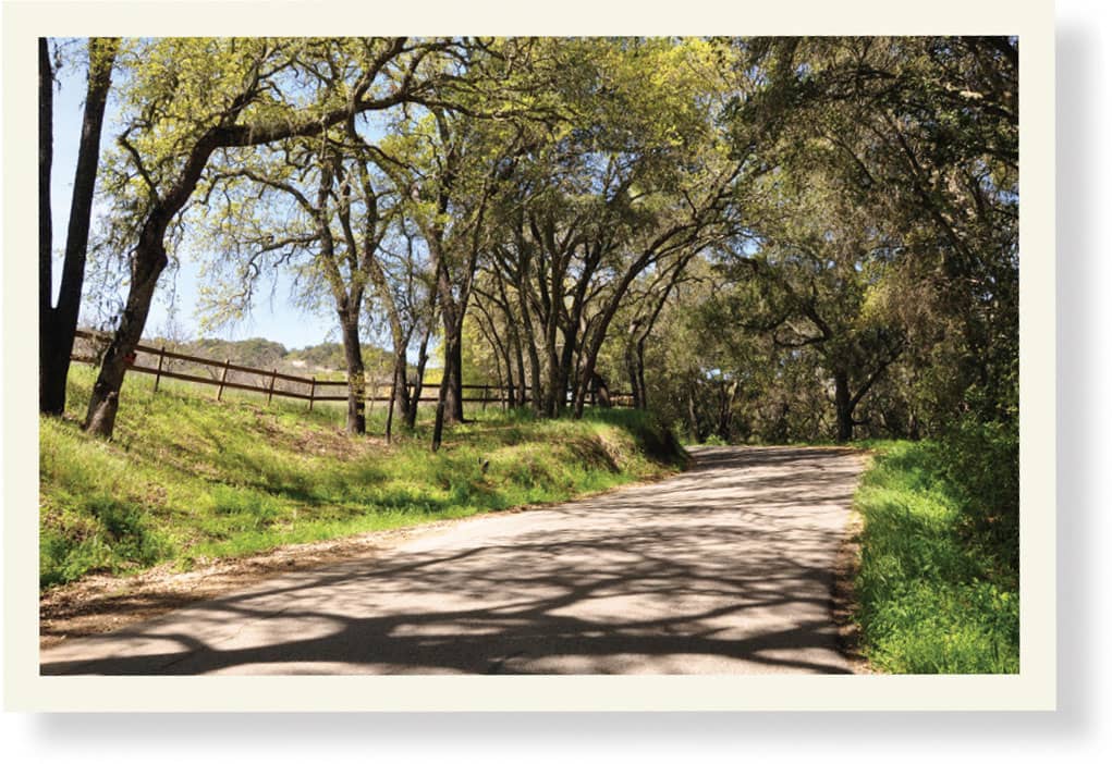
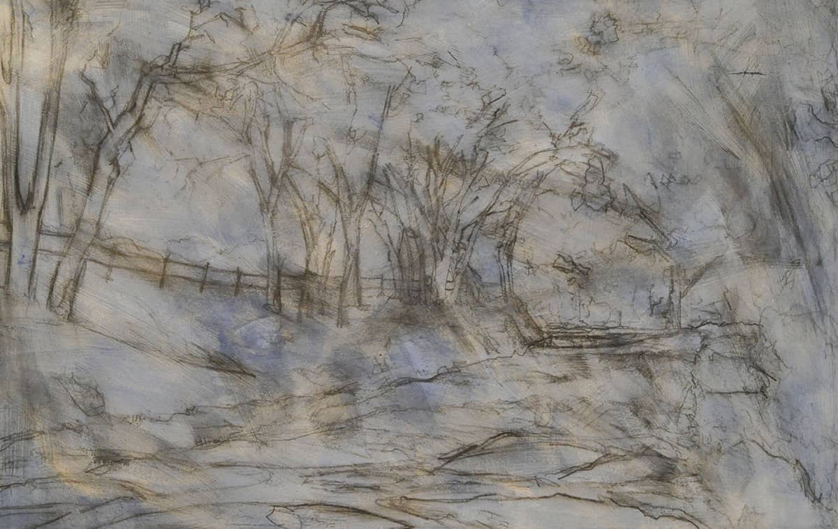
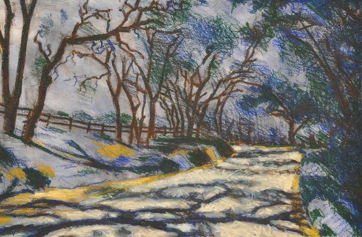
This wooded road, laced with shadow, provides an excellent opportunity to study the contrast between cool shadow and warm light. The project also allows the artist to capture and interpret light using impressionistic techniques.
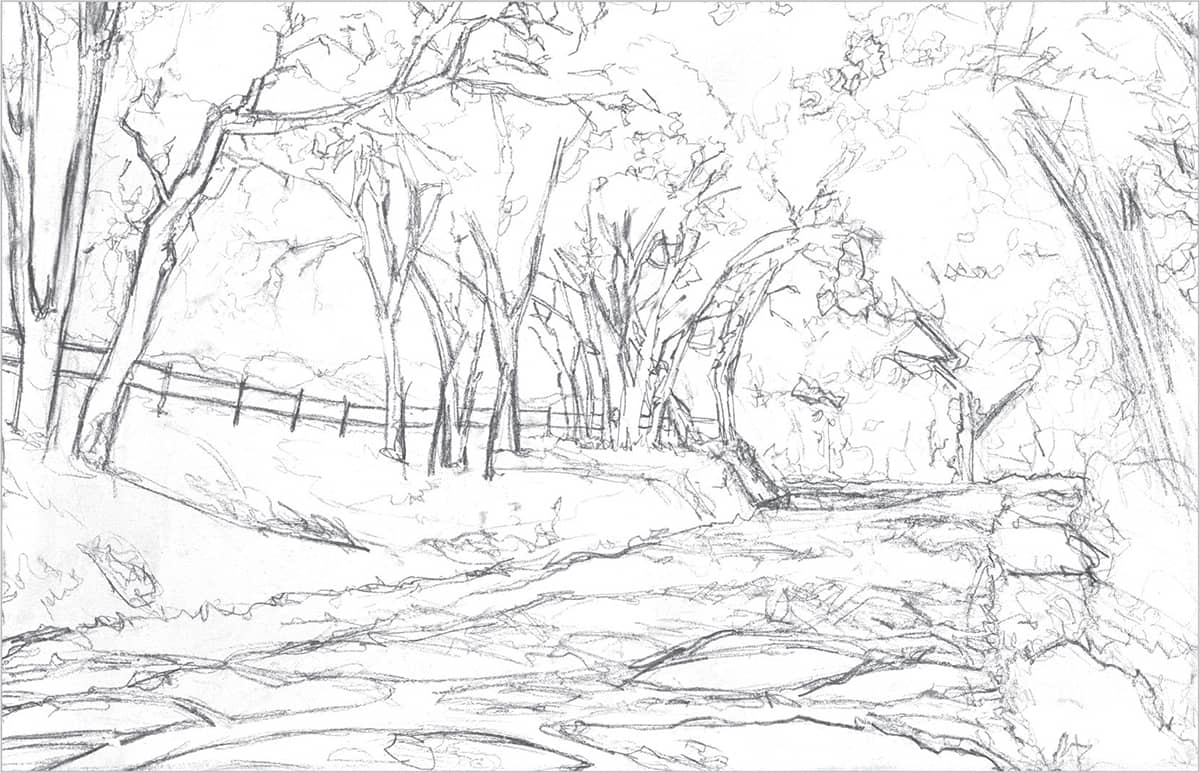
STEP 1 First, establish an expressive and gestural drawing. To achieve this, begin by separating the major shapes of light and dark, figure, and ground. Variation in line weight is extremely important at this point.
STEP 2 Next, paint a transparent layer over the drawing, using matte medium and ultramarine blue acrylic paint. This process seals the drawing, tones the image, and unifies the colors. Ultramarine blue is a good color to use for landscapes as a base.
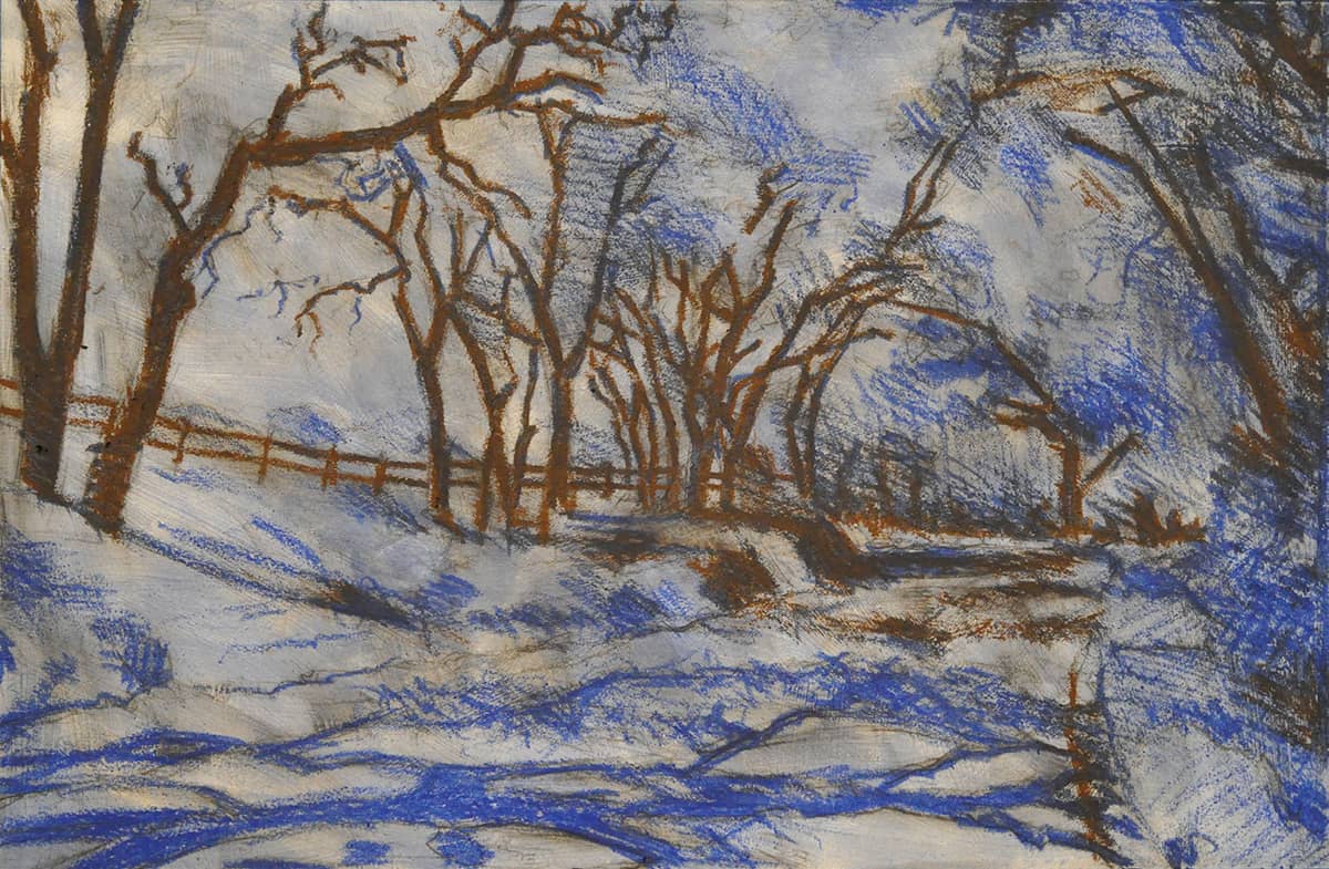
STEP 3 Draw in the darkest darks with Van Dyke brown. Begin to separate the shadow shapes using ultramarine blue. Then layer ultramarine blue on top of the Van Dyke brown to create a darker color. Use a variety of marks, crosshatching, and gestural movements, always maintaining variation in line weight. At this point, the only oil pastel used on the foreground shadow shapes is ultramarine blue. Keep the shadows cool—that way, when later blocking in the light sections, they will be warm.
STEP 4 With Prussian blue, keep working the darks and shadow shapes. As needed, go back in with Van Dyke brown to correct and darken. Continue working the overall shadow shapes in the trees and on the ground, correcting the drawing as needed.
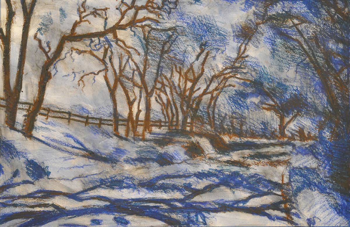
STEP 5 Using gray, begin to block in the light sections of the road. Then layer with white to brighten the lightest lights in the street. If necessary, blend slightly and remove excess oil pastel with your finger. After finishing the white in the road, begin working on the shoulder of the road. Here use yellow ochre as a base, adding white over that.
STEP 6 In this step, adjust the foreground branch shadows, making them a bit darker with Van Dyke brown. Then, using deep green, layer the darks in the trees, ground, mountains, and everywhere as needed. Continue to employ crosshatching and variation in line weight by alternately pushing harder, then softer, when making marks.
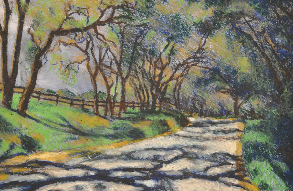
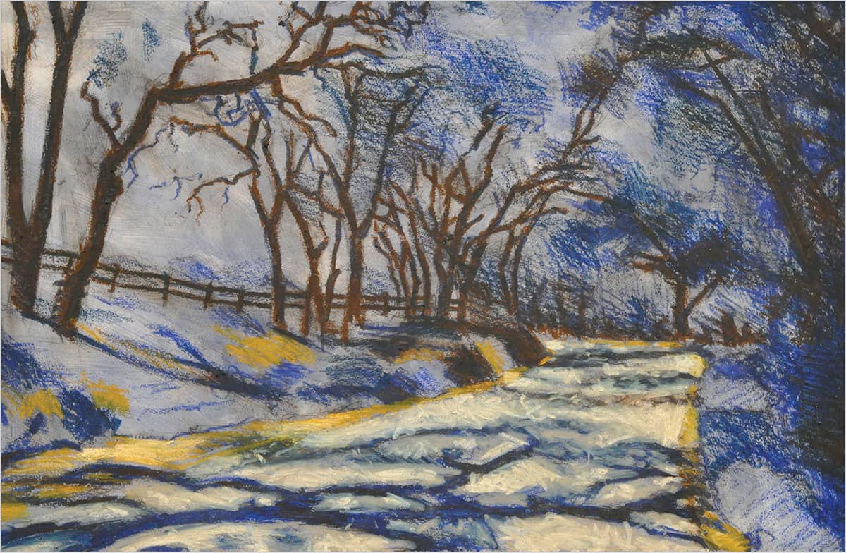
STEP 7 Next add olive brown throughout the piece and start to work your way toward the lights. This creates a transition between tones and is used for the dead branches and dry grass. Then add yellow green in the grass, layering it to saturate the color. Finally, move into the trees using a gestural stroke that mimics trees and branches.

STEP 8 Continue working the trees with green gray, yellow ochre, and lemon yellow. Then follow the light pattern and scratch away mistakes. At this point, press hard to layer the oil pastel. Next, using a palette knife, begin to scrape away the oil pastel in the sky shapes in the trees. Then use pale blue to block in the sky shapes. It is important to remember that the blue is darker at the top of the image and gets lighter as it approaches the horizon line. To accomplish this, apply white at the horizon line and transition to the pale blue. Then correct the sky shapes using yellow green.
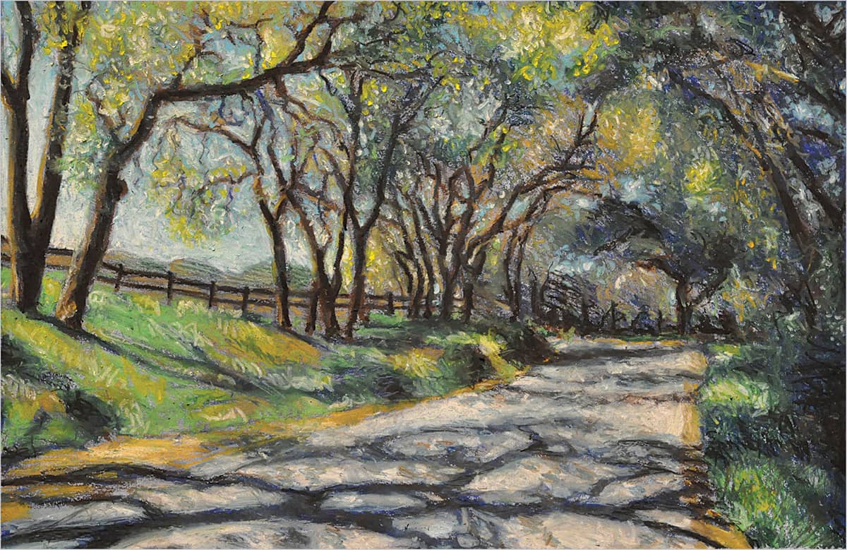
STEP 9 For the final step, use white and lightly go over the background hills for more atmospheric perspective. Then, with the palette knife, scrape away oil pastel to increase the lights with yellow, yellow ochre, pale blue, and white. Make these marks by jabbing and pushing to create stippling, dots of light. Then clean up the tree darks with Prussian blue. Soften and work the shadow shapes in the grass to make them more irregular. With Prussian blue and Van Dyke brown, soften the dappled light on the road. Use your finger to blend and soften edges, then use white to increase lights. Finally, use black to solidify the darkest darks.