COMPOSITION
Composition in film is the harmonious combination of shapes and movement within a field that creates an interesting imaginative world for the audience. We want the viewers to forget that it is a movie, an artificial world they are watching. A good story is the most important thing, but it has to be set in a believable world. And it has to fulfill visual dreams that are the same around the globe. The human brain has some basic understanding of the picture it sees, about the arrangement, the size and the balance in it. In film time it is limited. When you look at a painting you can take your time, get lost in the mood and the tiniest details. Our images are visible only for a few seconds, they have to be very precise in their arrangement. Nothing is accidental. We lead the eyes of the audience.
SOME BASIC RULES
The script, the mood and action in your scene as well as what has happened earlier and what will happen in the next scene will give you the keys for your composition.
Hectic and action-driven scenes are treated differently from peaceful, romantic scenes. It is amazing that a slightly tilted camera angle indicates that something disturbing might
happen. This is made even stronger by the positioning of the characters, the use of light in front of dark or vice versa, and during the whole sequence a certain rhythm in editing. Everything has to work together. Composition and color of scenes in a sequence create what the script asks for Pacing and storytelling is also determined by the cutting, and the very well-planned use of different camera angles and the length of the scenes. Action sequences are cut very fast, with scenes sometimes only a few frames long and with a very hectic change of close-ups and wider shots. Longer scenes and slower camera movements are used in slower-paced sequences.
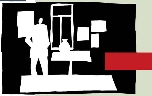
A good composition should have the right selection of order, rhythm and intelligent balance. That balance is between space, the negative area that is all around your objects and defines their shape, and the objects or the positive form that defines the readability of your design.
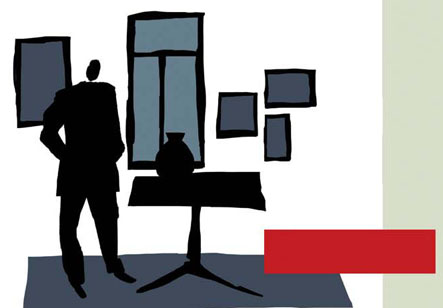
OBJECTS positive shape
Find the harmonious center of your planned picture. Use it as the starting point for the placement of the action and all the necessary information around it.
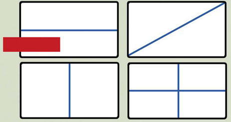
Uninteresting placement of objects concentrated in one area should be avoided, as should placement on one straight line or precisely in the center of your field. You don’t need to show each object at full length; you create more depth by cutting closer, moving them sideways and into the depth of your composition.
More importantly, lead the eye to the center of your “stage” where the action takes place.
try to avoid
DISTRIBUTION OF SPACE
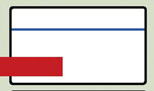
a better choice
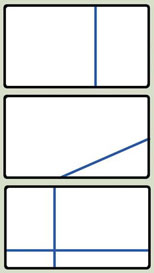
SPACE the negative form around the objects
close-ups — cut off
open space
out of focus foreground
upshots — tilted camera
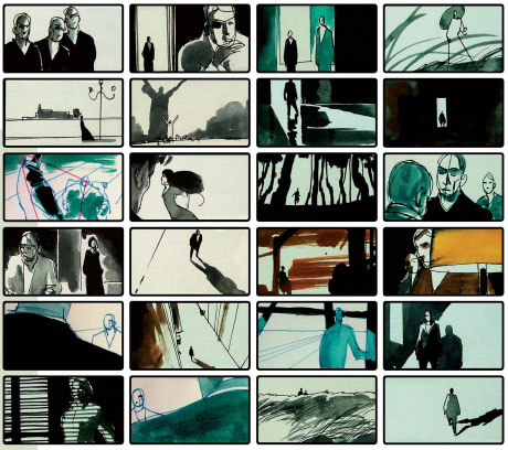
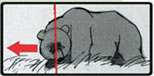
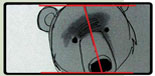
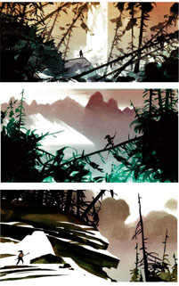
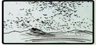
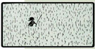
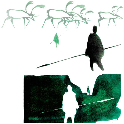
When I started work on Brother Bear, I collected a lot of ideas for image compositions. It became my personal guideline for visualizing a script. There always has to be a reason why you use a certain point of view; nothing is accidental. With the positioning of the camera, we do the first step of a statement. With lots of “air” around the action, we suggest freedom of movement, wide open space — peace. The movement of the character within our frame can say a lot about the mood or the situation. A balanced composition with the main action in the center, or golden section, will indicate a balanced feeling. And all that is only about the distribution of important elements within our picture, and not about color. That’s why I chose only simple black & white roughs. Color will enhance your basic composition in a later step.
The format is a very important factor. In a normal 3:4 format from the old days, the positioning of characters is very different compared to a Cinemascope or
Panavision format. Deciding where to cut to a close-up in these wide formats can be especially tricky. A close-up of a face that is not close enough leaves too much empty space around it. These extreme close-ups were a big problem in the days when the animation still had to be painted on cells. Very often the big empty color areas in between the few lines of a face had their own “animated” life, the color was usually not evenly applied and the image flickered.
Movement within the frame has to be designed very differently in a wide format as well. The camera is panning much more often in a normal 3:4 format, as soon as a character starts to move, the camera has to follow. In the wider formats, the action has more room within the bigger field. But it is difficult here as well to plan the character- and camera-movement. It is following different rules. A too hectic camera movement within a picture that big creates a lot of nervous tension where we don’t really need it. Another big difference is when the camera starts to move. Usually the character movement initiates the moving of the camera as the camera always “follows.” In a normal format, there is not that much room for a character to move, so the camera will follow pretty much at the same time. In wider formats, we can give the character a lot more room along with a more gentle treatment of the camera. And it is easier in these wide formats to really compose a picture, balancing positive and negative space as well as the action.
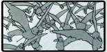
interesting moving patterns
size difference + out of focus
underwater + distortion effect
interesting cutting — extreme close ups…
…to extreme wide
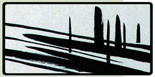
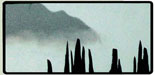
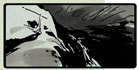
diagonals — shadows/snowpatches/rockshapes
positive/negative
“breaking the rule”
different levels — depth
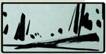
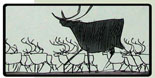
organized chaos

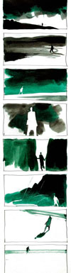
An animated film is a succession of static images that comes to life. Norman McLaren said, “Animation is not the art of drawings that move, but the art of movements that are drawn.”
We have to think about the later result, the moving image, in our planning stage. It is the visual concept that creates a movie, and the rhythm of these visuals creates an interesting film.
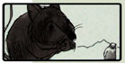
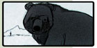
Hundreds of the most beautiful close-ups, one after another, don’t make a good movie. A good film consists of well-planned composition of very differently staged shots, like the ones in thumbnail sketches in this chapter.
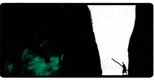
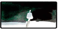
There are visuals that create peaceful emotions. The background composition is balanced. Aggressive moments will show hectic designs and a chaotic and unbalanced composition. Usually the climax of a movie is built by images that create tension. Tilted camera angles, harsh contrasts in light and shadow, a well-planned rhythm of close-ups and wider shots, as well as a disturbing composition of background details lead us there.
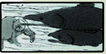
downshots — shadows reveal shapes
framing within the frame
moving in + out of shadow, clear readability
unusual compositions + effects
different moving speed depth
softness
dimensions
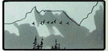
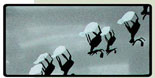
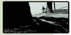
changing horizons epic compositions
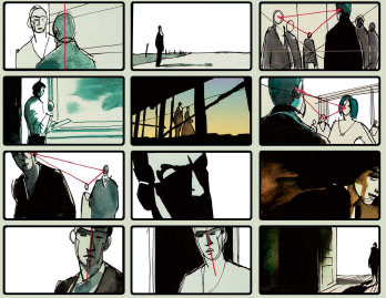
What is it that makes an image? First of all, there is the action, the movement. It is what separates our movie image from a “still” image.
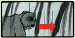
The movement can be that of an object or a character: the hands, face or the whole body. The camera can follow the movements, or the camera can move independently from the character. Among the “horizontal” movements (pans), camera moves from left to right are more accepted. It is our writing and reading direction. Knowing this, the opposite move from right to left can be used more dramatically.
“Vertical” camera moves follow an object up into the air or the other way around. Then we have “diagonal” moves, and also moves into or out of the picture (truck in/out).
Very rare are circular moves around a character or object, such as in Snow White and the Seven Dwarfs in the scene with the queen drinking the magic potion. In that case, background and foreground are moved in opposite directions and the character is animated correspondingly.
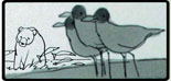
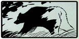
interesting positioning of characters
selective focus + different sizes
moving patterns…
…still patterns
sizes — the other way around
tilted angles — dramatic composition
interesting framing — proportional dark + light
dramatic up …
… down shots
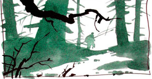
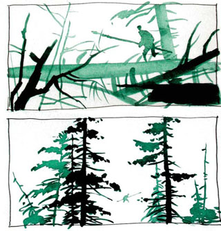
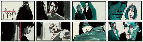
In the background behind our character, we have to deal with several different items: linear elements, shapes and values.
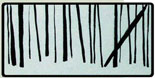
Lines are everywhere, straight and curved, pure lines or lines as part of an object. They have to be treated very carefully, because they can indicate a separation or direction. Tangents must be avoided as well as lines leading the eye into the corners of the image. Parallel lines are dangerous unless they are wanted for design reasons, as are the lines dividing the images into equal parts. A part of the style of Mulan was to avoid straight lines. Sloppier (controlled sloppy) drawn lines look cartoony, while precisely straight lines belong in an architectural design.
The shape is the definition of objects in the background, such as architecture, trees or mountains. We usually arrange overlapping shapes in our composition. It is important to create interesting-looking shapes, which leads us to values. Values define our shapes and their position within the background. During the planning of a scene, we usually work with four to five grey values. They separate the design into the positive and the negative shape, as well as the mid-range values. There will be more about this in a later chapter.
In a planned value scheme, a silhouette can be light in front of dark. All the different elements of our image have to be clearly readable. The design’s composition has to work well within a continuous arrangement of scenes. It has to fit into the puzzle, a piece within a sequence, and several sequences within the movie.
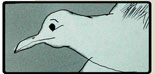
interesting dividing of space
size exaggeration
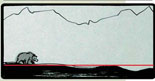
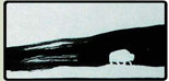
open space
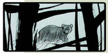
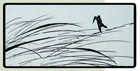
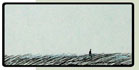
beauty of nature
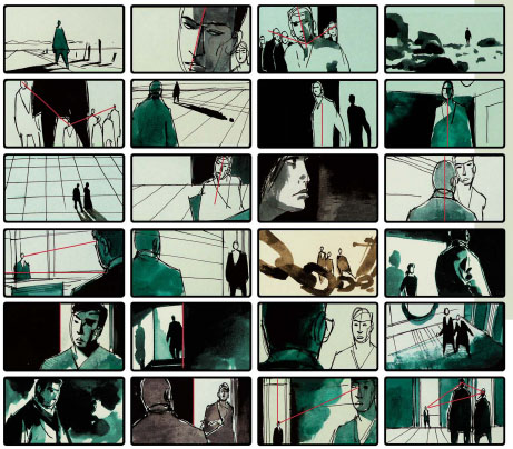
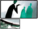
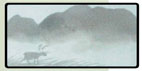
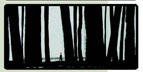
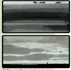
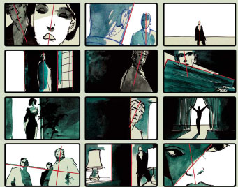
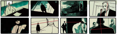
Here are some composition studies based on live-action movies. They show you only a few interesting choices of character and environment combinations within a wide-screen format.
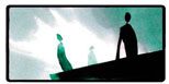
The interaction of characters is always interesting, as is their placement in relation to each other. The characters provide the most interesting way of moving the different puzzle pieces around.
The ingredients and their variation are the key: the depth within your field, created by a combination of foreground and background, use of light and dark contrasts and different focus levels. Then the arrangement of the characters to each
other (in case you have more than one). Use the triangle rule to avoid the uninteresting succession of figures that appear the same size right next to each other. And go for simplicity! I try to avoid detail wherever possible. In our design-planning stage, detail should only be added where it is needed to explain the story. It is interesting to note that if your sketch works without the detailed stuff, the final background should do it as well. I am not talking about texture. When used correctly, texture creates a tone. Flat color areas without a certain amount of texture can be part of a style, but usually the information that texture gives us is necessary to describe materials and creates depth.