
VALUES
The lights and darks of any color are called values. Normally these values are the result of light in nature. Where there is a lot of light, you get the lightest value – white; in the darkest shadow areas you get black. There is of course a scale of mid-values in different shades of grey. We reduce these middle tones to only three. It makes them easier to work with.
There are different ways to arrange scaled value steps in your sketch. Define the foreground, one or two middle ground areas, and then the background. In case you want to arrange the values realistically, your foreground might be the darkest, and your background the lightest tone. But even in nature you will find a situation where the sky is the darkest value and a middle-ground the lightest.
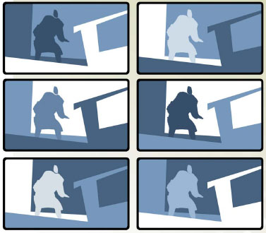
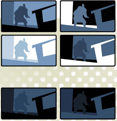
You should know what you want to design without following the rules of nature. To achieve the desired result, a scary moment or a romantic scene, you choose the best arrangement of values.
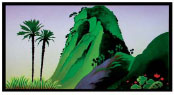
In these simple sketches, I want to show you the different options you have. You choose a combination because it is the best Interpretation of a story situation. And don’t forget, these sketches are not black & white. They define color. Use them as a starting point to determine the atmosphere, and then add the colors following your value range. This makes it much easier to create depth in your design, along with the right mood. And it is better to stage your character that way. You can see in these sketches different ways of making the action read.
COLOR
Henri Matisse said, “When I choose a color it is not because of any scientific theory. It comes from observation, from feeling, from the innermost nature of the experience in question.”
That worked well for Matisse. However, it doesn’t hurt to know a little bit about the scientific background of why to use them, especially when color is such an important part of our business.
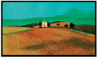
Color should be used to create specific moods. Of course our cultural background plays a significant role in that. Countries closer to the equator are more colorful in all ways than countries in the northern parts. Yet nearly everywhere around the world the same rules can be applied. Certain cool colors calm down the emotions, while hot colors create aggression in emotions. These colors can be used in different combinations to create different atmospheres. Psychologists and interior designers know how to use them together to achieve specific results. History will show you that dictators knew (and know) about the manipulative powers of color.
In the film business, especially in our area of animated films, it is not necessarily a good idea to use color because “it looks so nice!” Of course we could start a discussion about taste, but putting that aside, there are rules that have been created over the past eighty years. And it is best to study these rules so as not to repeat past mistakes.
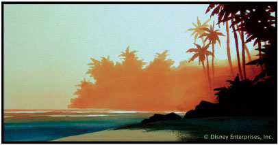
The color in our films corresponds with specific events in the story, and just as there is an “emotion/action curve,” there should be a “color mood curve.” The dictates of the color palette will begin with the different seasons that the film takes place during as well as the times of the day, weather situations, and interior/ exterior locations within the story.
For example, a love scene will need different colors than a suspense scene. At the end of the film, the color is especially important to build up the climax.
And just as music is a substantial ingredient used to establish the mood of the story, the proper colors and color combinations are just as important. Sequences need to be designed in “color-chapters” and “color-transitions” between the different sequences have to be developed. Normally, transitions are designed to be smooth; however, contrasting colors next to each other (from one sequence to the next and even from scene to scene) help indicate dramatic story changes that may occur and also helps create the appropriate emotional response.
Analyzing some of the older masterpieces that Disney has created such as Bambi, Pinocchio, Fantasia or 101 Dalmatians, it is obvious how well-planned every single detail was, especially the color! Unlike today where our eyes are being hurt by tasteless experiences in the world of television, most specifically in the
world of children’s programming. The color of the “good old days” was something very special, especially after the black & white years. Color meant something different back then, and it had to be used carefully. A lot of time was spent making sure it was used right! And I am not talking about realistic colors. This was the Hollywood “dream factory” using all the tricks. Every color was chosen for the special effect it had on the audience.
In The Sorcerer’s Apprentice, the color fades to black & white when Mickey destroys the broom. The color slowly returns to the rhythm of the music as the life returns within the broken wooden pieces.
Bambi shows us how masterfully transitions between color-chapters can be done. Just look at the beautiful scenes that were created solely to fill the gaps between late summer and the first snow of the winter.
Or in The Three Caballeros, fresh complementary color combinations create a happy atmosphere that conjures up the images of a South American carnival.
Peter Pan opens with the more subdued colors of Victorian England, only to transform into the complete opposite once we enter the world of Neverland.
In the mid-1950s, with a team of the best artists and thirty years of experience, the Disney studio created two more masterpieces: Lady and the Tramp and Sleeping Beauty. In Lady and the Tramp, color was more of a realistic mind. Depending on the mood of the sequence, the color was either fresh or tinted. With the latter, a very unique style was created by master artist Eyvind Earle. Elements of medieval European art were combined with Persian miniatures. Color was used very carefully because of the extensive number of layers used in the multi-plane camera and the immense amount of detail in the backgrounds. It is amazing that the characters read at all times in front of the “miniature masterpieces” and, on closer inspection, you will see that there is a clear “color-curve” throughout the whole of these films.
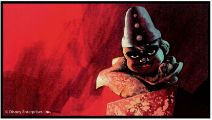
The rules that apply for background color choices also apply to character color choices. In comparing the villain-characters in the Disney films, you will find many similarities. There are sharp contrasts and lots of black with red or purple. “Heroes” are more down to earth with friendlier colors that are mixed with greys. Comic characters are often made up of pure fresh colors. Younger characters have different colors than older ones… the list is endless.
It is well worth your time to study films while knowing all of this. As a result, you will begin to understand why certain films are more successful than others, and why we make the choices we do when it comes to color.