
STAGING
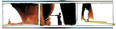
Staging is the placement of the characters within a set. The characters have to be part of the composition of the whole image and their placement in relation to each other has to work. If the characters are moving, a choreographed movement has to be planned. For dialogue scenes, precise camera angles and cuts have to be prepared and the direction of the light and corresponding shadows defined in floor plans.
All this is not the sole responsibility of the production designer; the director also decides about these issues, but you have to come up with ideas and you have to know about all the technical details.
It is very important to create a rhythm in your compositions. Some directors in live-action movies have even developed a distinctive style in the way their movies are cut. But, first of all, you have to visualize the story. Then you start to refine your images.
It doesn’t make sense to use the most stunning visuals and have the most interesting camera angles, as well as staging and movement of the characters when it has nothing to do with the story. Music videos can afford to do that since they want to keep your attention for four minutes, and they can go over the top with their effects. Advertising commercials are similar, but you should not do that in a feature film. It is like too much sweet cake with whipped cream. You begin to feel sick after a while.
It is also important not to give everything away within the first part of the movie. You want to keep something special for the climax of the film, the most incredible combination of camera angles, movement and color. Start slow, take your time to establish the mood, and then accelerate with the speed of the story toward the climax. Staging here can be crazy, cuts very fast, and colors unusual. And slow down to the end.
PROJECT
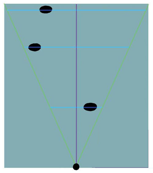
Floor plan
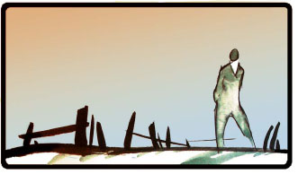
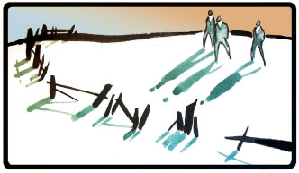
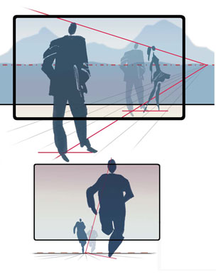
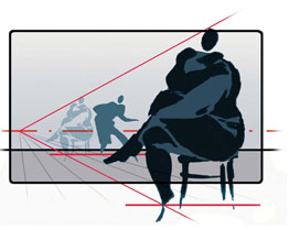
Complicated sequences are usually discussed and staged with floor plans. Background elements are sketched abstractly and the characters are indicated with simple dots. The camera positions along with the camera angle based on the camera field are sketched in as well.
That way it is possible to plan the necessary character-moves together with the corresponding camera positions and moves. What the dots and angles don’t show, is if all combinations of characters in their different sizes together with the background will be good-looking and interesting compositions.
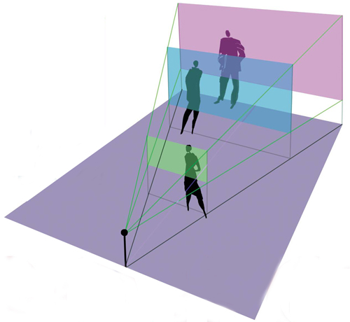
Projection
Of course you can sketch a rough interpretation of a floor plan situation the way the camera would see it. To be sure to find possibly better staging
It is a simple translation of a floor plan with actor positions and camera angle into a three-quarter perspective view. You can follow the different steps in the samples on this double-page illustration. It is not the very complex projection method that film architects use. I tried that system once while working on a live-action film and found it very complicated.
To be a bit faster with acceptable results for animation, I developed this simplified version for myself. Today, working with the computer is even faster and more accurate. I know there is 3-D software on the market that will do an even better job, but I never left the 2-D stage.
As you can see in the final combination of the three character-levels, the composition in this case works pretty well. If you are not happy, just shift the position of the characters in your three-quarter view until you are satisfied.
If you have down- or upshots, the construction in your projection sketch will be a bit more complicated. But I only use this method for very carefully planned positioning of the action and the camera. An even simpler method is indicated on the following page.
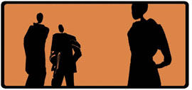
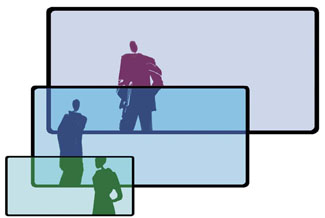
Image through camera
Every layout artist knows this method. You have two or more related characters involved in a scene. Some of them are seen to be closer shots where you don’t see the characters’ contact to the ground level. If you think you can just make it up, that never really works. The problem is the perspective. The characters with and without visible ground-contact have to follow the same perspective grid.
The solution is pretty simple. You know the horizon-level in your design. Place your foreground character in the same size relation next to the background character. Following the perspective grid, it is fairly simple to find the later invisible ground contact for your foreground action.
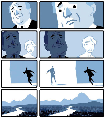
These are some simplified visuals to show you the different results using different lens-sizes.
As you probably know from photography, the smaller the lens-millimeter size, the wider your picture; the bigger the millimeter size, the closer you can go into the far distance. Lenses from about 20 mm to 35 mm are wide-angle lenses. Everything closer to 50 mm is a normal lens. From about 150 mm upward, we call them telephoto lenses.
It is not only the different amount of information you get with these lenses, the motifs have a very specific look. Wide-angle lenses show a lot of perspective, especially when you use them combined with up- or down-shots. They have a funny effect on portraits when used for close-ups. Normal-lenses are similar to what our eyes see, perspective is not too exaggerated, and the focus level has to be precisely chosen. Extreme foregrounds will be out of focus. The effect you get from telephoto lenses is very interesting. They seem to eliminate perspective; you will find a lot more parallel lines. And everything except your focus level will be out of focus. Objects in the far distance seem to be closer to each other than they really are.
In animation we don’t actually use different camera lenses. We draw what their result would look like. From the experience of the different looks you can get with a variety of lenses, you can create very interesting visuals. A composition of three related characters will look very different if you design it with either a wide-angle or a telephoto look You have another design element in your toolbox, an element that will improve your visual language.
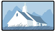
24mm Wide-angle lens
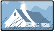
50mm Normal lens
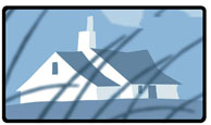
200mm Telephotolens
FORMATS
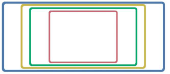
normal format 3 :4
widescreen I : 1.85
cinemascope I :2
panavision I : 2.35
Edison and Eastman Kodak were the first to produce 35 mm film at the end of the nineteenth century. This 35 mm celluloid stripe had perforation holes on both sides to transport it through the camera. The area in between was 1 inch or 2.54 cm wide. That defined the width of the exposed picture, its height was the distance measured between 4 perforation holes, or 3/4 of an inch, or 1.9 cm. That’s why it is called 3:4 format In the old days, one foot of film contained 16 frames, running at 16 frames per second through the camera.
Later, different formats were invented such as Cinemascope. It used the same 35 mm film format but squeezed the picture using an anamorphic lens. The projected un-squeezed format was an impressive 1:2. Very common today is a slightly smaller 1:1.85 format, called widescreen.
And there are the super-widescreen formats such as ToddAO and 70 mm, with the 1:2.35 dimensions. It is widely called Panavision format.
As you can see on the left, the different formats create their own rules for composition and camera-moves.
In close-up shots, it is easy to place the character into your normal format frame. To keep the same amount of negative space around the face in a super-widescreen format, you have to cut off a lot more around the face. If you don’t, it will not be a close-up anymore and you will have too much empty space around the face.
Composing with two or more characters, on the other hand, is much easier in the wider format and you have a lot more choices for a good composition. But there is so much room for information in this big image that you have to be very careful how much you use without overloading it.
The way you move your camera in these formats is very different. With a moving object you have to start your camera-move very early so as not to lose the action. In a wider format, there is a lot of room around the moving objects or characters. You let the character move halfway through your picture and then start speeding up your moving camera. For most moves in a wider composition, it is not necessary to move the camera at all, but it makes it more challenging to arrange the right choreography of your action.
The same rule applies to panoramic shots. To show that majestic wide landscape in a normal format you would either go much wider, which increases the amount of sky, or you would need to move your camera.