
11. Using Forms and Fields
A lot of Web sites exist just to provide information and entertainment to site visitors. But if you want your site to get information back from your visitors, you’ll need some way to let them interact with you and your site. To do that, you’ll need to add a form.
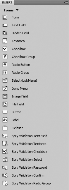
A form contains fields, and those fields can be anything from a simple check box to a group of radio buttons, or a single or multi-line text entry area. And of course, you’ll want some sort of “OK” or “Submit” button so that your visitors know how to send you their completed form. Look at the Forms category of the Insert panel  , and you’ll see that it contains everything you need to add any kind of form and field to your site.
The Forms category of the Insert panel contains all the items you might want to add to your form.
Adding a Form to a Page
You could start creating a page by throwing fields onto it, but when your visitor clicks Submit, the browser won’t know what to do with the data. That’s where you need a form—it tells the browser that all this information is part of one package, and it tells the browser what it should do with all of the information that it has gathered.
To add a form to a page
1. Choose where on your Web page you want your form, and click the Form button on the Insert panel. A red dashed box appears on your page .
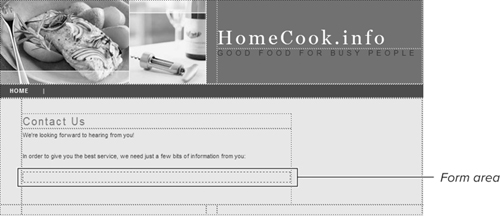
A form looks bare until you add the form fields.
The red box is the form area, and behind the scenes in the code, Dreamweaver has added a <form>...</form> container tag.
2. If that box isn’t automatically selected, select it, and you’ll see the options you can change for your new form in the Property Inspector  . The ones that apply solely to forms are:
• Form ID: If you’re going to be doing any JavaScript validation of your form, it’s a requirement to give it a name. In addition, some CGIs (which stands for Common Gateway Interface and is the program that runs on the server that interprets the data sent by your form) need their associated forms to have a particular name.
• Action: This is the program on the Web server that is executed when the form is submitted. You’ll need to get the name of this from your system administrator or hosting provider. It’s also commonly referred to as a System CGI.
• Method: The most common options are GET and POST. POST passes the form data as part of the header of the request to the server. GET passes the data as part of the URL of the request to the server. Because of this, and because GET has a length limitation, POST is what you’ll usually want.
• Enctype: This field describes the enclosure type being sent to the server. The default is application/x-www-form-urlencoded. The only time you’ll want to use multipart/form-data is if you’re asking your visitors to upload a file.
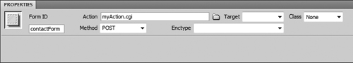
The Property Inspector is where you set a form’s name, action, and method.
Tip
Make sure that all your form fields are inside your form; if they are not, their contents won’t be sent to the server.
Tip
If you try to add a form field to a page that doesn’t have a form, you’ll be asked if you want to add a form tag. You might think from this that it’s not worth bothering to add a form tag manually first, but it is. You’ll have better control over where the form is placed, and what ends up going inside it.
Tip
No, that red border around the form won’t actually display on your site. It’s just there in Dreamweaver so that you’ll know where the form begins and ends.
Adding Text Fields
The simplest type of form field you can have is a single-line text field. Your average form will have several of them, allowing people to enter anything from their name to their phone number to their shoe size.
To add text fields
1. Choose where in your form you want your text field to appear (by clicking in the document), and click the Text Field button on the Insert panel. The Input Tag Accessibility Attributes dialog may appear, depending on the settings in Dreamweaver’s Preferences. If it does, see how to handle it in the “Labeling Your Fields” sidebar, later in this chapter, and then return to this point. The new text field appears on your page .
The first text entry field added to the form.
2. If the text field hasn’t been automatically selected, select it, and you’ll see the options you can change for your new field in the Property Inspector . From there, you can change the fields:
• TextField: This field contains the name of the field, which can be used by JavaScript behaviors and by CGI scripts on the server.
• Char width: The width of the text input area on your page. The larger this number, the wider the space it needs. And because it’s the number of characters allowed, the larger the font you’ve set (usually with CSS), the wider the space will be.
• Max chars: The maximum number of characters that a user can enter into this field. For instance, you could limit a credit card to 16 characters.
• Type: This has three values: Single line, Multi line, and Password. Multi line is covered in the next section, “Adding a Text Area.” The only difference between Single line and Password is what users see when they enter something into this field: if the type is Password, no matter what your visitor types, it will appear as black dots. The correct value will be sent back to the server, though.
• Init val: This is the initial value of the field. This text is displayed when the page is loaded.
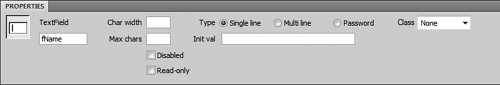
Set a text field’s properties using the Property Inspector.
Tip
A hidden field is similar to a text field. It’s used when there’s information that a CGI needs to get from a form, but which a user doesn’t enter—so the field contains a value but isn’t seen in the document. Adding a hidden field is virtually identical to adding a text field: just click the hidden field button in the Insert panel (obviously, where it’s put on the Web page doesn’t matter) and then set the value and unique field name in the Property Inspector.
Labeling Your Fields
When you click a button in the Insert panel to add a form field to your page, the Input Tag Accessibility Attributes dialog may appear . This dialog allows you to set certain attributes that can enhance accessibility for people with disabilities. These fields are:
• ID: This is the same as the field name in the Property Inspector. It’s used by JavaScript to manipulate the contents of fields, and also by the CGI that processes the form.
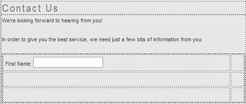
• Label: Figure  shows a label of “First Name:” being entered. Figure from “Adding Text Fields” shows the result: that text is displayed just to the left of the new text field.
• Style: There are three style options: Wrap with label tag, Attach label using ‘for’ attribute, and No label tag. If you choose Wrap with label tag, Dreamweaver surrounds your new <input> tag with a <label> tag:
<label>First Name: <input type="text" name="textfield" /></label>
If you choose Attach label using ‘for’ attribute, Dreamweaver writes the <label> tag based on what you enter for position (covered below):
<label for="textfield">First Name: </label><input type="text"
name="textfield" id="textfield" />
Unfortunately, Dreamweaver doesn’t offer full WYSIWYG support for this option—you can change the name and id attributes of your new text field (by changing the TextField), but the label’s for attribute, which should change to match, doesn’t. There isn’t any way to change it short of going into the markup and changing it by hand.
If you choose No label tag, the text you enter appears, but it’ll be just that: text.
The <label> tag helps make your site more accessible in two ways: it tells voice browsers that this is the text associated with this field, and it allows users with certain browsers (such as Firefox) to click the text label as an alternative to only clicking inside a check box. This gives your visitor a larger space in which to click. Accessibility is important, and using the <label> tag helps make your site more accessible—but if you want to use it with Dreamweaver’s Design view, stick with the Wrap with label tag option.
• Position: The label for a form field can be either before or after the field. For text fields, you’ll usually see the label before the field. For check boxes and radio buttons, you’ll usually see the label afterwards. The default value of the position changes depending on the type of field .
• Access key: Some browsers allow users to enter keyboard shortcuts to select form fields. If you want this option, enter the keyboard shortcut for the field here. For instance, if I entered g in figure  , the user with Internet Explorer for Windows could click that check box by pressing Alt-G.
• Tab Index: If you want users to be able to tab from form field to form field in a particular order, you’ll want to assign each field a tab index. This is the numbered order in which the user can tab through your form’s fields. It’s especially useful to set this when your form fields are inside table cells, as the default can be quite different from what you actually want to occur. The numbers need to be between 0 and 32767, and they don’t have to be in sequence: you can make your fields be (for instance) 100, 200, and so on, leaving room for future changes to your form.
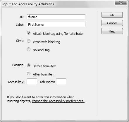
To enable your site to be accessible for people with disabilities, set the label attributes here. The default position for a text field label is before the form item.
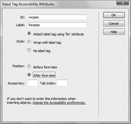
For a check box, the label’s default position is usually after the form item.
If you don’t use labels, access keys, or tab indices, and are annoyed at seeing this dialog come up every time you add another form field, you can get rid of it by clicking the link at the bottom. This opens Dreamweaver’s Preferences, and turning off “Show attributes when inserting Form objects” makes the dialog go away for good. If you later decide you want it back, go back into Preferences, choose the Accessibility category, and you can turn it on again.
You can also add a label afterwards by clicking the Label button on the Insert panel, but it doesn’t do what you expect. Instead of bringing up the Input Tag Accessibility Attributes dialog, Dreamweaver adds a <label> tag around whatever you selected and throws you into Split view. If you are markup-phobic, stick with adding labels along with their associated fields.
Adding a Text Area
It’s possible that you want your visitors to enter more than just a single line of text—maybe they have a lot to say, or you just want them to have a free-form area in which to enter their comments. If that’s the case, you’ll want to use a text area.
To add a text area
1. Choose where in your form you want your text area to appear, and click the Textarea button on the Insert panel. The new text area appears on your page .
A text area lets your visitors enter multiple lines of text, and it will scroll when necessary.
2. If the text area isn’t automatically selected, select it, and you’ll see the options you can change for your new field in the Property Inspector . From there, you can change the same values that you could for text fields, with some small differences:
• Num Lines: This is the number of lines that you want the field to take up on the page. If you only want a single line, use a text field instead.
• Disabled and Read-only: These check boxes do similar but not identical things. Disabled displays the text area, but doesn’t let users select or change it. You might use this with a script that enables the text area if the user performs a particular action. Read-only makes the text area unchangeable by users, but they can still select and copy the field’s contents.
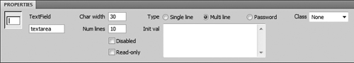
Use the Property Inspector to set the dimensions and initial value of the text area.
Adding Check Boxes
Check boxes are one of the most commonly used form fields, and you’re likely to want several on your forms. They’re particularly useful when you want specific responses from your site visitors, and you don’t want them to have to enter data into text fields (and possibly misspell their entry).
To add a check box
1. Choose where in your form you want your check box to appear, and click the Checkbox button on the Insert panel. A new check box appears on your page .

Check boxes are an easy way to get exact information from your site’s visitors.
2. If the check box isn’t automatically selected, select it, and you’ll see the options you can change for your new field in the Property Inspector :
• Checkbox name: This is the name of the field, and it’s used by any JavaScript validation as well as any server-side CGI.
• Checked value: This is the value that’s passed to the server (and JavaScript client-side code) when the user has checked the check box.
• Initial state: This refers to the appearance of the check box when the page is first loaded—is the box checked or unchecked?
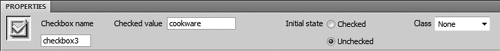
Set the name and value of the check box in the Property Inspector along with the checked status of the box when the page is loaded.
Tip
Just a reminder: the difference between check boxes and radio buttons is that for a group of radio buttons, only a single option can be picked. When you have a group of check boxes, however, the state of each check box is not dependent on the other check boxes, so you can select multiple check boxes.
Adding a Fieldset
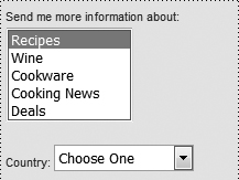
A fieldset is HTML’s way of grouping fields on your form to add additional meaning for the user. How a fieldset displays on a Web page depends on the browser being used, and you can’t control that: Dreamweaver’s Design view shows a thin gray line around a fieldset’s contents. Compare figure in “Adding Check Boxes” with : it’s easier to see that those check boxes are grouped together, and all have a similar function.
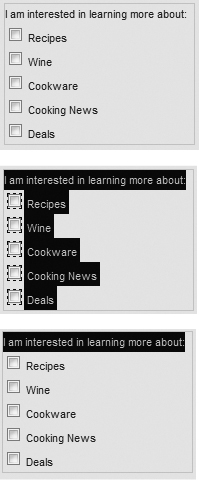
Adding a fieldset to your form helps group related form fields, making your form easier for your visitors to understand. Dreamweaver puts a thin gray line around the fieldset in the document (top). Selecting the <fieldset> tag in the Tag Selector shows you the items in the fieldset (middle) and selecting the <legend> tag in the Tag Selector highlights the fieldset’s legend (bottom).
To add a fieldset
1. Choose where in your form you want your fieldset to appear, and click the Fieldset button on the Insert panel.
2. The Fieldset dialog appears , asking you to enter a legend—that’s the text that appears at the beginning of the fieldset . Enter that text, click OK, and the fieldset box appears in the document.
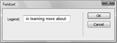
Enter the legend text in the Fieldset dialog.
3. If you’re adding a fieldset to an existing form, drag the related fields into the fieldset. If it’s a new form, click inside the fieldset and create its fields.
Tip
If the fieldset contains no form fields, the legend appears inside the box. When form fields are added, the legend is displayed as part of the box.
Tip
If you’re dragging fields inside the fieldset, be careful when selecting—make sure (for example) that all of a label is selected.
Tip
You can’t change a fieldset or a legend using the Property Inspector. You can change the legend by modifying the text in the document window, and change the fieldset by going into Code view.
Tip
A fieldset can contain any type of form fields, not just check boxes.
Adding a Radio Button Group
Radio buttons don’t exist by themselves—they always come in a group. And of that group, only one option can be chosen: your visitors can pick rock or paper or scissors.
To add a radio button group
1. Choose where in your form you want your radio button group to appear, and click the Radio Group button on the Insert panel.
2. The Radio Group dialog appears , asking you to enter several fields:
• Name: A radio group needs a name that associates all of the radio buttons together. In this example, your visitor is choosing whether or not to subscribe to a newsletter, so the name is “newsletter.” This name will not appear in the finished form.
• Label: Each radio button needs a label to distinguish it from its neighbors. In this example, the labels are “Yes” and “No.”
• Value: Each radio button needs a value, which will be passed back to the server CGI and/or JavaScript. The example values here are, again, “yes” and “no.”
• Lay out using: Radio buttons are normally aligned vertically, so here you make your choice of how you want that layout to be done in the HTML markup. Your choices are “Line breaks” and “Table.” Line breaks will almost always be sufficient.
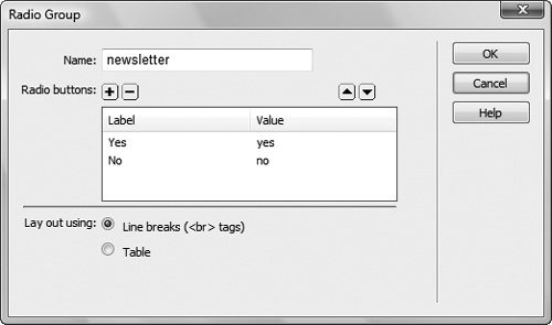
The Radio Group dialog lets you enter all of your radio buttons in a single dialog.
The Radio Group dialog starts with two fields, which you can overwrite to say whatever you want. If you want to add more radio buttons, click the + on the left side. If you want to delete buttons, in the list, select the one you want to remove, and click the -.
To rearrange the order of buttons, in the list, select the name of the button to move, and then click the up/down arrows to move that button.
3. Click OK to accept your entries, and your new radio button group is added to your document .
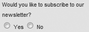
Here’s your radio group. Only one item can be selected.
Tip
If you want your buttons to all be on the same line (as in this example), select “Lay out using: Line breaks,” and then remove the line breaks. Sadly, Dreamweaver doesn’t include an option of “just leave them on the same line, okay?”
Tip
There’s also an option on the Insert panel to add a single radio button (Radio Button): It’s unlikely, though, that you’ll ever want to have only a single radio button on a page. If you add a single radio button to an existing radio group, be sure to copy the name of the group exactly into the Property Inspector  . In fact, your best bet is to click one of the existing radio buttons, copy the name from the Property Inspector, click the new radio button (if it already exists; add it if it doesn’t), and then paste the name in from the clipboard.
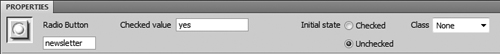
When setting the properties for an individual radio button, set the name of the group carefully—it has to match other radio buttons to work correctly.
Tip
If you want one of your radio buttons to be set as selected, click that button in your document, and then change the Initial state in the Property Inspector from Unchecked to Checked.
Tip
Dreamweaver will happily let you set multiple radio buttons with their initial state checked even though browsers won’t display it that way. Each kind of browser may display this error in a different fashion, so don’t make the mistake in the first place. Be careful that you’re only setting one (or no) radio button to be checked.
Adding a List/Menu
Another common form element is what’s referred to in the Forms category of the Insert panel as Select (List/Menu). It’s actually the two forms of the HTML select tag: either a pop-up menu or a scrolling list of options. If it’s the latter, you can decide whether the user can click a single option or multiple options.
To add a pop-up menu
1. Choose where in your form you want your pop-up menu to appear, and click the Select (List/Menu) button on the Insert panel.
The empty list appears in your layout, with a downward-pointing triangle indicating the future pop-up menu.
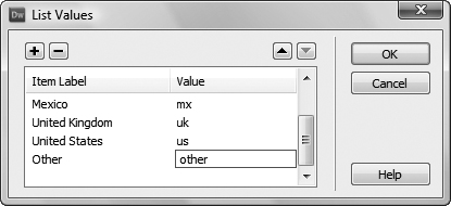
2. Make sure the empty list is selected in the layout; then, in the Property Inspector, click the List Values button. The List Values dialog appears . Enter your desired options. The Item Label is what appears in the pop-up, and the Value is what’s sent to the server-side CGI/JavaScript.
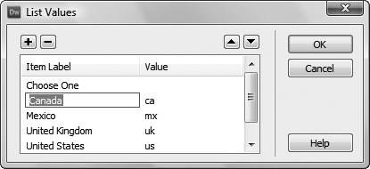
You’ll enter all the values for pop-up menus and scrolling option lists in the List Values dialog.
3. Click OK, and your new pop-up appears on your page .
The new pop-up menu is now on your form.
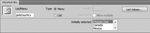
4. If the pop-up menu isn’t automatically selected, select it, and you’ll see the options you can change for your new field in the Property Inspector :
• List/Menu: This is the field name that will be passed back to the server-side CGI/JavaScript when it processes the form.
• Type: The choices are Menu or List; for a pop-up menu, choose Menu.
• Initially selected: You can choose one of the menu options to be the default that’s shown when the page loads.
• List Values: Clicking this button causes the List Values dialog  to reappear, so you can easily change the list contents.
You can change the existing pop-up menu into a scrolling option list by clicking the List button in the Property Inspector.
You can return to the List Values dialog to view or change the items by clicking the List Values button in the Property Inspector.
To add a scrolling option list
1. Follow steps 1–3 in the previous exercise to create a pop-up menu, and select the pop-up menu.
2. In the Property Inspector  , change Type to List. You’ll notice that even though you’ve changed the type to list, your field still displays as a pop-up menu.
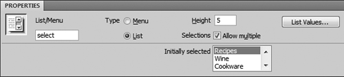
If you change from a pop-up menu to a scrolling list, you’ll get a couple of new options in the Property Inspector.
3. Change the Height to show the number of items you want displayed at any one time in the scrolling list. Changing this causes the field to display as a scrolling list  .
.
And here’s the new scrolling list above a pop-up menu.
4. If desired, change the Selections option to allow multiple choices. When you do this, visitors to your site will be able to pick several options in the scrolling list at one time.
Tip
If you leave the Height set to 1, and change Selections to “Allow multiple,” you’ll also see your pop-up menu change to a scrolling list. But a scrolling list with a height of one isn’t much of a scrolling list—it’s too difficult for your users to see what’s available.
Styling Forms
How forms should be styled is a matter of hot debate among leading Web designers: are tables acceptable, or should you try and stick to CSS-only solutions?
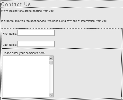
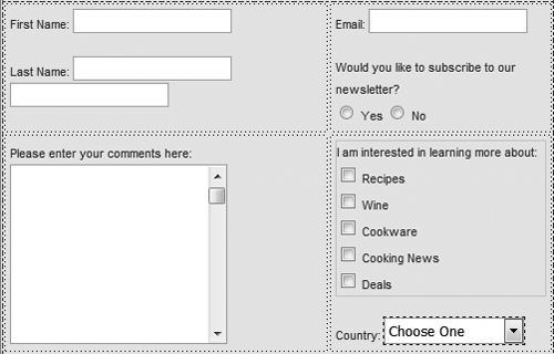
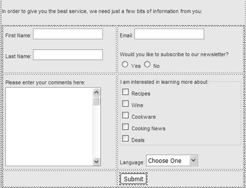
The grim reality is that it’s unlikely that you’ll get 100% of what you want from CSS, which is why we’ve used tables in this example—browsers such as Microsoft Internet Explorer 6 for Windows still can’t do what’s required. On the other hand, a simple form with a simple layout such as this one still comes across differently in browsers, even with the entire layout designed with tables. Looking carefully at , , and , you can see that each browser has its own quirks, and no two look exactly the same.
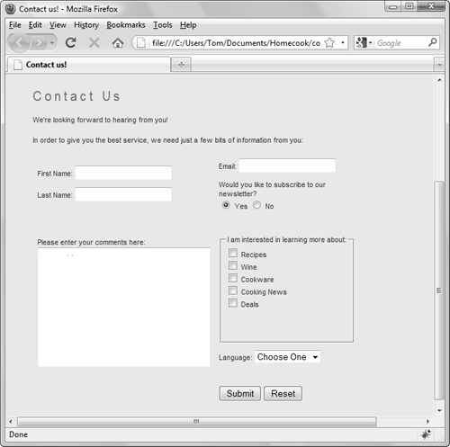
Our new form, as it appears in Firefox on Windows.
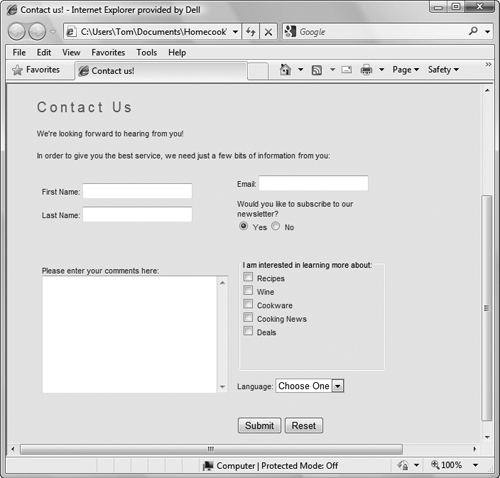
The same form in Microsoft Internet Explorer 8 for Windows.
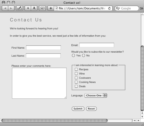
And finally, the same form in Safari on the Mac. Even when you use CSS to style form fields in a certain way, Safari often uses its own Mac-like fields instead (even on Safari for Windows!).
Adding a Button
A form on your site doesn’t do you much good unless you can get the information that’s entered into it, and that’s the primary use of buttons. A Submit button triggers the action specified in the form tag (described earlier in this chapter). Another type of button is the Reset button, which allows a user to go back to a form’s original state.
To add a button
1. Choose where in your form you want your button to appear, and click the Button icon on the Insert panel. The default value—the Submit button—appears on your document .
Add a Submit button to your Web form so you can receive your visitor’s completed form.
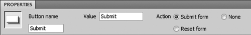
2. If the button isn’t automatically selected, select it, and you’ll see the options you can change for your new button in the Property Inspector :
• Button name: This is the name of the button; generally, you’ll use “Submit” to specify that it’s a Submit button, and “Reset” to show that it’s a Reset button .
• Value: This is the message that is displayed on the Submit button itself. It’s common for it to say “Submit,” but it can also say, “Place order,” “OK,” or whatever you think your users will understand.
• Action: There are three possible actions. Submit form and Reset form do what you’d expect. None creates a generic button, which can later be set to trigger a JavaScript action (covered in Chapter 13).
The buttons you’ll usually use are Submit and Reset; this one’s a Submit button.

A button can be changed to a Reset button using the Property Inspector.
Tip
There is actually one other type of button: an image button. It is created by clicking the Image Field button on the Insert panel. You’ll be prompted to browse for an image file in your site, and the image then appears in your document. When a visitor comes to your site and completes the form, clicking that image triggers an immediate submission of the form.
Submit/Reset or Reset/Submit?
If you want to start a fight in a group of designers, just ask which order your Submit and Reset buttons should be in. There are two vocal schools of thought, and they tend to break down into Windows advocates versus Mac advocates.
In a nutshell, Windows users expect to find the OK/Submit button as the first button in a group, whereas Mac users are accustomed to always seeing it as the rightmost button. As shown in and , interface designers who work on cross-platform applications are able to change the order depending on the user’s platform. While this is the same General Preferences dialog on both platforms, notice that where Mac and Windows users click to accept their changes is very different.
Dreamweaver’s General Preferences on Windows show the buttons as OK and Cancel at the bottom right and Help at the bottom left.
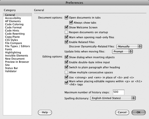
The General Preferences on the Mac also has Help at the bottom left, but uses the order Cancel and OK at the bottom right.
If you’re working on a Web site you don’t have that flexibility, but you should be aware that visitors to your site will have expectations about how your forms should work—and at least some of those expectations may be different than yours. We’re not going to make the call here as to which is preferable; that call should be made based on your visitor logs and your own personal preferences.
Putting It All Together
1. Add a form to a page on your site.
2. Set the form’s name, action, and method, and other options in the Property Inspector.
3. Add text fields and set their options as desired.
4. Label your fields to make them accessible using the Input Tag Accessibility Attributes dialog.
5. Add a text area for comments. Be sure to set its options as well.
6. Add a fieldset to group appropriate fields on the form.
7. Add at least three check boxes to your form.
8. Add a radio button group. Use the Radio Group dialog to enter fields.
9. Add a pop-up menu or a scrolling option list of items.
10. Add Submit and Reset buttons.