
Chapter 2
Touring Dreamweaver
In This Chapter
- Choosing a workspace layout
- Comparing workspace layouts
- Working in the Document window
- Accessing common commands on the toolbars
- Inserting elements with the Insert panel
- Modifying tag properties with the Property inspector
- Working with dockable panels
- Stepping through the menus
- Accessing online services
Dreamweaver’s user interface is efficient, powerful, and flexible. By offering a wide variety of customizable tools and controls, Dreamweaver helps you tailor its workspace to your specific preferences and needs so that you can focus on the task of creating your website. This chapter provides a detailed overview of the Dreamweaver workspace so you know where all the tools are when you need to use them.
One of Dreamweaver’s greatest strengths is its flexibility. The makers of Dreamweaver realize that not everyone works in the same way, and they have created a product that you can customize to maximize your efficiency. By default, Dreamweaver provides a range of different workspace layouts and even allows you to customize your own.
You can access these options by choosing Window Workspace Layout or by choosing the Workspace switcher in the Applications bar and selecting one of the available choices.
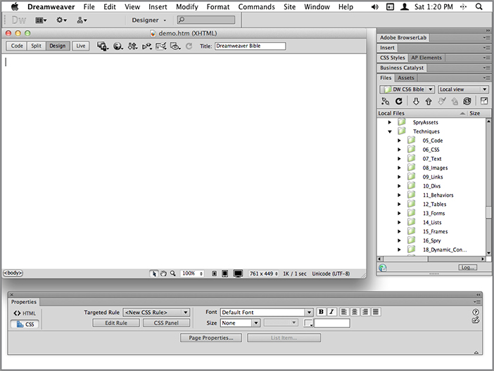
The default layout option is referred to as the Designer workspace. Here, the most design-oriented of Dreamweaver’s many panels are organized into groups and docked on the right side of the window, with the panel names exposed. The Designer workspace is illustrated in Figure 2-1.
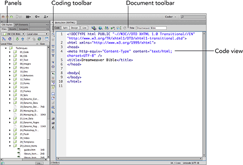
A variation on the Designer workspace is the Coder workspace option. Here, the panels are docked on the left side of the window rather than the right. With this option, when you first open documents, you are presented with the code for the document rather than a view that reflects what the page will look like when viewed in a browser. Figure 2-2 shows the Coder workspace layout.
Figure 2-1: Dreamweaver’s Designer workspace places docked panel groups on the right.
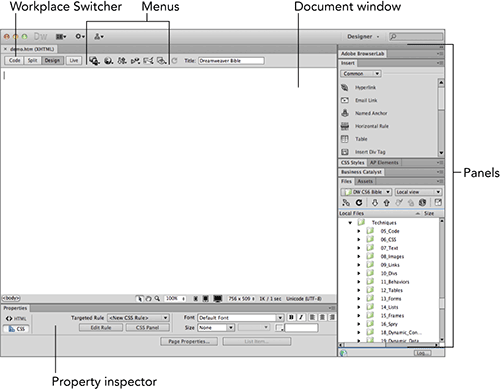
Figure 2-2: The Coder style workspace opens documents in Code view and docks panels on the left.
Cross-reference: You have numerous options for customizing Dreamweaver. Later in this chapter, you learn how to move the panels and toolbars; dock or float the panels; hide, show, or resize panels; and more. Chapter 3 systematically covers many additional customization options, referred to within Dreamweaver, as with most programs, as preferences.
Another option, Dual Screen, is useful if you have two monitors for the same computer. When invoked, the Dual Screen layout undocks all the major components (Property inspector, panel groups, and Code inspector) so that they can be positioned exactly how you like.
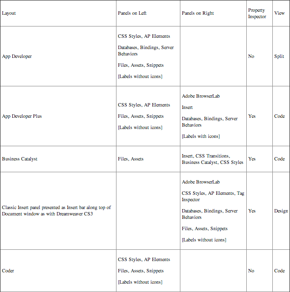
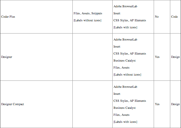
Other layout options are detailed in Table 2-1.
If you ever adjust a standard layout and want to return to its default settings, choose Reset Workspace, where Workspace is the name of the workspace from either the Window Workspace Layout menu or the Workspace switcher.
Table 2-1: Default Layout Options

Tip: If you aren’t sure which workspace works best for you, don’t worry; you can switch workspaces at any time and even completely customize a workspace so that it works the way you do.
All customized layouts can be saved for later retrieval. Once you’ve set up the desired layout, you can choose Window Workspace Layout New Workspace or, from the Workspace switcher, New Workspace, to store your customized environment. When you opt to create a new workspace, a dialog box appears for you to name your layout; after confirming your choice by clicking OK, your new layout option is displayed in the Workspace Layout submenu. Select Window Workspace Layout Manage Workspaces to delete or rename your custom layouts; the same command is available from the Workspace switcher.
New feature: Dreamweaver offers Mac users the capability to enable the Application Frame (enabled by default), a boxed-in version of the application that blocks the view through to the Desktop with a Windows-like gray background. To revert to the previous user interface with separate panels, Document window, and Property inspector (see Figure 2-3), toggle Window Application Frame.
As you can see in Figures 2-1, 2-2, and 2-3, all the workspaces comprise variations of the same basic elements even though they are laid out differently on the screen. For the most part, you work with those elements in the same way, regardless of workspace; the only major differences among the workspaces are the location of the tools onscreen and which panels are open. The basic elements of Dreamweaver include the following:
- Document window
- Toolbars
- Insert panel
- Property inspector
- Panels
- Menus
The rest of this chapter takes you on a tour of each of these basic interface elements.
Figure 2-3: The workspace for Mac enables users to position panels wherever they would like while still being able to see the Desktop.
Dreamweaver’s primary work area is the Document window. When you first create a new page in Dreamweaver, you see what is essentially an empty canvas surrounded by tool panels and toolbars. This canvas is where you create your web pages by typing headlines and paragraphs; inserting images and links; and creating tables, forms, and other HTML elements.
You can open more than one document at once in Dreamweaver, and all of your documents are viewed within the same window. If the documents are not maximized, you can see more than one document at once using the various window manipulation commands on the Window menu. If you want to separate documents, choose Window Cascade, Window Arrange Horizontally, or Window Arrange Vertically (Window Cascade, Window Tile, and Window Combine as Tabs on the Mac). This adds a great deal of flexibility because you can have multiple documents open in tabs in multiple document windows.
Tip: For maximum flexibility with documents on the Mac, make sure Window Application Frame is not selected.
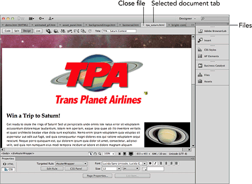
If you maximize one document, all the open documents are maximized. Switch between the open documents by clicking the appropriate tab for the document, located near the top of the window, or by choosing Window Next Document/Previous Document. The buttons to minimize, restore, and close a maximized document on Windows are located in the upper-right corner of the Dreamweaver Document window. On a Mac, the buttons to close, minimize, and restore a group of tabbed documents remain in the upper left of the document window. To close one document, click the close widget to the right of the filename on each tab. You can also right-click a document tab and choose Close from the context menu to close the document. Figure 2-4 illustrates maximized documents within the Mac workspace.
Tip: To change the order in which your documents are displayed in tabs, drag a tab to the desired position.
If you open more documents than Dreamweaver can show, it displays a double-angle bracket indicator on the far right of the tab list that displays a drop-down list of files to choose from.
Figure 2-4: In the Dreamweaver workspace use tabs to switch between maximized documents.
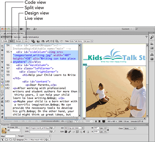
Switching views in the Document window
Typical web design tasks consist of visually creating a page in Dreamweaver, perhaps tweaking the underlying code to achieve the exact effect you want, and making sure your standard web page or application is performing as expected. You can do all these things without ever leaving the Dreamweaver Document window, simply by switching the view of the page you are editing.
Design and Code views
In Design view, you lay out a page visually. As your web page begins to take shape, Design view shows you a close representation of how the page looks when viewed through a browser such as Firefox or Internet Explorer. You can even see active elements, such as QuickTime movies or Shockwave and Flash files in your web page as you’re building it. You can switch to Design view with the View Design menu command or by clicking the Show Design View button on the Document toolbar, described in the section “Accessing the Toolbars” later in this chapter.
As the name suggests, Code view displays the underlying code used to create the document, whether that is HTML, CSS style definitions, or JavaScript—whatever code is used to create the page is visible to you in Code view. If you are working in the Coder style workspace, Code view is the default view; but you can also switch to Code view by choosing the View Code menu command or by clicking the Show Code View button on the Document toolbar. When in Code view, you have the ability to examine the code from the same page in two different windows by choosing View Split Code. This option replaces Design view, if open.
You can choose View Code and Design to split the Document window, so that both Code view and Design view are visible at the same time (see Figure 2-5). You can also do this by clicking the Split button on the Document toolbar. Once in Split view, you can orient Code view and Design view horizontally by deselecting View Split Vertically. You also have the option of repositioning Design view to the left or on top by choosing View Design View on Left, when Split Vertically is enabled, or View Design View on Top, when it is not.
Figure 2-5: Quickly edit your document in two different modes—code or WYSIWYG design—with Split view.
When you switch document views, the switch applies to the currently active open document and to any subsequent documents you open. It does not, however, change the view of other open documents.
Live View and Live Code
Whereas Design view gives you an editable, browser-approximate display of your web page, Live View is an actual real-world browser rendering. Although Live View is not editable, it is tightly integrated with Code view, so that any changes made to the code are immediately rendered when you refresh the page.
Live View is based on Apple’s open source browser engine, WebKit, which is the basis for Apple’s Safari and Google’s Chrome browsers. Live View brings a whole new workflow to Dreamweaver, one that is well-suited to the modern web designer’s task of crafting complex web pages that integrate external JavaScript, CSS, or server-side include files. Live View not only displays web pages accurately according to up-to-date web standards but also provides basic interactivity so you can test your CSS or JavaScript rollovers right within Dreamweaver.
Live View is best used in conjunction with Code view. The typical workflow is to switch to Live View once your basic page has been completed and you are fine-tuning the code. At this stage, click Live View in the Document toolbar or choose View Live View and then choose Split from the Document toolbar, as shown in Figure 2-6, or choose View Design and Code. Then, make any desired changes in Code view and, when you’re ready, click Refresh Design View in the Document toolbar, choose View Refresh Design View, or press F5. Although page elements in Live View are not editable, you can click any area to navigate to the related code block. In addition to Code view, you can also make changes in other Dreamweaver panels, most notably the CSS Styles panel.
Figure 2-6: Live View is built on the open source WebKit browser engine for real-world rendering.
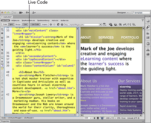
When you enter into Live View, the Live Code feature becomes available. Like Live View, Live Code gives you a real-world, albeit uneditable, window into your web page, but on the code side. You can easily tell you’re in Live Code by the yellow highlighted code. Certain JavaScript or server-side functions may rewrite the HTML sent to the browser to be rendered. With Live Code enabled, you can see the exact code used. Moreover, you can interact with the page in Live View and then stop the interactivity by choosing View Live View Options Freeze JavaScript, choosing Freeze JavaScript from the Live View menu button, or pressing F6. Once the JavaScript is frozen, you can examine the current state in Live Code or Live View and make changes in the CSS Styles panel.
Cross-reference: Enhanced features such as Related files and the Code Navigator, as well as the capability to freeze JavaScript, are all part of the Live View and Live Code workflow. To learn more about how to use Live View with these features, see Chapter 5.
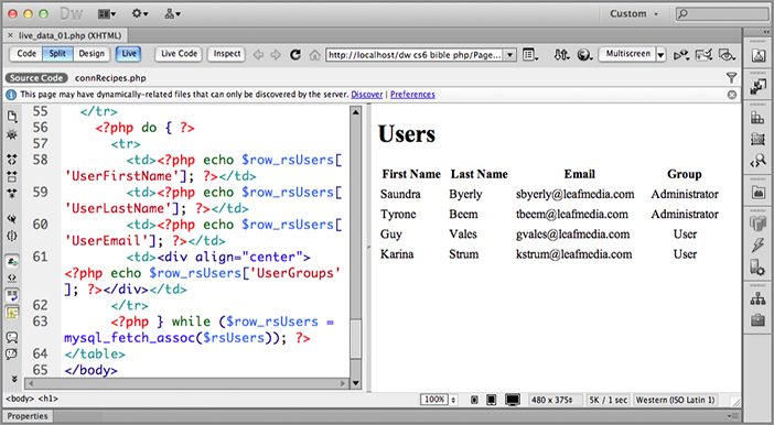
If you are creating a web application that includes dynamic elements from a database, Live View can also serve you well. When you invoke Live View while the current page uses the PHP, ASP, or ColdFusion server model, Dreamweaver displays your page with data from your data source. The live data that Dreamweaver displays replaces data source placeholders such as {rs.employeeID} with the selected information pulled from the database’s designated field, as shown in Figure 2-7.
To use Live View with a dynamic page, you’ll need a connection to a testing server, either local or remote, to be properly established in the Site Definition dialog box. If Dreamweaver is unable to complete the connection, an error message appears with several possible solutions listed.
Cross-reference: Live View is extremely helpful in building your web applications. Find out more about how to use this important feature in Chapter 21.
Figure 2-7: Live View lets you work on a dynamic web page—altering the CSS styles—while displaying the actual data from your application.
Working with the status bar
The status bar is found at the bottom of the Document window. Embedded here are several important tools: the Tag Selector, Zoom tool, Window Size pop-up menu, and Download Indicator. These helpful status bar tools provide the web designer with several time-saving utilities.
Tag Selector
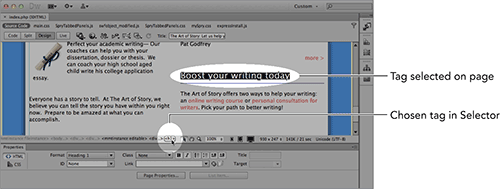
The Tag Selector is an excellent example of Dreamweaver’s elegant design approach. On the left side of the status bar, you see a listing of the current HTML tags. When you first open a blank page in Dreamweaver, you see only the <body> tag. If you type a line of text and then press Enter (Return), the paragraph tag <p> appears. Your cursor’s position in the document determines which tags are displayed in the Tag Selector. The Tag Selector keeps continuous track of where you are in the HTML document by displaying the tags surrounding your current cursor position. This becomes especially important when you are building complex web pages that use such features as nested <div> tags.
As its name implies, the Tag Selector does more than just indicate a position in a document. Using the Tag Selector, you can quickly choose any of the elements surrounding your current cursor. After an element is selected, you can modify or delete it. If you have the Property inspector (described later in this chapter) onscreen, choosing a different code from the Tag Selector makes the corresponding options available in the Property inspector.
Tip: If you want to quickly clear most of your HTML page, choose the <body> tag in the Tag Selector and press Delete. All graphics, text, and other elements you have inserted through the Document window are erased. Left intact is any HTML code in the <head> section, including your title, <meta> tags, and any preliminary JavaScript. The <body> tag is also left intact.
In a more complex web page section, such as the one shown in Figure 2-8, the Tag Selector shows a wider variety of HTML tags. As you move your pointer over individual codes in the Tag Selector, they are highlighted; click one, and the code becomes bold. Tags are displayed from left to right in the Tag Selector—starting on the far left with the most inclusive (in this case, the <body> tag) and proceeding to the narrowest selection (here, the italic <h1> tag) on the far right.
As a web page developer, you’re constantly selecting elements in order to modify them. Rather than rely on the click-and-drag method to highlight an area—which often grabs unwanted sections of your code, such as <td> tags—use the Tag Selector to unerringly pick just the code you want. Dreamweaver’s Tag Selector is a subtle but extremely useful tool that can speed up your work significantly.
Right-clicking (Control+clicking) an item in the Tag Selector displays a menu that contains several tag-editing commands. Using this menu in Design view, you can remove the tag or select a class or id attribute for the tag. From either Design view or Code view, you can also modify the tag by choosing Edit Tag from the context menu.
Figure 2-8: The Tag Selector enables you to highlight just the code you want. If you select the <h1> tag here, the complete tag and its contents are chosen.
Select, Hand, and Zoom tools
With the greater layout flexibility made possible by CSS positioning comes the need for more powerful design tools. The first set of tools on the right side of the status bar offers Dreamweaver designers a number of options for viewing and interacting with the page at design time.
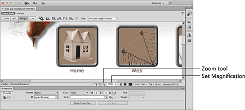
With the Zoom enhancement, Dreamweaver offers designers the ability to magnify a page for finer design control. This set of tools—Select, Hand, Zoom, and the Set Magnification pop-up menu—works together. In the typical design session, Dreamweaver is generally in Select mode, which allows the selection and manipulation of any and all page elements. Choose the Hand tool to pan around a page that is larger than the Document window, whether or not the page is magnified.
The Zoom tool works in a multifaceted fashion similar to graphic applications such as Photoshop and Fireworks. Once you’ve selected the Zoom tool, you can:
- Magnify a specific section of the page by clicking that area; each click increasing the magnification according to the values in the Set Magnification pop-up menu. For example, one click magnifies the area from 100 to 150 percent and then another goes to 200 percent magnification and so on. Hold Alt (Option) while clicking to zoom out of an area.
- Drag a rectangle around the area to magnify to view that section at the highest magnification, as shown in Figure 2-9.
To zoom in or out by a preset amount, select a value from the Set Magnification pop-up menu. Magnification options range from 6 to 6,400 percent. You can also opt to zoom in on a specific selection by choosing Fit Selection, view the width of the page by choosing Fit Width, or view the entire page by choosing Fit All. If you prefer to view the page at a specific magnification not found on the Set Magnification pop-up menu, you can enter the value directly in the field and press Tab; there’s no need to enter the percent symbol, %.
Figure 2-9: Get in tight for close-up work with Dreamweaver’s magnification tools.
Tip: If you’re zoomed in or out of a page, you can double-click either the Zoom or the Pointer tool to return to 100 percent magnification. To quickly begin selecting in standard magnification, double-click the Pointer tool.
Keyboard shortcuts are also available for zooming in and out of the page. Press Ctrl+= (Command+=) to zoom in and Ctrl+– (Command+–) to zoom out.
To return to editing the page—at any magnification level—click the Select tool.
Window Size options
The universality of the Internet enables virtually any type of computer system from anywhere in the world to access publicly available web pages. Although this accessibility is a boon to global communication, it forces web designers to be aware of how their creations look under various circumstances—especially different screen sizes.
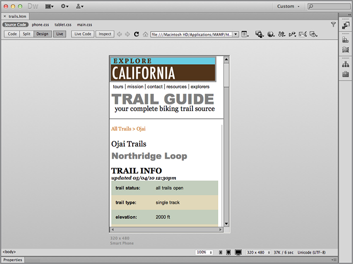
New feature: A number of window size options give designers a sense of how their pages look on different monitors. Three screen icons allow you to quickly flip from one common target to another: mobile, tablet, and desktop. An example design for a mobile phone is shown in Figure 2-10.
For a wider range of possibilities, use the Window Size pop-up menu. Located just right of the three screen-size icons, the Window Size pop-up menu indicates the screen size of the current Document window, in pixels, in width × height format. If you resize your Document window, the Window Size indicator updates instantly. This indicator gives you an immediate check on the dimensions of the current page.
To select a different screen size, click once on the expander arrow to the right of the displayed dimensions to bring up a menu listing the standard sizes. Click a size from the menu.
Figure 2-10: The Window Size options can quickly give you a design preview of multiple screen layouts.
Note: If no sizes are listed in the status bar, you may be in Code view, described later in this chapter. Select View Design to gain access to the Window Size pop-up menu. If you can see the menu, but the options are disabled, your Document window is maximized (this happens only in the Dreamweaver integrated workspace for Windows users).
The standard sizes, and their most common uses, are as follows:
- 240 × 320 Feature Phone
- 320 × 480 Smart Phone
- 480 × 800 Smart Phone
- 592
- 768 × 1024 Tablet
- 1000 × 620 (1024 × 768, Maximized)
- 1260 × 875 (1280 × 1024, Maximized)
- 1420 × 750 (1440 × 900, Maximized)
- 1580 × 1050 (1600 × 1200, Maximized)
The fourth option, 592, is the only option that does not change the height and the width. Instead, this option uses the current window height and alters only the width.
Tip: You can set up your own custom screen settings by choosing Edit Sizes from the Window Size pop-up menu. This option opens the Status Bar category of the Preferences dialog box. Chapter 3 describes how to modify the pop-up list.
The dimensions offered by the Window Size pop-up menu describe the entire editable area of a page.
Download Indicator
So, you’ve built your web masterpiece, and you’ve just finished uploading the HTML, along with the 23 JPEGs, 8 audio files, and 3 Flash movies that make up the page. You open the page over the Internet and—surprise!—it takes five minutes to download. Okay, this example is a tad extreme, but every web developer knows that opening a page from your hard drive and opening a page over the Internet are two vastly different experiences. Dreamweaver has taken the guesswork out of loading a page from the web by providing the Download Indicator.
The Download Indicator is located to the right of the Window Size item on the status bar. As illustrated in Figure 2-11, Dreamweaver gives you two values, separated by a slash character:
Figure 2-11: Find the Download Indicator in the status bar.
- The cumulative size of the page, including all the associated graphics, plugins, and multimedia files, measured in kilobytes (KB)
- The time it takes to download at a particular connection speed, measured in seconds (sec)
Tip: You can check the download size of any individual graphic by selecting it and looking at the Property inspector—you can find the file size in kilobytes next to the thumbnail image on the left.
The Download Indicator is a handy real-world check. As you build your web pages, it’s a good practice to monitor your file’s download size—in both kilobytes and seconds. As a web designer, you ultimately have to decide what your audience will deem is worth the wait and what will have it reaching for that Stop button. Remember that all the component parts of a page make up the total file weight shown in the Download Indicator.
Cross-reference: Not everybody has the same connection speed. If you are working with an intranet or on a broadband site, you can set your connection speed far higher. Likewise, if your site gets a lot of traffic from mobile users, you can lower the connection speed. Change the anticipated download speed through Dreamweaver’s Preferences dialog box, as explained in Chapter 3.
Regardless of the job—whether it’s hanging a picture or fixing a faucet—work goes faster when your tools are at your fingertips. The same principle holds true for website building: The easier it is to accomplish the most frequently required tasks, the more productive you’ll be as a web designer. Dreamweaver puts a number of repetitive tasks, such as previewing your page in a browser, just a function key away. However, there are far more necessary operations than there are function keys. In an effort to put needed functionality right up front, Dreamweaver incorporates four toolbars—Standard, Document, Browser Navigation, and Style Rendering—located across the top of the Document window. One other toolbar is available only when you are in Live Data view and another when you’re in Code or Split view. In addition, Dreamweaver has two other bars built into the interface that provide essential functionality: the Application and Related Files bars.
The Application bar
The Application bar, so-called because of the identifying application icon on the left side, is common to all Adobe Creative Suite software programs. In addition to the menus, you can also find the following user interface elements in the Application bar, shown in Figure 2-12.
Figure 2-12: The goal of the Application bar is to surface commonly used features such as creating a new site or searching help.
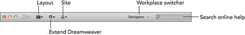
- Layout: The Layout menu button gives you quick access to the various document views including Code, Split Code, Design, and Code and Design (a.k.a. Split view); you can also toggle the Split Vertically and Design View On Left options from the Layout menu button.
- Extend Dreamweaver: Dreamweaver is wonderfully extensible, and you can add many time-saving capabilities through the free and commercial extensions available. Under the Extend Dreamweaver menu button, you’ll find quick access to the Extension Manager, the Creative Suites tool for inserting and managing extensions. Two other menu items give you direct access to some of the available extensions. Browse For Web Widgets opens your primary browser to the Adobe Exchange page dedicated to JavaScript web widgets compatible with Dreamweaver, and Browse For Other Dreamweaver Extensions takes you to the main Adobe Exchange page for Dreamweaver.
- Site: The Site menu button offers two options. New Site opens the Site Definition dialog box so you can define a new local and/or remote site. Manage Sites displays the full-featured Manage Sites dialog box, which allows you to edit, duplicate, or remove existing sites; import or export site settings; or set up new sites or direct server connections.
- Workspace switcher: As described earlier in this chapter, the Workspace switcher is used to modify your Dreamweaver environment. You can either choose from default workspaces or create your own custom ones.
- Search: The search field included in the Application bar allows you to perform online searches of the Dreamweaver Help system. Enter a term and then press Enter (Return) or click the magnifying glass icon to load the search results in your primary browser.
The Related Files bar
The Related Files bar is located between the filename tab and the Document toolbar if the current file contains links to any external CSS, JavaScript, or server-side file. Any such documents, or related files, are listed in the order they are included in the primary web page, after a Source Code link, which, when clicked, displays the primary web page in Code view.
The beauty of the Related Files feature is that you can click the entry for a related file to open it in Code view while continuing to display the complete web page in Design or Live Data view. Any updates made to the code—whether in CSS, JavaScript, or server-side code includes—can be immediately displayed in Live View. If you’re not already in Split view, choosing one of the related files will switch to that mode.
Caution: Some web pages can include a great number of related files—often too many to deal with practically. Dreamweaver provides a filtering mechanism to show just the files you want to work with, whether they’re CSS, PHP, or JavaScript. Just click the Filter icon found on the far right of the Related Files bar and toggle on just the file types you need. You can even create a custom filter to restrict the related files displayed to a common file name or extension.
Should you prefer to open related files as separate documents rather than in Code view all the time, there is an option for doing so in the General category of Preferences. To open a related file just once, right-click (Control+click) the related file link and choose Open as Separate File.
Cross-reference: To make the most out of the Related Files feature and its companion features (Live Data view and Code Navigator), see Chapter 5.
The Document toolbar: Design view
The Document toolbar gives you quick access to commands that affect the entire document. As with the Standard toolbar, you can hide and show the Document toolbar with a menu command: View Toolbars Document. The Document toolbar actually has two modes. This first is displayed when Dreamweaver is in Design view. One of the Document toolbar’s best features in Design view is the quick and easy access it offers for changing your web page’s title, as shown in Figure 2-13.
Figure 2-13: The Document toolbar offers easy access to an important element of a web page, the title.
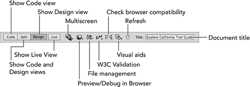
The first set of buttons in the Document toolbar in both modes is dedicated to the various views: Code, Split, and Design. These buttons are mutually exclusive because only one view can be shown at a time.
To the right of the first three buttons is another view-related button: Live View. As previously explained, when Live View is selected, Dreamweaver renders the page with the built-in browser, and it also invokes the second mode of the Document toolbar. For more details, see the section “Document Toolbar: Live View.” The following subsections describe additional functionality found on both Document toolbar modes.
Setting up for multiple screen design
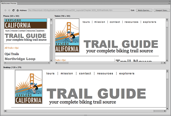
Today’s world is rife with an ever-increasing number of mobile devices capable of browsing the web as easily as a desktop. For Dreamweaver users, this means designs should be flexible enough to fit well on a number of differently sized screens. To meet this need, Dreamweaver has introduced a workflow that uses media queries—CSS statements that allow styles to be applied conditionally. The Multiscreen Preview dialog box, accessible from the Document toolbar, is designed to assign these media queries to the appropriate style sheets and compare the results, side by side.
When you first click the Multiscreen icon (to the right of the four view buttons when in Design view, and after Live View Options when in Live View), you’re presented with a very large dialog box and three identical displays. The main area on the bottom shows the current desktop view while the upper left shows what a phone-sized screen would show, and the upper right shows a tablet view. Click the Media Queries button within the dialog box to set up your style sheet conditions. After you’ve added custom styles to the appropriate style sheets, Multiscreen Preview will reflect those differences, as shown in Figure 2-14.
Cross-reference: To learn more about media queries and designing layouts for multiple screens, see Chapter 6.
Figure 2-14: Review the custom layouts for three different devices in the Multiscreen Preview.
Previewing your file
Although Dreamweaver gives you a good representation of what your page looks like when rendered in a browser, it’s not perfect—even with Live View. So many variations exist among the different browser programs—not to mention versions—that you absolutely must test your page throughout the development process.
Selecting the Preview in Browser button on the Document toolbar (next to Multiscreen) presents a dynamic list of available browsers. All the browsers entered in Preferences appear first, with the primary and secondary browsers leading the list.
The final entry under the toolbar’s Preview/Debug in Browser button is Edit Browser List. When invoked, this command opens the Preview in Browser category of Preferences, enabling you to add, remove, or otherwise manage the browsers on your system in relation to Dreamweaver.
Cross-reference: See Chapter 3 for details about working with the Preview in Browser preferences.
Managing files
At the far right end of the Document toolbar is the Title text field for displaying and altering the title of your document. Dreamweaver, by default, titles every new page Untitled Document. Not only is it considered bad form to keep this default title, search engines need a relevant title to properly index a site. To change a page title, enter the new text in the Title field and press Enter (Return) to confirm your modification.
The File Management button (up and down arrows), which contains web-publishing–related commands, is to the right of the Title field when in Live View and to its left when in normal view. While maintaining a website, you’ll often be required to make small alterations such as changing a bit of text or rescaling an image. I prefer to post these changes as quickly as possible to get the work off my virtual desk. The Get and Put options, along with the Check In and Check Out options, found on the Document toolbar under File Management, greatly simplify the process and speed up my work. Note that these commands are available only if you have defined a remote site as part of your site definition.
The File Management button offers these options:
- Turn Off Read Only: Unlocks the current file for editing. This command is enabled only if the current document is marked as read-only. (On the Mac, the Turn Off Read Only option is called Unlock.)
- Get: Transfers the remote file to the local site.
- Check Out: Marks the file as checked out and gets the remote file.
- Put: Transfers the local file to the remote site.
- Check In: Marks the file as checked in and puts the file to the remote site.
- Undo Check Out: Replaces the local version of the page with the remote version, effectively undoing any changes made on the local file.
- Show Checked Out By: Displays a dialog box that allows you to filter files checked out by a specific user.
- Design Notes: Opens the Design Notes dialog box for the current page.
- Locate In Site: Selects the current page in the file listings of the Site panel. This command is enabled only if the current file has been saved.
Validating your site pages
A key technique to make sure that your website pages are compatible across the board is to validate them. Dreamweaver now makes it possible to validate your pages with the W3C—the authority responsible for creating the HTML, CSS, and other specifications—without leaving the program. To start the process, click W3C Validation and choose Validate Current Document (W3C). Results are shown in the Validation window. Dynamic pages can also be validated by entering into Live View and choosing Validate Live Document (W3C). The W3C Validation menu also includes the Settings option, which displays the Validation category of Preferences.
Cross-reference: To find out more about W3C Validation in Dreamweaver, see Chapter 30.
Checking for browser errors
With the wide range of browsers on the market today—many with different rendering capabilities—web designers need to keep a close eye on their page from start to finish. Dreamweaver offers a handy debugging feature known as Check Browser Compatibility. As mentioned earlier, the Check Browser Compatibility button is found to the right of the File Management button.
Check Browser Compatibility relies on the web-building community for its expertise. With the Check Browser Compatibility feature, Dreamweaver currently inspects the page for 26 different CSS issues that affect a full range of modern browsers. In addition to pinpointing the problematic code on your page and describing the error in the Results panel, the Check Browser Compatibility feature also provides a link to the relevant page on Adobe’s CSS Advisor site.
Cross-reference: For details on each of the CSS rendering issues checked by Dreamweaver, see Chapter 30.
Dreamweaver checks the page against whichever browsers you specify in the Target Browsers dialog box, opened by choosing Settings from the Browser Check menu. You have the option of choosing any or all of six different browsers and specifying the minimum acceptable browser version.
The Check Browser Compatibility menu offers these options:
- Check Browser Compatibility: Checks the current page against the browser versions selected in the Settings dialog box.
- Next Issue: Displays the first (or next) problem Dreamweaver found in Split view with the cause of the error marked with a wavy red underline. Mouse over the error to see an explanation of the error in a tooltip; Dreamweaver also lists the browser or browsers in which the error occurs.
- Previous Issue: Displays the prior error, again marked with a red wavy underline.
- Show All Issues: Opens the Target Browser Check category of the Results panel with a list of all the problems found in the document. Double-click an entry to highlight that error in Split view.
- Edit Ignored Issue List: Opens the Exceptions.xml file, which contains the browser check errors you want Dreamweaver to ignore during the checking process.
- Check Spelling: Displays the Check Spelling dialog box and begins spell-checking the current document.
- Check CSS Advisor Website For New Issues: Opens the CSS Advisor site on Adobe.com in your primary browser.
- Report A Browser Rendering Issue: Displays the page on the CSS Advisor site to submit a new post; you’ll need to be registered with Adobe.com and signed in to file a new report.
- Settings: Opens the Target Browsers dialog box where you specify which browser and browser version you want Dreamweaver to check.
I find it helpful to run the Browser Compatibility Check after each major CSS addition (layout, text styling, and so on) during the design stage rather than wait until the page is fully completed. By keeping a close eye on browser compatibility, I keep the debugging compartmentalized and easier to solve.
Easy refresh and viewing options
The next two items on the Document toolbar are the Visual Aids and the Refresh Design View buttons. Use the Refresh Design View button when you’ve altered code directly in the Code view and you’re ready to apply those changes in the Design view; this option is especially useful when the split-screen Code and Design view is in operation.
The layout-oriented Visual Aids are only available in Design view. A series of options toggle web page–focused helper tools on and off. One command, Show/Hide All Visual Aids, displays or conceals all of them at once. The Visual Aids are:
- Hide All Visual Aids
- Fluid Grid Layout Guides
- CSS Layout Backgrounds
- CSS Layout Box Model
- CSS Layout Outlines
- AP Element Outlines
- Table Widths
- Table Borders
- Frame Borders
- Image Maps
- Invisible Elements
Document Toolbar: Live View
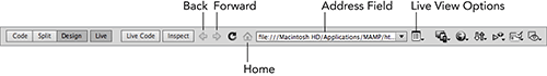
Next to the three initial view buttons (Code, Split, and Design) is a fourth: Live, for invoking Live View. Dreamweaver’s Live View is, at its heart, a full-fledged web browser. And, like other web browsers, Live View can be used to jump from one page to another via links or by direct URL input. You can control how you move through a site—and the code displayed—through the Document toolbar when in Live View. Entering Live View displays another mode of the Document toolbar, exposing buttons like Live Code and Inspect, as shown in Figure 2-15. Choose Live Code to reveal the code as processed by the browser.
Figure 2-15: Extended options are available on the Document toolbar when in Live View.
Adjacent to Live View is the Inspect button. Click Inspect to display color-coded backgrounds for the margins (yellow), padding (purple), border (green), and content (blue) areas of any element you hover over while in Live View. If you’re not in Live View when you click Inspect, Dreamweaver automatically shifts into that mode.
Tip: You’ll get the most out of the Inspect feature if your CSS panel is open in Current mode. Depending on the situation, you might also find it helpful to have Live Code enabled in Split view.
Much of the Document toolbar’s functionality when in Live View is given over to mimicking a traditional browser. There are back and forward buttons, an easy way to refresh the page, an address field for quick URL entry, and even a home icon to get you back where you started. More Dreamweaver-specific commands that, for example, allow you to freeze JavaScript and reveal generated code, are handily grouped under a menu button. The key elements of the Browser Navigation toolbar are:
- Back and Forward: Browser-like buttons for moving to and from a previously selected web page.
- Refresh: Reloads the current page.
- Home: Displays the initially loaded page in Live View.
- Address: Shows the current pages URL and can be used to enter a new web address.
- Live View options: Contains a collection of commands related to Live View.
Once Live View is engaged, the additional icons on the Document toolbar become active, and the current page’s file URL is shown in the Address field, like file:///C|/inetpub/wwwroot/Ellen%20Celli%20Jewelry/index.htm or, on the Mac, file:///Macintosh%20HD/Users/josephlowery/Sites/markofthejoe/index.htm. Amazingly, you can enter any standard URL in the Address field, press Enter (Return), and, assuming you’re online, display that web page in Dreamweaver. Moreover, if you click Live Code, you can even see how it’s built, as shown in Figure 2-16.
Figure 2-16: Reveal the underlying code as used by the browser in Live Code.
The Live View Options menu offers a variety of commands, all geared toward helping you make the most of Live View:
- Freeze JavaScript: Stops JavaScript from functioning so you can inspect the current state in Live Code.
- Disable JavaScript: Turns JavaScript off, as a user might, to display the page under that condition.
- Disable Plugins: Turns off any plugin, such as the Flash Player, so you can test your page output in that scenario.
- Highlight Changes In Live Code: Adds a background color to source code during user interactivity.
- Edit The Live View Page In A New Tab: Opens the current page, navigated to in Live View, in a new Document Window.
- Follow Link (Ctrl+Click/Cmd+Click Link): Displays linked pages in Live View when the listed keys are pressed and the link clicked.
- Follow Links Continuously: Displays related pages when the link is clicked without requiring a modifier key.
- Automatically Sync Remote Files: Includes related files that are hosted remotely automatically.
- Use Testing Server For Document Source: Pulls the linked pages from the designated testing server in the Site dialog box.
- Use Local Files For Document Links: Relies on files saved locally to displayed linked pages.
- HTTP Request Settings: Opens a dialog box for setting URL and form parameters.
Cross-reference: For more details on using the Live View options, see Chapter 5. HTTP Request Settings are covered in Chapter 21.
The Standard toolbar
You can toggle the Standard toolbar on and off by choosing View Toolbars Standard. When first enabled, the Standard toolbar appears across the top of the Dreamweaver window, whether you’re in Design view or Code view. As shown in Figure 2-17, the Standard toolbar offers some of the most frequently used editing commands, familiar to you from any word processing program.
Figure 2-17: The Standard toolbar contains frequently used editing commands.
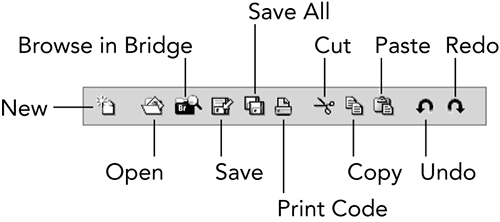
The first group of buttons you find on the Standard toolbar includes New, Open, Browse in Bridge (Adobe’s visual file browser), Save, Save All, and Print Code. These create a new document, open an existing document, display available assets in Adobe Bridge, save the current document, save all open documents, and print the code of the current document, respectively. The next group of buttons includes Cut, Copy, and Paste. These enable you to place a selected item on the clipboard and then paste it into another location. The final group of buttons on the Standard toolbar includes the all-important Undo and Redo. Undo removes the effects of the last action you performed, and Redo repeats the most recent action or performs an undone action again.
Cross-reference: For more details on how to use Bridge with Dreamweaver, see Chapter 24.
In Windows, you can reposition the Standard toolbar by clicking one of the separator bars between the toolbar buttons and then dragging. If you drag the Standard toolbar away from the edge of the window, it becomes a floating toolbar. You can dock the Standard toolbar by dragging it to the top or bottom edge of the window. On a Mac, the Standard toolbar cannot be repositioned.
The Style Rendering toolbar
One of the reasons CSS is increasingly used for layout is its capability to target different media types. Although web designers most frequently do not specify a media type at all—which is the same as using one style sheet for all output devices—savvy designers take the time to optimize their pages for both screen and printer at a minimum.
The W3C specification recognizes many different media types including Screen, Print, Handheld, Projection, TTY, and TV. Through the Style Rendering toolbar (see Figure 2-18), Dreamweaver allows designers to switch from one type to another, if defined. This feature is extremely helpful when the designer needs to add a print-friendly style sheet. As web designers restyle their content to fit other devices, such as handhelds, the Style Rendering toolbar becomes indispensable.
Figure 2-18: The Style Rendering toolbar allows you not only to quickly switch between CSS media types but also to toggle CSS rendering on and off.
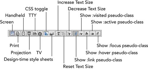
The next button on the Style Rendering toolbar toggles the rendering of CSS. This capability is extremely helpful when optimizing your CSS; for example, without CSS layout, you can quickly tell how a screen reader would approach your page and determine if content needs to be repositioned to make it more understandable.
The Style Rendering toolbar’s next button, Design-Time Style Sheets, allows the designer to include or exclude CSS style sheets to be rendered in the development phase; that is, design time. This is a powerful feature that can help fine-tune Dreamweaver’s rendering capabilities without affecting the final published output.
Modern browsers all make it relatively easy for users to change the text size of the web page they’re looking at. The next three buttons on the Style Rendering toolbar—Increase Text Size, Reset Text Size, and Decrease Text Size—help you simulate that effect so you can gauge how your layout is affected.
Note: Changing text size by itself isn’t used as much these days as all major browsers now support page zoom, which increases the size of both text and images together.
The final set of buttons on the Style Rendering toolbar is great for displaying another browser feature, link states. Hyperlinks have five different states possible:
- Link: The initial state of the hyperlink when the page first loads.
- Visited: How the link looks after it has been clicked.
- Hover: The appearance displayed when the user’s mouse rolls over the link.
- Active: The state invoked when the user’s mouse clicks a link and the mouse button is held down.
- Focus: The state triggered by the user tabbing to a particular link.
In CSS, these states are referred to as pseudo-classes because, like a standard CSS class, they can be assigned to any number of page elements, but unlike the typical class, they are dependent on the user’s actions and not the designer’s coding. These pseudo-class buttons are mutually exclusive, and you can display only one at a time.
The Coding toolbar
The Coding toolbar is quite different from the other toolbars in a number of ways. First, it’s only available in Code view, and second, it’s a vertical rather than horizontal toolbar. The Coding toolbar also cannot be repositioned in either Windows or Mac. These differences, however, quickly fall by the wayside once coders understand the power inherent in the toolbar.
Much of the functionality is unique to the Coding toolbar (see Figure 2-19), although a few commands are replicated from elsewhere in the Dreamweaver interface for ease of use. The very top button, Open Documents, falls into the former category; click the Open Documents button to see a list of all files currently open. What distinguishes this button from other file listings—on the document tabs and under the Window menu—is the listing of the full path to the file rather than just the filename. The first time you have four files from separate folders, all named index.html, open at the same time, you’ll immediately grasp the value of this feature.
Figure 2-19: The Coding toolbar hugs the left edge of Code view, easily accessible to the power coder.
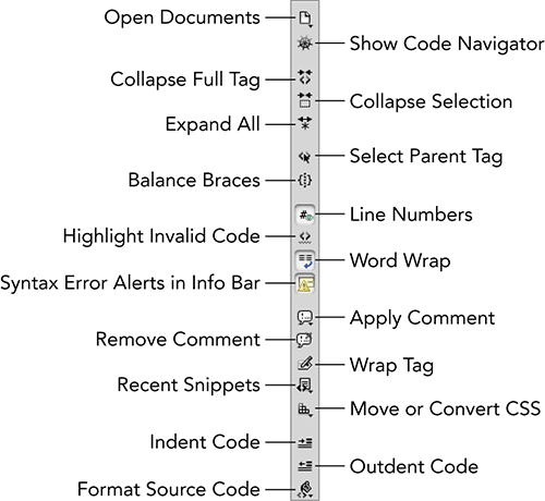
Tip: The Code Navigator allows you to quickly move to any code functions related to or affecting the current selection. When Show Code Navigator—a nautically themed ship’s wheel icon—is clicked, the Code Navigator window appears with a series of links. Click any link to go directly to the code.
The next group of functions relate to Dreamweaver’s Code Collapse functionality. Included in this group are Collapse Full Tag, Collapse Selection, and Expand All. When clicked, Collapse Full Tag expands the current selection to the immediate tag and collapses the code. Press Alt (Option) while clicking either Collapse Full Tag or Collapse Selection to collapse all except the current tag or selection, respectively; a very useful feature when you’re trying to focus on one aspect of your code.
The following group of buttons helps coders verify proper code. Select Parent Tag quickly highlights the tag surrounding the current selection, clicking it again highlights its parent’s tag, and Balance Braces selects code within the matching set of parentheses, braces, or square brackets. Both Line Numbers and Highlight Invalid Code can also be found in the Visual Aids menu option of the Document toolbar.
Caution: Dreamweaver reads your code as you write it or make any changes in Code view. If any errors are found in the syntax of your code, a yellow info bar appears at the top of the document with the line number of a possible problem in your code if the Syntax Error Alerts In Info Bar option is enabled. If you’re making a number of changes, you might want to disable this option to prevent being alerted to a series of false positives.
Comments are an essential building block of any programming language, and Dreamweaver supports a wide range of them. Under the Apply Comments button, you’ll find the option to insert HTML, JavaScript, CSS comments, and more. The different types of comments available are:
- <!-- HTML Comments -->
- /* CSS or JavaScript block style comments */
- // CSS or JavaScript single line style comments
- @apos;Visual Basic single line style comments
- ASP, ASP.NET, JSP, PHP, or ColdFusion style comments, depending on the application server used
Each of the comment options wraps a selection in the chosen comment style; in the case of single line style comments, the comments are placed at the start of each selected line. If no code is highlighted, an empty comment of the desired type is inserted.
Paired with the Apply Comment button is another option for deleting them: Remove Comment. The Remove Comment feature uncomments any selected code and will remove multiple comments unless they are nested. In the case of nested comments, only the outer comments are deleted.
Need a quick way to add a parent tag to a selection? Choose Wrap Tag and you can easily enter the desired outer element, along with any desired attributes and values. Press Enter (Return) to confirm your choices and the parent tag code is inserted.
You can wrap content with much more than a single tag through the Recent Snippets button. The Recent Snippets feature lists the 10 most recently used snippets, which can be either wrap or block type.
The next button, Move or Convert CSS, includes two CSS management functions: Convert Inline CSS to Rule and Move CSS Rules. The Convert Inline CSS to Rule extracts styles that are defined within a selected tag (or inline), like this:
<div id=@quot;pullQuote@quot; style=@quot;float: right; margin: 5px;@quot;>
to a new rule, like this:
pullQuote {
float: right;
margin: 5px;
}
You’ll have an opportunity to choose whether the new rule should be saved in the <head> section of the current document or in an external style sheet. Inline styles are harder to manage and more limited in their effect and, under most circumstances, should be converted to rules.
The clearly named Move CSS Rules does just that: moves selected CSS rules from the current page or style sheet to an external style sheet. You can specify an existing style sheet or create a new one to hold your rules. This command is especially beneficial for designers who—like me—prefer to embed CSS rules when first creating a new layout.
The final buttons on the Coding toolbar are used for styling your code. The Indent Code and Outdent Code buttons move selected code blocks in or out according to the options set in the Code Format category of Preferences. The final button, Format Source Code, allows you to style either the entire document or a selection of your code according to the Code Format Settings, which, along with another code style option, Tag Libraries, is also available under this menu.
Selecting from the Insert Panel
The Insert panel holds the items most frequently used—the primary colors, as it were—when designing web pages. You can select everything from images to ActiveX plugins to HTML comments from the Insert panel.
The Insert panel is divided into separate categories of objects: Common, Layout, Forms, Data, Spry, jQuery Mobile, InContext Editing, Text, and Favorites. Additional advanced categories are available for various server-side scripting languages: ASP, CFML Basic, CFML Flow, CFML Advanced, PHP, and XSLT. These advanced categories are available only when the currently open document is of the relevant file type, as determined by its file extension. Table 2-2 shows the file extensions related to each category.
Table 2-2: File Types for Advanced Categories
|
Insert Panel Category |
Related File Extensions |
|
ASP |
.asp |
|
CFML Basic |
.cfm, .cfc |
|
CFML Flow |
.cfm, .cfc |
|
CFML Advanced |
.cfm, .cfc |
|
PHP |
.php, .php3 |
|
XSLT |
.xsl |
The initial view is of the Common category. Switch from one category to another by selecting the appropriate choice from the category menu (see Figure 2-20).
Tip: If you yearn for the good old days pre-CS4, when the Insert panel was an Insert bar, fear not. From the Workspace switcher, choose Classic to move the Insert panel to its former position above the Document window. Once the change is made, if you prefer the menu view rather than the Insert panel tab view, choose Show As Menu from the bottom of the category menu. To switch back, right-click and choose Show As Tabs, as shown in Figure 2-21.
Figure 2-20: Switch categories from the pop-up menu on the Insert panel.
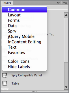
Figure 2-21: You can switch your Insert panel view from menus to tabs and back again when in the Classic workspace.

If the Insert panel is not available when you first start Dreamweaver, you can enable it by choosing Window Insert, View Toolbars Insert, or by pressing the keyboard shortcut, Ctrl+F2 (Command+F2). Likewise, choosing Window Insert, View Toolbars Insert, or the shortcut again, closes the Insert panel.
Tip: The icons in Dreamweaver’s Insert panel are intentionally grayscale in appearance to keep focus on the web page under development. When you hover over them with your cursor, they change to a colored icon. If you’d prefer to have the icons always appear in color, right-click (Control+click) and choose Colored Icons from the pop-up menu.
The following sections describe each category in the Insert panel.
Common objects
The most frequently used HTML elements, aside from text, are accessible through the Common category of the Insert panel.
The Insert panel in Dreamweaver uses menu buttons in each category, like the Images and Media menus in the Common category. Menu buttons are identifiable by a small downward-pointing arrow to the right of the button. Numerous objects are contained within each menu group; when you choose an object, that object becomes the default item for the menu. For example, if you choose Image Placeholder from the Images menu group, the icon for that menu item is displayed in the Insert panel. Image Placeholder then becomes the default until another item from the group, such as Image or Fireworks HTML, is chosen. The first time any menu button is accessed, no default object yet exists, and you must choose an object from the menu group.
The Common category contains five submenus: Images, Media, Head, Script, and Templates. Everything from basic images to the navigation bar is available from the Images group, as shown in Figure 2-22. Dreamweaver facilitates the inclusion of external elements—such as multimedia animations, Java applets, plugins, and ActiveX controls—through the Media group of the Insert panel’s Common category. Under the Head menu button, you’ll find tags that affect or describe the entire document, such as keywords and description, and that are inserted in the <head> area of the page. The Script group contains only two objects—Script and No Script—that give the designer the option of including JavaScript external files or functions or telling the browser what to display if the user does not have JavaScript enabled. Templates are special Dreamweaver documents that define the layout and visual design of a page. The most common template options are found under the Template menu on the Insert panel’s Common category.
Figure 2-22: Graphics-related objects are grouped under the Images menu in the Common category.
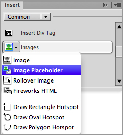
Many of the common objects open a dialog box that enables you to browse for a file or specify parameters. If you prefer to enter all your information (including the necessary filenames) through the Property inspector or in Code view, you can turn off the automatic appearance of the dialog box for some objects when inserted through the Insert panel or the menus. Choose Edit Preferences (Dreamweaver Preferences) and, from the General category, clear the Show Dialog When Inserting Objects option. In the Common category, this option affects the Hyperlink, Email Link, Named Anchor, Insert Table, Image, and Image Placeholder, as well as all the Head elements and Flash objects.
Note: Additional Preferences settings, located in the Accessibility category of the Preferences dialog box, also cause dialog boxes to appear when you insert an object using the Insert panel. These accessibility dialog boxes appear even if the Show Dialog When Inserting Objects option is clear.
General document information—such as the title and any descriptive keywords about the page—is written into the <head> section of an HTML document. The Head menu objects enable web designers to drop in these bits of code in a handy object format. Although Dreamweaver enables you to see the <head> objects onscreen via the View Head Content menu option, you don’t have to have the Head Content visible to drop in the objects. Simply click any of the objects, and a dialog box opens, prompting you for the needed information.
Script menu objects simplify the task of adding custom scripts or server-side includes to your page.
Layout objects
You use the Layout category of the Insert panel to work with tables, <div> tags, AP elements, and Fluid Grid Layout Divs—objects that enable you to define the layout of your page. You can even insert advanced JavaScript-controlled elements through the four Spry widgets available here: the Spry Menu Bar, Spry Tabbed Panels, Spry Accordion, and Spry Collapsible Panel. These objects are explained a bit later in this chapter in the section covering the Spry category, “Spry Objects.”
Dreamweaver offers you two ways to work with tables. You can use Standard mode (where you define the structure of a table using dialog boxes, menu commands, and the Property inspector), or you can use Expanded Table mode (where the table structure is made more obvious for easy modification). Switch between these mutually exclusive modes by clicking their buttons in the Layout category.
You’ll also find objects for manipulating table structure, such as those for adding a row or column, as shown in Figure 2-23.
Figure 2-23: Whether you are working with <divs> or <table> tags, the Layout category has what you need.
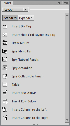
Note: Because of the visual nature of tables and AP elements, many of the objects in the Layout category can be used only in Design view.
Forms objects
Forms are the primary method for implementing HTML interactivity. The Forms category of the Insert panel gives you the basic building blocks for creating your web-based form—including the Form tag, Text field, Checkbox, and Radio buttons—as shown in Figure 2-24.
Figure 2-24: Implementing forms is a key aspect of web applications; not shown are the various Spry Validation form objects.
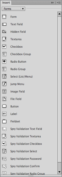
As with the Layout category, the Forms category has several JavaScript-driven objects. These Spry-based elements provide form validation and the basic form object. For more details, see the section “Spry Objects” later in this chapter.
Data objects
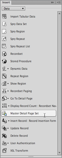
Although the layout of a web page and the dynamic content that fills it may vary widely, much of the code underlying basic web data operations remains the same. For example, the basic code that is used to insert employee records into a Human Resources database may also be used to add a new entry into a database that maintains a DVD collection. Dreamweaver removes much of the tedium of scripting common web applications by supplying objects in the Data category of the Insert panel. Additionally, you’ll also find objects for handling data in non-dynamic formats, including importing tabular data and applying Spry data sets. For more information about the Spry elements, see the following section.
With a single Data object, you can build an entire web application that displays a list of records, enables you to navigate through them, displays which records are currently onscreen, and links to another page with detailed information from a selected record. In general, Dreamweaver’s Data objects can be used separately or together. The Master Detail Page Set object includes two other Data objects: the Recordset Navigation Bar object and the Recordset Navigation Status object.
Data objects, shown in Figure 2-25, are particularly powerful when combined with Dreamweaver’s template feature. It’s possible, for example, to create a basic Master Detail Page Set with the Data object and then apply a template to give the page a specific look and feel, thereby integrating it into a site. Numerous menu buttons bring almost all of Dreamweaver’s server-side power to the Insert panel.
Figure 2-25: Common web data, such as the Master Detail Page Set, are created in one action with Dreamweaver’s Data objects.
Spry objects
Spry is an Ajax (Asynchronous JavaScript and XML) framework developed by Adobe. The Spry objects in Dreamweaver make it easy to apply the more powerful facets of Ajax, including the capability to update data in a portion of the page without refreshing the entire page.
The Spry category of the Insert panel, shown in Figure 2-26, is divided into three groups: data, forms, and layout. As noted earlier, these objects are also available from each of the Insert panel’s corresponding categories. The Dreamweaver team decided to take this multiple access approach to both highlight the new Spry technologies and emphasize where the various components fit in the web designer’s workflow.
Cross-reference: You’ll find a full chapter devoted to the world of Ajax and the Spry implementation in Chapter 16.
Figure 2-26: Spry objects make it possible to include advanced JavaScript and XML technologies with the click of a mouse.
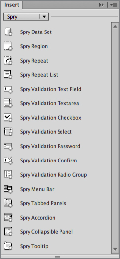
The Spry data objects work with associated HTML or XML files to selectively display just the data requested by the user. The first object in the group, Spry Data Set, is a wizard that establishes the connection to the data and, optionally, lays out the elements. The other objects are components of this process and can be applied separately. Table 2-3 details the individual Spry data objects.
Table 2-3: Spry Data Objects
|
Icon |
Name |
Description |
|
Spry Data Set |
Identifies an HTML or XML data source and data columns to work with. |
|
Spry Region |
Sets an HTML tag, typically <div> or <span>, to work with a specified Spry data set. |
|
Spry Repeat |
Establishes a repeating region for Spry data within <div> or <span> tags. |
|
Spry Repeat List |
Repeats Spry data for list-related tags, such as <ol>, <ul>, or <dl>. |
The Spry form objects add client-side validation to a range of form elements. With validation enabled, users are immediately informed if they enter their information in the wrong format. Table 2-4 lists the available Spry form objects.
Table 2-4: Spry Form Objects
|
Icon |
Name |
Description |
|
Spry Validation Text Field |
Inserts a standard text field with 13 different validation types. |
|
Spry Validation Textarea |
Inserts a textarea form element that can be required or restricted to a certain number of characters. |
|
Spry Validation Checkbox |
Includes a checkbox form element to the page that can be required or, if multiple checkboxes are used, restricted to a minimum or maximum selected. |
|
Spry Validation Select |
Adds a menu select list to the page that checks to see if a choice or invalid selection has been made. |
|
Spry Validation Password |
Inserts a password field with masked input, which can require a defined number of letters, numbers, uppercase letters, and special characters. |
|
Spry Validation Confirm |
Adds a password or text field where the input value is required to match the input value of another such field on the form. |
|
Spry Validation Radio Group |
Includes two or more radio buttons, which can be required. |
The four Spry layout objects bring enhanced layout possibilities to every designer’s palette. Each of the Spry layout options—from the Menu Bar to the Accordion panel—are easily customizable in Design view with the help of the dedicated Property inspectors. Table 2-5 provides details about the Spry layout objects.
Table 2-5: Spry Layout Objects
|
Icon |
Name |
Description |
|
Spry Menu Bar |
Inserts a standards-based vertical or horizontal navigation bar, capable of supporting multiple levels. |
|
Spry Tabbed Panels |
Adds a series of content areas to the page, each made visible by selecting the corresponding tab. |
|
Spry Accordion |
Initially includes two sliding content areas, which can be opened and closed interactively by the page visitor; additional areas can easily be added. |
|
Spry Collapsible Panel |
Inserts a pod-like region that can be expanded or collapsed with a mouse click. Multiple panels, independently controlled, can be applied to a page. |
|
Spry Tooltip |
Adds a completely customizable tooltip to any page selection, which can be configured with various effects, such as fade and blind. |
jQuery Mobile objects
The jQuery framework has, for several years, been among the most popular JavaScript libraries for web development in general, and the recently introduced jQuery Mobile framework looks to achieve the same success for the mobile platform. jQuery Mobile gives a common look and feel across a wide spectrum of mobile device operating systems, including iOS, Android, Blackberry, and Windows, among others. Dreamweaver makes it easy to set up and implement a mobile-optimized site or mobile app with the jQuery Mobile objects, as shown in Figure 2-27.
Figure 2-27: Take advantage of the mobile platform’s advanced functionality by adding an object from the jQuery Mobile category.
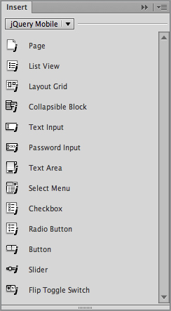
When you first insert a jQuery Mobile object, Dreamweaver presents you with a dialog box that sets up the framework for you, copying files and inserting code where needed. You have the option of working with locally or remotely hosted JavaScript and CSS files or even using another version entirely.
The jQuery Mobile objects cover a great deal of functionality, from core layout to enhanced user controls. Unlike standard websites, which typically rely on a separate HTML file for each page, a jQuery Mobile site can use a single file for numerous pages. This basic division is set up with the Page object. The page is often structured using a List View for navigation, and a Layout Grid or Collapsible Block for content. A full array of form controls is included, each within its own contained area that combines label and field. You’ll find details about the complete collection of jQuery Mobile objects in Table 2-6.
Table 2-6: jQuery Mobile objects
|
Icon |
Name |
Description |
|
Page |
Inserts code for a <div> tag with a data-role attribute of page with optional header and footer sections. |
|
List View |
Adds code for an unordered or ordered list with a data-role attribute of listview and a variety of options. |
|
Layout Grid |
Inserts code for a user-definable grid of layout <div> tags. |
|
Collapsible Block |
Includes code for creating a jQuery-driven collapsing and expanding area. |
|
Text Input |
Adds a <label> tag and <input> text field within a <div> tag with a data-role attribute of fieldcontain. |
|
Password Input |
Same as Text Input, but the <input> tag is set to type=password. |
|
Text Area |
Same as Text Input, with a <textarea> instead of <input> tag. |
|
Select Menu |
Same as Text Input, with a <select> instead of <input> tag. |
|
Checkbox |
Same as Text Input, but the <input> tag is set to type=checkbox. |
|
Radio Button |
Same as Text Input, but the <input> tag is set to type=radio. |
|
Button |
Inserts code for one or more links, <button> or <input> tags that act as buttons. |
|
Slider |
Same as Text Input, but the <input> tag is set to type=range. |
|
Flip Toggle Switch |
Same as Select Menu with two options specified (Off and On) and data-role=slider. |
Cross-reference: To learn more about the exciting possibilities of the jQuery Mobile objects, see Chapter 17.
InContext Editing objects
InContext Editing allows anyone to make updates to specific areas of their web pages directly through the browser, without installing any additional software. Offered as part of the Business Catalyst hosting, InContext Editing is perfect for those clients who want control of their content but lack the technical expertise to create and modify the pages in a web authoring tool like Dreamweaver. The InContext Editing editable areas are inserted and managed through the objects found in the Insert panel InContext Editing category, shown in Figure 2-28. In addition to an object for creating an editable region, this category also includes another for generating a repeating region.
Figure 2-28: InContext Editing objects make it possible to modify web pages directly in the browser.

Cross-reference: InContext Editing is covered in depth in Chapter 28.
Text objects
The text objects represent the most commonly used text formatting HTML tags, such as those needed to emphasize text or create bulleted lists (see Figure 2-29).
The Text objects behave differently, depending on whether you are working in Design view or Code view. If you are working in Code view, Dreamweaver puts you in charge and simply surrounds whatever text is selected with the appropriate HTML tags. If no text is selected, the tag pair is inserted at the current text insertion point.
In Design view, Dreamweaver also surrounds selected text with the appropriate tag pair. But in some situations, Dreamweaver does more than blindly surround the selected text with the specified HTML tags. The following examples illustrate the additional processing that occurs in Design view:
- In Design view, the Paragraph, Preformatted Text, Heading 1, Heading 2, and Heading 3 objects are treated as mutually exclusive. If you select text that is formatted as a Heading 1, and then you click the Heading 2 button on the Insert panel, Dreamweaver not only surrounds the selected text with <h2></h2> tags but also removes the <h1></h1> tags that were there before. In Code view, Dreamweaver simply adds the <h2></h2> tags without automatically removing the <h1></h1> tags. This is inappropriate coding and should be avoided.
- When you select one or more paragraphs of text in Design view and then click the Unordered List button, Dreamweaver creates a bulleted list by inserting <ul></ul> tags around the selected text, as in Code view. But in Design view, Dreamweaver additionally converts each paragraph to a separate item in that list by inserting the appropriate <li></li> tags. The same is true for Ordered lists and Definition lists.
Figure 2-29: Change the format of selected text by choosing a Text object.
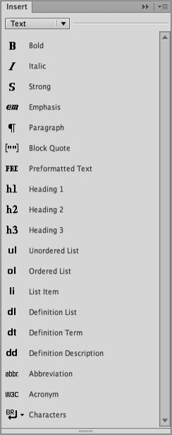
In Design view, if no text is selected when you click one of the text formatting buttons in this category, no tags are added until you start typing. This feature helps prevent the inclusion of empty tag pairs within your document.
The Text category contains a single menu button: Characters. Certain special characters—such as the copyright symbol (©)—are represented in HTML by codes called character entities. Dreamweaver eases the entry of these complex, hard-to-remember codes with the Characters objects. The most commonly used characters are included as separate objects, and another button opens a dialog box with additional special characters from which to choose. The Characters category also contains objects for inserting a line break and a nonbreaking space.
Favorites
Because you can choose from an overwhelming number of objects on the Insert panel, the Favorites category is a welcome and productive addition to Dreamweaver. Initially, no objects are displayed in the Favorites category—it’s up to you to choose which objects to include. All modification of the Favorites category is handled through the Customize Favorite Objects dialog box (see Figure 2-30), which shows all the available objects on the left and the selected objects on the right. Objects can be grouped through use of a dotted-line separator.
To add, remove, or modify objects in the Favorites category, follow these steps:
1. Choose Favorites from the Insert panel menu or tab.
2. Right-click (Control+click) and choose Customize Favorites from the context menu. You can actually perform the same action from any category/tab of the Insert panel to open the Customize Favorite Objects dialog box.
3. In the Customize Favorite Objects dialog, select the category holding the object you want to display in the Favorites category from the drop-down list under Available Objects. The All category displays every available object, sorted by category. If you know what category your object is in, it’s quicker to select that category from the list.
Figure 2-30: Use the Customize Favorite Objects dialog box to personalize your Insert panel for maximum productivity.
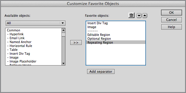
4. Choose an object from those listed in the Available Objects area and select the double-arrow button. The selected item moves to the Favorite Objects list.
5. Repeat Steps 3 and 4 to declare additional objects as favorites.
6. Change the order in which the objects are displayed by selecting an object and then clicking Up or Down to move the object left or right, respectively.
7. To delete an object from the Favorites list, select it and choose Remove.
8. To group objects together, choose Add Separator to insert a dotted-line divider.
9. When you’re finished, click OK.
The objects you’ve selected, in the order you’ve specified, appear in the Favorites category. You can modify these objects at any time by re-opening the Customize Favorite Objects dialog box.
ASP objects
If you are creating Active Server Pages, the ASP category of the Insert panel can speed up the development of your code. Only available when the current document is named with an extension of .asp, this category contains the building blocks of an ASP page.
CFML and CFForm objects
The CFML and CFForm categories of the Insert panel give you access to the most frequently used objects in the ColdFusion toolbox. These categories are available on the Insert panel only if the active document has a file extension of .cfm or .cfc. In addition to the standard objects, there are a couple of menu buttons. The first is Flow, which inserts ColdFusion markup tags that alter the flow of control through the code. The second is Advanced, which provides numerous advanced functions, such as those that enable you to transfer files and data using a variety of protocols.
Tip: You can find detailed descriptions of the ColdFusion tags in the Reference panel. To view the ColdFusion documentation, select Window Reference, and then select Adobe CFML Reference from the Book drop-down list.
PHP objects
The PHP category of the Insert panel enables you to insert code used in the PHP server-side scripting language. This category is available only if you are working in a document with the extension of .php, .php3, .php4, or .php5.
XSLT objects
If you’re building either an XSLT fragment or a full page, you’ll have access to the XSLT object category of the Insert panel. This category replicates features available from the Insert XSLT Objects menu and includes Dynamic Text, Repeat Region, Conditional Region, Multiple Conditional Region, and XSL Comment.
Getting the Most Out of the Property Inspector
Dreamweaver’s Property inspector is your primary tool for specifying an object’s particulars. What exactly those particulars are—in HTML, they are known as attributes and in CSS, properties—depends on the object itself. The contents of the Property inspector vary depending on which object is selected and which button, HTML or CSS, is selected. For example, click anywhere on a blank web page, and the Property inspector set to HTML shows text attributes for format, bold, italic, and so on. When in CSS mode, the same selection displays the targeted rule, font name, size, color, and so on. You can see the differences between the two modes in Figure 2-31. If, however, you click an image, the Property inspector displays a small thumbnail of the picture, and the image’s attributes for height and width, image source, link, and alternative text. There is no HTML or CSS option.
Figure 2-31: The Property inspector takes many forms, depending on the HTML element you select and, if text, whether you’re in HTML (top) or CSS mode (bottom).
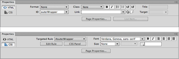
Manipulating the Property inspector
You can enable the Property inspector by choosing Window Properties or selecting the keyboard shortcut Ctrl+F3 (Command+F3). As with the Insert panel, the Property inspector can be closed by clicking the Close button (available only if the Property inspector is floating), unchecking Window Properties, or choosing the keyboard shortcut again. You can also close the Property inspector by selecting Close Panel Group from the panel menu, which is accessed by clicking the gray button at the right side of the Property inspector’s title bar (see Figure 2-31).
Caution: For text—whether in a paragraph, heading, or table cell—the Property inspector can switch between two modes: HTML and CSS. You move from one mode to the other by clicking the HTML or CSS button on the far left of the Property inspector. When in HTML mode, you can choose a standard text format, such as paragraph or any of the heading tags, set a class or ID, provide a link, add a <strong> or <em> tag through the Bold and Italic buttons, or change to an ordered or unordered list. Enter CSS mode to redefine text-based properties of applied rules, such as font-family, color, font-size, font-weight, font-style, and text-align. The CSS mode is also an efficient way to initially define a new style for a selection.
Cross-reference: For more information about applying the HTML attributes and CSS properties to text, see Chapter 7.
You can reposition the Property inspector in one of the following ways:
- If the Property inspector is floating, you can click and drag the drag bar that appears along the left edge of the window and move it to a new location.
- You can also click and drag any open gray area in the floating inspector itself, a difference between it and the Insert panel. This technique is handy for quickly moving the inspector aside, out of your way.
- When you move the floating inspector near the edge of the screen or near a window border, the Property inspector snaps to the edge of the window or screen.
The Property inspector initially displays the most typical attributes for a given element. Virtually all the inserted objects have additional parameters that can be modified. Unless you’re tight on screen real estate, it’s a good idea to keep the Property inspector expanded so you can see all your options.
Tip: You can reveal (or hide) the expanded attributes by double-clicking any open gray area of the Property inspector.
Property inspector elements
Many of the attributes in the Property inspector are text boxes; just click in any one and enter a value. If a value already appears in the text box, whether a number or a name, double-click it (or click and drag over it) to highlight the information and then enter your new data—the old value is immediately replaced. You can see the effect of your modification by pressing the Tab key to move to the next attribute or by clicking in the Document window.
For several attributes, the Property inspector also provides drop-down list boxes that offer a limited number of options. To open the drop-down list of available options, click the arrow button to the right of the list box. Then choose an option by highlighting it.
Tip: Some options on the Property inspector are a combination drop-down list and text box—you can select from available options or type in your own values. For example, when text is selected, the font name and size are combination list/text boxes.
If you see a folder icon next to a text box, you have the option of browsing for a filename on your local or networked drive or manually inputting a filename. Clicking the folder opens a standard Open File dialog box (called Select File in Dreamweaver); after you’ve chosen your file and clicked OK (Open or Choose on the Mac), Dreamweaver inputs the filename and any necessary path information in the correct attribute.
Dreamweaver enables you to quickly select an onscreen file (in either a Document window or the Files panel) as a link, with its Point to File icon, found next to the folder icon. Just click and drag the Point to File icon until it touches the file (or the filename from the Files panel) that you want to reference. The path is automatically written into the Link text box.
Certain objects such as text, AP elements, and table cells enable you to specify a color attribute. The Property inspector alerts you to these options with a small color box next to the text box. You can type in a color’s name (such as blue) or its three- or six-figure hexadecimal value (such as #3366FF or #666), or select the color box. Choosing the color box opens a color picker, shown in Figure 2-32, which displays the so-called browser-safe colors. You can go outside of this range by clicking the System Color Picker icon in the upper-right corner of the color picker. Selecting this icon opens a full-range Color dialog box in which you can choose a color visually or enter its red, green, and blue values or its hue, saturation, and brightness values.
Figure 2-32: Dreamweaver’s color picker enables you to choose from a wide selection of colors, from the palette or right off the desktop, with the Eyedropper tool.
The color picker in Dreamweaver is very flexible. Not only can you choose from a series of color swatches, but you can also select any color onscreen with Dreamweaver’s Eyedropper tool. If you’d like to access the system color picker, the color wheel button opens it for you. You can also use the Default Color tool, which deletes any color choice previously inserted. Finally, you can use the color picker’s context menu to change the swatch set shown. By default, the Color Cubes view is shown, but you can also view swatches in a Continuous Tone configuration or in Windows OS, Mac OS, or Grayscale colors. Although the web designer may not use these options frequently, Adobe standardized the color picker across its product line to make it easier to switch between applications.
Tip: To close the color picker without selecting a color, click in the empty gray area at the top of the color picker.
The Property inspector also includes a panel menu. Open this context-sensitive menu by clicking the panel menu icon, located in the upper-right corner of the Property inspector. The commands on this menu vary depending on what type of object has been selected in the Document window. Some basic commands, however, are always available, regardless of what has been selected, such as the following:
- Help: Opens a Help topic for the current Property inspector.
- Close: Closes the Property inspector.
- Close Tab Group: Closes the Property inspector and any other panels it may be grouped with.
Note: Two additional commands that are typically available for panels, Group Properties With and Maximize Panel Group, are disabled for the Property inspector. You cannot dock the Property inspector with other panels, and you cannot change the height of the Property inspector.
Customizing Your Workspace with Dockable Panels
Dreamweaver is known for its powerful set of tools: behaviors, AP elements, and so much more. Dreamweaver presents its tools in a variety of panels, as shown in Figure 2-33. Panels can be combined into the same window; when grouped together in this way, each panel is displayed as a tab within the panel group. The panel groups can be floating, docked to each other, or docked within the Dreamweaver window.
Figure 2-33: Dreamweaver’s many tools reside in panels, which can float anywhere on the screen or be docked within the Document window.
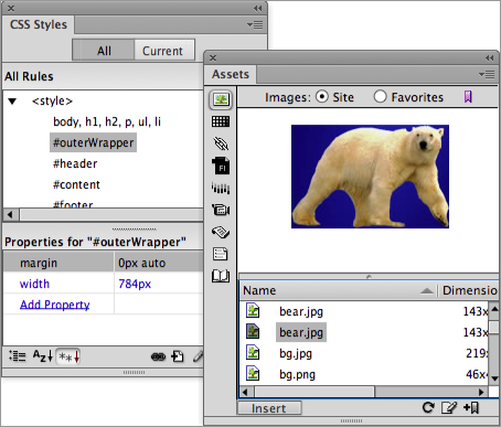
Table 2-7 lists each of the panels available in Dreamweaver, along with a description and a cross-reference to chapters in this book that provide more information about the panel. It also lists a keyboard shortcut that you can use to open the panel. If the keyboard shortcut is different between Mac and Windows platforms, the Mac shortcut is listed in parentheses after the Windows shortcut. If the Mac shortcut is not available, the initials N/A are displayed in the parentheses.
Table 2-7: Dreamweaver Panels.
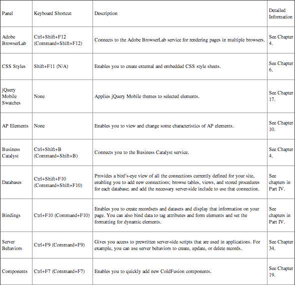

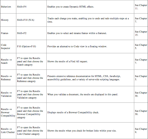
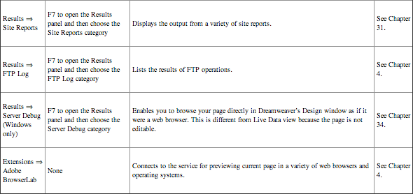
Hiding and showing panels
Because of the large number of panels available in Dreamweaver, your workspace can become cluttered very quickly. To reduce the amount of screen real estate taken up by the individual panels but still utilize their power, Dreamweaver enables you to group multiple panels in a single window. These groups of related panels are called, not surprisingly, panel groups. Whenever one panel is docked with another in a panel group, each panel becomes accessible by clicking its representative tab. Selecting the tab brings the panel to the front.
You can also display individual panels by using the keyboard shortcuts listed in Table 2-6 or by using commands in the Window menu; a separate command opens each panel. Using any of these methods opens the panel or brings it to the top if it is hidden; if the panel is already on top, any of these actions collapses the panel group so that only its title bar is showing.
Tip: One very important keyboard shortcut to remember is the F4 key, which hides all panels. This shortcut immediately clears the screen of all panels, including the Property inspector. Pressing F4 again restores all the hidden interfaces.
To maximize your Document window, you can reduce panels to an icon representation when closed. Simply make the panel smaller by dragging a panel’s left or right edge; if the panel or panel group is docked, you’ll need to drag the edge furthest from the program border. Once iconified, a click on the icon opens up the panel fully.
A panel can be set to remain open or automatically close once you click outside of it. To expose your options, right-click the dark gray border area. From the pop-up menu, choose Auto-collapse Iconic Panels to automatically close your panel; leave this option unchecked to keep the panel open.
The panel groups may be docked along the edges of the Dreamweaver window. In this situation, you can collapse all the panel groups to maximize your work area by clicking the double-triangle button that appears at the top of the panel, as shown in Figure 2-34. This action collapses only the panel groups docked on one edge of the screen, leaving intact toolbars, floating panels, or even panels docked along a different edge of the window.
Figure 2-34: You can collapse all the panel groups along one edge of the screen with the click of a single button.

In any workspace, you can collapse an individual panel group so that just its title bar is showing. To do this, double-click the panel group name in the title bar. To resize any floating panel, click and drag its borders. If the panel groups are docked together, you can drag the border of the panel area to resize all the panel groups in that area.
Finally, if you want to close a panel group entirely so that even its title bar is not visible, click the panel menu located on the right of the title bar in an open panel group, and then select Close Panel Group from the drop-down list. You can also right-click (Control+click) in the title bar and select Close Tab Group, even if the panel group is collapsed. The next time you open any panel within the group, the entire panel group opens automatically.
Note: The panel menu also gives you access to Help for the currently displayed panel and may contain additional commands specific to the panel that is open.
Customizing panel groups
Dreamweaver comes with related panels already combined into panel groups. However, you’re not limited to the predefined panel groups. In fact, the panel groups are completely customizable, giving you optimum control over your workflow. Moving panels from one group to another, creating new groups, and renaming panel groups are straightforward operations. If you want, you can also remove little-used panels from groups and reorder the panels within a group.
To move a panel from one group to another, drag the panel’s name tab and drop it into place; Dreamweaver displays a blue border to indicate where the panel will be positioned. If the blue border appears as a thin line below existing docked panels, the moved panel will appear in its own panel group. If the blue border is displayed on a panel group’s separator, the panel will be incorporated into that group. Finally, if the blue border appears to one side of the panel group, the panel will be docked to the side of the group. Why might you want to have two or more docked sets of panels? Dreamweaver (and all Creative Suite applications) allows only one panel in a docked panel group to be visible at one time. If you ever need to display two panels simultaneously, you can either establish them as individual panels or dock them in different panel groups.
Tip: To reorder panels within a panel group, simply drag them by their tabs into new positions.
How do you remove a panel from a panel group? Simply drag it away. You can move a panel group by dragging the panel’s tab (see Figure 2-35) and dragging the group to any location on the screen.
Figure 2-35: Drag the gray area to remove a panel from its dock.
Like many programs, Dreamweaver’s menus duplicate most of the features accessible through panels. Certain features, however, are available only through the menus in the Document window or through a corresponding keyboard shortcut. This section offers a reference guide to the menus when you need a particular feature or command. (Note to Windows users: The menus referred to here are those for the Document window and not the Files panel; the menu options particular to the Files panel are covered in Chapter 4.)
Tip: Almost every element placed in the Document window has a shortcut menu associated with it. To access a shortcut menu, right-click (Control+click) any area or object. The shortcut menus are context-sensitive and vary according to which object or area is selected. Using the shortcut menus can enhance your productivity tremendously.
Following is a glance at the various Dreamweaver Document window menus. You can find explanations of each command (along with its keyboard shortcuts for Windows and Mac) on this book’s website.
- File menu: Contains commands for file handling and overall site management. All import, export, and convert features are also found in this menu.
- Edit menu: Provides the commands necessary to quickly modify your page—or recover from a devastating accident. Many of the commands (Cut, Copy, and Paste, for example) are standard in other programs; others, such as Select Parent Tag, are unique to Dreamweaver.
- View menu: As you build your web pages, you may find that it’s helpful to be able to turn certain features on and off. The View menu centralizes all these commands and switches between Design view and Code view. One of the handiest commands hides all the visual aids with a keyboard shortcut, Ctrl+Shift+I (Command+Shift+I).
- Insert menu: Contains the same items available through the Insert panel. In fact, if you add additional objects, you can see your objects listed on the Insert menu the next time you start Dreamweaver. All objects selected from the Insert menu are added to the page at the current cursor position.
- Modify menu: Inserting objects is less than half the battle of creating a web page. Most web designers spend most of their time adjusting, experimenting with, and tweaking the various elements. The Modify menu lists all Dreamweaver’s commands for altering existing selections.
- Format menu: The Internet was initially an all-text medium, and despite all the multimedia development, the World Wide Web hasn’t traveled far from those beginnings. The Format menu commands cover overall formatting and provide access to the Color dialog box.
- Commands menu: Commands are user-definable code capable of affecting almost any tag, attribute, or item on the current page—or even the current site. Commands increase your productivity by automating many of the mundane, repetitive tasks in web page creation.
Dreamweaver comes with several handy commands, but they are truly just the tip of the iceberg. Commands are written in a combination of HTML and JavaScript and can be created and modified by any capable JavaScript programmer.
The first few items on the Commands menu enable you to create, add, and manage custom commands. The additional items represent standard commands that come with Dreamweaver. If you add custom commands to Dreamweaver, they also appear in this menu.
- Site menu: Web designers spend a good portion of the day directly interacting with a web server: putting up new files, getting old ones, and generally maintaining the site. To ease the workflow, Dreamweaver groups site-management commands in their own menu.
- Window menu: Manages both program and user-opened windows. Through this menu you can open, close, arrange, bring to the front, or hide all the additional Dreamweaver screens.
Tip: The commands for Dreamweaver’s various windows, panels, and inspectors are toggles. Select a command once to open the window; select it again to close it.
- Help menu: Provides access to Dreamweaver’s excellent offline and online Help, as well as special examples and lessons.
In this chapter, you were introduced to some of the power of Dreamweaver and had a look at its well-designed layout. From the Insert panel to the various customizable panels, Dreamweaver offers you an elegant, flexible workspace for creating next-generation websites. Here are some of the key points covered in this chapter:
- Users can choose from 11 default workspace layouts or choose to structure their workspace in whatever manner best suits their workflow. The same basic tools are available in each layout; the primary difference involves where the panels are located and whether you have more than one display.
- The Document window is your main canvas for visually designing your Dreamweaver web pages. This window includes simple, powerful tools such as the Tag Selector, Zoom, and the Window Size pop-up menu.
- Frequently used tools are available on Dreamweaver’s various toolbars. The toolbars can be displayed or hidden depending on your personal preferences.
- The Insert panel is Dreamweaver’s toolbox. Highly customizable, the Insert panel holds the elements you need most often, grouped into useful categories. You can customize one category of the Insert panel, Favorites, and place your own most commonly used objects together.
- Dreamweaver’s mechanism for assigning details and attributes to an HTML object is the Property inspector. The Property inspector is context-sensitive, and its options vary according to the object selected.
- Many of Dreamweaver’s tools reside in separate panels, which can be combined into panel groups. Panel groups can be docked or floated, hidden or shown, depending on your workflow.
- Dreamweaver’s full-featured menus offer complete file manipulation, a wide range of insertable objects, the tools to modify them, and extensive online—and on the web—help. The most commonly used menu items can be invoked through keyboard shortcuts.
- Dreamweaver offers a direct connection to Adobe’s robust hosting service, Business Catalyst. Once you’ve signed up to Business Catalyst, you can create and modify sites from within Dreamweaver.
In the next chapter, you learn how to customize Dreamweaver to work the way you work by establishing your own preferences for the program and its interface.