
Chapter 10
Power Tools for “Measure”
Collecting and Using Data

If You’re Gonna Do It, Do It Right
“Whew!” said Jake, as he finished writing. “At last we’ve finished our data collection, Clare. I can’t wait to get this analyzed so we can start making some real improvements around here.”
Clare was excited, too. “I’m with you there, Jake. Three weeks with a stopwatch in my hand measuring how long it takes the warehouse guys to package the orders is enough for me! I think my thumb is going numb!”
Jake glanced down at the stack of papers on the table. “I was getting pretty sick of it, too,” he agreed. “I hope we don’t have to go through this again. Now let’s get to work organizing this data so we’ll have something to present at the team meeting tomorrow. I’ll bet everyone is as anxious as we are to look at the results.”
Clare and Jake showed up at the team meeting with a handful of charts they had created from the data. They could tell their team-mates how long it took on average to pack an order, how many steps were involved, and where they thought there was some rework in the process. At the end of their presentation, they invited their team-mates to ask them questions.
Moira was the first to speak up: “I know that the Southwest Sales team had a special promotion two weeks ago where customers could get their items shipped free if they bought at least $500 worth of product. That’s about double our normal order size. Did any of those orders from Southwest come through when you were collecting data?”
Jake and Clare glanced at each other, then finally Jake spoke up, “Um, we didn’t ask whether the orders were special or not. And nobody mentioned it to us. Uh, and I guess we never thought to mark down where an order originated.”
Moira wasn’t sure what to say. “Well, maybe I can find out if any were processed, though I’m not sure how to tell which data points that might be. I just think they’d take longer than our typical orders to pack.”
Marcus, the team leader, spoke up then, trying to rescue Jake and Clare from an embarrassing situation. “That’s a good idea, Moira. Anyone else have questions for Jake and Clare, or ideas about how to get more from this data?”
Ben, the packaging supervisor, raised his hand. “My main question is what contributes the most to the time it takes to complete a package. Is it the number of items, or the way that different items have to be wrapped? And I’ve always thought that processing the paperwork took longer than the actual assembly. Is that true?”
This time it was a slightly red-faced Clare who answered. “Well, we didn’t really break things out by steps. We just timed the whole thing from start to finish. And I guess we didn’t really count the number of items per package, either.” She looked at Jake. “Guess we need to go back to the drawing board on this.”
Marcus stood up, grabbed a marker, and went to the flipchart. “I think we all dropped the ball on this one, Clare. Obviously, none of us thought much ahead of time of what we really wanted to know so we could collect the kind of information that would answer our questions. Let’s say we brainstorm now all the questions we have about the time it takes to package orders. Then we can rethink what data we need to collect.”
Has is happened to you yet? Have you collected the wrong data on the wrong things? Or not enough data on the right things? If not, it probably will. It’s natural for Six Sigma teams to be anxious to get to work, to get some data quickly so they can do the “real work” of making improvements. Most of us have fallen victim to the temptation to just go collect data.
Unfortunately, succumbing to that temptation usually ends up putting your team behind schedule rather than ahead of it. Taking the time to create a data collection plan isn’t a luxury; it’s a necessity if you want to use your team’s time effectively and efficiently.
The tools in this chapter help a team with its two key Measure tasks:
A. Deciding what data to collect and collecting it.
B. Using data on defects to determine a baseline sigma level.
In additional, two further items for the toolkit:
C. Measure completion checklists.
D. Advanced sigma tools.
A. Collecting Data/Taking Measurements
The example that opened this chapter illustrated some of the common problems teams face when collecting data, such as not collecting enough information about each data point. Jake and Clare got plenty of measurements of their most important indicator, time, they didn’t collect any other information associated with each measurement, such as the size of the order, or different packaging techniques used for different types of products included in each order, or where the order originated.
All of the data collection tools and methods described in this section will help you avoid the most common errors associated with data collection. Much of your work will be summarized in the very first tool, the Measurement Planning Worksheet.
The length of time needed to complete a data collection plan varies greatly from team to team based on team members’ prior experience, the types of data that will be collected, and so on. The best advice, especially to novice teams, is not to rush through it. As Jake and Clare’s experience showed, that may just end up costing you more time in the long run.
Measurement Planning Worksheet
Purpose: To capture a team’s plan for collecting useful, meaningful data.
Application: Should be completed any time a team is going to collect data, which can occur in any phase of DMAIC.
Instructions: Read through the appropriate sections of Chapter 9, and use the other tools in this section to generate the information you need to complete this form.
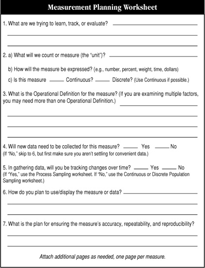
Figure 10-1. Measurement Planning Worksheet (for other worksheets referred to in Item 5, see Figures 10-6, 10-7, and 10-8)
Related tools: This worksheet summarizes data collection decisions your team will make using other tools in this chapter.
CTQ Tree
Purpose: To link measure to an important outcome.
Application:
♦ Use in data collection to make sure you collect data that is meaningful to your project.
Instructions: The CTQ Tree in Figure 10-2 shows the basic structure. The exact number of branches on your tree will be determined by your team.

Figure 10-2. CTQ Tree Structure
1. Identify an output that is important to customers. (Use your SIPOC diagram as a starting point.)
2. Identify a characteristic of that output that is “critical to quality” and write it in a box on the left-hand side of a sheet of flipchart paper, white-board, etc.
♦ If appropriate, have your team brainstorm a list of potential characteristics, then use multivoting or other decision-making tools to select the one that is most critical.
3. Brainstorm specific kinds of data associated with the critical-to-quality characteristic and arrange them logically on branching limbs of the diagram.
♦ You may want to use an affinity process to identify related sets of measures. This can help you determine logical groupings for the CTQ Tree.
4. Do a reality check on the final diagram. Is it feasible and desirable to collect all the data identified?
5. Confirm which of the data you will collect.
Stratification Factors
Purpose: To collect information that will help you pinpoint the patterns and causes of problems.
Application:
♦ You should consider collecting stratification information any time you collect data.
Instructions:
1. Identify questions you might want to investigate once you have the data in hand. (Use Figure 10-3 as a starting point.)
2. Decide which stratification factors are most important to your team (that is, are most pertinent to questions that are key to being able to solve the problem under study).
3. Document those decisions. (You will incorporate these decisions into your data collection form, described later in this chapter.)
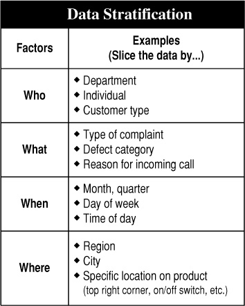
Figure 10-3. Common Stratification Factors
Measurement Assessment Tree
Purpose: To link data collection to key issues in a project.
Application:
♦ Used primarily in the Measure phase of DMAIC to help identify measures (metrics) that will produce useful, meaningful data for the team.
Instructions: Use Figure 10-4 as a model for drawing your own Measurement Assessment Tree.
1. Identify a customer-related defect in a key output, and write it above the designated line on the chart. (Use your SIPOC diagram as a starting point.)
2. Brainstorm a list of questions that relate to that defect, and write them on the left side of the tree.
♦ What patterns do you suspect you might find?
♦ What factors do you think might influence the type or amount of that defect?
Note: If your team generates a lot of questions, use an affinity process (pp. 56-57) or multivoting (p. 56) to develop a short list of critical questions.
3. Identify stratification factors (p. 165) that will help you answer the questions about the output. Write these on the branches to the right of the output.
4. Identify specific types of data (metrics) you could collect that would answer the question of how the stratification factor did or did not affect the output.
5. When the diagram is complete, have your team review each of the metrics and rate them as follows:
♦ Put a square with Y (for yes) by any of the metrics for which you think there is existing data.
♦ Put a circle with a Y (for yes) by any of the metrics that you think will help you predict Y (that is, the status or change in this metric is a clue linked to the level of defects in the output).
6. Use this analysis to help your team decide which of the metrics will be most useful for your project.
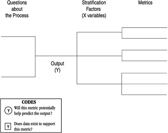
Figure 10-4. Measurement Assessment Tree
Operational Definition Worksheet
Purpose: To ensure that all persons collecting data collect it the same way.
Application: Should be completed any time the team collects data.
Instructions:
1. Ask one or two team members to write a draft definition of the data and how it will be collected. The definition should include specifically the issues listed in Table 10-1.
2. Ask different team members to read the definition and try to shoot holes in it. Is every word understandable? Make revisions as appropriate.
3. If relevant, check the definition with customers. Is the definition of a defect exactly the same as theirs?
4. Develop job aids if appropriate. For example, show a range of color swatches from a cloth to show unacceptable and acceptable shades. Compile a set of photos depicting what is and isn’t a “surface defect.”
5. Have people who were not involved in developing your definition apply it in collecting data. Plan to observe the testers to watch for problem areas and sources of confusion.
6. Finalize the definition and train all data collectors in its use. Use the worksheet shown in Figure 10-5 to develop operational definitions.
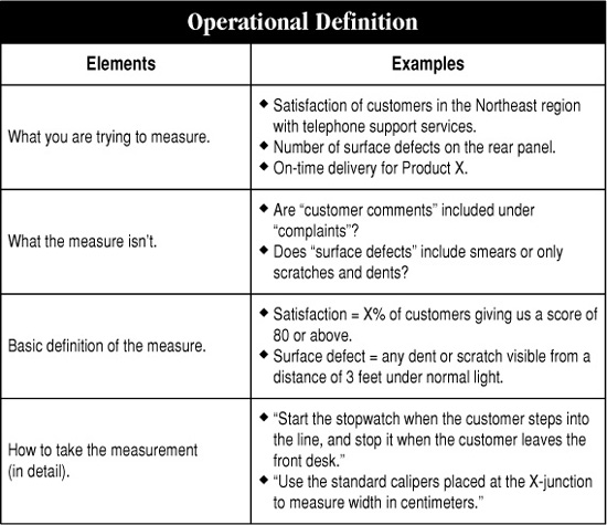
Table 10-1. Elements of an operational definition
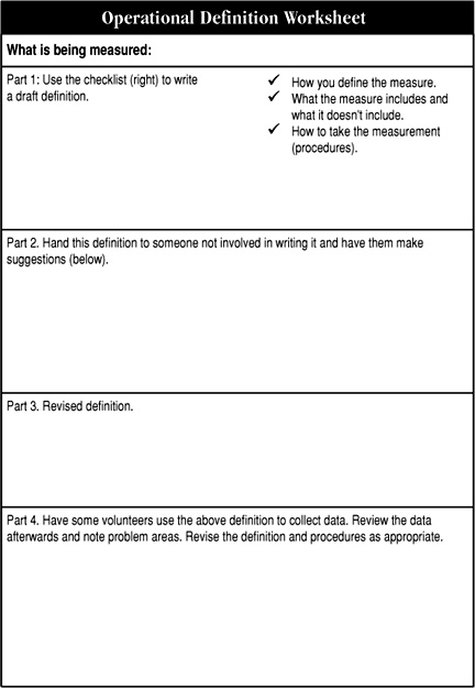
Figure 10-5. Operational Definition Worksheet
Process and Population Sampling
Purpose: To help a team decide when to collect data from a process or population and how much data it will need to draw valid conclusions.
Application: Any time it is impractical or simply unnecessary for a team to measure everything produced by a process (within a given time frame) or all the items in a population.
Instructions:
1. Review the distinction between population and process sampling in Chapter 9 (pp. 140-143). Decide which type of sampling your team will be doing.
2. Select the appropriate sampling worksheet (Figure 10-6, 10-7, or 10-8).
3. Review the important sampling definitions (Table 10-2).
4. Divide your team in half. Have each subgroup complete the selected worksheet independently of the other subgroup.
5. Compare answers. Did both subgroups come up with the same sampling size, frequency, etc.? If not, where do they differ? Were they interpreting the terms in the same way? Did they make different judgment calls along the way?
6. Reach agreement on a single sampling plan for your team.
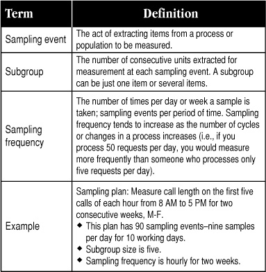
Table 10-2. Definitions of Key Sampling Terms
Sampling Worksheet #1: Discrete data from a population
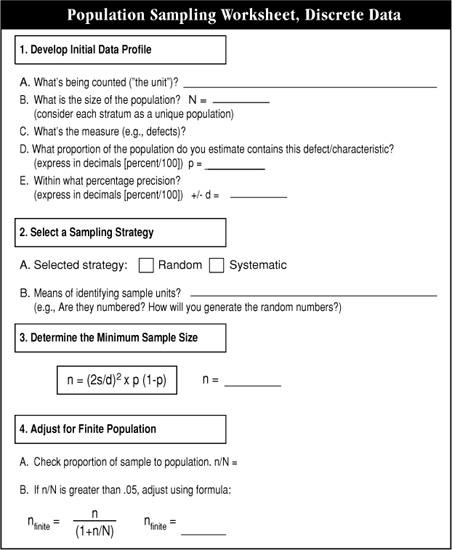
Figure 10-6. Population sampling when you have discrete data
Sampling Worksheet #2: Continuous data from a population
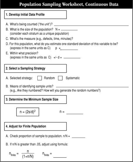
Figure 10-7. Population sampling when you have continuous data
Sampling Worksheet #3: Continuous or discrete data from a process

Daily and Weekly Sampling Charts
Instructions: Locate the appropriate daily or weekly quantity on the vertical (Y) axis on Figure 10-9 or 10-10. Now move horizontally directly across the chart until you hit the diagonal line. Move from that point down to the horizontal (X) axis and determine the minimum sample size appropriate for the quantity of items. Note that these are minimums; you can collect more data if you like, but not less.

Figure 10-9. Sample Size Selector Chart—daily strategy
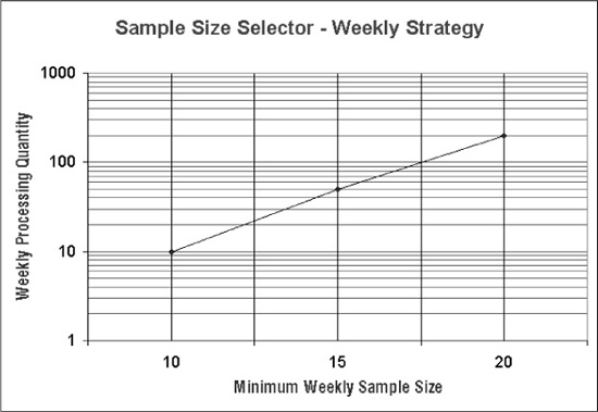
Figure 10-10. Sample Size Selector Chart—weekly strategy
Checksheet Development Instructions
Purpose: Used in data collection to categorize and measure/track frequency of process problems, causes, or other performance factors. Serves as “starting point” for Pareto charts and other display tools (e.g., pie chart, run chart).
Application:
♦ Providing consistent data collection.
♦ Identifying and defining problems/opportunities.
♦ Setting priorities.
♦ Identifying root cause(s).
♦ Following up and verifying results.
Instructions:
1. Determine the data to be gathered. Options include:
♦ Types of problems in a process.
♦ Possible causes of one or more problems.
♦ Satisfaction of a customer requirement.
♦ Other process measures.
Note: Item to be noted should be objective and yes/no.
2. Decide on frequency to be covered by checksheet (hour, shift, day, week, month).
3. Design a checksheet matrix or form:
♦ One axis for categories, the other for frequency.
♦ Use complete dates (e.g., 10/10/02 or week of 10/10-10/17/02).
♦ Include space for data collectors’ full name and for stratification factors as needed.
Designing the form in the same software in which you’ll compile data saves time and work. (Using Excel, for example, helps in design, compilation, and graphing of data.)
4. Ensure effectiveness of data gathering or observation. (Train users.)
5. Place checkmarks or hashmarks in appropriate boxes when occurrences are observed.
6. Compile results.
7. Chart and analyze data as needed.
B. Counting Defects and Calculating Sigma
The following tools are what distinguishes Six Sigma methods from all other improvement and management philosophies. A key reason that organizations are increasingly turning to Six Sigma is the ability to develop comparable measures of performance across a wide range of processes, products, and services— and put numbers to issues that were formerly thought to be too fuzzy to withstand a rigorous business analysis. That “comparable measure” is the sigma level, which is based on defining and counting defects—the tasks that the following tools will help you complete.
Sigma Calculation Worksheet
Purpose: To help a team determine the sigma capability of a process.
Application:
♦ Determining baseline process capability.
♦ Assessing whether process changes have improved capability.
Instructions: Complete the worksheet shown in Figure 10-11. If you are confused about what the terms mean, refer to Chapter 9 (pp. 150-157). Here are some additional hints:
1. Select the process. Your team should have already identified the process under study, its customers, and their requirements when you completed your Define work.
2. Define “defect” and “number of opportunities” (i.e., defining “defect opportunities” for your product, process, or service).
♦ Develop a preliminary list of defect types. For example, a coffee mug might have the following types of defects:
![]()
♦ Re-evaluate the list based on which opportunities are realistic, customer-critical, and specific. Combine or reorganize items. Usually, some defects realistically never happen or might reflect two types of defects. So it’s a good idea to scrutinize your first draft list. For the mug example, using common sense leads to three opportunities for error on a mug, as follows:
– Glazing/finish blemishes
– Misshapen (container or handle)
– Broken
Leaks no longer appear on the list because they are so rare that it’s not a realistic consideration for day-to-day measures of performance. Also, it’s simple and also realistic to consider all malformed mugs to fall under one opportunity.
Note: There is no single right answer to what a “defect opportunity” is. Use your team’s judgment to come up with a list that seems reasonable, realistic, practical, and, most importantly, consistent with other such measures in your organization.
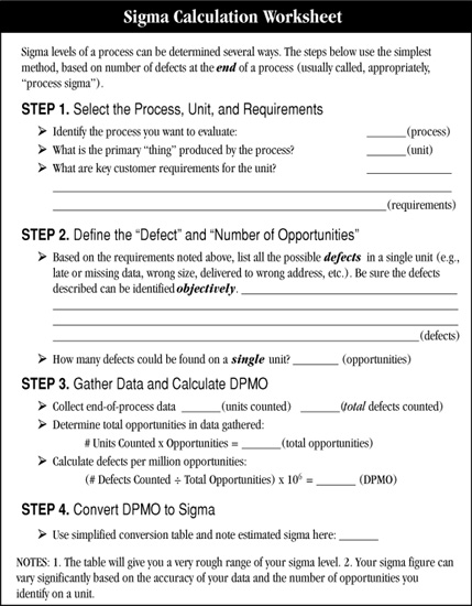
Figure 10-11. Sigma Calculation Worksheet (for the conversion table referred to in Step 4, see Figure 10-12)
♦ Check proposed number of opportunities against other standards. Over time there would likely be guidelines or conventions for numbers of opportunities for certain products. (For additional discussion of these terms, refer to Chapter 9, pp. 150-157.)
3. Gather data and calculate DPMO.
♦ If your team has not collected defect data already, follow the guidelines discussed in the first half of Chapter 9 to do so.
♦ Calculate defects per unit: Baseline sigma reflects the number of defects that might occur if we had a million opportunities for defects (defects per million 0pportunities = DPMO). Start by dividing the number of observed defects by all the defect opportunities across all the units (products/services) included in the defect count. Here’s the formula: ![]() (D = defects, N = number of units produced, O = opportunities for defects)
(D = defects, N = number of units produced, O = opportunities for defects)
♦ Calculate DPMO: Take the number from Step 1 and multiply by one million. That gives you DPMO.
4. Convert DPMO into sigma. Use the sigma conversion table (right) to determine the sigma level for your process.
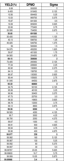
Figure 10-12. Sigma Conversion Table
Optional: Teams who are familiar with sigma calculations may also want to calculate the “Z shift,” which tells you what your process’s short-term capability is compared to its long-term capability. (See pp. 186-188 later in this chapter.)
Proportion Defective and Yield Calculation Instructions
1. Calculate the proportion defective for the process. This is the fraction or percentage of the item sampled that had one or more defects.
2. Calculate final yield for your process using the simple formula shown at the top of Figure 10-13. (Several examples are included to illustrate the basic concept.)
3. Calculate first-pass yield.
♦ Construct a simple diagram like that shown in Figure 10-14 (showing the initial units input, boxes reflecting the number of steps in your process, and the final output).
♦ For each step, determine the number of units that make it through without requiring rework. Use this figure to calculate a yield for each step.
♦ Determine first-pass yield (Figure 10-14) for the process as a whole. (That is, the proportion of units that make it through the entire process requiring rework.)
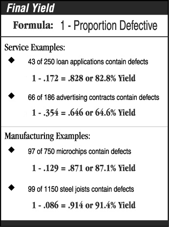
Figure 10-13. Final yield calculation
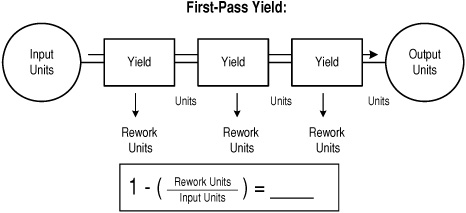
Figure 10-14. First-pass yield
Cost of Poor Quality (COPQ) Calculations
Purpose: To assign a dollar figure to the amount of defects produced by a process.
Application: After collecting defect data to gauge the impact of those defects on profitability.
Instructions: For any type of error, defect, or mistake…
1. Count the number of incidents over a period of time (once, per day, per week).
2. Determine the labor cost associated with fixing those incidents (reworking, storing, retrieving, etc.).

3. Determine the material cost for the defects.
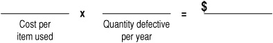
4. Add the totals from Steps 2 and 3.
C. Measure Completion Checklists
Measure Checklist
Purpose: To bring a formal end to the Measure stage of a team’s project.
Applications:
♦ Use during the Measure work to track progress.
♦ Use at the end of the Measure stage to make sure all essential tasks have been completed.
Instructions:
1. Walk through this checklist (Figure 10-15) item by item at a team meeting.
2. Mark a “yes” only if everyone on the team agrees the task has been completed. If anyone says no, ask him or her to state why they think the task is incomplete, and to offer specific actions needed to complete it.
3. Reach agreement as a team on each answer before marking the checklist.
4. If there is unfinished work, ask for volunteers, assign responsibilities, and set deadlines for completion of those tasks.
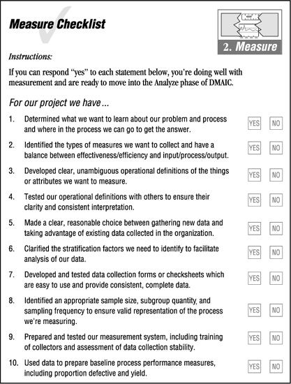
Figure 10-15. Measure Completion Checklist
Tollgate Preparation Worksheet
Purpose: To help a team prepare a presentation for the tollgate review at the end of the Measure stage.
Application: Use at the end of the Measure stage to help the team prepare its presentation.
Instructions (Figure 10-16): Follow the general tollgate guidelines given for the Define review (pp. 118 and 120) to identify priority message to include in your presentation. In addition:
1. Document any commitments or promises the team made to the Sponsor/Champion, Leadership Council, etc., during the Define tollgate review.
2. Compile information about progress on meeting those commitments.
3. Decide on a sequence for the presentation, and complete the left column on the worksheet (key messages).
4. For each message, identify how that information can best be presented to someone unfamiliar with the details of the project. Be creative! Look for ways to convert messages into data charts, pictures, or other high-impact visuals. Also identify what format that information will take in the presentation (such as handouts, flipcharts, slides or overheads, etc.). Complete the middle column of the worksheet (vehicles for key messages).
5. Ask for volunteers and/or assign responsibilities for each section of the presentation. Try to involve the whole team.
6. Prepare an agenda for the tollgate review. Identify information that will need to be sent to the reviewers ahead of time.
7. Do a dry run of the presentation to make sure it can be completed in the time allotted and to help team members get more comfortable with their roles.
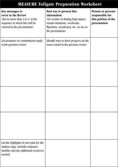
Figure 10-16. Measure Tollgate Preparation Worksheet
D. Advanced Sigma Tools: Understanding Long-Term Variation
Tracking Long-Term Variation and Process Shifts
Two Six Sigma teams are studying the same manufacturing process and measuring the same quality characteristic or defect. Team Rabbit collects 50 data points all on the same day. Team Hare collects one data point a day for 50 days. If you plotted these data on a frequency plot, which do you think would show more variation?
The answer, of course, is that you’d expect to see more variation in Team Hare’s 50 points than in Team Rabbit’s. Why? Because a process will change a lot more over the course of 50 days than it will in one day. A 50-day span would cover changes in batch materials received from a supplier, changes in physical conditions, possible deterioration of equipment, etc.—all of which would be less likely to happen (or would not be as pronounced) in the course of a single day.
The concept of “variation over time” is just as relevant to administrative processes, as they, too, will change over time. In addition, administrative processes are very prone to variation between different individuals, groups, locations, etc. For example, suppose our two Six Sigma teams were studying “application processing time.” Team Rifle collects data on processing time for 50 applications processed by one office during the course of one week. Team Shotgun collects data on processing time from 50 different offices on the same day. Which of these sets of data do you think would show more variation? The answer is that it’s more likely that the 50 different offices will each have their own individual application processes, and therefore you’d expect to see more variation among different offices than within a single office.
The lesson to learn from these examples is that over the long term, or in widest application, processes experience much more variation than they do in the short term or in limited applications. This concept is captured in Figure 10-17. The smaller distributions at the top of the figure all reflect what can happen in the short term to any process. If you compiled all this data together, you would get the long-term distribution shown at the bottom.
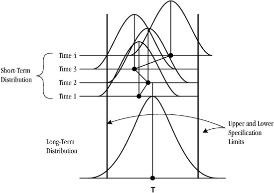
Figure 10-17. Long- and short-term variation
Long-Term Variation and Sigma Capability
This difference between short- and long-term variation has a direct relationship to process capability as well. Look again at Figure 10-17 and notice the relationship between the various distribution curves and the specification limits drawn on the chart. As you can see, in the short term, the process can drift closer to one of the specification limits, then back in the other direction. This leads to two key concepts:
♦ Short-term capability: the best the process can be if centered.
♦ Long-term capability: sustained reproducibility of the process.
Let’s say you have a process that has a short-term process capability of 3.2σ. You know that over time, the process will likely shift in one direction or the other. Experience has shown that this shift often reduces capability by 1.5σ: that means your 3.2σ process is really only “1.7σ capable” in the long run (see Figure 10-18).
Now here’s the curious part: the sigma conversion table used with the sigma calculations described earlier in this chapter has the 1.5σ built into it—oddly, the table assumes you are using long-term data to calculate short-term capability. However, you can use a separate Z conversion table to calculate both the long-and short-term sigma capability for your processes as follows. Table 10-3 shows examples of these calculations; the Z conversion table (normal distribution) is in Table 10-4.

Figure 10-18. Shifts in process capability over time
Table 10-3. Examples of calculating shift
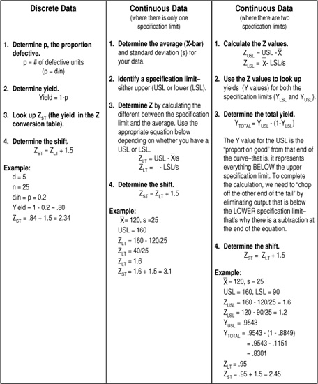
Table 10-4. Z conversion table
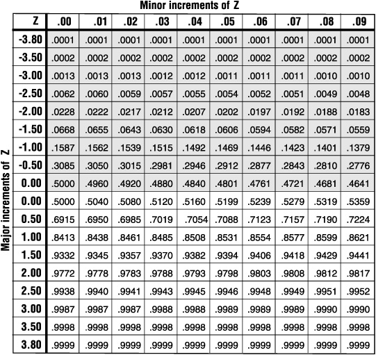
This is an abbreviated version of the Z or “normal” table, in which you can find in most basic statistics texts.
If you know the Z value, first find the major increment that is closest to that value, then move across to the appropriate minor increment. For example, if your Z value is 2.07, start at the “2.00” row, the move across to the “.07” column. (Since this is an abbreviated table, you will need to interpolate for values that are not represented, locate a statistics text, or check a statistics computer program.)
If you know the yield of your process, find the closest value in the four-digit numbers in the body of the table, then read across and up to find the closest Z value. For example, if your yield is 85%, the Z value is somewhere between 1.03 and 1.04. As noted in the text, if your process yield is less than 50%, don’t bother calculating shift! Go improve your processes!