
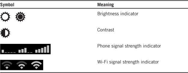
Visual Design
“What makes good visual design? Visual design, unlike art, should not be subjective. It has to accomplish a particular purpose such as solving problems, educating, or explaining a new feature. Good visual design communicates in a way that produces its intended result.”
—JODI HERSH
People often confuse user interface design with graphic design and therefore assume that UI design is a subjective art that requires extensive training and talent. Nearly all points in this misconception are true: Visual design is an important part of UI design. Graphic designers have extensive training and talent in visual communication. Certainly part of graphic design is a subjective art—and unless you have substantial training and experience, it’s an art that you can’t do well.
What’s misleading about this misconception is that it implies that most of UI design is graphic design. Not true! Even though visual design is a crucial element of UI design, most of your design effort should focus on interaction design—the subject of the previous chapter.
This statement also implies that visual design is mostly a subjective art. Also not true! The subjective, artistic part of visual design is crucial, but for user interface design most of your visual design effort should focus on what it communicates visually.
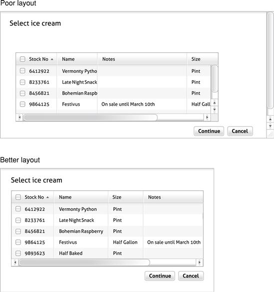
Through the lens of communication, many visual design decisions that initially appear subjective, emotional, arbitrary, and aesthetic are actually objective, rational, coordinated, and principled. At the wireframe level, every visual design element should be justified by what it communicates. A wireframe is a prototype with content and functionality represented by rough controls, rectangles, lines, text, and simple glyphs. Layout and element sizes are rough, and details such as colors, backgrounds, fonts, graphics, and icons are often omitted.
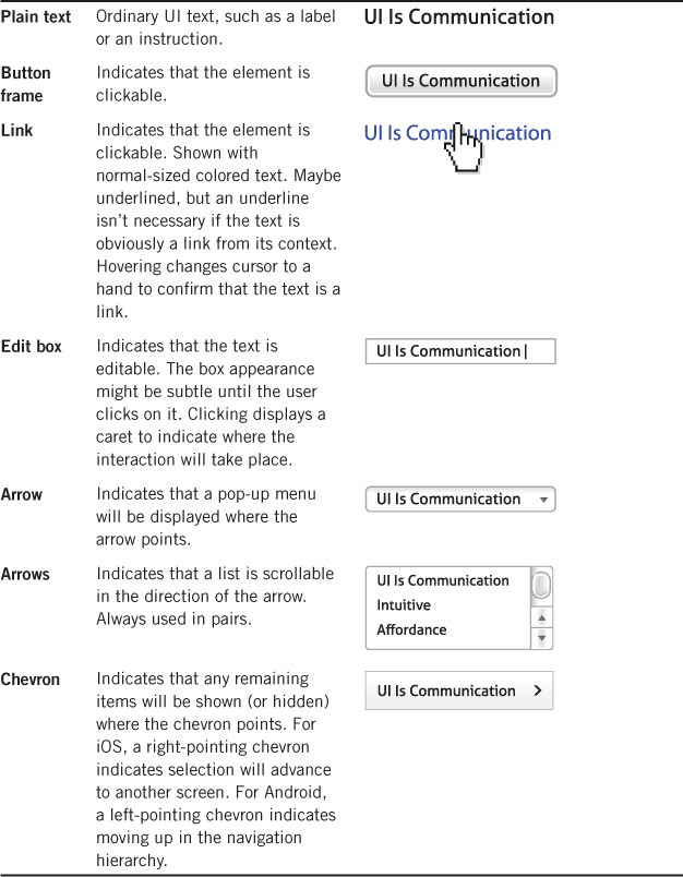
Here is what common visual design elements should communicate:
• Layout. Should draw users’ attention to a page’s focal point, present a clear path for the eye to follow, have a clear termination point that advances to the next step, and draw proper emphasis to the UI elements along the way. Additionally, a well-designed layout appears simple, orderly, easy to scan, and aesthetically pleasing.
• Typography. Should ensure that the UI text is attractive, legible, and readable in its target environment.
• Icons and glyphs. Should give controls understandable visual labels to either supplement or replace text labels.
• Affordances. Should indicate how to interact with controls as well as suggest the effect of interactions.
• Graphics. Should supplement layout to give a page visual structure and show relationships between UI elements.
• Color. Should be used to communicate status, meaning, and importance visually.
• Animations and transitions. Should give feedback, show relationships, draw attention to change, or explain tasks visually.
When we’re evaluating a wireframe, if a UI element doesn’t communicate anything, it should be removed. If it communicates poorly, it should be redesigned. With only rare exceptions, given a choice between a design with effective visual communication and one that is aesthetically pleasing, the design that communicates more effectively is the better choice.
FIGURE 3.1 What does this icon mean? I don’t know either, but it’s clear when labeled. If the icon design doesn’t communicate anything, why is it there? We should improve the icon or give it a static label. 
Form may follow function in industrial design, but in UI good design form follows communication. From the communication point of view, each visual design choice isn’t independent or arbitrary. For effective communication, each element should be communicating a different aspect of the same consistent story. That story needs to be coordinated and harmonious. Any inconsistencies reveal design problems.
FIGURE 3.2 The length of this numeric text box suggests long input (like a part number), but the spin buttons (the arrows on the right side) suggests that the default value is close to the right value (so, not like a part number). This inconsistency reveals a design problem.
The goal of this chapter is to explore visual UI design from the communication point of view. I’m not assuming that you have any visual design knowledge or experience. My goal isn’t to turn you into a graphic designer, because that’s not realistic. Rather, my goal is to help you develop your visual “design thinking,” primarily by understanding that visual design is mostly about visual communication. Once you understand and focus on the communication angle, you can make better visual design decisions more quickly and confidently at the wireframe level.
Although you should work with professional graphic designers when designing at the pixel level, the information in this chapter will help you work together more effectively by having a more objective basis for making decisions. By contrast, making design decisions based on personal opinion is a notoriously poor way to work with a visual designer.
If you are designing for a platform that has a visual style guide, give that precedence. I will present visual design techniques that communicate well generally, but always do your best to follow your platform’s visual style guidelines.
The importance of effective visual design
Your users will definitely notice if your product isn’t visually appealing—regardless of the power and flexibility of its underlying technology. In my work as a user experience design consultant and trainer, I specialize in helping teams of software professionals who lack design resources improve their product’s user experience design. Often their products are unattractive. In their defense, these teams say things like, “Our product might not be a beauty, but it sure does the job!”—implying that the visual appearance is a superficial detail that users will overlook as long as the required functionality is there.
People are emotional and they react emotionally to a product’s visual appearance. Your product should look the part—it should look like it fulfills its purpose well. But if instead your product’s visual appearance is of questionable quality, users will naturally assume that the rest of the product has the same level of quality. Users assume that attractive products are better designed and more usable (this is known as the aesthetic-usability effect). Don’t assume that users will see the beauty that lies beneath; they won’t.

Visual appearance is essential to our perception of quality. As rational technologists, we are reluctant to accept this idea. We really want customers to see our product’s inner beauty and we want to believe that the quality of the functionality and internal design is what matters—the quality of the system architecture, its performance, robustness, reliability, scalability, and flexibility. These technology details do matter, but only as experienced by users. As Steve Jobs once said:
Design is not just what it looks like and feels like. Design is how it works.
From the user’s point of view, the user experience is the product. And if the user experience is poor, nothing else matters!
Returning to the communication angle, good visual design is important functionally. Users need to be spatially oriented and know where to look, how to scan a page, and how to find what they are looking for quickly—without being overwhelmed. The text needs to be readable and legible and have a clear visual hierarchy. Users need to understand what icons and graphics mean. They need animations and transitions to keep them oriented, give feedback, and show relationships—without being distracted. Ultimately, a good visual design enables users to get their work done efficiently and without distraction.
Working with graphic designers
If you want a beautiful product, my best advice is to hire a graphic designer. Graphic designers are highly trained professionals who will help take your product to a level that your team of nondesigners couldn’t possibly achieve on its own. Hiring a graphic designer is the best, simplest thing you can do to make your UI look great.
But if you work for a small company or have a very tight budget … still, seriously, hire a graphic designer. Hiring a good designer will help you get the visual design right more efficiently and ultimately save you time and money, no matter how tight your budget. I work with a graphic designer for all my visual design work and I’m sure my budget is tighter than yours.
At this point, you might be wondering: “If I really should work with a professional graphic designer, why should I bother reading this chapter?” Here are four excellent reasons:
1. These are important UI design skills. Even if your graphic designers do all your visual design work, this chapter will help you understand what they are doing. But chances are you won’t have designers do everything; few teams have the required design resources for that luxury.
2. You can design the basics more efficiently at the wireframe level and have your graphic designers focus their talent where it is needed most. This is especially important if you are on a tight schedule and budget.
3. Understanding visual design will help ensure that important design details are faithfully executed during development. Important design details often get lost in translation when developers don’t “get it.”
4. These skills will help you work with your designers more effectively and productively. You will work together to make better decisions for the right reasons.
The last reason is the most important. Nondesigners do not have an impressive track record for effective, productive relationships with their graphic designers. Quite the opposite. Reading this chapter will help you get on the same page as your designers.
FIGURE 3.4 Louis, I think this is the beginning of a disastrous collaboration. From TheOatmeal.com ©Matthew Inman. Used by permission.
Here are some additional tips for working with graphic designers:
• Hire the best graphic designers you can and trust them to do their job. Most of the horror stories I hear from graphic designers stem from their managers lacking trust. If you hire a top graphic designer, assume that that person understands visual design a thousand times better than you—so it would be foolish not to trust him or her.
• Hire graphic designers early in the process, when they can have the most impact. If you hire designers after all the code is already written, it’s probably too late for getting the most impact from designers. All they can do is fix minor details.
• Designers’ worst nightmare is having nondesigners tell them how to do their job—so don’t do this! Perhaps it’s better to keep your color theory to yourself.
• Focus on your high-level project vision, goals, requirements, direction, and branding guidelines. To be happy with your designers’ work, you must communicate what you want but avoid telling your designers the details—it’s their job to figure out those details.
• Provide constructive feedback and give the designer the benefit of any doubt. The most diplomatic way to give feedback is by asking questions instead of making demands and assertions. For example, instead of saying, “I don’t like this color scheme!” and putting the designer on the defensive, a better approach is to ask: “Interesting … why did you choose this color scheme?” Once you understand the reason behind a design choice, you are in a better position to give constructive feedback and help make improvements.
• Don’t trivialize designers’ contributions. For graphic designers, “pretty” is a dirty word. It implies that their work is trivial and superficial and that you have already done all the real work.

Layout
Layout is the placement, sizing, spacing, and emphasis of UI elements and content within a page. Effective layout is crucial in helping users find what they are looking for quickly as well as making the page’s appearance visually appealing. Layout is the visual design skill that nondesigners find most challenging, so let’s start here—but without worrying about the traditional artistic details such as golden ratios, rule of thirds, or symmetry.
The biggest problem nondesigners have with layout is that they are focused on the mechanical layout—getting stuff to fit—without putting much thought into what the layout communicates. Controls are placed because they fit, not because they belong, as though they are playing a game of UI Tetris.
This approach works fine for simple UIs, but it breaks down badly with more complex pages or as features are added over time.
A page’s layout communicates the purpose of the page, how to scan and read the page, and the order in which to use the elements on the page. Additionally, a well-designed layout appears simple, orderly, easy to scan, efficient, and aesthetically pleasing.
There are two modes of reading: immersive reading and scanning. The goal of immersive reading is comprehension, whereas the goal of scanning is to find things quickly. Well-designed layouts need to accommodate both modes well. Let’s start with designing for comprehensive reading and address scanning in detail in the next section.
Layout design principles
Reading patterns
Users read immersively in a left-to-right, top-to-bottom order (in Western cultures), following the layout of the page. During immersive reading, users read most of the words and most of the content, but they may skip over content that doesn’t appear relevant or that requires too much effort to read.
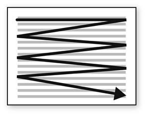
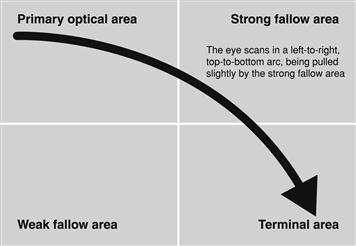
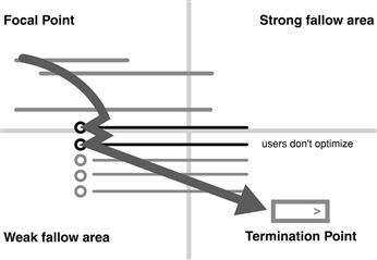
By contrast, users often scan a page using an arching pattern, starting in the upper-left corner and ending in the lower right. Along the way, they might notice the upper-right corner (called the strong fallow area). They see the lower-left corner (called the weak fallow area) last—if they see it at all. This scanning path is formally known as the Gutenberg diagram.
Users follow these patterns generally, but the patterns change when there is content that attracts or repulses attention. Users recognize that interactive controls are likely the more relevant ones, so these interactive controls get the user’s immediate attention.
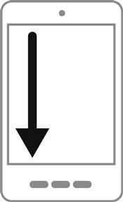
Small screens found on smartphones have a different scanning pattern. Users scan small screens starting in the upper-left corner and going straight down. They can take in the width of the screen without scanning across.
Conversation patterns
Reading patterns indicate how users view the content of a page physically, but they don’t tell us how to structure the content. To help you choose the right presentation model, let’s look at some conversation patterns—a concept introduced in Chapter 2. For the sake of argument, let’s assume that the page has a significant amount of information that we need to lay out. Laying out a simple page is pretty easy, after all.
Start by thinking about the conversation you would have with the target users in person to explain what to do on the page. Naturally you would present the steps in a smooth, logical order instead of an out-of-sequence jumble. You wouldn’t explain out of sequence just because it takes less space.

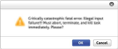
Would this conversation be a monologue, where you explain everything to anticipate every question, without involving the user? If so, a document would be a good conversation pattern. This isn’t a rhetorical question; a document might be the right choice, but there are other—often better—options.
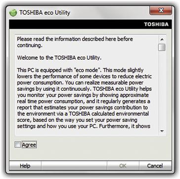
FIGURE 3.13 This agreement is like a monologue. And note how poorly the visual presentation of the OK and Cancel buttons communicates their purpose.
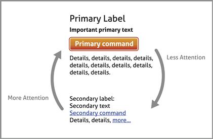
Or would the conversation be like a brief summary of the essentials, followed by Q&A? If so, a summary followed by progressive disclosure of optional content would be a good choice. This approach works well with the inverted pyramid presentation style, where the most important information is placed first and details follow according to their importance. Using this style, users can stop reading at any time once they have the information they need.
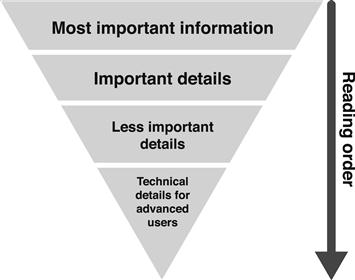
FIGURE 3.14 The inverted pyramid presentation style allows users to stop reading once they have the information they need.
Advantages to this approach are that it’s easier for users to find the information they care about, plus once users click to see more information, they are actually motivated to read it.
Attributes of an effective layout
Here are the attributes of an effective layout to help users quickly find what they are looking for and quickly figure out what to do and to make the appearance visually appealing:
• Focus. Indicates where users are supposed to look first, usually in the upper-left corner or top center of the page.
• Flow. Provides a clear scan path for the user’s eye to follow smoothly and naturally across the page.
• Termination. Indicates where the scan path should end, often with a UI element to go to the next step or complete the task.

FIGURE 3.16 The eye starts at the focal point, scans across the page, and ends at the termination point.
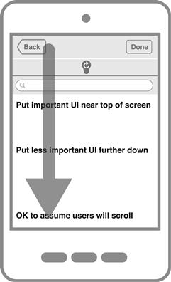
• Order. The UI elements are presented in a logical, task-flow order. The most important information is placed “above the fold.” Generally, users won’t scroll unless they have a reason to, so that reason needs to be obvious without scrolling. Furthermore, the most important content on the page—the primary reason the user is on the page—stands out from everything else.
• Control sizing and spacing. Controls are sized appropriately based on their purpose and need for emphasis. The controls are also spaced appropriately to show their relationships and have adequate space to avoid appearing overwhelming.
• Emphasis. UI elements are emphasized based on their importance to give a visual hierarchy. Pages are harder to scan and read if all UI elements appear uniformly. The type of control, font, size, placement, and background all affect emphasis.
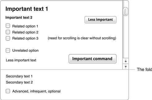
FIGURE 3.17 The most important information is “above the fold”, and any reason to scroll is obvious without scrolling. Controls are sized and emphasized based on their purpose and spaced to show their relationships.
• Layout grids. An invisible alignment system used to give a page a coordinated, orderly appearance. You can make a layout appear simpler by reducing the number of vertical alignment grids. Reusing layout templates appropriately across your product will give it a consistent appearance.
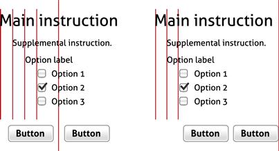
FIGURE 3.18 The layout on the right appears simpler because it uses fewer vertical alignment grid lines.
• Label alignment. Shows the relationship between controls and their labels. The most common styles are top-aligned labels, left-aligned labels, right-aligned labels, and left-aligned labels with ragged controls. Placeholders are another option; they are covered in Chapter 2. For large screens, there is no single best alignment approach; each has benefits that depend on how the controls and their labels are used. For smartphones, top-aligned labels work best because users can stay oriented when the screen is zoomed and the vertical format works well with vertical scrolling.
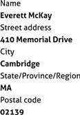
FIGURE 3.19 Top-aligned labels work best when the controls are interactive (such as a form), when users are likely to scan both the labels and the controls vertically, and when ease of localization is important. A downside is that top-aligned labels take a lot of vertical space, so they don’t work well with many fields.
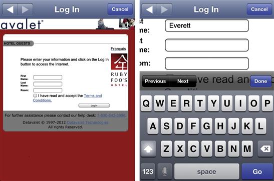
FIGURE 3.20 Because of automatic zooming, top-aligned labels are the best alignment choice for smartphones with small screens. Note how the left-aligned labels aren’t visible after zooming.
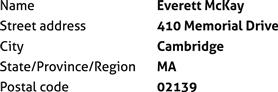
FIGURE 3.21 Left-aligned labels work best when users are likely to scan both labels and controls vertically and the labels don’t vary much in length. Downsides to this format are that the gaps between the labels and controls can be large if the labels vary in length, the labels and controls look like two individual columns—giving a cluttered appearance, and it takes a lot of horizontal space if there are long labels or controls.
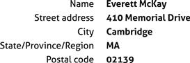
FIGURE 3.22 Right-aligned labels with left-justified controls work well when users are reading more than they are scanning, such as in a form. In contrast to left-aligned labels, this format’s consistent space between the labels and controls makes the pair easier to read and it looks like one column instead of two.
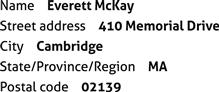
FIGURE 3.23 Left-aligned labels with ragged controls work best when users are likely to scan vertically to find specific labels but not likely to scan the controls vertically, such as when displaying a set of properties.
• Grouping. Use to give related UI elements a clear visual relationship where related items are grouped together; unrelated items are separated. Group boxes can be used to show relationships and lines can be used to show separation, but it is usually better to show these relationships using layout alone to avoid visual clutter.

FIGURE 3.24 Show relationships using grouping and separation. Although you can use group boxes and lines to show relationships, using layout alone often works best.
• Layout efficiency. Make sure screen space is used efficiently—especially important on mobile devices. Look out for unnecessary scrolling or truncated data, especially when there are large areas of unused space. Users shouldn’t have to manually resize anything to make the contents usable.
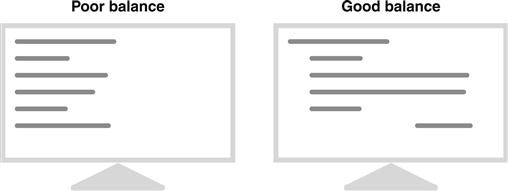
• Balance. Content appears evenly distributed across the surface. Imagine placing a fulcrum at the bottom center of a page. If that page looks like it would immediately topple over to one side—usually the left side—your page layout needs more balance.
Designing for scanning
As Steve Krug effectively points out in Don’t Make Me Think!, users don’t read, they scan—so you should design pages specifically for scanning. Don’t assume that users will take the time to comprehensively read your pages in a strict left-to-right, top-to-bottom order. Normally they won’t.
The goal of scanning is to find things quickly. Users scan a page by looking at those UI elements that attract the most attention and then filter those down to what looks relevant to the task. Here’s how you can tell if a page is designed for scanning:
• The most important UI elements attract users’ attention at a glance.
• The scanned UI elements make sense on their own and are not misleading.
• Based only on the scanned UI elements, it should be clear (more or less) to target users what to do for the top tasks. It’s acceptable if secondary tasks require some reading.
The goal of this section is to take a second look at page layout from the point of view of scanning. (Chapter 5 will present a scanning review process that you can use to determine how well a page is designed for scanning.)
A model for scanning
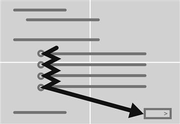
Here is a simple model for how users scan a page (see Figure 3.27):
• Users quickly look at the overall visible portion of the page to get an idea what is there.
• Users then start to scan at the page’s focal point. The focal point is the element on the page that demands users’ attention and they expect to find it toward the upper left or upper center of the page.
• Users scan the page in roughly a left-to-right, top-to-bottom order. For large displays, the scan path is usually an arc starting in the upper left and ending in the lower right—per the Gutenberg diagram. Users tend to spend far more time in the upper left than the lower right; this is a consistent pattern in eye-tracking heatmaps. By contrast, for small displays such as smartphones, the scan path is straight down.
• Along the way, users check any UI elements that attract their attention. These elements tend to attract attention:
• Interactive controls and their labels, especially controls that require input and commands. Large interactive controls placed prominently on the scan path get the most attention.
• Prominent text and icons or anything else that’s unexpectedly large, such as graphics.
• Any controls that the already scanned controls encourage users to look at.
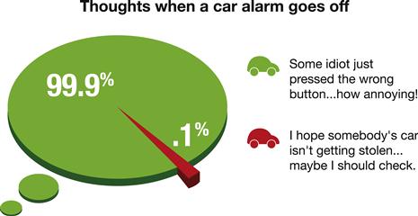
• Along the way, users skip over any UI elements that repulse their attention, including:
• Anything that looks like an advertisement. This phenomenon is known as banner blindness, in which users often skip over banners because they assume they are ads. (This is ironic because banners are intended to attract attention.)
• Large blocks of mostly unformatted text. Users often don’t read such text at all because it requires too much effort. (Again, this is ironic because these large blocks of text often address important issues.)
• Anything that is visually complex or requires a lot of effort to scan.
• Since the scan path usually ends in the lower right, users expect to find the command to complete the step or task there. If they don’t find anything, their scan will go to the upper right.
• Users don’t optimize, they satisfice. Another observation from Steve Krug. Once users think they know what to do, they immediately stop scanning and do it. Consequently, if there are better options after the first good one or there are more controls after the commands that complete the step or task, chances are that users won’t see them.
• Users won’t scroll the page unless what they’ve just scanned gives them a strong reason to do so. Consequently, controls required to understand the page should be visible without scrolling. (But smartphones are different—users expect to have to scroll on their small displays and doing so is very efficient.)
Designing a layout for scanning
Applying this model, here are steps for designing a layout for scanning:
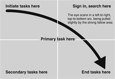
• Place UI elements that initiate the task in the upper-left corner or upper-center. These elements should be visually prominent so that they act as the focal point—where users look at first.
• Place UI elements that complete the task in the lower-right corner. These elements should be visually prominent so that they stand out from ordinary commands.
• If the page scrolls, design the page so that commands to complete the task don’t require scrolling. If that’s not possible and the page is long, consider having completion commands at both the right top and right bottom of the scrolling area so that users aren’t forced to scroll to complete the task.
• Place primary UI elements required to perform the task prominently along the scan path between the starting and ending points.
• Place secondary UI elements for general tasks in the upper-right corner. Such commands include sign in, search, and shopping cart.
• Place secondary UI elements for interacting with the page content in the lower-left corner. Such commands include performing related tasks. It should be acceptable if users don’t see these.
• Place general information about your product or company or contact information in a footer. Users ignore the footer during scanning, but they know when it is there and roughly what they should expect to find there.
• Whenever possible, put crucial text on interactive controls instead of using static text labels. Users are less likely to scan static text, so they might miss that critical information.
• Reconsider banners and large blocks of mostly unformatted text. These formats are often used for the important information, but users are likely to not scan them at all.
The model is slightly different for small screens because users scan straight down and often scroll.
Quick fixes to scanning problems
Here are some solutions to common scanning problems:
• Multiple focal points. A page should have only one focal point; otherwise the eye doesn’t know where to look. Make the UI elements that initiate the task the focal point and deemphasize other elements so that they don’t compete. You can use location, size, and color to make a focal point.
• An unnatural flow order. The flow through the page should mirror the flow through the task. If not, reorder the page elements. It’s more important for a page to have a logical flow than to have the most compact layout, so take the space if you need it.
• Primary elements not attracting enough attention. If users aren’t seeing primary UI elements when they scan a page, you can make them more prominent by:
• Moving them to a more prominent location on the scan path—perhaps higher on the page.
• Using a more noticeable control (by size, color, and adding an icon label).
• Giving them a more prominent size. Don’t be afraid to use large buttons for the most important commands and larger fonts for the most important text.
• Surrounding with generous space.
• Using more noticeable colors, bold text.
• Secondary elements attracting too much attention. If secondary UI elements are drawing more attention than they deserve, you can make them less prominent by:
• Moving them outside the scan path or lower on the page.
• Using a less noticeable control (example: a link instead of a push button).
• Using less noticeable colors, normal or deemphasized text.
• Using progressive disclosure to hide less important information by default.
Typography and text
Well-presented text is beautiful. Calligraphy is the art of stylized writing that has been practiced by all cultures for centuries. Steve Jobs often mentioned that a calligraphy class at Reed College changed his life and that his appreciation of beautiful typography was an important inspiration for the Macintosh.

Frankly, the presentation of text in classic UI is so poor that it is embarrassing. We can do better. We tend not to put a lot of thought into the appearance of text, but users interact with text more than any other UI element. Typography and text deserve our attention.
Modern UI design strives to present text attractively. Here is a summary of what makes modern UI text so good and classic UI text so awful:
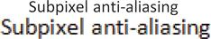
• Better typography. Modern fonts use subpixel antialiasing to effectively increase screen resolution. Consequently, the text looks solid and smooth instead of thin and jagged.
FIGURE 3.32 The text at the top appears smooth, but zooming in reveals how using subpixels achieves that smoothness.
• Visual hierarchy. Modern UI text uses a variety of sizes, primarily to draw attention to important text. By contrast, classic UI text tends to be uniformly small and hard to read.
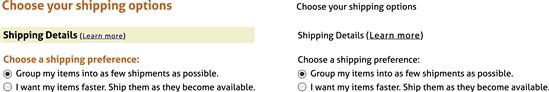
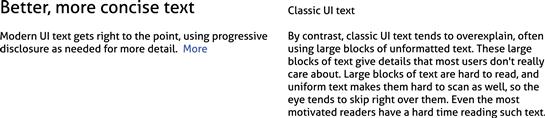
• Better, more concise text. Modern UI text gets right to the point, using progressive disclosure as needed for more detail. By contrast, classic UI text tends to overexplain, often using large blocks of unformatted text.
Clear, minimal text is beautiful when well presented. Although this is mostly an aesthetic point of view, let’s now consider typography from the communication point of view.
Typography and system fonts
Fonts not only have their obvious visual differences in appearance and style, they also have different reading characteristics. Good fonts are readable, which means that the font design leads the eye along the horizontal line, making it easy to read large blocks of text (such as documents). Good fonts are legible, which means that the individual characters are easy to recognize and differentiate (important for headings and short text such as labels).
Readability and legibility are often tradeoffs because the most readable fonts are usually serif fonts (which have small turns that often finish the strokes of letters), whereas the most legible fonts tend to be sans-serif fonts (which lack the serif strokes). Consequently, it is common for books to use sans-serif fonts for headings and serif fonts for the body text. There are so many different fonts for a reason.
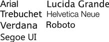
Here are the system UI text fonts for common platforms:
• Web. Arial, Trebuchet, Verdana (these fonts are “Web safe,” meaning that they are supported by all major browsers in all platforms).
Using the appropriate system font for your platform is always a safe choice. UI text needs to be legible (especially on low-resolution displays), so sans-serif fonts are used.
Text attribute guidelines
Here are some guidelines for effective use of UI text:
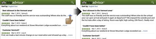
• Color. Large UI text, such as headings and main instructions, can use color for styling and to draw attention. By contrast, normal-sized text shouldn’t use color, because color would make it look like a link. By convention, unvisited links (normally blue) are displayed differently than visited links (normally purple), but link colors can be changed through styling. Modern UIs often don’t use a different color for visited links, for aesthetic reasons (a poor motivation). Although using a different visited link color often isn’t helpful, it can be extremely helpful for tasks that involve exploring lists of items that are otherwise hard to differentiate.
FIGURE 3.36 Google uses the visited-link color to make visited items easy to differentiate from the ones you have yet to look at. No question where I’ve been. 
• Shade. Shade (specifically luminosity) is used to distinguish normal text from deemphasized text and disabled text. Deemphasizing text means that that it is less important and doesn’t need to be scanned, whereas disabled text means that it doesn’t apply and likely doesn’t need to be read at all. Make sure there is a clear visual distinction between the two.
FIGURE 3.37 This chart shows recommended shades for normal, deemphasized, and disabled text. If your deemphasized text looks like disabled text, users are likely to ignore it.
• Bold. Use bold text to emphasize the most important text that users must read or are likely to scan for. Most text isn’t the most important (relatively speaking), so most text shouldn’t be bold.
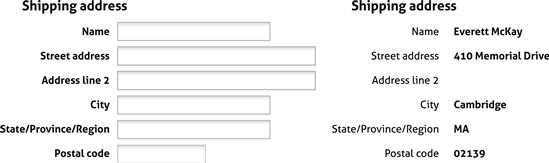
FIGURE 3.39 Consider using bold labels for editable fields because users are likely to scan for specific labels. By contrast, don’t use bold labels for reports because users are more likely to scan for specific data, not the labels.
• Italic. Use italics as a substitute for quotation marks, primarily when text should be interpreted literally. Use sparingly to emphasize specific words.
• Bold italic. Don’t use in UI text. There’s no need.
• Underline. Don’t use except for links, because users expect underlined text to be a link. Given that users assume normal-size colored text is a link, there’s no need to underline text unless the link is in an unexpected context.

FIGURE 3.40 The blue text clearly indicates a link, so there’s no need to underline. Underlining just adds visual clutter.
• Capitalization. Different platforms have different capitalization rules, so you should follow them for consistency. If your platform doesn’t have capitalization rules, the simplest and best approach is to use everyday capitalization (why be different?). In English, this means using title capitalization (where the first letters of all words are capitalized except articles, conjunctions, and prepositions) for titles and sentence capitalization (where only the first letter of the first word is capitalized) for everything else. Don’t use all uppercase or all lowercase. This “everyday” approach is natural, friendly, and flexible.
Background guidelines
Text needs to have good contrast with its background to be legible. (Technically, contrast is defined as a large difference between the luminance of text and its background.) Per the World Wide Web Consortium (W3C) accessibility guidelines, accessible software now must have a 5:1 contrast ratio between text and its background.
Contrast ratios are difficult to calculate (in practice, you should use a contrast calculator), but you can be confident in meeting the accessibility requirement if you follow these guidelines:
• Normal text. Most text is black (or near-black) on a white (or near-white) background.
• Contrasting text. For visual contrast, some text can be white (or near-white) on a solid dark background.
• Solid background colors. Don’t put text on harsh gradients or images. Subtle gradients (where you need to look carefully to tell that it’s a gradient) are usually acceptable.
If you want to make sure all users can read your text easily, use dark text on a solid light background.
Color
Of all the visual UI elements, the use of color is the most subjective, emotional, and passionate. People have strong opinions about color based on their personal preferences and experiences. And they seem to be surprisingly willing to share their color preferences—managers without design backgrounds especially. Once managers insist that they don’t like blue or gray and so the product can’t use them, your visual design is in trouble.

FIGURE 3.42 The use of color is subjective, emotional, passionate … even visceral. DILBERT ©2002 Scott Adams. Used by permission of UNIVERSAL UCLICK. All rights reserved.
Beyond aesthetics, the interpretation of color is often culturally dependent. For example, in Western cultures white may symbolize peace and purity, whereas in Eastern cultures white may symbolize death and mourning. Similarly, in Western cultures black may symbolize evil, whereas in Eastern cultures black symbolizes power and strength. Fortunately these connotations don’t always carry over to software. It would be very difficult to design a UI without black or white.
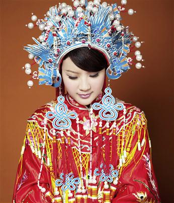
FIGURE 3.43 The interpretation of color is culturally dependent. For example, traditional Chinese wedding dresses are red to symbolize love, prosperity, and good luck, whereas red suggests danger in Western cultures. Photo by Kelidimari via Wikimedia Commons.
Another challenge is that color affects your product’s accessibility. Users with blindness or low vision may not be able to see the colors well, if at all. Approximately 8 percent of adult males (yes, 8 percent!) have some form of color confusion (often incorrectly referred to as “color blindness”), of which red-green color confusion (deuteranopia) is the most common.
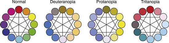
FIGURE 3.44 The primary colors as seen with normal color vision, with deuteranopia (6% of the male population), with protanopia (1% of the male population), and with tritanopia (1% of the male population).
Never use color as the only method of communication. Instead, make sure that color is used to reinforce other design elements such as text, icons, graphics, and physical size and location.
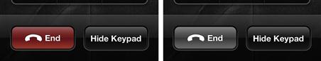
FIGURE 3.45 The color red demands attention, but the button’s icon and text label clearly communicate its purpose independently of color. Also, its size and separate physical location reinforce the button’s significance.
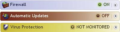
There is a lot of subjectivity in regard to color, but there is a fair amount of objectivity that you can take advantage of. Let’s start with the basics. Here are the standard colors used to communicate status:
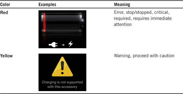

Using status color appropriately allows you to communicate meaning at a glance.
The interpretation of these status colors is globally consistent. This is due to the United Nations Convention on Road Signs and Signals, which defines the worldwide convention for traffic lights. Even though red means “good luck” in Chinese culture, a red traffic light in Beijing still means stop.
What if you want to use red, yellow, or green without suggesting status? Users associate the status to hues that have high saturation and midlevel luminosity, so you can avoid these meanings by choosing colors that have low saturation or high or low luminosity.
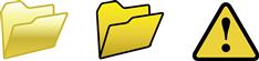
FIGURE 3.47 The left folder looks yellow, not like a warning. By contrast, the saturated folder in the middle looks like a warning.
Here are the typical human perceptions of some colors, independent of status or cultural interpretation:
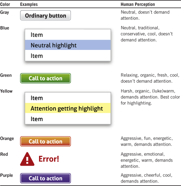
These perceptions suggest that color can be used strategically to help users scan a page:
• Focal point. For the focal point, use the strongest color on the page to demand the user’s attention. To have a single focal point, avoid using that color elsewhere on the page. Shades of orange, red, or purple are often used for this purpose.
• Next step. For the control to advance to the next step, use a color with medium strength to stand out from the other controls without demanding attention. Shades of green or blue are often used for this purpose.
• Differentiation. To make certain controls stand out, use a neutral color. Shades of blue or gray are often used for this purpose.
Even though there is flexibility with these colors, you should keep these perceptions in mind when you’re choosing colors. For example, the Register Now buttons shown in Figure 3.49 are identical except for their color. How does each make you feel? Which one do you think communicates its message best?
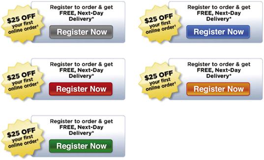
FIGURE 3.49 The color of these Register Now buttons has a strong connotation. The gray button feels too neutral—as if to suggest that you can’t register now. The blue button also feels neutral but without the discouraging connotation of the gray. The red button certainly demands attention, but the error status association makes you feel like you shouldn’t click it. Oranges feels similar to the red in that it demands attention but without the feeling of error status. Finally, green feels the most encouraging—yes, you can click this button to proceed safely.
Here are some recommendations for designing with color:
• Start your design process using monochrome wireframes. Ironically, the best way to design for color is to start by designing without color and then add color later. Doing so places focus in the right place (which, early in the process, isn’t color) and ensures that that information isn’t being communicated using color alone for accessibility.
• Keep your use of color simple. Limit the use of color to design themes, key visual elements, visual communication, and branding. Anything outside these goals should probably be a neutral color.
• When you’re choosing colors, consider what each UI element communicates and choose a color consistent with that communication. Make sure the resulting color has the right meanings, is consistent with your product-branding guidelines, and is aesthetically pleasing and appropriate for your product. When in doubt, use a shade of gray or blue.
• Use a graphic designer if you want to use complex color such as color schemes, gradients, or unusual colors. It’s all too obvious when a nondesigner creates a complex color scheme. Don’t do it!
Affordances
Affordances are the visual properties of a UI element that indicate how to perform an interaction. Standard controls all have affordances. For example, push buttons have frames that visually suggest they can be pushed (that is, clicked or touched).
To contrast with labels, affordances indicate how to interact with a control mechanically, whereas labels communicate the results of an interaction functionally.
FIGURE 3.51 The button, text box, checkbox affordances indicate the interaction, whereas the labels indicate their meaning.
The consistent use of affordances is essential to having an intuitive UI. To help you achieve consistency, here are the common affordances with their effects, usage details, and examples, starting with plain text as a baseline:

Some of these affordances have multiple meanings, but their meaning is usually clear from the context.
A downside to affordances is that they can add a significant amount of visual clutter, especially when they aren’t really needed. Consider removing affordances when the interaction is already clear or the affordance is redundant. Chapter 1, “Strategically Unintuitive UI,” explored the cost of affordances.
FIGURE 3.52 The Windows taskbar icons could have arrow affordances to indicate pop-up menus, but these would add visual clutter without sufficient benefit.
FIGURE 3.53 The arrow indicates that clicking the button advances to the next step, but so does the label. Better off without the arrow here.
How do you get the intuitive benefits of using affordances without the visual clutter downside? Here’s a good solution:
• Always display nonobvious primary affordances so that users can easily discover them.
• Display secondary affordances dynamically when users interact with the object.
This approach strikes the right balance by displaying the most important affordances but avoiding the clutter of the secondary affordances only until they are relevant. For more information, refer to “Dynamic Secondary Commands and Affordances” in Chapter 2.
Icons and glyphs
An icon is a small picture—often rendered using 3-D, full color, and shading—that’s used to label a command, option, or object. A glyph is a flat (2-D without shading), monochrome symbol or shape used for the same purpose. Modern UIs tend to use fewer icons than classic UIs and tend to use glyphs instead of icons.
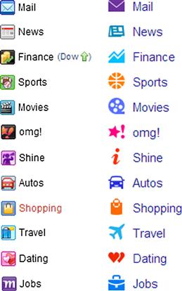
FIGURE 3.54 Icons (on left) and glyphs (on right). Note how the glyphs tend to be easier to understand at a glance.
Icons and glyphs vs. labels
A picture is worth a thousand words … unless it’s an icon!
If it’s an icon or glyph, it is worth up to three words—at best! The oft-cited cliché is misleading because icons are a poor way to communicate. (Important exceptions: when the target audience can’t read, as with young children, or when the target audience’s language is unknown, as in an airport.) With the exception of well-known standard icons, people understand text labels much better than icons. As Jef Raskin noted in The Human Interface, “Instead of icons explaining, we have found that icons often require explanation.”
Don’t believe that icons are a poor way to communicate meaning? Take the “icon challenge” by removing all labels and tooltips and see if you can correctly determine what the controls do based on their icons alone. For example, try to figure out the meaning of the commands on the Insert tab in Microsoft Word.

When I tried this challenge, I scored only 10 out of 24 for this ribbon tab. Keep in mind that Word is a familiar program and Microsoft Office uses excellent iconography, so I would expect the typical score to be even lower, especially if there are many custom icons.
I recommended using this approach to evaluate your product’s icons. Don’t expect the results to be encouraging.
Recognition versus comprehension
If icons are so poor at communicating, why bother with them? First, I should reiterate that well-known standard icons communicate their one to three words quite effectively. It is the not-well-known, nonstandard icons—the ones that require time and thought to figure out—that are the ones in question.
Icons are all about efficient visual recognition, so nonstandard icons help users recognize and distinguish commands visually. Although users understand text labels quickly, they recognize and distinguish icons faster still. For example, users might remember that the command they are looking for has a blue globe on it and locate it immediately, even though they might not understand exactly what the globe means. When there are many commands, using a labeled icon works well because the icon enables quick visual recognition and the text label enables quick comprehension.
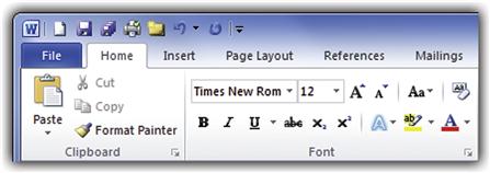
FIGURE 3.56 Quick: Find the New Comment command Based on the icon alone, can you determine what the Format Painter command does? Try this exercise enough, and you’ll see that labels are best for comprehension, icons are best for recognition, and labeled icons are best for both.
To help users distinguish between your icons, make sure the icons are visually distinct in terms of design, shape, and color. If all the icons in a specific context have a common theme (for example, a database), remove the common theme to focus on the differentiation.
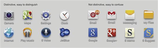
FIGURE 3.57 The icons on the left have distinct shapes and colors, whereas the icons on the right have similar shapes, colors, and designs and are more likely to be confused.
If your target user’s comprehension of your icons is low, it’s likely that you need to reconsider your labeling strategy more than the icon design itself. Efficient recognition is valuable—just keep in mind that it’s not a substitute for comprehension.
Intuitive icon designs
The user’s ability to understand an icon is primarily determined by the icon type. The follow icon types are easy to understand:
• Simple nouns doing simple verbs
• Simple nouns showing simple adjectives
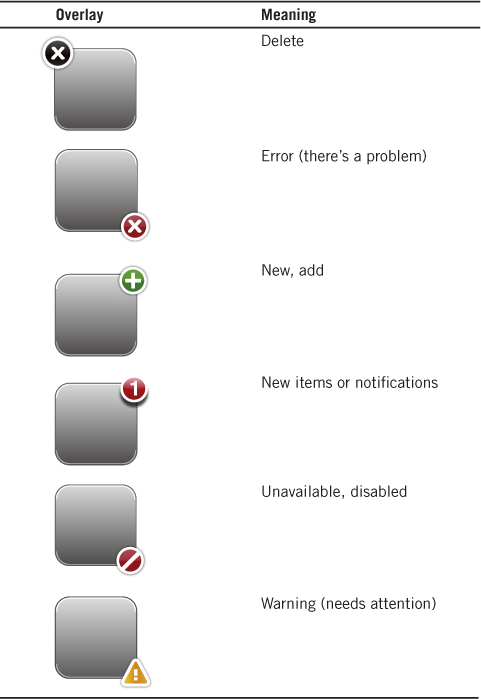
• All of the above with a single standard overlay (error, warning, disabled, etc.)
Standard and simple works well. This list reveals an interesting challenge to icon design: Icons are symbols, and symbols are nouns. Yet icons are often used to represent commands, and commands are verbs. Consequently, many icons boil down to a noun representing or doing the verb.
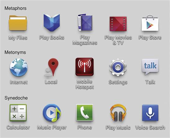
The following icon types are moderately difficult to understand:
• Metaphors. When an object with similar behaviors or properties is used as a substitute.
• Metonyms. When a completely different but related object is used as a substitute.
Metonyms and synecdoche are related to metaphors, but I listed them explicitly to show that metaphors aren’t the only game in town. Using a fork on a map to represent a restaurant is a synecdoche, not a metaphor. Again, simplicity and familiarity are the key to success here. For example, a star is a successful metonym for “favorite” because people often rate things they like using stars.
The following icon types are difficult to understand:
To work through an example, what is a good icon for fidelity? Fidelity is an abstract concept, so it’s very difficult (if not impossible) to create an understandable icon to represent it. Dogs are known for having fidelity to their masters, but a dog icon is far more likely to be interpreted literally.
In addition to type, context plays an important role in helping users easily deduce meaning. For example, a zebra icon (an unfamiliar noun, icon-wise) is meaningless out of context, but in the context of monkey, turtle, bird, and snake icons, a zebra most likely represents savanna animals.

FIGURE 3.59 In the context of a database program, users can figure out that this funnel icon is a metaphor for filtering. But the meaning of this icon is unclear in any other context. Martinis, anyone?
Everett’s Laws of Icon Design
I have a couple laws for icon design:
The longer it takes to come up with an idea for an icon, the less comprehensible the icon is going to be.
and
If an icon requires a tooltip to understand, it’s not comprehensible. At best, such icons help in recognition.
If you are wracking your brain trying to come up with an idea for a good icon, most likely it’s because there isn’t one. Once you’ve made this realization (and if you really must have an icon), better to focus on the recognition consolation prize.
What to do if your icons aren’t good
If you are dissatisfied with your icons, consider the following, in priority order:
• Reconsider the need. Icons are overused and are often not necessary. Text labels are just as recognizable when there are only a few items, and icons help recognition when there are many. But when they aren’t really needed, icons just add visual clutter. You can design a good UI without them.
• Reconsider consistency. Using icons in some places doesn’t mean that you have to use them everywhere. In Figure 3.60, note how Yahoo only uses icons for their most well-known sites.
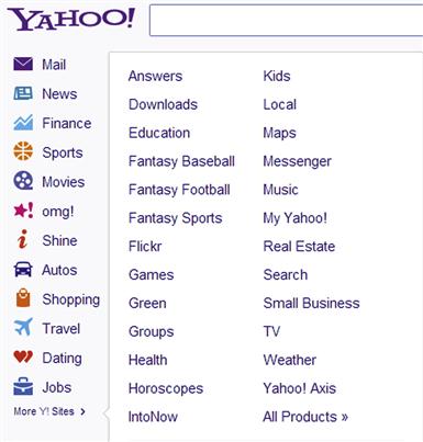
• Hire an icon design specialist. Icon design is a specialized talent, so you’ll need to either buy suitable preexisting icons or hire a specialist to design custom professional, comprehensible icons. Keep in mind that creating custom icons is very time intensive, so don’t expect to get off cheap. (And whatever you do, don’t attempt to design them yourself.)
Standard icons and glyphs
Here’s a list of standard icons (glyphs, actually) with their meanings (from a variety of sources):
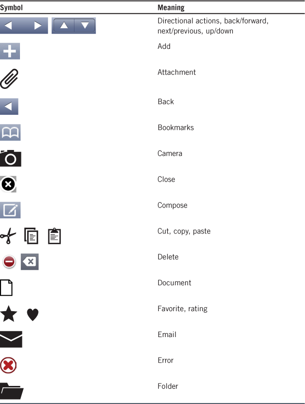

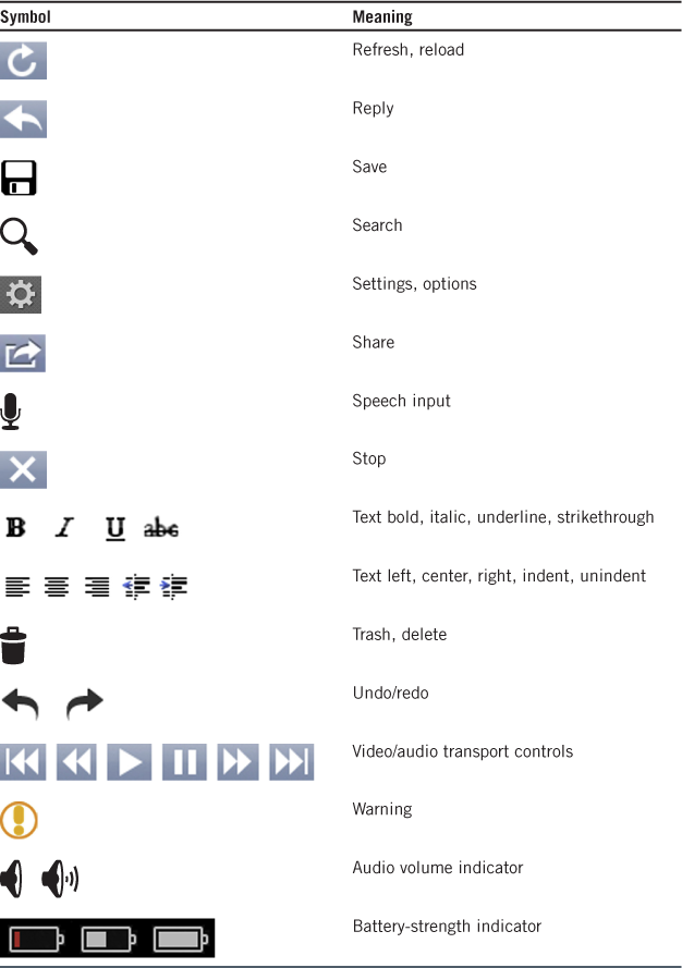
To reinforce the meaning of these standard icons, choose them based on their meanings, not their appearance. If you need a different meaning, use another icon. So, scissors means Cut, not office supplies; a magnifying glass means Find, not Zoom.
You can use these standard icons unlabeled and be confident that users will understand them. For all other icons, you should use either a labeled icon (a static label or tooltip) or a text label without an icon. Still, there may be situations where you must use an unlabeled nonstandard icon—perhaps because the UI framework you are using requires it or you just don’t have the screen space for a label.
For unlabeled, nonstandard icons, assume that users won’t understand them and will experiment to figure them out, which, of course, you want to avoid. But if necessary, make sure those experiments are immediately self-explanatory and easy to undo if undesired.

Animations and transitions
Using animations and transitions appropriately can make your product easier to understand, feel smoother and more natural, and have a modern, engaging, high-quality feel. Animations give the appearance of motion or change over time. You can use animations to give feedback, show relationships, draw attention to important change, or explain tasks visually. Transitions are animations that keep users oriented during a state change and that make those changes feel smooth and natural instead of jarring.
Effective animations and transitions communicate what is happening visually. Animations and transitions don’t have to demand the user’s attention to be successful. In fact, the opposite is often true: Transitions are often used to not draw attention, but instead to make state changes smooth and natural. The ideal transition is so natural that users don’t even notice it’s there—and would only notice its absence.
By contrast, the classic “flaming logo” types of animations communicate nothing and serve only to draw unnecessary attention to themselves. Remove any such animations.
Effective nonverbal communication
Animations and transitions are all about effective visual communication, and consistent meaning is crucial to their effectiveness. The best way to achieve consistency is to define an animation vocabulary for all meaningful animations and transitions. By contrast, making arbitrary one-off, spur-of-the-moment animation choices because they look “kind of cool” undermines effective visual communication. Such animations offer little more than eye candy.
Meaningful animations should be assigned a single meaning, and that meaning should be applied consistently throughout the product. An animation is meaningful when it communicates a specific meaning. For example, a right-to-left page transition might be used to communicate that page content is being replaced by the next item in a sequence. Using that transition for other meanings would be confusing or surprising.

FIGURE 3.65 A right-to-left transition shows that the page content is being replaced by the next item.
By contrast, a cross-fade transition (where the old content is faded out and the new content is faded in) has no particular meaning and can be used for many purposes without confusion.

FIGURE 3.66 Cross-fade transitions don’t have a specific meaning and can be used for many purposes without confusion.
Page transitions used by presentation software such as PowerPoint usually have no meaning and are intended to draw the user’s attention to the slide transition instead of making the transition feel natural. Consequently, these transitions are a poor design model for your UI.
An example transition vocabulary
To give you an example of an effective animation vocabulary, here are the common transitions used by iOS, along with their consistent meanings:
| Name/Meaning | Transition |
| Sign in | Cut page in half horizontally, slide top up and bottom down to return |
| Zoom in | Emerge from center of screen |
| Zoom out | Collapse to center of screen |
| Slide in | Choreographed slide in from right |
| Slide out | Choreographed slide in from left |
| Next item | Slide in from right |
| Previous item | Slide in from left |
| Show options or keyboard | Slide up from bottom |
| Remove options or keyboard | Slide down to bottom |
| Show dialog | Slide up from bottom, dim background |
| Flip left/right | Reveal options (on back side) |
| Curl up/down | Reveal options (underneath) |
| Cross fade | Change view |
| Enter passcode | Slide numeric keypad up and passcode input from left |
| Shrink | Display in higher-level context |
| Restore | Restore to original context |
| Expand/contract | Show more/less information |
| Edit mode | Shift in editing affordances from both left and right sides of screen |
And here are the common iOS animations:
| Name/Meaning | Animation |
| Searchlight | Draw attention to “Slide to unlock” |
| Rubber band bounce | Indicate at top or bottom of document |
| Genie | Move item to object |
| Move | Show move to new location |
| Determinate progress | Progress bar |
| Indeterminate progress | Spinner |
| Stretch | The refresh control stretches as users drag down |
| Wiggling icons | Rearrange the Home screen icons mode |
Consider defining a similarly consistent animation and transition vocabulary for your app.
Designing an appropriate personality
When you’re communicating, it’s not just what you say but how you say it. For animations and transitions, the “what you say” is the meaning of the effect and the “how you say it” is its personality. We will explore personality in detail in Chapter 4, but for now make sure that the personality you choose for your animations is consistent and appropriate for your product.
An animation’s personality can be relaxed, energetic, or even happy. For example, suppose you are using an animation to show that an object needs attention. A relaxed personality might show this feedback with a slow animation that has an economy of movement.
An energetic personality might show the feedback with a faster animation that has much more movement and a jarring ending. A happy animation might bounce with delight.
When in doubt, animations and transitions that are natural, subdued, and efficient yet relaxed are a safe bet.
Animation and transition guidelines
Here are some general animation and transition guidelines:
• Don’t use animations and transitions just because you can. The gratuitous use of animations can easily make your product distracting and annoying.
• For accessibility, never use animations as the only method to communicate important information. Make sure that low-vision users can find that important information some other way.
• Choose transitions that don’t harm users’ productivity. Such transitions happen quickly (200 milliseconds or less, 100 milliseconds or less if frequent) and don’t interfere with interaction. No matter how good your transitions, nobody is going to want to wait for them.
• Choose transitions that feel responsive. If a transition looks slow, it will feel slow—regardless of what the clock says. A good approach is a “shotgun/pillow,” where the animation starts quickly to feel fast but ends with a soft landing to feel smooth.
• Choose animations and transitions that aren’t tiresome after repeated viewings. Design for the long run. The ideal animation or transition is as engaging the 1,000th time as it was the first. Gratuitous animations that draw unnecessary attention to themselves are the most vulnerable here—they feel tiresome quickly.
Demanding attention
Well designed UIs are often described as invisible in the sense that once users are in a state of flow, they aren’t even aware of the UI. Normally this is what you want. Users don’t read, they scan, and they are immersed in their work and aren’t too concerned with the details of using your product. Great visual designs recognize this fact and are designed for efficient user decision making while scanning. That way, users will do the right thing even if they aren’t paying full attention to the UI.
In some situations you want to do the opposite: break the user’s concentration, demand their full attention, and address a pressing issue thoughtfully. In such situations, if users were to maintain their flow, there’s a good chance that they would make a mistake with significant consequences—perhaps without even realizing it.
Here are some situations worthy of breaking users’ flow and demanding their full attention:
• Potential for physical harm. Example: disabling a carbon monoxide detector.
• Potential harm to device (hardware or software) or access to it. Example: installing software from an untrusted source.
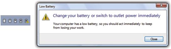
• Critical change in status. Examples: low battery, low storage, long-term loss of connectivity.
• Potential for significant loss of data or user effort. Example: erasing or formatting a storage device.
• Disclosure personal or sensitive information. Example: disclosing user’s physical location.
Attention-getting techniques
Your first choice should be to avoid the need to demand attention, but here are some techniques to demand the user’s attention (in order of least obtrusive first):
• Put critical text on control labels. Although users scan most UI text, they usually read control labels before they click on them. If there is critical information users must know before giving a command, put it on the label.
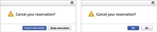
FIGURE 3.70 Putting critical text on the buttons makes it clear what is going on, even if the user is scanning the UI. Using Yes and No also works because users aren’t likely to click Yes without knowing what they are saying "yes" to.
• Use an attention-getting presentation. Critical or urgent UIs should look critical or urgent instead of normal, so make these controls stand out using layout, control size, color, and highlighting.
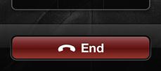
FIGURE 3.71 By making the End call button large, red, and physically separate, the iPhone ensures that this button gets users’ attention, even when they’re distracted. Users are unlikely to tap this button by accident.

FIGURE 3.72 The iPhone uses update overlays to show when there is a new email, message, or app update. The red overlay gets the user’s attention without demanding it.
• Use warning icons. Nothing communicates warning more concisely than a warning icon, which suggests that users should pay special attention to the task at hand. But displaying many warning icons runs the risk of causing users to ignore them all.
• Animations. Obvious animations draw attention without demanding it (unlike flashing, which demands attention). Larger, faster animations draw more attention than smaller, slower ones.
• Notifications. A UI (supported by many platforms) that shows timely, important events unrelated to the current activity and that are useful and relevant, but not critical—without breaking users’ flow. The top question designers have about notifications: “How can I make sure users see my notification?” The answer: “You can’t—the fact that users can ignore them is their entire point!”
• Modal dialog boxes. Modal dialog boxes interrupt users and force them to respond before they can continue. This makes modal dialogs a good choice for information users must see (and a poor choice for everything else).
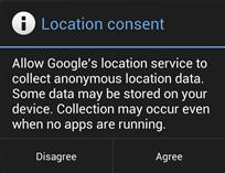
FIGURE 3.73 Modal dialog boxes are a good choice for information users must see, but they’re not so good for other stuff.
• Flashing. Flashing demands attention, especially when it’s rapid. A slow pulsing makes an object noticeable without demanding immediate attention. Rapid flashing is best reserved for only the most urgent problems (which should rarely occur).
FIGURE 3.74 If you end a call by pressing the Sleep button instead of the End button, the iPhone will flash the End button to confirm your intention.
• Beeping and alarms. Beeping and alarms definitely demand people’s attention, especially when they’re loud. They make it hard to do anything else. These are best reserved for only the most urgent, critical problems—like preventing a disaster.
Although flashing and beeping are the most obtrusive and annoying, they aren’t always effective in getting people to act. People are very motivated to get the annoyance to stop, but they won’t necessarily make an effort to address any underlying problems.
Abuse and habituation
All the previous techniques can be abused if overused or if the attention they draw is undeserved. For example, just about anything you can do with a computer has the potential for going badly, but using warning icons for every potential problem accomplishes nothing but makes your product feel hazard-prone.
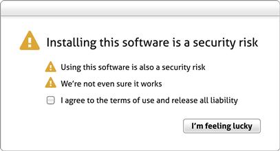
FIGURE 3.76 Overwarning accomplishes nothing except making your product feel hazard prone … and designed by a lawyer.
Worse, if users perceive any these attention-getting techniques as normal, they just start to filter them out. Your effort to demand attention just becomes a routine extra step.
Recommendations
Here are some ways to get attention when needed, without overdoing it:
• Think about what you would do in person. Would you interrupt someone immersed in their work to report this issue? If so, how would you do it? Make sure the issue is worthy of the interruption.
• Use the least obtrusive attention-getting technique that does the job. This means using different techniques instead of a single favorite one. Often, doing nothing special is that least obtrusive technique.
• Make sure that the need to demand attention is rare. If a feature constantly needs the user’s immediate attention, redesign the feature.
• Use progressive escalation. If an issue gets progressively worse, start unobtrusively but become more obtrusive as the situation warrants.
Summary
If you remember only 12 things:
1. UI form follows communication. At the wireframe level, every visual design element should be justified by what it communicates. If a UI element doesn’t communicate anything, it should be removed. If it communicates poorly, it should be redesigned. Through the lens of communication, many visual design decisions that initially appear subjective, emotional, arbitrary, and aesthetic are actually objective, rational, coordinated, and principled.
2. People are emotional and react emotionally to a product’s visual appearance. Your product should look the part—it should look like it fulfills its purpose well. But if instead your product’s visual appearance is of questionable quality, users will naturally assume that the rest of the product has the same level of quality. Don’t assume that users will see the beauty that lies beneath; they won’t.
3. If you want a beautiful product, hire a professional graphic designer … even if you are on a tight budget. It’s money well spent.
4. A page’s layout communicates the purpose of the page, how to scan and read the page, and the order in which to use the page elements. Additionally, a well-designed layout appears simple, orderly, easy to scan, efficient, and aesthetically pleasing.
5. In designing a page’s presentation, think about how you would present the content in person. Unless you would present the content as a continuous monologue that covers everything without interruption, choose a presentation model that lets users drive the conversation.
6. Generally, users don’t read, they scan—where the goal of scanning is to find things quickly. Scanning is so important that you should design pages specifically for scanning. On large displays, users scan a page by starting at the focal point (usually in the upper-left corner), scanning across the page with a left-to-right, top-to-bottom arc, checking UI elements that attract users’ attention along the way, ignoring UI elements that repulse their attention, and ending in the lower-right corner.
7. Well-presented text is beautiful, with attractive, easy-to-read typography, a clear visual hierarchy, and concise text. It’s always a safe choice to use the appropriate system font for your platform. Use color, shade, attributes, and capitalization to help users understand the text. If you want to make sure all users can read your text easily, use dark text on a solid light background.
8. When choosing color, consider what the UI element communicates and choose a color that communicates the meaning at a glance. The interpretation of color is culturally dependent, but the meaning of red, yellow, and green as status indicators is globally consistent. Also, color has a human perception (warm versus cool, neutral versus aggressive) that is independent of cultural interpretation. For accessibility, never use color as the only method of communication.
9. Not everything needs an affordance. Affordances are the visual properties of a UI element that indicate how to perform an interaction, and the consistent use of affordances is essential to having an intuitive UI. But affordances potentially add visual clutter, so make sure they are worth it. Do this by always displaying unobvious primary affordances and displaying secondary affordances dynamically.
10. Choose (and design) icons based on what they communicate. Standard icons communicate their meaning well, but nonstandard icons are primarily for visual recognition. For good visual recognition, make sure your icons are visually distinct in terms of design, shape, and color. Standard icons don’t require labeling, but all other icons should be labeled to avoid the need for experimentation to figure them out.
11. Effective animations and transitions communicate what is happening visually. Use animations to give feedback, show relationships, draw attention to important change, or explain tasks visually. Use transitions to keep users oriented during a state change, and make those changes feel smooth and natural instead of jarring. To ensure effective communication, define an animation and transition vocabulary and apply it consistently across your product.
12. Sometimes you need to break the user’s flow and demand their full attention. If you do, use the least obtrusive attention-getting technique that does the job. To avoid habituation, make sure that the need to demand users’ attention is rare.
All the good examples in this chapter have something in common: They use visual design to communicate effectively. Even though aesthetics are important, effective communication should drive most visual design decisions.
Exercises
To improve your visual design skills, try the following exercises. Assume that anything is possible. Don’t let concerns about development costs or current technology limitations inhibit your thinking.
1. Design is the product. Make a list of all the high-quality products that you enjoy using that have a poor visual appearance. How long is that list? What does that tell you?
2. Visual communication. Find or create a wireframe design for a UI. Pass through the wireframe and evaluate each element based on what it communicates. Remove any elements that don’t communicate anything. Redesign any elements that don’t communicate well. Better?
3. Using conversation patterns. Find a UI that contains a significant amount of information. Think about how you would present this information to the target user in person. Choose a presentation pattern that mirrors that conversation and redesign the page to use it. Better?
4. Designing for scanning. Take a printout of a UI, apply the scanning rules to determine what users will see, and highlight those elements. Now read the page in a left-to-right, top-to-bottom order, reading only the highlighted elements. Is it still clear what to do? Does your own scanning behavior match the scanning rules? For example, do any banners attract or repulse your attention?
5. Using good text presentation. Find some pages that don’t present text well. Identify the specific problems with the text, including fonts, colors, backgrounds, and attributes. Now redesign the page to address these problems. Better?
6. Using color for communication. Find some pages that make poor use of color. Make black-and-white photocopies, and restore the color only when needed to communicate status or draw needed attention. Better?
7. Using affordances effectively. Review several products for their use of affordances. Can you find any affordances that are used incorrectly based on their interaction and effect? Are there any that result in unnecessary visual clutter? Can you reduce the clutter by displaying secondary affordances dynamically?
8. Using icons for communication. Find a product that makes heavy use of icons. Evaluate its icons based on what they communicate (removing any text labels or tooltips). Do all the icons communicate equally well? Can you improve the icons that communicate poorly? Should text labels be used? What would happen to the design if these icons were removed or replaced with text labels?
9. Using transitions. Find a product that uses transitions extensively and document its transition vocabulary. Are the transitions meaningful? Are they used consistently? How could they be improved?
10. Demanding attention. Find a product that uses several different attention-getting techniques. Is the user’s attention really required? Are the techniques used appropriately? Could less obtrusive techniques be used instead?