
Interaction Design
“Everything is best for something and worst for something else. The trick is knowing for what, when, for whom, and why.”
—BILL BUXTON
The concept behind UI is Communication is that a user interface is essentially a conversation between users and a product to perform tasks that achieve users’ goals. A user interface differs from human conversation primarily in that it uses the language of UI instead of natural language.
The goal of this chapter is to establish and help readers understand the language of UI—essentially the parts of speech for user interfaces. In doing so, the chapter presents the traditional UI elements—controls, labels, feedback, pages, dialog boxes, error messages, and so on—and focuses on how to choose and use them effectively based on what they communicate. My goal is to help you make the right decisions quickly and confidently, for the right reasons.
To help you visualize this language analogy, Figure 2.1 shows how common UI elements map to the parts of speech and other elements of communication. This chapter is organized around those elements, starting with words and working up to conversations.
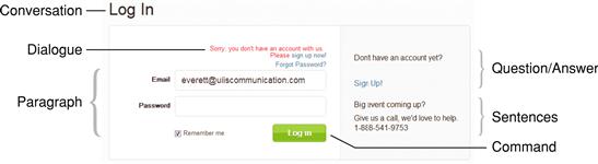
FIGURE 2.1 The language of UI maps well to the parts of natural speech and other elements of communication.
As you will see in this chapter, although there are many factors, effective communication often drives decisions in UI design. I have observed that designers sometimes develop a set of UI elements that they like and others that they avoid. This approach is fundamentally wrong. There are no good or bad UI elements—rather, there are appropriate and inappropriate ones based on what you need to communicate. As Bill Buxton observed, “Everything is best for something and worst for something else. The trick is knowing for what, when, for whom, and why.”
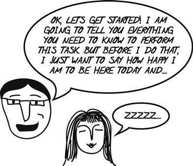
FIGURE 2.2 That flashing icon on the taskbar is very distracting and makes it hard to concentrate. It’s great choice for something that really requires attention; otherwise, it interferes with getting work done.
Interactions
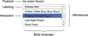
A typical UI element can be broken down into these constituent parts:
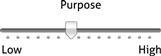
• Purpose. The purpose of the element; what it does. For example, the purpose of a textbox is to allow users to input unconstrained text.
• Affordance. Visual clues that indicate how to perform an interaction. For example, a box around text indicates that the text is editable. Poorly designed UI elements require labeling to explain how to perform the interaction. For example, labels like “Click here to type” should go without saying.
• Body language. The details of an element’s presentation that provide additional information beyond its purpose and affordance. For example, the size of a textbox suggests the size of the expected input.
• Interaction. The specific user action to perform an interaction. For example, users interact with textboxes by clicking or tapping and typing.
• Labeling. Text labels, placeholders, icons, or tooltips that explain the meaning or effect of an element. For example, nearly all textboxes need a label to explain their meaning.
We will explore purpose, body language, and labeling in detail later and affordances in Chapter 3, so let’s start by reviewing the different types of interactions used by most UI elements. Here are the common mouse interactions used by desktop UI:
| Left-click | Activate or select an object. For text, set the insertion point. |
| Double-(left) click | Select an object and perform its default command, such as opening. For text, select a word. |
| Hover | Show tooltips or secondary affordances. (Not supported by touch screens.) |
| Right-click | Select an object and display its context menu. |
| Left-click+drag | Slide, move, resize, split, or drag an object. (Exact effect is indicated by the mouse pointer.) |
| Triple-click | For text, select a paragraph. |
| Control+left-click | Toggles a list item selection. |
| Shift+left-click | Extend a list selection contiguously. |
| Shift+left-click+drag | A constrained left-click+drag. For example, constrains resizing an oval or a rectangle to the existing aspect ratio. |
This list is presented roughly in order of discoverability. (The  key is the equivalent of Control on Macintosh.) It’s safe to assume that all users know about left-clicking and that most users know about double-clicking, hovering, and right-clicking. The remaining interactions are less discoverable and therefore more advanced.
Many users are confused by the difference between single click and a double click and may double-click objects when only a single click is required. As a rule, double-clicking is required to invoke a selectable object (such as items in a list, where the first click selects, and the second click invokes or opens), whereas nonselectable objects (items not in a list, such as command buttons, links, and checkboxes) are invoked on the first click, and any second click should have no effect. Other combinations such as double right-click are nonstandard and should not be used.
Here are the common keyboard interactions used by desktop UI:
| Shortcut keys | Advanced keystrokes primarily for efficiency, known mostly to advanced users. In Windows, usually assigned to Function keys or Control keys; on a Mac, usually assigned to Control, Option, and keys. Shortcut keys are memorized and therefore must be assigned consistently within a platform. |
| Access keys | Keyboard access to controls primarily for accessibility. In Windows, usually assigned to Alt keys. They cannot be assigned consistently, so they are documented within the UI. Access keys are not used on Macs. |
Shortcut keys or access keys are secondary interactions, so they shouldn’t be the only way to perform a command. For desktop UI, there should be a mouse-based alternative.
Here are some common interactions and gestures for touch-based UI:
| Tap | Activate or select an object. For text, set the insertion point. Stop a scroll. |
| Double-tap | If in the center of the screen, zoom in and center the content or zoom out if already zoomed in. If at the top or bottom, scroll up or down a half page (iOS only). For text, makes selection. |
| Touch and hold | Display a magnified view for insertion point position. Display the context menu or additional commands. Change of modes (for example, edit mode). |
| Drag | Drag an object, reorder a list, pan or scroll a screen. |
| Pinch or spread | Spread two fingers apart to zoom in, pinch fingers together to zoom out. |
| Rotate | Rotate an object. |
| Flick | Pan or scroll a screen quickly. |
| Drag from top | When already at the top, dragging down reveals a search box or refreshes the content. |
| Swipe | Swipe across to reveal a Delete button for a list item. Swipe from top of screen to reveal notifications, timely information, important settings. Navigate between views such as items in a list (Android only). |
| Shake | Initiate an Undo or Redo command (iOS only). Refresh time-sensitive information (Android only). |
Again, this list is presented roughly in order of discoverability. It’s safe to assume that all users know about tapping and that many users know about double-tapping, touching and holding, dragging, and pinching. The remaining interactions are less discoverable and therefore more advanced.
Controls (words)
Controls are the words of expression in the language of UI. In this section, my goal is to help you have a clear understand of the purpose of each type of control and how to use controls effectively.
In human communication, there is what you say—the meaning of the words—as well has how you say it—the “body language.” In human communication, body language is a form of nonverbal communication that subtly suggests how to interpret the meaning.
Controls are similar. Each type of control has a certain meaning, but the control’s presentation also communicates subtle clues about how to interpret the control. Here are the most common forms of control “body language”:
• Size of expected input. The physical control size suggests the size of the expected input or data. Example: A textbox width and height indicate the expected input size.
• Number of items. The physical size suggests the number of items. Example: A list box height suggests the length of the list, whereas longer lists usually are displayed in longer controls.
• Screen space required. The physical size required to display the control. Example: A set of checkboxes requires screen space to display each option, whereas a scrollable checkbox list does not.
• Immediate versus delayed effect. When the interaction takes effect—some controls are immediate, but not all. Example: Command buttons and sliders usually have an immediate effect, whereas checkboxes and drop-down lists usually have a delayed effect.
• Default values. The value a control has when it is initially displayed. Example: Most radio button groups have a default value, but to prevent bias, radio buttons used in surveys don’t.
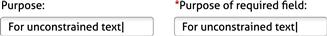
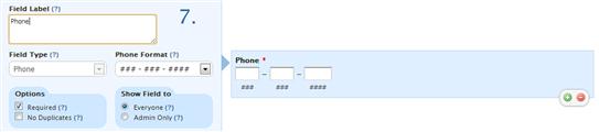
• Required input. Controls without default values are often marked to indicate that user input is required. Example: Forms often indicate required fields with a red asterisk.
• Encourage change. Open, easy-to-change controls encourage users to make selections, whereas closed, harder-to-change controls do not. Example: Sliders encourage users to try different values.
• Presentation, order. Whether a control enables users to change its presentation. Example: List views enable users to sort and filter list items.
• Level of commitment. Whether an action can be easily undone. Example: A button labeled Next does not imply commitment, whereas a button labeled Purchase does.
• Forgiveness. Whether user mistakes are prevented or easy to correct. Example: Some multiple-selection lists are unforgiving; if users make a small selection mistake, they have to start completely over.
• Complexity. The overall complexity of the control and its presentation. Example: Hierarchical tree controls are more complex than flat lists.
• Discoverability. How noticeable the control is. Example: Command buttons are more discoverable than links, making command buttons appropriate for primary commands and links a possible choice for secondary commands.
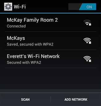
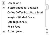
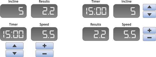
FIGURE 2.4 In this case, an open list of Wi-Fi connections encourages selection, making it a better choice than a drop-down list.
Usually, control choice is driven by purpose first and body language issues second, but sometimes body language is important enough to make the decision.
Common controls
Here are the most common input controls, organized by their purpose.
• Purpose: Used to input unconstrained text, such as names and addresses. Because they are unconstrained, textboxes require more knowledge and are more error-prone than other controls.
• Body language: Control width suggests maximum input size. Control height suggests maximum numbers of lines of text. Red asterisk indicates a required field.
• Numeric textboxes (with optional spin buttons): 
• Purpose: Used to input unconstrained numeric values. Spin buttons can be used for convenience if the default value is close to the expected value.
• Body language: Control width suggests maximum input size. Red asterisk indicates required field.
• Purpose: Used to select a value from a range of values where the desired value isn’t known exactly or the exact value isn’t meaningful, so users need to experiment to choose. For example, the numeric value of a volume slider usually isn’t meaningful.
• Body language: Needs immediate effect because feedback helps users select the desired value. Encourages change and experimentation.
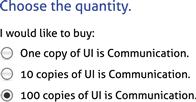
• Purpose: Used to select an exclusive choice from a small number of choices (say, eight or fewer).
• Body language: Needs screen space to display all the choices.
• Purpose: Used to enable or disable an option or small number of options (say, eight or fewer).
• Body language: Needs screen space to display all the choices.
• Purpose: Used to select an exclusive choice from a possibly large number of choices (up to several hundred).
• Body language: Needs a fixed amount of screen space. Closed presentation discourages change, but default values such as “[Select an option]” require change.
• Purpose: Used to input unconstrained text, but most likely selections are in the drop-down lists. Drop-down list values may be fixed or based on previous user input.
• Body language: Needs a fixed amount of screen space.
• Single-selection list boxes: 
• Purpose: Used to select an exclusive choice from a possibly large number of choices (hundreds or even thousands).
• Body language: List height is roughly proportional to the number of items in a list, where larger lists are usually displayed in larger boxes. In contrast to drop-down lists, open presentation encourages change.
• Multiple-selection list boxes: 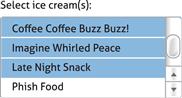
• Purpose: Used to select independent choices from a possibly large number of choices (hundreds or even thousands).
• Body language: Multiple-selection capability (through Shift+ and Control+click) is invisible, so it is either suggested by the label or deduced by users through experimentation. Also, very unforgiving, because any selection mistake will result in all previous selections being cleared. List height is roughly proportional to the number of items in the list, where larger lists are usually displayed in larger boxes.
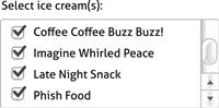
• Purpose: Used to select independent choices from a possibly large number of choices (hundreds or even thousands).
• Body language: Multiple selection capability is clearly visible through the checkboxes. Forgiving compared to multiple-selection list boxes because selection mistakes affect only the current item. List height is roughly proportional to the number of items in the list, where larger lists are usually displayed in larger boxes.
• Purpose: Used to display different information or different views of the same information.
• Body language: Needs screen space to display all the tabs.
Commands
• Purpose: Used to initiate an action.
• Body language: Normally immediate. Ellipses are used to indicate that more input is required before the command can be performed. Can be used for any command, but their easy discoverability makes them especially suitable for primary commands (used to invoke the purpose of a page.)
• Purpose: Used to initiate an action or navigate to another page or window.
• Body language: For navigation, always immediate. For commands, normally immediate, but ellipses may be used to indicate that more input is required. Their reduced discoverability compared to command buttons make them suitable for secondary commands. (Secondary commands aren’t directly related to the purpose of a page.)
Data controls
• Purpose: Used to display and interact with a list or table of data in either a flat organization or organized by groups.
• Body language: Typically users may sort table data by clicking column headings or filter by choosing various filters.
• Purpose: Used to display and interact with data using a multilevel hierarchical structure. Works best when that hierarchy is unique and well known by users.
• Body language: Users can expand and collapse tree nodes but not change the order or filter as with list views. A very complex control to use and understand, making list views a better choice unless a multilevel hierarchy is required.
Mobile controls
Here are the additional mobile controls, organized by their purpose:
• Purpose: Used to present data in a grid (a single-column grid for iOS table views).
• Body language: Used to gather input, show settings, and make choices.
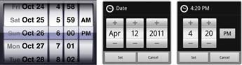
• Purpose: Used to select an exclusive choice from a moderate number of choices (moderate because users may need to flick through the entire list). Date and time pickers are used to select dates and times.
• Body language: Flicking has momentum, making it easy for users to choose from a moderate range of values. More physical and engaging, and less error prone than typing. Table views are more efficient for selecting from a large list.
• Purpose: Used to turn an option on or off.
• Body language: Like checkboxes but more touchable.
• Segmented controls (iOS only): 
• Purpose: Used to show exclusive views (up to about five) and which one is currently selected.
• Body language: Direct, labeled, and exclusive.
• Purpose: Used to show the number of views open (up to a maximum of 20) and which one is currently visible.
• Body language: Sequential and unlabeled, so may require users to browse many views to find what they are looking for.
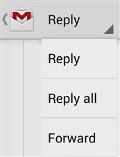
• Purpose: Used to display a list of options, either in a drop-down or pop-up menu.
• Body language: Needs a fixed amount of screen space. Closed presentation discourages change (compared to the alternatives).
Removing, disabling, or giving an error message
What should you do if a setting or command doesn’t apply in the current context? Here are your choices:
• Remove the control. Remove controls that don’t apply. This approach simplifies the UI at the potential cost of confusing users who expect to find the control.
• Disable the control. Disable controls that don’t apply. If users expect the control, they will find it (instead of continuing to look elsewhere), but disabled controls add clutter, and the reason they are disabled isn’t always obvious.
• Give an error message. Leave the control enabled, but give an error message when users invoke it.
Although giving an error message might seem like a poor option, it depends on how helpful the error message is. Consider providing an error message if doing so eliminates confusion or the need for experimentation or help. (But to clarify: By “error message,” I am referring to the general UI pattern of giving feedback in response to a problem. It doesn’t have to look or feel like an error or draw unnecessary attention to the user’s mistake.)
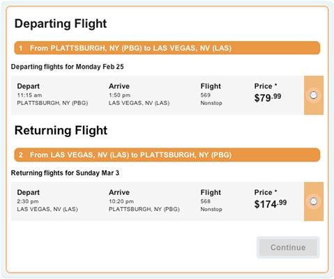
FIGURE 2.5 Is it completely clear why the Continue button is disabled? Better to leave it enabled and give a helpful error message. 
When in doubt, here is how to decide:
• Start by writing the error message you might give. If it provides useful information that doesn’t go without saying and avoids confusion, leave the control enabled and give the error message.
• Determine whether users will be confused if the control is removed. If they won’t, remove it.
• For mobile apps, bias the decision more toward removal, to maintain simplicity on small displays.
Commands (verbs)
We just looked at controls generally. Controls have three purposes:
Let’s focus on commands now. Commands have a special design challenge: There are often many commands, where do you put them all? Worse, command presentation often has conflicting goals:
• Discoverability. For intuitiveness, users need to find the command they are looking for quickly and easily.
• Directness. Commands are easier to find and more efficient to use if they are directly visible on the screen (as opposed to being in a drop-down menu).
• Consolidation. Commands are easier to find if there is only one place to look. Users shouldn’t have to go on a “command safari” to hunt down exotic commands.
• Context. Commands are displayed in or next to the objects they affect, rather than out of context.
• Simplicity. The cumulative effective of the commanding shouldn’t be overwhelming, which is likely if you have many direct commands piled in one place.
• Space efficiency. Your app’s content is the reason users are there, so it needs to be the star of the show. A poorly designed app shows mostly commands and navigation and very little content.
No one solution to these tradeoffs works best for all situations; hence the need for different ways to present commands. Let’s review the most common commanding patterns.
In-place commands
In-place commands are command buttons and links (for secondary commands) placed directly on the UI surface. This approach works well when there are only a few commands used all the time.
Sometimes in-place commanding can be eliminated by giving actions immediate effect.
FIGURE 2.8 “Adornments” change the appearance of their associated list. They often have immediate effect, making an explicit command button unnecessary.
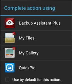
Pop-up menus
Pop-up menus are menus displayed contextually by clicking a button. They may pop up, drop down, or slide out in some way. These menus are called action sheets on the iOS and pop-ups on Android. They use screen space effectively, making them a great choice for mobile apps.
• Pros: For a few clearly related commands, pop-ups are very discoverable and simple and provide one place to look for related commands.
• Cons: Break down quickly if frequently used, if there are many commands, or if they aren’t clearly related.
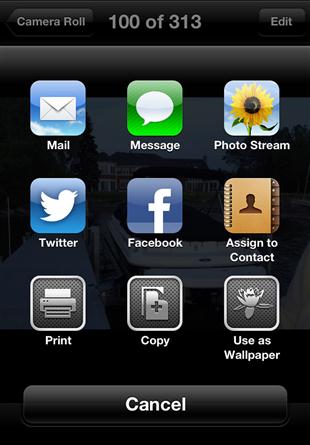
FIGURE 2.9 Pop-up menus are simple and yet still have a contextual feel. These menus are called action sheets in iOS.
Menu bars
Menu bars display a comprehensive list of all the commands available in an app. They are indirect because users must interact to do anything. They are typically displayed at the top of a window, although Macintosh displays its menu at the top of the main display. They are labeled primarily with text.
• Pros: A great way to summarize all the commands available in one place.
• Cons: Not direct or contextual and therefore often inefficient compared to the alternatives.
Given the cons, menu bars are traditionally combined with toolbars for both comprehensiveness and efficiency. With this combination, the toolbar is used to access frequently used commands and the menu bar is used to find infrequently used ones—often the ones that aren’t in the toolbar.
Toolbars
Toolbars display the most frequently used commands directly, making them quick and easy to access. Toolbar commands are labeled with icons or text.
• Pros: Very discoverable and direct. Simple, at least compared to ribbons. Perfect for a small set of frequently used commands.
• Cons: Not contextual (unless displayed dynamically). Not simple if there are many commands.
Toolbars are strong where menu bars are weak, so the two are often combined. Unfortunately, some toolbars have the exact same commands as their associated menu bars, defeating their purpose of optimizing for the most frequently used commands.
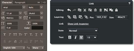
Ribbons
Ribbons organize commands into grouped tabs. Most ribbon commands are labeled with both a text label and an icon.
Context menus
Context menus display the most frequently used commands for a specific object or context. They are called edit menus on the iOS and pop-ups on Android.
• Pros: Very contextual. Discoverable, at least for advanced users. One place to look for commands related to a specific object.
• Cons: Break down quickly if there are many commands. Must be used only for contextual commands, not global ones.
Palettes
Palettes display the most frequently used commands for a specific task on a user-movable surface. Palette commands are usually labeled with icons.
• Pros: Very discoverable, direct, and contextual. More efficient than the alternatives when doing detailed work in a specific area. Perfect for a small set of frequently used commands in a specific context.
• Cons: Because they are movable, they require users to move them where they’re needed or out of the way when they’re not. Introduces another place to look for commands.
Command-labeling patterns
We will look at labeling generally in the next section, but let’s now look at the common command-labeling patterns.
Commands are labeled with some combination of text labels and icons:
• Text-only labels. Self-explanatory but not easy to scan and recognize. Traditionally used in menus but now used in toolbars as well.
FIGURE 2.16 Toolbars can have text-only labels. Note how most of the commands on the Windows Explorer toolbar in Windows 7 don’t have icons.
• Icon-only labels (plus tooltips). Compact, easy to scan and recognize, but not self-explanatory. Commands are verbs, and verbs are hard to show with symbols, which are nouns. So, except for the most well-known icons, icon-only labels depend on tooltips to explain them—which makes them harder to use than text labels. One benefit to icon-only labels is that they don’t require translation, but of course tooltips do. Touch screens don’t support hovering, making unlabeled nonstandard icons a poor choice.
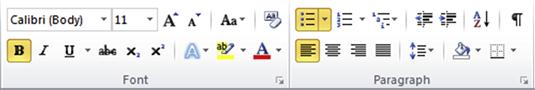
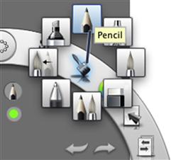
FIGURE 2.18 By contrast, the meaning and differences between these commands aren’t entirely clear. They require tooltips to help users understand them.
• Icon and text labels. Both self-explanatory and scannable but at the cost of being larger than the alternatives.

Not all commands require icons. Modern, intuitive UI designs tend to favor text labels (often without icons) to be self-explanatory without depending on tooltips. Modern, simple designs with few commands benefit less from using icons to help scanning than from classic UIs with dozens.
Labels and instructions
Labels refer to text or icons directly on controls or associated with controls, whereas instructions refer to additional explanations beyond the labels. This section focuses on the label and instruction text. We will explore label layout in Chapter 3.
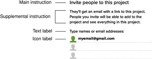
Most controls need a label for users to understand their purpose and effect. On rare occasions, some controls (like a playback control in a media player) don’t need labels, but they are the exception rather than the rule.
FIGURE 2.21 Most controls need a text or icon label. Controls that don’t—like this playback control—are the exception.
Main instructions are large text instructions at the top of a page that explain the purpose of the page. A good main instruction should be what you would actually say to users to explain the page. Designing good main instructions and pages to accurately reflect those instructions leads to better, more intuitive task flows—even if you don’t explicitly display the instruction, which is often the case in mobile UI. Main instructions were covered in detail in Chapter 1.
Ordinary (not main) instructions should rarely be needed. Use ordinary instructions when concise, self-explanatory labels aren’t possible or when users need information beyond the individual control labels.
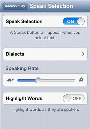
FIGURE 2.22 Design controls so that further instructions usually aren’t needed. Here the Speaking Rate slider requires no further instructions, but the Speak Selection and Highlight Words options do. 
An important contrast between labels and instructions is that users rarely interact with controls without reading their labels first, but users frequently skip over instructions without reading them at all. Moral: If there is text that users must read, try to put it directly on a control label.
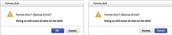
FIGURE 2.23 Very few users will click on Format without reading the button label, but many users will click OK without reading the warning.
Concise vs. self-explanatory: Getting the right balance
Imagine a conversation with someone in which all her responses were limited to a single word—usually OK or Cancel. You could engage in such a conversation, but it wouldn’t be effective and it would feel very tedious. Yet many UI “conversations” are like this.
There is a tradeoff between concise and self-explanatory labels. Traditionally, control labels were very concise, often using a single word such as OK, Cancel, Submit, Close, Done, or Save. These single-word labels were originally motivated by small, low-resolution displays and poor typography. Although we still have small displays for smartphones, for desktop UI and tablets we have high-resolution displays and excellent typography.
By contrast, modern UI tends to make the tradeoff in favor of being self-explanatory. Being self-explanatory occasionally results in having more text, but that isn’t always the case. In fact, my experience is that it usually results in less but much better text—without repetition. Say it well, yet concisely, once instead of many times poorly, and add an extra word or two as needed to add clarity. You have permission to do this now—we have the technology!
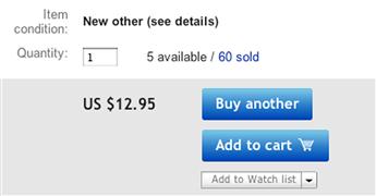
FIGURE 2.25 Modern UI labeling is self-explanatory but less redundant—using more words but ultimately much less text. This example uses very little text, but it communicates quite clearly.
In The Elements of Style, William Strunk Jr. famously admonished, “Omit needless words!” My additional advice: “Add needed words!” The alternative is having users rely on experimentation, documentation, and training—clear signs of an unintuitive UI.
Attributes of effective labels and instructions
As I explained in Chapter 1, effective labels and instructions should reflect what you would actually say to someone in person. If a UI feels like a natural, professional, friendly conversation, it is probably a good design. If it feels unnatural, technical, or robotic, it probably isn’t.
Chapter 1 presented the attributes of effective communication in detail. Here is a summary of the attributes most relevant to labels and instructions:
• Useful, relevant, necessary. The label provides information that is useful and relevant to the task at hand and doesn’t go without saying. If a completely confused user could readily provide the same information, skip it.
• Purposeful. The label helps users understand the UI element, focusing on the objectives and tying them to the users’ goals and motivation, not the basic mechanics of the interaction. If novice users who understand basic interaction could provide the same information, skip it.
• Clear and natural. The label speaks the users’ language—using language users would naturally say in conversation. The text avoids unnecessary jargon, abbreviations, and acronyms, fully spelling out words in plain language whenever possible.
• Easy to understand. The label doesn’t require thought, experimentation, or special knowledge to understand.
• Specific and explicit—it doesn’t undercommunicate. The label provides the right level of detail so that users know what to do.
• Concise and efficient—it doesn’t overcommunicate. The label provides the right level of detail so that users can make informed decisions confidently but without going overboard.
• Good personality and tone. The text has a good personality and tone—like a likeable person. If saying what is on the label would be inappropriate, rude, disrespectful, or stupid between people, it should be considered equally inappropriate with software.
Label and instruction details
When crafting label and instruction text, here are some details to get right:
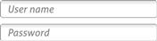
• Placeholders. Placeholders are textbox labels placed temporarily inside the control. They disappear once users activate the control. Placeholders can simplify the appearance of a UI and work well with small screens but disappear when users potentially need them most. For that reason, reserve placeholders for simple forms where it’s obvious what to do.
FIGURE 2.26 Placeholders work great for simple forms where users already know what they should enter.
• Ellipses. Use on command labels only to indicate that more input is required to perform the command. Ellipses are a constant source of confusion on desktop UI. (Note that ellipses aren’t used for this purpose in mobile UI.) Commands normally have immediate effect, whereby the command is executed immediately after an interaction. Ellipses are added to labels to indicate when a command isn’t immediate—when more input is required. Many people mistakenly believe that ellipses indicate that the command displays a window or dialog box. The difference: If the purpose of a command is to display a window or dialog box, ellipses aren’t needed.
FIGURE 2.27 Print… indicates that more input is required to print the document (by displaying Print Options). By contrast, a command that displays Options doesn’t have an ellipsis.
• Capitalization. Follow your platform’s guidelines, but generally use title capitalization for titles, sentence capitalization for everything else. In classic UI, title capitalization (where pretty much all words are capitalized except articles, conjunctions, and prepositions) is used for commands. Title capitalization made the commands more legible with poor typography, but it makes the text feel overly formal and awkward with multiword labels. By contrast, sentence capitalization (where only the first word of a new sentence is capitalized) feels friendly and is more flexible.
• Periods. Don’t use periods at the end of labels, links, or main instructions. However, use periods at the end of ordinary instructions presented as complete sentences.
• Underlining. Don’t underline any text that isn’t a link; use italics if necessary for emphasis. Most links don’t need underlines, either. Use them only when text isn’t clearly a link based on its context.
Feedback
Feedback indicates that the action is happening and was either successful or unsuccessful, providing specific details when needed. Effective feedback communicates status, keeps users oriented, and builds their confidence in a task. Although you can communicate feedback using a heavy modal dialog box, it is usually better to keep it simple, lightweight, and engaging.
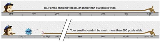
FIGURE 2.31 Feedback is an excellent opportunity to be engaging. Why be dull? Here, without using a heavy UI, MailChimp vividly lets you know when you have stretched your email too wide.
Effective feedback is responsive. When users perform an action, they expect to see feedback within 200 ms before they start to wonder what is going on and perhaps retry the action. No response is always poor feedback; there should be some visual clue that the action is happening.
Here are the most common forms of feedback, least intrusive first:
• Progressive rendering. Shows progress by rendering as it happens. More informative than other forms of feedback because it is the actual progress instead of an indirect indicator. The best first step in the rendering is to make the content and its layout stable so that users can interact right away with confidence.
FIGURE 2.32 Progressive rendering shows the actual progress as it happens. Note that the first step is to make the new items stable.
• Animations. Animations visually show that an interaction has happened, the relationship between an action and its effect, or the outcome or side effect of an action.
• Activity indicators. Spinners and indeterminate progress bars show that work is getting done but without indicating progress toward completion. Spinners work well for actions that take only a few seconds, but they are uninformative after that.

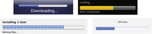
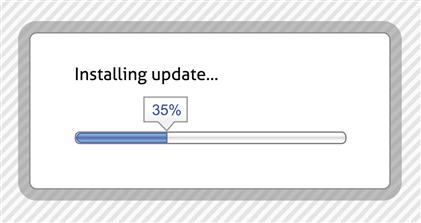
• Progress feedback. Determinate progress bars show an approximate percentage of completion. Progress bars provide useful feedback for actions that take longer than a few seconds. The value of a progress bar is undermined if progress stalls or—worse—the bar resets to the beginning. Resetting turns a progress bar into an activity indicator.
• Modal dialog boxes. Show feedback primarily through text, using a presentation that users must respond to. Can be a good choice to show complex results for a long-running task but not so good for other forms of feedback.
• Flashing or bouncing. An attention-demanding, often intrusive animation to indicate that something requires the user’s immediate attention. For flashing, the frequency indicates the urgency and seriousness of the issue. Use another form of feedback if the user’s immediate, undivided attention isn’t required.

FIGURE 2.37 Bouncing demands the user’s immediate attention. It had better be worth the interruption!.
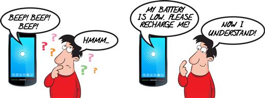
FIGURE 2.38 This beeping device appears to have some problem that I can’t figure out. I can’t get it to stop! Where is my hammer?.
• Beeping. An attention-demanding, often intrusive way to indicate that something requires the user’s immediate attention. The volume, frequency, and dissonance of the beeps indicate the urgency and seriousness of the issue. Not only is beeping annoying, but the meaning and source of the beep are often unclear.
Grouping (sentences)
Grouping shows relationships between controls visually within a page and makes pages easier to scan and parse.
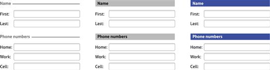
Group boxes
Group boxes are labeled rectangular frames that surround a set of related controls. Group boxes have been around forever. Although they’re simple conceptually, they are visually heavy and distracting, inflexible, and often overused.
On the iOS, group boxes within table views and forms are the most common form of grouping. Group boxes’ visual style makes them look like an integral part of a screen, so they don’t feel as heavy or distracting.
Separators or heading banners
Separators and heading banners are essentially group boxes without the box—using labeled lines or banners to separate groups of related controls. Although they are a better choice than group boxes, using rich headings (which we’ll talk about in a moment) is a cleaner, more modern approach. There is a phenomenon known as banner blindness (explained in Chapter 3), so for heading banners I recommend black text on a light background instead of white text on a color background—which looks somewhat like an advertisement, so users tend to ignore it.
Rich headings and layout
You can use layout alone to show relationships between controls. And instead of using separators to identify sections, you can use rich headings. (By “rich,” I mean that the UI text uses a variety of fonts instead of a single font, so headings would be larger and bolder than plain UI text.) Group boxes and separators are sometimes helpful, but rich headings and layout are lighter weight, more flexible, and more modern.
Progressive disclosure
Progressive disclosure, in which additional information is displayed on demand, is a way to group dynamically. The information being displayed dynamically can be shown in place, in a pop-up, or in a flyout.

Sentence-style grouping
Sentence-style grouping shows the relationship between controls by composing them into complete thoughts—much like a sentence. One approach is to make a grammatically correct sentence. Although there might be situations in which this is a good approach, a significant downside is that it can be extremely hard to localize given that sentence structures vary greatly across languages.
A more practical approach (that is, no localization worries) is to present an entire thought without making an actual sentence. For example, classic UI often presents settings as control + label pairs. Modern and mobile UI often use richer label + current setting + control to change setting triplets that form a more complete thought.
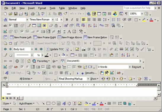
Task steps (paragraphs, monologues, and dialogues)
Imagine reading a book that was presented as a single paragraph. No matter the size, content, or writing style, such a book would be excruciatingly tedious to read. Many UIs feel like that.
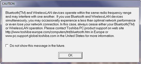
FIGURE 2.47 Regardless of the content, reading a book consisting of one paragraph would be excruciatingly tedious. Like this UI.
People often ask me how much information is appropriate to display on a single page. Without looking, I know that a concise response would be, “Much less than you have now.” Inexperienced designers have a tendency to put way too much information on their pages—their motivation being that it is easier to develop and that having fewer pages somehow sounds better.
But to be courteous and helpful, the response I usually give is: “Think about the conversation you would have in person. The right UI pattern will reflect the nature of that conversation.”
Here are some conversation patterns to consider:
• A speech. In this pattern, the UI effectively delivers a speech—where all the user does is passively listen. The communication is one way and there is no interaction. In practice, such a UI might answer a user question by providing a .pdf document.
• A monologue. In this pattern, the communication is still one way. The user listens, but unlike the speech pattern, the user can control how the information is delivered. In practice, such a UI might present an interactive brochure.
• App-driven dialogue. Here the UI displays the information and controls the flow of the conversation. Unlike a monologue, there is plenty of interaction, but the user has little control over it. Such a UI is often called a wizard.
• User-driven dialogue. In this pattern, users have control over the conversation. The app presents the minimum to get the task done, but users can choose to see or do more and determine the direction of the conversation; they just have to ask.
• A form. Here users ask for something and the app responds by having the user fill out a form. This pattern has a bureaucratic feel, but it works well if the form feels simple and its fields are clearly necessary.
Many complex, hard-to-use UIs use heavy monologues or app-driven dialogues when they should be using simple user-driven dialogues. There’s nothing wrong with giving a speech—as long as it’s the right conversation pattern. It just rarely is. Better to let the user drive the conversation.
Here are the common techniques to present dialogues that are simpler and more user driven:
• Present less stuff. Though this concept is seemingly obvious, it doesn’t go without saying. When evaluating your UIs, take a highlighter and highlight the useful stuff, then take a step back and reevaluate what you didn’t highlight. We tend to overcommunicate, so chances are that you should simply remove most of what isn’t highlighted.
• Better organization and a visual hierarchy. Having better organization and a visual hierarchy presents the same amount of information but in a way that is easier to scan and understand. It doesn’t feel like a big pile of stuff.
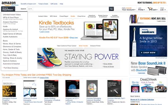
FIGURE 2.49 Even though the Amazon homepage is packed with information, it has a good organization and a clear hierarchy, making things easy to find.
• Progressive disclosure. We already looked at progressive disclosure, but it is a great way to let users control how much information they see.
• Modes. Although it’s a design principle to avoid modes, a more enlightened approach is to avoid unnecessary modes. They are necessary modes and they work well—so don’t avoid these. For example, a common pattern is to display information that users might occasionally need to change. Rather than display everything required for both viewing and editing, start in a simple view mode and let users ask to edit.
• Tabs. Tabs display related information on demand. Tabs are a great way to display different information or different views of the same information. However, don’t use tabs for other purposes, such as presenting steps in a task flow or general commands; users don’t expect to find these in tabs.
• Pages. Of course, you don’t have to display everything on a single page. You can use more than one page—it works great! Though that’s an obvious solution, it’s not hard to find pages that ought to be split up.
Task navigation
A great way to simplify a complex task and let the user drive the conversation is to break a task down into simple steps. But to do that, we have to provide a way for users to navigate between the steps.
A helpful way to think about task navigation is to think about how you find your way around in an unfamiliar city as a tourist. Often you start a journey from “home” (your hotel) by knowing where you want to go, but without necessarily knowing how to get there. As you go, you use navigation aids such as maps, landmarks, street signs, and pointers to specific attractions. You won’t consider yourself lost as long as you know roughly where you are and can take the next step with confidence. If you get lost, you might backtrack to the last place where you knew you were and restart from there. If you ask for help, it’s likely to be the last thing you try—doubly true if the last time you asked for help wasn’t helpful. Navigating through an unfamiliar task in software is much the same kind of process.
There are many possible navigation models, but some variation of Web navigation is often the best choice. By Web navigation, I mean a navigation model that:
• Has clear means to advance to the next step
• Offers a consistent way to go back to the previous step when needed
Regardless of the navigation model you choose, keeping navigation simple and consistent across your app will help users get tasks done more efficiently by leveraging their previous experience.
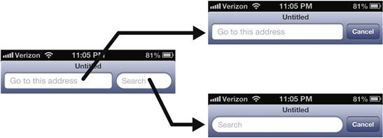
FIGURE 2.53 Browsers support the key elements of the Web navigation model, which works well because it is simple, familiar, and forgiving.
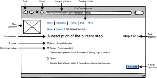
Beyond the basic Web navigation elements, Figure 2.38 shows additional useful components of task navigation:
• Clear landmarks. The page header, consistent navigation elements across pages to keep you oriented.
• Possible routes. Buttons or links to take you to the top tasks.
• “You are here” marks. The main instruction, the address bar.
• How you got here. A “breadcrumb” bar that shows your path.
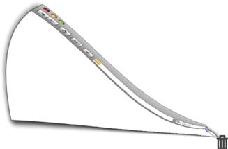
• Task progress. A progress bar or step indicator to show you where you are and give you confidence that you are making progress.
• A choice. The user needs to make a decision, and the page has enough information to make an informed decision confidently.
• Recommendations. Defaults and recommendations to make decisions quickly and confidently based on what is most likely.
• A clear next step. This action should be visually obvious. Users should never be surprised to discover that they made a commitment. Commitments should always be obvious.
• Go back to the last step. A simple way to recover from small mistakes without having to start completely over.
• Home. A simple way to go back to the known starting point.
Surfaces (documents)
The final UI elements that I would like to explore are documents—the UI surfaces that we can use to present content to users. Surfaces have these characteristics:
• Weight. Some surfaces are lightweight; others are heavy.
• Floating versus fixed. Floating surfaces can be moved by users; others are fixed.
• Modality. Some surfaces are modal (so users must interact and dismiss before they can do anything else) and others are modeless.
Here are the common UI surfaces, starting from the lightest to the heaviest:
• Pages. Lightweight, fixed, and modeless. Fills the entire window, minus any panes or bars. Called screens in mobile UI because pages fill the entire screen.
• Pros: A great way to provide a primary work area.
• Cons: Can only display one page at a time.
• Panes and bars. Lightweight, fixed, and modeless. Bars are narrow and used to present commands and status, whereas panes are larger and can be used to present anything.
• Pros: A great way to provide an alternative work area or give quick feedback.
• Cons: Doesn’t scale well. Use two at the most, if you please.
• Dialog boxes. Heavy and floating. Can be modeless, but are usually modal. Lightboxes are typically used instead for Web UI to avoid pop-up blockers.
• Pros: Demands the user’s attention. Maintains context.
• Cons: Often used to demand the user’s attention when it isn’t warranted.
• Properties. Complex settings presented in a pane or dialog box.
• Pros: Works well for presenting object properties (hence the name).
• Cons: Way too much for things that aren’t properties.
• Windows. Heavy, floating, and independent.
• Pros: The best surface for an independent application. Very flexible.
Modern UI tends to favor lightweight, fixed, and modeless, whereas classic UI often used heavy, floating, and modal. That said, there’s nothing wrong with using heavy UIs such as modal dialog boxes—as long as you are presenting something that users must respond to immediately.
Errors, warnings, confirmations, and notifications (interruptions)
As with real-world interruptions, some UI situations must demand the user’s attention:
• Errors. Alert users to a problem that has already occurred.
• Warnings. Alert users to exceptional conditions that might cause a problem in the future.
• Confirmations. Verify that the user wants to proceed with an action.
• Notifications. Show timely information that is useful and relevant but not critical.
All these message types are potentially annoying, so reserve them for situations in which they are really needed. Also, try to say what you need to with a single message instead of many. Unfortunately, abusing these messages is all too common.
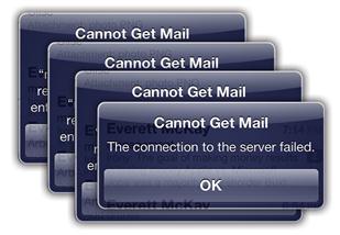
FIGURE 2.58 Yes, I get it already! I need Internet connectivity to check my mail. One message would have been better.
For errors:
• Don’t give an error message unless users are likely to do something differently. If users won’t do anything differently, don’t bother.
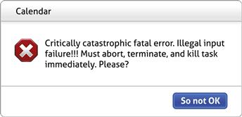
• Clearly state a specific problem with a user-centered explanation. Say what is wrong from the user’s point of view, not the code’s. Avoid vague wording, such as illegal operation. Provide specific names and values of the objects involved. If helpful, explain the cause as well.
• Whenever possible, propose helpful solutions that are likely to fix the problem. Assume that saying “Contact technical support” isn’t helpful.
• Don’t blame the user. Avoid using you and your in the phrasing. Use the passive voice when the user is the subject.
• Don’t use the following words:
• Error, failure (use problem instead)
• Failed to (use unable to instead)
• Illegal, invalid, bad (use incorrect or not valid instead)
Such language is unnecessarily harsh and has a poor personality.
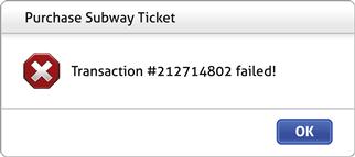
FIGURE 2.59 I tried to buy a subway ticket with my credit card. What is the problem? The kiosk knows, but it’s not telling. Should I try again? Is there an insufficient balance on my card? Do I really want to make the trip? Being specific can save the user a lot of time and frustration.
For warnings:
• Use warnings to describe exceptional conditions that might cause a problem in the future. Warnings aren’t questions, so don’t phrase routine questions as warnings, even if they are important.
• Don’t give a warning unless users are likely to do something differently. If users aren’t likely to do anything differently, don’t bother.
• Clearly state a specific condition, the potential problem and its consequences, and what the user needs to do about it. If users can’t do anything but get stressed, that’s a clear assessment of the warning’s value.
• Don’t overwarn. Present exceptional conditions that involve infrequent, immediate risk, not trivial possibilities. Once users see several inconsequential warnings, they stop paying attention (a phenomenon called habituation). All overwarning accomplishes is that it makes your product feel hazard prone—and like it was designed by lawyers.
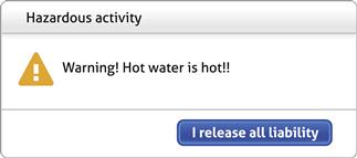
FIGURE 2.61 Unnecessary warnings (where users don’t do anything differently as a result) make your app feel like a hazard-prone one. This program looks like it was designed by lawyers.

FIGURE 2.62 A low-battery warning presents an exception condition that might cause a problem in the future. The modal dialog box rightly demands the user’s attention.
For confirmations:
• Use confirmations only for risky actions or to alert users to significant, unintended consequences. Confirmations to prevent the mere possibility of a mistake only serve to annoy. For desktop UI, assume that users are really, really sure. For mobile UI, design destructive actions to be deliberate (with multiple steps or a precise gesture, such as a swipe).
• Effective confirmations present users a good, unobvious reason not to proceed—and a reasonable chance that sometimes users won’t. Effective confirmations make users stop and think rather than immediately dismissing them to get back to work.
• Use either completely self-explanatory responses or Yes or No responses to confirmations. Although there is no way to force users to read confirmation instructions, users generally read what they are saying Yes or No to before they click. By contrast, users routinely click on generic responses like OK without giving them any thought at all.
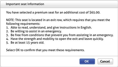
FIGURE 2.63 This confirmation gives a good reason not to proceed, but will users read it first? And notice how the real issue isn’t obvious.
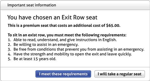
FIGURE 2.64 By contrast, this confirmation focuses on the real issue, gives a good reason not to proceed, and has a presentation that encourages users to actually read it.
And for notifications:
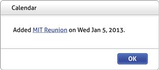
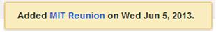
• Use notifications to keep users informed about timely, important events unrelated to the current activity that are useful and relevant but not critical enough to interrupt users’ workflow. Examples include new chat messages and calendar events.
• Notifications are potentially annoying, so make them rare. Be respectful of users’ time, focus, and attention.
• Don’t try to force users to see notifications. Nothing bad should happen if users don’t see notifications or if they ignore them. If users must see the information or take an action, use another UI.
For general guidelines on how to write message text, be sure to review the “Effective Communication” section in Chapter 1.
Dynamic elements
In classic UI, nearly all elements are displayed statically on the screen, whereas modern UI has many dynamic elements. To prevent yourself from getting overwhelmed, it’s best to start with static designs first, then look for opportunities to add dynamic behaviors. Most dynamic elements fall into one of these categories:
Chapter 1 presented the attributes of an intuitive UI, and discoverability and affordance were at the top of the list. And there lies the challenge: How can a UI be dynamic (and therefore not always visible) while also being easily discoverable and have good affordance? If done right, dynamic elements are a great way to balance power and simplicity. But if done poorly, they are a great way to turn your UIs into unfathomable puzzles that frustrate your users. Unless it’s an advanced command for expert users, even beginning users should know that these dynamic UI elements are there.
Your dynamic UI shouldn’t feel like a video game where users have to click around to discover secret passageways. To help assure that it doesn’t, here is my rule for dynamic behaviors:
Any dynamic interactions that aren’t inevitably discoverable must be redundant, advanced, or infrequently used.
Unintuitive UIs work well only when they are deliberately and strategically designed rather than accidental—as we explored in detail in Chapter 1. Figuring out poorly designed, unintuitive UI is never delightful.
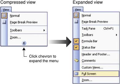
Progressive disclosure
With progressive disclosure, the most commonly used controls and information is displayed by default, but users can display more on demand. This approach works well because the progressive disclosure controls provide discoverability and affordance.
FIGURE 2.66 Common progressive disclosure controls, which all involving clicking on a button or link to see more information, provide discoverability and affordance.
FIGURE 2.67 Using progressive disclosure, you can simplify a UI by displaying only the basic commands by default. Here Android Voice Search displays the basic commands by default. Tapping More and swiping reveals others.
Dynamic resizing
With dynamic sizing, the controls are visible statically (and therefore discoverable), but their sizes change dynamically based on the current context. Typically, controls that users click on become larger and easier to use, and controls not relevant in the context become smaller or are temporarily removed. This is a great solution when you’re working with small mobile screens.
Dynamic secondary commands and affordances
Dynamic secondary UI elements are normally hidden but displayed automatically when users click on or hover over a control or perform an action to make them relevant. These secondary elements are usually controls, affordances, or additional information and may be displayed in place or in a tooltip or flyout. Unlike progressive disclosure, users don’t do this interaction explicitly; rather, these secondary elements are displayed as a side effect of doing something else.
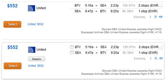
FIGURE 2.70 Kayak displays the list items selection rectangle, a flight Details button, and flight segment checkboxes on hover or click.
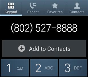
FIGURE 2.71 Android dynamically displays an Add to Contacts command when you enter an unfamiliar phone number.
Although tooltips can be helpful, they are often abused as usability “duct tape”—and can be annoying as well. Avoid relying on them. And remember that hovering isn’t supported by touch screens.

FIGURE 2.72 Users shouldn’t have to depend on tooltips to make sense of your program. Any clue what these commands do?
Displaying these secondary elements dynamically reduces the overall heaviness of the static UI, while displaying the primary affordances statically makes it clear what to do. This approach works well because users inevitably discover these secondary elements through normal interaction.
By contrast, hiding primary affordances risks turning your program into a puzzle because users won’t know what to do and will have no reason—other than desperation—to click or hover. The key to success is to have a clear understanding of what is primary versus secondary.

FIGURE 2.73 Displaying primary commands and affordances dynamically isn’t a good idea. What are you supposed to do here? It doesn’t look interactive.
That said, inevitable discovery can work for primary controls if everything is removed from the static UI, as is common with video players.
Direct manipulation
With direct manipulation, users move, edit, transform, or perform commands by directly interacting with an object instead of going through an intermediary UI, such as dialog boxes and menus. For example, users can open, move, rename, copy, and throw away files by interacting directly with their icons. Using gestures, users can display, zoom, browse, crop, and fix redeye on photos.
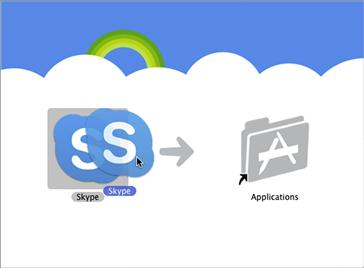
FIGURE 2.75 Users can interact directly with files instead of using dialog boxes, menus, or other intermediaries. On Macintosh, users install programs by dragging them onto the Applications folder.
Direct manipulation has the advantage of being direct, engaging, and modern as well as simple and efficient. With direct manipulation, your program’s content can be the user interface! But because direct manipulation often lacks visibility and affordance, it has the potential for being undiscoverable and unexpected. Another potential downside is accessibility, because users lacking fine motor skills might not be able to perform certain manipulations.
Your first plan of attack is to design frequently used or unexpected direct manipulations to be easily discoverable. Here are the typical approaches—listed in order of discoverability for novice users:
• Explicit instructions. If users need to drag objects to an area, that area can state that it is a drop target.
• Contextual commands. On selection or hover, an object reveals commands that indicate users can do direct manipulation.

• Manipulation affordances. When selected, an object reveals affordances that indicate that users can do direct manipulation.
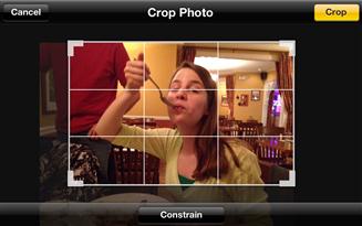
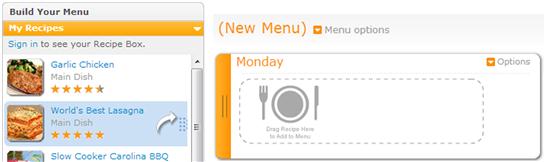
FIGURE 2.80 The AllRecipes Menu Planner reveals a drag affordance for the recipes on hover as well as giving instructions for the drop targets.
• Hand cursors. Showing a hand cursor on hover indicates that an object is movable or pannable. This approach works well if users are likely to hover over an object in the first place; it works poorly otherwise.
• Experimentation. In this case, there is poor discoverability, so users must experiment to determine whether direct manipulation is possible. This approach isn’t intuitive by definition, but it might work well if users expect the manipulation (so their experiments are usually successful) or the need is infrequent enough that having affordances results in unnecessary clutter.

FIGURE 2.82 The Macintosh Dock has no drag affordance, but users expect to be able to move items, and a quick experiment confirms this ability.
Using these approaches, it’s possible to design direct manipulation to be discoverable, but it’s fair to say that in practice most aren’t. The problem only gets worse when you consider the need for accessibility.
Fortunately, the solution to the discoverability problem is simple: Use less discoverable direct manipulation as a redundant, efficient shortcut for advanced users. Novice users need easily discoverable, perhaps less efficient alternatives to get started, and they can discover direct manipulation through experimentation when they are ready.
Summary
If you remember only 12 things:
1. Use standard interactions for your software’s platform. Don’t be creative here, because consistent interaction is required for intuitive UI. For basic commands, avoid using advanced interactions with which your target users aren’t likely to be familiar. Make sure that shortcuts (which require special knowledge) aren’t the only way to perform an action.
2. Generally the simplest, lightest-weight, most constrained, least error-prone alternative is the best choice. Purpose and body language usually determine which control is best.
3. The challenge to commands is presenting them in a way that is discoverable, direct, easy to find, contextual, simple, and space efficient. These are tradeoffs, so you need to choose the commanding UI that strikes the right balance.
4. Commands don’t require icons, so don’t feel obligated to provide them. Unlabeled icons work well only when they are well known. If they’re not, provide a text label; avoid relying on tooltips.
5. Modern UI uses more self-explanatory labels and instructions than classic UI. However, the goal isn’t to have more text but rather to have less but much better text. Usually this boils down to using more useful, relevant, purposeful text, adding a word or two as needed to add clarity, and removing unhelpful, mechanical text and repetition.
6. Use feedback to indicate that an action is happening and was either successful or unsuccessful. Provide feedback responsively so that users remain confident and know what is going on. There are many ways to provide feedback, so choose the least intrusive form that communicates well.
7. Use grouping to show relationships visually between controls within a page and to make pages easier to scan and parse. Prefer modern, lighter-weight styles such as rich headings, layout, progressive disclosure, and sentence styles over classic styles such as group boxes.
8. In designing the presentation of your content, think about the conversation you would have in person. The right UI pattern will reflect the nature of that conversation. Although there are many conversation patterns, long speeches are rarely the best choice. Better to present your content in smaller conversational units and, when practical, let users drive the conversation.
9. Use a simple, consistent navigation model in your app. A Web navigation approach—with consistent Back, Home, and Search—is a good approach. Be sure your page design has all the necessary navigation elements so that users can proceed with the task with confidence yet easily recover from mistakes. Make sure that it’s obvious when users make a commitment.
10. Choose the right UI surface based on its purpose and the user’s need to interact with it. Prefer lightweight, fixed, and modeless surfaces.
11. Design errors, warnings, and confirmations carefully by making sure that they are necessary, specific, and actionable. Focus the presentation of each type of message on what users really need to know. Otherwise, these messages are more likely to be annoying than helpful.
12. Well-designed dynamic elements are a great way to balance power and simplicity. Although dynamic UIs are initially invisible, there are many techniques to facilitate easy discoverability. Use direct manipulation as a redundant, efficient shortcut for advanced users. Basic commands should never require hard-to-discover direct manipulation.
Exercises
To improve your interaction design skills, try the following exercises. Assume that anything is possible. Don’t let concerns about development costs or current technology limitations inhibit your thinking.
1. Misleading or missing affordances. Find an example of a control that has a misleading or missing affordance. What is misleading or missing about the affordance? What problems did the affordance cause? What can you do to fix the problem?
2. Using the right control. Find an example of a UI that uses the wrong controls. What problems did using the wrong controls cause? Fix the problems by determining the right controls and justifying your choices.
3. Designing list controls. Design a list optimized for 10 or fewer items. Now design lists optimized for 50, 100, 1,000, and 10,000 items. Consider ease of use and performance. What extra features did you need to introduce to handle the larger scales?
4. Unlabeled controls. Find as many examples of unlabeled controls as you can. (Here text and icon labels count; tooltips don’t.) Review the list and determine which controls really needed a label and which controls didn’t. Now characterize them. What makes the difference?
5. Instructions. Review mobile apps to find examples of explicit, contextual instructions. Review the list and determine whether the instructions were really necessary. Now characterize them—what made the difference? When are instructions necessary (and when are control labels not enough)?
6. Feedback. Find an example of a UI with poor feedback—where feedback isn’t given, is given too late, is too intrusive, or doesn’t communicate effectively. Determine the specific problem and redesign the feedback.
7. Task navigation. Find an example of a multistep task in which you got seriously lost. (It doesn’t have to be a software task.) Review what happened. Where did you get lost? Why? Design an alternative navigation that might have prevented the problem or made it simple to correct.
8. Modal dialog boxes. Find several examples of modal dialog boxes. Is the information worthy of stopping users and requiring interaction? If it’s not, design a better, modeless alternative.
9. Error messages. Find five error messages that aren’t effective or unnecessary. For each, what is the specific problem with the error message? Redesign the messages to be effective.
10. Direct manipulation. Find as many examples of drag and drop as you can. Characterize them. If they are discoverable, what make them so? If they’re not, what does the UI do to prevent this from being a problem?
11. Sound. Find as many examples of sound in UI as you can. Characterize them. What is the purpose of each sound? Is the sound ambient, intrusive, annoying, or embarrassing? Is each sound really necessary?