Chapter 4. The Unwitting Ally 2.0
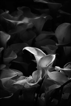
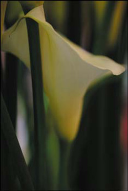
Figure 4.0.1. Before

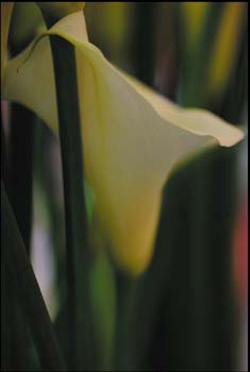
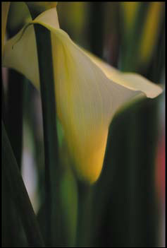
Figure 4.0.2. After

Light, gesture, and color are the key components of any photograph. Light and color are obvious, but it is gesture that is the most important. There is gesture in everything. It’s up to you to find the gesture that is most telling.
—Jay Maisel
In this chapter, you will go beyond exposure and apply the concepts of Extended Dynamic Range photography (ExDR) to focus, blur, and image structure by using image harvesting. You will apply this to the image editing process in order to support the aesthetic choices you make regarding light, shape, gesture, and color when you first take the picture. Picasso said, “Art is the lie that tells the truth.” With that in mind, you will also apply techniques to create an aesthetically satisfying final image rather than a historically accurate one. Additionally, you will use the approach introduced in Chapter 1, and expanded on in Chapters 2 and 3, to guide the viewer’s unconscious eye through the image. Finally, you will explore the changes in workflow that you need to make when working with large megapixel files. (The files for this lesson were captured with a Nikon D3x, which is a 24.5MP camera.)
The concepts behind this lesson are the outcome of conversations that I have had over the years with two great photographers: Jay Maisel, who has forgotten more than I will ever know about light, gesture, and color, and who first introduced me to those concepts; and my uncle, photographer CJ Elfont, who taught me photography and, most importantly, how the eye “sees.” The writings and images of poet-photographer Ernst Haas have also strongly influenced me by teaching me how to allow the eye to see the feeling of the moments in my images; to be taken by the photograph rather than take the photograph. When you master this lesson, you will have grasped the heart of what I have discovered about how it all works. The real journey begins now.
On Light, Color, Shape, and Gesture
The late painter and designer Josef Albers said that “shape is the enemy of color.” By that he meant that when shape is in the presence of color, we tend to remember the shape and not the color. But if you understand how to control color—regardless of whether the photograph is color or black and white—you will have complete mastery of the images you create. The key is to find a way to cause shape to become color’s unwitting ally, and thereby make color a shape that the viewer will remember.
This is easier said than done, of course. What you need is a catalyst to make shape and color work in harmony. And this is where pattern comes in.
Patterns are shapes we tend to see in things, sometimes when they are not really there. Patterns tend to manifest themselves as shapes. Whether it is light coming through tree leaves, a paper bag in a subway trash can, or raindrops on a windshield, everything can form or be perceived as a pattern. Patterns are interesting, but a pattern interrupted is more interesting. If you interrupt a pattern, you are on the path to finding a way to use shape as the unwitting ally of color.
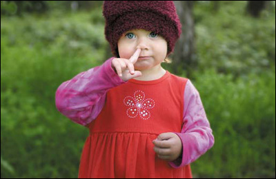
Jay Maisel says that light and color are obvious, but it is gesture that is most important. In the photograph of my niece, the gesture is obvious. The pattern we recognize first is her face, and the finger stuck in her nose interrupts that pattern (Figure 4.0.3).
Figure 4.0.3. A universal gesture
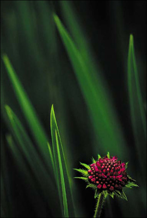
Here is an example of an image where gesture is not as plain as the nose on my niece’s face. Look at the image of the flower and the leaves, then look away (Figure 4.0.4). Which color do you remember? Most people will say magenta or red. Even though 90% of the image is made up of greens, you tend to remember the part with the most shape. The shape has become an unwitting ally of the color. The color is further reinforced because the magenta/red flower’s shape and circular pattern is interrupted by the linear pattern of the green blades. Further, the magenta flower appears to be moving away from the green blades, and this pattern holds the gesture that is most telling.
Figure 4.0.4. Do you see the green or the magenta?
Of light, gesture, and color, light is the most frequently taken for granted. You see it, it is there, end of story. But rather than merely accepting its presence, why not consider viewing it as an object? Treat it as if it were a solid and a part of the experience being expressed in the photograph.
Take, for example, these images from the original Seattle Sequence series (Figures 4.0.5, 4.0.6, 4.0.7, 4.0.8, 4.0.9, and 4.0.10). The light tells the story of the moment in each image, whether black and white or color. (If you can see something, it has color. The artist Matisse said, “Black is the queen of all colors.”)
Figure 4.0.5.
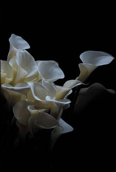
Figure 4.0.6.

Figure 4.0.7.

Figure 4.0.8.
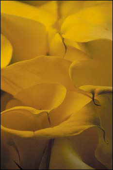
Figure 4.0.9.

Figure 4.0.10.
Note
The 12 images that are the original Seattle Sequence were shot in 45 minutes. My skill as a photographer had nothing to do with how quickly I shot; I had forgotten to charge the battery in my camera. I saw the charge eroding as I watched one of the prettiest displays of light that I have ever seen. Shafts of light broke through the clouds of a departing rainstorm, while a new rainstorm was moving in. Knowing that I had little time to record these images, fear became my caffeine, and I shot until my battery died. Among the images that came from those 45 minutes were 12 that I thought were particularly outstanding. The lessons that I learned were to just shoot the image—don’t think about shooting the image—and carry an extra battery.
In each instance, no matter how brief, I perceived the image in its final form as I photographed it, and that perception determined how I harvested the images. In each capture, the light informed the image, made the patterns and interrupted them. In each instance, light was as physical and tangible a thing as the flowers, and for each I considered (no matter how momentarily) how I would use dark, intermediate, and light isolates.
Using Dark and Light Isolates
The Isolate Theory, conceived by CJ Elfont, is a way of looking at composition and explains the interrelationship of the elements (or isolates) in a photograph and how these can be used to evoke meaningful, emotional responses in viewers. (See the sidebar for a very brief overview of this theory.) This compositional theory formed the basis for how I see and remains one of the cornerstones of my vision today.
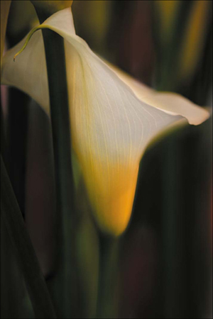
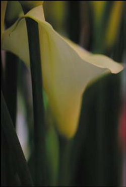
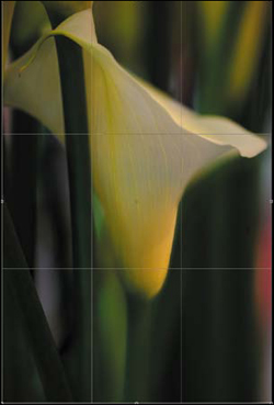
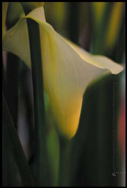
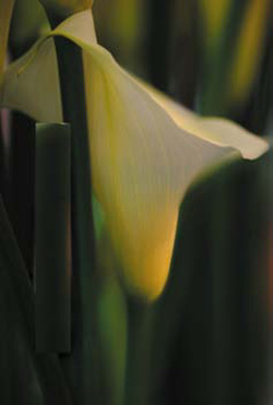
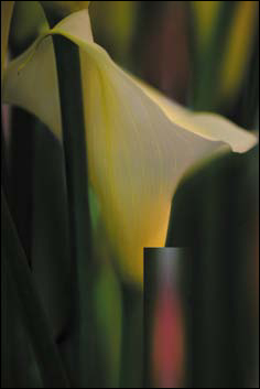
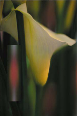
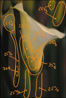
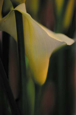
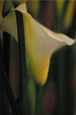
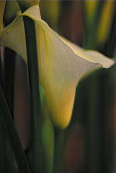
In the next image of Calla lilies, the primary isolates are the two flowers that are slightly to the right of center. The gesture that is most telling is the spiral that starts from the upper right in the dark isolate. This is the darkest area in which there are definable structures, and it continues to the center of the photograph, where the primary light isolates exist. This particular pattern occurred by happenstance, but I reinforced it (Figures 4.0.11, 4.0.12, and 4.0.13).
Figure 4.0.11.
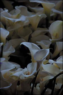
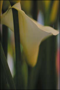
Figure 4.0.12.

Figure 4.0.13.
By using selective contrast and sharpness, I gradually created the dramatic effect of motion in a still image. I also interrupted the pattern of the background with the spiral of light-to-dark and, in this way, found the most telling gesture. All of this was already present in the image, but it had to be brought out; I had to remove from the file everything that was not my vision.
If gesture is the expression of the photograph, and light is its language, then colors are its words, and contrast, saturation, and sharpness are the alphabet. Without words and language, expression has no meaning. Without the alphabet, there are no words.
If the words of color are lost in a cacophony of shapes, the image will be less than it could be. The better you support color and its expression, the better your images will be appreciated. And just as in a street fight, the only rule is that there are no rules. Everything you do is in service of the print, which will always be in service of what is ultimately most important: your voice and vision.
Seattle Sequence Re-Sequenced
Stop taking pictures. Be taken by your pictures.
—Ernst Haas
In the first edition of this book, I used a series of images that I captured one morning at sunrise in Cades Cove (in the Great Smoky Mountains National Park). Without planning what I would shoot, I had gotten up extraordinarily early hoping to shoot in the fog at sunrise. I actually saw the field of flowers after all the fog had burned off and I was about to leave. I just found the images, or maybe they found me (Figure 4.0.14). With this set of images, I began to be aware of the difference between taking a picture and being taken by one.
Figure 4.0.14. Cades Cove flowers
As I crawled around on my hands and knees among the flowers in the dew, the light moved and changed. I tried to approach the light the same way I approached the flowers, as if it were a solid object. I made sure to get as many captures as I could using as many options as I could. Moments like those happen; you cannot make them re-happen.
If you look at the images that I shot, you can see the evolution of my vision as I experienced the flowers. It is in that journey that I discovered the destination.
For this rewriting of Welcome to Oz, I decided to change the image for this lesson so that I could go beyond using my first epiphany (or Eureka!) moment images in order to more deeply explore the concept of ExDR and how to manage the huge amounts of data and the large files that are generated when using high-megapixel DSLRs.
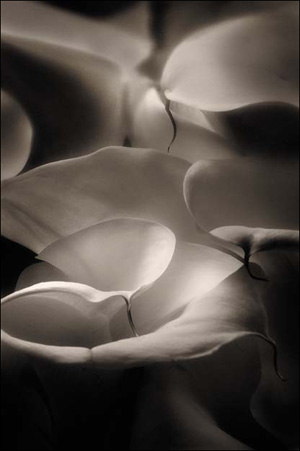
If you look at the images that I captured of the flowers that were randomly placed in buckets in a crowded market (Figure 4.0.15), once again, you can see the evolution of my vision as I experienced the flowers. Each was a part of the journey on which the flowers took me (Figures 4.0.16, 4.0.17 and 4.0.18).
Figure 4.0.15. Images captured of flowers in a bucket in a market

Figure 4.0.16.

Figure 4.0.17.
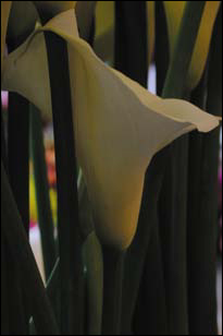
Figure 4.0.18.
The lessons to be learned using the images that make up this lesson are not just about the bokeh of the lens, they are also about using sharpness and defined image structures to selectively extend the areas of focus in an image that is mostly about blur.
If you look at the image as some photographers might shoot it and call it a day (_VAV072122_SHRP.tif), it is boring, but historically accurate; something you might see on a seed packet. If you look at _VAV0722BASE_LITE.tif, it is a far more interesting image due to the bokeh or blur. Though more visually appealing, it still does not realize the vision that I had when it took me. To recreate that vision, I needed an expanded exposure range so that multiple areas, at different distances and at different levels of sharpness, were all in focus, while existing in a shallow DOF. As I discussed in the previous chapter, that cannot be achieved in one capture using a fixed optical/sensor plane system. To achieve the end that I had in mind for this image, I had to practice preemptive Photoshop and capture all of the image elements that I thought I might need to extend the dynamic range of each of them. Simply put: Real pixels are always preferable to computer-generated ones.
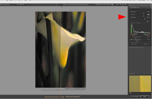
Up to this point, you have been working with images that were captured with cameras that were no larger than 5.5 megapixels. In this lesson, you will be working with images captured from a Nikon D3x, a 24.5 megapixel camera. You will see how to adapt your workflow to the needs of the file. A 24.5MP RAW file, when opened in 16-bit in the ProPhoto color space, is about 149 megabytes. This means that if you harvest four images, you will have a file that is almost 600 megabytes before you do anything.
Once you have chosen the images with which you want to work, you can begin making structural and aesthetic choices. (Because the fulfillment of your vision starts with the choices you make at the time of capture, you should let them guide you in choosing how and what to photograph. The more you get right in your captures, the better off you will be when you begin building the image in Photoshop.)
Here are some initial considerations:
• You will need to align all the images, so that they will blend together as seamlessly as possible.
• Because the lightness of the images differ, you must make aesthetic choices that you can accomplish without leaving chalk marks. More specifically, do not make choices that require technical adjustments that will be obvious to the viewer once your work on the image is complete.
• Aesthetically, you want to support the image’s yellows rather than its greens.
• The gesture of this image is the way the top of the flower wraps around the stem and flows downward to the right before tapering to the center bottom where it attaches to the stem. However, you want the viewer’s eye to travel in the opposite direction: from the lower right, up through the middle, to the flower embracing the stem, because it makes for a stronger visual journey and therefore a more successful image. This movement should be repeated as long as the viewer is looking at the image (hang time). You will use sharpness, contrast, saturation, and focus to cause the viewer’s eye to travel through the image along a path you create, and you want to use blur to give the eye a place to which it can retreat.
Creating a Single Image
Disregard for details is the first sign of doom.
—Kai Krause
Step 1: Many Parts to Assemble the Whole
As in the previous chapters, you will approach the creation of this image going from global to granular. The following steps will show you how I removed everything that was not my vision from the Seattle Sequence 2.0 flower images and how I practiced preemptive Photoshop at the point of capture. I chose the lens I used for its bokeh, because, in my vision of this image, it is the quality of the blur in relationship to the area(s) of focus that I find aesthetically appealing.
- Open these three files:
_VAV0719BASE_DRK.tif
_VAV0722BASE_LITE.tif
_VAV072122_SHRP.tif
- Starting with the file _VAV0722BASE_LITE.tif, double-click on the icon of the image in the Layers panel. (It should say “background” when the Layer dialog box comes up.) Name this layer BASE_LITE which unlocks it—something that needs to be done before you align all of the layers.
- When you select Save As, create a new folder (located in the lower, left corner of the Save As dialog box) and name the folder SEATTLE_LILY. Now, rename the _VAV0722BASE_LITE.tif file SEATTLE_LILY_16bit, and save it as a Large File Format (.psb). (This is located in the Format pull-down menu in the Save As dialog box and is the second option just below Photoshop Document.)
- Duplicate this file, and rename it SEATTLE_LILY_ALIGN_16bit.
- Once you have saved the file, create a layer group, and name it ALIGNED_PARTS.
- Click on the _VAV0719BASE_DRK.tif, making it the active file. Click on the BACKGROUND layer of this file and, holding down the Shift key, drag the background layer to the destination file, SEATTLE_LILY_16bit.psb. Name the newly created layer BASE_DRK. Do the same with _VAV072122_SHRP.tif and rename this new layer SHRP_DRK. Once you have placed all of the files into the SEATTLE_LILY_ALIGN_16bit file, close them. You should have two files open, SEATTLE_LILY_ALIGN_16bit.psb and SEATTLE_LILY_16bit.psb. The layer order in the ALIGN_PARTS layer group in the SEATTLE_LILY_ALIGN_16bit file should be BASE_LITE, BASE_DRK, and SHRP_DRK.
- Save the file.
Step 2: Creating a Lighter Version of a Darker Flower
In this step, you will use Match Color to make a lighter version of a layer. It would have been lighter had I done this in the camera, but while I was shooting this part of the harvest, the clouds moved, changing the lighting. Normally, when I am working this way, once I have established focus, I do things in manual mode, which affords me greater control over exposure and DOF. The trade off is that the camera cannot automatically readjust exposure for changes in light. So even though I wanted a brighter image, I did not get it. Using Match Color is one way to match both the color and the brightness of one file to another. There is a caveat—when the Match Color adjustment works, it works really well, and when it does not, it is useless. Match Color works best when you harvest images of the same thing at the same location. It might not work if you try matching color from two different locations and/or of two different objects.
- Duplicate the SHRP_DRK layer (Command + J / Control + J).
- Rename this newly duplicated layer (which Photoshop will have automatically named SHRP_DRK copy) to SHRP_LITE.
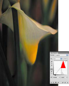
- Make SHRP_LITE the active layer, and go to Image > Adjustments > Match Color (Figure 4.2.1).
Figure 4.2.1.

- In the Source pull-down menu, select SEATTLE_LILY_ALIGN_16bit and, in the Layer pull–down menu, select BASE_LITE (Figures 4.2.2 and 4.2.3).
Figure 4.2.2. Selecting SEATTLE_LILLY_ALIGN_16bit. in the Source pull-down
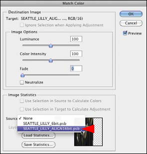
Figure 4.2.3. Selecting BASE_LITE in the Layer pull-down
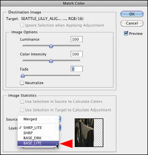
- The image is brighter, but not quite enough. In the Options part of the Match Color dialog box, move the Luminance slider to the right to 133, and move the Color Intensity slider to the right to 115.
- Click OK.
Compare the image before the Color Match adjustment (Figure 4.2.4), after the Color Match adjustment (Figure 4.2.5), and after the Luminace and Color Intensity increases (Figure 4.2.6).
Figure 4.2.4. Before the Color Match adjustment

Figure 4.2.5. After the Color Match Adjustment

Figure 4.2.6. After the Luminance and Color Intensity increases

Note
These choices were made because you want the viewer’s unconscious eye to go first to the flower and to see the yellows before the greens. Because the eye first goes from light to dark, you lightened up the layer that contained the most defined image structures. However, you had to increase the color intensity because when you lighten an image, color saturation decreases. Conversely, when you darken an image, color saturation increases.
- Save the file.
Step 3: Aligning the Almost Aligned
No matter how good your tripod, tripod head, and camera fastening system, whenever you touch the camera during the capture process, even to refocus, you introduce some form of camera movement. This next step addresses this first part of the alignment problem.
I have observed that when using the Auto Align Layers feature in Photoshop CS5, the order of the layers in the layer stack and which layer you click on first (top or bottom) has an effect on how the layers will be aligned. Therefore, you must decide which is the primary layer (the BASE_LITE layer is the primary layer in this image) and make sure it is at the top of the layer stack.
- Click on the BASE_LITE layer and make it active. Holding down the Shift key, click on the SHRP_LITE layer. This will make all of the layers between the two active.
- Go to Edit > Auto Align Layers. For the Projection, select Auto. Generally, this one works best. Click OK.
You will notice that the alignment process has resulted in an image that is no longer full frame (Figure 4.3.1). You could crop the open areas, but that would change the image, and perhaps risk losing parts of it. This next step addresses this second part of the alignment problem.
Figure 4.3.1. After the alignment, the image is not full frame

- Holding down the Shift key, click on the ALIGNED_PARTS layer group and drag it to the SEATTLE_LILY_16bit file.
- Save the SEATTLE_LILY_16bit.psb file.
- Close and do not save the SEATTLE_LILY_ALIGN_16bit.psb file.
Note
You are not saving this file so that you give yourself an exit strategy. Because the aligned layers are now in the SEATTLE_LILY_16bit.psb file, there is no need to have two copies of them. Should you feel the need to re-align the layers later, you have a file that is already set up for that in which the layers are not aligned.
Step 4: The Sum is Greater Than the Parts: Creating One Image from Four Layers
In this step, you will not only extend the range of exposure, you will also extend the range of the sharpness and blur. I have found that real pixels are always better to use than attenuated ones. By using pixels unmodified in Photoshop, you reduce the amount of overall artifacting. You can also control the amount of detail in any specific area. Essentially, you can have your blur and see the image, too. In the first part of this next step, you will add dark, and in the second part, you will add light and sharpness.
All the decisions that you make from this point forward are about how the viewer’s eye will move through the image, how to reinforce the gesture of the image, and how to cause shape to become the unwitting ally of color.
You will begin by making sure that the viewer sees the yellows before the greens, so that their unconscious eye moves from the lower left of the image to the center, then to the upper part of the flower where the top of the lily intertwines with the stem, and then to the top of the lily that goes out of the frame.
Adding Dark
- You have two layers named BASE_LITE: one inside the ALIGNED_PARTS layer group, and one outside it. Rename the BASE_LITE layer in the ALIGNED_PARTS layer group BASE_LITE_M (for Base Lite Modified). This is the image map for the BASE_DRK layer (Figure 4.4.1).
Figure 4.4.1. The image map
- In the ALIGNED_PARTS layer group, turn off all the layers except BASE_DRK and make it the active one. You should now have the BASE_LITE layer turned on (the one outside the layer group) and the BASE_DRK layer (the one inside the layer group) turned on.
- Add a layer mask to the BASE_DRK layer and leave it white.
- Select the Brush tool (B), make the foreground color black and the background white, set the brush opacity to 100% and the width to 400 pixels, and brush in the entire flower and the area inside the stem. View the layer mask (Figure 4.4.2), and compare the images before (Figure 4.4.3) and after the brushwork (Figure 4.4.4).
Figure 4.4.2. The layer mask

Figure 4.4.3. Before brushwork

Figure 4.4.4. After brushwork
- With the foreground color black and the background white, and a brush opacity of 50% and a width of 250 pixels, brush in the entire stem next to the flower. Bring up the Fade effect dialog box and move the slider right to 74%. Brush in the back part of the flower at 50%. Bring up the Fade effect dialog box and move the slider left to 44%. View the layer mask (Figure 4.4.5) and the image after the brushwork (Figure 4.4.6).
Figure 4.4.5. The layer mask

Figure 4.4.6. After more brushwork
- With the foreground color black and the background white, and a brush opacity of 50% and a width of 600 pixels, brush in the entire area to the lower right of the flower. Bring up the Fade effect dialog box and move the slider left to 34%. View the layer mask (Figure 4.4.7) and the image after the brushwork (Figure 4.4.8).
Figure 4.4.7. The layer mask

Figure 4.4.8. After more brushwork

- With the foreground color black and the background white, and a brush opacity of 50% and a width of 600 pixels, brush in the two stalk areas above the leaf on the right side of the image. Do one first, then bring up the Fade effect dialog box and move the slider left until the adjustment is most visually appealing, which for this image is at 47%. Then do the second and move the slider left to 47% as well. (They both require the same setting because you want both stalks to match. The Fade effect tool allows you to address only the last thing that you did, so you can do only one thing at a time; it’s the same type of adjustment that you made in Chapter 1 when brushing in Challen’s eyes.) In the lower left corner of the image, brush in the lower corner to the left of the stem, bring up the Fade effect dialog box and lower that opacity to 47%. View the layer mask (Figure 4.4.9) and the image after the brushwork (Figure 4.4.10).
Figure 4.4.9. The layer mask
Figure 4.4.10. After more brushwork
- Save the file.
Adding Light and Sharpness and More Dark
What you have done thus far is to manually extend the dynamic range of the dark aspect of this image without using tone mapping software. Also, you used real pixels created at the point of capture to darken the image. This approach leads to more realistic looking colors and shadows, and you did not introduce the potential artifacts and color shifts that can result from using Curves and Levels adjustment layers.
In the first part of this step, you created an image that is all about the bokeh or the quality of the blur of the lens that created it. In the next steps, you will selectively add lightness to extend the dynamic range of the exposure even further. You will accomplish this using the layer on which you did the Match Color adjustment. Specifically, you are going to add sharpness from an image that was shot at a greater DOF. (In Step 2 of this lesson, Creating a Lighter Version of a Darker Flower, you matched the color and brightness of that image to the present one.) You will also add sharpness from the original image (before you applied the Match Color adjustment) that was captured at about the same exposure level as the BASE_DRK layer that you have just brushed in.
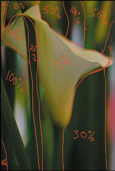
Here are the image maps for the three things that you will be doing to this image: The Sharpen Lite image map (Figure 4.4.11), the Sharpen Dark image map (Figure 4.4.12), and the Lily Tip Sharp image map (Figure 4.4.13).
Figure 4.4.11. The Sharpen Lite image map

Figure 4.4.12. The Sharpen Dark image map

Figure 4.4.13. The Lily Tip Sharp image map

- Make the SHRP_LITE layer active.
- Select the Marquee tool, make a selection of the lily leaf tip (Figure 4.4.14), copy it to its own layer (Command + J / Control + J) and name that layer TIP_SHRP_LITE. Create a layer mask and fill it with black.
Figure 4.4.14. The selected area
- Make the SHRP_LITE layer active, create a layer mask, and fill it with black. With the foreground color white and the background black, brush in the area of the front part of the lily with a brush opacity of 100% and a width of 600 pixels.
- Set the opacity to 50% and brush in the lily’s stem. Bring up the Fade effect dialog box and lower the effect to 22% by moving the slider to the left. View the layer mask (Figure 4.4.15) and the image after the brushwork (Figure 4.4.16).
Figure 4.4.15. The layer mask on SHRP_LITE
Figure 4.4.16. After brushwork on SHRP_LITE
- Make the SHRP_DRK layer active, create a layer mask, and fill it with black. With the opacity still set to 50%, and the foreground color white and the background black, brush in the back part of the lily. View the layer mask (Figure 4.4.17) and the image after the brushwork (Figure 4.4.18).
Figure 4.4.17. The layer mask on SHRP_DRK

Figure 4.4.18. After the brushwork on SHRP_DRK

- Make the TIP_SHRP_LITE layer active. Making sure that the layer mask is also active, zoom in to the tip area. Make the brush opacity 100% and the brush size 40 pixels. Brush in just the tip. View the layer mask (Figure 4.4.19) and the image after the brushwork (Figure 4.4.20).
Figure 4.4.19. The layer mask on TIP_SHRP_LITE
Figure 4.4.20. After the brushwork on TIP_SHRP_LITE
Breaking the 11th Commandment... Yet Again
In the lower left corner of the image, there is an area of light that pulls the eye’s focus away from the flower. To address this issue, you will first use a clipped curve that you will also darken. Here is the image map for the Darken and Lowered Contrast adjustment layer (Figure 4.4.21).
Figure 4.4.21. Image map for the Darken and Lowered Contrast Curves adjustment layer

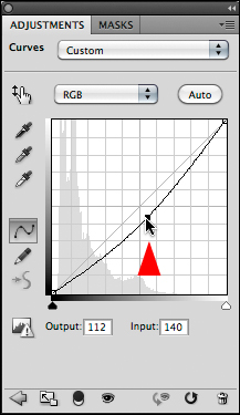
- Create a Curves adjustment layer, and if it is not already, put it in the Fine Grid mode (Option- / Alt- click on the grid in the Curves dialog box). Lower the top handle of the curve six grid points. Click on the center handle and move it so that it is on the first and second grid line from the bottom. The output should read about 107 (Figure 4.4.22).
Figure 4.4.22.

- Fill the layer mask with black, and with the foreground white, select the Brush tool. Set the opacity to 50% and the brush width to 400 pixels. Brush in the area from below the bottom of the upper part of the left side of the lily (between the two stems) up to the stem that crosses the bottom of the lower left corner. Then re-brush over the brightest part of the area on which you just did brush work. (Remember that since 50% of 50% is 25%, you have just re-brushed this area at 75%.) Now, brush the stem in the lower left corner, bring up the Fade effect dialog box, and reduce the amount by moving the slider to 25%. View the layer mask (Figure 4.4.23) and the image after the brushwork (Figure 4.4.24).
Figure 4.4.23. The layer mask
Figure 4.4.24. After the brushwork

- Click on the ALIGNED_PARTS layer group, create a master layer, and name it MASTER_1.
- Save the file.
Step 5: The Registration Problem
You will notice that there is a light band that runs across the bottom of the image. This occurred during the alignment process. Also, there may be some parts of the aligned image that may fall outside the canvas of the original BASE_LITE image (the image onto which you dragged the ALIGNED_PARTS layer group). In this step, you will address both issues.
- Select the Crop tool (C) and drag it from the top left corner to the lower right one so that the entire image is within the Crop box (Figure 4.5.1).
Figure 4.5.1.
- Press the Return or Enter key to accept the crop.
- When the Crop processing has finished, make the MASTER_1 layer active, and zoom in to the lower left corner of the image.
- Select the Marquee tool (M), then click and drag the marquee selection so that it is slightly bigger than the light area at the bottom of the image. Drag it from the right to the left edge of the image.
- Go to Edit > Fill and, in the Contents part of the Fill dialog box, from the Use pull-down menu, select Content Aware. Click OK.
- Save the file.
Note
New to CS5 are Content Aware Fill and Content Aware Spot Healing. Both of these are implementations of PatchMatch technology. These algorithms work by copying multiple patches to stitch together from the surrounding background and fitting them inside the area of the fill selection or the area of the Spot Healing brush. This is an improvement over the old Spot Healing proximity match approach that used only one patch from the background. By stitching together multiple areas, you get a much more convincing and seamless patch. The PatchMatch algorithm works not only for small areas, but for large ones, as well, as you have just seen.
Step 6: Harvesting from Within
As I discussed earlier, a pattern is interesting, but a pattern interrupted is more interesting. Currently, the image on which you are working has a pattern of greens and yellows in the background with one area of pinkish red. You want to interrupt that pattern while reinforcing the yellows over the greens. And there are still light areas that need to be toned down so that they do not pull the unconscious eye away from the main focus of the image, the lily. For that, you need some darker shapes to conceal the lighter ones and then some red/pink shapes to interrupt the pattern of greens and yellows. Simply darkening the image by using Curves would not accomplish this. Whatever you do, when you are finished with this next step, the image must look as if it was originally captured that way. To accomplish this, you will harvest image structures from within the image. Here are the image maps for the two things you are about to do. View the Stem Parts image map (Figure 4.6.1) and the Reds image map (Figure 4.6.2).
Figure 4.6.1. Stem Parts image map
Figure 4.6.2. Reds image map
- Create a layer set and name it INNER_HARVEST.
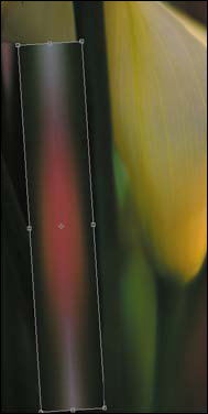
- Make the MASTER_1 layer active. With the Marquee tool (M), make a selection at the edge of the lower right corner that contains the reddish/pink area, and copy it to its own layer. Name this layer REDS. Drag REDS into the INNER_HARVEST layer set (Figure 4.6.3).
Figure 4.6.3. Copying the lower right corner to its own layer
- Again, make the MASTER_1 layer active. With the Marquee tool (M), make a selection of the stem area below the front part of the lily and copy it to its own layer. Name this layer STEM_PART. Add a layer mask. Drag the STEM_PART into the INNER_HARVEST layer set. Duplicate the STEM_PART layer (Figure 4.6.4).
Figure 4.6.4. Duplicating the stem area

- Turn off the STEM_PART copy layer (the one that you just created) and make the STEM_PART layer active.
- Select the Move tool (V) and move the STEM_PART layer to the lower right corner (Figure 4.6.5).
Figure 4.6.5. Moving the new STEM_PART layer to the lower right

- Select Free Transform (Command + T / Control + T), click on the top, center control handle, and stretch the selection upward to just above the front part of the lily. Click Return / Enter (Figure 4.6.6).
Figure 4.6.6. Stretching the selection upwards

- Select the Brush tool. Fill the layer mask with black. With the foreground color set to white, set the brush opacity to 50%, and brush in the right side of the image (as shown in the STEM_PART image map). Bring up the Fade effect dialog box and increase the amount by moving the slider to 71%. Compare the image before the brushwork (Figure 4.6.7), and after the brushwork (Figure 4.6.8), and look at the resulting layer mask (Figure 4.6.9).
Figure 4.6.7. Before brushwork

Figure 4.6.8. After brushwork
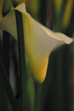
Figure 4.6.9. The layer mask

- Copy the STEM_PART copy layer so that you have a new layer, STEM_PART copy 2. Turn on the STEM_PART copy 2 layer. Select the Move tool (V) and move the STEM_PART copy 2 layer to the upper right corner, above the lily and over the light area between the two stems (Figure 4.6.10).
Figure 4.6.10. Adding STEM_PART copy 2 above the lily

- Select Free Transform (Command + T / Control + T). Holding down the Option / Alt key, click on the left, center control handle and expand the selection to the left. Click Return / Enter (Figure 4.6.11).
Figure 4.6.11. Expanding the selection left

- Select the Brush tool and fill the layer mask with black. With the foreground color set to white, set the brush opacity to 50% and the brush width to 400 pixels. Brush in the upper right side of the image (as shown in the STEM_PART image map) leaving the slider set to 50%. View the image after the brushwork (Figure 4.6.12) and the resulting layer mask (Figure 4.6.13).
Figure 4.6.12. After the brushwork
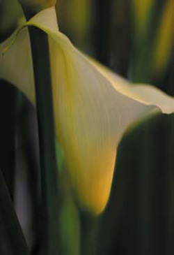
Figure 4.6.13. The layer mask

- Turn on and make the STEM_PART copy layer active, and move it so that it is over the bright area in the left corner of the image (Figure 4.6.14).
Figure 4.6.14. Adding the STEM_PART to the bright area on the left
- Select Free Transform (Command + T / Control + T) and move the curser to the lower handle. When the rotation arrows appear, click and drag it to the right, and holding down the Option / Alt key, click on the left, center control handle. Expand the selection as you move it to the left. Click Return / Enter (Figure 4.6.15).
Figure 4.6.15. Transforming the selection

- Select the Brush tool. Fill the layer mask with black. With the foreground color set to white, set the brush opacity to 50% and its width to 250 pixels. Brush in the light area in the lower left corner (as shown in the STEM_PART image map). Bring up the Fade effect dialog box and move the slider to 86%. View the image after the brushwork (Figure 4.6.16) and the resulting layer mask (Figure 4.6.17).
Figure 4.6.16. The image after the brushwork
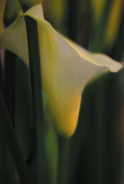
Figure 4.6.17. The resulting layer mask

- Save the file.
Getting the Red In
You should now have an image in which the central focus is the lily. There should be no light areas to pull the eye away from that. You have used both image structures and colors that were inherent in the image. In this next step, you will add reds into the image to interrupt the pattern of the greens and yellows in the background, and to introduce visual depth. By introducing red elements, I think that all the aspects of the image become more appealing, which means that the viewer will look at it longer. Look again at the Reds image map (Figure 4.6.2).
Figure 4.6.2. The Reds image map
- Turn on, and make the REDS layer active. Select the Move tool (V) and move it to the center of the image.
- Duplicate the REDS layer twice.
- Flip the REDS layer copy 2, horizontally (Edit > Transform > Flip Horizontal). Move the layer that you just flipped to the right (Figure 4.6.18).
Figure 4.6.18. Duplicating the REDS layer twice and flipping the REDS layer copy 2

- With the Move tool selected (V), click the left arrow key until the two layers overlap (Figure 4.6.19).
Figure 4.6.19. Aligning the two new layers with the Move tool
- Merge this layer to the layer below it (Command + E / Control + E).
- Select the Spot Healing tool from the Tool options bar and select Content Aware. Make sure the Sample All Layers checkbox is turned off (Figure 4.6.20).
Figure 4.6.20. Selecting Content-Aware and turning off Sample All Layers

- With a brush width of 70 pixels, and holding down the Shift key (this locks the brush so that it will move in a straight line), start at the top of the pink area and drag the brush down to bottom of the pink area. Then release it (Figures 4.6.21 and 4.6.22).
Figures 4.6.21 and 4.6.22. Brushing in the gap to correct it and the result


- Name this layer REDS_DUO and add a layer mask to it.
- Duplicate the layer (the new layer will be named REDS_DUO copy), and move it to the upper right corner above the lily between the two stems. Turn off the REDS_DUO and REDS layers (Figure 4.6.23).
Figure 4.6.23. Moving the REDS_DUO above the lily
- Select Free Transform (Command + T / Control + T) and, holding down the Option / Alt key, click on the left control handle and expand the size. Click near the lower, left handle, which will bring up the Rotate arrows, and rotate the image slightly clockwise to match the angle of the two stems that border this selection. Press Return / Enter (Figures 4.6.24, 4.6.25, 4.6.26, and 4.6.27).
Figure 4.6.24. Activating the Free Transform tool

Figure 4.6.25. Expanding the width
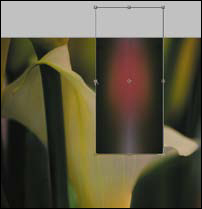
Figure 4.6.26. Rotating the selection

Figure 4.6.27.

- Make the layer mask active and fill it with black. Select the Brush tool, set its opacity to 50% and its width to 300 pixels, and brush in the area between the two stems. Bring up the Fade effect dialog box and reduce the opacity to 38%. View the image after brushwork (Figure 4.6.28) and the resulting layer mask (Figure 4.6.29).
Figure 4.6.28. The image after brushwork

Figure 4.6.29. The layer mask

- Duplicate the REDS_DUO layer (the new layer will be named REDS_DUO copy2), and move it to the lower right corner to the right of the lily stem (Figure 4.6.30).
Figure 4.6.30. Adding red below the lily
- Select Free Transform (Command + T / Control + T), and holding the Option / Alt key, click on the left control handle and expand the size. Click near the lower, left handle which will bring up the Rotate arrows and rotate the image slightly clockwise to match the angle of the two stems that border this selection. Press Return / Enter (Figures 4.6.31, 4.6.32, and 4.6.33).
Figure 4.6.31. Free Transform tool
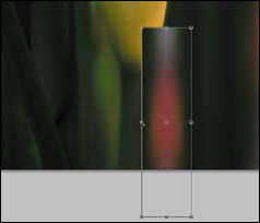
Figure 4.6.32. Expanding the width
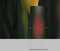
Figure 4.6.33. Rotating the selection

- Make the layer mask active and fill it with black. Select the Brush tool, set its opacity to 50% and its width to 500 pixels, and brush in the area between the two stems. Bring up the Fade effect dialog box and reduce the opacity to 38%. View the image after the brushwork (Figure 4.6.34) and the resulting layer mask (Figure 4.6.35).
Figure 4.6.34. After the brushwork

Figure 4.6.35. The layer mask

- Turn on and make the RED_DUO layer active. Move it to the lower left corner between the two stems (Figure 4.6.36).
Figure 4.6.36. Adding red to the left side
- Select Free Transform (Command + T / Control + T), and holding down the Option / Alt key, click on the top, center control handle and expand the height. Click near the lower, left handle to bring up the Rotate arrows and rotate the image slightly counterclockwise to match the angle of the two stems that border this selection. Holding down the Option / Alt key, click on the left, center control handle and expand the selection slightly. Press Return / Enter (Figures 4.6.37, 4.6.38, and 4.6.39).
Figure 4.6.37. Selecting the Free Transform tool
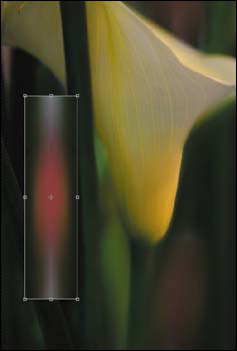
Figure 4.6.38. Expanding the selection

Figure 4.6.39. Rotating the selection
- Make the layer mask active and fill it with black. Select the Brush tool, set its opacity to 50% and its width to 500 pixels, and brush in the area between the two stems. Bring up the Fade effect dialog box and reduce the opacity to 31%. View the image after the brushwork (Figure 4.6.40) and the resulting layer mask (Figure 4.6.41).
Figure 4.6.40. The image after the brushwork
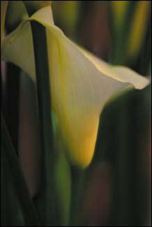
Figure 4.6.41. The layer mask

The Emery Board Step
In this last part of the “inner harvesting” step, you will smooth out any places where the transition from sharpness to blur occurs more abruptly than you would like. Also, this is a good time to increase the colors’ intensities and the lightness of the background to further fine tune the image. You will use the Base Layer to accomplish all these tasks. Look at the Base Lite Brush Back image map (Figure 4.7.1).
Figure 4.7.1. Base Lite Brush Back image map
- Duplicate the BASE_LITE layer and move it so that it is the topmost layer in the INNER_HARVEST layer group. Rename this layer BASE_LIGHT_BB (BB = Brush Back).
- Create a layer mask and fill it with black.
- Make the layer mask active. Select the Brush tool. With the foreground color set to white, set the brush opacity to 50% and its width to 400 pixels. Using the image map diagram as your guide, brush in the lower part of the lily. Bring up the Fade effect dialog box and reduce the opacity to 41%. Brush in the left stem. Bring up the Fade effect dialog box and reduce the opacity to 36%. Brush in the right stem. Bring up the Fade effect dialog box and reduce the opacity to 31%. In the upper right corner, brush the right-most yellow base of the background lily. Bring up the Fade effect dialog box and reduce the opacity to 28%. Finally, brush in the lily’s base next to where you just brushed. Bring up the Fade effect dialog box and reduce the opacity to 31%. Look at the image after the brushwork (Figure 4.7.2) and the layer mask (Figure 4.7.3).
Figure 4.7.2. The image after the brushwork

Figure 4.7.3. The layer mask

- Make the INNER_HARVEST layer group active.
- Create a Master layer and name that layer MASTER_2.
- Save the file.
- Select Save As (Command + Shift + S / Control + Shift + S), and when the Save As dialog box comes up, rename the file SEATTLE_LILY_MASTER_CNTRST_SHRP_16bit. Click off the layers radial button and save it in the Large Document file format (.psb).
Note
The reason for doing this is that the current file size of what you have just done is 2.1 gigabytes. That is a lot of file to have to move. Everything you just did was to create one image from many. Every decision that needed to be made, has been made. By breaking the image workflow up into different files, you save time while preserving an exit strategy.
The Dance of Aesthetics
Directing the unconscious eye
Every act of creation has to start first with an act of destruction.
—Pablo Picasso
As I indicated in the previous chapter, the human eye is an amazing biological optical system. But this eye is by no means conscious. True, the eye evolved from migrated brain tissue, but it does not think. It sees what it sees and does so in a very specific, predictable manner.
But I believe that humans are in possession of another eye, the conscious one; the one that gives meaning to what we see. The unconscious eye records, while the conscious eye interprets what is recorded.
To this point, you have made decisions on how to manipulate an image so that it will speak to the conscious eye of the viewer. You have done that by causing the unconscious eye to go where you wanted it to go, so that the story would be seen the way you determined it should. You did this by using the alphabet of the photograph: contrast, saturation, and sharpness and by the recognition that the unconscious eye first recognizes light areas and then moves to dark ones, sees high contrast before low contrast areas, records areas of high sharpness before low sharpness, notices areas in focus before those that are blurred, and focuses on highly color-saturated areas before moving to less-saturated ones. Thus, you overrode the tendency of the unconscious eye to wander and sent it on a path of your own choosing.
By controlling the sequence of things that the unconscious eye sees is another facet of control by which you cause shape to become the unwitting ally of color. Previously, you created a pattern interrupted to control the unconscious eye. Now you will do that by working from dark-to-light to remove the light that does not belong and light-to-dark to add brightness where it should be. Also, you will further control the unconscious eye through use of contrast and several forms of “unsharp” sharpening.
At this point in the lesson, you realize that the image you now have was created from conscious decisions that were made at the time of capture. You did not fix this image in Photoshop; rather, you used Photoshop to re-create the vision that you had at moment of capture using fragments of the image itself. No tone mapping software was used to extend the exposure’s dynamic range.
It is at this point in an image’s workflow that you would probably do a color cast correction, as you have in the previous three chapters. You will not do that for this image, because here, the color cast works to your advantage. Remember, the cleanest file that exists, the one with the least amount of artifacts, is the original RAW file, and a non-destructive workflow endeavors to minimize artifacting, as well as assuring an exit strategy. The important lesson is that workflow is dynamic and image specific. You will never do the same things, and in the same order, all of the time.
Step 7: Setting Up for Things to Come
- If you have not already done so, close the SEATTLE_LILY_16bit.psb file. (If Photoshop asks you if you want you to save the file before closing, click OK.)
- Open the SEATTLE_LILY_MASTER_CNTRST_SHRP_16bit.psb file.
- Rename Layer 1 and call it MASTER_BASE.
- Save the file.
- Duplicate the file (Image > Duplicate) and name the new one SEATTLE_LILY_LAB_SAT_SHARPEN.
- Convert this file to LAB (Image > Mode > Lab color).
- Save the newly created LAB file and leave it open.
- Make SEATTLE_LILY_MASTER_16bit.psb the active file.
- Duplicate the MASTER_BASE layer twice.
- Make the MASTER_BASE copy 2 (the top-most layer in the layer stack) into a Smart Filter. Add a layer mask and duplicate this layer twice.
- Create a layer group and name it CONTRST/SHRPN.
- Inside the layer group that you just made (CONTRST/SHRPN), create a new layer group and name it CS_SHARPEN.
- Drag the MASTER_BASE copy and MASTER_BASE copy 2 layers into the CS_SHARPEN layer group. (MASTER_BASE copy 2 should be the top layer in the layer stack at this time.)
- Turn off the MASTER_BASE copy 2 layer and make the MASTER_BASE copy layer the active one.
- Save the file.
Part One: The Dance of Sharpness and Contrast
Step 8: Aesthetic Sharpening Using CS Only
As I discussed in Chapter 3, each type of sharpening sharpens the image in a slightly different way and each has a benefit. By separating your sharpening steps into different layers and then using opacity and layer masks to blend them together, you get the benefits of the different types of sharpening without the cumulative effect of artifacting.
Sharpening Using the High Pass Filter
In this step, you will selectively enhance sharpness using High Pass sharpening. Look at the Image map (Figure 4.8.1).
Figure 4.8.1. High Pass Sharpening image map

- Rename the MASTER_BASE copy layer HIGHPASS.
- De-saturate the HIGHPASS layer (Command + Shift + U / Control + Shift + U).
- Make the HIGHPASS layer into a Smart Filter and add a layer mask.
- Go to Filter > Other > High Pass.
- If it is not already there, move the Radius slider all the way to the left, or to a radius of 0.1. You should see nothing but gray.
- Move the Radius slider to the right until you start to see just the edges of the image structures (in this case the veins in the lily) at 13.5 pixels for this image (Figure 4.8.2).
Figure 4.8.2. High Pass Sharpening set to a radius of 13.5 pixels

- Click OK and change the HIGHPASS layer blend mode to Softlight. Compare the image before High Pass (Figure 4.8.3) and after High Pass sharpening (Figure 4.8.4).
Figure 4.8.3. Before High Pass sharpening
Figure 4.8.4. After High Passs sharpening

- Make the layer mask active, fill it with black, select the Brush tool, and set its opacity to 100% with a width of 500 pixels. Brush in the front lily area. View the layer mask (Figure 4.8.5).
Figure 4.8.5.

- Set the brush opacity to 50% and brush in the back part of the lily. Then, reduce your brush size to 70 pixels and brush in the tip of the lily. View the layer mask (Figure 4.8.6).
Figure 4.8.6.

- Set the brush opacity to 50% and the width to 400 pixels, and brush in the lower stem of the lily. Bring up the Fade effect dialog box and reduce the opacity to 34%. Brush in the long stem around which the lily tip wraps. Bring up the Fade effect dialog box and reduce the opacity to 44%. Brush in the lower left corner stem. Bring up the Fade effect dialog box and reduce the opacity to 24%. View the resulting layer mask (Figure 4.8.7) and the image after the brushwork (Figure 4.8.8).
Figure 4.8.7.

Figure 4.8.8.

- Save the file.
Sharpening in LAB
- Make the SEATTLE_LILY_LAB_SAT_SHARPEN.psb file the active one.
- Duplicate the layer, destaturate the layer you just duplicated, name it LAB_SHARP_WORKING, and make it into a Smart Filter.
- Go to Filter > Sharpen and select Smart Sharpen.
- In the Smart Sharpen dialog box, select Gaussian Blur from the Remove pull-down menu, and set the amount to 500% and the radius to 0.1.
- Zoom in on the veins of the lily.
- Now, move the radius first to the desired range of sharpening (2.6 pixels for this image).
- Lower the amount until you remove the crispiness or hardness and the halos around the edges of the image. I chose 258%.
- Click OK.
- Do “the Move” and name this layer LAB_SHARPEN. Set the layer blend mode to Luminosity. Compare the image before (Figure 4.8.9) and after LAB sharpening (Figure 4.8.10).
Figure 4.8.8.
Figure 4.8.9.
- Turn off the LAB_SHARP_WORKING layer.
- Save the file.
- Holding down the Shift key, drag the LAB_SHARPEN layer to the CS_SHARPEN layer set folder (so that it is above the HIGHPASS layer) in the SEATTLE_LILY_MASTER_16bit.psb file. Add a layer mask and fill it with black.
- Select the Brush tool and set its opacity to 50% and its width to 400 pixels. Brush in the sharp area of the lily and the back part of the lily including the tip. Do not brush in the blurred areas of the lily. View the image map (Figure 4.8.11), the image after the brushwork (Figure 4.8.12), and the layer mask after the brushwork (Figure 4.8.13).
Figure 4.8.11.

Figure 4.8.12.

Figure 4.8.13.
- Save the file.
Sharpening Using the Smart Sharpen Lens Blur Filter
- Turn on the MASTER_BASE copy2 and make it the active layer. Change the blend mode to Luminosity. (This layer should be the top layer in the CS_SHARPEN layer set folder.) Name this layer SMART_SHARP_LENS.
- Go to Filter > Sharpen and select Smart Sharpen.
- In the Smart Sharpen dialog box, select Lens Blur from the Remove pull-down menu and set the amount to 500% and the radius to 0.1.
- Move the radius to 1.7 and the amount to 258%. Click OK.
- Copy the layer mask from the LAB_SHARP layer.
- Make a master layer and name it CS_SHARP.
- Turn off the CS_SHARPEN layer group.
- Save the file.
Step 8.1: Aesthetic Sharpening Using the Nik Software Sharpener Pro 3.0 Filter
These next steps require that you have Nik Software Sharpener Pro 3.0 or that you have downloaded the free 15-day demo. For this image, you will use control points to define the sharpening. When I use control points for sharpening, I zoom in to the area of most importance and use the global sliders to get the look I want. Then, I drop the control points to either sharpen the areas I want or to define those I do not want sharpened. Below is the workflow I employed for this image.
- Make the MASTER_BASE copy3 layer active, duplicate this layer, and name it NIK_SHARPEN.
- Set the layer blend mode to Luminosity.
- Place this new layer above the CS_SHARPEN layer. (Set it so that it is outside of the layer set.)
- Go to Filter > Nik Software > Sharpener Pro 3.0. (2) : Output Sharpening.
- In the Output method pull-down menu, select Inkjet.
- For the sharpening type you selected, leave the viewing distance set to Auto and the paper dimensions to what comes up in the dialog box. You are creating a fine-art print, so select Texture & Fine Art. Set the printer resolution to 2880 x1440.
- Zoom in to the center part of the lily (Figure 4.9.1).
Figure 4.9.1. Zoomed in on the center of the lily in Sharpener Pro 3.0
- In the Creative Sharpening dialog box, start with Structure and move the slider to a little more than you think you need. I chose 44%.
- Next, move the Local Contrast slider to little more than you think you need. I chose 21%.
- Next, move the Focus to little more than you think you need. I chose 21%.
- Zoom out of from the center of the image (Command + 0 / Control + 0).
- Select the Select tool (located next to the Magnify Glass tool) in the upper left of the dialog box. Make sure that Selective Sharpening is checked on and Control Points is selected in the pull-down menu (Figure 4.9.2).
Figure 4.9.2. Selecting Control Points in the Selective Sharpening pull-down menu
- Click on Control Points and find the place in which you want to drop the control point. (I put this first one in the center part of the lily.) When you click, the Control Point is placed. Then, click directly on the Control point to make all of the handles visible (Figure 4.9.3).
Figure 4.9.3. Making the Control Point active

- Click on the S (Structure) handle and move it to 44%, then click on the LC (Local Contrast) handle and move it to 21%, and then click on the F (Focus) handle and move it to 21% (Figure 4.9.4).
Figure 4.9.4. Adjusting the sliders for the control point

- Click on Control Points and place the second point. (I dropped the second one in the upper right corner on the red area between the two stems.) You will see the sharpness that was applied from the first control point disappear, but the sharpness in the lily remains (Figure 4.9.5).
Figure 4.9.5. Placing the second control point

- Click on Control Points and place the third point in the lower right corner on the red area between the two stems (Figure 4.9.6).
Figure 4.9.6. Placing the third control point

- Click OK. Compare the image before (Figure 4.9.7) and after (Figure 4.9.8).
Figure 4.9.7. Before

Figure 4.9.8. After

- Make the layer mask active and fill it with black. Select the Brush tool, and with the foreground color set to white, the brush opacity set to 50%, the brush width set to 400 pixels, brush in the center part of the lily (using the image map diagram as your guide). Leaving the brush opacity set to 50%, reduce your brush size to 250 pixels, and brush in the upper part and back of the lily. Again, leaving the brush opacity set to 50% reduce the brush width to 80 pixels, and brush over the flower tip. Increase the brush width to 400 pixels, brush in the stem of the lily, bring up the Fade effect dialog box, and move the slider to 35%. Brush in the lower stem to the right of the lily, bring up the Fade effect dialog box, and move the slider to 20%. Brush in the upper stems to the right of the lily, bring up the Fade effect dialog box, and move the slider to 20%. Brush in the long stem to the left of the lily, bring up the Fade effect dialog box, and move the slider to 10%.
Look at how the image evolved by looking at the image map (Figure 4.9.9) the layer mask after the brushwork (Figure 4.9.10) the image before brushwork (Figures 4.9.11 and 4.9.12), the image after the brushwork (Figures 4.9.13 and 4.9.14), and the image after the brushwork is combined with the CS_SHARPEN layer (Figures 4.9.15 and 4.9.16).
Figure 4.9.9. The image map
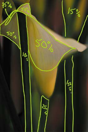
Figure 4.9.10. The layer mask
Figures 4.9.11 and 4.9.12. Before brushwork and detail
Figures 4.9.13 and 4.9.14. After brushwork and detail

Figures 4.9.15 and 4.9.16. After brushwork and combined with CS_SHARPEN and detail

- Save the file.
Step 9: Selective Contrast
In this next series of steps, you will create two contrast layers: a Tonal Contrast layer and a Contrast Only layer.
Adding Tonal Contrast with the Nik Software Tonal Contrast Filter
- Create a new layer set (above the NIK_SHARPEN or CS_SHARP layer depending on which way you went with the aesthetic sharpening of this image) and name this new layer set CONTRAST.
- Turn off the Sharpen layer(s).
- Drag the MASTER_BASE copy 3 layer into the CONTRAST folder. Set this layer to the Luminosity blend mode and duplicate it. (This newest layer should be MASTER_BASE_copy 4.) Name this layer CONTRAST_ONLY and turn it off.
- Make the MASTER_BASE_copy 3 layer active (turn it on if it is not already) and rename it TONAL_CONTRAST.
- Select Filter > Nik Software > Color Efex Pro 3.0 Versace Edition. When the Nik Software filter dialog box comes up, select Tonal Contrast.
- If you have not already, select Split view.
- Zoom in so that you have the upper middle part of the lily in the preview screen.
- First, set the Mid Contrast slider (I chose +56), and then the Shadow slider (I chose +17). Set the Highlight at +29. Set both the Protect Shadows and Protect Highlights to 15% (Figure 4.10.1).
Figure 4.10.1. Setting the Protect Shadows and Highlights to 15%

- Click OK. Compare the image before (Figures 4.10.2) and after (Figures 4.10.3).
Figure 4.10.2. Before
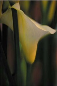
Figure 4.10.3. After
- Select the Brush tool. With the foreground color set to white, the brush opacity set to 50%, and the brush width set to 400 pixels, brush in the center part of the lily using the image map diagram as your guide. Leaving the slider set to 50%, reduce the brush size to 250 pixels, and brush in the upper part and back of the lily. Again, leaving the slider set to 50%, reduce the brush size to 175 pixels, and brush over the blurred part of the lily. Bring up the Fade effect dialog box and move the slider to 27%. View the image map (Figure 4.10.4), the resulting layer mask (Figure 4.10.5), and the image after the brushwork (Figure 4.10.6).
Figure 4.10.4. Image map

Figure 4.10.5. Layer mask
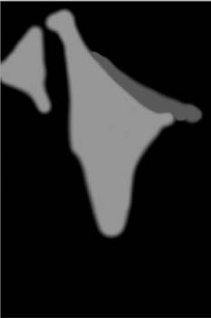
Figure 4.10.6. Image after brushwork

- Lower the layer opacity to 57%.
Adding Contrast Using the Nik Software Contrast Only Filter
- Turn on and make the CONTRAST_ONLY layer active.
- Select Filter > Nik Software > Color Efex Pro 3.0 Versace Edition. When the Nik filter dialog box comes up, select Contrast Only. Zoom in to approximately the same area that you used for the Tonal Contrast adjustments.
- From the default setting of 50%, move the Brightness slider to 40%. Open up the Protect Shadows and Highlights dialog box. Set Protect Highlights to 34% and Protect Shadows to 27%. Lower the Contrast to 40%. Lastly, adjust the Saturation slider to about 50% (Figure 4.10.7).
Figure 4.10.7. Setting the Tonal Contrast sliders
- Click OK.
- Holding down the Option / Alt key, click on the layer mask of the TONAL_CONTRAST layer, and drag it to the CONTRAST_ONLY layer.
- Reduce the opacity to 57%.
- If they are not already, turn on the sharpen layer group(s) and/or layers.
- Make the CONTRST/SHARPN layer set active.
- Create a master layer and name it CONTRAST/SHARP.
- Turn off the CONTRST/SHARPN layer.
- Save the file.
- Go to Save As (Command + Shift + S / Control + Shift + S) and, when the dialog box comes up, rename the file SEATTLE_LILY_MASTER_COLOR_16bit. Click off the Layers radial button and save the file in the Large Document file format (.psb).
Note
Remember that there is a bit of a dance between Contrast Only, Tonal Contrast, and Sharpening. Every image is different and, frequently, that difference determines the layer order. For this image, it was best to have Sharpening beneath Contrast—and to have Contrast Only above Tonal Contrast. The reason for this former choice was that when Sharpening was beneath Contrast, it minimized the noise that sometimes comes with sharpening. I placed Contrast Only over Tonal Contrast to further lower the noise and to brighten the areas that I wanted the eye to go to first. So not only did I help move the way the unconscious eye tracks across the image, I enhanced light-to-dark and high-to-low contrast just by layer placement.
View the image with the Contrast Only adustment only (Figure 4.10.8), the image with the Tonal Contrast and Contrast Only combined (Figure 4.10.9), and the Sharpening, Tonal Contrast, and Contrast Only combined (Figure 4.10.10).
Figure 4.10.8. Contrast Only adjustment

Figure 4.10.9. Tonal Contrast and Contrast Only

Figure 4.10.10. Sharpening, Tonal Contrast and Contrast Only

Step 10: Enhancing Warmth
Using the Nik Software Skylight Filter
- Close the SEATTLE_LILY_MASTER_CNTRST_SHRP_16bit.psb.
- Open the SEATTLE_LILY_MASTER_COLOR_16bit.psb.
- Rename Layer 1 SHRP/CNTRST_BASE.
- Duplicate the SHRP/CNTRST_BASE layer and make it into a Smart Filter.
- Add a layer mask.
- Create a new layer set and name it SKYLGHT/WHT_NTRL/LABSAT.
- Drag the SHRP/CNTRST_BASE copy layer into the SKYLGHT/WHT_NTRL/LABSAT layer set.
- Rename this layer SKYLIGHT.
- Go to Filter >Nik Software > Color Efex Pro 3.0 Versace Edition. Select Skylight from the three plug-in options and click OK. For this image, I thought the default of 25% appeared to be the best choice.
- Change the layer blend mode to Color.
Note
The Color blend mode affects only the color of the image; it does not change the highlights or the shadows. When you last used the Nik Software Skylight filter, you saw that the image brightened and the colors warmed when you ran the plug-in. When you changed the blend mode to Color, the colors did warm up, but the shadows and highlights remained unaffected.
I generally prefer to switch to the Color blend mode for the last step in my process—when I am finished with my adjustments to sharpness, color, and contrast. When I use the Luminosity blend mode, however, I frequently use it when I do an adjustment to sharpness or contrast, because I do not want to affect the color of the image.
- Select the Brush tool. With the foreground color black, set the brush opacity to 50% and its width to 400 pixels, and brush in the center part of the stem and the upper part of the lily using the image map diagram as your guide. Bring up the Fade effect dialog box and move the slider to 24%. Now, rebrush the top part of the lily and just left of its yellow center. Leave the amount set to 50%, reduce the brush size to 250 pixels, and brush in the upper part and back of the lily. Bring up the Fade effect dialog box and move the slider to 27%. View the image map (Figure 4.11.1), the layer mask (Figure 4.11.2), and the image after the brushwork (Figure 4.11.3)
Figure 4.11.1. Image map

Figure 4.11.2. Layer mask

Figure 4.11.3. After brushwork

Step 11: Neutralizing Whites
In this step, you will visually neutralize the whites using a Hue and Saturation adjustment layer that will specifically target the yellows of the image. First, you will reduce the saturation, then you will add some blue with the Hue slider, and finally, you will lighten everything without removing all the color.
Note
Obviously, if there is any color in a white, it is not white. This is where having a calibrated monitor is important. If you do not have one, what you see on the screen is not what you will print.
- Create a Hue and Saturation adjustment layer and rename it NTRLIZE_WHITES.
- Select Yellows from the Colors pull-down menu (Figure 4.12.1).
Figure 4.12.1. Selecting Yellows from the Colors pull-down

- Lower the Saturation to −72 (Figure 4.12.2).
Figure 4.12.2. Lower Saturation slider
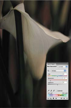
- Lower the Hue to −6 (Figure 4.12.3).
Figure 4.12.3. Lower Hue slider
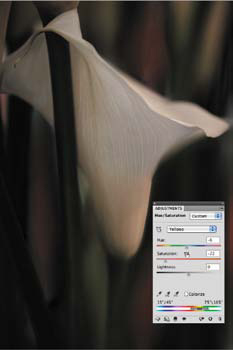
- Increase the Lightness to +6 (Figure 4.12.4).
Figure 4.12.4. Increasing Lightness to +6
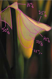
- Select the Brush tool and fill the layer mask with black. With the foreground color white, set the brush opacity to 50% and the width to 400 pixels. Using the image map diagram as your guide, brush in the center part of the lily, the upper blurred part of the lily, and the upper part of the lily to the right of the stem that separates the back and front of the lily. Bring up the Fade effect dialog box and reduce the amount to 19%. Next, rebrush the top of the lily, just to the left of its yellow center. Bring up the Fade effect dialog box and reduce the amount to 19%. Just brush the center top and blurred background. Bring up the Fade effect dialog box and reduce the amount to 27%.
- Leaving the opacity at 50%, reduce the brush size to 250 pixels, and brush in the upper part and upper blurred back of the lily. Bring up the Fade effect dialog box and move the slider to 27%. Brush the top and back part (to the left of the main stem). Bring up the Fade effect dialog box and move the slider to 27%. View the image map (Figure 4.12.5), the resulting layer mask (Figure 4.12.6), and the image after the brushwork (Figure 4.12.7).
Figure 4.12.5. The image map

Figure 4.12.6. Layer mask
Figure 4.12.7. The image after the brushwork

- Do “the Move.”
- Save the file.
Step 12: Increasing Saturation in the LAB Color Space
- Holding down the Shift key, click and drag the newly merged layer (Layer 1) to the SEATTLE_LILY_LAB_SAT_SHARPEN.psb file. (This file should still be open.) Make sure this layer is at the very top of the layer heap.
- Rename this layer TEMP_COLOR.
- Create a Curves adjustment layer and name it LAB_BOOST. (Make sure that you are in fine grid mode. To do this, Option / Alt click on the grid in the Curves dialog box.)
- Select the “a” channel from the Channel pull-down menu.
- Click on the top point of the Curve line and move it two grid lines left. Then, click on the bottom point on the Curve line, and move it two grid lines right (Figure 4.13.1).
Figure 4.13.1. Clipping the “a” Curve at the bottom point

- Select the “b” channel from the Channel pull-down menu.
- Click on the top point of the Curve line and move it one grid line left. Then, click on the bottom point of the Curve line and move it one grid line right (Figure 4.13.2).
Figure 4.13.2. Clipping the “b” Curve at the top point
- Do “the Move” and rename this layer LAB_SAT.
- Save the file.
- Holding down the Shift key, drag the LAB_SAT layer into the SKYLGHT/WHT_NTRL/LABSAT layer set.
- Drag the Layer 1 layer to the trash.
- Add a layer mask to the LAB_SAT layer and change the blend mode to Color.
- Fill the layer mask with black.
- Select the Brush tool. With the foreground color white, set the brush opacity to 50% and the width to 400 pixels. Using the image map diagram as your guide, brush in the red area in the lower, left corner between the two stems. Leave the opacity at 50% and brush in the red area at the lower right corner of the image. Bring up the Fade effect dialog box and move the slider to 69%. Brush in the red area midway to the right corner. Leave the opacity at 50% and brush the red area at the top right corner between the two stems.
- Brush in the lily stems in the upper, left corner. Bring up the Fade effect dialog box and move the slider to 28%. Brush in the yellow parts of the area that you just brushed, both at 50%. Brush the long stem below the front of the flower in the lower right corner. Bring up the Fade effect dialog box and move the slider to 28%. Brush the stem of the main lily (the stem that is at the base of the flower in the bottom middle). Leave the opacity at 50% and brush in the upper part of the lily next to the stem following the yellow to the base and including all of the yellow area in the base. Bring up the Fade effect dialog box and move the slider to 17%. Brush just the yellow parts of the lily’s base and move the slider to 27%.
- Reduce your brush to 80 pixels and brush the tip of the lily. Bring up the Fade effect dialog box and move the slider to 77%. Brush in the top part of the lily and leave the opacity at 50%.
- Reduce the layer opacity to 57%.
View the image map for the planned work (Figure 4.13.3), the resulting layer mask (Figure 4.13.4), and the image after the brushwork (Figure 4.13.5).
Figure 4.13.3. The image map

Figure 4.13.4. The layer mask

Figure 4.13.5. The image after brushwork

Seeing the Light of Traveling at the Speed of Dark
In my view you cannot claim to have seen something until you have photographed it.
—Emile Zola
Everything you have done on your journey through this image has been to get to this point—controlling the viewer’s eye by the use of isolates (you might want to review the Isolate Theory sidebar at the beginning of this chapter). As I have discussed in the previous chapters, dark is as important to an image as is light. And as you have already seen, there is more to adding dark than merely adding dark. How you darken an image affects its color. Therefore, the blend modes that you choose to use, and where you use Curves adjustment layers with regard to the layer stack, become important in the creation of the dark aspects of any image.
What is true for the dark aspects of the image is also true for the light ones. You will see, as you create dark-to-light and light-to-dark Curves adjustment layers, that how you create and place the light aspects of the image are also important.
Just as was the case when you used Curves adjustment layers to remove color cast, there is no one Curves adjustment layer that will do everything in one swift move. It will take a number of steps to create just the right balance of light-to-dark isolates to take the viewer’s eye on the path you intend.
Step 13: Traveling at the Speed of Dark: Using Curves to Create Dark-to-Light Areas
In this step, you will first work on the dark and intermediate isolates in the image by using two Curves adjustment layers. The final goal that you seek for this image is to cause shape to become the unwitting ally of the color yellow, which includes the yellow-tinged white areas of the lily as well. Your aim is to direct the viewer’s eye in such a way that they first see, and remember, the yellow, even though the image is mostly green. Also, by building the dark-to-light and light-to-dark relationships in the next series of steps, you will add an almost three dimensionality to the image by enhancing the warm colors (that tend to move forward in a image). Here is the image map of the brushwork that you will do (Fig 4.14.1).
Figure 4.14.1. Brushwork image map

- Create a new layer group and name it L2D_D2L.
- In the L2D_D2L layer group, create a Curves adjustment layer.
- Name this new layer D2L_NORM.
- Leave the blend mode set to Normal.
- Click on the center control point and drag it downward toward the right corner so that it is in the middle of the grid box that was to the right of the center point. The output should be about 112 and the input be about 140 (Figure 4.14.2).
Figure 4.14.2. Dragging the center point down
- Fill the layer mask with black, set the foreground color to white, and select the Brush tool. Set the brush opacity to 50% and the brush width to 400 pixels. Following the image map, brush in the stem in the upper right corner above the main lily. Leave the opacity at 50%. Do the same to the stem in the upper right corner above the lily that is at the center of the image—again leave the opacity at 50%. Brush in the red area between the two stems that you have just brushed. Bring up the Fade effect dialog box and increase the opacity to 60%. Brush in the upper left corner, the area above the left top of the lily, and the long stem around which the flower wraps. Leave the opacity at 50%.
- Brush in the stem in the lower right corner that starts beneath the main lily. Leave the opacity at 50%. Brush in the red area to the left of the stem that you just brushed. Brush right up to the lily. Bring up the Fade effect dialog box and increase the opacity to 60%. Brush in the red area to the right of the lower stem. Bring up the Fade effect dialog box and increase the opacity to 60%. Brush in the red area to the left of the lily between the two lower left stems. Bring up the Fade effect dialog box and increase the opacity to 60%.
- Brush in the yellow area of the main lily and the lower background to the left of the main lily’s stem. Make sure not to brush the main lily’s stem. Leave the opacity at 50%. Brush the lower edge of the upper part of the lily. Leave the opacity at 50%.
Compare the image before the brushwork (Figure 4.14.3), the resulting layer mask (Figure 4.14.4), and after the brushwork (Figure 4.14.5).
Figure 4.14.3. Before brushwork

Figure 4.14.4. The layer mask
Figure 4.14.5. The image after the brushwork

- Duplicate the D2L_NORM Curves adjustment layer, rename it D2L_NORM_2 and fill the layer mask with black.
The goal of the next D2L Curves adjustment layer is to both deepen the yellow of the lily base (due to the increase of color saturation that occurs when you darken an image) and to cause the white part of the image to become more prominent by increasing the relationship of light-to-dark (part of the ABC’s of how the eye sees). This is the image map of the areas that you will brush in the D2L_NORM_2 Curves adjustment layer (Figure 4.14.5).
Figure 4.14.5. Image map for D2L_NORM_2

Note
The reason that you are duplicating this Curves adjustment layer is first, by simply duplicating the layer, you do not need to go through all the work of darkening over again (workflow efficiency) and second, you will have more granular control. This granular control comes when you fill the layer mask with black and do brush work on it. In some cases where you have already done brush work on the L2D_NORM Curves adjustment layer (that you have just duplicated), you will further fine tune the layer’s opacity.
You did not duplicate the layer twice after filling the layer mask with black in Step 6, because this is what I did when I created this image for the first time. You are seeing my “thought workflow.” It was after doing the brush work on the first L_2_D_NORM Curves adjustment layer that I realized that I wanted to apply more targeted “darkness” in certain areas. I liked what I had done in the first L_2_D_NORM Curves adjustment layer, and because I did not want to change that, I chose to create a new layer rather than to paint more on the existing one.
- Making sure that the layer mask is active, set the foreground color to white. Select the Brush tool and set its opacity to 50% and its width to 400 pixels. Following the image map, brush in the upper right corner, just brushing the lily stem to the top of the main lily. Bring up the Fade effect dialog box and decrease the opacity to 46%.
- Brush in just the red area at the bottom right of the stem of the main lily. Bring up the Fade effect dialog box and increase the opacity to 62%.
- Brush in just the red area at the bottom left between the two stems to the left of the main lily. Bring up the Fade effect dialog box and increase the opacity to 62%.
- Brush in just the yellow part of the base of the main lily. Leave the opacity at 50%.
- Brush in the stem of the main lily, the yellow part of the base of the lily, and to the left of the base stem.
- Save the file.
Look at the image before (Figure 4.14.6), the image after brushwork (Figure 4.14.7), and the resulting layer mask (Figure 4.14.8).
Figure 4.14.6. Before the brushwork

Figure 4.14.7. After the brushwork

Figure 4.14.8. The layer mask
Step 14: Let There Be Light... Isolates
What you did in the last step was to set the stage for the primary light isolate, to which you want the eye to be drawn, by adjusting the supporting dark and intermediate isolates. (See the Isolate Theory sidebar at the beginning of this chapter.) These supporting isolates will be the areas that allow the eye places in which to wander and begin to recognize the subtle nuances that support the primary isolate and draws the eye to it. To accomplish this you will use three Curves adjustment layers, two blend modes, and placement above and below the two D2L Curves adjustment layers.
This approach is based on a renaissance painting technique called sfumato, which is the intricate mixing of thin layers of pigment, glaze, and oil to yield the appearance of lifelike shadows and light. In his work, of which Mona Lisa was a prime example of sfumato, Leonardo da Vinci used upwards of 30 layers of paint with a total thickness of less than 40 micrometers, or about half the width of a human hair. You can accomplish a similar effect using opacity and blend modes with both pixel-based layers, as well as adjustment layers. This approach works amazingly well in the creation of realistic looking atmospheric effects, from misty haze to inner glow, which, in addition to creating a primary light isolate, is the goal of the next series of steps.
These are the image maps for the brushwork you will do on the three Curves adjustment layers layer masks:
• L2D_SCREEN (Fig 4.15.1)
Figure 4.15.1. L2D_SCREEN image map

• L2D_SCREEN_2 (Fig 4.15.2)
Figure 4.15.2. L2D_SCREEN_2 image map

• L2D_NORM (Fig 4.15.3)
Figure 4.15.3. L2D_NORM image map

Creating a Glow from Within
- In the L2D_D2L layer set, create a Curves adjustment layer, name it L2D_SCREEN, and place it below the D2L_NORM Curves adjustment layer. (Starting from the top, the layer order should be L2D_SCREEN, then D2L_NORM, and then D2L_NORM_2.) Change the blend mode to Screen and fill the layer mask with black.
- Making sure that the layer mask is active, set the foreground color to white. Select the Brush tool and set its opacity to 50% and its width to 400 pixels. Following the image map, brush in the lily stem to the top of the main lily. Bring up the Fade effect dialog box and decrease the opacity to 22%.
- Brush in the front part, the upper top, and top left of the main lily. Bring up the Fade effect dialog box and increase the opacity to 31%.
- Brush in the lower base and about two-thirds up the front part of the main lily. Bring up the Fade effect dialog box and increase the opacity to 19%.
- Lower the L2D_SCREEN layer to an opacity of 82%. View the resulting layer mask (Figure 4.15.5) and the image after the brushwork (Figure 4.15.6).
Figure 4.15.5. The layer mask
Figure 4.15.6. After brushwork

- In the L2D_D2L layer set, create another Curves adjustment layer, name it L2D_SCREEN_2, and place it above the L2D_SCREEN Curves adjustment layer. (Starting from the top, the layer order should be L2D_SCREEN, then L2D_SCREEN_2, then D2L_NORM, and then D2L_NORM_2.) Change the blend mode to Screen and fill the layer mask with black.
- Making sure that the layer mask is active, set the foreground color to white. Select the Brush tool and set its opacity to 50% and its width to 400 pixels. Following the image map, brush in all of the main lily. Bring up the Fade effect dialog box and decrease the opacity to 22%.
- Brush in just above the lower base at the edge of the yellow front part of the main lily. Bring up the Fade effect dialog box and increase the opacity to 31%.
- Lower the L2D_SCREEN_2 layer to an opacity of 33%. View the resulting layer mask (Figure 4.15.7) and the image after the brushwork (Figure 4.15.8).
Figure 4.15.7. Layer mask

Figure 4.15.8. After the brushwork

- In the L2D_D2L layer set, create a Curves adjustment layer, name it L2D_NORM, and place it above the D2L_NORM_2 Curves adjustment layer. (Starting from the top, the layer order should be L2D_SCREEN, then D2L_NORM, and then D2L_NORM_2 L2D_NORM). Leave the blend mode set to Normal.
- Click on the center control point and drag it upward toward the left, upper corner so that the center control point is in the middle of the grid box that was to the left of the center point. The output should be about 142 and the input should be about 119 (Figure 4.15.9).
Figure 4.15.9. Tweaking the Curves adjustment

- Fill the layer mask with black.
- Making sure that the layer mask is active, set the foreground color to white. Select the Brush tool and set its opacity to 50% and its width to 400 pixels. Following the image map, brush in just the center part of the main lily. Bring up the Fade effect dialog box and increase the opacity to 79%.
- Lower the L2D_SCREEN_2 layer to an opacity of 33%.
- Make the L2D_D2L layer set active, create a master layer, and name it MASTER_FINAL.
- Turn off all of the layer sets. (This will speed up opening and saving because this file contains Smart Filters.)
- Save the file.
View the resulting layer mask (Figure 4.15.10), and the image after the brushwork (Figure 4.15.11).
Figure 4.15.10. The layer mask
Figure 4.15.11. After the brushwork
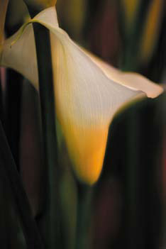
If you now analyze the color image of the Seattle Lily using the Isolate Theory, you can see that all of the elements come together to create a composition where the lily (the primary isolate) is reinforced and brought to the foreground so that it appears to be almost three-dimensional. The subtle appearance of the green stalks and reddish background, rendered as dark to intermediate isolates, surround the lily and allow it to pop out of the image and start the viewer’s seeing process. As the viewer becomes more involved with the image, he/she begins to see and feel the subtle supporting isolates that add to his/her emotional response and appreciation of the entire composition—and this is what you set out to do at the beginning!
Step 15: Disbanding the Potential Banding Issue of Blur
If you make a print and find that areas of high blur exhibit a stepping pattern that looks like a topographical map, you are seeing banding and possible posterization. Banding has a tendency to occur in the very blurry areas of an image, because the computer is trying to linearize the randomness of the blur. There are several ways to address this issue, but the quickest one is to add noise to the affected areas. The noise breaks up the banding. Generally, you want to use Monochromatic Gaussian noise.
The size of the image file determines how much noise to add. I have found that the range is between 2 and 8, but as a rule, it is better to add as little noise as possible. The smaller the file, the less noise you should add. For the purposes of teaching this technique, I am going to have you do this step at this point in this image’s workflow rather than doing it after sharpening for output, which is when I generally do this. This step is best done after output sharpening because the last thing you want to sharpen is noise.
- Make the MASTER_FINAL layer active.
- Holding the Option / Alt key, create a new layer.
- In the Name box, type NOISE. Then, from the Mode pulldown menu, select the blend mode Soft Light, and check the Fill with Soft-Light-neutral color (50% gray). Click OK (Figure 4.16.1).
Figure 4.16.1. Creating a new layer
- Make the NOISE layer into a Smart Filter.
- Go to Filter > Noise > Add Noise. In the dialog box, select Gaussian Noise and check Monochromatic. (Remember that the size of the image file determines how much noise to add.) Zoom into a blur problem area and move the noise amount slider until any banding issues go away. For this image, I chose 6. Click OK (Figure 4.16.2).
Figure 4.16.2. Adding noise to the image
Note
When you look at the 100ppi version of this file, it appears to be much noisier than the original, because the amount of noise that you apply to an image is dependent on the size of the file. For example, if the file size was 100ppi instead of the original file size of 300ppi, the amount of noise that that you would apply would be around 2 or 3. I have turned off the NOISE layer in the 100ppi reference file, but you should turn it on and play with it to see how adding noise works.
- Add a layer mask to the NOISE layer. For this image, leave the layer mask white. Following the image map, set the brush width to 400 pixels at an opacity of 100%, and with the foreground color set to black, completely brush the main lily. Now, brush in the main lily stem, bring up the Fade effect dialog box, and reduce the opacity to 50%.
- Lower the NOISE layer to an opacity of 86%.
- Save the file.
View the image map (Figure 4.16.3), the resulting layer mask (Figure 4.16.4), and the image after the brushwork (Figure 4.16.5).
Figure 4.16.3. The image map

Figure 4.16.4. The layer mask
Figure 4.16.5. The image detail after the brushwork
Children Play, They Don’t Take Notes. Adults Take Notes and Don’t Play as Much as They Should
I hope you are now convinced that there is more to dynamic range than just bracketing your exposures. I also hope that you have found that there is a much bigger high to be had by exploring and exploiting the power and subtlety of image harvesting for the purpose of extending the dynamic range of all aspects of an image. You have also had a master class in directing the viewer’s unconscious eye.
Figure 4.0.1. Initial image
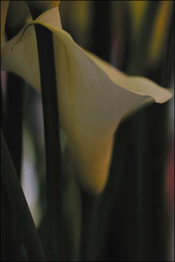
I believe that once you understand how to control color, you will have complete mastery of the images that you create. I also believe that you have to learn the rules before you can effectively break them. But if you make all of this a game, the playfulness and spontaneity that you bring to the process will be inherent in the image. It is from this sort of spontaneity that the truth of your experience will be captured.
Figure 4.0.2. Final image