
5. How Variables Classify Jointly: Contingency Tables
In Chapter 4, “How Variables Move Jointly: Correlation,” you saw the ways in which two continuous variables can covary: together in a direct, positive correlation, and apart in an indirect, negative correlation—or not at all when no relationship between the two exists.
This chapter explores how two nominal variables can vary together, or fail to do so. Recall from Chapter 1, “About Variables and Values,” that variables measured on a nominal scale have names (such as Ford or Toyota, Republican or Democrat, Smith or Jones) as their values. Variables measured on an ordinal, interval, or ratio scale have numbers as their values and their relationships can be measured by means of covariance and correlation. For nominal variables, we have to make do with tables.
Understanding One-Way Pivot Tables
As the quality control manager of a factory that produces sophisticated, cutting-edge cell phones, one of your responsibilities is to see to it that the phones leaving the factory conform to some standards for usability. One of those standards is the phone’s ability to establish a connection with a cell tower when it is being held in a fashion that most users find natural and comfortable (rather than as your company’s CEO tells them to hold it).
Your factory is producing the phones at a phenomenal rate and you just don’t have the staff to check every phone. Therefore, you arrange to have a sample of 50 phones tested daily, checking for connection problems. You know that zero-defect manufacturing is both terribly expensive and a generally impossible goal: Your company will be satisfied if only 1% of its phones fail to establish a connection with a cell tower that’s within reach.
Today your factory produced 1,000 phones. Did you meet your goal of at most ten defective units in 1,000?
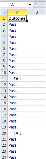
You can’t possibly answer that question yet. First, you need more information about the sample you had tested: In particular, how many failed the test? See Figure 5.1.
Figure 5.1. A standard Excel list, with a variable occupying column A, records occupying different rows, and a value in each cell of column A.
To create a pivot table with category counts, take these steps:
- Select cell A1 to help Excel find your input data.
- Click the Insert tab and choose PivotTable in the Tables group.
- In the Create PivotTable dialog box, click the Existing Worksheet option button, click in the Location edit box, and then click in cell C1 on the worksheet. Click OK.
- In the PivotTable Fields list, click Outcome and drag it into the Row Labels area.
- Click Outcome again and drag it into the Summary Values area, designated in Excel 2010 by Σ Values. Because at least one value in the input range is text, the summary statistic is Count.
- It’s often useful to show the counts in the pivot table as percentages. If you’re using Excel 2010, right-click any cell in the pivot table’s Count column and choose Show Values As from the shortcut menu. See the following note if you’re using an earlier version of Excel.
- Click % of Column Total in the cascading menu.
You now have a statistical summary of the pass/fail status of the 50 phones in your sample, as shown in Figure 5.2.
Figure 5.2. A quick-and-easy summary of your sample results.

Note
Microsoft made significant changes to the user interface for pivot tables between Excel 2003 and 2007, and again between Excel 2007 and 2010. In this book I try to provide instructions that work regardless of the version you’re using. That’s not always feasible.
In this case, you could do the following in either Excel 2007 or 2010. Right-click one of the Count or Total cells in the pivot table, such as D2 or D3 in this example. Choose Value Field Settings from the shortcut menu and click the Show Values As tab. Click % of Column Total in the Show Values As drop-down. Then click OK. In Excel 2003 or earlier, right-click one of the pivot table’s value cells and choose Field Settings from the shortcut menu. Use the drop-down labeled Show Data As in the Field Settings dialog box.
The results shown in Figure 5.2 aren’t great news. Your target is this: Out of the entire population of 1,000 phones that were made today, no more than 1% (10 total) should be defective if you’re to meet your target. But in a sample of 50 phones you found 2 defectives. In other words, a 5% sample (50 of 1,000) got you 20% (2 of 10) of the way toward your self-imposed limit.
You could take another nineteen 50-unit samples from the population. At the rate of 2 defectives in 50 units, you’d wind up with 40 defectives overall, and that’s four times the number you can tolerate from the full population.
On the other hand, it is a random sample. As such, there are limits to how representative the sample is of the population it comes from. It’s possible that you just happened to get your hands on a sample of 50 phones that included 2 defective units when the full population has a smaller defective rate. How likely is that?
Here’s how Excel can help you answer that question.
Running the Statistical Test
A large number of questions in the areas of business, manufacturing, medicine, social science, gambling, and so on are based on situations in which there are just two typical outcomes: succeeds/fails, breaks/doesn’t break, cures/sickens, Republican/Democrat, wins/loses. In statistical analysis, these situations are termed binomial: “bi” referring to “two,” and “nomial” referring to “names.” Several hundred years ago, due largely to a keen interest in the outcomes of bets, mathematicians started looking closely at the nature of those outcomes. We now know a lot more than we once did about how the numbers behave in the long run.
And you can use that knowledge as a guide to an answer to the question posed earlier: How likely is it that there are at most 10 defectives in the population of 1,000 phones, when you found two in a sample of just 50?
Framing the Hypothesis
Start by supposing that you had a population of 100,000 phones that has 1,000 defectives—thus the same 1% defect rate as you hope for in your actual population of 1,000 phones.
Note
This sort of supposition is often called a null hypothesis. It assumes that there is no difference between two values, such as a value obtained from a sample and a value assumed for a population; another type of null hypothesis assumes that there is no difference between two population values. The assumption of no difference is behind the term null hypothesis. You often see that the researcher has framed another hypothesis that contradicts the null hypothesis, called the alternative hypothesis.
If you had all the resources you needed, you could take hundreds of samples, each sample consisting of 50 units, from that population of 100,000. You could examine each sample and determine how many defective units were in it. If you did that, you could create a special kind of frequency distribution, called a sampling distribution, based on the number of defectives in each sample.
Under your supposition of just 1% defective in the population, one of those hypothetical samples would have zero defects; another sample would have two (just like the one you took in reality); another sample would have one defect; and so on until you had exhausted all those resources in the process of taking hundreds of samples. You could chart the number of defects in each sample, creating a sampling distribution that shows the frequency of the number of defects in each sample.
Using the BINOM.DIST() Function
Because of all the research and theoretical work that was done by those mathematicians starting in the 1600s, you know what that frequency distribution looks like without having to take all those samples. You’ll find it in Figure 5.3.
Figure 5.3. A sampling distribution of the number of defects in each of many, many samples would look like this.
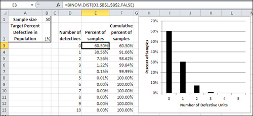
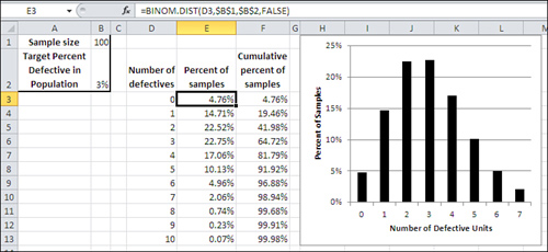
The distribution that you see charted in Figure 5.3 is one of many binomial distributions. The shape of each binomial distribution is different, depending on the size of the samples and the probability of each alternative in the population. The binomial distribution you see in Figure 5.3 is based on a sample size of 50 and a probability (in this example, of defective units) of 1%. For contrast, Figure 5.4 shows an example of the binomial distribution based on a sample size of 100 and a probability of 3%.
Figure 5.4. Compare with Figure 5.3: The distribution has shifted to the right.
The distributions shown in Figures 5.3 and 5.4 are based on the theory of binomial distributions and are generated directly using Excel’s BINOM.DIST()function.
For example, in Figure 5.4, the formula in cell E3 is as follows:
=BINOM.DIST(D3,$B$1,$B$2,FALSE)
Note
If you are using a version of Excel prior to 2010, you must use the compatibility function BINOMDIST(). Notice that there is no period in the function name, as there is with the consistency function BINOM.DIST(). The arguments to the two functions are identical as to both argument name and argument meaning.
or, using argument names instead of cell addresses:
=BINOM.DIST(Number_s,Trials,Probability_s,Cumulative)
Here are the arguments to the BINOM.DIST() function:
• Number of successes—Excel calls this Number_s. In BINOM.DIST(), as found in cell E3 of Figure 5.4, that’s the value found in cell D3: 0.
• Trials—In cell E3, that’s the value found in cell $B$1: 100. In the context of this example, “Trials” means number of cell phones in a sample.
• Probability of success—Excel calls this Probability_s. This is the probability of a success—of finding a defective unit—in the population. In this example, we’re assuming that the probability is 3%, which is the value found in cell $B$2.
• Cumulative—This argument takes either a TRUE or FALSE value. If you set it to TRUE, Excel returns the probability for this number of successes plus the probability of all smaller numbers of successes. That is, if the number of successes cited in this formula is 2, and if Cumulative is TRUE, then BINOM.DIST() returns the probability for 2 successes plus the probability of 1 success plus the probability of zero successes (in Figure 5.4, that is 41.98% in cell F5). When Cumulative is set to FALSE, Excel returns the probability of one particular number of successes. As used in cell E4, for example, that is the probability of the number of successes found in D4 (1 success in D4 leads to 14.71% of samples in cell E4).
So Figure 5.4 shows the results of entering the BINOM.DIST() function 11 times, each time with a different number of successes but the same number of trials (that is, sample size), the same probability, and the same cumulative option. If you tried to replicate this result by taking a few actual samples of size 50 with a success probability of 3%, you would not get what is shown in Figure 5.4. After taking 20 or 30 samples and charting the number of defects in each sample, you would begin to get a result that looks like Figure 5.4. After, say, 500 samples, your sampling distribution would look very much like Figure 5.4. (That outcome would be analogous to the demonstration for the normal distribution shown at the end of Chapter 1, in “Building Simulated Frequency Distributions.”)
But because we know the characteristics of the binomial distribution, under different sample sizes and with different probabilities of success in the population, it isn’t necessary to get a new distribution by repeated sampling each time we need one. (We know those characteristics by understanding the math involved, not from trial and error.) Just giving the required information to Excel is enough to generate the characteristics of the appropriate distribution.
So, in Figure 5.3, there is a binomial distribution that’s appropriate for this question: Given a 50-unit sample in which we found two defective units, what’s the probability that the sample came from a population in which just 1% of its units are defective?
Interpreting the Results of BINOM.DIST()
In Figure 5.3, you can see that you expect to find zero defective units in a sample of 50 in 60.50% of samples you might take. You expect to find one defective unit in a sample of 50 in another 30.56% of possible samples. That totals to 91.06% of 50-unit samples that you might take from this population of units. The remaining 8.94% of 50-unit samples would have two defective units, 4% of the sample, or more, when the population has only 1%.
What conclusion do you draw from this analysis? Is the one sample that you obtained part of the 8.94% of 50-unit samples that have two or more defectives when the population has only 1%? Or is your assumption that the population has just 1% defective a bad assumption?
If you decide that you have come up with an unusual sample—that yours is one of the 8.94% of samples that has 4% defectives when the population has only 1%—then you’re laying odds of 10 to 1 on your decision-making ability. Most rational people, given exactly the information discussed in this section, would conclude that their initial assumption about the population was in error—that the population does not in fact have 1% defective units. Most rational people don’t lay 10 to 1 on themselves without a pretty good reason, and this example has given you no reason at all to take the short end of that bet.
If you decide that your original assumption, that the population has only 1% defectives, was wrong—if you decide that the population has more than 1% defective units—that doesn’t necessarily mean you have persuasive evidence that the percentage of defects in the population is 4%, as it is in your sample (although that’s your best estimate right now). All your conclusion says is that you have decided that the population of 1,000 units you made today includes more than ten defective units.
Setting Your Decision Rules
Now, it can be a little disturbing to find that almost 9% (8.94%) of the samples of 50 phones from a 1% defective population would have at least 4% defective phones. It’s disturbing because most people would not regard 9% of the samples as absolutely conclusive. They would normally decide that the population has more than a 1% defect rate, but there would be a nagging doubt. After all, we’ve seen that almost one sample in ten from a 1% defective population would have 4% defects or more, so it’s surely not impossible to get a bad sample from a good population.
Let’s eavesdrop: “I have 50 phones that I sampled at random from the 1,000 we made today—and we’re hoping that there are no more than 10 defective units in that entire production run. Two of the sample, or 4%, are defective. Excel’s BINOM.DIST() function, with those arguments, tells me that if I took 10 samples of 50 each, roughly one of them (8.94% of the samples) would be likely to have two or even more defectives. Maybe that’s the sample I have here. Maybe the full production run only has 1% defective.”
Tempting, isn’t it? This is why you should specify your decision rule before you’ve seen the data, and why you shouldn’t fudge it after the data has come in. If you see the data and then decide what your criterion will be, you are allowing the data to influence your decision rule after the fact. That’s called capitalizing on chance.
Traditional experimental methods advise you to specify the likelihood of making the wrong decision about the population before you see the data. The idea is that you should bring a cost-benefit approach to setting your criterion. Suppose that you sell your 1,000 phones to a wholesaler at a 5% markup. The terms of your contract with the wholesaler call for you to refund the price of an entire shipment if the wholesaler finds more than 1% defective units in the shipment. The cost of that refund has to be borne by the profits you’ve made.
So if you make a bad decision (that is, the population of items from which we drew our sample has 1% or fewer defective units, when in fact it has, say, 3%) the 21st sale could cost you all the profits you’ve made on the first 20 sales. Therefore, you want to make your criterion for deciding to a ship the 1,000-unit lot strong enough that at most one shipment in 20 will fail to meet the wholesaler’s acceptance criterion.
Note
The approach discussed in this book can be thought of as a more traditional one, following the methods developed in the early part of the twentieth century by theoreticians such as R. A. Fisher. It is sometimes termed a frequentist approach. Other statistical theorists and practitioners follow a Bayesian model, under which the hypotheses themselves can be thought of as having probabilities. The matter is a subject of some controversy and is well beyond the scope of a book on Excel. Be aware, though, that where there is a choice that matters in the way functions are designed and the Data Analysis add-in works, Microsoft has taken a conservative stance and adopted the frequentist approach.
Making Assumptions
You must be sure to meet two basic assumptions if you want your analysis of the defective phone problem—and other, similar problems—to be valid. You’ll find that all problems in statistical inference involve assumptions; sometimes there are more than just two, and sometimes it turns out that you can get away with violating the assumptions. In this case, there are just two, but you can’t get away with any violations.
Random Selection
The analysis assumes that you take samples from your population at random. In the phone example, you can’t look at the population of phones and pick the 50 that look least likely to be defective.
Well, more precisely, you can do that if you want to. But if you do, you are creating a sample that is systematically different from the population. You need a sample that you can use to make an inference about all the phones you made, and your judgment about which phones look best was not part of the manufacturing process. If you let your judgment interfere with random selection of phones for your sample, you’ll wind up with a sample that isn’t truly representative of the population.
And there aren’t many things more useless than a nonrepresentative sample (just ask George Gallup about his prediction that Truman would lose to Dewey in 1948). If you don’t pick a random sample of phones, you make a decision about the population of phones that you have manufactured on the basis of a nonrepresentative sample. If your sample has not a single defective phone, how confident can you be that the outcome is due to the quality of the population, and not the quality of your judgment in selecting the sample?
Using Excel to Help Sample Randomly
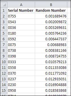
The question of using Excel to support a random selection comes up occasionally. Here’s the approach that I use and prefer. Start with a worksheet list of values that uniquely identify members of a population. In the example this chapter has used, those values might be serial numbers.
If that list occupies, say, A1:A1001, you can continue by taking these steps:
- In cell B1, enter a label such as Random Number.
- Select the range B2:B1001.
- Type the formula =RAND() and enter it into B2:B1001 using Ctrl+Enter. This generates a list of random values in random order. The values returned by RAND() are unrelated to the identifying serial numbers in column A. Leave the range B2:B1001 selected.
- So that you can sort them, convert the formulas to values by clicking the Copy button on the Ribbon’s Home tab, then clicking Paste, choosing Paste Special, selecting the Values option, and then clicking OK. You now have random numbers in B2:B1001.
- Select any cell in the range A1:B1001. Click the Ribbon’s Data tab and click the Sort button.
- In the Sort By drop-down, choose Random Number. Accept the defaults for the Sort On and the Order drop-downs and click OK.
The result is to sort the unique identifiers into random order, as shown in Figure 5.5. You can now print off the first 50 (or the size of the sample you want) and select them from your population.
Figure 5.5. Instead of serial number, the unique identifier in column A could be name, social security number, phone number—whatever is most apt for your population of interest.
Note
Random numbers that you generate in this way are really pseudo-random numbers. Computers have a relatively limited instruction set, and execute their instructions repeatedly. This makes them very fast and very accurate but not very random. Nevertheless, the pseudo-random numbers produced by Excel’s RAND() function pass some rigorous tests for nonrandomness and are well suited to any sort of random selection you’re at all likely to need.
Independent Selections
It’s important that the individual selections be independent of one another: that is, the fact that Phone 0001 is selected for the sample must not change the likelihood that another specific unit will be selected.
Suppose that the phones leave the factory floor packaged in 50-unit cartons. It would obviously be convenient to grab one of those cartons, even at random, and declare that it’s to be your 50-unit sample. But if you did that, you could easily be introducing some sort of systematic dependency into the system.
For example, if the 50 phones in a given carton were manufactured sequentially—if they were, say, the 51st through 100th phones to be manufactured that day—then a subset of them might be subject to the same calibration error in a piece of equipment. In that case, the lack of independence in making the selections again introduces a nonrandom element into what is assumed to be a random process.
A corollary to the issue of independence is that the probability of being selected must remain the same through the process. In practice, it’s difficult to adhere slavishly to this requirement, but the difference between 1/1,000 and 1/999, or between 1/999 and 1/998 is so small that they are generally taken to be equivalent probabilities.
The Binomial Distribution Formula
If these assumptions—random and independent selection with just two possible values—are met, then the formula for the binomial distribution is valid:
In this formula:
• n is the number of trials.
• r is the number of successes.
• ![]() is the number of combinations.
is the number of combinations.
• p is the probability of a success in the population.
• q is (1 − p), or the probability of a failure in the population.
(The number of combinations is often called the “nCr” formula, or “n things taken r at a time.”)
You’ll find the formula worked out in Figure 5.6 for a specific number of trials, successes, and probability of success in the population. Compare Figure 5.6 with Figure 5.4. In both figures:
• The number of trials, or n, representing the sample size, is 100.
• The number of successes, or r, representing the number of defects in the sample, is 4 (cell D7 in Figure 5.4).
• The probability of a success in the population, or p, is .03.
Figure 5.6. Building the results of BINOM.DIST() from scratch.

In Figure 5.6:
• The value of q is calculated simply by subtracting p from 1 in cell C4.
• The value of ![]() is calculated in cell C5 with the formula =COMBIN(C1,C2).
is calculated in cell C5 with the formula =COMBIN(C1,C2).
• The formula for the binomial distribution is used in cell C6 to calculate the probability of four successes in a sample of 100, given a probability of success in the population of 3%.
Note that the probability calculated in cell C6 of Figure 5.6 is identical to the value returned by BINOM.DIST() in cell E7 of Figure 5.4.
Of course, it’s not necessary to use the nCr formula to calculate the binomial probability; that’s what BINOM.DIST() is for. Still, I like to calculate it from scratch from time to time as a check that I have used BINOM.DIST() and its arguments properly.
Using the BINOM.INV() Function
You have already seen Excel’s BINOM.DIST() function, in Figures 5.3 and 5.4. There, the arguments used were as follows:
• Number of successes—More generally, that’s the number of times something occurred—here, that’s the number of instances that phones are defective. Excel terms this argument successes or number_s.
• Number of trials—The number of opportunities for successes to occur. In the current example, that’s the sample size.
• Probability of success—The percent of times something occurs in the population. In practice, this is usually the probability that you are testing for by means of a sample: “How likely is it that the probability of success in the population is 1%, when the probability of success in my sample is 4%?”
• Cumulative—TRUE to return the probability associated with this number of successes, plus all smaller numbers down to and including zero. FALSE to return the probability associated with this number of successes only.
BINOM.DIST() returns the probability that a sample with the given number of defectives can be drawn from a population with the given probability of success. The older function BINOMDIST() takes the same arguments and returns the same results.
As you’ll see in this and later chapters, a variety of Excel functions that return probabilities for different distributions have a form whose name ends with .DIST(). For example, NORM.DIST() returns the probability of observing a value in a normal distribution, given the distribution’s mean and standard deviation, and the value itself.
Another form of these functions ends with .INV() instead of .DIST(). The INV stands for inverse. In the case of BINOM.INV(), the arguments are as follows:
• Trials—Just as in BINOM.DIST(), this is the number of opportunities for successes (here, the sample size).
• Probability—Just as in BINOM.DIST(), this is the probability of successes in the population.
• Alpha—This is the value that BINOM.DIST() returns: the cumulative probability of obtaining some number of successes in the sample, with the sample size and the population probability. (The term alpha for this value is nonstandard.)
Given these arguments, BINOM.INV() returns the number of successes (here, defective phones) associated with the alpha argument you supply. I know that’s confusing, and this may help clear it up: Look back to Figure 5.4. Suppose you enter this formula on that worksheet:
=BINOM.INV(B1,B2,F9)
That would return the number 7. Here’s what that means and what you can infer from it, given the setup in Figure 5.4:
You’ve told me that you have a sample of 100 phones (cell B1). The sample comes from a population of phones where the probability of a phone being defective is 3% (cell B2). You want to hold on to a correct assumption that the sample came from that population 96.88% of the time (cell F9). Thus, you’re willing to make a mistake, to reject your assumption when it’s correct, 3.12% of the time: 3.12% of 100-unit samples from a population with 3% defective will have 7 or more defective units.
Given all that, you should conclude that the sample did not come from a population with only 3% defective if you get 7 or more defective units in your sample—if you get that many, you’re into the 3.12% of the samples that have 7 or more defectives. Although your sample could certainly be among the 3.12% of samples with 7 defectives from a 3% defective population, that’s too unlikely a possibility to suit most people. Most people would decide instead that the population has more than 3% defectives.
So the .INV() form of the function turns the .DIST() form on its head. With BINOM.DIST(), you supply the number of successes and the function returns the probability of that many successes in the population you defined. With BINOM.INV(), you supply the largest percent of samples beyond which you would cease to believe the sample comes from a population that has a given defect rate. Then, BINOM.INV() returns the number of successes that would satisfy your criteria for sample size, for percent defective in the population, and for the percent of the area in the binomial distribution that you’re interested in.
Therefore, you would supply the probability .99 if you decided that a sample with so many defects that it could come from a 3% defective population only 1% of the time, the sample must come from a population with a higher defect rate. Or you would supply the probability .90 if you decided that a sample with so many defects that it could come from a 3% defective population only 10% of the time, the sample must come from a population with a higher defect rate.
You’ll see all this depicted in Figure 5.7, based on the data from Figure 5.4.
Figure 5.7. Comparing BINOM.INV() with BINOM.DIST().
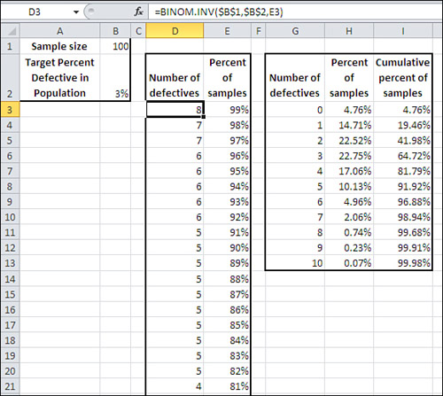
In Figure 5.7, as in Figure 5.4, a sample of 100 units (cell B1) is taken from a population that is assumed to have 3% defective units (cell B2). Cells G2:I13 replicate the analysis from Figure 5.4, using BINOM.DIST() to determine the percent (H2:H13) and cumulative percent (I2:I13) of samples that you would expect to have different numbers of defective units (cells G2:G13).
Columns D and E use BINOM.INV() to determine the number of defects (column D) you would expect in a given percent of samples. That is, in anywhere from 82% to 91% of samples from the population, you would expect to find as many as five defective units. This finding is consistent with the BINOM.DIST() analysis, which shows that a cumulative 91.92% of samples have as many as five defects.
The following sections offer a few comments on all this information.
Somewhat Complex Reasoning
Don’t let the complexity throw you. It usually takes several trips through the reasoning before the logic of it begins to settle in. The general line of thought pursued here is somewhat more complicated than the reasoning you follow when you’re doing other kinds of statistical analysis, such as whether two samples indicate that the means are likely to be different in their populations. The reasoning about mean differences tends to be less complicated than is the case with the binomial distribution.
Three issues complicate the logic of a binomial analysis. One is the cumulative nature of the outcome measure: the number of defective phones in the sample. To test whether the sample came from a population with an acceptable number of defectives, you need to account for zero defective units, one defective unit, two defective units, and so on.
Another complicating issue is that more percentages than usual are involved. In most other kinds of statistical analysis, the only percentage you’re concerned with is the percent of the time that you would observe a sample like the one you obtained, given that the population is as you assume it to be. In the current discussion, for example, you consider the percent of the time you would get a sample of 100 with four defects, assuming the population has only 1% defective units.
It complicates the reasoning that you’re working with percentages as the measures themselves. Putting things another way, you consider the percent of the time you would get 4% defects in a sample when the population has 1% defects. It’s only when you’re working with a nominal scale that you must work with outcome percentages: X% of patients survived one year; Y% of cars had brake failure; Z% of registered voters were Republicans.
The other complicating factor is that the outcome measure is an integer, and the associated probabilities jump, instead of increasing smoothly, as the number of successes increases. Refer back to Figure 5.4 and notice how the probabilities increase by dwindling amounts as the number of success increases.
The General Flow of Hypothesis Testing
Still, the basic reasoning followed here is analogous to the reasoning used in other situations. The normal process is as follows:
The Hypothesis
Set up an assumption (often called an hypothesis, sometimes a null hypothesis, to be contrasted with an alternative hypothesis). In the example discussed here, the null hypothesis is that the population from which the sample of phones came has a 1% defect rate; the term null suggests that nothing unusual is going on, that 1% is the normal expectation. The alternative hypothesis is that the population defect rate is higher than 1%.
The Sampling Distribution
Determine the characteristics of the sampling distribution that would result if the hypothesis were true. There are various types of distributions, and your choice is usually dictated by the question you’re trying to answer and by the level of measurement available to you. Here, the level of measurement was not only nominal (acceptable vs. defective) but binomial (just two possible values). You use the functions in Excel that pertain to the binomial distribution to determine the probabilities associated with different numbers of defects in the sample.
The Error Rate
Decide how much risk of incorrectly rejecting the hypothesis is acceptable. This chapter has talked about that decision without actually making it in the phone quality example; it advises you to take into account issues such as the costs of making an incorrect decision versus the benefits of making a correct one. (This book discusses other related issues, such as statistical power.)
In many branches of statistical analysis, it is conventional to adopt levels such as .05 and .01 as error rates. Unfortunately, the choice of these levels is often dictated by tradition, not the logic and mathematics of the situation. But whatever the rationale for adopting a particular error rate, note that it’s usual to make that decision prior to analyzing the data. You should decide on an error rate before you see any results; then you have more confidence in your sample results because you have specified beforehand what percent of the time (5%, 1%, or some other figure) your result will be in error.
Hypothesis Acceptance or Rejection
In this fourth phase of hypothesis testing, take the sample and calculate the pertinent statistic (here, number of defective phones). Compare the result with the same result in the sampling distribution that was derived in step 2. If your sample result appears in the sampling distribution less often than implied by the error rate you chose in step 3, reject the null hypothesis. For example, if the error rate you chose is .05 (5%) and you would get as many defective units as you did only .04 (4%) of the time when the null is true, reject the null; otherwise, retain the null hypothesis that your sample comes from a population of phones with 1% defectives.
Figure 5.3 represents the hypothesis that the population has 1% defective units. A sample of 50 with zero, one, or two defective units would occur in 98.62% of the possible samples. Therefore, if you adopted .05 as your error rate, two sample defects would cause you to reject the hypothesis of 1% defects in the population. The presence of two defective units in the 50-unit sample bypasses the .95 criterion, which is the complement of the .05 error rate.
This logic can get tortuous, so let’s look at it again using different words. You have said that you’re willing to make the wrong decision about your population of phones 5% of the time; that’s the error rate you chose. You are willing to conclude 5% of the time that the population has more than 1% defective when it actually has 1% defective. That 5% error rate puts an upper limit on the number of defective phones you can find in your sample and still decide it came from a population with only 1% defectives.
Your sample of 50 comes in with two defective phones. You would get up to two defectives in 98.62% of samples from a population with 1% defective units. That’s more than you can put up with when you want to limit your error rate to 5%. So you conclude that the population actually has more than 1% defective—you reject the null hypothesis.
Figure 5.4 shows the distribution of samples from a population with a 3% defect rate. In this case, two defects in a sample of 100 would not persuade you to reject the hypothesis of 3% defects in the population if you adopt a .05 error rate. Using that error rate, you would need to find six defective units in your sample to reject the hypothesis that the population has a 3% defect rate.
Choosing Between BINOM.DIST() and BINOM.INV()
The functions BINOM.DIST() and BINOM.INV() are two sides of the same coin. They deal with the same numbers. The difference is that you supply BINOM.DIST() with a number of successes and it tells you the probability, but you supply BINOM.INV() with a probability and it tells you the number of successes.
You can get the same set of results either way, but I prefer to create analyses such as Figures 5.3 and 5.4 using BINOM.DIST(). In Figure 5.4, you could supply the integers in D3:D13 and use BINOM.DIST() to obtain the probabilities in E3:E13. Or you could supply the cumulative probabilities in F3:F13 and use BINOM.INV() to obtain the number of successes in D3:D13.
But just in terms of worksheet mechanics, it’s easier to present a series of integers to BINOM.DIST() than it is to present a series of probabilities to BINOM.INV().
Alpha: An Unfortunate Argument Name
Standard statistical usage reserves the name alpha for the probability of incorrectly rejecting a null hypothesis, of deciding that something unexpected is going on when it’s really business as usual. But in the BINOM.INV() function, Excel uses the argument name alpha for the probability that your data will tell you that the null hypothesis is true, when it is in fact true, and in standard statistical usage, that is not alpha but 1 − alpha. If you’re used to the standard usage, or even if you’re not yet used to it, don’t be misled by the idiosyncratic Excel terminology.
Note
In versions of Excel prior to 2010, BINOM.INV() was named CRITBINOM(). Like all the “compatibility functions,” CRITBINOM() is still available in Excel 2010.
Understanding Two-Way Pivot Tables
Two-way pivot tables are, on the surface, a simple extension of the one-way pivot table discussed at the beginning of this chapter. There, you obtained data on some nominal measure—the example that was used was acceptable vs. defective—and put it into an Excel list. Then you used Excel’s pivot table feature to count the number of instances of acceptable units and defective units. Only one field, acceptable vs. defective, was involved, and the pivot table had only row labels and a count, or a percent, for each label (refer back to Figure 5.2).
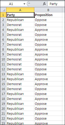
A two-way pivot table adds a second field, also normally measured on a nominal scale. Suppose that you have at hand data from a telephone survey of potential voters, many of whom were willing to disclose both their political affiliation and their attitude (approve or disapprove) of a proposition that will appear on the next statewide election ballot. Your data might appear as shown in Figure 5.8.
Figure 5.8. The relationship between these two sets of data can be quickly analyzed with a pivot table.
To create a two-way pivot table with the data shown in Figure 5.8, take these steps:
- Select cell A1 to help Excel find your input data.
- Click the Insert tab and choose PivotTable in the Tables group.
- In the Create PivotTable dialog box, click the Existing Worksheet option button, click in the Location edit box, and then click in cell D1 on the worksheet. Click OK.
- In the PivotTable Fields list, click Party and drag it into the Row Labels area.
- Still in the PivotTable Fields list, click Proposition and drag it into the Column Labels area.
- Click Proposition again and drag it into the Σ Values area in the PivotTable Fields list. Because at least one value in the input range is text, the summary statistic is Count. (You could equally well drag Party into the Σ Values area.)
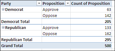
The result is shown in Figure 5.9.
Figure 5.9. By displaying the Party and the Proposition fields simultaneously, you can tell whether there’s a joint effect.

There is another way to show two fields in a pivot table that some users prefer—and that some report formats make necessary. Instead of dragging Proposition into the Column Labels area in step 5, drag it into the Row Labels area along with Party (see Figure 5.10).
Figure 5.10. Reorienting the table in this way is called “pivoting the table.”
The term contingency table is sometimes used for this sort of analysis because it can happen that the results for one variable are contingent on the influence of the other variable. For example, you would often find that attitudes toward a ballot proposition are contingent on the respondents’ political affiliations. From the data shown in Figure 5.10, you can infer that more Republicans oppose the proposition than Democrats. How many more? More than can be attributed to the fact that there are simply more Republicans in this sample? One way to answer that is to change how the pivot table displays the data. Follow these steps, which are based on the layout in Figure 5.9:
- Right-click one of the summary data cells. In Figure 5.9, that’s anywhere in the range F3:H5.
- In the shortcut menu, choose Show Values As.
- In the cascading menu, choose % of Row Total.
The pivot table recalculates to show the percentages, as in cells E1:H5 in Figure 5.11, rather than the raw counts that appear in Figures 5.9 and 5.10, so that each row totals to 100%. Also in Figure 5.11, the pivot table in cells E8:H12 shows that you can also display the figures as percentages of the grand total for the table.
Figure 5.11. You can instead show the percent of each column in a cell.

Tip
If you don’t like the two decimal places in the percentages any more than I do, right-click one of them, choose Number Format from the shortcut menu, and set the number of decimal places to zero.
Viewed as row percentages—so that the cells in each row total to 100%—it’s easy to see that Republicans oppose this proposition by a solid but not overwhelming margin, whereas Democrats are more than two-to-one against it. The respondents’ votes may be contingent on their party identification. Or there might be sampling error going on, which could mean that the sample you took does not reflect the party affiliations or attitudes of the overall electorate. Or Republicans might oppose the proposition, but in numbers less than you would expect given their simple numeric majority.
Put another way, the cell frequencies and percentages shown in Figures 5.9 through 5.11 aren’t what you’d expect, given the overall Republican vs. Democratic ratio of 295 to 205. Nor do the observed cell frequencies follow the overall pattern of Approve versus Oppose, which at 304 oppose to 196 approve approximates the ratio of Republicans to Democrats. How can you tell what the frequencies in each cell would be if they followed the overall, “marginal” frequencies?
To get an answer to that question, we start with a brief tour of your local card room.
Probabilities and Independent Events
Suppose you draw a card at random from a standard deck of cards. Because there are 13 cards in each of the four suits, the probability that you draw a diamond is .25. You put the card back in the deck.
Now you draw another card, again at random. The probability that you draw a diamond is still .25.
As described, these are two independent events. The fact that you first drew a diamond has no effect at all on the denomination you draw next. Under that circumstance, the laws of probability state that the chance of drawing two consecutive diamonds is .0625, or .25 times .25. The probability that you draw two cards of any two named suits, under these circumstances, is also .0625, because all four suits have the same number of cards in the deck.
It’s the same concept with a fair coin, one that has an equal chance of coming up heads or tails when it’s tossed. Heads is a 50% shot, and so is tails. When you toss the coin once, it’s .5 to come up heads. When you toss the coin again, it’s still .5 to come up heads. Because the first toss has nothing to do with the second, the events are independent of one another and the chance of two heads (or a heads first and then a tail, or two tails) is .5 * .5, or .25.
Note
The gambler’s fallacy is relevant here. Some people believe that if a coin, even a coin known to be fair, comes up heads five times in a row, the coin is “due” to come up tails. Given that it’s a fair coin, the odds on heads is still 50% on the sixth toss. People who indulge in the gambler’s fallacy ignore the fact that the unusual event has already occurred. That event, the streak of five heads, is in the past, and has no say about the next outcome.
This rule of probabilities—that the likelihood of occurrence of two independent events is the product of their respective probabilities—is in play when you evaluate contingency tables. Notice in Figure 5.11 that the probability in the sample of being a Democrat is 41% (cell H10) and a Republican is 59% (cell H11).
Similarly, irrespective of political affiliation, the probability that a respondent approves of the proposition is 39.2% (cell F12) and opposes it 60.8% (cell G12). If approval is independent of party, the rule of independent events states that the probability of, say, being a Republican and approving the proposition is .59 * .392, or .231. See cell E16 in Figure 5.12.
Figure 5.12. Moving from observed counts to expected counts.
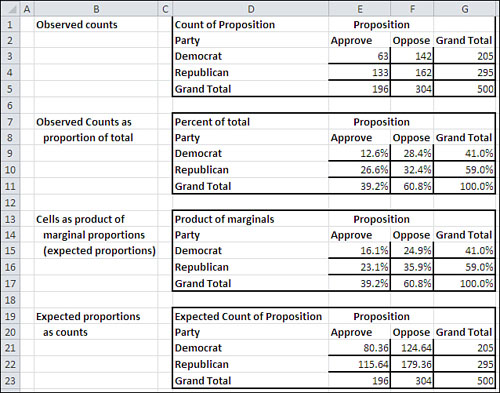
You can complete the remainder of the table, the other three cells F16, E17, and F17, as shown in Figure 5.12. Then, by multiplying the percentages by the total count, 500, you wind up with the number of respondents you would expect in each cell if party affiliation were independent of attitude toward the proposal. These expected counts are shown in cells E21:F22.
In Figure 5.12, you see these tables:
• D1:G5—These are the original counts as shown in the pivot table in Figure 5.9.
• D7:G11—These are the original counts displayed as percentages of the total count. For example, 41.0% in cell G9 is 205 divided by 500, and 12.6% in cell E9 is 63 divided by 500.
• D13:G17—These are the cell percentages as obtained from the marginal percentages. For example, 35.9% in cell F16 is the result of multiplying 60.8% in cell F17 (the column percentage) by 59.0% in cell G16 (the row percentage). To review, if party affiliation is independent of attitude toward the proposition, then their joint probability is the product of the two individual probabilities. The percentages shown in E15:F16 are the probabilities that are expected if party and attitude are independent of one another.
• D19:G23—The expected counts are in E21:F22. They are obtained by multiplying the expected percentages in E15:G16 by 500, the total number of respondents.
Now you are in a position to determine the likelihood that the observed counts would have been obtained under an assumption: that in the population, there is no relationship between party affiliation and attitude toward the proposition. The next section shows you how that’s done.
Testing the Independence of Classifications
Prior sections of this chapter discussed how you use the binomial distribution to test how likely it is that an observed proportion comes from an assumed, hypothetical distribution. The theoretical binomial distribution is based on the use of one field that has only two possible values.
But when you’re dealing with a contingency table, you’re dealing with at least two fields (and each field can contain two or more categories). The example that’s been discussed so far concerns two fields: party affiliation and attitude toward a proposition. As I’ll explain shortly, the appropriate distribution that you refer to in this and similar cases is called the chi-square (pronounced kai square) distribution.
Using the CHISQ.TEST() function
Excel has a special chi-square test that is carried out by a function named CHISQ.TEST(). It is new in Excel 2010, but all that’s new is the name. If you’re using an earlier version of Excel, you can use CHITEST() instead. The two functions take the same arguments and return the same results. CHITEST() is retained as a so-called “compatibility function” in Excel 2010.
You use CHISQ.TEST() by passing the observed and the expected frequencies to it as arguments. With the data layout shown in Figure 5.12, you would use CHISQ.TEST() as follows:
=CHISQ.TEST(E3:F4,E21:F22)
The observed frequencies are in cells E3:F4, and the expected frequencies, derived as discussed in the prior section, are in cells E21:F22. The result of the CHISQ.TEST() function is the probability that you would get observed frequencies that differ by as much as this from the expected frequencies, if political affiliation and attitude toward the proposition are independent of one another. In this case, CHISQ.TEST() returns 0.001. That is, assuming that the population’s pattern of frequencies is as shown in cells E21:F22 in Figure 5.12, you would get the pattern in cells E3:F4 in only 1 of 1,000 samples obtained in a similar way.
What conclusion can you draw from that? The expected frequencies are based on the assumption that the frequencies in the individual cells (such as E3:F4) follow the marginal frequencies. If there are twice as many Republicans as Democrats, then you would expect twice as many Republicans in favor than Democrats in favor. Similarly, you would expect twice as many Republicans opposed as Democrats opposed.
In other words, your null hypothesis is that the expected frequencies are influenced by nothing other than the frequencies on the margins: that party affiliation is independent of attitude toward the proposal, and the differences between observed and expected frequencies is due solely to sampling error. If, however, something else is going on, that might push the observed frequencies away from what you’d expect if attitude is independent of party. The result of the CHISQ.TEST() function suggests that something else is going on.
It’s important to recognize that the chi-square test itself does not pinpoint the observed frequencies whose departure from the expected causes this example to represent an improbable outcome. All that CHISQ.TEST() tells us is that the pattern of observed frequencies differs from what you would expect on the basis of the marginal frequencies for affiliation and attitude.
It’s up to you to examine the frequencies and decide why the survey outcome indicates that there is an association between the two variables, that they are not in fact independent of one another.
For example, is there something about the proposition that makes it even more unattractive to Democrats than to Republicans? Certainly that’s a reasonable conclusion to draw from these numbers. But you would surely want to look at the proposition and the nature of the publicity it has received before you placed any confidence in that conclusion.
This situation highlights one of the problems with nonexperimental research. Surveys entail self-selection. The researcher cannot randomly assign respondents to either the Republican or the Democratic party and then ask for their attitude toward a political proposition. If one variable were diet and the other variable were weight, it would be possible—in theory at least—to conduct a controlled experiment and draw a sound conclusion about whether differences in food intake cause differences in weight. But survey research is almost never so clear cut.
There’s another difficulty that this chapter will deal with in the section titled “The Yule Simpson Effect.”
Understanding the Chi-Square Distribution
Figures 5.3 and 5.4 show how the shape of the binomial distribution changes as the sample size changes and the number of successes (in the example, the number of defects) in the population changes. The distribution of the chi-square statistic also changes according to the number of observations involved (see Figure 5.13).
Figure 5.13. The differences in the shapes of the distributions are due solely to their degrees of freedom.

The three curves in Figure 5.13 show the distribution of chi-square with different numbers of degrees of freedom. Suppose that you sample a value at random from a normally distributed population of values with a known mean and standard deviation. You create a z-score, as described in Chapter 3, “Variability: How Values Disperse,” subtracting the mean from the value you sampled, and dividing by the standard deviation. Here’s the formula once more, for convenience:
![]()
Now you square the z-score. When you do so, you have a value of chi-square. In this case, it has one degree of freedom. If you square two independent z-scores and sum the squares, the sum is a chi-square with two degrees of freedom. Generally, the sum of n squared independent z-scores is a chi-square with n degrees of freedom.
In Figure 5.13, the curve that’s labeled df = 4 is the distribution of randomly sampled groups of four squared, summed z-scores. The curve that’s labeled df = 8 is the distribution of randomly sampled groups of eight squared, summed z-scores, and similarly for the curve that’s labeled df = 10. As Figure 5.13 suggests, the more the degrees of freedom in a set of chi-squares, the more closely the theoretical distribution resembles a normal curve.
Notice that when you square the z-score, the difference between the sampled value and the mean is squared and is therefore always positive:
![]()
So the farther away the sampled values are from the mean, the larger the calculated values of chi-square.
The mean of a chi-square distribution is n, its degrees of freedom. The standard deviation of the distribution is ![]() . As is the case with other distributions, such as the normal curve, the binomial distribution, and others that this book covers in subsequent chapters, you can compare a chi-square value that is computed from sample data to the theoretical chi-square distribution.
. As is the case with other distributions, such as the normal curve, the binomial distribution, and others that this book covers in subsequent chapters, you can compare a chi-square value that is computed from sample data to the theoretical chi-square distribution.
If you know the chi-square value that you obtain from a sample, you can compare it to the theoretical chi-square distribution that’s based on the same number of degrees of freedom. You can tell how many standard deviations it is from the mean, and in turn that tells you how likely it is that you will obtain a chi-square value as large as the one you have observed.
If the chi-square value that you obtain from your sample is quite large relative to theoretical mean, you might abandon the assumption that your sample comes from a population described by the theoretical chi-square. In traditional statistical jargon, you might reject the null hypothesis.
It is both possible and useful to think of a proportion as a kind of mean. Suppose that you have asked a sample of 100 possible voters whether they voted in the prior election. You find that 55 of them tell you that they did vote. If you assigned a value of 1 if a person voted and 0 if not, then the sum of the variable Voted would be 55, and its average would be 0.55.
Of course, you could also say that 55% of the sample voted last time out, and in that case the two ways of looking at it are equivalent. Therefore, you could restate the z-score formula in terms of proportions instead of means:
z = (p − π) / sπ
In this equation, the letter p (for proportion) replaces X and the letter π replaces ![]() . The standard deviation in the denominator, sπ, depends on the size of π. When your classification scheme is binomial (such as voted versus did not vote), the standard deviation of the proportion is:
. The standard deviation in the denominator, sπ, depends on the size of π. When your classification scheme is binomial (such as voted versus did not vote), the standard deviation of the proportion is:
![]()
where n is the sample size.
So the z score based on proportions becomes:
Here’s the chi-square value that results:
X2 = (p − π)2 / (π * (1 − π) / n)
In many situations, the value of p is the proportion that you observe in your sample, whereas the value of π is a hypothetical value that you’re investigating. The value of π can also be the value of a proportion that you would expect if two methods of classification, such as political party and attitude toward a ballot proposal, are independent of one another. That’s the meaning of π discussed in this section.
The discussion in this section has been fairly abstract. The next section shows how to put the concepts into practice on a worksheet.
Using the CHISQ.DIST() and CHISQ.INV() Functions
The CHISQ.TEST() function returns a probability value only. That can be very handy if all you’re after is the probability of observing the actual frequencies assuming there is no dependence between the two variables. But it’s usually best to do the spadework and calculate the value of the chi-square statistic. If you do so, you’ll get more information back and you can be clearer about what’s going on. Furthermore, it’s easier to pinpoint the location of any problems that might exist in your source data.
The process of using chi-square to test a null hypothesis is described very sparingly in the prior section. This section goes more fully into the matter.
Figure 5.14 repeats some of the information in Figure 5.12.
Figure 5.14. The expected counts are based on the hypothesis that political party and attitude toward the proposition are independent of one another.

In this example, Excel tests the assumption that you would have observed the counts shown in cells E3:F4 of Figure 5.14 if political party and attitude toward the proposition were unrelated to one another. If they were, if the null hypothesis were true, then the counts you would expect to obtain are the ones shown in cells E9:F10.
There are several algebraically equivalent ways to go about calculating a chi-square statistic when you’re working with a contingency table (a table such as the ones shown in Figure 5.14). Some methods work directly with cell frequencies, some work with proportions instead of frequencies, and one simplified formula is intended for use only with a 2-by-2 table. I chose to use the one used here because it emphasizes the comparison between the observed and the expected cell frequencies.
The form of the equation used in Figure 5.14 is
![]()
where
• k indexes each cell in the table.
• fo,k is the observed count, or the frequency, in each cell.
• fe,k is the expected frequency in each cell.
So, for each cell:
- Subtract the expected frequency from the observed frequency.
- Square the difference.
- Divide the result by the cell’s expected frequency.
Total the results to get the value of chi-square. This procedure is shown in Figure 5.14, where cells E13:F14 show the results of the three steps just given for each cell. Cell E16 contains the sum of E13:F14 and is the chi-square value itself.
Tip
You can combine the three steps just given for each cell, plus totaling the results, into one step by using an array formula. As the data is laid out in Figure 5.14, this array formula provides the chi-square value in one step:
=SUM((E3:F4-E9:F10)∧2/E9:F10)
Recall that to array-enter a formula, you use Ctrl+Shift+Enter instead of simply Enter.
Cell E17 contains the CHISQ.DIST.RT() function, with the chi-square value in E16 as one argument and the degrees of freedom for chi-square, which is 1 in this case, as the second argument.
Chi-square, when used in this fashion, has degrees of freedom that is the product of the number of categories in one field, minus 1, and the number of categories in the other field, minus 1. In other words, suppose that there are J levels of political party and K levels of attitude toward the ballot proposition. Then this chi-square test has (J − 1) * (K − 1) degrees of freedom. Because each field has two categories, the test has (2 − 1) * (2 − 1) or 1 degree of freedom. The probability of observing these frequencies if the two categories are independent is about 1 in 1,000.
Note that the number of cases in the cells has no bearing on the degrees of freedom for this test. All that matters is the number of fields and the number of categories in each field.
The Yule Simpson Effect
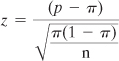
In the early 1970s, a cause célèbre put a little-known statistical phenomenon on the front pages—at least on the front pages of the Berkeley student newspapers. A lawsuit was brought against the University of California, alleging that discrimination against women was occurring in the admissions process at the Berkeley campus. Figure 5.15 presents the damning evidence.
Figure 5.15. Men were admitted to graduate study at Berkeley with disproportionate frequency.
Forty-four percent of men were admitted to graduate study at Berkeley in 1973, compared to only 35% of women. This is pretty clear prima facie evidence of sex discrimination. The expected frequencies are shown in cells H3:I4 and are tested against the observed frequencies, returning a chi-square of 111.24 in cell C8. The CHISQ.DIST.RT() function returns a probability of less than .001 for such a large chi-square with 1 degree of freedom. This makes it very unlikely that admission and sex were independent of one another. The OJ Simpson jury took longer than a Berkeley jury would have.
Some Berkeley faculty and staff (Bickel, Hammel, and O’Connell, 1975) got involved and, using work done by Karl Pearson (of the Pearson correlation coefficient) and a Scot named Udny Yule, dug more deeply into the numbers. They found that when information about admissions to specific departments was included, the apparent discrimination disappeared. Furthermore, more often than not women enjoyed higher admission rates than did men. Figure 5.16 shows some of that additional data.
Figure 5.16. Information about department admission rates shows that women applied more often where admission rates were lowest.

There were 101 graduate departments involved. The study’s authors found that women were disproportionately more likely to apply to departments that were overall more difficult to gain admission to. This is illustrated in Figure 5.16, which provides the data for six of the largest departments. (The pattern was not substantially different across the remaining 95 departments.)
Notice cells C3:D8 and F3:G8, which show the raw numbers of male and female applicants as well as the outcomes of their applications. That data is summarized in row 9, where you can see that the aggregated outcome for these six departments echoes that shown in Figure 5.15 for all departments. About 45% of men and about 30% of women were admitted.
Compare that with the data in cells I3:J8 in Figure 5.16. There you can see that women’s acceptance rates were higher than men’s in Departments 1, 2, 4, and 6. Women’s acceptance rates lagged men’s by 3% in Department 3 and by 4% in Department 5.
This pattern reversal is so striking that some have termed it a “paradox,” specifically Simpson’s paradox after the statistician who wrote about it a half century after Yule and Pearson’s original work. But it is not in fact a paradox. Compare the application rates with the admission rates in Figure 5.16.
Note
This effect is not limited to contingency tables. It affects the results of tests of two or more means, for example, and in that context is called the Behrens-Fisher problem. It is discussed in that guise in Chapter 9, “Testing Differences Between Means: Further Issues.”
Departments 1 and 2 have very high admission rates compared with the other four departments. But it’s the two departments with the highest admission rates that have the lowest application rates from females. About ten times as many males applied to those departments as females, and that’s where the admission rates were highest.
Contrast that analysis with Departments 5 and 6, which had the two lowest admission rates. There, women were twice as likely as men to apply (Department 5) or just as likely to apply (Department 6).
So one way of looking at the data is suggested in Figure 5.15, which ignores departmental differences in admission rates: Women’s applications are disproportionately rejected.
Another way of looking at the data is suggested in Figure 5.16: Some departments have relatively high admission rates, and a disproportionately large number of men apply to those departments. Other departments have relatively low admission rates, regardless of the applicant’s sex, and a disproportionately large number of women apply to those departments.
Neither this analysis nor the original 1975 paper proves why admission rates differ, either in men’s favor in the aggregate or in women’s favor when department information is included. All they prove is that you have to be very careful about assuming that one variable causes another when you’re working with survey data or with “grab samples”—that is, samples that are simply close at hand and therefore convenient. The Berkeley graduate admissions data is far from the only published example of the Yule Simpson effect. Studies in the areas of medicine, education, and sports have exhibited similar outcomes.
I don’t mean to imply that the use of a true experimental design, with random selection and random assignment to groups, would have prevented the initial erroneous conclusion in the Berkeley case. An experimenter would have to direct students to apply to randomly selected departments, which is clearly impractical. (Alternatively, bogus applications would have to be made and evaluated, after which the experimenter would have difficulty finding another test bed for future research.) Although a true experimental design usually makes it possible to interpret results sensibly, it’s not always feasible.
Summarizing the Chi-Square Functions
In versions of Excel prior to Excel 2010, just three functions are directly concerned with chi-square: CHIDIST(), CHIINV(), and CHITEST(). Their purposes, results, and arguments are completely replicated by functions introduced in Excel 2010. Those new functions are discussed next, and their relationships to the older, “compatibility” functions are also noted.
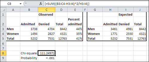
Using CHISQ.DIST()
The CHISQ.DIST() function returns information about the left side of the chi-square distribution. You can call for either the relative frequency of a chi-square value or the cumulative frequency—that is, the cumulative area or probability—at the chi-square value you supply.
Note
Excel functions return cumulative areas that are directly interpretable as the proportion of the total area under the curve. Therefore, they can be treated as cumulative probabilities, from the leftmost point on the curve’s horizontal axis through the value that you have provided to the function, such as the chi-square value to CHISQ.DIST().
The syntax of the CHISQ.DIST() function is
=CHISQ.DIST(X, Df, Cumulative)
where:
• X is the chi-square value.
• Df is the degrees of freedom for chi-square.
• Cumulative indicates whether you want the cumulative area or the relative frequency.
If you set Cumulative to TRUE, the function returns the cumulative area to the left of the chi-square you supply, and is the probability that this chi-square or a smaller one will occur among the chi-square values with a given number of degrees of freedom.
Because of the way most hypotheses are framed, it’s usual that you want to know the area—the probability—to the right of a given chi-square value. Therefore, you’re more likely to want to use CHISQ.DIST.RT() than CHISQ.DIST()—see “Using CHISQ.DIST.RT() and CHIDIST()” for a discussion of CHISQ.DIST.RT().
If you set Cumulative to FALSE, the function returns the relative frequency of the specific chi-square value in the family of chi-squares with the degrees of freedom you specified. You seldom need this information for hypothesis testing, but it’s very useful for charting chi-square, as shown in Figure 5.17.
Figure 5.17. CHISQ.DIST() returns the height of the curve when Cumulative is FALSE, and returns the area under the curve when Cumulative is TRUE.
Note
The only chi-square function with a Cumulative argument is CHISQ.DIST(). There is no Cumulative argument for CHISQ.INV() and CHISQ.INV.RT() because they return axis points, not values that represent either relative frequencies (the height of the curve) or probabilities (the area under the curve, which you call for by setting the Cumulative argument to TRUE). There is no Cumulative argument for CHISQ.DIST.RT because the cumulative area is the default result; you can get the curve height at a given chi-square value using CHISQ.DIST().
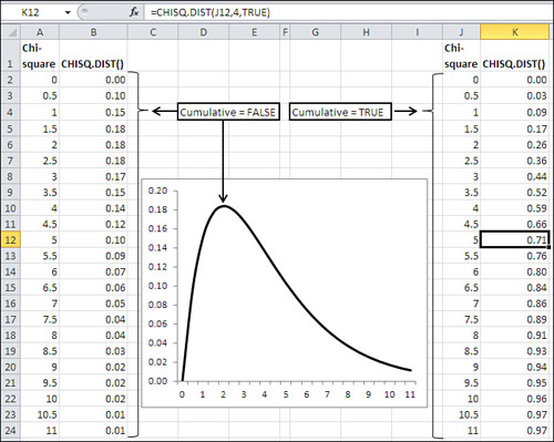
Using CHISQ.DIST.RT() and CHIDIST()
The Excel 2010 function CHISQ.DIST.RT() and the “compatibility” function CHIDIST() are equivalent as to arguments, usage, and results. The syntax is
=CHISQ.DIST.RT(X, Df)
• X is the chi-square value.
• Df is the degrees of freedom for chi-square.
There is no Cumulative argument. CHISQ.DIST.RT() and CHIDIST() both return cumulative areas only, and do not return relative frequencies. To get relative frequencies you would use CHISQ.DIST() and set Cumulative to FALSE.
When you want to test a null hypothesis using chi-square, as has been done earlier in this chapter, it’s likely that you will want to use CHISQ.DIST.RT() or, equivalently, CHIDIST(). The larger the departure of a sample observation from a population parameter such as a proportion, the larger the associated value of chi-square. (Recall that to calculate chi-square, you square the difference between the sample observation and the parameter, thereby eliminating negative values.)
Therefore, under a null hypothesis such as that of the independence of two fields in a contingency table, you would want to know the likelihood of a relatively large observation. As you can see in Figure 5.18, a chi-square of 10 (cell A22) is found in the rightmost 4% (cell B22) of a chi-square distribution that has 4 degrees of freedom (cell E1).
Figure 5.18. The farther to the right you get in a chi-square distribution, the larger the value of chi-square and the less likely you are to observe that value purely by chance.
That tells you that only 4% of samples from a population where two variables, of three levels each, are independent of one another would result in a chi-square value as large as 10. So it’s 96% to 4%, or 24 to 1, against a chi-square of 10 under whatever null hypothesis you have adopted: for example, no association between classifications in a 3-by-3 contingency table.
Using CHISQ.INV()
CHISQ.INV() returns the chi-square value that defines the right border of the area in the chi-square distribution that you specify, for the degrees of freedom that you specify. The syntax is
=CHISQ.INV(Probability, Df)
where:
• Probability is the area in the chi-square distribution to the left of the chi-square value that the function returns.
• Df is the number of degrees of freedom for the chi-square value.
So the expression CHISQ.INV(.3, 4) returns the chi-square value that divides the leftmost 30% of the area from the rightmost 70% of the area under the chi-square curve that has 4 degrees of freedom.
CHISQ.INV()_is closely related to CHISQ.INV.RT(), as you might expect. CHISQ.INV() equals 1 − CHISQ.INV.RT(), which is discussed next.
Recall that the chi-square distribution is built on squared z-scores, which themselves involve the difference between an observation and a mean value. Your interest in the probability of observing a given chi-square value, and your interest in that chi-square value itself, usually centers on areas that are in the right tail of the distribution. This is because the larger the difference between an observation and a mean value—whether that difference is positive or negative—the larger the value of chi-square, because the difference is squared.
Therefore, you normally ask, “What is the probability of obtaining a chi-square this large if my null hypothesis is true?” You do not tend to ask, “What is the probability of obtaining a chi-square value this small if my null hypothesis is true?”
In consequence, and as a practical matter, you will not have much need for the CHISQ.INV() function. It returns chi-square values that bound the left end of the distribution, but your interest is normally focused on the right end.
Using CHISQ.INV.RT() and CHIINV()
As is the case with BINOM.DIST(), CHISQ.DIST.RT() returns the probability; you supply the chi-square value and degrees of freedom. And as with BINOM.INV(), CHISQ.INV.RT() returns the chi-square value; you supply the probability and the degrees of freedom. (So does the CHIINV() compatibility function.)
This can be helpful when you know the probability that you will require to reject a null hypothesis, and simply want to know what value of chi-square is needed to do so, given the degrees of freedom.
These two procedures come to the same thing:
Determine a Critical Value for Chi-Square Before Analyzing the Experimental Data
Decide in advance on a probability level to reject a null hypothesis. Determine the degrees of freedom for your test based on the design of your experiment. Use CHISQ.INV.RT() to fix a critical value of chi-square in advance, given the probability level you require and the degrees of freedom implied by the design of your experiment. Compare the chi-square from your experimental data with the critical value of chi-square from CHISQ.INV.RT() and retain or reject the null hypothesis accordingly.
This is a formal, traditional approach, and enables you to state with a little more assurance that you settled on your decision rules before you saw the experimental outcome.
Decide Beforehand on the Probability Level Only
Select the probability level to reject a null hypothesis in advance. Calculate the chi-square from the experimental data and use CHISQ.DIST.RT() and the degrees of freedom to determine whether the chi-square value falls within the area in the chi-square distribution implied by the probability level you selected. Retain or reject the null hypothesis accordingly.
This approach isn’t quite so formal, but it results in the same outcome as deciding beforehand on a critical chi-square value. Both approaches work, and it’s more important that you see why they are equivalent than for you to decide which one you prefer.
Using CHISQ.TEST() and CHITEST()
The CHISQ.TEST() consistency function and the CHITEST() compatibility function both return the probability of observing a pattern of cell counts in a contingency table when the classification methods that define the table are independent of one another.
For example, in terms of the Berkeley study cited earlier in this chapter, those classifications are sex and admission status.
The syntax of CHISQ.TEST() is
=CHISQ.TEST(observed frequencies, expected frequencies)
where each argument is a worksheet range of values such that the ranges have the same dimensions. The arguments for CHITEST() are identical to those for CHISQ.TEST().
The expected frequencies are found by taking the product of the associated marginal values and dividing by the total frequency. Figure 5.19 shows one way that you can generate the expected frequencies.
Figure 5.19. If you set up the initial formula properly with mixed and absolute references, you can easily copy and paste it to create the remaining formulas.

In Figure 5.19, cells H3:J5 display the results of formulas that make use of the observed frequencies in cells B3:E5. The formulas in H3:J5 are displayed in cells H10:J12.
The formula in cell H3 is =$D3*B$5/$D$5.
Ignore for a moment the dollar signs that result in mixed and absolute cell references. This formula instructs Excel to multiply the value in cell D3 (the total men) by the value in cell B5 (the total admitted) and divide by the value in cell D5 (the total of the cell frequencies). The result of the formula, 3461, is what you would estimate to be the number of male admissions if all you knew was the number of men, the number of admissions, the number applying, and that sex and admission status were independent of one another.
The other three estimated cells are filled in via the same approach: Multiply the marginal frequencies for each cell and divide by the total frequency.
Using Mixed and Absolute References to Calculate Expected Frequencies
Now notice the mixed and absolute referencing in the prior formula for cell H3. The column marginal, cell D3, is made a mixed reference by anchoring its column only. Therefore, you can copy and paste, or drag and drop, the formula to the right without changing the reference to the males’ column, column D.
Similarly, the row marginal, cell B5, is made a mixed reference by anchoring its row only. You can copy and paste it down without changing its row.
Lastly, the total frequencies cell, D5, is made absolute by anchoring both its row and column. You can copy the formula anywhere and the pasted formula will still divide by the value in D5.
Notice how easy this makes things. If you take the prior formula
=$D3*B$5/$D$5
and drag it one column to the right, you get this formula:
=$D3*C$5/$D$5
The result is to multiply by C5 instead of B5, by total denied instead of total admitted. You continue to use D3, total men. And the result is the estimate of the number of men denied admission.
And if you drag it one row down, you get this formula:
=$D4*B$5/$D$5
Now you are using cell D4, total women instead of total men. You continue to use B5, total admitted. And the result is the estimate of the number of women admitted.
In short, if you set up your original formula properly with mixed and absolute references, it’s the only one you need to write. Once you’ve done that, drag it right to fill in the remaining cells in its row. Then drag those cells down to fill in the remaining cells in their columns.
With the range that contains the observed frequencies and the range that contains the computed, expected frequencies, you can use CHISQ.TEST() to determine the probability of observing those frequencies given the expected frequencies, which assume no dependence between sex and admission status:
=CHISQ.TEST(B3:C4,H3:I4)
As noted earlier in the chapter, you bypass the calculation of the chi-square value itself and get the probability directly in the cell where you enter the CHISQ.TEST() function. There’s no need to supply the degrees of freedom because CHISQ.TEST() can calculate them itself, noting the number of rows and columns in either the observed or in the expected frequencies range.
Using the Pivot Table’s Index Display
As easy as it is to generate the expected frequencies in a 2-by-2 contingency table, it can get complicated when you’re dealing with more rows and columns, or with a different number of rows and columns, or with a third classification.
If your original data is in the form of a list that you’ve used to create a pivot table, you can display the counts as an Index. This simplifies the task of getting the expected frequencies. Figure 5.20 shows an example.
Figure 5.20. The Index display helps you move from observed to expected frequencies.
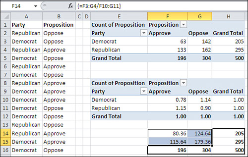
The first pivot table in Figure 5.20 shows the normal result of showing the count in cells defined by two nominal variables. It repeats the analysis shown in Figure 5.9.
The second pivot table, found in E8:H12, uses the same source data as the first pivot table and is structured identically. However, it shows what Excel terms the Index. To get that display, take these steps:
- Replicate the first pivot table. You can either build a second pivot table from scratch or simply copy and paste the first pivot table.
- Right-click in any one of the summary cells of the second pivot table. The shortcut menu contains a Show Values As item.
- Move your mouse pointer over the Show Values As item to display a cascading menu that contains the Index item. Click Index.
Note
If you’re using Excel 2007, follow the instructions in the note in this chapter’s section, “Understanding One-Way Pivot Tables.” Choose Index from the Show Values As drop-down.
The final task is to divide the observed frequencies by the index values. That is done in cells F14:G15 of Figure 5.20 by means of this array formula:
=F3:G4/F10:G11
The result is the expected cell frequencies, based on the marginal frequencies, assuming no dependency between sex and admission status. There is no need to structure an initial formula properly, either as to pointing it at the correct marginal frequencies or as to changing the correct cell references from relative to mixed.