
4. How Variables Move Jointly: Correlation
Chapter 2, “How Values Cluster Together,” discussed how the values on one variable can tend to cluster together at an average of some sort—a mean, a median, or a mode. Chapter 3, “Variability: How Values Disperse,” discussed how the values of one variable fail to cluster together: how they disperse around a mean, as measured by the standard deviation and its close relative, the variance.
This chapter begins a look at how two or more variables covary: that is, how higher values on one variable are associated with higher values on another, and how lower values on the two variables are also associated. The reverse situation also occurs frequently, when higher values on one variable are associated with lower values on another variable.
Understanding Correlation
The degree to which two variables behave in this way—that is, the way they covary—is called correlation. A familiar example is height and weight They have what’s called a positive correlation: High values on one variable are associated with high values on the other variable (see Figure 4.1).
Figure 4.1. A positive correlation appears in a chart as a general lower-left to upper-right trend.
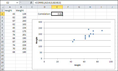
The chart in Figure 4.1 has a marker for each of the 12 people whose height and weight appear in cells A2:B13. Generally, the lower the person’s height (according to the horizontal axis), the lower the person’s weight (according to the vertical axis), and the greater the weight, the greater the height.
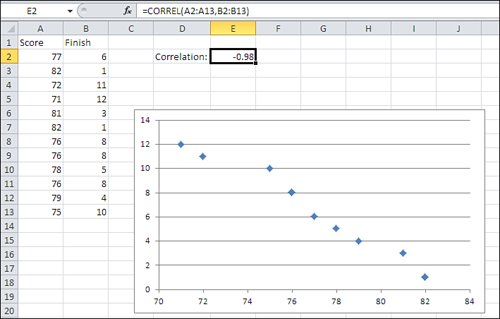
The reverse situation appears in Figure 4.2, which charts the number of points scored in a game against the order of each player’s finish. The higher the number of points, the lower (that is, the better) the finish. That’s an example of a negative correlation: Higher values on one variable are associated with lower values on the other variable.
Figure 4.2. A negative correlation appears as a general upper-left to lower-right trend.
Notice the figure in cell E2 of both Figure 4.1 and 4.2. It is the correlation coefficient. It expresses the strength and direction of the relationship between the two variables. In Figure 4.1, the correlation coefficient is .82, a positive number. Therefore, the two variables vary in the same direction: Higher values on one variable are associated with higher values on the other variable.
In Figure 4.2, the correlation coefficient is −.98, a negative number. Therefore, the relationship between the two variables is a negative one, indicated by the direction of the trend in Figure 4.2’s chart.
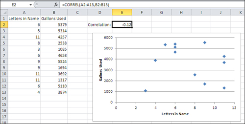
The correlation coefficient, or r, can take on values that range from −1.0 to +1.0. The closer that r is to plus or minus 1.0, the stronger the relationship. When two variables are unrelated, the correlation that you might calculate between the two of them should be close to 0.0. For example, Figure 4.3 shows the relationship between the number of letters in a person’s last name and the number of gallons of water that person’s household uses in a month.
Figure 4.3. Two uncorrelated variables tend to display a relationship such as this one: a random spray of markers on the chart.
The Correlation, Calculated
Notice the formula in the formula bar shown in Figure 4.3:
=CORREL(A2:A13,B2:B13)
The fact that you’re calculating a correlation coefficient at all implies that there are two or more variables to deal with—remember that the correlation coefficient r expresses the strength of a relationship between two variables. In Figures 4.1 through 4.3, two variables are found: one in column A, one in column B.
The arguments to the CORREL() function indicate where the values of those two variables are to be found in the worksheet. One variable, one set of values, is in the first range (here, A2:A13), and the other variable and its values is in the second range (here, B2:B13).
In the arguments to the CORREL() function it makes no difference which variable you identify first. The formula that calculates the correlation in Figure 4.3 could just as well have been this:
=CORREL(B2:B13,A2:A13)
In each row of the ranges that you hand off to CORREL() there should be two values associated with the same person or object. In Figure 4.1, which demonstrates the correlation between height and weight, row 2 could have John’s height in column A and his weight in column B; it could have Pat’s height in column A and weight in column B, and so on.
The important point to recognize is that r expresses the strength of a relationship between two variables. The only way to measure that relationship is to take the values of the variables on a set of people or things and then maintain the pairing for the statistical analysis. In Excel, you do that by putting the two measures in the same row. You could calculate a value for r if, for example, John’s height were in A2 and his weight in B4—that is, the values could be scattered randomly through the rows—but the result of your calculation would be incorrect. Excel assumes that two values in the same row of a list go together and that they constitute a pair.
In the case of the CORREL() function, from a purely mechanical standpoint all that’s really necessary is that the related observations occupy the same relative positions in the two arrays. If, for some reason, you wanted to use A2:A13 and B3:B14 instead of A2:A13 and B2:B13, all would be well as long as John’s data is in A2 and B3, Pat’s in A3 and B4, and so on.
However, that structure, A2:A13 and B3:B14, doesn’t conform to the rules governing Excel’s lists and tables. As I’ve described it that structure would work, but it could easily come back to bite you. Unless you have some compelling reason to do otherwise, keep measures that belong to the same person or object in the same row.
Note
If you have some experience using Excel to calculate statistics, you may be wondering when this chapter is going to get around to the PEARSON() function. The answer is that it won’t. Excel has two worksheet functions that calculate r: CORREL() and PEARSON(). They take the same arguments and return precisely the same results. There is no good reason for this duplicated functionality: When I informed a product manager at Microsoft about it in 1995, he responded, “Huh.”
Karl Pearson developed the correlation coefficient that is returned by the Excel functions CORREL() and PEARSON() in the late nineteenth century. The abbreviations r (for the statistic) and ρ (rho, the Greek r, for the parameter) stand for regression, a measure that’s closely related to correlation, and about which this book will have much more to say in this and subsequent chapters.
Anything that this book has to say about CORREL() applies to PEARSON(). I prefer CORREL() simply because it has fewer letters to type.
So, as is the case with the standard deviation and the variance, Excel has a function that calculates the correlation on your behalf, and you need not do all the adding and subtracting, multiplying and dividing yourself. Still, a look at one of the calculation formulas for r can help provide some insight into what it’s about. The correlation is based on the covariance, which is symbolized as sxy:
![]()
That formula may look familiar if you’ve read Chapter 3. There, you saw that the variance is calculated by subtracting the mean from each value and squaring the deviation—that is, multiplying the deviation by itself: ![]() or
or ![]() .
.
In the case of the covariance, you take a deviation score from one variable and multiply it by the deviation score from the other variable: ![]() .
.
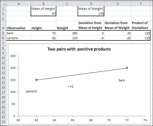
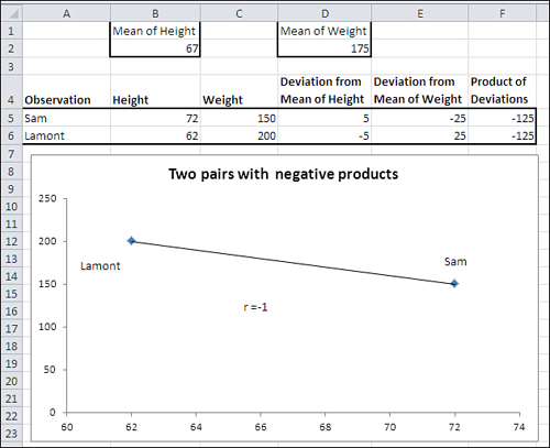
To see the effect of calculating the covariance in this way, suppose that you have two variables, height and weight, and a pair of measurements of those variables for each of two men (see Figure 4.4).
Figure 4.4. Large deviations on one variable paired with large deviations on the other result in a larger covariance.
Note
Notice that the denominator in the formula for the covariance is N − 1. The reason is the same as it is with the variance, discussed in Chapter 3: In a sample, from which you want to make inferences about a population, degrees of freedom instead of N is used to make the estimate independent of sample size.
Along the same lines, notice from its formula that the covariance of a variable with itself is simply the variable’s variance.
In Figure 4.4, one person (Sam) weighs more than the mean weight of 175, and he also is taller than the mean height of 67 inches. Therefore, both of Sam’s deviation scores, his measure minus the mean of that measure, will be positive (see cells D5 and E5 of Figure 4.4). And therefore the product of his deviation scores must also be positive (see cell F5).
In contrast, Lamont weighs less than the mean weight and is shorter than the mean height. Therefore, both his deviation scores will be negative (cells D6 and E6). However, the rule for multiplying two negative numbers comes into play, and Lamont winds up with a positive product for the deviation scores in cell F6.
These two deviation products, which are both 125, are totaled in this fragment from the equation for the covariance (the full equation is given earlier in this section):
![]()
Their combined effect of summing the two deviation products is to move the covariance away from a value of zero: Sam’s product of 125 moves it from zero, and Lamont’s product, also 125, moves it even further from zero.
Notice the diagonal line in the chart in Figure 4.4. That’s called a regression line (or, in Excel terms, a trendline). In this case (as is true of any case that has just two records), both markers on the chart fall directly on the regression line. When that happens, the correlation is perfect: either +1.0 or −1.0. Perfect correlations are the result of either the analysis of trivial outcomes (for example, the correlation between degrees Fahrenheit and degrees Celsius) or examples in statistics textbooks. The real world of experimental measurements is much more messy.
We can derive a general rule from this example: When each pair of values consists of two positive deviations, or two negative deviations, the result is for each record to push the covariance further from zero. The eventual result will be to push the correlation coefficient away from zero and toward +1.0. This is as it should be: The stronger the relationship between two variables, the further the correlation is from 0.0. The more that high values on one variable go with high values on the other (and low values on one go with low values on the other), the stronger the relationship between the two variables.
What about a situation in which each person is relatively high on one variable and relatively low on the other? See Figure 4.5 for that analysis.
Figure 4.5. The covariance is as strong as in Figure 4.4, but it’s negative.
In Figure 4.5, the relationship between the two variables has been reversed. Now, Sam is still taller than the mean height (positive deviation in D5) but weighs less than the mean weight (negative deviation in E5). Lamont is shorter than the mean height (negative deviation in D6) but weighs more than the mean weight (positive deviation in E6).
The result is that both Sam and Lamont have negative deviation products in F5 and F6. When they are totaled, their combined effect is to push the covariance away from zero. The relationship is as strong as it is in Figure 4.4, but its direction is different.
The strength of the relationship between variables is measured by the size of the correlation and has nothing to do with whether the correlation is positive or negative. For example, the correlation between body weight and hours per week spent jogging might be a strong one. But it would likely be negative, perhaps −0.6, because you would expect that the more time spent jogging the lower the body weight.
Weakening the Relationship
Lastly, Figure 4.6 shows what happens when you mix positive with negative deviation products.
Figure 4.6. Peter’s deviation product is negative, whereas Sam’s and Lamont’s are still positive.
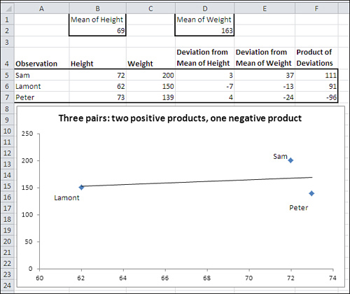
Figure 4.6 shows that Sam and Lamont’s deviation products are still positive (cells F5 and F6). However, adding Peter to the mix weakens the observed relationship between height and weight. Peter’s height is above the mean of height, but his weight is below the mean of weight. The result is that his height deviation is positive, his weight deviation is negative, and the product of the two is therefore negative.
This has the effect of pulling the covariance back toward zero, given that both Sam and Lamont have positive deviation products. It is evidence of a weaker relationship between height and weight: Peter’s measurements tell us that we can’t depend on tall height pairing with heavy weight and short height pairing with low weight, as is the case with Sam and Lamont.
When the observed relationship weakens, so does the covariance (it’s closer to zero in Figure 4.6 than in Figures 4.4 and 4.5). Inevitably, the correlation coefficient gets closer to zero: It’s shown as r in the charts in Figures 4.4 and 4.5, where it’s a perfect 1.0 and −1.0.
In Figure 4.6, r is much weaker: .27 is a weak correlation for continuous variables such as height and weight.
Notice in Figure 4.6 that Sam and Peter’s data markers do not touch the regression line. That’s another aspect of an imperfect correlation: The plotted data points deviate from the regression line. Imperfect correlations are expected with real-world data, and deviations from the regression line are the rule, not the exception.
Moving from the Covariance to the Correlation
Even without Excel’s CORREL() function, it’s easy to get from the covariance to the correlation. The definitional formula for the correlation coefficient between variable x and variable y is as follows:
![]()
In words, the correlation is equal to the covariance (sxy) divided by the product of the standard deviation of x (sx) and the standard deviation of y (sy). The division removes the effect of the standard deviations of the two variables from the measurement of their relationship. Taking the spread of the two variables out of the correlation fixes the limits of the correlation coefficient to a minimum of −1.0 (perfect negative correlation) and a maximum of +1.0 (perfect positive correlation) and a midpoint of 0.0 (no observed relationship).
I’m stressing the calculations of the covariance and the correlation coefficient because they can help you understand the nature of these two statistics. When relatively large values on both variables go together, the covariance is larger than otherwise. A larger covariance results in a larger correlation coefficient.
In practice, you almost never do the actual calculations, but leave them to the Excel worksheet functions CORREL() for the correlation coefficient and COVAR() for the covariance.
Using the CORREL() Function
Figure 4.7 shows how you might use the CORREL() function to look into the relationship between two variables that interest you. Suppose that you’re a loan officer at a company that provides home loans and you want to examine the relationship between purchase prices and buyers’ annual income for loans that your office has made during the past month.
Figure 4.7. It’s always a good idea to validate the correlation with a chart.
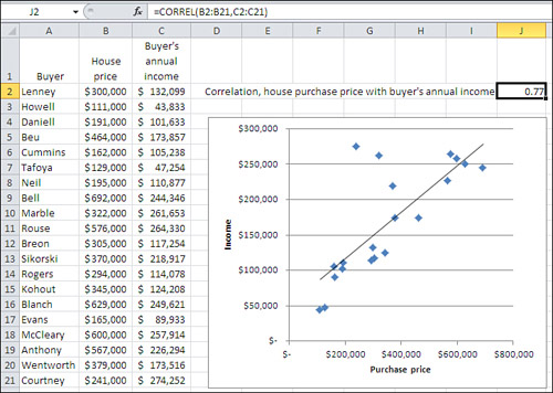
You gather the necessary data and enter it into an Excel worksheet as shown in columns A through C of Figure 4.7.
Notice in Figure 4.7 that there’s a value—here, the buyer’s name in column A—that uniquely identifies each pair of values. Although an identifier like that isn’t at all necessary for calculating a correlation coefficient, it can be a big help in verifying that a particular record’s values on the two variables actually belong together. For example, without the buyer’s name in column A, it would be more difficult to check that the Neil’s house cost $195,000 and their annual income is $110,877. If you don’t have the values on one variable paired with the proper values on the other variable, the correlation coefficient will be calculated correctly only by accident. Therefore, it’s good to have a way of making sure that, for example, the Neil’s income of $110,877 matches up with the cost of $195,000.
Note
Formally, the only restriction is that two measures of the same record occupy the same relative position in the two arrays, as noted earlier in “The Correlation, Calculated.” I recommend that each value for a given record occupy the same row because that makes the data easier to validate, and because you frequently want to use CORREL() with columns in a list or table as its arguments. Lists and tables operate correctly only if each value for a given record is on the same row.
You would get the correlation between housing price and income in the present sample easily enough. Just enter the following formula in some worksheet cell, as shown in cell J2 in Figure 4.7:
=CORREL(B2:B21,C2:C21)
Simply getting the correlation isn’t the end of the job, though. Correlation coefficients can be tricky. Here are two ways they can steer you wrong:
• There’s a strong relationship between the two variables, but the normal correlation coefficient, r, obscures that relationship.
• There’s no strong relationship between the two variables, but one or two highly unusual observations make it seem as though there is one.
Figure 4.8 shows an example of a strong relationship that r doesn’t tell you about.
Figure 4.8. The relationship is not linear, and r assumes linear relationships.
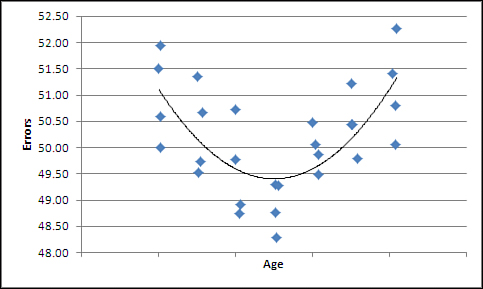
If you were to simply calculate the standard Pearson correlation coefficient by means of CORREL() on the data used for Figure 4.8, you’d miss what’s going on. The Pearson r assumes that the relationship between the two variables is linear—that is, it calculates a regression line that’s straight, as it is in Figure 4.7. Figure 4.8 shows the results you might get if you charted age against number of typographical errors per 1,000 words. Very young people whose hand-eye coordination is still developing tend to make more errors, as do those in later years as their visual acuity starts to fade.
A measure of nonlinear correlation indicates that there is a .75 correlation between the variables. But the Pearson r is calculated by CORREL() at 0.08 because it’s not designed to pick up on a nonlinear relationship. You might well miss an important result if you didn’t chart the data.
A different problem appears in Figure 4.9.
Figure 4.9. Just one outlier can overstate the relationship between the variables.
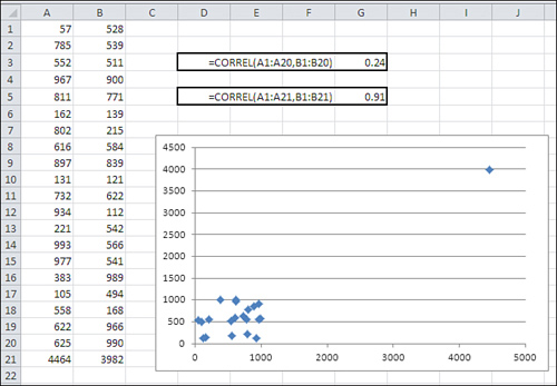
In Figure 4.9, two variables that are only weakly related are shown in cells A1:B20 (yes, B20, not B21). The correlation between them is shown in cell G3: It is only .24.
Somehow, because of a typo or incorrect readings on meters or a database query that was structured ineptly, two additional values appear in cells A21:B21. When those two values are included in the arguments to the CORREL() function, the correlation changes from a weak 0.24 to quite a strong 0.91.
This happens because of the way the covariance, and therefore the correlation, is defined. Let’s review a covariance formula given earlier:
The expression in the numerator multiplies an observation’s deviation from the mean of X times the observation’s deviation from the mean of Y. The addition of that one record, where both the X and the Y values deviate by thousands of units from the means of the two variables, inflates the covariance and the correlation far above their values based on the first 20 records.
You might not have realized what was going on without the accompanying XY chart. There you can see the one observation that turns what is basically no relationship into a strong one. Of course, it’s possible that the one outlier is entirely legitimate. But in that case, it might be that the standard correlation coefficient is not an appropriate expression of the relationship between the two variables (any more than the mean is an appropriate expression of central tendency in a distribution that’s highly skewed).
Make it a habit to create XY charts of variables that you investigate via correlation analysis. The standard r, the Pearson correlation coefficient, is the basis for many sophisticated statistical analyses, but it was not designed to assess the strength of relationships that are either nonlinear or contain extreme outliers.
Fortunately, Excel makes it very easy to create the charts. For example, to create the XY chart shown in Figure 4.9, take these steps:
- With raw data as shown in cells A1:B21, select any cell in that range.
- Click the Insert tab.
- Click the Scatter button in the Charts group.
- Click the Scatter with Only Markers type in the drop-down.
Using the Analysis Tools
Since the 1990s, Excel has included an add-in that provides a variety of tools that perform statistical analysis. In several Excel versions, Microsoft’s documentation has referred to it as the Analysis ToolPak. This book terms it the Data Analysis add-in, because that’s the label you see in the Ribbon once the add-in has been installed.
Many of the tools in the Data Analysis add-in are quite useful. One of them is the Correlation tool. There isn’t actually a lot of sense in deploying it if you have only two or three variables to analyze. Then, it’s faster to enter the formula with the CORREL() function on the worksheet yourself than it is to jump through the few hoops that Data Analysis puts in the way. With more than two or three variables, consider using the Correlation tool.
You can use this formula to quickly calculate the number of unique correlation coefficients in a set of k variables:
k * (k − 1) / 2
If you have three variables, then, you would have to calculate three correlations (3 * 2 / 2). That’s easy enough, but with four variables there are six possible correlations (4 * 3 / 2), and with five variables there are ten (5 * 4 / 2). Then, using the CORREL() function for each correlation gets to be time consuming and error prone, and that’s where the Data Analysis add-in’s Correlation tool becomes more valuable.
You get at the Data Analysis add-in much as you get at Solver; see Chapter 2 for an introduction to accessing and using the Solver add-in. With Excel 2007 or 2010, click the Ribbon’s Data tab and look for Data Analysis in the Analysis group. (In Excel 2003 or earlier, look for Data Analysis in the Tools menu.) If you find Data Analysis you’re ready to go, and you can skip forward to the next section, “Using the Correlation Tool.”
If you don’t see Data Analysis, you’ll need to make it available to Excel, and you might even have to install it from the installation disc or the downloaded installation utility.
Note
The Data Analysis add-in has much more than just a Correlation tool. It includes a tool that returns descriptive statistics for a single variable, tools for several inferential tests that are discussed in detail in this book, moving averages, and several other tools. If you intend to use Excel to carry out beginning-to-intermediate statistical analysis, I urge you to install and become familiar with the Data Analysis add-in.
The Data Analysis add-in might have been installed on your working disk but not yet made available to Excel. If you don’t see Data Analysis in the Analysis group of the Data tab, take these steps:
- In Office 2010, click the File tab and click Options in its navigation bar. In Office 2007, click the Office button and click the Excel Options button at the bottom of the menu.
- The Excel Options window opens. Click Add-Ins in its navigation bar.
- If necessary, select Excel Add-Ins in the Manage drop-down, and then click Go.
- The Add-Ins dialog box appears. If you see Analysis ToolPak listed, be sure its check box is filled. (Analysis ToolPak is an old term for this add-in.) Click OK.
You should now find Data Analysis in the Analysis group on the Data tab. Skip ahead to the section titled “Using the Correlation Tool.”
Things are a little quicker in versions of Excel prior to 2007. Choose Add-Ins from the Tools menu. Look for Analysis ToolPak in the Add-Ins dialog box, and fill its check box if you see it. Click OK. You should now find Data Analysis in the Tools menu.
If you do not find Analysis ToolPak in the Add-Ins dialog box, regardless of the version of Excel you’re using, you’ll need to modify the installation. You can do this if you have access to the installation disc or downloaded installation file. It’s usually best to start from the Control Panel. Choose Add or Remove Software, or Programs and Features, depending on the version of Windows that you’re running. Choose to change the installation of Office.
When you get to the Excel portion of the installation, click Excel’s expand box (the one with a plus sign inside a box). You’ll see another expand box beside Add-Ins. Click it to display Analysis ToolPak. Use its drop-down to select Run From My Computer, and then Continue and OK your way back to Excel.
Now continue with step 1 in the preceding list.
Using the Correlation Tool
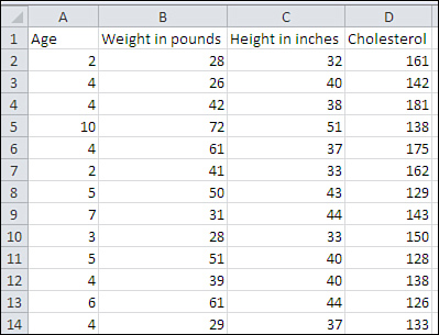
To use the Correlation tool in Data Analysis, begin with data laid out as shown in Figure 4.10.
Figure 4.10. The Correlation tool can deal with labels, so be sure to use them in the first row of your list.
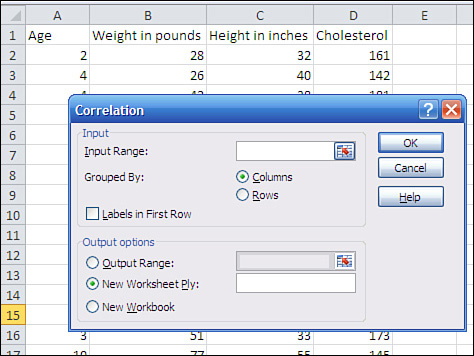
Then click Data Analysis in the Data tab’s Analysis group, and choose Correlation from the Data Analysis list box. Click OK to get the Correlation dialog box shown in Figure 4.11, and then follow these steps:
- Make sure that the Input Range box is active—if it is, you’ll see a flashing cursor in it. Use your mouse pointer to drag through the entire range where your data is located.
Tip
For me, the fastest way to select the data range is to start with the range’s upper-left corner. I hold down Ctrl+Shift and press the right arrow to select the entire first row. Then, without releasing Ctrl+Shift, I press the down arrow to select all the rows.
- If your data is laid out as a list, with different variables occupying different columns, make sure that the Columns option button is selected.
- If you used and selected the column headers supplied in Figure 4.11, make sure the Labels in First Row check box is filled.
- Click the Output Range option button if you want the correlation coefficients to appear on the same worksheet as the input data. (This is normally my choice.) Click in the Output Range edit box, and then click the worksheet cell where you want the output to begin. See the Caution that follows this list.
- Click OK to begin the analysis.
Figure 4.11. If you have labels at the top of your list, include them in the Input Range box.
Caution
The Correlation dialog box has a trap built into it, one that it shares with several other Data Analysis dialog boxes. When you click the Output Range option button, the Input Range edit box becomes active. If you don’t happen to notice that, you can think that you have specified a cell where you want the output to start, but in fact you’ve told Excel that’s where the input range is located.
After clicking the Output Range option button, reactivate its associated range edit box by clicking in it.
Almost immediately after you click OK, you’ll see the Correlation tool’s output, as shown in Figure 4.12.
Figure 4.12. The numbers shown in cells G2:J5 are sometimes collectively called a correlation matrix.
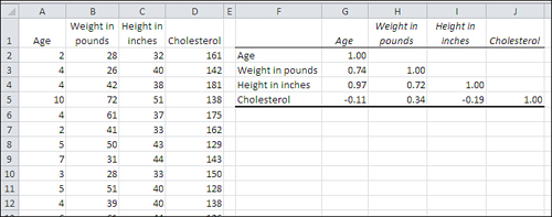
You need to keep some matters in mind regarding the Correlation tool. To begin, it gives you a square range of cells with its results (F1:J5 in Figure 4.12). Each row in the range, as well as each column, represents a different variable from your input data. The layout is an efficient way to show the matrix of correlation coefficients.
In Figure 4.12, the cells G2, H3, I4, and J5 each contain the value 1.0. Each of those four specific cells shows the correlation of one of the input variables with itself. That correlation is always 1.0. Those cells in Figure 4.12, and the analogous cells in other correlation matrixes, are collectively referred to as the main diagonal.
You don’t see correlation coefficients above the main diagonal because they would be redundant with those below it. You can see in cell H4 that for this sample, the correlation between height and weight is 0.72. Excel could show the same correlation in cell I3, but doing so wouldn’t add any new information: The correlation between height and weight is the same as the correlation between weight and height.
The suppression of the correlation coefficients above the main diagonal is principally to avoid visual clutter. More advanced statistical analyses such as factor analysis often require the fully populated square matrix.
The Correlation tool, like some other Data Analysis tools, reports static values. For example, in Figure 4.12, the numbers in the correlation matrix are not formulas such as
=CORREL(A2:A31,B2:B31)
but rather the results of the formulas. In consequence, if even one number in the input range changes, or if you add or remove even one record from the input range, the correlation matrix does not automatically update to reflect the change. You must run the Correlation tool again if you want a change in the input data to result in a change in the output.
The Data Analysis add-in has problems—problems that date all the way back to its introduction in Excel 95. One, the Output Range issue, is described in a Caution earlier in this section. Another, concerning the tool named F-Test: Two Sample for Variances is discussed in some detail in Chapter 6, “Telling the Truth with Statistics.” The tool named ANOVA: Two Factor without Replication employs an old fashioned approach to repeated measures that involves some very restrictive assumptions. But the Data Analysis add-in is nevertheless a useful adjunct and I encourage you to install it and use it as needed.
Correlation Isn’t Causation
It can be surprisingly easy to see that changes in one variable are associated with changes in another variable, and conclude that one variable’s behavior causes changes in the other’s. For example, it might very well be true that the regularity with which children eat breakfast has a direct effect on their performance in school. Certainly, TV commercials assert that eating breakfast cereals enhances concentration.
But there’s an important difference between believing that one variable is related to another and believing that changes to one variable cause changes to another. Some observational research, relying on correlations between nutrition and achievement, concludes that eating breakfast regularly improves academic achievement. Other, more careful studies show that the question is more complicated: that variables such as absenteeism come into play, and that coaxing information out of a mass of correlation coefficients isn’t as informative or credible as a manufacturer of sugar-coated cereal flakes might wish.
Besides the issue of the complexity of the relationships, there are two general reasons, discussed next, that you should be very careful of assuming that a correlational relationship is also causal.
A Third Variable
It sometimes happens that you find a strong correlation between two variables that suggests a causal relationship. The classic example is the number of books in school district libraries and scores on the standardized SAT exams. Suppose you found a strong correlation—say, 0.7—between the number of books per student in districts’ libraries and the average performance by those districts’ students on the SATs. A first-glance interpretation might be that the availability of a larger number of books results in more knowledge, thus better outcomes on standardized tests.
A more careful examination might reveal that communities where the annual household income is higher have more in the way of property taxes to spend on schools and their libraries. Such communities also tend to spend more on other important aspects of children’s development, such as nutrition and stable home environments. In other words, children raised in wealthier districts are more likely to score well on standardized tests. In contrast, it is difficult to argue that simply adding more books to a school library will result in higher SAT scores. The third variable here, in addition to number of library books and SAT scores, is the wealth of the community.
Another example concerns the apparent relationship between childhood vaccinations and the incidence of autism. It has been argued that over the past several decades, vaccination has become more and more prevalent, as has autism. Some have concluded that childhood vaccines, or the preservatives used in their manufacture, cause autism. But close examination of studies that apparently supported that contention disclosed problems with the studies’ methods, in particular the methods used to establish an increased prevalence of autism. Further study has suggested that a third variable, more frequent and sophisticated tests for autism, has been at work, bringing about an increase in the diagnoses of autism rather than an increase in the prevalence of the condition itself.
Untangling correlation and causation is a problem. In the 1950s and 1960s, the link between cigarette smoking and lung cancer was debated on the front pages of newspapers. Some said that the link was merely correlation, and not causation. The only way to convincingly demonstrate causation would be by means of a true experiment: Randomly assign people to smoking and nonsmoking groups and force those in the former group to smoke cigarettes. Then, after years of enforced smoking or abstinence, compare the incidence of lung cancer in the two groups.
That solution is obviously both a practical and ethical impossibility. But it is generally conceded today that smoking cigarettes causes lung cancer, even in the absence of a true experiment. Correlation does not by itself mean causation, but when it’s buttressed by the findings of repeated observational studies, and when the effect of a third variable can be ruled out (both liquor and sleep loss were posited and then discarded as possible third variables causing lung cancer among smokers), it’s reasonable to conclude that causation is present.
The Direction of the Effect
Another possibility to keep in mind when you consider whether a correlation represents causation is that you might be looking at the wrong variable as the cause. If you find that the incidence of gun ownership correlates strongly with the incidence of violent crime, you might come to the conclusion that there’s a causal relationship. And there might be cause involved. However, without more rigorous experimentation, whether you conclude that “More guns result in more violent crime” or “People respond to more violent crime by buying more guns” is likely to depend more on your own political and cultural sensibilities than on empirical evidence.
Using Correlation
To this point, we have talked mostly about the concept of a correlation coefficient—how it is defined and how it can illuminate the nature of the relationship between two variables. That’s useful information by itself, but things go much further than that. For example, it’s probably occurred to you that if you know the value of one variable, you can predict the value of another variable that’s correlated with the first.
That sort of prediction is the focus of the remainder of this chapter. The basics discussed here turn out to be the foundation of several analyses discussed in later chapters. Used in this way, the technique goes by the name regression, which is the basis for the designation of the correlation coefficient, r.
Note
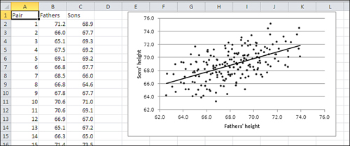
Why the word regression? In the nineteenth century, a scientist and mathematician named Francis Galton studied heredity and noticed that numeric relationships exist between parents and children as measured by certain standard variables. For example, Galton compared the heights of fathers to the heights of their sons, and he came to an interesting finding: Sons’ heights tended to be closer to their own mean than did the heights of their fathers.
Put another way, fathers who stood, say, two standard deviations above the mean height of their generation tended to have sons whose mean height was just one standard deviation above their own generation’s mean height. Similarly, fathers who were shorter than average tended to have sons who were also shorter than average, but who were closer to the average than their fathers were. The sons’ height regressed toward the mean.
Subsequent work by Karl Pearson, mentioned earlier in this chapter, built on Galton’s work and developed the concepts and methods associated with the correlation coefficient. Figure 4.13 shows some heights, in inches, of fathers and sons, and an XY chart showing visually how the two variables are associated.
Figure 4.13. The regression line shows where the data points would fall if the correlation were a perfect 1.0.
Given that two variables—here, fathers’ height and sons’ height—are correlated, it should be possible to predict a value on one variable from a value on the other variable. And it is possible, but the hitch is that the prediction will be perfectly accurate only when the relationship is of very limited interest, such as the relationship between weight in ounces and weight in grams. The prediction can be perfect only when the correlation is perfect, and that happens only in highly artificial or trivial situations.
The next section discusses how to make that sort of prediction without relying on Excel. Then I’ll show how Excel does it quickly and easily.
Removing the Effects of the Scale
Chapter 3 discussed the standard deviation and z-scores, and showed how you can express a value in terms of standard deviation units. For example, if you have a sample of ten people whose mean height is 68 inches with a standard deviation of four inches, then you can express a height of 72 inches as one standard deviation above the mean—or, equivalently, as a z-score of +1.0. So doing removes the attributes of the original scale of measurement and makes comparisons between different variables much clearer.
The z-score is calculated, and thus standardized, by subtracting the mean from a given value and dividing the result by the standard deviation. The correlation coefficient uses an analogous calculation. To review, the definitional formula of the correlation coefficient is
![]()
or, in words, the correlation is the covariance divided by the product of the standard deviations of the two variables. It is therefore standardized to range from 0 to plus or minus 1.0, uninfluenced by the unit of measure used in the underlying variables.
The covariance, like the variance, can be difficult to visualize. Suppose you have the weights in pounds of the same ten people, along with their heights. You might calculate the mean of their weights at 150 pounds and the standard deviation of their weights at 25 pounds. It’s easy to see a distance of 25 pounds on the horizontal axis of a chart. It’s more difficult to visualize the variance of your sample, which is 625 squared pounds—or even to comprehend its meaning.
Similarly, it can be difficult to comprehend the meaning of the covariance (unless you’re used to working with the measures involved, which is often the case for physicists and engineers—they’re usually familiar with the covariance of measures they work with, and sometimes term the correlation coefficient the dimensionless covariance).
In your sample of ten people, for example, you might have height measures as well as weight measures. If you calculate the covariance of height and weight in your sample, you might wind up with some value such as 58.5 foot-pounds. But this is not one of the classical meanings of “foot-pound,” a measure of force or energy. It is a measure of how pounds and feet combine in your sample. And it’s not always clear how you visualize or otherwise interpret that measurement.
The correlation coefficient resolves that difficulty in a way that’s similar to the z-score. You divide the covariance by the standard deviation of each variable, thus removing the effect of the two scales—here, height and weight—and you’re left with an expression of the strength of the relationship that isn’t affected by your choice of measure, whether feet or inches or centimeters, or pounds or ounces or kilograms. A perfect, one-to-one relationship is plus or minus 1.0. The absence of a relationship is 0.0. The correlations of most variables fall somewhere between the extremes.
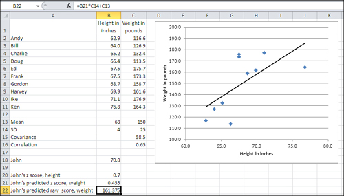
In the z-score you have a way to measure how far from the mean a person or object is found, without reference to the unit of measurement. Perhaps John’s height is 70.8 inches, or a z-score on height of 0.70. Perhaps the correlation between height and weight in your sample—again, uncontaminated by the scales of measurement—is 0.65. You can now predict John’s weight with this equation:
ZWeight = rZHeight
Put into words, John’s distance from the mean on weight is the product of the correlation coefficient and his distance from the mean on height. John’s z-score on weight equals the correlation r times his z-score on height, or .65 * .70, or .455. See Figure 4.14 for the specifics.
Figure 4.14. The regression line shows where the data points would fall if the correlation were a perfect 1.0.
Note
John’s z-score on weight (.455) is smaller than his z-score on height (.70). He has regressed toward the mean on weight, just as a son’s predicted height is closer to the mean than his father’s height. This regression always takes place when the correlation is not perfect: that is, when it is less than ±1.0. That’s inherent in the equation given above for weight and height, repeated here in a more general form: zy = rxyzx. Consider that equation and keep in mind that r is always between −1.0 and +1.0.
The mean weight in your sample is 150 pounds, and the standard deviation is 25. You have John’s predicted z-score for weight, 0.455, from the prior formula. You can change that into pounds by rearranging the formula for a z-score:

In John’s case, you have the following:
161.375 = 25 * 0.455 + 150
To verify this result, see cell B22 in Figure 4.14.
So, the correlation of .65 leads you to predict that John’s weighs 161.375 pounds. But then John tells you that he actually weighs 155 pounds. When you use a reasonably strong correlation to make predictions, you don’t expect your predictions to be exactly correct with any real frequency, any more than you expect the prediction for a tenth of an inch of rain tomorrow to be exactly correct. In both situations, though, you expect the prediction to be reasonably close most of the time.
Using the Excel Function
The prior section described how to use a correlation between two variables, plus a z-score on each variable, to predict a person’s weight in pounds from his height in inches. This involved multiplying one z-score by a correlation to get another z-score, and then converting the latter z-score to a weight in pounds by rearranging the formula for a z-score. Behind the scenes, it was also necessary to calculate the mean and standard deviation of both variables as well as the correlation between the two.
I inflicted all this on you because it helps illuminate the relationship between raw scores and covariances, between z-scores and correlations. As you would expect, Excel relieves you of the tedium of doing all that formulaic hand-waving.
Figure 4.15 shows the raw data and some preliminary calculations that the preceding discussion was based on.
Figure 4.15. The TREND() function takes care of all the calculations for you.
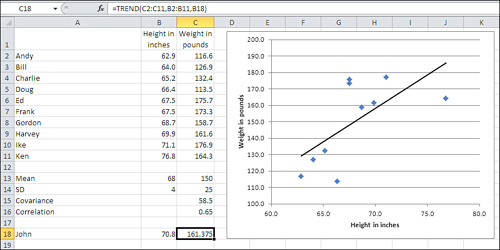
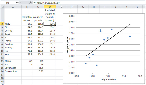
To predict John’s weight using the data as shown in Figures 4.14 and 4.15, enter this formula in some empty cell (it’s C18 in Figure 4.15):
=TREND(C2:C11,B2:B11,B18)
With this data set, the formula returns the value 161.375. To get the same value using the scenic route used in Figure 4.14, you could also enter the formula
=((B18-B13)/B14)*C16*C14+C13
which carries out the math that was sketched in the prior section: Calculate John’s z-score for height, multiply it by the correlation, multiply that by the standard deviation for weight, and add the mean weight. Fortunately, the TREND() function relieves you of all those opportunities to make a mistake.
The TREND() function’s syntax is as follows:
=TREND(known_y’s, known _x’s, new_x’s, const)
The first three arguments to TREND() are discussed next.
Note
The fourth argument, const, is optional. A section in Chapter 13, “Dealing with the Intercept,” discusses the reason you should omit the const argument, which is the same as setting it to FALSE. It’s best to delay that discussion until more groundwork has been laid.
known_y’s
These are values that you already have in hand for the variable you want to predict. In the example from the prior section, that variable is weight: the idea was to predict John’s weight on the basis of the correlation between height and weight, combined with knowledge of John’s height. It’s conventional in statistical writing to designate the predicted variable as Y, and its individual values as y’s.
known_x’s
These are values of the variable you want to predict from. Each must be paired up with one of the known_y’s. You’ll find that the easiest way to do this is to align two adjacent ranges as in Figure 4.15, where the known_x’s are in B2:B11 and the known_y’s are in C2:C11.
new_x’s
This value (or values) belongs to the predictor variable, but you do not have, or are not supplying, associated values for the predicted variable. There are various reasons that you might have new_x’s to use as an argument to TREND(), but the typical reason is that you want to predict y’s for the new_x’s, based on the relationship between the known_y’s and the known_x’s. For example, the known_x’s might be years: 1980, 1981, 1982, and so on. The known_y’s might be company revenue for each of those years. And your new_x might be next year’s number, such as 2012, for which you’d like to predict revenue.
Getting the Predicted Values
If you have only one new_x value to predict from, you can enter the formula with the TREND() function normally, just by typing it and pressing Enter. This is the situation in Figure 4.15, where you would enter =TREND(C2:C11,B2:B11,B18) in a blank cell such as C18 to get the predicted weight given the height in B18.
But suppose you want to know what the predicted weight of all the subjects in your sample would be, given the correlation between the two variables. TREND() does this for you, too: You simply need to array-enter the formula.
You start by selecting a range of cells with the same dimensions as is occupied by your known_x’s. In Figure 4.15, that’s B2:B11, so you might select D2:D11. Then type the formula =TREND(C2:C11,B2:B11) and array-enter it with Ctrl+Shift+Enter instead of simply Enter.
Note
Array formulas are discussed in more detail in Chapter 2, in the section titled “Using an Array Formula to Count the Values.”
The result appears in Figure 4.16.
Figure 4.16. The curly brackets around the formula in the formula box indicate that it’s an array formula.
You can get some more insight into the meaning of the trendline in the chart if you use the predicted values in D2:D11 of Figure 4.16. If you create an XY chart using the values in B2:B11 and D2:D11, you’ll find that you have a chart that duplicates the trendline in Figure 4.16’s chart.
So a linear trendline in a chart represents the unrealistic situation in which all the observations obediently follow a formula that relates two variables. But Ed eats too much and Doug isn’t eating enough. They, along with the rest of the subjects, stray to some degree from the perfect trendline.
If it’s unrealistic, what’s the point of including a trendline in a chart? It’s largely a matter of helping you visualize how far individual observations fall from the mathematical formula. The larger the deviations, the lower the correlation. The more that the individual points hug the trendline, the greater the correlation. Yes, you can get that information from the magnitude of the result returned by CORREL(). But there’s nothing like seeing it charted.
Note
Because so many options are available for chart trendlines, I have waited to even mention how you get one. For a trendline such as the one shown in Figures 4.14 through 4.16, click the chart to select it and then click the Layout tab in the Chart Tools section of the Ribbon. Click Trendline and then click Linear Trendline on the drop-down.
Getting the Regression Formula
An earlier section in this chapter, “Removing the Effects of the Scale,” discussed how you can use z-scores, means and standard deviations, and the correlation coefficient to predict one variable from another. The subsequent section, “Using the Excel Function,” described how to use the TREND() function to go directly from the observed values to the predicted values.
Neither discussion dealt with the formula that you can use on the raw data. In the examples that this chapter has used—predicting one variable on the basis of its relationship with another variable—it is possible to use two Excel functions, SLOPE() and INTERCEPT(), to generate the formula that returns the predicted values that you get with TREND().
There is a related function, LINEST(), that is more powerful than either SLOPE() or INTERCEPT(). It can handle many more variables and return much more information, and subsequent chapters of this book, particularly Chapter 12, regression analysis, and Chapter 13, on the analysis of covariance, discuss it in depth.
However, this chapter discusses SLOPE() and INTERCEPT() briefly, so that you’ll know what their purpose is and because they serve as an introduction of sorts to LINEST().
A formula that best describes the relationship between two variables, such as height and weight in Figures 4.14 through 4.16, requires two numbers: a slope and an intercept. The slope refers to the regression line’s steepness (or lack thereof). Back in geometry class your teacher might have referred to this as the “rise over the run.” The slope indicates the number of units that the line moves up for every unit that the line moves right. The slope can be positive or negative: If it’s positive, the regression line slopes from lower left to upper right, as in Figure 4.16; if it’s negative, the slope is from upper left to lower right.
You calculate the value of the slope directly in Excel with the SLOPE() function. For example, using the data in Figures 4.14 through 4.16, the value returned by the formula
=SLOPE(C2:C11,B2:B11)
is 4.06. That is, for every unit increase (each inch) in height in this sample, you expect slightly over four pounds increase in weight.
But the slope isn’t all you need: You also need what’s called the intercept. That’s the value of the predicted variable—here, weight—at the point that the regression line crosses its axis. In Figure 4.17, the regression line has been extended to the left, to the zero point on the horizontal axis where it crosses the vertical axis. The point where the regression line crosses the vertical axis is the value of the intercept.
Figure 4.17. The ranges of values on the axes have been increased so as to show the intercept.
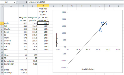
The values of the regression line’s slope and intercept are shown in B18 and B19 of Figure 4.17. Notice that the intercept value shown in cell B19 matches the point in the chart where the regression line crosses the vertical axis.
The predicted values for weight are shown in cells D2:D11 of Figure 4.17. They are calculated using the values for the slope and intercept in B18 and B19, and are identical to the predicted values in Figure 4.16 that were calculated using TREND(). Notice these three points about the formula, shown in the formula box:
• You multiply a known_x value by the value of the slope, and add the value of the intercept.
No curly brackets appear around the formula. Therefore, in contrast to the instance of the TREND() function in Figure 4.16, you can enter the formula normally.
You enter the formula in one cell—in the figure, you might as well start in cell D2—and either copy and paste or drag and drop into the remaining cells in the range (here, that’s D3:D11). So doing adjusts the reference to the known_x value. But because you don’t want to adjust the references to the cell with the slope and the cell with the intercept, dollar signs are used to make those references absolute prior to the copy-and-paste operation.
Note
Yet another way is to begin by selecting the entire D2:D11 range, typing the formula (including the dollar signs that make two of the cell references absolute), and finishing with Ctrl+Enter. This sequence enters the formula in a range of selected cells, with the references adjusting accordingly. It is not an array formula: you have not finished with Ctrl+Shift+Enter.
It’s also worth noting that an earlier section in this chapter, “Removing the Effects of the Scale,” shows how to work with z-scores and the correlation coefficient to predict the z-score on one variable from the z-score on the other. In that context, both variables have been converted to z-scores and therefore have a standard deviation of 1.0 and a mean of 0.0. Therefore, the formula
Predicted value = Slope * Predictor value + Intercept
reduces to this formula:
Predicted z-score = Correlation Coefficient * Predictor z-score
When both variables are expressed as z-scores, the correlation coefficient is the slope. Also, z-scores have a mean of zero, so the intercept drops out of the equation: Its value is always zero when you’re working with z-scores.
Using TREND() for Multiple Regression
It often happens that you have one variable whose values you would like to predict, and more than just one variable that you would like to use as predictors. Although it’s not apparent from the discussion so far in this chapter, it’s possible to use both variables as predictors simultaneously. Using two or more simultaneous predictors can sometimes improve the accuracy of the prediction, compared to either predictor by itself.
Combining the Predictors
In the sort of situation just described, SLOPE() and INTERCEPT() won’t help you, because they weren’t designed to handle multiple predictors. Excel instead provides you with the functions TREND() and LINEST(), which can handle both the single predictor and the multiple predictor situations. That’s the reason you won’t see SLOPE() and INTERCEPT() discussed further in this book. They serve as a useful introduction to the concepts involved in regression, but they are underpowered and their capabilities are available in TREND() and LINEST() when you have only one predictor variable.
Note
It’s easy to conclude that TREND() and LINEST() are analogous to SLOPE() and INTERCEPT(), but they are not. The results of SLOPE() and INTERCEPT() combine to form an equation based on a single predictor. LINEST() by itself takes the place of SLOPE() and INTERCEPT() for both single and multiple predictors. TREND() returns only the results of applying the prediction equation. Just as in the case of the single predictor variable, you can use TREND() with more than one predictor variable to return the predictions directly to the worksheet.
LINEST() does not return the predicted values directly, but it does provide you with the equation that TREND() uses to calculate the predicted values (and it also provides a variety of statistics that are discussed in Chapters 12 and 13). The function name LINEST is a contraction of linear estimation.
Figure 4.18 shows a multiple regression analysis along with two standard regression analyses.
Figure 4.18. The predicted values in columns E, F, and G are all based on TREND().
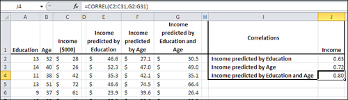
In Figure 4.18, columns E and F each contain values, predicted from a single variable, of the sort that this chapter has already discussed. Column E shows the results of regressing Income on Education, and Column F shows the results of regressing Income on Age.
One way of assessing the accuracy of predicted values is to calculate their correlation with the actual values, and you’ll find those correlations in Figure 4.18, cells J2 and J3. In this sample, the correlation of Education with Income is .63 and Age with Income is .72. These are good, strong correlations and indicate that both Education and Age are useful predictors of Income, but it may be possible to do better yet.
In Figure 4.18, column G contains this array formula:
=TREND(C2:C31,A2:B31)
Notice the difference between that formula and, say, the one in Column E:
=TREND(C2:C31,A2:A31)
Both formulas use the Income values in C2:C31 as the known_y’s. But the formula in Column E, which predicts Income from Education, uses only the Education values in Column A as the known_x’s. The formula in Column G, which predicts Income from both Education and Age, uses the Education values in Column A and the Age values in Column B as the known_x’s.
The correlation of the actual income values in Column C with those predicted by Education and Age in column G is shown in cell J4 of Figure 4.18. That correlation, .80, is a bit stronger than the correlation of either Income with Income predicted by Education (0.63), or of Income with Income predicted by Age (0.72). This means that—to the degree that this sample is representative of the population—you can do a more accurate job of predicting Income when you do so using both Education and Age than you can using either variable alone.
Understanding “Best Combination”
The prior section shows that you can use TREND() with two or more predictor variables to improve the accuracy of the predicted values. Understanding how that comes about involves two general topics: the mechanics of the process, and the concept of shared variance.
Creating a Linear Combination
You sometimes hear multiple regression discussed in terms of a “best combination” or “optimal combination” of variables. Multiple regression’s principal task is to combine the predictor variables in such a way as to maximize the correlation of the combined variables with the predicted variable.
Consider the problem discussed in the prior section, in which education and age were used first separately, then jointly to predict income. In the joint analysis, you handed education and age to TREND() and asked for—and got—the best available predictions of income given those predictors in that sample.
In the course of completing that assignment, TREND() figured out the coefficient needed for education and the coefficient needed for age that would result in the most accurate predictions. More specifically, TREND() derived and used (but did not show you) this equation:
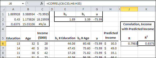
Predicted Income = 3.39 * Education + 1.89 * Age + (−73.99)
With the data as given in Figure 4.18 and 4.19, that equation (termed the regression equation) results in a set of predicted income values that correlate in this sample with the actual income values better than any other combination of education and age.
Figure 4.19. The predictions use the regression equation instead of TREND().
How do you get that equation, and why would you want to? One way to get the equation is to use the LINEST() function, shown next. As to why you would want to know the regression equation, a fuller answer to that has to wait until Chapter 12. For now, it’s enough to know that you don’t want to use a predictor variable that doesn’t contribute much to the accuracy of the prediction. The regression equation, in combination with some associated statistics, enables you to decide which predictor variables to use and which to ignore.
Using LINEST() for the Regression Equation
Figure 4.19 contains quite a bit of information starting with cells A1:C3, which show most of the results of running LINEST() on the raw data in the range A6:C35.
Note
LINEST() can return two more rows, not shown here. They have been omitted because the meaning of their contents won’t become clear until Chapter 12.
The first row of results returned by LINEST() includes the regression coefficients and the intercept. Compare the contents of A1:C1 in Figure 4.19 with the equation given toward the end of the prior section. The final column in the first row of the results always contains the intercept. Here, that’s −73.99, found in cell C1.
Still in the first row of any result returned by LINEST(), the columns that precede the final one always contain the regression coefficients. These are the values that are multiplied by the predictor variables in the regression equation. In this example, there are only two predictor variables—education and age—so there are only two regression coefficients, found in cells A1 and B1.
Figure 4.19 uses the labels b2, b1 and a in cells E1, F1 and G1. The letters a and b are standard symbols used in much of the literature concerning regression analysis. I’m inflicting them on you only so that when you encounter them elsewhere you’ll know what they refer to. (“Elsewhere” does not include Microsoft’s Help documentation on LINEST(), which is highly idiosyncratic.) If this example used a third predictor variable, standard sources would refer to it as b3. The intercept is normally referred to as a.
The reversal of the order of the regression coefficients imposed by LINEST() is the reason you see b2 as a label in cell E1 of Figure 4.19, and b1 in cell F1. If you want to derive the predicted values yourself directly from the raw data and the regression coefficients—and there are times you want to do that rather than relying on TREND() to do it for you—you need to be sure you’re multiplying the correct variable by the correct coefficient.
Figure 4.19 does this in columns E through G. It then adds the values in those columns to get the predicted income in column H. For example, the formula in cell E6 is
=A6*$F$2
In F6:
=B6*$E$2
And in G6, all you need is the intercept:
=$G$2
In H6, you can add them up to get the predicted income for the first record:
=E6+F6+G6
Note
I have used the coefficients in cells E2, F2, and G2 in these prediction equations, rather than the identical coefficients in A1, B1, and C1. The reason is that if you’re using the workbook that you can download from this book’s website (www.informit.com/title/9780789747204), I want you to be able to change the values of the coefficients used in the formulas. If you change any of the coefficients, you’ll see that the correlation in cell J6 becomes smaller. That’s the correlation between the actual and predicted income values, and is a measure of the accuracy of the prediction.
Earlier, I said that multiple regression returns the best combination of the predictor variables, so if you change the value of any coefficient you will reduce the value of the correlation. You need to modify the values in E2, F2, and G2 if you want to try this experiment. But the coefficients in A1, B1, and C1 are what LINEST() returns and so you can’t conveniently change them to see what happens in cell J6. (You cannot change individual values returned by an array formula.)
Understanding Shared Variance
Toward the beginning of this chapter there is a discussion of a statistic called the covariance. Recall that it is analogous to the variance of a single variable. That is, the variance is the average of the squared deviations of each value from the mean, whereas the covariance is the average of the cross products of the deviations of each of two variables from its mean:
![]()
If you divide the covariance by the product of the two standard deviations, you get the correlation coefficient:
![]()
Another way to conceptualize the covariance is in terms of set theory. Imagine that Income and Education each represent a set of values associated with the people in your sample. Those two sets intersect: that is, there is a tendency for income to increase as education increases. And the covariance is actually the variance of the intersection of, in this example, income and education.
Viewed in that light, it’s both possible and useful to say that education shares some variance with income, that education and income have some amount of variance in common. But how much?
You can easily determine what proportion of variance is shared by the two variables by squaring the values in the prior formula:
![]()
Now we’re standardizing the measure of the covariance by dividing its square by the two variances. The result is the proportion of one variable’s variance that it has in common with the other variable. This is usually termed r2 and, perhaps obviously, pronounced r-squared. It’s usual to capitalize the r when there are multiple predictor variables: then you have a multiple R2.
Figure 4.19 has the correlation between the actual income variable in column C and the predicted income variable in column H. That correlation is returned by =CORREL(C6:C35,H6:H35). Its value is .7983 and it appears in cell J6. It is the multiple R for this regression analysis.
The square of the multiple R, or the multiple R2, is shown in cell K6. Its value is .6373. Let me emphasize that the multiple R2, here .6373, is the proportion of variance in the Income variable that is shared with the income as predicted by education and age. It is a measure of the usefulness of the regression equation in predicting, in this case, income. Close to two-thirds of the variability in income, almost 64% of income’s variance, can be predicted by (a) knowing a person’s education and age, and (b) knowing how to combine those two variables optimally with the regression equation.
You might see R2 referred to as the coefficient of determination. That’s not always a meaningful designation. It is often true that changes in one variable cause changes in another, and in that case it’s appropriate to say that one variable’s value determines another’s. But when you’re running a regression analysis outside the context of a true experimental design, you usually can’t infer causation (see this chapter’s earlier section on correlation and causation). In that very common situation, the term coefficient of determination probably isn’t apt, and “R2” does just fine.
Is there a difference between r2 and R2? Not much. The symbol r2 is normally reserved for a situation where there’s a single predictor variable, and R2 for a multiple predictor situation. With a simple regression, you’re calculating the correlation r between the single predictor and the known_y’s; with multiple regression, you’re calculating the multiple correlation R between the known_y’s and a composite—the best combination of the individual predictors.
After that best combination has been created in multiple regression, the process of calculating the correlation and its square is the same whether the predictor is a single variable or a composite of more than one variable. So the use of R2 instead of r2 is simply a way to inform the reader that the analysis involved multiple regression instead of simple regression. (The Regression tool in the Data Analysis add-in does not distinguish and always uses R and R2 in its labeling.)
Shared Variance Isn’t Additive
It’s easy to assume, intuitively, that you could simply take the r2 between education and income, and the r2 between age and income, and then total those two r2 values to come up with the correct R2 for the multiple regression. Unfortunately, it’s not quite that simple.
In the example given in Figure 4.19, the simple correlation between education and income is .63; between age and income it’s .72. The associated r2 values are .40 and .53, which sum to .93. But the actual R2 is .6373.
The problem is that the values used for age and education are themselves correlated—there is shared variance in the predictors. Therefore, to simply add their r2 values with income is to add the same variance more than once. Only if the predictors are uncorrelated will their simple r2 values with the predicted variable sum to the multiple R2.
The process of arranging for predictor variables to be uncorrelated with one another is a major topic in Chapter 12. It is often required when you’re designing a true experiment and when you have unequal group sizes.
A Technical Note: Matrix Algebra and Multiple Regression in Excel
The remaining material in this chapter is intended for readers who are well versed in statistics but may be somewhat new to Excel. If you’re not familiar with matrix algebra and see no particular need to use it—which is the case for the overwhelming majority of those who do high-quality statistical analysis using Excel—then by all means head directly for Chapter 5, “How Variables Classify Jointly: Contingency Tables.”
Figure 4.20 repeats the raw data shown in Figure 4.19 but uses matrix multiplication and matrix determinants to obtain the regression coefficients and the intercept. It has the advantage of returning the regression coefficients and the intercept in the proper order.
Figure 4.20. Excel’s matrix functions are used to create the regression coefficients.
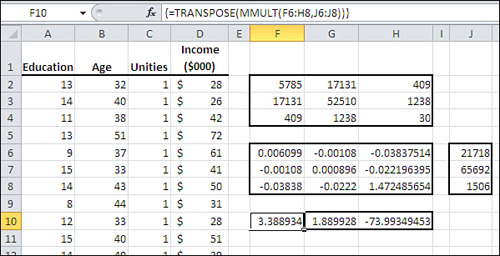
Begin by inserting a column of 1’s immediately following the columns with the predictor variables. This is a computational device to make it easier to calculate the intercept. Figure 4.20 shows the vector of unities in column C.
Cells F2:H4 in Figure 4.20 show the sum of squares and cross products (SSCP) for the predictor variables, perhaps more familiar in matrix notation as X′X. Using Excel, you obtain that matrix by selecting a square range of cells with as many columns and rows as you have predictors, plus the intercept. Then array-enter this formula (modified, of course, according to where you have stored the raw data):
=MMULT(TRANSPOSE(A2:C31),A2:C31)
Excel’s MMULT() function must be array-entered for it to return the results properly, and it always postmultiplies the first argument by the second.
To get the inverse of the SSCP matrix, use Excel’s MINVERSE() function, also array-entered. Figure 4.20 shows the SSCP inverse in cells F6:H8, using the formula
=MINVERSE(F2:H4)
to return (X′X)−1.
The vector that contains the summed cross products of the predictors and the predicted variable, X′y, appears in Figure 4.20 in cells J6:J8 using this array formula:
=MMULT(TRANSPOSE(A2:C31),D2:D31)
Finally, the matrix multiplication that returns the regression coefficients and the intercept, in the same order as they appear on the worksheet, is array-entered in cells F10:H10:
=TRANSPOSE(MMULT(F6:H8,J6:J8))
Alternatively, the entire analysis could be managed in a range of one row and three columns with this array formula, which combines the intermediate arrays into a single expression:
=TRANSPOSE(MMULT(MINVERSE(MMULT(TRANSPOSE(A2:C31),A2:C31)),MMULT(TRANSPOSE(A2:C31),D2:D31)))
This is merely a lengthy way in Excel to express (X′X)−1 X′y.
Moving on to Statistical Inference
Chapter 5 takes a step back from the continuous variables that are emphasized in this chapter, to simpler, nominal variables with only a few possible values each. They are often best studied using two-way tables that contain simple counts in their cells.
However, when you start to make inferences about populations using contingency tables built on samples, you start getting into some very interesting areas. This is the beginning of statistical inference and it will lead very quickly to issues such as gender bias in university classes.