11. Titles and Text
Titles are what you use to add text to your Projects. And Final Cut Pro has more than 150 animated titles to choose from, in a number of categories.
This chapter shows you how to find, apply, modify, and delete titles. Along the way, I’ll show you how to create commonly used titles for your own Projects.
Title Basics
If Browsers are new to you, read Chapter 10 to learn how to use a Browser.
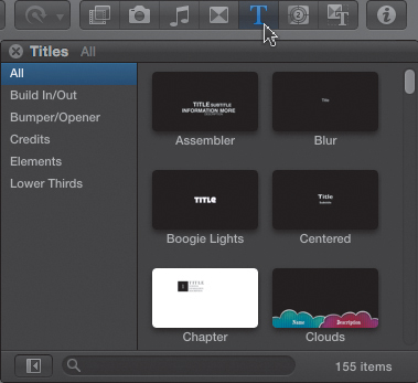
The Titles Browser is part of the Browser buttons on the right side of the Toolbar. To open it, either click the letter T icon, which is the symbol for this Browser, or create a custom keyboard shortcut in the Commands Editor (Figure 11.1). Inside are more than 150 animated titles, grouped into six categories displayed on the left.
Figure 11.1 Open the Titles Browser by clicking its icon.
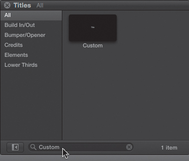
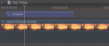
Let’s start by adding a title to our Project that doesn’t contain any animation—the Custom title.
1. To find this title, choose the All category on the left—otherwise the search just searches in the selected category—and type “Custom” in the search box at the bottom (Figure 11.2).
Figure 11.2 The Custom title is a good choice for a title that doesn’t contain any animation.
2. There are three options for applying a title:
• Double-click it to connect it to the primary storyline at the position of the playhead.
• Drag the title into the Timeline and drop it where you want it to connect.
• Position the playhead in the Timeline where you want the title to appear and press the Q, E, D, or W key. Titles can be edited to the Timeline just like video clips.
Note: Are Titles Always Connected Clips?
No. A title can be edited directly into the primary storyline, where it acts as a full-screen graphic. Most of the time, however, titles are connected clips.
3. Once the title has been placed in the Timeline, put the playhead in the middle of the title clip to see it in the Viewer (Figure 11.3). It is generally better practice to put the playhead, rather than the skimmer, in the middle of a title because that allows you to see the changes you are making in the Viewer.
Figure 11.3 Text in the Timeline is almost always a connected clip. Put the playhead in the middle of the title to see it in the Viewer.
When it comes to modifying a title, there are two things you can change:
• The text and styling in the title
• The location, duration, and animation of the title
Tip: How Long Should a Title Be Displayed?
Ahhh... there’s a raging controversy going on right now about that. Producers want titles up and out as quickly as possible. My feeling is the reason you put a title on screen is so that people will read it. Back in the day, you had titles hold for eight seconds. That would seem like an eternity now. I recommend that titles hold for at least five seconds, or long enough for you to read it out loud twice—whichever is longer.
You already know how to modify the duration of a title—drag an edge in the Timeline or use Control+D. So I won’t spend any more time explaining what you already know. And it should come as no surprise that the way you delete a title is to select it in the Timeline and press the Delete key (just in case you needed reminding). I’ll talk about Title animation in the next section. Here, I want to show you how to change the text and modify its style.
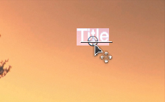
4. To move the text on-screen, double-click the text in the Viewer (Figure 11.4). The small position ring that you first saw moving the star animation in the last chapter shows up at the bottom of the text.
Figure 11.4 Double-click the text in the Viewer to display the on-screen controls, then drag the circle to move the position of a title. Select text in the title to make changes.
5. Drag the ring. In this example, I moved it to the upper-right corner of the Viewer.
6. Then, with the title text still selected, change the text. I changed the text—similar to changing text in Adobe Photoshop—by typing the new text directly into the Viewer (Figure 11.5).
Figure 11.5 With the text selected, make changes by typing in the new text.

7. Press the Escape (ESC) key to exit text-entry mode.
8. To add a fade-in to the text—assuming it doesn’t have animation associated with it—select the edge where you want the transition to appear and apply the default transition. Adjust as necessary.
Modifying Titles
These basics are all well and good, but Apple did not give you 155 animated titles to only use the most boring one in the collection. So, in this section, I’ll show you how to modify titles and animation using the Inspector. Then you’ll learn a very cool way to find and replace text directly in the Timeline.
In this case, I chose Assembler, from the Build In/Out category, and edited it to the Timeline by dragging. I selected the title and double-clicked each element in the Viewer—five in all—and changed the wording and position to match the screen shot here (Figure 11.6).
Figure 11.6 The Assembler animated title shows a collection of text all coalescing in the frame.

Let’s take a look at this in the Inspector (Figure 11.7). As always, select the title in the Timeline before opening the Inspector. Ideally, put the playhead in the title so you can see it in the Viewer as well.
Figure 11.7 There are four tabs in the Inspector. The Title tab controls title effects, while the Text tab allows for adjusting the text.
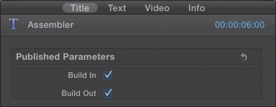
The Title tab controls the animation associated with the title and any related parameters. Build-in or Build-out determines whether to animate the start or the end of the title. Uncheck these to turn off animation.
The Text tab controls the look of the text on the screen.
The Video tab controls all the built-in effects associated with that clip. Chapter 12 goes over these settings in detail. I will ignore them in this chapter.
The Info tab provides access to the metadata that I talked about in Chapter 4.
For this example, I will leave the opening and closing animation for this title turned on.
Manipulate Text
Click the Text tab and you’ll discover that, unlike with Final Cut Pro 7 or Final Cut Express, there’s a ton of ways you can manipulate text—or at least a whole lot more than ever before (Figure 11.8).
Figure 11.8 The Text tab offers extensive flexibility in how you format text.
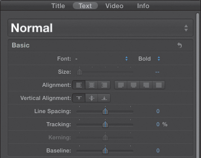
These settings at the top control font, style, size, alignment—all the text controls that you’d expect in any program. Here are a few definitions for the new settings:
• Alignment. Determines the horizontal position of the text within the box that contains it. The right-hand buttons determine how a paragraph of text is formatted.
• Vertical alignment. Determines the vertical position of the text within the box that contains it—top, middle, or bottom.
• Line spacing. The vertical spacing between lines of text in the same paragraph.
• Tracking. The horizontal spacing between characters.
• Kerning. The horizontal spacing between two characters. To turn this on, put your cursor between two letters—such as A and V—in the text in the Viewer, and adjust the slider.
• Baseline. This is the position of the bottom of the text compared to the horizontal line drawn under the text.
Normally, you don’t need to worry about changing kerning or baseline, as the default values for almost all Macintosh fonts are fine.
Font Settings
A very helpful new feature appears when you change fonts (Figure 11.9). When you select the font list, fonts are displayed in their native font. This lets you see what a typeface looks like without applying it to text in your title.
Figure 11.9 Fonts are displayed in their own typeface, which makes picking the right font a whole lot easier.
Scroll down to the bottom of the Text pane to see the settings, which allow you to change settings related to the text itself:
• Face. Controls type color, opacity, and blur.
• Outline. Allows you to add an outline around the text and control its color.
• Glow. Allows you to add a glow around the text and control the amount and color.
• Drop shadow. Allows you to add a drop shadow to text.
To turn a setting on, click the blue checkbox to its left.
I am a huge fan of drop shadows. Video, even HD, is very low-resolution compared with print. For this reason, whenever you add text to the screen that you want people to read, you must add drop shadows, especially when the text is placed over any color except black. Turn on drop shadows by clicking the blue box so it glows blue (Figure 11.10).
Figure 11.10 Turn on drop shadows by clicking the blue checkbox. These are my strongly recommended drop shadow settings.
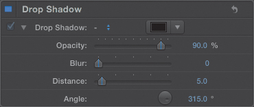
The default drop shadow settings aren’t bad—they get better with each version of Final Cut Pro—but I suggest making one change. To adjust the settings, click the blue word Show to the right of the words “Drop Shadow,” to reveal the settings underneath. Although you can change any of these, I recommend changing just the Opacity from 75 percent to 90 percent. This provides more sharpness to the shadow and makes the text easer to read. Figure 11.10 illustrates my recommended settings.
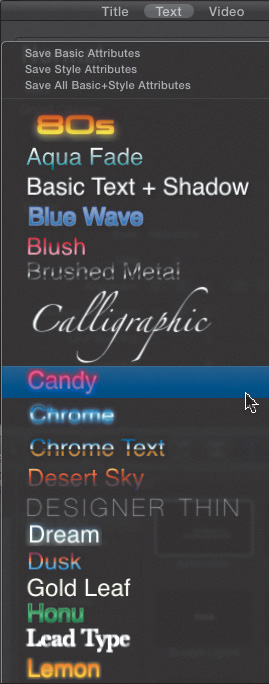
Use Text Styles
One of the hidden new features in the Text tab is the collection of text styles that you can use for your fonts. To display an otherwise hidden collection of text styles, click the word Normal at the top of the Text pane (Figure 11.11). This displays a wide range of text fonts and styles. Basic presets apply font settings. Style presets apply style settings to the current font. For example, if you were to save your favorite drop shadow setting as a custom preset, you would probably want to save it as a Style preset so you could apply it to any text regardless of its font.
Figure 11.11 An array of text styles is hidden at the top of the Text tab.
To apply a preset to the text in your title, be sure the title text is selected in the Viewer, then click the style you like. If you decide that you don’t like a particular style, you can remove the styling by choosing Basic Text and Shadow. However, this does not change the font back to the way you had it; instead it removes style attributes but leaves the font typeface and size changed.
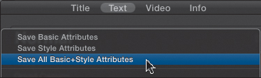
To reset the font, click the triangle menu at the far right of the parameter, and choose “Reset Parameter.” And if you’ve created a modified style you like, you can save it by choosing “Save All Basic + Style Attributes” at the top of this pop-up menu (Figure 11.12).
Figure 11.12 The ability to save a text style preset makes it easy to reuse styles in the future.
This is a very convenient way to create a text style, with a drop shadow, for all your lower-third titles. Presets allow you to quickly reuse a particular style without taking time to re-create it.
Displaying Action and Title Safe
One of the problems of adding text to video is that not all portions of the image are always displayed. Old CRT-based TVs are notorious for cropping the edges of a picture, as are more modern digital projection systems. On the other hand, video displayed on the Web shows the entire image from edge-to-edge.
This presents you with the worst of all worlds: needing to make sure the entire image is clean, with no light stands or stray production personnel standing along the edges (called “protecting the frame”), yet ensuring that all text and graphics can be seen regardless of how the image is displayed.
This problem has been around since the earliest days of television; to solve it, you create two boundaries within the frame:
• Action Safe, which is 5 percent in from all edges.
• Title Safe, which is 10 percent in from all edges.
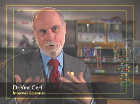
To display these, click the Switch in the top right corner of the Viewer, then select “Show Title/Action Safe Zones” (Figure 11.13). Two boxes are displayed. Action Safe is the outside box, and Title Safe is the inside box (Figure 11.14).
Figure 11.13 Click the Switch at the top right of the Viewer, then turn on “Show Title/Action Safe Zones.”
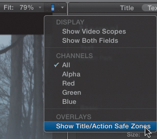
Figure 11.14 Here’s what the Action Safe and Title Safe boundaries look like. Title Safe is the inside box.
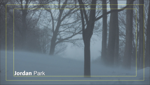
All essential action, actors, sets, and movement need to be contained within the Action Safe boundary, which is 5 percent in from the outside edge. All essential graphics, logos, phone numbers, names, titles—all text elements—need to be contained inside the smaller Title Safe boundary, which is 10 percent in from the outside edge.
Keep in mind that the industry considers these essential boundaries and respect them in the work you create. When I am working with text, these boundaries are always on.
Finding and Replacing Text
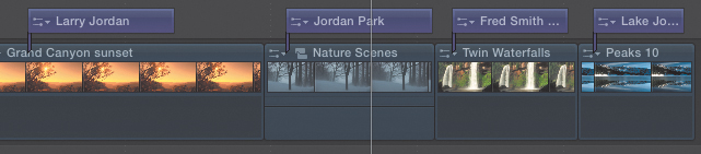
One of the very cool features in FCP X is its ability to find and change title text. It can do this for an individual title or all titles in a Project. Here, for example, is a Project that has four titles (Figure 11.15). Three of them have the word Jordan somewhere in them; one doesn’t. The placement of the text varies between titles, and each has a different text style.
Figure 11.15 This sample Project has four titles, three that contain the word Jordan.
Choose Edit > Find and Replace Title Text. In the Find and Replace Title Text dialog box, you can do a “Find” for an individual title, or all the titles in the Project (Figure 11.16). You have several options available to you depending on your needs:
Figure 11.16 The Find and Replace Title Text dialog box makes it very easy to replace text in multiple titles.
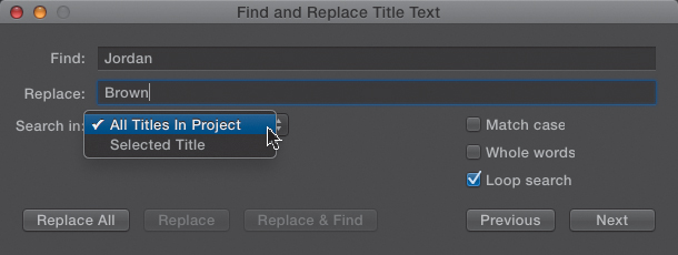
• Match case. This means that FCP will only find text that matches the capitalization of the text in the Find box. In this example, if this option were turned on, it would find Jordan but not JORDAN.
• Whole words. FCP will only look for whole words containing the Find text. For instance, if this option were turned on, it would match Jordan, but not Jordan’s.
• Loop search. FCP will continue the search from the beginning of the Project, if the search started in the middle. (The search starts at the current position of the playhead in the Timeline.)
• Selected Title. FCP will only replace the currently found and selected title, as opposed to all matching titles in the Project.
Note: Why Won’t It Find My Text?
If you added extra spaces between words, or a carriage return or tab, the Find Text box won’t find your source text. Try to keep your source text—that is, the text inside your titles—as clean as possible, and use the formatting in the Inspector to get the looks and alignment you need.
Specific Title Examples
Let’s take a look at some specific examples, adding a graphic with a picture.
This element starts with the underlying image full-screen, then zooms back, does a slow spin and zooms in, then brings the image back full-screen again. Creating this title takes just two steps:
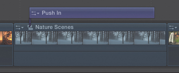
1. I chose Push In from the Credits category, dragged it to the Timeline, and placed it so it starts one second after and ends one second before the underlying clip. This reduces the jar of having an animated title start or end too close to a shot change (Figure 11.17).
Figure 11.17 The Push In title starts one second after the start of the underlying clip and ends one second before the end of the clip.
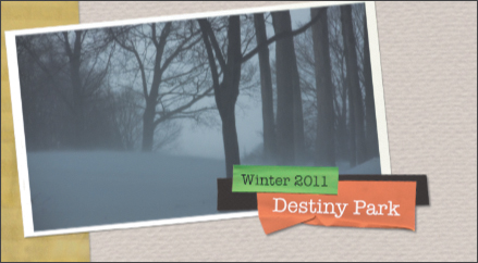
2. I double-clicked the on-screen text placeholders in the Viewer and added my own text, then styled them in the Inspector (Figure 11.18).
Figure 11.18 Here’s the Push In title with accompanying text.
Here’s another example: adding a corner locator.
1. In this case, I chose Elements > Instant Replay. This is an animated upper locator used to establish where a shot was taken (Figure 11.19).
Figure 11.19 Another typical example is adding a corner locator to a title.

The animation flies in from the right side and displays in the upper-right corner of the screen.
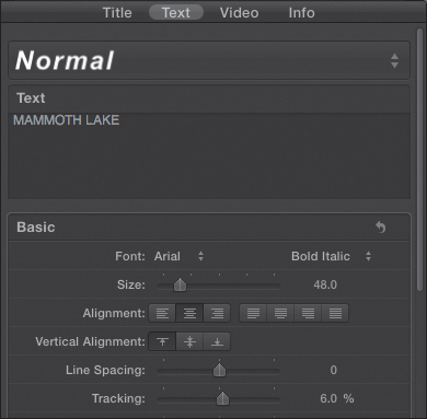
2. Rather than double-click the text in the Viewer, I changed the text in the text-entry box of the Inspector, then increased the Tracking to 6 percent at the bottom of the window, to increase the horizontal distance between the letters (Figure 11.20).
Figure 11.20 You can also add text to titles in the Text tab of the Inspector.
Here’s another example, adding a lower-third name and title by choosing Gradient Edge in the Lower Thirds category (Figure 11.21).
Figure 11.21 From the Lower Thirds category, choose Gradient Edge to get a standard lower-third title with a gray background.
Now, to be truthful, I find most of these Lower Thirds options almost useless. What I would like is a clean, simple, lower-third title with no animation and the ability to set it flush-left, center, or right. Two titles—Gradient Edge and Middle—tend to be my preference.
I changed the font from Futura—a font I like a lot—to GillSans, which is another font I like a lot. I changed the font colors and increased the font sizes (Figure 11.22). This title can be aligned left, right, or center, and the bar behind it can be any color.
Figure 11.22 Here are the settings I changed. I also turned on drop shadows from the Text tab.
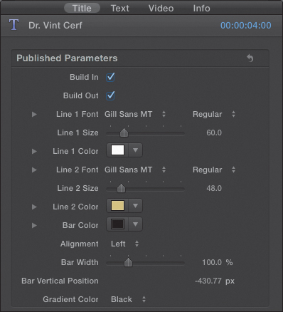
Since I enlarged the font size, the text no longer fits in Title Safe. You can either adjust the Baseline parameter, or as we’ll see in Chapter 12, you can use the Transform parameters to reposition it. Keep in mind that drop-shadow settings are off by default and the title looks better with them on. (This is where creating a drop shadow style preset comes in handy.)
Summary
When used effectively, titles are the best way to communicate specific information to viewers. Keep in mind that the look of your title conveys more than just information; it also reinforces the feel of your Project. Final Cut Pro X gives you lots of new titles, bumpers, graphics, and animations to play with. Due to FCP’s consistent interface, once you understand how one of these works, you are ready to work with any of them.
Finally, remember two things whenever you add text to your screen:
1. Add a drop shadow.
2. Pay attention to Action and Title Safe.
Keyboard Shortcut