16. Color Correction
Unlike all earlier versions of Final Cut Pro, color correction is now built into every clip. Apple has simplified automatic color correction, beefed up manual color correction, and shifted into a new color space—RGB.
Along the way, video scopes have undergone a transformation, the color-correction tools have a new interface, and everything is much, much faster.
In other words, there’s a lot of new stuff to talk about!
Color Correction Basics
Color conveys emotion. Before you hear one word of dialogue or listen to one measure of music, your eyes are already getting emotional information from the colors in a shot. As filmmakers learned long ago, lighting is much more than illumination; lighting and color are as essential to the craft of storytelling as the script and the score.
The problem is that mastering this craft takes time and practice. Final Cut Pro X provides a variety of techniques you can use whether you are new to the craft or a longtime master at it.
There are two terms you hear a lot with color: color correction and color grading. In my view, color correction fixes problems and color grading creates looks. Let me start with some simple things you can do to improve the look of your Projects, then move on to the subtler and more complex ways you can fix and improve your color.
Color Looks
When time is pressing and you just need to make your images look “different,” the Effects Browser is the place to turn. (The beginning of Chapter 12 covers how to use built-in effects, in case you need a refresher.)
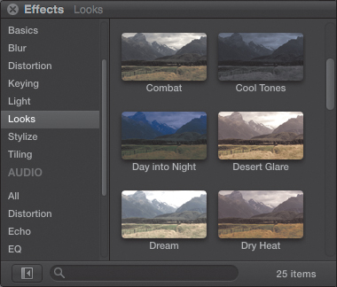
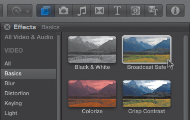
1. Press Command+5 to open the Effects Browser, and choose the Looks category (Figure 16.1). Here you can choose from 25 Looks that you can apply to visually change a clip.
Figure 16.1 The fastest way to change the look of a clip, or group of clips, is to use a Look from the Effects Browser.
2. To apply a Look, select the clip or group of clips to which you want to apply that effect. (You can’t apply an Effects filter to a range within a clip.)
3. Then, either double-click the Look from the list on the right, or drag it onto the clips. (Double-clicking only works if something is selected.) Poof! Instant new look.
4. Looks allow a small level of adjustment, which you can modify by selecting the clip, opening the Inspector, and clicking the Video tab. All effects, also called filters, are listed at the top of the window (Figure 16.2).
Figure 16.2 Each Look can be adjusted in the Video tab of the Inspector. To delete a Look, select its name in the Inspector, and press the Delete key.
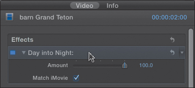
5. To remove a Look, select the name of the effect in the Inspector and press Delete. (You can’t delete built-in effects.)
This process of applying, adjusting, and removing an effect is the same for every effect in the Effects Browser.
The good news about Looks is that they are very easy to apply. The bad news is that you can’t adjust them very much. Also, they don’t fix color problems, such as when images are too blue because a camera wasn’t color-balanced properly.
Color Correction with the Enhancement Menu
One place to turn, when you have color balance problems, is the Enhancement Menu in Final Cut Pro X. Let’s look at what it does in more detail.
Analyze for Balance Color
One of the options when you import a video clip is to “Analyze for balance color.” While the grammar in this sentence is a bit suspect, the power it represents is not.
There are two ways to analyze a clip for color problems: as you import it, or after it’s imported and displayed in the Events Browser. (You can also analyze a single representative frame of a clip after it’s edited in the Timeline.)
My recommendation, since color analysis takes time, is to either analyze clips for color after you’ve imported them and decided that you want to use them in your Project, or analyze a single, representative frame once the clip is edited into the Timeline. This way you analyze only the clips you need. However, all these options work fine, and analyzing during import means you never have to worry about it again.
To analyze clips for color problems during import, be sure to check the “Analyze for balance color” option in the Import window (see Chapter 4). To analyze clips in the Event Browser, select the clips, and choose Modify > Analyze and Fix.
You can also decide to skip color analysis entirely. However, if the clip has been analyzed, when making automatic color adjustments, Final Cut Pro makes its changes based on the entire clip. If the clip has not been analyzed, Final Cut Pro decides what to do by looking at the frame of the clip under the playhead or the skimmer when you select the Balance Color option.
Fixing Color Cast
There are two dominant colors of white light: the blue cast of daylight, and the yellow cast of indoor light. A common problem is that a camera has been set for the wrong color of light, resulting in shots that look either too blue or too orange.
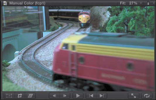
In this shot, the overall image is too blue/green (Figure 16.3). This problem is called a color cast. A clip has a color cast when it contains an undesirable color affecting the entire image, such as the blue/green in this shot.
Figure 16.3 In this shot, the image is too blue/green.

Whether your shot is too blue or too orange, here’s a fast way to fix it.
1. In the Toolbar, click the magic wand icon to open the Enhancement Menu (Figure 16.4).
Figure 16.4 The Enhancement Menu in the Toolbar is the perfect first stop when you want to improve a video clip or an audio clip.
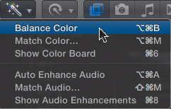
2. For a quick and easy color correction, choose Balance Color, or press Option+Command+B. (Even when you’re manually correcting a clip, this is often a good place to start.)
Instantly, the image color is corrected (Figure 16.5). FCP actually did several things here: adjusted the black level to make the shadow detail richer, adjusted the white level to maximize the exposure, and adjusted the color to fix the color cast with the clip.
Figure 16.5 The same train shot, with the color corrected and exposure adjusted.
Matching Color Between Shots
There’s one more automatic feature, called Match Color, that also does a nice job of solving color problems.
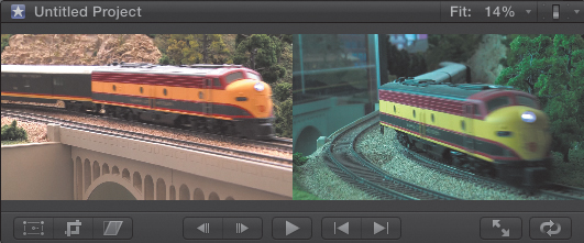
It’s a typical problem (Figure 16.6). The first shot, on the left, looks great, but the second shot looks too blue. The Balance Color option gets close, but the color of these two shots needs to match:
1. Select the clip to fix and apply Balance Color from the Enhancement menu.
2. Go back to the Enhancement Menu and choose Match Color, or press Option+Command+M.
3. In either the Timeline or Event Browser, use the skimmer to find a clip with the color you like and click the skimmer on a frame with the color you want. The clip with the bad color is immediately changed to match the clip with the desirable color.
4. Click the Apply Match button in the lower-right corner of the Viewer to apply the change.
Figure 16.6 Clearly, the two shots don’t match. The Match Color feature helps fix this.
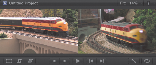
I’ve found that choosing the right clip takes experimentation. If you don’t like the result, try a different part of the same clip or a different clip entirely. Changes aren’t “locked in” until you click Apply Match. In this case I had to try several clips before I found the right look to match the color of the clips (Figure 16.7).
Figure 16.7 The color of the right-hand clip now more closely matches the color of the left.
Tip: Borrowing Looks
If you see a look that you like while watching a streaming movie or television show, take a screen shot or search the web for a still frame, import it into the Event, and use that as the source image for Match Color.
One thing I really like about this feature is that you can select from any clip in the Timeline or the Event Browser. This makes it much easier to find a clip with the look you want.
Another benefit of using Balance Color and Match Color is that you don’t need to understand anything about video scopes or color correction to improve the look of your shots. Both of these techniques will make your video look better.
But a wealth of additional color tools is hidden in Final Cut Pro that can really make your images sing. These tools take some training and practice to master, but the results are well worth the effort. However, in order to use them, first you need to learn how to read video scopes.
How to Read the Video Scopes
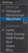
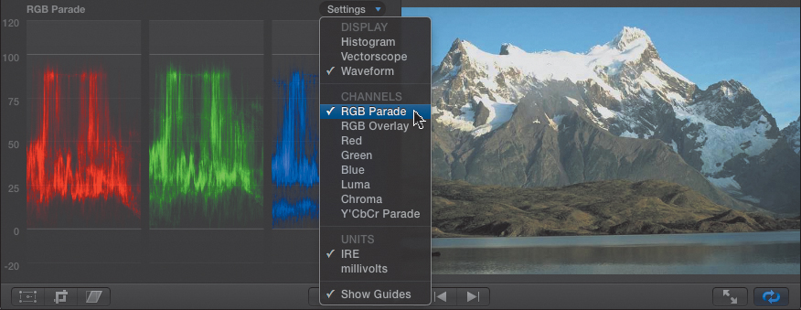
Final Cut has, essentially, four video scopes, each of which has a variety of settings: Histogram, Waveform, Vectorscope, and RGB Parade (Figure 16.8).
Figure 16.8 Video scopes can be accessed from Window > Show Video Scopes, or keyboard shortcuts. Once scopes are displayed, go to this Settings menu in the top-right corner of the Viewer to select which scope to display.
When you examine a clip using a scope, you are looking at two different things:
• Grayscale—also called contrast, luma, or exposure—which is the black-and-white portion of the image
• Color—also called chroma—which is the color portion of the image
It is generally best to look first at the grayscale, then examine the color.
To access the video scopes, choose Window > Show Video Scopes. Click the word Settings in the top right corner of the Viewer to choose one of the scopes.
Waveform Monitor
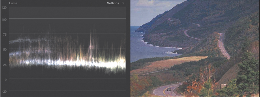
Even though Final Cut Pro defaults to displaying the Histogram video scope, the best place to start when examining images with scopes is the Waveform monitor; press Shift+Command+7 (Figure 16.9).
Figure 16.9 The Waveform monitor is the most helpful scope for analyzing video. It tells you almost everything you need to know about the grayscale of an image, but nothing about color.
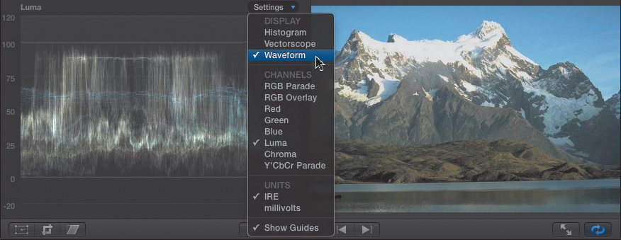
The Waveform monitor displays the grayscale values in an image. The left edge of the Waveform corresponds to the left edge of the image, and the right edge of the Waveform matches the right edge of the image. So you can say things like, “The left side of the picture is a little darker than the right side.” But vertically, the Waveform displays the brightness value of the pixels in the image. This means you can’t look at the scope and say things like, “The dark part of the image is at the bottom.”
Grayscale values are grouped into categories and measured by the scale on the left side of the scope:
• More than 100 percent: superwhites
• 100 percent: white
• 70 percent to 100 percent: highlights
• 30 percent to 70 percent: midtones, midgrays, or mids
• 0 percent to 30 percent: shadows
• 0 percent: black
• Less than 0 percent: superblacks
Superblack is a new category for Final Cut Pro 7 editors, because in FCP 7, Apple clamped black levels at 0 percent. This is no longer the case in FCP X. However, when you are adjusting black levels manually, it is very strongly suggested that black levels not extend below 0 percent.
In this example, the image has a wide range of grayscale, with the dark shadows near the shore, the medium grays in the water and mountains, and the highlights in the snow.
Histogram
The Histogram displays the range of pixels from black, on the left, to white and superwhite, on the right (press Command+7). (This is just like the histogram in Photoshop.) To see just the grayscale values, select the Luma option in the Settings pop-up menu (Figure 16.10).
Figure 16.10 The Histogram in FCP works just like the one in Photoshop; it displays the range of pixels from black, on the left, to white, on the right.
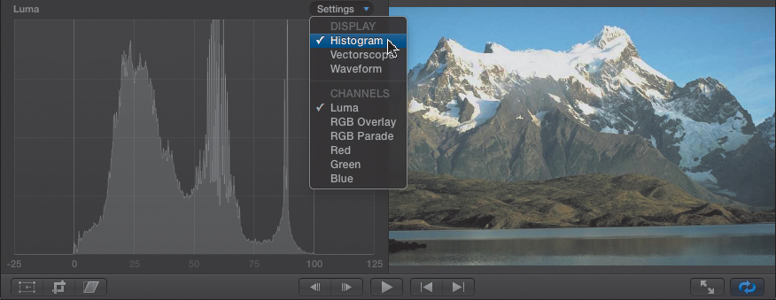
For me, the Waveform monitor is much more useful, and while it isn’t the default keyboard shortcut, I can quickly display it. Though I use the Histogram for setting black levels, most of my scope time is spent elsewhere.
Select the RGB Overlay option to see color values of the selected clip displayed along with the grayscale values. These RGB values are useful, but the RGB Parade scope in the Waveform monitor is a better choice because it makes comparisons between colors easier.
Vectorscope
The Vectorscope is the complement to the Waveform monitor (Figure 16.11). While the Waveform tells you everything about grayscale, the Vectorscope tells you everything about color (press Option+Command+7).
Figure 16.11 The Vectorscope is the other essential scope in Final Cut Pro. It tells you everything you need to know about color, but nothing about grayscale.
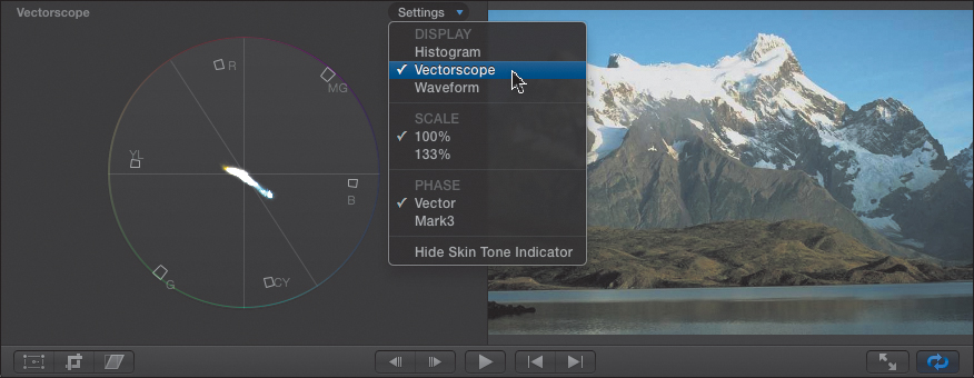
All shades of gray coalesce into a single dot in the center of the scope. The farther out from the center a pixel moves, the more saturation, or color, that represents. As you look around the circle, you see small squares—these are called “targets.” Starting in the top left, and rotating clockwise, are Red, Magenta, Blue, Cyan, Green, Yellow, and back to Red. In this image, for example, there is a small thrust toward yellow, but the big “arm” of color is heading toward blue.
So, as the Waveform monitor describes a pixel (which is what all these white dots represent) in terms of how light or dark it is (as a percentage of white), the Vectorscope describes that same pixel using two numbers: what color, or hue, it is and how much color, or saturation, it contains.
These three numbers—for grayscale, hue, and saturation—define the image value of every pixel in the frame. (Another way of representing this is HSB—hue, saturation, and brightness.)
RGB Parade in the Waveform Monitor
The RGB Parade is a special-case scope: FCP X contains an RGB Parade scope as part of both the Waveform monitor (Figure 16.12) and the Histogram. The Parade scope shows the amount of red, green, and blue in an image.
Figure 16.12 The RGB Parade is a special scope for both the Histogram and the Waveform monitor. The Waveform version, shown here, displays the amount of red, green, and blue in the image.
The Parade scope is essential to manual color correction, but still takes a second seat to the Waveform and Vectorscope.
Adjusting Grayscale and Color
Apple changed the underlying color model it used when it moved from Final Cut Pro 7 to FCP X. FCP 7 used YCbCr—though Apple called it YUV—and FCP X uses RGB. YUV was easier to calculate, but RGB provides greater accuracy, and it parallels the color space used in Color, DaVinci Resolve, and other high-end color grading systems.
The key points of difference between the old system and the new include the following:
• In FCP X, adjusting grayscale affects color values, and adjusting color values affects contrast.
• In FCP X, black levels can descend below 0 percent, but you need to prevent that.
• In both systems, white levels can exceed 100 percent, which you also need to prevent.
The steps to adjusting color remain the same between the two programs:
1. Set the black level first.
2. Set the white level second.
3. Adjust the midtones to get the exposure the way you want it.
4. Adjust color values.
Useful Settings
Before all the e-mails start, let me say at the outset that color correction is as much an art as a science. There is no one value that works for everyone. The story and your level of experience make every color grading session different.
On the other hand, if you don’t know where you are going, a basic map can be a real help. So, here’s a basic map, and then I’ll show you how to apply it.
1. Set black levels to 0 percent.
2. Set white levels so that they do not exceed 100 percent (personally, I use 97 percent).
3. Adjust midtones to get the “vibe,” feeling, or time-of-day look that you want.
4. Adjust colors so skin tones look normal.
5. Apply the Broadcast Safe filter to trap black levels below 0 percent or white levels greater than 100 percent.
Your goal here is not to make the colors in your clip look like reality, but to make them look believable. If directors wanted actors to look “real,” no one would wear makeup.
There are two key rules in color correction:
• To remove a color, add the opposite color; FCP X makes this easy by also allowing you to subtract a color using the Color Board
• Equal amounts of red, green, and blue equal gray. Or, stated in a way that helps you color correct—if something is supposed to be gray, it must contain equal amounts of red, green, and blue.
However, sometimes you don’t have something gray in the shot, in which case you need to do your color correction based on the skin tones of the actors. Remember, your goal is to make actors look believable. (One thing I’ve learned—if the actor’s skin color looks believable, everything else in the scene looks good. If the skin tones are off, nothing else in the scene matters.)
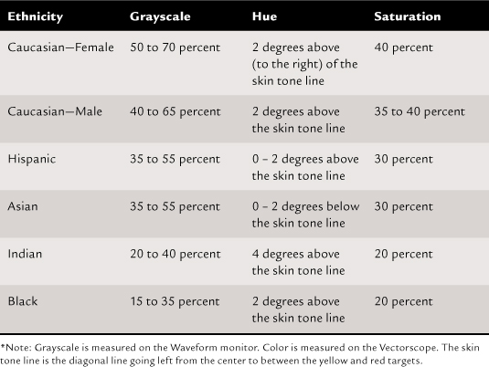
Alexis Van Hurkman has written extensively about color correction, and Table 16.1, modified from his book Encyclopedia of Color Correction, is designed to help you get skin tones to look right. This assumes natural, studio lighting.
Table 16.1 Color Values for Skin Tones*
Adjusting Grayscale
Let’s apply these settings to a few clips to see how this works. Most digital cameras raise the black level a bit, giving the image a washed-out look. So, the first step in manually color correcting an image is to set the black level to 0 percent. (This assumes you have something very dark, like a shadow, in your shot. If you don’t have something dark, don’t set the black level to 0; it will create a “crushed” look to your image.)
Figure 16.13 is a good example of an image with washed-out shadows. The color is OK, but the exposure needs help. The black levels are very high—close to 20 percent—giving the image a washed-out look. Also, the white levels are down around 80 percent, and could come up a bit. You can fix both of these using the Color Board in the Inspector.
Figure 16.13 Here’s a typical example of an image that looks washed-out. On the Waveform monitor the black levels are raised to almost 20 percent—way too high!
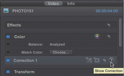
All color corrections are done in the Inspector. Press Command+4 to open it. The color settings are at the top of the built-in effects. To apply a correction, click the gray, right-pointing arrow (my cursor is parked on it in Figure 16.14). When a custom correction is created, this correction button displays a rainbow of colors.
Figure 16.14 Open the Inspector by pressing Command+4. All the color settings are at the top. To apply a correction, click the right-pointing gray arrow next to “Correction 1.”
Clicking the arrow opens the Color Board (or press Command+6). There are three sections in the Color Board:
• Exposure adjusts the grayscale in an image (press Control+Command+E).
• Color adjusts the hue (press Control+Command+C).
• Saturation adjusts the saturation (press Control+Command+S).
Any adjustment you make in any of these three panels affects the entire clip, not just the frame you are looking at in the Viewer. There is no limit to the number of color corrections you can apply to a clip.
The Exposure panel has four sliders, called “pucks” because they can move in two dimensions (Figure 16.15). These are, from left to right:
• Global exposure
• Black, or shadow, levels
• Midtone levels
• White, or highlight, levels
Figure 16.15 The default panel is the Exposure panel; to reveal it, click the Exposure icon. From left to right, the four sliders control global exposure, shadow levels, midtone levels, and highlight levels. (Apple calls this type of control a “puck.”)
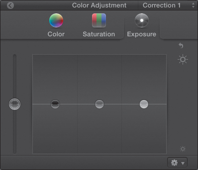
Dragging a puck up increases the level. Dragging a puck down decreases it. Generally, you adjust the black level using only the black puck. Most of the time, leave the Global exposure puck alone.
To reset just this panel, click the hooked Reset arrow in the top-right corner. To reset the entire color correction, click the Color Reset arrow in the Inspector. To return to the main Inspector, click the Go Back button in the top-left corner (Figure 16.16).
Figure 16.16 The Go Back button in the top-left corner returns you to the Inspector.
The hues (or colors) in an image are controlled in the Color panel (Figure 16.17). The same four pucks control the hue globally, in the shadows, in the midtones, and in the highlights of the image. Drag up to add a color, drag down to remove a color, and drag sideways to change a color. This is the only panel whose pucks move both up and down as well as side-to-side.
Figure 16.17 Click the Color icon to display the Color panel. From left to right, the four pucks control global hue, shadows hue, midtones hue, and highlights hue.
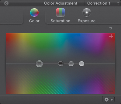
In FCP 7, a color was removed by adding the opposite (complementary) color. With this new Color Board, you can still do that, but it is much easier to drag down to remove a color. For FCP 7 editors, replacing the color wheel with a color rectangle takes a lot of getting used to. (No, I still haven’t fully gotten used to it myself.)
Note: Thinking Like the Color Board
The new rectangular shape of the Color Board makes it more closely resemble the Spectrum view in the Apple Color Picker. Also, you can assign keyboard shortcuts to Nudge Puck Up/Down/Left/Right using the Command Editor.
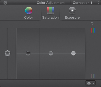
The amount of color in the image is controlled by the Saturation panel (Figure 16.18). The same four pucks control the saturation in the same four ways: globally, shadows, midtones, and highlights. Drag each puck up to increase saturation, or drag down to decrease it.
Figure 16.18 Click the Saturation icon to display the Saturation panel. From left to right, the four pucks control the amount of color globally, in the shadows, midtones, and highlights of the image.
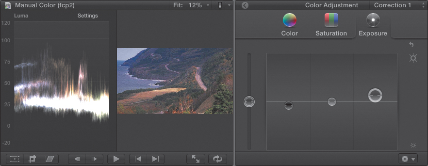
Returning to the original image to correct the washed-out effect, I clicked the Exposure panel, then lowered the black level until the darkest part of the waveform (at the bottom) was just touching the 0 percent line. This set the darkest shadows to grayscale black. Then I raised the white levels slightly to give the image some “pop,” making sure the white levels did not exceed 100 percent.
Figure 16.19 illustrates the final settings I used for this image. Shadows add vitality, highlights add energy, and midtones set the emotion.
Figure 16.19 These are the Exposure settings that corrected the initial image.
Adjusting Color
Here’s another example: The skin tone of the girl in this image looks green, which is not a normal skin color (Figure 16.20).
Figure 16.20 The girl’s skin color in this image is green, which is not normal. I’ll fix it.
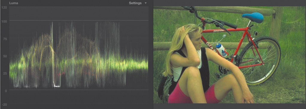
Also, the black level is a little high. Since she’s wearing a black vest, I would expect the shadows to sit right at the 0 percent line. Just by way of illustration, her black vest is the dark shadow about 1/3 of the way in from the left edge. The highlights on the top right side of the scope are from the reflection in the bike wheel at the bottom of the image. The waveform matches the Viewer from left to right, but not from top to bottom.
Even though she is wearing white and black, which are easy to isolate and color correct, I’m pretending she’s wearing other colors, as that makes the problem more challenging and the solution more applicable to other clips. Here is how I adjusted the color:
1. Using Exposure, I set the black level to 0 percent by lowering the shadows puck.
2. I went to the on-screen Crop tools and trimmed the image to isolate her skin (Figure 16.21).
Figure 16.21 To correct the skin tone, I trimmed the clip to isolate the skin, then opened the Vectorscope to figure out exactly what colors I needed to fix.
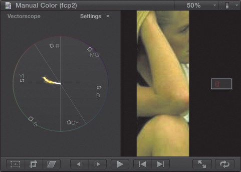
3. To make the image bigger, I then scaled the image—pressing Command+[plus], or using the Scale menu in the top-right corner of the Viewer.
4. I displayed the Vectorscope and discovered just how green the image was—very green! Look at that huge spike heading right toward yellow.
Except, well, where should it be going? This, to me, is the most magical thing about color correction. Look closely at the Vectorscope in Figure 16.21. See that thin white line going up and left at about the 10:30 position? That’s the skin tone line. All of us, whether we are black or white or any other shade of humanity, have the same color red blood under our skin. That line represents the color of red blood under skin. (In fact, skin without blood is gray—another weird fact you get to learn in this book!)
When adjusting color for skin tone, you first need to make the grayscale values correct (using the table I supplied earlier) and measure them on the Waveform monitor. Then, adjust the color using the Vectorscope so skin tones are placed on the skin tone line.
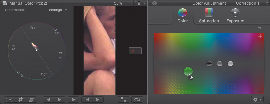
5. Because the entire image was green, I decided to apply a global color-correction setting and adjusted the global color puck. By dragging it down, I removed the green in the image. Dragging above the line increases the color; dragging below the line decreases it.
6. To add or remove a specific color, drag the puck over that specific hue in the panel.
Figure 16.22 illustrates the final skin tone image and the results as measured in the Vectorscope. (Though in my corrections, I often move individual pucks.)
Figure 16.22 In the final result, you see corrected black levels and corrected color. Notice the skin tone sitting directly on the skin tone line, around 40 percent, out toward the targets.
Applying the Broadcast Safe Effect
Sometimes, especially with inexpensive digital cameras, white levels are recorded at levels greater than 100 percent. There’s a simple effect, or filter, you can add that solves problems with superblacks and superwhites, as these excess levels are called. The Broadcast Safe filter clamps both excessive white and black levels to make your videos technically “safe.”
Open the Effects Browser (press Command+5), choose the Basics category, and apply the Broadcast Safe filter to the clip or clips you want to protect (Figure 16.23). If the clips are already selected, double-click the filter. If not, drag the filter on top of the clips where you want to apply it.
Figure 16.23 The Broadcast Safe filter (top right) protects your clips against excessive white or black levels. For web video, you don’t need this. For DVD or broadcast, you do.
For web-only videos, this filter is not necessary. For everything else, it can keep you out of serious trouble. One of the advantages of a compound clip is that you can apply an effect, such as the Broadcast Safe filter, to the entire compound clip, which then applies that filter to all the clips inside.
To turn your entire Project into a single compound clip, select the Timeline, press Command+A to select everything in the project, then press Option+G to create a single compound clip from all the selected clips.
You can use this technique to apply a single effect to a group of clips. To adjust the effect in the Inspector, select the compound clip first.
Using Masks for Color Correction
A new feature in FCP X is an improved ability to add masks for color correction. As you discovered in Chapter 14, a mask lets you restrict an effect, such as color correction, to only a portion of the frame.
There are two types of masks that are part of the color-correction filter:
• A color mask isolates a portion of the image based on a color range.
• A shape mask isolates a portion of the image based on a shape.
Here’s an example, using three balloons. I want to keep the yellow balloon, but change everything else to black and white. (This is also called the Pleasantville Effect, named after the movie.)
1. Select the clip, open the Inspector, and click the Add Shape Mask button (Figure 16.24). This displays the on-screen mask controls:
Figure 16.24 Clicking the Add Shape Mask button displays an image of three balloons with the default shape mask applied. The on-screen controls let you adjust the size and shape of the circles.
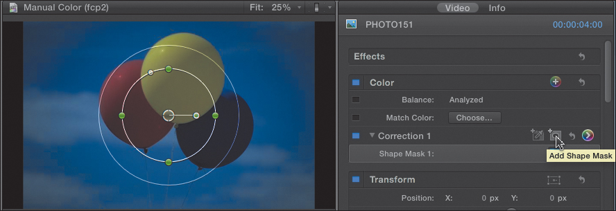
• The inner circle controls the shape of the shape mask.
• The circle in the center controls position.
• The dot at the end of the line to the right controls rotation.
• The white dot at the top, to the left of the top dot, morphs the shape from circle to rectangle.
• The outer circle controls feathering.
• Drag the four green control dots to adjust the shape of the circle.
2. Adjust the shape. In this example, the mask shape is adjusted to isolate just the yellow balloon with no feathering.
3. Once the mask is in position, open the Inspector and switch to the Color Board (press Command+6). There are two text buttons at the bottom:
• Inside Mask makes all color adjustments inside the selected mask area.
• Outside Mask makes all color adjustments outside the selected mask area.
You can have separate settings inside and outside the mask.
4. In this case, you want to adjust the area outside the mask, so click the Outside Mask button (Figure 16.25).
Figure 16.25 The mask is complete. In the Saturation panel, I clicked the Outside Mask button, then dragged global saturation way down.
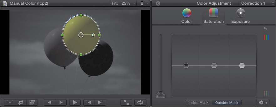
5. Then, drag the global saturation puck all the way down, to remove all color from outside the mask area.
All masks and color-correction settings can be keyframed using the techniques discussed in Chapter 12.
There is no limit to the number of color corrections you can apply to a clip. There is no limit to the number of masks you can apply to a clip. And each mask can have different settings for inside and outside the mask.
Summary
The color-correction settings in Final Cut Pro X are flexible, extensive, and powerful. They also provide a never-ending opportunity to make your images look great.
Working with color is a skill that gets better with practice and studying the works and writings of others. The good news is that you will have to work very hard to outgrow the possibilities that Final Cut Pro X provides.
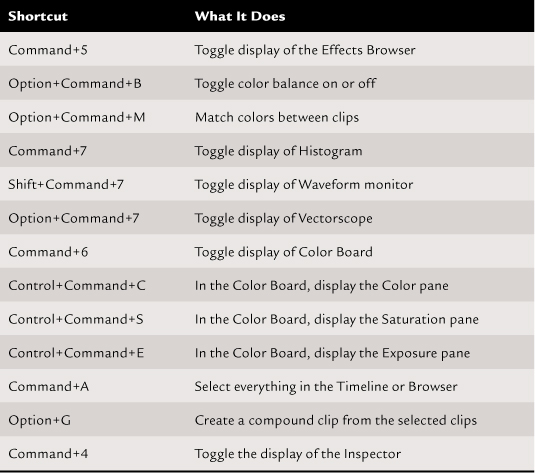
Keyboard Shortcuts