
5. Getting Stylish with Graphics
Chapter Overview
In the last chapter, you began the creation of a user interface design for Wheelr. You created a grid, added basic elements to define UI structure, and set some type. In this chapter, you’ll harness the power of Illustrator’s vector-based features and effects to turbocharge your design workflow. Illustrator provides three tools to assist in creating and reusing your beautiful UI elements:
• The Appearance panel
• Graphic styles
• Symbols
You’ll use these tools to enhance the mockup for Wheelr. You’ll also learn how to use the Layers panel to organize your artwork as you tighten up the layout. By the way, if you’ve been following along and creating the UI design, now would be a great time to save your work.
Adding Style to Appearances
Executing a design that I have in my head or on paper has always been a fun challenge to tackle. I absolutely love that part of my job. When the tool I use makes getting that vision onto the screen easy, it’s a glorious thing. That being said, I think the addition of the Appearance panel and graphic styles are two of the best things to happen to Illustrator since its inception. The Appearance panel allows for a lot of flexibility in the creation of a design element, and graphic styles make it simple to apply that design to any other object on the page. Let’s take a look at how these work together.
Using the Appearance Panel
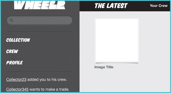
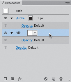
In Illustrator, the appearance of an object can be thought of as a stack of attributes viewed from the top down. The Appearance panel (accessed using the keyboard shortcut Shift-F6) is the tool you use to manage this stack. It gives appearance information about all the attributes of an object on the screen. You can view the object’s fill, stroke, opacity, and any effects that have been applied (5.1). At first glance, the panel may seem like only a tool for viewing information about a selected object, but it provides real power for creating screen graphics. To show you just how powerful it is, let’s use it to create a common UI element.
5.1. The Appearance panel
Creating a Search Box
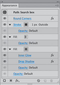
Sites and applications that deal with a lot of content (both native and user-generated) typically use a search box as the mechanism for finding that content. The web has many examples of this design pattern from which you can draw inspiration for your UI designs (5.2). Since there are many ways to style one with HTML and CSS, you’ll want to specify the look that your developers should match when the system is built.
5.2. Real-world search box examples
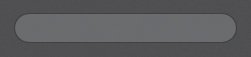
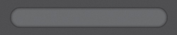
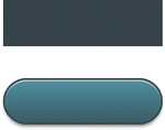
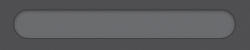
The next set of steps describes how to create a search box (5.3) that will reside in the sidebar of the Wheelr mockup. This search box will need a dark background, as well as an inner shadow and a drop shadow to give it some depth on the page.
5.3. This is the search box design you’ll create.
1. Draw a 221 px x 28 px rectangle and place it at the top of the sidebar, underneath the Wheelr name.
2. In the Appearance panel, select the Fill layer (5.4).
5.4. Selecting a Fill layer
3. Give the rectangle a fill by double-clicking the Fill button in the Tools panel (5.5).

5.5. Double-clicking the Fill button opens the Color Picker.
Using the Color Picker, you can quickly add a fill to an object. It allows you to choose a color by clicking in a color field or spectrum, entering numbers in one of the color models, or choosing a color swatch.
If the grid you created in the last chapter is visible, hide it by choosing View > Guides > Hide Guides (
 ; [semicolon]/Ctrl+Option+; [semicolon]), which makes it easier to see what you are doing.
4. Enter 4d4d4d in the hexadecimal color value field (5.6), and then click OK.
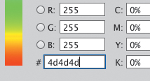
5.6. The hexadecimal color field allows you to specify web colors as you would in CSS.
5. In the Appearance panel, select the Stroke layer. This time, double-click the Stroke button in the Tools panel and assign a hexadecimal color of 1d1d1d.
6. In the Stroke panel, click the Align Stroke to Outside button  .
.
7. Press S/Crtl+S to save your work.
5.7 shows what you have so far. You need to do a couple more things before it really looks like a search box, though.
5.7. This search box is still pretty boring.
Adding a stroke to an object automatically gives it a 1 px stroke that is aligned to center of the line segment. Align this stroke to the outside of the object so it matches the browser’s box model.
• Clicking a swatch in the Swatches panel
• Using the Color panel to mix colors
In the Appearance panel and Control panel, clicking the Fill and Stroke pop-ups  opens the Swatches panel; pressing the Shift key and clicking will show the Color panel.
Stacking Appearance Attributes
The awesome thing about the Appearance panel is the ability to “stack” strokes, fills, and effects on a single object. Even better, each stroke and fill can have independent effects, opacity, and transformations. Let’s dive a little deeper with this idea.
Adding Rounded Corners
To start, this search box needs some rounded corners. Besides looking more approachable, rounding the corners keeps them from acting like four arrows that lead the eye out of the object.
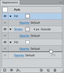
1. Select the search box rectangle and then click the Path layer at the top of the Appearance panel (5.8).

5.8. Selecting the Path layer ensures that an effect is applied to all attribute layers automatically.
2. Choose Effect > Stylize > Round Corners.
3. In the resulting dialog box, make the corners 14 px and click OK to see the result (5.9).
5.9. The typical search box shape
To create the perfect lozenge-shaped box, make the rounded corners as close to half the height of the object as possible. This keeps the corners from looking like the edges of a bullet.
Illustrator has a tool for drawing rectangles with rounded corners, but it leaves you with a very inflexible object. Once the object is drawn, the corners are locked in at that radius. You would have to select individual points to edit the shape to keep from distorting the corners, or redraw it if you wanted a different radius.
Note that in the previous steps you applied the rounded-corner effect to the Path layer rather than the fill or stroke layer. Doing this ensures that both stroke and fill receive the effect. That way, you don’t have to add the effect to each appearance layer independently.
The other thing that is great about the rounded-corner effect (and all others like it) is that it is a “live” effect. So as you resize the object, the corners don’t distort. In this case, that also means the corners will always have a 14 px radius no matter how you resize the object. You can also change the radius or remove the effect altogether at any time without affecting the underlying object.
You’ll enhance this rectangle by adding an inner shadow and a drop shadow to create an inset look.
Creating an Inner Shadow Effect
Many search boxes use an effect called an inner shadow. It makes the text field look like it is set into the page, adding depth and interest to the design. Illustrator doesn’t have a built-in inner shadow effect yet, so you’ll need to create an equivalent:
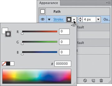
1. Select the search box and then click the Fill layer in the Appearance panel.
2. Choose Effect > Stylize > Inner Glow. In the Inner Glow dialog box, set the mode to Normal, and then click the swatch to the right of the Mode pop-up (5.10). Enter 000000 in the Color Picker’s hexadecimal color field.
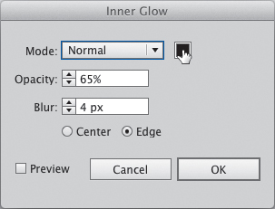
5.10. Set the color for the inner glow by clicking the color swatch icon.
3. Set Opacity to 65% and Blur to 4 px, and click OK to see the result (5.11).
5.11. The shadow is beginning to take shape.
4. With the search box still selected, click the Add New Fill  button at the bottom of the Appearance panel.
This will add another fill to the object using the same color as the previous one. This fill will be used to add a one-color gradient that is transparent at one end so the top of the inner glow peeks through.
5. Give this new fill a gradient by pressing the > key.
6. In the Gradient panel, double-click the white color stop to open the Color panel (5.12).
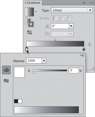
5.12. Double-clicking a color stop will allow you to add color to the gradient.
7. Choose Web Safe RGB from the panel menu and set the color to 4d4d4d.
8. Double-click the black color stop and repeat step 7. Set the Opacity to 0%.
9. Type 90 in the Gradient panel’s Angle field  . Press Enter to view the result (5.13).
5.13. The completed inner shadow effect
If you haven’t created any gradients yet, the object will be filled with a default black-to-white gradient. If you don’t have that default gradient, press the /Ctrl key and click the gradient swatch  in the Gradient panel (accessed by choosing Window > Gradient) to reset the default gradient. Resetting it will make this series of steps easier to follow.
Adding a Drop Shadow
With the inner shadow complete, you’re ready to add the drop shadow. This drop shadow will use a white fill with a very low opacity level. The 2 px Y-offset reveals the drop shadow by nudging it down from the stroke.
1. Make sure the search box is still selected. In the Appearance panel, select the bottom Fill layer and then choose Effect > Stylize > Drop Shadow.
2. Set the Opacity to 15%, the X-offset to 0, and the Y-offset to 2 px.
3. Click the color swatch at the bottom of the dialog box and enter ffffff in the hexadecimal color field. Click OK to see the result (5.14).

5.14. The final inset effect for the search box
4. Press S/Ctrl+S to save your work.
This inner shadow technique is very customizable. The trick when creating the effect is to make sure that the fill that creates the search field’s background and both colors of the gradient fill are the same color. These same steps would work the same no matter what color you use (5.15). You can finesse the inner glow’s blur and opacity levels until it looks right to your eye.
5.15. Changing the color of the search field
All that’s left to add to complete the search box is a magnifying glass icon. You’ll add that later in the chapter.
When creating effects like this, think about how they might be built with CSS. For example, the stroke that creates the border of the search box is aligned to the outside so that it mimics the box model. You used Normal since blending modes aren’t yet supported in CSS.
• Recolor it
• Change the corner radius
• Adjust the inner shadow and the drop shadow attributes
• Add other effects easily from the Appearance panel
Selecting and moving the box around on the screen is a snap, too, because it’s still just one simple rectangle.
Each effect is self-contained on the object, so you don’t have to worry about selecting all the different elements before moving or transforming it. You can view it in Outline mode (View > Outline or Y/Ctrl+Y) to see what I mean.
Creating the Photo Frame
Another popular design pattern on the web and in apps is a photo frame. These frames are usually made to look like pictures with slightly curled edges, creating a small shadow underneath (5.16). If you’ve been following along with the Wheelr mockup, you created the basis for this effect in the last chapter (5.17).
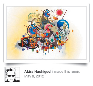
5.16. Photo frame effect as seen on www.mixel.cc
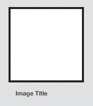
5.17. The starting point for Wheelr’s photo frame
This square will eventually multiply to become a group of photos showing the latest cars added by users of the system. Since this content should be the focus of the page, you’ll use the Appearance panel to give it some depth. This is accomplished by using the Arch effect to give it a curved drop shadow.
1. Select the 142 px wide by 142 px tall square. In the Appearance panel, hold the Shift key while clicking the Color pop-up to access the Color panel (5.18).
5.18. Shift-click the Color pop-up to quickly access the Color panel.
2. Change the stroke color #ededed.
The stroke may be a little light right now (5.19), but this background will become darker in the next chapter.

5.19. The photo frame has a very light outline for now.
3. In the Appearance panel, click the Add New Fill button .
This adds a new fill to the top of the appearance stack. You’ll use this new fill as the basis for the photo frame’s drop shadow.
4. Drag the new fill to the bottom of the stack (5.20) and set the color to #000000.
5.20. Dragging the topmost fill to the bottom to change the stacking order
5. With the new fill selected, choose Effect > Warp > Arch. Set the Bend to 4% and click OK.
At this point, you won’t see the shadow. You’ll add another effect to position it correctly.
6. Choose Effect > Distort & Transform > Transform. Set the Vertical setting to 7 px (5.21).
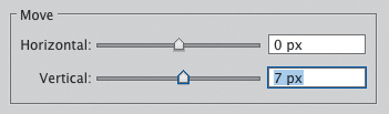
5.21. Moving an attribute layer with the Distort and Transform effect
7. Click the Opacity link of this Fill layer and change the opacity to 35% (5.22).
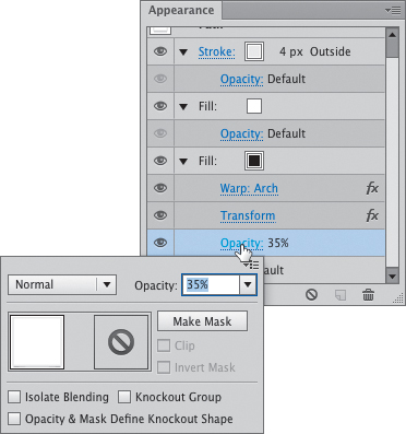
5.22. Setting the opacity for an attribute layer
8. Press S/Ctrl+S to save your work.
This Transform effect positions the black rectangle lower to give a drop shadow effect. The Arch effect gives the impression of a slight curl to the photo to add a bit of realism (5.23). You’ll enhance the photo frame and its shadow a bit more in the next chapter.

5.23. The start of the curled drop shadow effect
If you don’t see the Opacity link for an Appearance layer, click the triangle on the left of the layer to expand its attributes.
Each Appearance layer has its own Opacity setting separate from that of the entire object. It can get confusing at times, as these Opacity links often appear right next to each other in the panel. The easiest way to determine the Opacity setting for an Appearance layer is to look for the one that is indented (5.24).
5.24. Appearance panel layer attributes are indicated by an indent and darker background.
Creating and Editing Graphic Styles
Creating the inner shadow and drop shadow effects on the search box and photo frame took a lot of steps. Thankfully, graphic styles enable you to add appearances to other objects without having to go through all the steps over and over again.
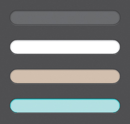
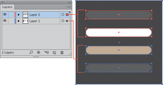
Graphic styles allow you to take a group of appearance attributes and effects and package them together in a reusable style. Once saved, the style can be applied an infinite number of times to any vector object on the screen (5.25). This helps increase efficiency when creating objects that need to look the same.
5.25. Using a graphic style allows you to make the top rectangle look like the bottom one with one click.
Creating a New Graphic Style
Creating a new graphic style is really easy:
1. Select the search box again. You’ll use this object to set the style.
2. In the Graphic Styles panel (Shift-F5), click the New Graphic Style button  .
.
This will create a new swatch in the panel with the name Graphic Style.
3. Double-click the new style and name it Search Box.
Naming graphic styles is important. As you begin to create many of them in a project, distinguishing between them is easier when they have good, relevant names.
Editing the Style
Graphic styles also make updating your design more efficient. Imagine 10 other pages in this mockup that all had the search box on them. You decide the white drop shadow is a little too strong, so you want to decrease the opacity slightly. Here’s how you can edit a graphic style to update all the other search boxes automatically:
1. Select the search box and click the Drop Shadow effect on the bottom Fill layer (5.26).
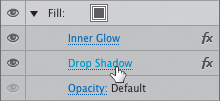
5.26. Clicking an effect link opens its dialog box for editing.
2. Change Opacity to 10% and click OK.
3. In the Appearance panel, choose Redefine Graphic Style “Search Box” from the panel menu (5.27).
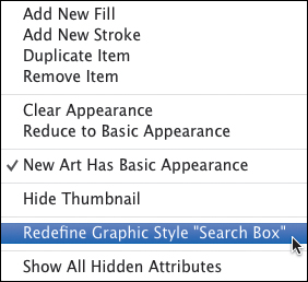
5.27. Redefining a graphic style after editing applies the change to all objects that have the style.
This action takes the change made to the graphic style and applies it to all other objects in the document that use it. Now go and take a break, because you just saved yourself a ton of time.
Using Symbols
A symbol is another Illustrator feature that helps create efficiency when dealing with objects that need to be repeated. If you’ve used Adobe Flash, the concept of a symbol will be familiar. Symbols were originally added to Illustrator to help with interoperability with Flash. Since CS5, however, they have gained features that benefit Illustrator-only use as well.
The main difference between a symbol and a graphic style is that a symbol is a self-contained art object rather than just a collection of appearance attributes. Symbols have their own layer structure and positioning information as well as advanced transformation and color capabilities. Let’s take a look at how symbols can be used in the Wheelr mockup with the search box you just created in the previous section.
As mentioned earlier, the search box still needs a magnifying glass icon to distinguish it as such in the UI. Creating this icon is easy:
1. Inside the search box, draw a 10 px by 10 px circle with the Ellipse tool  (L).
(L).
2. Give it a 2 px stroke that is aligned to the inside and set #2d2d2d as the color.
3. With the Line Segment tool  (), draw a handle for the icon. Hold the Shift key as you draw to constrain the segment to a 45-degree angle (5.28).
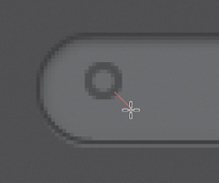
5.28. Drawing the magnifying glass handle
4. Give the handle a 2 px stroke and set #2d2d2d as the color.
5. Press S/Ctrl+S to save your work.
Creating a Symbol
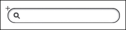
Now that you have the icon in the search box (5.29), make the whole thing a symbol.
5.29. The finished search box, ready to be made into a symbol
Creating a symbol is very straightforward:
1. Select the search box and the magnifying glass objects and press F8.
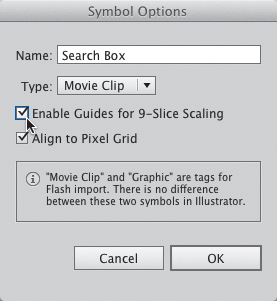
The Symbol Options dialog box appears (5.30). Several important settings here determine the behavior of the new symbol.
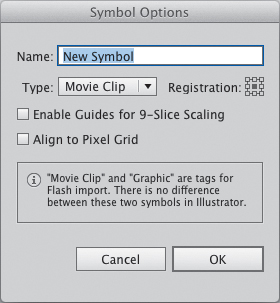
5.30. The Symbol Options dialog box
2. Name the symbol Search Box.
3. Keep the Type setting at its default.
The Type setting is important only if you plan to use this document in Flash. Movie clips in Flash have different uses than graphics. This setting has no effect on the object in Illustrator.
4. Set the registration point to the top left.
The registration point determines the origin point of the symbol. The registration point is used when placing, resizing, or rotating a symbol. Where to place this registration point really is based on how you plan to use the symbol. I tend to place it in the top-left corner about 99% of the time.
5. Leave Enable Guides for 9-Slice Scaling deselected for now.
Enabling this setting allows the symbol to be resized without distorting it. This feature is covered later on in the chapter.
6. Select the Align to Pixel Grid option.
For a symbol that uses effects and strokes in its appearance, turning this feature on helps to keep all the objects within it to stay on the pixel grid.
7. Click OK to create the symbol.
8. Press S/Ctrl+S to save your work.
You can distinguish a symbol onscreen by the registration icon on the selection (5.31).

5.31. A symbol is indicated by the registration mark on the selection.
Working with Symbols
Once you have created a symbol, all the attributes that define it remain with the original contained in the Symbols panel. Any symbol on the artboard is considered an instance of the original symbol and any transformation made applies only to that instance.
Placing a Symbol Instance
You can place as many instances of a symbol as you need, and you can place them a couple of ways:
• Drag an instance onto the artboard from the Symbols panel: Using this method allows you to place an instance where you drop it on the artboard.
• Click the Place Symbol Instance button  at the bottom of the panel: Using this method places the instance in the center of the view.
Editing a Symbol
You can transform a symbol instance with a tool like the Free Transform tool. To actually change the look of a symbol, you’ll need to edit the symbol definition itself. Let’s see how this works by changing the look of a duplicated symbol:
1. In the Symbols panel, select the Search Box symbol and choose Duplicate Symbol from the panel menu.
2. Click the Symbol Options button  and rename the duplicated symbol Search Box Active. Select the Align to Pixel Grid option and click OK.
3. In the Symbols panel, double-click the symbol to enter isolation mode.
4. Select the object and click the bottom Fill layer in the Appearance panel.
5. Change the color of this fill to #ffffff.
6. Select the gradient Fill layer and change all color stops to white.
The final symbol should look like 5.32.
5.32. The alternate search box symbol
7. Press Escape to exit isolation mode.
8. Press S/Ctrl+S to save your work.
With the white background completed, this symbol will act as the active search box in the mockup.
Swap Symbols
Illustrator can replace one symbol with another, which comes in handy for mocking up how the search box would change when a user clicks in it to enter search terms. To document this search interaction, you’ll duplicate the current artboard and change the search box to the active state.
1. Duplicate the current artboard by choosing Duplicate Artboards from the Artboards panel menu. In the Artboards panel, drag up the new artboard so it’s just underneath the old one (5.33).
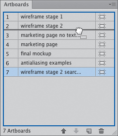
5.33. Dragging artboards into place
2. Double-click the new artboard to make it active in the window.
When you create the duplicate, Illustrator doesn’t automatically bring it into the current view. If you don’t perform this step, you could inadvertently edit the original artboard. I’ve done it a thousand times and it’s a pain.
3. Select the search box on the new artboard. The Control panel has a pop-up panel labeled Replace; open the panel and click the Search Box Active symbol (5.34).
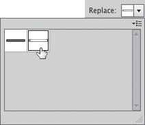
5.34. Swapping one symbol for another
4. Press S/Ctrl+S to save your work.
The search box on the artboard will now show the symbol with the white background. Clicking the Next and Previous buttons in the artboard navigator (found in the bottom-left corner of the document) will toggle between the two artboards, showing how the interaction works.
Resizing Symbols with 9-Slice Scaling
Symbols have one more amazing feature that makes life easier for a UI designer. Some elements in a UI may vary in size, like a text field or a background element; when using symbols for these objects, you can use 9-slice scaling to keep distortions from happening when you resize.
First, let’s see what happens when you resize a symbol that doesn’t have this setting enabled:
1. Select the search box that has the dark background.
2. Select the Free Transform tool (E) and drag the right edge handle of the symbol to resize it.
Without 9-slice scaling enabled, the symbol looks like it ran into a wall. That’s not the effect we are hoping to achieve (5.35).

5.35. Symbols get squished without 9-slice scaling enabled.
3. With the symbol selected, click the Reset button in the Control panel.
This button allows you to remove all transformations made to a symbol and returns it to its original state.
You can enable 9-slice scaling for a symbol at any time. Turn it on now and see how it affects the search box symbol.
4. In the Symbols panel, select the Search Box symbol and then click the Symbol Options button .
5. Select the Enable Guides for 9-Slice Scaling option (5.36) and click OK.
5.36. Enabling 9-slice scaling in Symbol Options
6. Back on the artboard, double-click the search box to enter isolation mode.
When you double-click a symbol on the artboard, you’ll see a dialog box letting you know you’re about to edit a symbol (5.37).
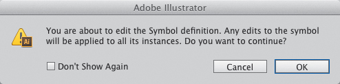
5.37. This warning lets you know that you have double-clicked a symbol and will enter isolation mode.
In isolation mode, you’ll notice four dashed guides that run through the search box (5.38). You can move the lines to indicate which areas of the symbol will be resized and which will be protected when you transform the symbol.
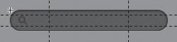
5.38. Guides for 9-slice scaling as shown in isolation mode
7. Place the guides in the search box as shown in 5.39. Press Escape to exit isolation mode.

5.39. How 9-slice scaling works
8. Select the Free Transform tool (E) and drag the right edge handle of the symbol to resize it.
With the 9-slice scaling guides set, you can resize the search box without distorting the icon inside or the corners.
Going Off the Pixel Grid
Keeping objects on the pixel grid has been a major theme running throughout this chapter. The addition of pixel alignment features is what finally made Illustrator viable for UI design. However, it’s still a drawing tool, and sometimes you’ll want to include artwork that doesn’t need to strictly adhere to the pixel grid.
Adding a few of these illustrative touches to your application UI will provide interest and variety. User interfaces don’t have to be boring; if anything, they should always have some element of surprise and delight to help make an emotional connection with the user. It adds a human element into the mix.
Being that this is an app about toy cars, let’s add some whimsical typographic touches to the page.
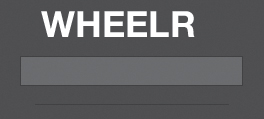
Creating an Application Logo
Wheelr needs a logo as an identifier. For this admittedly simple logo, I chose the font Clutchee, which is a free web font available at FontSquirrel (www.fontsquirrel.com). It’s a bold display font that kind of looks like it has skid marks from a tire burnout running through each letter. Install the font on your system and then use it to create the logo.
If you’re unsure how to install a new font on your computer, consult your operating system’s help files for your installation instructions.
1. Select the Type tool (T) and click in the sidebar to create a point type object.
2. Type Wheelr and press Escape.
This keyboard shortcut is indispensible when editing type. It quickly gets you out of type-editing mode, but leaves the type object selected.
3. Using the Control panel, set the font to Clutchee and size it to 42 pixels.
4. In the Control panel, click the Character link to pop up the Character panel. In the Tracking field  , set the tracking value to 25.
A positive tracking value puts extra space between each letter, which helps the legibility of this super-bold typeface.
5. Give it a white fill by clicking the white swatch in the Color panel.
6. Skewing the logo a little to the right makes it look speedy. To do this, click and hold the mouse on the Scale tool  until the tool group flyout appears. Select the Shear tool
  from the group.
7. Double-click the Shear tool to bring up the Shear dialog box. Set the shear angle to 13 degrees and click OK.
8. Finish off the logo by placing it right at the top center of the sidebar (5.40).
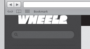
5.40. Final logo placement
9. Press S/Ctrl+S to save your work.
If you select this type object and view its position in the Transform panel, you’ll notice that there are no whole pixel values to be seen. Because type objects are comprised of many curves and have font-specific data embedded that you can’t change, they will never fit on the pixel grid. That’s perfectly okay.
Enhancing the Hierarchy
To emphasize the navigation hierarchy, you’ll use a different typeface for the section headline, app navigation, and the Popular Collectors headline. Doing so will help to visually separate those section identifiers from the regular content. For these elements, use the free web font Komika Title, also available from FontSquirrel. I chose this typeface because it has a hand-lettered feel that’s common with custom pinstriping and lettering. After you install it, use the font’s Paint style to make the following changes:
1. Set the section headline, The Latest, to 18px Komika Title – Paint.
2. Set the Collection, Crew, and Profile navigation items to 13px Komika Title – Paint.
3. Set the Popular Collectors heading to 13px Komika Title – Paint.
4. Press S/Ctrl+S to save your work.
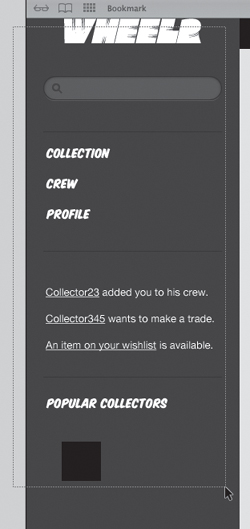
Your final type should look like 5.41.

5.41. The mockup is coming along nicely.
Using Layers for Organization
Much as you would layer ingredients to make the perfect BLT, you can use layers in Illustrator to stack your objects into logical groups. A BLT put in the blender probably wouldn’t taste very good. In Illustrator, leaving all your objects on one layer is the equivalent scenario. Doing so makes it difficult to work with your design as it gets more complex.
To help with this organization principle, Illustrator provides the Layers panel (Window > Layers). You’ll use the Layers panel in several ways to organize your art, and the panel itself has quite a few options. This section will outline the most useful features for UI design.
The Layers Panel
The Layers panel (5.42) is, at its core, a list of all the objects in your document. By default, the panel contains a single parent layer with each object on the artboard listed underneath it. As you add objects to a layer, a triangle appears next to it that you can use to toggle the visibility of its contents in the panel. Each layer has a small thumbnail that gives you a visual representation of the objects that reside in it.

5.42. The Layers panel
You can add as many layers as you need to meet the needs of your design. Objects can be added to new layers and moved easily between them at any time. You can also reshuffle the stacking order of layers, which in turn affects how your objects display on the artboard. Each layer you create receives a color to help you identify its objects. When you select an object, its selection outline matches that of its parent layer (5.43).
5.43. When selecting objects, the color of their selection outlines match that of the layer in which they reside.
Each item in the list has three columns that can be used for information about a layer or as a means of interacting with its objects. Clicking in a column controls the following layer characteristics:
• Visibility: Clicking in this column toggles the visibility of the layer contents. The presence of the Eye icon  indicates that the objects on the layer are visible on the artboard.
• Editability: Clicking in this column toggles the editing capability of the layer. When the Lock icon  is present, the layer cannot be edited.
• Selection: This column indicates whether one or more items in the layer are selected. When all objects on the layer are selected, a large colored selection box appears in the column. If one or more items on the layer are unselected, the colored selection box is smaller (5.44).

5.44. The selection column indicates with a large colored square whether all objects on the layer are selected.
Display Options
The Layers panel has several different ways of displaying information. Your document’s layer structure can be as simple or as complex as your needs and working style dictate. The panel provides viewing options for each type of workflow.
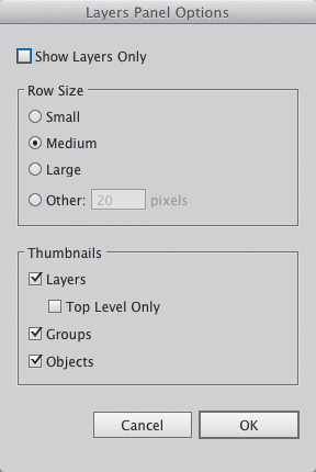
To change the display of the Layers panel, choose Panel Options from the Layers panel menu. The following options are available (5.45):
• Show Layers Only: This option hides from the list all the items that normally appear under a parent layer. I like to work this way since selecting objects on the artboard is really easy, and having all the cruft appear in the Layers panel just creates information overload.
• Row Size: As you begin to create a lot of layers, you might find that they take up a lot of space in the panel. You can make each row a preset size, or you can set a custom height.
• Thumbnails: You can select which thumbnails to show in the panel. The size of the thumbnail is determined by the row height set in the previous box. If you choose the Small row size, this Thumbnails option is disabled completely.
5.45. Layers Panel Options dialog box
Creating Layers
As you begin to make your designs more complex, using additional layers helps to organize your work into logical groups. Since you haven’t gone too far into the Wheelr mockup yet, now would be a good time to do some housecleaning. My process for organizing artwork comes from my many years of working with Photoshop.
Typically, I create a layer for all background elements, one for the browser chrome, and then put the rest into layers based on where they fall in the page structure. For the Wheelr mockup, you’ll create a header, sidebar, and content layer in addition to the two layers previously mentioned. To begin creating these layers and moving artwork to them:
1. Select Artboard 1 from the artboard navigator (found at the bottom left of the screen) to bring it into the view.
2. In the Layers panel, click the Create New Layer button to add a new layer to the list.
New layers appear at the top of the list by default.
3. Rename this layer by double-clicking the name and typing Chrome. Additionally, rename the bottom layer Background.
4. Create three more layers and name them Header, Sidebar, and Content (5.46).
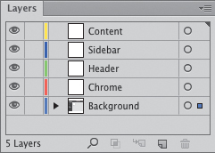
5.46. The basic layer structure for Wheelr
Moving Objects Between Layers
Now that the layer structure is in place, all you have left to do is populate the new layers. Right now, every piece of this design is on the Background layer. You’ll change this by selecting the appropriate elements and moving them to their respective layers:
1. Select the browser chrome element with the Selection tool  (V).
(V).
2. In the Layers panel, drag the colored selection square from Background to Chrome (5.47).
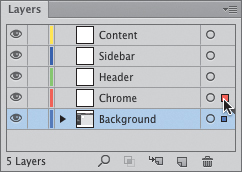
5.47. Moving the browser chrome to a new layer
Next, you’ll move all the content to the header layer, independent of the background rectangles.
3. In the Layers panel, click the Selection column for the Background layer (5.48).
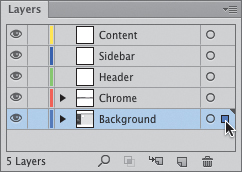
5.48. Click in the Selection column to select all objects on the layer.
This will select all the art on the background layer while leaving the chrome out of the selection. You’ll need to deselect the background rectangles in order to move all the content.
4. Hold down the Shift key and click each of the background rectangles to remove them from the current selection (5.49).
5.49. With the background rectangles deselected, you can move the content to a new layer.
With the background shapes deselected, you can move all the text out of the Background layer.
5. Drag the colored selection square to the Header layer (5.50).
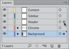
5.50. Moving content to the Header layer
Now that you have all the background elements and the browser chrome on their own layer, you can lock these layers to prevent them from being selected.
6. To lock the Background and Chrome layers, click the Lock column (5.51).
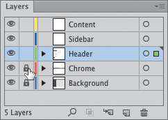
5.51. The lock icon indicates non-editable layers.
The lock icon indicates that these layers are now unable to be selected or edited. Now you’ll be able to easily select each grouping of content in order to move them to their respective layers.
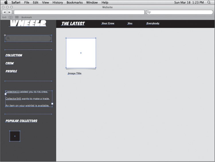
7. With the Selection tool (V), click and drag around all the sidebar content (5.52). Move the colored selection square in the Layers panel to the Sidebar layer.
5.52. Drag to select all the sidebar content as you prepare to move it to a new layer.
8. Select the photo frame and its label and move the colored selection square to the Content layer.
Now that all the content is organized into logical layers, let’s take a moment to tighten up the layout before moving on to the next chapter.
Tightening Up the Layout
Now that the structure is in place and you have all the necessary elements in the layout, let’s put everything in its proper place. Up to this point, the content on the mockup has been placed pretty loosely. Depending on the level of fidelity you’ll need for your client, you may choose to keep the layout loose or tighten it up substantially. I prefer to keep it somewhat loose until all the features and functionality get figured out, just in case there are changes.
Choose View Guides > Show Guides (;/Ctrl+;) to make the grid visible again and then line up all the elements to roughly match 5.53. Be sure to press S/Ctrl+S to save your work when you are done.

5.53. Use this as a guide for the tightened layout of elements in the mockup.
Conclusion
The Appearance panel makes it possible to create beautiful graphics using multiple layers and effects using a single object. You can edit these effects at any time without affecting the original object. You can then take the design and save it as a graphic style that can be used on other objects.
Symbols allow you to create multiple instances of an object or group of objects. They can be used to create common interface elements like search boxes, icons, buttons, and even entire backgrounds. 9-slice scaling allows symbols to be resized while keeping their corners intact.
Layers give you the ability to organize your artwork into logical groupings. This can assist in making selections, showing and hiding certain pieces of the design for simplicity, and protecting areas you don’t want to accidentally edit.
Creativity and efficiency are the name of the game here, and these features give you the best of both worlds. The next chapter aims to take them a step further by introducing more effects for graphic styles, symbols, as well as additional features for text. You’ll also learn how to work with images.