4. UI Design Building Blocks
Chapter Overview
Up to this point, we’ve spent some time getting to know Illustrator’s user interface. Now it’s time to begin putting those tools into action and start creating a UI yourself. This chapter takes a look at the basic features that Illustrator provides for the building blocks of UI design:
• Using guides and alignment tools
• Creating page grids
• Achieving pixel precision
• Beginning a layout
• Setting type
You’ll learn these features in the context of creating a screen for a mock web application for die-cast car collectors. The mockup has several elements: a sidebar that contains the app name, a search field, app navigation, and some activity info. It also has a section navigation bar and a main content area. It has some simulated browser chrome to finish it off. I’ll show you how to create this over the next few chapters.
Guides Objectified
Every professional design application lets you set guides to help you align objects in your document. Alignment is one of the design principles that make any design just feel right. It brings cohesiveness into the layout. In Illustrator, there are two basic ways to use guides in your documents:
• Create an ad-hoc guide when you need to align several objects to a certain plane.
• Pull several guides out to create a layout grid.
By default, guides are “magnetic.” Dragging an object will cause it to snap to a guide once it gets within a certain pixel distance (4.1). This ensures that your objects will line up exactly as you want them. Alternatively, dragging a guide to a selected object will snap the guide to that object.
4.1. The drag cursor changes to white when an object has snapped to a guide.
Guides will be helpful in the mockup for aligning graphic elements. You’ll explore Illustrator’s guides by first creating a new document for the mockup:
1. Choose File > New. In the dialog box, choose the Web profile.
2. Select 1024 x 768 as the artboard size and click OK to create the document.
This size represents the target display resolution you’ll use for this mockup.
Creating Guides
Now that you have a document open, it’s time to create some guides. In order to create guides, you’ll need to make sure your rulers are visible. If they aren’t showing at the top and left side of the document window, choose View > Rulers > Show Rulers ( R/Ctrl+R).
1. Click and drag a guide from the ruler onto the artboard.
2. If you didn’t get the guide in just the right spot, undo the guide placement by doing one of the following:
• Press Z/Ctrl+Z to undo the guide placement and try again.
• Move the guide into place by selecting it and dragging until you have it positioned correctly. If you are unable to move the guide, it may be locked. Choose View > Guides > Lock Guides ( ; [semicolon]/Ctrl+Alt+; [semicolon]) to unlock the guides. Selecting this menu option toggles the lock state on or off.
3. To remove a guide, simply select it and press Delete (make sure the guide is unlocked).
4. If you no longer need any guides in your document, or need to start over, remove them all at once by choosing View > Guides > Clear Guides.
Guides are always visible by default; you can choose to show or hide guides as well. To do so, choose View > Guides > Hide Guides (;/Ctrl+;) to toggle guide visibility. If your guides are hidden, the menu changes to read Show Guides.
Making Guides from Objects
Another awesome feature is the ability to make any vector object on the artboard into a guide. This is really helpful if you need to align objects at strange angles. This feature has a practical use:
1. Click and drag with the Line tool () and draw a line on the artboard.
2. Select the line and choose View > Guides > Make Guides (5/Ctrl+5).
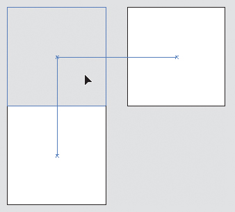
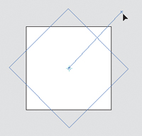
You object is instantly turned into a guide, taking on all current attributes you have set for your guides (such as snapping behavior, visibility, lock state, and color). This is a great way to align objects already on your artboard to an angle without having to measure (4.2).
4.2. Snapping an object to a custom guide
You can also convert any guide—whether you pulled it from a ruler or created it from an object—into an object:
1. Make sure that guides are unlocked (; [semicolon]/Ctrl+Alt+; [semicolon]). You won’t be able to select them otherwise.
2. Select the guide you want to convert and choose View Guides > Release Guides (5/Ctrl+Alt+5).
The guide is now an object, selected and ready for you to work with.
Using Alignment Tools
Besides allowing you to snap and align objects to guides, Illustrator also provides powerful alignment features accessible via the Align panel (Shift-F7). This panel (4.3) helps to align objects to an axis or position as well as distribute them across a distance. A few of the more commonly used alignment features can also be accessed in the Control panel when you have more than one object selected.
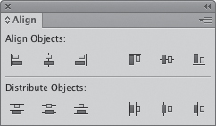
4.3. The Align panel
The buttons in the top row of the Align panel align objects by their edges and centers along the horizontal and vertical axes. The buttons provide a graphical representation of how Illustrator will align the selected objects.
The buttons in the bottom row of the panel distribute objects across a distance based on the axis or edge that the user has chosen. This is very different from aligning objects. Instead of lining them up along a single edge or center, Illustrator will equally space the objects from the edge or center you clicked.
You can make a couple of extra options (4.4) visible by choosing Show Options from the Align panel menu. The first of these options, Distribute Spacing, distributes objects across a distance by putting an equal amount of space (which can be user-specified) between them.
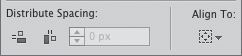
4.4. Align Panel extra options
The second button houses the Align To options. These options allow you to choose how objects will align in the following ways:
• To the selection (the default behavior): The selection in this option represents the area in which all selected objects are contained. For example, if you have four rectangles and you want to align all of their left edges, clicking the align left button would move all but the leftmost rectangle.
• To the artboard: This option aligns objects to centers or edges of the artboard itself. This alignment method is best used when you want to center a single object or a selection of objects on the artboard.
• To a key object: This option allows you to select an object to which all other objects in the selection will align. This method is best used when the object you want to align to needs to stay in place.
To designate an object in your selection as the key object, perform the following steps:
1. Select all objects (including the one that will be the key object) you want to align either by dragging a selection box around them or by Shift-clicking each object.
2. Set the key object for the selection by clicking it.
The key object is always indicated by a bold selection outline (4.5).
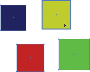
4.5. The key object is indicated by a bold selection outline.
Smart Guides
Illustrator has another type of guide called a Smart Guide. Instead of being just a static object to which you can align something, smart guides are dynamic and provide useful feedback as you draw. There are six different types of Smart Guides you can set up in the Preferences dialog box (4.6). You can enable as many of these guides as you’d like, or disable them altogether. You may find it a little intrusive to have these guides on all the time; you can toggle the guides on or off by choosing View > Smart Guides (U/Ctrl+U).
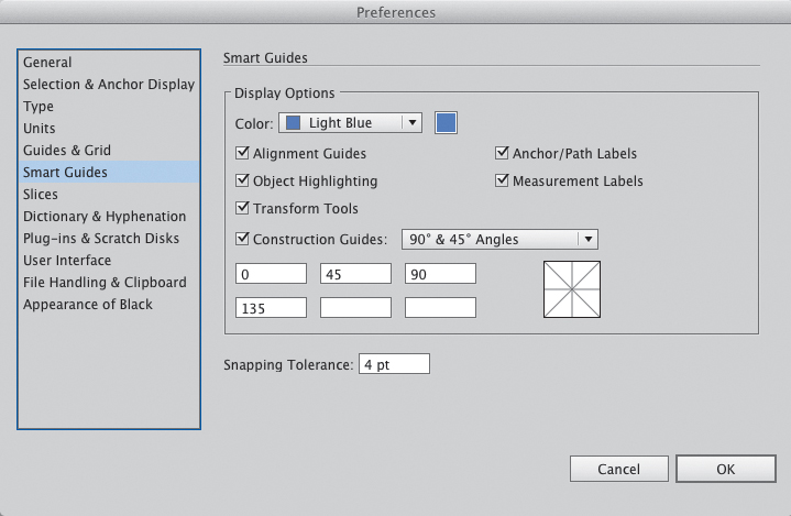
4.6. Setting up smart guides in the Preferences dialog box
What follows is a description of how each type of Smart Guide works. Play around with each of the settings to see which ones work best for your workflow.
Alignment Guides
Alignment guides help you to align objects while drawing, moving, or editing. They help you align objects and anchor points to the centers and/or edges of nearby objects (4.7) without having to pull guides from the ruler.
4.7. Using alignment guides helps align objects as you move them around.
Anchor/Path Labels
Anchor/path labels appear as you hover over an object to let you know whether you have an anchor point, path, center point, or edge of an object under your cursor. This really aids in making selections once you have a more complex design (4.8).
4.8. Anchor/path labels let you know what’s beneath your cursor.
Object Highlighting
With the Object Highlighting Smart Guide enabled, objects are highlighted with a selection outline as you hover over them. Again, this Smart Guide is most useful when you have a lot of objects on the artboard, as it allows you a preview of what object will be selected when you click. It also allows you to see objects that have live effects applied, as seen in 4.9.
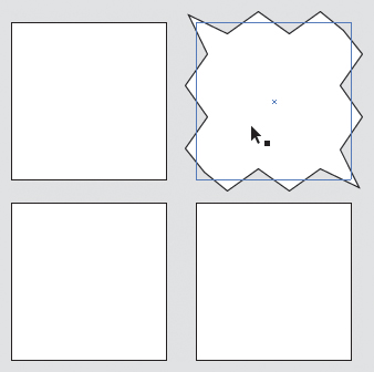
4.9. Object highlighting shows which object will be selected when you click. It also shows the original shape of objects with effects applied to them.
Measurement Labels
Measurement labels display the size, distance, and position of objects as you draw, move, or edit them (4.10). It helps you to be really precise with layout and placement in context.
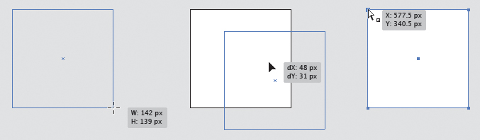
4.10. Measurement labels provide in-context information about the dimensions and position of objects.
Transform Tools
Transform tools display guides when used with the Rotate, Scale, or Shear tools (4.11). These guides help to constrain these transformations to common angles when drawing, so you don’t have to use the Shift key to do the same thing.
4.11. In this example, the guides help you snap an object’s rotation to 45-degree angles.
Construction Guides
When drawing with the Pen tool, construction guides help to constrain line segments to specified angles (4.12). You can choose a preset angle group or specify your own custom angles (see 4.6).
4.12. Construction guides make drawing with the Pen tool a little easier.
Grids Made Easy
Over the last several years much discussion has taken place about using traditional grids in web design. Articles and books by designers like Mark Boulton and Khoi Vinh have helped us learn and understand how to use grids effectively to create beautiful designs for the screen. Constraints in design can be a pain and a blessing at the same time. Creating a grid is an essential task that will enable a foundation on which to build a consistent design scheme.
How do we create grids today? I’m sure designers everywhere use a lot of different methods, including not using a grid at all. Typically, though, we painstakingly create a grid by dragging guides from rulers and trying to place them consistently on the page.
My old process for creating a grid was ridiculous. I used to draw a couple of rectangles, one for the column width and one for the gutter, and then copy and paste them end to end across the page. I’d use those as markers so that I would know where to snap my guides. Every new page I would create would need to use the grid; worse, I would often have multiple files or grid layers on sites that called for the use of more than one grid. If those grids ended up changing, frustration would ensue.
Fuss no more, as Illustrator can help make you more productive by not only letting you create a single grid easily, but also allowing you to maintain multiple grids in a single document.
Creating a Grid
You’ll start the mockup for Wheelr by creating a standard 950 pixel-wide grid with 24 columns and 10-pixel gutters. This grid will sit in the center of the 1024 x 768 document you created earlier, defining the “safe” area in a browser or tablet device. In the past, I would have done all kinds of math (which I’m no good at) to figure out how wide the columns and gutters needed to be so that the measurements were in whole numbers. Thankfully, there is a feature in Illustrator that will do these tricky calculations automatically.
1. Start by choosing View > Guides > Clear Guides to remove all the guides. This will give you a clean slate from which to begin.
2. Draw a 950 (W) x 768 (H) rectangle, give it a color of your choosing, and align it to the center of the artboard (4.13) using the Align to Artboard feature.
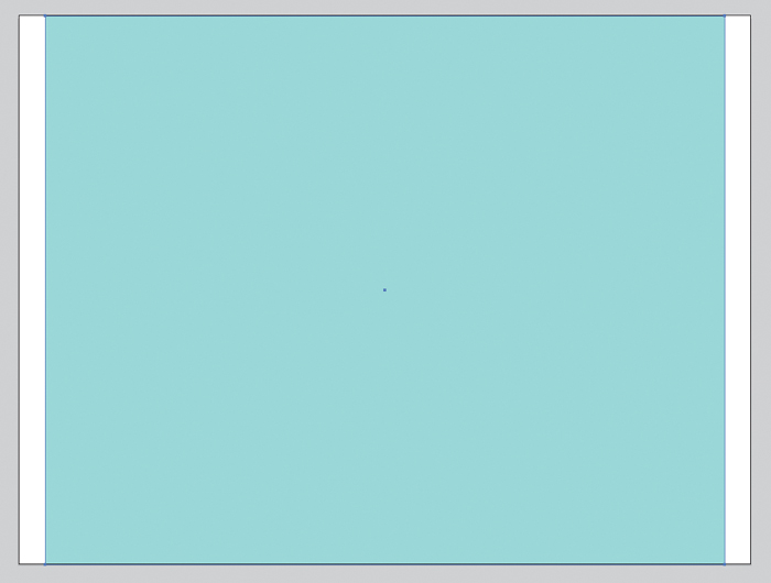
4.13. Center the rectangle on the artboard before you create the grid.
3. Choose Object > Path > Split Into Grid.
The resulting dialog box allows you to choose settings for this particular grid.
4. Under the Columns section, enter 24 in the Number field and 10 px in the Gutter field (4.14).
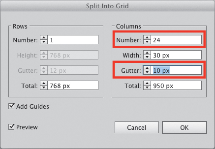
4.14. Create a 24-column grid with 10 pixel-wide gutters.
5. Select the Preview option to see what’s being created, and select the Add Guides option so you don’t have to add your guides manually afterwards. Click OK.
The rectangle you started with is now divided into 24 rectangles (4.15). The grid and the rectangles should all be selected at this point.
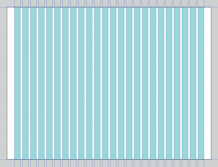
4.15. A standard 24-column grid.
6. Press and hold the Shift key and click the guides to deselect them.
7. The extra rectangles are unnecessary at this point, so press Delete to get rid of them.
Making the Gridlines Fit
Now you have a nice 24-column grid. The last thing to do at this point is resize the gridlines so they fit nicely on the artboard. It’s an optional step, but it helps when you have multiple artboards so you don’t have grids overlap other artboards. To make them fit, follow these steps:
1. With the Direct Selection tool  (A), drag to select all the anchor points on the top of the grid (4.16).
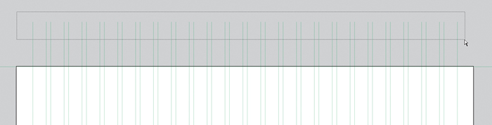
4.16. Select the top anchor points of the grid with the Direct Selection tool.
2. Use the arrow keys to nudge the anchor points until they sit at the top of the artboard (4.17).
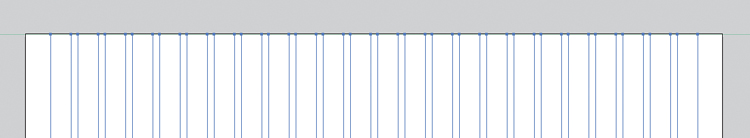
4.17. Move the anchor points to the edge of the artboard.
3. Repeat for the bottom side so that all the vertical grid lines fit within the bounds of the artboard.
4. With the Direct Selection tool (A), select the two horizontal gridlines by clicking on their respective line segments. Press Delete twice to remove these two horizontal lines, as you do not really need them.
5. Press S/Ctrl+S to save your work.
When you select a line segment with the Direct Selection tool, the segment is selected, but the anchor points on each end are not. Pressing Delete removes only the segment; pressing Delete again removes the anchor points.
Applying the Grid to Multiple Artboards
You started with one artboard; as you begin to design more of the application, you may need to create multiple artboards in this single document. This 24-column grid is versatile enough to be useful on every page of the app. The question remains: How can you get this grid on every artboard in the document without having to copy and paste to each, or worse, recreate the previous steps on each artboard? The answer is stunningly simple.
1. Click the New Artboard button  at the bottom of the Artboard panel three times to add three more artboards to the document.
2. Select the grid with the Selection tool  (V).
(V).
3. Choose Edit > Cut (X/Ctrl+X) to cut the grid to the clipboard.
4. Choose Edit > Paste on All Artboards ( V/Ctrl+Alt+Shift+V).
This brilliant shortcut pastes the grid to every artboard in exactly the same spot as where it was cut.
To add some variety to the layout, create a different grid for the landing page than you would on the rest of the application. All you would need to do is delete a grid from one of the artboards and follow the steps to create a new grid with different properties. When it comes to grids, Illustrator allows precision, speed, and flexibility. By using these tools, you’ll find it easier to create and maintain grids than ever before.
Achieving Pixel Precision
I used to be a diehard Photoshop user. But I became frustrated with how difficult creating and maintaining large projects was with it and wanted a more efficient tool for my web design projects. I had tried several times over the last ten years to use Illustrator for web and UI design, only to be stopped in my tracks by the one thing that killed it—the lack of pixel-precise drawing features. My designs suffered from unwanted anti-aliasing (heretofore referred to as “fuzzy-edge syndrome”) and a general lack of character that Photoshop made easy. Chances are you fit in this same camp; that may be the reason you’re reading this book right now.
I made the switch for good when Adobe rolled out Illustrator CS4 in 2008. It turned out that Illustrator already included a few features for enabling pixel precision, I just didn’t know those features were available or how to use them. Once I got it figured out, it was easy to walk away from Photoshop (for UI design, at least) for good. With CS5 and CS6, Adobe has made creating pixel-precise designs even easier (4.18).

4.18. The left side of the button suffers from fuzzy-edge syndrome. The right side is crisp thanks to the pixel-snapping features in Illustrator CS5 and later.
Pixel Preview Mode
The first feature Illustrator provides for ensuring pixel-precise artwork is Pixel Preview mode (Y/Ctrl+Alt+Y). The default Preview mode in Illustrator allows you to view your artwork as it would print. Objects are smooth and crisp no matter how far you zoom into your design. This mode is perfect for creating illustrations, logos, typography, or other illustrative elements that don’t need to be pixel-precise.
However, when creating UI elements like buttons, widgets, or rules, using Preview mode paints an unrealistic picture of how these objects appear on the web or mobile devices, with the exception of newer ultra-high resolution devices. Using Pixel Preview mode renders your design on the screen at 72 pixels per inch, just like a raster-based application such as Photoshop would. When you zoom in, you can see how your objects and effects look on a bitmap display (4.19). This is referred to as anti-aliasing. The application inserts extra pixels of related colors to simulate a smooth curve.
4.19. Pixel Preview mode allows you to see vectors as if they were bitmaps.
Pixel Preview mode is great as a diagnostic tool, perfect for visualizing how your artwork will render on the low-resolution displays that are still fairly common today. It’s great for viewing how Photoshop and Illustrator effects (to be discussed in Chapter 6) render on the screen. If you are a Photoshop user, you can also use it as your full-time view mode to provide some comfort and familiarity as you try to switch.
Aligning Objects to the Pixel Grid
In Illustrator’s application preferences (K/Ctrl+K), you can specify and view a customizable document-wide grid that is akin to graph paper (4.20). This is separate from the guide-based grid you created in the last section. However, in my opinion, this extremely loose yet very restrictive grid structure is really only useful for technical drawings. It’s also inefficient, because it can be visually intrusive and has to be toggled on and off manually.
4.20. Illustrator’s document-wide grid is like having graph paper on your screen.
Since the end product of UI design is viewed on a pixel-based screen, it makes sense that it should be designed to match a pixel-based grid. Illustrator’s answer for that need is the pixel grid. This grid is separate from both the document-wide grid and the guide-based grid. It’s made up of one-pixel increments and allows for extremely precise drawing. In Pixel Preview mode (Y/Ctrl+Alt+Y), this grid is viewable when you zoom in to 600% or closer (4.21).
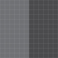
4.21. The pixel grid (which is filled in to show pixel detail) is displayed when in Pixel Preview mode and zoomed in closer than 600%.
One of the newest features to take advantage of this grid is the ability to seamlessly and automatically align objects to the pixel grid as you draw. It enables you to keep your objects from having fuzzy edges in Pixel Preview mode by snapping the dimensions to whole-pixel values. Fuzzy-edge syndrome occurs when an object is either sized at sub-pixel increments (for example, a width of 400.3456 px) or sits on a sub-pixel X or Y point. Since Illustrator is a vector-based program, you have the ability to size and place artwork anywhere on the screen with up to 3-decimal-point precision, which can be helpful when creating print documents.
Since displays use pixels to render artwork, placing an object off of the pixel grid will cause it to blur; the screen can’t color half of a pixel, so it anti-aliases it in order to keep pixel from looking jagged, which is where the fuzzy edge comes in. Keeping your objects on the pixel grid by having whole numbers in the object dimensions ensures that your artwork will render without fuzzy edges, appearing exactly the way you’d expect it. It’s especially helpful when dealing with strokes.
You can enable or disable pixel alignment in a three ways:
• You can set pixel alignment on or off in the advanced section of the New Document dialog box when creating a new document (4.22).
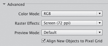
4.22. The Align New Objects to Pixel Grid setting in the New Document dialog box
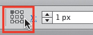
• If you didn’t turn the setting on when you created a new document, you can do so at any time from the Transform panel menu (4.23).
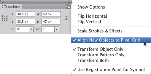
4.23. Turning on pixel alignment in the Transform panel menu
• You can control pixel alignment on an object-specific basis by toggling the option in the Transform panel’s options pane (4.24). You can view these extra options by choosing Show Options from the Transform panel menu.
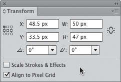
4.24. Toggle pixel alignment for individual objects in the Transform panel options pane.
Since pixel alignment is a fairly new feature, opinions vary on whether you should let Illustrator control pixel-precise placement or whether you should turn the feature off and manage it yourself. I feel that as you begin to design UIs with Illustrator, you’ll find the method that works best for you.
Coordinates and Reference Points
The Transform panel can also be a great tool to aid in achieving pixel-precise artwork. The Transform panel contains four fields: two for positioning elements according to values on the X and Y axis, and two for setting the width and height of an object. It also has the reference point locator, which is used for setting the point on an object that will act as the anchor for transformations (like rotations or scaling). You’ll also find these fields in the Control panel when an object is selected (4.25).
4.25. The Control panel Transform fields
It’s really easy to use coordinates to precisely place your artwork anywhere on the artboard. This is a perfect opportunity to begin working on the Wheelr mockup. The first thing you need to do is add the simulated browser chrome. This has been created as a separate file that can be linked in this document via the Place command:
1. Using the document created earlier in the chapter, select Artboard 1 in the artboard navigator. This will place the artboard in the view and make it active.
2. Download the simulated browser chrome file at: www.peachpit.com/UIwithAI/ch4/browser-chrome.ai. Once you’ve downloaded the file to your computer, choose File > Place.
When you import an element using the Place command, it’s dropped in the center of the current view based on its origin point (4.26). Since the object needs to be at the top of Artboard 1, using the X and Y value inputs in the Control panel will be the most precise way to get the object in place. The reference point locator in the Control panel shows the current origin point to be the center of the object.
4.26. Placing an element with the Place command drops it in the center of the view.
3. Select the object and click the top left square on the reference point locator to change the object’s point of origin (4.27).
4.27. Change the origin point of an object with the reference point locator.
The X and Y values in the Control panel will change to reflect the new reference point. This doesn’t affect the placement of an object; rather, it shows the location of that particular point.
4. Type 0 into the X and Y input fields in the Control panel.
Because the placed object’s reference point was the top-left corner, using zero for the x and y fields moves that point in the top-left corner of the artboard.
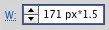
1. Type 2 in in the W (width) field and press Enter/Return. Illustrator resizes the object and automatically converts the units to pixels.
Second, you can use the Transform inputs to do math.
2. To make an object 150 percent larger, add *150% or *1.5 after the existing number (4.28) in the field and press Enter/Return. You can add, subtract, and divide using the same method.
4.28. You can use the Transform inputs to perform math equations.
If you want to resize an object proportionally, hold down the /Ctrl key as you press Enter/Return. Illustrator will adjust the width or height in proportion to what you entered.
Beginning the Layout
Now that you have a grid and the browser chrome in place, you can start putting together the design of the screen. In this chapter, you’ll begin by putting in the main structural divisions for the UI as well as the basic typography.
First, you’ll create the sidebar area. This will hold the logo, main navigation, and social features for the app:
1. Draw a rectangle on the left side of the artboard. If the object has a stroke, remove it and set the fill to #2d2d2d.
2. With the rectangle selected, use the width and height fields in the Control panel to make the rectangle 267 px wide and 674 px tall. Place it at the far left of the artboard and under the browser chrome (4.29).
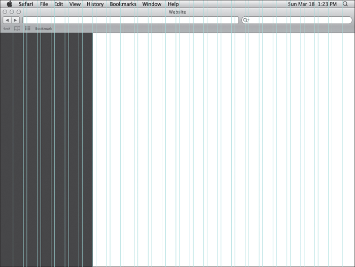
4.29. First, draw the sidebar.
3. Within the sidebar, draw a 49 px wide by 49 px tall square and give it a black fill and no stroke. This will act as the thumbnail image for a Suggested Friends feature.
4. Draw another rectangle that starts under the chrome and just to the right of the sidebar. It should be 38 pixels tall and the width of the remaining area. Set the fill of this rectangle #000000 (4.30). This will be the section navigation bar.
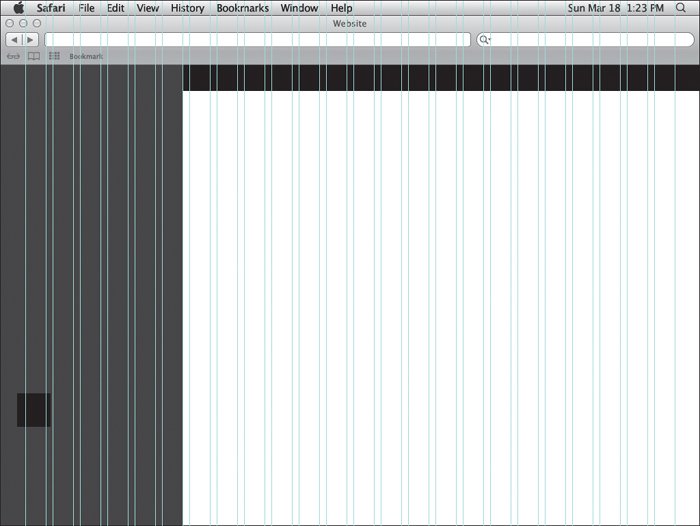
4.30. Then draw the section navigation bar.
5. Draw a rectangle that fills the remaining space in the artboard. Give it it a color of #e6e6e6 (4.31). This will be the main content area.
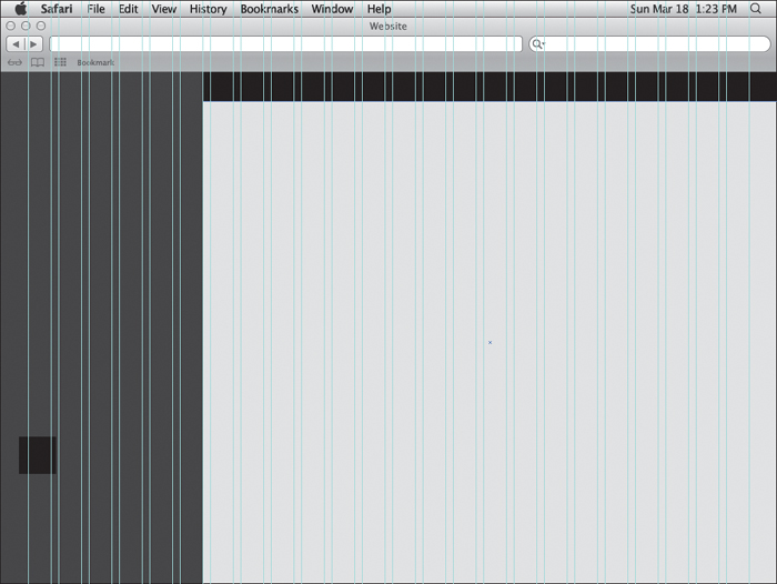
4.31. Finish up by drawing the content area background.
6. Press S/Ctrl+S to save your work.
Lining Up Strokes
Filled objects are easy to line up on the grid, but objects with strokes pose a problem. When using strokes on objects, Illustrator places the stroke across the line segment. This means that a one-pixel stroke will cover half a pixel on each side of the line segment. Using pixel alignment on the object will prevent the stroke from looking fuzzy in Pixel Preview mode, but the fact that the stroke is placed over the line segment isn’t accurate to how the object will render in a browser.
In HTML/CSS, the browser box model renders all borders on the outside of the object. To stay true to this rendering, you’ll want to have your strokes in Illustrator do the same thing so that you have accurate measurements for development. To demonstrate how to do this, you’ll create the picture frame for the car photos in the mockup.
1. Draw a 142 px x 142 px rectangle in the content area of the mockup and give it a white fill and a 4 px black stroke.
If you zoom in, you’ll notice how the line segment sits smack dab in the middle of the stroke (4.32).
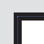
4.32. Strokes are centered over line segments by default.
2. Select the rectangle and click the Stroke link in the Control panel (4.33).
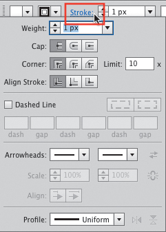
4.33. Click the link in the Control panel to conveniently access the Stroke panel.
3. Click Align Stroke to Outside (4.34).
4.34. The Align Stroke to Outside button
Now the rectangle looks the way it’s supposed to, with the stroke outside the object (4.35).
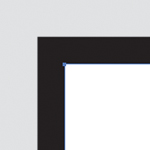
4.35. The stroke aligned to the outside of the segment
Things work a little differently with open objects and rules. Aligning a stroke to the inside or outside is not enabled for these objects. Because you have pixel alignment enabled, the stroke will automatically move tho the nearest pixel to keep from getting fuzzy-stroke syndrome:
1. Select the Line Segment tool  () and draw a 223 pixel-wide horizontal rule in the sidebar. Remove the fill and give it a 1 px stroke, with the color set to #1d1d1d.
This stroke will be used as a dividing line between sections in the sidebar.
2. Turn on Pixel Preview mode by selecting View Pixel Preview (Y/Ctrl+Alt+Y).
3. Zoom in to view how the stroke automatically adjusts to stay on the pixel grid (4.36).
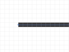
4.36. Pixel alignment automatically adjusts strokes to fit on the pixel grid. (The background color has been hidden so that you can more easily see what’s happening.)
4. Press S/Ctrl+S to save your work.
Typography for the UI
With the main structure created, it’s time to move on to typography. Good typography in a UI can emphasize and give clarity to app structure and hierarchy. In some applications, it can actually be the interface itself. If you have experience in setting type for print documents, there are some factors you need to consider when you’re setting type for a UI.
Looking Good on the Screen
First, you’ll need to think about font choices. You can use web fonts from sources like FontSquirrel (http://www.fontsquirrel.com) or the standard fonts that come with every Mac or Windows system. For system fonts, there is some parity between the two. Choosing a font that both systems have will ensure a similar experience no matter the platform. Make sure to use the same font in your mockup that you are going to use in the final UI.
The next thing to consider is how your type will render on the screen. One of the big pushes in the UI design world is for a tool that will render type the same way as it does in the browser. While I think that is a great idea, it’s difficult for me to imagine it happening anytime soon, simply because of all the variables that go into displaying type on a screen. You have the browser or app rendering engine, screen resolution, computer platform, and quality of typeface working against this idea. In the meantime, my philosophy is to get as close as I can in Illustrator and let the screen do what the screen will do.
That said, Illustrator recently inherited a feature from Photoshop that makes type rendering even better. You can now set the anti-aliasing method of the typeface you’re using to get better results for type destined for the web or mobile devices. There are subtle differences in the way each method affects your type. 4.37 shows a comparison of the four modes on Helvetica Neue.
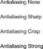
4.37. Anti-aliasing modes
You’ll see how it works in the real world by adding a current section headline to the navigation bar in the mockup. To make things easier to see for now, go ahead and hide your guides by choosing View > Guides > Hide Guides (;/Ctrl+;).
1. Select the Type tool  (T) and set some point type by clicking once in the navigation bar. Type The Latest as the name of this section. Press Escape to leave type-editing mode.
Illustrator defaults new text to Myriad Pro, which always seems to render well. However, since I don’t have a web font license for Myriad and not everyone using the app will likely have it installed on his or her system, you’ll change it to something else.
2. With the Selection tool (V), click once on the text to select it and then click the Character link in the Control panel. This will reveal the Character panel.
3. Choose Helvetica Neue Bold from the font list. If you don’t have Helvetica, choose Arial Bold instead.
4. Change the size to 18 px and give it a white fill by clicking the white swatch in the Swatches panel.
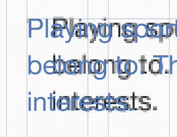
These typefaces really highlight the wonky rendering effects of the Sharp anti-aliasing mode (4.38).

4.38. The section headline looks odd when using Sharp anti-aliasing.
At the bottom right of the Character panel is a drop-down menu of anti-aliasing options (4.39).
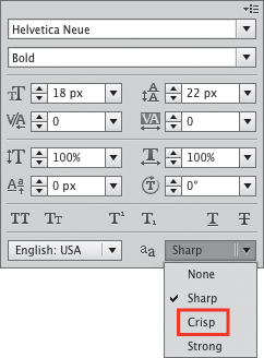
4.39. Accessing the anti-aliasing modes from the Character panel
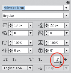
5. Choose the Crisp setting from the drop-down menu.
The Sharp setting is the default, and I have found after a lot of experimentation and comparison that the Crisp setting will give you the best results the majority of the time.
Typesetting Basics
Now that you have type rendering looking good, you’ll get the rest of the type into the mockup. You will use a mixture of point type and area type so you can get the feel for how and when to use each.
Using Point Type
Start by finishing off the section navigation bar:
1. Select the Type tool (T) and click once in the navigation bar you created earlier to set a point type object. Type Your Crew as one of the navigation items.
2. When you’re finished, press Escape. This is the fastest way to exit text-editing mode.
3. Finish off the navigation by typing You and Everybody with point type.
4. Select all three blocks of type and use the Character panel to make them Helvetica Neue Bold (or Arial Bold) at 12 px. Give them a white fill.
5. Move the type into place so that it matches the type in 4.40. You don’t need to be precise at this point since you are still in the rough stage of the layout. Things could change as you move on.
4.40. The completed section navigation bar with horizontal navigation
Now complete the text for the sidebar.
Using point type as opposed to area type for horizontal navigation elements gives you much more flexibility in moving, aligning, and spacing the individual blocks of type.
6. For the main app navigation, click once with the Type tool and type Collection, Crew, and Profile. Use a hard return after each word with the Return key so that each word is on its own line (4.41).
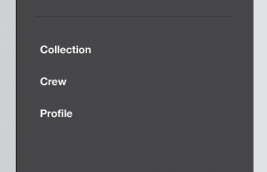
4.41. The sidebar with vertical navigation
7. With the area text still selected, select the Eyedropper tool (I) and click the section headline text, The Latest.
Not only does this trick make styling your text fast and easy, but it also ensures consistency in the UI. Just like you don’t want to use too many different fonts in a document, using too many different sizes and styles can make a layout look cluttered and inconsistent.
For vertical navigation elements, it’s easier to keep all the text in one block as opposed to separate ones. You can use leading and paragraph spacing to manage the distances between elements here in a way that is easy to replicate in HTML.
Using Area Type
For the Activity section of the sidebar, we will stray away from point type and use area type instead. The text in this section may end up being lengthy, so we want the line wraps to happen automatically like in the browser.
1. To set a block of area type, select the Type tool (T), and then click and drag a rectangle in the sidebar (4.42).
4.42. Click and drag with the Type tool to create an area type container.
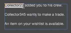
2. Type the lines from 4.43 in the text box, using a hard return between each line.
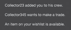
4.43. The Recent Activity feature in the sidebar
3. Style this text using Helvetica Neue (or Arial) at 12 px. Give it a white fill if it doesn’t already have one. Press Escape to exit text-editing mode.
Using area type allows you to constrain the width of a type container automatically. But how do you resize a container once it’s set? There are two ways to accomplish this:
• To manually adjust the width or height, use the Direct Selection tool (A). This will allow you to select a single segment of the container and then either drag it or use the arrow keys to resize it.
• If you know precisely what size you’d like the container to be, select the text and choose Area Type Options from the Type menu. In the dialog box that appears, you can input exact numbers for height and width.
4. To simulate the link in the activity text, double-click the type container with the Selection tool (V). This is another handy way to edit text without having to click the Type tool first.
5. Click and drag over the first couple of words to select them (4.44).
4.44. Underlining text to indicate a link
6. In the Character panel, click the Underline button (4.45).
4.45. The Underline button in the Character panel
Adding the Final Headline
You’re almost done with the first iteration. Now you’ll add the final headline for a Suggested Friends feature in the sidebar and a label for the picture frame in the content area (4.46).
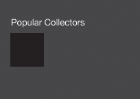
4.46. Create the section headline for the suggested friends feature.
1. Click with the Type tool (T) just above the small black square in the sidebar. Type Popular Collectors.
2. Style this text with the Eyedropper tool  (I) by clicking the text that reads “The Latest.”
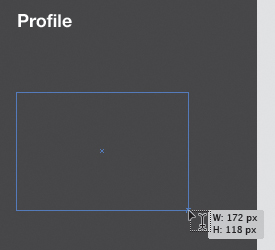
3. Use point type to create a label called Image Title for the picture frame box in the content area.
4. Style this text with Helvetica Neue Bold (or Arial Bold) at 12 px.
5. With the text still selected, choose the Eyedropper tool and click the section navigation rectangle.
You used the Eyedropper tool before to pull the color and type attributes from another text element. You can also color your text by pulling the color from a shape. Again, this helps keep consistency in the interface.
6. Press S/Ctrl+S to save your work.
You can use the Eyedropper tool to pull the color from any object. To pull a color from a portion of a gradient or a placed bitmap image, hold the Shift key while you click the color you want to sample.
Creating Character Styles
You’ll need to take care of one final detail before you move on. Creating character styles now will help out immensely as you add more text to the mockup. Character styles save text-formatting information in a way that it can be applied to other text elements with a click.
To create a character style:
1. Select the text to use as the basis for the style. For this example, choose the section navigation headline, “The Latest.”
2. Open the Character Styles panel either from the panel groups onscreen or by choosing Window > Type > Character Styles.
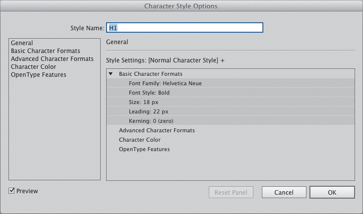
3. Click the Create New Style button (4.47).
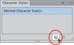
4.47. Creating a new character style
The new style appears in the panel list with the name “Character Style 1.” Rename it so it’s easier to figure out later when you need to use it.
4. Double-click the style in the list and rename it H1. Press Enter.
That was easy! If you need to edit the formatting options of the style, choose Character Style Options from the panel menu. In the dialog box that appears, you can edit pretty much any formatting attribute you need (4.48).
4.48. The Character Style Options dialog box
5. Create character styles for the other text elements as you see fit.
Conclusion
Go ahead and place the last few elements to match 4.49. It may not look like much right now, but don’t be discouraged. Creating a good user experience happens best in layers. It’s vital to make sure that you have the right content and have thought through the interactions before you start thinking about style. Once you have those things figured out, you can move on to creating and polishing the UI.
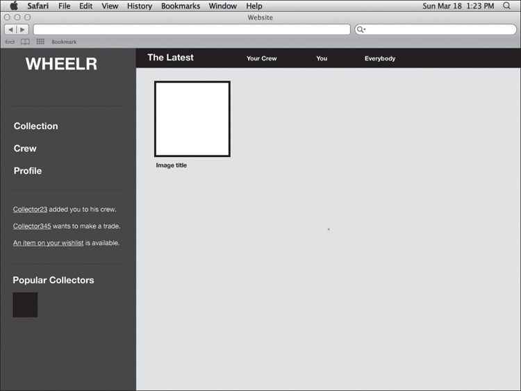
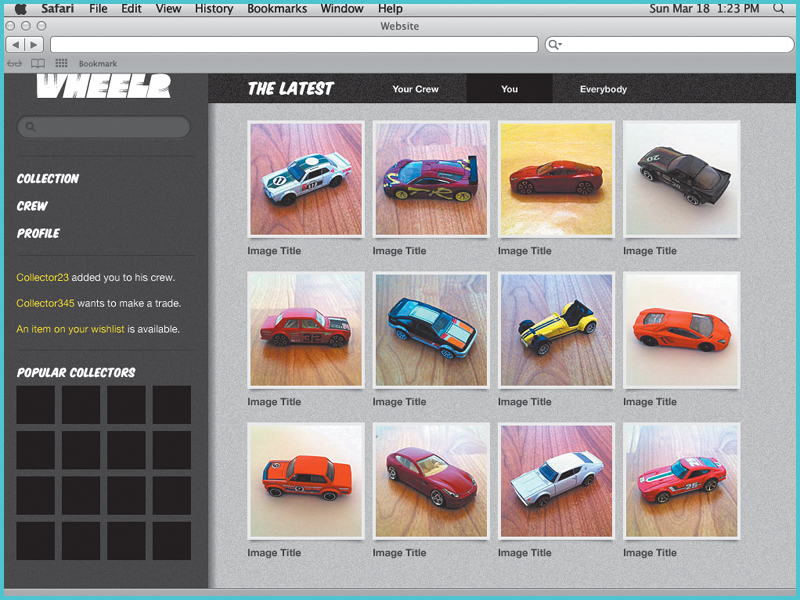
4.49. The mockup for Wheelr ... so far
You began with a wireframe by creating the basic shapes and setting the type. In the next chapter, you’ll learn how to use graphic styles and symbols to speed up UI element creation. You’ll also learn how to take advantage of layers to organize your artwork.
Table 4.1. Keyboard Shortcuts in This Chapter