
1. UI Design with Adobe Illustrator: An Overview
Chapter Overview
There are a lot of options on the market today for creating UI mockups and prototypes. They come with varying degrees of difficulty and a staggering range of features. One might say it’s as hard to choose a mockup tool as it is to pick a computer platform.
Throughout my career, I have used several of these tools and have come to rely on Adobe Illustrator for my day-to-day work. It’s loaded with features for professional UI design and is relatively easy to use. In this first chapter, you’ll get a brief overview of some of the features that make Illustrator the perfect tool for creating high-fidelity mockups for your sites and apps:
• Vector-based drawing environment for flexibility
• Excellent color and typography tools
• Tools to help achieve design consistency
• Pixel-precise layouts
Let’s dig in!
It’s All About the Vector
Adobe Illustrator is a vector-based application. That means it uses mathematical expressions to draw points, lines, curves, and shapes on the screen to create graphics. In this way, Illustrator differs from a raster-based application like Photoshop that draws these same graphics with individual pixels. Vectors are inherently faster because computer processors can execute math instructions a lot faster than they can draw pixels.
The benefits for Illustrator users are many. To start, Illustrator just feels fast. Complex documents don’t bog down your system and keep you from getting work done. Whether you’re creating highly detailed UI mockups or simple wireframes, Illustrator chugs along without skipping a beat. Second, files don’t consume as much storage space, allowing you to store more documents on your drive.
For example, the Illustrator file for a typical application screen mockup (1.1) weighs in at 883 KB. The same design saved as a layered Photoshop document is a hefty 4.4 MB. Add multiple screens or states into the Photoshop file and the size begins to increase exponentially. That may seem like a small file in comparison to high-resolution photos, but when you start to generate a lot of project files, it adds up quickly.
1.1. A typical application screen mockup has a much smaller file size in Illustrator. This entire design is less than a megabyte, even with photos.
Third, vector graphics are scalable. For example, a design element created in Illustrator using vector shapes can be resized larger or smaller without affecting the quality of the graphic. Edges are always crisp, because all the computer has to do is redo the math to accommodate whatever change in size you made (1.2 and 1.3). It allows you to be more creative and spontaneous, because it frees you from having to think about the technical aspect of what you’re creating. Let fear of client changes be a thing of the past.

1.2. Vectors produce smooth edges that stay smooth when resized (shown here at 300% zoom).

1.3. Raster images pixelate when resized (shown here at 300% zoom).
Finally, Illustrator is very stable; I rarely experience crashes that steal away half a day’s work like I did with my old Photoshop work-flow. Notice that I didn’t say never. Like any other software application on a computer bogged down with lots of activity, Illustrator is susceptible to scream-inducing crashes. You should really get in the habit of saving early and often. I’ve learned by sad experience that time still sometimes gets the better of me. I’ll go an hour before saving my progress—that seems to be when crashes happen most. Murphy’s Law, I guess.
Typography + Color = Power
1.4 This screen design uses color and typography to create a visual hierarchy.
Typography and color theory are important principles of design. Adhering to or ignoring these principles can make or break the message or feeling you’re trying to convey to your users. Illustrator’s type and color tools help you to get that user-experience vision out of your head and onto the screen.
Typography for UI Design
If the content of your app delivers the experience you’re trying to create, then good typography reinforces the voice of that experience. To help to achieve this synergy, Illustrator is stocked with professional-level typography tools (1.5). Truth be told, it’s been one of Illustrator’s strengths for a long time, but was made even better for UI design with the recent addition of anti-aliasing options.
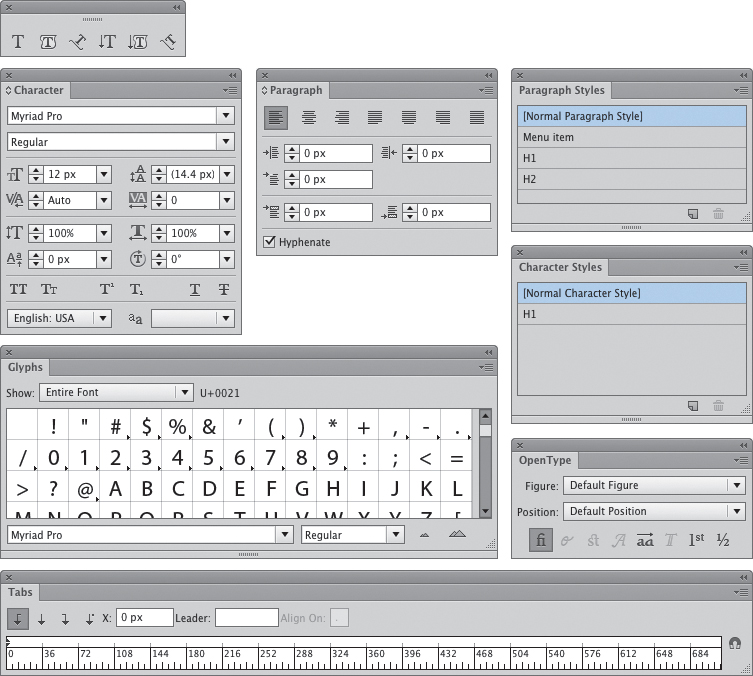
1.5. A bevy of typography tools gives users the power to create professional results.
Anti-aliasing adjusts how type looks on the screen by slightly blurring curved edges of letters to make them look as smooth as possible (1.6). Starting with Illustrator CS5, Adobe added additional anti-aliasing options from Photoshop. These new options allow you to more accurately simulate how type will render on your target devices. It’s not 100% perfect, but it gets the job done.
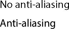
1.6. Anti-aliasing smoothes the curved edges of a typeface to help it look better on-screen.
Illustrator’s flexible typesetting and extensive formatting tools give you tremendous agility when setting type. Character and Paragraph styles make formatting loads of text quick and easy. The Glyphs panel gives you access to any character in a typeface—no more hunting around the keyboard trying to find alternate characters, ornaments, or symbols. You can also wrap text around graphics in order to simulate browser floats in your design.
Powerful Tools for Color
Choosing the right color is fundamental to establishing a visual hierarchy and evoking emotion. Often, color speaks to your users in ways that content can’t. Whether your design vision calls for a simple two-color palette or a complex system of color, Illustrator provides the tools you need to realize your vision.
Illustrator’s color tools help you create the perfect color schemes and color any object with ease (1.7). There are several ways to apply color to your designs, allowing for maximum flexibility in your workflow. You can choose to use the default color swatches or go and make your own by mixing colors from one of several color models. Creating custom gradients is a cinch, and you can create and interact with them in a panel or directly on the object.
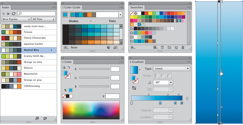
1.7. Get the right color for your project with Illustrator’s extensive color tools.
If, like me, you’re one of the many designers who sometimes struggle with choosing the right colors, Illustrator can help you immensely with color harmony tools that take the guesswork out of color theory. With the Color Guide panel, you’ll be able to build palettes using any of the standard color harmony rules and then vary your swatches based on included swatch libraries. You can even use Adobe’s fantastic color inspiration tool, Kuler, right inside Illustrator.
Design for Consistency
One of the most time-consuming things to deal with in UI design is making sure that your design is consistent. Consistency is an extremely important attribute of great design. However, once you start working with multiple screens across several documents, keeping things consistent can become quite a chore. Illustrator addresses this need with several tools to help make the job easier.
For type, Illustrator’s Paragraph and Character styles enable you to format text with a click (1.8). Gone are the days of trying to remember what font size you used on a headline, or what the leading value was for a standard bloc of body copy. Save these values in a style that can be used over and over again, just like you would with a word processor or page-layout app. You can also load them from one document into another so that you can maintain consistent typography as you begin to work with multiple documents.
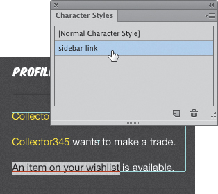
1.8. Using Character styles allows for one-click text formatting
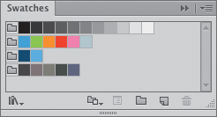
You’ll find it easy to design complete color schemes and combine the swatches together into portable swatch groups (1.9). These groups can be named and loaded into documents whenever you need them. This keeps you from having colors deviate between documents, creating inconsistencies that are a pain to fix.
1.9. You can save color swatches in groups to create different color schemes.
Illustrator keeps track of how objects look with the Appearance panel. An appearance is a group of attributes that include an object’s fill, stroke, transparency, and effects. You can style objects with ease using the Appearance panel and then save the appearance attributes as a graphic style. This graphic style can then be applied to other objects with one click (1.10). This automates the repetition of styling across similar elements, reducing time and effort to achieve consistency.
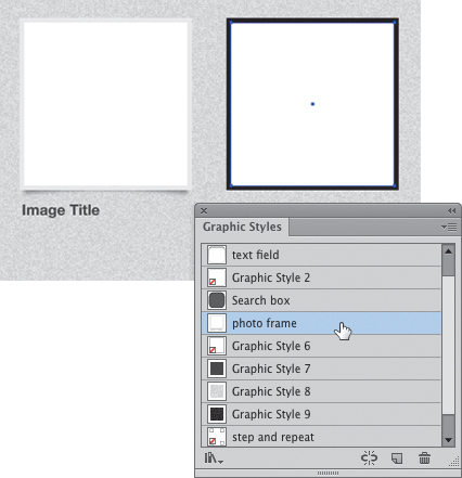
1.10. Complex designs saved as a graphic style can be applied to other objects in one click.
Design elements can be repeated easily using symbols. A symbol is an object that can be reused multiple times (1.11). In a document, a symbol can have multiple instances that are based on the original symbol. Where this helps with consistency is that if the original object changes, all the instances are automatically updated to reflect the changes. Conversely, symbols can be resized without affecting the original.
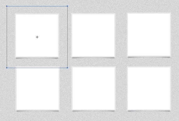
1.11. A symbol is an object that can be reused multiple times.
Another feature that enables consistency is the ability to create a template. You’ll be able to save document settings, color schemes, graphic styles, character and paragraph styles, and symbols into the template and save it as a separate file. You can then use this template to create a new document that contains everything you need to get started.
Finally, you can “componentize” certain design elements by saving them as separate files and then importing them into a document. This feature is awesome if you work regularly with an interface design that spans multiple documents. When you import a file, it creates a link to the original. Any changes you make to the original file automatically updates all documents that contain an imported copy.
Layouts with Precision
Illustrator provides you with an ultra-precise drawing and layout environment. Because vectors rely on math to plot the location of each point, putting objects right where you want them is really easy. The object-based drawing model makes each piece of your design accessible and changeable with relative ease. Selecting objects, moving them around, and resizing them happens with laser-like accuracy.
With excellent grid tools and guides, you’ll find that creating layouts can happen very quickly (1.12). You can create a layout grid (or even multiple grids) in seconds without relying on plug-ins. Smart Guides help you draw with precision, and extensive alignment tools mean you don’t have to eyeball where an element lines up with the grid or another object. A broad range of zoom options allows you to get up close and personal in order to work on the minute details. And that’s great because, as they say, the devil is in the details.
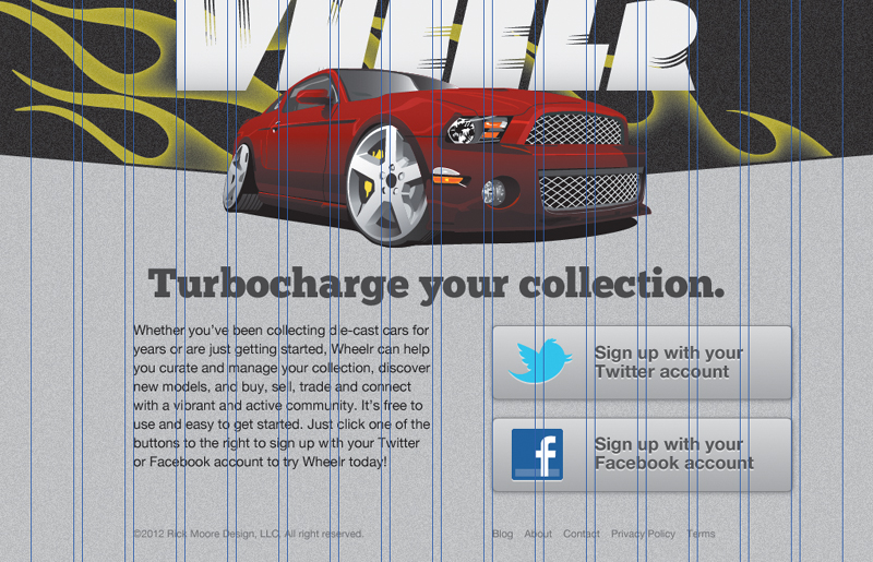
1.12. Creating grid systems is really easy with Illustrator.
Conclusion
This chapter skimmed the surface of what makes Illustrator a great tool for UI design. Illustrator is a feature-packed application with many tools designed to help you realize your creative vision.
In the next chapter, you’ll get a more indepth view of Illustrator’s tools and workspace. As you continue through the book, my goal is to give you enough knowledge to start using Illustrator right away to create beautiful user interfaces in your own projects.