
Preface: It All Begins with a Spark
Why is it that when one man builds a wall, the next man immediately needs to know what’s on the other side?
—Tyrion Lannister in George R.R. Martin’s A Game of Thrones
There’s probably something you don’t know about college professors: we tend to have peculiar hobbies.
In October 2014, I spent my entire fall recess catching up with R, a programming language for statistical analysis; ggplot2, an R library that creates nice-looking charts; and Tableau, a data visualization program.1 Learning any software tool without using it is impossible, so I needed some data to play with, and not just any data, but data I could care about.
1 I hope that this doesn’t impress you. I am by no means an advanced user of any of these tools. All graphics in these pages were designed with very little knowledge of how to use them properly. For more information, visit http://www.r-project.org/, http://ggplot2.org/, and http://www.tableau.com.
A few months back, my family and I had moved to a new home, so I had briefly visited the Miami-Dade County Public Schools website (DadeSchools.net) to check the quality of the elementary school, middle school, and high school in our area. Each had a grade of A. I had felt reassured at the time, but also a bit uneasy, as I hadn’t done any comparison with schools in other neighborhoods. Perhaps my learning R and Tableau could be the perfect opportunity to do so.
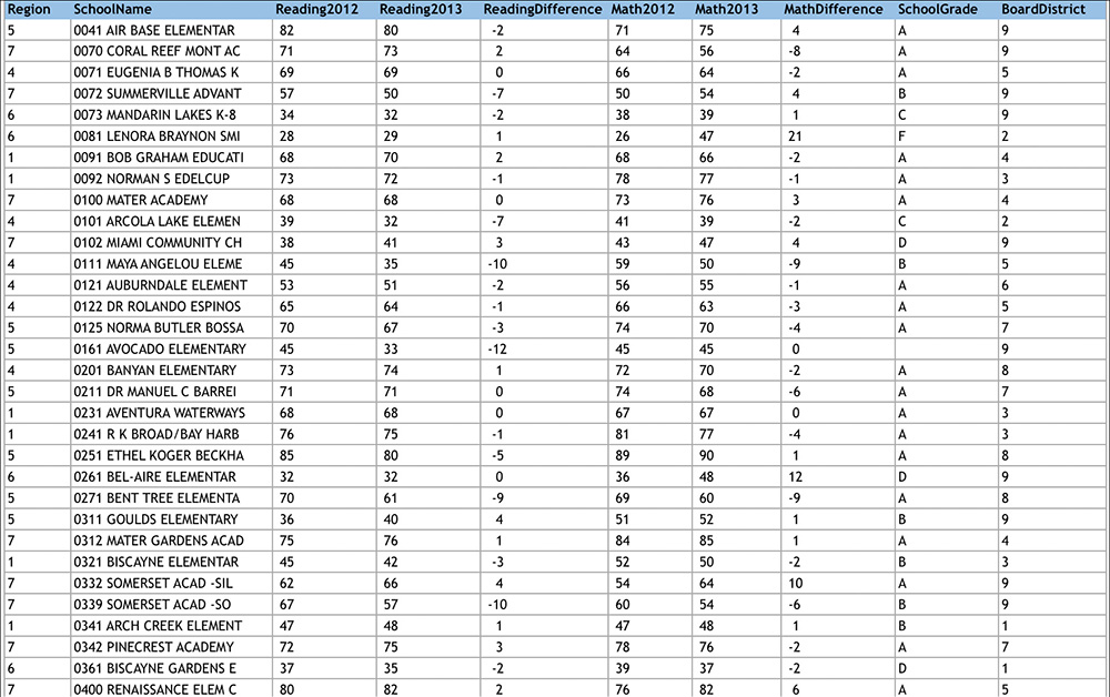
DadeSchools.net has a neat data section, so I visited it and downloaded a spreadsheet of performance scores from all schools in the county. You can see a small portion of it—the spreadsheet is 461 rows tall—in Figure P.1. The figures in the Reading2012 and Reading2013 columns are the percentage of students from each school who attained a reading level considered as satisfactory in those two consecutive years. Math2012 and Math2013 correspond to the percentage of students who were deemed reasonably numerate for their age.
While learning how to write childishly simple scripts in R, I created rankings and bar charts to compare all schools. I didn’t get any striking insight out of this exercise, although I ascertained that the three public schools in our neighborhood are decent indeed. My job was done, but I didn’t stop there. I played a bit more.
I made R generate a scatter plot (Figure P.2). Each dot is one school. The position on the X-axis is the percentage of students who read at their proper level in 2013. The Y-axis is the same percentage for math proficiency. Both variables are clearly linked: the larger one gets, the larger the other one tends to become.2 This makes sense. There is nothing very surprising other than a few outliers, and the fact that there are some schools in which no student is considered proficient in reading and/or math. This could be due to mistakes in the data set, of course.
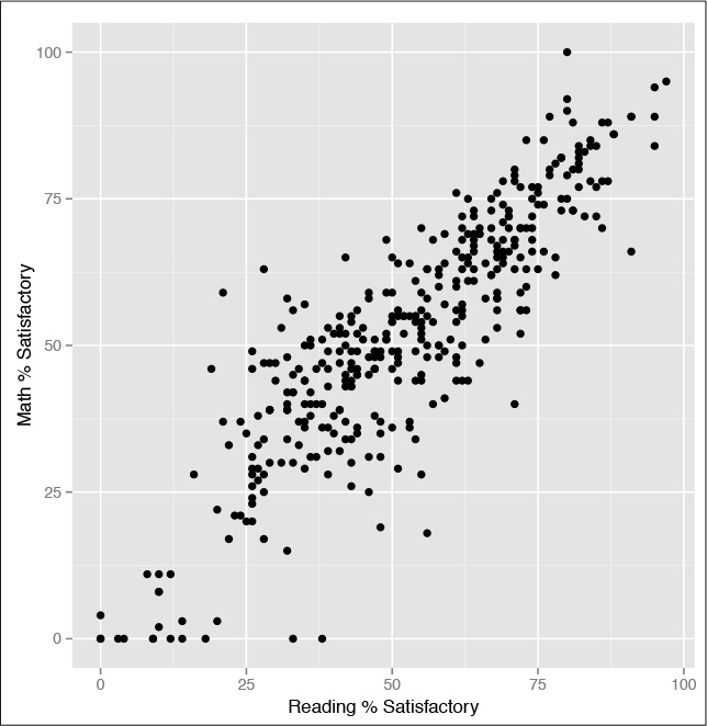
2 In statistics, we may call this a “strong positive correlation.” But I’m getting a bit ahead of myself.
After that, I learned how to write a short script to design not just one but several scatter plots, one for each of the nine school board districts in Miami-Dade County. It was then that I became really intrigued. See the results in Figure P.3.
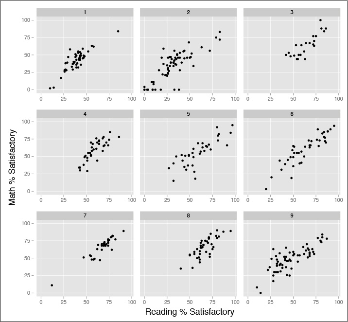
There are quite a few interesting facts in that array. For instance, most schools in Districts 3, 7, and 8 are fine. Students in Districts 1 and 2, on the other hand, perform rather poorly.
At the time I was not familiar with the geography of the Miami-Dade school system, so I went online to find a map of it. I also visited the Census Bureau website to get a map of income data. I redesigned and overlaid them. (See Figure P.4. Warning: I didn’t make any adjustment to these maps, so the overlap isn’t perfect.) I got what I foresaw: the worst-performing districts, 1 and 2, encompass low-income neighborhoods, like Liberty City, Little Haiti, and Overtown.

Immediately, questions started piling up in my head. Is the relationship between bad schools and low household income direct? Does a bad education lead to reduced wages? Or do kids coming from low-income families go to school being already disadvantaged, and that worsens the scores of the schools they attend? Am I getting causality right? What are other possible variables that affect both school performance and income?
What about the outliers in those charts, those schools in Districts 1 and 7, for instance, that are so far from their flocks? Or that school in District 3 that got a perfect score in math? And what about District 6? Schools in that plot are much more spread out than in the others. Is that related to the sharp divide between a richer strip on the east (Coconut Grove) and poorer blocks on the west within that school district?
And more: have all these percentages and grades changed substantially in the past few years? If so, is it due to real variation in the quality of our public education or because of changes in the methods researchers use to measure attainment? So many questions.
And so the seeds for many potential stories got planted. I didn’t have an idea of what they might be at that point or if any of them would be worth telling. I just got a glimpse, an enticing clue. As most visualization designers and data journalists I know will tell you, sometimes it is not you who finds good ideas when you’re seeking them. Instead, good ideas find you in the most unexpected circumstances.
Good ideas are fleeting things, so I feverishly scribbled notes in a computer application called Stickies, short messages for my future self, musings of a mind in a state of joyous flow. I added, “Find some education experts.3 Ask them. Contact the folks running dadeschools.net. You’ll likely need more data from the U.S. Census Bureau’s website.” And so on and so forth.
3 Here’s Robert B. Reich—who isn’t an expert on education but was Secretary of Labor under President Bill Clinton—in his book Saving Capitalism (2015): “A large portion of the money to support public schools comes from local property taxes. The federal government provides only about 10 percent of all funding, and the states provide 45 percent, on average. The rest is raised locally (...) Real estate markets in lower-income communities remain weak, so local tax revenues are down. As we segregate by income into different communities, schools in lower-income areas have fewer resources than ever. The result is widening disparities in funding per pupil, to the direct disadvantage of poor kids.” Another possible clue to follow.
As the saying goes, every great story begins with a spark. Fun ensues.