Chapter 2. Understanding Views—The UI Building Blocks
Sometimes it is best to start with the building blocks before diving into much more complex topics, and that is the goal here. This chapter is all about views, which allow your apps to display their content to your users. You will learn all the major view subclasses and gain a fundamental understanding of key attributes such as view IDs, padding, and margins. If you have already built any apps, most of this will be review for you, so feel free to skim through the chapter as you move toward the heart of the book.
What Is a View?
Views are the most basic component of the UI, and they extend the View class. They always occupy a rectangular area (although they can display content of any shape) and can handle both drawing to the screen and events such as being touched. Everything that is displayed on the screen utilizes a view.
There are two primary types of views: those that stand alone, such as for displaying some text or a picture, and those that are meant to group other views. This chapter focuses on those that stand alone, with the exception of some specialized views. Chapter 3, “Creating Full Layouts with View Groups and Fragments,” covers the ViewGroup class and its subclasses (i.e., views that group together one or more other views).
Android gives you the flexibility of defining how you use your views using Java within the application code and with XML in external files, typically referred to as “layouts.” In most cases, you should define your layouts with XML rather than creating them programmatically because it keeps your application logic separate from the visual appearance, thus keeping your code cleaner and easier to maintain. You also get the advantage of resource qualifiers, which are explained in Chapter 4, “Adding App Graphics and Resources.”
Views are highly customizable, and the easiest way to make changes to views is by changing XML attributes in your layout files. Fortunately, most XML attributes also have Java methods that can accomplish the same thing at runtime. And, if nothing else, you can always extend an existing view to modify it in some way or extend the View class itself to create something completely custom.
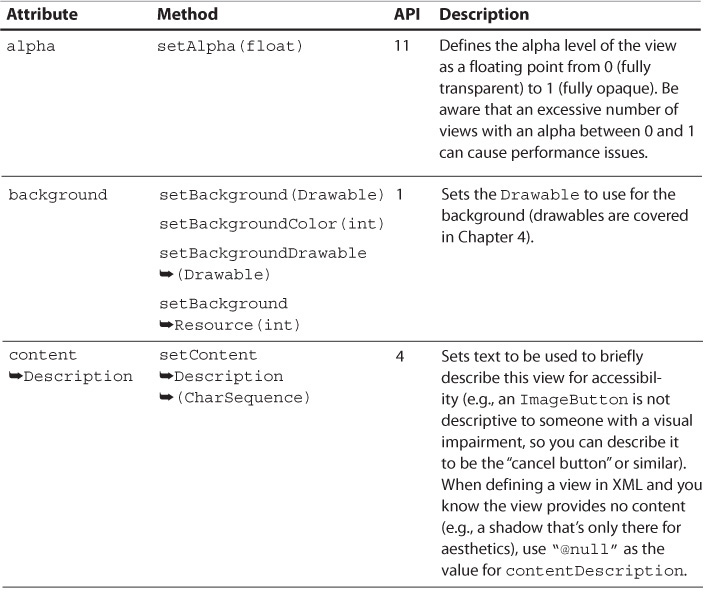
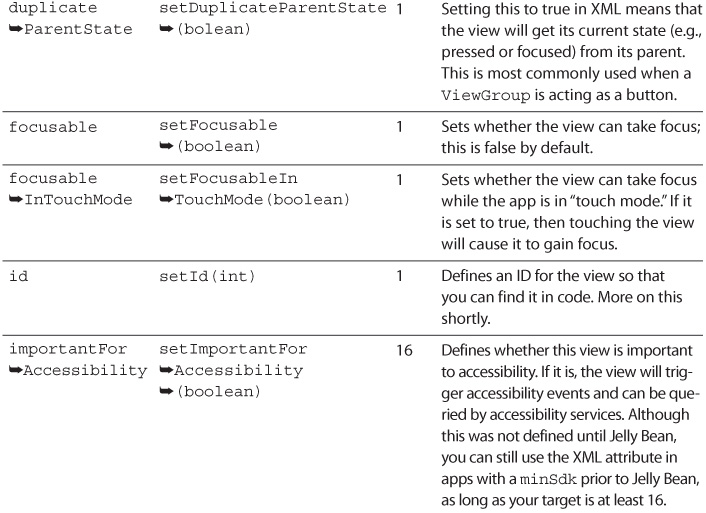
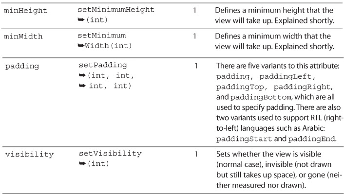
See Table 2.1 for a list of the most commonly used attributes for the View class. Remember that all other views extend the View class, so these attributes apply to all views (though child classes can handle the attributes differently or even ignore them). The API levels refer to the version of the Android SDK where the attributes were introduced. API level 4 was Android 1.6, called “Donut.” API level 11 was Android 3.0, or “Honeycomb.” API level 16 was Android 4.1, the first version of “Jelly Bean.” For a complete list of the API levels, you can see the table at http://developer.android.com/guide/topics/manifest/uses-sdk-element.html#ApiLevels.
View IDs
As you might suspect, view IDs are used to identify views. They allow you to define your layouts in XML and then modify them at runtime by easily getting a reference to the view. Defining an ID for a view in XML is done with android:id="@+id/example". The “at” symbol (@) signifies that you’re referring to a resource rather than providing a literal value. The plus (+) indicates that you are creating a new resource reference; without it, you’re referring to an existing resource reference. Then comes id, defining what type of resource it is (more on this in Chapter 4). Finally, you have the name of the resource, example. These are most commonly defined using lowercase text and underscores (e.g., title_text), but some people use camel case (e.g., titleText). The most important thing is that you’re consistent. In Java, you can refer to this value with R.id.example, where R represents the resources class generated for you, id represents the resource type, and example is the resource name. Ultimately, this is just a reference to an int, which makes resource identifiers very efficient.
You can also predefine IDs in a separate file. Typically, this file is called ids.xml and is placed in the values resource folder. The main reasons for defining IDs like this rather than in the layout files directly are to use the IDs programmatically (such as creating a view in code and then setting its ID), to use the IDs as keys in a map, or to use the IDs for tags. The View class has a setTag() method, which allows you to attach any object to that view for later retrieval. Calling that method with a key allows you to attach multiple objects that are internally held with a SparseArray for efficient retrieval later. This is especially handy when using the “View Holder” pattern (covered in Chapter 10, “Using Advanced Techniques”) or when the view represents a specific object that it needs access to later.
Note
The R class is generated for you as you make changes in Android Studio. By default, this is built for you whenever it needs to be updated. You can also manually force Android Studio to build your project from the Build menu.
Warning: R Class Versus android.R Class
Although your R class will be generated for you, there is also an android.R class. Unfortunately, IDEs will sometimes import this class when you really mean the R class that’s specific to your app. If you see your resource references not resolving, verify that you have not imported android.R.
It is a good idea to always use R within your code to reference your own R class and android.R to reference the Android R class explicitly (meaning that R.id.list refers to an ID that you have defined called “list” and android.R.id.list refers to the Android-defined “list” ID).
Understanding View Dimensions
One of the challenges designers and developers alike often have, when first starting to think about layouts in Android, is the numerous possible screen sizes and densities. Many design specialties (e.g., print and earlier versions of iOS) are based on exact dimensions, but approaching Android from that perspective will lead to frustration and apps that do not look good on specific resolutions or densities.
Instead, Android apps are better approached from a more fluid perspective in which views expand and shrink to accommodate a given device. The two primary means of doing so are the layout parameters match_parent (formerly fill_parent) and wrap_content. When you tell a view to use match_parent (by specifying that as a dimension in either the XML layout or by programmatically creating a LayoutParams class to assign to a view), you are saying it should have the same dimensions as the parent view or use up whatever space is remaining in that parent. When you tell a view to use wrap_content, you are saying it should only be as big as it needs to be in order to display its content. Using match_parent is generally more efficient than wrap_content because it doesn’t require the child view to measure itself, so prefer match_parent if possible (such as for the width of most TextViews).
You can specify dimensions in pixel values as well. Because screens have different densities, specifying your layouts in pixels will cause screen elements to appear to shrink the higher the density of the device. For example, specifying 540 pixels high on a 55-inch high-definition TV (which is 27 inches high, because screen sizes are measured diagonally) means the pixels take up 13.5 inches. On a phone with a 5-inch screen, those same pixels are under an inch-and-a-half in landscape orientation.
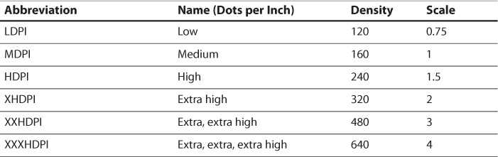
Instead, you should use density-independent pixels (abbreviated as dp or dip) to have dimensions automatically scale for you based on the device’s density. The six densities Android currently specifies based on dots per inch (DPI) are listed in Table 2.2. Since the original Android devices were MDPI devices, everything else is relative to that density (e.g., extra high density is twice as dense along each axis as MDPI). If you specify a line that is 2dp thick, it will be 2 pixels thick on an MDPI device, 3 pixels thick on an HDPI device, and 8 pixels thick on an XXXHDPI device.
Fortunately, you don’t have to create specific layouts for each density. The main consideration with so many densities is the graphical assets. Android will automatically scale images for you, but obviously blowing up a small image will not look as sharp as having an image of the correct size. Graphics assets and other resources are covered in detail in Chapter 4, “Adding App Graphics and Resources.”
There are times when you want a view to be at least a certain size but bigger if needed. A good example is for anything that the user can touch and the smallest you want a touchable view is 48dp (roughly 9 mm). In these cases, you can use the minHeight and minWidth properties. For example, you can define a minHeight of 48dp but the layout_height as wrap_content. That guarantees that the view will be at least tall enough to touch, but it can be larger to accommodate more content.
Two other parts of layouts are important to understand: padding and margins. If you were to set your phone next to another phone and think of each device as a view, you could think of the screens as the actual content, the bevel around the screens as the padding, and the space between the devices as the margins. Visually, it’s not always obvious whether spacing is from padding or margins, but conceptually padding is part of the width of a layout and margins are not. See Figure 2.1 for a visual depiction of margins and padding.
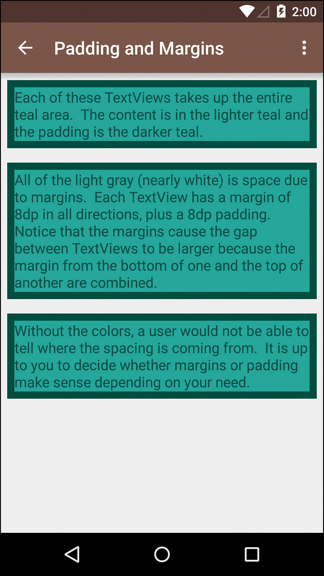
Figure 2.1 A visual demonstration of layouts with padding (dark cyan) and margins (space between the edge and the color)
Android also supports RTL (right-to-left) languages such as Arabic. Because it is common to indent the leading side of text differently from the trailing side, you can run into layouts where the only difference would be padding or margins for an RTL language compared to an LTR (left-to-right) one. Fortunately, Android solved this by adding new versions of padding and margins to easily accommodate this in Android 4.2. By replacing “left” with “start” and “right” with “end,” you can easily have layouts that dynamically adjust based on language orientation. For example, if an LTR language would have a 72dp padding on the left, you would normally specify paddingLeft="72dp" in your layout. By adding paddingStart="72dp" to that same layout, the padding will automatically apply to the left side in English and the right side in Arabic. If you support older versions of Android, they’ll use the padding left values. Any newer versions will use the padding start values. If you aren’t supporting older versions of Android, you don’t need to specify the padding left value. See Figure 2.2 for an example of what happens to the layout based on the language’s layout direction. Notice that the spacing is almost like a mirror image where the LTR layout shows the dividers going all the way to the right with no margin, but the RTL layouts show them going all the way to the left with no layouts and the spacing around the icons is consistent.
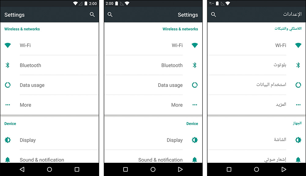
Figure 2.2 Here you can see the Settings screen shown in English both as naturally appearing (left-to-right) on the left and with a forced right-to-left layout in the middle compared to a natural right-to-left language on the right
Warning: Problematic Samsung Devices
Unfortunately, Samsung created their own custom attributes for paddingStart and paddingEnd by modifying the source code of Android for version 4.1. Their versions of these attributes required integers instead of floats, which means you can get a crash when the layouts are inflated on those specific devices. Fortunately, Android Studio will warn you via lint with a message that says, “Attribute paddingStart referenced here can result in a crash on some specific devices older than API 17.”
Although that message is not as clear as it could be, the solution is to put the layouts in a layout folder with a resource qualifier (covered in depth in Chapter 4, “Adding App Graphics and Resources”) to prevent the layouts from loading on those devices. Most people choose to put the versions of the layouts with these attributes in a layouts-v17 folder, preventing those layouts from loading on older versions of Android, or layouts-ldrtl, preventing the layouts from loading on a device that’s not set up to use a layout direction of left to right.
Additional detail about this issue is available at https://code.google.com/p/android/issues/detail?id=60055.
Displaying Text
One of the most fundamental ways in which you will communicate with your users is through text. Android gives you tools both to make displaying text easy and to make handling localization almost no work at all. Resources, covered in depth in Chapter 4, allow you to specify the displayed strings (among other types of content) outside of your layouts, letting the system automatically select the correct strings for a given user’s language.
Text sizes are in scale-independent pixels (sp). Think of scale-independent pixels as the same as density-independent pixels but with the user’s preferred scaling applied on top. In most cases, 1sp is the same as 1dp, but a user might prefer to have fonts bigger, so they’re easier to read, or even smaller to see more on the screen. If you take the size in sp, times the density multiplier in Table 2.2, times the user’s preferred scale, you’ll get the resulting size. For example, if you specify 14sp (typical for body text) and it runs on an XXHDPI device (a 3× multiplier) and the user has a preferred font size of 10 percent larger, then the result is 14 × 3 × 1.1 or 46 pixels. More important than understanding that formula is knowing that font sizes are in sp and your layouts should always be able to accommodate different font sizes.
TextView
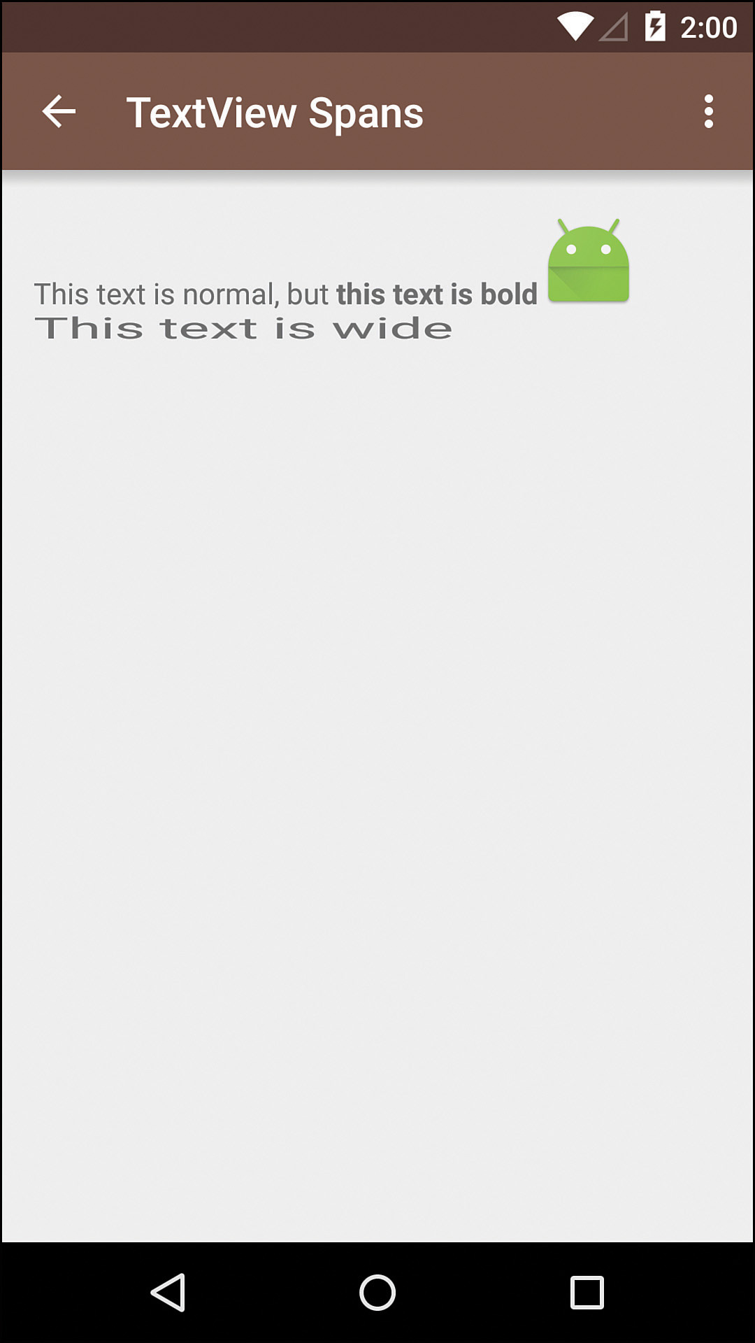
TextView is one of the most common views in Android. As its name suggests, it displays text. What its name does not tell you is that it actually supports a wide variety of appearances and content. In fact, you can even specify a Drawable (such as an image) to appear to the left, top, right, and/or bottom of a text view. You can add text shadows, change colors, and have portions of text bold and others italicized. You can even have metadata associated with specific portions of text within a text view, allowing for click events on specific words or phrases, for example. Figure 2.3 shows a single text view that uses “spans,” which allow the display of a variety of styles and even an inline image. Examples of text views are shown throughout the book, but Chapter 10, “Using Advanced Techniques,” shows the specifics about how to accomplish what is shown in Figure 2.3.
Text views are robust but very easy to use. In fact, the majority of views that display text extend the TextView class precisely for those reasons. In addition, utilities are available that make some of the more difficult processes easy to do, such as converting portions of the text to links with the Linkify class (you can specify whether you want phone numbers to go to the dialer, links to go to a browser, or even custom patterns to do what you’d like) and converting most basic HTML (with the aptly named Html class) into styled text that uses the Spanned interface.
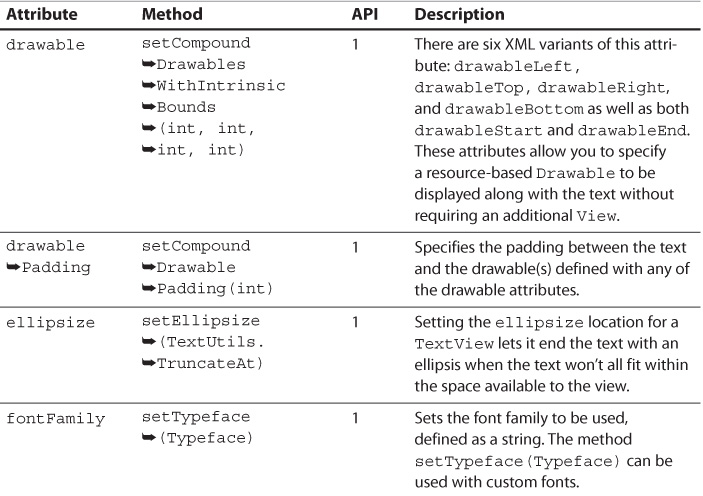
A wide variety of attributes can be used to make a text view work and look exactly how you want. See Table 2.3 for the most commonly used attributes.
EditText
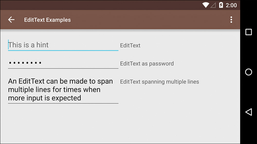
EditText is the primary means for allowing the user to input text such as a username or password. Because it extends TextView, the attributes in Table 2.3 are applicable. With EditText, you can specify the type of text the user will input via the inputType attribute or the setRawInputType(int) method. For example, saying that the user will input a phone number allows the keyboard to display numbers and symbols instead of the complete alphabet. You can also provide a hint, which is displayed before the user has entered any text and is a good way of providing context. When a user has entered text that is invalid such as an incorrect username, EditText can easily display error messages as well. See Figure 2.4 for examples of EditText.
Button
Like EditText, Button extends TextView. The primary difference is that a button is simply meant to be pressed, but the displayed text lets the user understand what the button will do. In most cases, the fact that Button extends TextView will be mostly irrelevant. Rarely should you use a mixture of styles in a button or ellipsize it. A button should be obvious with a short string explaining its purpose. A standard button following the Material Design guidelines uses a medium font (which is a font partway between normal and bold), all caps, and 14sp. Additional styling such as bolding a particular word in the button creates a distraction and confuses users. See Figure 2.5 for examples of Button.
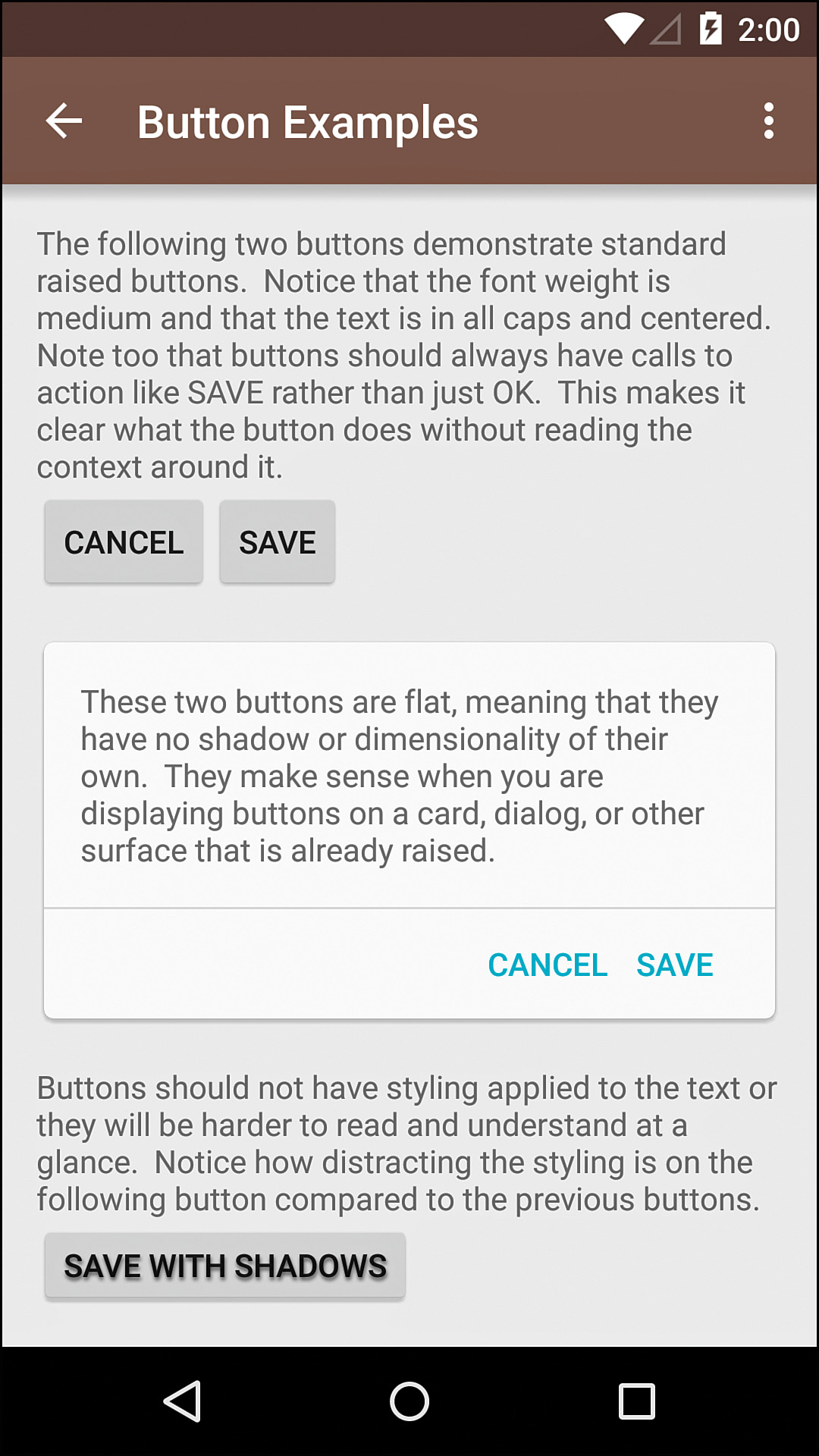
Figure 2.5 Examples of buttons using a raised style and a flat style (the cyan text) as well as an example of what not to do with text shadows
Displaying Images
Although displaying text is vital for nearly any application, an app with text alone is not likely to get everyone screaming with excitement. Fortunately, there are many ways for displaying images and other graphical elements in your apps.
Backgrounds
In many cases, you will be able to apply an image to the background of the view and it will work as expected. One great benefit of doing this is that you do not have to create an extra view, so you save the system a little bit of processing and memory. Unfortunately, you do not have as much control over the backgrounds of views as you do over views that are designed to display images specifically.
In Chapter 4, the various Drawable subclasses supported by Android are covered in depth. All of these drawables can be used as the background for views, so they give you a fair amount of control over the display of graphical content for your apps.
ImageView
ImageView is the primary class used for displaying images. It supports automatic scaling and even setting custom tinting, for instance. Keep in mind that an image view can also have a background, so you can actually stack images with this one view type. Fortunately, this class has far fewer attributes to consider than the TextView class.
The most obvious attribute for an image view is src, which defines the source of the image to display. You can also set the image via setImageBitmap(Bitmap), setImageDrawable(Drawable), and setImageResource(int) to dynamically set or change the image displayed by this view.
Although later chapters will discuss working with images and the ImageView class in much more depth, one more extremely common image view attribute that you should know is scaleType, which defines how the view handles displaying an image that is larger or smaller than the view’s area. See Table 2.4 for details and Figure 2.6 for a visual example that shows each of the different ways of scaling an image as well as the full-sized image.
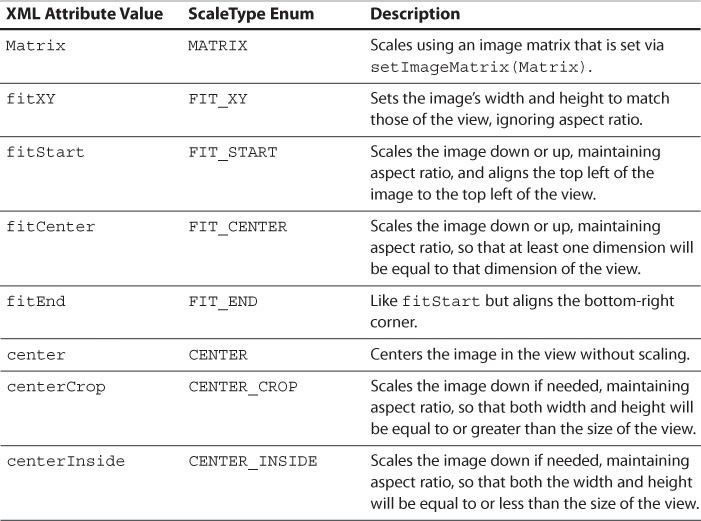
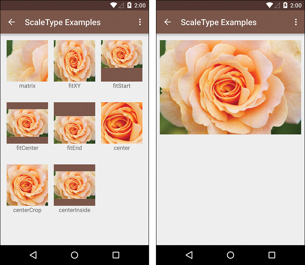
Figure 2.6 Each of the ScaleTypes is shown on the left, and the image that is being scaled is shown on the right
ImageButton
An ImageButton is a class that extends ImageView to display an image on top of a standard button. You set the image the same way as with an image view (typically using the src attribute or any of the setImageBitmap(Bitmap), setImageDrawable(Drawable), or setImageResource(int) methods), and you can change the button by setting the background to something other than the default.
Views for Gathering User Input
You already know about EditText, which you can get user input from, as well as both Button and ImageButton for handling simple touch events, but many more views can be used for collecting user input. Although any view can actually handle user feedback, the following views are specifically designed to do so:
 AutoCompleteTextView—This is essentially an
 EditText that supplies suggestions as the user is typing.
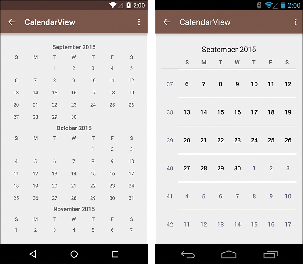
CalendarView—This view lets you easily display dates to users and allow them to select dates. See Figure 2.7 for an example.
CheckBox—This is your typical check box that has a checked and unchecked state for binary choices. Note that the B is capitalized. See Figure 2.8 for an example.
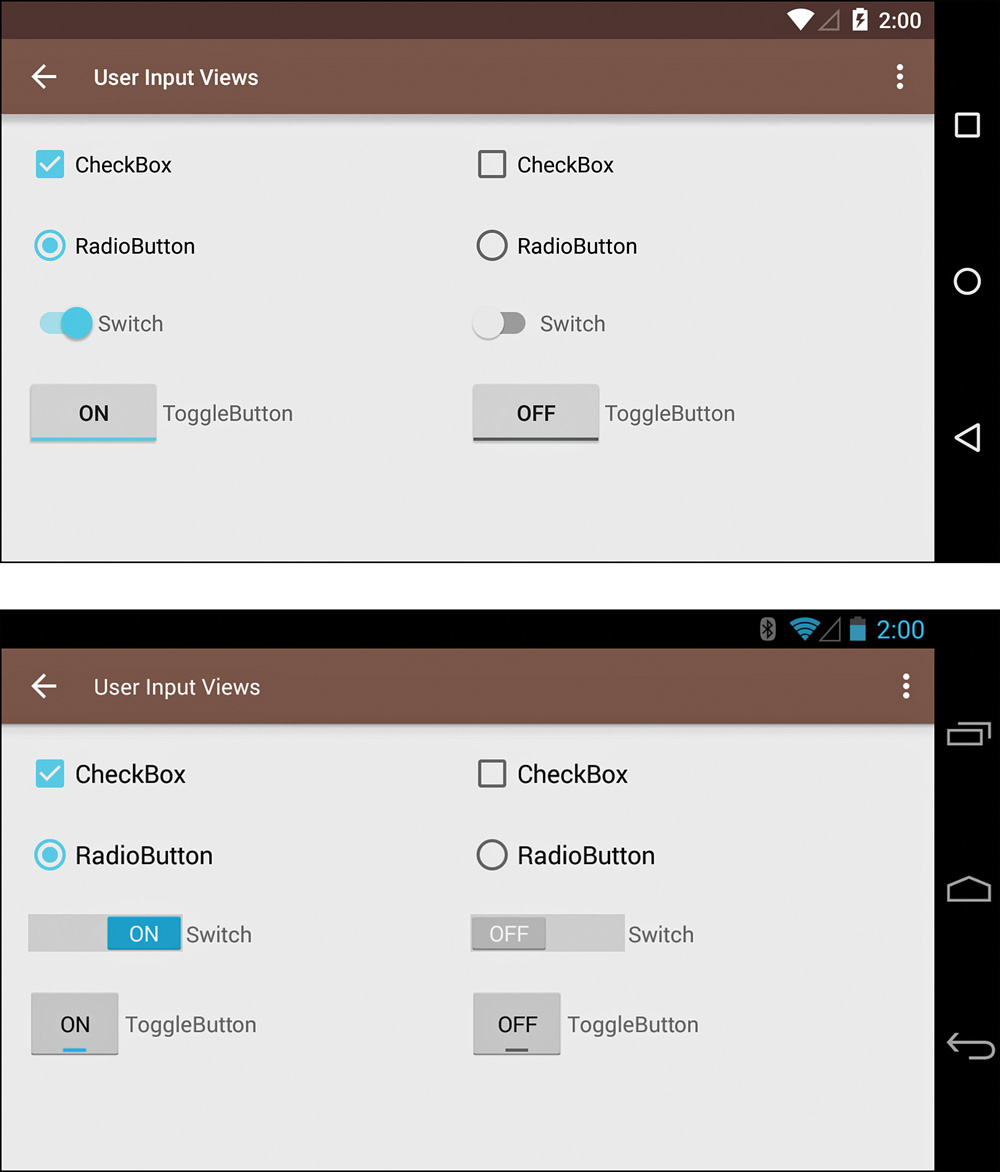
Figure 2.8 An example of CheckBox, RadioButton, Switch, and ToggleButton with on (left) and off (right) states; the top image shows Android 5.0’s styles and the bottom image shows the same thing on Android 4.3 with an earlier version using the support library
CheckedTextView—This is basically a TextView that can be checked and is sometimes used in a ListView (discussed in the next chapter).
CompoundButton—This is an abstract class that is used to implements views that have two states, such as the CheckBox class mentioned earlier.
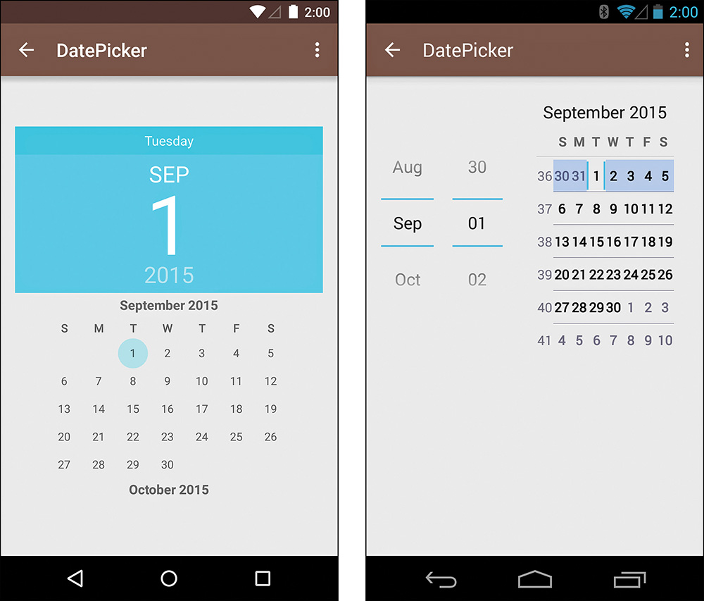
DatePicker—This class is used for selecting a date and is sometimes combined with CalendarView. See Figure 2.9 for an example.
MultiAutoCompleteTextView—This class is similar to AutoCompleteTextView, except that it can match a portion of a string.
NumberPicker—This class lets users pick a number, but you probably figured that out already.
RadioButton—This view is used with a RadioGroup. Typically, you have several RadioButtons within a RadioGroup, allowing only one to be selected at a time. See Figure 2.8 for an example.
RadioGroup—This is actually a ViewGroup that contains RadioButtons that it watches. When one is selected, the previously selected option is deselected.
RatingBar—This view represents your typical “four out of five stars” visual rating indicator, but it is configurable to allow for fractions, different images, and more.
SeekBar—This view is your typical seek bar that has a “thumb” the user can drag to select a value along the bar.
Spinner—This view is commonly called a drop-down or drop-down menu (it’s also referred to as a combo box or a picker view). It shows the current option, but when selected, shows the other available options.
Switch—This view is basically a toggle switch, but the user can tap it or drag the thumb. Keep in mind this was introduced in API level 14, but the support library has a SwitchCompat class for older versions. See Figure 2.8 for an example.
TimePicker—This view lets users pick a time, but that was pretty obvious, wasn’t it? See Figure 2.10 for an example.
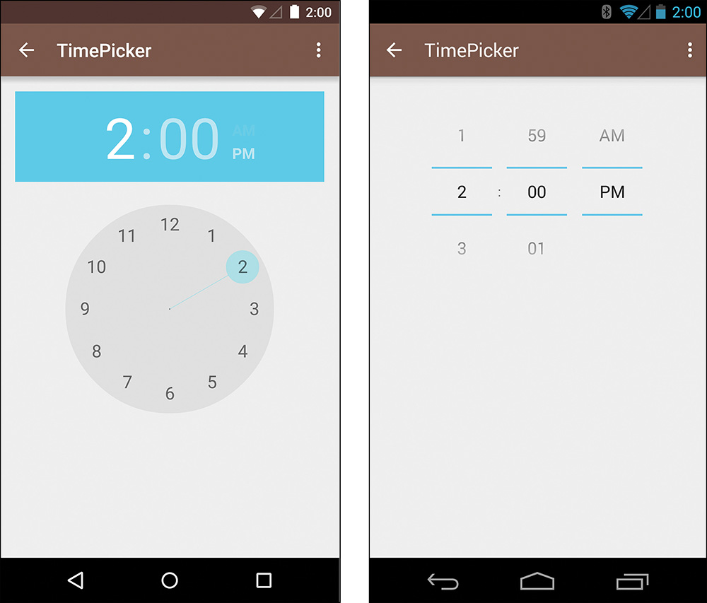
Figure 2.10 Another example where the left side shows the improvements of Android 5.0, in this case for the TimePicker, and the right side shows the older style
ToggleButton—This view is conceptually quite similar to a CheckBox or a Switch, but it is usually displayed as a button with a light that indicates whether or not it is on, and it can have different text to display depending on whether it is on or off. In general, you should prefer a Switch over a ToggleButton. See Figure 2.8 for an example.
Other Notable Views
Whew, you’ve made it through the bulk of the chapter, but there are dozens of other views and far more to the views we’ve discussed so far. Remember that your goal at this point isn’t to have every view memorized, but to have some idea of what’s out there. If you need to implement a view that does X and you can remember that some view did something pretty similar, you can always jump back here to track it down. For now, it’s sufficient to have just a quick explanation of some of the remaining views:
AnalogClock—As you can probably guess, this view displays an analog clock. You are likely to never use it, though it can be a good starting place for a custom analog clock. See Figure 2.11 for an example.
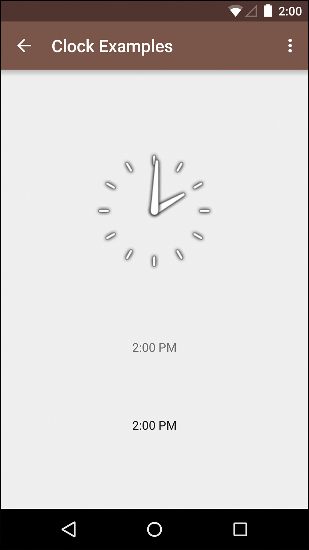
Figure 2.11 An example of the AnalogClock on the top and the DigitalClock at the center and a TextClock at the bottom
Chronometer—This view is basically a simple timer, like on a stopwatch.
DigitalClock—A simple extension of TextView, this class displays a digital clock that just triggers a Runnable every second to update the display. This class was deprecated in API level 17 in favor of the TextClock class. See Figure 2.11 for an example.
ExtractEditText—This is a child class of EditText for handling the extracted text. You probably won’t directly use this class.
GLSurfaceView—This SurfaceView class is for displaying OpenGL ES renders. This is most commonly used in games.
KeyboardView—Another well-named class, this view is for displaying a virtual keyboard. You will probably only ever use this if you make your own keyboard app.
MediaRouteButton—This view was added in Jelly Bean to control the routing of media such as outputting videos or audio to external speakers or another device (such as a Chromecast).
QuickContactBadge—Added in Android 2.0, this class allows you to easily display a contact that can handle various actions when tapped (such as email, text, call, and so on).
ProgressBar—This class can be used for showing progress, including indeterminate progress (i.e., progress for which you don’t have a clear sense of where you are in the process, just whether you have started or finished).
RSSurfaceView—This view has been deprecated, but it was for outputting RenderScript.
RSTextureView—This view was deprecated as well; it was also for RenderScript, but API level 16 added a direct replacement, TextureView.
Space—This is a simple subclass of View that is intended only for spacing and does not draw anything. It is basically a view that is set to invisible, so it handles layouts but not drawing. In most cases, you don’t need to use this view because padding and margins can generally give you what you need for positioning. This view is also available in the support library for older versions of Android.
SurfaceView—This view is intended for custom drawing, primarily for content that is frequently changing. Games that are relatively simple can use this view to display the graphics with reasonable efficiency, but most apps won’t make use of it. The view is actually behind the Window that controls your view hierarchy, so the SurfaceView creates a hole to show itself. If you want to draw it on top of other content, you can do so with the setZOrderOnTop(true) method with a transparent SurfaceHolder, but that causes the GPU to have to do alpha blending with every view change, so it can be inefficient very quickly. In most cases, a TextureView is a better solution.
TextClock—This view was added in API level 17 as a replacement for DigitalClock.
TextureView—Introduced in Ice Cream Sandwich (API level 14), this view is used for displaying hardware-accelerated content streams such as video or OpenGL.
VideoView—This view is a SurfaceView that simplifies displaying video content.
WebView—When you want to display web content (whether remote or local), WebView is the class to use.
ZoomButton—This is another class you probably won’t use, but it essentially allows the triggering of on-click events in rapid succession, as long as the user is holding down the button (as opposed to just triggering a long-press event).
Listening to Events
You can listen for a number of events simply by registering the appropriate listener (an object that has a method that is triggered when the event happens). Unlike some frameworks, Android’s methods for settings listeners take the form of setOnEventListener (where “Event” is the event to listen for), meaning that only one of a given listener is registered at a time. Setting a new listener of a given type will replace the old one. This may seem like a limitation, but in practice it rarely is and it helps simplify your code. When you really do need more than one class to listen to a particular event, you can always have one listener act as a relay to trigger other listeners.
One point worth noting is that listeners will return a reference to the view that triggered the event. That means you can have one class handle the events for multiple views, such as having your fragment handle clicks for three different buttons. Most commonly you will determine how to react by switching on the ID of the view with getId(), but you can also compare view references or even types. Note that there is a special exception to using a switch when creating a library project due to the IDs not being final; see http://tools.android.com/tips/non-constant-fields for details.
OnClickListener
This is the single most common listener you will use. A “click” event is the default event triggered when a view is tapped or when it has focus and the select key is pressed (such as the d-pad center key or a trackball).
OnLongClickListener
A long-click event is when a click (typically a touch) lasts longer than the value returned by ViewConfiguration.getLongPressTimeout(), which is typically 500 milliseconds. This action is now most commonly used for enabling multiselect mode.
OnTouchListener
Although “touch” is a bit misleading, this listener allows you to react to MotionEvents, potentially consuming them so that they are not passed on to be handled elsewhere. That means you can react to specific types of motion such as a fling or other gesture. OnTouchListener implementations often make use of helper classes such as GestureDetector to make it easier to track touches over time. This technique is discussed in Chapter 13, “Handling Input and Scrolling.”
Other Listeners
A few other listeners are much less commonly used but are good to know about in case they come in handy. They are as listed here:
OnDragListener—This listener lets you intercept drag events to override a view’s default behavior, but it is only available in Honeycomb (API level 11) and newer.
OnFocusChangeListener—This listener is triggered when focus changes for a view so that you can handle when a view gains or loses focus.
OnHoverListener—New in Ice Cream Sandwich (API level 14), this listener allows you to intercept hover events (such as when a cursor is over a view but not clicking that view). Most apps won’t use this type of listener.
OnGenericMotionListener—This listener allows you to intercept generic MotionEvents as of API level 12.
OnKeyListener—This listener is triggered on hardware key presses.
Summary
Whether you wanted to or not, you now know of the large number of views Android offers you. You also know the most commonly used attributes for the main views, so you can get them to look and behave how you want. At the end of the chapter, you concluded by learning how to handle events for views such as click events. Although not entirely exciting, the details of this chapter are key in breaking down UI concepts into concrete views in Chapter 6, “Prototyping and Developing the App Foundation” and beyond. Much more advanced techniques of using many of these views will also come later on, helping to solidify your knowledge of the Android UI.