
Chapter 7. Designing the Visuals
Now that you have completed wireframes and prototypes, you should have a good foundational knowledge upon which to build your designs. Good graphical design is a combination of art and science, understanding how to make something both beautiful and functional. Even if you’re a developer reading this book who will have a designer handle creating comps, slices, and assets, it is very beneficial to understand the basics of what goes into a good design.
Wireframes and Graphical Design
Although wireframes were primarily covered in Chapter 5, “Starting a New App,” you should come back to them after trying to create prototypes and improve them. The cycle is iterative, like any development process, and having a solid set of wireframes will lead to a much better graphical design.
At this point, it may seem like the graphical design is just coloring between the lines created by the wireframes, but it is never that easy, nor should it be that limited. The wireframes serve as a logical grouping of content, an expectation of user interaction and user experience. They are intended to make the user expectations blatant. You would likely draw a box around related form elements in a wireframe, but the actual visual design might have just a background difference or even a common treatment to the form elements letting their visual proximity create the same grouping that the obvious box did in the wireframes.
Graphical design serves the two sides of the app: what the stakeholders want and what the users need. On one side, you have brand requirements. On the other, you have user expectations. The graphical design has to marry those together and, ideally, do it in a visually pleasing way. The produced designs that show exactly how the app should look are called “comps.” Sometimes the design will include comps for all the main screens and states plus directions for other scenarios to be supported (such as empty pages, loading states, and long titles).
Chances are you know what the brand requirements are. There is a certain logo to use, a specific color palette to work with, and other constraining factors. Knowing the user side of the equation is a little harder. Some of this comes out in the wireframes, where you can define the user interface (UI) based on what makes sense to the target audience. An interactive book aimed at young children should have large touch areas and large fonts, but a painting app for artists is going to have precise touch controls and an interface based largely on iconography that borrows from what the artists have learned from other creative apps.
Tools
Just like with wireframing, there are countless tools out there for graphical design. The most known is Adobe’s ubiquitous Photoshop (http://www.adobe.com/products/photoshop.html). It is exceedingly powerful and offers pixel-level precision. You can use filters, layer blending, and custom masks to create impressive visuals. But, as Uncle Ben said, with great power comes a steep learning curve (or something like that). If you’re inexperienced with Photoshop, you can quickly become frustrated with simple tasks like creating arrows. The closest open source program is Gimp (http://www.gimp.org/). It isn’t as full-featured or as polished as Photoshop, but it does work on Linux and is free. If you’re on a Mac and looking for something a bit more polished than Gimp, consider Pixelmator (http://www.pixelmator.com/mac/).
Another Adobe product that can be used for graphic design is Illustrator (http://www.adobe.com/products/illustrator.html). Since Illustrator is vector-based, it can make it easier to create some assets. Remember that vector graphics describe lines and shapes relative to each other, which means they can scale infinitely. With design trends moving away from textures and heavy blending, Illustrator is well suited for graphic design of modern apps. The closest open source equivalent is Inkscape (https://inkscape.org/en/). It has most of the core features from Illustrator, but there are a lot of important features that are lacking in comparison. Of course, free is an appealing price for those on a budget.
There are also some newer tools such as Sketch (http://bohemiancoding.com/sketch/) for OS X. You should take some time searching for whichever tool works for you. You may even find that you use different tools for different design tasks.
Styles
Looking across art throughout history, you can see there are many different styles, and graphical design of apps is the same. There is no need for you to learn all the different styles at this point, but understanding a few of the big ones that have had particular impact in mobile apps can help as you determine how to approach graphically designing your own apps. An app doesn’t necessarily fit into one category perfectly; it can mix and match as desired.
Skeuomorphism
Skeuomorphism is probably the design style that is most polarizing; people either love it or hate it. In simple terms, skeuomorphism is designing an object to mimic another, particularly elements that were required in the original. For instance, a software button might have a texture that makes it look metallic and pressing it causes the graphics to change, giving it the appearance of being depressed; the physical button that this software mimics required that movement to complete or break an electrical circuit. You’ll also see detailed imitations of microphones and even tape recorders with a spinning supply reel.
The benefit of skeuomorphism is that it allows people to grasp onto a concept because it can be familiar such as the idea of pushing a button despite that they’re really just touching a piece of glass that doesn’t move in response. It also gives graphic designers the opportunity to create extremely life-like designs. The disadvantage is that it limits your design based on constraints of the object that’s being emulated even when that might not make sense.
Design trends have been moving away from skeuomorphism for many years, and every designer is likely to give you a different reason for that. Skeuomorphism isn’t inherently bad, but one of the big challenges of this design style is the tendency to put more emphasis on visual appearance than the actual user experience. Consider how many calculator apps mimic pocket calculators. Even when Apple released the first iPhone with an impressive touchscreen and a powerful processor, the calculator app drew heavy design influence from the Braun ET44 pocket calculator. With all this technology, shouldn’t there be a better design than mimicking limited calculators of decades past?
Minimalism
Minimalism is a design language that relies on as little visual design as possible. That doesn’t mean that no effort goes into it (in fact, good minimalist designs are very challenging to create); it means the effort goes into determining exactly what elements are required and eliminating any superfluous. For example, many designs include dividers between sections such as in lists, but a minimalist design might visually cluster those sections so that the divider is implied. Boxes around elements and colored sections are often eliminated by using proximity.
Flat Design
Flat design eliminates texture and the shadows that are used to create a sense of depth, giving it a minimalist quality. Gradients and other embellishments are also avoided. Although not strictly required for flat design, bright colors are frequently used as a means of grouping content or creating emphasis. Microsoft’s design language (known widely as “Metro”) relies on a lot of the elements of flat design, but it puts particular emphasis on typography in an effort to move away from the heavy reliance on icons that many designs have.
With iOS 7, Apple ditched their skeuomorphic design language, moving toward a flatter (but not purely flat) design. Although Apple still uses a few shadows here and there, they have largely eliminated shadows as an indicator of depth. Panels slide in and out, obscuring other content to appear in front. Sometimes Apple uses a translucent blurring effect (similar to the “Aero” style first used in Windows Vista) that further reinforces that the panel is in front of other content.
As you can probably already tell, design tends to shift and evolve borrowing elements from other places and changing them to match differing needs.
Material Design
And what about Material Design? It is a bit of all three. It uses the concept of “paper” meant to mimic real life paper but with fewer constraints (such as the ability to grow, shrink, or join multiple pieces together). This paper might be considered skeuomorphic, indeed it even casts shadows at higher elevations, but it doesn’t have texturing like real paper. The surface itself is flat. The ink applied to Material Design’s paper is often bright and vivid, which is more common with flat designs. Material Design is also focused on the content and takes a more minimalistic approach to embellishments. Anything added to a Material Design layout is intended to be purposeful and add to the experience.
The designs discussed in this book focus primarily on Material Design. That isn’t meant to say that any other style is “wrong,” but Material Design has two major benefits: it is a current trend (which means your apps will look modern and fit in) and it is a comprehensive design language that has been well thought out.
Lighting
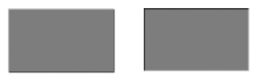
For years, most app designs have had lighting that comes from either the top left or the top center of the screen. This causes raised shapes to be slightly brighter at the top where the light reflects more directly (sometimes referred to as a “hot spot”) and slightly darker at the bottom where the shape is in shadow. Depressed shapes are the opposite with shadows at the top and brighter spots at the bottom. Figure 7.1 illustrates this better than words can.
Material Design has a key light (definition) at the top center of the screen, casting light directly down, but it also has an ambient light. If you take a photo of someone outside on an overcast day, the light will be very even as it filters through the clouds. To make that person stand out more, you can use a light shining on that person from the front, often from an angle. This light gives that person more shape and draws attention; it’s a key light. Despite that you are shining a light on the front of the person the shadow behind your subject isn’t black. Light comes down from the sun, bouncing around through the clouds, and off of the trees and the rest of the environment to give some lighting to nearly all surfaces. This light that seems to be everywhere is called ambient light. It creates soft shadows (hold your hand a few inches above a surface and you can see the shadows below it), and these soft shadows are a key part of Material Design. They show when a surface is elevated and by how much. They also create a soft aesthetic that is visually pleasing.
Generally speaking, you want shadows to be subtle, adding dimensionality to your layout without taking the focus away from the content. Shadows are a visual cue that something is elevated, helping to create depth and separate different UI layers. Combined with purposeful color choices, shadows can draw attention to particular parts of your design (such as a floating action button).
Colors
Books have been written on color theory. The way our eyes and visual cortex process wavelengths to see color is complex and fascinating. The way our brains create associations and meanings based on those colors is no simpler. That means there isn’t an easy answer to color choice, but there are certainly a few tips that can help steer you in the right direction.
The Science
Before diving into specific colors, it’s a good idea to know a few of the ways of thinking about colors. You already know the idea of making colors from red, green, and blue channels. This is an additive process where more color brings you brighter and whiter colors. In print, CMYK is often used. This subtractive process combines cyan, magenta, yellow, and black to create all other colors. The more color you add, the closer you get to black. These are both ways to think of colors based on how individual channels can be combined, but another way to think about colors is hue, saturation, and brightness (or HSB).
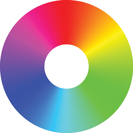
Hue is basically color. If you take a color wheel (shown in Figure 7.2), the hue correlates to a particular degree. It doesn’t have a sense of how bright/dark or vibrant/subdued the color is; hue is simply the color somewhere along the spectrum.
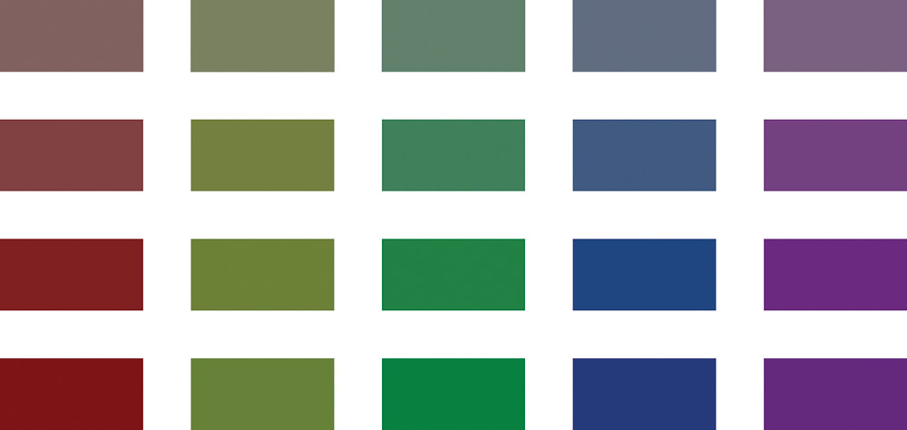
Saturation is how pure the hue is. A saturation of zero would be a medium gray without any of the hue applied; a saturation of 100% would be entirely the color chosen without gray. All values in between are a mixture of gray and the hue. Figure 7.3 shows how a single hue can range from 0% saturation to 100%. That means that a color with a higher saturation will appear more vibrant than a color with lower saturation, which can look dull or muddied. Figure 7.4 shows a range of colors in columns. The hue is exactly the same for each rectangle in the column, but the rows show saturations of 25%, 50%, 75%, and 100%. You can see that the colors at the bottom with full saturation are significantly more vivid than the colors higher up, which have a gray, muddied appearance.

Brightness is how much black is mixed in. With a value of 0% for brightness, you’ve have pure black. A value of 100% means that you aren’t adding any black, so you have the brightest value for the hue that you’ve chosen. Figure 7.5 shows a brightness range for cyan. Sometimes this is referred to as “value” (making the abbreviation HSV) because our perception of brightness is slightly different based on hue; a yellow will seem to be brighter than blue even when the saturation and brightness are the same.

Why bother thinking about colors in terms of HSB instead of RGB? After all, RGB is pretty simple, right? One advantage of HSB is that it lets you quickly compare the saturation of colors and the brightness of colors. Another is that it is easier to choose related colors. Consider the colors Google recommends for Material Design (available at http://www.google.com/design/spec/style/color.html). For each color, they provide several variants labeled with numbers from 50 to 900 along with the RGB hex values. Taking purple as an example, the colors range from #F3E5F5 to #4A148C. If you’re human, you probably don’t get much meaning out of those hex values. In comparison, the HSB values for the lightest color are 292, 7%, and 96%, respectively; the HSB values for the darkest color are 267, 86%, and 55%. You can see that the hue shifts some, but the significant changes are with saturation and brightness. Figure 7.6 plots these out in a chart to visualize how these values change from the 50 color to the 900 color. Because hue is a degree value, the chart shows its value divided by 360 to plot it on the same axis as the saturation and brightness.
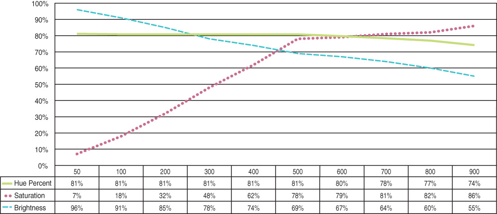
You can see that the saturation change is almost completely linear until the 500 color and then it’s very flat. The brightness has a relatively consistent drop off. The hue is interesting because it is almost unchanged from the 50 color to the 500 and then shifts to lower values, pushing it toward blue. Although the exact values of each of Google’s suggest colors are different, the trends are very similar. Saturation increases as the brightness decreases. Purple had a pretty significant hue shift in the darker colors, but most of Google’s other color suggestions only vary the hue by a few degrees.
Choosing Colors
Armed with a better understanding of colors, you might still be wondering how to pick them. The Material Design guidelines recommend picking a color from the 500 level as your primary, a color from the 700 or 800 level as your darker primary, and a separate accent color. You can certainly create any kind of color scheme you want, but starting with this simple pattern can work well. So how do you choose your primary color?
This part isn’t so scientific. Color choice has an incalculable number of factors from cultural meanings to color harmony and even visual impairment considerations. Some colors are viewed as warmer (reds, oranges, and yellows), which feel more energetic; others are cooler (greens, blues, and purples), which are more calming. Cultural meanings can be difficult, especially if your product will be available worldwide or in a region you’re unfamiliar with, but you can even think of the ones you know. For instance, red is often a color associating with stopping or with warnings. It’s a bold color choice that Google made work for the Gmail app and Google+. Given the popularity of those apps, you may wish to opt for another color.
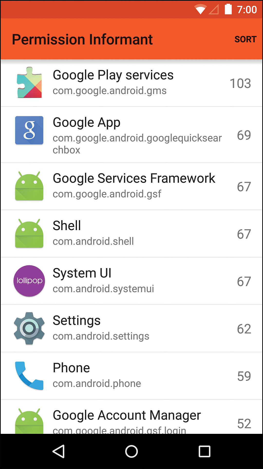
Orange is sometimes associated with warnings as well, but it also conveys excitement and warmth. I developed an app called Permission Informant to let users easily see which apps on their devices were using which permissions. I chose orange for that app because it had both conveyed some sense of caution around permissions and gives a strong and bold vibrancy to the app that otherwise has few visual elements. Figure 7.7 shows the main screen of the Permission Informant app.
Yellow is a cheerful color, but it is perceived as extremely bright. It can be a difficult color to use as your primary color due to that brightness, but it can work well for apps that want to create a playful excitement. It can be a good choice for apps targeted at kids or any audience where being upbeat can be beneficial.
Green is strongly associated with nature and sometimes with finances as well. It can be a good choice for most apps because it doesn’t clash with many other colors (though you may have to tone down reds) and you can even create a visually interesting app with multiple shades of green.
Blue is one of the most frequently chosen colors. It works well with most colors other than yellow. It’s the color of the sky and the ocean, so we’re naturally used to seeing large sections of blue. It’s viewed as a safe choice used by some of the biggest brands out there, so its popularity may be something to consider. If you’re choosing blue, your design will probably be fine, but it might not stand out against Facebook, Twitter, and many others that have chosen blue as well.
Violet is a very rich color full of vibrancy. Being a mix of red and blue, you can add more red to give it a warmer feel or more blue for a cooler feel. It’s sometimes associated with royalty, but it doesn’t have strong meanings in most cultures.
If your app is focused almost entirely on displaying photos, you might opt to not have a strong primary color. Traditionally, these types of apps have been white, gray, or black because those colors won’t interfere with the colors in photos. You can also experiment with colors that have a very low saturation, such as Google’s blue-gray, which has just 31% saturation at the 500 level.
If your app has a particular brand color already, you might use that. For instance, maybe your brand color is #268056, a green with some cyan mixed in. It could be used as your primary color, but you need to come up with a darker version. The HSB values of this green are 152, 70%, and 50%, respectively. From the previous section, you know that a darker version will have an increased saturation and a decreased brightness. The exact amount depends on the desired effect, but you always want to make design choices appear purposeful. In other words, you don’t want two colors that are almost identical because the difference will look like a mistake. By increasing the saturation to 80% and decreasing the brightness to 35%, the color looks sufficiently darker with the same hue.
The accent color you choose should be sufficiently different from your primary color to stand out. It keeps your application looking vibrant while drawing attention to specific elements such as a floating action button or interactive controls. There are no hard rules about choosing an accent color, but one of the easy ways is to look near the opposite side of the color wheel from your primary color. It doesn’t need to be exactly opposite, but you generally want it to be a warm color if your primary color is cool and vice versa. Figure 7.8 shows the green from the previous paragraph near the bottom right of the color wheel with the colors closest to it faded out somewhat. Any of the colors that are vibrant (opposite of that green) are potentially good candidates for accent colors. You can choose one of the accent colors that lines up with one of Google’s suggestions (any of the “A” colors below the primary colors) or you can create your own by selecting a hue that is somewhere roughly opposite of the primary color and then adjusting the saturation and brightness. Most accent colors will have high values for the saturation and brightness, though you can experiment to see what works. Figure 7.9 is an example of the two greens and a purple accent.
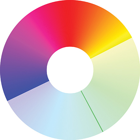
Figure 7.8 Color wheel showing the primary color at the bottom right and potential accent colors at the top left
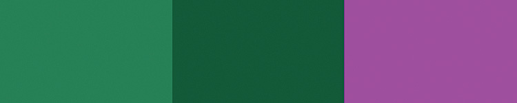
Figure 7.9 An example color scheme with a primary color on the left, primary dark color in the middle, and accent color on the right
Still need help deciding? There are plenty of tools for determining full color schemes that can help you decide. For instance, Adobe’s Color (previously called Kuler) is a nice tool that’s easy to use (https://color.adobe.com/create/color-wheel/), but there are many others out there, so don’t be afraid to take a look at others.
Color vision deficiencies (colloquially referred to as “color blindness”) are another consideration when choosing colors. The most common forms affect the ability to differentiate red and green hues from one another, but there are also color vision deficiencies that affect the ability to differentiate yellow and blue and even to differentiate color altogether (although quite rare). If you’re using a recent version of Photoshop, you can preview your designs to get a feel for how they look to those with color vision deficiencies by going to View, Proof Setup, and picking one of the Color Blindness options. You can also go to Window, Arrange, New Window to create another view of the same document. Picking Window, Arrange, Tile All Vertically allows you to see both of these views side by side. You can then apply one of the color blindness proofs to easily compare full-color vision to either common color vision deficiency. One quick check you can do to help ensure your design works is to convert it to grayscale and ensure that all the essential elements are still obvious.
The Woodworking App
With all this knowledge, how could it be applied to the woodworking app from the previous chapters? What primary color would make sense? An obvious choice might be brown. It’s the color of wood, so it may work well for the app. The Material Design brown has a lower saturation that makes the color feel mellow, even a bit bland. By taking that color and increasing the saturation, the brown looks more vibrant and more interesting. Brown is near the same point as orange on the color wheel, making blue and cyan good choices for accents. Given that blue is so common, cyan might make the app stand out a little more. Just like that, an initial color scheme is available to start working with as seen in Figure 7.10.

Text Considerations
You will primarily communicate with your users through visuals and through text. Getting the text right is as important as getting your visuals right, so be sure to give text the proper level of consideration. Both the appearance of your text and its content influence how effectively a user can read and interpret what you’re communicating.
When creating comps, use real text. It’s easy to fall into the habit of using “lorem ipsum” filler text, but that can create a disconnect from the real content. How long are the titles? Is the text full of long, scientific terms or short capitalized acronyms? By using real text in your designs, you are forced to consider whether text should wrap and how full or empty the design will really be. This is one of the times when it is very useful for designers to work with the development team (including any server-side developers, when applicable) to get examples of real content. If a designer just creates a screen that shows a list of country names for the user to pick from, “U.S.A.” might fit the design perfectly, but how does it look when the server actually returns “United States of America” instead?
In cases where you are designing for an app that does not yet have any real text defined, it’s a little harder to make sure the comps are representative of the final product. Sometimes you can look at similar apps to get a feel for what kinds of text they handle. Other times you just have to take a stab at it and potentially revise once the real text is determined.
Text Contrast
To be easily read, your app’s text must have enough contrast with its background. According to the WCAG (Web Content Accessibility Guidelines), your text should have a minimum 4.5-to-1 contrast ratio. There are a variety of online tools for determining contrast ratios such as the one at snook.ca (http://www.snook.ca/technical/colour_contrast/colour.html) and the one by Lea Verou (http://leaverou.github.com/contrast-ratio). There are also simple desktop programs that can make calculating contrast easy as well. Contrast Analyser for Windows and Mac is available at http://www.paciellogroup.com/resources/contrast-analyser.html and allows you to quickly check contrasts by using eyedropper tools for picking colors from anywhere on your screen.
Why should you care about maintaining this contrast ratio for text? After all, isn’t this intended for people with visual impairments who actually represent a fairly small percentage of users? Although it’s easy to dismiss the need for high contrast because it does not always let you create the visual design that you want, it’s important to remember that this affects far more people than you might realize. Yes, there are the obvious users who benefit the most from higher contrast, such as those with color vision deficiencies and older users with presbyopia, but high-contrast text makes the app easier to use for everyone, even those with excellent vision. Consider also that your app may run on a variety of devices, each of a different size with a different screen technology. Add in that many devices are woefully reflective and users may be outside in the sun, and suddenly it seems everything is working against designs that don’t ensure a high contrast in the text.
Hopefully, you are doing your designing on a high-quality monitor that has been calibrated, but you still have to keep in mind that the app will be running on devices with AMOLEDs, which usually have high-contrast ratios and can have oversaturated colors. It will also run on low-quality TFT LCDs, which often display only a fraction of the full color gamut. Throw some glare on top of a screen with lowered brightness because the user is trying to squeeze the last bit of battery life out of the device, and high contrast becomes vital.
One more consideration with text contrast is the pattern of the background. Whenever possible, the background should be a solid color or a simple gradient. A background with lines, zigzags, and other shapes will interfere with the user’s ability to see the text. If it is okay to make the text difficult to read, then the text must not be very important. If the text is not important, why is it in your app?
Text Sizes, Styles, and Capitalization
Text sizes should be established very early on in the design process. It’s too easy to decide on sizes for each individual screen and end up with a dozen different sizes in the app. By limiting the number of sizes, you allow the user to quickly learn what they mean. A good starting point is 24sp for headlines and titles, 16sp for subheadings, 14sp for body text, and 12sp for captions and fine print.
You can always adjust the font sizes as needed, but sticking to a small set of sizes will keep your design consistent. These sizes will be reasonably consistent across devices (e.g., text that is 24dp will appear to be about the same size on multiple devices), with the caveat that the user can increase font sizes. In general, you do not need to design for each possible font size that the user could change to, but you should keep in mind that the sizes can be changed. For instance, try to avoid designing something that requires the text to be an exact height and breaks otherwise.
Android supports the typical range of styling for text such as bold, italic, and underline. As with any design, use these sparingly. If everything is bold, nothing is. If an entire paragraph is in italics, it is simply harder for the user to read. If every other word is underlined, there is a lot of visual clutter for the user to make sense of.
Using all capitals should be limited to brief labels or actions (such as “DELETE” on a button). A large amount of capitalized text is difficult to read, so avoid ever using capitals for body text or any significant portion of text, which can include items in a list.
Text Spacing
Unfortunately, Android is extremely limited when it comes to spacing in text. Line spacing, also called “leading” (and pronounced ‘ledding’), can be adjusted by a multiplier (e.g., use 1 or 1.5) and an extra amount that’s added or subtracted. For example, you can use a line spacing of 1.5 and add 2sp to each line, but you cannot do much more than that. One important thing to know is that if you are decreasing the line spacing, you may end up clipping descenders (the portion of a letter that goes below the baseline, such as the bottom of a g), so you may have to compensate with extra padding.
Android does not natively support adjusting kerning or tracking. Implementing custom kerning is a nontrivial effort, so it’s best to pick a font that already has a default kerning that works for your design. The hours that would be spent developing a custom view to display a font with a slightly different kerning can be better spent on other aspects of the app.
Text Shadows
Text shadows can be used to give a little extra to some text, but they’re largely unused in apps following Material Design. This is because letters are created with ink and ink is two dimensional. It dyes the paper; it doesn’t float above the paper.
Android has one particular quirk about the way it handles text shadows. Essentially the shadow is drawn and then the text is drawn on top of it. This sounds obvious and generally works, but having partially transparent text means that the shadow shows through the text. In some cases, this can be what you want, but it often just works to muddy the text. You end up with your text color where the shadow isn’t, a mix of your text color and the shadow where they overlap, and just the shadow outside of that.
Custom Fonts
Traditionally, Android used the Droid family of fonts. The Droid fonts worked but they were not as clean as some more popular fonts such as Helvetica. Fortunately, the font Roboto was specifically designed for Android and added in Ice Cream Sandwich (Android 4.0). For most designs, this font should be considered first because it has been specifically built for mobile devices of varying densities and tends to render better across screen types, including those that don’t use traditional RGB striping. Google continues to improve Roboto, morphing it into a better font with every iteration, so you might consider including the latest version in your app if you support older versions of Android that don’t have the latest version.
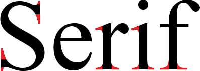
You can divide and group typefaces in a variety of ways, but this book will simply break them into serif, sans serif, monospace, and script as shown in Figure 7.11.

Serif fonts were considered the standard for a long time. They get their name from serifs, which are lines at the ends of strokes. Figure 7.12 shows these lines highlighted to make them more obvious. Serif fonts are commonly used in print, particularly in novels or books with dense text.
Sans serif fonts are fonts that don’t have serifs (“sans” is French for “without”). Roboto, the primary font of Android, is a sans serif font. As serif fonts had been the norm for a long time, the appearance of fonts without serifs around 200 years ago earned them the name “grotesque.” Other terms evolved such as gothic, which was used commonly in America after a sans serif font of that name was created. Eventually, the name sans serif became the standard, but you’ll still run into many others if you read much about typography.
Sans serif fonts are generally considered more modern and (debatably) easier to read on digital displays. They work well on high-density displays, which are common on mobile devices now, and have largely become the standard typeface for digital content.
If you’ve done any development, you’ve undoubtedly used monospace fonts. As the name implies, these fonts have the same spacing for every character. This was out of necessity in early typewriters, but it’s still desirable in cases where aligning characters is important (such as programming). Many non-monospace typefaces keep all numeric characters the same size because aligning numbers is somewhat common.
Script typefaces are those that imitate cursive form. If you aren’t a skilled designer, you should just stay away from these. They’re difficult to read, so the number of use cases in which they make sense is very small and largely reserved for things that need to appear more traditional or formal (such as wedding invitations).
What does all this mean to you? Well, if you did not follow any of that, then you should use Roboto. If you are dead set on using another font, be sure to test it on multiple screens (consider densities as well as subpixel layouts). Many thin/light fonts will not look good on low-density displays, especially those that use a PenTile matrix.
Accessible Vocabulary
Text is not all about appearance. One of the important things to consider with text is how understandable it is to the end user. If you’re targeting a general audience, that means you have to consider a variety of educational levels. Whenever possible, use plain, obvious language. For instance, don’t say “reauthenticate” when you can say “log in again.” Avoid technical jargon, use words consistently, and be succinct.
Other Considerations
It is easy to design for the ideal case, but you also have to consider each of the other states of the app. What does it look like when content is loading? What about when it fails to load? What if the content is longer or shorter than expected?
Varying Text Lengths
Although it was mentioned earlier, it’s worth mentioning again: Use real content for your comps. Forcing yourself to use real content means your comps are much more likely to encounter the same scenarios that the developer will have to handle. If you design all your comps for ideal text sizes (“Hey, I’ve got enough room for a four-letter username, so ‘Jake’ would be perfect!”), you end up with great comps that don’t help the development of the app as much as they should. The developer ends up trying to make reasonable guesses as to how to handle the real content and the developer probably has neither a background in design nor the time to really consider how the UI will be affected. Of course, that doesn’t mean every case needs to be designed. Oftentimes, it is enough to design for the 80-percent case (in other words, pick text that is representative of 80% of use cases) and include details about how to handle others (e.g., “limit text to one line and ellipsize”).
Image Availability and Size
Include placeholder images for any images that will be loaded dynamically. The user experience becomes very jarring when images suddenly appear and text jumps around on the page to accommodate those images. Be sure to consider the aspect ratio of images. If you’re connecting to a service that you have no control over for the images, you are going to need to take a representative sample and see how they look cropped in different ways. Do they need to fill the space or be fully displayed? Should they be enlarged if they’re too small?
Transparency and the 3× Rule
Transparency has many uses in design. It is a simple way of lowering contrast and blending parts of a UI together. Transparency can also be used for visual effects such as crossfading between two images. However, there is an important performance consideration with transparency. Many devices are fill-rate limited. That means they can only push so many pixels (typically due to a limited graphics pipeline). You might think that a device only needs to push as many pixels as are displayed on the screen, but that’s not always the case. If you have several layers, you may have to draw pixels on top of pixels. In the case of software rendering, pixels are typically drawn using the painter’s algorithm. The farthest/deepest layer is drawn first, then the next layer on top of that, and the next one, and so forth. Because of this drawing method, the device may be drawing pixels that are covered up entirely, thus wasting bandwidth. Hardware rendering can often be smarter, which can optimize opaque layers, but it still has to calculate for mixing partially transparent pixels.
The problem with transparency is that regardless of the rendering method, the pixels must be blended. That means having a black background and a white foreground with 50% transparency will draw all the black pixels and then the white pixels. If that is drawing 60 times per second, you have less than 17 milliseconds per frame to draw every pixel on the screen twice. Add more transparent pixels and suddenly you’re drawing three times as many pixels as the screen displays in 17 milliseconds. It doesn’t take long before the result is a choppy UI, particularly during animation and scrolling.
The general rule of thumb is to avoid drawing more than three times the total pixels on the screen. This isn’t a hard limit and some devices can handle more than this, but sticking to this limit means that your UI will appear smooth on a variety of devices.
Standard Icons
The Android design site has a section specifically on iconography that is well worth reading (http://developer.android.com/design/style/iconography.html). It covers the different types of icons and their technical requirements, but it also links out to the Material Design guidelines where appropriate. Be sure to read these thoroughly before creating any icons for your app, whether they’re launcher icons, notification bar icons, action bar icons, or something else entirely.
Android’s launcher icons can be any shape you desire, so consider using shape to help users locate your app. For example, if your app is a world exploration app, your icon might be an image of the world, effectively a circle. Do not just create a rounded rectangle because it’s common or can be used on iOS as well. Shape is one of the key visual indicators that people use to identify something, so use this flexibility of Android to your advantage. For details on creating app icons, see Appendix A, “Google Play Assets.”
Navigation and Transitions
Considering navigation and transitions between UI early and often will help ensure that you create a better overall user experience. What does the UI look like while it is being interacted with? What about when swiping between lists? How does the next screen animate in? Just like the rest of the design, these considerations aren’t just aesthetic. For example, the way in which the next view animates in affects whether the user perceives it as a new page and thus whether he or she thinks the back button will reverse the transition. Animations are covered more in Chapter 9, “Polishing with Animations.”
Error Cases
Do not forget your error cases. Do not forget your error cases. No, repeating that was not a mistake. Gracefully handling errors is a significant user experience consideration that should be well designed. This covers everything from the user entering an invalid email address to the device running out of storage space. It is very common to not design for these cases and to end up with a thrown together result such as an ugly pop-up that just says, “No space available.” That is neither good looking nor useful for the user. In fact, these non-designed errors can feel rather jarring, which makes them much more troubling to the user. Instead of thinking, “Oh, I forgot the ‘at’ symbol in my email address,” the user might think, “What did I break?”
If an app is well designed, even the error states are designed and feel like they belong. Error messages should simply acknowledge a problem and give the user enough information to act on the problem, without being judgmental. Sometimes you can use simple animations to draw the user’s attention to an error (such as a minor shake of an EditText field). Other times it is enough to use color to indicate where a problem lies.
Designing Step-by-Step
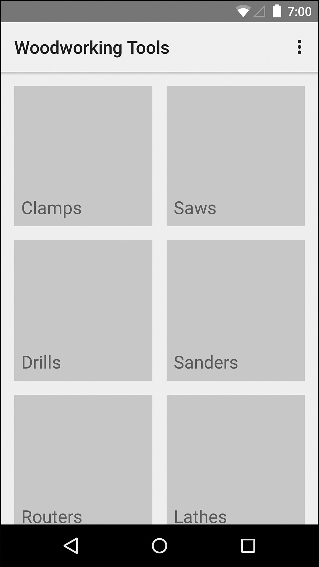
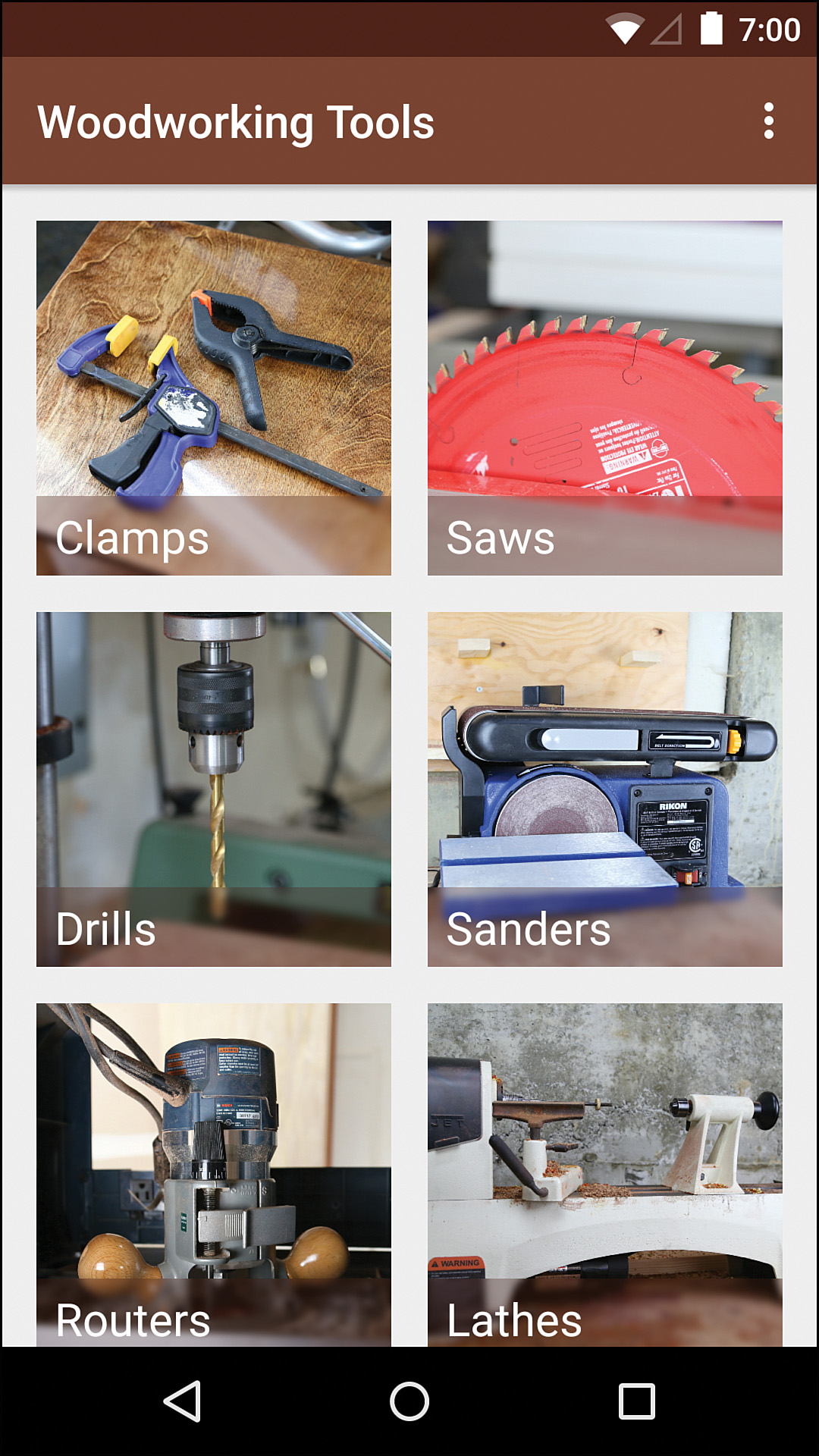
In the previous chapter, user studies revealed that the initial wireframes weren’t quite ready. The navigation drawer wasn’t ideal and combining it with tabs on the main screen caused issues, so a new wireframe was created. Figure 7.13 shows the new wireframe for the main screen. Notice that each tool type is given a large image as well as the name. Through user testing, it became clear that including an image significantly helped users understand each section.
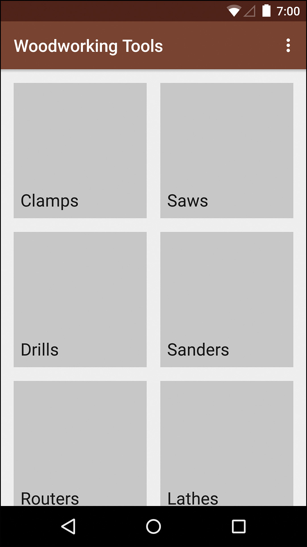
By simply adding the color scheme created earlier in the chapter, the main screen looks like Figure 7.14. This little splash of a vivid brown is beginning to bring some life to the app.
It might seem like there isn’t much to design here; however, even deciding how to display the combined text plus image can take a fair bit of effort and experimentation. Any time you place text over an image, you have to be careful to ensure readability. Generally, you want the text fairly large to help it stand out from the background. You also want to ensure enough contrast with the image, which is the bigger challenge. Images could have any color of background, so just plunking some text on top and hoping for the best means you’re likely to have some of the text very readable when the background image just happens to work and some text that is virtually impossible to read.
There are three main ways to handle this: (1) change the brightness of some or all of the photo, (2) add a background to the text, and (3) blur the background behind the text. The part that you’re adding to help the readability is called a scrim (the term comes from a piece of equipment in photography called a scrim, which is generally fabric that will reduce the intensity of light). You can also combine these for the effect you want. You should generally use either white or black text because they will have more contrast than anything in between.
Assuming white text is desirable, the simplest change is darkening the image. By adding 50% black to an image, white text on it is guaranteed to have at least a decent level of contrast. This solution might be easy, but it tends to be a poor choice for larger images because the image becomes more difficult to see, which partly defeats the purpose of having it in the first place. You could instead just darken the portion of the image behind the text. This gives you a crisp edge to the scrim that may or may not be the effect you’re looking for. Figure 7.15 shows the original image with white text, the full image scrim, and the text area scrim.
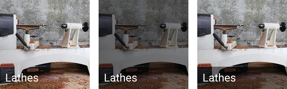
Figure 7.15 The original image at the left, the full-image scrim in the center, and the text area scrim on the right
If you want to darken the background of just the text, but you don’t want a harsh edge, you can use a gradient that darkens the bottom portion of the most and fades out higher up. You can also use text shadows with the blur value high enough to ensure that the shadow isn’t immediately obvious. Figure 7.16 shows both these techniques.
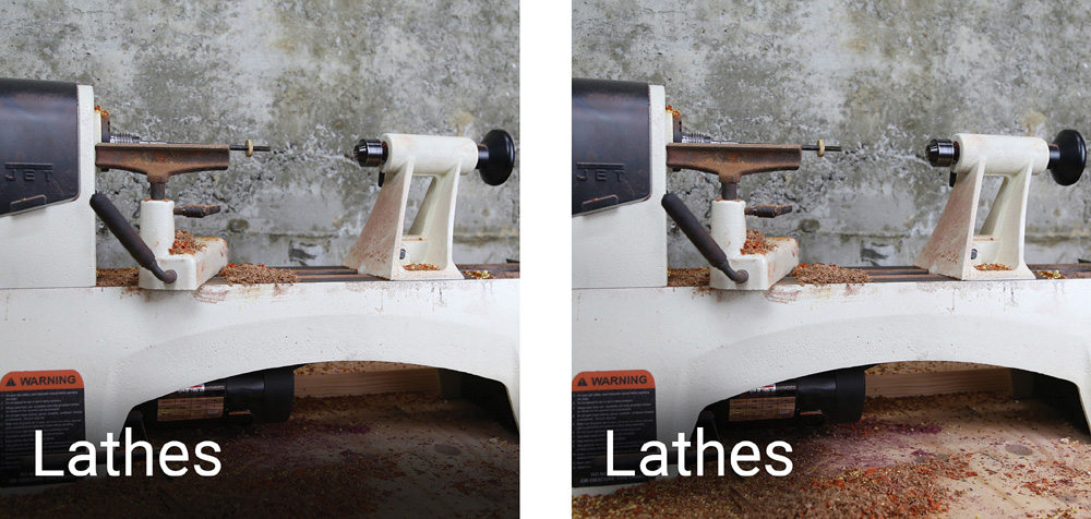
Another technique is using a blur. By blurring the portion of the image immediately behind the text, you ensure that there aren’t harsh lines that might interfere with the text, but you don’t necessarily ensure enough contrast. You can both blur the background behind the text and darken it slightly to improve the contrast. Figure 7.17 shows the background blur with and without the darkened portion.
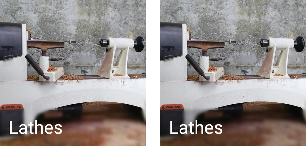
Figure 7.17 A blurred background on the left and a blurred background that’s also darkened on the right
With all these options, which one do you choose? Sometimes it helps to see all of them together at a smaller size so you can better tell how readable the text is (see Figure 7.18). All of these techniques can work, but some work better than others. For the design of the woodworking app, the scrim will be a combination of a background blur and the crisp text area scrim, using the primary dark color. This gives a sharp look that helps attract attention to the text and also keeps the image feeling warmer than a black or gray scrim would. See Figure 7.19 to see how the screen looks with this applied.
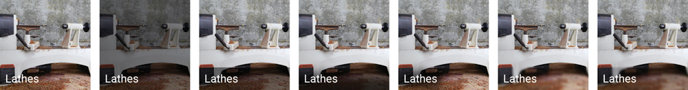
Figure 7.18 All of the scrim examples side-by-side can help make it easier to decide which works best for your use
When you have a solid set of wireframes ready that have been tested with real users, the design process goes much faster. Using that solid foundation, you can add in a color scheme and begin painting the broad areas like the status bar and the app bar. After that, filling in images and determining how the text around them will look can significantly help shape the design.
Summary
Designing an effective UI is a lot of work. You have to consider what stakeholders want and what users need, somehow finding the balance between using existing patterns and visuals and creating a new, recognizable design. You also have to consider what is technically feasible, which brings up the importance of having the designer(s) and developer(s) communicate early and often. That communication is extremely valuable because it also forces the designer to talk through why the design is the way it is (what is it trying to accomplish), ensuring that the developer understands the decisions and knows which aspects are most important when the design might not be able to be perfectly met in code. Establish your patterns early (fonts, text sizes, color palette, touch states, and so on) and ensure that they are consistent. Use color as a secondary indicator and follow conventions where applicable.
In the next chapter, you will see how to begin implementing an actual design.