17
Format reports: In-depth techniques
In this chapter
This chapter focuses on creating, customizing, and formatting reports. Reports can contain two data-focused elements: tables and charts. In addition, reports can include text boxes, images, and shapes for elaboration or decoration.
This chapter guides you through procedures related to creating a custom report with custom chart and table elements.
Create a custom report
In Chapter 7, “Format and share your plan,” you applied styles to the built-in reports in Project. When a built-in report doesn’t meet your needs, you can create a custom report. Custom reports can include the mix of information you want. In fact, you can combine tasks, resources, and graphics together in a single report to convey insights not possible elsewhere in Project.
Think of a custom report as a container of any combination of these elements:
Charts Add bar, area, or other types of charts to a report.
Tables Use tables to present information in a row-and-column layout.
Images Add images such as JPEG or PNG format files to a report.
Shapes Insert and customize ready-made shapes such as arrows, circles, and speech bubbles. Shapes are great for drawing attention to important information on a report.
Text boxes Add a text box anywhere on a report.
The buttons to insert these elements into a report appear on the Report Design tab, in the Insert group (see Figure 17-1).
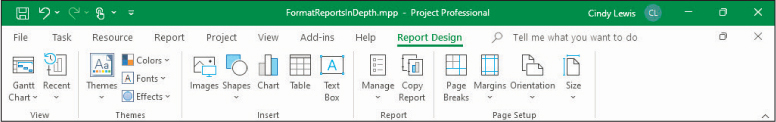
FIGURE 17-1 Use the buttons in the Insert group of the Report Design tab to add elements to a report.
You use these features in a Project report in a similar way that you use them in other Microsoft files, such as a PowerPoint presentation or an Excel workbook.
Charts and tables are different from the other report elements. Charts and tables use task and resource field data from the open plan in Project. The field values included in a chart or table are updated automatically as the underlying data changes in the plan.
When you create a new report, you have the option of choosing the report elements to start with, as Figure 17-2 shows.
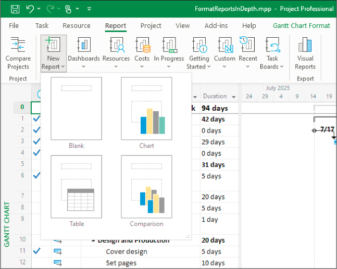
FIGURE 17-2 When creating a new report, you can pick the components you want to include.
You can use these options to start with either a blank report or a report that includes an initial table or chart. The Comparison option creates a new report that contains two identical charts, with the expectation that you’ll customize one or both.
It’s easy to add components to a custom report, so it doesn’t really matter which components you include when creating a new report. You’ll likely want to start by building a chart or table (or both) to convey the essential details from your plan and then add text boxes, images, or shapes to enhance or decorate your key points in the charts and tables.
When you insert or edit a chart or table in a report, Project displays the Field List pane shown in Figure 17-3. Use this pane to control what values from the plan are displayed in the selected chart or table and how those values are organized.

FIGURE 17-3 In this custom report, the Field List pane opens for the selected table or chart.
The Field List pane groups fields into task fields and resource fields. The currently selected fields are listed under the field list for easy reference.
The bottom of the Field List pane includes options to filter, group, outline, or sort the selected fields. These are similar to the filter, group, outline, and sort features you use in task or resource views (see Chapter 13, “Organize plan details”). Use these options to control how reports display the selected fields. Here are just a few options for controlling how report data is organized:
In a pie chart that contains cost fields for tasks, show only top-level summary task cost values by setting Outline Level to Level 1.
In a table that contains task fields, show only milestone tasks by applying the Milestones filter.
In a table that contains resources’ remaining work values, sort in descending order by Remaining Work.
The remaining topics in this chapter explore these options for charts and tables in more detail.
![]() Tip
Tip
Project includes a set of instructional tools designed as reports. On the Report tab, in the View Reports group, select Getting Started and then select Get Started With Project. You’ll find more information about reports in the online help for Project. In the Tell Me box, enter Create a Project report and then select the desired Action.
![]() Tip
Tip
Custom reports reside within the plan in which they were created and are not available in other plans. To make a custom report available in any plan you work with in Project, use the Organizer to copy it to the global template. For more information about the Organizer, see Chapter 18, “Customize Project.”
To create a new report
On the Report tab, in the View Reports group, select New Report.
Select the type of new report you want: blank or with other components included.
In the Report Name dialog, enter a name and then select OK. This name becomes the title at the top of the report and appears in the Custom list (on the Report tab, in the View Reports group) so that you can view this report later.
To add a chart to a report
On the Report Design tab, in the Insert group, select Chart to open the Insert Chart dialog.
On the left side of the dialog, select the chart type you want, and then select the specific chart layout you want. Then select OK. Project adds the new chart to the report and displays the Field List pane.
Drag the chart to position it where you want it on the report.
![]() Tip
Tip
For instructions on customizing the content and format of a chart, see the “Customize charts in a report” topic, later in this chapter.
To add a table to a report
On the Report Design tab, in the Insert group, select Table.
Drag the table to position it where you want it on the report.
![]() Tip
Tip
For instructions on customizing the content and format of a table, see the “Customize tables in a report” topic, later in this chapter.
To add a text box to a report
On the Report Design tab, in the Insert group, select Text Box.
In the report, select where you want to position the upper-left corner of the text box, and drag down and to the right until the text box looks the way you want it. Then release the mouse button.
Enter the text you want inside the text box.
Select additional text formatting options you want from the Shape Format tab, and on the Task tab, in the Font group.
To add a shape to a report
On the Report Design tab, in the Insert group, select Shapes.
In the Shapes list, select the specific shape you want.
In the report, select and drag to create and size the shape.
If you want, add text to the shape and apply whatever additional formatting options you want from the Shape Format tab, and on the Task tab, in the Font group.
To add an image to a report
On the Report Design tab, in the Insert group, select Images.
Select the image you want to add to the report, and then select Open. After the image is added, you can move and resize it, as well as use the Picture Format buttons to further modify it.
Customize charts in a report
The reports in Project give you charting capabilities comparable to some of the ones you find in a spreadsheet program such as Microsoft Excel. In Project, you can create a variety of chart types, including column, line, pie, and bar charts.
When you add a chart or select it in a report, the Field List pane opens, as mentioned earlier, and as Figure 17-4 shows, two new tabs appear on the ribbon.
FIGURE 17-4 The Chart Design and Format tabs are visible when you add or select a chart.
These tabs, Chart Design and Format, are described here:
The Chart Design tab Use the buttons on this tab to change the chart’s layout and style, as well as include elements such as data labels.
The Format tab Use the buttons on this tab to format chart elements such as data series.
In addition, whenever you select a chart, three buttons appear to the right of it, as shown in Figure 17-5.
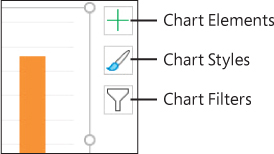
FIGURE 17-5 The Chart Elements, Chart Styles, and Chart Filters buttons are visible when you add or select a chart.
You can use these buttons to refine your chart, as follows:
Chart Elements Quickly add or remove elements such as data labels.
Chart Styles Switch the selected chart to a different chart style (including color and fill combinations) and change the chart’s color scheme.
Chart Filters Add or remove the specific data series (which correspond to Project fields) and data categories (which correspond to specific tasks or resources).
These three buttons give you quick access to some of the features on the Chart Design tab.
As noted in the previous topic, when you select a chart in a report, the Field List pane opens, as shown in Figure 17-6.
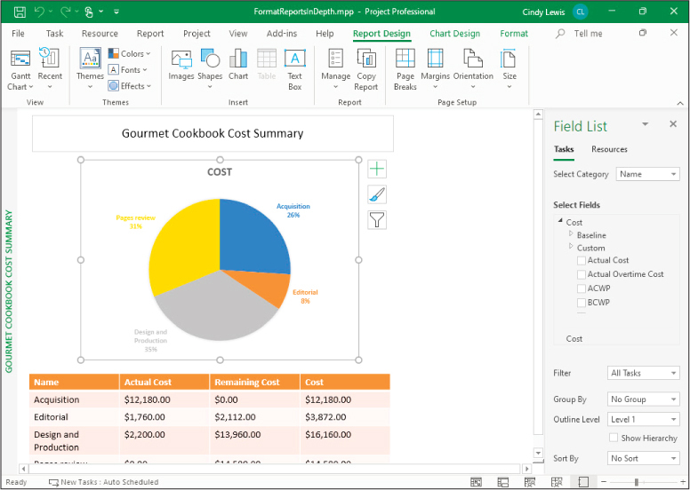
FIGURE 17-6 The Field List pane is the primary interface for controlling what data appears in the selected chart and how it is organized.
Let’s look in more detail at the contents of the Field List pane for charts:
Tasks or Resources Pick the type of data you want to work with. A chart can display data from either Task fields or Resource fields.
Category Pick the primary item to be charted. When you’re working with task data, the available categories include descriptive attributes such as task ID and task name. Resource data categories include attributes such as the resource name. Some categories, such as time, are available for both task and resource data. When you’re working with a bar or line chart, the category determines what field’s labels appear on the x-axis.
Available fields Fields are organized into an outline by type, such as Cost or Work. Expand each field category to see its fields.
Selected fields The currently selected fields are listed at the bottom of the field list for easy reference.
Data organization features (Filter, Group By, and so on) Use these settings to control how the chart presents the task or resource data. For example, you can group tasks by critical tasks or filter resources to show only overallocated resources.
The Field List pane gives you a great deal of flexibility for building charts. As you make changes in the Field List pane, the chart instantly updates the results.
To select the Project information to include in a chart
Select the chart.
In the Field List pane, select the type of data you want to work with: Tasks or Resources.
In the Select Category list, select the category of data to be charted, such as the task name for tasks or the resource name for resources. If you select Time as a category, an Edit button appears so you can edit the time settings.
In the Select Fields box, select the checkboxes for the fields you want the chart to include.
 Tip
TipThe names of the selected fields appear at the bottom of the Select Fields box. To adjust the order of the fields as they appear in the chart, drag the selected field names up or down. You can also right-click or long-press (tap and hold) a field name to remove or rename it.
At the bottom of the Field List pane, select any filter or other options you want to apply to the tasks or resources.
To further adjust the chart’s content, select the Chart Filters button to the right of the chart and then fine-tune the series (the specific values to be charted) and categories (the labels on the x-axis) until the chart appears as you want it to.
![]() Tip
Tip
Building a chart can be a highly iterative process. As you adjust the chart’s settings, the chart instantly updates accordingly. You can also examine the Field List pane and other settings of the built-in charts in Project and then create the same results in your custom charts.
To change a chart’s format and style
Select the chart.
On the Chart Design tab, select the chart layout, color, chart style, and chart type options you want.
On the Format tab, select the shape style, text style, and other shape options you want.
![]() Tip
Tip
You can also use the three floating chart buttons to apply format and design options or adjust the series and category values you want. For example, if the chart doesn’t include the specific chart element you want to format, select the Chart Elements button and then add the element you want. You can also use this button to remove elements you don’t want.
Customize tables in a report
As with views, tables in reports use Project field labels as column headings and display field values in the rows. The field labels (such as Duration) and values (such as 20 days) are the same labels and values you see in views and dialogs throughout Project.
When you select a table in a report, two new Table tabs appear on the ribbon, as shown in Figure 17-7.
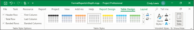
FIGURE 17-7 The Table Design and Layout tabs are visible when you add or select a table.
These tabs, Table Design and Layout, are described here:
The Table Design tab Use the buttons on this tab to add or remove a header row, change the table’s formatting, apply table styles (color schemes), and apply WordArt styles to selected text in the table.
The Layout tab Use the buttons on this tab to adjust row height and column width, adjust the alignment of content in the table’s cells, and make other table size adjustments.
Just as with charts, when you select any table in a report, the Field List pane opens. In this pane, you control what fields are included in the selected table. In the Field List pane, you can also apply filtering, grouping, and sorting of the table rows; for task fields, you can change the outline levels to determine what tasks to display.
Fields in Project are organized into task fields and resource fields. These groupings apply to charts but not to tables, so the Select Category box doesn’t appear for tables. For the report table shown in Figure 17-8, notice that Select Fields is visible but Select Category is not.
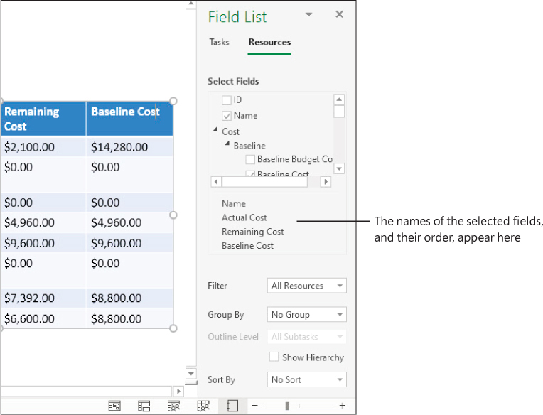
FIGURE 17-8 The Field List pane is the primary interface for controlling what data appears in the selected table and how it’s organized.
The order in which fields get added to a table determines the table’s column organization from left to right. As you add fields, their names appear at the bottom of the Select Fields box. To reorder the columns in the table, drag the field names up or down. As you do so, the table updates to show the result.
The options to filter, group, or sort the table data at the bottom of the Field List pane are similar to the same features you use in view-based tables. The Outline Level box is available only when working with task fields because resources do not have an outline structure.
To select the project information to include in a table
Select the table.
In the Field List pane, select the type of data you want to work with: Tasks or Resources.
In the Select Fields box, select the checkboxes for the fields you want to include in the table. Either select the fields in the sequence you want them to be ordered from left to right, or drag the selected field names up or down at the bottom of the Select Fields box.
To further adjust the table’s content, apply the filter, group, sort, or (for task fields) outline level settings you want at the bottom of the Field List pane.
To change a table’s design and layout
Select the table.
On the Layout tab, select the size, alignment, and other options you want.
On the Table Design tab, select the style options you want.
![]() Tip
Tip
You can right-click the border of a table and, in the shortcut menu that appears, select Font to adjust the font settings of the entire table.
Skills review
In this chapter, you learned how to
Create a custom report
Customize charts in a report
Customize tables in a report

Practice tasks
The FormatReportsInDepth practice file for these tasks is located in the ProjectDekstopSBSCh17 folder. For practice file download instructions, see the introduction to this book.
![]() Important
Important
If you’re running Project Online desktop client or Project Professional, make sure that Project is not connected to Project Web App and is instead set to Computer mode. For more information, see Appendix C, “Integration with Microsoft 365 solutions for collaboration.”
Create a custom report
The scenario: at Lucerne Publishing, you’re sometimes asked for project cost details in terms of both summary tasks (or phases) and resources. You can create a custom report that includes the mix of cost information you want. Open the FormatReportsInDepth plan in Project and then perform the following tasks:
Create a new blank report.
Name the custom report Gourmet Cookbook Cost Summary.
Insert a pie chart. Use the default pie chart style (first one on the left).
Insert a table and position it below the pie chart (see Figure 17-9). You’ll customize the chart and table in the next section.
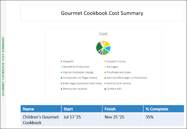
FIGURE 17-9 Your custom report includes a pie chart and table; you’ll change them next.
TipYou might need to cancel the selection of the chart (by selecting in an empty area on the report) before you can add a table.
Customize charts in a report
The scenario: you want to change the chart’s data and format in the custom report. Continuing in the FormatReportsInDepth plan, perform the following tasks:
Select the pie chart.
Update the information in the Field List pane so that the chart displays the Cost field instead of the Work field.
Set the Filter value to All Tasks, set the Group By value to No Group, and set the Outline Level value to Level 1.
Apply the Style 3 style (the third style shown on the Chart Design tab, in the Chart Styles group). You can see the results of these steps in Figure 17-10.
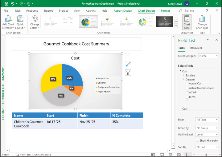
FIGURE 17-10 Your custom report’s pie chart now looks like this.
Customize tables in a report
The scenario: to finish your custom report, you change the data and format of the table. Continuing in the FormatReportsInDepth plan, perform the following tasks:
Select the table.
Update the information in the Field List pane to show the Resource field names.
TipSelect Resources, just below the Field List title, to show the Resource field names.
Leave the Name field selected, but remove the Start and Finish date fields.
In the Cost field group, select the Actual Cost, Remaining Cost, and Cost fields.
Apply the Medium Style 2 - Accent 2 style (the third style shown on the Table Design tab, in the Table Styles group). Figure 17-11 shows the results of these steps.
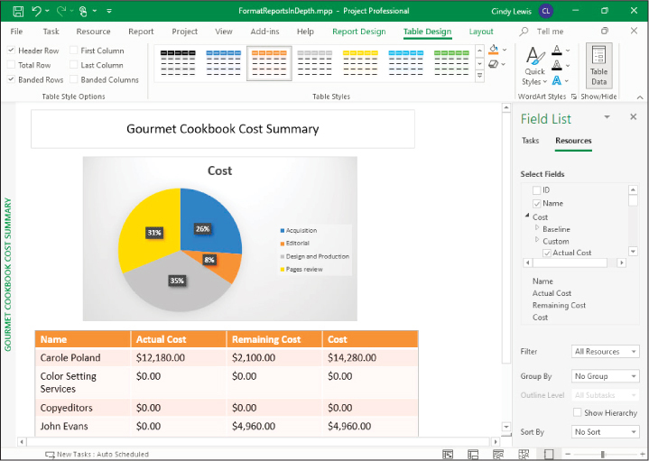
FIGURE 17-11 Your custom report with a chart and a table now looks like this.