
CHAPTER 8
Exporting
The ultimate conclusion of taking a picture is bringing it to the public’s attention. Whether that ‘public’ extends to a million people in a newspaper or just the members of your family, the goal is the same and so are the tools at your disposal.
Fortunately Aperture caters well here, as besides allowing you to export your images in the traditional sense – effectively saving them out as digital files – it also allows for a full range of printing and online publishing. It works in tandem with Kodak printing services to output prints, ties in with Apple’s own MobileMe online service for publishing Web galleries, gives you the option of producing impressive books for personal or portfolio use and lets you create slideshows and contact sheets for reviewing and showing off your work.
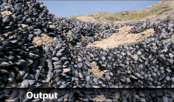
There are, unfortunately, some obvious omissions from Aperture’s output options, including the cards and calendars available in iPhoto 08. The easiest way to plug this gap is to view your Aperture Library in iPhoto and create cards and calendars from there, but this will require a copy of the iLife suite (of which iPhoto is a part) at a cost of £ 55 (Fig. 8.1).
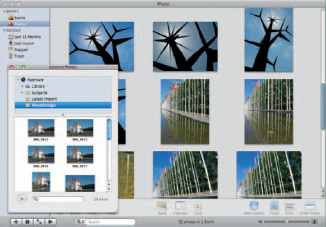
Fig. 8.1 Viewing your Aperture Library within iPhoto will let you create calendars and other products using your images that are not available within Aperture itself.
Fig. 8.2 Use Aperture’s Preferences dialog to choose which application should be used for external photo editing.
Unless you want to use all of your images in the products built into Aperture – Books, Galleries, Journals and so on – you’ll spend a lot of time exporting your work to use it in different ways. Aperture works exceptionally well with other applications and can even read and write native Photoshop PSD files, which opens up access to a wide range of Photoshop filters.
It includes a range of preset export settings from which you can choose when outputting your images and you can choose a default external image editor by opening Preferences (![]()
![]() ) and clicking the Export tab (Fig. 8.2).
) and clicking the Export tab (Fig. 8.2).
From here, you can choose between TIFF and PSD export formats and select their resolution, specify your email client for sending and to which level images should be compressed when emailed, as well as specifying a default copyright notice for Web pages and Journals.
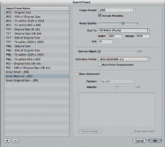
Fig.8.3 The Export Presets tool lets you specify how your images should be optimized when exported from Aperture and includes three specific settings for images that will be distributed by email.
Clicking the Edit … button beside the Email Export Preset gives you finer-grained control over the level of compression by opening the Image Export Preset dialog (Aperture > Presets > Image Export) (Fig. 8.3).
Defining Your Own Export Settings
Presets defined here apply system wide and are available when exporting Web Pages, Journals and so on. They do not apply to Digital Masters exported as Projects to be reincorporated into another Library, as these are not compressed. You can create as many presets as you like, and they will then be presented in a drop-down when you export images in the future.
The range of available image types is impressive, including JPEG, Png, regular and 16-bit TIFF and 8- and 16-bit Photoshop PSD. Which one you choose will determine which other options are available to you when making up your specific export profile. While you can specify the dimensions and resolution of all image formats, for example, only JPEG gives you access to the quality slider, which specifies the level of compression and hence the resulting file size.
When exporting as a Png, TIFF or Photoshop PSD, you can only reduce the bulk of your images by specifying a physical or pixel-based size for the resulting file. Since images are usually exported in batches, rather than one by one, these sizes are specified either as a percentage of the original or to fit within a certain size, measured in pixels, inches or centimeters. Choose any one of these from the Size To: dropdown menu and fill in the width and height boxes to constrain them (Fig. 8.4).
The simplest, if your exported images will be emailed or published online, is to specify a common dimension, such as 800 × 600 or 1024 × 768. However, if you are using the inches or centimeters measurements, it is worth keeping an eye on the resolution (DPI) setting to give you an idea of the size of the resulting file.
An uncompressed TIFF with a resolution of 300 dpi to be printed at 10 × 8 in. would be a 7.2 megapixel image (3000 × 2400 pixel resolution). If you were to increase this to fill a spread in an A4 magazine (420 × 297 mm) it would leap to 4960 × 3508 pixels or 17 megapixels. Lump in all of the supplementary information contained with a TIFF and leave it uncompressed, and your exports could easily touch 50 MB. Clearly this is no good for attaching to an email.
Fig. 8.4 Not all Export options are available for all file types. However, you can specify the dimensions of all exported images to fit within specified limits.
Diligent use of intelligent compression settings is therefore a must, and saving presets here – with logical, descriptive names – will save a lot of time in the future.
Protecting Your Exported Images
In many instances, your images will be both your livelihood and the public assets you use to drum up business. However, putting your images online in an effort to attract new customers can leave those images open to abuse by less scrupulous visitors, who may pay scant attention to copyright notices posted on the bottom of the page.
In this instance, you need to brand your images, rather than your pages, which is done with the Watermark setting in both the Image Export and Web Export dialogs.
Unlike some photo editors that let you watermark to images using plain text, Aperture overlays another image with an opacity level of your choice. If the image you choose – which should ideally be a Photoshop file with a transparent background – is larger than the photo you are exporting, Aperture will scale it down, but it cannot scale images up. This is logical, as you may only want your watermark to sit discretely in the corner of an exported image rather than obscure it entirely. If you want to have watermarks of various sizes for different export sizes – say one for 10 × 8 in. photos at 300 dpi and another for small Web editions – you should create multiple watermarks at the appropriate dimensions and save them to different Export presets.
In the same way, you can also create different watermarks for different clients and save them in presets dedicated to specific jobs (Fig. 8.5).
Your watermark can be as plain or elaborate as you like, but it should achieve two primary goals. First, it should clearly identify the work as your own without being easy to remove, meaning that it should not be easy to clone out, or that it should be positioned in such a way that the part of the image that it overlays can be cropped with no loss of meaning in the resulting picture. Second, it should not obscure the image to such a degree that it makes it a commercial disincentive. While nobody would ever think to misappropriate a photojournalist’s image of riots at a G8 summit on which a watermark had been stamped square and center, few publications would be tempted to buy it if that same watermark obscured the main focus of the image and made it difficult to quickly see if it met their needs. There will be 1000 alternatives available to the busy picture editor, and it will be both quicker and easier for them to turn elsewhere.
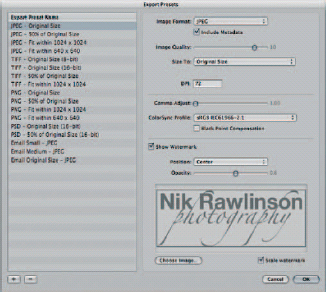
Fig. 8.5 Protect your images by using a watermark. This is a Photoshop-format file that is overlaid on top of your files at the point of export. By specifying a custom opacity, you will ensure that clients can still see your work through the branding.
Color Management
Mac OS X has excellent color management features. Its integrated ColorSync utility sits between the various parts of your system – applications, monitor, printer, scanner and so on – and translates the colors used by each one so that they can be accurately reproduced by each of the others. It does this because every piece of hardware is built in a slightly different way, and so none will be able to capture or display precisely the same range of tones as any other.
The range of colors any device can handle is called its gamut and is described in terms of being wide (a device with a wide gamut can handle more colors) or narrow (fewer colors). A consumer inkjet printer, therefore, will have a comparatively narrow gamut when compared with a professional photo printer, and a cheap all-in-one device with an integrated scanner will have a narrower gamut than a high-end digital camera.
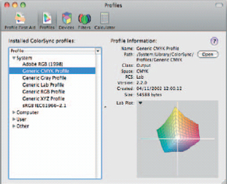
Fig. 8.6 The CMYK color gamut is very narrow and doesn’t come close to matching that of your RGB display. As such, Mac OS X will have to translate the tones used in your images between the two color spaces to achieve accurate matching between screen and printed output.
In some cases, the differences are very small, such as that between Generic RGB and sRGB, but in others they differ by a wide margin, such as is the case when comparing Generic RGB with the much wider gamut of Adobe RGB. You can see for yourself by opening ColorSync Utility (Applications > Utilities > ColorSync Utility) and clicking through the installed profiles. The narrowest of the most commonly used color spaces, as you’ll see, is CMYK. This has a particular relevance to digital photography, as images are captured with RGB sensors (traditionally sporting two green photosites for every one red and blue site) and edited on RGB monitors, before being output in the CMYK colorspace, on inkjet or laser printers or as professional photo prints (Fig. 8.6).
The problem, therefore, is in working out how each color relates to any other and how a pink blush captured by a camera should be recreated on an LCD screen, a conventional display, a photographic print, an Aperture book, a website or a PAL-based television.
It is little surprise, then, that Aperture builds color management right into the export dialog, by gathering together all of the information it already knows about devices attached to your Mac and combining them with industry standards like Secam, NTSC, generic RGB and ‘Black & White’.
If you are exporting photos for use on your own devices, such as a printer, or for import into a video editing application like Final Cut, you should choose the appropriate setting to ensure that what you created on screen while editing matches what you see on the output device, noting that for many printers the profile will vary between output media as much as it will for the hardware itself.
If you are exporting for client use and they have been unable to provide you with a specific profile, however, the general advice would be to leave the image as it is by selecting Use Source Profile and allow the client to apply their color management settings when they place the photo.
Defining Export Names and Destinations
All of the options set in the presets described above will be available when exporting Versions of an image from your Library (shortcut ![]()
![]()
![]() ). When you choose to export a Master (shortcut
). When you choose to export a Master (shortcut ![]()
![]()
![]() ) it will be output using the same name as that which it has inside your Library, complete with the original extension and in the original format. So a Raw file produced by a Canon DSLR and saved with the extension .CR2 will remain as such and be inaccessible to anyone without the necessary Raw converter or another Mac with an up-to-date Version of the operating system, which handles these files as a native format.
) it will be output using the same name as that which it has inside your Library, complete with the original extension and in the original format. So a Raw file produced by a Canon DSLR and saved with the extension .CR2 will remain as such and be inaccessible to anyone without the necessary Raw converter or another Mac with an up-to-date Version of the operating system, which handles these files as a native format.
If you need to ensure maximum compatibility, then, you should export your images as a Version, even if you are outputting an untouched Digital Master. Doing so will include an Export Preset drop-down on the Export Dialog box that will be missing if you export a Master. This will show all of your saved presets and the defaults ones that shipped with Aperture (assuming you haven’t deleted them) (Fig. 8.7).
Regardless of whether you are exporting a Master or a Version, though, you will always have the option to specify where your images should be saved and under which name. By default, Aperture will suggest the picture’s existing name, which was probably set by the camera at the point you pressed the shutter release. However, you can specify your own or choose a logical encoded name that gives a more useful description of the file, based on its assets, than an arbitrary serial number.
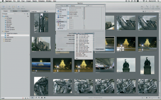
Fig. 8.7 Exporting a Version of your Digital Masters gives you access to the Export presets that shipped with Aperture and any new presets you may have created yourself.
These are found under the drop-downs beside Sub-folder format and Name format, and while they can be set by picking the Edit… option from each of those menus, their control panels are also found in the Presets section through which we set the compression levels above (Figs 8.8 and 8.9).
Why the Presets section? Because each one can make use of the metadata tracked by Aperture as it organizes and edits your files, and because as with the Export and Gallery presets, you can save a range of standard configurations for use with different clients and jobs.
We covered these in depth at the very start of our Aperture workflow, when we imported our images into the Library, as the same Preset tools used for specifying where your imports should be stored and what they should be called are used for directing the output of your exports.
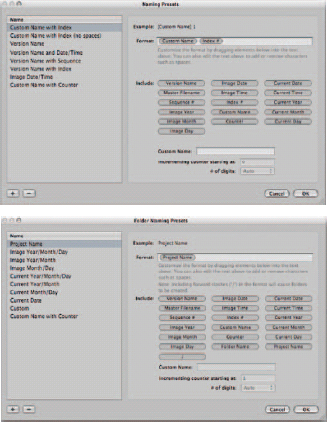
Fig. 8.8 & 8.9 Use the Naming and Folder Naming presets to specify how Aperture should title your images when it exports them, and where they should be written to disk.
The presets are accessed in one of two ways: either through Aperture > Presets > File Naming…/Folder Naming… or by picking Edit at the bottom of the File Name and Folder Name pop-up menus in the Export dialogs.
See p.84 for a more detailed explanation of each dialog, but in general remember the rule that you should adopt is a top–down approach to specify your folders and image names, with the largest, most general classifications coming first and more specific, tightly focused attributes coming last. As such, if you were to create your own preset that would generate folders using Project names and dates, you should examine whether any of your Projects span multiple years. If they do, start with the year first; if not, start with the Project. Apply the same test to months. If your project all took place in the course of a single month, specify that the month delimiter should come immediately after the year; if not, break the two by inserting the Project first and so on down the line. As an example, using a Project called France:
For a collection of photos taken between the 21 and 23 September 2008, use the structure Year/Project/Month/Dates to give: 2008/France/09/21… 22… 23… or Year/Month/Project/Dates to give: 2008/09/France/21… 22… 23….
If the photos were taken between 29 September and 2 October, the project name must come first to avoid having two redundant project folders inside separate months. The structure would therefore be Year/Project/Month/Dates to give: 2008/France/09/29… 30… and /10/01… 02….
If they were taken between 30 December 2008 and 2 January 2009, move the Project name to the very front of the folder structure as Project/Year/Month/Date to give: France/2008/12/30… 31… and /2009/01/01… 02….
Using this last shooting schedule as an example, if you were to adopt the folder structure we specified first time around – Year/Project/Month/Date, and were using the Finder to browse pictures taken on 2 January 2009, you would need to navigate up three levels and back down three levels of the file system to see the photos taken on 30 December. Adopting our final recommended structure would require that you move up and down only two levels in each instance, and all of the images taken in France would be kept in a single parent folder on your disk.
Exporting Metadata
In an increasingly connected society where we spend almost as much time sharing photos with each other as we do taking them, metadata become more and more important. Attaching relevant filing and categorization information to our photos increases their value exponentially. Not only does it allow photo editors to quickly identify images they would like to buy and use – thus providing a financial incentive for the professional photographer – but it also greatly simplifies your own task of keeping your images in order and finding them more easily at a later date.
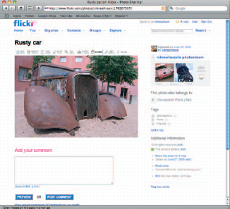
Fig. 8.10 Services such as Flickr can take advantage of metadata tags embedded in your photos to help you manage your collection.
Some image formats, including JPEG and TIFF, can embed the data in IPTC format directly inside the headers of the file itself. In other instances, you can export a so-called IPTC4XML sidecar. IPTC is the International Press Telecommunications Council, an organization based in Windsor, west of London, which developed a protocol for interchanging information about images as early as 1979. This protocol carries captions, keywords, copyright information, bylines and so on and can be exploited directly by many online photo management sites, including Flickr. The fields are flexible and range widely in length, right up to a generous 2000 character field for captions. From a professional point of view, it is used by news agencies to help them maintain their Libraries, choose images to use in their media and manage rights (Fig. 8.10).
You can export the metadata for a chosen image or range of images, separately from the images themselves by picking File > Export > Metadata, in which case, it will be saved as a tabdelimited table in plain text format, which can be imported into a database or spreadsheet for sorting.
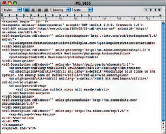
Fig. 8.11 Metadata exported in a Sidecar file is rendered as XML data. This can be parsed by third-party tools and used to catalog images in a database.
However, exporting metadata at the same time as your images is a simple matter of picking whether you want to export it embedded (‘Include IPTC’ from the Metadata pop-up in the Export Master dialog) or as a Sidecar file that is separated from the image itself, but given the same name, and the extension XMP. The format of this file remains plain text, but every attribute is surrounded by descriptive tags to make it more useful for sorting, parsing and including in third-party tools (Fig. 8.11).
Export Plug-ins
As a professional photographer, your work will be split into three distinct parts. One part will be for yourself, which you’ll use for personal reference or recreation. Another will be for private clients looking for portraits and professional photos of personal subjects, and the third will probably be for professional clients who will use your shots in a photo library or publication.
For each, the treatment of your photos – and in particular your exports – will differ. Your personal Projects will be treated to meet your own specific requirements; private clients’ work will be tailored to their specific tastes, and commercial work for professional clients will be adjusted to meet the house style of a particular publication.
Fig. 8.12 Apple maintains an extensive collection of downloadable plug-ins for Aperture on its website.
In every instance, though, you will eventually want to export your work in some form or other, and while the guidance above will meet most requirements, you may be able to cut some corners through the use of plug-ins. These are add-ons to Aperture that automate the process of changing file sizes, formats and naming conventions to meet specific requirements and of posting your photos online, perhaps because a newspaper can only accept them in a particular manner, or because it’s simply easier to cut out the tedious logging in and individual uploads to an online photo service such as Flickr or Picasa.
Apple maintains a catalog of available plug-ins for Aperture, including a wide range of Export plug-ins at apple.com/downloads/macosx/aperture. The list is extensive but by no means exhaustive, and an Internet search will turn up others. It’s also worth talking to professional clients to see whether they have plug-ins of their own that they are willing to send out to freelance contributor (Fig. 8.12).
You can create your own plug-ins using the Aperture software development kit (SDK). However, this is only available to developers with an Apple Developer Connection membership, which starts at £ 329.
Working with Two Macs and Two Libraries
With the release of Version 2, Aperture gained the ability to play host to a tethered camera and write images direct to its Library. This affords the professional photographer great benefits as they can see far larger previews on a Mac than the camera-back LCD would allow. It also means they can make small adjustments to the results as they go along to see whether digital manipulation or physical adjustment of lighting, props and exposure settings would be beneficial.
It, too, means that they can take a notebook out into the field, cutting down on the range of kit they must carry, giving them an immediate backup and letting them start work on the filtering and editing before they even get back to the studio.
However, each of these benefits falls foul to a common downfall. Namely, unless the photographer is working with their primary Mac and their Master Library, the newly shot images will be stored in a Library separate from the rest of their assets. The simplest solution is to travel and work with your primary Mac, but this is inherently insecure and risky.
As such, it will be necessary at the end of every expedition to import any new photos into your Master Library. Clearly you shouldn’t simply copy across your Aperture.aplibrary package, or you will overwrite any Versions and Digital Masters already stored at the destination.
To perform the copying accurately and safely without risking your existing assets, then, you must perform an export and import out of the mobile Library and into the one used at home base respectively. In this instance, select the Project you want to export in the Projects Inspector and pick File > Export > Project. You’ll be given the opportunity to assign it a name and create a new folder to hold it and to ‘Consolidate images into exported project’. What does this mean? It’s simply offering to include any referenced Digital Masters in the export file if they are stored in folders outside of the mobile computer’s Library package (Fig. 8.13).
Publishing Your Photos Online
There are three ways to get your images out of Aperture and onto the Web: Web Galleries, Web pages and Web journals. Each one gives you a little bit more control over the results than its predecessor, with Web Galleries simultaneously the most visually impressive and the least flexible of all three. We’ll cover each in turn below.
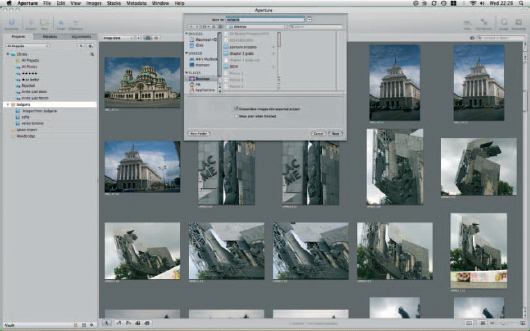
Fig. 8.13 Images stored in one Aperture Library can be safely transferred to another by exporting their parent Project and choosing to consolidate the images into that Project. This lets you shoot using a notebook and tethered camera when away from the studio and then incorporate your new work into your existing Library when you return to base.
Web Galleries
Aperture’s Web Galleries feature lets you put your images online without any knowledge of HTML, PHP or other Internet technologies. It requires a MobileMe account, which costs £ 59 per year, as many of the features of Aperture Web Galleries use server-based code that is not written out by Aperture itself and isn’t found in conventional hosting packages. You can sign up to MobileMe at www.me.com (Fig. 8.14).
These features include password protection, visitor-customizable layouts and slideshow transitions, as well as the ability for visitors to upload their own pictures to the Gallery, should you permit them (Fig. 8.15).
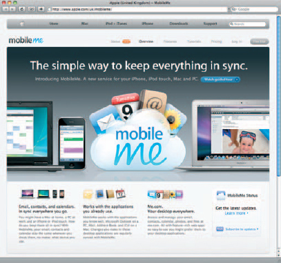
Fig.8.14 Apple’s online service, MobileMe adds synchronication, email, shared calendaring and – of most interest to Aperture users – online publishing tools to the operating system and several of Apple’s core applications.
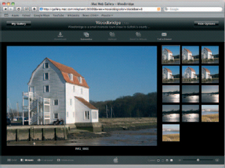
Fig.8.15 Web Galleries are impressive Web 2.0 sites that give your visitors a great deal of interactivity and even allow them to your site to upload their own images.
To create your first Web Gallery, select a Project or a collection of images and click New > Web Gallery on the Toolbar. You’ll be asked to give it a name and description and choose who should be allowed to view the images it contains. This is done through the ‘Album viewable by’ drop-down, which by default is set to allow everyone to see your images. The other options are to restrict it to yourself, in which case its title will be removed from the links in your MobileMe pages, or to people to whom you give a password (Fig. 8.16).
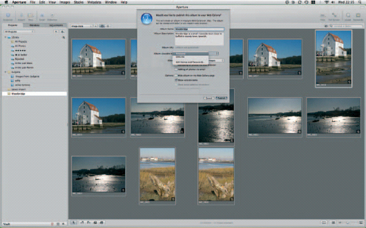
Fig. 8.16 Careful use of restrictions on your Web Gallery will let you keep it protected from unauthorized viewing. This makes Galleries of this sort an effective means of showing your work to a client but retaining a degree of confidentiality.
This latter option will let you individually control who has access to every Album you publish, as by allocating each user a different password you can give them access to some, but not to others. It is set by picking Edit Names and Passwords from the viewable drop-down and using the ‘+’ button to add new users to the list. Aperture keeps track of who has been authorized to view each Album and so will automatically populate the third column of the table – Albums – on that basis. In this way, you can use Aperture as a tool for allowing clients to preview images before signing them off by posting them to a Web Gallery that only they can access (Fig. 8.17).
In this situation, you might want to prevent them from downloading the images themselves, in which case clearing the checkbox that allows that, or tailoring what can be downloaded is a sensible move. The Allow section also lets you tailor users’ ability to add their own photos, either by email or through the Browser. There are simple controls to stop this being abused in the form of a Captcha device requiring users to enter the text version of a series of letters and numbers displayed in a graphic to prove that they are a real person, but it is still advisable to use the Browser upload feature with care. The email feature, however, is a boon for iPhone users, who can use it to upload images direct from their phones when away from home. Each Gallery is given a unique email address in the form of username-">checkbox that allows that, or tailoring what can be downloaded is a sensible move. The Allow section also lets you tailor users’ ability to add their own photos, either by email or through the Browser. There are simple controls to stop this being abused in the form of a Captcha device requiring users to enter the text version of a series of letters and numbers displayed in a graphic to prove that they are a real person, but it is still advisable to use the Browser upload feature with care. The email feature, however, is a boon for iPhone users, who can use it to upload images direct from their phones when away from home. Each Gallery is given a unique email address in the form of username-[email protected], where username is the membership name you chose when signing up to MobileMe, and serial is a unique identifier appended by Apple to differentiate your Galleries from one another.
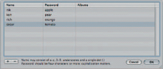
Fig. 8.17 User names and passwords let you restrict who can see your Smart Galleries on an Album-by-Album basis.
Once published, you can add new images to your Web Gallery from Aperture itself by dragging them from Projects in your Library onto the Gallery’s entry in the Projects pane. You can specify whether Aperture automatically updates the online edition of the Gallery and if so, how often. Open Preferences (![]()
![]() ) and click Web Gallery, then change the Check for New Photos option to Every Hour, Every Day or Every Week, as appropriate (Fig. 8.18).
) and click Web Gallery, then change the Check for New Photos option to Every Hour, Every Day or Every Week, as appropriate (Fig. 8.18).
If you would rather maintain full control of the uploading of new photos, leave it set to Manual. You then need to update the published Gallery by clicking on the Check Now button or on the Gallery’s entry in the Projects pane, followed by Web Gallery on the divider between the Browser and Viewer windows and then Settings…. This will call up the dialog used to create the Gallery in the first place, which sports a Publish button that, when clicked, uploads your newly imported image to your MobileMe space.
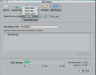
Fig. 8.18 Use Aperture’s Preferences to specify how often it should update published Web Galleries. Leave it set at the default ‘manually’ if you want to retain control over updates.
You can stop publishing a Gallery at any time and remove any published images from your MobileMe web space by selecting the Gallery in the Web Gallery entry in the Preferences pane. Click on the name of the Gallery you want to remove and confirm your action.
Web Pages
Web Galleries are very attractive and full of impressive effects that will wow your visitors, but they are not very flexible. There is only one style of Gallery, and you have to publish them on Apple’s charged-for MobileMe service. Not only does this mean you could end up paying twice – once for your personal Web space and once for MobileMe space; it also means that your Gallery’s address will include the MobileMe branding. This doesn’t look very professional.
The solution to both of these problems is to switch to the less ambitious, but no less attractive Web page option, which creates static pages for your photos that can be hosted on your own Web space under your own domain name. Don’t be confused by the title, ‘Web page’; this doesn’t create a single page for all of your images, but a mini site with index pages showing thumbnails of every image you choose to include, which link through to individual pages for a full-size version of each one (Fig. 8.19).
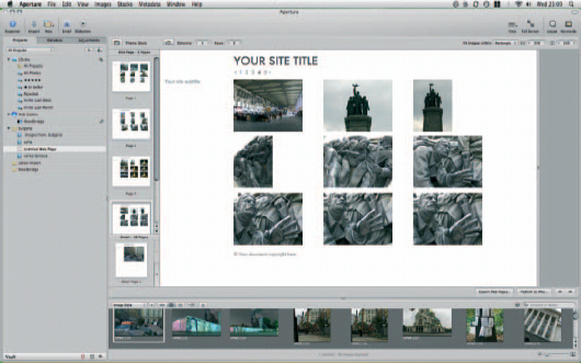
Fig. 8.19 Web pages created by Aperture have fewer features than Web Galleries, but they offer greater flexibility when it comes to layout and design.
The process starts off in a similar way to creating Web Galleries. Pick a Project or Album in your Library, select the images you want to include and choose Web Page from the New drop-down on the Toolbar. Aperture will create a series of index pages to hold thumbnails of all of the pictures in your selection and an individual page for each image, at a larger size.
By default, it will choose the Stock theme, but there are six to choose from, which you can access by clicking the Theme button on the Web page Toolbar that appears above the Web page thumbnails. Each theme contains only two types of page: the index thumbnails and the full image display pages. As such, any change that you make to one of these pages will be reflected on every page of the same type (Fig. 8.20).
So, for example, scrolling to the bottom of any page and changing the copyright data to protect your images will apply the same change to every page. The same goes for the site title.
Fig. 8.20 Aperture ships with six different themes for creating Web Galleries, each with two page styles – one for the index page and one for the detail pages that show each image at a larger size.
Fig. 8.21 Use the Web page Toolbar to change the number of rows and columns into which your images are organized. From this same bar, you can also specify the area into which each image must fit.
However, some aspects, such as image sizes and metadata, differ depending on whether you are working on the index pages or the detail pages.
Click on Page 1 in the Web Page panel and you can change the number of columns and rows displayed on the page. As you do, you’ll see the thumbnail of the page update in real time and, if you have more than one index page, that change will also be reflected on the other pages in the panel. Switching to the Detail pages in the pane below, you can’t adjust the number of images on the page (there’s only ever a single image), but you can change the size of each one by constraining the size of the box in which it must fit. You have three options: rectangle, square and width, which are also available when sizing up the thumbnails on the index pages (Fig. 8.21).
The rectangle option lets you specify a maximum height and width for each image. Whichever is reached first will truncate the other. So, if we have a portrait image with a 3:4 aspect ratio (narrower than it is tall) and we have set up our Web page so that detail shots should fit within a 500 by 400 rectangle, and thumbnails within a 100 by 80 rectangle, the image will appear at 500 × 375 pixels on the detail pages and 100 × 75 pixels on an index page. You can change the dimension limits by either typing in a new value or clicking and holding on the value in each box and then dragging to the right or left to increase or decrease it.
The ‘square’ option will keep both width and height in line, while the ‘width’ option will concern itself only with the width of each image and let your pictures take as much vertical space as they require. This is logical, as Web pages are designed to work in a top–down mode rather than left-to-right, which is why it’s more common to end up scrolling vertically than horizontally online. By using the width setting, you can therefore set your images to fit within a common Browser window size, such as 1024 pixels wide, and let them extend below the bottom of the screen if required.
The options for adding metadata are the same on both the index and detail pages, although the settings for one don’t apply to the other, allowing you to pick a short data set, such as ‘Caption only’ or ‘Name & Ratings’ on the index page, and a more extensive set, such as ‘IPTC-Expanded’, which lists dates, times, photographer details, aperture, exposure, keywords and so on, on the detail pages (Fig. 8.22).
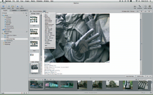
Fig. 8.22 The metadata options on the Web Gallery details pages draw extensively from the metadata attached to the images in your Library, and can be tailored to include views already defined in your Metadata presets.
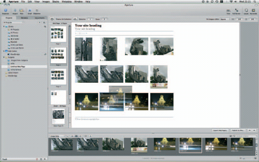
Fig. 8.23 Move any picture on an index page to reposition it, and all other photos in the Gallery will shuffle themselves to accommodate its new location.
Fig. 8.24 If you want to publish your Web pages anywhere other than a MobileMe homepage, you will have to use your own FTP software. The free Cyberduck application (which invites donations) is an excellent client, and can be downloaded from www.cyberduck.ch
Your pictures remain editable, even after you’ve placed them on the page. Hovering over each one overlays it with two icons – a curled arrow that will take you to the detail page and a negative bar in a circle that will delete it entirely. Clicking on and dragging an image will move it to a new position on the page, with the other pictures shuffling to accommodate it in the new layout (Fig. 8.23).
You can upload your completed pages to your MobileMe space directly by clicking Publish to MobileMe…, but if you want to host them on your own website then you’ll have to first save them to your local hard drive and upload them from there, as Aperture has no in-built FTP software (Fig. 8.24).
Whichever option you choose, the final step is deciding on the compression and color settings of your images. These are set individually for thumbnails and detail shots, with both defaulting to high-quality JPEGs. By picking from the drop-down menus beside each one, you can vary the compression or switch to PNG format files, but selecting Edit … from the bottom of each one lets you define your own preset that will appear in the menus every time you save a future Web page. The Edit … option opens the Web Export Presets dialog, giving you access to 12 levels of compression (under the title Image Quality), gamma control and the ability to apply a ColorSync profile. This gives access to all profiles installed on your Mac, including those assigned to installed printers, and two gray profiles – ‘Black & White’ and ‘Generic Gray Profile’ – which let you apply changes to every image in your pages at export without having first gone through and edited them by hand within the Aperture environment (Fig. 8.25).
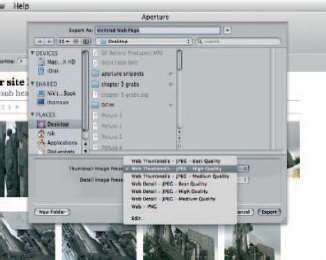
Fig. 8.25 When you come to export your Web pages you can specify individual compression levels for both the thumbnails on your index page and the full-size images on the detail pages.
You can also protect your images by applying a watermark.
In switching from Web Galleries to Web pages, you lose features like the ability to upload new images by email or through a Web Browser, but you will find the end results to be less fussy and, perhaps, more professional than the glitzy alternative.
Web Journals
Web journals are by far the most versatile of all of the online products you can make with your photos in Aperture. They come closer to proper Web design than is offered by any of the other options the application can offer.
Its goal is less to show off your photos in isolation – as a portfolio – but to let you tell stories using a mixture of words and pictures. As such, it’s the online equivalent of the Photo books (see later).
That said, it shares many features with the Web page. Again, you start by gathering together the images you want to use, in a Project, Album or folder, and use them to create a new Web journal from File > New > Web Journal. Once you’ve given it a name, you can start populating the pages with images, either manually by dragging them out of the Browser bar and onto the page or by asking Aperture to do the hard work for you.
Every image you add to your Journal’s index page will link to a new detail page showing a larger edition of the same. There is no reason, then, why you can’t put all of your thumbnails on one page, as you would in a Web page. However, this would miss the point of a Journal, which can take advantage of metadata attached to your images to split them into more logical sub-groups.
The Shortcut button between the page thumbnails and Browser pane (with a cog icon) conceals a drop-down menu that lets you automatically place all of the images in the Browser bar onto index pages defined by day, keyword, rating, byline, city or category. You will end up with one index page for each day, category and so on and one detail page for every image in the Browser bar. It’s quick and simple, but, as we’ll discover in a moment, lacks some flexibility (Fig. 8.26).
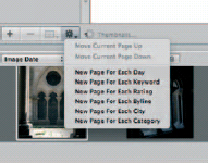
Fig. 8.26 The Web Journal feature’s Shortcut button lets you automatically place images within your Journal on the basis of their attached metadata. This is a quick and easy way of kick-starting your Journal, but it lacks flexibility and can have drawbacks later in the creation process.
Once your images are in place, whether they were added manually or automatically, you can start adding your text. The same metadata features are available here as in the Web Page feature and is added using the same Toolbar button sporting the tag icon. On the index pages you can also add your own text boxes and captions.
The trouble is you can’t drop a text box in the middle of an image box. So, if you want a paragraph of words between two strips of pictures, you’ll need a total of three boxes: one each for the picture strips and another for the text. If you took the easy option and had Aperture split your images onto pages defined by metadata, it will have lumped them all into a single large container on each page, relegating any words you add to the very bottom of the page. Obviously this is more of an issue if your groups are particularly large, such as 100 images taken at one event and then sorted by date (Fig. 8.27).
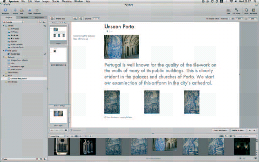
Fig. 8.27 By dragging your images onto the pages of a Web journal manually you have far greater control over the positioning of other elements on your page, including text and captions.
In all other respects, Web journals and Web pages work in precisely the same way. Journals’ styles are defined by themes: you can set the number of columns on an index page and you can constrain both the thumbnails and the detail shots to fit within a square or rectangle of your own choosing. You can set boilerplate text, such as the copyright notice, and you can also access any of the export presets you set up when creating a Web page to downsample your images, change their color profiles or apply watermarks, before uploading them to your MobileMe Web space or saving them to your Mac’s hard drive and then publishing them elsewhere using FTP.
Producing Books
Books are the most impressive products you can make with your pictures. If you’ve never seen one in real life, you’ll be impressed by the range of choices on offer and the quality once they arrive. Apple offers a range of sizes and layouts and the choice of either softback or bound hardback volumes. The choice is similar to that found in iPhoto, with a couple of extras thrown in to appeal to the professional photographer, in place of which it drops more ‘family’ oriented options like the ‘crayon’ book found in its consumer offering (Fig. 8.28).
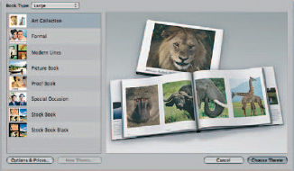
Fig. 8.28 Aperture ships with a range of book styles, most of which are skewed to the professional user and are not found in iPhoto, Apple’s consumer image management application.
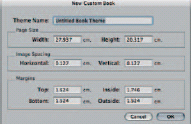
Fig. 8.29 If none of the default book sizes suits your needs, they are supplemented by a custom option, which lets you specify your page dimensions and margins. This is particularly useful if you intend to print the results yourself or send them to a professional bureau.
Books come in a choice of three preset sizes: large, medium and small and are now supplemented by a custom option, through which you can set page sizes, image spacing and margins on each page. There are eight styles on offer, encompassing formal occasions, art collections and stock books (Fig. 8.29).
Considering these are just templates into which you drop your pictures and text – the photo editing version of low-end desktop publishing, in effect – the range of customization options is impressive. And if you find your chosen style doesn’t work for the pictures in your Library, you can even change the theme half way through, although with the caveat that custom layouts obviously won’t be transferred to the new theme.
New books are created from the File menu, or the New drop-down above the Projects panel. Click on any Project, Album or Light Table and then pick Book from the New menu. As the first image in any of these collections will already be selected, you’ll be given the option of creating your book using just that image or all images in the collection. Even if you pick All Images, there is no obligation to place them all in your completed book, so while you can go back and filter out just the pictures that you want to print, there is no harm in clicking Create With All Images at this stage.
Once you have specified which images should be available to the book, you need to pick its style. All of the books offered by Aperture have a sober and professional slant. The eight on offer should meet most needs, but if they don’t they can be tailored extensively after selection. At this initial stage, then, you need only to select the one that comes closest to what you want and pick Choose Theme.
Obviously your choice of book will determine what it costs to have it printed. Prices will change over time, but at the time of writing (early 2008) softcover books ranged from £ 7.39 to £ 14.09 in the default page counts, with an additional charge of between 22p and 53p for each additional page. Hardback books cost £ 19.96 with their default page counts, with each additional page costing between 76p and £ 1.05, depending on whether they are double- or single-sided. All books have 10 pages (20 sides), and no book can have more than 50 extra pages (100 sides) added in.
A t 6.7 × 8.9 cm, the ‘small’ book format isn’t much larger than a credit card, and as such your choice of layouts is limited to the Picture book in which each image fills a complete page. Anything smaller would be fiddly. As the price is around £ 1.50 higher than for the medium-sized book, however, each order will comprise three identical books.
We’ll walk through the creation of a Special Occasion book here, so select that from the theme options if you want to follow along.
Once you have chosen your book style, a new untitled book will be added to the Projects panel. Give it a name before examining the rest of the interface. You’ll see that the main part of the display has been split into three sections: a Browser showing the images in your collection, above which two areas show thumbnails of the pages in your book and each individual page as you’re working on it.
The pages are template driven, with boxes for images and text already in place. The Book Creation dialog opens with the cover page open showing a gray box where you can position an image. Dragging a picture from the Browser to the box drops it in place. Notice how its thumbnail in the Browser pane now has the number 1 stamped on its top-right corner to indicate that it has so far been used once in the book (Fig. 8.30).
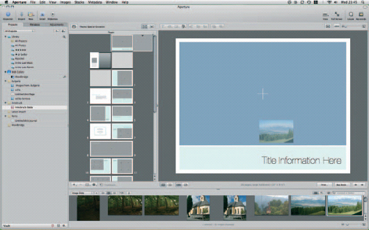
Fig. 8.30 Books are constructed by dragging images into pre-defined holders on the pages or cover.
By default, it fills the box entirely, but if you want to focus on just one part then double-clicking it in place in the box will call up the Image Scale dialog. Sliding to the right will enlarge the image without increasing the size of the box. Sliding back to the left will reduce it again. Once you have resized your image, it may well be off-center with the focus on the least interesting aspect of the picture. It should therefore be repositioned by clicking and dragging on it within the box (Fig. 8.31).
Right-clicking on the image calls up a context-sensitive menu, giving you fast access to common layout defaults: scale to fill, scale to fit centerd, scale to fit left-aligned and scale to fit rightaligned. From here you can also cut, copy or delete the image (Fig. 8.32).
The same principle applies for placing photos on other pages within the book. However, internal pages are more versatile than cover designs. Notice how there is a small black arrow to the right of the cover in the Pages thumbnail window. Clicking this will drop down alternative designs for the cover. There will be only two: the default style we have just been using and a second style in which the cover image spreads across the front and back of the book. Click on any internal page – other than the dust jacket’s internal flap – and you will see that you have a far wider choice of layouts from which to pick. In the unlikely event that none of them meets your needs, pick the one that comes closest, and then set about customizing it.
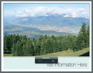
Fig. 8.31 Aperture color codes the Synchronization buttons in the Vaults pane. Red circular arrows indicate that there are Digital Masters in your Library that have never been backed up in a Vault. Yellow shows that all Digital Masters have been backed up, but not all Versions are saved in the Vault. A black icon shows that everything has been backed up and your Vault is up to date.
When you create books in Aperture, you’ll split your time between two working modes, in which you edit either the content or the layout of your pages. You can’t work on both at the same time. To switch between them, use the two buttons to the right of the Theme description just above the page thumbnails. When you switch from the default of Edit Content to Edit Layout, clicking on an image or text box will apply grab handles to each side, with which you can resize it. While in this mode you can still drag in images from the Browser strip at the bottom of the screen. However, you cannot reposition them with the container frames, as grabbing onto them to do so instead moves the frames themselves. As you do this, Aperture will flash up yellow guidelines to show when any side or the vertical or horizontal centers of your frames line up with any other edge or central position on another frame (Fig. 8.33).
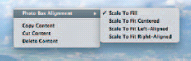
Fig. 8.32 A context-sensitive menu lets you easily resize your source material to suit particular frame shapes in your book.
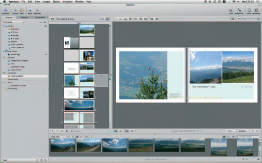
Fig. 8.33 Switch from Edit Content to Edit Layout to change the dimensions of the image frames on your pages. As you drag the grab handles on each one, yellow guidelines will show you when you have lined them up with matching elements on the same or facing page.
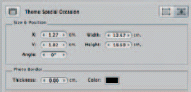
Fig. 8.34 The Layout Options dialog lets you control the size and position of your photo boxes more precisely by entering numerical dimensions. From here, you can also specify the thickness of the border on each one.
(If you find it difficult to position elements using the guides, you can do it manually by opening the Layout Options dialog, which is found in the Shortcut menu indicated by the cog button below the pages’ thumbnails. This lets you nudge frames in any direction and adjust images’ border thickness; Fig. 8.34.)
While you can happily drop images from the Browser strip into frames in your book while you are editing the layout, you cannot drag images out of one frame and into another. The usage tally on the corner of each image thumbnail will be adjusted to reflect this, so that images that have been replaced by others have one deducted from their total (Fig. 8.35).
The remaining tools on the Book Toolbar work in the same way as their desktop publishing equivalents. The Type drop-down gives you quick access to the preset type styles that accompany your chosen Book theme. The range of styles will be determined by the theme, with some such as Special Occasion boasting 20 options, and others – the Small book, for example – having just one. These are all given logical names that pertain to a specific copy type, such as Cover Title, Date and Event Details-Smaller (Fig. 8.36).
Fig. 8.35 The numeric badges on the upper right corner of each thumbnail in the Browser indicate how many times each one has been used in your book, making it easy to spot which have yet to be exploited.
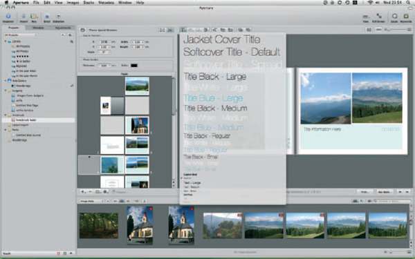
Fig. 8.36 The Type drop-down lets you select from the pre-defined styles that make up part of your chosen Book theme. You cannot add your own styles to the list.
Two along from the Text Styling button is the Photo Filter tool, which applies variations on three different styles to placed images. The two most obvious are black and white and sepia filters, but these are supplemented by the option of a light or strong wash, which can also be applied to images in their original colors. These washes are particularly useful if you are placing text over the top of your images or image boxes on the top of picture-based backgrounds, as it allows you to reduce the contrast in the underlying material and so help the front-most items to sit forward (Fig. 8.37).
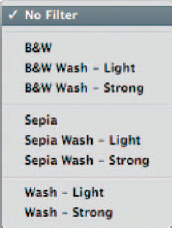
Fig. 8.37 A small selection of image filters lets you change the look of each image in your book. By applying a wash, you can knock back the colors of images used as background files behind text.
If, after washing your background images in this way, you still find that they are distracting, the next button – Set Background – gives you a quick way to disable it altogether. This drop-down has just two options: No Background and Photo – whose functions are self-explanatory.
Not all functions are available at all times, as this Toolbar is context sensitive. When you have focus on an image frame, for example, the text styling tool will be grayed out, and when you are in Layout mode, all of the positioning tools for adding new text and image boxes and layering them on screen will be inaccessible.
Switching to Edit Layout gives you access to Add Text Box, Add Metadata Box and Add Photo Box. The second of these deserves further explanation, as it hooks into Aperture’s extensive database of information about every image in your Library.
To use it, select any positioned image in your book and then click the button. A text box will appear immediately below it, with a tab peeling off to the left stating Plate Number & Caption. This describes the content of the Metadata frame, which will most likely be empty at this point. Move four buttons to the left, to the Set Metadata Format button that we skipped over beside the Text Style button and click it to drop down a list of options. This gives you access to everything Aperture knows about your image, including keywords and copyright information you have applied to it yourself and shutter speed and focal length details written to its Exif data by your camera at the time of creation. Selecting any one of these places the relevant details in the associated Metadata box, which can then be formatted using the Text Styles drop-down (Fig. 8.38).
You can considerably speed up the process of laying out a book by allowing Aperture to do most of the hard work for you.
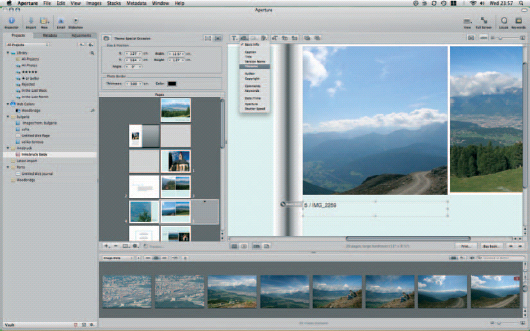
Fig. 8.38 By attaching Metadata boxes to your images, you can use the data you have already entered with respect to your images to add text to the page.
The Shortcut menu found below the Pages thumbnails (the button with the cog on it) duplicates many of the functions of the Book Creation Toolbars, such as adding photo and text boxes. However, it also contains several more powerful features, such as the ability to split text boxes into multiple columns, to show or hide page numbers and to save out individual pages to new documents should you wish to experiment on them elsewhere.
The four tools at the top of the menu, though, are the quickest way to build a book with the least amount of effort. Used to automatically flow all unplaced images, or all selected images or to rebuild the book from scratch with unplaced or selected images, they give Aperture free rein to fill as many of the photo frames as it can with the photos in your Browser bar. Of course, you can then go through the book yourself and rearrange them, but it is a quick and easy way to get a head start on what could otherwise be a lengthy process. The one thing it can’t do, of course, is write your descriptive comments.
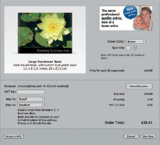
Fig. 8.39 Before you can buy your completed book, you must sign up for an Apple ID and turn on 1-Click ordering. If you have ever bought from the iTunes Store or signed up for MobileMe you will already have an Apple ID. If not, you can sign up through the book purchasing dialog.
Once you have completed your book, you have the option of buying it (the ‘Buy Book…’ button) or printing it yourself. To buy a book, you need an Apple account, with 1-Click ordering enabled. If you have ever bought from the iTunes Store, then you can use the same account details here, but if not, you can set one up through the Purchase dialog (Fig. 8.39).
If you would rather sort out your own professional printing or you want to send a completed book to a client for approval, then you can save your pages as PDFs by instead clicking Print and select Save as PDF… from the bottom of the Print dialog.
Printing
If pressing the shutter is one half of the photography equation, outputting your edited, perfected images is the balance. We’ve already discussed making Web Galleries, pages and Journals, and sending your photos to Apple’s printing partners to produce professional-looking books. However, the most common form of output remains the standard studio, home or office-based print, on an inkjet, laser printer, dedicated 6 × 4 in. photo printer or large format device.
Fortunately, Aperture is well equipped to handle any kind of DIY printing job you care to throw at it, so you have an end-to-end photo production suite in one application, without having to resort to Photoshop for the final stage of the process.
As you might expect, they are controlled by presets, and while Aperture ships with two set of default printing presets already installed, you can add your own, and either edit or delete those already in place.
As with almost any application, the Aperture Print command is found both on the File menu and hiding behind the ![]()
![]() keyboard shortcut. However, unlike most other applications, it is a fully color-managed part of the application, just like any other part of the suite.
keyboard shortcut. However, unlike most other applications, it is a fully color-managed part of the application, just like any other part of the suite.
It is split into two halves, for printing single images or contact sheets showing several images from a particular collection. Each has a similar set of controls, and they differ only in terms of layout options. We’ll start by looking at the common controls in both sets, before looking at the layout options for each individually below.
Before you step straight in and start changing the defaults shipped with Aperture, though, be sure to create new copies of each one. The settings in place are optimized for your particular set up, and while you may be able to improve on them for a particular output job, you should try to preserve these wherever possible.
As such, use the Shortcut button at the bottom of the dialog (sporting the cog icon) to create new single image or contact sheet presets from scratch, or to duplicate whichever preset is selected at any time. From here, you can also lock the existing presets, or indeed any others that you create, to prevent them being changed and overwritten. Once you have done so, the only changes that can be made to any preset without going back and unlocking it from the same menu is the choice of printer, the number of copies, and the range of pages that should be output (Fig. 8.40).
Note that presets remain works in progress, just like half-written documents in a word processor or semi-edited images in Photoshop. As such, you should save your changes as you go along, using the Save button at the bottom of the Print dialog.
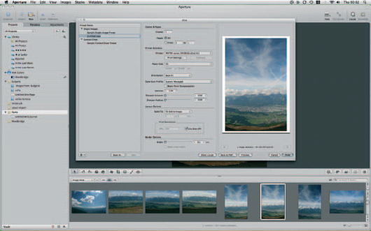
Fig. 8.40 Avoid changing the printing presets that ship with Aperture by creating new presets based on those already in place.
To set milestones, saving later amendments so that they do not interfere with existing settings; use Save As…, which effectively copies the Duplicate command from the Shortcut menu.
Common Features in The Printing Dialogs
The Copies & Pages section at the top of the Aperture Print dialog should already be familiar to any Mac OS X user. It specifies merely how many copies of your printout should be made and which pages you want to produce. Of course, this latter option will only be of relevance if you are printing more images that can fit on a single page, so More Than One in Single Image mode and More Than would fill the number of columns and rows set in the Contact Sheet preset (Fig. 8.41).
This should help clarify Aperture’s use of the term Single Image. This preset does not relate to images printed on their own, one at a time, but batches of images in which each one occupies its own page.
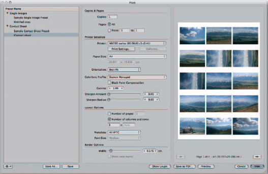
Fig. 8.41 When printing contact sheets, you can specify the number of columns and rows, which in turn will determine the number of photos you can fit on each page. Below this, the Border Options slider increases and decreases the margin between each image.
Your choice of printer is defined in the Printer Selection section and is saved as part of the preset. In this way, if you use one printer for low-grade proofing and another with more expensive inks and media for final output, you can define multiple presets, with one devoted to each output device, but which are functionally identical in every other way.
Why would you do this? Because your choice of printer, even in many cases the media you feed it, will have an impact on the colors achieved in the final output. All colors, inks and media have different color profiles, and so if they are to function as part of a fully color-managed system they must be treated as distinct and different entities.
Managing Color… or Not
Set the choice of paper using the Print Settings… button, which opens the standard Printer Options dialog for your printer. This will differ between manufacturers and models but in general will include an option for Quality & Media, where you can specify the media type, a paper source on devices with more than one input hopper and print mode, which could include photos, tables, composite documents or grayscale images.
You should also be able to set color options here to specify how colors are managed. You should avoid making changes to any Color, Tone or Intensity sliders and instead disable Color Management from the Color Correction drop-down. This will leave Aperture in full control of color management and avoid the situation where you may find you have your printer driver correcting adjustments made by Aperture that it perceives to be less than perfect.
Laying Out Your Page
There is a Calibration button beside the one for Print Settings. Whatever its name may suggest, this doesn’t give you access to further color management features but to a positional tool, which lets you tweak the position of your images on the page.
For some printers, it will be grayed out, but if it works on yours, it initiates a simple process of printing elongated L-shaped characters all around the border of an otherwise blank page. Each is assigned a number, and they run in groups along each edge, with each member of the group being slightly closer to the border than the one in the same position in the previous group. As such, a group that contains positions 27, 19, 11, 3 will be followed by a group labelled 26, 18, 10, 2.
Examine these closely and look for the one whose longest, narrowest end, running parallel to the edge of the page, is closest to the border without being cut off.
Aperture is set to assume that this will be the one labelled 0, but if that’s not the case on any of the four edges, correct the Margins section of the Print Calibration dialog. Aperture will now position your images on the page more accurately.
Your choice of printer will have a bearing on the paper sizes available to you, and you will notice that some may even define standard sizes, such as A4, slightly differently, with hundredth of a millimeter variations between different manufacturers (the commonly accepted standard being, of course, 210 × 279 mm).
The range of papers your printer can handle is found in the Paper Size drop-down and their corresponding sizes are shown below in the dimension boxes. By default, these will be purely informational, but if you are using a non-standard paper size then selecting Custom from the Size drop-down will let you enter your own specifications, measured in centimeters and decimals thereof.
This is used in conjunction with the orientation setting below, which skips between landscape and portrait, and a best fit option, which will rotate the image on the page as appropriate. This is useful when you are printing a series of images in both landscape and portrait format. When working with single image presets, choosing Best Fit, or an appropriate orientation for each image will let you maximise the portion of each page given over to your work, allowing for the border specified at the foot of the dialog. When working with the Contact Sheet preset, however, the effect of changing the orientation can be a marked variation in the number of images you can fit onto a single page, as we will see when we come to the Layout Options section.
Managing Printed Color
We can group the rest of the Printer Selection area in the Print dialog together, as each option deals with color management and the way in which the image you see on screen is translated for use on the page.
Screens and printers are fundamentally different technologies with one, the screen, emanating light of different colors, and the other, the printer, producing paper-based images that reflect selected tones in different areas. They also work with totally different colorsets. Screens make up their colors using red, green and blue pixels. Printers, on the whole, use cyan, magenta, yellow and black, often with half-strength variations of each thrown in to improve reproduction accuracy and smooth the transitions between similar tones. A small number even include pure reds, greens and blues used on monitors, but this still doesn’t get around the problem of translating one color technology into another.
The ColorSync menu contains a list of installed profiles on your system from which you should choose the one relevant to your printer, before tweaking the output using the Gamma and Black Point Compensation options (Fig. 8.42).
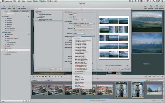
Fig. 8.42 The ColorSync Profile drop-down includes profiles for standard system settings and any hardware devices you have attached to your Mac.
Gamma handles the exposure of your image on the page, although only in one direction. It is impossible to darken an image at this stage, but you can lighten it by up to 30%, in 5% steps. This should help to counter the fact that, as discussed above, while your monitor can illuminate your photos from behind, the best your printer can hope to achieve is output that fairly accurately reflects the available light under which it is viewed. Inevitably some light will be absorbed by the paper, and some papers are worse offenders here than others, which can make your printed output look appreciably darker than what you have been viewing on screen. As such, the Gamma variable lets you lighten your printed output slightly to compensate.
The Black Point Compensation checkbox works hand in hand with Gamma. The chances are that if your images are printing too dark, subtle shadows are being lost and everything below a certain level of luminance is being lumped together. The result is muddy, or entirely missing detail at the darker end of the spectrum, which dramatically reduces the dynamic range of your printed work.
Checking the Black Point Compensation box uses the ColorSync profile for your selected output device as the benchmark against which your photos are adjusted. This is best understood in relation to the Histogram on the Adjustments panel. Using Auto Levels expands the range of tones visible in the image across the full luminance spectrum, so that the very darkest tones appear black, the lightest appear white, and everything in between is proportionally distributed across the rest of the scale.
However, the range of levels that your printer can reproduce may be far more restricted than those your Mac can display – particularly if your output device doesn’t have half-strength inks in its lineup. Checking Black Point Compensation will therefore perform an equivalent task to the Adjustments Inspector’s Auto Exposure button, but in relation only to printed output, by rescaling the luminance of your image so that the lightest and darkest tones do not exceed the extremes of the gamut defined by your printer profile.
On-Screen Proofing
Ink and paper – in particular specialist media – don’t come cheap, and so while printing a photo several times is often the easiest way to ensure that the results look the way you want, it has three major drawbacks: cost, environmental impact and the amount of time it takes to run off several proofs with only minor variations as you apply sequential adjustments to your photos.
Fortunately, thanks to its excellent color management system, Aperture lets you proof your images on screen with a fair degree of confidence. Choose the profile of your output device by picking View Proofing Profile and then use the shortcut ![]()
![]()
![]() to toggle on-screen proofing on and off. Aperture will cross-refer the profile of your display with that of your output device to adjust the on-screen colors and luminance to approximate the equivalent printed results.
to toggle on-screen proofing on and off. Aperture will cross-refer the profile of your display with that of your output device to adjust the on-screen colors and luminance to approximate the equivalent printed results.
A line warning you that you are proofing in this way will appear below the Viewer window whenever it is toggled on (Fig. 8.43).
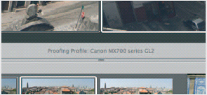
Fig. 8.43 Aperture makes it clear when the colors you are seeing on your screen are a result of using a ColorSync Profile for on-screen proofing.
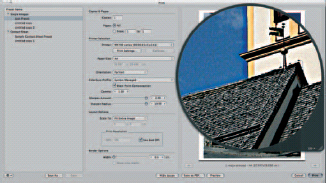
Fig. 8.44 Excessive use of the Sharpen sliders in the Print dialog will lead to undesirable, unrealistic results, as can be seen if you use the Loupe to examine the output at 100% magnification.
Sharpening Your Output
Particular care should be taken when using the Sharpen sliders, which control the amount of sharpening applied and how far from any contrasting edge – say between the roof of a dark building and the light sky against which it sits – the sharpening effect should extend.
It is easy to be heavy handed here, but judicious use of the Loupe, available in the Single Images Preset dialog, will show more accurately how damaging it can be. Excessive sharpening can create a halo effect around sharp contrasts, which looks unnatural and can actually make the results less – rather than more – clear. Fortunately, printed results can be better than the on-screen preview, so a little bit of trial and error can pay dividends (Fig. 8.44).
If you feel that your image would benefit from some crisper edges, a good starting point is to move the Sharpen Amount slider to around 0.70 – about a third of the way along its run – and then apply a very small radius value, by clicking the ![]() and
and ![]() arrows surrounding the value to the right of the slider. Use the Loupe set to at least 100% magnification to examine your image for any halo effect, and only if you are certain both that you have not degraded the image in any way, and that you need to add more, should you then increase either the Amount or Radius values.
arrows surrounding the value to the right of the slider. Use the Loupe set to at least 100% magnification to examine your image for any halo effect, and only if you are certain both that you have not degraded the image in any way, and that you need to add more, should you then increase either the Amount or Radius values.
If you find you have already introduced problems, reduce the values accordingly, remembering always that you should aim to output your work with the smallest number of changes possible. Any edit or enhancement that is easy to see, unless that was your intention, is a bad edit.
Settings Specific to Single Image and Contact Sheet Printing
The Border setting at the foot of the Print dialog is the same, regardless of whether you are printing a series of single images or a contact sheet. However, the Layout Options differ considerably due to the more complex nature of a contact sheet.
When printing a single image, you need concern yourself only with its dimensions. Aperture comes set up with three commonly used sizes already specified: 4 × 6 in., 5 × 7 in. and 8 × 10 in. Note that none of these matches the 4:3 aspect ratios commonly used by digital cameras, and only 4 × 6 in. matches the 3:2 ratio used by some models.
So, if your images haven’t been cropped to these proportions, choosing one of these common formats will introduce extra margins along at least two of the edges as Aperture scales the image to fill as much of the page as it can without losing anything over the edge. Choosing Fit Entire Image will do the same but this time in respect of the paper size chosen in the Paper Size drop-down. Fill Entire Page, however, will print right up to the defined margins, set at the bottom of the dialog, in all directions always taking the poorest-fitting dimension to extremes and cropping the adjacent sides.
So, if you have a 3:2 aspect picture that you want to print at 8 × 10 in., you will lose a little from each end of the picture in Landscape orientation or the top and bottom in Portrait. Printing the same image on 5 × 7 in. paper would see the top and bottom cropped off in Landscape orientation and the sides trimmed down when set to Portrait.
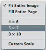
Fig. 8.45 Use the Scale setting to shrink or grow your images to common output sizes with less effort.
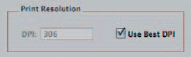
Fig. 8.46 The best compromise between output size and print quality can be maintained by checking the Use Best DPI box.
Note that there is a very clear distinction between paper size and image size. The paper size chosen in the Printer Selection area of the Print dialog talks only about the media. The layout options talk only about the size of the finished image. If you have specified a paper size larger than your print size – say A4 paper – on which you’re printing 5 × 7 in. images, the finished product will also sport crop marks, showing the dimensions of the picture itself.
The most versatile option, of course, is the Custom Scale setting, which unlocks the grayed-out dimensions boxes below the presets so you can enter your own.
When printing single images – but not contact sheets – you can specify the resolution at which they should be outputted. Resolution and maximum print sizes enjoy something of a symbiotic relationship: the higher the resolution, the smaller your images will have to be; the larger the images, the more visible dots you’ll have to accept. To ensure the best balance of output size and quality, leave the Use Best DPI resolution box checked (Figs 8.45 and 8.46).
Contact sheets are used more for reference than display. They are an easy and effective way to get an overview of a collection of images and are the printed equivalent of a full-screen Browser view of the pictures in your Library. By default, you’d want to print all of the images in a collection across as many pages as you need, but if you want to first print a test page to see how they fit, restrict the Number of Pages setting to ‘1’.
Once you are sure it looks fine, having adjusted the margins at the foot of the dialog to suit your needs (which now applies to every image, rather than just the page as a whole), switch to ‘Number of columns and rows’ and specify how many columns of images you want to feature on each page and, optionally, the number of rows, too. By default, the rows will be set to Auto and will revert to this every time you remove any number e ntered in this box.
In order to help choose and filter images from a printout, you have the option of appending metadata to each photo. These are drawn from your Aperture Library and can be chosen using the pop-up menu below the number of images, and the font used to display them using the font size. By default it opts to include All IPTC metadata.
Slideshows
You could be forgiven for thinking that a slideshow was just … well, a slideshow, in which the pictures follow one another in sequence.
To a degree that’s true and as if to prove it, there’s a Slideshow button on the main Aperture Toolbar. Clicking it, or pressing ![]()
![]() will launch a slideshow using your Slideshow presets and whichever view of images is open in the Browser, whether that be a folder, a Project, or even your entire Library. You have only two options: how you want each slide to transition into the next and whether you want Aperture to show the status of each image. A file’s status tracks whether an image is stored locally, remotely or offline.
will launch a slideshow using your Slideshow presets and whichever view of images is open in the Browser, whether that be a folder, a Project, or even your entire Library. You have only two options: how you want each slide to transition into the next and whether you want Aperture to show the status of each image. A file’s status tracks whether an image is stored locally, remotely or offline.
As such, default slideshows are a great way to get a quick fix on how a collection looks without having to manually click through every image in a folder. However, by tweaking the Slideshow presets, you can produce a far more compelling production, which will be suitable for public display, perhaps at the end of an event where you have been hired to provide your services.
Adjusting Slideshow Settings
Open Aperture > Presets > Slideshow… to access the Slideshow Settings dialog. As with the export presets for image and Web, this gives you access to the presets shipped as part of Aperture, which can be amended or deleted, and also lets you add your own from scratch (Figs 8.47 and 8.48).
Clicking through the six options already in place will give you a good idea of how each one works and how you can best take advantage of the various options on offer. To really understand them, though, it’s always best to create a new one of your own.
We’ll create a slideshow that shows nine images on every screen and transitions by fading the screen to black before bringing up the next page. Our first step is to add it to the list by clicking the ‘+’ button at the bottom of the dialog and give it a name. We’ll call it Dissolving Thumbnails.
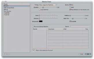
Fig. 8.47 The Slideshow Presets dialog lets you define the way in which images should be displayed in an on-screen presentation.
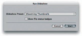
Fig. 8.48 Once you have defined the presets for your slideshows, you can use them by selecting a range of photos and clicking the Slideshow button on the toolbar.
You’ll notice that as you do this, Aperture makes a copy of whichever preset was selected when you created the new one. This gives you a starting point, so if you are creating anything similar to one of the pre-existing presets, you’ll save a lot of time by having that one selected when you add your own.
Unfortunately, there is no Preview option for slideshows, so if you don’t have a clear image in your mind of what difference each setting will make to the completed product, you may find that working your way through the Slideshow Presets dialog requires a certain amount of trial and error. However, it is logical, starting out with the amount of time each image should be displayed. You have three options: manual, automatic, or fit to music. This last option is perhaps the most interesting as it leaves each image on the screen for the whole duration of each track that it plays.
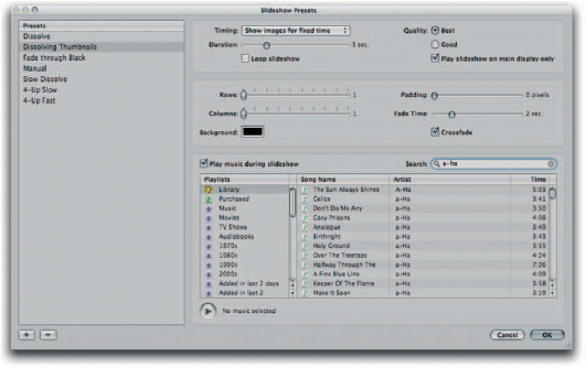
Fig. 8.49 You can use music from your iTunes Library to accompany your slideshow. Bear in mind that if you have set each image to be displayed in time with the music, each one will be shown for the full duration of each track.
Music is taken from your iTunes Library, and you can pick either single tracks or complete playlists. This opens up interesting possibilities for creating stills-based guides (see box ‘Creating a stills-based guide; p. 349).
For the moment, we will select the option to Show images for a fixed time and specify this using the Duration slider below the drop-down, setting it to one second per photo. This is cumulative, though, so with nine images on the screen at any one time, appearing one at a time and displayed without interruption for a second each, it would take nine seconds for each image to be replaced in turn. Add into this any fade times you have set (see below) and you can see why a single second for each photo is more than enough. Nonetheless, we’ll check the box to loop the slideshow so that it repeats indefinitely until someone stops playback.
Even if you don’t choose to fit your slides to music, you can still play the contents of your iTunes Library while the images are being displayed, by checking the ‘Play music during slideshow’ box at the bottom of the dialog, picking the tracks or playlists you want and previewing them if necessary using the Play button. Aperture will tell you how long the selected playlist will run for, assuming it’s not set to loop (Fig. 8.49).
If you use Aperture on a multi-monitor setup, the option to Play slideshow on main display only will obviously restrict it to just the screen on which you view the actual Aperture application with all of its toolbars and dialogs (the secondary display being the one on which you view your images full screen, if attached).
We now need to look at the layout of our slides. We have already decided that we want nine thumbnails on each screen, and the only way to do this is in three rows of three images. Aperture isn’t flexible enough to allow you to design bespoke layouts that vary from page to page, as it only allows you to specify the number of rows and columns. You can get around this easily, however, by designing your slides in an external layout application, such as InDesign or Photoshop. Take advantage of whatever filters and layers you want, overlapping images and adding captions as appropriate, and then save your work as an image file which you then import into the Aperture Library and organize into a dedicated Slideshow folder. You would then create a Preset that displays these images in full screen, one at a time.
For now, then, we will drag both the Row and Column sliders to the right until they reach 3 out of a possible 10, and add 25 pixels of padding between each one. If we ignored the padding, each image would butt up against the others. With 25 pixels of breathing space, they will be more clearly differentiated and easier to read in the limited time our viewers will be shown each one. The Fade time slider controls how long it takes to transition between each page of the slideshow and is used in conjunction with the Crossfade checkbox below. Regardless of whether Crossfade is ticked or not, the point at which one image starts to disappear and the next appears will match what you have chosen on the Fade time slider. However, if you leave Crossfade checked the overall effect will appear slightly slower, as each image – the old one and the new one – can equally share the allotted time (Fig. 8.50).
Fig. 8.50 We have chosen to display nine images on each slide of the slideshow: three lines of three pictures each. To this we have added a 25 pixel padding between each one so that they do not butt up against each other.
By clearing the Crossfade checkbox, you are asking Aperture to introduce a short period when only the background color (set using the Background color picker to the left) will be on display. This is a third element, for which the disappearing and appearing images have to leave time. To have your images appear instantly or swap out one for another, you would set the Fade timer to 0.
By default, the background color is always set to black, and unless you have good and specific reasons to change this, it’s worth leaving it as it is. Black backgrounds focus the eye on the image, as they almost become invisible. Introducing red, green or white would be distracting and if they’re brighter than the images themselves they will detract from the photos’ impact.
The best argument for leaving this set to black, though, is the fact that it is neutral, and so compatible with any tone in your photos. Without being able to sample background colors from the images themselves or select different background colors for each slide without designing them one by one outside of Aperture, you can’t guarantee that what works on your first will work on the last.
Controlling Playback
Slideshows are designed to be self-running: set them going and they’ll cycle through your photos until either they come to the end of the run, or if you’ve set them to loop, you intervene.
As such, tapping ![]() pauses and resumes a running slideshow, the
pauses and resumes a running slideshow, the ![]() and
and ![]() arrow keys let you skip backwards and forwards through the slides as they would in Keynote or PowerPoint, and the
arrow keys let you skip backwards and forwards through the slides as they would in Keynote or PowerPoint, and the ![]() key brings it to an end and gracefully fades it out.
key brings it to an end and gracefully fades it out.
Aperture builds your slideshow using preview images, rather than the Raw files that make up your Library. Each preview is stored alongside the Digital Master or Version to which it relates, and as it saves the application from parsing the Raw Master and then applying adjustments to create each Version every time you click onto a new image, they make the application feel more responsive. They also keep slideshows snappy.
However, if you have not set Aperture to create highquality previews, you will find that the results of your slideshow could be softer or more compressed than you would like.
Preview quality is controlled through the Previews tab of Aperture’s Preferences pane (![]()
![]() ). Here, you can set the preview quality on a scale running from 0 (low) to 12 (high) that matches the JPEG export options in Photoshop. You can also opt to limit the size of each preview within certain dimensions, supplemented by a 1/2 size option to reduce each image preview by 50%, or ‘Don’t limit’ to keep them at full size (Fig. 8.51).
). Here, you can set the preview quality on a scale running from 0 (low) to 12 (high) that matches the JPEG export options in Photoshop. You can also opt to limit the size of each preview within certain dimensions, supplemented by a 1/2 size option to reduce each image preview by 50%, or ‘Don’t limit’ to keep them at full size (Fig. 8.51).
While reducing quality and image dimensions will both improve responsiveness and save on disk space, each degrades the quality of your slideshows. Limiting the preview size will mean that each one has to be scaled up further when displayed on screen, and so choosing a smaller setting, such as 1440 × 1440, can lead to softer results or blockiness, depending on size, as it is scaled back up. Knocking down the quality, meanwhile, can introduce compression artefacts at areas of sharp contrast or where the underlying texture is complex, for example where the branches of a bare tree in a photo overlay the sky.
Fig. 8.51 Preview images are primarily used to help you navigate your Aperture Library more quickly. However, they are also the basis of the images shown in a slideshow. As such, you should be careful about the level of compression you choose to employ.
You must judge carefully, then, whether speed or quality are of greatest importance, and should make that decision as early on as you can, as previews will be created from the point of your very first import.
Creating A Stills-Based Guide
The Fit To Music option in the Slideshow Presets dialog tells Aperture that it should swap the image on display at the end of every track it has been instructed to play. These tracks are drawn from the iTunes Library which, with its Playlists feature, lets you specify a range of audio files and a specific order in which they should play. By combining a carefully ordered collection of photos and audio files through this dialog, it’s easy to create a slideshow that goes beyond the usual transitions and music productions and becomes a truly useful resource.
The first step is to organize your photos into the most relevant order, remembering the movie-making convention of telling a building story, with each image moving on logically from the last. Once you have assembled your collection, you need to record a short narrative for each one. Apple’s own GarageBand application, which ships as part of the £ 55 iLife suite, and the free Audacity recording and editing tool (audacity.sourceforge.net) are both excellent and easy-to-use options.
Rather than recording a single track to describe every image in the collection as a whole, you should produce a short clip for each one individually, and give them sequential numbers, with leading zeros to pad them out and make sure they are all the same length, so for a slideshow with fewer than 100 images each track would have a double-digit name, and for one with more than 99 but fewer than 1000 each track would have a three-digit name.
Each audio file name will match the position of the associated image in the slideshow, so that the track describing the seventh image would be 07, and the twelfth would be 12. Aperture can play back any audio format supported by iTunes, so saving as Wav or MP3 is safe, but Windows Media Files are inaccessible.
Import the tracks by opening iTunes and picking Add to Library… (shortcut ![]()
![]() ) from the File menu and organize them into their own Playlist. This isolates them from the rest of the Library and lets you confine Aperture to use just those tracks as backing for the slideshow without straying into the rest of the Library.
) from the File menu and organize them into their own Playlist. This isolates them from the rest of the Library and lets you confine Aperture to use just those tracks as backing for the slideshow without straying into the rest of the Library.
Returning to Aperture, you would then create a Slideshow Preset with timing set to Fit To Music, and the newly created iTunes Playlist set as the audio source. Navigate to the folder within your Aperture Library containing the slideshow’s images and then tap ![]()
![]() to start the slideshow, remembering to select your newly created Preset.
to start the slideshow, remembering to select your newly created Preset.
Unfortunately there is no way to export a narrated slideshow from Aperture. The easiest way to achieve this is by using the QuickTime export functions in Keynote (part of iWork) or a video editing application or to use the enhanced podcast tools in GarageBand.