

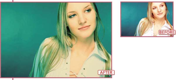
Once you have mastered the basic editing and enhancement skills and techniques in Elements you will no doubt want to move on to some more challenging tasks that will extend and build upon what you already know. The group of techniques collected together here is loosely based on traditional photographic ‘know how’ that I have reworked in a digital fashion.
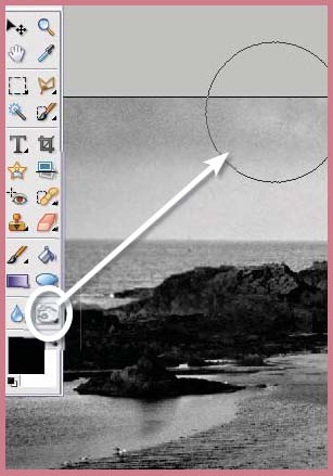
Suitable for Elements – 5.0, 4.0, 3.0, 2.0, 1.0 | Difficulty level – Intermediate | Resources – Web image 701 Tools used – Eraser | Menus used – Filter, Layer
Even though as image-makers we spend thousands of dollars on equipment that ensures that we make sharp photographs, there is something enticing about a delicately softened picture. Especially when this lack of sharpness is contrasted against a well-focused section of the picture. Diffusion printing is one traditional printing technique that played with this idea. Parts of the image were purposely blurred whilst other areas remained sharp.
With non-digital photography adding such an effect meant placing a ‘mist’ or ‘fog’ filter in front of the camera lens at the time of shooting. More recently, in an attempt to gain a little more control over the process, photographers have been placing diffusion filters below their enlarging lenses for part of the print’s exposure time. This process gave a combination effect where sharpness and controlled blur happily coexisted in the final print.
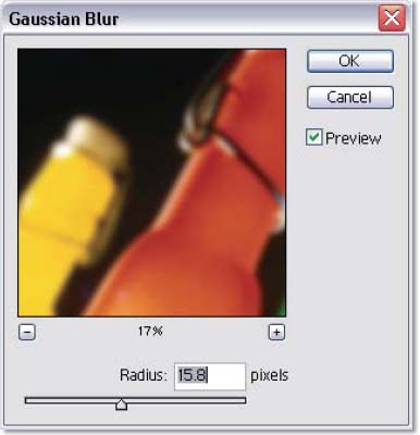
Gaussian Blur filter >> The diffusion printing technique is based around the careful application of the Gaussian Blur filter.
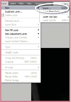
Step 1 >> Duplicate the original picture by dragging it to the New Layer button or choosing the Layer>Duplicate Layer option.
Step 2 >> Apply the Gaussian Blur filter (Filter>Blur>Gaussian Blur) to the upper, duplicated, layer..

Step 3 >> Control the way that the blurred layer interacts with the one beneath by adjusting the blending mode and/or using the eraser to remove unwanted blurred areas.

Diffusion printing >> To control the style and position of the effect change the blending mode of the blurred layer and use the eraser to remove blurred areas to reveal the sharp original beneath. (a) Darken blending mode. (b) Lighten blending mode. (c) Normal blending mode.
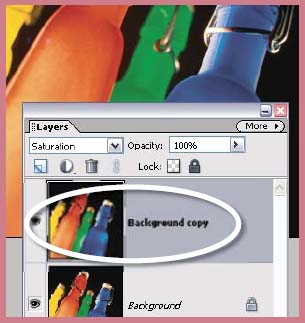
Creating this style of picture using digital processes offers the image-maker a lot more choice and control over the end results. The technique is based around the Gaussian Blur filter, which can be used to soften the sharp details of your photograph. A simple application of the filter to a base image produces a less than attractive result and one that doesn’t combine the sharp and blurred imagery. Instead more control is possible if the filter is applied to a copy of the picture stored as a layer above the original image. This blurred layer is then combined with the original by either reducing the opacity of the blurred layer to allow the sharp original to show through, or by changing the blurred layer to a different blending mode such as Darken or Lighten.
Extending the Technique
Blending mode or opacity changes provide control over the overall effect of the diffusion, but to fine-tune the results select the blur layer and use the Eraser tool, set to a low opacity, to gently remove parts of the top layer to reveal the sharpness beneath.
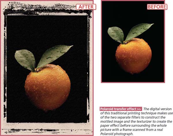
Polaroid transfer effect >> The digital version of this traditional printing technique makes use of the two separate filters to construct the mottled image and the texturizer to create the paper effect before surrounding the whole picture with a frame scanned from a real Polaroid photograph.
7.02 Instant Film Transfer Effect
Suitable for Elements – 5.0, 4.0, 3.0, 2.0, 1.0 | Difficulty level – Advanced | Resources – Web images 702-1, 702-2, 702-3, Menus used – Filter, Layer, Enhance, Image
Most readers will probably be familiar with Polaroid instant picture products – you push the button and the print is ejected and develops right before your eyes. For many years professional image-makers have been using the unique features of this technology to create wonderfully textured images. The process involved substituting watercolor paper for the printing surface supplied by Polaroid. As a result the image is transferred onto the roughly surfaced paper and takes on a distinctly different look and feel to a standard Polaroid print.
Much acclaimed for its artistic appeal, the technique was not always predictable and, much to the frustration of photographers, it was often difficult to repeat the success of previous results. There were three main problems – dark areas of an image often didn’t transfer to the new surface, colors and image detail would bleed unpredictably, and it was difficult to control how dark or light the final print would be. I know these problems intimately as it once took me 16 sheets of expensive instant film to produce a couple of acceptable prints.
A Digital Solution
This success ratio is not one that my budget or my temperament can afford. So I started to play with a digital version of the popular technique. I wanted to find a process that was more predictable, controllable and repeatable. My first step was to list the characteristics of the Polaroid transfer print so that I could simulate them digitally.
To me it seemed that there were four main elements: desaturated colors, mottled ink, distinct paper texture and color, and the Polaroid film frame.
If I could duplicate these on my desktop then I would be able to make an image that captured the essence of the Polaroid transfer process.
Step 1 >> Desaturate the image tones slightly using the Hue/Saturation feature..
Step 2 >> Duplicate the background layer by dragging it to the New Layers button at the top of the dialog.
Step 3 >> Apply both the Paint Daubs and Palette Knife filters to the upper layer (duplicate).
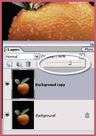
Step 4 >> Reduce the opacity of the filtered upper layer to allow some of the sharp details of the original image to show through.
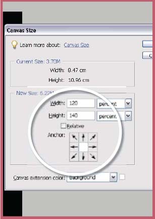
Step 5 >> Check to see that the background color is set to white. Increase the size of the canvas to accommodate the Polaroid edge surround using the Canvas Size command with a setting of 120% for width and 140% for height. Flatten the layers.
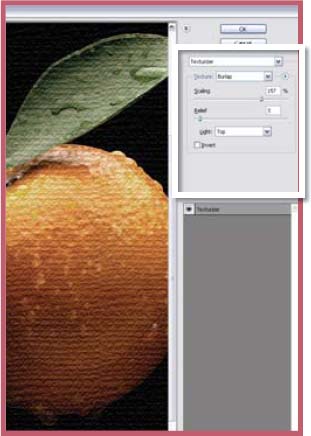
Step 6 >> Either use one of the preinstalled textures available in the Texturizer filter or download and install the watercolor paper.psd file (web image 702-2) from the book’s website. Use the filter to add the texture to the surround.
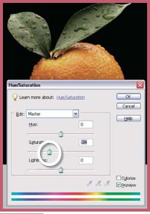
The Polaroid technique requires the watercolor paper to be slightly wet at the time of transfer. The moisture, whilst helping the image movement from paper to paper, tends to desaturate the colors and cause fine detail to be lost. These characteristics are also the result of the coarse surface of the donor paper. So the first step of the digital version of the process is to desaturate the color of our example image. In Elements this can be achieved by using the Hue/Saturation control from the Adjust Color section of the Enhance menu. With the dialog open carefully move the Saturation slider to the left. This action will decrease the intensity of the colors in your image.
Mottle the Ink
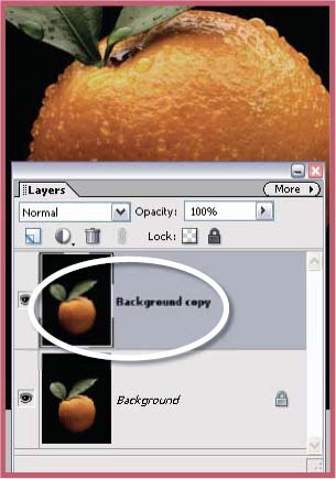
The distinct surface and image qualities of Polaroid transfer prints combine both sharpness and image break-up in the one picture. To reproduce this effect digitally, I copied the original image onto a second layer. My idea was to manipulate one version so that it displayed the mottled effect of the transfer print whilst leaving the second version untouched. Then, using the blending modes or opacity features of Elements’ layers I could adjust how much sharpness or mottle was contained in the final result.
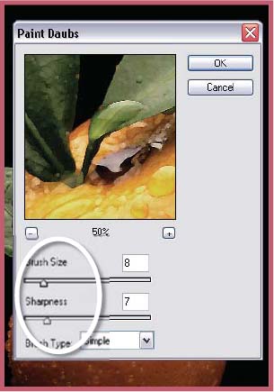
In practice, I started by duplicating the image layer. This can be achieved by selecting the layer to be copied and then using the Duplicate Layer command located under the Layer menu. Alternatively you drag the layer to the Create New Layer button at the top of the Layers palette. With the upper layer selected, I then needed to find a method to simulate the mottle of the transfer print. Though not exactly right, I found that by combining the effects of the Paint Daubs and Palette Knife filters I could produce reasonable results. When using these filters yourself keep in mind that the settings used will vary with the style and size of your image. This part of the process is not an exact science. Play and experimentation is the name of the game. You might also want to try other options in the Artistic, Sketch or Texture selections of the Filter menu.
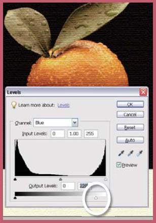
Step 7 >> In the Levels feature select the blue and red channels separately, dragging in the white Output slider towards the center.
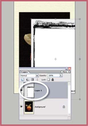
Step 8 >> Open the edge file as a separate document and drag it onto the original picture.
Step 9 >> Switch the mode of the edge layer to Multiply and use the Scale command to adjust its size to fit the picture below.
The last step in this stage is to combine the characteristics of the two layers. This can be achieved by either changing the Blending mode of the uppermost layer or by adjusting its opacity, or both. For the example image a simple opacity change was all that was needed, but don’t be afraid to try a few different blend/opacity combinations with your own work.
Apply a Paper Texture and Color
The paper color and texture is a critical part of the appeal of the transfer print. These two characteristics extend throughout the image itself and into the area that surrounds the picture. For this to occur in a digital facsimile it is necessary to provide some space around the image using Elements’ Canvas Size feature. Unlike the Image Size command, this option allows the user to increase the size of the canvas without changing the image size (and all its associated layers). In the example the canvas width was increased by 120% and the height by 140%.
To add the texture to both image and surround I flattened the two image layers and the white background into a single layer. Next, I photographed a section of watercolor paper to use as a customized texture with the Texturizer filter. You can download and use this very file from the book’s website (www.adv-elements.com). With the texture complete, I played with the overall color of the image using the Levels feature. I adjusted the blue and red channels independently and concentrated on the lighter tones of the image so that rather than the paper being stark white it took on a creamy appearance.
Add the Polaroid Frame
The last part of the process involves combining the final image with a photograph of a Polaroid film edge. The edge picture is nothing more complex than a scanned Polaroid print with the image removed. But rather than go to the trouble of making your own, you can download the edge I used for the example directly from the website (web image 702-3). Next, open the file as a separate Photoshop Elements document. Click onto the edge layer and drag it onto your picture. The edge will automatically become a new layer on top of the existing image layer.
With the edge layer selected change the layer’s mode to Multiply. Notice that the white areas of the layer are now transparent, allowing the picture beneath to show through. Finally, use the Scale command to adjust the size of the edge to fit the image. Though not an exact copy of the Polaroid transfer print, the digital version displays much of the character of the original and can be achieved for less cost and with more control.
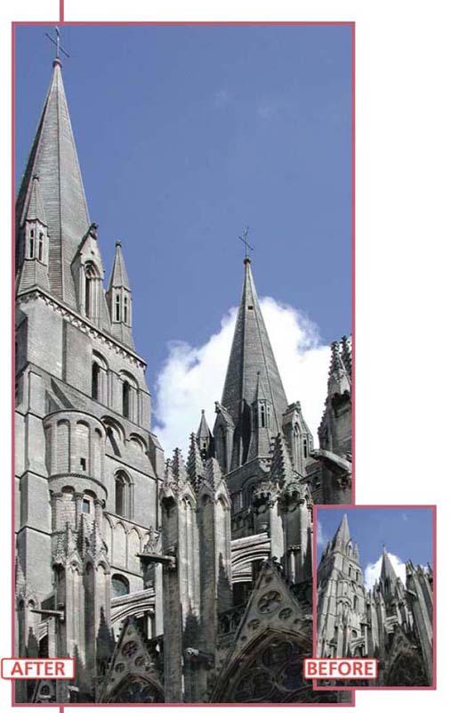
7.03 Using the Unsharp Mask Filter to Add Contrast
Suitable for Elements – 5.0, 4.0, 3.0, 2.0, 1.0 | Difficulty level – Basic | Resources – Web image 703 Tools used – Burning-in | Menus used – Enhance
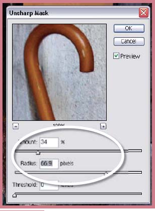
Most digital photographers have used the Unsharp Mask filter as a way to add some crispness to pictures that are a little soft. In another application this feature can be used to add some local contrast to flat images in much the same way that multi-contrast printing provides a boost to black and white prints.
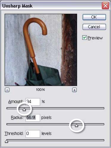
USM local contrast settings >> Instead of using the modest radius settings that we normally associate with the Unsharp Mask filter this technique requires the radius to be set to a high value.
The trick with this technique is to forget the way that you have been using the feature. Instead of selecting a high amount and low radius setting you do the opposite. You drag the amount downwards and the radius upwards. This produces a change in local contrast rather than a sharpening of individual pixels. To use the technique as part of your standard enhancement process you would adjust highlight and shadow points to set the contrast of the whole picture first, then employ the Unsharp Mask filter to increase the local contrast and then use the filter a second time, with different settings, to increase the photograph’s sharpness.
The new Adjust Sharpness filter also contains Amount and Radius sliders which can be employed to produce similar contrast changing effects.
Step 1 >> To change local contrast open the Unsharp Mask filter and select a low Amount value and a high Radius value.
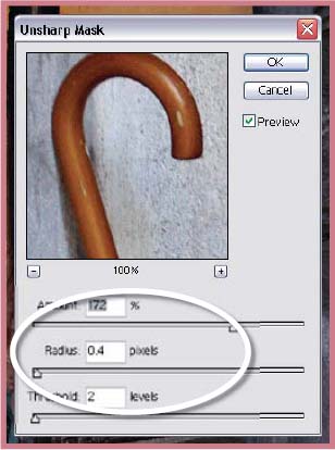
Step 2 >> After adjusting the contrast sharpen the image using the Unsharp Mask filter in the normal fashion.
Step 3 >> The final step in the example image was to darken some of the tones around the door opening with the Burn tool.
USM contrast change >> Until now most of us have used the Unsharp Mask filter for the sharpening of pictures, but with this technique you can use the feature to increase the local contrast of an image as well.
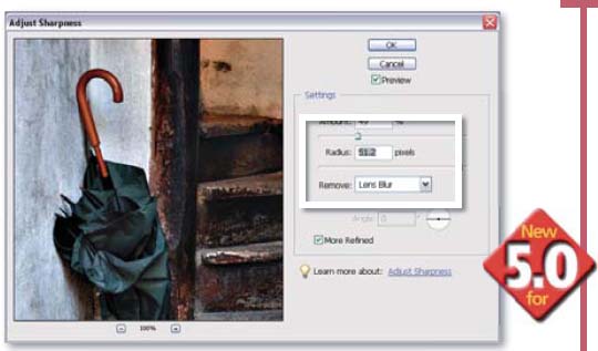
The Adjust Sharpness alternative >> The new Adjust Sharpness filter in Photoshop Elements 5.0 can also be used to provide similar local contrast changes.
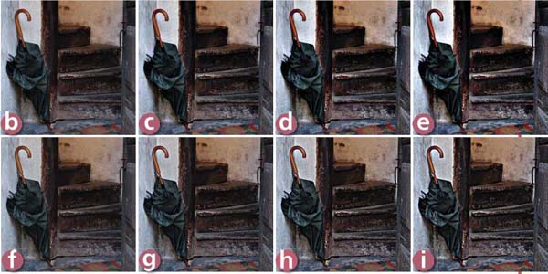
Recipes for USM contrast changes >> (a) Original image, no contrast change. (b) Amount 30, Radius 80, Threshold 0. (c) Amount 60, Radius 80, Threshold 0. (d) Amount 90, Radius 80, Threshold 0. (e) Amount 120, Radius 80, Threshold 0. (f) Amount 30, Radius 20, Threshold 0. (g) Amount 60, Radius 20, Threshold 0. (h) Amount 90, Radius 20, Threshold 0. (i) Amount 120, Radius 20, Threshold 0.
Suitable for Elements – 5.0, 4.0, 3.0, 2.0, 1.0 | Difficulty level – Basic | Resources – Web image 704 Tools used – Dodging, Burning-in | Menus used – Enhance, Image, Filter
Just a few short years prior to the massive uptake of digital photography many professional and amateur image-makers alike were discovering the beauty of a whole range of craft printing processes. There was a resurgence in the techniques involved in the production of high quality black and white pictures and a growing interest in ‘alternative’ processes that could create stunningly different monochromes.
One such process was lith printing. The process involves the massive overexposure of chlorobromide-based papers coupled with development in a weak solution of lith chemistry. The resultant images are distinctly textured and richly colored and their origins are unmistakable. But rather than head back to the darkroom in pursuit of your first lith print you can use the following steps to recreate the results digitally.
Most lith prints have strong, distinctive and quite atmospheric grain that is coupled with colors that are seldom seen in a black and white print. They range from a deep chocolate, through warm browns, to oranges and sometimes even pink tones. If our digital version is to seem convincing then the final print will need to contain all of these elements.
Select a picture where the composition is strong. It should contain a full range of tones, especially in the highlights and shadows and good contrast will help make a more striking print. The first task is to lose the color. We want to achieve this change whilst still keeping the picture in a color mode (RGB Color). This way later on we can add color back to the picture. If the original is a color picture use the new Convert to Black and White feature (Enhance > Convert to Black and White) to loose the color. If you are starting the project with a grayscale picture change the color mode to RGB Color (Image > Mode > RGB Color).
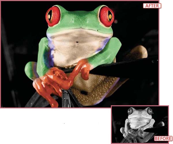
Lith printing >> Recreating the highly textured, colored prints that result from the lith printing process involves the following steps: – losing the color from the image, – adding some texture and then – reapplying color to the picture.
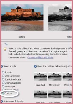
Step 1 >> Convert your color picture to black and white with the new Convert to Black and White feature.
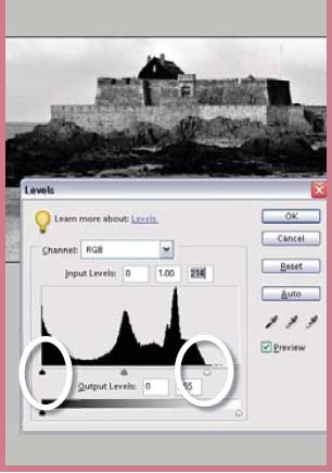
Step 2 >> Adjust your picture’s black and white points and check the spread of tones using the Levels feature.
Step 3 >> Use the Dodging and Burning-in tools to add drama to specific areas of the picture.
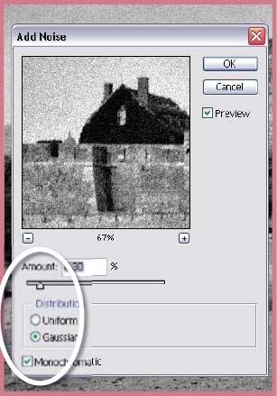
Step 4 >> Add some texture to the image using the Add Noise filter set to Gaussian and Monochrome.
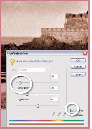
Step 5 >> Apply some color using the Hue slider and Colorize option in the Hue/Saturation feature .
Perform all your tonal enhancement steps now. Use the Levels feature (Enhance > Adjust Lighting > Levels) to ensure a good spread of tones and the Burning and Dodging-in tools to enhance specific parts of the picture. Add some texture to the image using the Add Noise filter (Filter > Noise > Add Noise) with the Gaussian and Monochrome options set. The final step is to add some color back to the picture. We can achieve this effect by selecting the Colorize option in the Hue/Saturation feature and then adjusting the Hue slider to select the color of the tint and the Saturation slider to alter the strength.
7.05 Correcting Perspective Problems
Suitable for Elements – 5.0 | Difficulty level – Basic Resources – Web image 705 | Menus used – Filter
You know the story: you’re visiting a wonderful city on holiday wanting to capture as much of the local scenes and architecture as possible. You enter the local square and point you camera towards an impressive three-spired building on the other side of the road only to find that you must tilt your camera upwards to get the peaks into the picture. At the time you think nothing of it and you move on to the next location. It is only when you are back at home about to print your photograph that you realize that the innocent ‘tilt’ has caused the edges of the building to lean inwards.
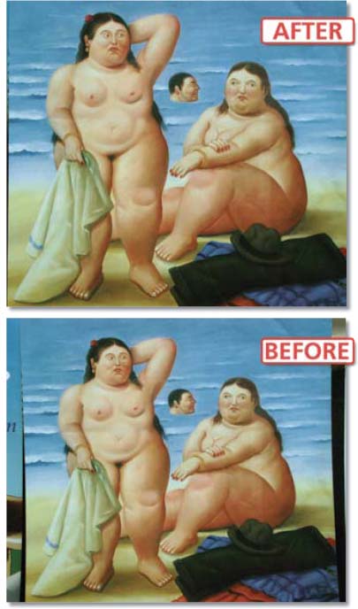
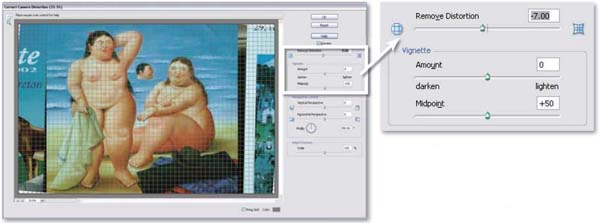
Now, to a certain extent this isn’t a problem; even though it is not strictly accurate, we all know that most buildings have parallel walls and the majority of people who look at you picture will take this into account – won’t they? Apart from a return trip and a re-shoot is there any way to correct these converging verticals? Well, I’m glad you asked. Armed with nothing except Elements 5.0, the new Correct Camera Distortion filter and the steps detailed here, you can now straighten all those leaning architectural shots without the cost of the return journey.
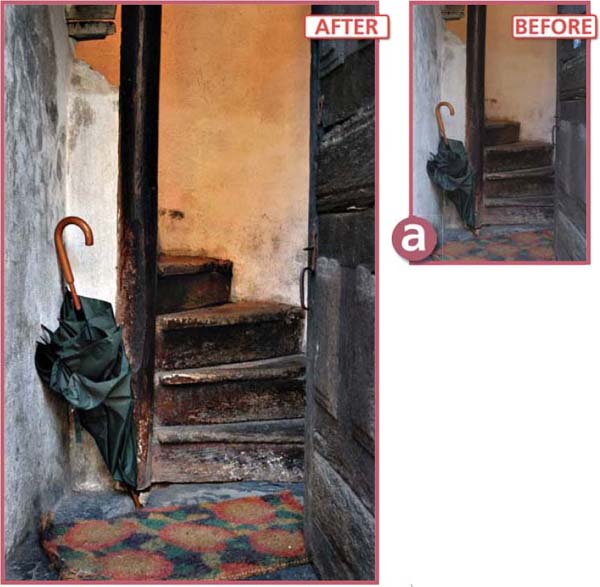
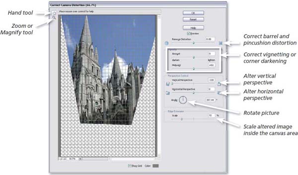
Correcting perspective >> When shooting upwards with a wide angle lens the sides of buildings converge inwards rather than remain parallel. You can correct this problem using the new Correct Camera Distortion filter in Elements 5.0.
With the offending image open in the Full Edit workspace select Filter > Correct Camera Distortion. Ensure that the Grid option is switched on via the checkbox at the bottom of the dialog before starting to correct the photo. The dialog contains a variety of controls designed for correcting barrel and pincushion distortion, vertical and horizontal perspective, crooked horizons and the vignetting or the darkening of the corners of the picture frame. The key to using the feature is being able to identify the type of distortion that is present in the photo and then choosing the control to deal with the problem. The presence of a preview window means that you can see the results of the corrections as you apply them. Use the grid to guide your changes.
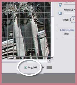
Step 1 >> With the example image open in the Full Edit space of Elements select Filter > Correct Camera Distortion. Ensure that the Show Grid option at the bottom of the dialog is checked.
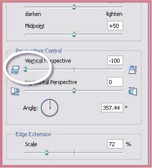
Step 2 >> The main problem with the example image is converging verticals which can be corrected by moving the Vertical Perspective control to the left. Unlike the correction techniques in earlier versions of Elements this slider also adjusts the height of the building as well.
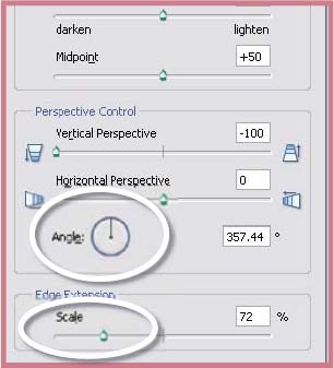
Step 3 >> To complete the corrections straighten the photo with the Angle control and scale the results so that they fit within the original canvas area. Click OK to apply the changes and close the dialog – then use the Crop tool to remove unwanted areas of the photo.
Lens correction >> The new Correct Camera Distortion filter provides a variety of controls for correcting the distortion that results from tilting the camera or using a wide angle lens.
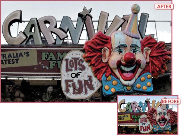
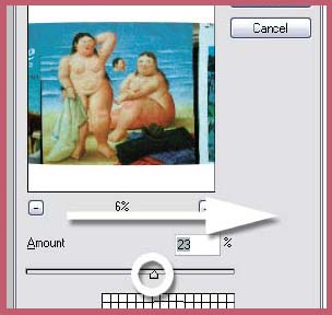
Desaturate/saturate >> Direct your viewer’s gaze by increasing the saturation of important parts of the picture whilst reducing the color vibrancy of the rest of the image.
7.06 Add Emphasis with Saturation
Suitable for Elements – 5.0, 4.0, 3.0, 2.0, 1.0 | Difficulty level – Basic | Resources – Web image 706 Tools used – Selection tools | Menus used – Enhance, Select
This technique, unlike the ones that we have looked at previously in this chapter, does not draw easy parallels from the world of traditional photography. Until digital came along it was not possible, at least not without a lot of professional smoke and mirrors, to change the vibrancy of the color in one part of the picture whilst maintaining or even boosting it in another part. It certainly wasn’t an easy job to combine both black and white and full color in a single picture.
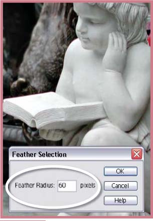
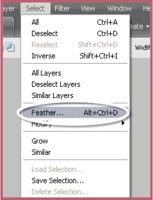
The Hue/Saturation feature has removed such limitations forever. When this tool is combined with a carefully created (and feathered) selection it is possible to desaturate one part of the picture and then, using an inverted selection, increase the saturation of the rest. Like dodging and burning this technique can direct the viewer’s interest to a part of the picture that the photographer deems important. In fact it is when these two techniques, dodging and burning and saturation/desaturation, are used in tandem that the desktop photographer can really start to create some dramatic pictures.
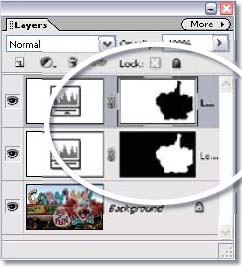
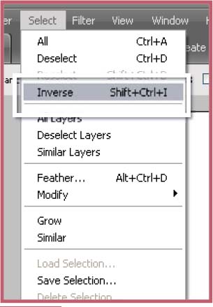
In the example image the clown’s head was selected using a combination of the Magnetic and standard Lasso tools. Once completed the selection was feathered slightly (1–2 pixels) (Select > Feather) to soften the transition of the effect and saved (Select > Save Selection). With the selection still active the Hue/Saturation feature was opened and the color vibrancy of the clown increased by moving the Saturation slider to the right. To add more contrast, the selection was then inverted (Select > Inverse) and the saturation of the background was decreased almost to the point of just being black and white. An alternative way of working this technique is to create masked Hue/Saturation adjustment layers using the saved selection. This would allow you to readjust the amount of saturation and desaturation at any point later in time and would keep the original picture intact.
Non-destructive version >> Use masked Hue/Saturation layers to produce the same results with fine-tuning options.
Step 1 >> Carefully select the area to saturate/desaturate using your favorite selection tools.
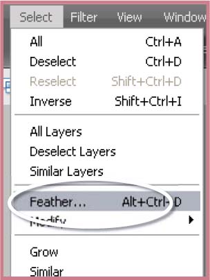
Step 2 >> Feather the edge of the selection slightly so that the transition will be smoother.

Step 3 >> Save the selection so that you can use it or edit it later.
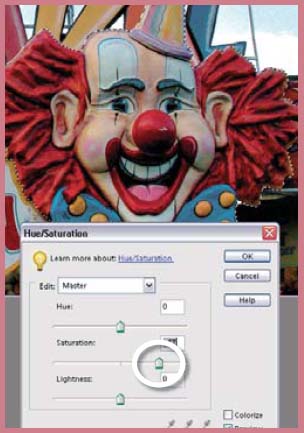
Step 4 >> With the selection still active use the Hue/Saturation feature to increase the saturation of the clown’s face.
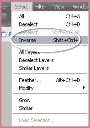
Step 5 >> Inverse the selection so that the rest of the picture is now selected.
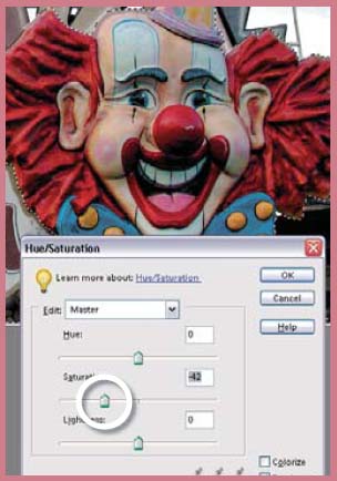
Step 6 >> Use the Hue/Saturation slider to decrease the saturation and provide color contrast between the two picture parts.
7.07 Restoring color to faded images
Suitable for Elements – 5.0, 4.0, 3.0, 2.0, 1.0 | Difficulty level – Intermediate Resources – Web image 707 | Menus used – Enhance
Old images, whether they be captured on color films, negatives or slides, are prone to fading and color changes as the dyes they are constructed of break down. It is a source of concern for all photographers who have big collections of images stored away in attics, cupboards or under the bed. After all, many of these photographs, though not valuable in the commercial sense, are irreplaceable as they hold glimpses of a family’s history and echoes of days gone by.
Recently a loyal reader and avid Elements user emailed me with exactly this problem. Tom Edwards asked me if I had a solution for restoring the color to the hundreds of fading slides that he had taken in the Orient in the early 70s as they now all appear to be turning red.
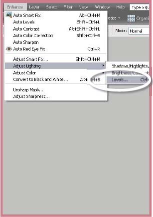
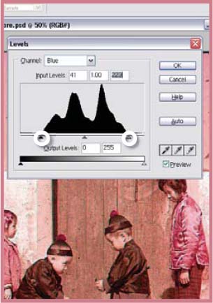
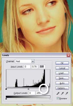
The first step in any such restoration work is diagnosing the problem that is causing the color shift and fading. To get a good understanding of the cause I always turn to the Levels feature (Enhance > Adjust Lighting > Levels) for help. It contains a descriptive display of the spread pixels in the image and also includes the tools needed to coax the picture back to life.
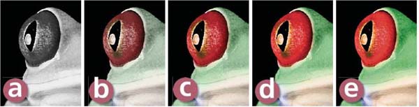
When the Levels feature is first opened it displays a graph of the combined red, green and blue pixels. This is signified by the RGB label in the Channels drop-down menu. To really see what is happening to the tones in your picture select and view the graph for each of the individual color channels. The graphs for each channel of Tom’s example image can be seen to the right. Notice how the green and blue channels are fairly similar but the red channel has all the signs of being overexposed, that is, all the tones being pushed to the right end of the graph. This is where our problem lies.
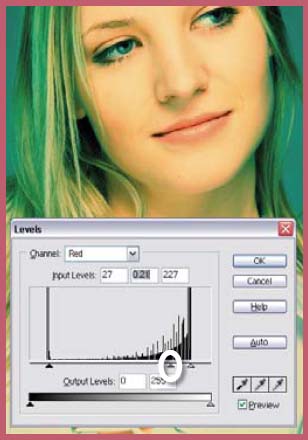
To help restore the original color and brightness of the photograph the tones of each of the color channels have to be adjusted individually. Starting with the red channel, drag the black input triangle towards the center of the graph until it meets the first major group of pixels. Do the same for the green and blue channels, but with these also adjust the white point Input slider in the same way.
This action will help to restore the color and contrast of the picture and will give good results for all but the most faded slides or prints. Final adjustments to tone and the removal of any slight color casts that remain can be achieved using levels on the combined RGB channel setting and the Color Variations features.
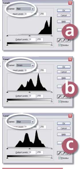
Restoring faded slides >> When you look at the histogram for each of the red, green and blue channels separately it is easy to see why the faded slide appears so warm.
- Red channel.
- Green channel.
- Blue channel.
To restore the color in the image work on each channel separately, dragging the white and black points in to meet the first major group of pixels.
This will balance the distribution of the tones ineach of the channels and restore the slide’s color and contrast.
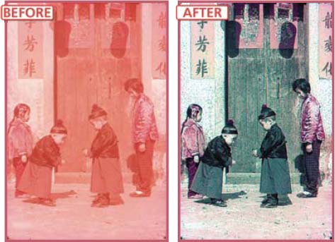
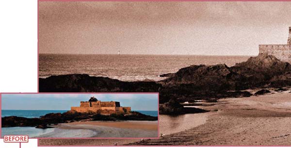
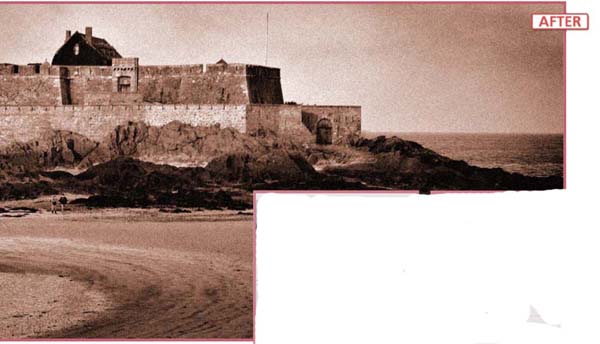
Fading slides >> Over time traditional color photographs, slides and negatives can show signs of fading and take on a dominant color cast. Using the color correction and tonal change tools in Elements might not be aggressive, or selective enough, to correct these problems. Instead use the steps detailed here to rebalance the tones and colors in your picture. Image courtesy of Tom Edwards © 1972.
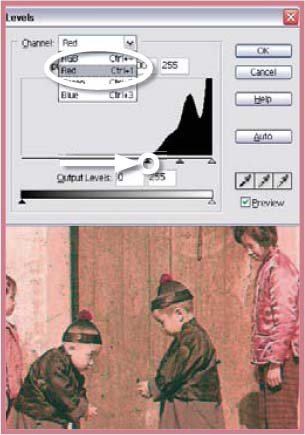
Step 2 >> Start with the red channel and drag the black input triangle to meet the first group of pixels.
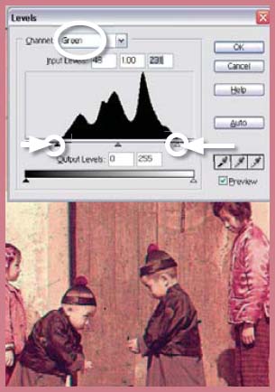
Step 3 >> Next select the green channel and move both the white and black input sliders to the first group of pixels.
Step 4 >> Make the same black and white point adjustments for the blue channel as well.
Step 5 >> With the image now balanced you can use the Color Variations feature to remove any slight color casts that remain.
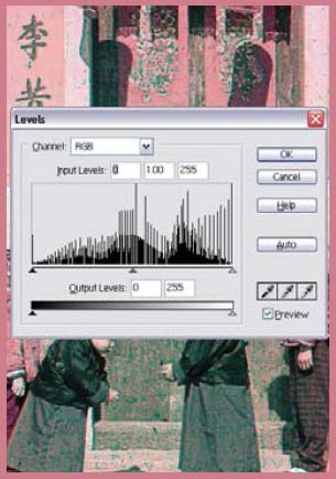
Step 6 >> As a final check of the tones open the Levels feature again and adjust white, middle and black points for the composite channel (RGB).
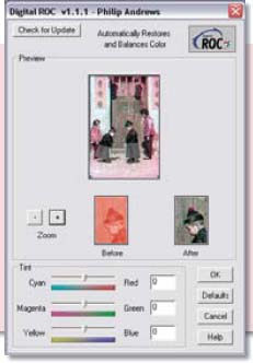
For those readers who have many images that need this type of color rebalancing and correction it may be worthwhile purchasing the Applied Science Fiction Digital ROC filter. Produced by the same company as the scanner tools that we looked at in Chapter 2, Digital ROC is designed to restore and rebalance the faded color in old slides, negatives and prints. |

Supplied with some scanners this technology is also available as a plug-in that installs in the Filters section of Photoshop Elements. Trial versions of the program are available from www.asf.com.
Cross-processing effects >> Made popular because of its use in fashion photography, cross-processing is a traditional technique that takes either print film and processes it in slide chemistry or slide film and develops it in print film chemistry. You can create similar results using the digital version of the process detailed here.
Suitable for Elements – 5.0, 4.0, 3.0, 2.0, 1.0 | Difficulty level – Intermediate Resources – Web image 708 | Menus used – Enhance
Processing your film in the wrong chemistry sounds like an action that will guarantee disaster, but this is precisely the basis of the cross-processing technique. Print film is developed using slide chemistry or alternatively slide film is processed using print film chemistry. Whichever method you use the process results in distinctly recognizable images that have found their way into many fashion magazines in the last few years. As with many of these alternative techniques the process can be a little unpredictable, with strange color shifts and massive under- and overexposure problems, reducing the number of usable pictures resulting from any shooting session.
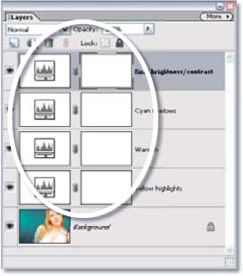
Four adjustment layers >> This technique relies on the application of four different adjustment layers being stacked upon the original image.
Martin Evening of ‘Adobe Photoshop for Photographers’ Focal Press fame created a digital version of this process that uses a series of curve changes to create images that have a similar look and feel to those produced with the chemical cross-processing effect. Here I present an Elementsfriendly version of the technique that provides equally impressive results without using the Photoshop curves feature. In addition, as the technique uses a series of adjustment layers to create the effect, the original picture remains unaltered throughout and the settings for each of the layers can be altered at any time to tweak the final result.
To recreate the look of crossprocessing (print film developed in slide chemistry) we must change the image so that it contains creamy highlights, cyan shadows and is generally reduced in contrast. Start with a standard color image. Create a Levels adjustment layer and select the blue channel. Move the white Output slider to the left to flatten the highlights and color them yellow. Create a second Levels adjustment layer and with the red channel selected move the white Output slider to the left as well. This adds some warmth. Next create another Levels adjustment layer and select the red channel again. This time you need to move the mid point Input slider to the right to make the shadows and mid tones cyan. With the Levels feature still open move the white and black Input sliders till they meet the first group of pixels in the histogram. To finetune the overall tones you can add yet another Levels adjustment layer and with the composite of all channels selected (RGB), alter contrast and brightness of the whole picture.
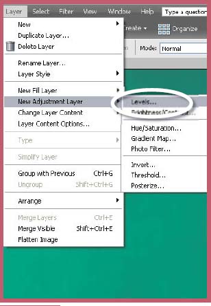
Step 1 >> To start the process open a colour image and create a Levels adjustment layer.
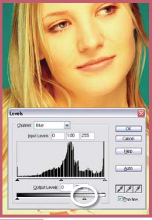
Step 2 >> To make the yellow highlights select the blue channel in the Levels feature and drag down the white Output slider. This adds some yellow to the highlights.
Step 3 >> Create another Levels adjustment layer, select the red channel and drag down the white input layer. This adds some warmth to the highlights.
Step 4 >> To add cyan to the shadow areas create another Levels adjustment layer, select the red channel and move the mid tone Input slider to the right.
Hand coloring >> Digital hand coloring works by applying painted sections of the image to the black and white original using the Color blending mode. This technique preserves the detail of the monochrome picture and tints the surface with the color of the upper layer in much the same way as oil paint was used to tint black and white prints of old.
Suitable for Elements – 5.0, 4.0, 3.0, 2.0, 1.0 | Difficulty level – Basic | Resources – Web image 709 Tools used – Brush | Menus used – Layer
Before the advent of color film the only way to add a hue to a picture was to apply water- or oilbased paints over the top of a black and white print. Most of us will have old photographs of family weddings that are delicately colored in this way. There is a simplicity and subtlety about this approach that is worth recapturing in the digital age.
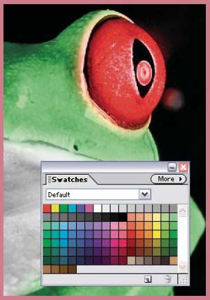
If you look at the old images you will notice that the detail of the black and white picture shows through the colored paint. The combination of these details and the applied color creates the hand colored effect. To simulate this technique digitally we can use the Color blending mode in Elements. The color is applied to a separate layer using the paint brush and then the mode of the layer is changed to Color. This allows the details of the image beneath to show through the color above. Using the paint brush in the Normal mode will create large flat areas of color that hide the detail beneath.
Step 1 >> Open a black and white picture and make sure that it is in RGB color mode. Make a new layer in the document.
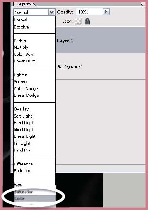
Step 2 >> Select the layer and change its Blending mode to Color.
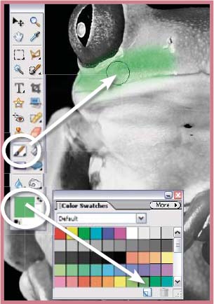
Step 3 >> Select the paint brush from the tool box and then select a foreground color to paint with from the Swatches palette. Step 4
Step 4 >> Paint over the area of the image that you want to hand color. Switch foreground colors and continue to paint.
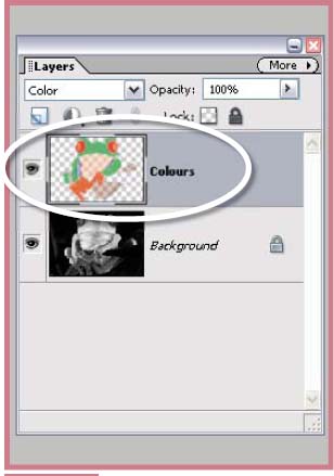
Step 5 >> Make sure that the colors are being applied to the newly created layer. The strength of the coloring can be altered by adjusting the opacity of the layer.
The color can be removed from any part of the picture with the eraser tool and the vibrancy of the hues can be altered by changing the opacity of the color layer.
For the ultimate control each individual color can be added via a new layer. This approach means that the various colors that make up the picture can be edited individually.
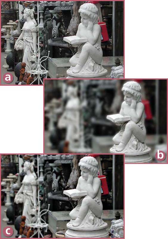
Hand coloring >> Changing the opacity of the color layer will alter the strength of the hand coloring effect. (a) 0% opacity. (b) 25% opacity. (c) 50% opacity. (d) 75% opacity. (e) 100% opacity.
Artificial depth of field effects >> It is possible to create realistic depth of field effects by making and blurring a series of selections that gradually increase in size. (a)Straight print. (b) Simple selection with Gaussian Blur. (c) Multiple selections with increasing Gaussian Blur values.
7.10 Realistic Depth of Field Effects
Suitable for Elements – 5.0, 4.0, 3.0, 2.0, 1.0 | Difficulty level – Advanced Resources – Web image 710 | Tools used – Selection tools | Menus used – Filter, Select
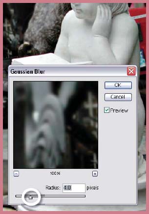
The shallow depth of field effect that is created when you select a small F-stop number (use a long lens or get in very close to your subject) controls the way that a viewer sees your picture. The eye is naturally drawn to the sharpest part of the image and shallow depth of field restricts the sharpness in a photograph to often only a single subject. The Gaussian Blur filter can be used in a similar way to produce results that help to direct the viewer’s gaze. Areas of an image can be selected and blurred so that our eyes will be redirected to the sharp part of the print. In a way, by blurring parts of an otherwise sharp picture, this process is creating artificial depth of field.
When the potential of the Blur filter is first discovered many enthusiastic digital photographers take to the task of creating shallow DOF pictures from their sharp originals with gusto. The process they use is simple – select and blur. The results certainly provide a contrast in sharpness, but the pictures lack the sense of realism that is needed for the effect to be truly convincing.
To recreate shallow depth of field more effectively there needs to be a gradual decrease in sharpness as you move in front of, or behind, the main point of focus. Making a single selection doesn’t provide the gradual change that is needed. In its place we need to use a series of overlapping selections that gradually move further away from the point of focus. Each selection is feathered to smooth the transition of the effect and then the selected area is blurred using the Gaussian Blur filter. The amount of blur is increased as the selection gets more distant from the point of focus.
Multiple selections >> Convincing depth of field effects are based on the sequential blurring of multiple overlapping selections.
First selection.
Second selection.
Third selection.
Fourth selection.
This simulates lens-based depth of field by surrounding the point of focus with the area of least blur and then gradually increasing the out of focus effect as the eye moves further from this part of the picture.
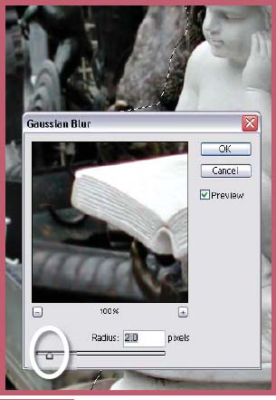
Start the process by creating a selection of the subject area that you want to remain sharp. Inverse (Select > Inverse) the selection so that the rest of the picture is selected. Feather (Select > Feather) the edge slightly to ensure that the transition between blurred and sharp picture parts is less obvious. Apply the Gaussian Blur filter (Filter > Blur > Gaussian Blur) to the selection using a low Radius value of 1 pixel. Now to recede the selection away from the point of focus. Here I have used the Contract command (Select > Modify > Contract) but you could just as easily draw another selection that is further away from the statue. The edge is feathered again, this time by a larger amount, and the whole thing blurred with a larger radius.
Step 1 >> Carefully select the part of the picture that is to be your point of focus – the area that will remain sharp.
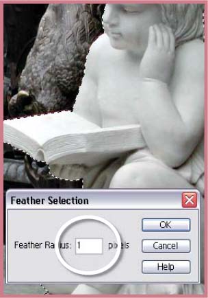
Step 2 >> Feather (1 or 2 pixels) and then save the selection.
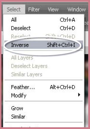
Step 3 >> Use the Inverse command to select the rest of the picture.
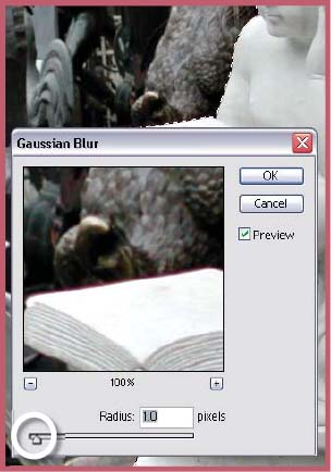
Step 4 >> Apply a small Gaussian Blur to this initial selection. Here I have used a radi us of 1.0 pixels.

Step 5 >> Reduce the area that is selected by selecting the Contract command from the Select menu.
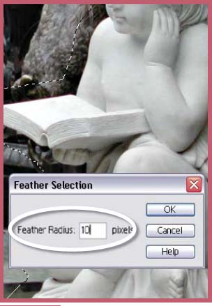
Step 6 >> Feather the new selection by a greater amount. Here I have used 10 pixels. Save the selection.
This process – contract, feather blur – is repeated as many times as is needed to ensure that the picture’s background details are suitably unsharp. In the example image I used four selections to get the shallow depth of field effect.
Step 7 >> Apply a larger Gaussian Blur (2 pixels) to this new section of the picture.
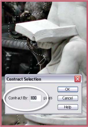
Step 8 >> Create a new smaller selection using the Contract command set to 100 pixels.
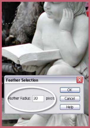
Step 9 >> Feather and save the new selection. Here I have used a radius of 30 pixels.
Step 10 >> Blur the new selection with a higher Gaussian Blur setting.
Step 11 >> Contract the selection by 100 pixels and then again by another 100 pixels before feathering the edge by 60 pixels and saving the selection.
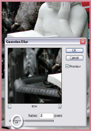
Step 12 >> Apply the final Gaussian Blur to the selection using a radius of 4 pixels.
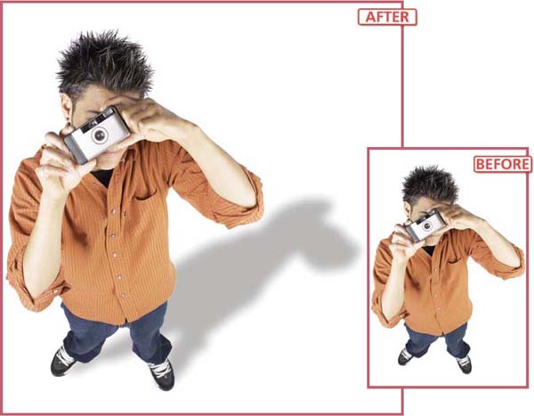
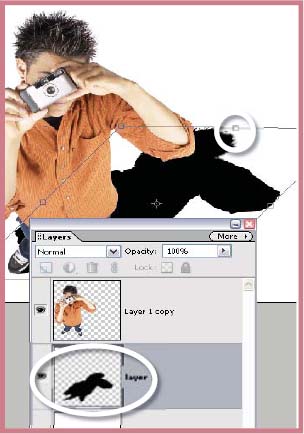
Creating realistic shadows >> Simple shadows can be applied to any layer using the Drop Shadow options in the Elements Styles palette. More complex shadows, like the one in the example that looks like it is falling on the ground, can be created by making a shadow layer beneath the image. Image courtesy of www.ablestock.com. Copyright © 2003 Hamera and its licensors. All rights reserved.
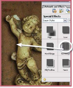
Elements’ drop shadow styles >> Elements provides a range of ready-made drop shadow styles that can be applied directly to any layer. (a) High. (b) Low. (c) Noisy. (d) Hard edge. (e) Soft edge. (f) Outline. (g) Fill/outline. (h) Neon.
7.11 Beyond the Humble Drop Shadow
Suitable for Elements – 5.0, 4.0, 3.0, 2.0, 1.0 | Difficulty level – Advanced | Resources – Web image 711 Tools used – Selection tools | Menus used – Edit, Filter, Image
The drop shadow effect has become very popular in the last few years as a way of making an image or some text stand out from the background. To coincide with this popularity Adobe created a series of drop shadow styles that can be applied directly to any layer. These options are suitable for many applications and Elements users can even customize the look of the effect by altering variables like the direction of the light and the shadow distance using the Style Settings dialog (Layer > Layer Style > Style Settings).
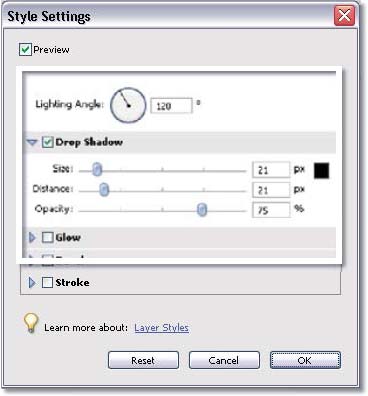
Drop shadow style settings >> Alter the look of your drop shadows by changing the value of the options in the Style Settings dialog.
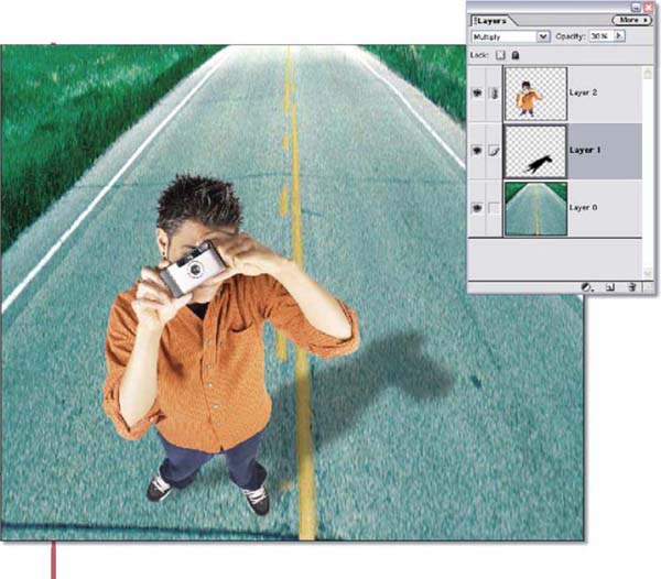
But what if you want a more sophisticated shadow than these preset choices allow? Well then you will need to create your own shadows. Using the example image let’s make a shadow that lies upon the ground that the model is standing on. To do so, we will need to revisit the steps that I used to use to create even the simplest drop shadow before the days of layer styles.
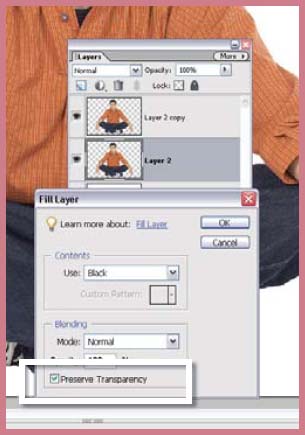
First select the subject with one of your favorite selection tools and copy it to memory (Edit > Copy). Next paste the picture (Edit > Paste) twice to form two new layers. Fill the background layer with white. Next fill the second image layer with black making sure that the Preserve Transparency option is turned on. This creates a silhouette exactly the same size and shape as the main picture. To allow for the shadow we will need to create some more space on the righthand side of the picture. Use the Canvas Size feature for this (Image > Resize > Canvas Size). Here I have anchored the canvas on the left side and set the option to percent and then increased the width to 150%.
With the shadow layer still selected I used the Distort feature (Image > Transform > Distort) to push the shadow downwards and to the right. Keep in mind that for this type of shadow to be convincing it must be consistent with the lighting in the image generally. In the example the main light is coming from the left and so the shadow should be projected to the right. Also make sure that the shadow is positioned so that it grows from where the subject touches the ground. In the example it is the feet. If need be, use the Move tool and even the Rotate feature (Image > Rotate > Free Rotate Layer) to orientate the shadow so that it meets the shoes.
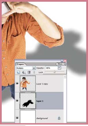
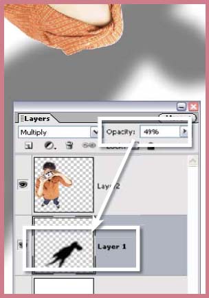
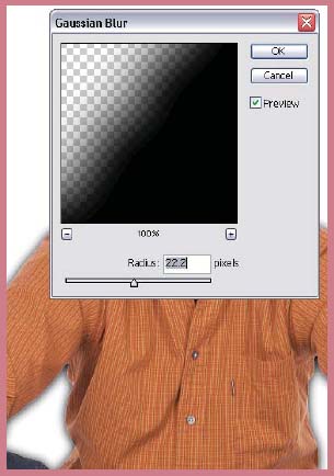
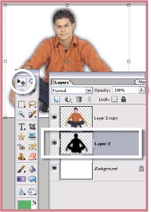
Next we need to blur the edges of the shadow and adjust its transparency to complete the illusion. With the shadow layer still selected use the Gaussian Blur filter (Filter > Blur > Gaussian Blur) to make the edges of the shadow less sharp. There are no hard and fast rules about the amount of blur to apply. It is a matter of trying a few settings with the Preview option switched on in the Filter dialog until you are happy with the results. To make the shadow a little brighter and more transparent I changed the blending mode from Normal to Multiply and dragged down the opacity of the whole layer.
Although not immediately obvious here, changing the blending mode to Multiply will give a more realistic shadow effect when laid over other picture areas. When used in conjunction with the layer’s Opacity slider the density of the shadow can be adjusted to allow the detail from the picture beneath to show through.
Multiply shadows >> Switching the Blending mode of the shadow layer to Multiply will allow the detail of the layer below to show through, producing a more realistic effect.
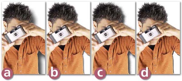
Step 1 >> Carefully select the main subject using your favorite selection tools. Here it was easier to select the uniform background and adjust the selection around the hair region rather than selecting the model.
Step 2 >> Change the selection from the background to the model by inversing the selection.
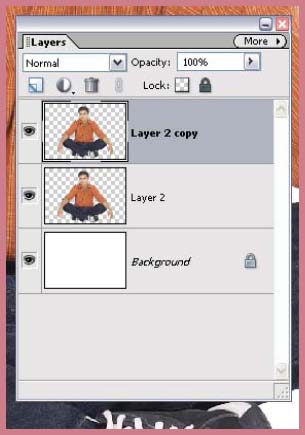
Step 3 >> Copy the selected area to the computer memory and then paste the contents twice to form two new image layers containing the copied model picture.
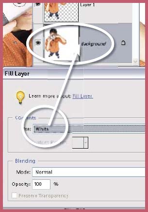
Step 4 >> Select the background layer and fill it with white.
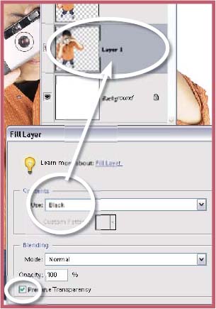
Step 5 >> Select the lower of the two new layers and fill this layer with black, this time making sure that the Preserve Transparency option is turned on.

Step 6 >> Increase the size of the canvas to accommodate the shadow by anchoring the image on the left side and increasing the width by 150%.
Step 7 >> With the shadow layer still selected use the Distort tool to squash the shadow into the newly created space on the right side of the model.
Step 8 >> Blur the edge of the shadow using the Gaussian Blur filter.
Step 9 >> Switch the mode of the shadow layer to Multiply and adjust the opacity of the shadow until the desired brightness is shown.

Ring flash shadow >> You can extend the technique detailed above to allow you to create shadows similar to those created when using a ring flash that surrounds the camera’s lens. Image courtesy of www.ablestock.com. Copyright © 2003 Hamera and its licensors. All rights reserved.
Suitable for Elements – 5.0, 4.0, 3.0, 2.0, 1.0 | Difficulty level – Advanced | Resources – Web image 712 Tools used – Selection tools | Menus used – Edit, Filter, Image
You can extend the technique detailed above to create a shadow that is similar to those found in pictures created with a ring flash attached to the camera lens. These pictures are characterized by the model having a shadow projected onto the wall behind. As the light is coming from the same position as the camera the shadow is larger but directly behind the subject.
The first few steps are the same as those found in the previous technique. Start by selecting the main subject and copy and pasting it twice to form two new layers. Next fill the background with white. Select the lower image layer and fill it with black, making sure that the Preserve Transparency option is selected. Blur the shadow using the Gaussian Blur filter (Filter > Blur > Gaussian Blur). With the Preview option selected in the Filter dialog, adjust the Blur Radius so that the edge of the shadow is visible as a halo around the top image layer.
With the shadow layer still selected use the Move tool to shift its location upwards by a few pixels. For accuracy you can use the arrow keys instead of the mouse. Each arrow key press moves the shadow one pixel. To finalize the technique change the blending mode of the shadow to Multiply and reduce its opacity.
Step 1 >> Select, copy and paste the model twice to create two image layers. Fill the background with white.
Step 2 >> Select the lower image layer and fill the image area withblack. Make sure that the Preserve Transparency option is selected.
Step 3 >> Use the Gaussian Blur filter to blur the shadow so that it shows as a halo around the top image layer.
Step 4 >> Use the arrow keys to move the shadow gradually upwards so that it shows to the left, right and above but not below the model. Change the Blending mode to Multiply and adjust the opacity.
Altering specific tones >> Images with bright highlights often need a little curve tweak to darken these tones without changing the white and black points of the picture.
Suitable for Elements –5.0 | Difficulty level – Intermediate | Resources – Web image 713 | Menu used – Enhance
One of the regular complaints from Photoshop enthusiasts trying to put Elements users in their place is that the program ‘doesn’t contain curves’ and so can’t really be considered as a serious photo enhancement package. For the first four versions of the program this was indeed true, but in 5.0 Adobe has included an easy-to-use version of Photoshop’s famous Curves feature. This is great news as the Curves feature in Photoshop does offer a great deal of flexibility and creativity over manipulating the tones in your image. In particular, curves provide a great way to lighten shadow areas and darken highlights and it is precisely these two tasks that I use Curves for most.
Adjust Color Curves Feature
The new Adjust Color Curves feature contains two different ways to manipulate the tones in your photo. The first is a series of six thumbnail buttons, called Samples, that apply specific curve tweaks to your photos. These adjustments include the options to Increase Midtones, Lighten Shadows, Increase Contrast, Darken Highlights, create a Solarize effect and compensate for Backlight in a photo. Clicking on one of these buttons adds the selected adjustment to the photo. Clicking a second thumbnail replaces the first tonal tweak with the second curves adjustment.
The second way to alter the tones in your photo when using the new Adjust Color Curves feature is via a set of four slider controls coupled with a graphical curves display located in the Advanced Options section. The sliders controls include Adjust Highlights, Mid tone Brightness, Mid tone Contrast and Adjust Shadows options. Moving any of the sliders directly alters the way that the tones are distributed in your photo and changes the shape of the curve. Using these controls you can fine-tune specific areas of your photo.
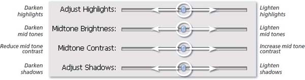
Advanced Options slider controls >> Moving the position of the sliders in the Advanced Options section of the Adjust Color Curves dialog produce the changes listed above to specific tonal ranges in a photo.
Users can display or hide either or both control sections using the arrows on the left of the dialog. The Reset button removes all curves changes, both thumbnail selections and slider movements, and restores the feature back to the default setting, which is the same as the Increase Mid tones sample.
The easiest and most effective way to use this new Elements’ Curves control is to use the Samples thumbnails to select the general correction to apply to the photo first and then use the sliders in the Advanced Options to fine-tune the results.
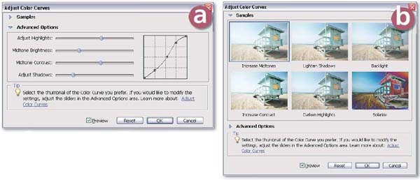
Adjust Color Curves >> The new Adjust Color Curves feature provides two different ways to tweak the tones in your photo. You can use each set of controls independently but the best results are obtained when the global changes are set by clicking a Sample thumbnail and small fine-tuning to specific tonal ranges added next via the Slider controls.
Advanced Options section containing Slider controls for specific tonal ranges.
The Samples thumbnails which apply a set adjustment to the picture when clicked.
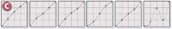
Changes in the shape of the curve based on clicking the Sample thumbnails. Left to right: Increase Midtones, Lighten Shadows, Backlight, Increase Contrast, Darken Highlights and Solarize.

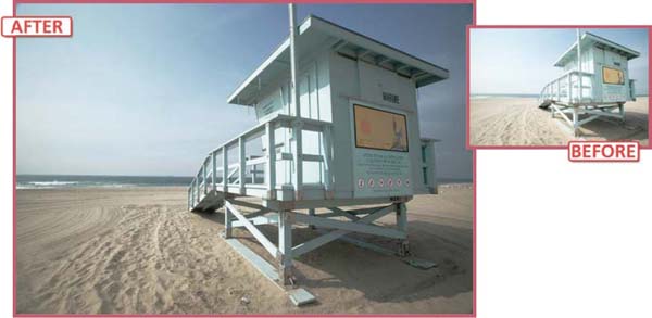
Fill Flash effects >> The Shadows/Highlights option introduced in version 3.0 of Elements also easily lightens the shadows of contrasty photos without affecting the mid and highlight tones in the picture.
Like the new Adjust Color Curves feature, Shadows/Highlights is useful for lightening the shadows in backlit images such as this beach example.
Both options provide a Fill Flash effect which takes its name from the technique of using an on-camera flash in daylight to lighten the shadows caused by direct sunlight. This way of working is popular with photojournalists who in their haste to capture hard news images have little time to modify the lighting on their subjects.
Curves Like Control via the Shadows/Highlights Feature
The Shadow/Highlights tool can also be used to alter specific tonal ranges in your photos. It contains three sliders – the upper one is for lightening shadows, which replaces the old Fill Flash tool (included up to version 2.0), the control in the middle darkens highlights and is a substitute for the old Adjust Backlighting tool (included up to version 2.0) and the final slider adjusts mid tone Contrast. Moving the Shadows control to the right lightens all the tones that are spread between the middle values and black.
Sliding the Highlights control to the right darkens those tones between middle values and white. The beauty of this feature is that unlike the Brightness/Contrast tool, these changes are made without altering other parts of the picture. To fine-tune the tonal changes a third slider is also included in the dialog. Moving this Mid tone control to the right increases the contrast of the middle values and movements to the left decrease the contrast making the image ‘flatter’.
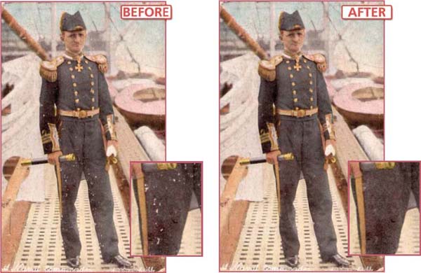
Removing dust automatically >> One of the most tedious jobs for the digital photographer is the removal of dust and scratch marks from a badly damaged slide or print. Using the Clone Stamp tool to patch each individual mark can take considerable time and effort. A more automated approach that doesn’t soften the detail in an image is detailed here. It uses the much besmirched Dust and Scratches filter in conjunction with the Layer blending modes to restrict changes to just the areas where it is needed.
7.14 Dust and Scratches be Gone
Suitable for Elements – 5.0, 4.0, 3.0, 2.0, 1.0 | Difficulty level – Intermediate | Resources – Web image 714 Menus used – Layer, Filter
The enticingly named Dust and Scratches filter (Filter > Noise > Dust and Scratches) teases us with the promise of a simple solution to repairing the dust and scratches in our scanned pictures. Nearly always the results of using the filter are disappointingly soft or the tones flattened. It is not that the filter doesn’t obscure or disguise the problem marks, it is just that in doing so the rest of the image is also filtered. In areas where there is no dust this causes a deterioration of the picture. If only we could restrict the application of the filter to just the areas where the dust marks appear the results would be more usable.
The Lighten and Darken blending modes in Elements can be used for just this purpose. By applying the Dust and Scratches filter to a copy of the background and then blending this filtered layer using the Darken mode, the layer will only change the light dust marks of the original image and will leave the rest of the image unaffected. Similarly a second copy layer also filtered for dust and scratches could also be applied to the original image using the Lighten blending mode to remove the black marks from the picture. If we then control where the effects are applied with a layer mask then it is possible to restrict the changes made by the Dust and Scratches filter to just the areas where it is needed most.
Pro’s Tips for using the Dust and Scratches filter:
1. Always start with both sliders set to 0.
2. Move the Radius slider first until the marks disappear.
3. Next move the Threshold slider until the texture of the image returns. Do not move this slider so far that the marks start to reappear.
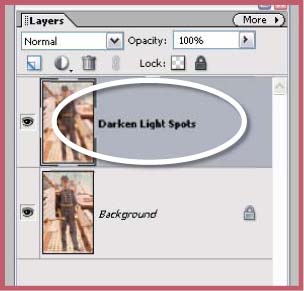
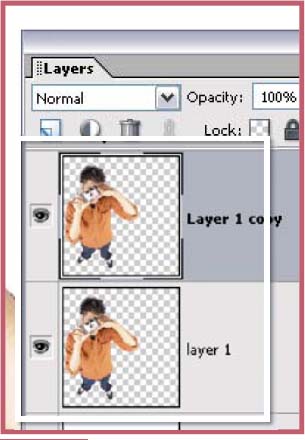
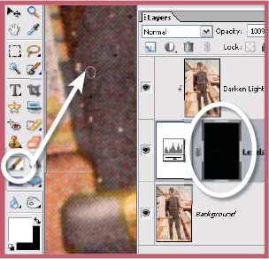
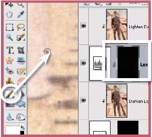
Step 1 >> Start the technique by copying the base layer by dragging the background to the New Layer button at the bottom of the Layers palette. Label the new layer Darken Light Spots.
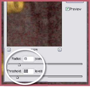
Step 2 >> With the new layer selected apply the Dust and Scratches filter. Start with both sliders set on 0. Move the Radius slider first until you see the dust spots disappear. Next gradually move the Threshold slider to the right until the texture returns to the picture – not so far that you start to see the spots again.
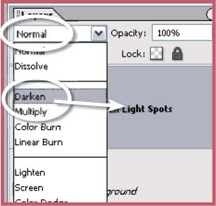
Step 3 >> With the Darken Light Spots layer still selected change the mode of the layer to Darken. This will only apply the dust and scratches changes to the areas where this original layer is lighter – the white dust spots.
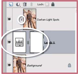
Step 4 >> Add a Levels adjustment layer with no changes to the default settings above the background layer. Select the Darken White Spots layer and the choose Layers > Group.
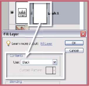
Step 5 >> Select the layer mask of the Levels adjustment layer and then choose the Edit > Fill Layer option to fill the mask with black. This action hides the upper layer and reveals the unretouched layer beneath.
Step 6 >> With the layer mask still selected choose white as the foreground color and proceed to paint onto the canvas over the white marks in the photo. The white strokes will reveal the results of the upper layer.
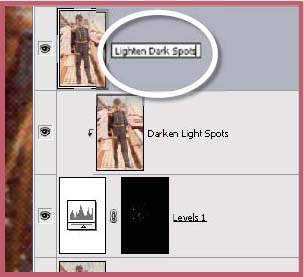
Step 7 >> Create a copy of the background layer and label it ‘Lighten Dark Spots’. Apply the Dust and Scratches filter to remove the black marks and change the mode of this layer to Lighten.
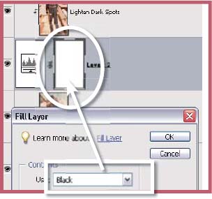
Step 8 >> Create a blank Levels adjustment layer and then group it with the Lighten Dark Spots layer. Fill the Levels layer mask with black to hide the filtered results.
Step 9 >> With white set as the foreground color and the mask still selected paint over the dark marks on the picture with the Brush tool.
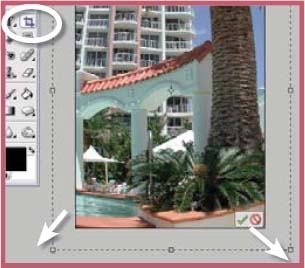
7.15 Combining Images Seamlessly
Suitable for Elements – 5.0, 4.0, 3.0, 2.0, 1.0 | Difficulty level – Intermediate Resources – Web images 715-1, 715-2 | Tools used – Selection tools | Menus used – Select, Layer
One of the most basic yet critical skills for any digital photographer to learn is the art of careful selection of image parts. Whether you need to isolate a portion of a picture so that it is not affected by a filter, or use a selection as a prelude to copying an image section from one photograph to another, being able to manipulate your program’s selection tools is a very important skill.
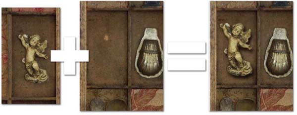
The success of a simple task such as creating a montage from two separate pictures is largely dependent on how well the image parts are isolated and copied. As an example I will add an extra ornament from a separate picture to an existing shadow box image and in the process demonstrate some basic selection and montaging steps that will help you to increase your image editing skills.
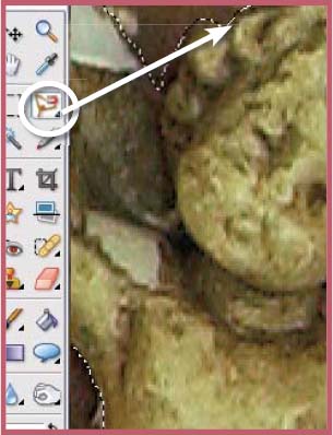
With both images open in Elements check to see that they are similar in size by viewing both the images at the same magnification. Make image size adjustments using the Scale feature. This step can also be performed after copying and pasting have occurred. Using the Lasso tool carefully work your way around the edge of the subject to be copied, in this example it is an angel, being sure to pick out as much edge detail as possible. In scenarios where there is more contrast between the edge and the background the Magnetic Lasso could be used instead.
Most selections are not perfect first time round, but rather than scrapping the initial selection try using the modifying keys to adjust your results. To take away part of the selection hold down the Alt key and draw around the area. Increase the image magnification to ensure accuracy around areas or detail. To add to the selection hold down the Shift key and draw around the image part to be included. These keys work with all selection tools and can be used repeatedly to build up a perfect result. Keep in mind that you can switch between any of the selection tools during the modification process; this includes the Magic Selection Brush.
Montaging picture parts >> Selecting, copying and pasting picture parts from one image to another is a basic skill that most digital photographers should learn. Seamless integration is based on careful selection techniques so it is on developing these skills that you should spend your time.
At this point a lot of digital photographers would copy the angel and paste it onto the shadow box image, but such an action can produce a very sharp edge to the selection, which is a dead give-away in the final montage. The best approach is to apply a little feathering (Select > Feather) to the edge of the selection before copying. In most cases a value of between 1 and 3 pixels will give a realistic result.
With the feather applied copy (Edit > Copy) the selected portion of the image. This action stores the copy in the computer’s memory ready for the Paste command. Switch to the shadow box image and paste the copied angel onto the picture. At this point you should see the object sitting on top of the shadow box picture. Any problems with the relative sizes of the two images will now become obvious. To make small changes in size you can use the Image > Transform > Free Transform tool. When the angel picture was pasted onto the shadow box image a new layer was created. Keeping these two image parts on separate layers means that they can be altered, edited and moved independently of each other; just keep in mind that the changes will only be made to the layer that is selected. Using the Move tool the angel picture is placed in the spare box space in the shadow box. As a final touch of realism a small drop shadow is applied to the angel using the Layer Styles > Drop Shadow options (via the Layer Style menu in the Special Effects section of the Artwork and Effects palette) . The direction and size (shadow distance) of the shadow can be altered via the Layer > Layer Styles > Style Settings dialog box. The shadow helps integrate the new picture element with the other ornaments already in the box.
Typically, as your skills increase you will attempt more and more complex selection tasks, some of which may take many minutes to complete. For this reason Adobe has included in version 2.0 of Elements a Save Selection (Select > Save Selection) feature that will allow you to store a copy of your carefully created selection with your image file, ready for later use. Input a name for the selection in the Save Selection dialog. It is good practice to save progress on complex selections as you go. This way if at any point you lose the work you have done you can simply reload the lost selection. Reinstating a saved selection is as simple as selecting the Load Selection option from the Select menu (Select > Load Selection) and choosing the particular selection name from the drop-down menu.
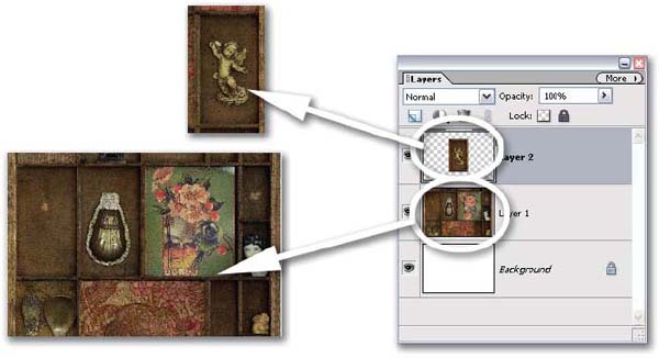
Edit>Paste >> When part of a picture is selected, copied and pasted into a different document, Elements automatically creates a new layer to hold the pasted part. Having the element stored separately means that you can easily move, scale, change brightness or even add texture without altering the background image. In the example I added a drop shadow to the separate layer to help unify the new subject with the background.

Step 1 >> Open both images into the Elements workspace. Check their relative sizes by displaying them at the same magnification rate.
Step 2 >> Carefully select the subject to be copied using your favorite selection tool. Zoom in closer to ensure accuracy.
Step 3 >> Feather the selection slightly (1–2 pixels) to ensure that the edge of the copied part is not too crisp to appear real.
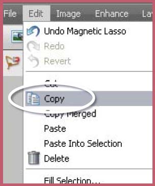
Step 4 >> Copy the selected picture part. This places the part into the computer’s memory.
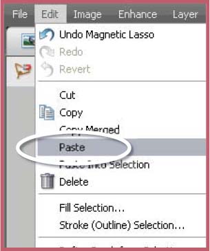
Step 5 >> Click onto the background document to make it active and paste the copied part. Use the Move tool to position it and, if need be, use the Free Transform tool to adjust its size to suit.
Step 6 >> To complete the illusion add a drop shadow to the object. Make sure that the size and direction of the shadow are consistent with the others in the background.
7.16 Believable Montages – a Step Further
Suitable for Elements – 5.0, 4.0, 3.0, 2.0, 1.0 | Difficulty level – Intermediate Resources – Web images 716-1 to 716-5 | Tools used – Selection tools, Eraser, Clone Stamp Menus used – Select, Layer, Filter, Enhance
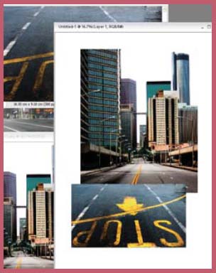
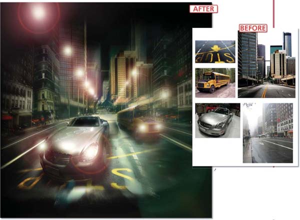
Against the background of the basic montaging skills developed in the last technique let’s really test out your abilities to combine disparate images by stepping through the following project that brings together five very different source pictures and with the aid of Photoshop Elements creates a single and hopefully convincing final illustration.
The project has two parts. The first involves creating a background street scene from three different pictures and then unifying the composition by applying a lighting effect. In the second phase of the project a car and bus are added, the street lights are turned on and a little blur is mixed in to create a sense of speed and motion.
Step 1 >> Open the background images. Be careful to choose pictures with similar pixel dimensions and try to pick photographs with a consistent perspective. Create a new document (File > New) large enough to encompass all three photos and then click-drag the open pictures onto the canvas of the new document.
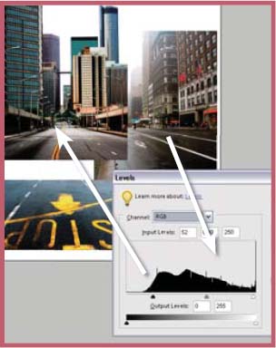
Step 2 >> To match the picture parts select the most different photo and adjust the brightness using the Levels feature. Next alter the color using the Color Variations feature. Finally, make a copy of the right background layer (Layer > Duplicate Layer). This will be used later in the process.
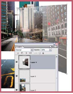
Step 3 >> Using the background as the base match the perspective, size and shape of the other background pieces to fit. Do this by reducing the opacity of the layer to be changed and then using the Free Transform feature to resize, rotate and change layer position. To alter perspective hold down the Ctrl key whilst dragging a corner or side handle.

Step 4 >> Use the Eraser tool set to Brush mode, low opacity and soft edge to carefully remove the sharp edges of the upper layers to allow them to blend with the lower ones.
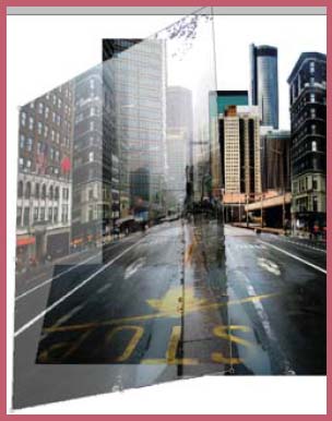
Step 5 >> Complete the background by selecting the duplicate layer (Step 2) and flipping it horizontally (Image > Rotate > Flip Horizontal). Use this copy to form the left side of the composition. Size, shape and rotate the layer before blending it into the existing background.
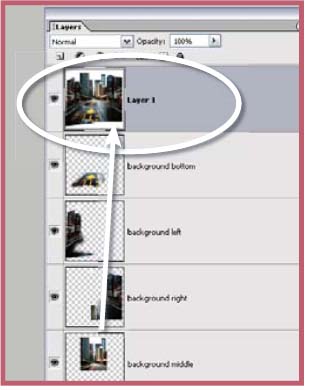
Step 6 >> Make a flat version of the background by selecting all of the document (Select > All) and then choosing the Copy Merged command (Edit > Copy Merged). The merged copy is then pasted (Edit > Paste) as a new layer.
Creating convincing montages:
1. When using a selection tool to cut out an object that will be pasted onto another background always apply a 1-pixel feather to the selection before cutting.
2. Try to ensure that all source images have similar lighting direction and quality.
3. Match the color, contrast and brightness of all picture parts before starting to merge them together.
4. Make sure that all source images are the same (or very similar) size and resolution.
5. Label all layers as you create them as this will help you keep track of the many layers that often make up a complex montage.
7. Don’t flatten all the layers and masks that you have used for editing – instead Select > All, then Edit > Copy Merged and finally Edit > Paste a composite of all the detail as a new layer.
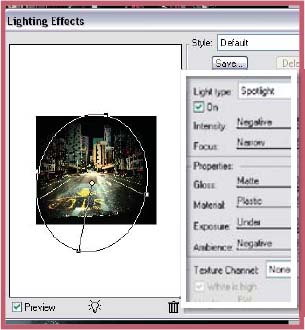
Step 7 >> Use the Clone Stamp to even out the textures and tones and the Burn and Dodge tools to darken or lighten areas. Next select white sky area with the Magic Wand tool and fill (Edit > Fill) with black. Use the Lighting Effects filter (Filter > Render > Lighting Effects) to add a yellow hotspot in the center of the picture, fading the edges of the buildings into the newly created black sky.
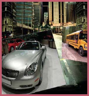
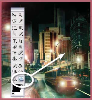
Step 8 >> Drag the car and bus images onto the background. Flip the bus horizontally (Image > Rotate > Flip Horizontal) and select the bus destination display and flip it back. Using the Free Transform tool (Image > Transform > Free Transform) both the car and bus images are resized and their perspective adjusted to suit the scene.

Step 9 >> Use a low opacity softedged eraser to remove the unwanted areas around the car and bus. Next darken the side of the bus and add a shadow underneath using the Burn-in tool. Apply similar burning-in changes to the car including shadows and darkening the front and wind screen areas. Use the Sponge tool to desaturate vivid color areas that can appear after burningin.
All images courtesy of www.istockphoto.com©2005.
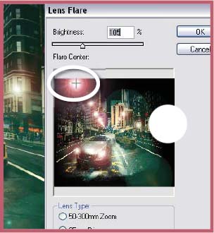
Step 10 >> Next select the Lens Flare filter (Filter > Render > Lens Flare) and add glows to the headlights of the car and bus and to most of the bigger street lamps using the filter. Because the filter preview window is so small, it is more difficult to apply the changes to the more distant lamp posts. Instead add these with a softedged, slightly transparent brush that is colored white.
Step 11 >> One of the side effects of the Lens Flare filter is a general lightening of shadow areas in the picture. For this reason use the Burn tool to restore some of the depth of tone to the shadow areas. Selecting Mid tone or Shadows as the target range ensures that the highlights remain bright during the changes.
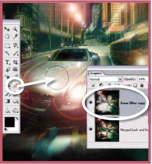
Step 12 >> Make a copy of the merged layer of the work to date using the technique outlined in Step 6 and then apply the Radial Blur filter (Filter > Blur > Radial Blur), set to zoom and with the centre positioned over the car, to the copy. Reduce the opacity of the blurred layer to restore a little detail and then use a soft-edged eraser to remove layer parts to reveal the detail beneath.
7.17 Producing High-Key Pictures
Suitable for Elements – 5.0, 4.0, 3.0, 2.0, 1.0 Difficulty level – Intermediate Resources – Web image 717 Tools used – Selection tools Menus used – Select, Layer
When, as a student, I was asked to produce a high-key portrait I can remember the extreme lengths that I went to making sure that my lighting was just right, my exposure perfect and my printing spot on. So finicky was the process that many photographers veer away from making many of these stylized portraits. There is no doubting the beauty of a well-produced highkey portrait. The skin tones become almost white, but still manage to retain just a hint of detail, whilst the shadows keep their depth and the detail throughout remains crisp.
With digital now dominant, what new spin can this technology offer to this old technique? Well I’m glad you asked. This technique takes a standard portrait and with a few basic changes in Photoshop Elements creates a new high-key version. Just like the original technique the digital approach concentrates on lightening the subject’s skin tones whilst still retaining depth in the shadows.
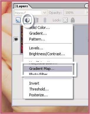
Step 1 >> With the image open in Photoshop Elements, the first task is to create a Gradient Map adjustment layer. Do this by selecting the option from the Adjustment Layer button at the top of the Layer’s palette.

Step 2 >> Double-click in the gradient area in the dialog to display the Gradient editor. Now to change the tones that make up the start and end points of the gradient. Start with the left end of the gradient – double-click on the Color Stop box.
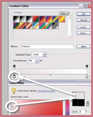
Step 3 >> The Color Picker dialog will open. Select a light gray and click OK. This sets this color as the left end of the gradient. Now double-click the color stop on the right end and select white as the gradient end point.
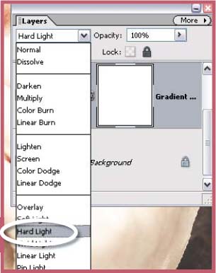
Step 4 >> Select the adjustment layer and change the blending mode to Hard Light. This will produce a much lighter color image but still hold most of your highlight details.
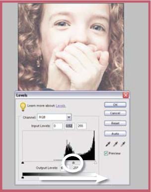
Step 5 >> Now add a Levels adjustment layer so that it sits at the top of the Layer Stack. Adjust the Mid tone slider to control the brightness of the subject’s skin tones.
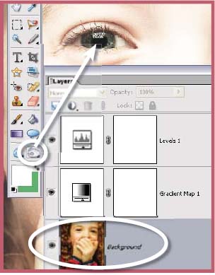
Step 6 >> Now to restore the shadow detail. Select the image layer at the bottom of the stack and with the Burn-in tool set to shadow and an exposure of 10% enhance the shadow areas using light overlapping strokes.
Gradient map?
This feature switches the colours in your picture with tones from a gradient. This option is often used to convert colour images to black and white by using a black-to-white gradient map. The colours in your picture are mapped to the grays in the gradient. The feature works just as easily with colours and complex rainbow gradients as well. Try it yourself.
Suitable for Elements – 5.0, 4.0, 3.0, 2.0, 1.0 | Difficulty level – Intermediate | Resources – Web images 718-1, 718-2 | Menus used – Filter, Image
The following techniques are designed to correct two of the most common lens problems:
- Barrel distortion and
- Pincushion distortion.
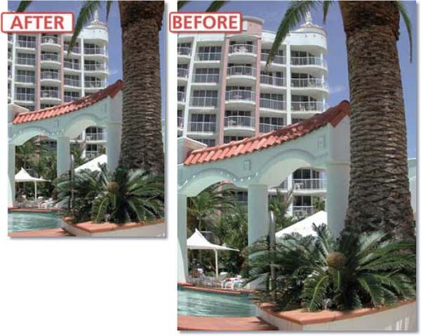
As we have already seen in technique 7.05 the new Correct Camera Distortion filter that ships with Photoshop Elements 5.0 can quickly and easily correct perspective problems in your photos, but this isn’t the end of the feature’s abilities. The Remove Distortion slider is designed specifically for removing the barrel distortion or pincushioning effects common with some lenses. For best results this slider can be used in conjunction with the Rotate, Perspective and Vignetting controls to fine-tune the look of your photo. This feature can also be used to intentionally add the effects of each of these lens problems in order to produced bloated or pinched photos.
The Remove Distrortion control >> Moving the slider to the right removes the effect of pincushioning by causing the picture to bulge. Sliding the control to the right pinches the picture inwards correcting barrel distortion.
Before Correct Camera Distortion Filter
In previous version of Photoshop Elements you could use the Spherize filter (Filter > Distort > Spherize) to help correct the distortion problems in your photos. It contains a preview thumbnail and a slider control that adjusts the degree of barrel or pincushion correction that is applied to the picture. Moving the slider to the right balloons the picture and therefore counteracts the effects of pincushioning. Sliding the control to the left contracts the image and reduces barrel distortion. But simply applying this filter to the problem picture will cause some parts of the photo to be left unchanged (corners) whilst the rest of the image is ‘spherized’. To overcome this problem and apply the changes to all the picture, you will need to add some space around the image before applying the filter. Use the steps below to correct the photos you have in your collection that suffer from lens distortion.
Step 1 >> Open the example image. Next select the Crop tool and clickdrag the marquee so that it covers the whole of the picture. Now click on the marquee corner handles in the top left and bottom right and drag these outwards beyond the edge of the picture. Double-click in the centre of the marquee to add the new canvas space.
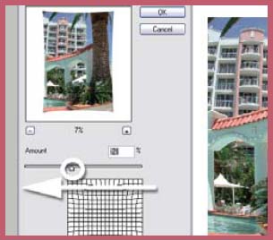
Step 2 >> Open the Spherize filter (Filter > Distort > Spherize) and adjust the magnification of the thumbnail so that all the image can be seen. Drag the Amount slider to the left to remove the barrel distortion. Continue the adjustment until the ballooning effect is no longer evident. Click OK to apply.
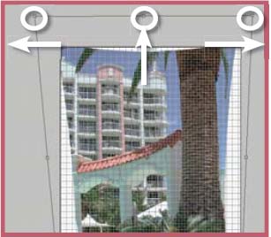
Step 3 >> Next choose View > Grid and then select Image > Transform > Free Transform. Click-drag the top corner handles outwards until the building parts that should be vertical are aligned to a grid line. Drag the top handle upwards to counteract the squashing action and then double-click to transform. Use the Crop tool to remove edges.
Step 1 >> Open the example image and as before select the Crop tool and click-drag the marquee so that it covers the whole of the picture. Now click on the marquee corner handles in the top left and bottom right and drag these outwards beyond the edge of the picture. Double-click in the centre of the marquee to add the new canvas space.
Step 2 >> Open the Spherize filter (Filter > Distort > Spherize) and adjust the magnification of the thumbnail so that all the image can be seen. Drag the Amount slider to the right to remove the pincushion distortion. Continue the adjustment until the edges of the card are no longer bent. Click OK to apply.
Step 3 >> Select the Crop tool and after drawing the crop marquee around the picture click outside the marquee and drag to rotate the marquee until the edges of the marquee are parallel to the card’s sides. Double-click in the centre of the marquee to crop and rotate the photo.
Suitable for Elements – 5.0, 4.0, 3.0, 2.0, 1.0 | Difficulty level – Intermediate | Resources – Web images 719-1, 719-2 | Tools used – Selection tools, Free Transform | Menus used – Select, Layer, Enhance, Filter, Edit
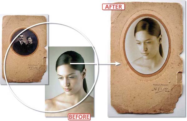
Most people would say that old photographs have a certain look and feel about them that can almost be described as magical. It is hard to pin down exactly why we can be so fascinated by these aged images; it may be nostalgia pure and simple, or the knowledge that you are holding a piece of captured history in your hands or it may even be the fact that they look so different from their modern, dare I say it, digital, counterparts. But such is the fascination with old images that many contemporary shooters use a range of digital techniques to recapture this ‘look and feel’ in their pixel-based photographs. In this section we will gracefully add years of age to a straight portrait with the help of some of the features in Photoshop Elements.
Sepia Toned Vignettes with Old Background
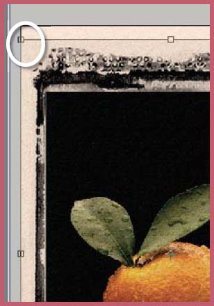
In this technique we will take a modern portrait that uses a classic pose, give it an old time treatment and then add it to an original antique background. Such picture surrounds can be easily located at car boot sales or, as with my example, a French brocante shop. The state of the photograph itself is not all that important; it is the surround that we are interested in. The circular cutout won’t suit the oval vignette of the example picture so some quick copy, paste and transform steps modify the original to fit our modern portrait. The last part of the process adds some texture and a little unsharpness to the original to ensure that it matches its new (or is that old?) surround.
![]()
To see how to create similar results using the new Frame layer technology included in Photoshop Elements 5.0 go to Chapter 12.
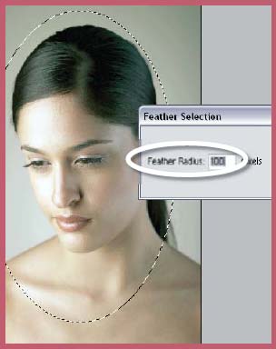
Step 1 >> Start by making an oval selection using the Elliptical selection tool from the Elements tool box. Feather the selection (Select > Feather) to make the transition between the selected and nonselected areas more gradual. Inverse the selection (Select > Inverse) and then press the Delete key to remove the background of the portrait.
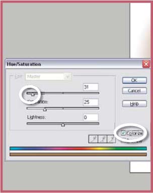
Step 2 >> A digital simulation of sepia toning can be obtained by opening the Hue/Saturation feature (Enhance > Adjust Color > Hue/Saturation), ticking the Colorize option and then moving the Hue slider to a value of about 30. The strength of the color can be changed by sliding the Saturation slider.

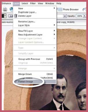
Step 3 >> Open the photo-frame picture. This example was photographed using window light directed from the top of the picture. Change the circular cutout to suit the oval picture by making a feather selection of the oval and Edit > Copy and Edit > Paste the selection. Next use the Free Transform tool to make the circle taller. Double-click to apply the transformation.
Step 4 >> Flatten the picture (Layer > Flatten Image) and carefully select the inside of the cutout using one of the Lasso tools. Feather the selection by 1 pixel. Save the selection (Select > Save Selection) just incase you loose it during the next couple of steps. Switch back to the sepia toned portrait and select (Select > All) and copy (Edit > Copy) the whole picture to memory. Click onto the background document and make sure that the cutout selection is still active. Now select the Paste Into Selection option from the Edit menu (not the Paste option).
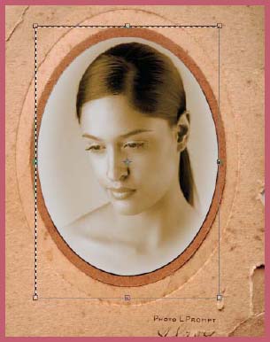
Step 5 >> Straight after you paste the portrait into the surround select the Free Transform feature using the shortcut key – Ctrl T. This will place the familiar transformation handles around the pasted picture allowing you to manipulate the size of the portrait to suit the cutout. Be sure to hold down the Shift key whilst resizing to guarantee that the portrait remains in proportion. Double-click to apply the transformation.
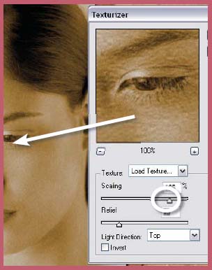
Step 6 >> Although the picture now fits the surround well there is an obvious difference between the texture of the two parts. To help match these areas, select a portion of the picture surround and then copy and paste this into a new Elements document. Save the texture as a PSD file. Reload the original selection made for the cutout (Select > Load Selection). Now apply the saved copied texture to the portrait area using the Load Texture option in the Texturizer filter (Filter > Texture > Texturizer).
Suitable for Elements – 5.0, 4.0, 3.0, 2.0, 1.0 | Difficulty level – Intermediate | Resources – Web image 720 | Menus used – Filter
Before photography was even invented or digital became the way to take and make pictures, artists had been creating great pictures for centuries using such diverse materials as chalk, pastel, pen and ink, and, of course, paint. Now you can emulate the look of these old masterpieces by using your very own photographs as the starting point and adding the artistic ‘look and feel’ with a few well-chosen, but simple, digital embellishments. Here we will recreate four distinct artistic illustrations from a single humble photographic beginning using several enhancement steps and the filters contained in Elements.

Changing to a Pen and Ink Drawing (See A)
Using the Graphic Pen filter it is possible to simulate the effect of making a drawing of a photograph with a thin graphic arts pen. Close overlapping strokes are used for the shadow areas; mid tones are represented by balancing strokes with the paper colour showing through; and highlight details are drawn with a few sparse strokes.
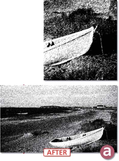
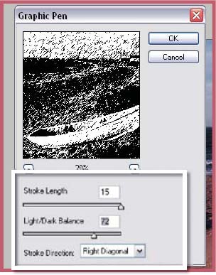
Step 1 >> Set the foreground colors to default by clicking the small black and white squares in the bottom left of the toolbar. The Graphic Pen filter uses the foreground color as the ‘ink’ color and the background color as the ‘paper’ color. Select the filter from the Sketch menu. Using the preview as a guide adjust the Stroke Length, Light/Dark Balance and Stroke Direction controls. Click OK.
Step 2 >> To add a little more color to your Graphic Pen ‘drawings’ select colors other than black and white for the foreground and background values. Double-click each swatch to open the Color Swatch palette where you can select the new color. Here I changed the pen color to brown and the paper color to light cream.
Switching Photographic Tones with Pastel Strokes (See B)
As well as the pen and ink approach used above, another favorite with artists is the use of pastels or chalks on a roughly textured paper surface. The tones of the picture are layered upon the paper’s texture so that the image detail gradually emerges from the background as a combination of stroke, colour and texture.
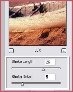
Step 1 >> To create this effect we make use of the Rough Pastel filter. The feature contains two distinct control sections. The upper two sliders, Stroke Length and Stroke Detail, are used to adjust the way that the photographic tone is converted to pastel strokes. With the preview window zoomed in to 100% move both sliders until you are happy with the mix of detail and tone.
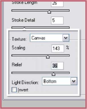
Step 2 >> When drawing with pastels artists often use a heavily textured paper as a base for the picture. The lower section in the Filter dialog is used to apply such a surface texture to your pastel image. Here you can select the texture type (canvas, burlap, sandstone), the size of the texture (scaling), the strength of the texture effect (relief) and the direction of the light that provides shadow for the surface. After making your texture selections, check the preview and readjust the stroke length and detail if necessary before clicking OK to complete.
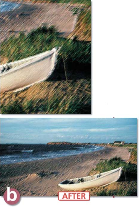
Creating a Watercolour Painting (See C)
If you want to create the feeling of a painted surface rather than a drawn one then the Watercolor filter in Photoshop or Photoshop Elements is a good place to start. With this feature the tone and hue of the original photograph is converted to daubs of semi-transparent color with the larger areas surrounded by a darker border edge. To make the effect even more convincing I have applied a texture to the picture after the watercolour conversion.
Pop Art Posters (See D)
Andy Warhol made the technique famous in the sixties and now you can recreate his posterized effect using your own pictures. Warhol’s images were extremely graphic and constructed of very few colours, which were then applied in broad flat areas of the picture. Others like Roy Lichtenstein added a cartoon-like feeling to the pop art pictures by including a black line around coloured areas. Here we will use the Cutout and Poster Edges filters to recreate this image style.
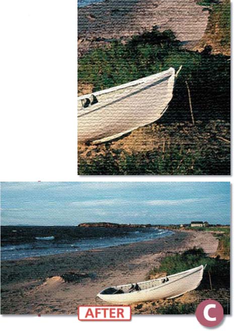
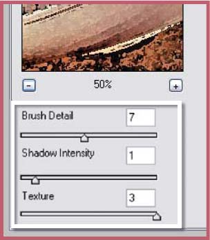
Step 1 >> Start by opening the Watercolor filter from the Artistic option of the Filter menu. Next, with the preview set to 100%, adjust the Brush Detail and Shadow Intensity sliders to suit the picture. The third slider, Texture, is used to control the break-up of the painted areas rather than any simulated paper texture. This comes in the next step. Click OK to filter.
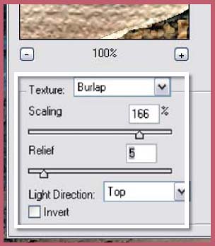
Step 2 >> Now to add a surface treatment to the picture that will really make the conversion to a watercolor painting complete. For this task we will use the Texturizer (Filter > Texture > Texturizer) filter which has the same controls and options that we looked at in the Rough Pastel filter. We can choose the type, scale, relief and light direction that will be used for the texture. Be sure to preview the effect of the settings at 100% before clicking OK to apply.
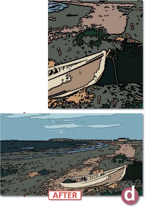
Step 1 >> To start we will use the Cutout filter (Filter > Artistic > Cutout) to reduce the colors in the picture and to simplify the photographs detail. The feature contains three sliders. The first, No. of Levels, determines the number of colors that will be present in the final picture. Smaller values mean less colors. The Edge Simplicity and Fidelity sliders are used to determine the amount of detail that is retained in the picture. Try several settings to ensure that you have a good balance of detail and flat tone. Click OK to filter.
Step 2 >> The final step in the pop art transformation is to add a black surround to the flat areas of color. For this job we will use the Poster Edges filter (Filter > Artistic > Poster Edges). The Edge Thickness slider adjusts the width of the line drawn around the picture parts, the Edge Intensity slider controls the darkness of the line and the Posterization setting is a further color reduction control. Check how the results of your settings appear when previewed at 100% and then click OK to complete.