Chapter 6. Small (but Important) Details
TYPOGRAPHY IS ALL ABOUT THE DETAILS, and good typographers tend to be mildly obsessive by temperament. But this sweating the small stuff is more than just nitpicking; it’s about clear communication. Attending to detail requires that we take charge of our computers so that they don’t force us into making amateurish mistakes. All design programs have some dumb default settings, and InDesign is no exception. Avoiding bad default settings is no guarantee that your type will look good, but it helps guard against it looking bad. For good-looking typography we must take advantage of InDesign’s many options for finessing our type—understanding the different widths and uses of the spacing characters, knowing the difference between em dashes and en dashes, and taking advantage of OpenType features. It’s this attention to detail that sets your work apart from the crowd.
Typographer’s Quotes
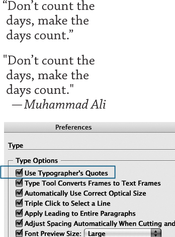
No self-respecting typographer would be caught dead using straight quotation marks, or inch marks, instead of paired typographer’s (“curly”) quotes. By default, this preference is on. Using typographer’s quotes is also an option in Word Import Options when you place text with the Show Import Options box checked. In American English, double quotation marks are used to set off a quote and single quotation marks are used for quotes within a quote. In British English, it is the other way around. In addition, American English requires commas and periods to go inside the quotation marks even if the punctuation is not part of the quoted sentence. Colons and semicolons, however, go outside the quotation marks. In British English, all punctuation goes outside the quotation marks, which perhaps makes more sense, but looks ugly.
Figure 6.1 Typographer’s quotes (top) versus inch marks (bottom).
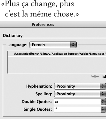
Dictionary Preferences allows you to choose the appearance of your single and double quotes for specific languages.
‹O› French single quotes
«O» French double quotes (guillemets)
«O» Non-French guillemets without space
’O‘ German single quotes
”O” German double quotes
Straight quote marks are a legacy from when engineers (not typographers) translated typewriter keyboard layouts to ASCII codes. The misuse of straight quotes became common when desktop publishing programs empowered everyone with a computer to set their own type. If you need to convey feet or inch measurements, it is possible, though not recommended, to toggle to straight quotes by pressing Cmd+Option+Shift+’ (Ctrl+Alt+Shift+’). A better option is to avoid straight (dumb) quotes altogether and use the prime (feet, minutes) and double prime (inches, seconds) characters instead. You can find these characters in the Symbol font and access them using the Glyphs panel—or you could add them to your own custom glyph set, as described in “Creating a Glyph Set” later in this chapter.
Figure 6.2 Change the language in Dictionary Preferences to use the appropriate type of quote marks. Here, guillemets are used in place of typographer’s double quotes.
Note:
Non-French refers to guillemets used in an unofficial way without spaces. The official French style uses spaces.
Apostrophes
An apostrophe is the same character as a single closing quote. Confusion can arise when InDesign second-guesses you and thinks you want a single opening quote rather than an apostrophe. This is most likely to occur in phrases where an apostrophe substitutes for missing letters or in dates where the apostrophe substitutes for missing numerals. To make sure you get an apostrophe rather than a single opening quote, type Shift+Option+] (Shift+Alt+]).
Punctuation
In running text, when a comma, period, or colon follows a word set in italic or bold, it should also be in italic or bold. Quote marks, question marks, and exclamation marks should be set in the same style as the rest of the sentence.
Punctuation (and hyphens) should hang outside the column measure—something that is easily achieved using Optical Margin Alignment, applied either locally through the Story Panel or globally as part of an Object Style definition (see Chapter 13, “Global Formatting with Styles”). The font size setting determines the amount of overhang. Usually this should be the same size as the text, but you’ll want to eyeball it.
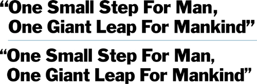
Punctuation in display type can look disproportionately large, so be prepared to reduce the size of your commas, periods, colons, and quote marks to compensate.
Figure 6.3 Prime marks from the Symbol font compared to quote marks and inch marks.
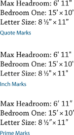
Figure 6.4 Apostrophes versus single opening quote marks.
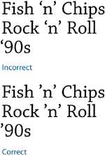
Figure 6.5 Use Optical Margin Alignment to make punctuation “hang” outside the text frame.
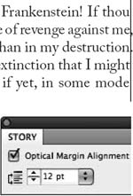
Figure 6.6 Adjusting the size of punctuation in headlines: No adjustment (top); punctuation reduced from 30 points to 24 points (bottom).
Dashes
There are three lengths of dash–five if you include the minus sign and the figure dash–and they all serve different functions.
The hyphen is the shortest dash, typically one-third the length of an em dash. Hyphens are used to break single words into syllables when hyphenation is turned on (soft hyphens), to join ordinarily separate words into compound words, or to link the words of a phrase that is used as an adjective. The hyphen does not require spaces on either side, except for suspended hyphens, which require a space after the hyphen. Suspended hyphens are used when hyphenated adjectives refer to a common basic element and this common element is shown only with the last term—such as upper- and lowercase, two- and four-wheel drive, pre- and post-war, and so on.
Figure 6.7 Four different widths of dash (Adobe Caslon Pro, 60 pt).
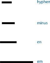
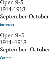
The en dash (Option+- or Alt+-) is used to indicate duration. If you would say “to” when reading the sentence out loud, then use an en dash. You would also use an en dash when you have a compound adjective, one part of which consists of two words or a hyphenated word. There is no space around the en dash.
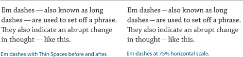
The em dash (Shift+Option+- or Shift+Alt+-) is used to separate a parenthetical break in the sentence.
Em dashes should not touch the characters that precede or follow them. You can put a thin space (Cmd/Ctrl+Option/Alt+Shift+M) around em dashes to ensure they remain separate. A regular word space is too wide and in justified type will grow and shrink to achieve justification. A thin space is one-eighth the width of an em space, is nonbreaking (meaning that it prevents the dash from being separated from the words next to it), and will not change size in justified text.
Figure 6.8 The en dash is used here to separate times and dates.
Some people find the em dash too wide and choose instead to use an en dash as a phrase marker, or to use an em dash at 75–80 percent horizontal scale. If you opt for the latter, you can set up a GREP style (see Chapter 13) to automate the process. This was my preference for the em dashes, but the Peachpit style uses full em dashes.
Figure 6.9 Correct usage of the em dash.
On a typewriter, an em dash is conveyed with double hyphens. Because some people are resistant to unlearning this habit, you’re likely to encounter this and all manner of other approximations of an em dash, which you’ll need to find and change. See “Cleaning Up Text” in Chapter 2, “Getting Type on Your Page,” for more about this.
OpenType fonts may also have a figure dash, which is the width of a lining numeral and is designed to work in concert with lining numerals, and a minus sign, which is slightly wider than a hyphen and may be slightly wider or narrower than the en dash, depending on the typeface.
Ellipses
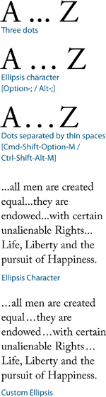
An ellipsis indicates omission or rhetorical pause. When the omitted words are within a sentence, use a three-dot ellipsis preceded and followed by a space. When the omission occurs at the end of a sentence, add a period at the end of the sentence just before the ellipsis.
A three-dot ellipsis is included in most standard font sets (Option+; /Alt+0133). If you find the dots of the ellipsis character too tightly spaced, you can create your own ellipsis with dots separated by thin spaces. Use Find/Change to automatically replace any other ellipsis forms with your custom ellipsis or set up a GREP style to automate their conversion within the text.
End Marks
An end mark is a common device in magazines, newsletters, and journals to signify the end of an article, especially when the article spans several pages. The end mark can be a character taken from a picture font like the venerable Zapf Dingbats, or an inline graphic such as the logotype of the publication. End marks should be scaled so that they are no bigger than the cap height of the text; depending on the mark you’re using you may want to size them to the x-height. They can be separated from the text with an en space (Cmd/Ctrl+Shift+N) or set flush right with the margin (Shift+Tab). To ensure consistency, create an End Mark character style.
Symbols
Frequently used special characters can be accessed by choosing Type > Insert Special Character > Symbols; all others can be accessed from the Glyphs panel. As with punctuation, as your text gets bigger, the symbols should become proportionately smaller.
Figure 6.10 Different approaches to the ellipsis.
White Space Characters
There are 12 other spacing characters in addition to the word space, and they can be accessed by choosing Type > Insert White Space, or by selecting Insert White Space from the Type Tool context menu (Ctrl-click or right-click).
Em Space
An em space (Cmd+Shift+M/Ctrl+Shift+M) is a relative unit, equal in width to the size of your type. In 12-point type, an em space is 12 points wide; in 72-point type, it is 72 points.
En Space
An en space (Cmd+Shift+N/Ctrl+Shift+N) is half the width of an em space.
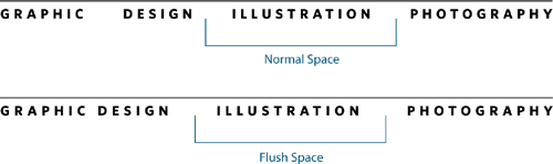
Flush Space
A flush space can be useful to flush out a series of items across a column measure without increasing the word spacing within those items. Flush spaces work with Justify All Lines alignment only.
Hair Space
A hair space (Cmd+Option+Shift+I/Ctrl+Alt+Shift+I) is 1/24 the width of an em space. It can be used as an alternative to a thin space.
Figure 6.11 An end mark, sized to the x-height of the type and separated by an en space (left) or set flush right using Shift+Tab (right).
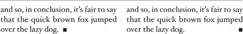
Figure 6.12 The special characters available in the Symbols menu—all others can be found in the Glyphs panel.
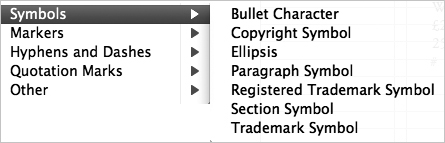
Figure 6.13 The white space characters available on the Type > Insert White Space menu. Their relative sizes relate to the point size of the type.
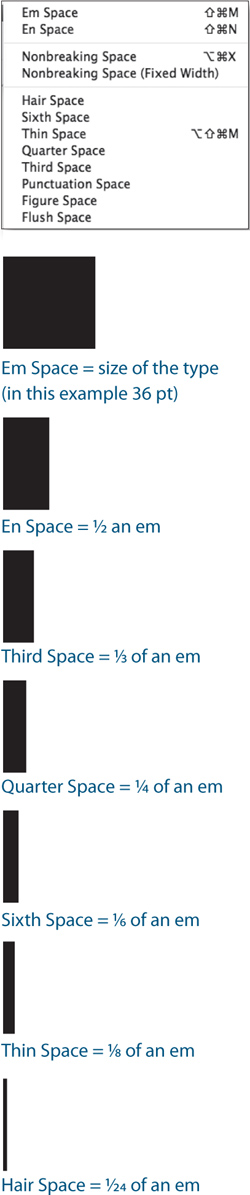
Figure 6.14 Flush spaces are used to spread out items across the column measure without increasing the space between those items.
Tip:
Both Mac OS and Microsoft Windows support keyboard layouts for multiple languages. Make sure you’re using the appropriate one, so that you have ready access to the characters you need.
Nonbreaking Space
The same width as a word space, a nonbreaking space (Cmd+Option+X/ Ctrl+Alt+X) prevents two (or more) words, like a name for example, from being broken across a line. Using a nonbreaking space is preferable to a forced line break to fix a runt line. If the text is edited or reflowed, you won’t end up with a break in the middle of your line. The Nonbreaking Space (Fixed Width) is used in justified type to prevent the space from varying with the other spaces on the line in order to achieve justification. Instead of using a nonbreaking space, however, you can apply No Break to a selected range of text. See Chapter 9, “Breaking (and Not Breaking) Lines, Paragraphs, Columns, and Pages.”
Thin Space
A thin space (Cmd+Option+Shift+M/Ctrl+Alt+Shift+M) is one-eighth the width of an em space—a good choice on either side of an em dash or to separate the dots of an ellipsis.
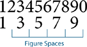
Figure Space
A figure space is the same width as a figure in the typeface, if the typeface you are using is designed with Tabular Lining or Tabular Oldstyle figures, where each figure occupies the same set width. Figure spaces can be used to help align numbers in tables.
Figure 6.15 Figure spaces can be used to align numbers.
Punctuation Space
A punctuation space is the same width as an exclamation mark, period, or colon in the typeface.
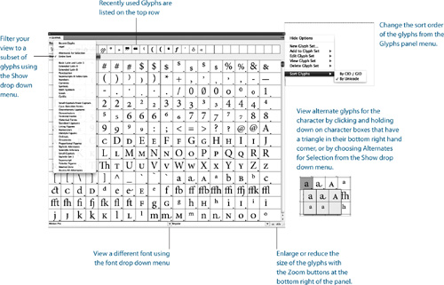
The Glyphs Panel
To access the special characters, foreign accents, currency symbols, and diacritical marks that are not on an English keyboard, we have the Glyphs panel. To view the Glyphs panel, choose Type > Glyphs. The Glyphs panel is a less than perfect solution to finding specific glyphs, especially when working with typefaces that have big character sets. You can subset your view, sort by Unicode number (which is useful only if you know the Unicode number for the glyph you’re after), and change the view size of the glyphs. These techniques notwithstanding, searching for a glyph can still seem like hunting for the proverbial needle in a haystack. When you find the glyph you want, make sure your Type Tool is inserted in a text frame, then double-click to insert the glyph into the text.
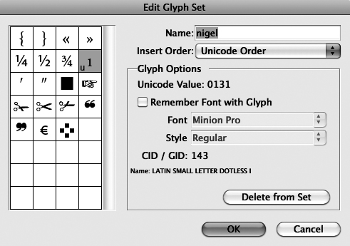
Creating a Glyph Set
If you find yourself repeatedly using the same glyphs, making a glyph set saves hunting for them each time you need them.
- Choose Type > Glyphs.
- From the Glyphs panel menu, choose New Glyph Set, name your glyph set, and click OK.
- Click on a glyph you want to add to your glyph set. Ctrl-click (right-click) and choose Add to Glyph Set from the context menu that appears.
Once you’ve made your glyph set, choose Edit Glyph Set from the Glyphs panel menu. As appropriate, deselect the option Remember Font with Glyph for those glyphs where you don’t want to capture the specific font, but only the glyph itself. If the typeface you’re working with doesn’t have that particular character (for instance, an exclamation mark is not part of Zapf Dingbats), then the glyph will revert to its original typeface.
Tip:
To download a list of all the characters in the Adobe Western 2 character set go to www.adobe.com/type/pdfs/AdobeWestern2.pdf. This list provides the Unicode value for each character as well as the keyboard commands to access the characters.
Figure 6.17 Editing a glyph set. When you deselect Remember Font with Glyph, a U appears in the lower-left corner of the character box.
Unicode
OpenType fonts are based on Unicode—an international, cross-platform standard that assigns numbers to the characters in a font. Before Unicode, the recognized standard was ASCII, which has a character set of 256 characters. The problem with ASCII is that Mac OS and Windows use different encoding schemes. While they agree on the first 128 characters, the next 128 numbers are specific to each platform. This means that specifying the characters you need requires different key combinations on the different platforms.
Unicode, however, offers a character set of up to 65,000—and to think, it used to be the boast of typographers that “with 26 soldiers of lead” they could conquer the world! In reality, no font comes close to having this many characters, but OpenType Pro fonts have expanded character sets that include a full range of Latin characters, accented characters to support central and Eastern European languages, such as Turkish and Polish, as well as Cyrillic and Greek characters. In addition to making multilingual typography easier, OpenType Pro fonts also give us all kinds of typographic delicacies—such as extra ligatures, real small caps, real fractions, and Oldstyle numerals—that we formerly had to switch to an “Expert Set” in order to access.
In Windows, you can type any glyph using Alt + the Unicode value. The same option exists in Mac OS, although it’s a bit obscure. With the “Unicode Hex Input” keyboard selected in the Language & Text System Preferences—it’s close to the bottom of the list of language keyboards—you can type Option + the Unicode value as you would in Windows. However, using the Hex Input keyboard does make using keyboard shortcuts that include the Option key nonfunctional, so it’s something you’d only want to use on an as-needed basis.
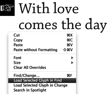
Figure 6.18 Loading a selected glyph into the Find dialog box.
Making Fractions
PostScript and TrueType fonts have the following fractions in their character set: ![]() ,
, ![]() ,
, ![]() . Certain OpenType Pro typefaces may also contain
. Certain OpenType Pro typefaces may also contain ![]() ,
, ![]() ,
, ![]() ,
, ![]() ,
, ![]() ,
, ![]() ,
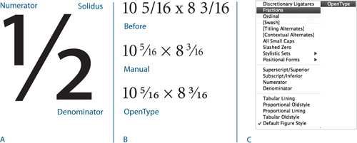
, ![]() . More importantly, OpenType typefaces allow you to make custom fractions. Highlight the numbers you want to convert to fractions and choose Fractions from the OpenType menu on the Control Panel. Unfortunately, leaving this feature on will “fractionize” all numerals in your text, so it’s necessary to apply it on an as-needed basis.
. More importantly, OpenType typefaces allow you to make custom fractions. Highlight the numbers you want to convert to fractions and choose Fractions from the OpenType menu on the Control Panel. Unfortunately, leaving this feature on will “fractionize” all numerals in your text, so it’s necessary to apply it on an as-needed basis.
Figure 6.19 The Character Viewer in Mac OS 10.6 (B), accessed via the Language & Text system preferences (Unicode Hex Input chosen) (A).
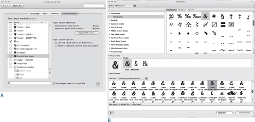
Figure 6.20 The parts of a fraction (A). Making fractions (B): No treatment (top), non–OpenType fractions made either manually or using a fraction script (center), and Open Type fractions. The OpenType options (C) accessed via the Control Panel menu.
Note:
A short-lived solution to the some of the limitations of Type 1 PostScript fonts was the multiple master, which allowed the user to generate different weights and widths of the typeface from a small number of master outlines. However, multiple masters didn’t catch on, mainly because these fonts were expensive and confusing to use. Names like MyriadMM 215LT didn’t exactly roll off the tongue. Multiple masters were discontinued in 2001, though they still show up on font menus.
If you’re using PostScript Type 1 or TrueType fonts you can still make your own fractions without too much fuss. There are several fraction scripts, like Dan Rodney’s Proper Fraction, that you can download for a nominal fee or for free from the Adobe Exchange Web site. These scripts convert the numerator to superscript, the denominator to subscript, and replace the slash or virgule with a fraction bar or solidus (Option/Alt+Shift+1). For best results, in Advanced Type Preferences set Super/Subscript size to 60%, the Superscript position to 33%, and the Subscript position to 0. No matter how you get your fraction, if it follows a whole number, no space is necessary before the fraction.
Multiplication Sign
The multiplication or dimension sign is its own character, more symmetrical than a lowercase x. It’s available in the Symbol font or in OpenType fonts. To access the multiplication sign, filter your view in the Glyphs panel to show Math Symbols.
The Euro Symbol
Fonts newer than 1998 should have the Euro symbol as part of the character set: Option+Shift+2 (Alt+0128). If you’re using fonts older than 1998, or you don’t like the design of the Euro character in a particular font, you can download a family of Euro fonts from the Adobe Web site: http://store.adobe.com/type/euroreg.html. Euro Sans has a regular weight that is the same as the official character adopted in Europe. Euro Mono is a condensed version of Euro Sans that is designed to work with monospaced fonts. Euro Serif is useful for settings of serif faces. All three fonts are free.
Figure 6.21 The multiplication sign (right) compared to a lowercase x (left).
![]()
Figure 6.22 Euro Monospace, Euro Sans, and Euro Serif, from the Adobe Euro fonts.
![]()
Note:
InDesign CS5 ships with several OpenType fonts, including Adobe Garamond Pro, Chaparral Pro, Adobe Caslon Pro, Caflisch Pro, Minion Pro, and Myriad Pro.
Ligatures, Diphthongs, and the Dotless i
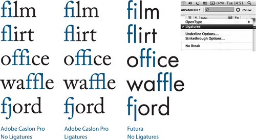
Ligatures are two or more intersecting characters fused into a single character. They are used to avoid collisions, most commonly between the finial of the lowercase f and the dot of the i or between the finial of the f and the ascender of the l. InDesign can use standard ligatures whether you’re using OpenType, PostScript, or TrueType fonts. Check Spelling is smart enough to recognize them and not flag as misspelled any word that contains them. The use of ligatures may not be necessary with sans serif typefaces, where there’s no danger of a character collision. First try setting the type without ligatures. If the characters collide, then turn on Ligatures. If they don’t, well—if it ain’t broke, don’t fix it, especially since using ligatures may make these letter combinations appear to be more tightly set than the rest of your type. Ligatures can be turned on from the Control Panel menu or, when applied as part of a Paragraph Style, in the Basic Character Formats.
Figure 6.23 Ligatures: necessary for serif typefaces, but typically unnecessary for sans serif.
OpenType fonts offer more ligatures such as ffi, ffl, fj, and ff combinations, and may contain discretionary ligatures such as ct, sp, and st. Discretionary ligatures are not for everyday use, but may be perfect for special occasions. The next time you’re working on something fancy like a wedding invitation, discretionary ligatures might be just the extra seasoning you need.
Diphthongs are ligatures that visually represent the pronunciation of a combined vowel. The most common examples are ae, AE, and oe, OE such as in Caesar, encyclopeadia, mediaeval, and oeuvre. Their usage is considered archaic in modern English, especially American English. Both discretionary ligatures and diphthongs can be applied on a case-by-case basis through the Glyphs panel. Choose Discretionary Ligatures from the Show menu to isolate the available options.
Figure 6.24 Minion Pro with discretionary ligatures.
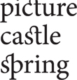
Because ligatures can look odd in display type, you may be better off kerning to avoid character collisions, or replacing the i with a dotless i. On the Mac, the dotless i can be typed by pressing Shift+Option+B. In Windows, open Character Map, select Advanced View, and with Character Set set for Unicode, type 0131 (the Unicode ID number for the dotless i) in the Go to Unicode field. The dotless i will be highlighted in the character grid. Use the Copy button and InDesign’s Paste command to insert the i into text. Both methods are faster than hunting and pecking in the Glyphs panel, which has no search tools.
Figure 6.25 Diphthong ligatures.

Figure 6.26 At display sizes, using a dotless i (top) in place of an fi ligature (bottom) makes it easier to equalize the spacing between the characters.
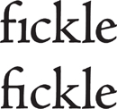
Figure 6.27 Coming Together is an OpenType font of 400 ampersands created for Font Aid IV. All proceeds benefit victims of the Haitian earthquake.

Ornaments
Sometimes referred to as fleurons, typographic ornaments were historically used to expand the typesetter’s palette. Today they can lend a historic feel to a book cover, title page, chapter opener, or be used in repetitions to create a typographic wallpaper suitable for endpapers. They might also come in handy as bullets or end marks. Some were designed to be used in multiples to make decorative frames—although you’d find it a lot easier to achieve the same result in Adobe Illustrator. Some typefaces, like Chaparral Pro, contain playful ornaments.
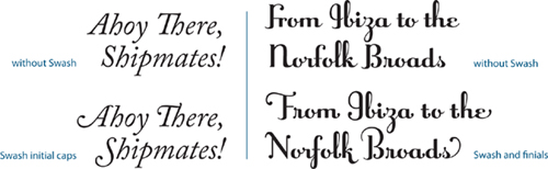
Swash Characters
Used sparingly, swash characters can add a flourish to your type. Typically, they are used at the beginning of words or sentences. Some italic styles of OpenType fonts have swashes—you can check by opening the Glyphs panel and looking for Swash in the Show menu. Some OpenType fonts may also have lowercase swash characters called finials or terminal characters, intended for use at the end of a word or line.
Figure 6.28 A title treatment using Adobe Caslon Pro Ornaments (top) and Chaparral Pro Ornaments (bottom).
Figure 6.29 Swash characters used with Adobe Caslon Pro Italic (left) and Raniscript (right).
Oldstyle Figures
The default figures in most typefaces are tabular lining figures, which were invented about 200 years ago. Lining figures have a fixed width so that they can be aligned in columns, and all have the same height (the cap height of the type). Because of this, they tend to stand out too much when combined with upper- and lowercase text.
Figure 6.30 Different figure styles. Tabular figures all occupy the same set width (A); Oldstyle numbers have ascenders and descenders (B). A comparison of lining figures and Proportional Oldstyle figures in text (C). The four different figure styles available in OpenType Pro typefaces (D).
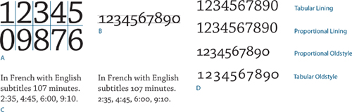
Proportional Oldstyle figures are as tall as the x-height of your type and are, as their name suggests, proportionally spaced. They have a better type color in body text than full-height lining figures. Figures 3, 4, 5, 7, and 9 have descenders, while 6 and 8 have ascenders.
OpenType fonts may also offer Proportional Lining figures (which are good for working with text in all caps) and Tabular Oldstyle figures—the same letterforms as Proportional Oldstyle, but without the proportional spacing, so therefore more appropriate for use in tables.
Contextual Alternates
Some OpenType script faces have alternate characters designed to connect better in certain letter combinations and make your type look more like handwriting. Choose Contextual Alternates from the OpenType menu, and as you type, the glyph to the left of your cursor may change according to the glyph that follows it—if there is an alternate for that particular letter combination. You can also choose the alternates on a case-by-case basis using the Glyphs panel and choosing Alternates for Selection from the Show menu.
Titling Alternates
Some OpenType fonts have special “titling” characters intended for type set at sizes of 72 point and above. The letters of titling alternates are more nuanced. The thin parts of the strokes are relatively thinner, the serifs more refined, and the letters are more condensed, giving them a more elegant look. The large glyphs (A, B, C, etc.) on the chapter opening pages of this book all use titling alternates.
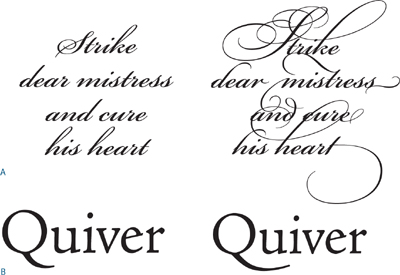
Figure 6.31 Many OpenType Pro faces have a wide range of alternate characters that can be applied through the Glyphs panel. Here Bickham (A) and Adobe Jensen Pro (B) are shown before and after alternates have been applied.
Tip:
You might expect the type preference Use Correct Optical Size to be related to optical sizes, but it actually applies to Multiple Master fonts.
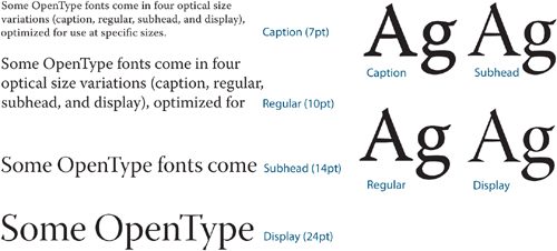
Optical Sizes
Some OpenType fonts include four optical size variations: caption, regular, subhead, and display, so you can choose whichever is most appropriate for the size of your type. The title given the size variation (caption, for example) is your clue to its intended usage. As with titling alternates, the bigger the size, the more refined the characters.
Figure 6.32 The different optical sizes of Warnock Pro.