Chapter 14. Pages, Margins, Columns, and Grids
CRUCIAL TO ANY PAGE DESIGN are its dimensions and its framework. The page size and orientation, the width of the margins that define and frame the type area, and the number and width of the columns that control the flow of the text are all integral design elements that profoundly influence how a reader reacts to the page, be it printed or onscreen. Superimposed on these dimensions is the grid, a series of intersecting guides at regular intervals. The grid is an invaluable tool for organizing text and suggesting (rather than dictating) how text and pictorial elements should be arranged on the page.
Setting Up the Document
When setting up a new document, here are some questions to ask:
• What type of document is it? Is it a novel or continuous prose with a single text flow, a magazine or newsletter with multiple stories, a brochure with several folds, a single-sided poster or flyer?
• Is there a fixed page count or will the number of pages be determined by the length of the text?
• How will the piece be printed? Is it possible to have bleeds—elements that print to the edge of the page?
• How many different types of text are there? Are there sidebars, captions, pull quotes, footnotes, or endnotes? How many levels of hierarchy?
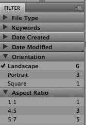
• If there are images, are they predominantly vertical, horizontal, or square in orientation? (See Figure 14.1 for how to get a breakdown of the image orientations in your document.) Are they photographs, illustrations, maps, icons, or all of the above? Do they need to be integrated into the flow of the text?
Figure 14.1 You can use the Bridge Filter panel (File > Browse) to see how many images of a certain orientation or aspect ratio you have. Put a check mark next to an orientation to see images of that type only. (The Filter panel is not available in Mini Bridge.)
Choosing a Page Size
Often we don’t have the option of choosing a page size—and when we do, our choice may in large part depend on convenience and economy. Standard page sizes, as well as being readily available, also have practical benefits: brochures need to fit into standard envelopes, magazines and newspapers into display racks, and business cards into wallets.
That said, for as long as we have been making printed materials we have been searching for the perfect page dimensions. A carefully chosen custom size can look unique rather than expected, organic rather than off the shelf. Many books have been written about the quest for the perfect page aspect ratio—the relationship of width to height. Here are some common approaches.
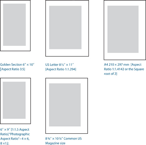
The Golden Section/Golden Ratio: 1:1.618. This formula is based on the proportions found in the human body and in nature. It was used as the standard grid for medieval manuscripts as well as in the creation of great works of art and architecture like the Mona Lisa and the Parthenon.
Figure 14.2 Where it all begins: choosing a page size in the New Document dialog box. Click the Save Preset button to save your settings.
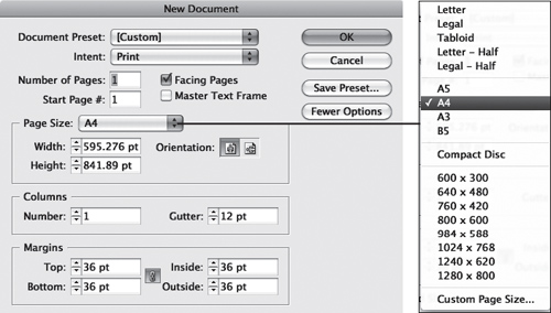
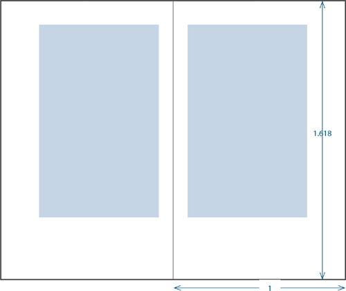
Figure 14.3 A facing-pages spread using Golden Section proportions of 1:1.618 and margins in a ratio of 3:5:8:13 (a Fibonacci sequence, in which each number is the sum of the two preceding numbers). While this makes for harmonious proportions, it also makes for economically impractical margins.
Tip:
InDesign’s smaller screen sizes (640 by 480, 800 by 600, and 1024 by 768) are all 4:3 aspect ratio; 1280 by 800 is a golden ratio.
The Silver Ratio: 1:1.4142. ISO paper sizes—A4, A3, and so on—are based on this aspect ratio of 1 to the square root of 2. It’s a clever and economical system because it allows you to fold one standard size into another without needing to trim the paper to make smaller sizes. You can make brochures by using paper of the next size up. For example, fold an A3 page in two and you have two A4 pages; fold an A4 in two and you have two A5 pages, and so on. The standard US letter size (8.5 by 11 inches) is similar in aspect ratio to an A4 page (8.3 by 11.7 inches), but slightly taller and not quite as wide.
Classical Proportions: 2:3. Jan Tschichold (1902–1974) developed these aspect ratios based upon his studies of medieval manuscripts.
Photographic aspect ratio: 1:1.5. This yields sizes such as 4 by 6 inches, 6 by 9 inches, and 8 by 12 inches.
Business Card aspect ratio: 2:3.5. This is the ratio of most business cards. Its size, and multiples of it, feels familiar.
Tip:
US letter, A4, tabloid, and so on are convenient, but the world is full of documents in these sizes. Use them, but choose them because they offer the best solution for the design you are creating. Don’t settle for them just because they are the defaults.
Tip:
If you opt for a nonstandard page size, be sure to get a cost estimate from your commercial printer before you commit to designing your publication at that size. It’s good to be different, but sometimes being different comes with a big price tag.
Tip:
A handy workflow feature is the ability to save your nonstandard settings as a preset. Once you’ve keyed in the values you want, choose Save Preset. Thereafter you can choose the preset name from the Document Preset menu.
Figure 14.4 ISO paper sizes, with US standard letter size overlaid in blue.
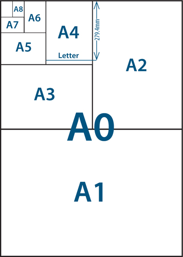
Figure 14.5 Classical proportions developed by typographer Jan Tschichold, using a 2:3 aspect ratio and a series of intersecting guides to determine the size and position of the type area on the page. Start by drawing guides from the lower outside edge to the upper inside edge of each page (1). Then draw guides from the bottom outside corners across the spine to the opposite side (2). Where these lines intersect (circled), project a straight line up to the top of the page (3) and from there draw a diagonal from the top of the page to meet the same intersection on the facing page (4). To determine the type area, draw a rectangle from point A out toward the outside margin until it intersects with line 2 (point B) and then drag the rectangle down until it intersects with line 1 (point C). For an alternative that maintains the integrity of classical proportions but has a more practical bottom margin, follow the diagonals as shown in the lower example.
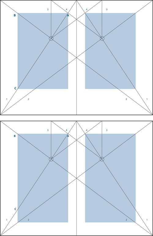
Figure 14.6 Some common pages sizes and aspect ratios (type areas shown in gray).
Page Orientation
A quick glance at your bookshelf confirms that the majority of books—as well as magazines, newspapers, and brochures—are tall (portrait) in orientation, rather than wide (landscape). Of course, there are exceptions: CD covers are square, and books that showcase landscape-orientation photos or images may work better in wide format. But for the most part, printed material is tall and those publications that aren’t sit uneasily alongside this overwhelming majority.
Pages designed for the screen, however, work better in landscape format for the simple reason that our monitors are horizontal.
Figure 14.7 Custom page sizes allow you to combine different page sizes in the same document. In the example shown, custom page sizes have been used for the inside and outside flaps of a book jacket, as well as for the spine.
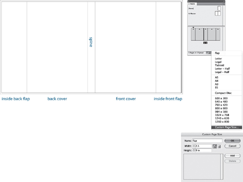
Different Page Sizes
InDesign CS5 allows the use of different page sizes within the same document. This is especially useful if you want to keep the parts of a project together (for example, a business card, letterhead, and envelope can each be different pages in the same document) or if you want to create the front and back cover of a publication as a single page. To change the size of a page or range of pages, select the page(s) in the Pages panel and choose Edit Page Size in the bottom of the panel. Alternatively, choose the Page tool ![]() , click the page, and change its dimensions on the Control Panel.
, click the page, and change its dimensions on the Control Panel.
Determining Margins
Margins often aren’t given enough consideration. It’s easy to fall back on even margins of half an inch or an inch, but in doing so you miss a big opportunity to establish the margins of your document as an integral design element. Look at any page and you’ll notice that margins are the first space you see: They play a vital role in determining the reader’s initial impression of the page. Margins serve the following functions:
• Margins frame and define the type area of the page—and if you’ve ever done any picture framing you’ll appreciate how dramatically a good frame can increase a picture’s impact.
• Obviously, but quite profoundly, margins are where you hold the book or page—they are a place for readers to put their thumbs, hopefully without obscuring the content on the page.
Note:
When setting the inside margin, bear in mind that the binding will change the reader’s perception of the amount of space at the inside of the page. If the inside margin is too small, text will be “lost” in the shadow between the pages.
Tip:
Do a thumbnail sketch. When working on a layout, no matter how zippy you are with InDesign, you’ll save yourself loads of time (and create a better- looking page) if you first rough out the pages on paper. Pencil sketches are the fastest way of trying out ideas and getting a sense of scale.
• Historically, margins have been used as a space to write notes (wide outside margins are still referred to as scholars’ margins) and in certain types of publication they continue to serve this function.
• Margins are also a place to put the page numbers (known as folios) and publication information, in either the top or bottom margins of the page, outside of the type area. (The treatment of margins in the age of the Amazon Kindle and the Apple iPad remains to be seen.)
While margins define the type area, they are not absolute. Certain text elements like drop caps, pull quotes, and captions may hang outside the margins—as will punctuation if you are using Optical Margin Alignment. Pictures frequently break out of the type area, disrupting the rectilinear nature of the page and—potentially—making for a more dynamic layout.
Relative Size of Margins
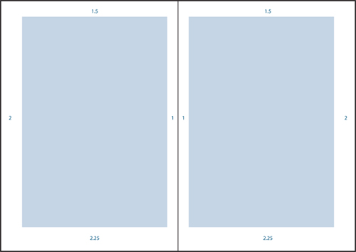
While single-sided documents like posters, flyers, or business cards often use even margins (click the chain icon to make sure it is unbroken), making all the margins the same for documents with facing pages can look static. When two pages are adjacent—such as in a magazine or book—they share an inside margin broken only by the spine. This double margin is a visual factor to take into consideration when designing spreads. Margins typically progress from smallest to largest in the following order: inside, top, outside, bottom. There are no cast-iron rules, but a popular ratio for determining margins is 1:1.5:2:2.25. This produces margins that are generous yet look familiar to a 21st-century eye.
• The inside margin should be the smallest dimension since it faces another inside margin. However, this measure should be at least 10 mm on each page to avoid losing information in the spine.
• Next comes the top margin (head). This should be about 1.25 to 1.5 times the size of the inside margin.
• The outside margin (foredge) should be big enough so the type doesn’t look confined by the page and to allow space for the reader to handle the document. It should be approximately 1.75 to 2 times the size of the inside margin.
• The bottom margin (foot) should be the biggest—about 2 to 2.5 times the size of the inside margin—so as to avoid the type area looking bottom heavy and to allow room for the folios. The amount allowed for the top and bottom margins can be switched if the folios will be placed above the type area.
Figure 14.8 Margins based on ratios of 1:1.5:2:2.5. If the folio is to be placed at the head as opposed to the foot, the size of these margins can be switched.
Facing-Pages Documents
In a document with facing pages, the left and right pages mirror each other and the margins are expressed as inside and outside, as opposed to left and right for a single-sided document.
Tip:
The first page of a two-page document is a right-hand page (or recto), meaning that the first two pages will not appear next to each other as a spread. To make them do so, make sure the Start Page number is an even number. If you forgot to do this (or if you’re working with an earlier version of InDesign), select the first page and from the Pages panel menu choose Numbering And Section Options. Choose Start Page Numbering At and type an even number.
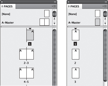
Figure 14.9 The Pages panel showing facing pages (left) and single-sided pages (right).
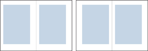
When you make a facing-pages document, the master page that you create will have two symmetrical pages with inside and outside margins that mirror each other. If you want to create an asymmetrical facing-pages layout, start with a facing-pages document, Ctrl/right-click on the spread representing the A-Master, choose Master Page Options, and change the number of pages to 1. A single-page A-Master will replace the spread.
Figure 14.10 Facing-pages documents with asymmetrical margins (left) and symmetrical margins (right).
Setting Up Columns
The type area defined by your margins can be subdivided into columns. The relationship between type size and column width, or measure, is a key factor in determining the readability of your type. There’s no cast-iron rule for determining column width. Some jobs lend themselves to generous columns; often economy dictates narrower columns than are optimal.
As a rough guide, aim for 40 to 70 characters (including the spaces) per line. That’s a big range, so there’s plenty of scope. More than 70 characters and “doubling” can occur—the eye returns to the left column edge only to read the same line again. If you are obligated to work with a measure that is too wide, you can improve its readability by increasing the leading of your type. At the other extreme, if you have fewer than 25 characters on a justified line, getting evenly spaced type will be next to impossible as the words rush to fit the column measure.
Take a look at your daily newspaper and you’ll find justified columns with a lot less than 50 characters. You’ll probably also find—without looking too hard—that these columns are riddled with huge word spaces. This is due to poor justification as a consequence of the narrow column measure. We’ve gotten used to bad typography in newspapers—which in their defense are produced under tight deadline pressure—and read them easily despite their typography, not because of it. Historically newspapers used smaller type than they do today. But while the type has gotten bigger, the columns haven’t grown proportionally, hence the justification problems. That said, there are notable exceptions—The Guardian (UK) has significantly raised the bar for newspaper typography in the last few decades.
Figure 14.11 The Guardian: an exemplar of readability.

Column width is more of an issue with justified type than with ragged type. If you are working with a narrow measure, do yourself a favor and use Left rather than Left Justified alignment.
Determining Gutter Width
In multicolumn documents, the separate columns of type should look like they are parts of a unified whole. If the space between your columns (the gutter) is too wide, those columns will look like they bear no relation to each other. If the gutter is too narrow, though, the reader’s eye may mistakenly cross over from one column to the next.
Gutter widths should be relative to the leading value. To achieve uniform spacing, set your gutter width to the same value as, or a multiple of (1.5 or 2 for example), your baseline grid increment, which is itself based on the leading increment of your text. The wider the column, the bigger the gutter.
Changing the Number of Columns
To change the number of columns, the size of the margins, or both for your page(s) or your whole document, choose Layout > Margins And Columns. While it’s possible to change the number of columns and the page size of a document in progress, there’s nothing like getting it right to begin with. How successful the transition from one column grid to another will be depends not only on choosing the right options, but also on how much of a departure from the original the new layout represents. To put it another way: Don’t expect miracles.
When changing the number of columns, here are some things to consider:
• To change the number of columns for all the pages based on a specific master page, you should edit the master page itself (see the sidebar “Master Pages” later in this chapter).
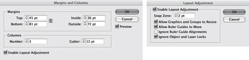
• To adjust the text and picture frames (and not just the column guides) on your document pages, select Enable Layout Adjustment. You can set how Layout Adjustment behaves in the Layout Adjustment dialog box, also under the Layout menu.
• To change the columns for the left- and right-hand pages of a spread, select both page icons in the Pages panel; otherwise you’ll be changing just the left or the right page.
• You can change the margins and columns for a range of pages by selecting those pages in your Pages panel.
Figure 14.12 The Margins And Columns and Layout Adjustment dialog boxes. Select the Enable Layout Adjustment option in the Margins And Columns dialog box if you want the size and position of text and picture frames to conform to the new margin sizes.
Tip:
To change the page size of a document in progress, choose File > Document Setup.
Creating Columns of Fixed Width
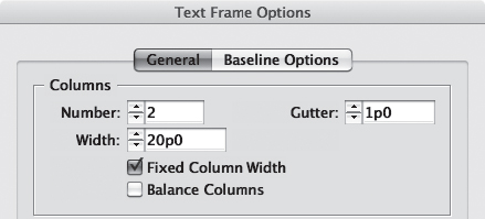
If you know how wide you want your columns to be, select a text frame and choose Object > Text Frame Options (Cmd+B/Ctrl+B) and specify a fixed column width for a text frame in the Text Frame Options dialog box. You can then use the total width of the text frame to determine the left and right page margins. For example, if you choose two columns with a width of 20 picas and a 1-pica gutter, the total width of the text frame will be 41 picas. From here, you can subtract the width of the text frame from the page width and allot this space to the left and right margins. This approach makes the margin width subservient to an appropriate column width, rather than the other way around.
Figure 14.13 Creating columns of fixed width.
Tip:
If you want columns of unequal widths, unlock the column guides (View > Grids And Guides > Lock Column Guides) and drag the column guides. You may find it helpful to use the Rectangle Frame Tool as a “measuring stick” by drawing in place the outline of the columns, then position the column guides according to these frames. When you’re happy with the result, delete the frames and relock the column guides.
Using Grids
A grid is an underlying structure of lines drawn up to suggest where the various elements of your document can be placed on the page. Essentially, they are visual aids to help you quickly and consistently arrange text and graphics. Though a well-designed grid will be invisible to the average reader, it nevertheless helps the reader make sense of the different elements in a document. Columns of text, headlines, photos, illustrations, captions, pull quotes, and other page elements are more easily tied together—or unified—by using a grid. Grids impose constraints on the designer but at the same time enhance creativity by suggesting a consistent structure. Because they take the guesswork out of where to place different elements on the page, grids significantly speed up workflow.
Beneath just about every well-designed document is a grid of some sort. Novels may use a simple one-column grid, but even this has to be carefully considered, because it determines the type area of the page as well as where the folios go. Newspapers and magazines with multiple columns and a mixture of type sizes—as well as photographs and illustrations—call for more complex grids. These layout schemes use a flexible number of columns and divide the page horizontally into rows as well as vertically. In addition, they employ a secondary layer of structure known as a baseline grid, the purpose of which is to keep the baselines of the type cross-aligned over columns and in relation to other elements.
Tip:
Swiss designer Josef Müller-Brockmann is the guru of the grid system. His book, Grid Systems in Graphic Design, though written before the digital era, remains a seminal work on the subject.
“The reduction of the number of visual elements used and their incorporation in a grid system creates a sense of compact planning, intelligibility, and clarity, and suggests orderliness in design. This orderliness lends added credibility to the information and induces confidence.” [Grid Systems in Graphic Design by Josef Müller-Brockmann. Sixth Edition 2008. Niggli (first published 1981).]
Things to Consider
• When working with multipage documents, establish grids on master pages.
• It’s possible, though rarely necessary, to have more than one baseline grid per document. InDesign allows individual text frames to have their own baseline grid.
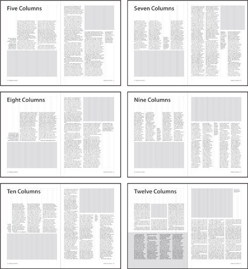
• Grids should be flexible. Grids based on a fixed number of columns can suffer from too much symmetry if text and graphics are confined to those columns throughout all the pages of the publication. Using more grid fields allows more flexibility. With multiple columns, a single text frame may span two, three, or even four of the vertical grids. For example, using a 12-column grid as an underlying structure is an easy way to introduce variety, because you can break the area into three and four columns, 12 being divisible by both. Another common approach is to use an uneven number of columns. For example, a five-column grid allows for two text frames each filling two column widths, with a single column for white space, photos, captions, and other material. You can mix things up by changing the position of this “floating” column.
• The grid is there as a starting point, not as an end in itself. Rigid adherence to the grid can make for a static layout. Having made the rules, you are free to break them when doing so results in a better-looking page.
Figure 14.14 Experimenting with different numbers of columns over different grid structures.
The Grid Toolkit
InDesign has a suite of tools that work together to help you set up and manage your grid.
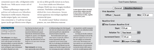
Grid Preferences
To show the baseline grid, choose View Options > Show Baseline Grid. Choose Preferences > Grids to determine the look, starting position, and increment of the baseline grid.
Note:
Objects and ruler guides are always in front of margins, column guides, and the baseline grid—even if you deselect Grids In Back.
Color: I like to change the color of my baseline grid. Light gray works well because it’s not too distracting.
Start and Relative To: These settings determine where the grid starts counting off from and whether that number is relative to the top margin or the top of the page. I prefer to start at 0, relative to the top margin. These settings show the baseline grid only within the type area, rather than across the whole page.
Increment Every: This should be the same as your body text leading. This value appears in points regardless of your chosen unit or measurement. Making the grid work will involve some rudimentary math, so it helps if you have an easy number to work with, like 12. You’ll use this leading value (or multiples of it) for the spacing of the elements on your page. Make sure you’re not using Auto Leading, which may give you fractional leading values. For example, if your body text is 11, your Auto Leading will be 13.2—not a number you want to be juggling with.
View Threshold: This setting determines the view size at which the baseline grid becomes visible when Show Baseline Grid is selected. If you’re working on a laptop, you may wish to make this number less than the default 75 percent.
Grids In Back: When this option is selected, the baseline grid (but not ruler guides) will be behind all other objects.
Align To: Your baseline grid doesn’t count for much until you align text to it. On a local level, you can click the icons on the Control Panel; at the paragraph style level, choose Align To from the Indents And Spacing options. For text with different leading increments such as captions or callouts, where aligning all lines to the baseline grid would prove too constraining, you can opt to align the first line only. The first line of the paragraph will be on the grid; thereafter the text will be controlled by its leading value.
Note:
Distinct from the baseline grid, the document grid makes your page and pasteboard look like graph paper. While this is useful when aligning elements in diagrams, it is not particularly helpful when creating layouts that combine text and images.
Figure 14.15 The Preferences dialog box, set to Grids.
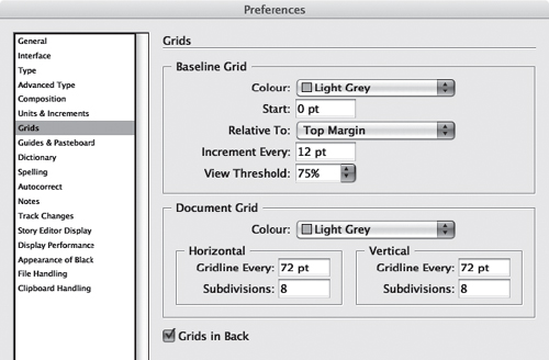
Figure 14.16 Text not aligned (left) and aligned (right) to the baseline grid.
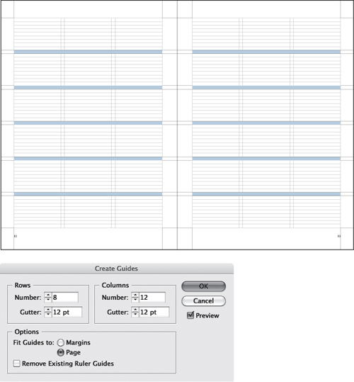
Create Guides: While the Margins And Columns dialog box is the place to create or adjust major column divisions that affect text flow, Create Guides can be used to make custom grids of rows and columns, as an alternative to laboriously dragging out multiple ruler guides. Create Guides is a guide-making machine—and, because it’s instantaneous, you can experiment with different configurations. To prevent the document from becoming cluttered with too many guides, consider putting your custom grid guides on their own dedicated layer, which you can show, hide, or lock as needed.
Ruler Guides: Choose Layout > Ruler Guides to change the color of any selected guide(s). This is useful for color-coding different parts of the grid. For example, superimposed on a 12-column grid, you can indicate three columns with one color and four columns with another.
The following options allow you to create a grid of objects:
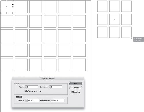
Step And Repeat: Choose Step And Repeat (Cmd+Option+U/Ctrl+Alt+U) and select Create Grid to generate a grid of objects from your selection, each successive copy offset a specified distance from the preceding one. Note that you need to factor in the size of the object when specifying the offsets. For example, if you want to copy a 72-point square 12 points to the right, then make the horizontal offset 84 points.
Gridify: This is a new feature in CS5 that allows you to expand a frame into a grid. While you’re drawing a frame, press the Up Arrow and Down Arrow keys to add or remove rows and the Right Arrow and Left Arrow keys to add or remove columns. This also works with a loaded Place cursor. To adjust the gutter spacing between the rows and columns, hold down Cmd/Ctrl while pressing the arrow keys. There is, however, no numeric feedback on the size of the gutter spacing, which makes it difficult to get the horizontal and vertical gutters the same.
Figure 14.17 Using Step And Repeat (left) and the Gridify feature (right) to create a grid of frames.
You can also duplicate objects into a grid. Hold down Option/Alt and begin dragging away from a selected frame. Once you’re moving, press the Up Arrow key or Down Arrow key to change the number of rows of objects and the Left Arrow key or Right Arrow key to change the number of columns of objects.
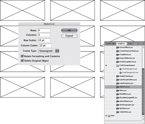
MakeGrid: Though to some extent superseded by the new Gridify, the MakeGrid script is still a quick and effective way of dividing a frame into a specified number of row and column grid fields. Choose Window > Utilities > Scripts to access the Scripts panel and then drill down through the folders, from Application to Samples to JavaScript. In the JavaScript folder you’ll see a list of scripts. With a frame selected, double-click MakeGrid.jsx, then choose the number of rows and columns and the gutter space between them.
Figure 14.18 The MakeGrid script is a simple way to divide a frame into rows and columns.
AddGuides: This script will add ruler guides to any selected object(s), which is useful if you’ve created a grid of objects that you’d like to convert to guides. Simply add the guides, then delete the original objects.
Tip:
Set your vertical ruler to a custom increment. Open the Preferences dialog box and select Units And Increments in the list on the left. Choose Custom from the pop-up menu next to Vertical and enter the grid increment as the amount. This makes the ticks on your ruler correspond to the lines of your grid.
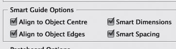
Smart Guides: These make it easy to snap items to objects on your page. As you drag or create an object, temporary green guides appear, indicating that the object is aligned with an edge of the page, the center of the page, or another page item. With Smart Guides on, you can create a grid of objects on a separate, locked layer and have those objects function as guides. Smart Guides are on by default (View > Grids And Guides > Smart Guides or Cmd+U/Ctrl+U). Their preferences can be set in Guides And Pasteboard preferences.
Figure 14.19 The AddGuides script puts guides around a selected object or an entire selection.
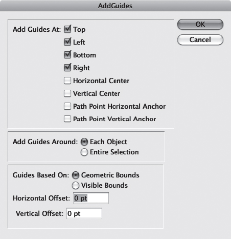
Figure 14.20 Smart Guides preferences.
Tip:
The Grid System (thegridsystem.org) is an excellent resource and learning center for all things related to designing with grids.
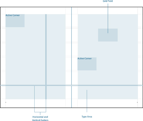
Figure 14.21 The elements of a custom page grid.
Tip:
In a perfect world, our clients would mark up their proofs electronically with Adobe Acrobat or, better still, use an InCopy workflow. Until that day, for clients who like to give you corrections over the phone, make a line scale on your master page to indicate line numbers. Put the line scale on its own layer. This way your client can refer to corrections by page and line number, which makes for quicker document editing. When the layout is finished, either delete the layer containing the line scale or make that layer nonprinting. To do that, double-click the layer name in the Layers panel to bring up the layer properties. Deselect the Print Layer option.
Adjusting the Height of the Type Area
For continuous reading, columns should be vertical (that is, taller than they are wide) and, when working with a baseline grid, their height should be an exact multiple of the text leading.
To make the column height a multiple of the baseline grid increment, do the following:
- In InDesign’s Grid preferences, select Grids In Back. Turn on the baseline grid (Cmd/Ctrl+Shift+’).
- Go to the master pages. The type area will almost certainly end with a partial grid increment. Zoom in to the bottom of the page and with the Rectangle Frame Tool draw a rectangle in this partial increment to measure its height. Make a note of the height of the rectangle (shown on the Control Panel) or highlight the value and copy it to the clipboard.
Figure 14.22 Adjusting the height of the type area to be an exact multiple of the baseline grid.
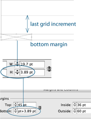
- Go to Layout > Margins And Columns. Insert your cursor after the value of the bottom margin and type + and then enter (or paste) the value of the partial increment to increase the size of the bottom margin by this amount.
- Click OK. The type area should now be an exact multiple of the baseline grid increment.
Figure 14.23 Add a nonprinting line scale to the master pages for easy referencing of editorial problems.
Layers
If you are familiar with using layers in either Adobe Photoshop or Adobe Illustrator, then InDesign’s layers will look very familiar. Layers determine the stacking order of objects on your page. In the example shown in Figure 14.24, elements on the Text layer display (and print) on top of any elements on the Pictures or Panels layers. Each individual layer also has a stacking order that you can control using the Object > Arrange menu. But layers trump Bring To Front and Send To Back. For instance, in the example shown, an object at the front of the Pictures layer is still beneath an object that is at the back of the Text layer. If there are no objects on a layer, you see through to the layer(s) beneath.
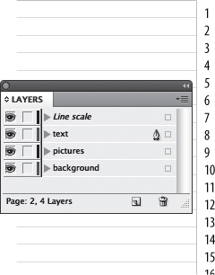
Figure 14.24 The Layers panel for a 16-page newsletter. The Text layer is expanded to show the items on that layer, all of them text frames with a preview of the first few words in each story. If you wish, you can rename any of these sublayers. To select an item using the Layers panel, simply click the square to the right of the layer or sublayer name. This is very useful for locating items on a particular layer rather than clicking layers on and off to see what’s where.
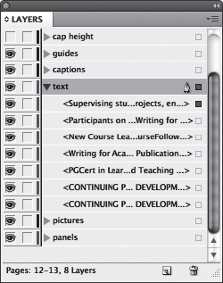
Layers allow you to view and edit specific kinds of content in your document without affecting other kinds of content, which significantly speeds up your workflow. For example, you can hide the Pictures layer when concentrating on the text and vice versa. Clicking on the small square to the right of the layer name selects all the content on that layer.
In CS5, layers can be twirled open to show their sublayers—like in Illustrator. This makes it easy to see and change the stacking order of elements (by dragging the sublayers up or down in the list) as well as select specific items by clicking the selection square to the right of the layer or sublayer name. This is especially useful if you are selecting one item of a group, or if you need to hide/show or lock/unlock individual objects.
Layers are also necessary to avoid printing problems that can arise when you use transparent elements in your layout. In InDesign, transparency means a drop shadow, feathering, a Photoshop image with an alpha channel, or any object with a blend mode other than Normal or an opacity of less than 100 percent. You can set the Panel Options (found in the Pages panel menu) to display a checkerboard icon when transparency is used on a page or spread. The icon serves as a reminder to troubleshoot these pages before sending them off to your printer. When a document is printed, any text in close proximity to a transparent element—for example, a text wrap around a layered Photoshop image—is in danger of being rasterized, and possibly ending up looking rather furry as a result.
To prevent this from happening, move all text objects (except those that use transparency effects) to the top layer of your document.
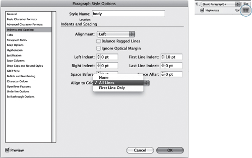
Aligning Text to the Grid
Once you’ve established a baseline grid, you can align text to it by choosing All Lines in the Align To Grid choices found under the Indents And Spacing section of the Paragraph Style Options menu. You can also apply this option locally by clicking the Align To Grid icon on the Control Panel.
Figure 14.25 Aligning text to the baseline grid through the Paragraph Style Options menu (left), or locally on the Control Panel (right).
A baseline grid sets the rhythm of your document. In documents that use a variety of type and leading sizes, it’s perfectly acceptable to go against that rhythm by coming off the grid with certain elements, such as headings and subheads, so long as the next passage of body text finds the beat again and is back on the grid, reestablishing the rhythm.
Tip:
When resizing and moving graphics, picture frames snap to the baseline grid, making it easier to position and crop your images to a leading increment. If you are using text wraps, set the text wrap offset to your leading increment.
Aligning to the grid always means the next grid increment, causing leading values to be rounded up, never down. For example, if a paragraph with a specified leading value of 13 points is aligned to a 12-point grid, its leading will become 24 points. When you align text to a grid, the grid increment always trumps the leading.
Tip:
Need a fresh start while creating your grid? To remove all ruler guides from a page or spread, Ctrl/right-click the ruler and choose Delete All Guides from the context menu.
This can present problems when you have paragraphs with different leading values that you don’t want rounded up to the next leading increment or where you like to apportion some of the paragraph spacing below, as well as above, the paragraph. In such instances, it’s preferable to take these paragraphs off the baseline grid—making sure, however, that the total paragraph spacing (leading+space before+space after) equals a multiple of the grid increment, so that the grid-aligned text that follows has a predictable amount of paragraph spacing before it. For example, if the grid is 12 points and you have subheads that are 14/14, you can take these paragraphs off the grid and divide the 10 points of space (24–14) between the space before and after.
Tip:
Grids, of course, are meant to serve only as guides in the document, but there may be times when you need to print the grid guides. In the General panel of the Print dialog box, select Print Visible Guides And Baseline Grids to make all visible guides (that is, those that are not hidden or on hidden layers) print.
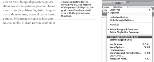
Only Align First Line To Grid (found in the Control Panel menu) is useful for captions and other supporting text that, because of size and leading values, cannot keep to the grid. This option ensures that the first lines of such paragraphs align with the text in adjacent columns. Subsequent lines follow the specified leading increment.
Figure 14.26 In the text on the left, the subhead is aligned to the grid, causing all the extra spacing to be added before the paragraph. On the right, the subhead is not aligned to the grid but the total paragraph spacing is a multiple of the baseline grid, allowing the extra spacing to be distributed between the space before and after.
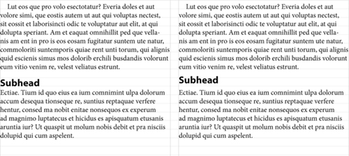
Figure 14.27 For supporting text with smaller leading values, choose Only Align First Line To Grid.
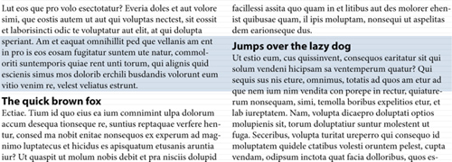
Accommodating Different Leading Values
The baseline grid needs to accommodate different type sizes and leading values. One way to make this possible is to set the leading values of the sidebars or supporting text so that they resolve with the baseline grid on every third or fourth line. For example, if the body text leading is 13.5 points and the sidebar leading is 9 points, the baselines will resolve on every second/third line (13.5 × 2 = 27, 9 × 3=27).
Here are some other body text/supporting text leading combinations that resolve themselves on every third or fourth line:
• 12.75/8.5 every third line
• 12/9 every fourth line
• 11/8.25 every fourth line
• 11.5/8.625 every fourth line
A different approach is to halve the baseline grid increment, effectively giving you the option of adding a half, rather than a whole, line space above subhead paragraphs. This will mean that the baselines will be out of register when there are an odd number of subheads in one or more columns; the baselines will come back into register when there is an even number of subheads in all columns. It will also mean double the number of baseline grid guides on the page, which may be dizzying to work with.
Figure 14.28 If the leading values of supporting text are carefully considered, the text will align with every third line of the main text block, as indicated by the heavier rules.
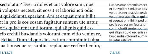
Figure 14.29 Halving the grid increment gives you the option of adding half-line spaces above subheads. The baselines will be out of register in adjacent columns (as indicated by the blue shading) until a subhead is introduced.
Aligning Images with the Top of the Text
When you align text frames to the top of picture frames, the gap between the text cap height and the top of the text frame results in optical misalignment. To fix this, draw a ruler guide from the horizontal ruler aligned to the cap height (or the x-height—whichever is more consistent) of the first line of type and align the top of the image frame to this guide. If the layout requires cross alignment of multiple picture frames with the text cap height, then create a cap height grid by following these steps:
- Draw a ruler guide to the cap height of the first line of type.
- Cut the guide to the clipboard (Cmd/Ctrl+X), and go to the master pages.
- Create a new layer for the cap height grid—having the grid visible all the time will create visual clutter, so you’ll want the option of only seeing it when necessary by turning on and off the layer visibility.
- Paste the guide (Cmd/Ctrl+V) from the clipboard.
- With the guide selected, choose Edit > Step And Repeat (Cmd+Option+U/Ctrl+Alt+U) and enter the number of lines in your type area (minus 1) for the Count and the baseline grid increment for the Vertical Offset.
- Finally, select all the guides on the layer: Ctrl/right-click the square to the right of the layer name and choose Layer Options. From there you can change the color of the guides to distinguish your alignment grid from the baseline grid.
Figure 14.30 The blue lines mark the cap height of the type, incremented at the same interval as the baseline grid in gray. The tops of picture frames are aligned to the cap height grid.
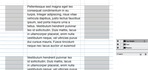
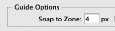
Figure 14.31 The Snap To Zone setting in the Guides And Pasteboard Preferences dialog box.
Text Frames with Different Grids
In addition to a document-wide baseline grid, you can use a separate baseline grid for each frame. This can be useful if you have sidebar material that flows in multiple columns and uses a different type size and leading value than the body text. Use a custom baseline grid when it’s more important that the supporting text aligns with itself, than side by side with the main text. Theoretically, every text frame can have its own baseline grid, but having too many different baseline grids in a document undermines the whole purpose of the grid: a document architecture based on consistent modular units.
Figure 14.32 The smaller text in the shaded box does not run side by side with the body text, so it is a good candidate for a custom baseline grid. The caption is on the main baseline, but aligned to the first line only.
Dividing the Page into Rows
To divide the page into a number of rows that each have an exact number of lines, you’ll need to make sure the height of the type area is an exact multiple of the baseline grid as described earlier in this chapter.
The row gutters should be the same value as the baseline grid increment. For six rows, subtract five gutter widths from the total height of the type area, for eight rows, subtract seven gutters, and so on. The number you are left with needs to be divisible by your grid increment. If it is not, you’ll either need to increase or decrease the top and bottom margins accordingly.
For example, a type area of 53 lines divides into six rows: 53 – 5 = 48/6 = 8 lines per row. A type area of 55 divides into seven rows: 55 – 6 = 49/7 = 7 lines per row, or into eight rows: 55 – 7 = 48/8 = six lines per row.
Tip:
To draw a custom guide from the horizontal ruler that straddles the left- and right-hand pages of the spread, hold down Cmd (Ctrl) as you draw the guide. You can also position guides precisely by selecting them and typing precise coordinates in the Control Panel. For vertical guides, specify their x coordinate; for horizontal guides, specify their y coordinate.
Figure 14.33 An A4 spread with a type area of 59 lines, divided into six rows of nine lines each (6 × 9 = 54 + 5 gutter spaces = 59). The row gutters are shaded in blue.
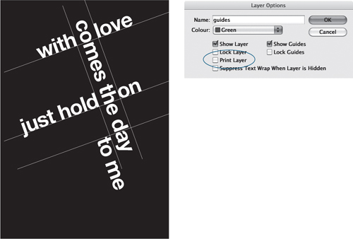
Creating Diagonal and Spherical Guides
While InDesign doesn’t let you draw objects and turn them into guides the way Illustrator does, there’s nothing to stop you from putting “guide objects” on a separate layer and making that layer nonprinting. Alternatively, you can select the objects and use the Output panel to make their attributes nonprinting.
Figure 14.34 Diagonal lines drawn with the Line Tool converted to guides by isolating them on a nonprinting layer.
Page Numbers and Running Heads
Page numbers, or folios, should be placed on a document’s master pages so that they show up on all the pages based on that master page. Although folios are placed outside the type area, they must relate to it. Their type size will typically be same as the body text, and in terms of position, the practical options are either at the top or the bottom of the page in the outside margins. Folios typically work best in the outside margin where they can be easily seen by the reader, though centered folios are common in book design and are a legitimate choice. Folios in the inner margin, however, make it hard to flip through the book to find a specific page, and are consequently of little use.
The page number may be accompanied by information like the name of the magazine and month of publication or the chapter title, separated from the number by an em space or en space. The left and right pages of a spread typically mirror each other so that the page number is the outermost element.
Tip:
Press Cmd+Shift+M (Ctrl+Shift+M) for an em space and Cmd+Shift+N (Ctrl+Shift+N) for an en space.
Figure 14.35 Inserting a page number. On master pages these will appear as the prefix of the master page: A, B, C, etc.; on document pages they will reflect the current page number.
Creating Mirrored Folios
- On the left-hand master page, use the Type Tool to draw a text frame below the bottom margin to the full width of the type area. You may find it helpful to first draw guides that correspond to the outside and inside margins, and then draw the text frame from guide to guide.
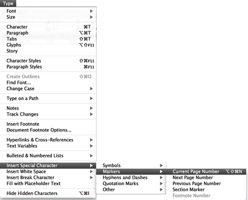
- Select Type > Insert Special Character > Markers > Current Page Number or press Cmd+Option+Shift+N (Ctrl+Alt+Shift+N) to insert the special character for page number and any folio information (for example, publication name), then apply character formats as appropriate.
- Set the alignment to Align Away From Spine, then make a paragraph style for the folio.
- To position the folio a precise distance from the bottom margin, first move its text frame up so that the top of the frame touches the bottom margin, then insert your cursor into the y value for the frame on the Control Panel and add the increment of the baseline grid after the existing value to move the folio text frame down by one line space.
- Zoom out to Fit Spread In Window view by pressing Cmd+Option+0 (Ctrl+Alt+0), then switch to the Selection Tool and duplicate the text frame to the right-hand master page by holding down Option/ Alt+Shift as you drag—the Shift key constrains the movement to the horizontal plane only.
- The folio will be positioned in the outside margin due to its Align Away From Spine alignment, but you’ll still need to manually adjust the order of the text using Cut and Paste.
Running Heads
The content of running heads (headers) varies between publishing houses, but it’s common to put the author’s name at the top top of the left-hand (verso) pages and the title of the book or chapter on the right-hand (recto) pages. This may be useful for short story collections or anthologies, which have multiple authors, but is unnecessary in a work by a single author. After all, how many times do you need to be reminded of the author’s name or the name of the book you’re reading?
In a work using running heads at the top of the page, it is common to position the folio at the bottom of the page on chapter heading pages where a running head at the top of the page would interfere with the type treatment of the chapter heading. In such instances, it’s worth making a separate master page for the chapter opening pages.
For books divided into chapters or sections, the running head may contain the name of the chapter or section number. It’s easy to add a text variable to a master page to achieve this:
- On either the left- or right-hand master page, create a text frame that is the width of the type area and position it at least one line space above the top margin. Choose Type > Text Variables > Define to set up the conditions of the text variable.
- Choose Running Header as the type of variable, and click Edit to define its options (see Figure 14.36).
- Choose the appropriate predefined style sheets used in the document to apply to the text for the header.
Figure 14.36 Defining a Running Header text variable.
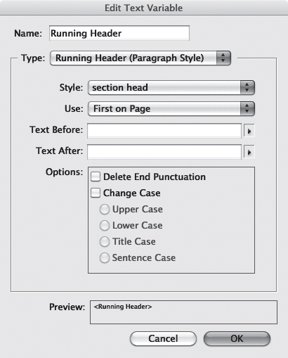
- Click OK, then click Insert to insert the text variable into the text frame. While you’re on the master page the variable will read <Running Header> and will not reflect the applied styles. Style comes into play on the actual document pages. If necessary, duplicate the text frame to the facing master page. Now, on the document pages the text variable will reflect the chapter or section head of the first (or last) match of the paragraph style specified in the previous step.
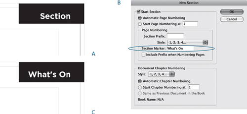
Section Markers
If you’re working with long documents that are divided into different sections, section markers can help simplify the project by cutting down on the number of master pages or the number of documents needed. Section markers can be used to mark the transitions between departments in a magazine or parts of a book—wherever a document is made up of distinctly different sections. Each section can have its own numbering scheme—Arabic, roman numeral, or abc. Section Markers can be formatted just as you would any piece of text.
To insert a section marker:
- Create a text frame for your folio on a master page.
- Ctrl/right-click and choose Insert Special Character > Markers > Section Marker from the context menu. The word Section will be inserted into your type.
- Format the section marker the way you want it to look.
- To “activate” the section marker on a document page, select the page where you want the section to begin in the Pages panel and choose Numbering And Section Options from the Pages panel menu. Type the section name into the Section Marker field and click OK. This section marker will now appear on all pages based on the master page until another section is defined.
Figure 14.37 A section marker is inserted on the master page (A), then defined on the relevant document page (B). This will remain “on” until a new section is defined (C).