
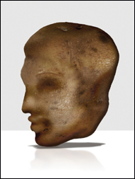
These chapter intros are all named after either song titles, movies, or TV shows, and this chapter is named after the song “Miracle Photo,” by a band called Ruth (which is an all-guy band, which is what makes the name cool, right? Because if it was an all-guy band and they named it Mike, it would sound totally uncool, unless of course, no one in the band was named Mike, which would then make the name cool again. Now, if they were named Mike and really wanted to take it up a notch, they’d have to concoct a story about how their first agent was named Mike, but then he was killed in a freak combine accident, or that Mike was the club owner of the first paid gig they ever played as a band, but then he was killed in a freak combine accident). Anyway, when I first saw the name of their song “Miracle Photo,” it reminded me of those stories you hear on the news where a farmer out in the Midwest finds a potato in the shape of Elvis’s head, and people come from hundreds of miles around to see it because they feel it’s some sort of message from beyond, like Elvis is trying to contact us through starch. You might think I’m crazy, but I believe that’s exactly what these bizarre discoveries are, which are too eerily coincidental to be anything but authentic communications from beyond the grave, and in this particular situation, I think the message is clear—stay away from combines.


This desaturated look is one of the most popular looks out there right now in high-end portrait photography, and you also see it used pretty often in automotive shots, or any type of photo where you want a really dark and dramatic sky. The challenge in adding this effect is with your subject’s skin tone—sometimes it looks great, and sometimes it makes your subjects look washed out, but you won’t know until you see the final image. In this project, you’ll learn what to do if you run into the latter.
Open the image you want to apply the effect to and then press Command-J (PC: Ctrl-J) to duplicate your Background layer. Press that keyboard shortcut again to duplicate that layer one more time (so you have your background and two copies above it, as seen here).
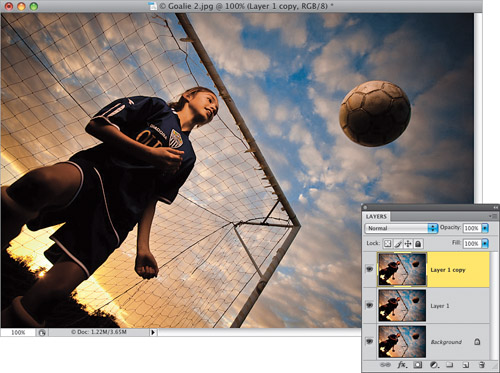
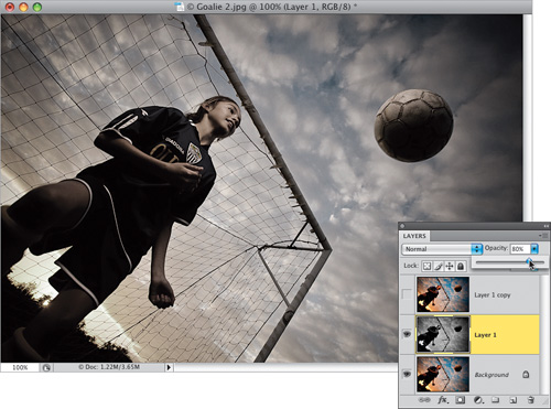
Go to the Layers panel and hide the top layer from view by clicking on the Eye icon to the left of the layer’s thumbnail. Click on the middle layer (shown highlighted here) and then press Command-Shift-U (PC: Ctrl-Shift-U) to remove the color from this layer. Now, go up to the Opacity slider and lower the Opacity to 80% (as shown here) to let just a tiny bit of the color come back into this layer.
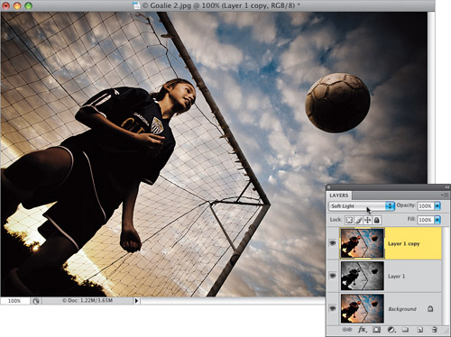
Make the top layer visible again by clicking where the Eye icon used to be, then click on this top layer to make it active. Change the layer blend mode of this top layer from Normal to Soft Light (as shown here), which adds more contrast to the image, and brings back more of the color. Now, you could just flatten the image and be done right at this point, and a lot of people will do just that, because they like how the desaturated skin tone looks. Generally, I like to go another step or two to bring back most, but not all, of the original fleshtone skin colors. So, if you want to learn how to do that (it’s easy), then go on to the next step.
Press Command-Option-Shift-E (PC: Ctrl-Alt-Shift-E) to create a new layer at the top of the layer stack that is a flattened version of your image, and then get the History Brush tool (Y) from the Toolbox. I always think of the History Brush as “undo on a brush,” and if you started painting over your entire image with it, it would return it to how it looked when you first opened it. We’re going to use this brush (in the next step) to bring back the original skin tone of our soccer player, and the original purple and yellow colors in her uniform.
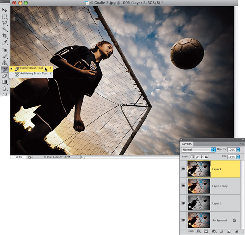
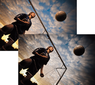
From the Brush Picker in the Options Bar, choose a medium-sized soft-edged brush, then take the History Brush and start painting over the soccer player. Make sure you paint over her uniform, as well (as shown here). When you’re done, the original skin tone and uniform colors are back, but now, with the rest of the colors desaturated, her skin color looks a little too vibrant. There are two ways to fix this: The first is to undo your painting with the History Brush (press Command-Z [PC: Ctrl-Z] if you only made one continuous brush stroke or Command-Option-Z [PC: Ctrl-Alt-Z] if you made multiple brush strokes, or just click on your merged layer and drag it onto the Trash icon at the bottom of the Layers panel and then create a new one). Then lower the History Brush’s Opacity (up in the Options Bar) to around 60%, paint over her again, and now you’ll only bring back 60% of her original skin tone. Here’s a little trick you might want to consider: paint over her skin tones at 60%, then go back up to the Options Bar, raise the Opacity back up to 100%, then paint over her uniform, which will bring back those original vibrant colors. It’s a little more work, but I think you’ll like the result.
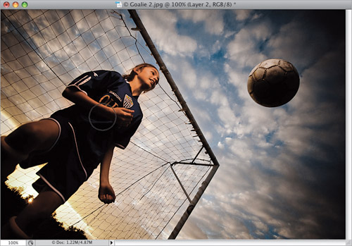
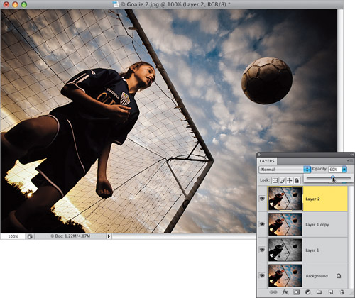
The second method is to paint over all of her with the History Brush at its default opacity of 100%, then just lower the Opacity of this layer to 60%, giving you the look you see here, which I think looks very natural with the desaturated surroundings. I wanted to give you both techniques and let you see which one you like the best for the particular photo you’re working on.
Here’s a before/after using the second History Brush method. By the way, the reason her skin tone looks yellowish is because I put a gel over my off-camera flash to mimic the setting sun (I used a half-cut of CTO [color temperature orange] gel taped over the front of the flash).
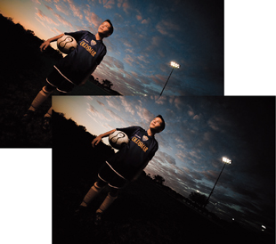
Here’s a shot of the goalie’s brother taken at the same shoot, but a little later, as the sun was going down. I used the exact same technique on him as I did with her (the second method).
I actually saw this layout in a Snickers print ad for a contest promotion where you could win Super Bowl tickets. Anyway, although the ad featured players from the two teams in the Super Bowl that year, I thought this same type of sports-look layout would work great for other groups of people and other topics (like business managers, or delivery people, or “employee of the month” layouts, etc.). So, we’re going to build that same look here from scratch, but we’re going to apply it in a different way.
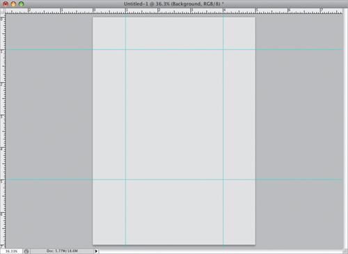
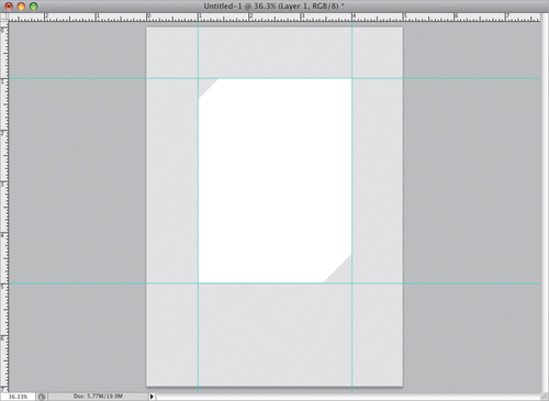
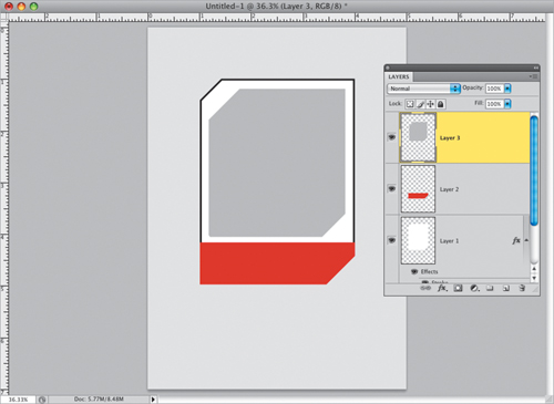
Start by creating a new document that’s 5×7″ at a resolution of 240 ppi. Click on your Foreground color swatch and choose a light gray, then fill your Background layer with this light gray by pressing Option-Delete (PC: Alt-Backspace). The graphic we’re going to build in this document is 3 inches wide by 4 inches deep, and it will make your job a lot easier if you drag out some guides now. So, press Command-R (PC: Ctrl-R) to make your Rulers visible, then go up to the top ruler, click-and-hold on the ruler, drag down a horizontal guide, and place it 1″ from the top. Then drag down another guide and place it at the 5″ mark. Now drag a vertical guide from the left ruler out to the 1″ mark, and then drag another to the 4″ mark (so you have a tall rectangle made up of guides like you see here).
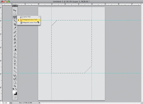
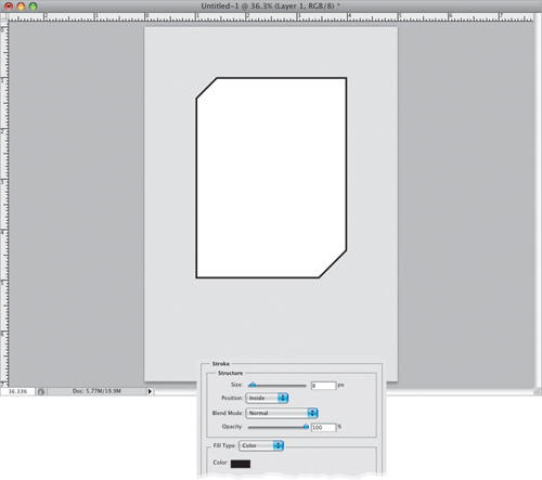
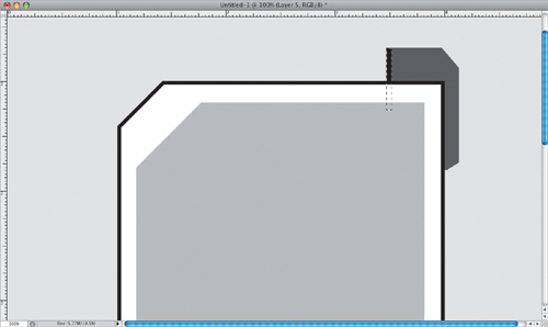
Get the Polygonal Lasso tool (L; shown here), press-and-hold the Shift key, then use the tool to draw the shape you see here. By pressing-and-holding the Shift key, not only will it draw straight selections, but it will automatically give you exact 45° angles in the corners. If you make a mistake, just press the Delete (PC: Backspace) key and it will undo your last click of the Polygonal Lasso tool. When you get back to the point where you started, just click and it will complete the shape.
Now go to the Layers panel and click on the Create a New Layer icon at the bottom of the panel to create a new blank layer. Press the letter D, then X on your keyboard to set your Foreground color to white, fill your selection with this white Foreground color (as seen here) using the same shortcut we used in Step One to fill the layer, and then press Command-D (PC: Ctrl-D) to Deselect (since we don’t need the selection anymore). By the way—the reason we made the background light gray in Step One was so you could see the white shape stand out at this point. If not, it would be pretty tough to see a white-filled shape on a white background.
You don’t need the guides any longer (after all, your shape is in place), so go under the View menu and choose Clear Guides. Now you’re going to add a stroke around the shape using a layer style. Click on the Add a Layer Style icon at the bottom of the Layers panel, and choose Stroke from the pop-up menu. When the Layer Style dialog appears, set the stroke’s Size to 8 px, set the Position to Inside (which makes the corners nice and sharp. If you leave it set to Outside, then the corners start to become rounded), then change the Color to black (all of this is shown here), and click OK to apply this black stroke around your white shape (as seen here).
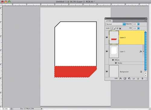
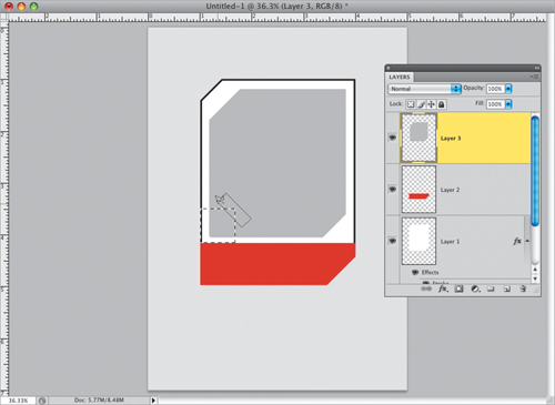
Press-and-hold the Command (PC: Ctrl) key, then go to the Layers panel and click once directly on the top layer’s thumbnail to put a selection around your shape. Now, you’ll need to deselect just the top three-quarters of your selected shape, and to do that you press-and-hold the Option (PC: Alt) key, then get the Rectangular Marquee tool (M), and click-and-drag out a square selection around the top three-quarters of your selected shape (as shown here).

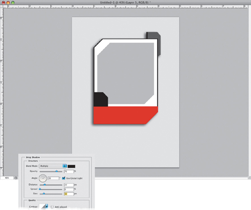
Once you release the mouse button, it deselects the top three-quarters of your shape, leaving just the bottom quarter still selected (you can see it still selected here). Create another new blank layer, set your Foreground color to red, then fill that bottom-quarter selected area with red, as seen here. Now, you can deselect that bottom quarter.
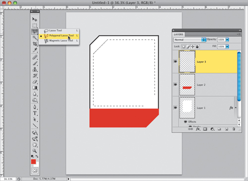
Next, add one more new blank layer, get the Polygonal Lasso tool again, and now you’re going to draw the shape that holds your photo. It’s similar to the shape you drew earlier, but you’re going to draw this shape inside your existing shape. So, press-and-hold the Shift key and use the Polygonal Lasso tool to draw the selection shape you see here (you don’t really need to pull out guides to do this, but if you feel you need to, go for it).
Once your selection is in place, click on your Foreground color swatch and set a light gray as your Foreground color, then fill your new selection shape with this light gray. Now, you can deselect.
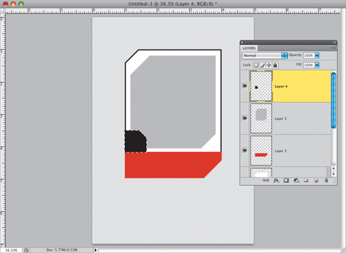
We have two more smaller shapes to draw before our basic cell is complete. Get the Rectangular Marquee tool again, press-and-hold the Shift key (so when you use the tool it makes perfectly square selections), then click-and-drag out a square selection at the bottom-left corner of the white area of your shape (as shown here).

Now you need to cut off the top-right corner of your selection, and we’re going to do this pretty much like how we removed the top of the main shape back in Step Five. Get the Polygonal Lasso tool, press-and-hold the Option (PC: Alt) key, so you’re subtracting from the current selection, and then draw a line over the top-right corner of your square selection. You’ll need to make a complete selection now, so just draw a little rectangle (like the one shown here), and when it’s complete, it deletes the top-right corner, but leaves the rest of the selection in place.
Once your selection is in place, create another new blank layer, then press D to set black as your Foreground color, and fill your selected area with black, as shown here. Now you can deselect. For our second (and final) shape, you’ll need to go to the Layers panel, click on the Background layer, and create a new blank layer (which gives you a blank layer right below your original white shape).
Take the Polygonal Lasso tool, press-and-hold the Shift key, and draw the shape you see here, which is another version of the two other shapes you’ve already drawn. Once the shape is in place, set your Foreground color to a dark gray, then fill your selected shape with your Foreground color, as seen here. Go ahead and deselect.
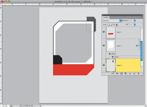
Now for a little special touch. Get the Rectangular Marquee tool and make a really thin rectangular selection (like the one you see here, where I zoomed way in so you could see it), then fill it with black, and deselect. I know, this is an awfully little thing, but it’s all about the little things, right? Next, you’ll need to make this dark gray layer and the white main shape layer into just one single layer. To do that, go to the Layers panel, click on the white shape layer, then press Command-E (PC: Ctrl-E), which merges this white layer with the layer directly beneath it (the dark gray shape layer).
You’re going to add a drop shadow to this newly merged layer, so click on the Add a Layer Style icon at the bottom of the Layers panel and choose Drop Shadow from the pop-up menu. When the Layer Style dialog appears, set the Angle to 39°, the Distance to 22 px, and the Size to 32 px (as seen here), then click OK to give you a soft drop shadow, set down and to the left, like you see here.
In this step, you’re going to put a photo inside the gray shape you created inside the white shape. In the Layers panel, click on the gray shape layer, then press-and-hold the Command (PC: Ctrl) key and click on the layer’s thumbnail to put a selection around the gray shape (as shown here). Now, open the photo you want inside the gray shape. To make it easy to select the subject, he was shot on a white seamless paper background (remember, you can download this same image to follow along with—the Web address for the book’s downloads page is listed in the book’s intro). Click the Magic Wand tool (press Shift-W to get it) once on the background to select it (you may have to Shift-click in one of the top corners to get the entire background selected), then press Command-Shift-I (PC: Ctrl-Shift-I) to Inverse the selection, so that instead of having the background selected, you have the subject selected. Press Command-C (PC: Ctrl-C) to Copy your subject into memory.
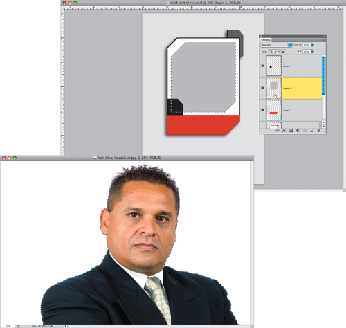
Switch back to the document we created, go under the Edit menu, and choose Paste Into to paste the photo you just copied into memory into your selected area. When your photo appears pasted inside that selection, you may need to use Free Transform to scale it to fit inside the box, and reposition it. So, press Command-T (PC: Ctrl-T) to bring up Free Transform, press-and-hold the Shift key to keep your resizing proportional, then grab a corner point and drag inward to scale the photo down to size or outward to scale it up. If you can’t reach the Free Transform handles, press Command-0 (zero; PC: Ctrl-0) and the image window will resize so you can reach the handles. When you’re done, just press Return (PC: Enter) to lock in your transformation.
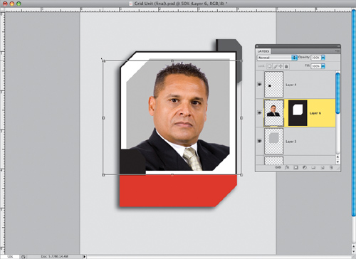
It’s time to add some text (like the person’s name, a fictitious player number, and a two-letter title, as if they had a football position, like LB for Linebacker or QB for Quarterback, but in a corporate version of this look, it could be VP or CEO, GM, etc.), so grab the Horizontal Type tool (T) and make some up. The font I used here is Rockwell, but you can use any font you’d like (if you want Rockwell, I found it at www.fonts.com for $29). Once your type is in place, you’ll need to do one thing that will help with the next step: Scroll down to the layer where your photo was pasted in. You’ll see a thumbnail of the photo and, to the right of it, a black layer mask thumbnail. You need to click once directly between these two thumbnails, and a Link icon will appear, linking the mask with the photo (as shown here). You’ll need to do this now, so you can resize this entire image later.
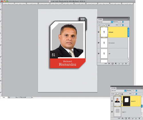
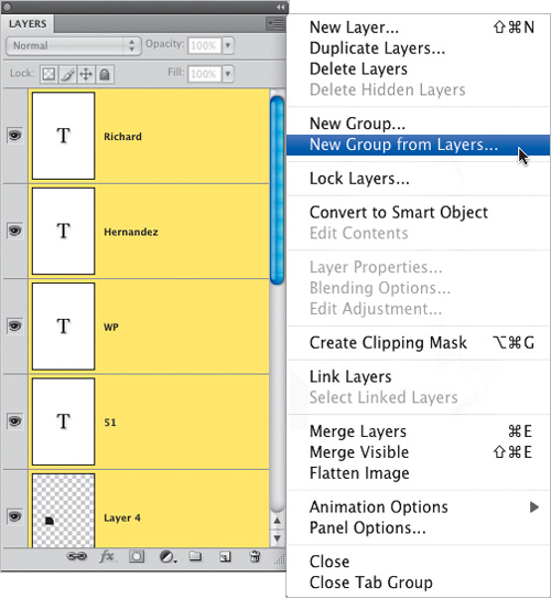
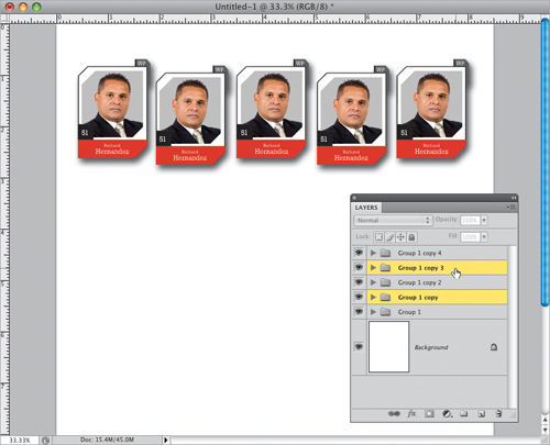
Press-and-hold the Command (PC: Ctrl) key, and in the Layers panel, click on every layer (except the Background layer) to select them (your selected layers will appear highlighted). Then, from the flyout menu at the top right of the Layers panel, choose New Group from Layers (as shown here). This puts all your layers into one folder (called a Group in layer-speak), which makes working with all these layers much easier (really, that’s why you’d make a group in the first place—because once you start to have a lot of layers, things can become really cluttered and confusing. Imagine how crazy things would be on your computer if you didn’t use folders to organize things, eh?).
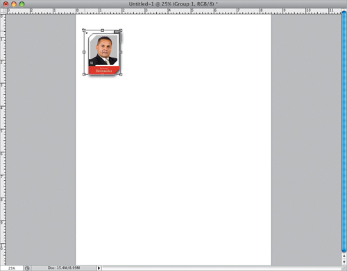
Open a new document in the size you want your final document to be (in this case, I created an 8.5×11″ letter-sized document at a resolution of 240 ppi). Go back to your original document and, in the Layers panel, click on the layer named “Group 1” and drag-and-drop it right onto your new document. Now you can resize the group of layers as if they were just one layer. Bring up Free Transform, press-and-hold the Shift key (to keep your resizing proportional), grab any corner point, and drag inward to shrink the size of the group (as shown here). Make it small enough so you can make a row of five of them across, then lock in your resizing.
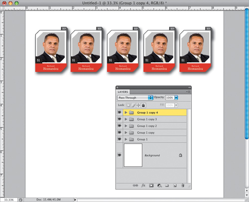
Get the Move tool (V), press-and-hold Option-Shift (PC: Alt-Shift), then click directly on the group itself out in the image area (not in the Layers panel). Now, drag to the right, and the entire group will be duplicated (you’re basically dragging a copy. That’s what holding the Option key does—when you hold it, it makes a copy [duplicate] of whatever you’re dragging with the Move tool. The reason you’re holding the Shift key is to make sure your duplicate stays perfectly aligned with the original). Drag yourself out four copies, until you have five across like you see here (if you look in the Layers panel, you’ll see you now have five groups).
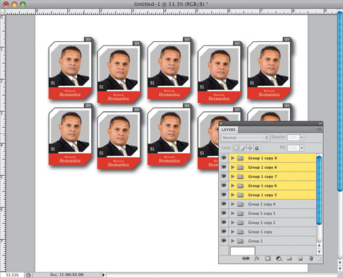
Make sure you still have the Move tool, then press-and-hold the Command (PC: Ctrl) key, go to the Layers panel, and click on the second and fourth layer groups from the top (as shown here). Press the Down Arrow key on your keyboard 10 times to move those two selected groups down a little from the rest (as seen here).
Now select all five groups in the Layers panel, then press-and-hold Option-Shift (PC: Alt-Shift), click on any one of the five groups in the image area, and drag straight downward to duplicate all five groups, creating a second row of five (as seen here). Note: If you’re going to be photographing the people on your team, to get a more realistic “football” look, don’t have them angle their shoulders (like a traditional portrait). Instead, have them pose more like a standard football player shot, with their shoulders flat, facing directly toward the camera.
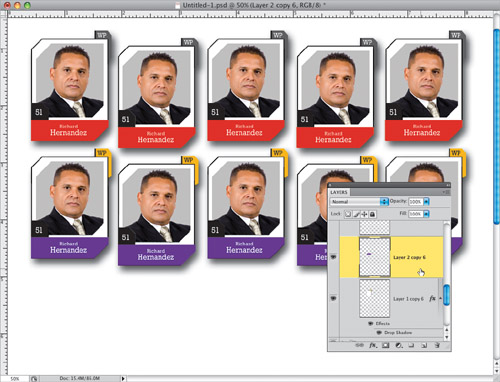
You can change the colors of the bottom row if you’d like, and you do that by going to one of the duplicate groups in the Layers panel, expanding the group by clicking on the little right-facing arrow beside the folder, and then scrolling down to the layer with the red bar. Choose a new Foreground color, and fill this bar with your new color (purple, in this case) by pressing Option-Shift-Delete (PC: Alt-Shift-Back space). Now, in the Layers panel, click on the white shape layer, then take the Magic Wand tool and click it on the dark gray area at the top right to select that area. Choose a contrasting Foreground color (I chose yellow), and fill your selected area with this new Foreground color. Finally, get the Horizontal Type tool, click on the layer for the type that appears on that upper tab, then highlight it and change the text color from white to black (click on the color swatch up in the Options Bar). Repeat this process for the other four cells on the bottom row.
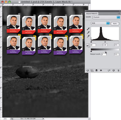
Now you’re going to add a background photo. In this case, we’re going to use a football-on-the-field shot, in keeping with the theme (you can download this same background shot, if you’d like, from this book’s downloads page, listed in the book’s intro). Once you open the background photo, get the Move tool, and drag-and-drop that background photo onto your main document. Then, in the Layers panel, click-and-drag it so it appears just above the Background layer (that way it appears behind all the cells you created earlier).
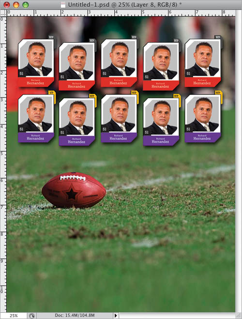
You’re going to make an adjustment to that background photo, so it doesn’t distract or compete with the cells you created. Start by removing all the color from the photo by pressing Command-Shift-U (PC: Ctrl-Shift-U), which is the shortcut for Desaturate. Next, go to the Adjust ments panel and click on the Levels icon (the second icon from the left in the top row). When the Levels options appear, drag the bottom-right Output Levels slider to the left (as shown here) to darken the overall image, which helps to make your cells stand out.
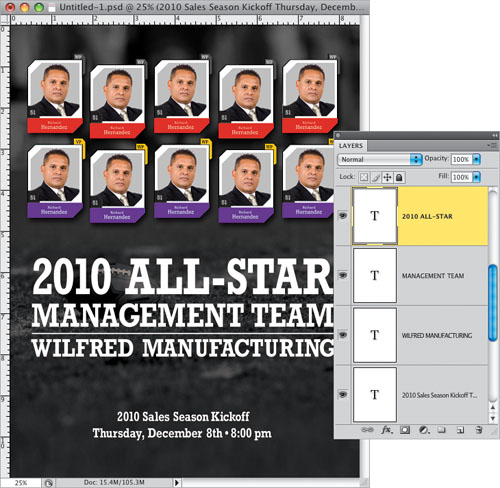
We’re almost done. Now, you can add any text you’d like below the whole cell area. Here, I added a few lines of text with the Horizontal Type tool, using the same font that I used for the “players” names in each cell. The key to doing the stacked lines of type, and making it look good, is to not add space between the letters to make each line fit—instead you increase (or decrease) the size of the font until it’s a perfect fit. It also helps to pull out vertical guides (from the rulers) before you start sizing your text—that makes it much easier to align each line of type. After the type is in place, get the Line tool (it’s one of the Shape tools—press Shift-U until you have it), click on the Shape Layers icon at the left end of the Options Bar, and then set the Weight (also in the Options Bar) to 8 px. Make sure your Foreground color is set to white, then press-and-hold the Shift key, and draw a line separating the company name from the “MANAGEMENT TEAM” line.
Now that you’ve got the whole thing designed, it’s time to swap out our original team member placeholder photo with the real members of your management team (or tag football league, or employees of the month, etc.). To do that, switch to the Move tool, press-and-hold the Command (PC: Ctrl) key and, right within your image, click once on the cell you want to edit, and that layer group will become selected in the Layers panel (that’s an awfully handy shortcut). Now, expand that layer group, scroll down to the photo layer and drag it onto the Trash icon at the bottom of the Layers panel to delete it. Click on the gray shape layer to make it the active layer, then Command-click (PC: Ctrl-click) right on the layer’s thumbnail to put a selection around that gray shape.
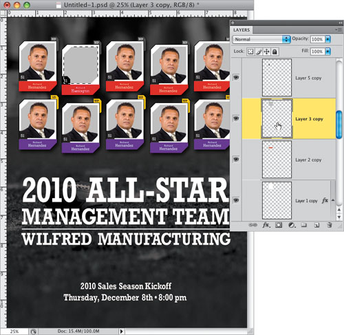
We’re going to do what we did back in Steps 15–16, which is open the photo you want to appear in this next cell, put a selection around your subject, copy that selection into memory, then return to this main document, and choose Paste Into from the Edit menu. Then you’ll use Free Transform to resize your subject to fit properly in the cell, and you’ll go to the Layers panel to update the Type layers with your subject’s name, player number, and two-or-three letter position. You’ll do this for each of the remaining cells (hey, I didn’t say this was a quick technique, but the good news is that as long as you save a copy with the layers intact, you can use this as a template for a quick update in the future).

I saw this technique in a logo for the company that created the video game Project Gotham Racing, and what caught my eye from the standard Web reflection look is that the reflection actually came from a photograph, and that really made it stand out from the rest. Although that reflection part is fairly simple, there’s a bit of setup to get to the part of the logo where the reflection is added, so we get to learn an awful lot along the way (which is really what this book is all about, eh?).
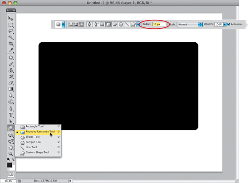
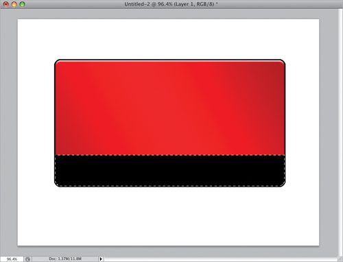
Create a new document by going under the File menu and choosing New. In the New dialog, choose Web from the Preset pop-up menu, under Size, choose 800×600, and click OK. Get the Rounded Rectangle tool from the Toolbox (shown here in the Shape tools, or press Shift-U until you have it), then go up to the Options Bar and click on the third icon from the left (so your shape is just made up of regular pixels, rather than being a Shape layer [the default] or a path [which is what the second icon gives you]). Also, you’ll need to make the corners a little more rounded, so increase the Radius amount (shown circled in red here) to 15 pixels (the default setting is 10—the higher the number, the more rounded the corners become). Now, click on the Create a New Layer icon at the bottom of the Layers panel, press D to set black as your Foreground color, then click-and-drag out a wide rectangular shape, like the one you see here.
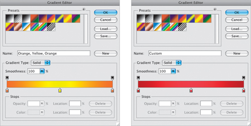
Now you’re going to create a gradient that goes from dark red to bright red to dark red again. The easiest way to do this is to edit an existing three-color gradient. Get the Gradient tool (G), then go up to the Options Bar and click on the gradient thumbnail to bring up the Gradient Editor. Click on the eighth gradient in the top row (Orange, Yellow, Orange). To change the color of the gradient, just double-click on the little color stops under the gradient ramp in the middle of the dialog and the Color Picker appears, where you can choose your colors (so choose dark red on both ends, and a bright red for the middle stop).
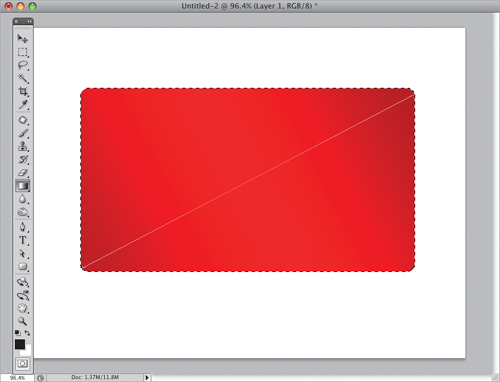
Click OK once your gradient colors are in place. Now go to the Layers panel, press-and-hold the Command (PC: Ctrl) key and click directly on the thumbnail of the layer with your shape to put a selection around your shape (seen here). Then take the Gradient tool and click-and-drag it diagonally from the bottom-left corner to the top-right corner of your selected shape to apply this gradient over your shape (as I did here). Press Command-D (PC: Ctrl-D) to Deselect.
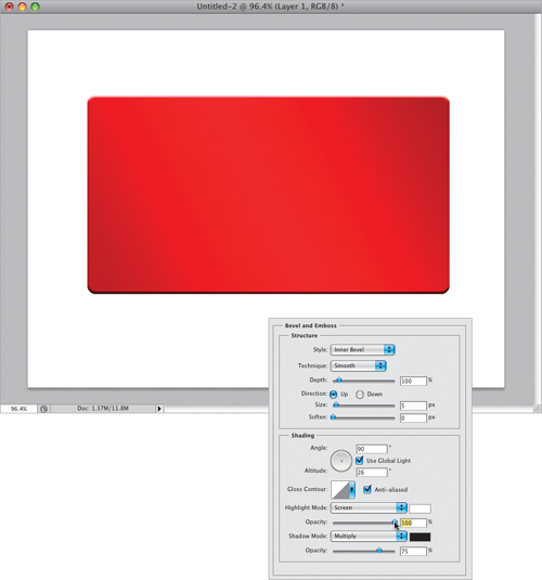
We need to add a slight bevel to the shape (mostly to get a highlight along the top of the shape), so click on the Add a Layer Style icon at the bottom of the Layers panel and choose Bevel and Emboss from the pop-up menu. When the Layer Style dialog appears, set the Depth to 100%. Then in the Shading section, set the Angle to 90° (so the highlights appear right across the top), the Altitude to 26°, then increase the Highlight Mode Opacity to 100% (as shown here) to really make that highlight bright.
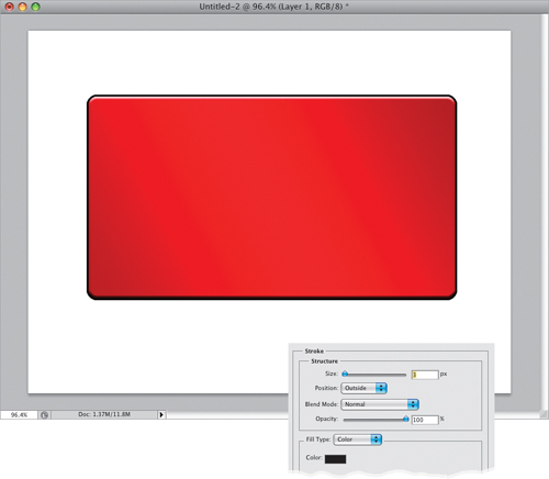
Now you’ll need to add a thin black stroke around the shape, so if you clicked OK, choose Stroke from the Add a Layer Style icon’s pop-up menu (or if you still have the Layer Style dialog open, you can just click on Stroke in the list of layer styles on the left). In the Stroke options, increase the Size to 3 px (you can leave all the rest of the settings at their default), and click OK to apply a black stroke around the shape (seen here). Note: If you previously changed your stroke color, click on the color swatch and choose black in the Color Picker.
Next, you’ll need to select the bottom quarter of the shape, and there’s a pretty cool trick for doing just that. Get the Rectangular Marquee tool (M) and draw a rectangular selection loosely around the bottom quarter of this shape (it will extend beyond the sides and bottom, but don’t worry—that’s what the trick is). Once your selection is in place, switch to the Move tool (V), then press the Up Arrow key on your keyboard one time and it will automatically snap to the edges of your shape (as seen here). I know—that’s a way cool tip. The reason it works is because your shape is on its own layer, and your selection has nowhere to go but to snap to the edges. Now, set your Foreground color to black, press Option-Delete (PC: Alt-Backspace) to fill this selection with black, then deselect.
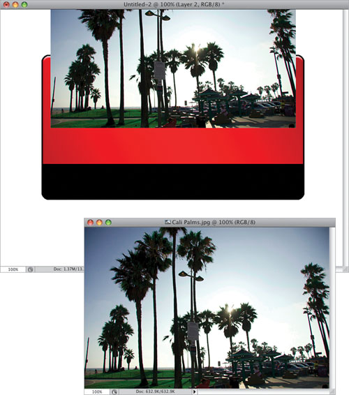
Open a photo of an outdoor scene (you can download the photo shown below from the book’s downloads page, mentioned in the intro of the book). With the Move tool, click on this photo and drag-and-drop it onto your main document, and position it like I have here—with the top of the photo extending off the top of the image area. Note: If you have Photoshop set up to use tabbed images, drag the image up to your red-and-black document’s tab, hover there until the red-and-black image appears, then drag down over the red-and-black image and drop the photo onto it. If you don’t have tabbed documents, but can’t see both images, go under the Window menu, under Arrange, and choose Cascade.
Click on the Create a New Layer icon at the bottom of the Layers panel to create a new blank layer, then get the Rounded Rectangle tool again, but this time drag out a wide, thin rectangle like the one you see here. Once you’ve drawn it, go to the Layers panel, press-and-hold the Command (PC: Ctrl) key, and click directly on this layer’s thumbnail to put a selection around your thin wide shape. Now that your selection is in place, you really don’t need that Shape layer any longer (you just needed the selection—not the shape), so you can drag that Shape layer onto the Trash icon at the bottom of the Layers panel to delete it.
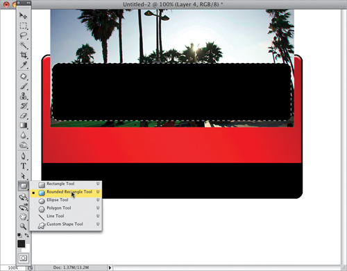
Since you deleted that Shape layer, you’re now back on the photo layer (and your selection is still in place), so press Command-Shift-I (PC: Ctrl-Shift-I) to Inverse your selection, so everything is selected except the photo inside that thin, wide rectangle. Press the Delete (PC: Backspace) key to delete all parts of the photo surrounding that rectangle (as seen here). Now, you can deselect.
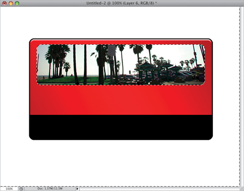
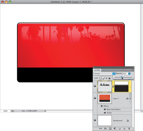
Next, you’ll have the bottom of the photo fade into the background, and to do that, click on the Add Layer Mask icon at the bottom of the Layers panel (it’s the third icon from the left, shown circled here in red). Now, get the Gradient tool, go up to the Options Bar and click on the down-facing arrow to the right of the gradient thumbnail to get the Gradient Picker, and choose the third gradient from the left in the top row (the Black, White gradient). Take the Gradient tool, click it just above the bottom of your photo, and drag upward to have your photo fade away at the bottom of the image (as seen here).
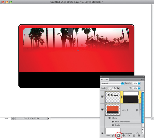
To really see the effect appear, you have two more simple changes to make: (1) go to the Layers panel and change the layer blend mode from Normal to Screen, which makes the photo lighter and somewhat see-through, and (2) lower the Opacity to 40%, where, at that point, it gets its reflective look (as seen here), almost like the reflection of the world outside on a window.
Now, click back on the red rectangle layer and choose Drop Shadow from the Add a Layer Style icon’s pop-up menu at the bottom of the Layers panel. Set the Angle to 48°, increase the Distance to 13, the Size to 21, and click OK to add a drop shadow to the lower left. Lastly, add some text, using the Horizontal Type tool (T), to finish things off (the text “CSR” is set in the font Satisfaction, which costs $15 from MyFonts.com, and the “Sports Fashion” text font is Eurostile Bold Extended).

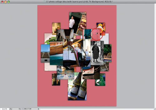
I saw this technique in an ad for HP printers, and although at first glance it looks like a bunch of photos thrown together, there actually is a layout and more organization than you might think. It starts with using the right number and type of photos, and then arranging them in a particular way. Here’s how it’s done:
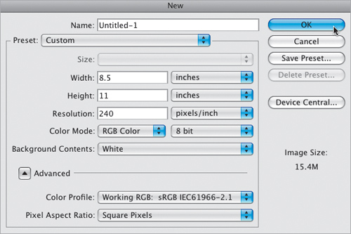
For this particular layout, you’ll need 17 photos, and ideally they should all relate to each other in some way (so they might all be vacation photos, or family photos, or photos of flowers, etc.). So, start by putting your 17 photos in a folder. Then go under Photoshop’s File menu and choose New. When the New dialog appears (seen here), choose a letter-sized page (8.5×11″) at whatever resolution you want to use (I usually print to a color inkjet printer, so I’m using 240 ppi as my resolution), then click OK to create a new blank document.
Pick the image you want as the main focal point of your collage, open it, and use the Move tool (V) to drag it into your blank document. Now press Command-T (PC: Ctrl-T) to bring up Free Transform, so we can scale the image down in size—just press-and-hold the Shift key, grab a corner point, and drag inward (as shown here) until the image is about the size you see here. Press Return (PC: Enter) to lock in your transformation. Note: If, after dragging it onto the page, your image is larger than the borders of the page, you won’t be able to reach the Free Transform handles. So, just press Command-0 (zero; PC: Ctrl-0), and the window will resize so you can reach all the handles.
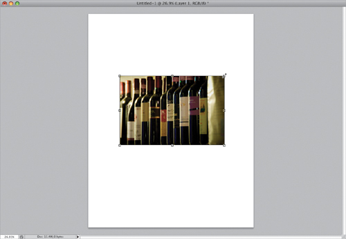
The center image needs to be perfectly square (rather than the standard rectangular shape of digital camera images), so get the Rectangular Marquee tool (M), press-and-hold the Shift key (which constrains your selection so it’s perfectly square), and drag out a square selection over the most important area of the photo (as shown here).
So, at this point you have a square selection in place, but we need to erase everything but that square selected area. To do that, press Command-Shift-I (PC: Ctrl-Shift-I), which is the keyboard shortcut for inversing your selection, so now everything except that square is selected. Then, press the Delete (PC: Backspace) key, and everything but that square part of the photo is deleted (as seen here). Now press Command-D (PC: Ctrl-D) to Deselect your selection.
You’re now going to drag four vertical photos into your layout, and use Free Transform to make them a bit smaller than your main image. Use the Move tool to position these with one on either side of the main image, and in the Layers panel, drag them below the main image (so they appear behind it), then back on your image, drag them so about one-third of the image is tucked behind that main image (as seen here). Place the other two vertical images above and below the main image, and leave a gap between each image and the main image (as shown here). Note: From now on, when you bring an image in, make sure you drag it below the main image in the Layers panel.
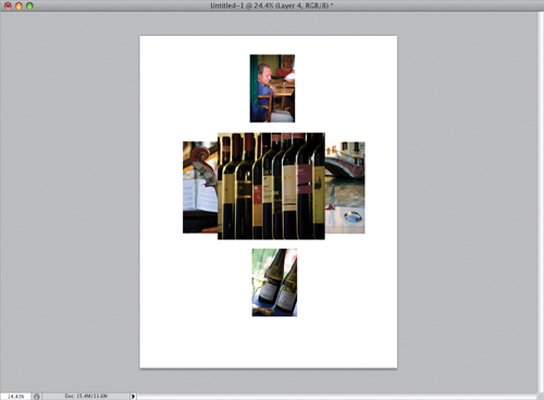
Now add four horizontal images, crop them so they’re square (using the same method you learned earlier), and position them in the four corners, as seen here. Again, be sure that these are stacked on lower layers, so all the photos we’ve imported so far appear behind the images already in place. If you have a photo that isn’t behind the others, just go to the Layers panel and drag it below.
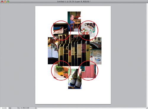
Add four more vertical photos (if they’re not vertical, you can crop them, or simply use the Rectangular Marquee tool to make a vertical selection and drag-and-drop the selection onto your document), and place them under the corners of the four square photos you added in the last step (as seen circled here). Then add two more vertical photos on either side (shown here inside the red boxes).
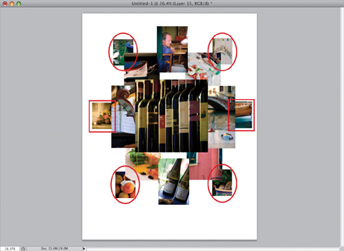
Here, we’re adding the last two photos (both vertical), and they go on the left and right sides at a very large size. You’re going to put them side-by-side, with a small gap between them. After I added these last two photos, I decided I didn’t like them where they were, so I used them to replace a couple of the smaller photos and added two new photos as the large ones. I added an extra capture below, with all the other layers hidden, so you can see how the new large photos are placed. Next, go to the Layers panel and click on the layer that has your main square center image (it should be the top layer in the stack of layers in the Layers panel, since it’s in front of everything else).
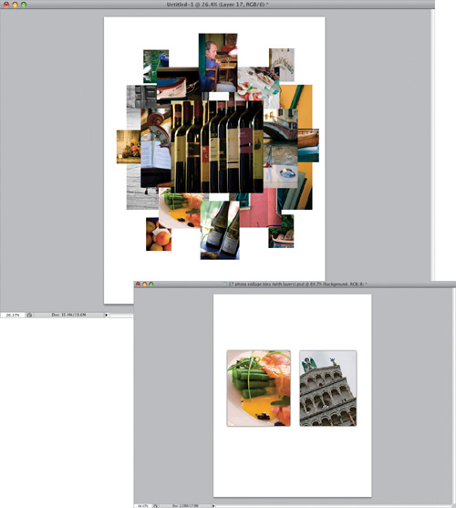
We’re going to add what looks like a drop shadow behind all of your images, but because we need the shadow to be on more than one side of the image, instead of applying just a drop shadow, we’re going to apply an outer glow, which puts a drop shadow effect on all sides of the image. Click on the Add a Layer Style icon at the bottom of the Layers panel and choose Outer Glow from the pop-up menu, which brings up the dialog you see here. Starting at the top of the dialog, change the Blend Mode pop-up menu to Normal (by default, it’s set to Screen, which is about worthless for almost everything you’d ever want to do here. Why it’s the default setting is an entirely different discussion—one where there’s a lot of cussing. But I digress). Now lower the Opacity to 40%, then click on the color swatch and change the glow color from light yellow (don’t ask) to black. Lastly, increase the Size (the softness of your shadow) to 10, then click OK to apply a soft all-around drop shadow to your main photo.

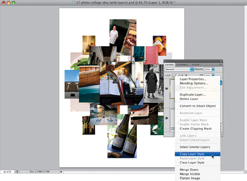
Here’s what the Outer Glow layer style looks like applied to just the center front-most image. (You’ll notice, I moved a few of the other images around and added a couple new ones, just to mix things up a little.) Now, if you’re thinking that we have to do this for 16 layers, you’re right, but there’s a huge shortcut we can take. Control-click (PC: Right-click) on the layer we just applied the outer glow to, and a contextual menu will appear (seen here in the Layers panel). From this contextual menu, choose Copy Layer Style. This copies that Outer Glow layer style, with all the same settings you just applied.
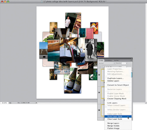
In the Layers panel, click on the next layer down to select it. While pressing-and-holding the Command (PC: Ctrl) key, click on all the other layers in your document (but not the Background layer) to select them, too. Now, once all these other layers are selected, Control-click (PC: Right-click) on any one of those selected layers, and when the contextual menu appears, choose Paste Layer Style. Now that Outer Glow drop shadow layer style will be applied to all the other layers at once, as seen here (sweet shortcut!). These drop shadows are what adds separation and depth to the collage.
The last step, adding a color background, is totally optional, but if you want to do that, here’s a tip that will help you choose a color that’s guaranteed to work with your collage: Get the Eyedropper tool (I) from the Toolbox, then click on a prominent color in one of your images. In the example shown here, you can see I’ve clicked the Eyedropper tool on the pinkish color of the wall next to the green shuttered windows (it’s shown circled here in red), which makes that color my new Foreground color. Now, just click on the Background layer and press Option-Delete (PC: Alt-Backspace) to fill your Background layer with that color (as seen here). You can try sampling different colors from different photos and refilling the Background layer to see which one looks the best. That’s it!
This technique of taking a wide-angle or overhead photo and transforming it, so it looks like a tiny toy model, caught on like you can’t believe. There are entire Flickr groups packed with people recreating this tilt-shift lens look, which really does make your photo’s subject look like a tiny toy model. Luckily, it’s one of the shortest, and easiest, techniques in the whole book.
Open the photo you want to apply the effect to. The effect works best on photos where you’ve taken the photo from a high vantage point. The photo shown here (which you can download from the book’s downloads page, mentioned in the book’s intro) was an aerial photo taken from a helicopter, but you don’t need an aerial shot—a shot from a bridge, an overpass, from the window of a hotel, etc., will work fine. The reason you want this high viewing angle is that you want kind of the same viewing angle of a city that you would see of a toy model if you walked up on it.

Press the letter Q to enter Photoshop’s Quick Mask mode, and then press D to reset your Foreground and Background colors to their defaults of black and white. Now, get the Gradient tool (G) and, up in the Options Bar, click on the Reflected Gradient icon (it’s the fourth one from the left, shown circled here in red) and turn on the Reverse checkbox to the right. Take the Gradient tool, and click-and-drag it from the point you want to be in-focus downward (the farther you drag, the more that will be in focus, but drag farther than you’d think, because the in-focus area winds up being much smaller than you’d think). When you do this, you’ll see a red mask appear (as seen here). The clear parts will be in focus, the red parts will be out of focus, but there will be a soft transition between the two.

Press the letter Q again, to leave Quick Mask mode, and now you’ll see a horizontal, rectangular selection across the center of your image going from side to side (that’s the in-focus part). Now, go under the Filter menu, under Blur, and choose Lens Blur. When the dialog appears, under Depth Map, turn on the Invert checkbox, then in the Iris section, from the Shape pop-up menu, choose Hexagon (6), and for Radius, choose 35 (as shown here; the Radius controls how blurry your lens blur will be). Then in the Specular Highlights section, set the Brightness to 50.

When you click OK, the blurring is applied. Just press Command-D (PC: Ctrl-D) to Deselect, and now your image looks like a very small toy model (or architectural model), like the one shown here.
