4. Designing Interfaces
The iPhone SDK helps you craft user interfaces. This chapter introduces the visual classes you’ll work with and discusses their roles in the interface design process. You read about controllers that work with these visual classes and discover how they handle tasks like device reorientation. Then you move on to solutions for laying out and customizing interfaces. You learn about hybrid solutions that rely both on IB-created interfaces and Objective-C-centered ones. By the time you finish this chapter, you’ll have discovered many approaches that you can apply to your own application design.
UIView and UIWindow
Nearly everything that appears on the iPhone’s screen is a child of the UIView class. Views act like little canvases that you can draw on with colors, pictures, and buttons. You can drag them around the screen. You can resize them. You can layer them. Views provide the basic component of user interfaces.
The iPhone rule goes like this: one window, many views. If you keep that idea in mind, the iPhone interface design scenario simplifies. Metaphorically speaking, UIWindow is the TV set, and UIViews are the actors on your favorite show. They can move around the screen, appear, and disappear, and may change the way they look and behave over time.
The TV set, on the other hand, normally stays still. It has a set screen size that doesn’t change even if the virtual world you see through it is practically unlimited. You may even own several TVs in the same household (just like you can create several UIWindow instances in the same application), but you can watch just one at a time.
UIViews are user interface building blocks. They provide visual elements that are shown onscreen and invite user interaction. Every iPhone user interface is built from UIViews displayed within one UIWindow, which is a specialized kind of UIView. The window acts a container; it is the root of the display hierarchy. It holds all the visible application components within itself.
Beyond UIView and UIWindow, you find a wealth of specialized views, such as UIImageView and UITextView, that allow you to build your interfaces from predesigned components. This section provides a rundown of those views. The Interface Builder library makes these views available to you, allowing you to place them in your application interfaces to build your GUIs.
Note
The UI at the beginning of certain classes (like UIView) stands for User Interface.
Views That Display Data
One of the most important things that a view can do is provide a visual representation of data. In Cocoa Touch, the following classes show information onscreen.
• The UITextView class presents passages of text to your users and/or allows them to type in their own text using the keyboard. You choose whether to set the view text as editable. Text views use a single font with a single text size throughout.
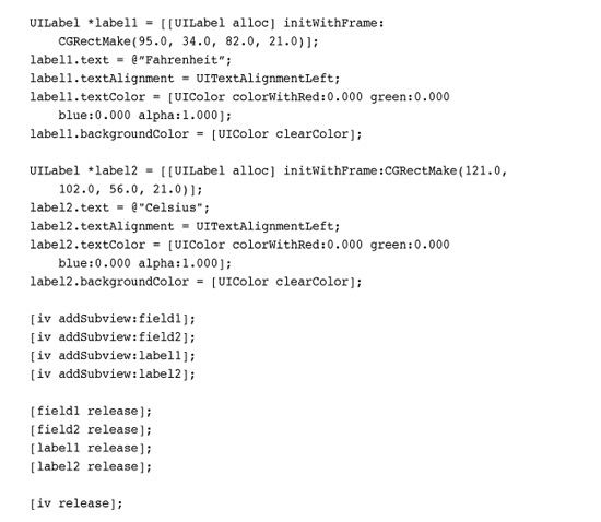
• UILabel instances present short, read-only text views. As the name implies, this class is used to statically label items on your screen. You choose the color, font size, and font face for your labels by setting view properties. The words “Fahrenheit” and “Celsius” shown in Figure 4-8, later in the chapter, are created by UILabels.
• UIImageViews show pictures. You load them with UIImage objects, which are instances of an abstract image storing class. Once loaded, you specify the view’s location and size. The UIImageView automatically scales its contents to fit those bounds. A special feature of this class allows you to load a sequence of images rather than a single picture and animate them on demand.
• When you want to display HTML, PDFs, or other advanced Web content, the UIWebView class provides all the functionality you need. UIWebView instances offer a powerhouse of display capabilities, allowing you to present nearly any data type supported by the built-in Safari browser. These views offer simple Web browsing with a built-in history, essentially giving you a canned, usable Safari-style object you can insert into your programs. Sometimes developers use UIWebView instances to present blocks of stylized text. As a bonus, these support zoom and scroll with no additional work.
• MKMapViews (MK stands for Map Kit) embed maps into your applications. Users can view map information and interact with the map contents, much as they would with the Maps application. This class, which was introduced in the 3.0 SDK, lets you annotate the map with custom information using the MKAnnotationView and MKPinAnnotationView classes.
• UIScrollView instances allow you to present content that is larger than the normal size of an application window. Users can scroll through that content to view it all, using horizontal and/or vertical scrolling. Scroll views support zooming, so you can use standard iPhone pinch and spread gestures to resize content.
Views for Making Choices
The iPhone offers two core classes that offer choices to users. The UIAlertView class produces those blue pop-up windows you’ve seen in many applications. You choose the message and customize their buttons to ask users questions. For example, you might ask a user to confirm or cancel an action in your program. In addition to questions, you can present information. By offering just one button (typically “Okay”), alert views provide a simple way to show text to users.
The second choice-based class is UIActionSheet, which offers menus that scroll up from the bottom of the screen. Action sheets display a message and present buttons for the user to choose from. Although these sheets look different from alert views, functionally they perform in a similar manner. As a rule, use action sheets when you have a number of options to choose from and alert views when you are presenting just two or three choices at most.
Both these presentations are modal. They require users to make a selection before proceeding. For this reason, it’s polite to offer a cancel option among the other choices.
Controls
Controls are onscreen objects that transform user touches into callback triggers. They may also provide numeric or text values consumed by your application. Controls include buttons, switches, and sliders, among others. They correspond closely to the same kinds of control classes used in desktop programming. Here’s a quick rundown of the major classes provided by Cocoa Touch and what each control offers:
• UIButton instances provide onscreen buttons. Users can push them to trigger a callback via target/action programming. You specify how the button looks, the text it displays, and how the button triggers. The most typical trigger used is “touch up inside,” where the user touch ends inside the button’s bounds. If it seems strange to trigger with touch up rather than touch down, consider that the de facto standard on the iPhone allows users to cancel a button press by sliding their finger away from the button before lifting it.
In Interface Builder, buttons are called Round Rect Buttons. In IB, you also encounter buttons that look like views and act like views but are not, in fact, views. Bar button items (UIBarButtonItem) store the properties of toolbar and navigation bar buttons but are not buttons themselves. The bars use these descriptions to build themselves; the actual button views are not generally accessible to you as a developer.
Note
In Interface Builder, you can search the view library by class name (e.g., UIButton) or by IB’s description (e.g., round or button).
• The UISegmentedControl offers a row of equally sized buttons that act like the old-fashioned radio buttons in a car, namely that only one button can be selected at a time. You can present these buttons as images or text. An option (called “momentary”) lets you replace the radio-button behavior with a style that prevents the buttons from showing which button was last selected.
• In Cocoa Touch, the UISwitch class provides a simple binary control. This class presents On/Off choices and looks like a standard light switch you’d see on a wall.
• The UISlider class lets users choose a value from a specified range by sliding an indicator along a horizontal bar. The indicator (called the “thumb”) represents the current setting for the control. The value is set by the thumb’s relative placement. The iPhone’s onscreen volume slider in the iPod/Music application represents a typical slider instance.
• Page controls let users move between pages, usually as part of a UIScrollView implementation. The UIPageControl class offers a series of small dots (like the ones you see on the iPhone’s home page) showing the current page and letting users navigate to the next or previous pages.
• UITextFields are a kind of control that let you enter text. These fields offer just a single line for input and are meant to solicit short text items (like usernames and passwords) from users. Figure 4-8, later in the chapter, includes two text fields.
Tables and Pickers
Tables present a scrolling list of choices. The UITableView class provides the most commonly used table style, which you see, for example, in the Contacts, YouTube, and iPod/Music applications. Tables offer rows of information (provided by the UITableViewCell class), which users scroll through and can select.
The UIPickerView class offers a kind of table, where users can select choices by scrolling individual wheels. A specialized version of this class is the UIDatePicker, which comes preloaded with date- and time-specific behavior and is used extensively in the Calendar and Clock applications.
Bars
The iPhone offers four kinds of bar-style views. Bars are compact views (typically shorter than 50 pixels in height) that extend from one side of the screen to the other. The most commonly used view is the UINavigationBar (see Figure 4-2, later in the chapter), which is presented on top of many interfaces to provide navigation state. As a developer, you almost never work directly with class instances. Instead, the view is generated and managed by UINavigationController instances, which you read about in chapter sections that follow this one.
Tab bars offer the kinds of choices you see at the bottom of the YouTube and iPod/Music applications, like Featured, Most Viewed, Albums, and Podcasts. Later in the chapter, Figure 4-3 (top) shows a typical UITabBar instance. Search bars (UISearchBar) add a text-based view meant to be shown on the top navigation bar of a table, as used in the Contacts application. As with navigation bars, you normally work through UITabBarControllers and UISearchDisplayControllers instead of building and managing the view directly.
Of all the iPhone bars, only the UIToolbar class is meant for direct use. It provides a series of buttons similar to segmented controls but with a different look (see Figure 4-3, bottom). Toolbars are limited to a momentary highlighting style. The role of toolbars is to provide a vocabulary of actions that act on the current view. The toolbar used in the Mail application allows you to delete messages or to reply to messages. Toolbars present monochrome images on each button.
If your design ideas include tab bars and toolbars, take the time to read Apple’s Human Interface Guidelines, available as part of the standard iPhone documentation library. Apple regularly rejects applications that use bars in a manner inconsistent with these guidelines.
Note
As with bar button Items, navigation items appear in Interface Builder and can be placed in your projects as you would place views. Like their cousins, navigation items are not views themselves. They store information about what items go on navigation bars and are used to build the bar that does appear.
Progress and Activity
Cocoa Touch provides two classes meant to communicate an ongoing activity to the user. The UIActivityIndicatorView offers a spinning-style wheel, which is shown during an ongoing task. The wheel tells the user that the task may finish at some point, but it does not determine when that time will end. When you want to communicate progress to a user, use the UIProgressView class. Instances offer a bar that fills from left to right, indicating how far a task has progressed.
UIViewControllers
On the iPhone, view controllers centralize certain kinds of view management. They provide practical utility by linking views into the pragmatic reality of your device. View controllers handle reorientation events such as when users tip the iPhone on its side to landscape mode and navigation issues such as when users need to move their attention from view to view.
View controllers aren’t views. They are abstract classes with no visual representation; only views offer visual canvases. Instead, they help your views live in a larger application design environment. Do not set a frame the way you would with a normal UIView. UIViews use initWithFrame:; UIViewControllers use init.
The iPhone SDK offers many view controller classes. These classes range from the general to the specific. In a way, specialized controllers are both a blessing and a curse. On the positive side, they introduce enormous functionality, essentially with no additional programming burden. On the downside, they’re so specialized that they often hide core features that developers might prefer to work with.
For example, there’s no simple camera access class. You must work through the UIImagePickerController class to snap photos. This class with its prebuilt GUI is elegant and well designed, but it denies developers direct access to the camera and to custom user interfaces that they might prefer to build. You cannot pull live data from the camera and store it to a time-lapse database. Instead, your user must shoot the image, agree that the image is what he or she wanted, and then pass the control back to your application.
Here’s a quick guide to some of the view controllers you’ll encounter while building your iPhone application interfaces.
UIViewController
UIViewController is the parent class for view controllers and the one you use to manage your primary views. It’s the workhorse of view controllers. You may spend a large part of your time customizing this one class. The basic UIViewController class manages each primary view’s lifetime from start to finish and takes into account the changes that the view must react to along the way.
For example, UIViewControllers handle reorientation tasks, letting you program for both landscape and portrait orientation. UIViewControllers decide whether to change their orientation when a user tilts the iPhone, and specify how that orientation change occurs. They do this via instance methods like shouldAutorotateToInterfaceOrientation:. Without a view controller, your interface won’t support automatic orientation updates. Many developers have found it difficult trying to rotate UIViews directly without the help of a view controller class.
UIViewController instances are responsible for setting up how a view looks and what subviews it displays. Often they rely on loading that information from .xib files. A variety of instance methods such as loadView and viewDidLoad let you add behavior while or after a view sets up.
Reacting to views being displayed or dismissed is another job that view controllers handle. These are the realities of belonging to a larger application. Methods like viewDidAppear: and viewWillDisappear: let you finish any bookkeeping associated with your view management. You might preload data in anticipation of being presented or clean up memory that won’t be used when the view is not onscreen.
Each of the tasks mentioned here specifies how a view fits into an enveloping application and works on a particular device. The UIViewController mediates between views and these external demands, allowing the view to change itself to meet these needs.
UINavigationController
As the name suggests, navigation controllers allow you to navigate up and down through tree-based view hierarchies. They create the solid-colored navigation bars that appear at the top of many standard iPhone applications. You see navigation controllers in use whenever you drill through some sort of hierarchy, whether using the Contacts application or the on-iPhone App Store. Both of these applications are built using navigation controllers.
Navigation controllers let you push new views into place and automatically generate “back” buttons showing the title of the calling view controller. All navigation controllers use a “root” view controller to establish the top of their navigation tree, letting those back buttons lead you back to a primary view. Navigation controllers and their trees are discussed in greater detail later in this chapter.
Handing off responsibility to a navigation controller lets you focus your design work on creating individual view controller screens. You don’t have to worry about specific navigation details other than telling the navigation controller which view to move to next. The history stack and the navigation buttons are handled for you. Chapter 5, “Working with View Controllers,” discusses navigation controllers in further detail and offers recipes for their use.
UITabBarController
Parallel views are like stations on a radio. A tab bar helps users select which UIViewController to “tune in to,” without there being a specific navigation hierarchy. You see this best in applications like YouTube and iPod, where users choose whether to see a “Top 25” list or decide between viewing albums or playlists. Each parallel world operates independently, and each can have its own navigation hierarchy. You build the view controller or navigation controller that inhabits each tab, and Cocoa Touch handles the multiple-view details.
For example, when tab bar instances offer more than five view controller choices at a time, users can customize them through the More > Edit screen. The More > Edit screen lets users drag their favorite controllers down to the button bar at the bottom of the screen. No extra programming is involved. You gain editable tabs for free. All you have to do is request them via the customizableViewControllers property. See Chapter 5 to read more about implementing tab bar-based applications and setting the images that adorn each button.
Table Controllers
Table view controllers simplify using tables in your iPhone projects. The UITableViewController class provides a standard already-connected UITableView instance and automatically sets delegation and data sources to point to itself. All you have to do is supply those delegate and data source methods to fill up the table with data and react to user taps. UITableViewController is discussed at length in Chapter 11, “Creating and Managing Table Views.”
The search display controller is a kind of table view but one that offers a built-in search bar via UISearchBar. With it, you allow users to search data that is provided by another view controller, called its contents controller. As users update the search information, the contents controller adjusts its data source to include only those items that match the search query.
It may seem odd to force another controller to perform that work, but in practice, it works out very neatly. The contents controller is almost always a table view controller, which displays the search controller on demand. The search then weeds through the original table’s data and shows a subset of that information until the search is dismissed.
The NSFetchedResultsController also provides a kind of table-based controller. Although strictly speaking, not a view controller, this class helps populate a UITableView with objects fetched from a Core Data store. See Chapter 19, “A Taste of Core Data,” for an example that shows this class in action.
Address Book Controllers
The Address Book user interface framework (AddressBookUI.framework) provides several view controllers that let you select a person from your address book, view his or her details, and add a new person or modify an existing person’s entry. These view controllers tie into the C-based ABAddressBook framework, which provides functions that query and update the iPhone’s built-in address book. Chapter 18, “Connecting to the Address Book,” discusses the Address Book and its UI controllers in greater detail.
UIImagePickerController
This utility controller allows users to select images from onboard albums or to snap a photo or shoot video using the iPhone camera. With it, you gain full access to most of the organizational features made available to users via the Camera and Photos applications. In truth, there are not two separate applications. There is just one application that poses as those two utilities, just as the single controller offers access to both camera and photo selection features.
When selecting pictures, Apple has added an advanced image-selection interface. Users can navigate up and down the photo album hierarchy until they find the image they want to use. The picker automatically handles access to the onboard photo album leaving you little more to do than decide how to use the picture it picks.
The photo/video interface is equally impressive. The controller even lets the users optionally orient and zoom an image before finishing, providing user-defined “edits” on the picture they snap. Full discussions of this class, including how-to’s for both the selection and camera versions, appear in Chapter 7, “Working with Images,” and Chapter 15, “Audio, Video, and MediaKit.”
Mail Composition
The MFMailComposeViewController lets you create mail messages that users can customize from directly in your program. Although the iPhone has long supported mailto: URLs to send mail messages, this new class introduced in the 3.0 SDK offers far more control over mail contents and attachments. What’s more, users can continue working within your program without being forced to leave to access the Mail application.
The mail composition controller is simple to use and is used in Chapter 7 to mail photographs. It is part of the MessageUI framework; the MF prefix apparently stands for Message Framework.
GKPeerPickerController
The GameKit peer picker provides a standard GUI for discovering and connecting to other iPhones. It offers a slick interface listing other iPhones that are available and can be linked to. Although this controller is part of GameKit, its technology is readily adaptable to nongame uses including file transfer, messaging, and so forth.
You can configure the picker to select whether to use Bluetooth or Internet connections. When presented to the user, only the supported connections appear. Note that users cannot control that choice themselves using this interface.
Read more about using the peer picker controller in Chapter 12, “Making Connections with GameKit and Bonjour.”
Media Player Controllers
The Media Player framework offers several controllers that allow you to choose and play music and movies. The MPMediaPickerController provides a media-selection GUI that allows users to choose music, podcasts, and audio books. You choose which media to present, and you can play back that media via an MPMusicPlayerController instance.
When your user needs to watch a movie or listen to audio, an MPMoviePlayerController instance does the trick. Just supply it with a path to the media resource and push the controller into view. The controller provides a Done button for the user or automatically returns a delegate call when playback finishes.
If you want to read more about picking and playing back media, refer to Chapter 15.
View Design Geometry
The iPhone hardware is not theoretically limited to a 320-by-480 display. Design your applications as resolution-independently as possible. That having been said, certain facts of geometry play a role in the design of current generation iPhone applications, particularly when you need to hand specs to a graphic designer to take to Photoshop.
Here is a rundown of the onscreen elements whose geometry can mostly be counted on to stay set when building your interfaces. Try not to rely on these sizes where possible, but rather design around them while keeping their proportions and aspect ratios in mind.
Keep in mind that future iPhone models and related iPhone OS devices may not use the same screen size or shape. All the measurements in this section apply specifically to the first five members of the iPhone OS family, all of which use a 320×480 screen: the first generation iPhone, the iPhone 3G/3G S, and the various generations of iPod touch.
Status Bar
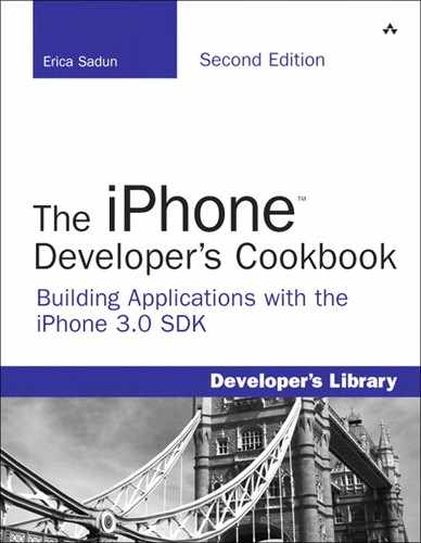
The status bar at the very top of the iPhone screen shows the time, connectivity, battery status, and carrier (iPhones) or model (iPods) of the unit. This bar is 20 pixels in height for normal use. It zooms to 40 pixels high during phone calls or when displaying messages; note that double-height status bars appear to be a portrait-only feature. Unfortunately the SDK does not offer any public hooks into the message display system so you can’t display your own messages. You can see these 40-pixel colorful status displays when you pause a Voice Memo recording, use Nike+, or tether the iPhone on 3G or later units.
Figure 4-1 shows the status bar for portrait, landscape, and 40-pixel-high message modes. You can hide the status bar from your users, but doing so at a minimum eliminates their access to seeing the time and battery information unless you supply that information elsewhere in your application’s user interface. You can set the status bar to display in gray, black, or translucent black. The latter allows the view behind it to bleed through to better coordinate colors with your application.
Figure 4-1 The status bar is normally 20 pixels high, regardless of whether the iPhone is using portrait or landscape orientation. At times the status bar zooms to 40 pixels in height to indicate ongoing system operations like a phone call or a paused recording.
If you’d rather free up those 20 pixels of screen space for other use, you can hide the status bar entirely. Use this UIApplication call: [UIApplication sharedApplication] setStatusBarHidden:YES animated:NO]. Alternatively, set the UIStatusBarHidden key to <true/> in your application Info.plist file.
With the status bar displayed, your application has 320×460 pixels to work with in portrait mode, and 480×300 pixels in landscape mode for the standard iPhone. These numbers change depending on whatever other elements you add into the interface such as navigation bars, tab bars, and so forth. And as already mentioned, the standard iPhone pixel dimensions may change over time as Apple releases new models and new related touch-based products that run iPhone OS.
The status bar plays a role in both landscape and portrait orientations, adjusting to fit as needed. To run your application in landscape-only mode, set the status bar orientation to landscape. Do this even if you plan to hide the status bar (that is, [[UIApplication sharedApplication] setStatusBarOrientation: UIInterfaceOrientationLandscapeRight]). Alternatively, set UIInterfaceOrientation in your Info.plist to the string UIInterfaceOrientationLandscapeLeft or UIInterfaeOrientationLandscapeRight. These options force windows to display side to side and produce a proper landscape keyboard.
Note
Use Hardware > Toggle In Call Status Bar to test your interfaces in the simulator using the 40-pixel-high status bar.
Navigation Bars, Toolbars, and Tab Bars
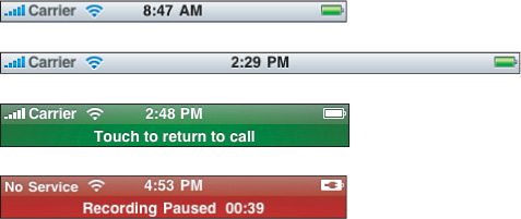
By default, UINavigationBar objects (see Figure 4-2) are 44 pixels in height in portrait mode and 32 pixels high in landscape. They stretch from one side of the screen to the other, so their full dimensions are 320×44 pixels and 480×32 pixels.
Figure 4-2 Navigation bars stretch from one side of the screen to the other. Their height is fixed at 44 pixels for portrait mode and 32 pixels for landscape on the standard iPhone. The rarely used prompt feature shown in the bottom two images zoom the bar to 74 pixels high.
Navigation bars offer a seldom-used “prompt” mode that extends the height by 30 pixels. In portrait mode, the bar occupies 320×74 pixels and in landscape, 480×74, using a 44 pixel high navigation bar rather than the normal 32 pixel high version.
Note
To add a prompt to a navigation bar, edit the view controller’s navigation item, that is, self.navigationItem.prompt = @"Please click a button now";.
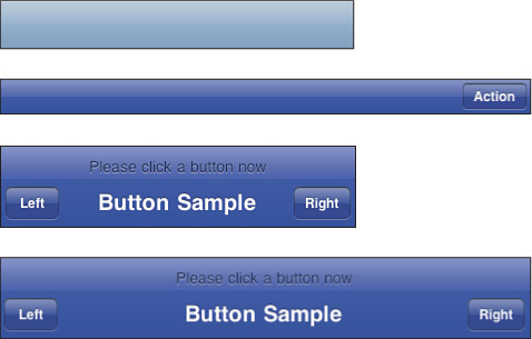
Tab bars are 48 pixels high in both orientations, 320×48 pixels and 480×48 pixels. According to Apple, the individual items on tab bars should be designed with a minimum 44×44 hit region to provide sufficient space for users to tap. That corresponds to individual art of about 30×30 pixels.
Figure 4-3 shows a typical tab bar and its near-cousin class, the toolbar. Toolbars use the same 44 pixel spacing as navigation bars but, like tab bars, they’re meant to be displayed at the bottom of the screen.
Figure 4-3 Tab bars are 48 pixels high for 320×480-pixel iPhone units (top). Toolbars use the same 44-pixel spacing as navigation bars.
These two UI elements aren’t generally meant for landscape mode use. You can see this with both the iPod and YouTube applications. These apps swap out a toolbar-based portrait view for a completely separate landscape presentation: Coverflow for iPod, movies for YouTube.
Between status bars, navigation bars, tab bars, and toolbars, you need to apply some basic math to calculate the remaining proportions available to background design. A typical application with a navigation bar and status bar leaves a central area of 320×416 for portrait display and 480×268 for landscape. Using tab bars or toolbars effectively diminishes the available height by another 48 or 44 pixels and the resulting proportions change accordingly.
Keyboards and Pickers
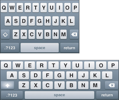
The standard iPhone keyboard uses 320×216 pixels for landscape presentation and 480×162 for portrait. Figure 4-4 shows the keyboard in its default configuration in both its orientations. When a text element becomes active in your application, the keyboard displays over any elements at the bottom of the screen leaving a shortened space at the top for interaction. Complex keyboard layouts may use even more onscreen room.
Figure 4-4 Both the portrait and landscape keyboards occupy a large part of the iPhone screen. Design your applications accordingly.
As a rule, resize your main view when the keyboard displays. When you have several onscreen elements to edit, a shortened scrolling view works best. This lets your users access all possible areas by scrolling and won’t leave text fields or text views hidden behind the keyboard. Change the background view’s frame, shortening it by 216 or 162 pixels, depending on orientation.
Make sure you provide a way for the user to dismiss the keyboard, by pressing the Return key or tapping a Done button, to make sure you can return to your normal display. Don’t leave users caught with the keyboard displayed. See Chapter 9, “Building and Using Controls,” for a discussion about dismissing keyboards for more details.
Note
Both the UIPickerView and UIDatePicker use the same geometry as the standard Keyboard. UISwitches default to 94 by 28 pixels, and UISegmentedControls are typically 44 pixels high in their standard text-based form.
Text Fields
When working with UITextField instances, allocate at least 30 pixels in height. This allows users enough room to enter text using the default font size without clipping.
The UIScreen Class
The UIScreen object acts as a stand-in for the iPhone’s physical screen, which you can access via [UIScreen mainScreen]. This object maps standard window layout boundaries into pixel space. It takes into account any toolbars, status bars, and navigation bars in use.
To recover the size of the entire screen, use [[UIScreen mainScreen] bounds]. This returns a rectangle defining the full pixel size of the iPhone’s screen. As mentioned earlier in this chapter, the iPhone screen may not always be 320×480 pixels in size should Apple introduce new units.
Another method call returns the central application space. Call [[UIScreen mainScreen] applicationFrame] to query this value. On a first or second generation unit, for an application that uses a status bar and a navigation bar, this might return a size of 320×416 pixels, taking into account the 20-pixel status bar and 44-pixel navigation bar.
Use these numbers to calculate the available space on your iPhone screen and lay out your application views when not using Interface Builder.
Building Interfaces
There’s more than one way to build an interface. With the iPhone SDK, you can build a GUI by hand using Objective-C, or you can lay it out visually in Interface Builder. When coding, you programmatically specify where each element appears onscreen and how it behaves. With Interface Builder, you lay out those same elements using a visual editor. Both approaches offer benefits. As a developer, it’s up to you to decide how to balance these benefits.
In the end, both technologies take you to the same place. The code used in Objective-C corresponds directly to the layout used in Interface Builder, and the callback behavior set up in Interface Builder produces identical results to those designed in Objective-C.
Yes, the implementation details differ. A hand-built version uses loadView to create the main view and add its interface elements. In contrast, an xib-based view controller finishes setting itself up in viewDidLoad after loading the prebuilt interface from a .xib file. Cocoa Touch supports both these approaches, plus you can use a hybrid approach, loading .xib files via direct Objective-C commands.
The next few sections show you various ways to use these tools. You walk through a full IB approach and then a full Xcode one. After, you’ll find two further hybrid solutions. All four of these walk-throughs produce identical end products offering identical functionality.
Walk-Through: Building a Temperature Converter with IB
Interface Builder, with its interactive GUI layout tools, helps lay out visual content. It makes it possible for you to add interactive controls, moving them around the screen by hand to design custom interfaces. This first example creates a classic Fahrenheit to Celsius converter using absolutely standard Xcode/IB design templates. The interface is laid out entirely in Interface Builder with a minimum of coding in Xcode.
Note
Make sure that you have worked through the Hello World examples in Chapter 2, “Building Your First Project,” so you have a starting off point for understanding Xcode and Interface Builder. The samples in this chapter go into greater depth but assume you’ve already learned some of the basic vocabulary for using these tools.
Create a New Project
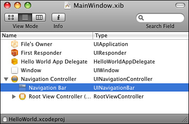
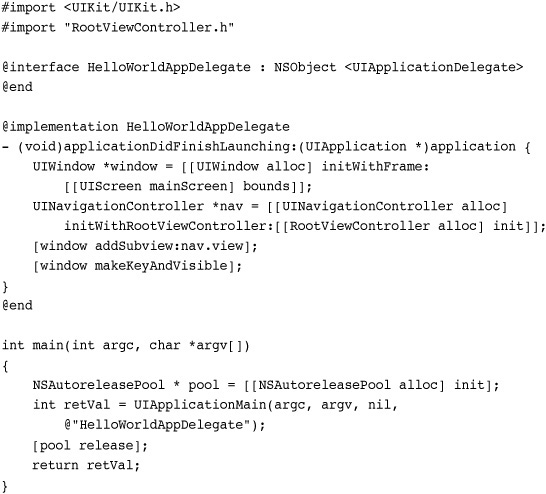
Launch Xcode and create a new project. Choose File > New Project > iPhone OS > Application > Navigation-based Application and click Choose. Name it HelloWorld and save it to your Desktop. Once created, a new project window opens in Xcode. This new project contains two .xib files, MainWindow.xib and RootViewController.xib, as well as classes for your application delegate and the root view controller.
Any time you use a navigation-style project, you must assign it a root view controller. This is the view controller that lives at the top of the navigation tree. All other view controllers branch out from this one. The name of the .xib file and its class reflect this design necessity.
Add Media
Before moving forward, you need to add some basic media to the project. Copy the icon.png and Default.png artwork—they’re in the sample code folder—to the project by dropping them into the Resources group in the Groups & Files column. Make sure to check Copy Items into Destination Group’s Folder (If Needed) before clicking Add.
Note
When you use a single asset in multiple projects, you can add that file without copying. This maintains a single source version that you can update, and its changes are reflected in each of the projects that use it. On the downside, if you remove the file from any project, you might accidentally delete the original, which can affect multiple projects.
These two items provide the image used for the application icon on the iPhone’s SpringBoard (icon.png) and the image displayed as the application launches (Default.png). Each application you build should contain art for these. The roles of these two items are discussed in further detail in Chapter 1, “Introducing the iPhone SDK.”
Next, add cover320×416.png in the same manner and add it to the Resources group. This file provides a backsplash image, which you use in this project. The art is sized for a portrait-style interface that uses a status bar and a navigation bar.
Interface Builder
Locate MainWindow.xib and double-click it to open the file in Interface Builder. Bring the MainWindow.xib window to the front. It is listed in the Windows menu if you have trouble finding it. Here, you find five items, as shown in Figure 4-5. The first two, File’s Owner and First Responder, you saw in Chapter 2. The others, a Hello World application delegate (labeled Hello World A...), the Window, and the navigation controller (labeled Navigation Co...) are new.
Figure 4-5 The standard MainWindow.xib components generated by Xcode’s Navigation Application.

The identity inspector (Command-4) lets you explore the classes for each object. Click on each object with the inspector open. The File’s Owner is a UIApplication instance, and its delegate is the Hello World application delegate. This matches the design pattern previously discussed in Chapter 1.
The Window is a UIWindow instance. The window provides a full-screen view that owns all application views once they are added. You will not work with this instance directly because it has already been set up to show the view contents defined by the navigation controller.
The role of the navigation controller is a little tricky. That’s because it provides a navigation bar showing an optional title and maybe some buttons while another class provides the actual interface elements below the bar. Every UINavigationController must be initialized with a single root view controller. That view controller provides the view that fills the rest of the screen. Navigation controllers are discussed in greater detail later in this chapter.
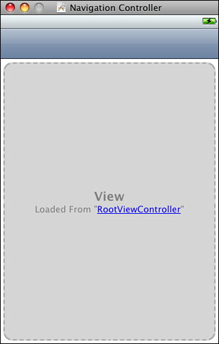
Double-click the navigation controller object and an editor window opens, as shown in Figure 4-6. As you can see from this screenshot, the MainWindow .xib does not define the root directly. Instead, it loads that view from RootViewController.xib, the second .xib file that was created when you built the Navigation Application template.
Figure 4-6 The Navigation Controller loads its root view controller from a secondary .xib file.
In theory, loading that view controller from a secondary file lets you design components orthogonally, designing the view separately from the window and navigation bar. (In reality, this is not a universally loved feature of Interface Builder.) Open the Attributes Inspector (Command-1). Here you see the pop-up that lets you choose a .xib to set as the root view controller. Do not change the selection, as you have no other UIViewController .xib items to choose from.
Edit the Navigation Bar
Return to the editor shown in Figure 4-6, and make the following changes. First double-click the middle of the blue bar and type the word “Converter.” This adds a title to your navigation bar. Second, drag a bar button item from the library (Tools > Library, Command-Shift-L) onto the right side of the bar. Double-click and change the word “Item” to “Convert.” Figure 4-7 shows the bar after performing these actions.
Figure 4-7 You can edit the navigation controller bar directly and add buttons to it.

Replace the Main View
When using standard templates, sometimes Apple doesn’t quite deliver what you really need. To see this problem in action, open RootViewController.xib in Interface Builder. This file includes a File’s Owner, a First Responder, and a Table View. Xcode’s default Navigation Application project assumes you will use a table view controller, but this walk-through requires a UIViewController instead. Quit IB. You’re about to replace the table-based controller with a view-based one.
In Xcode, select RootViewController.xib, RootViewController.h, and RootViewController.m. Delete these files by pressing Delete on your keyboard. Choose Also Move to Trash. This eliminates the table-based defaults you started with.
Choose File > New (Command-N) > iPhone OS > Cocoa Touch Class > UIViewController subclass. Check With XIB for User Interface and click Next. Name the file RootViewController.m, check Also Create Root View Controller.h, set the location to your main project folder, and click Finish. This builds a new view-based version of the three RootViewController files you need for the project: the .xib file, the .h header file, and the .m implementation file. At this point, you may want to drag the new class files into the Classes group and the new .xib file into the Resources group.
Note
I use navigation controller-based projects often enough that I created my own template rather than fix up the table-based version each time. Directions for building your own Xcode user templates appear in Chapter 2.
Enable Simulated Elements
Locate the new RootViewController.xib file and double-click it to open it in IB. In Interface Builder, double-click View. This opens the view editor, which starts as basically a blank view, possibly with a status bar. Before going any further, you need to add a simulated element; this ensures that the design space matches the components that show onscreen.
Open the attributes inspector (Command-1). The status bar should already be selected as Gray. If it is not, go ahead and do so. Then choose Top Bar > Navigation Bar. This adds a basic navigation bar placeholder to the view. Leave the bottom bar unselected. These simulated elements block off parts of the screen, limiting your design space to the remaining area.
Create an Image Backdrop
Drag an image view into the editor. It automatically zooms to fill all available space in the view below the navigation bar. Let the image view automatically snap into place and completely cover that below-bar area.
In the attributes inspector, locate the Image drop-down. Choose cover320×416.png. This drop-down lists all available art from your Xcode project. (To add more images, drop them into the project in Xcode.) After selecting the png image, the editor’s image view updates to show the art you chose.
Remaining in the attributes inspector, check Interaction > User Interaction Enabled. This is a vital step, allowing users to interact with any subviews. Whenever you use an image backdrop, always be sure to enable interactions. This little “gotcha” frequently snags developers who forget.
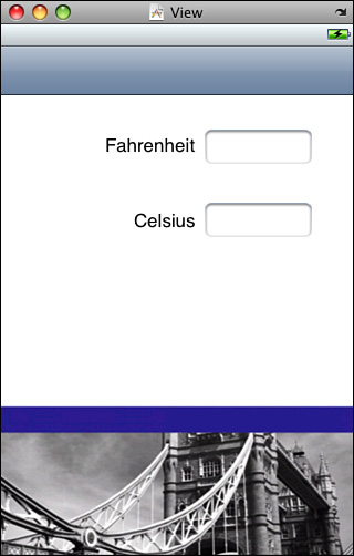
Add Labels and Views
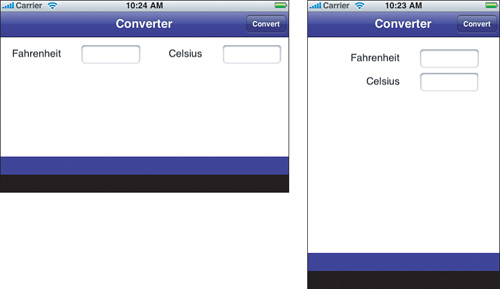
Drag two text fields and two labels into the view from the library. Set up these elements to roughly match the layout in Figure 4-8. Then double-click the labels and edit the text, labeling the top one Fahrenheit and the bottom Celsius.
Figure 4-8 Lay out your text fields and labels to match this design.
It’s important to specify how you want each text field to interact with users. Among other features, you can choose which keyboard to display, whether a prompt appears in the text box, whether words are autocorrected, autocapitalized, and so forth.
Select the top text field. In the attributes inspector, choose Text Input Traits > Keyboard > Numbers & Punctuation. This ensures that a numeric keyboard is presented when the user taps the top field.
Select the bottom field. Uncheck Control > Content > Enabled. The bottom field shows results and should not be editable by users.
Note
As you add more elements to your Interface Builder view, it becomes difficult to select the correct one by clicking on it. One handy tip is to Control+Shift+click on any view in an Interface Builder edit window to display a list of all views stacked at that point. You can choose an item from that list to select it.
Test the Interface
Save your changes and return to Xcode. Choose Project > Set Active SDK > iPhone Simulator, and then Run > Run to compile the project as-is and run it in the simulator. While running, make sure that the top field opens a numbers-based keyboard and that the bottom field cannot be edited. You can click on the Convert button, but it does not do anything yet. So long as your project can be compiled, you can always check your current progress in the simulator and/or on a device.
Although you can test an interface directly in Interface Builder (use File > Simulate Interface, Command-R), the IB implementation is far less reliable than actual Xcode testing.
Add Outlets and an Action
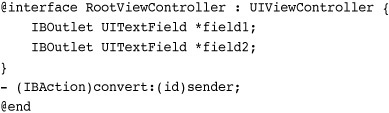
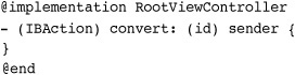
Outlets and actions play important roles in Interface Builder design. Outlets connect interfaces to objects; they essentially act as instance variable stand-ins. Actions are methods that your IB-created interfaces can invoke. They specify target/action pairs, sending callbacks from control views to objects. For this project you need to create two outlets and one action.
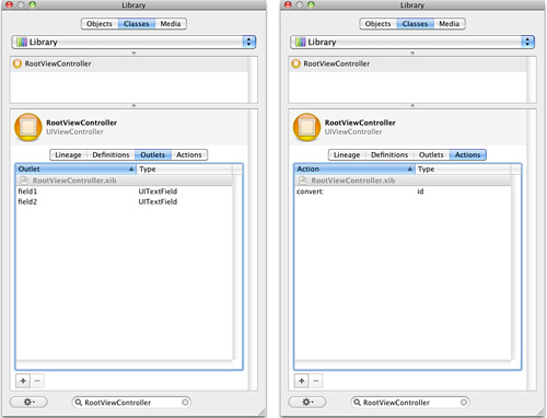
Return to Interface Builder and open the Library > Classes pane. Type RootViewController into the search field at the bottom of the pane. Then tap on RootViewController in the search results and click the Outlets tab. Add two outlets by clicking the + button. Name them field1 and field2. By default, the outlets are typed to id. Edit each type to change id to UITextField. Typing limits how outlets can connect to view objects. When typed to UITextField, the outlets can connect to the two fields you placed in the view but not, for example, to the labels.
Next, add an action, again using +. Edit the default action name to convert:, making sure to add the colon. Figure 4-9 shows the Library pane after making these changes.
Figure 4-9 Use the Library’s Classes pane to add outlets and actions to your classes.
Interface Builder can generate class files from the action and outlet changes you made. Save the project, select File’s Owner, and choose File > Write Class Files. Keep the filename as RootViewController (no extensions) and save into your main folder, not the Classes subfolder. When you re-created RootViewController, both the .xib file and the class files were added to the main project folder. Click Replace to replace those files. Take note that this action could cause data loss if you’ve already customized the RootViewController class and then use IB to overwrite those changes.
Note
Interface Builder can read class header files from Xcode (File > Read Class Files), or you can drop header files into your IB document. This lets you add instances of custom classes and assign objects to those classes with the identity inspector. If your .xib file “forgets” which class the file owner belongs to (usually indicated by a warning about the view outlet being connected but no longer defined), just reimport the custom view controller class header.
Inspect the New Class Header
Return to Xcode and open RootViewController.h. The newly generated class interface includes the outlets and action you defined in IB. Both field1 and field2 are typed, as you requested, as UITextField instances and they are declared using the IBOutlet keyword. This keyword specifies that the instance variable will be set to match an IB element when the view controller loads. The single convert action is typed to IBAction, which is basically the same as (void).
Although you have now defined these two outlets and the action in your RootViewController class, you have not made any assignments that would connect these to elements in your view object. It’s time to do so.
Add Your Connections
Return to IB, select File’s Owner, and open the connections inspector (Command-2). This inspector (shown in Figure 4-10) lists each available outlet and action. The empty circles on the right show that the three elements you added have not yet been assigned.
Figure 4-10 Empty circles indicate outlets and actions that have yet to be connected to real world objects.
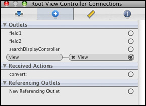
Drag from the field1 circle to the top text field. Then drag from the field2 circle to the bottom text field. These connections define the real objects that each IBOutlet refers to. Save your work.
Open MainWindow.xib. Double-click Navigation Controller to open the editor window shown in Figure 4-6. While holding down the Control key, drag from the Convert button to the view in the middle. The Control-drag shortcut creates connections in the same way as dragging from the circles shown in Figure 4-10. When the central view turns slightly darker, release the mouse. A Sent Actions pop-up appears, as shown in Figure 4-11. Select convert:, the only available action currently defined by the RootViewController. Save.
Figure 4-11 Dragging from the bar button item to the central view allows you to connect the button action to a method defined by the view’s view controller.
Note
Control-click (right-click) objects to open a pop-up showing many of the same details that normally display in the connections inspector.
It may seem counterintuitive to connect a button’s action to a view, when the actual method being called is defined by the view’s view controller and not by the view itself. It may also seem odd to connect a button in one .xib file to an object that’s defined in another. These are, unfortunately, Interface Builder quirks that must be lived with.
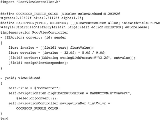
Capture Purple
The design for this project specifies a navigation bar that is tinted to match the art in the backsplash. To make this happen, you must capture the right shade of purple. Return to RootViewController.xib and open the View editor, which displays the cover320×416.png art.
Open the Color Inspector (Font > Show Colors). Click the magnifying glass and drag it over to the purple bar in the View art and click. This measures the purple from that view and sets it as the current color for the color inspector.
Close RootViewController.xib and return to MainWindow.xib. In the project window, locate the view-mode options at the top-left of the window, above the File’s Owner icon. Click the middle of these three view mode buttons. The window switches from icon display to a list.
Open the disclosure triangle to the left of Navigation Controller and select Navigation Bar, as shown in Figure 4-12.
Figure 4-12 To edit the navigation bar’s tint color, you must navigate down to items not directly available in the editor window.
With Navigation Bar selected, open the attributes inspector (Command-1). Make sure the View from RootViewController.xib is visible onscreen. Drag the purple you sampled from the top bar of the Colors palette into the tint well of the attributes inspector. Save the file and close MainWindow.xib.
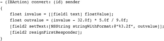
Defining the Conversion Method
Your project is now fully laid out and wired. The outlets are connected to the text field, the button to the convert: action. That action, however, does not yet do anything. Return to Xcode and open RootViewController.m. The method is still just a skeleton that does nothing.
For this project, the method should recover any text typed into the top field, convert it to a float value, and then transform it from a Fahrenheit value to a Celsius one. The resulting value gets placed into the second field. The following method does exactly that. What’s more, it dismisses the keyboard after performing the conversion by calling resignFirstResponder. Add this full method to your code, and save.
Run the Application
Now that you have fully edited your project, once again, run the program with Run > Run. The program now converts Fahrenheit values into Celsius. Test with values of 32 (0 Celsius), 98.6 (37 Celsius), and 212 (100 Celsius).
Walk-Through: Building a Converter Interface by Hand
Anything that can be designed in Interface Builder can be implemented directly using Objective-C and Cocoa Touch. The code in Listing 4-1 duplicates the sample project you just built. Instead of loading an interface from a .xib file, it manually lays out the elements in the loadView method.
Listing 4-1 Code-Based Temperature Converter
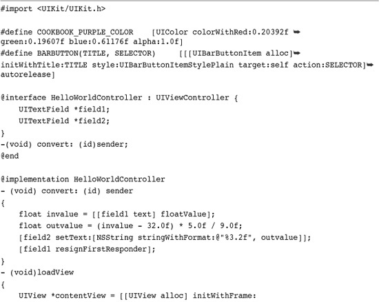
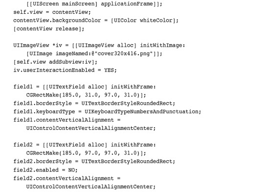
The code takes the same approach in doing so. First after creating a background view (corresponding to View in the IB project), it adds an image view on top. The image view uses the same art (cover320×416.png) and, as in IB, has its userInteractionEnabled flag set to YES.
Next, it adds two labels and two text fields. It sets the label texts to Fahrenheit and Celsius, tells the first field to use a numbers and punctuation keyboard, and disables the second. The locations and sizes for these items use view frames derived from the previous walk-through.
To finish the layout, the code tints the navigation bar purple and adds a Convert button. The button uses the same convert: callback as the IB project and calls the same code.
Putting the Project Together
Building this project means adapting one of Xcode’s built-in templates. Start by selecting File > New Project (Command-Shift-N) > iPhone OS > Application > Window-based Application. Click Choose. Name the new project HelloWorld2 and save it to the Desktop.
This template-based project demands a little file bookkeeping. Delete MainWindow.xib, and choose Also Move to Trash. Next, open HelloWorld-Info.plist. Locate the line that says “Main nib file base name”. Delete this and save your change. This removes the project’s dependency on an xib-based interface.
Similarly, locate the Classes group. Delete this group including the two source files contained within. Choose Also Move to Trash. This removes the code associated with the original .xib file, leaving you free to introduce your own code.
As with the previous walk-through Copy in the three image files from the sample code: icon.png, Default.png, and cover320×416.png. Make sure to check Copy Items into Destination Group’s Folder (If Needed) before clicking Add. Move these files to the Resources group in your project.
To finish, open the main.m file, paste in the code from Listing 4-1 (it’s in the sample code folder), compile the project and run it in the simulator. What you’ll find is an application that both looks and acts identical to the IB version. Instead of loading the interface from a .xib file, this version creates it programmatically in the view controller class implementation.
Walk-Through: Creating a Hybrid Converter
One of the great things about Cocoa Touch is that you don’t have to program entirely by hand or entirely using Interface Builder. You can leverage IB’s visual layout and combine it with Xcode-based programming for a better, hybrid solution. This combines the static loading of .xib files provided by IB with a more reusable programmatic dynamic loading approach. You can use one of two approaches. Either create entire IB-centered UIViewController-based classes or code your own view controller class and load an IB-designed UIView. This walk-through shows you the former; the next walk-through describes the latter.
Whenever Xcode finds a .xib file whose name matches a class derived from UIViewController, it automatically loads that .xib when initializing an instance. For example, say you create a new navigation controller and initialize its root view controller as follows:
When a file named RootViewController.xib is included in the project, Xcode uses that .xib to set up the view controller’s view. The actual name of the view controller class does not matter. What matters is that that name has a matching .xib file. This walk-through uses this behavior to initialize an interface.
Clean Up a Basic Template
As with the previous project, you need to adapt a built-in template to get started. Select File > New Project (Command-Shift-N) > iPhone OS > Application > Window-based Application. Click Choose. Name the new project HelloWorld3 and save it to the Desktop.
Delete MainWindow.xib, and choose Also Move to Trash. Open HelloWorld-Info.plist. Locate the line that says “Main nib file base name”. Delete this and save your change. In the project window, locate the Classses group and delete it, including the two source files contained within. Choose Also Move to Trash.
Finally, copy in the three image files from the sample code: icon.png, Default.png, and cover320×416.png. Make sure to check Copy Items into Destination Group’s Folder (If Needed) before clicking Add. Move these files to the Resources group in your project.
Add a New View Controller Class with .xib
In Xcode, choose File > New (Command-N) > iPhone OS > Cocoa Touch Class > UIViewController subclass. Check With XIB for User Interface and click Next. Name the file RootViewController.m, check Also Create Root View Controller.h, set the location to your main project folder, and click Finish.
The class name is arbitrary. I use RootViewController here because it describes the role of the view controller, and it matches the name used in the previous walk-throughs.
Design the Interface
As you did with the first walk-through, locate the new RootViewController.xib file and double-click it to open it in IB. In Interface Builder, double-click View to open the view editor, and then perform the following steps:
1. With View selected, open the attributes inspector (Command-1), and choose Top Bar > Navigation Bar.
2. Drag an image view into the editor. Let it snap to fill the view below the navigation bar.
3. In the attributes inspector, set the Image drop-down to Choose cover320×416.png. Also check Interaction > User Interaction Enabled.
4. Drag two text fields and two labels into the view from the library. As before, set up these elements to roughly match the layout in Figure 4-8.
5. Select the top text field. In the attributes inspector, choose Text Input Traits > Keyboard > Numbers & Punctuation.
6. Select the bottom field. Uncheck Control > Content > Enabled.
7. Open the Library (Command-Shift-L). Search for and select the RootViewController class and then click Outlets. Add two outlets by clicking the + button. Name them field1 and field2. Edit each type to change id to UITextField.
8. Click Actions and add an action, again using +. Edit the default action name to convert:, making sure to add the colon.
9. Open the connections inspector (Command-2). Drag from the field1 circle to the top text field. Then drag from the field2 circle to the bottom text field.
10. Save the project with your changes.
11. Select File’s Owner, and choose File > Write Class Files. Keep the file name as RootViewController (no extensions) and save into your main folder. Agree to replace the existing files.
12. Close the RootViewController.xib file and return to Xcode.
Edit the View Controller Implementation
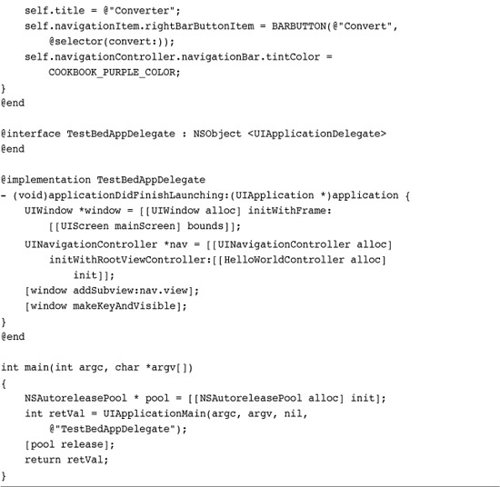
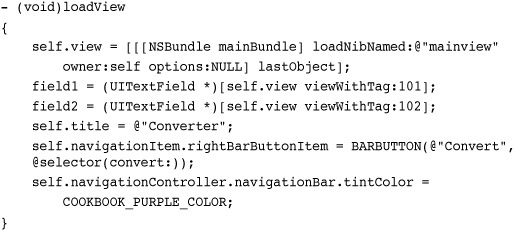
In Xcode, open RootViewController.m and replace the contents of that file with this code. This code adds the convert: method used in the previous two walk-throughs but also adds a new method called viewDidLoad. This method is called after the .xib loads and gives the view controller a chance to finish any initialization details. Here it sets the title (“Converter”), adds the navigation bar’s bar button item (“convert”), sets its callback (convert:), and tints the bar purple.
Edit main.m
As a final step edit main.m, replacing its contents with the following. This code sets up the main window and navigation controller, and assigns a new instance of RootViewController as the navigation controller’s root view controller.
Run the Application
Now that you have fully edited your project, once again, run the program with Run > Run. The compiled application loads its interface from the .xib file. Once loaded, it finalizes the details regarding the navigation bar, its button, its title, and its tint. The application’s look and behavior remains identical to those built in the previous walk-throughs.
Walk-Through: Loading .xib Files Directly from Code
Cocoa Touch lets you recover objects from any .xib file by calling loadNibNamed: owner: options:. This returns an array of objects initialized from the .xib bundle, which you can then grab and use in your program. In this walk-through, you use this feature to load an IB-designed interface from an otherwise hand-built application. To get started, copy the project from the second walk-through, the one built entirely by code. You adapt this hand-built code to use a xib-designed view.
The view you use is from the first project. Copy the RootViewController.xib file from that project and add it into your new project folder. This .xib file contains the original layout, with the image view backsplash, the two text fields, and so on. Rename the file to mainview.xib. This renaming is important because you need to use a .xib file whose name does not match the name of the primary view controller class. If you forget, the application attempts to load that view causing all kinds of runtime misery.
Open the project in Xcode and drop the copied mainview.xib file from the folder into the project. You can leave the Copy check box checked although it is not needed here; the file is already in the folder. Click Add.
Clean Up the .xib
Open mainview.xib in Interface Builder. Here you perform a few maintenance tasks that allow the .xib file to load properly from loadView, and allow you to access subviews that normally would be assigned to IBOutlet instance variables.
Tagging views assigns numbers to them. All view classes provide a tag field. Tags are integers that you can utilize to identify view instances. You choose what number to use. Select the top text field, open the attributes inspector (Command-1), and edit the View > Tag field to 101. (You may have to scroll down to find this field.) Select the bottom field and edit its tag field to 102. Once tagged, you can retrieve views from a parent view by calling viewWithTag:.
Remove any previous connections set up in Interface Builder. Select the File’s Owner and open the connections inspector (Command-2). Delete all the connections (there are three) by clicking the small X on each. Save and close the .xib file. This ensures that your application does not attempt to make any outlet or action connections at compile time.
Update loadView
Open main.m and replace the loadView method with the following code. This code loads a view from a .xib file and assigns it as the main view for the view controller. This approach relies on the fact that there is just one actual view object in that .xib. For this .xib that is the main UIView that is named View in Interface Builder. Neither the File’s Owner nor First Responder is a view.
More complicated .xib files may include several view objects. When loading views from .xibs, you may want to use tagging and class confirmation to check which object is which, ensuring you retrieve the correct object from the returned array.
Note
The order of the items in the .xib file array mirrors the order of the items in Interface Builder’s project window. Since this .xib contains exactly one top-level item, the code could just as easily use objectAtIndex:0 as lastObject.
Objects from a .xib file are created with a retain count of 1 and autoreleased. When loading items directly from a .xib file, you must retain any objects from within the returned array that you need to stick around. Using the self.view setter automatically retains a view. Be aware that the default memory warning logic for view controllers relies on releasing and setting to nil all views that are not displayed at that moment. This effectively disposes any .xib files from memory.
Designing for Rotation
On the iPhone, device orientation changes are a fact of life. How you decide your application should respond to those changes presents a common design challenge. Do you resize onscreen elements, letting them grow and shrink in place like Safari does? Do you move them to new locations to accommodate the different view proportions? Or do you present an entirely different view, like the YouTube and iPod/Music apps do? Each of these choices presents a possible design solution. The one you pick depends on your application’s needs and the visual elements in play.
The following sections explore these design approaches. You learn about autosizing and manual view placement as well as view swapping approaches. Apple has indicated it will eventually support separate landscape and portrait views in the SDK. At the time of writing, this functionality has not yet been implemented.
Enabling Reorientation
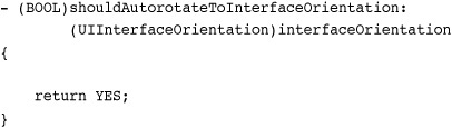
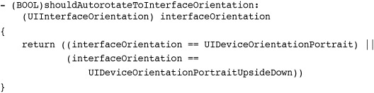
UIViewController instances decide whether to respond to iPhone orientation by implementing the optional shouldAutorotateToInterfaceOrientation: method. This method returns either YES or NO, depending on whether you want to support autorotation to a given orientation. To allow autorotation to all possible orientations, simply return YES.
Possible iPhone orientations passed to this method include
• UIDeviceOrientationUnknown
• UIDeviceOrientationPortrait
• UIDeviceOrientationPortraitUpsideDown
• UIDeviceOrientationLandscapeLeft
• UIDeviceOrientationLandscapeRight
• UIDeviceOrientationFaceUp
• UIDeviceOrientationFaceDown
Of these orientations, only the portrait and landscape varieties influence how a view autorotates. If your application is portrait only or landscape only, it might allow flipping between the two available orientations. This code uses the logical OR symbol “||” to combine tests into a single return value.
When returning YES, the view controller uses several flags to determine how the autorotation takes place. For example, you might want to stretch subviews both horizontally and vertically.

These flags correspond exactly to settings made available in Interface Builder’s size inspector (Command-3), which is discussed in the next section.
Autosizing
When you tilt the iPhone on its side in Safari, the browser view adjusts its proportions to match the new orientation. It does this through autosizing. Autosizing adds rules to a view telling it how to reshape itself. It can stretch, stay the same size, and/or be pinned a certain distance from the edge of its parent. These properties can be set by hand in code or in Interface Builder’s size inspector (Command-3), which is shown in Figure 4-13.
Figure 4-13 Interface Builder’s Autosizing pane sets a view’s autoresizingMask.
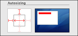
This pane adjusts a view’s autosizing rules. The control consists of an inner square with two double-arrowed lines and an outer square with four blunt-ended lines. Each item can be set or unset via a click. When enabled, they appear in bright red; when disabled they are dim red in color.
The four outer lines are called struts. They establish a fixed distance between a view and its parent’s edge. Imagine setting a view at 40 pixels from the top and left of the superview. Enabling the top and left struts (as shown in Figure 4-13) fixes that view at that position. It basically pins the view in place. When you use a right or bottom strut, those distances are also maintained. The view must either move or resize to stay the same pixel distance from those sides.
The two inner lines are called springs. They control how a view resizes itself. The sample shown in Figure 4-13 has its horizontal spring set, allowing the view to resize horizontally in proportion to the parent view’s size.
To allow a view to float, that is, to set it as both unpinned and without automatic resizing, unset all six struts and springs. This option is only available for subviews. The primary view defined in Interface Builder must be set with both springs on.
If you prefer to set these traits by hand, the two properties involved are autoresizesSubviews, a Boolean value that determines whether the view provides subview resizing, and autoresizingMask, an integer composed of the following flags, which are combined using the bitwise OR operator “|” to produce a value for the property.
• UIViewAutoresizingNone means the view does not resize.
• UIViewAutoresizingFlexibleLeftMargin, UIViewAutoresizingFlexibleRightMargin, UIViewAutoresizingFlexibleTopMargin, and UIViewAutoresizingFlexibleBottomMargin allow a view to resize by expanding or shrinking in the direction of a given margin without affecting the size of any items inside. These correspond to the four struts of Interface Builder’s Autosizing pane (refer to Figure 4-13) but act in the opposite way. In IB, struts fix the margins; the flags allow flexible resizing along those margins.
• UIViewAutoresizingFlexibleWidth and UIViewAutoresizingFlexibleHeight control whether a view shrinks or expands along with a view. These correspond directly with Interface Builder’s springs. Springs allow flexible resizing, as do these flags.
Autosizing Example
Consider the view shown in Figure 4-14. It consists of one main view and three subviews, namely the title, a white background splash, and a small piece of art. These subviews represent three typical scenarios you’ll encounter while designing applications. The title wants to stay in the same place and maintain its size regardless of orientation. The white splash needs to stretch or shrink to match its parent’s geometry, and the butterfly art should float within its parent.
Figure 4-14 Setting view autosizing in Interface Builder.
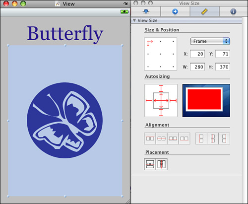
The autosizing behavior of each subview is set in the size inspector (Command-3). The title requires only a single strut at the top. The splash needs to resize while maintaining its distance from each edge. Setting all six struts and springs (shown in Figure 4-14) produces this result. The art subview uses the opposite setting, with none of the six struts or springs in use.
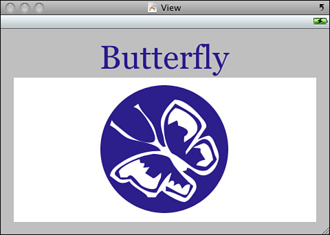
Test the view in its opposite orientation by clicking the small curved arrow at the top-right of the view editor window. In Figure 4-14, this arrow appears just above the battery indicator in the simulated status bar. Figure 4-15 shows the landscape version of this view using these settings. Switching between portrait and landscape presentation helps preview how your autoresizing choices work.
Figure 4-15 This is the landscape version of the view shown in Figure 4-14 using the described autosizing choices. Click the arrow at the right of the title bar to rotate the view in Interface Builder.
Note
The iPhone loads the last saved .xib orientation on launch. Make sure to return to the portrait view before saving your .xib file.
Evaluating the Autosize Option
Some iPhone classes work well with autosizing. Some do not. Large presentation-based views provide the best results. Web views and text views autosize well. Their content easily adapts to the change in view shape.
Small controls, especially text fields, fare more poorly. These views are not naturally elastic. Moving from landscape to portrait, or portrait to landscape, often leaves either too much room or not enough room to accommodate the previous layout. For these views you might place each item in a custom position rather than depend on autosizing. That’s not to say that autosize solutions cannot work for simple layouts just that as a general rule more complex views with many subviews do not always lend themselves to autosizing.
Image views are another class that doesn’t work well with autosizing. Most pictures need to maintain their original aspect ratios. A 320×480 image shown originally in portrait orientation must shrink to 213×320 for landscape. That leaves you with just 45% of the portrait size. Consider swapping out art to a landscape-appropriate version rather than trying to stretch or resize portrait-based originals.
When working with autosizing, always take the keyboard into account. If your main view does not scroll or provide provisions for moving its views into accessible places, a keyboard may hide some of the views it’s trying to service. Test your interfaces as you design them, both with Interface Builder’s flip button and in the simulator, to ensure that all elements remain well placed and accessible.
Moving Views
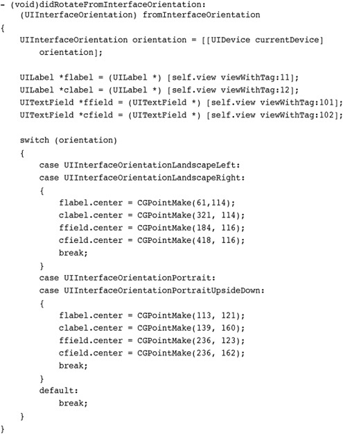
If autosizing provides a practically no-work solution to orientation changes, moving views offers a fix with higher-bookkeeping responsibilities. The idea works like this. After a view controller finishes its orientation, it calls the delegate method didRotateFromInterfaceOrientation:. You can implement a method that manually moves each view into place, producing the kinds of results seen in Figure 4-16. As you can see, this approach quickly gets tedious, especially when you are dealing with more than four subviews at a time.
Figure 4-16 Moving views allows you to adjust layouts after orientation changes.
The big advantage of this moving-subviews approach over presenting two separate views is that you maintain access to your original subviews. Any instance variables in your view controller that point, say, to a text field, continue to do so regardless of where that field is placed onscreen. The data structure of your view controller remains unchanged and independent of location, which is very model-view-controller compliant.
Moving Views by Mimicking Templates
There’s a much simpler way to accomplish the same movement with less work. In Interface Builder, duplicate your primary view twice. Edit those two copies to create landscape and portrait versions using the same view elements. Since the views were copied from the original, all the subviews retain their original tags. Figure 4-17 shows what those views might look like.
Figure 4-17 Duplicating views in Interface Builder creates templates for moving subviews.

This example continues to use your original view and subviews after orientation changes. (Please note that allSubviews() is defined in Recipe 6-2, “Subview Utility Functions.”) What you do is use those extra two views as templates to determine where to place each subview. You move objects into position based on matching the template. This approach introduces two enormous advantages. You don’t hard-code locations, and you can adjust the layouts in Interface Builder as needed.
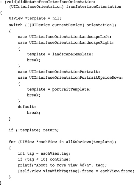
Here are a few points about this approach:
• This code ignores untagged views and tags with a value under 10. Apple rarely tags views, but when it does so, it uses small numbers like 1, 2, and 3. Make sure to tag your views starting with numbers from 10 and up.
• This example uses two instance variables (portraitTemplate and landscapeTemplate) to provide immediate access to the templates. These are defined as IBOutlets in the view controller header file and are connected via Interface Builder. When the .xib loads, these two outlets are automatically set.
• If you decide to edit your portrait layout, do so in your original view in Interface Builder. Discard the previous Portrait view and replace it with a copy of your edited View. Reconnect the outlet from the File’s Owner to the new Portrait view. This ensures that your portrait and primary views remain identical in the .xib file. Unfortunately, you cannot just use the main view as your portrait template. Once rotated, it loses all memory of the proper portrait view positions.
Swapping Views
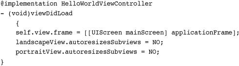
The iPod/Music application does not attempt to restructure its table when you flip the iPhone into landscape. Instead it displays an entirely different view, namely a Coverflow presentation of albums. To create your own swap, add two views into your view controller’s .xib, one portrait and one landscape. Assign IBOutlets to each and, to start, set your view controller’s view property to the portrait version.
In your view controller implementation, make sure to set the autoresizesSubviews flag for each primary view to NO. This ensures that the view appears exactly as you laid it out in Interface Builder. (If you want, you can amuse yourself by commenting out those lines and performing a few flips in the simulator. The results are often startling.)
When the view rotates to landscape or portrait, switch self.view to point to the proper view. This code first checks for landscape and then uses else if and checks for portrait orientations. This guards against matching unknown orientations and face up/face down ones to the portrait view.
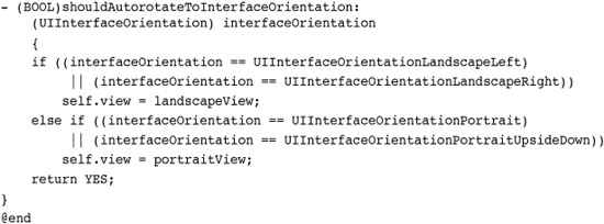
When run, this code responds to interface changes by reassigning the view controller’s view property either to the landscape or the portrait version based on the new orientation.
One More Thing: A Half Dozen Great Interface Builder Tips
It never hurts to have a few extra tricks up your sleeve when developing with Interface Builder and Xcode. Here are six favorite IB tricks that I use on a regular basis:
• Selecting from stacked views—Figure 4-12 showed you how to drill down into Interface Builder’s object hierarchy to reveal subviews. Another way to find and select subviews is by Control-Shift-clicking a view. This exposes all the views layered at that point (see Figure 4-18) and lets you select whichever item you want, regardless of whether it is the top view.
Figure 4-18 Shift-Control-click a view to pop up a view-selection dialog.

• Naming views—Give your views names like the ones used in Figure 4-18 in the identity inspector (Command-4). Edit the Interface Builder Identity > Name field.
• Pulling in media—Interface Builder’s library offers a Media tab, listing the media currently available in your Xcode project (see Figure 4-19, left). You can drag artwork from there and drop it onto a view. Interface Builder automatically creates a new UIImageView instance, adding the art (as a UIImage) to that view.
Figure 4-19 You can drag media from the Library into your IB projects (left). Custom guides add attraction points for laying out views (right).

• Adding custom guides—Interface Builder offers the same kind of layout guides used in programs like Photoshop. Use the Layout menu to add horizontal and vertical guides. As Figure 4-19 (right) shows, IB provides live position feedback as you drag the guide into place, offering pixel-precise placement.
• Moving objects—When moving subviews, the arrow keys move you one pixel in any direction. Hold down the Shift key to move by 5 pixels at a time.
• Show object layout—Hold down the option key and hover the mouse over any object to reveal the pixel-accurate layout information shown in Figure 4-20.
Figure 4-20 Holding the option key while moving the mouse over views reveals how each view is placed in the view container.
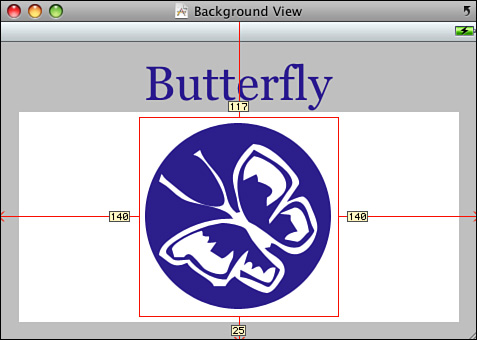
Summary
This chapter introduced the basics of iPhone interface design. You discovered not one but four ways to build interfaces: using Interface Builder, using Xcode, and blending the two approaches. You saw reorientation in action and learned about different ways to update your views to live in both portrait and landscape worlds.
Before moving on to the next chapter, here are a few points to consider about laying out interfaces:
• Interface Builder excels at laying out the content of UIView instances. Use its tools to connect those instances to the view controllers in your program and use Interface Builder to refine WYSIWYG-style interfaces like the temperature converter example covered in this chapter.
• Know when Interface Builder isn’t the right solution. When you’re building tab bars and navigation controllers with minimal window design (such as for table-based or text-based applications), you don’t especially need IB’s view layout tools. When skipping IB, make sure to delete the .xib file from your project and remove the Main NIB Window key from Info.plist. Also edit your main.m file to substitute the application delegate class name for the fourth UIApplicationMain() argument. Failing to do so produces an application that shows a black screen and provides no further interaction.
• Some views work beautifully under multiple orientations. Some do not. Don’t feel that you must provide a landscape version of your application that exactly matches either the look or the functionality of the portrait one.
• Always, always save your work in Interface Builder. Until you do so, your project will not be updated with the current version of your .xib files.
• There’s no “right” way to design and implement portrait and landscape layouts. Choose the approach that works best for your needs and provides the best experience for your users.