
Appendix B
An Introduction to Microsoft Expression Blend for Windows Phone
One of the key advantages Microsoft has over its competitors is the feature-rich development tools it provides. The sample applications in this book are mainly developed using Microsoft Visual Studio 2010 Express for Windows Phone, which is an IDE environment that many software developers are familiar with. In this appendix, you’re exposed to a different development environment: Microsoft Expression Blend 4 for Windows Phone. The purpose of this appendix is to walk you through the basics of Microsoft Expression Blend 4 and explain how you can unleash the power of this tool to deliver solid WP7 applications with stunning user experiences.
Microsoft Expression Blend 4 is a visual tool for designing and prototyping desktop, web, and mobile applications. The full version of this software isn’t free. However, Microsoft Expression Blend for Windows Phone is offered to developers at no cost; it’s included in the free full Windows Phone developer package. If for any reason you cannot find this tool on your computer, you can always visit the Microsoft App Hub to download it and install it (http://create.msdn.com/en-us/home/getting_started).
In the lineup of Microsoft development tools, Microsoft has positioned Expression Blend in an interesting spot. It’s like Expression Design in the sense that you can easily create graphic designs. It’s also like Visual Studio because you can edit Extensible Application Markup Language (XAML) code and run your applications directly from Expression Blend. As a matter of fact, you can use Expression Blend to open and edit Silverlight-based WP7 applications that are developed using Visual Studio and vice versa. But Expression Blend doesn’t offer as many graphic tools as Expression Design does, and you don’t have to export your vector artwork to Visual Studio. And unlike Visual Studio, Expression Blend doesn’t offer powerful debugging capabilities. It doesn’t support XNA at all. In many ways, Expression Blend isn’t competing against Expression Design or Visual Studio. It complements both tools and works as a bridge that seamlessly connects an attractive user interface (UI) with back-end programming logic. And it’s certainly a perfect tool for interactive designers and XAML architects.
MICROSOFT EXPRESSION BLEND IDE
In this section, you’ll learn about the Microsoft Expression Blend for Windows Phone working environment. The program name appears as Microsoft Expression Blend 4 on your computer. To illustrate the basic tools, you can create an empty project as follows.
1. Start Microsoft Expression Blend 4. Windows starts the Expression Blend 4 IDE.
2. Choose File ⇒ New Project. You’ll see the New Project dialog box, as shown in Figure B-1. You’ll also notice from this window that Microsoft Expression Blend 4 supports the same five Silverlight templates that Visual Studio 2010 Express for Windows Phone does.
FIGURE B-1: New Project dialog box of Expression Blend
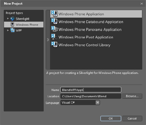
3. Choose Silverlight for Windows Phone templates from the left panel. Highlight the Windows Phone Application template. You’ll see a description of this template shown below the template section box.
4. Type BlendWP7App1 in the Name field and select Visual C# from the Language drop-box. Click OK. Expression Blend creates a blank application for you, as shown in Figure B-2.
FIGURE B-2: Expression Blend IDE environment
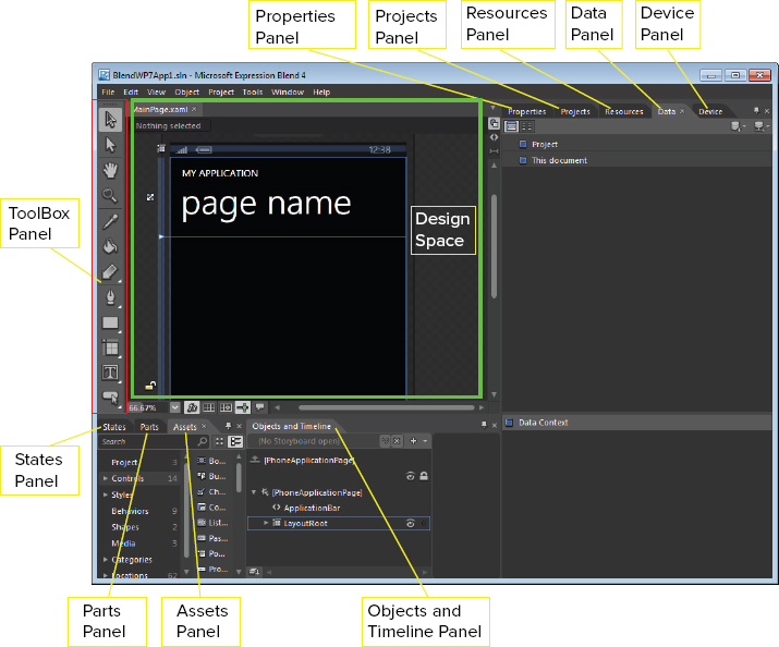
On your computer, the position of each panel might not be identical to Figure B-2. But that isn’t something you need to be concerned about because you can easily dock/undock, hide/unhide, or reposition those panels with ease. The following list describes each of these panels.
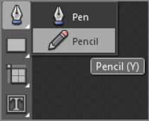
- ToolBox panel: This is the top left panel in Figure B-2. It contains tools such as Selection, Pen, and Rectangle. Note that the tiny triangle icon at the bottom right of a tool entry means it contains more than one tool. For example, if you click and hold (or right-click) on the Pen icon, you can select either the Pen control or the Pencil control, as shown in Figure B-3.
FIGURE B-3: Select a control from a control group
- Design space: This is the center of the IDE environment. You can directly design your artwork or edit the XAML/C# code from the design space.
- Properties panel: This is one of the panels on the right side of the IDE. You can edit the properties of a control by using this panel.
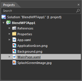
- Projects panel: Figure B-4 shows the Projects panel. It looks a lot like the Solution Explorer in Visual Studio.
FIGURE B-4: Projects panel
- Resources panel: This panel also appears on the right side of Figure B-2. It lists all the resources in your current open project. You can also add/remove resources by using this panel.
- Data panel: Next to the Resources panel in Figure B-2, you’ll find the Data panel. It lists the data sources in current open project. You can also add/remove data sources on the current project.
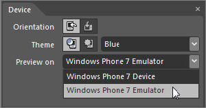
- Device panel: This panel also appears on the right side by default. You can change the default orientation and WP7 Theme colors from this panel. You can also choose whether your project connects to the emulator or to the real device from this panel. Figure B-5 illustrates the options in this panel.
FIGURE B-5: Device panel
- States panel: This panel appears on the bottom left side of Figure B-2. It enables you to define state groups and state transitions. As a result, you can easily create animation effects triggered by events such as mouse over.
- Parts panel: Next to the States panel, you’ll find the Parts panel. It provides a list of parts you can use to design control templates.
- Assets panel: The Assets panel lists all the controls, styles, media, behaviors, and effects that you use in your project. You can find Windows Phone 7 controls in this panel.
- Objects and Timeline panel: On the bottom of Figure B-2, you’ll find this panel. It enables you to create storyboards with animation features.
- Output panel: By default, this panel isn’t displayed in the IDE. If you start running a project in Expression Blend, build results and error information automatically show up in this panel.
If you accidentally close a panel, you can always re-enable it by selecting its entry in the Window menu. In the Expression Blend IDE, you can re-arrange all these panels and save the layout as a workspace. You can also minimize/restore those panels by pressing the F4 key. To rotate between different workforces, press the F6 key.
CREATING ANIMATION WITH EXPRESSION BLEND
Recall in Chapter 8 that you learned how to cycle through a portion of a sprite to generate an animation effect. In this section, you’ll learn how to use the Objects and Timeline controls to create a storyboard with Expression Blend. If you have already closed the empty project BlendWP7App1, please re-open it. When you follow the instructions below, you’ll make a textbox that moves, rotates, and changes its color.
1. Select the PageTitle object from the Properties panel, change its font size to 36pt, and change the Text property to Blend Animation.
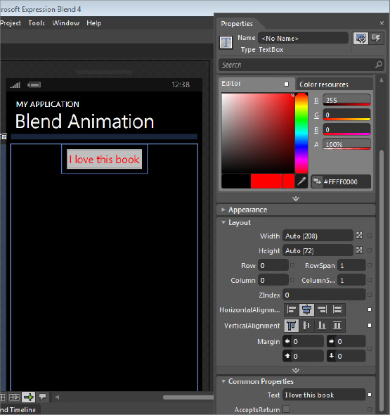
2. From the Assets Panel, choose Controls ⇒ TextBox. Drag and drop this TextBox control to the ContentPanel of PhoneApplicationpage.
3. From the Properties panel, change the color to Red, set HorizontalAlignment to Center, and change Text to I love this book, as shown in Figure B-6.
FIGURE B-6: Change the properties of the Textbox control.
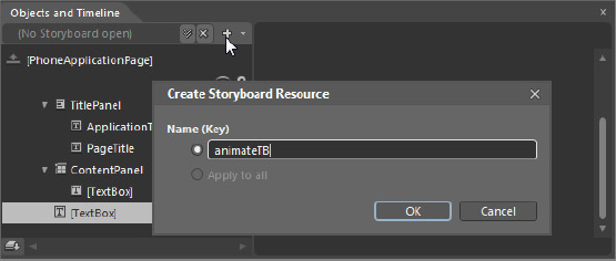
4. Next, create a storyboard by clicking the plus sign on the top of the Objects and Timeline panel. You’ll see a Create Storyboard Resource window pop up. Enter animateTB in the Name (Key) field, as shown in Figure B-7. Click OK to begin recording the animation. You’ll see a red round button appear on the top left of the design space with the words “animateTB timeline recording is on” next to it.
FIGURE B-7: Add a story board.
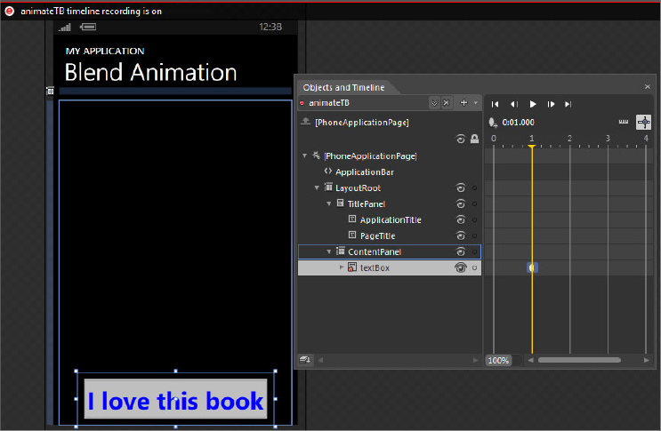
5. Set the timeline to 1s (second), and select textBox. Drag the textBox from the top to the bottom of the ContentPanel. From the Properties window, change the Text font to 36pt and its color to Blue, as shown in Figure B-8.
FIGURE B-8: Adding a key frame at the time value 1s
6. Set the timeline to 2 seconds, and select textBox. Rotate textBox 180 degrees to make it upside down and move the textBox to the center of the ContentPanel.
7. Set the timeline to 3 seconds, and select textBox. Reset textBox so that it has the same look at time 0s by dragging it to the top of the ContentPanel, rotating the control 180 degrees, changing the font size to 19pt, and changing the foreground color to red.
8. Click the round red button on the top left of the design space to stop recording the storyboard. The color of the button turns to gray, and the statement changes to “animateTB timeline recording is off.”
9. Now you can enjoy the animation by clicking Play in the Objects and Timeline panel.
You’ve accomplished a lot so far without writing a single line of code. But if you press F5 to start running this application, you won’t see any animations because the storyboard isn’t hooked to any events. There are two ways you can start playing this animation. One is to call its Begin() method in an event handler, the other is to use Behaviors. In this section, you’ll learn how to use Behaviors to trigger an event to play the animation.
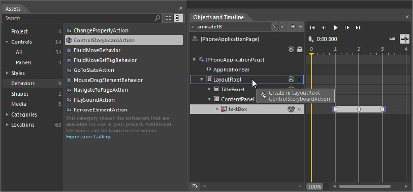
From the Assets panel, click Behaviors. Select ControlStoryBoardAction and drop it onto the LayoutRoot in the Objects and Timeline panel, as shown in Figure B-9.
FIGURE B-9: Adding ControlStoryboardAction behavior to LayoutRoot
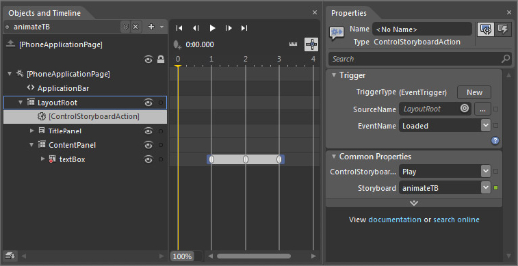
Now with ControlStoryboardAction selected in the Properties panel, select Loaded from the EventName, Play from ControlStoryboardOption, and animateTB from Storyboard, shown in Figure B-10.
FIGURE B-10: Set ControlStoryboardAction properties to play animationTB
Press F5 to start this application. You’ll see animation start once the page is loaded. And now you have created an animation storyboard without writing a single line of code: isn’t that amazing!
In the next section, you’ll learn how to customize a UI control and you’ll also learn how to hook the animation with a control event handler.
CUSTOMIZING UI WITH EXPRESSION BLEND
Expression Blend provides many great tools that enable you to create eye-catching UI components. For ease of discussion, this section shows how to add a 3D perspective to a Button control. The following steps assume you created the example in the “Creating Animation with Expression Blend” section of this appendix.
1. Drag a Button from the Assets panel to the ContentPanel. Align it to the bottom left of ContentPanel.
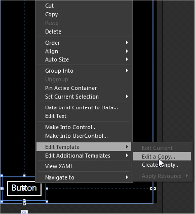
2. Right-click the Button control, choose Edit Template ⇒ Edit a Copy from the Context menu as shown in Figure B-11. You’ll see a Create Style Resource window pop up.
FIGURE B-11: Editing the template of a Button control
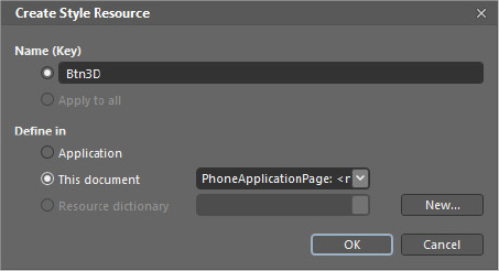
3. Type Btn3D in the Name (Key) property and set the Define In property to This document as shown in Figure B-12. Click OK. You’ll see Btn3D (Button Template) appear in the Objects and Timeline panel.
FIGURE B-12: Creating a new style resource
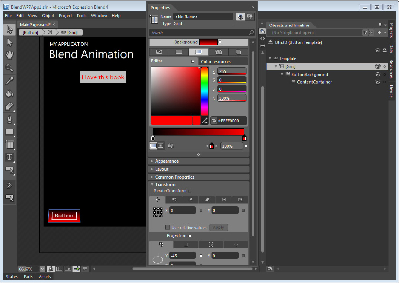
4. Select [Grid] from the Objects and Timeline panel. Select the Gradient brush and set the Background color to Red. Next find the Projection option in the Transform group on the Properties panel, and change the X value to -50 degree, as shown in Figure B-13.
FIGURE B-13: Changing the grid of a Button control
5. Click the up arrow key to the left of Btn3D in the Objects and Timeline panel to quit the template editing mode. This action returns the scope to the PhoneApplicationPage. If the storyboard recording mode is on, you can turn it off by clicking the round red recording button.
6. Now drag and drop another Button to the ContentPanel, and move it to the bottom right of ContentPanel. To apply the template you defined in Steps 1 through 5, right-click the new Button and choose Edit Template ⇒ Apply Resource ⇒ Btn3D from the Context menu.
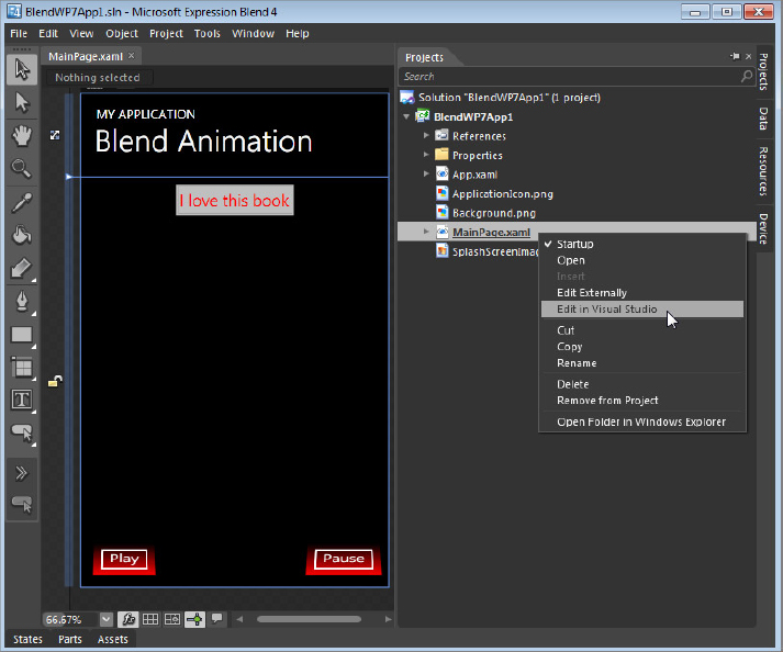
7. Change the Text property of the left button to Play and the right button to Pause. You can then add an event handler to each button. You can perform this task within Expression Blend but it’s probably a better idea to develop the application code in Visual Studio. Figure B-14 illustrates this process: right-click the MainPage.xaml file entry in the Projects panel and choose Edit in Visual Studio from the Context menu.
FIGURE B-14: Open project Item from Visual Studio
Within Visual Studio, add the button click event handlers, as described below.
//Play button
private void Button_Click(object sender, RoutedEventArgs e)
{
    if (this.animateTB.GetCurrentState() == ClockState.Filling)
        this.animateTB.Begin();
    else this.animateTB.Resume();
}

//Pause button
private void Button_Click_1(object sender, RoutedEventArgs e)
{
    this.animateTB.Pause();
}
Code snippet BlendWP7App1BlendWP7App1MainPage.xaml.cs
When the user clicks the Play button, the code checks the storyboard state. If the state is ClockState.Filling, it means the storyboard has finished playing, and you can call the Begin() method. Otherwise, the code calls the Resume() method. When the user clicks the Pause button, the code calls the animateTB.Pause() method.
After you finish editing code in Visual Studio, you can save the changes and close Visual Studio. When you return to Expression Blend, the IDE warns you that external programs have modified project items. Click OK to reload the project. Press F5 again to start the application; you can now enjoy playing this animation over and over again.
Expression Blend is a powerful tool that delivers a graphical environment in which to create UI components. The fact that it works seamlessly with Visual Studio makes developing WP7 applications a joyful experience. This appendix shows only the tip of the iceberg. You’re encouraged to learn more about Expression Blend so you can deliver more attractive applications to the Windows Phone Marketplace.