Chapter 4
Working with PivotTables
In This Chapter
![]() Cross-tabulating with pivot tables
Cross-tabulating with pivot tables
![]() Setting up with the PivotTable Wizard
Setting up with the PivotTable Wizard
![]() Fooling around with your pivot tables
Fooling around with your pivot tables
![]() Customizing the look and feel of your pivot tables
Customizing the look and feel of your pivot tables
Perhaps the most powerful analytical tool that Excel provides is the PivotTable command, with which you can cross-tabulate data stored in Excel lists. A cross-tabulation summarizes information in two (or more) ways: for example, sales by product and state, or sales by product and month.
Cross-tabulations, performed by pivot tables in Excel, are a basic and very interesting analytical technique that can be tremendously helpful when you’re looking at data that your business or life depends on. Excel’s cross-tabulations are neater than you might at first expect. For one thing, they aren’t static: You can cross-tabulate data and then re-cross-tabulate and re-cross-tabulate it again simply by dragging buttons. What’s more, as your underlying data changes, you can update your cross-tabulations simply by clicking a button.
Looking at Data from Many Angles
Cross-tabulations are important, powerful tools. Here’s a quick example: Assume that in some future century that you’re the plenipotentiary of the Freedonian Confederation and in charge of security for a distant galaxy. (Rough directions? Head toward Alpha Centauri for about 50 million light years and then hang a left. It’ll be the second galaxy on your right.)
Unfortunately, in recent weeks, you’re increasingly concerned about military conflicts with the other major political-military organizations in your corner of the universe. Accordingly, assume for a moment that a list maintained by the Confederation tracks space trooper movements in your galaxy. Assume that the list stores the following information: troop movement data, enemy name, and type of troop spaceships involved. Also assume that it’s your job to maintain this list and use it for analysis that you then report to appropriate parties.
With this sort of information, you could create cross-tabulations that show the following information:
- Enemy activity over time: One interesting cross-tabulation is to look at the troop movements by specific enemy by month over a two- or five-year period of time. You might see that some enemies were gearing up their activity or that other enemies were dampening down their activity. All this information would presumably be useful to you while you assess security threats and brief Freedonian Confederation intelligence officers and diplomats on which enemies are doing what.
- Troop movements by spaceship type: Another interesting cross-tabulation would be to look at which spaceships your (potential) enemies are using to move troops. This insight might be useful to you to understand both the intent and seriousness of threats. As your long experience with the Uglinites (one of your antagonists) might tell you, for example, if you know that Jabbergloop troop carriers are largely defensive, you might not need to worry about troop movements that use these ships. On the other hand, if you notice a large increase in troop movements via the new photon-turbine fighter-bomber, well, that’s significant.
Pretty powerful stuff, right? With a rich data set stored in an Excel table, cross-tabulations can give you remarkable insights that you would probably otherwise miss. And these cross-tabulations are what pivot tables do.
Getting Ready to Pivot
To create a pivot table, your first step is to create the Excel table that you want to cross-tabulate. Figure 4-1 shows an example Excel table that you might want a pivot table based on. In this list, I show sales of herbal teas by month and state. Pretend that this is an imaginary business that you own and operate. Further pretend that you set it up in a list because you want to gain insights into your business's sales activities.
Note: You can find this Herbal Teas Excel Data list of herbal tea sales Workbook, available in the Zip file of sample Excel workbooks related to this book, at the companion website for this book. You might want to download this list in order to follow along with the discussion here. See the Introduction for more on accessing the companion website.
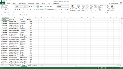
Figure 4-1: This Excel table can be the basis for a pivot table.
Running the PivotTable Wizard
You create a pivot table — Excel calls a cross-tabulation a pivot table — by using the PivotTable command. To run the PivotTable command, take the following steps:
- Click the Insert tab’s PivotTable command button.
Excel displays the Create PivotTable dialog box, as shown in Figure 4-2.
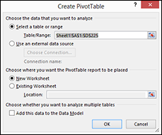
Figure 4-2: Use the wizard to set up a pivot table.
- Select the radio button that indicates where the data you want to analyze is stored.
If the to-be-analyzed data is in an Excel table or worksheet range, for example, select the Table/Range radio button. I demonstrate this approach here. And if you’re just starting out, you ought to use this approach because it’s the easiest.
If the data is in an external data source, select the Use an External Data Source radio button. I don’t demonstrate this approach here because I’m assuming in order to keep things simple and straightforward that you’ve already grabbed any external data and placed that data into a worksheet list. (If you haven’t done that and need help doing so, skip back to Chapter 2.)
If the data is actually stored in a bunch of different worksheet ranges, simply separate each worksheet range with a comma. (This approach is more complicated, so you probably don’t want to use it until you’re comfortable working with pivot tables.)
 If you have data that’s scattered around in a bunch of different locations in a worksheet or even in different workbooks, pivot tables are a great way to consolidate that data.
 - Tell Excel where the to-be-analyzed data is stored.
If you’re grabbing data from a single Excel table, enter the list range into the Table/Range text box. You can do so in two ways.
- You can type the range coordinates: For example, if the range is cell A1 to cell D225, type $A$1:$D$225.
- Alternatively, you can click the button at the right end of the Table/Range text box. Excel collapses the Create PivotTable dialog box, as shown in Figure 4-3.
Now use the mouse or the navigation keys to select the worksheet range that holds the data that you want to pivot. After you select the worksheet range, click the button at the end of the Range text box again. Excel redisplays the Create PivotTable dialog box. (Refer to Figure 4-2.)
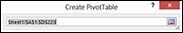
Figure 4-3: The collapsed Create PivotTable dialog box.
- After you identify the data that you want to analyze in a pivot table, click OK.
Excel displays the new workbook with the partially constructed pivot table in it, as shown in Figure 4-4.
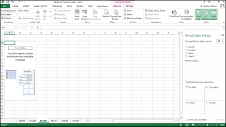
Figure 4-4: Create an empty pivot table; tell Excel what to cross-tabulate.
- Select the Row field.
You need to decide first which field from the list that you want to summarize by using rows in the pivot table. After you decide this, you drag the field from the PivotTable Field List box (on the right side of Figure 4-4) to the Rows box (beneath the PivotTable Field List). For example, if you want to use rows that show product, you drag the Product field to the Rows box.
Using the example data from Figure 4-1, after you do this, the partially constructed Excel pivot table looks like the one shown in Figure 4-5.
- Select the Column field.
Just like you did for the Row field, indicate what list information you want stored in the columns of your cross-tabulation. After you make this choice, drag the field item from the PivotTable Field List to the box marked Columns. Figure 4-6 shows the way the partially constructed pivot table looks now, using columns to show states.
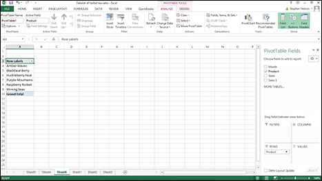
Figure 4-5: Your cross-tabulation after you select the rows.
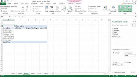
Figure 4-6: Your cross-tabulation after you select rows and columns.
- Select the data item that you want.
After you choose the rows and columns for your cross-tabulation, you indicate what piece of data you want cross-tabulated in the pivot table. For example, to cross-tabulate sales revenue, drag the sales item from the PivotTable Field List to the Values box. Figure 4-7 shows the completed pivot table after I select the row fields, column fields, and data items.
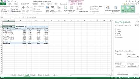
Figure 4-7: Tah dah! A completed cross-tabulation.
Note that the pivot table cross-tabulates information from the Excel table shown in Figure 4-1. Each row in the pivot table shows sales by product. Each column in the pivot table shows sales by state. You can use column E to see grand totals of product sales by product item. You can use row 11 to see grand totals of sales by state.
Another quick note about the data item that you cross-tabulate: If you select a numeric data item — such as sales revenue — Excel cross-tabulates by summing the data item values. That’s what you see in Figure 4-7. If you select a textual data item, Excel cross-tabulates by counting the number of data items.
 Although you can use pivot tables for more than what this simple example illustrates, this basic configuration is very valuable. With a table that reports the items you sell, to whom you sell, and the geographic locations where you sell, a cross-tabulation enables you to see exactly how much of each product you sell, exactly how much each customer buys, and exactly where you sell the most. Valuable information, indeed.
Fooling Around with Your Pivot Table
After you construct your pivot table, you can further analyze your data with some cool tools that Excel provides for manipulating information in a pivot table.
Pivoting and re-pivoting
The thing that gives the pivot table its name is that you can continue cross-tabulating the data in the pivot table. For example, take the data shown in Figure 4-7: By swapping the row items and column items (you do this merely by swapping the State and Product buttons), you can flip-flop the organization of the pivot table. Figure 4-8 shows the same information as Figure 4-7; the difference is that now the state sales appear in rows and the product sales appear in columns.
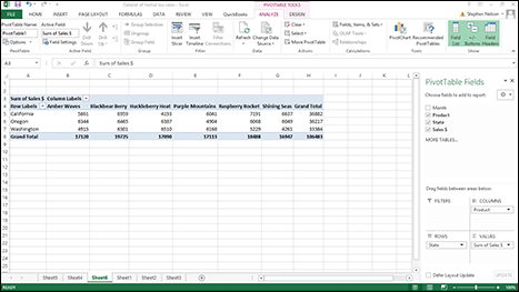
Figure 4-8: Change your focus with a re-pivoted pivot table.
Note: As you pivot data within the Excel window, the viewable portion of the Excel workbook changes. Depending on the sizing of your window and the data, you may need to scroll around a bit to see your information.
Another nifty thing about pivot tables is that they don't restrict you to using just two items to cross-tabulate data. For example, in both the pivot tables shown in Figures 4-7 and 4-8, I use only a single row item and a single column item. You’re not limited to this, however: You can also further cross-tabulate the herbal tea data by also looking at sales by month and state. For example, if you drag the month data item to the Row Labels, Excel creates the pivot table shown in Figure 4-9. This pivot table enables you to view sales information for all the months, as shown in Figure 4-9, or just one of the months.
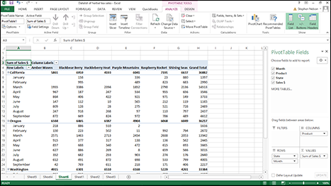
Figure 4-9: Use multiple PivotTable fields for rows.
Filtering pivot table data
And here’s another cool thing you can do: filtering. To filter sales by month, drag the Month PivotTable field to the Filters box. Excel re-cross-tabulates the PivotTable as shown in Figure 4-10. To see sales of herbal teas by state for only a specific month — say, January — you would click the down-arrow button that looks like it’s in cell B1. When Excel displays a drop-down list box, select the month you want to see. Figure 4-11 shows sales for just the month of January. (Check out cell B1 again.)
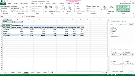
Figure 4-10: You can filter page fields.
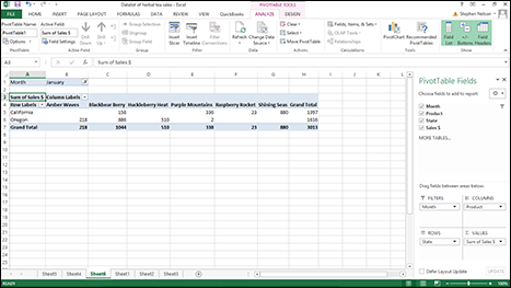
Figure 4-11: Filtered pivot table information.
To remove an item from the pivot table, simply drag the item’s button back to the PivotTable Field List or uncheck the checkbox that appears next to the item in the PivotTable Field List. Also, as I mention earlier, to use more than one row item, drag the first item that you want to use to the Rows box and then also drag the second item that you also want to use to Rows Here.
Drag the row items from the PivotTable Field List. Do the same for columns: Drag each column item that you want from the PivotTable Fields to the Columns box.
Check out Figure 4-12 to see how the pivot table looks when I also use Month as a column item. Based on the data in Figure 4-1, this pivot table is very wide when I use both State and Month items for columns. For this reason, only a portion of the pivot table that uses both Month and State column items shows in Figure 4-12.
Sometimes having multiple row items and multiple column items makes sense. Sometimes it doesn't. But the beauty of a pivot table is that you can easily cross-tabulate and re-cross-tabulate your data simply by dragging those little item buttons. Accordingly, try viewing your data from different frames of reference. Try viewing your data at different levels of granularity. Spend some time looking at the different cross-tabulations that the PivotTable command enables you to create. Through careful, thoughtful viewing of these cross-tabulations, you can most likely gain insights into your data.
You can remove and redisplay the PivotTable Field List in Excel 2013 by clicking the Field List button on the Analyze tab.
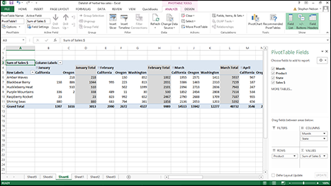
Figure 4-12: Slice data however you want in a cross-tabulation.
 To remove and redisplay the PivotTable Field List in Excel 2007 or Excel 2010, right-click PivotTable and choose the Hide Field List command. To show a previously hidden field list, right-click the PivotTable again and this time choose the Show Field List command. Predictably, whether the PivotTable shortcut menu displays the Show Field List command or the Hide Field List command depends on whether the field list shows. And, yes, this is the sort of insightful commentary you can count on me to supply.
Refreshing pivot table data
In many circumstances, the data in your Excel list changes and grows over time. This doesn't mean, fortunately, that you need to go to the work of re-creating your pivot table. If you update the data in your underlying Excel table, you can tell Excel to update the pivot table information.
You have four methods for telling Excel to refresh the pivot table:
- Click the PivotTable Tools Options ribbon’s Refresh command. Note that the Refresh command button is visible in Figure 4-12, shown earlier. The Refresh button appears in roughly the middle of the Analyze ribbon.
- Choose the Refresh Data command from the shortcut menu that Excel displays when you right-click a pivot table.
- Tell Excel to refresh the pivot table when opening the file. To do this, click the Options command Analyze ribbon (the PivotTable Tools Options ribbon in Excel 2007 and Excel 2010), and then after Excel displays the PivotTable Options dialog box, click the Data tab and select the Refresh Data When Opening File check box.
You can point to any Ribbon command button and see its name in a pop-up ScreenTip. Use this technique when you don’t know which command is which.
Sorting pivot table data
You can sort pivot table data in the same basic way that you sort an Excel list. Say that you want to sort the pivot table information shown in Figure 4-13 by product in descending order of sales to see a list that highlights the best products.
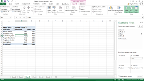
Figure 4-13: A pivot table before you sort on California herbal sales.
To sort pivot table data in this way, right-click a cell in the column that holds the sort key. For example, in the case of the pivot table shown in Figure 4-13, and assuming that you want to sort by sales, you click a cell in the worksheet range C5:C10. Then, when Excel displays the shortcuts menu, choose either the Sort Smallest to Largest or the Sort Largest to Smallest command. Excel sorts the PivotTable data, as shown in Figure 4-14. And not surprisingly, Raspberry Rocket sales are just taking off.
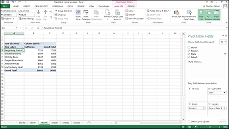
Figure 4-14: A pivot table after you sort on California herbal tea sales.
You can also exercise more control over the sorting of pivot table data. To do this, follow these steps:
- Choose Data tab’s Sort command.
Excel displays the Sort by Value dialog box shown in Figure 4-15.
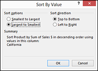
Figure 4-15: The Sort by Value dialog box.
- Select your sorting method.
You can select the Smallest to Largest option to sort by the selected PivotTable field in ascending order. Or you can select the Largest to Smallest option to sort by the selected PivotTable field in descending order. You can also specify the Sort Direction using the Top To Bottom and Left To Right buttons.
Pseudo-sorting
You can manually organize the items in your pivot table, too. You might want to do this so the order of rows or columns matches the way that you want to present information or the order in which you want to review information.
To change the order of items in your pivot table, right-click the pivot table row or column that you want to move. From the shortcut menu that Excel displays, choose the Move command. You should see a list of submenu commands: Move [X] to Beginning, Move [X] Up, Move [X] Down, and so forth. (Just so you know, [X] will be the name of the field you clicked.) Use these commands to rearrange the order of items in the pivot table. For example, you can move a product down in this list. Or you can move a state up in this list.
Grouping and ungrouping data items
You can group rows and columns in your pivot table. You might want to group columns or rows when you need to segregate data in a way that isn't explicitly supported by your Excel table.
In this chapter’s running example, suppose that I combine Oregon and Washington. I want to see sales data for California, Oregon, and Washington by salesperson. I have one salesperson who handles California and another who handles Oregon and Washington. I want to combine (group) Oregon and Washington sales in my pivot table so that I can compare the two salespersons. The California sales (remember that California is covered by one salesperson) appear in one column, and Oregon and Washington sales appear either individually or together in another column.
To create a grouping, select the items that you want to group, right-click the pivot table, and then choose Group from the shortcut menu that appears.
Excel creates a new grouping, which it names in numerical order starting with Group1. As shown in Figure 4-16, Excel still displays detailed individual information about Oregon and Washington in the pivot table. However, the pivot table also groups the Oregon and Washington information into a new category: Group1.
You can rename the group by clicking the cell with the Group1 label and then typing the replacement label.
To ungroup previously grouped data, right-click the cell with the group name (probably Group1 unless you changed it) to again display the shortcut menu and then choose Ungroup. Excel removes the grouping from your pivot table.
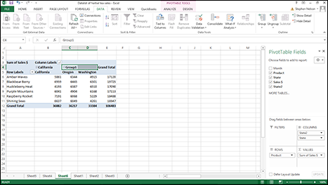
Figure 4-16: Group data in a pivot table.
Important point: You don't automatically get group subtotals. You get them when you filter the pivot table to show just that group. (I describe filtering earlier, in the section “Filtering pivot table data.”) You also get group subtotals, however, when you collapse the details within a group. To collapse the detail within a group, right-click the cell labeled with the group name (probably Group1), and choose Expand/Collapse⇒Collapse from the shortcut menu that appears. Figure 4-17 shows a collapsed group. To expand a previously collapsed group, right-click the cell with the group name again and choose Expand/Collapse⇒Expand from the shortcut menu that appears. Or just double-click the group name.
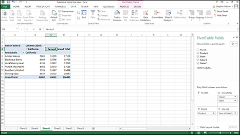
Figure 4-17: Group data in a pivot table.
Selecting this, selecting that
At your disposal is the Analyze ribbon’s Select submenu of commands: Labels and Values, Labels, Values, Entire Table, and Entire Selection. To display the Select submenu, click the drop-down arrow button to the right of the Select command button. When Excel displays the Select menu, choose the command you want.
In Excel 2007 and Excel 2010, the Select commands appear on the PivotTable Tools Options tab when you click the drop-down arrow button to the right of the Options command button. Also, Excel 2007 and Excel 2010 uses the term data rather than the term values.
Essentially, when you choose one of these submenu commands, Excel selects the referenced item in the table. For example, if you choose Select⇒Label, Excel selects all the labels in the pivot table. Similarly, choose Select⇒Values command, and Excel selects all the values cells in the pivot table.
The only Select menu command that’s a little tricky is the Enable Selection command. That command tells Excel to expand your selection to include all the other similar items in the pivot table. For example, suppose that you create a pivot table that shows sales of herbal tea products for California, Oregon, and Washington over the months of the year. If you select the item that shows California sales of Amber Waves and then you choose the Enable Selection command, Excel selects the California sales of all the herbal teas: Amber Waves, Blackbear Berry, Purple Mountains, Shining Seas, and so on.
Where did that cell’s number come from?
Here’s a neat trick. Right-click a cell and then choose the Show Details command from the shortcuts menu. Excel adds a worksheet to the open workbook and creates an Excel table that summarizes individual records that together explain that cell's value.
For example, I right-click cell C8 in the workbook shown earlier in Figure 4-16 and choose the Show Details command from the shortcut menu. Excel creates a new table, as shown in Figure 4-18. This table shows all the information that gets totaled and then presented in cell C8 in Figure 4-16.
You can also show the detail that explains some value in a pivot table by double-clicking the cell holding the value.
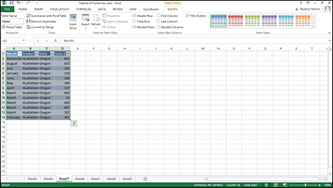
Figure 4-18: A detail list shows where pivot table cell data comes from.
Setting value field settings
The value field settings for a pivot table determine what Excel does with a field when it’s cross-tabulated in the pivot table. This process sounds complicated, but this quick example shows you exactly how it works. If you right-click one of the sales revenue amounts shown in the pivot table and choose Value Field Settings from the shortcut menu that appears, Excel displays the Value Field Settings dialog box, as shown in Figure 4-19.
Using the Summarize Values By tab of the Data Field Settings dialog box, you can indicate whether the data item should be summed, counted, averaged, and so on, in the pivot table. By default, data items are summed. But you can also arithmetically manipulate data items in other ways. For example, you can calculate average sales by selecting Average from the list box. You can also find the largest value by using the Max function, the smallest value by using the Min function, the number of sales transactions by using the Count function, and so on. Essentially, what you do with the Data Field Settings dialog box is pick the arithmetic operation that you want Excel to perform on data items stored in the pivot table.
If you click the Number Format button in the Data Field Settings dialog box, Excel displays a scaled-down version of the Format Cells dialog box (see Figure 4-20). From the Format Cells dialog box, you can pick a numeric format for the data item.
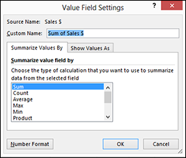
Figure 4-19: Create field settings here.
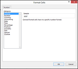
Figure 4-20: The Format Cells dialog box for pivot tables.
Click the Show Values As tab of the Value Field Settings dialog box, and Excel provides several additional boxes (see Figure 4-21) that enable you to specify how the data item should be manipulated for fancy-schmancy summaries. I postpone a discussion of these calculation options until Chapter 5. There’s some background stuff that I should cover before moving on to the subject of custom calculations, which is what these boxes are for.
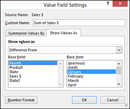
Figure 4-21: Make more choices from the expanded PivotTable Field dialog box.
Customizing How Pivot Tables Work and Look
Excel gives you a bit of flexibility over how pivot tables work and how they look. You have options to change their names, formatting, and data manipulation.
Setting pivot table options
Right-click a pivot table and choose the PivotTable Options command from the shortcut menu to display the PivotTable Options dialog box, as shown in Figure 4-22.
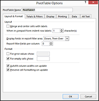
Figure 4-22: Change a pivot table’s look from the PivotTable Options dialog box.
The PivotTable Options dialog box provides several tabs of check and text boxes with which you tell Excel how it should create a pivot table. I do a quick run-through on these tab’s options.
Layout & Format tab options
Use the Layout & Format tab’s choices (refer to Figure 4-22) to control the appearance of your pivot table. For example, select the Merge And Center Cells with Labels check box to horizontally and vertically center outer row and outer column labels. Use the When in Compact Form Indent Row Labels [X] Character(s) to indent rows with labels when the PivotTable report is displayed using the compact format. Use the Display Fields in Report Filter Area and Report Filter Fields Per Column boxes to specify the ordering of multiple PivotTable filters and the number of filter fields per column.
The Format check boxes appearing on the Layout & Format tab all work pretty much as you would expect. To turn on a particular formatting option — specifying, for example, that Excel should show some specific label or value if the cell formula returns an error or results in an empty cell — select the For Error Values Show or For Empty Cells Show check boxes. To tell Excel to automatically size the column widths, select the Autofit Column Widths on Update check box. To tell Excel to leave the cell-level formatting as is, select the Preserve Cell Formatting On Update check box.
Perhaps the best way to understand what these layout and formatting options do is simply to experiment. Just an idea… .
Totals & Filters options
Use the Totals & Filters tab (see Figure 4-23) to specify whether Excel should add grand total rows and columns, whether Excel should let you use more than one filter per field and should subtotal filtered page items, and whether Excel should let you use custom lists when sorting. (Custom sorting lists include the months in a year or the days in the week.)
Display options
Use the Display tab (see Figure 4-24) to specify whether Excel should add expand/collapse buttons, contextual ScreenTips, field captions and filter drop-down list boxes, and similar such PivotTable bits and pieces. The Display tab also lets you return to Excel’s old-fashioned (so-called “classic”) PivotTable layout, which lets you design your pivot table by dragging fields to an empty PivotTable template in the worksheet.
Again, your best bet with these options is to just experiment. If you’re curious about what a check box does, simply mark (select) the check box. You can also click the Help button (the question mark button, top-left corner of the dialog box) and then click the feature that you have a question about.
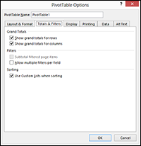
Figure 4-23: The Totals & Filters tab of the PivotTable Options dialog box.
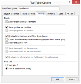
Figure 4-24: The Display tab of the PivotTable Options dialog box.
Printing options
Use the Printing tab (see Figure 4-25) to specify whether Excel should print expand/collapse buttons, whether Excel should repeat row labels on each printed page, and whether Excel should set print titles for printed versions of your PivotTable so that the column and row that label your PivotTable appear on each printed page.
Data options
The Data tab’s check boxes (see Figure 4-26) enable you to specify whether Excel stores data with the pivot table and how easy it is to access the data upon which the pivot table is based. For example, select the Save Source Data with File check box, and the data is saved with the pivot table. Select the Enable Expand to Detail check box, and you can get the detailed information that supports the value in a pivot table cell by right-clicking the cell to display the shortcut menu and then choosing the Show Detail command. Selecting the Refresh Data When Opening the File check box tells Excel to refresh the pivot table's information whenever you open the workbook that holds the pivot table.
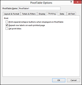
Figure 4-25: The Printing tab of the PivotTable Options dialog box.
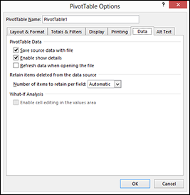
Figure 4-26: The Data tab of the PivotTable Options dialog box.
The Number of Items to Retain Per Field box probably isn’t something you need to pay attention to. This box lets you set the number of items per field to temporarily save, or cache, with the workbook.
Alt Text options
Use the Alt Text tab (see Figure 4-27) to provide textual descriptions of the information a PivotTable provides. The idea here (and this tab appears in Excel 2013 and later versions) is to help people with vision or cognitive impairment understand the PivotTable.
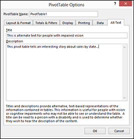
Figure 4-27: The Alt Text tab provides a tool you can use to help people with impaired vision or other cognitive issues understand PivotTable information.
Formatting pivot table information
You can and will want to format the information contained in a pivot table. Essentially, you have two ways of doing this: using standard cell formatting and using an autoformat for the table.
Using standard cell formatting
To format a single cell or a range of cells in your pivot table, select the range, right-click the selection, and then choose Format Cells from the shortcut menu. When Excel displays the Format Cells dialog box, as shown in Figure 4-28, use its tabs to assign formatting to the selected range. For example, if you want to assign numeric formatting, click the Number tab, choose a formatting category, and then provide any other additional formatting specifications appropriate — such as the number of decimal places to be used.
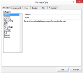
Figure 4-28: Format one cell or a range of cells here.
Using PivotTable styles for automatic formatting
You can also format an entire pivot table. Just select the Design tab and then click the command button that represents the predesigned PivotTable report format you want. (See Figure 4-29.) Excel uses this format to reformat your pivot table information. Look at Figure 4-30 to see how my running example pivot table of this chapter looks after I apply a PivotTable style.
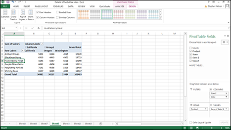
Figure 4-29: Choose a format for an entire pivot table.
If you don’t look closely at the Design tab, you might not see something that’s sort of germane to this discussion of formatting PivotTables: Excel provides several rows of PivotTable styles. Do you see the scrollbar along the right edge of this part of the ribbon? If you scroll down, Excel displays a bunch more rows of predesigned PivotTable report formats — including some report formats that just go ape with color. And if you click the More button below the scroll buttons, the list expands so you can see the Light, Medium, and Dark categories.
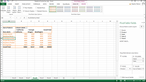
Figure 4-30: My pivot table formatted from AutoFormat.
Using the Other Design tab tools
The Design tab provides several other useful tools you can use with your pivot tables. For example, the tab’s ribbon includes Subtotals, Grand Totals, Report Layout, and Blank Rows command buttons. Click one of these buttons and Excel displays a menu of formatting choices related to the command button’s name. If you click the Grand Totals button, for example, Excel displays a menu that lets you add and remove grand total rows and columns to the PivotTable.
Finally, just so you don’t miss them, notice that the PivotTable Tools Design tab also provides four check boxes — Row Headers, Column Headers, Banded Rows, and Banded Columns — that also let you change the appearance of your PivotTable report. If the check box labels don’t tell you what the box does (and the check box labels are pretty self-descriptive), just experiment. You’ll easily figure things out, and you can’t hurt anything by trying.