
Lesson 31
Windows Store Apps
This lesson explains how you can build Windows Store–style applications. Note that you don't actually need to upload these applications to the Windows Store. You can build and run them locally on your computer if you like. Here “Windows Store apps” simply means they have a style similar to those available in the Windows Store.
Navigation Style
Windows Store and Phone apps differ from desktop applications in several ways. One big difference is the way they handle device real estate. Desktop applications typically share the desktop with other applications that you can minimize, maximize, resize, rearrange, and close. Store and Phone apps typically cover the entire device. You can switch between different apps, but you can't resize and rearrange the apps to view more than one on the screen at the same time.
Because Store and Phone apps don't display multiple windows at the same time, they typically use a different navigation model than the one used by desktop applications. A desktop application might display several dialogs and other windows that you can navigate between as needed.
In contrast, Store and Phone apps display a single window. To display other information, the app replaces that window with a new one. Often you can tap a back button to move to the previous window, much as a web browser lets you navigate back through your browsing history.
Many of these apps also don't provide buttons or menu items that let the user close them. Instead the user simply opens or navigates to another app and leaves yours sitting the background. Later the device closes your app if it needs to free up memory.
Because these apps cover the entire device, you must arrange the controls to take best advantage of whatever space is available. You don't have control over how large the user's screen is, so you should use container controls such as Grid and StackPanel to get the most out of the space you have.
App Styles
Visual Studio includes templates for building several different styles of Windows Store apps. The following list summarizes the most common kinds of Windows Store templates:
- Blank—This kind of app displays a single window with no navigation to other windows. It's similar to a one-window desktop application without dialogs.
- Hub—This kind of app uses a
Hubcontrol. The mainHubcontrol displays a horizontally scrolling window divided into sections holding different kinds of information. You can tap a section heading to open a new page that provides details about that section. - Grid—This kind of app displays sections in a grid. You can tap a section to open a list of items in that section. If you then tap an item in the list, the app opens a full page about that item.
- Split—This kind of app displays a list and a detail area. You can tap an item in the list to see its details.
- Pivot—This kind of app displays a collection of list categories. When a category is selected, you see its list of items below it. You can scroll horizontally through the different categories. This template is useful for displaying different views of data. For example, my phone displays Outlook mail in a pivot view with categories All, Unread, and Urgent.
If you use one of these templates to create a new project, the app comes pre-loaded with sample data so you can see what the finished app will look like. (In fact, you'll probably get a better sense of how the different templates work if you just create some sample projects and run them rather than staring at the previous descriptions.)
App Images
Windows and the Windows Store can represent your app in many ways using images with different sizes. For example, the Windows Start screen can displays your app's tile in Small, Medium, Wide, and Large sizes.
The kinds of images are grouped into categories, each of which includes several versions at different sizes. If you include one image in a category and omit the others, that image is scaled if necessary to use when the others are needed.
For example, suppose for the Square 150×150 logo category you provide an image that's 150 pixels wide and 150 pixels tall. Then Windows automatically scales that image if it needs images with sizes 270×270, 210×210, or 120×120 pixels.
Automatic scaling is better than nothing, but sometimes it can produce poor results. For example, if you provide a relatively large image that contains text, when it's scaled down to a small size the text may turn into a fuzzy blur. Enlarged images also tend to have fuzzy edges. To provide the best results, you should create separate images at several different scales.
The images you include in a project must match the required dimensions exactly. For example, you can't use a 100×100 pixel image in place of a 120×120 pixel image.
Table 31.1 lists the kinds of images you can include in a Windows Store app. The bold entries in the Sizes column indicate required images.
| Category | Purpose | Sizes |
| Store Logo | Used by the Windows Store's details section in app listings. | 50×50 70×70 90×90 |
| Square 30×30 Logo | Used by Windows in several places such as when the user lists all installed apps. (Tap the down arrow button on the Start screen to see the list.) | 24×24 30×30 42×42 54×54 |
| Square 70×70 Logo | Used for the Small tile on the Windows Start screen. | 56×56 70×70 98×98 126×126 |
| Square 150×150 Logo | Used for the Medium tile on the Windows Start screen. | 120×120 150×150 210×210 270×270 |
| Wide 310×150 Logo | Used for the Wide tile on the Windows Start screen. | 248×120 310×150 434×210 558×270 |
| Square 310×310 Logo | Used for the Large tile on the Windows Start screen. | 248×248 310×310 434×434 558×558 |
| Splash Screen Logo | This image is displayed briefly when the app loads. You also specify a background color to display behind the splash screen. | 620×300 868×420 1116×540 |
The purposes of the images depend on the category that contains` them, not on their sizes. For example, the Square 70×70 Logo and Store Logo categories both contain 70×70 images but they are not interchangeable. If you specify a 70×70 image in one category and not in the other, Windows won't use the one you specify for both purposes.
If you don't specify images for the Wide 310×150 Logo or Square 310×310 Logo categories, the user cannot use the Wide or Large tiles. To allow the user to arrange tiles flexibly, I highly recommend that you include these images.
If you don't specify an image in the Square 70×70 Logo category, Windows provides a small tile by scaling an image from the Square 150×150 Logo category. (For best results, include at least one image in each category.)
When you create your images, give them suggestive names such as MyApp56x56.png so you can tell what they are for.
After you've created the images, you need to attach them to the project. To do that, open Solution Explorer and double-click Package.appxmanifest to open the Manifest Editor shown in Figure 31.1. Click the Visual Assets tab to set the app's various images and image-related options.

The following list describes the items shown in Figure 31.1:
- Short name—This is a name that may be displayed directly on top of the app's tile.
- Show name—Check the boxes next to the tile sizes that should display the short name. For example, you could have the short name appear on top of the Wide and Large tiles.
- Default size—Select the size that the app's tile should be by default. This can be Square 150×150 logo, Wide 310×150 logo, or (not set).
- Foreground text—Select Light or Dark to indicate whether the name displayed on top of the tile should be dark or light. For example, if the tile has a light background, use dark text so it's visible.
- Background color—This is the tile's background color. Parts of a tile image that are transparent appear in this color. Some displays also outline tiles with this color. If you don't want the outline to be visible, make this color match the colors on the edges of the tiles.
- Splash screen background color—This is the background color shown behind the splash screen image.
In the category list on the left, you can click All Image Assets to see a list of everything, or you can click a category to see only the images in that category. For example, Figure 31.2 shows an app's Square 150×150 Logo category.

Use the ellipses below the image types to select an image for that type.
Deployment
You can deploy Windows Store apps in two main ways. First, you can deploy the app on a local or remote computer so you can test it. Second, you can submit the app to the Windows Store so others can download and install it. These approaches are described in the following sections.
Deploying Locally
When you build an app in Visual Studio, it is automatically deployed on your computer. If you use the system's Search tool, you can find the app. You can then click the app to run it. You can also right-click it and select Pin to Start, Pin to Taskbar, or Uninstall.
You can also manually deploy an app locally or on a remote computer. To do that, open the target dropdown on the Standard toolbar shown in Figure 31.3 and select Simulator, Local Machine, or Remote Machine. If you select Remote Machine, a dialog appears that lets you select the machine where you want to deploy the app.

After you select the deployment target, open the Build menu and select Deploy.
If you deployed to the Simulator target, you can use the Debug menu's Start Debugging command to run the application in the simulator. If you deployed to a local or remote machine, you should be able to find and run the app there.
Deploying to the Windows Store
After you have tested your app and want to make it available to others, you can submit it to the Windows Store.
Before you can submit apps to the Windows Store (or the Windows Phone Store), you need to register for a couple of accounts.
First register for a Microsoft account at signup.live.com/signup.aspx?lic=1.
Next, register for a Windows Dev Center developer account at dev.windows.com/join. Unfortunately this registration isn't free. It currently costs roughly $19 for individuals and $99 for companies (depending on your location and taxes).
Microsoft charges the fee to cover the cost of inspecting the apps that are submitted to the store. When you submit an app, Microsoft verifies that it meets some standard criteria to make apps more uniform. For example, you must include a description, an app tile icon, and a screen shot. Microsoft also inspects the app to ensure that it doesn't contain a virus or other malware.
After you have the Microsoft and Dev Center accounts, you can build and test your app. When you're finished, you use the unified Windows Dev Center dashboard to submit the app.
If your app fails certification, you can fix it and try again until everything is perfect. Then you can publish the app for the world to use.
Rather than including a lot of extra details (which would probably change before you read this anyway), this section ends with a list of links you can use to get more information:
- Sign up for a Microsoft account at
signup.live.com/signup.aspx?lic=1. - Register for a Windows Dev Center developer account at
dev.windows.com/join. - Learn about the unified Windows Dev Center dashboard at
msdn.microsoft.com/library/windows/apps/mt169843.aspx. - Learn more about the submission process at
msdn.microsoft.com/library/windows/apps/hh694062.aspx. - Learn more about the app certification process at
msdn.microsoft.com/library/windows/apps/mt148554.aspx. - Read introductory articles at
dev.windows.com/windows-apps. - Find a list of How-To articles for C# and XAML programming at
msdn.microsoft.com/library/windows/apps/xaml/br229566.aspx. - Visite the Windows Store at
www.microsoft.com/windows. - Visit the Apps and Games section of the Windows Store at
www.microsoft.com/en-us/windows/apps-and-games. - Read Microsoft's article “App features, start to finish (XAML)” at
msdn.microsoft.com/library/windows/apps/xaml/dn632431.aspx. - Read Microsoft's article “Create your first Windows Store app using C# or Visual Basic” at
msdn.microsoft.com/library/windows/apps/dn631757.aspx.
WPF Techniques
Before you get to the Try It, I want to briefly describe two more useful WPF techniques that you'll use in the Try It and the Exercises. Those techniques are using styles and setting dependency properties.
Using Styles
Imagine you have an app that uses several dozen TextBlocks. Now suppose you decide that you want to change the font size, color, or some other property for all of those TextBlocks. Editing the XAML code to make the change would be straightforward but time-consuming.
XAML makes this easier by allowing you to define styles. A style defines some of the properties for a particular type of control in some part of the window's hierarchy. You define styles inside a resource dictionary attached to some XAML object.
For example, you could give a resource dictionary to the main Grid control that contains the other controls on the window. Next you could create a style for the TextBlock class inside that resource dictionary. After you create the style, any TextBlock inside that Grid will use the style.
The following code shows how you might create a style to set the font size for TextBlock controls:
<Grid>
    <Grid.Resources>
        <Style TargetType="TextBlock">
            <Setter Property="FontSize" Value="20"/>
        </Style>
    </Grid.Resources>
    ...
    <TextBlock Text="First Name:"/>
    <TextBlock Text="Last Name:"/>
    ...
</Grid>
The Grid contains a Resources section that defines the resource dictionary. That section contains a Style object. The TargetType property (in this case set to TextBlock) indicates the type of object to which the style can apply.
Inside the style, a Setter object defines a property that it can set for the target type. In this example, the Setter sets the object's FontSize property to the value 20.
Now any TextBlock objects that come later in the Grid automatically use this style. If you later decide to change the size for the TextBlocks, you only need to change it in the style.
There's one other way you can use styles. If you give a style a name, then other controls can explicitly use that style. For example, the following code defines a named style:
<Grid>
    <Grid.Resources>
        <Style x:Key="BigStyle" TargetType="TextBlock">
            <Setter Property="FontSize" Value="50"/>
        </Style>
    </Grid.Resources>
    ...
    <TextBlock Text="First Name:" Style="{StaticResource BigStyle}"/>
    <TextBlock Text="Last Name:"/>
    ...
</Grid>
This Grid's resource dictionary defines a style named BigStyle. Later a TextBlock uses that style by explicitly setting its Style property to {StaticResource BigStyle}. (The keyword StaticResource tells the program to look in the resource dictionary for a resource that doesn't change after it is defined.)
Any other TextBlocks that don't explicitly set their Style properties use default styles or an unnamed style if one is defined.
Setting Dependency Properties
A dependency property is a property that is defined for one object by a different object. For example, if you place a TextBox inside a Grid control, then you can set the TextBox's Grid.Row and Grid.Column properties. Those properties are defined by the Grid class for any controls that are contained inside a Grid.
In XAML code at design time, you can simply set dependency properties to a value. For example, the following statement sets the TextBox's Grid.Row and Grid.Column properties:
<TextBox Grid.Row="2" Grid.Column="5" Name="annualRateTextBox"/>However, Row and Column are not truly properties of the TextBox class, so you can't set them directly in C# code. Instead you can use static methods provided by the Grid class, passing those methods the object for which you want to set the property (in this example the TextBox) and the value you want to set. For example, the following code sets the Grid.Row and Grid.Column properties for the TextBox named annualRateTextBox:
    Grid.SetRow(annualRateTextBox, 2);
    Grid.SetColumn(annualRateTextBox, 5);
If you need to retrieve the value of a dependency property, use the corresponding Get method as in int row = Grid.GetRow(annualRateTextBox).
Try It
In this Try It, you build a program that makes colorful balls bounce across the screen and make clicking noises when they hit the screen's edges.
Lesson Requirements
In this lesson, you:
- Start a new Windows project by selecting the Blank App. Replace the main window's
Gridcontrol with aCanvascontrol namedmainCanvas. - Add a
MediaElementto the main window's XAML code to play the click sound. - Create a
Ballsprite class to manage balls. Give it properties and methods to create a random ball, track the ball's position and velocity, and move the ball. - When the window loads, create a
DispatcherTimerand give it an event handler that moves the balls. - Test the program with both dark and light themes.
Hints
- Make the
Ballclass use anEllipseobject to display itself. - Give the
Ballclass the followingusingdirectives:using Windows.UI.Xaml.Shapes; using Windows.UI.Xaml.Controls; using Windows.UI.Xaml.Media; - Give the
Ballclass a randomizing constructor, aRandomBrushmethod, and aMovemethod.
Step-by-Step
-
Start a new Windows project by selecting the Blank App. Replace the main window's
Gridcontrol with aCanvascontrol namedmainCanvas.- In Visual Studio 2015's New Project dialog, you can find this template under Templates > Visual C# > Windows > Windows 8 > Windows.
- Give the
Canvasthe sameBackgroundproperty that the initialGridhad. It should look like this:Background="{ThemeResource ApplicationPageBackgroundThemeBrush}"
This makes the
Canvasdetermine its background color at run time by looking at the theme. (In case the user sets the theme to light or dark.) - Add a
MediaElementto the main window's XAML code to play the click sound.- Use the Project menu's Add Existing Item command to add a click sound file to the project.
- Add a
MediaElementto the main window's XAML code. Set itsx:Nameproperty toclickSoundand set itsSourceproperty to the sound effect file you added.
- Create a
Ballsprite class to manage balls. Give it properties and methods to create a random ball, track the ball's position and velocity, and move the ball.- Use code similar to the following.
class Ball
{
    // Used to generate random values.
    static private Random Rand = new Random();
    // All balls have black outlines.
    static private Brush BlackBrush =
        new SolidColorBrush(Windows.UI.Colors.Black);
    public Ellipse MyEllipse;
    public Canvas Parent;
    public double X, Y, Diameter, Vx, Vy;
    // Initialize a random Ball.
    public Ball(Canvas parent)
    {
        // Save the parent.
        Parent = parent;
        // Create the Ball's geometry.
        const int maxSpeed = 15;
        Vx = Rand.Next(-maxSpeed, maxSpeed + 1);
        Vy = Rand.Next(-maxSpeed, maxSpeed + 1);
        Diameter = Rand.Next(50, 200);
        X = Rand.Next(0, (int)(Parent.ActualWidth - Diameter));
        Y = Rand.Next(0, (int)(Parent.ActualHeight - Diameter));
        // Create the Ellipse.
        MyEllipse = new Ellipse();
        MyEllipse.Width = Diameter;
        MyEllipse.Height = Diameter;
        MyEllipse.Fill = RandomBrush();
        MyEllipse.Stroke = BlackBrush;
        Canvas.SetLeft(MyEllipse, X);
        Canvas.SetTop(MyEllipse, Y);
        // Add the new ball to the parent.
        Parent.Children.Add(MyEllipse);
    }
    // Return a random brush.
    static private Brush RandomBrush()
    {
        Brush[] brushes =
        {
            new SolidColorBrush(Windows.UI.Colors.Red),
            new SolidColorBrush(Windows.UI.Colors.Orange),
            new SolidColorBrush(Windows.UI.Colors.Yellow),
            new SolidColorBrush(Windows.UI.Colors.Lime),
            new SolidColorBrush(Windows.UI.Colors.Blue),
            new SolidColorBrush(Windows.UI.Colors.Indigo),
            new SolidColorBrush(Windows.UI.Colors.Violet),
        };
        return brushes[Rand.Next(0, brushes.Length)];
    }
    // Move the Ball. Return true if the Ball bounces.
    public bool Move()
    {
        // Remember if the ball bounces.
        bool bounced = false;
        // Update the ball's position.
        X += Vx;
        if (X < 0)
        {
            // Hit the left edge.
            X = -X;
            Vx = -Vx;
            bounced = true;
        }
        else if (X + Diameter > Parent.ActualWidth)
        {
            // Hit the right edge.
            double overshoot = (X + Diameter) - Parent.ActualWidth;
            X = Parent.ActualWidth - overshoot - Diameter;
            Vx = -Vx;
            bounced = true;
        }
        Y += Vy;
        if (Y < 0)
        {
            // Hit the left edge.
            Y = -Y;
            Vy = -Vy;
            bounced = true;
        }
        else if (Y + Diameter > Parent.ActualHeight)
        {
            // Hit the right edge.
            double overshoot = (Y + Diameter) - Parent.ActualHeight;
            Y = Parent.ActualHeight - overshoot - Diameter;
            Vy = -Vy;
            bounced = true;
        }
        // Update the Ellipse's position.
        Canvas.SetLeft(MyEllipse, X);
        Canvas.SetTop(MyEllipse, Y);
        return bounced;
    }
}
- Use code similar to the following.
- When the window loads, create a
DispatcherTimerand give it an event handler that moves the balls.- Add the XAML code
Loaded="Page_Loaded"to the main window's definition. - Use the following code to prepare the program when the window is loaded:
// The movement timer. private DispatcherTimer MoveTimer; // Balls. private const int NumBalls = 10; private Ball[] Balls = new Ball[NumBalls]; // Used to generate random numbers. private Random Rand = new Random(); // Create balls and start them moving. private void Page_Loaded(object sender, RoutedEventArgs e) { // Create the balls. for (int i = 0; i < NumBalls; i++) Balls[i] = new Ball(mainCanvas); // Create the timer. MoveTimer = new DispatcherTimer(); MoveTimer.Interval = new TimeSpan(0, 0, 0, 0, 20); MoveTimer.Tick += MoveTimer_Tick; MoveTimer.Start(); } - Use the following code to move the balls when the timer's
Tickevent fires:// Move the balls. private void MoveTimer_Tick(object sender, object e) { // Remember if a ball bounces. bool bounced = false; foreach (Ball ball in Balls) if (ball.Move()) bounced = true; if (bounced) clickSound.Play(); }
- Add the XAML code
- Test the program with both dark and light themes.
- Open the
App.xamlfile and add the codeRequestedTheme="Light"to theApplicationobject's definition. Test the program. - Change the
RequestedThemeto"Dark"and test the program again. - After testing, remove the
RequestedThemeproperty so the app uses the theme selected on the user's device.
- Open the
Exercises
- Make an interest calculator similar to the one shown in Figure 31.4 (shown in the
Lighttheme). When the user enters values and clicks Calculate, the program should enter a loop that runs over a sequence of months. Each month it should calculate the payment and the amount of interest for that month and update the user's balance. The loop should run until the balance is zero. (Hint: Give anyGridrows and columns relative sizes such as*or1.5*so they will resize if you change the top-levelGrid's size.)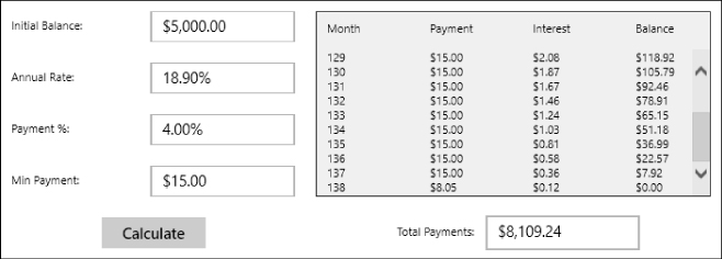
- Copy the program you wrote for Exercise 1 and use
Styleobjects to set theFontSizevalues to 20 for the app'sTextBlock,TextBox, andButtoncontrols. (Resize the app's top-levelGridif necessary.) - [Hard] There's probably a bug in the program you wrote for Exercise 2. If you enter a payment percentage of 0% and a minimum payment of $15, then the monthly interest will be greater than the monthly payments so the balance will increase over time. That means the program's loop will never end.
To fix that, copy the program you wrote for Exercise 2. Inside the loop, compare the payment and the interest. If the interest is greater, display an error message and break out of the loop.
Unfortunately Windows Store apps can't use
MessageBox.Show. Instead you can use theWindows.UI.Popups.MessageDialogclass. Create a dialog, passing its constructor an error message and a title string. Use the object'sShowmethod to display the dialog.The dialog's
Showmethod is asynchronous, which means it returns immediately to the calling code and then continues running in the background. That doesn't really hurt the application, but it does make Visual Studio issue a warning. To get rid of the warning, place theawaitkeyword before the call toShow. That makes the code pause and wait for the call toShowto complete before continuing. You can only useawaitin a method that is also asynchronous, so you also need to mark the event handler with theasynckeyword. - [Hard] Copy the program you wrote for Exercise 3 and modify it so it displays its own message instead of using the
MessageDialogclass. To do that, add aGrid(or some other container) holding the message and an “X”Button. Set theGrid'sVisibilityproperty toCollapsed.Make a
ShowMessagemethod that displays the message by doing the following:- Disable the window's
TextBoxes and the CalculateButton. - Set the main
Gridcontrol'sOpacityproperty to0.5. - Set the message
Grid'sVisibilityproperty toVisible.
Make a
HideMessagemethod that reverses the actions performed byShowMessage.(Bonus: To make the message stand out, make the message
Griduse the background color given byApplicationForegroundThemeBrushand make the controls it contains use the foreground color given byApplicationPageBackgroundThemeBrush. Be sure to test in theDarkandLightthemes.) - Disable the window's
- When you create a Windows Store app, Visual Studio creates blank PNG files for the required images. Copy the program you wrote for Exercise 4. Make the program use your images and remove the default images. Pin the program to the Windows Start screen and experiment with resizing the app's tile. Notice that the app displays the splash screen image when it starts.
- Copy the program you wrote for Exercise 5 and add the Wide 310×150 and Square 310×310 images. Verify that you can now change the app's tile to be wide or large on the Windows Start screen.
- Copy the program you built for the Try It and add the required Wide 310×150, and Square 310×310 images to it.