
Chapter Five
Pitfall 4: Statistical Slipups
“Facts are stubborn things, but statistics are pliable.”
—Mark Twain
How We Compare Data
In spite of the incredible utility and value of the field of statistics, its name has become somewhat of a byword in our time. Common search phrases that start with “statistics are” include:
- “statistics are bad”
- “statistics are lies”
- “statistics are useless”
- “statistics are not facts”
- “statistics are made up”
- “statistics are for losers”
What gives? Why such disgust for a field that, according to the Merriam-Webster dictionary, is simply “a branch of mathematics dealing with the collection, analysis, interpretation, and presentation of masses of numerical data.”1 Why is the field of statistics seen in such a negative light by so many?
I believe that the backlash against statistics is due to four primary reasons. The first, and easiest for most people to relate to, is that even the most basic concepts of descriptive and inferential statistics can be difficult to grasp and even harder to explain. Many a befuddled college freshman struggles to get a passing grade in Stats 101 each year. But even many professional scientists struggle to articulate what, exactly, a p-value is.2
The second cause for vitriol is that even well-intentioned experts misapply the tools and techniques of statistics far too often, myself included. Statistical pitfalls are numerous and tough to avoid. When we can't trust the experts to get it right, there's a temptation to throw the baby out with the bathwater.
The third reason behind all the hate is that those with an agenda can easily craft statistics to lie when they communicate with us. Even those in Mark Twain's day realized this, as this chapter's epigraph shows. There are quite popular how-to books written on the topic of lying with statistics for the would-be deceiver.3
And finally, the fourth cause is that often statistics can be perceived as cold and detached, and they can fail to communicate the human element of an issue. No one wants to wind up “being a statistic,” a phrase equated with being the victim of an unfortunate circumstance and then being forever shrouded in anonymity via aggregation into a single, nameless, and faceless number. Whoa, talk about a negative connotation!
But in spite of these popular condemnations, the field of statistics provides vital tools in the toolkit of every data worker. In some ways, if you reconsider the definition cited above, everything we do when we work with data is actually just statistics, no matter what sexier name we might want to give it. Data analysis, analytics, data science – they're all just subsets of statistics, if we interpret the definition literally.
So how can we rescue the perception of the field of statistics from purgatory? How can we restore it to its rightful position as the “OG” data-working discipline? It starts with understanding the pitfalls that give it a bad name.
Pitfall 4A: Descriptive Debacles
The simplest and most basic branch of statistics is descriptive statistics – boiling a data set down to individual figures that describe or summarize the data set itself – nothing more, nothing less. Consider how often you come across figures similar to the following, for example:
- The median income of all employees in a company
- The range of SAT scores in a class
- The variance of returns in a portfolio of stocks
- The average height of players on a team
This branch of statistics is distinct from inferential statistics, where we seek to infer properties about an underlying (and usually much larger) population from which a sample was drawn. We'll get to that later.
But are there really pitfalls involved with something as simple as describing a data set using summary statistics? You bet there are. Anyone who works with data falls into these pitfalls all the time. We've already seen how we can screw up something as basic as aggregating data where the mathematical operation is addition. How much easier, then, is it to stumble when we apply even slightly more involved calculations like average and standard deviation? Where to start…
In the toolbox of descriptive statistics, measures of central tendency are the hammer – one of the most useful tools of all – but often used rather clumsily. Much has been written about mean, median, and mode, and I don't intend to approach the subject as a textbook would. Most of us know the formulas by now – mean is the sum of all values added together and then divided by the total number of values (also called the “arithmetic average,” or just the “average”), median is the value above which you will find half of the records and below which you will find the other half, and mode is simply the value that appears most frequently in a particular data set.
It's not in calculating these statistics that the most common errors occur. The formulas are fairly straightforward, and scores of software packages compute them reliably. The real difficulty with these measures of central tendency is that when we use them, our audience interprets them as normal or typical values to which most of the records in the data set must surely be similar. Depending on the distribution of the data, that can be an accurate impression, or a wildly inaccurate one. Consider an example from the world of sports.
Let's talk football. Okay, to be more specific, let's talk American football.
On average, a male player in the professional American football league in the United States is 25 years old, stands about 6'2" tall, weighs 244.7 pounds, makes $1.5 million dollars per year, wears the jersey number 51, and has 13 characters in his full name (including spaces, hyphens, etc.).
Those statements are mathematical facts, at least if we analyze the 2,874 active players on the 2018 preseason team rosters of the 32 teams in the North American professional American football league (the salary figure is based on the 2017 “cap hit” of 1,993 active players, since salary data for the 2018 season wasn't yet available when I wrote this).
And now that I've told you all that, you have in your mind an impression of what “typical” means in that particular sport and league. If that information were all that I gave you, you'd probably think a player identified at random would have attributes fairly close to those provided averages, plus or minus some small amount of variation – within, say 10% or 20%.
You'd probably imagine a 50% deviation from the stated average to be highly unlikely (a 9'3" tall player?). You'd certainly have a hard time imagining any of their traits being in a completely different ballpark (pun intended) from the average values, right? Two or three times larger? Ten times larger than the average value? That seems pretty far-fetched.
And you'd be more or less right for about four of the six traits, for which the player with the maximum value doesn't even double the average. You'd be pretty close for a fifth trait, for which the player with the maximum value is about 2.25 times the average.
For another of the six traits, though, there's a chance that you'd be drastically wrong. One of the six traits possesses a different kind of variation altogether, and the player with the maximum value is 16 times greater than average. We'll see in a moment which of the six traits has a variation like that. Perhaps you can already guess which one it is.
Let's analyze further. If I show you the distributions for each of these six attributes – histograms showing how many players fall into certain “bins” or groups of values on the spectrum from the minimum value on the left (not necessarily zero) to the maximum value on the right for each attribute, can you guess which histogram goes with which attribute? I'll remove all the axes and labels to make it more of a challenge (Figure 5.1).
Really test yourself. Examine the shape of each histogram and think about what it would mean if each attribute took on each of the respective shapes. For those of you who are less familiar with American football, this may be a tougher exercise than for those who know it well, but try anyway.
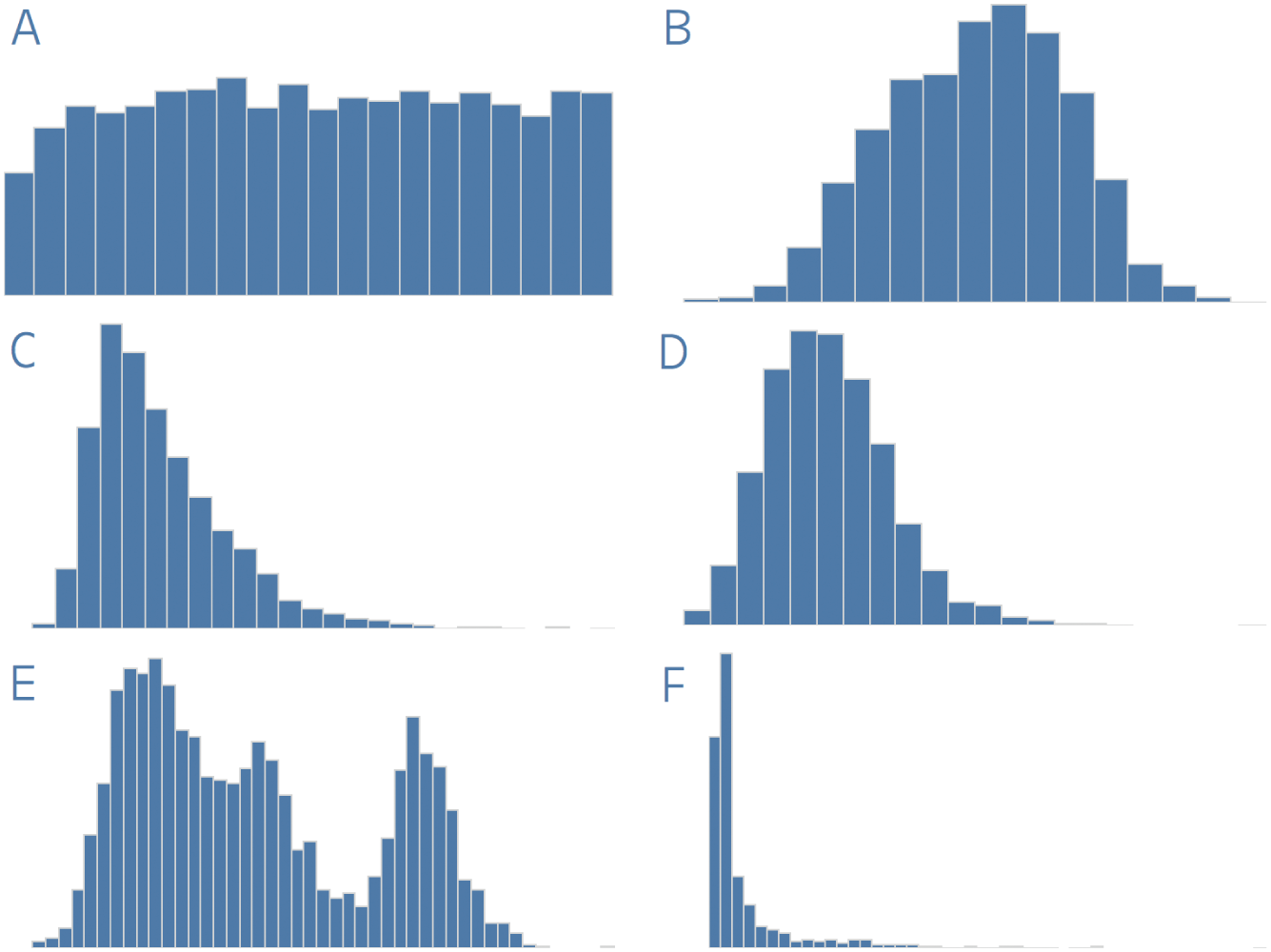
FIGURE 5.1 Guess which distribution shows age, weight, salary, height, jersey number, and name length of NFL players.
Let's pretend we're back in school. Stressful, I know.
I'll write the letter label of each chart and the variable name in alphabetical order in two columns, and you draw a line between the two based on your best guess as to the match (Figure 5.2).
Okay, let's try together. Take distribution A – it's a fairly uniform distribution, right? Could that distribution correspond to player age? If so, we'd expect a slightly lower likelihood of a player selected at random being at the lowest end of the age distribution (the first bar is a bit lower than the others), but after that it would be about equally likely that they have any age in the set of all ages.
But look at the far-right edge of this distribution – it ends rather suddenly, doesn't it? There's no tail at all to this first distribution. Could it be that players above a certain “cut-off” age suddenly disappear from the league altogether? This would only seem likely if there were some rule preventing players from playing beyond a certain age, but we know that's not the case. There's no “forced retirement” at, say, age 40. Which of the six traits has a cut-off rule that limits the upper value in this way?
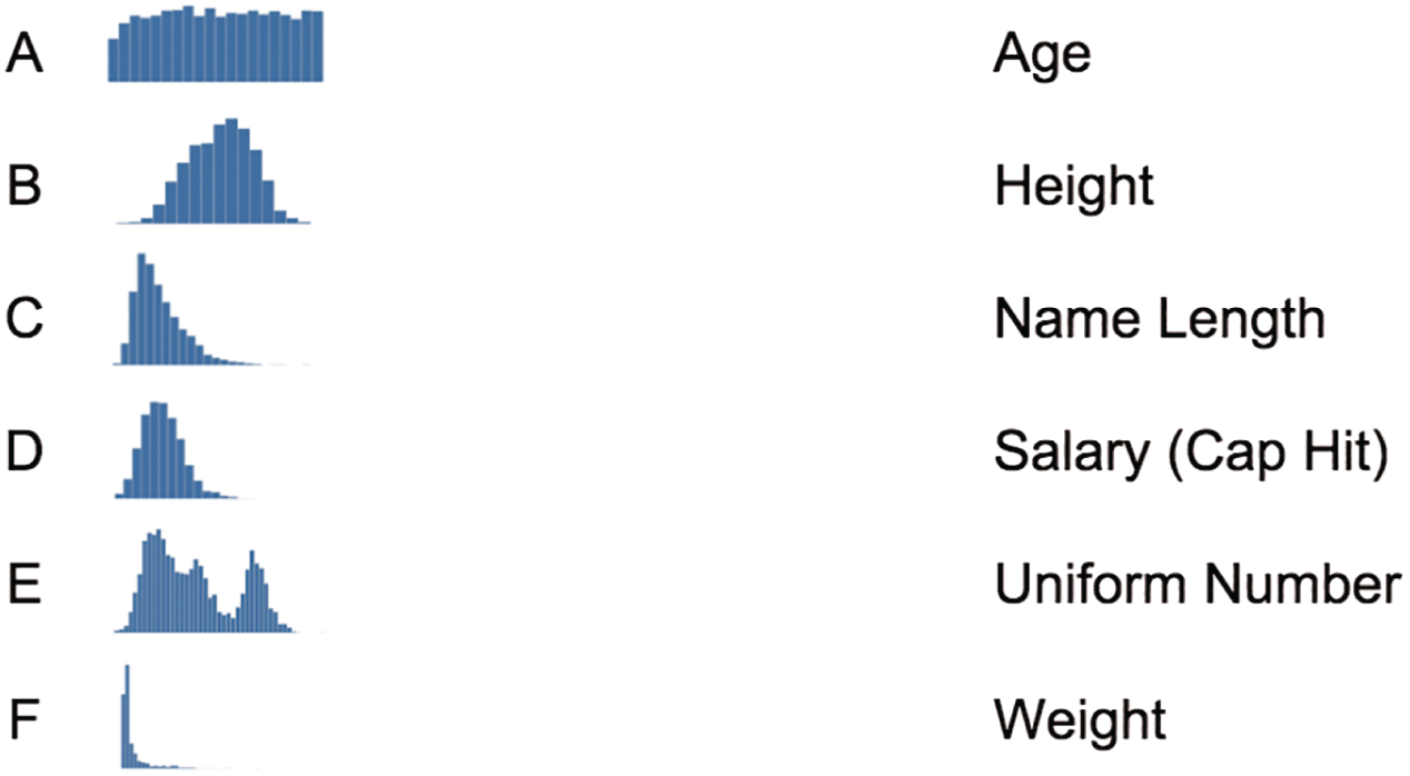
FIGURE 5.2 Match the histogram letter with the player variable type.
Okay, now let's jump down to distribution E. This one has a rather odd three-humped shape, doesn't it? It's called a multimodal distribution because the histogram has two or more distinct peaks. Which of the six traits seems like it could have three different subgroups within the overall set of player values? Could it be salary? Is there one group of players that make a lesser amount, others that are paid according to a slightly higher bar, and a final group that are paid even more still? It would seem that only a strange law of economics would produce such a distribution for salary, so that's not a likely match, is it? To figure out which of the six attributes goes along with distribution E, we'd need to think about which would have exactly three distinct “types” of players around which they tend to cluster in subgroups.
Okay, enough pontificating. Figure 5.3 is the answer key to our little stats quiz.
How did you do? How many of the six distributions did you get correct? Let's look at them one by one and consider more closely what the shape of the distribution means for the population of players, and how that relates to the notion we had developed in our minds about what a typical player looks like when we were just given the averages.
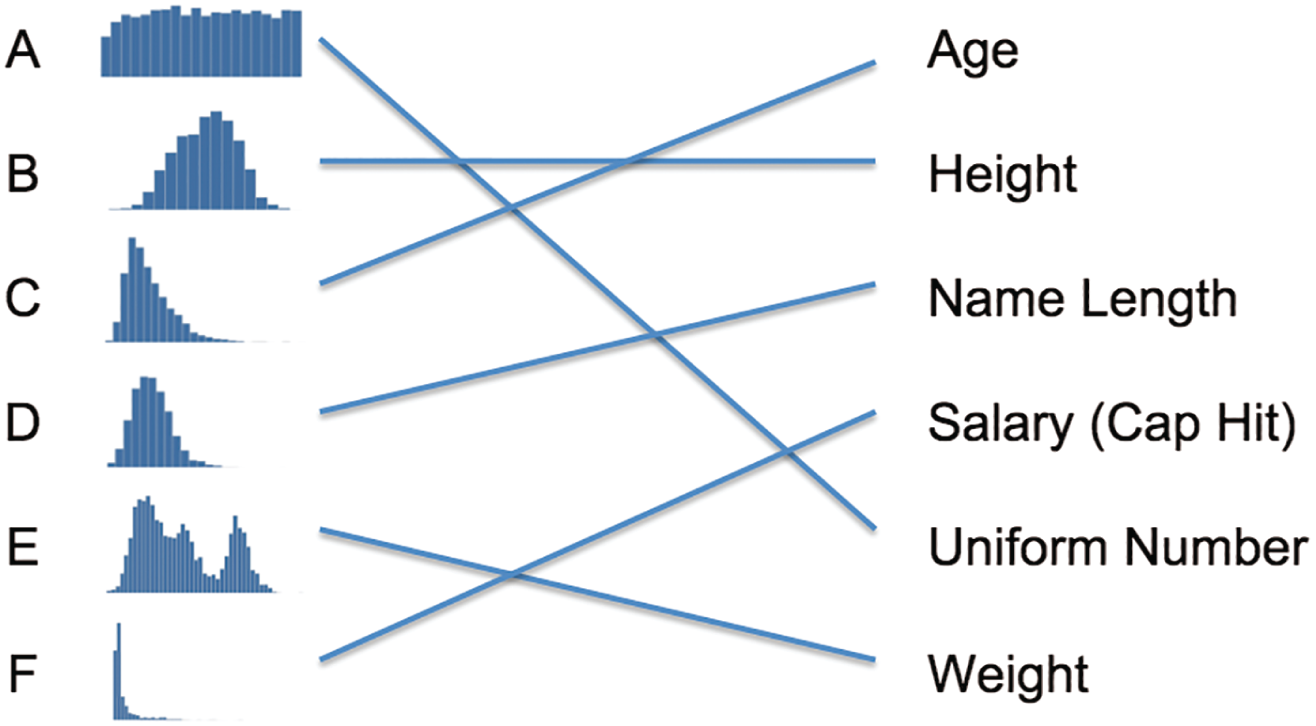
FIGURE 5.3 The distribution matching game answer key.
A. Uniform Distribution: Jersey Number
In a perfectly uniform distribution, a value chosen at random from the data set is equally likely to fall into any of the bins into which we group the data – like rolling a single six-sided die that's perfect weighted. Of course, empirical data sets from our world virtually never follow a distribution perfectly. But we can see from Figure 5.4 that if we group player jersey numbers into bins of 5 (players with jersey numbers 0–4 go into the first bin, those with jersey numbers 5–9 go into the second bin, 10 through 14 go into bin 3, and so on), each bin, with the exception of the first, accounts for about 5% of all of the players.
Why the drop-off after the last bar? It's simple: there's an official rule that all numbers on NFL jerseys have to be between 1 and 99.4 This is why we see the series come to an abrupt end after the last bar, which includes players who have jersey number 95 through 99. There are no players with a jersey number equal to 100.
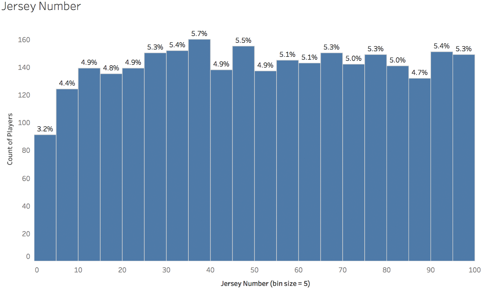
FIGURE 5.4 Histogram of American Football player jersey numbers, bin size = 5.
So what does this distribution imply about our interpretation of the earlier statement that, on average, a player “wears the jersey number 51”? Well, first of all, we wouldn't be astronomically far off if we guessed that a player selected at random had jersey number 51. At most we'd be 50 steps away from the actual value, and there's a reason why the deviation from the actual value can't be any larger than that – namely, the jersey rule (provided the rule doesn't change).
Think of it this way: if the distribution for jersey number had a maximum value that was 16 times greater than the average, then there would be a player out on the field somewhere with the jersey number 816. I've watched a lot of football – too much – and that would definitely catch my eye.
What's even more interesting, though, is that only 27 of the 2,874 players on the 2018 active roster during the preseason were listed as having a jersey number of exactly 51, meaning we'd have less than a 1% chance of guessing it right if we went with the average for any particular player. Appropriately, only a player who plays the position “center” (the player in the middle of the offensive line who hikes the ball to the quarterback) is allowed to have this number, according to the official rules.
And other than avoiding the numbers 0 (only one player was listed on team rosters with a jersey number of 0 during the preseason months, likely erroneously) and 1 (only 16 active players were listed as having that number during the 2018 preseason), we'd have about a 1% chance of getting it right no matter which number we went with.
The jersey number with the highest frequency of occurrence in the entire league roster in 2018 is number 38 (coincidentally, 38 players were listed with jersey number 38 at the time I scraped the data from the web), and even then we'd still just have a 1.347% chance of getting it right. Figure 5.5 is the histogram modified to decrease the bin size to 1.

FIGURE 5.5 Smaller bin size.
The bottom line is that when we have a uniform distribution, it's helpful to know the minimum and maximum values (and therefore the range, or the difference between these two numbers). The mean and median are both located in the center of the range and thus don't really provide any additional information for us, so long as we're aware that the distribution is uniform.
But is jersey number 51 a “typical” jersey number for an NFL player to wear? It's certainly within the range of what's possible, and of course we wouldn't say that it's atypical, like we would with jersey number 1. But “typical” doesn't really seem to capture it, either, does it? There aren't that many centers on each team, after all.
Let's move on to the next distribution.
B. Normal Distribution: Player Height
The heights of players in the NFL very much resembles a Gaussian, or normal, distribution. The normal curve is the most famous type of distribution, the basis of many statistical comparisons, a super-powerful tool, and also a source of blunders of epic proportions (Figure 5.6).
The average height of all of the players on the preseason rosters is 73.7 inches, or just under 6'2". The standard deviation of the distribution is 3.2 inches. What does that mean?
The standard deviation is often used to describe how much a particular distribution varies. So far in this chapter, we've been dividing the maximum value by the average to talk about how much each distribution varies (recall that one mystery distribution has a maximum that's 16 times greater than the average). That's a less effective way to talk about variation, though, because it depends highly on the magnitude of the amounts, and is only really meaningful to talk about distance from the average to the maximum value, not from the average to the minimum value.
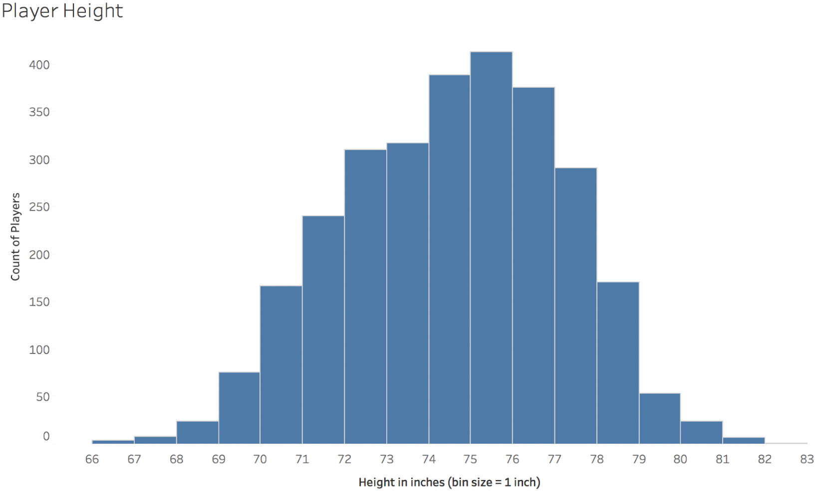
FIGURE 5.6 Player height.
Standard deviation (SD for short, sometimes indicated by the Greek letter σ) is calculated by taking the square root of the variance, which in turn is the expected value of the squared deviation from the mean. In the case of a normal, or Gaussian, distribution, the mean (μ) and the standard deviation (σ) together fully define the curve, as shown in Figure 5.7.
Sometimes people refer to the “68–95–99.7 Rule” when working with the Gaussian distribution, which tells us that about 68% of the values in a normally distributed data set can be found within plus or minus one standard deviation from the mean (34.1% + 34.1% to be exact), 95% can be found within two standard deviations from the mean (13.6% + 34.1% + 34.1% + 13.6%), and 99.7% can be found within three standard deviations from the mean (2.1% + the previous + 2.1%). It's a nice, perfectly symmetrical bell-shaped curve.
Where did this curve come from, and for what is it used? Before we go further in our discussion about football player attributes, let's take a brief aside into the history of statistics.
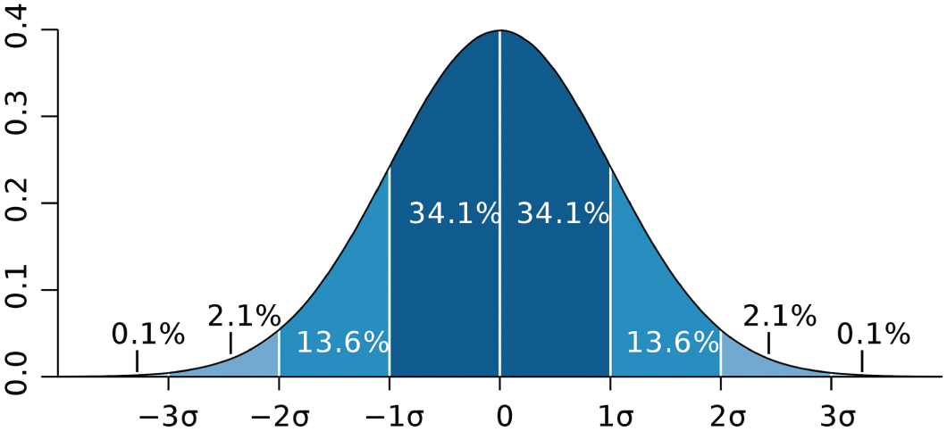
FIGURE 5.7 The standard normal distribution.
Source: https://en.wikipedia.org/wiki/Standard_deviation#/media/File:Standard_deviation_diagram.svg. Used under CC BY 2.5.
Gamblers in the eighteenth century used to employ statisticians to compute odds by hand in very time-consuming calculations. One such statistician, Abraham De Moivre, discovered that the odds of getting a certain number of heads or tails when flipping a coin multiple times approximated a bell-shaped curve more and more closely as the total number of coin flips increased. Galileo later discovered that the errors in astronomical measurements approximately fit a similar curve, leading to several hypotheses about the equation for the shape of this curve. At around the same time, mathematicians Robert Adrain and Carl Friedrich Gauss independently developed the equation for this curve in 1808 and 1809, respectively. The Belgian Adolphe Quetelet, developer of the body mass index (BMI), later applied the normal curve to social sciences and natural variables like human height, weight, and strength, just as we are analyzing here.
Starting in the late 1990s and thanks to former General Electric CEO Jack Welch, the “Six Sigma” movement introduced the concept of the normal curve and the standard deviation statistic to many business people who had never taken a single intro to stats class in college. The movement also reintroduced it to many others who had taken the dreaded freshman year course but had forgotten all about it.
The name for the movement had a “six” in front of it because a normal distribution in which the distance between the mean and both the upper and lower specification limits (what defines a “good” part in terms of quality control) is six times the standard deviation, or 6σ, will produce “good” parts 99.99966% of the time. That's a pretty good outcome for a manufacturing process that won't result in very much scrap or parts rejected due to out-of-specification measurements; 3.4 parts per million will be thrown away when you account for a 1.5σ “drift” in the process over time.
Enthusiasts of the movement eagerly applied the same way of measuring and improving processes to transactional processes as well as manufacturing ones, whether or not these processes exhibited stable outcomes that approximated the normal curve. More on that in a moment.
Another brief aside – I was a happy participant in the Six Sigma movement, earning the title “Master Black Belt” at my medical device employer and training eager “Green Belts” and “Black Belts” around the country in the ways of DMAIC, an acronym that described the 5 phases of a Six Sigma project: Define, Measure, Analyze, Improve, and Control. This movement was how I transitioned from an engineering career into a continuous improvement one.
I was super-proud about it all until my dad found out and asked me what the heck I was doing with the education he paid for. He was a pretty cool guy, and I think he was just trying to bust my chops, but there definitely was something almost hokey and/or cultish about the whole thing.
What can't be denied, though, is that people in historically non-statistically oriented departments like billing, customer service, and human resources started using – and undoubtedly misusing – statistics like the average and the standard deviation en masse. They were also comparing data sets using statistical hypothesis tests like the t-test, ANOVA, and the chi-squared test. It was a huge movement, and in some ways I feel that the more recent “big data” era (I hate that term) has left these important (if tricky for the layperson), hypothesis tests behind somewhat.
To return to our discussion of the football player heights, the fact that the distribution of heights closely approximates a normal distribution means that the likelihood of finding a particular value in the set decreases rapidly the farther away you move from the mean. The tallest player in the data set, Nate Wozniak, was listed on the roster at 82 inches tall, or 6'10", which is 2.6 times the standard deviation greater than the average value (Figure 5.8).
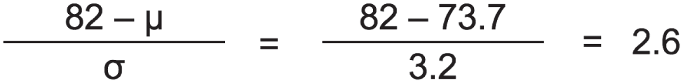
FIGURE 5.8 Calculating the distance in standard deviations from the mean to the maximum value.
The value 2.6 is called the Z score, and we can look up the odds of being at least that far away from the mean using a Z score table for the normal distribution.5 In the case of a group with average 73.7 inches and standard deviation 3.2 inches, the odds of being at least 82 inches tall is a little less than half a percent, or 0.47% to be exact. So about 1 in 215 players are expected to be as tall as Wozniak or taller.
A notable property of the normal curve, though, is that it never fully drops to 0. There's always some finite probability of being a certain distance away from the mean, no matter how far away you go. This probability gets vanishingly small as you get above, say, 10σ. A football player who is 6σ taller than the average would be almost 93 inches tall, or 7'9", and the odds of finding a player with at least that height would be less than 1 in 1 billion.
C. Lognormal Distribution: Player Age
The truth, though, is that if you look at all six of our distributions, only one of them closely resembles the normal curve. The others depart from the Gaussian quite noticeably.
Take player age, for example. This distribution is said to be “right-skewed.” Another way of describing it is that it displays “positive skewness” (Figure 5.9).
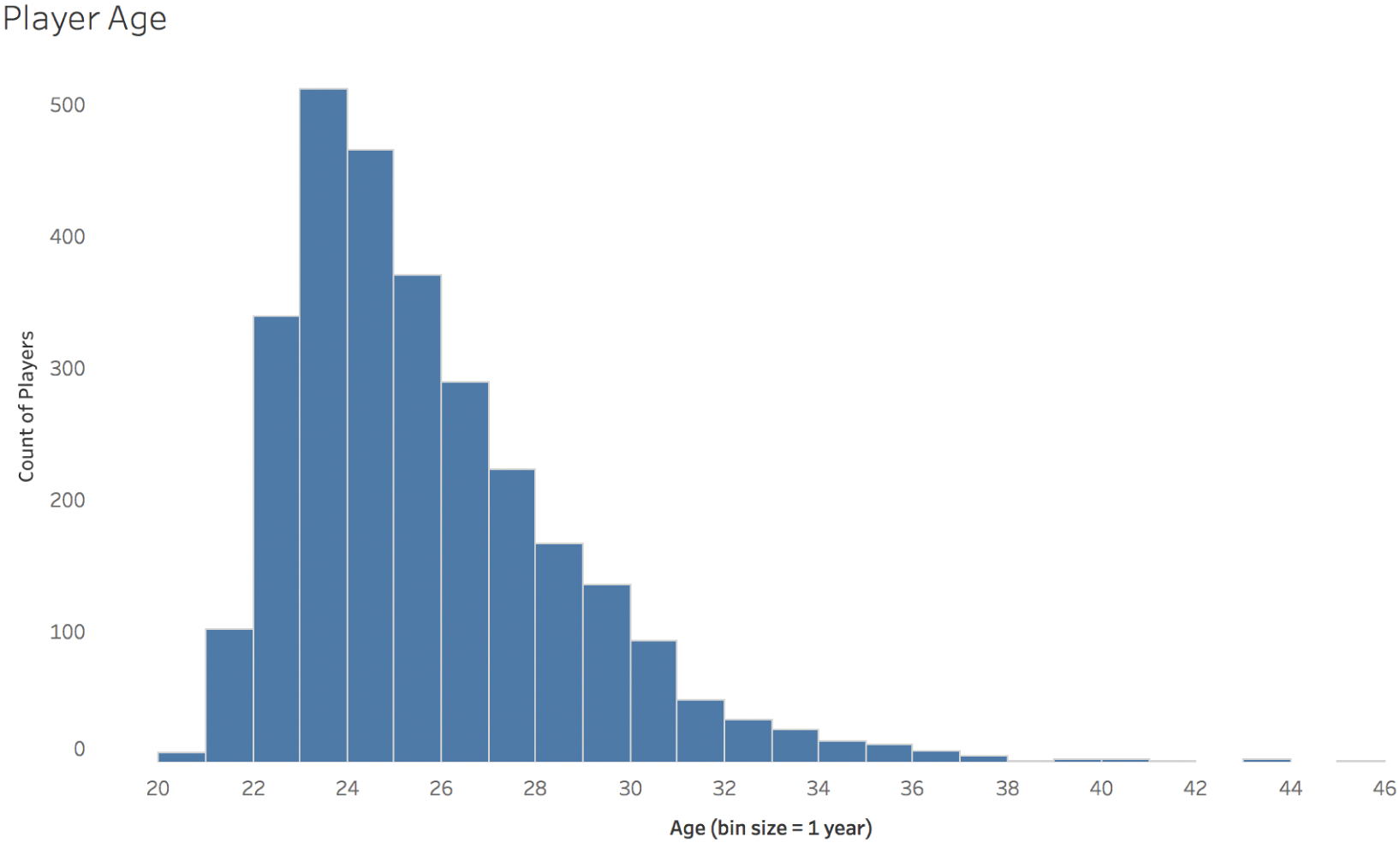
FIGURE 5.9 Player age.
The tail of players with ages higher than the mode, or the peak defined by the most common age group of 23 years old, is quite a bit longer than the tail of players with ages lower than the mode.
But wait a minute. You'll recall that we said at the beginning that the average player has an age of 25 years old, not 23 years old. The average is 25.22, to be exact. So why would the average be different than the peak of the histogram? If average is supposed to indicate “typical,” why wouldn't it be equal to the age group that has the most total number of players in it?
The reason is that thinking that average always indicates “typical” is a statistical pitfall that we fall into over and over and over. This distribution, like many distributions, isn't symmetrical. Since there are more players to the right of the peak than to the left of it, these older players “pull” the mean to the right, away from the peak. You'll recall that the mean, or arithmetic average, is just the total sum of values, in this case ages, divided by the total count of items, in this case players.
The median age, the age at which half of the players are older and half are younger, is 25. When a distribution is skewed, either to the right or to the left, the median will be found between the mode (the peak) and the mean, or average. Which is “typical”? You tell me. They all make a claim. Their claims all fall short.
So why are there more older players than younger players, relatively speaking? It's an interesting question. Technically, there are no minimum or maximum age limits in the North American professional football league. But there is a rule that states that players must be out of high school for at least 3 years before playing professionally. So practically speaking, the youngest a player can be is 20 or in some rare cases 19 years old. This is a matter of some controversy, but we'll leave that alone for now; we're not interested in labor discrimination here as much as we are in the impact on the distribution.
On the other side of the coin, a player can continue playing for as long as they are capable of doing so. And some seem to have an uncanny ability to do so, especially kickers and punters like Adam Vinatieri (45 years old and the oldest player at the time of roster scraping) and Sebastian Janikowski, among others. I don't mean to make light of the risks that all football players take when stepping out onto the field, but let's be honest – players who play these positions are involved in relatively few plays from scrimmage, and don't often get hit very hard. Exceptions abound, of course.
As an aside, this distribution is similar to the shape of a survival function, which is often used in engineering to indicate the time it takes particular objects – it could be a patient or a device – to fail. If you think of the end of a football player's professional career as the point of “failure,” then each player plays as long as they can until they can't play anymore, for one reason or another.
Instead of plotting the age of players at any given point of time, we'd exactly get a survival function if we plotted the length of time that each player played, from time = 0 when they started playing to time = x when they exit the league, in years, days, or whatever unit of time we'd like to use.
D. Normal Distribution (with Outlier): Number of Characters in Full Name
You may look at this fourth distribution – the number of characters in each player's name – and say, hey, this one looks like a normal curve, too! I agree, it does, but it has one interesting attribute that's hard to notice. Sure, it's also slightly right-skewed, but even more interestingly, it has an outlier value to the right that you can barely see (Figure 5.10).
The most common player name length is 12 characters, just slightly more than the number of players with 13 characters in their name. But there's a player with 29 total characters (including spaces and hyphens) in his name, and that's Christian Scotland-Williamson. The length of his name is almost 7 standard deviations higher than the mean. If there was a player whose height was that far away from the average height, he'd be over 7'8" tall. That wouldn't just be astronomically tall for a football player, that would be taller than the tallest person ever to play basketball in the North American professional basketball league. (Manute Bol and Gheorghe Muresan were the tallest players to play in the NBA, and they both stood at 7'7".)
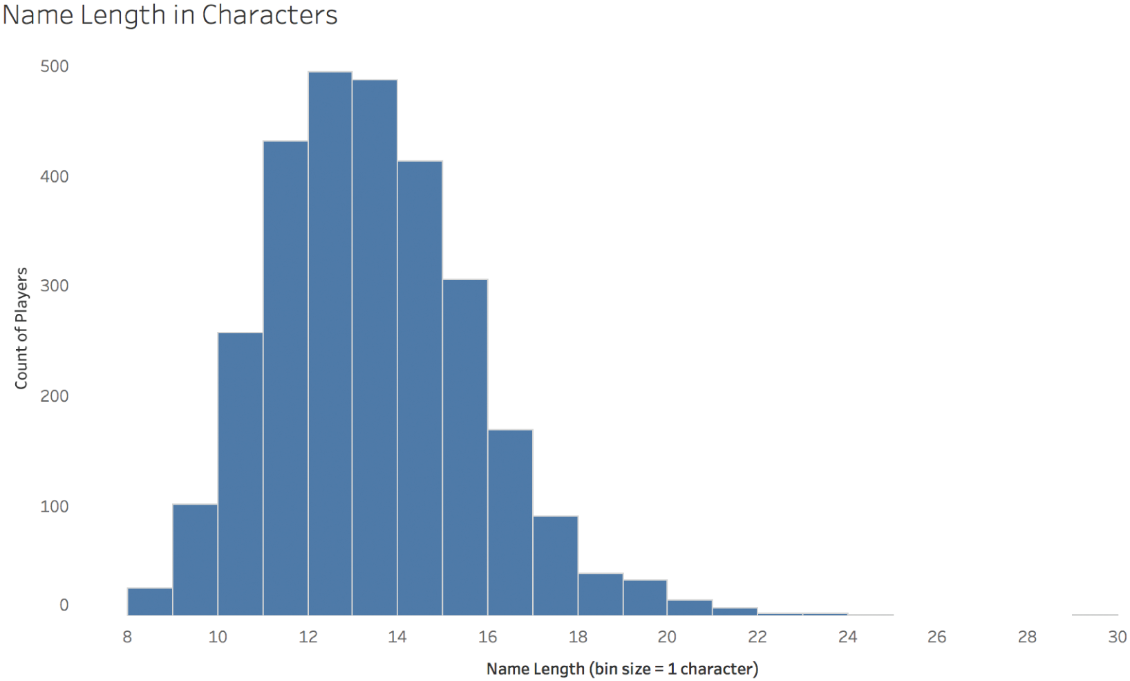
FIGURE 5.10 Name length in characters.
E. Multimodal Distribution: Player Weight
The fifth distribution to consider shows us how heavy football players are. Figure 5.11 is the three-humped, multimodal distribution.
Where does this odd shape come from? It comes from the fact that there are different positions on the field that require very different body types.
There are the very large players called “linemen” on both offense and defense who find themselves in a clash of titans seeking to control the middle of the field. There are the speedy and agile wide receivers on offense and their counterparts on defense in the secondary who seek to get open and catch or defend a pass from the quarterback. And then there's everyone else. There are close to 1,000 players in each of these three groups.
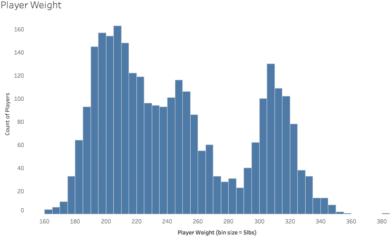
FIGURE 5.11 Player weight.
If we break up the histogram in Figure 5.11 by these rough groups of positions, we see that the league indeed comprises different types of players in terms of weight (Figure 5.12).
Remember that the average weight of all players is 244.7 pounds. It's easy to see from the histograms above that this is a pretty typical weight for the “all other positions” category, but it's an incredibly uncommon weight for the other two groups, which, put together, comprise roughly two-thirds of the players in the league. So is 244 pounds “typical”? No, not really. At least not for all position groups.
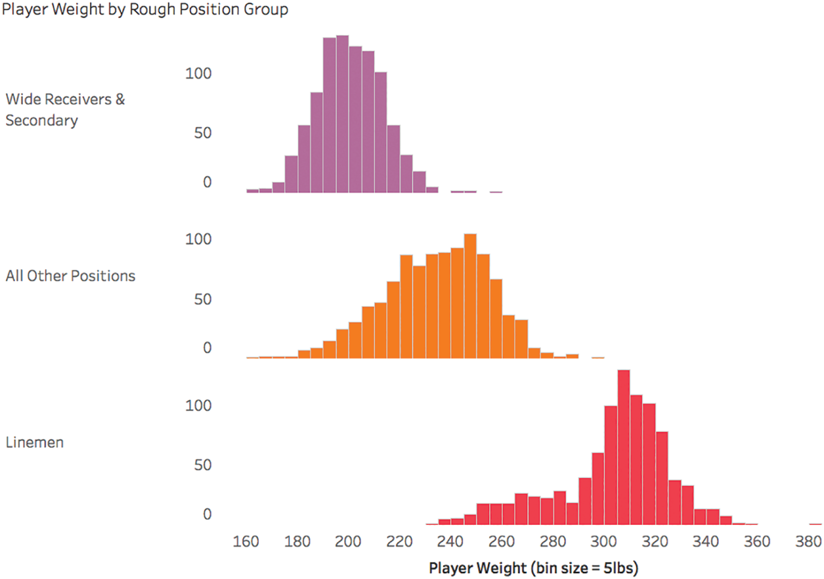
FIGURE 5.12 Player weight by rough position group.
So it is with distributions that have multiple modes, or humps in the shape of the distribution. The overall mean might map well to “typical” for one of the subgroups, or it might not map well to any of them. Without a doubt, there are subgroups in multimodal distributions for which the overall mean would be an incredibly unlikely value indeed.
F. Player Salary Cap Hit
I have saved the best distribution for last. If we look at how much money each player in the league makes in terms of the team's “cap hit” for that player – a technicality that factors in prorating of signing bonuses and such that we don't need to worry about too much here – then we noted earlier that on average, a player makes $1.5 million per year. The exact amount for 1,999 players in the 2017 season was $1.489 million.
Remember, the mean (aka “arithmetic average,” aka just “average”) is the “representative value” for the entire distribution. In other words, if we replaced each player's actual salary with the average salary of $1.489 million, then all of the owners put together would be on the hook for the exact same total amount of salary for the entire league of players, or around $2.97 billion.
Many, many players would be happy with that arrangement. If we look at the distribution in Figure 5.13 for salary cap hit, we see that the three largest bins – $0–$499K, $500K–$1M, and $1M–$1.5M – are pretty much at or below the average value.
In fact, a full 1,532 of the 1,999 players for whom I was able to find salary data for the 2017 season make less than the average salary. That's 76.6% of the players. The vast majority of players would be justifiably annoyed if you assumed they made around $1.5 million per year, and they'd be thrilled with a switch to the average.
But some players would be livid. Like Kirk Cousins, the quarterback whose cap hit in 2017 was almost $24 million. His mark in the histogram is the one way out there to the right. You can barely see it. He's the one who made 16 times the average player salary amount. If we try to evaluate this distribution using the standard deviation (σ), Cousins would be more than 10σ greater than the mean. If there was a player whose height was 10σ greater than the average height, that player would be 8'4". To put that in perspective, the tallest person alive right now is a full 3 inches shorter than that at 8'1".
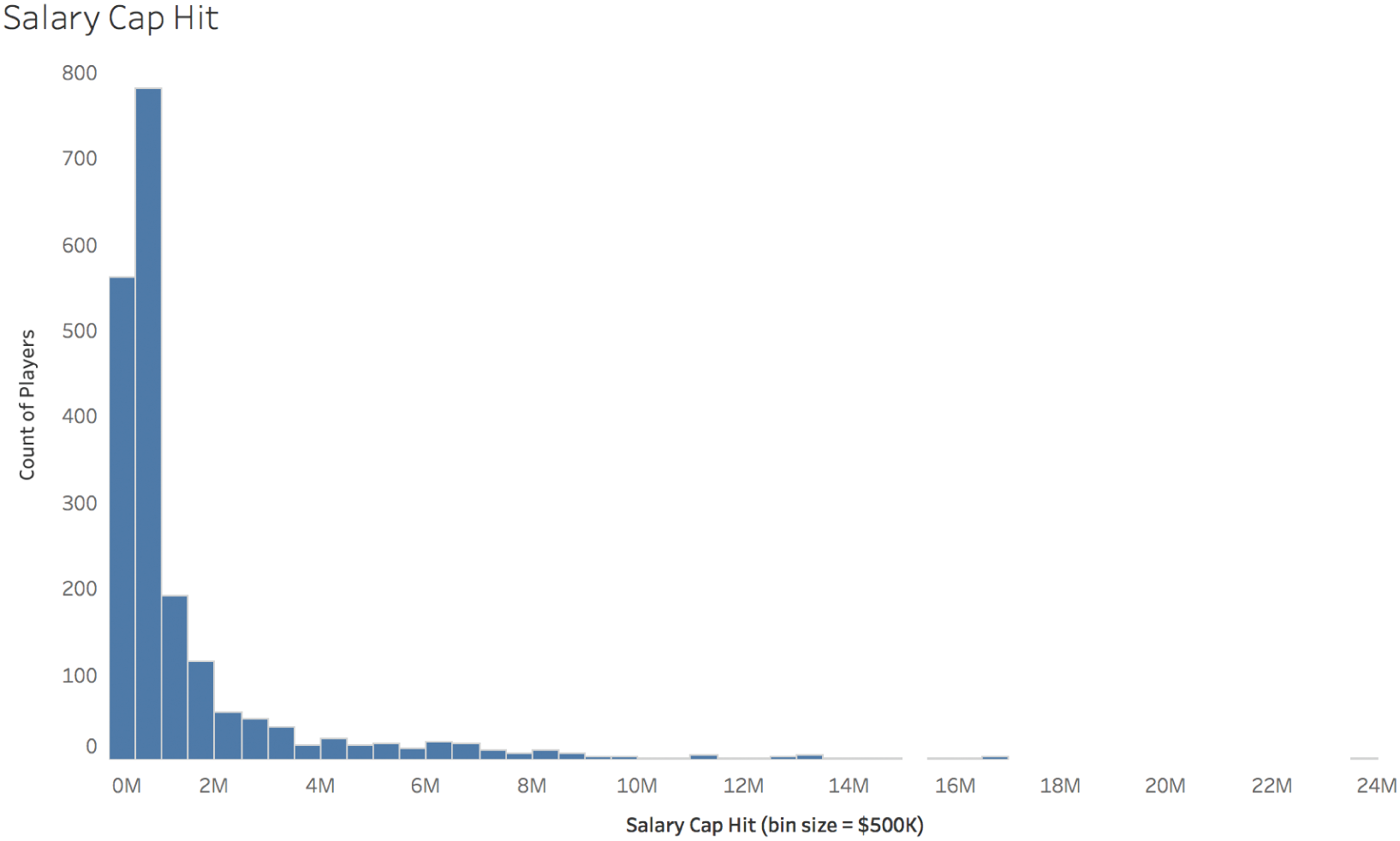
FIGURE 5.13 Salary cap hit.
And the standard deviation of salary? It's $2.25 million – so, larger than the mean itself, which is $1.489 million. As you can see, salary is a totally different type of distribution altogether. It's certainly not a uniform distribution, and it's not anything like a normal distribution.
It's called a power law distribution, and the thing is, it's everywhere in social sciences. Try to imagine the distribution of the number of followers for each social media account. There are a relatively small number of accounts with an enormous number of followers – millions and millions of followers each – and an incredibly long tail of accounts with just a few followers or less. This is true of so many things. Book sales, website visitors, music track listens on streaming services, movies. As humans, we focus a huge amount of our attention and we give a very large percentage of our money and adoration to a relatively small number of other humans and products. In so many things in human life, to the victor goes an insane portion of the spoils.
That's why power law distributions are often said to follow the Pareto rule, or the 80–20 rule: 80% of the spoils goes to 20% of the people. The numbers 80 and 20 aren't etched in stone, by the way, just an easy way of getting across the idea that a disproportionate amount of something is given to relatively few.
In the football player salary example, we're considering right now, for example, 80% of the salary in terms of cap hit would be claimed by the top 800 money earners in the league, or 40% of the entire league. A full half of the overall cap hit in the league went to 214 players, or just over 10% of the total league. If we plot the cumulative salary of each player, starting with the highest wage earners like Cousins to the left, and then adding the next player's salary to the total and so on, we see just how skewed this distribution is (Figure 5.14).
Contrast that with the cumulative distribution of player heights, where the tallest players like the aforementioned Nate Wozniak are placed to the far left (Figure 5.15).
It's almost a perfectly straight line. Here's another way to think about it. If you built a staircase where the height of each step was proportional to the height of each player, and the first step from the ground was for the tallest player and the last step at the top was for the shortest player, you'd hardly be able to see a difference at all if you looked at the whole staircase from a distance. On the other hand, if you did the same thing but you made each step proportional to the stack of bills each player makes? Yeah, you'd notice the difference all right – the staircase would bend dramatically like the arc above.
And think about it – we're only considering a population of people who play the exact same sport in the exact same league, and we still get astronomically higher than average values in the set. Imagine how much more variation we'd see if we considered a wider group – say, all athletes. Or even wider – all Americans. Or all citizens of planet earth. The distribution in income of all 7.53 billion people isn't anything like the distribution of those same individuals' heights, and it isn't anything like the distribution of the outcome of a single die roll if everyone took a turn and wrote down the number showing from 1 to 6.
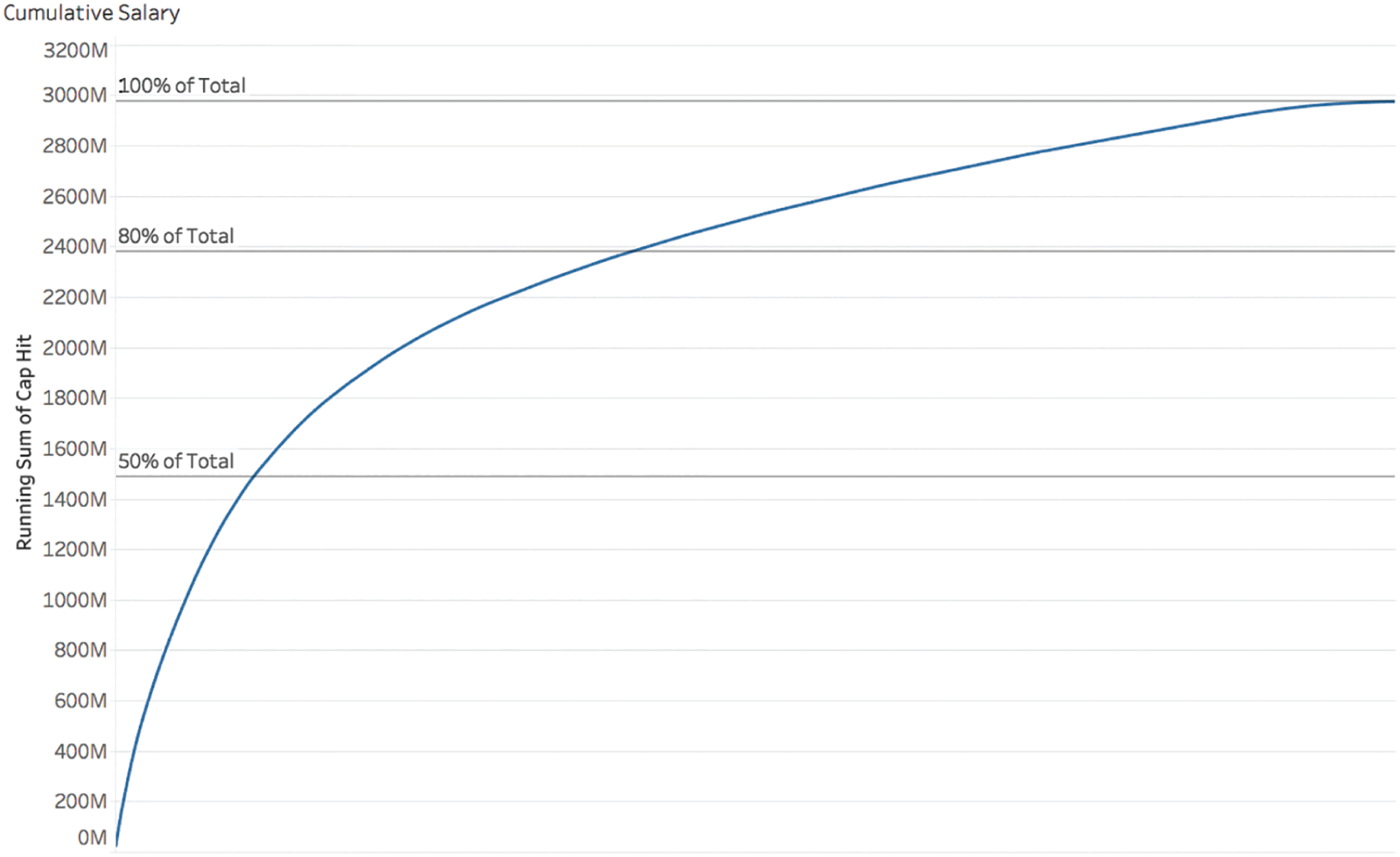
FIGURE 5.14 Cumulative salary.
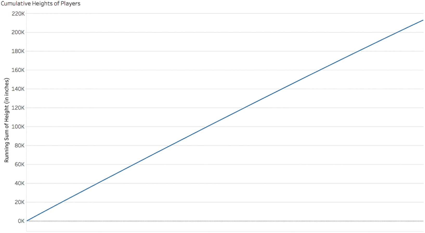
FIGURE 5.15 Cumulative heights of players.
These are all very different types of variation. But the pitfall – and it's a “humdinger” as my mom likes to say – is that we almost always think that “average” means “typical” for each one of them. It doesn't.
Pitfall 4B: Inferential Infernos
When we have data about all of the members of a population, such as the football league player data in the previous section, there's no need to make any inferences about the difference between groups within that population, because we're dealing with all of the data.
We don't have to infer which team has the tallest average player height, for example, because we can just compute average height for each team and then sort the teams in descending order. This is descriptive statistics, and we saw how even that activity can be tricky. (It was Pittsburgh, by the way.)
Many times, though, when we're working with data, it isn't feasible, practical, or cost effective to obtain data about every single one of the individual elements of a given population, so we have to collect data from samples, and make inferences about differences between groups. Here's where the trickiness increases by leaps and bounds.
There's a reason the census in the United States is decennial – meaning it only happens once every 10 years: it's very expensive and extremely difficult to attempt to count every single person in every single residential structure in the entire country, and such an undertaking is not without its sources of bias and error. The current budget request for the FY 2020 census is $6.3 billion.6 That's not a cheap data collection program at all. Worthwhile? Sure. But not cheap.
Since most organizations don't have the resources of the U.S. federal government or billions of dollars of funding to undertake such an exhaustive initiative, they make decisions based on data taken from subsets of the population. A lot. But they don't always do it right.
Making inferences based on data from samples of the population is a particular stretch on the road to data heaven that is absolutely full of pitfalls, one after the other. It very well might be the most treacherous zone of all.
Here are some common examples in everyday life and business that involve using data taken from a subset of the population:
- Customer satisfaction: When companies seek to survey their customers, they know that many won't respond to their email survey, so it can be very difficult to get 100% feedback from an entire group of people who have purchased your product or service.
- Quality control: When engineers want to test whether products in manufacturing meet specifications, the tests can often be costly, and sometimes even destructive in nature (like determining tensile strength), so it wouldn't make financial or practical sense to test 100% of the parts.
- Clinical trials: Researching the efficacy of an experimental drug means researchers need to see whether a group of study participants who used the drug fared any better than another group in the study that took a placebo. Also, inferences are made about how the drug will affect patients who take it after it is released into the market.
These are just a few examples where statistical inference is required to make informed decisions. These are clearly important scenarios.
To start the discussion about how statistical inference can go awry, I'll relate some experience from early in my career. I started my career as a mechanical design engineer working in a high-volume automotive sensor factory that mostly produced pressure sensors for under-the-hood applications for cars and trucks. These sensors were being cranked out by the tens of thousands each and every shift, sometimes three shifts per day. Even tiny process or equipment changes could result in massive quality issues and costly scrap, with bins upon bins full of “out of spec” parts piling up in the back of the building. Poor quality was very hard to sweep under the rug.
In that environment, it was critical to study how small changes would impact the quality of the parts being produced. Let's say a vendor who produced one of the components used in the final assembly made a change to a manufacturing process as volumes increased, resulting in a shift of a critical dimension on a print such as a shaft diameter – even a shift that resulted in components that were still “in spec,” or within the minimum and maximum allowable limits of the diameter, for example. How would this shift affect the overall performance of the manufacturing line? Would it perhaps affect some downstream quality assurance test in a negative way and cause fallout in production? How could the team know before creating batches upon batches of bad parts that would need to be thrown away?
Our quality engineers would perform an experiment – a qualification run – and they would obtain data from a set of sample parts that would make their way through the entire production line using the new components, and this data would be compared to data from parts made with the “old” components – the ones we used before the supplier made the change to their process.
These studies would require us to perform “null hypothesis statistical tests” such as Student's t-test, ANOVA, and chi-squared tests, among others. These tests are easy to compute, but they're tricky, and the concepts behind them are slippery and very easy to get wrong, even for experts.
So how do they work? For those of you well-grounded in statistics, you know this next part. But maybe not. Maybe you get it wrong from time to time, too, like I do.
The key to a null hypothesis statistical test is the null hypothesis – the scenario in which there's actually no difference between the groups being tested. Since random samples drawn from a population won't have the exact same mean and standard deviation all the time, some variation in these statistics is to be expected. How does that amount of likely variation compare with the actual difference observed in the experiment?
Hypothesis tests start with the assumption that the null hypothesis is true, and then they seek to determine how likely it would be to observe differences in sample statistics, such as the mean and standard deviation, at least as great as what was actually observed in the experiment, taking into account the number of samples, the size of the difference measured, and the amount of variation observed in each group. This is similar to the “presumption of innocence” in courts of law, but not exactly the same, because there's no “proving” the null hypothesis innocent or guilty. It's just a probabilistic assessment.
That's a mouthful, though, so it's no wonder people get it wrong. The key output of the null hypothesis test is the p-value. Much has been written about the much maligned and often defended p-value in many fields of study. The p-value just tells you the probability of seeing a difference at least as big as the one observed in the experiment, assuming the null hypothesis is true and there's no difference in the groups being tested. The p-value doesn't prove or disprove anything – a high p-value doesn't prove that the null hypothesis is true, and a low p-value doesn't prove that it's false. In practice, though, that's how people often think of it and use it.
There are a number of pitfalls in play here:
- Simply computing the difference in mean between the different groups and assuming any difference you see is statistically significant, ignoring the statistical probabilities altogether. We'll call this the “p-what? pitfall.”
- Getting a p-value that's low by sheer chance and therefore rejecting the null hypothesis when it's actually true is the “Type 1 pitfall.” In other words, you assume there's a statistically significant difference between the groups when they're basically cut from the same cloth.
- Getting a p-value that's high means you can fall into the “Type 2 pitfall” by failing to reject the null hypothesis when it's actually false.
- Misunderstanding the concept of statistical significance altogether, you get a low p-value in an experiment and then you run around the building waving a piece of paper and claiming to everyone who will listen that you have definitive proof that the null hypothesis is dead wrong, because MATH! Let's call this pitfall “p is for proof, right?”
- Running a test in which you collect data on many, many different variables, you blindly compute p-values for dozens upon dozens of comparisons, and lo and behold, you find a couple of low p-values in the mix. You don't bother confirming it or asking others to replicate your results. You just sit back and breathe a sigh of relief that you found a low p-value and thank the stats gods that now you'll have something to write about. We'll call this pitfall “p is for publish, right?”
- You confuse the notion of practical significance and statistical significance, and you conduct a huge clinical study with thousands and thousands of patients, some taking an experimental drug and others a placebo. You get a p-value of <0.0001 for your key factor – lifespan – but you forget to look at the size of the difference between the means. The difference is vanishingly small, and test subjects can expect to live 2 days longer in total. Of course, this pitfall is called the “p is for practical, right?”
These are just a handful of pitfalls that null hypothesis testing can cause us to fall into, which is at least part of the reason why a number of scientists, researchers, and statisticians are ditching the procedure altogether in favor of Bayesian methods such as the Bayesian information criterion.7
Pitfall 4C: Slippery Sampling
On some level, we all know that the data we're using to make conclusions about the world isn't perfect. We know that there remains some uncertainty about everything the human mind considers. From survey results to clinical studies to engineering bridges, there's always some error involved in the numbers. We tend to neglect this uncertainty, and lead ourselves and others astray as a result.
Case in point: fish labels.
On Fish Labels
When a nonprofit published the findings of their seafood labeling fraud investigation in February 2013, the results were shocking: “more than 1,200 seafood samples taken from 674 retail outlets in 21 states” yielded a disturbing trend – over 33% of DNA samples didn't match their label. You can read the news on the nonprofit's website.8
I first heard about the study while driving to work in Seattle after coming back from the Tapestry Conference in Nashville. At Tapestry, we had discussed uncertainty following Jonathan Corum's keynote, so the topic was fresh in my mind.
An Inferential Leap
Northwest Public Radio had the following to say about the study in an article that is no longer available on their site: “Seattle and Portland are among the best cities in the country to buy fish that is accurately labeled.” On the surface, it made perfect sense. Seattle and Portland are coastal cities with robust fishing industries. Of course they'd be better than cities like Austin or Denver. The NPR article went on to state that the lower rates may be due to “consumer awareness about seafood in Seattle.” Flattering.
For fun, I thought I'd take a deeper look, so I found the full report online.9 Let's take a look at the report to see what can be said about Seattle and Portland, if anything. The charts that follow are my own creations from the raw data available in the report.
If we just look at the overall percent of samples mislabeled by city, we find Seattle and Portland among the best, along with another famous North American fishing hub, Boston (Figure 5.16).
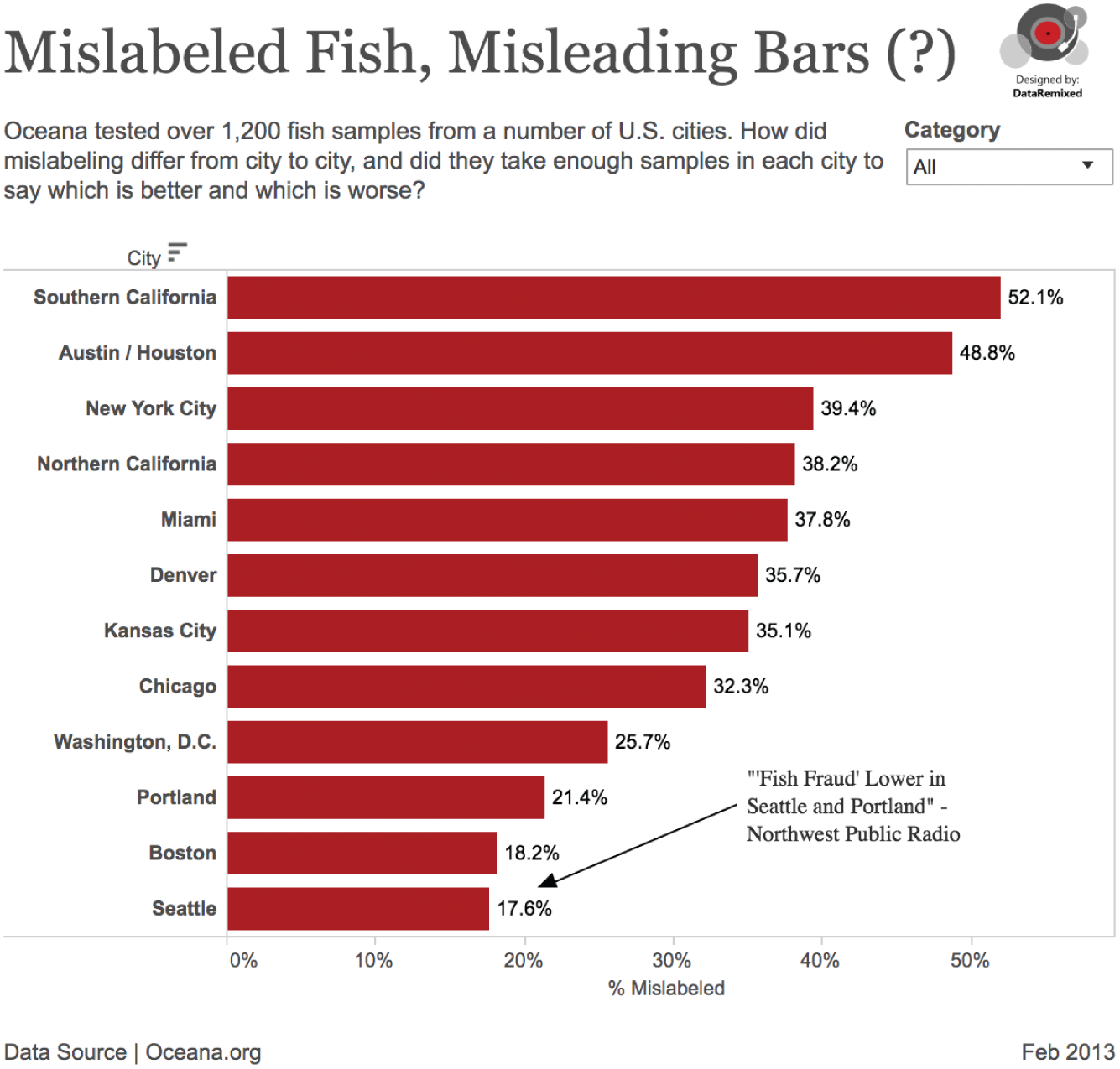
FIGURE 5.16 Mislabeled fish, misleading bars.
Case closed then, right? If this were all we were given, we'd make the same inferences as Northwest Public Radio. But were the cities sampled properly to make this statement?
Samples were taken from three types of retail outlets: grocery stores, restaurants, and sushi venues. Here are the results by each city and retail category pairing. Mislabeled samples are red bars, and correctly labeled samples are blue bars (Figure 5.17).
The first thing I noticed is that there are some pretty small sample sizes in there, once you break it down into cities and retail categories. Yes, there may be “more than 1,200” samples overall, but 12 samples from restaurants in the Austin/Houston area? And 9 samples from sushi joints in Kansas City?
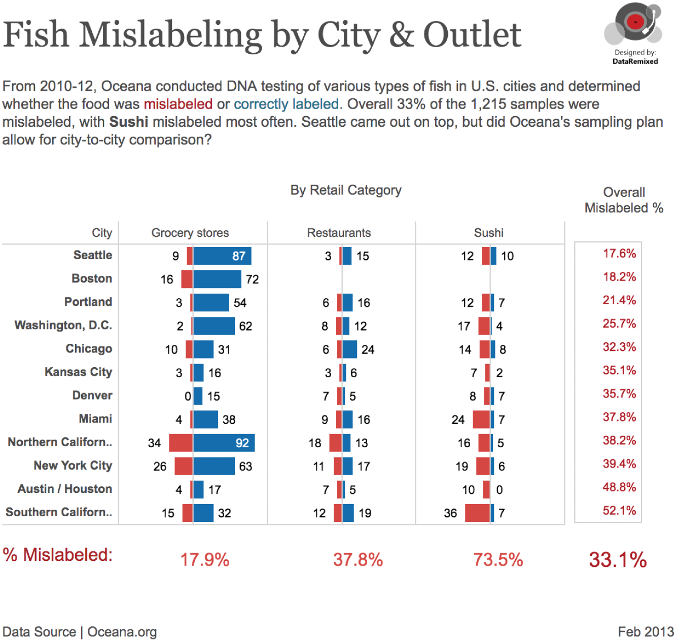
FIGURE 5.17 Fish mislabeling by city and outlet.
If we look at the data they provide, we can see that sushi venues seemed to yield the poorest results, with over 73% mislabeled across all cities (some of the sushi mislabeling was due to “foreign name translation” – e.g. not all types of fish called “yellowfish” in Japan meet the FDA classification).
But the other thing we notice is that very different amounts of sushi were collected in each city. In fact, no sushi was collected in Boston at all.
Breaking Down the Mix
Figure 5.18 shows a breakdown of the mix of each retail category in each city's sample set (thickness of the bars is proportional to mislabeling – thicker meaning a higher mislabeling rate).
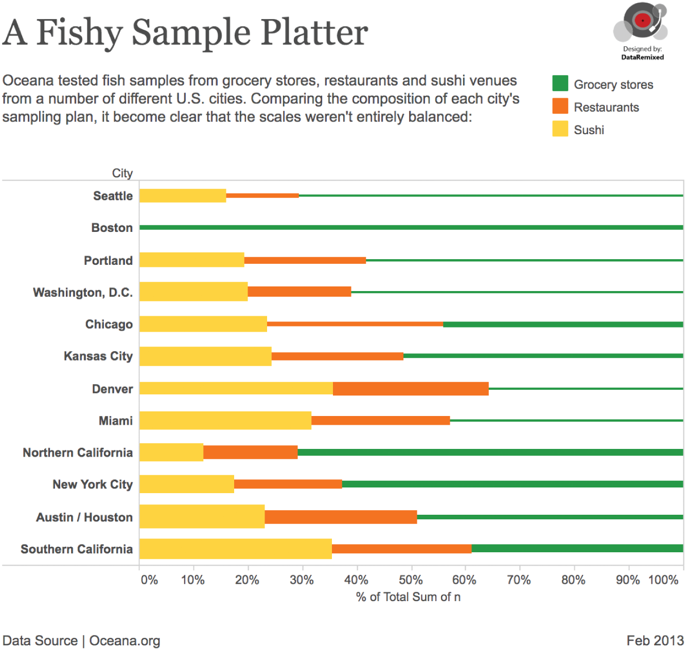
FIGURE 5.18 A fishy sample platter.
So, relatively low amounts of sushi samples were sampled in Seattle, Portland, and Boston. Of the samples in Seattle, 16% were sushi, while over 35% of the samples in Southern California were sushi, by comparison.
This organization didn't follow a stratified sampling plan when they collected their 1,214 samples and as a result, the overall mislabeling rates from each city really aren't apples-to-apples comparisons. This doesn't mean their study is meaningless; it just means that comparing the overall rates between cities isn't all that valid. It would be like comparing average human heights in each city and including way more children in one city's sample set than the others. It's just not fair dice.
Comparing Like-to-Like
Okay, since we can't really compare the overall rates, what if we just compare the cities within each retail category: so grocery stores to grocery stores, restaurants to restaurants, and sushi to sushi?
Even though a relatively high number of samples were taken overall, the sample sizes start getting fairly small when you look at each city/category combination, so we should add error bars to the mislabeling rates. This is a case for the binomial proportion confidence interval.10 There are a number of different ways to compute this interval, but for now we'll stick with the normal approximation that we all learned in college. Figure 5.19 shows the breakdown of mislabeling rates, with uncertainty taken into account.
This data visualization tells a very different story. Notice that not every city is included in this chart. That's because in some cases, there weren't enough samples to satisfy the requirements of the normal approximation (n*p>5 and n*(1-p)>5), so I filtered these cases out of the chart. Kansas City drops out altogether, for example – not enough samples in KC (19, 9, and 9) to say much of anything about labeling there.
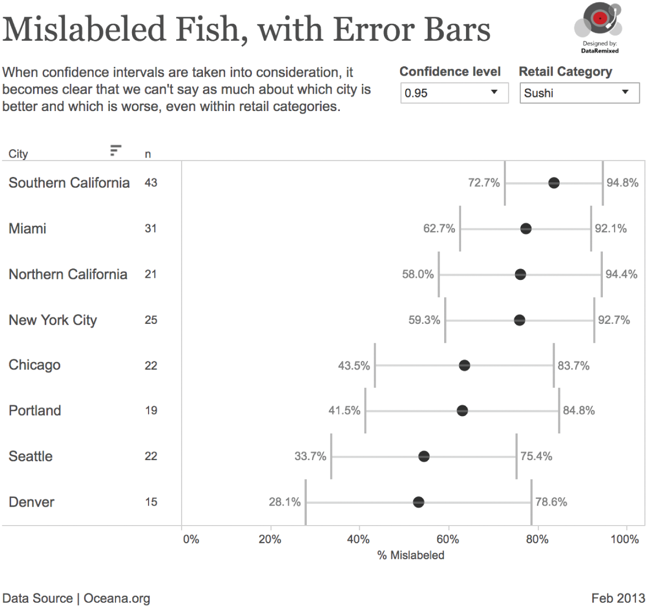
FIGURE 5.19 Mislabeled fish, with error bars.
What can we say about the different cities? Here's what we can (and can't) say based on a 95% confidence interval (ignoring the difference in the types of fish samples collected at each place):
- We don't have enough evidence to say whether any city is better or worse than any other in sushi mislabeling.
- The probability is high that restaurants in Chicago overall had lower mislabeling rates than restaurants in Northern California.
- The probability is high that grocery stores in Seattle had lower mislabeling than in both California (Southern and Northern) and New York.
So some comparisons can be made between cities, just not all that many. In the end, Seattleites can take consolation in the fact that the fish in their grocery stores is probably labeled more accurately than in California and New York, and perhaps this is even partly due to their seafood IQ.
If their tests are to be trusted, and if they can be replicated, then this nonprofit revealed widespread mislabeling of fish in the United States – that much can't be denied. But a massive inferential leap was made in reporting the story. Looking at the numbers through the lens of statistics allows us to make more accurate statements about the findings.
Yes, this involves much more work than simply taking the overall mislabeled rate and slapping it into a map or bar chart. And yes, uncertainty can be annoying. But we are falling into a pitfall and deceiving ourselves and others if we don't understand how our sampling plan and the confidence bands of the rates affect our ability to draw probabilistic conclusions about the world in which we live.
Embracing uncertainty just may mean the difference between truth and fiction, and we wouldn't want fishy results, now would we?
Pitfall 4D: Insensitivity to Sample Size
If you deal with numbers at all and haven't yet read Thinking, Fast and Slow by Nobel Prize winner Daniel Kahneman,11 I highly recommend you read it. It's a fascinating book about cognitive biases and “heuristics” (rules of thumb) in decision making. In it he refers to an article by Howard Wainer and Harris L. Zwerling called “Evidence That Smaller Schools Do Not Improve Student Achievement” that talks about kidney cancer rates.12
Kidney cancer is a relatively rare form of cancer, accounting for only about 4% of all new adult cancer cases. According to the American Cancer Society, an estimated 73,820 cases out of 1,762,450 total new cases in 2019 in the United States will be kidney and renal pelvis cancer cases.13 If you look at kidney cancer rates by county in the U.S. an interesting pattern emerges, as he describes on page 109 of his book:
The counties in which the incidence of kidney cancer is lowest are mostly rural, sparsely populated, and located in traditionally Republican states in the Midwest, the South, and the West.
What do you make of this? He goes on to list some of the reasons people have come up with in an attempt to rationalize this fact, such as the ideas that residents of rural counties have access to fresh food or that they are exposed to less air pollution. Did these explanations come to your mind, too? He then points out the following:
Now consider the counties in which the incidence of kidney cancer is highest. These ailing counties tend to be mostly rural, sparsely populated, and located in traditionally Republican states in the Midwest, the South, and the West.
Again, people come up with various theories to explain this fact: rural counties have relatively high poverty rates, high-fat diet, or lack of access to medication.
But wait – what's going on here? Rural counties have both the highest and the lowest kidney cancer rates? What gives?
This is a great example of a bias known as “insensitivity to sample size.”14 It goes like this: when we deal with data, we don't take into account sample size when we think about probability. These rural counties have relatively few people, and as such, they are more likely to have either very high or very low incidence rates. Why? Because the variance of the mean is proportional to the sample size. The smaller the sample, the greater the variance. There is, of course, rigorous mathematical proof for this fact if you're interested in following the steps.15
In looking into this matter further, I managed to find kidney cancer rate figures 16 as well as the population data for each U.S. county,17 and I created an interactive dashboard (Figure 5.20) to visually illustrate the point that Kahneman, Wainer, and Zwerlink are making quite clearly in words.
Notice a few things in the dashboard. In the choropleth (filled) map, the darkest orange counties (high rates relative to the overall U.S. rate) and the darkest blue counties (low rates relative to the overall U.S. rate) are often right next to each other.
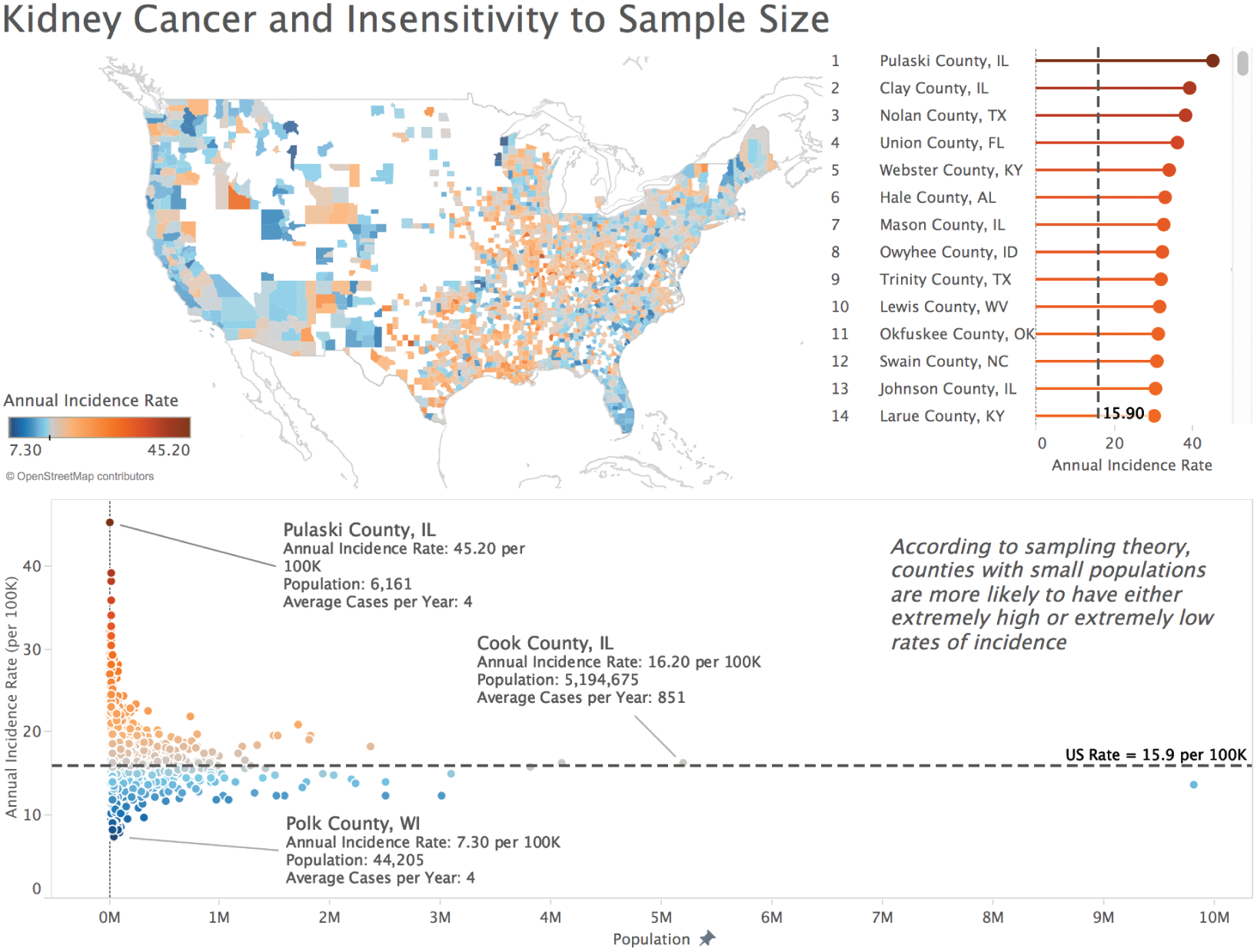
FIGURE 5.20 Interactive dashboard.
Furthermore, notice how in the scatterplot below the map, the marks form a funnel shape, with less populous counties (to the left) more likely to deviate from the reference line (the overall U.S. rate), and more populous counties like Chicago, L.A., and New York more likely to be close to the overall reference line.
One final observation: if you hover over a county with a small population in the interactive online version, you'll notice that the average number of cases per year is extremely low, sometimes 4 cases or fewer. A small deviation – even just 1 or 2 cases – in a subsequent year will shoot a county from the bottom of the list to the top, or vice versa.
Other Examples
Where else does “insensitivity to sample size” come up? An interesting example is the notion of “streaks” in sports, which can often be simply a “clustering illusion.”18 How does this work? We observe a limited sample of a player's overall performance and notice temporary periods of greatness. But we should expect to see such streaks for even mediocre players. Remember Linsanity?
Similarly, small samples make some rich and others poor in the world of gambling. You may have a good day at the tables, but if you keep playing, eventually the house will win.
So what do we do about it? How do we make sure we don't fall into the pitfall known as “insensitivity to sample size”?
- Be aware of any sampling involved in the data we are analyzing.
- Understand that the smaller the sample size, the more likely we will see a rate or statistic that deviates significantly from the population.
- Before forming theories about why a particular sample deviates from the population in some way, first consider that it may just be noise and chance.
- Visualize the rate or statistic associated with groups of varying size in a scatterplot. If you see the telltale funnel shape, then you know not to be fooled.
The point of the original article by Wainer and Zwerling is that smaller schools are apt to yield extreme test scores by virtue of the fact that there aren't enough students in small schools to “even out” the scores. A random cluster of extremely good (or bad) performers can sway a small school's scores. At a very big school a few bad results will still affect the overall mean, but not nearly as much.
Here's another way to think of it. Lost Springs, Wyoming, is a town with a population of one (Figure 5.21). If Daniel Kahneman ever moved to Lost Springs, Wyoming, then half of the town's population would be Nobel Prize winners. And if you think that moving there would increase your chances of winning the Nobel Prize, or that it's “in the water” or some other such reason, then you're suffering from a severe case of insensitivity to sample size.

FIGURE 5.21 The traffic sign welcoming drivers to Lost Springs, Wyoming.
Source: Wikimedia Commons. Public domain.
These are just a handful of statistical slipups, a type of pitfall on the road to data paradise that is particularly nasty and easy to fall into. Entire books have been written on this topic, and more really should be said for this chapter to be complete. But I'll stop here and we'll move on to other topics worthy of our consideration.
Notes
- 1 https://www.merriam-webster.com/dictionary/statistics.
- 2 http://fivethirtyeight.com/features/not-even-scientists-can-easily-explain-p-values/.
- 3 https://www.amazon.com/How-Lie-Statistics-Darrell-Huff/dp/0393310728.
- 4 https://operations.nfl.com/the-rules/2018-nfl-rulebook/#article-2.-players-numbered-by-position.
- 5 http://www.z-table.com/.
- 6 https://www2.census.gov/about/budget/census-fiscal-year-20-budget-infographic-2020-census.pdf.
- 7 https://www.ejwagenmakers.com/2007/pValueProblems.pdf.
- 8 https://oceana.org/reports/oceana-study-reveals-seafood-fraud-nationwide.
- 9 http://oceana.org/sites/default/files/reports/National_Seafood_Fraud_Testing_Results_FINAL.pdf.
- 10 https://en.wikipedia.org/wiki/Binomial_proportion_confidence:interval.
- 11 https://us.macmillan.com/books/9780374533557.
- 12 https://journals.sagepub.com/doi/abs/10.1177/003172170608800411?journalCode=pdka.
- 13 https://cancerstatisticscenter.cancer.org/#!/.
- 14 https://en.wikipedia.org/wiki/Insensitivity_to_sample_size.
- 15 https://newonlinecourses.science.psu.edu/stat414/node/167/.
- 16 https://statecancerprofiles.cancer.gov/map/map.withimage.php?99&001&072&00&0&01&0&1&6&0#results.
- 17 https://seer.cancer.gov/popdata/.
- 18 https://en.wikipedia.org/wiki/Clustering_illusion.