5
BREVITY IS THE SOUL OF WIT: THE ART OF COPYWRITING.
I HAD BEEN A COPYWRITER for decades before I could honestly answer the question of “What do I do for a living?” The right answer seemed to diminutize the effort I put into my labors, but it was true.
I try to think up clever stuff.
I know, it sounds so flip. Clever. But a look at how dictionaries define the word clever seems to back up what I see in all the best work out there.
- “A natural aptitude for using words and ideas in quick and inventive ways.”
- “The power of inventing or discovering a new way of accomplishing something.”
- “The perception and expression of connections between ideas that awaken amusement and pleasure.”
Think about it. Doesn't the word clever perfectly describe your favorite TV commercials? Your favorite memes? Your favorite Twitter feeds, sit-coms, as well as your favorite people to sit next to during boring gatherings?
Now, before we begin to discuss copywriting specifically, we need to point out that art direction, graphic design, and experience design, all these crafts can be practiced cleverly. As evidence, I point to the work you see throughout this book. It's all clever. Every last bit of it.
That said, let's turn now to the role of the copywriter.
For decades, copywriters in ad agencies “did the word part,” but all that's drastically changed. In Teresa Iezzi's book The Idea Writers, Guy Barnett (chief creative officer of Public), updated the job description of copywriter:
You need to keep people both entertained and informed. You need to be authoritative, charming, funny. You need to be able to recount a story and digress in all directions. You need to be able to do it in a variety of voices so you can work on a number of brands. And you need to be able to express yourself in 280 characters or less, as well as at length on the back of the packaging. And there simply aren't that many writers who can do that. Actually, there are; they just don't see advertising as a career. We call them authors. Or columnists. Or journalists. Or bloggers. The role of the writer in advertising is more vital than ever before because, despite what many people think, people read more than ever. They read blogs, magazines, Harry Potter, and Facebook updates. Gossage said, “People read what interests them, and sometimes it's an ad.” He's still right. Except sometimes it's a tweet.1
So, let's talk about writing. Writing is hard.

HAVE A WRITING PROCESS.
Stay off the stinkin' computer. Use a pencil and a pad of paper.
I recently read about a portfolio review where a creative director named Pat McKay gave the student this advice: “You've got only one line in there that feels to me like you went through a process. I want to see you have a writing process. Because that's what we writers do. We have a process.” Whatever your process turns out to be is up to you, but it's important you have one. Here's mine.
When you first get a job at an agency, they'll supply you with a nice computer. Don't use it.
There's something about a direct connection to the page, through your hand holding a pencil, that the computer can't give you. You will be a better writer working in a notebook or pad of paper.
Another benefit of paper and pencil is there are none of the distractions a computer tempts you with. This matters. Say you're having some serious trouble getting the words right, or maybe you've hit a brick wall. If you're like me, this is when your anxiety whispers in your ear, “Dude, just make a quick check on the ’Gram and see how many likes you got.” You are now using your computer as an escape hatch out of the room. I say, stay in the room and stay with the struggle. All the good stuff comes on the other side of a rough patch.
Also, it's easier to sit still for a long time when you have your feet up on the desk and a pad of paper in your lap. It's more comfortable than being upright in front of a computer and it's the best way I know to settle in for a good three-hour blast of writing.
Create a word and idiom list.
We mentioned this technique in the last chapter for general concepting, but it's also my preferred way to begin writing. But here, in addition to just listing words, I can also list idiomatic phrases relevant to my subject. Examples of idiomatic phrases are “up in the air” or “spill the tea.” These phrases often useful as shorthand can make writing feel conversational.
Get puns out of your system right away.
Puns, in addition to being the lowest thing on the joke food chain, have no persuasive value. Any headline that rhymes is also beyond saving. It's okay to think up puns and rhymes. It's okay to write them down. Just make sure you put them where they belong. Then close the lid and flush.
Draw a square on the page and fill it with something interesting.
Figure 5.2 is a page I rebuilt from my old notebooks. At the time, I was creating a campaign for the Art Center in Pasadena, California, specifically for their advertising curriculum.
I was teamed with Joe Paprocki, an art director at Fallon McElligott, to create a print campaign to appear in Communication Arts magazine. Our goal was to persuade the creative types reading the magazine to come to Art Center to study art direction and copywriting for a career in the ad industry.
I'm including it here partly to show what's meant by the term “thumbnail sketches”—they're simply a way to pull an idea out of the ether and save it on paper. There are 11 on this page, all imminently disposable. (Actually, even here they're more polished than they ought to be.) Later on, when you're editing, if an idea has any merit, it'll be apparent even at this dinky size.
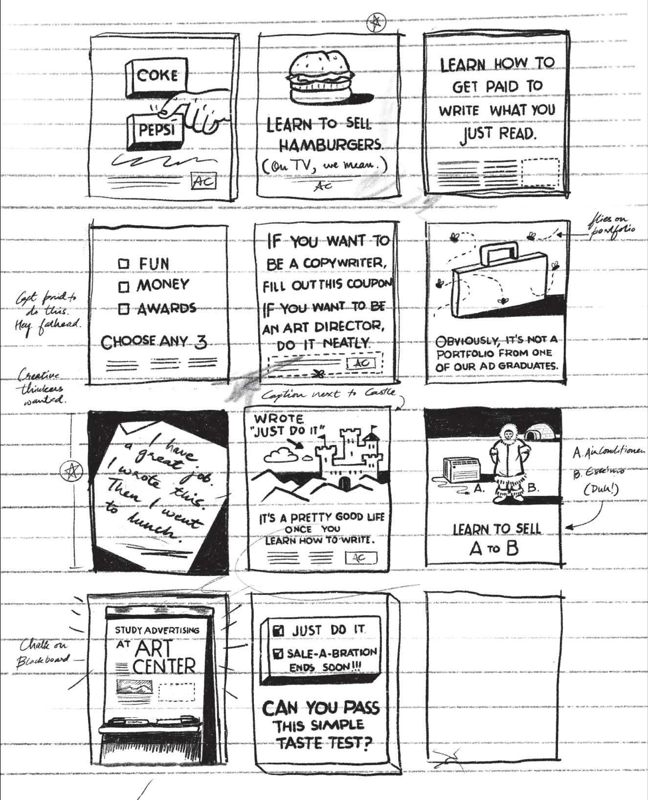
Figure 5.2 Some thumbnails for a campaign we did to sell ad classes at Pasadena's Art Center in the 1990s. I still kinda like the one in the top middle.
It's important to note here that this page of thumbnails was just one of many. I always tried to fill about five or six pages in a three-hour writing session. At the end of every day, Joe and I would go over our favorites, after which one of us would put all the ones we kinda-sorta liked on another piece of paper. This new pad became our short list of possible keepers, of which Figure 5.2 is an example. You can see the star marks we made as we continued to thin the herd.
Whether any of these ideas has any merit at all, you can decide. Ultimately, we executed other ideas. One of the finished ads is at the beginning of this chapter, the other begins the last chapter.
First say it straight, then say it great.
Think of that boring key message on the brief as a lump of clay and you've got to sculpt it into something interesting. So, you begin by taking this flat-footed message and you spin it. Maybe you shorten it. Or punch it up. Say it faster. Say it in slang. Add some attitude. Anything to change this boring sentence from a line you'd overhear at a sales convention to something more memorable.
For the sake of focus, let's begin by talking about ads that are just a headline and a logo. Here are three examples.
- Call in rich tomorrow. (Mystic Lake Casino)
- We hear you need a new muffler. (Korman Muffler Shops)
- For more information on lung cancer, keep smoking. (The Lung Association)
Okay, so what is it about these lines that make them kinda cool?
They're clever. And yet you understood exactly what the writer was tasked with saying. You understood them because the writers all knew they have to be both clever and clear.
The client has every right to expect our advertising to be clear. Problem is, the reader or viewer isn't out there looking for “clear.” (“Man, right about now, I could really go for a clear message.”) What customers notice is stuff that's interesting.
As you search for this balancing point, picture the image in Figure 5.3. Imagine the circle on the left represents all the ways you could clearly communicate the brief's key message. The circle on the right represents all the ways you could cleverly spin the key message into something interesting. The trick is to hit the sweet spot where the circles overlap.
Bill Bernbach said, “Dullness won't sell your product, but neither will irrelevant brilliance.” Here, dullness is represented on the far-left side of the left circle (X), and irrelevant brilliance on the far-right side of the right (Y). As a writer, your job is (Z). In his excellent book Advertising: Concept and Copy, George Felton describes the overlap this way:
As you'll discover when you work on advertising problems, you often lose the selling idea in the act of trying to express it creatively. There is a continual push-pull between being on-strategy and being clever. Each wants to wrestle you away from the other. Your job as a thinker and problem solver is to keep both in mind, to spin the strategy without losing hold of it. As though to indicate this truth, the two most common rejections of your ideas will be “I don't get it” and “I've seen that before.” In other words, either it's too weird or too obvious. That's why the great ones don't come easy.2
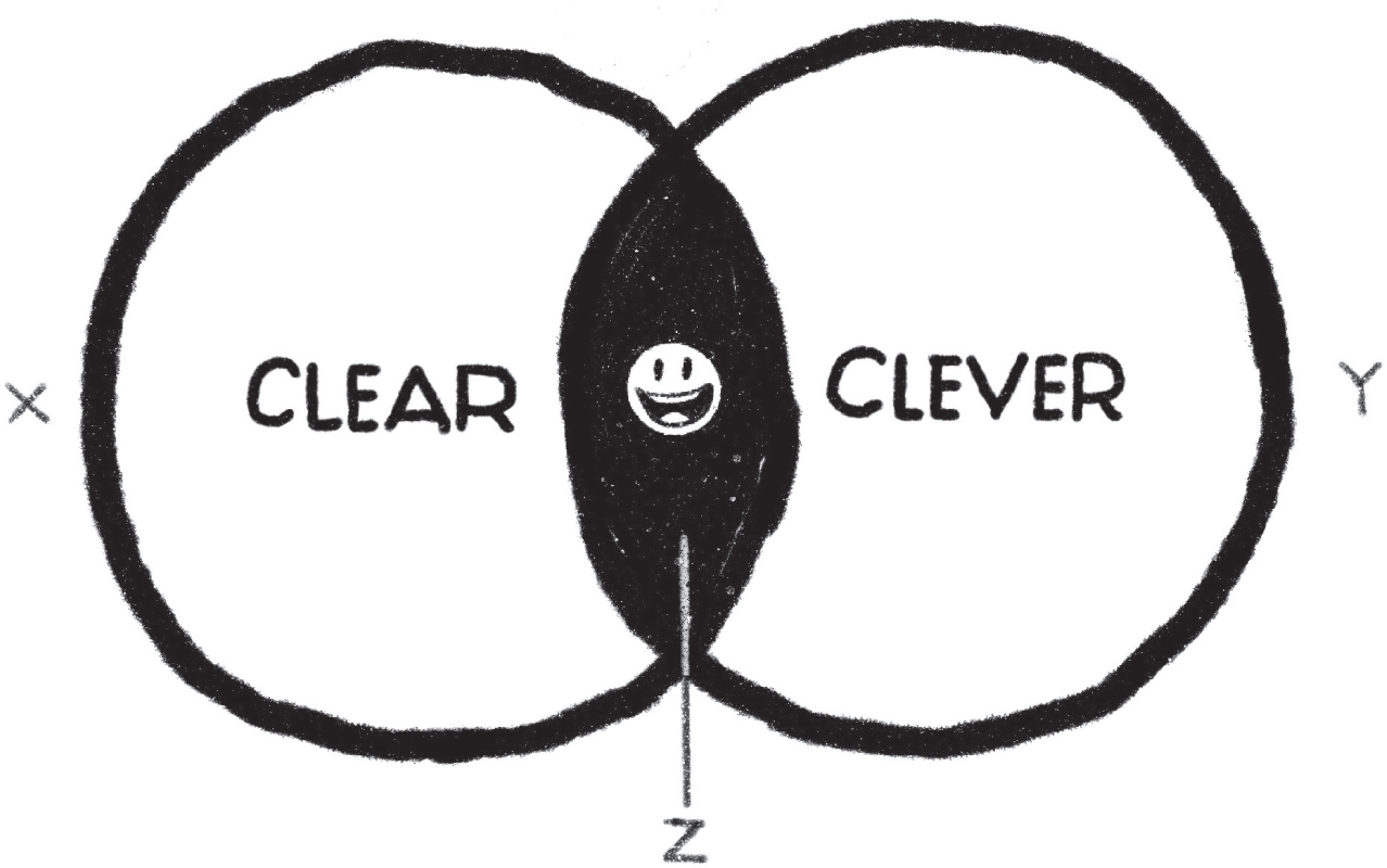
Figure 5.3 If your idea is only clear (X), it could be boring. If it's too clever (Y), nobody will get it. You have to hit the sweet spot (Z).
So, like I said, a great place to start is with this advice: first say it straight, then say it great. That's my version. In Junior, Thomas Kemeny puts it this way. “Start literal, finish lateral.” I like the imagery of his words. You begin in a straight direction and then add spin to it. It's kinda like the way the knight moves in chess; at the end of its move forward, it jukes left or right.
He gives two good examples:
LITERAL: A color printer for the price of a black-and-white printer.
LATERAL: Millions of colors for the price of two.
LITERAL: Your teeth will be a bright shiny white.
LATERAL: “James, your smile is needed at the lighthouse.”3
If your ad, billboard, or banner is just a headline, make it a great headline.
My first boss, Tom McElligott, told me if you have to create a multimedia campaign that includes the outdoor, start on the outdoor first. Pretend there's no photography budget and you must do it all with words. He said it forces us to boil down our thinking.
One of the best outdoor campaigns of all time (in this writer's opinion) is BBDO AMV's work for The Economist (Figure 5.4). The billboards were posted predominantly in the business district of London and all had the same message: Economist readers are sharp businesspeople. These brilliant headlines were set against a backdrop of the color red (lifted from the magazine's masthead) and remain to this day a master's course in copywriting. I include some favorites here:
- It's lonely at the top, but at least there's something to read.
- Think someone under the table.
- “Can I phone an Economist reader, please, Chris?”
- Don't be a vacancy on the board.
- Your argument should shine, not your forehead.
- E = iq2
- If they did brain transplants, would you be a donor or a recipient?
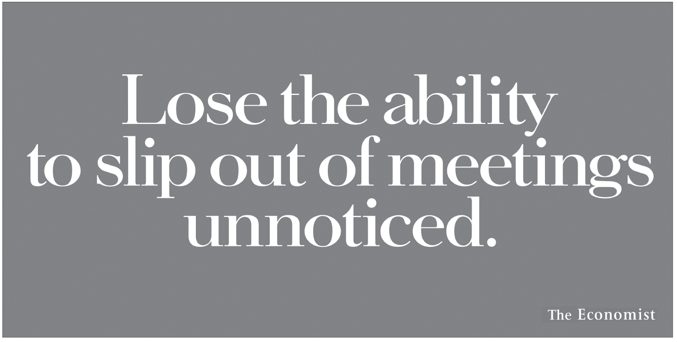
Figure 5.4 What an elegant way to say reading The Economist can help make your business thinking indispensable.
- Does anyone ever ask you for your opinion? No, not you, that guy behind you.
- If someone gave you a penny for your thoughts, would they get change?
- Think outside the dodecahedron.
- If you buy it just for show, sooner or later it will.
- Don't make the same mistake once.
- “Is it me, or is quantum physics easier these days?”
- Great minds like a think.
Try being half-rational, half-random.
This is an exercise that, after you do it a few times, your brain will do automatically. To demonstrate, I'll use an example from my files.
The project was Knob Creek bourbon. From the brief, the product description read: “Hand-made in small batches with pure water from a creek in Kentucky. Every sip is smooth because it's aged in charred oak barrels for a full nine years and bottled only at 100 proof.”
The client could afford only a small-space newspaper campaign and a billboard or two. The brand managers said they wanted to see their bottle, which makes sense given it's a packaged good and a new product to boot. There was no photography budget so the finished ads would have to be just a bottle and a headline, with maybe a sentence of body copy.
After some discussion with the account folks about tone (“thoughtful, intellectual”), I considered the main points I could make about the brand. I began by creating a list of these main points, which I pulled directly from the product description. My BRAND list went: Hand-bottled. Smooth. Expensive. Warming. Sip & savor. Nine years. Strong.
Then I made another list. This one would be a list of all the words and idiomatic phrases I might be able to pair with one of the main product attributes over on the BRAND list. I could base this new list on any number of themes pulled out of the product: how it's made—OLD BARRELS; how long it takes to make—NINE YEARS; or where it comes from—KENTUCKY. I started by thinking about Kentucky.
To make my KENTUCKY list, I began peeling off words and phrases that came to mind as I focused on KENTUCKY: Pure water. Moonshine. The movie Deliverance. Creek. Hatfields-vs-McCoys. Jug. My Old Kentucky Home. Hillbillies. The real stuff. Old-fashioned. White lightning. Mule-kick.*
Once I had enough things to play with, I leaned back and looked at the two lists BRAND and KENTUCKY to see what weird combinations I could pull out of the mess. I started by leaning in, picking up any random two, and stickin' them together like Legos.
Yes, I'm aware this sounds stupid but, as we discussed earlier, the whole creative process is stupid. (See: pig, washing a.) I kept my eyes flowing over the words on the page, jumping from one list to the other—randomizing, permuting, playing—hoping to stub my toes on a decent headline starter. I eventually saw an interesting way to refer to its Kentucky heritage and 100-proof strength.
- Kind of like an old Kentucky mule. Classic, stubborn, and plenty of kick.
In the BRAND list, my eyes light on the fact this brand is expensive. Over in KENTUCKY, I see hillbillies, I see Hatfields-vs-McCoys, and I get to:
- What the Hatfields would serve the Rockefellers.
As you can see, this process depends partly on the rational process of permutation and partly on the random collision of my eyes with a bunch of loosely associated words. Rest assured; you won't have to go through all this rigamarole every time you need to write something. After a while, your brain will just sorta open this program automatically.
We'll look at another version of this technique in Chapter 7—Tom Monahan's “Intergalactic Thinking.”
Don't just start writing headlines willy-nilly. Break it down: Do willy first, then move on to nilly.
Okay, so there's the “say it straight, say it great” process. Then there's this latest one, which I guess I'll call the Half-Rational Half-Random Word Collider. Now let's look at another writing process you can try.
When it comes time to write, don't just start spitting out headlines. Instead, methodically explore different attributes and benefits of your product as you write. It's like, in my head, I picture a long hallway of possible doorways I could walk through, and I move up and down the hallways rattlin' doorknobs like the night watchman.
So, I pick one of the attributes on my BRAND list, such as hand-bottled, or expensive, or nine years. Yeah, the bourbon's age might be fun to explore. By law, bourbon is aged a minimum of two years, often up to eight, sometimes longer. Knob Creek sits in the barrel aging for a full nine years. So, I start there to see what happens.
AGE IDEAS
- Order a drink that takes nine years to get.
- What went into the barrel nine years ago was fire. This is the glow.
(Note: On the pages from the actual file, there are about five false starts for each one of these headlines: tons of scratch-outs and half-witted ideas that go nowhere.)
- Nine years inside an oak barrel in an ugly warehouse. Our idea of quality time.
- After nine years of “trickle-down economics,” it's ready just in time.
- Like to hear how it's made? Do you have nine years?
- Nine long years in a barrel. One glorious hour in a glass.
Okay, nine years. What else happens in nine years? What about the feeling of the slow passage of time?
TIME IDEAS
- Continental drift happens faster than this bourbon.
- Mother Nature made it whiskey. Father Time made it bourbon.
- We can't make it slow enough.
- On May 15th, we'll be rotating Barrel #1394 one-quarter turn to the left. Thought you'd like to know.
- What wind does to mountains, time does to this bourbon.
- Tree rings multiply. Glaciers speed by. And still the bourbon waits.
Maybe one of these might work. Maybe not. We could go back and mess around with ideas about where this bourbon is made.
KENTUCKY IDEAS
- From the third floor of an old warehouse in Kentucky, heaven.
- Warming trend expected out of Kentucky.
- Now available to city folk.
- If this ad had a jingle, it'd be “Dueling Banjos.”
- This is a beautiful picture of a tiny creek that flows through the back hills of Kentucky. (The picture is just the bottle.)
- Smooth. Deep. Hard to find. Kind of like the creek we get the water from.
- Hand-bottled straight from a barrel in Kentucky. Strap in.
- Tastes like a Kentucky sunset looks.
- Its Old Kentucky Home was a barrel.
Maybe those last two might also make for good outdoor, given how short they are. I make a note. Remember, the point here isn't, hey, how many headlines can I write, but rather how many different doors can I go through? How many different ways can I look at the same problem?
Okay, now let's see what can be done with the way some people drink bourbon—on ice or neat. Or perhaps the time of day it's drunk. (Wait a minute, bad word.)
HOW-YOU-DRINK-IT IDEAS
- Water ruins baseball games and bourbon.
- Neither good bourbons nor bad arguments hold water.
- For a quiet night, try it without all the noisy ice.
- Mixes superbly with a rocking chair and a dog.
- You don't need water to enjoy this premium bourbon. A fire might be nice.
- Great after the kids are in bed. Perfect after they're in college.
As you can see, each one of these doors I went through—age, history, Kentucky, how to drink it—they all led to other hallways, full of other doors to try. Which is one of the marvelous things about writing. It's not simply a way of getting things down on paper. Writing is a way of thinking—thinking with your pencil, your wrist, and your spine and just seeing where a thing goes. Clearly, a few of the bourbon ideas presented here aren't very good. Lord knows, you may think they all suck. But the lesson here is copywriting is not free-form scribbling. It takes discipline as well as a lot of rewriting.
One more little case study, this one for one of the nation's largest airlines. The airline had just purchased a whole bunch of new 777s and A320s (read: “roomier wide-body jets”), and they wanted to promote the benefits to business travelers.
Well, if we break it down, perhaps some of the concepts could focus on having more personal space and some on the comfort of the seat itself. We could further break it down into ideas that are headline-driven and ideas that are visually driven, but still need a headline to complete the thought.
PERSONAL-SPACE IDEAS, HEADLINE-DRIVEN
Maybe we could try some headlines that would work by themselves as an all-type ad (or perhaps with a “flat” visual like a shot of a wide aisle or a roomy seat).
- Most passengers would give their right arm for more room for their right arm.
- Everyone who'd like more personal space, raise your hand, if possible. (✓)
- Getting incredibly close to people is fine for encounter groups, not planes.
- Now even luggage has more elbow room.
- You can use a camera lens to make your planes look big. Or you can buy big planes.
- Wouldn't it be great if an airline advertised wider planes instead of wider smiles?
- Choose one: Bigger bags of peanuts. Bigger smiles. Bigger planes. We thought so.
- Airline math: The wider the plane, the shorter the flight feels.
PERSONAL-SPACE IDEAS, A LITTLE MORE VISUALLY DRIVEN
- This, only higher.
- (VISUAL: A well-worn La-Z-Boy recliner.)
- There are two places you can stretch out and let someone solve your problems. With ours, you get miles.
- (VISUAL: Couch in psychiatrist's office.)
- Which one would you take on a long trip? Exactly. Now let's discuss planes.
- (VISUAL: Small car vs. big SUV.)
- We put it in our planes.
- (VISUAL: Man in his living room, football game on TV, quizzically looking at flattened area of rug where his La-Z-Boy recliner used to be.)
- Traveling has always been easier when you have room to yourself.
- (VISUAL: Vintage family photo of three kids fussing at each other in the backseat of a station wagon.)
- Da Vinci never designed a plane that worked, but he had this cool idea about personal space.
- (VISUAL: Da Vinci drawings of the body showing the arc of the arms, motion of legs.)
EMOTIONAL BENEFITS, A LITTLE MORE VISUALLY DRIVEN
What would happen if we concentrated more on the emotional benefits of a wider more comfortable seat?
- When you fly with us, never promise “I'll work on the plane.”
- (VISUAL: Computer screen with menu button of SLEEP.) (✓)
- If our new seat doesn't put you to sleep, try reading our whole ad.
- (VISUAL: Airline seat with page full of copy.)
- Like they say, some settling may occur during shipment.
- (VISUAL: Seat shot with sleeping passenger.)
- With our new seats, you won't have to count for long.
- (VISUAL: A single sheep with caption under it: “One.”)
- Almost every passenger arrives feeling human.
- (VISUAL: Dog getting out of airline pet carrier.) (✓)
After I've finished writing a ton of lines, I'll go back over it and make a little mark (✓) next to my favorites. Then I transfer those few ideas over to a clean sheet of paper. And then I'll start over on a clean new page.
If the idea needs a headline, write 100.
I mean, start all over. Even after you have few lines you like very much, you need to constantly pretend you've got nothin' so far.
The fact is, there were only 19 airline ideas in the preceding list—just 19. We cannot seriously believe we've crafted a ticket-selling, brand-building, One Show–winning campaign after 19 stinking tries. We'll need a couple hundred. If that sounds daunting, consider a different career than advertising.
So, for now, let's set a goal of writing 100. Over several writing sessions, we'll slowly and methodically crank out 100 workable lines—100 lines that range from decent, to hey-not-bad, to whoa-that-rocks. The key is they all have to be pretty good. Quality comes out of quantity.
Yes, I know we're all bored by the aphorism “Good is the enemy of great,” but it's true. One night, around 2:30 AM, “good” may start to look great to you. That's when good'll throw its arm around you and say, “C'mon, I'm not so bad.” But you will know it's not great. And so, you push. Brent Choi, now CEO of Angry Butterfly in Toronto, passes on similar advice.
The best advice I ever got was from a creative director who pushed me really hard, uncomfortably hard. And he taught me to never settle. Not just for the work, but for anything. He drove what was possible by getting past that first level of thinking and getting to the second level and third and fourth and fifty-seventh level of thinking. You always ended up with something better.
To show how quality comes out of quantity, copywriter Sally Hogshead bravely posted all the BMW motorcycle headlines she came up with to create five ads—all of which were chosen by the judges at the One Show. Read the list next* and you'll see a writer really thinking it through, rattling different doorknobs up and down the conceptual hallways, sometimes writing about the union of rider and bike, sometimes about goose bumps. They're all pretty dang good. (She's good at other stuff, too—particularly career advice for creatives. Check out her book, Radical Careering.)
Even atheists kneel on a BMW. • Some burn candles when praying. Others, rubber. • There are basilicas, cathedrals, mosques. And then there's Route 66. • Buy one before the Church bans such marriages. • People take vows of chastity to feel this way. • More Westminster Abbey than Cal Tech. • Runners get a high from jogging around a track at 8 miles per hour. Pathetic. • This is exactly the sort of intimacy that would frighten Mike Pence. • Fits like a glove. A metallic silver, fuel-injected, 150-horsepower glove. • You don't get off a BMW so much as take it off. • Relationships this intimate are illegal in some states. • Usually, this kind of connection requires surgery. • Didn't George Orwell predict man and machine would eventually become one? • The Church has yet to comment on such a marriage of man and machine. • Somebody call Ray Bradbury. We've combined man and machine. • Do you become more machine, or does it become more human? • “Oh look, honey. What a sweet looking couple.” • If you ever connect like this with a person, marry them. • Why some men won't stop and ask directions. • “Darling, is that … a smudge of motor oil on your collar?” • The road is calling. Don't get its message by voice mail. • The feeling is more permanent than any tattoo. • “Yippee! I'm off to my root canal!” • Your inner child is fluent in German. • The last day of school, any day of the year. • Your heart races, your senses tingle. Then you turn it on. • There is no known antidote once it gets into your blood. • There are no words to describe it. Unless “Wooohoo!” counts. • No amusement park ride can give this feeling. • If he had a mood ring on, it'd be bright green. • Never has a raccoon baking in the sun smelled sweeter. • How “joie de vivre” translates into German. • Put as much distance as possible between you and the strip mall. • Off, off, off, off-road. • The best psychotherapy doesn't happen lying on a couch. • A remote control is a more dangerous machine. • A carnivore in the food chain of bikes. • If you're trying to find yourself, you sure as hell won't find it on the sofa. • If you had eight hours, alone, no radio, imagine what you could think about. • Where is it written the love for your motorcycle must be platonic? • Seems preoccupied. Comes home later than usual. Always wanting to get out of the house. • You possess a motorcycle. You're possessed by a BMW. • Let's see. You're either riding it, or wishing you were riding it, or thinking about the last time you rode it. • What you're seeing is his soul. His body's in a meeting in Cincinnati right now. • Your estimated time of arrival just got moved up. • Where do you drive when you daydream? • What walking on air actually looks like. • The invitation said to bring your significant other. • Lust fueled by gasoline. • Room for luggage. None for baggage. • Men who own a BMW have something else to think about every 22 seconds. • Merge with traffic. Not every other motorcycle owner.
This is what a proper list of headline ideas looks like. Yes, it's hard to write this much smart stuff. It takes long writing sessions, discipline, and coffee. Thomas Kemeny describes his writing process as “Write until you go stupid.”4
THE ARCHITECTURE OF IDEAS.
“A smile in the mind.”
In a great book titled A Smile in the Mind: Witty Thinking in Graphic Design, authors Beryl McAlhone and David Stuart say, “wit invites participation.”
When wit is involved, the designer never travels 100 percent of the way [toward the audience]… . The audience may need to travel only 5 percent or as much as 40 percent towards the designer to unlock the puzzle and get the idea… . It asks the reader to take part in the communication of the idea. It is as if the designer throws a ball which then has to be caught. So, the recipient is alert, with an active mind and a brain in gear.5
The point about traveling “only 5 percent or as much as 40 percent” is an important one. If you leave too much out, you'll mystify your audience. If you put too much in, you'll bore them. It's another example of having to hit the sweet spot, that overlap of CLEAR and CLEVER from Figure 5.3. Finding the borders of this sweet spot will be where you spend pretty much all your time when you're working.
Check out the marvelously subtle ad shown in Figure 5.5. It's from Ogilvy Brasil for Band Sports, an all-sports cable TV network. You know, the kind of channel your friend's dad has turned on all weekend long?
Don't you love it when that little >CLICK< happens in your head and you suddenly get it?
Shifting from one point of view to another to introduce a sudden new interpretation—that >CLICK<—is often an effective way to add tension and release to the architecture of an idea. This tension-and-release involves the viewer more than a simple expository statement of the same facts.
This same shift happens when our brains interpret jokes. Consider these one-liners from stand-up comedian Steven Wright:
- If a cow laughed, would milk come out her nose?
- I spilled spot remover on my dog and now he's gone.
- I went to a tourist information booth and said, “Tell me about some people who were here last year.”
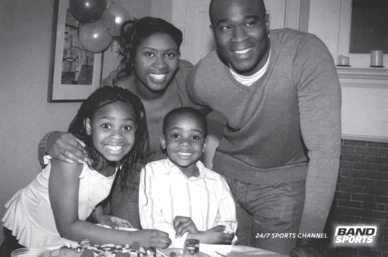
Figure 5.5 You lean into the ad because you know something's going on. And then you get it—a smile in the mind.
- I went to a restaurant that serves “Breakfast at any time.” So, I ordered French Toast during the Renaissance.
- When your pet bird sees you reading the newspaper, does he wonder why you're just sitting there staring at carpeting?
In the last bit, the word newspaper begins as reading material and ends as flooring material. A shift happens at the end of the line and things change. Creative theorist Arthur Koestler noted that, on hearing a joke, we are “compelled to repeat to some extent the process of inventing the joke, to re-create it in our imagination.”6 Our brains listen to a joke and instantly backtrack to the intended interpretation.
The same thing can happen when we scan an advertising idea. Look at the famous poster for Volkswagen here in Figure 5.6 and you can feel it happen in your brain. You take in the image and put together what's happened—quickly and backwards.
A Smile in the Mind authors McAlhone and Stuart add: “An idea that happens in the mind, stays in the mind… . It leaves a stronger trace. People can remember that flash moment, the click, and re-create the pleasure just by thinking about it.”
The term the authors use to describe this sublime moment—a smile in the mind—is apt. Because it's accompanied by a small release of dopamine, the brain chemical that makes us happy. We're happy because we figured something out. Researchers at the National Institute of Health suspect dopamine “might play a role in influencing how the brain evaluates whether a mental task is worth the effort.”7 When it is worth the effort, that >CLICK< happens and we have a happy dopamine smile in the mind.
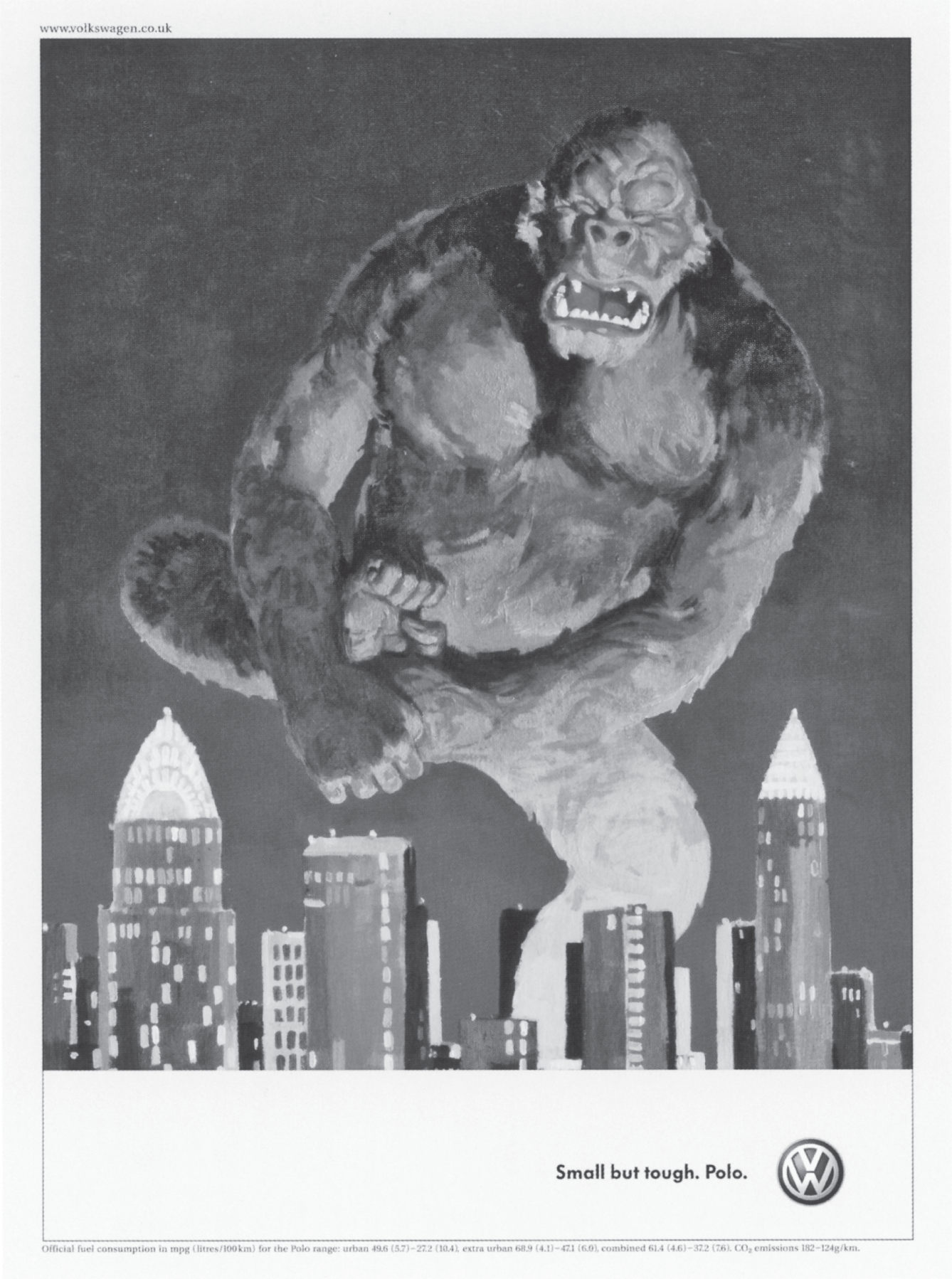
Figure 5.6 VW's tough little car = a Lego piece, for big apes.
The paraprosdokian and the parallelism: Tension and release in a sentence.
Wikipedia defines a paraprosdokian as “a figure of speech in which the latter part of sentence is surprising or unexpected in a way that causes the reader to reframe or reinterpret the first part.”
A shift happens. Sound familiar?
Their definition continues: “It is frequently used for humorous or dramatic effect, sometimes producing an anticlimax. For this reason, it's popular among comedians and satirists.”
It's popular with that crowd because a paraprosdokian has the same effect on our brains—the release of dopamine. It's pleasurable to feel these mental shifts occur. I cited this headline earlier but consider again this great billboard (Figure 5.7).
Having read the first part (“For more information on”), the brain autofills the rest of the sentence to either, “ask for our free brochure” or maybe “go to our website.” But instead, the headline takes a hard left and smacks us with “keep smoking;” an ending that makes us grimly reinterpret the first part of the sentence. It's not exactly a smile in the mind but we quickly figure it out and dopamine is released just the same.
It's important to note here that a complete reinterpretation of the first part of a sentence is not always a requirement for a powerful headline. Sometimes, just by saving the key word or phrase until the very end of the sentence, we can achieve a similar effect.
- Refreshes your breath while you scream. (Altoids)
- It's about as fast as you can go without having to eat airline food. (Porsche)
The words scream and airline food are placed at the very end of these headlines and, like a firecracker at the end of a fuse, the lines “go off” right when the writers want them to. There's a reason the punch lines of jokes are at the end.
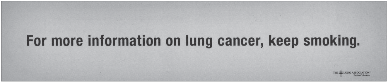
Figure. 5.7 The line doesn't end quite the way we expect it to.
The paraprosdokian structure isn't the only way to build tension into a headline. Another useful architecture is the parallelism. In Advertising: Concept and Copy, author George Felton suggests how to write this kind of line. He says as you study your product or customer
start looking for “two-fers,” language that separates this versus that, or this plus that, or this but not that, or not only this but that, and so on. You're trying to take your benefits and deliver them in a one-two punch. And you're usually looking for some kind of opposition, a contrast to throw into relief, [such as Holiday Inn's] “The best surprise is no surprise.”8
Note Felton's advice: “You're looking for some kind of opposition.” The parallelism structure doesn't require a reinterpretation of the first part of the sentence, only opposition to it, which you see in these headlines:
- You don't win silver. You lose gold. (Nike)
- Cars people swear by, not at. (Volvo)
- Happiness isn't around the corner. Happiness is the corner. (BMW)
- The meek may inherit the earth. But they won't get the ball. (Nike)
- You can't child-proof nature. So nature-proof the child. (Columbia sportswear)
- Get it through your thick skull: your skull is not that thick. (Specialized bike helmets)
- After thirty seconds, you're afraid the line might break. After thirty minutes, you're afraid it might not. (Quantum fishing rods)
Either way, paraprosdokian or parallelism, you want to push the key words to the very end of your sentence. Save your wrap-up punch for the end. It gives your thought more surprise and power.
Tension and release in an idea.
This idea of tension and release can also inform the way you structure an entire page, in print or on screen.
Many concepts start with a headline, which introduces or sets up a visual. As Pete Barry describes, “The idea or punch line of the ad is ‘revealed' by the visual. The unexpected is what creates the tension between the two elements.”9 Accordingly, the greater the polarity between the headline and visual, the bigger the shift in the reader's head; a good example is this ad from Leagas Delaney (Figure 5.8).
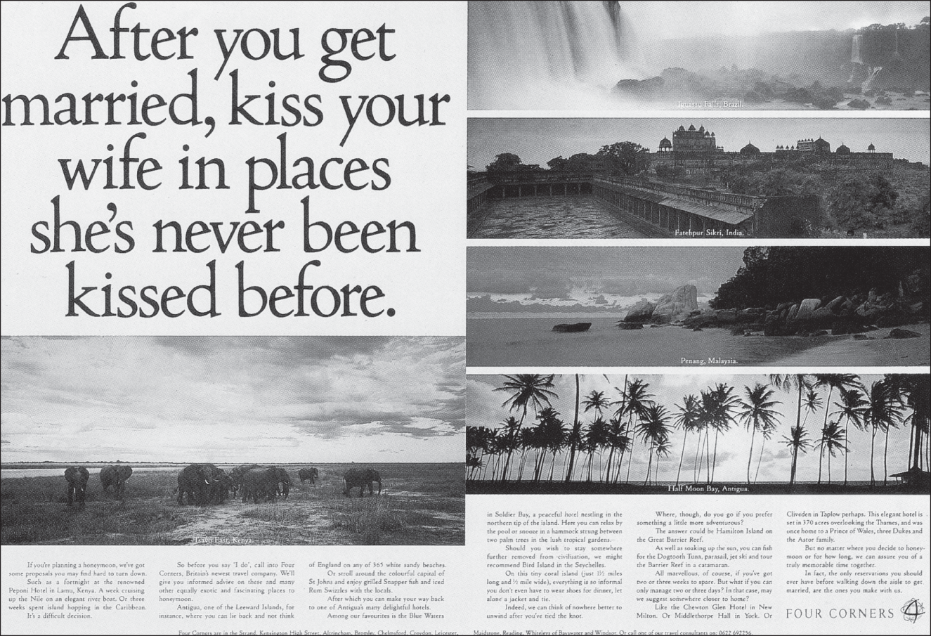
Figure. 5.8 This travel agency ad done by some naughty British creatives is a good example of image playing off word.
The way the idea goes off in the reader's mind can be constructed in any number of ways. The tension in the headline can be released with the visual. You can also structure an idea with a dominant visual and then let the headline reframe the image in the reader's head.
The clever-headline, straight-visual “rule.”
If your visual is a clever sort of image that's doing most of the work in delivering the message, let the headline quietly clean up the work left to it. However, if the headline is brilliant, well-crafted, and delivers the message beautifully, the visual (if one exists at all) should be fairly straightforward.
On the left in Figure 5.9 is a great example of an art director giving the main stage to the headline while adding just enough—that lovely image of a little girl on a beach—to amplify the headline's emotional impact. And on the right, for the same client, you see the reverse. (Both are from DiVito/Verdi, NYC.)
Similarly, never show what you're saying or say what you're showing. It's a common rookie error to “show the headline.” The result is a piece in which all the elements try way too hard and either repeat or trip over one another. We generally refer to this type of mistake as a “see-say ad.”
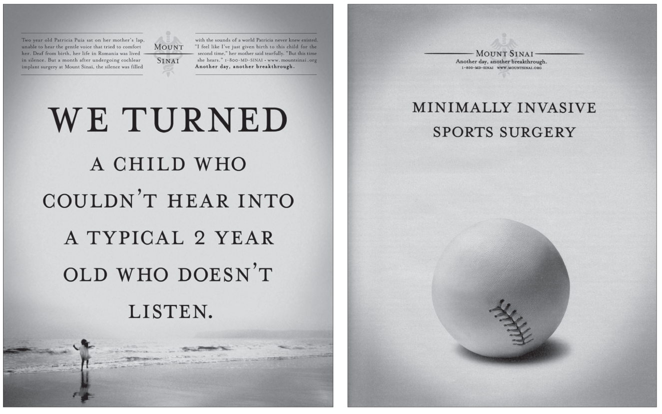
Figure 5.9 Ads for Mt. Sinai Hospital: On the left, a clever headline and a straight visual. On the right, a clever visual and a straight headline.
Ideally, the visual amplifies the headline or reinterprets it. The Harley-Davidson ad in Figure 5.10 is a perfect example of a headline playing off a visual while amplifying its import. By itself, the visual is tame. By itself, the headline is dull, almost meaningless. But the synergy between the two makes this one of the best ads I've ever seen. (Agency: Carmichael/Lynch, Mpls.)
VOICE AND TONE.
Okay, before we talk about voice and tone in writing, we have to talk about reading.
If you want to be a writer, you need to be reading—all the time. Doesn't matter what it is: fiction, nonfiction, the newspaper, romance novels, anything. As a copywriter, you need to be able to adopt different kinds of voices for the brands you'll work on. We writers do this by reading. Author George Felton notes, “You must assimilate American speech, from formal and literary down to funky and street-smart, because all copy comes out of these voices.”10
So important is reading to writing, I made it a practice to ask every copywriter I interview, “What are you reading right now?” I usually get a lot of “ums” and “uhs,” which is sadly par for the course when you consider a 2019 Pew Research study determined most Americans read about four books a year.11
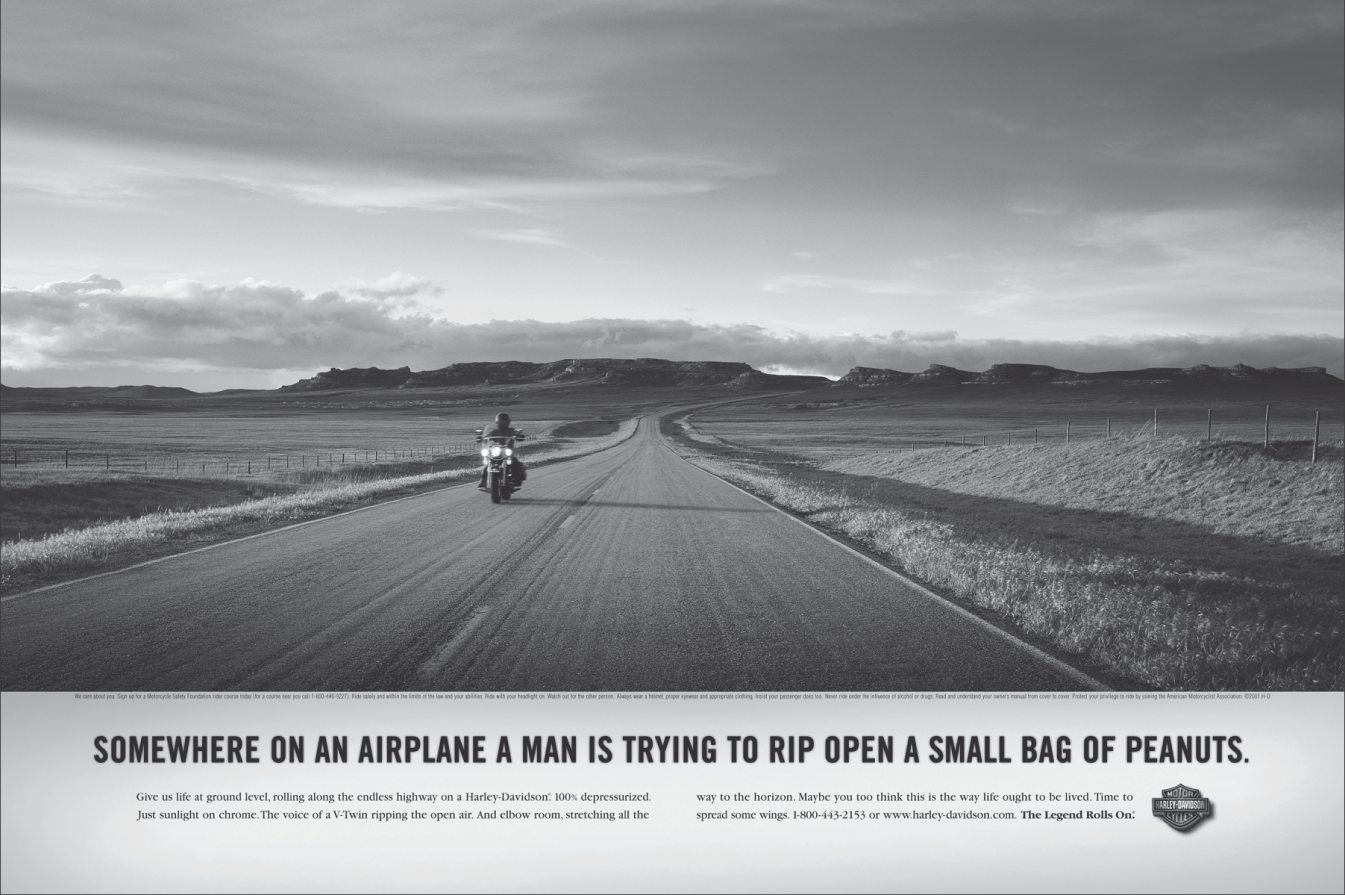
Figure 5.10 A perfect marriage of word and picture.
Four. Books. A. Year. (Is it any wonder half of America believes what they hear on Fox News?)
Write like you'd talk if you were the brand.
The best way I know to learn the cadence and style of a brand voice is to study as much of their published work as possible. Successful brands discover their own distinct voices and then stick with them year after year.
But if you have a new brand or you're creating a new voice for an old brand, consider yourself lucky. It's one of the most creative and rewarding things copywriters get to do in this business—discovering “who” a brand is and giving it shape and form and voice. This voice will emerge from the human truth and emotional center of your brand.
You will also have to know your customer; not just demographically, but emotionally, empathetically. When you really know somebody, you have an innate sense of how you ought to talk to them, what kind of tone is right. Like the message you're trying to impart, your tone also must have the ring of truth. It must feel right for the brand, the product, and the customer. This isn't done to create stylish writing. What you're doing is creating a brand personality, which is a big deal in a marketplace where the physical differences between products are getting smaller and smaller.
Let's say, for example, you're working on a car account. Most of the time, it's likely you'll have to show the car. Your idea may feel half art-directed already, and in a sense it is. So, if it comes down to showing just a headline and a picture of a car, your headline ought to have a voice no one else does.
Here are two car headlines:
- And if you run out of gas, it's easy to push.
- We'll never make it big.
Here are two more:
- A luxury sedan based on the belief that not all the rich are idle.
- The people with money are still spending it, but with infinitely more wisdom.
Can you tell which ones are from BMW? And from VW? It's pretty easy. Which is as it should be.
Or pretend you're writing a letter.
Why write to the masses? It's one person reading or hearing the words you're working on, right? So, write to that one person.
John O'Driscol was an art director at Doyle Dane Bernbach during the height of its VW glory days. He had this to say about how Bob Levenson wrote copy for those famous ads: “He put at the top of the copy, ‘Dear Charlie.' Then wrote the copy as if he was talking to his best friend. And he would always put at the bottom, ‘Yours sincerely, Bob.' And all he ever did [after that] was obliterate ‘Dear Charlie,' take off the bottom bit, and that's how they got the voice for Volkswagen.”12
So, if voice eludes you, try writing it as a letter. It's intimate. It keeps you from lecturing. The best copy feels more like a conversation than a speech. One person talking to another.
At the same time, remember to write like people talk.
For some reason, when handed a pen and asked to write something that will be seen by others, four out of five people decide a scholarly and authoritarian tone is somehow more persuasive than clear English.
Don't. Write like people talk.
If you don't, there is a cost, which the author of The Cluetrain Manifesto made clear in their famous 95 Theses: “In just a few more years, the current homogenized ‘voice' of business—the sound of mission statements and brochures—will seem as contrived and artificial as the language of the 18th century French court… . [C]ompanies that speak in the language of the pitch, the dog-and-pony show, are no longer speaking to anyone.”13
This horrible, boring voice is everywhere in business. Consider this actual memo I saved from my first agency job. It was written by a man who, were you to meet him, you'd say: “Sharp guy, that Bob. I want him on my account.” Yet Bob wrote the following memo. What he was trying to say was the program was killed because it was too costly.
Effective late last week the Flavor-iffic project was shelved by the Flavor-Master Consumer Products Division Management. The reasoning had to do with funding generated covering cost of entry, not cost of entry as it would relate to test market in 2020, but as it would relate to expansion, if judged successful across major pieces of geography in 2023 and beyond. In sum, the way Flavor-Master new products division served up Flavor-iffic to Consumer Products Division Management was that if Flavor-Master were to relax financial parameters for Flavor-iffic in 2017, 2018, and 2019, and in effect have Corporate fund the program, Consumer Products Division could recommend to Corporate to proceed with the program. The decision was made at the Consumer Products Division Management level that Corporate would most probably not accept that and the subject was taken no further.
Except for the names like “Flavor-Master,” I swear, every single word of this memo is real. Somebody actually wrote this.
The program was killed because it was too costly. That's nine words. Bob, in 143 words, was not only unable to get that nine-word message across but he also effectively lobotomized his audience with a torrent of corporate nonsense that said nothing. Bob proudly dictated this hieroglyph, snapped his suspenders, and took the elevator down to the lobby, thinking he'd done his bit to turn the wheels of capitalism for the day. Yet when he got home, he probably didn't talk this way to his wife.
Honey, RE: supper. It has come to my attention, and the concurrent attention of the other family members (i.e., Janice, Bill, and Bob Jr.), that your gravy has inconsistencies of viscosity (popularly known as “lumps”), itself not a disturbing event were it not for the recent disappearance of the family dog.
Write like you talk. Write with a smooth, easy rhythm that feels natural. Obey the rules of grammar and go easy on the adjectives. Short sentences are best, especially online. One-word sentences? Fine. End with a preposition if you want to. And if it feels right, begin a sentence with and.
On writing brand manifestos.
A manifesto is your brand's DNA chart and Declaration of Independence all rolled into one; it's the halftime locker room speech given by the CEO, the words the founder heard on the mountaintop before bringing down the stone tablets. Reading a great brand manifesto should make you want to run out and try the product. You should feel the brand fire in your bones.
Manifestos are never written for customers. They're usually created for a new business pitch or a rebranding. They can also serve as true north on a brand's compass and are used for all kinds of creative decisions. Figure 5.11 is an example of a good brand manifesto; it was written for the winning Miller High Life pitch by Jeff Kling when he was at Wieden+Kennedy.
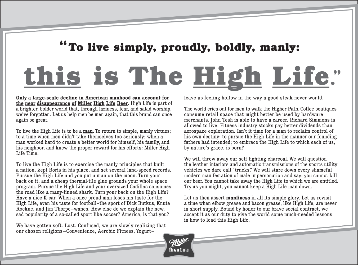
Figure 5.11 A brand manifesto is the blueprint of a brand, its DNA in words.
Listen to stand-up comedians talk about your product, brand, or its category.
My strategist friend, Madhavi Reese, once said, “If you want examples of great strategists, go watch good stand-up comedians. They're great at picking out nuances that make humans and life interesting.” She's right. Good strategists are students of human behavior (as are good art directors and copywriters).
Good stand-up comedians always get right to the truth. They get right down to the real reasons humans behave the way we do. And they're usually uncomfortable truths. On YouTube you'll find hundreds of hours of material on a wide variety of product and media categories, some of which can help your wheels get turning.
Don't set out to be funny. Set out to be interesting.
Funny is a subset of interesting. Funny isn't a language. Funny is an accent. And funny may not even be the right accent for your client. Funny, serious, heartfelt—none of it matters if you aren't interesting first.
Before we break for coffee, a short master course in writing with emotion.
If it's right for your brand, emotional appeals can connect with customers more deeply than rational ones. When you can pull it off, emotion can transcend rationality in a purchase decision but it is indeed difficult to pull off. We're not talking about writing that suggests emotion or sounds emotional. Strong writing elicits emotion. While reading the words, you feel it.
The short master course I was referring to was given in an episode of the series, “Mad Men,” in a pitch the character Don Draper makes to Kodak. Maybe you remember the scene, when he was selling the campaign for Kodak's new slide tray system, the “Carousel” (a round container for slides, an improvement over the straight trays sold at the time).
The emotion of the screenwriter's words—an ex-ad person, not surprisingly—was perfect for the product, and I remember much of Draper's pitch by heart to this day.
DRAPER: My first job, I was in-house at a fur company, and this old pro copywriter, a Greek named Teddy, and Teddy told me the most important idea in advertising is new. It creates an itch. You simply put your product in there as a kind of calamine lotion. But he also talked about a deeper bond with the product: nostalgia. It's delicate but potent. Teddy told me that in Greek, nostalgia literally means “the pain from an old wound.” It's a twinge in your heart far more powerful than memory alone. This device [gesturing to the Kodak Carousel] isn't a spaceship; it's a time machine. It goes backwards, forwards … takes us to a place where we ache to go again. It's not called the wheel. It's called the Carousel. It lets us travel the way a child travels … around and around … and back home again … to a place where we know we are loved.14
It's still viewable as a single scene on YouTube. Bring Kleenex.
FLOW AND READABILITY.
Write hot. Edit cold.
I gave this advice in the last chapter about general concepting, but it bears repeating here. All first drafts are crap. And all good copywriting is rewriting.
When you are writing, just write. Talk to the page. If you try to edit too much in your head, your pen will stop moving. Just let the words come out any old way they want. Later, after you've let your first draft cool, you can come back to it, with objectivity and a cold critical eye.
Writer Dorothy Parker said, “Creativity is a wild mind and a disciplined eye.”
Pretend your brand is arriving at a party.
Tone matters even more in body copy.
Imagine your brand is walking into a party of possible customers. Only a cad would start with some hard-sell at the door. So, we save our agenda for the one-on-one conversation that is body copy.
Think of your clever headline as the icebreaker you say at the door. An icebreaker should be insightful, clever, and relevant. A well-crafted icebreaker appeals to a guest's intelligence, says a bit about who you are, and leaves them wanting to hear more.
Great, your icebreaker seems to have worked. It seemed to do okay with a few guests anyway. Now you start talking to those interested guests. You aren't proselytizing. You're here to pass on news about something that might interest them. You speak with a calm authority the guests find credible. And when you've made your point, you hand out your business card, and take your leave.
However, bad body copy feels like the opening five minutes of a very bad date. You know how little you liked him the second he opened his mouth. He sounded fake. He talked about himself. He bragged. It all felt scripted. And all along you knew he just wanted to get into your pants for your wallet.
Don't have a “pre-ramble.”
Thomas Kemeny noted that too often body copy is treated as an explanation for the headline. But if your headline needs to be explained, it's not working.
The other mistake juniors make is to repeat what's already been said in the headline. Just get to the point. It's time for the details. Put your most interesting, surprising, or persuasive point in the first line if you can.
This format reflects a long-standing tradition in writing for journalism: the “inverted pyramid.” The most fundamental facts (the bottom of the pyramid) appear at the top of a story, followed by the remaining details, arranged from most- to least-important. Taking too much time getting to the key point recalls another journalistic truism: “Don't bury the lead.”
Never, ever, not even once, or even just a little bit, ever use exclamation points anywhere, ever.
You may agree I just made my point quite emphatically without resorting to using an exclamation point.
As an advertising copywriter you must promise me—right here, right now—never to resort to yelling. You may think a couple of happy little screamers !!! make you sound “excited” about your product, but it only makes a brand sound desperate. Take my word on this: the exclamation point is the used-car salesperson of advertising sentences. It is the jazz hands of punctuation. And it is kryptonite to authenticity.
Never use fake names in a headline (or anywhere else, for that matter).
“Little Billy's friends at school call him different.” This is another assault on authenticity. Lines like this drive me nuts.
“Little Billy will never know his real father.”
Hey, little Billy, c'mere.
Go back and tell your copywriter a strange man in the park said, “You need to write something that doesn't suck.” Anybody reading this kind of crap knows these ad names are fake—and an irritating kind of fake at that, like those manufactured relatives they put inside of picture frames at stores.
Avoid fake people. Avoid fake names. There are times, however, when using a person's name is the only way the concept will work. And in the hands of a seasoned team, it can be done beautifully, like in this Vitro Robertson ad for client Taylor guitars (Figure 5.12). It comes down to style. To how gracefully and believably you pull it off.
One other note here. Avoid using product or model numbers in the headline. Product numbers such as “TX-17” may seem familiar to you and your client. But you're used to it; you work on the account. In a headline, they serve only as a speed bump. They're not words, they're numerals, so they force readers to switch gears in their heads to 17, x45, 13z42 to get through your sentence.
Vary your sentence length and pacing.
And now, writing coach Gary Provost's master lesson in why this matters.
This sentence has five words. Here are five more words. Five-word sentences are fine. But several together become monotonous. Listen to what is happening. The writing is getting boring. The sound of it drones. It's like a stuck record. The ear demands some variety.
Now listen. I vary the sentence length and I create music. Music. The writing starts to sing. It has a pleasant rhythm, a lilt, a harmony. I use short sentences. And I use sentences of medium length. And sometimes when I am certain the reader is rested, I will engage her with a sentence of considerable length, a sentence that burns with energy and builds with all the impetus of a crescendo, the roll of the drums, and the crash of cymbals that say listen to this, it is important.15
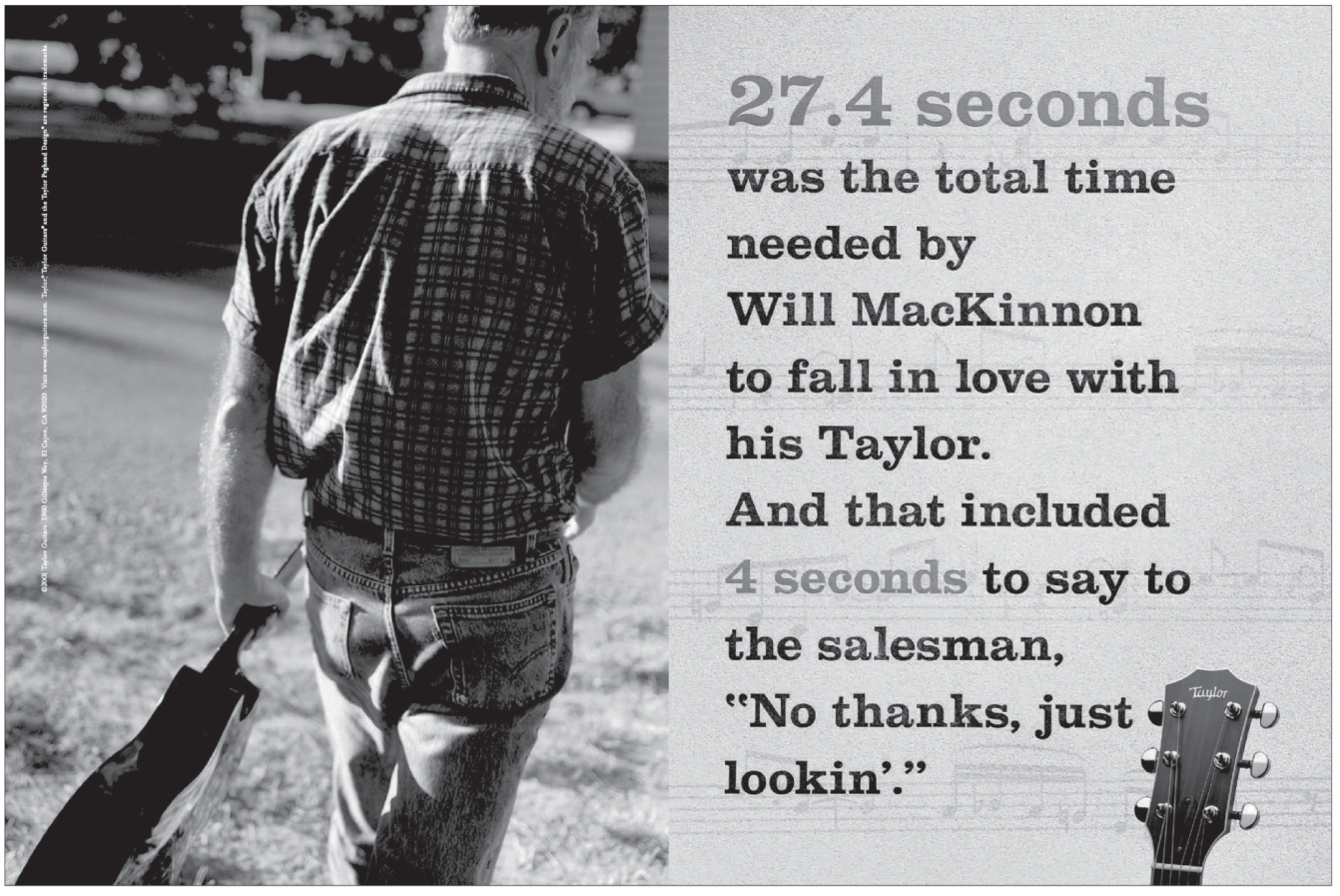
Figure. 5.12 Another example of the headline doing most of the work and the visual simply finishing the thought, beautifully.
Once you lay your sentences down, spackle between the joints.
Look at a piece of body copy as an essay. You should start with an interesting line that pulls the reader in. In the middle, you should support your lead-in with facts. And your closing is the call-to-action.
As you write, use transitions to flow seamlessly from one benefit to the next. Each sentence should come naturally out of the one that precedes it. To use Peter Barry's metaphor, an “invisible thread” should run through your entire argument, tying everything together.
When you've done it well, you shouldn't be able to take out any sentence without disrupting the flow and structure of the entire piece. Novelist Wallace Stegner nailed it when he penned, “Hard writing makes for easy reading.” (The fragile beauty of a perfectly constructed sentence is lost on many people and is the reason copywriters are often seen mumbling to themselves at bus stops.)
Break your copy into short paragraphs.
This is particularly true for writing that will be published online. Like it or not, “bite-size” pieces appear more appetizing and short paragraphs less daunting.
Remember, nobody ever had to read People magazine with a bookmark. This isn't an argument for dumbing down your work. Be as smart as you can but don't write paragraphs the size of shower curtains, okay?
When you're done writing the copy, read it aloud.
I discovered this one the hard way. I had to present some copy to a group of five clients and in the meeting, I read it out loud. It was only while reading it this way—out loud—I discovered how weak my copy was. Just hearing the words hanging out there in the air with all their stop-and-start cadences and jagged segues, seeing the flat reaction of the clients' faces, hearing my voice crack, feeling the flop sweat … it was awful.
When you're done writing, read it aloud. Not just your radio scripts, but copy for print, for online, for anything. Poor writing has a way of revealing itself when read aloud.
When you've finished writing something, go back and cut it by a third.
There is hardly anything that can't be improved by making it shorter. Shorter is almost always better. Author Sydney Smith suggested, “In composing, as a general rule, run your pen through every other word you have written; you have no idea what vigor it will give to your style.”
My friend, Thomas Kemeny, puts it this way: “Write with your eraser… . Condensing, shortening, and editing isn't about making less copy to read, it's about making any length of copy more interesting to read.”16
An idea isn't finished until it leads the customer somewhere.
My friend Clark Delashmet advises his students, “Every ad should ‘lead somewhere.'” It doesn't matter if you're working on a web page, a bill stuffer, or a video; end with a call-to-action. The action might be to find more information or download an app or join an online group. Whatever it is, don't leave your reader at a dead end.
Proofread your own work.
Don't depend on Spell-Check. First, it won't notice mistakes in you're writing like this. Second, using spell-check is just lazy. Seriously, if you insist on using some stupid computer program on your writing, maybe you should also use Suck-Check®, whenever that one comes out.
Another junior mistake that drives advertising people batty involves the use of the industry's most-misused word: mediums. The plural for medium, the way we mean it in advertising, is media. Yes, the word mediums exists, but it can be used correctly in only two situations* – one of them is when you're referring to a certain size of underwear (Figure 5.13).
If you have to have one, make your tagline an anthem.
If you must craft a tagline, save this part of the job until you have a very good start on creating the whole campaign. You might even want to save this ’til the very end.
Take all the work you've done so far and put it up on the wall and then try to boil its essence into an evocative, provocative, or anthemic tagline that works for everything. Boil it all down to one very, very short line that expresses the brand's whole purpose for being in the world.
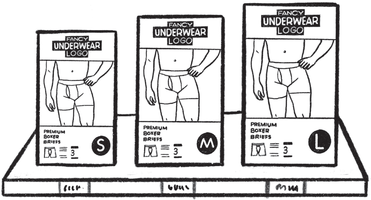
Figure 5.13 One of only two situations where you get to use the word mediums. In this case, it's, ”I'm going to buy three of the mediums.”
Try to make it about something bigger than just your client's product. Own some high ground. In my opinion, the best one ever written was for Nike: “Just Do It.” This exhortation is not about shoes, nor is it about just sports. It's about life, it's about the competitive spirit, it's about kicking ass. And yet it has sold a lot of shoes.
Adam Tucker, creative director at Leo Burnett, London, described his take on it:
A good tagline is simply a summation of your idea. It's the full stop to your thinking. Don't try to write something that sounds clever if it doesn't explain your ad. Write what you want to say in longhand… . People think taglines are all about wordplay. They aren't. ‘If only everything in life was as reliable as a Volkswagen' was one of the most famous taglines of all time. There are no puns, no trickery. It's just a simpler, powerful and thought-provoking statement.17
Once you have a great line, try plugging it into the actual executions and see if it finishes the argument. Also, keep in mind the perfect tagline must work all by itself with only the logo to keep it company.
NOTES
- 1. Theresa Iezzi, The Idea Writers: Copywriting in a New Media and Marketing Era (New York: Palgrave Macmillan, 2010), 71.
- 2. George Felton, Advertising: Concept and Copy (New Jersey: Prentice Hall, 1994), 85.
- 3. Thomas Kemeny, Junior: Writing Your Way Ahead in Advertising (Brooklyn: Powerhouse Books, 2019), 52.
- 4. Thomas Kemeny, Junior, 42.
- 5. Beryl McAlhone and David Stuart, A Smile in the Mind: Witty Thinking in Graphic Design. (London: Phaidon Press, 1996), 19.
- 6. Arthur Koestler, The Act of Creation: A Study of the Conscious and Unconscious Process in Humor, Scientific Discovery and Art (New York City: Dell Books, 1967).
- 7. “Dopamine Affects How Brain Decides Whether a Goal Is Worth the Effort.” National Institutes of Health, March 31, 2020, https://www.nih.gov/news-events/nih-research-matters/dopamine-affects-how-brain-decides-whether-goal-worth-effort.
- 8. George Felton, Advertising: Concept and Copy, 97.
- 9. Pete Barry, The Advertising Concept Book (London: Thames & Hudson, 2008), 72.
- 10. George Felton, Advertising: Concept and Copy, 128.
- 11. Andrew Perrin, “Who Doesn’t Read Books in America?” Pew Research Center, September 26, 2019, www.pewresearch.org/fact-tank/2019/09/26/who-doesnt-read-books-in-america/.
- 12. From YouTube video “Doyle Dane Bernbach: The Real MAD MEN,” 0:09:01, https://www.youtube.com/watch?v=-UuzV7nVPm4.
- 13. Rick Levine et al., The Cluetrain Manifesto (New York: Perseus Books, 200); www.cluetrain.com/book/95-theses.html.
- 14. Matthew Weiner and Robin Veith, “The Wheel,” Mad Men, season 1, episode 13.
- 15. Gary Provost, Writing That Works: A Guide to Writing that Works–for Fiction and Nonfiction. (Blue Ash, OH: Writer’s Digest Books, 1980).
- 16. Thomas Kemeny, Junior, 57.
- 17. Miriam Sorentino, Creative Advertising: An Introduction (London: Laurence King Publishing, 2012), 173.
- * I remember liking that term “mule kick.” It's since been adopted by a branded liquor, but at the time I'd picked it up from an old Stephen King novel where a character referred to white lightning as mule kick.
- * As long as this list may look, it's not the complete list. For space, I had to cut some of Sally's lines.
- * The other allowable use? Let's say you were trying to tell someone not to go into a room because it was full of creepy clairvoyants gazing into crystal balls. You could go, “Dude! Don't go in there. It's packed with mediums.”