Modelling the world with data: Predicting outcomes
What you’ll learn
This chapter shows you how to identify patterns in your data and understand what they mean. You will also learn how to use your data for predictive purposes (e.g., find out to what extent one thing influences another thing). Moreover, we will address what it takes to infer generalisations from data and what distinguishes ‘statistically significant’ from ‘practically meaningful’ findings.
Data conversation
For some weeks, Elaine’s team members have been more stressed and thin-skinned than usual. It was like a dark cloud was hanging over their heads. That dark cloud came in the form of a competitor who had launched a new energy drink that was very similar to their own ‘cash cow product’. ‘Will customers like the competitor’s energy drink better and thus stop buying ours?’ – the team members often worried and debated this question in their coffee break. Elaine, the head of marketing, hence commissioned a market research institute to conduct a survey on customers’ responses to both drinks.
It was a Monday morning, when suddenly an email from the market research institute popped up in her inbox. The institute informed Elaine that the data collection had been completed and that they had conducted a study with more than 4,000 participants. Moreover, attached to this email, they sent Elaine the raw data. Elaine was curious, opened the data file and started to explore the data. She had a basic knowledge in statistics and felt sufficiently confident to do the analysis herself. As Elaine ran the analysis, she became paler and paler. She printed out the analysis results, got up from her desk and walked straight into her team colleague’s office. ‘Barbara, you won’t believe this’, she said without knocking on the door. ‘I just looked at the data from the market research institute. People seem to like our competitor’s energy drink significantly better than ours’, she said. But, hold on – maybe Elaine didn’t see the full picture . . .
Elaine was shocked. The results from a survey among more than 4,000 participants suggested that participants liked the competitor’s drink significantly more than the energy drink from Elaine’s company. Barbara, her co-worker, looked over the results that Elaine had just printed out and said: ‘Well, yes, the significant results indicate that customers prefer the other energy drink over our drink. But that might not be the entire story. What about the magnitude of this effect?’. Elaine had heard about effect sizes; however, she had not calculated it. She quickly consulted her statistics book and figured that eta squared was an adequate measure of effect size for her data. She obtained an eta squared of .01, which is a very small and negligible effect. ‘So, how should we interpret the findings in the light of the small effect size?’, Elaine asked. ‘First of all, this very small effect size is reassuring as it implies that the difference between the two energy drinks is not really meaningful’, Barbara explained. She also pointed to an important aspect about p-values that Elaine hadn’t known. The p-values are linked with the sample size. The sample size influences whether differences are significant or not. In large samples, even very small and negligible effects can be significant. In small samples, however, even very big effects can be non-significant. Barbara added that the large sample (i.e., 4,000 participants) in the survey rendered even the very small difference in the liking of the two energy drinks significant. ‘Thanks a lot, Barbara’, Elaine said. Although the results from the study were not as Elaine had wished, she now could look at them in a more nuanced way. Considering not just the p-values but also effect sizes helped her gain a richer picture and not fall into alarmism.
It is in the very nature of humans to be curious about how the world works. Maybe you touched the hot stove as a child to see what would happen (and hopefully learned your lesson) or maybe you tried out what best to say to get your crush’s attention. This innate drive to figure out how things are related also accompanies us in our professional life. Typical questions relevant to the professional context in which you are working might be: ‘How is the weather related to the sales of your product (e.g., ice cream or umbrellas)?’ or ‘How is the number of volunteers connected to organisational goal achievement?’. Understanding the relationship between things gives you a richer and more in-depth understanding of your projects and helps you make more informed decisions. This is exactly what is needed in this ever more complex and intricate world.
However, be aware that just because two things appear to be connected, doesn’t necessarily mean that there is a cause-and-effect relationship. In other words: observing a connection between things does not automatically imply that one thing causes the other. But let’s take one step at a time.
In the previous chapter, we have been engaging with univariate data. That means, we have only looked at one variable at a time. For instance, we were interested in the number of projects top managers have initiated and how much they differ.
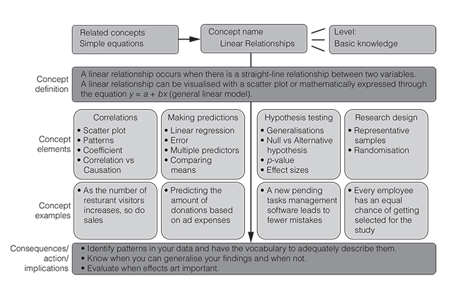
If we are interested in the connection between two variables, we are dealing with bivariate data (Cramer and Howitt, 2004). In the following, we will be dealing with the relationship between two variables (Figure 3.1). More specifically, we will focus on the most common type of relationships, namely linear relationships. These are also known as straight-line relationships. The linear relationship model is also the ‘working horse’ of many data analysis approaches.
Figure 3.1 gives you an overview of what we are going to cover in the next few pages. Having read this chapter, you will be equipped with the knowledge necessary to thoroughly understand linear associations between things, to use your data to make predictions, to avoid the most common mistakes when generalising from your data and when interpreting findings. Moreover, you will learn the key terms so that you feel statistics-savvy when talking about these things. Overall, this chapter will boost your statistics confidence. So, get yourself a cup of coffee, sit down in a comfy chair and let us walk you through the miraculous world of linear relationships.
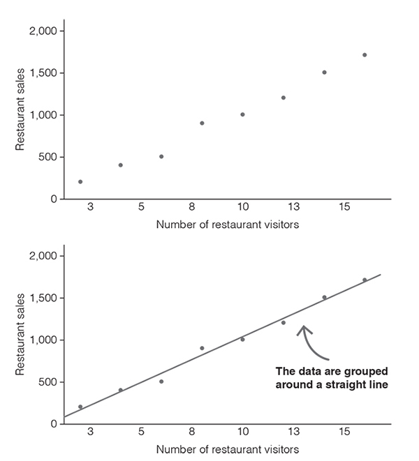
Let’s start with an example. Imagine you want to know whether the number of people visiting your restaurant per day and the sales you make per day are related. Let’s assume that you collected data on eight randomly selected days over a period of four months and that you wrote down your observations in Table 3.1.
The table contains all the data from your observations; however, it is quite difficult to see whether there is a pattern. To gain a better understanding of your data, you can draw a chart – a so-called scatter plot or scatter diagram. All you have to do is to draw a horizontal and a vertical axis. Usually we use the horizontal axis (the x-axis) for the variable that is considered the predictor and the vertical axis (the y-axis) for the variable that is considered the outcome. In our example, we take the number of restaurant visitors as the predictor and restaurant sales as the outcome (Figure 3.2).
With the scatter plot, a clearer picture emerges. We can see that the data are clustered around an imaginary straight line and that this line slopes upward (Figure 3.2). The scatter plot suggests that as the number of people visiting a restaurant increases, so do the restaurant’s sales. The scatter plot indicates that the number of restaurant visitors and restaurant sales are correlated.
Table 3.1 Example of bivariate data.
| People | 2 | 4 | 6 | 12 | 14 | 8 | 10 | 16 |
| Restaurant sales (in $) | 200 | 400 | 500 | 1,200 | 1,500 | 900 | 1,000 | 1,700 |
Scatter diagrams show the correlation between two variables (Griffiths, 2009). Correlations are mathematical relationships between two variables. The correlation is said to be linear when the data form a more or less straight line. Let’s take a look at the different types of correlations (Figure 3.3). A positive linear correlation occurs when the data show an uphill pattern. The relationship between the variables can be described as ‘the more of X, the more of Y’ or alternatively ‘as X increases, so does Y’. An example would be ‘the more employees, the higher the payroll costs’.
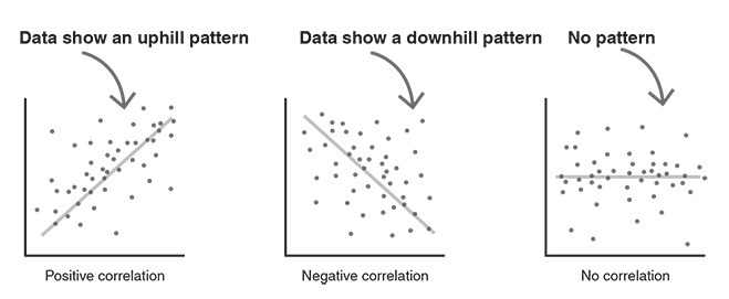
A negative linear correlation occurs when the data show a downhill pattern. The relationship between the variables can be characterised as ‘the more of X, the less of Y’ or ‘as X increases, Y decreases’. An example would be ‘the more competitors, the less market share’.
There is also the possibility that there is no correlation between two variables. This happens when the data form a random pattern (Rumsey, 2016).
So, you have just learnt what correlations are and how to correctly label different linear patterns. But why would you need that? The answer is straightforward: having the vocabulary to describe data patterns is key for building up your stats skills. You don’t want to stand in front of your peers (or even worse, in front of your boss) and be at a loss for words to correctly name the grouping of your data. Saying ‘the data form a linear uphill pattern’ is way more elegant than saying ‘the data sorta go up’.
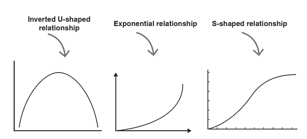
When talking about correlations it is important to keep in mind that other types of relationships exist in addition to linear relationships (Rumsey, 2016). Figure 3.4 shows some examples of scatter plots where two variables form a relationship that is clearly non-linear. So-called inverted U-shaped relationships (also known as curvilinear relationships) occur when one variable increases as the other increases, but only up to a certain point. After that point, one of the variables continues to increase, while the other decreases. An example of an inverted U-shaped relationship would be coffee consumption and work productivity. The more coffee people drink, the higher their work productivity, but only up to a certain number of coffees. When people drink too much coffee, they might get restless and nervous, which then leads to decreased work productivity. Exponential relationships are another type of non-linear relationships. Exponential means that one variable is an exponent. We have seen exponential relationships in the context of contagious diseases. If someone is infected, he or she will spread the virus. And the people who have been infected will spread the virus themselves. Like this, the virus goes around and infects more and more people. Another type of non-linear relationship is an S-shaped relationship. There might be such a relationship between time and organisational growth. The organisational growth at first is slow, followed by a phase of rapid growth, which is then followed by a phase of consolidation in which growth slows.
It is important to understand that there are further types of relationships in addition to linear relationships. However, for the sake of keeping complexity low, non-linear patterns will not be covered in this book. The good news is that a great deal of relationships found in real life fall under the uphill–downhill linear pattern.
Visualising bivariate data in a scatter plot helps to spot whether there is a positive or a negative linear pattern. However, scatter plots do not give you ‘hard facts’ about the extent and the nature of this relationship. What we want is a statistic that allows us to quantify the direction (positive vs negative) and the strength of a linear relationship (weak vs medium vs strong). This is important as it gives us an immediate view of the relationship between two variables and thus facilitates discussions about and interpretation of that relationship. When speed and agility are of paramount importance, characterising a relationship with just one number is key.
The figure that tells us something about the direction and the strength of the linear relationship between two variables is called the correlation coefficient. The correlation coefficient can take values between −1 and 1 and is usually denoted by the letter ‘r’ (Cramer and Howitt, 2004). It is also known as the Pearson correlation coefficient.
But how can you draw inferences from Pearson’s correlation coefficient about the direction and the strength of a linear relationship between two variables?
First of all, the sign of the coefficient tells you something about the direction. If Pearson’s correlation coefficient is positive (positive sign), then there’s a positive linear relationship. That means, the data form a linear uphill pattern. If Pearson’s correlation coefficient is negative (minus sign), then there’s a negative linear relationship between two variables. That means, there is a linear downhill pattern.
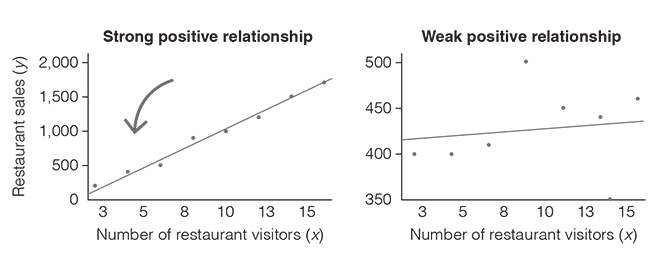
Second, information about the strength of the relationship is encoded in the size of the coefficient. The closer the coefficient is to +1 or −1, the stronger the correlation. To better understand the strength of a linear relationship, look at Figure 3.5 (strong vs weak correlation). On the left, you see a very strong positive linear relationship (Pearson correlation coefficient, r = 0.99). As you can see, the data do not all lie exactly on the line, but they are grouped very closely around it. In contrast, on the right, you see a weak positive linear relationship (Pearson’s correlation coefficient, r = 0.11). Here, the data are widely scattered around the line. But what does that mean? It means that the two variables are only very loosely connected. Hence, saying that ‘as X increases, Y increases’ is not very accurate.
What are the threshold values for strong, medium and weak correlations you may now wonder? As often in life, there is no clear answer to this. However, there are some helpful rules of thumb for interpreting the strength of the relationship. Table 3.2 summarises these and offers you an interpretation guide for the correlation coefficient.
Table 3.2 Interpretation guide for the correlation coefficient.
| Direction of the relationship | ||
| Strength of the relationship | Positive | Negative |
| Perfect | +1 | −1 |
| Strong | +0.9 | −0.9 |
| Strong | +0.8 | −0.8 |
| Strong | +0.7 | −0.7 |
| Moderate | +0.6 | −0.6 |
| Moderate | +0.5 | −0.5 |
| Moderate | +0.4 | −0.4 |
| Weak | +0.3 | −0.3 |
| Weak | +0.2 | −0.2 |
| Weak | +0.1 | −0.1 |
| Zero | 0 | 0 |
Misconceptions kill the flow
Talking about correlations is often a source of confusion. This is particularly the case when the people involved in a project or a meeting have very different levels of data literacy. Some may struggle with the term ‘association between variables’, while others may take a ‘negative relationship’ as something bad or harmful. Misconceptions about statistical concepts can severely impact the discussion quality and inhibit getting into a state of flow and creativity. To avoid misunderstandings, spell out what things in your analysis really mean. Give your audience a chance to understand what you did and what its implications are.
As a guideline, a good presentation or report should answer the following key questions:
- ●What was done and what can we learn from it?
- ●How was it done?
- ●Why was it done?
- ●Who did it?
- ●When was it done?
- ●(Where was it done?)
You may wonder whether you can calculate Pearson’s correlation coefficient with all kinds of variables (Field, 2018). Unfortunately, you can’t. Pearson’s correlation coefficient requires continuous variables (interval or ratio). However, if you have two ordinal variables, you can use Spearman’s rho or Kendall’s tau. These statistics are versions of the correlation coefficient which are applied to ordinally ranked data (Cramer and Howitt, 2004). Remember: the values of ordinal variables are ordered, but the differences between the values are not equal. Spearman’s rho and Kendall’s tau can both take values between −1 and +1, which indicate the direction and the strength of the relationship between two ordinal variables.
If you have two categorical variables (binary or nominal), then you can use statistics such as Cramer’s V (Cramer and Howitt, 2004). This statistic, however, only tells you something about the strength of the association and not about the direction (positive vs negative).
It may also happen that you want to investigate the relationship between a continuous variable and a binary variable (categorical variable with two categories). In this case, you should use the biserial correlation coefficient or the point-biserial correlation coefficient. The point-biserial coefficient is used when one of the variables is a true dichotomy (e.g., buy a product vs not buy a product), whereas the biserial correlation coefficient is used when one of the binary variables is an artificial dichotomy (e.g., passing vs failing an exam) (Field, 2018). Both the point-biserial and the biserial correlation coefficient range from −1 to +1 and thus indicate whether the relationship is positive or negative and how strong it is.
If two variables strongly correlate, does that mean that there is a cause-and-effect relationship? Can we assume that one variable causes the other? Take a deep breath. The answer is NO. Correlation only means that there is a mathematical relationship between two variables, but it does not mean that one causes the other, let alone that the relationship makes sense. For instance, you might be interested in the factors that increase chocolate sales and therefore collect data. Imagine you find that the number of lawyers per country and chocolate sales are positively related, so that as the number of lawyers increases, chocolate sales go up. While the statistic tells you that there is a strong connection between the number of lawyers and chocolate sales, it does not tell you whether the number of lawyers actually leads to an increase in chocolate sales. So, in a nutshell: don’t confuse correlation with causation! Use your common sense to judge whether a correlation makes sense or not.
Understanding how predictive models work
Correlations tell you whether there’s an association between two variables. However, there might be instances where you have (theoretically or empirically founded) reasons to assume that one variable influences the other. In such cases, you might want to make predictions. That means, you would use one variable to estimate changes in another variable. Simply put, predictions tell you ‘how one thing influences another thing’.
With an increasing availability of data, using predictive models for decision making has rapidly gained momentum in the modern business world. Making predictions enables allocating resources more efficiently and effectively because it gives an idea of how one thing impacts another. Accordingly, predictive models are important for any kind of organisational unit ranging from marketing, to human resources management, to finance or IT. The following pages will show you how to make sound predictions and how to avoid the most common mistakes when generalising your findings beyond your data.
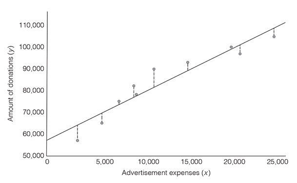
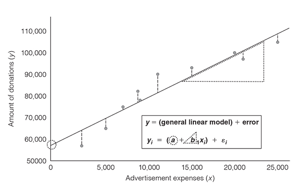
Suppose you came across a study that concluded that advertising expenses lead to higher fundraising effectiveness for non-profit organisations. You, as non-profit manager, therefore decide to gather data about your advertising expenses over the past 10 years and the volume of monetary donations per year. Specifically, you are interested in making predictions about the amount of donations you can expect depending on the amount of money spent on the advertisement.
To do so, you can visualise the data you collected in a scatter plot, with advertisement expenses being on the x-axis and the amount of donations on the y-axis. You then try to find the straight line through the points that fits the data as closely as possible. The line that best fits the data is known as the line of best fit or the regression line (Griffiths, 2008). But why would you do that? Because the line visualises how much we can expect one thing to influence the other thing. In our example, the line represents the expected amount of donations for a particular amount of advertisement expenses (Figure 3.6).
And how do you know where this line goes through? You would be ill-advised to draw it relying on your eyes and intuition. There is something better and more accurate. You can do it using the linear regression model. You may have heard about regression analysis before, as it is the cornerstone of analytics (and even of many AI applications). Regression analysis is just the fancy term to say: ‘We use one thing to predict another thing using a linear equation’. But how does the linear equation help us find the line that is as close as possible to all data points? The way this happens is through minimising the error of the model, which is also referred to as the residual. And what’s the error? It is the difference between the data that you collected (i.e., what you measured) and the prediction by your model (i.e., the regression line). Figure 3.6 illustrates what we mean by the distance between your data and the line. The bigger this difference, the worse the model is. The smaller the difference, the better the model is.
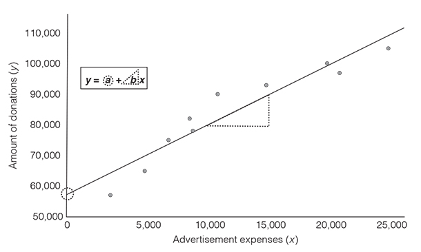
To conduct a regression analysis, we have to define a predictor variable, which in our case is the advertising expenses, and an outcome variable, which is the amount of monetary donations. The linear regression model, in its simplest form, is based on the equation y = a + bx, with a being the point where the line crosses the vertical axis (the intercept) and b being the slope (or gradient) of the line (Griffiths, 2008). Figure 3.7 visualises the components of the equation. The slope b indicates how steep the regression line is. The slope tells you how much you can expect the outcome to change as the predictor increases by one unit. This is visually represented in Figure 3.7 with the triangle that is attached to the regression line. In other words, the slope is a ratio of change in the outcome (y) per one-unit-change in the predictor (x). In our example, the slope indicates how much we can expect the amount of donations to go up as the advertisement expenses increase by one dollar.
We will now elaborate a bit on the intercept and the slope to give you the necessary background to interpret these two key components of regression analysis. This will help you gain a more in-depth understanding of how predictions work. This is really key to understanding how predictive analytics work today. We acknowledge that the following pages are probably not the most enjoyable and pleasant to read. However, be ensured that we did our best to keep it as short and concise as possible. (Note that the second author’s idea to include cat pictures to make these pages a bit more entertaining did not pass the editorial process.)
To find the line that best fits the data, we need to identify the values for the intercept (a) and the slope (b) that minimise the distances between the data that you have collected and the line. We will first look at the slope. The value of b that we are looking for can be calculated based on the following equation. No worries, we won’t torture you with lengthy explanations about this equation. Just know the following: x is the predictor variable and y is the outcome variable. There are basically two things you have to do in order to fill out the equation. First, you have to calculate the differences between the mean of the advertising expenses and the actual advertisement expenses you had over recent years. Second, you have to calculate the differences between the mean of all donations and the actual amount of donations made.
Equation: Regression slope b
where ∑ represents sum up, n denotes the sample size, xi represents the ith value of x, yi represents the ith value of y,
Anyway, let’s leave this equation as it is. In our example, the slope would be 1.96. But what does this slope tell us?
To interpret the slope, we have to consider the units of the outcome variable and the predictor variable. The amount of donations and the advertisement expenses are both measured in dollars. A slope of 1.96 means that the amount of donations increases by 1.96 dollars for every 1 dollar increase in advertisement expenses.
Things become a bit more complicated when the outcome and the predictor are measured in different units. Suppose the outcome is measured as a 10-point work satisfaction scale (y) and the predictor is weeks of vacation per year (x) and you find that the slope is 1.4. What does this mean? Without considering the units of the outcome and the predictor variable, this number does not make much sense. Considering the units, you understand that a slope of 1.4 means an increase of 1.4 satisfaction points (change in the outcome) for every 1-week increase in vacation (change in the predictor).
And what about the intercept a? How do we know where the line crosses the y-axis? The regression equation is y = a + bx. The regression line represents the line of best fit and as such, the line goes through the means of the outcome and the predictor. Again here, we do not bore you with lengthy explanations about why it is like that. Just trust us. In our example, we take the amount of donations and the advertisement expenses and calculate the means for each of the variables. Moreover, we already know the value of b (the slope). This allows us to figure out the value of the intercept (see equation below). The regression line crosses the y-axis at 59,890. We can interpret this value as follows: if no money is spent on advertising, our organisation is expected to receive donations of 59,890 dollars.
However, caution is warranted when interpreting the intercept. The point where our advertising expenses are zero (i.e., x = 0) lies outside of the range of data that we collected. Look again at Figure 3.7 and you’ll see that we do not have data for advertising expenses below 2,200 dollars. As a general rule, you should never make predictions for a point that lies outside of the range of the data that you have actually collected. The relationship between the variables might change, but you don’t know if it changes because you did not gather that data. For instance, it might be that the relationship between advertising expenses and donations is exponential and not linear for advertising expenses between 0 and 2,000 dollars. Hence, the intercept that we calculated based on the linear model would be a very inaccurate prediction. There are further instances where the intercept is meaningless: for example, when data near x = 0 do not exist (e.g., height: people cannot be 0 or 2 cm tall).
Equation: Intercept a.
As we have seen, the linear regression model allows you to calculate the line that best fits your data. Cutting-edge data visualisation tools such as Tableau fortunately relieve you from calculating the line of best fit yourself. These tools compute the line of best fit and give you various statistics including the correlation coefficient. Nevertheless, in the overwhelming majority of cases, the best fit is not the perfect fit: it almost never occurs that all data lie exactly on the line. There is almost always a discrepancy between the data that you collected and the values that you predict. Look at Figure 3.8. The dotted lines from the actual values to the predicted values visualise this discrepancy. If we want to consider that there is an amount of error in the predictions that we make, we need to extend the regression model with an error term (Figure 3.8).
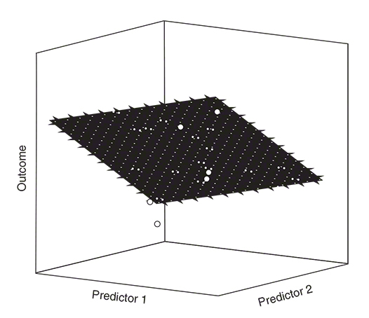
So far, we have seen how to predict an outcome from one variable. But ask yourself: are your own decisions driven by just one factor? Do you buy your clothes just because of the price tag? Or, do you donate money to a charity just because you are familiar with that non-profit organisation? In both cases, your answer is probably ‘no’. Usually, our decisions are affected by a number of factors, with some of them exerting a stronger influence than others. Often, it therefore makes sense to consider the influence of several predictors on a given outcome. One of the compelling advantages of the linear regression model is that we can expand it and include as many predictors as we want. An additional predictor can be included as shown in the following equation:
Equation: Regression with multiple predictors
where y is the outcome value, a is the intercept, b1 denotes the slope of the first predictor, b2 is the slope of the second predictor, x1i is the ith value of the first predictor variable, x2i is the ith value of the second predictor variable and ei is the error.
As you can see, there is still an intercept a. The only difference is that we have two variables now and therefore two regression slopes (two b-values). Moreover, the visualisation of the data looks slightly different. Instead of a regression line, we now have a regression plane. Just as with the regression line, the regression plane seeks to minimise the distances between the data that you have collected and the values that you predict. The aim is to minimise the vertical distances between the regression plane and each data point. The length and the width of the regression plane show the b-value for the predictors (Field, 2018). It is relatively easy to visualise regressions with one or two predictors (Figure 3.9). However, with three, four, five, or even more predictors visualisations are not readily made because we cannot produce visualisations beyond three dimensions.
Let’s take our example with the advertising expenses and the amount of monetary donations per year again. Imagine we also want to know whether the number of newsletters sent to our members influences the amount of donations. Hence, advertising expenses and number of newsletters would be predictors. The slope for advertising expenses is 1.51, whereas the slope for the number of newsletters is 363.17. But what does the slope for the number of newsletters mean? As we have said earlier, we have to consider the units of the predictor and the outcome to interpret the b-value. A slope of 363.17 means that the amount of donations increases by 363.17 dollars for every newsletter we send to our members.
The b-values come with a huge disadvantage: if the predictors have different units, the b-values are not directly comparable. However, there’s an easy fix to that problem: we can standardise the b-values so that they can be directly compared to each other. The standardised b-values are called ‘beta values’ (β) Beta values of different predictors can be easily compared to each other because they have standard deviations as their units (Field, 2018).
In our example, the standardised beta value for advertising expense is β = 0.73. This means that as advertising expenses increase by one standard deviation, donations go up by 0.73 standard deviations. The standard deviation for the amount of donation is 15,611.96 dollars, so this means donations go up by 11,369.73 dollars. Important to note is that this interpretation is true only if the influence of the number of newsletters on the amount of donations is held constant.
The standardised beta value for the number of newsletters is β = 0.25. As the number of advertisements increases by one standard deviation, donations go up by 0.25 standard deviations. This means a change of 3,902.99 dollars. Similarly, this interpretation is only true if the effect of advertising expenses on the amount of donations is held constant. Overall, the beta-values in our example suggest that advertising expenses have a comparatively stronger influence than the number of newsletters sent to our members.
Thus, one thing you can learn from this analysis is that your advertising expenses are more indicative of how much money people donate than the number of newsletters that you publish. This insight then might inform your overall marketing strategy and help you define your priorities.
![]() How to say it
How to say it
Resisting the temptation to use jargon
Analysing and presenting data requires a lot of preparation and often a lot of expertise. The more time you invest into data and statistics, the more you become familiar with statistical terms. But beware: your audiences may not have the same level of knowledge. When throwing around words like ‘correlation’, ‘Pearson’s correlation coefficient’, ‘regression’, ‘slope’ or ‘intercept’, you are more likely to scare off your audiences than to spark their interest for your project. Also, terms such as ‘statistically significant’ (see page 69) or ‘large effects’ (see page 76), which we will present later in this chapter, are rarely meaningful to non-statisticians. Always keep in mind that simple and clear communication is at the heart of any successful endeavour. Thus, avoid jargon (i.e., language which is meaningful to only a narrow group of people) as much as possible. Try to explain in simple terms what you mean, how you got to your conclusions, and help people interpret figures, tables, and statistics. For instance, do not anticipate that people know what a ‘negative correlation coefficient of .51’ means for your project. Explain what the correlation coefficient measures (i.e., strength and direction of relationship between two things; not causation) and how you would interpret it with regard to your project. If you are not sure whether you have already simplified your language appropriately, imagine how you would explain it to your parents, partner, kids or friends. You will also find a helpful overview of how to put statistical concepts in more understandable terms at the end of this chapter.
As you may have suspected already, regression analyses require continuous variables measured at the interval or ratio level. It is, however, often the case that predictors are categorical. This means, that you want to compare the differences between groups (categories!) on an outcome. Typical questions that might be of interest to you are: Do customers like our product more than the product of our competitor? Or do people volunteer longer at our organisation if we give them monetary incentives or non-monetary incentives? Such questions involve predicting an outcome based on membership in one or another group (Field, 2018). The good news is that for these kinds of questions we can again use the linear model.
Imagine that the CEO of your company entrusted you with the task to evaluate whether the company should buy ergonomic furniture for its employees. To back up your recommendation with data, you set up a small experiment. In this experiment, you measure to what extent people’s health is influenced by whether their workplace is equipped with ergonomic furniture or not (Figure 3.10). Hence, the underlying question is: Does ergonomic furniture influence people’s health? This question can be translated into a linear model with one binary predictor (no ergonomic furniture vs ergonomic furniture) and a continuous outcome (self-reported health status; a scale that ranges from 1 to 7). Remember, the equation for the linear model is y = (a + bx) + ε, where a is the intercept, b is the slope and e is the error that we make in predicting the outcome.
x refers to the predictor variable. But what values does the predictor variable take when we compare two groups? In our example, ergonomic furniture is our binary predictor variable: employees are provided with ergonomic furniture, or not. The ‘no ergonomic furniture’ condition is our baseline group and in mathematical terms this means that we assign the employees in this group a 0. The ergonomic furniture condition is our experimental group and we therefore assign the employees in this group a 1. Hence, x = 0 means that we are referring to the no ergonomic furniture group and x = 1 means that we are referring to the ergonomic furniture group.
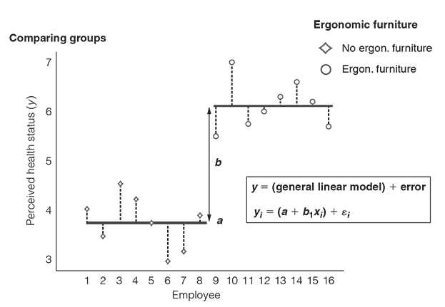
Let’s look at the no ergonomic furniture group first. With the knowledge that people are in the no ergonomic furniture group, what is the best prediction we can make of their health status? It’s the group mean, that is the average health status that people in the no ergonomic furniture group reported. The group mean is the best prediction because it is the summary statistic that produces the least differences between our actual data and our estimate of the outcome. In other words: the group mean comes with the least error in our predictions (Field, 2018). Basically, it is the least squared error, but never mind.
Knowing that the group mean is the best prediction of employees’ health status, we also know what value to put into the equation as our estimated outcome for the no ergonomic furniture group: exactly, the group mean
Equation: Intercept is equal to mean of the control group
And what about the ergonomic furniture group? Again, the best prediction we can make of people’s health status in the ergonomic furniture group is the group mean. For this group, the mean is 6.13. The value of the predictor variable x is 1 because this is the value that we have assigned to the employees in the ergonomic furniture group. Keep in mind that a (the intercept) is equal to the mean of the no ergonomic furniture group (
Equation: Calculating the slope when comparing two means

Let’s summarise what we have learnt so far. When we have a categorical predictor with two categories, the intercept a is equal to the mean of the group which is defined as the control group and the slope b represents the difference between the group means. This difference indicates whether membership in one or another group can be expected to influence an outcome.
You may wonder now why we have forced you to engage with all of these equations, when in fact we could have just told you to look at the group means and see if there’s a difference. The answer is easy. We wanted to help you develop an in-depth understanding of how the linear model works and how you can apply it to predict whether membership in one or another group has an impact on an outcome.
Allow us just one more remark on categorical predictors before we move on. As we have mentioned earlier, one of the compelling advantages of the linear regression model is that we can expand it and include as many predictors as we want. This is also the case when you have a categorical predictor with three or more categories. Here’s an example.
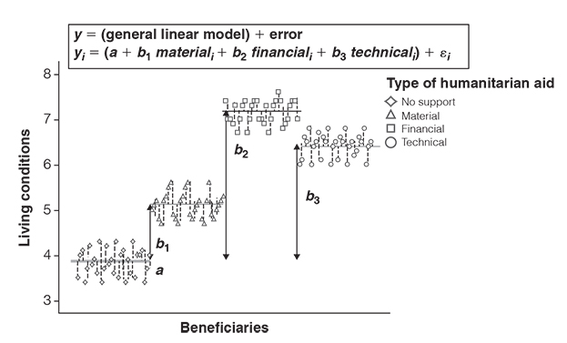
Let’s imagine you test the impact of three different types of humanitarian aid programmes and compare it to a control group. You would have a group that receives material support (i.e., tools, engines), a group that receives financial support (i.e., money), a group that receives technical support (i.e., know-how) and a group that does not receive any support. And let’s assume you ask people 6 months after the programme has terminated to rate the quality of their living conditions.
As you can see in Figure 3.11, the intercept a is equal to the group mean of the control group. Moreover, the bs (the slopes) represent the difference between the means of each group to the control group. The bs indicate that all types of humanitarian aid programmes help increase living conditions. The b-values further suggest that financial aid yielded the greatest improvements for people’s living conditions compared to when no support was given.
![]() How to say it
How to say it
Don’t separate what belongs together
There is a myth that frequently pops up in data discussions: the idea that you use regression analysis when you have a continuous predictor and a continuous outcome, whereas you use something called ANOVA (analysis of variance) when you have a categorical predictor and a continuous outcome. If you attended statistics courses at school or university, you may have even learned regression analysis in one class and ANOVA in another class. Maybe you were told that ‘ANOVA is a special case of regression analysis’ and that the two were ‘somehow related’. Although regression analysis is used for continuous predictors and ANOVA for categorical predictors, they are the same thing. Literally. As we have shown on the previous pages, they are based on the same equation (y = a + bx). So, whenever you hear someone drawing a distinct line between regression analysis and ANOVA, stand up and tell them why it’s an artificial difference. Be a myth buster.
By now, you have built up your statistics skills and have developed a more in-depth understanding of how to make predictions. But there is one thing which we haven’t addressed yet and which often causes confusion and misconceptions – even among data scientists. Let us walk you through this point by point.
How to generalise your findings
Imagine that you work in a huge international company with several thousand employees. One of the problems that has been brought up several times at the board meetings is that employees make a lot of mistakes because they work with an old and dull pending tasks management system. Being the head of the IT department, you therefore want to introduce a new pending tasks management software that is said to be easy to handle and well structured.
Your boss does not like this idea at all (the costs for this software are very high), but after several pitches, countless emails and phone calls, he is willing to give it a shot – if you can prove that your collaboration software decreases mistakes made in the projects.
Relieved about this opportunity, you decide to use data to emphasise the utility of the new pending tasks management software. You ask 400 employees to take part in a small study in which they are asked to complete a project task – 200 employees are asked to work with the old software and the other 200 are allowed to work with the new software. Your goal is to find out whether the use of the new software influences the number of mistakes that your study participants make.
Having read our book, you know that you can use the linear model to estimate the mistakes people make. Fortunately, the results clearly indicate that the use of the new pending tasks management software has an impact, such that it radically decreases the mistakes people make (the difference between the group means is extremely large). You may therefore conclude that the new software passes the test and that it is fit to be used company-wide. But hold on, caution is warranted. What you are about to do is to generalise your findings. But is that justified? The underlying question is whether the results occurred by mere coincidence or whether you can assume that they are real. Hence, what you need to find out is whether there is sufficient evidence to assume that the results did not just happen ‘by chance’, ‘randomly’ or ‘by accident’ (Miller, 2017). You may insist now that the results you have obtained are obviously ‘real’. You measured the number of mistakes people made and found that the use of the new software made a difference. So, why can’t we necessarily assume that this difference will always occur? Because we only examined the relationship between type of software and number of mistakes among some of our employees. The employees who participated in your study only constitute a subset of all the employees in the company. Or, put more formally, what you did was to study a sample and not the entire population of interest.
A population is defined as the entire group of people or things which we are studying and about which we seek to make inferences (Griffiths, 2008). Populations can be defined more broadly (e.g., all human beings, all students in a country/region, all cars, or all TV commercials broadcasted within a year) or more narrowly (e.g., all donors to a non-profit organisation, all jobs ads published in a certain newspaper).
A sample is a (relatively small) subset of the population that you can use to make statements about the population itself (Field, 2018; Griffiths, 2008). Examples for the above-mentioned populations could be: 9,000 people from 20 different countries, 300 students of an American university, 500 cars, 3,000 print advertisements that were published over the course of a year, 200 donors to a non-profit organisation or 50 job ads published in 3 local newspapers.
In our example with the pending tasks management software, the population may include all employees of the company who work with a computer. Our sample only included a relatively small number of those employees.
What we want to know is how confident we can be that the new software really influences the number of mistakes employees make. Can we assume that the results that we found apply beyond our sample? Or did our study just produce weird random findings?
We therefore need to do something that is called hypothesis testing.
Hypothesis testing involves the following three steps:
- 1. formulate a hypothesis that you want to test;
- 2. examine and evaluate the evidence;
- 3. make a decision.
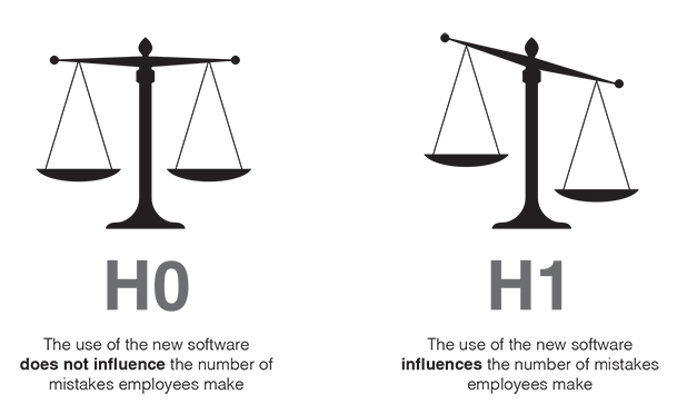
The first step is to make a claim about the effects we are expecting. This claim is also known as hypothesis (Griffiths, 2008).
Our hypothesis would be that the use of the new software influences the number of mistakes employees make. Assuming that the use of the new software has an effect, this hypothesis is called alternative hypothesis (and sometimes also experimental hypothesis). The alternative hypothesis is abbreviated with H1. The alternative hypothesis (H1) is tested against the null hypothesis (abbreviated with H0). The null hypothesis states that there is no effect. Hence, the null hypothesis would assume that the use of the new software does not influence the number of mistakes employees make. H0 is the baseline, or the default mode, against which we examine how confident we can be about our alternative hypothesis (Figure 3.12). We only reject the null hypothesis when there is sufficient evidence.
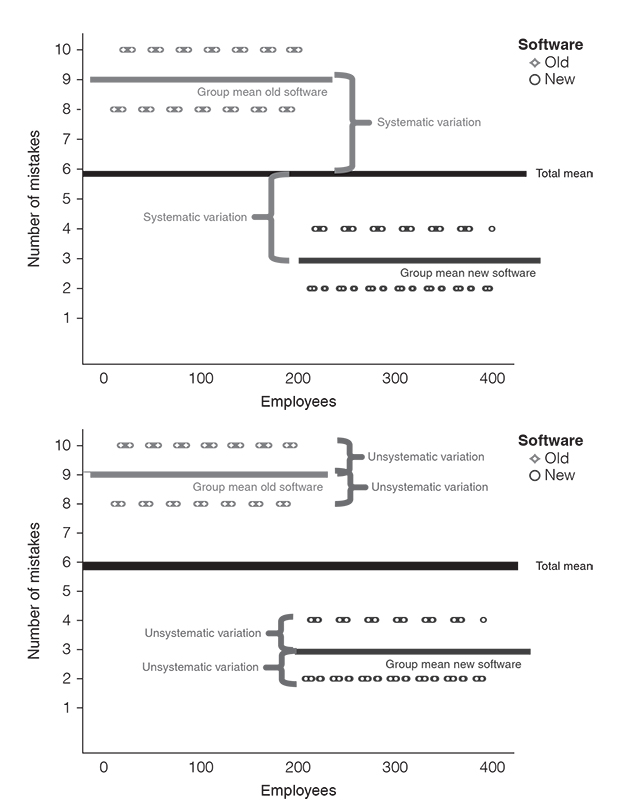
Having formulated our alternative hypothesis (H1) and the null hypothesis (H0), we now need a test to evaluate them. This is step 2. We assume that the null hypothesis is true (H0) and then we look at whether there is enough evidence to reject the null hypothesis and go with the alternative hypothesis (H1). To do so, we use a test statistic. A test statistic is a ‘signal-to-noise ratio’ (Field, 2018). It is a ratio between the systematic variation in the model (i.e., the effect that we can explain with the fact that people either worked with the new or with the old software) and the unsystematic variation in the model (i.e., the effects we cannot explain). In other words: a test statistic tells us something about the effect relative to the error.
Equation: Test statistic
Look at Figure 3.13. We can explain the differences between the group means with the fact that employees worked with different software. This is the systematic variation. What we can’t explain, however, is the difference between each employee and the respective group mean. For instance, why did some employees in the ‘old software group’ make ten mistakes, while others made eight mistakes? We simply don’t know.
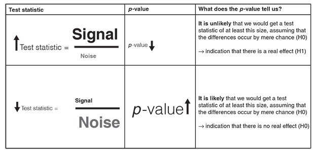
Generally, we can say that we want large test statistics. This means that the signal is bigger than the noise: the systematic variation (i.e., everything we can explain) is bigger than the unsystematic variation (i.e., everything we cannot explain). For instance, a signal-to-noise ratio greater than 1 means that there is more variation that we can explain than we can’t explain.
There are a lot of different approaches to calculate test statistics (e.g., t, χ2, F). Each of these approaches is based on a distribution that tells us how probable it is that we would get a signal-to-noise ratio of at least that size, assuming that the differences between the treatments occur by mere chance (i.e., assuming that the null hypothesis is true and there is no real effect). The probability of obtaining a certain signal-to-noise ratio under the assumption of the null hypothesis is known as the p-value. It is expressed as a number between 0 and 1. The lower the p-value, the more unlikely is it that we would get such a big effect size and could explain so much variance in the data, if the differences occurred by mere chance. There is an inverse relationship between the size of test statistics and the p-value: as the test statistic gets bigger, the p-value gets smaller. The more variation we can explain in the data (expressed by a large test statistic), the less evidence there is to assume that the differences occurred by mere chance (expressed by a small p-value).
In our software study, we get a very big signal-to-noise ratio. It means that the number of mistakes our employees make can be mainly explained by whether they use the old or the new software. This is also reflected in a very small p-value of .001. What does this p-value mean? Assuming that the use of the old or new software does not influence the number of mistakes our employees make (i.e., the null hypothesis is true), there is a 0.1% chance that we would obtain a signal-to-noise ratio at least as big as the one we have.
As this is highly unlikely to happen, the p-value indicates strong evidence against the null hypothesis. We therefore reject the null hypothesis (i.e., type of software has no effect on the number of mistakes).
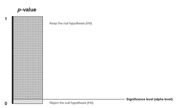
Still a bit confused? No worries, Figure 3.14 illustrates the inverse relationship between the size of test statistics and the p-value.
And what is the threshold for rejecting the null hypothesis? When do we have sufficient evidence for the alternative hypothesis? This is what we address with step 3 (make a decision). You need to set a predetermined cut-off point for how small the p-value must be at least so that you reject the null hypothesis (Figure 3.15). This cut-off point is also known as the significance level (or alpha level). The significance level determines how confident we must be that an effect did not happen by mere coincidence. It is a widely held convention across disciplines to choose an alpha level of 0.05. This means that we accept a 5% risk of deciding that an effect exists when in fact it does not exist. If we get a p-value that is equal or less than the alpha level, then we found strong support for the alternative hypothesis and reject the null hypothesis. If the p-value is greater than the alpha level, then we fail to reject the null hypothesis (Field, 2018).
So, in our example we have concluded that the people who use the new software differ ‘significantly’ in terms of the number of mistakes they make. But keep in mind that although there is strong evidence that the type of software influences the number of mistakes, we can never be absolutely sure. There is no guarantee because we go with the alternative hypotheses based on how likely it is that we are making a mistake when rejecting the null hypotheses. Although it might be very unlikely that we make a mistake, there always remains a small probability that we are wrong.
The difference between significant and important effects
There is a common fallacy that is often made; that is, to confuse significant effects (i.e., non-random effects) with important effects (i.e., meaningful effects). ‘Significant’ only means that we found enough evidence in our data to conclude that an effect might be real. However, the question is whether this effect is also meaningful. When talking about meaningful effects, we are referring to effect sizes. Effect sizes provide (absolute and standardised) measures of the magnitude of an effect (Field, 2018).
Effect sizes either capture the sizes of differences between groups or the sizes of relationships between continuous variables. The most commonly used measures of effect sizes are: Cohen’s d (comparison between two group means), eta squared (proportion of variation in an outcome that is associated with membership in different groups), the odds ratio (odds of an event occurring in one group compared to another group) and Pearson’s correlation coefficient (strength and direction of the relationship between two continuous variables) (Field 2018). You don’t need to know how they are calculated. What is important is that you know that effect sizes capture the magnitude of an effect. Note that Pearson’s correlation coefficient is also used as a measure of effect size because it expresses the size of the relationship between two variables. Remember that Pearson’s correlation coefficient indicates the strength and the direction of an association but does not discriminate between predictor and outcome variables (see page 21). That means, strictly speaking, it does not tell you whether one thing caused the other. However, the correlation coefficient is often used in a way that suggests that it reflects aspects of cause and effect.
Let’s illustrate the difference between p-values and effect sizes with an example. Imagine you were the CEO of a chocolate factory and you wanted to evaluate whether you should substitute chocolate bar B with chocolate bar A. Based on the experimental study that your team conducted, you find that participants liked chocolate bar A significantly more than chocolate bar B. The p-value is below the traditional 0.05 criterion, indicating that you can be very confident to assume that the difference did not occur by chance. The p-value tells you how confident you can be to assume that customers – beyond your study – like chocolate bar A more than chocolate bar B. What the p-value doesn’t indicate, however, is how big this effect is. This is where effect sizes come into play. By using a measure of effect size, you can conclude whether chocolate bar A is preferred only a little, moderately, or very much over chocolate bar B. And why would you want to know this? Because the p-value answers the question ‘is there a real difference?’, whereas effect sizes tell you ‘how big is this difference?’. If the difference between the chocolate bars is marginally small, you might want to reconsider whether it is really worth substituting one chocolate bar with the other – although the effect was significant.
By now, you have learned how to draw inferences from your data and distinguish statistically significant from practically meaningful results. However, there is one important aspect upon which we haven’t touched yet: that is, how to make sure that your conclusions are valid in the light of the data you collected. This is a matter of research design. Research design refers to the plan that you set up to answer your research question (e.g., do customers like chocolate bar A or B better?). Not having a sound research design can come at high costs because it may very quickly contaminate and invalidate the conclusions you draw from your data.
There are two key aspects which you need to consider to render your study worthwhile.
- 1. About whom do you aim to make inferences? And is your sample representative of the wider group to which you seek to generalise your findings?
Your sample is representative when it (more or less) reflects the key characteristics of the population of interest. Common examples of such key characteristics include gender, age, education, socioeconomic status, marital status, job position or consumer behaviour. Failure to account for sample representativeness is detrimental as it leads to the findings of your analysis being wrongly attributed. For instance, imagine that you wanted to generalise your findings to all employees in your company, but had only included managers from the middle management. Strictly speaking, your sampling approach does not allow you to draw inferences beyond managers from middle management. But how do you ensure sample representativeness? By using probability sampling methods. Probability methods use random selection, which means that subjects (e.g., people) are randomly selected from the population of interest and that each subject has an equal chance of getting selected. Let’s take the software example again. Random selection means that every employee would have the same chance to participate in the study. However, it is not always possible to use a probability sampling method because it would take too much time or may be too expensive or because you do not have a comprehensive list of all subjects of your population. Note that if every subject should have an equal chance of getting selected, you have to know in advance who belongs to your population of interest. We can think of a lot of instances where this is not given or very difficult to find out (e.g., when your population of interest is single parents in Europe or car owners in South America). Thus, the other option is to use non-probability sampling methods. This refers to sampling approaches in which not every subject has the same chance of being selected. Common non-probability sampling methods include convenience sampling (i.e., you select subjects who happen to be most accessible such as students or members of your non-profit organisations), voluntary response sampling (i.e., people volunteer themselves to participate in your study, for instance by responding to a consumer response survey) or snowball sampling (i.e., you recruit people for your study via other people). Non-probability sampling methods are often easier, cheaper and more feasible, but also come with decreased representativeness. The generalisations you can make about the population of interest are weaker (or more questionable) and your inferences may be more limited. Nevertheless, you should still try to make it as representative of the population as possible.
A common misconception about representativeness is that it means the number of subjects in your sample. We sometimes hear analysts or consultants talking about representative samples, while meaning large samples. Beware that just because 100 or 500 people participated in a study, does not necessarily mean that the sample is representative of the wider group to which the inferences should be drawn. Thus, always ask for clarification when someone speaks about ‘representative samples’.
- 2. Are there any aspects that might distort or confound your inferences?
The examples that we have used to explain hypothesis testing (i.e., the software study and the chocolate bar study) were both based on an experimental research design. The purpose of experimental research designs is to establish cause-and-effect relationships. In the software example, for instance, we wanted to find out whether the use of an old software or a new software influences the number of mistakes our employees make. In experimental studies, there are at least two groups that are compared in terms of an outcome (e.g., number of mistakes the employees make). In the simplest case, one group receives a treatment (experimental group), while the other group does not receive the treatment (control group). Sometimes you have no control group but several experimental groups (e.g., one group eats chocolate bar A and the other group eats chocolate bar B). As popular as experimental research has become in business contexts, as much caution is warranted when conducting such studies. There are several aspects that might invalidate your findings.
One of the most fundamental aspects refers to the way that the participants in your sample are assigned to the groups. In a true experiment, people are randomly assigned to the treatments. This is the case, for instance, if the 400 people participating in your software study were randomly assigned to either the old-software group or the new-software group. However, if you decided yourself who is in the old-software group and who is in the new-software group or if you put entire teams in either group, then it would be a quasi-experimental design. Quasi-experimental designs have a considerable disadvantage compared to genuine experimental designs. The lack of random assignment potentially leads to systematic differences between the groups. Let’s imagine that you conducted the software study and asked people from the marketing department to work with the old software and people from the IT department to work with the new software. Assume now that your findings would show significant and meaningful differences in the number of mistakes people make working with each software. The problem is that you cannot rule out the possibility that these differences are due to the pre-existing IT skills instead of the software itself. There are a number of further aspects that may result in systematic differences between the groups in quasi-experimental research (e.g., selection-history threat, which means that the treatment groups are differently influenced by extraneous or historical events).
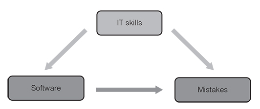
Whenever there are things that confuse the relationship between the independent variable (e.g., software) and the dependent variable (e.g., number of mistakes), we are dealing with confounding variables. Confounding variables, also referred to as confounders, are things that correlate with both the dependent variable and the independent variable. Take the above-mentioned example with the people from the marketing and IT department. It is possible that participants in the new-software group have better IT skills than the participants in the old-software group and that people with greater IT skills generally make less mistakes using software. IT skills might be a confounding variable (Figure 3.16). The results seem to show that the new software decreases the number of mistakes, which may not be true. Confounding variables lead to a mixing or distortion of effects so that the results do not reflect the actual relationship between the independent and dependent variable. The trouble with confounding factors is, however, that they are not always obvious or known. Random assignment is a common strategy used to control confounding variables as it allows the confounding variables to have their effects across the sample. Thus, whenever possible use true experimental designs instead of quasi-experimental designs.
Using randomisation is a way to minimise the impact of confounding variables before data collection. However, if you have already gathered data (and used quasi-experimental or survey designs), you can use statistical methods to control for potential confounders. The linear model assists you with this. Specifically, it tests whether a predictor has an effect on an outcome after removing the variance for which the confounding variable accounts. This allows you to see the ‘clean effect’ of the predictor on the outcome.
Overall, how can you evaluate whether your conclusions are valid in the light of the data you collected? First, ask yourself (or your analyst) to what extent your sample allows you to make inferences to the population of interest. Second, think about potential confounders and to what extent you managed to control for their influence.
Key take-aways
Sometimes we all want more: more money, more power or more happiness. Also, when analysing data, we sometimes strive for more, namely generalisable insights. It is helpful to describe the data that we have collected. But often, we want to go beyond our data and extrapolate from them. For instance, we might want to make statements about all our volunteers, not just about those who participated in our survey. Or, we might want to generalise the patterns in the consumption behaviour of the millennials in our study to all millennials in our country. Going beyond our data means that we can make generalisable statements. If we can infer under which conditions volunteers stay the longest in our organisation, we can adjust our volunteer management accordingly. Or, if we can infer what products millennials prefer, we can promote these products more intensively (Field, 2018). But getting from your data to generalisations can be a tricky endeavour. The following questions should help you with this.
- 1. Look at the scatter plot. Do your data form a linear uphill or downhill pattern? If this is the case, calculate the correlation between your variables. If you find a linear correlation between your variables, you can use the general linear model to make predictions (i.e., use one variable to predict the other).
- 2. Check the measurement level of the variables. Is the outcome variable continuous? Is the predictor continuous (➤if the outcome and the predictor variables are continuous, use regression; if the outcome variable is continuous but the predictor variable is categorical, compare means)?
- 3. What is your (alternative) hypothesis? What is the corresponding null hypothesis? What cut-off point do you define to reject the null hypothesis (significance level)?
- 4. Is there a significant effect? And if so, is it also meaningful?
- 5. Is the sample representative of the wider group (population) to which you aim to generalise your findings?
- 6. Did you account for potential confounding factors via research design (e.g., true experiments that use random group assignment) or via statistical methods?
 Traps
Traps
Analytics traps
- ●Confusing correlation (i.e., mathematical relationship between two variables: ‘as X increases, so does Y’ or ‘as X increases, Y decreases’) with causation (i.e., one thing causes the other).
- ●Not looking at the scatter plot and classifying the relationship between two variables as linear when in fact it is curvilinear or exponential.
- ●Choosing an inappropriate correlation coefficient that does not fit the measurement level of your variables (e.g., calculate Spearman’s rho when you should use Cramer’s V).
- ●Making predictions outside of the range of observed values (e.g., predicting the amount of donation based on ad expenses that lie outside of the range of data that you collected).
- ●Interpreting the intercept although it does not make sense (e.g., because there are no data near x = 0 such as for height: people cannot be 0 or 2 cm tall).
- ●Comparing b-values instead of beta-values when using several predictors in a regression model.
- ●Generalising findings from a sample (e.g., a random sample of members of a non-profit organisation) to a population (e.g., all members of that non-profit organisation) without doing hypothesis testing and checking whether the effects occurred by mere coincidence or whether they are real.
- ●Generalising findings from a non-representative sample to the population of interest.
- ●Not knowing your sample or the way that the data was collected.
- ●Not controlling for the influence of confounding variables.
Communication traps
- ●Ignoring people’s level of data literacy and assuming that everyone knows the same things as you do.
- ●Using jargon to demonstrate your data literacy.
- ●Failing to explain the key aspects of your analysis and the resulting implication (what was done and what can we learn from it? How was it done? Why was it done? Who did it? When was it done? Where was it done?).
- ●Talking of regression analysis (continuous predictor and a continuous outcome) and ANOVA (analysis of variance; categorical predictor and a continuous outcome) as if they were two different pairs of shoes. Regression analysis and ANOVA are the same thing because they are based on the same equation (y = a + bx).
- ●Speaking of significant effects (i.e., non-random effects) when you mean important effects (i.e., meaningful effects) and vice versa.
- ●Speaking of representative samples when you mean large samples.
- ●Using jargon instead of plain language when talking about statistics (see Table 3.3).
Table 3.3 Dos and don’ts when talking about statistics.
| Don’t Jargon | Do Plain language |
| Univariate data vs bivariate data | You look at one thing vs You look at the connection between two things. |
| Correlation | A mathematical relationship between things. |
| Positive linear correlation | The data show an uphill pattern. The relationship between two things can be described as ‘the more of X, the more of Y’ or alternatively ‘as X increases, so does Y’. |
| Negative linear correlation | The data show a downhill pattern. The relationship between two things can be characterised as ‘the more of X, the less of Y’ or ‘as X increases, Y decreases’. |
| Direction of the correlation coefficient | Tells you whether the data form an uphill or downhill pattern. This is indicated by the sign of the coefficient (positive or negative sign). |
| Strength of the correlation coefficient | Tells you how strongly or loosely connected things are. This is indicated by the size of the coefficient. The closer it is to +1 or −1, the stronger the connection. |
| Making predictions | You use one thing to estimate changes in another thing. Simply put, predictions help you understand ‘how one thing influences another thing’. |
| Regression analysis | You use a linear equation to see how one thing influences another thing. |
| Regression line/line of best fit | The line that fits the data as closely as possible. |
| The slope (b) | Indicates how steep the regression line is. The slope tells you how much you can expect the outcome to change as the predictor increases by one unit. |
| The intercept (a) | Indicates where the regression line crosses the y-axis. This tells you the amount of an outcome when the predictor is zero (e.g., what amount of donations we expect to receive if we spend no money on advertising). |
| Error | The difference between the data you collected and the values that you estimate (or predict). |
| Population | The entire group of people or things about which you seek to make inferences (e.g., car drivers in a country; employees under 40 in American companies). |
| Sample | A (relatively small) subset of the entire group of people or things in which you are interested. |
| Alternative hypothesis (H1) | Makes the claim that there is an effect. |
| Null hypothesis (H0) | Makes the claim that there is no effect. |
| p-value | Indicates how likely it is to assume that the results occurred by mere chance. |
| Significance level (alpha level) | Determines how confident we must be that an effect did not happen by mere coincidence. It is a widely held convention across disciplines to choose an alpha level of 0.05. This means that we accept a 5% risk of deciding that an effect exists when in fact it does not exist. |
| Effect sizes | Provide measures of the importance of an effect. Such measures tell you how big or meaningful an effect is. |
| Representative sample | A sample is representative when it reflects the key characteristics of the wider group of interest. |
| Random sampling | People (or things) are randomly selected from the wider group of interest and each one has the same chance to participate in the study. |
| Random assignment/Randomisation | Random assignment is a key feature of ‘true experiments’. It means that the study participants (i.e., those who are in the sample) are randomly assigned to the treatment groups. |
| Confounding variable | Things that confuse the relationship between two other things (e.g., software and number of mistakes). |
Further resources
For an online tool that creates scatter plots for bivariate data:
https://mathcracker.com/scatter_plot
For an informative and accessible text on the concept of statistical significance:
https://hbr.org/2016/02/a-refresher-on-statistical-significance
For an entertaining video on the difference between statistically significant versus meaningful effects: