
![]()
Power Map
An extremely recent addition to the panoply of self-service BI tools that Excel now makes available is Power Map. As its name implies, it is a powerful mapping tool that can generate some exceedingly cool geospatial representations of your data. Specifically, it can
- Create various types of map to represent geospatial data
- Add multiple layers of information to each map to show different data representations
- Add a time dimension to a map and display how the data evolves over time
- Chain several maps together into a dynamic visualization that can then be exported as a multimedia file
Power Map will use the data that you have prepared in the Excel Data Model, or it can add data from a spreadsheet table to a data model for geographical representation. So once again, it can be important to spend a certain amount of time creating and finalizing an accurate and coherent data model before you try and display—or discover—new insights using Power Map.
You may well be wondering why you have the choice between adding a map to Power View or using Power Map to display your data. Well, they have two quite different uses. Power View maps let you use all of the interactive filtering and slicing techniques that you learned in earlier chapters; however, if you want to create rich multilayered visualizations or the stunning exportable “movies,” then you will need to use Power Map. In any case, once you master both approaches, you will be able to choose the Excel add-in that best suits your needs.
Power Map is now part of Excel and should be available in the Insert ribbon. If you cannot see the Map button, then please ensure that you have followed the instructions in Chapter 1.
This chapter will use a sample file named PowerMapSample.xlsx, which is in the C:HighImpactDataVisualizationWithPowerBI folder, assuming that you have downloaded the sample files as described in Appendix A.
Bing Maps
Power Map, just like maps created with Power View, uses Bing Maps to provide the geographical data. Consequently, you will need to allow Power Map access to Bing Maps or maps simply cannot be created. Power Map currently needs an Internet connection to function correctly.
![]() Note Some areas of the world cannot use Bing Maps. If you attempt to use Power Map in these geographical zones, nothing will appear when you attempt to create a map.
Note Some areas of the world cannot use Bing Maps. If you attempt to use Power Map in these geographical zones, nothing will appear when you attempt to create a map.
Running Power Map
Time to get started! Clearly the first thing that we need to do is to launch Power Map, which is similar to the way that you learned to launch Power View. What you have to do is
- In Excel, click Insert to activate the Insert ribbon.
- Click the Map button. The Power Map window will open, looking (most probably) like Figure 14-1.
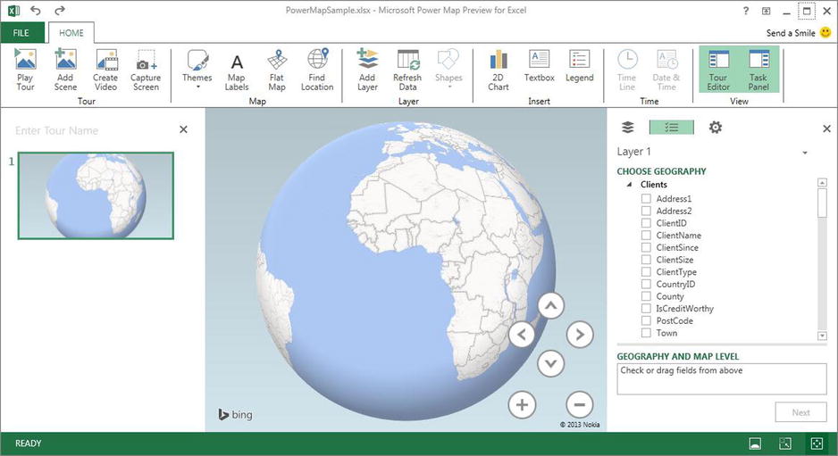
Figure 14-1. The Power Map window
![]() Note Power Map needs data to work. Consequently, it is important that you have either an Excel Data Model in the workbook from which you launch Power Map, or a table of data that you have selected before you run Power Map.
Note Power Map needs data to work. Consequently, it is important that you have either an Excel Data Model in the workbook from which you launch Power Map, or a table of data that you have selected before you run Power Map.
The Power Map Window
Even if the Power Map window and many of the elements that you will use are largely intuitive, I prefer to continue with the logic applied throughout this book, and explain the Power Map window and the objects that it contains from the outset. This way (I hope), the terms and elements that you will be using will be as clear as possible.
The Power Map window consists of the following five main elements:
- The map visualization—This is the core of Power Map and where your audience will see your analysis and the geographical representation of your insights.
- The Task panel—This is the area where you select data (both geographical data and the metrics that you want to overlay on the map) as well as modify many of the presentation aspects of the map.
- The Tour Editor—This panel is where you can put together an automated slideshow, or film, of the data for your audience.
- The Power Map ribbon—This is where you will find many of the available options for adding elements or enhancing the map that you are creating and modifying.
- The Power Map information bar—This indicates the state of any mapping calculations and progression of any timelines.
The main elements of the Power Map window are shown in Figure 14-2.
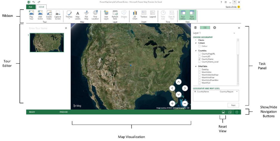
Figure 14-2. The principal elements of the Power Map window
The Power Map Ribbon
One of the key features of the Power Map window is the Power Map ribbon. The buttons that it contains and their uses are outlined in Table 14-1.
Table 14-1. The Power Map Ribbon
|
Button |
Description |
|---|---|
|
Play Tour |
Plays a Power Map tour |
|
Add Scene |
Adds a new scene to a Power Map tour |
|
Create Video |
Exports a Power Map tour as a stand-alone video |
|
Capture Screen |
Creates a screen capture of the map |
|
Themes |
Alters the Power Map presentation style |
|
Map Labels |
Adds country, region, and town labels to the map |
|
Flat Map |
Switches between a flat (2-dimensional) and curved (3-dimensional) map |
|
Find Location |
Finds a location on the map by entering a map reference or a town or county name |
|
Add Layer |
Adds another separate layer to the map |
|
Refresh Data |
|
|
Shapes |
Chooses the bar chart shape |
|
2-D Chart |
Adds an independent 2-D chart based on the data in a layer on the map |
|
Textbox |
Adds a floating textbox |
|
Legend |
Adds one or more legends |
|
Time Line |
Shows or hides the time line |
|
Date And Time |
Shows or hides the date and time |
|
Tour Editor |
Displays or hides the Tour Editor |
|
Task Panel |
Displays or hides the Task panel |
As a first, and admittedly very simple map, suppose that you want to see the cumulative sales for the various countries where Brilliant British Cars has hawked its wares in 2012—2013. This example will introduce the core mapping concepts that you will build on later in this chapter to develop some more complex geographical visualizations.
- In the Task panel, expand the Countries table and check the CountryName field. This field will be added to the GEOGRAPHY AND MAP LEVEL box. The map of the globe could swivel to display the area of the world where the majority of the data can be found.
- Click Next in the Task panel. The Task panel will switch to the metrics pane.
- In the lower part of the Task panel, select Region from the TYPE popup list. The countries where there are sales will appear colored in on the map.
- Expand the SalesData table. Check the SalePrice field. This will be added to the VALUE box and will indicate that the aggregation that has been applied is Sum. The countries will be shaded at different levels of intensity on the map to represent the proportion of sales by country. Power Map will also add a legend.
- Click the plus (+) icon a few times to zoom in on the map.
- Resize the legend by dragging the circle icon in the bottom right (or left) of the legend.
- Reposition the legend by dragging the legend window bar (probably green) at the top of the legend when you place the cursor over the legend. The map might look something like Figure 14-3.
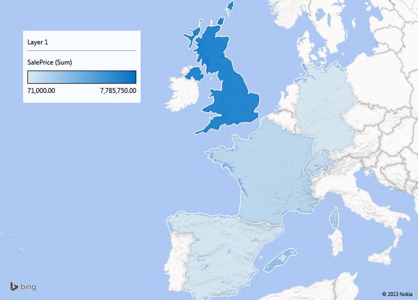
Figure 14-3. A simple regional sales map
This short example did quite a few things and introduced several concepts. To make some of the ideas easier to reapply in the future, here is a quick overview of the key points to note.
As I mentioned in the introduction to this chapter, Power Map uses the Excel Data Model (or data from a worksheet added to the data model) as the source for the data that you will deliver as a map. It is important, then, to consider Power Map as you consider Power View—that is, as a final output medium, and not as a data management solution. You will probably need to import data with either Power Query or PowerPivot, and will then almost certainly have to mold the data set into a coherent data model before you start using Power Map. When you launch Power Map it will display the current data model, and this is what you will be using to create your maps.
![]() Note You can add data to the data model when you launch Power Map. This implies that you must select the data first, and then choose the Add Selected Data To Power Map option from the Map button in the Excel Insert ribbon. However, I only advise doing this if you have a complete set of data in an Excel spreadsheet—and an empty data model in Excel; otherwise you will inevitably need to switch to PowerPivot and adjust the data model at some point. Consequently—in my opinion—it is much easier to follow the regular process and set up a correct data model before you launch Power Map.
Note You can add data to the data model when you launch Power Map. This implies that you must select the data first, and then choose the Add Selected Data To Power Map option from the Map button in the Excel Insert ribbon. However, I only advise doing this if you have a complete set of data in an Excel spreadsheet—and an empty data model in Excel; otherwise you will inevitably need to switch to PowerPivot and adjust the data model at some point. Consequently—in my opinion—it is much easier to follow the regular process and set up a correct data model before you launch Power Map.
Refreshing Data
If your data has changed (and remember that it could have changed in a source database or a shared worksheet on a network drive), you could both need and want to refresh the data so that Power Map will redraw the visualization to display the latest version of events. To do this
- Click the Refresh Data button in the Power Map ribbon.
The data will be updated from the source, and the map(s) will be redrawn. If the path to the source data involves a Power Query process and a PowerPivot data model, then the entire chain of data will be updated.
In this first Power Map example we added a single geographical data field. What is more, this field was recognized instantly for what it was—country names. In the real world of mapping data, however, you may not only have to add several fields but also specify which type of geographical data each field represents. Put simply, Power Map needs to know what the data you are supplying represents. Not only that, it needs to know what it is looking at without ambiguity. Consequently, it is up to you to define the source data as clearly and unambiguously as possible. This can involve one or more of several possible approaches.
Define the Data Category in the Data Model
As we saw in Chapter 11, you can define a data category for each column of data in PowerPivot. Although this is not an absolute prerequisite for accurate mapping with Power Map, it can help reduce the number of potential anomalies.
Add Multiple Levels of Geographical Information
Power Map lets you add several levels of geographical information from a data model. For instance (and as you will see in a few pages time), you can add not just a country, but also a town if you want. The advantage of adding as many relevant source data fields as possible is that by working in this way, you are helping Power Map dispel possibly ambiguous references. For instance, if you add only a field for Town, Power Map might not know if you are referring to Birmingham Alabama or England’s second city. If, however, you add a Country field and a Town field, then Power Map has a much better chance of detecting the correct geographical location. This principle can be extended to adding states, counties, and other geographical references. So remember, you can add multiple source fields, but you should only select the one that you want to display in a map.
Select the Correct Geographical Data Type in Power Map
Power Map will indicate in the GEOGRAPHY AND MAP LEVEL box the geographical data type that it is using for each selected field. If you have applied the right data category in the data model, then your life is made easier, because the correct geographical data type will be displayed. If you have not attributed a data category, then Power Map will try and guess the correct geographical data type. On most occasions, it will guess right; occasionally, however, you will need to override its choice to ensure that the mapping is applied correctly. Selecting another geographical data type is as easy as clicking on the popup (the downward-facing triangle) for each geographic data field in the GEOGRAPHY AND MAP LEVEL box whose data type you wish to change and selecting the appropriate data type.
The available geographical data types are explained in Table 14-2.
Table 14-2. Geographical Data Types
|
Data Type |
Comments |
|---|---|
|
Latitude |
Indicates that the source data contains the latitude |
|
Longitude |
Indicates that the source data contains the longitude |
|
City |
Tells Power Map that the data is a town or city |
|
Country/Region |
Tells Power Map that the data defines a country or region |
|
County |
Indicates that the source data defines a county |
|
State/Province |
Indicates that the source data defines a state or province |
|
Street |
Provides street-level data |
|
Zip |
Contains a zip (postal) code |
|
Address |
Contains a full address |
|
Other |
Indicates other geographical data that can be interpreted by Bing Maps |
The Task panel is where much of the work is done both to specify the data that will be displayed in a map and to tweak the available options for the map. To be sure that you are at ease with this key facet of the Power Map interface, let’s take a more in-depth look at what it has to offer.
Showing and Hiding the Task Panel
If you have finished, temporarily or permanently, with the Task panel, you can hide it (or make it reappear) by clicking the Task Panel button in the Power View ribbon. Alternatively, to make it disappear entirely, you can click the Close icon (the small X) at the top right of the panel.
Task Panel Panes
A Task panel can flip between three main panes:
- The Data pane (geographical and metrics)
- Display settings
- Layer modification
You can move between the available panes by clicking on the icons shown in Figure 14-4.

Figure 14-4. Task panel pane selection
For the next few pages we will be looking only at the Data pane; I will introduce the others a little further on in this chapter. Since we are looking at the Data pane of the Task panel, you need to know something important—how to switch from geographical data to data for metrics and vice versa.
Whenever you create a new map in Power Map, you begin by adding the geographical data, as we did in the first example, earlier. Fairly logically, Power Map defaults to displaying the geographical data view of the Data pane when you start to build a geographical representation of your data. As you saw in step 2 of the previous example, once the geography data is in place, you switch to the metric Data pane by clicking Next at the bottom of the Task pane. So what do you do to return to the geographical data view should you need to modify this data? The answer is that you click on the Geography icon in the Data pane, which is shown in Figure 14-5:
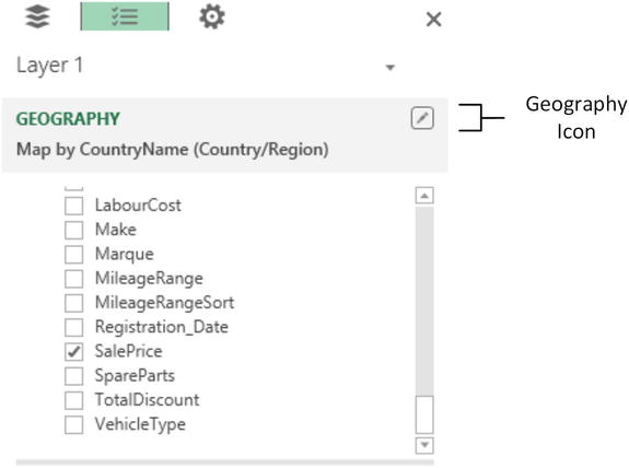
Figure 14-5. Switching back to the Geography pane of the Task panel
Clicking on the Geography icon will take you back to the initial task pane from which you started out. Once this view is selected, you can modify the geographical data to suit your requirements. As before, clicking Next will switch to display the data for any metrics that you want to show on the map.
The Task Panel Data Views
You saw the data views of the Task panel briefly in steps 2 and 3 of the earlier example. As this reference was only in passing, here is a more complete overview of what the two views in this pane actually do.
- The Geography view lets you select the source of the geographical data from the data set.
- The Metric view allows you to select which source data metrics will be shown in the map.
Both of these data elements can be taken a lot further than the first example showed. However, I think that it is easier to understand the possibilities using examples, as a result, we will see how to develop the use of both geographical data and display metrics a little further on.
In the meantime, the two views are explained in Figure 14-6.
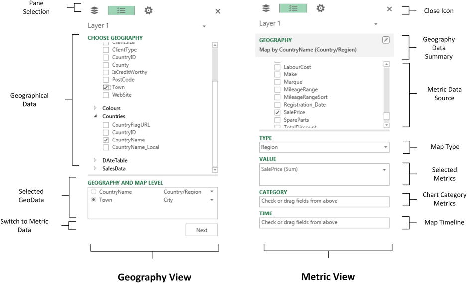
Figure 14-6. The Task panel, explained
Inevitably there will be times when you will want to remove a field from the Task panel. The technique is the same whether you are deleting a field from the Geography view or the Metric view.
- Click on the popup for the field (or the data type for geographical fields).
- Select Remove from the popup menu.
The field will be removed from the map (but not from the underlying data model) and the map will be redrawn to reflect the modification. Alternatively, you can uncheck the field in the Field List of the Task panel if you prefer.
![]() Note This operation cannot be undone—so if you have removed the wrong field, you will just have to add it back again.
Note This operation cannot be undone—so if you have removed the wrong field, you will just have to add it back again.
Moving Around in Power Map
When you first add geographical data, Power Map will adjust the map to display the geographical area with the greatest concentration of data. However, you may need to tweak the continents, countries, or counties that are displayed to make your point. If the area displayed in a map is not quite as perfect as you would prefer, then you can alter the area that appears in the map visualization. This involves
- Zooming in and out—to get closer to the detail of the data—or inversely taking a bird’s eye view.
- Panning around, which essentially means moving to the area that interests you.
- Altering the pitch; this can enhance the visual experience by changing the 3-D view of the map.
The icons used to zoom and pan around a map are explained in Figure 14-7.
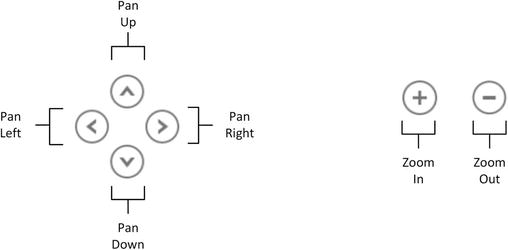
Figure 14-7. Zoom and Pan icons
You can hide the Zoom and Pan icons by clicking the Show/Hide Navigation Buttons icon at the bottom right of the Power Map window. This icon is shown in Figure 14-2, earlier.
Moving Around a Map
Moving around a map (without altering the pitch) is, as you would probably expect, extremely easy:
- Click on the Pan Right icon (the right facing symbol) to alter the geographical area displayed in the map visualization.
![]() Tip You can also click inside a map and drag the mouse to pan around, or you can use the cursor keys to move up, down, left, or right without altering the pitch.
Tip You can also click inside a map and drag the mouse to pan around, or you can use the cursor keys to move up, down, left, or right without altering the pitch.
Zooming In or Out
It is conceivable that the map that is displayed is not at a scale that you would prefer. Fortunately this is extremely easy to adjust to get the effect that you want. All you have to do is
- Click on the Zoom Out button (the minus sign) to zoom out or click on the Zoom In button (the plus sign) to zoom in.
![]() Tip You can also move the mouse scroll wheel or use the Pg Up and Pg Dn keys to zoom in or out of a map.
Tip You can also move the mouse scroll wheel or use the Pg Up and Pg Dn keys to zoom in or out of a map.
Power Map lets you change the pitch, or viewing angle, of a map. This can be particularly useful when displaying complex column charts, for example. All you have to do is
- Press Alt and drag the map.
![]() Tip If you prefer to use the keyboard, press Alt and use the Up and Down cursor keys to alter the pitch of a map.
Tip If you prefer to use the keyboard, press Alt and use the Up and Down cursor keys to alter the pitch of a map.
Although the Power Map default is to show a three dimensional globe, you can flip to a flattened view if you prefer. This view will show more data and will allow you to avoid having parts of the map disappear over the horizon. To switch between 3-D and flat mapping:
![]() Tip Using a flat map does not prevent you from changing the pitch of the map to obtain some really cool effects.
Tip Using a flat map does not prevent you from changing the pitch of the map to obtain some really cool effects.
Going to a Specific Location
Sometimes all you want to do is move to a particular location. You can do this in a couple of ways. If you can see the place where you want to take a closer look, simply double-click on it and Power Map will zoom in. If you want to jump straight to a particular region or town, then
- Click Find Location in the Power Map ribbon. The Find Location dialog will appear.
- Enter the place you want to find. The Find Location dialog will look like Figure 14-8.
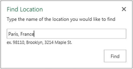
Figure 14-8. The Find Location dialog
- Click Find. Power Map will jump to the location.
- If Power Map has found the place that you were looking for, you can close the Find Location dialog by clicking on the Close icon (the X at the top right). If not, enter a new location and click Find, again.
![]() Tip You can move the Find Location dialog around the screen—and essentially away from the center of the map—to get a better view of the area that it has found. Remember that you can zoom in and out while searching for a specific place to ensure that you have found the right one. This can help to ensure that you are not looking at Paris, Texas, when you really wanted the French capital.
Tip You can move the Find Location dialog around the screen—and essentially away from the center of the map—to get a better view of the area that it has found. Remember that you can zoom in and out while searching for a specific place to ensure that you have found the right one. This can help to ensure that you are not looking at Paris, Texas, when you really wanted the French capital.
Power Map Aggregations
When you used the SalePrice field in the first example in this chapter as the basis for shading the regions in the map, Power Map automatically used the default aggregation for the field that you chose. This probably comes as no surprise, since it is exactly what Power View does. Similarly, Power Map does not limit you to using the default aggregation for a numeric field or a count for an attribute field. To select another aggregation
- Switch to the Geography view of the Data pane of the Task panel (unless it is already active).
- Click on the popup icon (the downward-facing triangle to the right of the selected metric name) for the metric. The popup list should look like Figure 14-9.
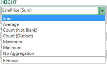
Figure 14-9. Aggregations
- Click on the required aggregation.
The map will be updated to reflect the new metric. The available aggregations are outlined in Table 14-3.
Table 14-3. Aggregation Types
|
Aggregation |
Description |
|---|---|
|
Sum |
Returns the total of the numeric field. |
|
Average |
Returns the average of the numeric field. |
|
Count (Not Blank) |
Counts all the non-blank records. |
|
Count Distinct |
Counts all unique values in the data. |
|
Maximum |
Returns the maximum value from a numeric field. |
|
Minimum |
Returns the minimum value from a numeric field. |
|
No Aggregation |
No aggregation is applied. |
Map Types
Power Map is not limited to shading in countries—far from it. In the current version there are four main map types. These are described in Table 14-4, and we will move on to take a look at each map type to see how they can best be used in the next few sections.
Table 14-4. Map Types in Power Map
|
Chart Type |
Description |
|---|---|
|
Column |
Adds a Column chart to the map |
|
Bubble |
Adds a Bubble (or Pie) chart to the map |
|
Heat Map |
Adds a heat map indicator (concentric colored circles) to the map |
|
Region |
Shades geopolitical entities by country or region |
The Various Map Types, by Example
Now that you understand the basic elements of Power Map, it is time to move on to the various ways in which data can be displayed and overlaid onto a geographical background. I feel that the best way to do this is to explain the data used, step by step, to give you an idea of what you can achieve. So, on that note, here are the four types of mapping data that Power Map can display. Let me just add that these map types are not explained in any particular order; it is up to each user to apply the type of visualization that makes their point most clearly and effectively.
A very simple, yet effective, way of displaying data is to use a bubble map. This is simply a circular representation of the data for each data point, where the relative size of each dot (or bubble, or point; there are many synonyms used to describe this) gives an idea of the proportional extent of the underlying data.
Bubble maps in Power Map come in two distinct flavors:
- Simple bubbles.
- Bubbles with multiple “subdivisions” or categories. These look like pie charts superimposed upon the map.
Let’s look at each in turn. To begin with, here is how to create a simple bubble map:
- Starting with the PowerMapSample.xlsx file, click Map in the Insert tab to launch Power Map.
- Select the CountryName field from the Countries table and click Next.
- Select CostPrice from the SalesData Table.
- Remove the Legend by clicking on the close icon (the small X) at the top right of the legend.
- Select Bubble as the type. Your map should look like Figure 14-10.
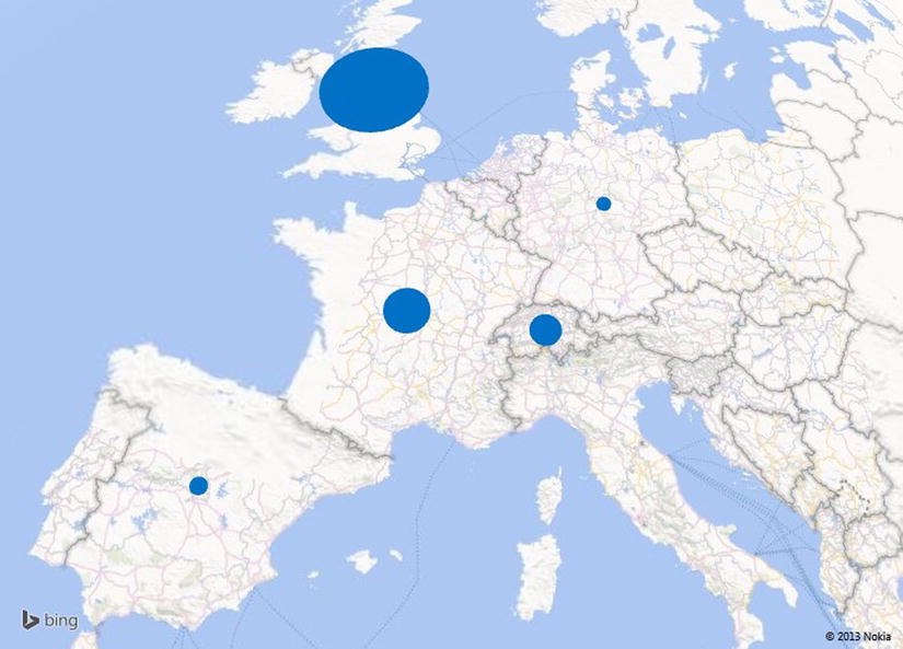
Figure 14-10. A simple bubble map
Now let’s extend this by adding a further breakdown—and consequently further information—by adding categories to the map.
- In the bubble map you just created, click Legend in the ribbon to add a legend.
- Resize and place the legend where it does not hide any data.
- In the Task panel, click on the Make field in the SalesData table. Make will be added to the CATEGORY box.
- Hover the cursor over one of the segments for the pie in the United Kingdom. A popup will appear explaining what the segment represents.
The map should now look like the one in Figure 14-11. As you can see, each bubble is now a pie chart.
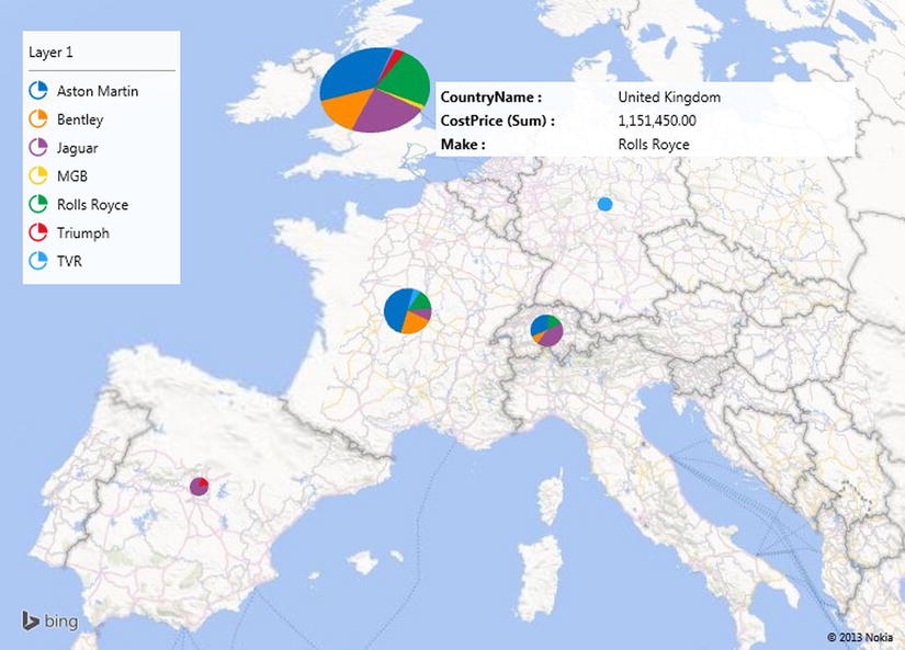
Figure 14-11. A bubble map with categories
I have a couple of comments to make here. First, you can only add a single category to a map. So, if you need multiple categories (such as make and model) to subdivide the data further, then you need to add a calculated column to the data first. Second, the aesthetics of having a legend or not will entirely depend on your requirements and circumstances.
An alternative to analysis by sector in a pie-style bubble map is to compare multiple values. As an example, let’s suppose that you want to see the proportional costs (Parts, Labour, and Discount) for each country.
- Starting with the PowerMapSample.xlsx file, click Map in the Insert tab to launch Power Map.
- Select the CountryName field from the Countries table and click Next.
- Select the following fields from the SalesData table:
- SpareParts
- LabourCost
- TotalDiscount
- Select Bubble as the type.
- Click Flat Map in the Power Map ribbon to remove the 3-D view.
- Resize and reposition the legend.
- To anticipate a little (and to ring the changes), click the Themes button and select the first theme on the second row. The map should look like Figure 14-12.
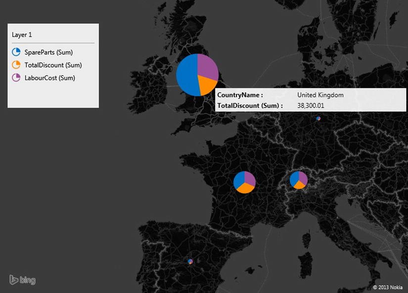
Figure 14-12. A bubble map containing multple values
I will explain the use of themes in more detail a little later on in this chapter. Nonetheless, I wanted to add a little variety to the presentation. As you can see, you have displayed the costs, and their proportional representation, for each country.
To take the example a little further, but still using very simple data, let’s now see how you can use columns to display the data for each geographical element. Here again there are two main options:
- Clustered columns
- Stacked columns
In both cases the height of the column represents the scale of the data. In the case of clustered columns, you can see the data points side by side; in the case of stacked columns, you can get an idea not only of the relative values but also of the totals for each geographical point.
Clustered Columns
I will begin by showing you how a clustered column could look.
- Follow steps 1-4 for the first bubble map I showed you earlier.
- Drag the Make field to the CATEGORY box.
- Select Column as the type from the TYPE popup.
- Click on the clustered column icon (the left-hand one) that appeared above the CATEGORY popup when you switched to Column in step 3.
- Tweak the presentation using the zoom and pan buttons for greater effect. Specifically try altering the pitch to get a more persuasive fly-over effect.
The map should look like Figure 14-13.
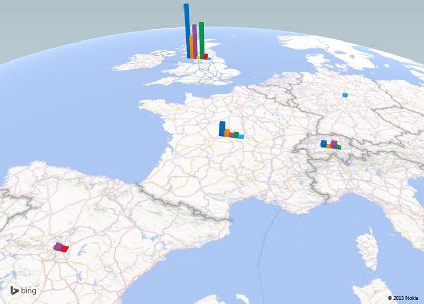
Figure 14-13. A clustered column map
![]() Note Here again, you may, or may not, want a legend. It is entirely up to you.
Note Here again, you may, or may not, want a legend. It is entirely up to you.
Stacked Columns
An alternative to clustered columns is to use stacked columns. Which you choose to use will depend on your requirements and the available data. I would merely suggest that when you have multiple data points, stacked columns can be easier to read and can avoid clutter in the presentation. As an example of this, let’s see sales for each town by make.
- Starting with the PowerMapSample.xlsx file, click Map in the Insert tab to launch Power Map.
- Select the CountryName field from the Countries table.
- Select the Town field from the Clients table.
- Click Next.
- Select CostPrice from the SalesData table.
- Drag the Make field to the CATEGORY box.
- Resize and reposition the legend.
- Select Column as the type from the TYPE popup.
- Adjust the zoom and panning to get the best effect, focusing on the United Kingdom.
The map should look like Figure 14-14.
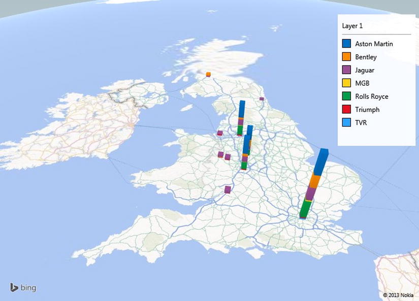
Figure 14-14. A stacked column map
The term heat map can mean many different things to different people. In Power Map it means a colored bubble where the intensity and shading of the color represents the scale of values that is represented. To see this, let’s look at the costs of sales for UK towns.
- Follow steps 1 to 7 that you used to create a stacked column map.
- Select Heat Map as the type from the TYPE popup.
- Adjust the zoom, panning, and pitch to get the best effect, once again centering the map on the United Kingdom.
The map should look similar to Figure 14-15.
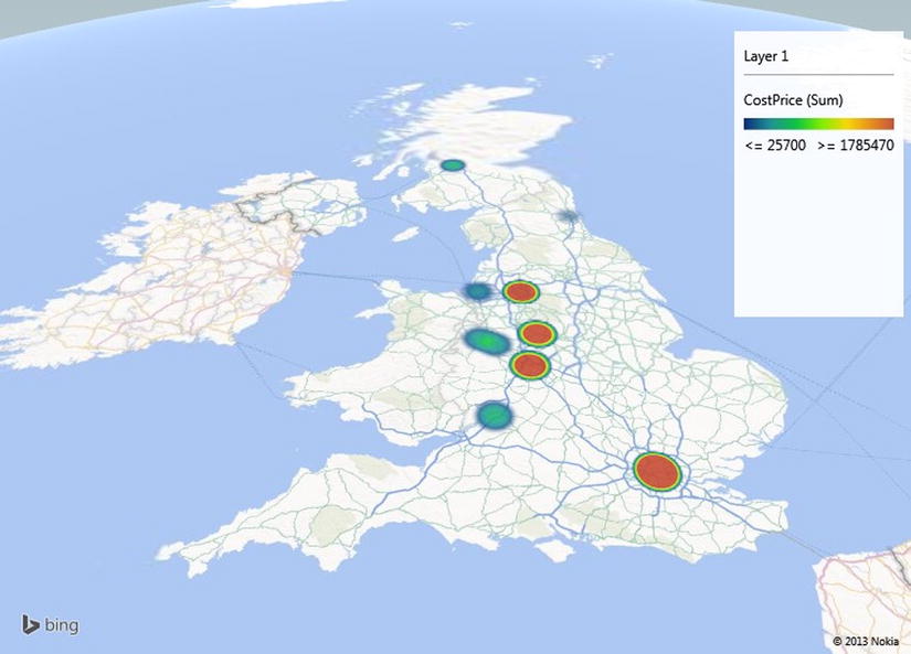
Figure 14-15. A simple heat map
![]() Note A heat map is somewhat more limited than some of the other map types. For instance you cannot choose a category, neither can you add multiple metrics.
Note A heat map is somewhat more limited than some of the other map types. For instance you cannot choose a category, neither can you add multiple metrics.
Region Maps
The first map that we created in this chapter was a region map, and the example that you created covers much of what you can do when you use this map type. Nonetheless, there is an interesting variation on a theme that deserves to be explained—using categories with region maps.
Suppose, for instance, that you want to see the sales by country, but you also want the colors of car sold to shape the data. Here is how:
- Starting with the PowerMapSample.xlsx file, click Map in the Insert tab to launch Power Map.
- Select the CountryName field from the Countries table and click Next.
- Select SalePrice from the SalesData Table.
- Drag the Colour field from the Colours table to the CATEGORY box.
- Delete the legend.
- Select Region as the type from the TYPE popup.
- Adjust the zoom and panning to get the best effect.
- Click on Spain to highlight the borders of the country.
- Hover the cursor over any country to display the sales breakdown by color of car sold. The map should look something like Figure 14-16.
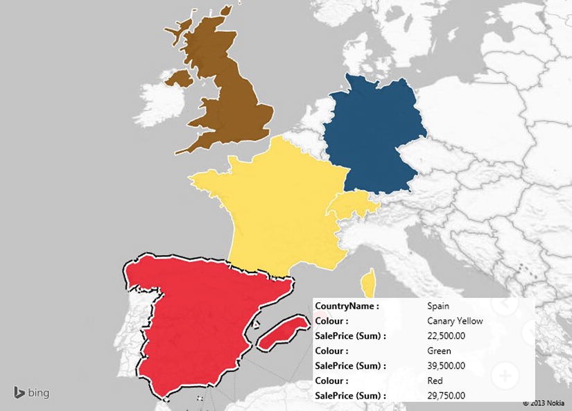
Figure 14-16. A region map with categories applied
When you see the result in a black and white book, the effect is probably less immediate. On screen, however, the change is profound as each country is now a different color. If you look at the popup for each country, you will see that the top selling category for each country has forced the choice of color for the country. In a couple of pages, you will see how to choose these colors so that you can, for this example, set the display color to match the sale color.
As a final remark, you can only select a region for which data exists.
![]() Tip In some cases you may want to just apply different colors to each country without using the color to represent anything meaningful. To achieve this (and assuming that the source data is set up to allow it), drag the CountryID field to the CATEGORY box of the Task panel. Since each country will have a different ID, each country will be displayed in a different color. This can be a good trick when you are setting up a background layer for a map; you’ll learn more about this toward the end of the chapter.
Tip In some cases you may want to just apply different colors to each country without using the color to represent anything meaningful. To achieve this (and assuming that the source data is set up to allow it), drag the CountryID field to the CATEGORY box of the Task panel. Since each country will have a different ID, each country will be displayed in a different color. This can be a good trick when you are setting up a background layer for a map; you’ll learn more about this toward the end of the chapter.
Presentation Options
Great! We have now seen how to create maps using Power Map, and we’ve also taken a look at the major types of geographical visualization that you can put together with this powerful extension to your self-service BI armory. Now it is time to move on to look at some of the presentation options that are available and that will help you:
- Adjust the way in which metrics are displayed
- Change the colors used for charts, bubbles, and heat maps
- Tweak the size of charts, bubbles, and heat maps
The first thing to retain is that all the map options that I listed earlier are adjusted from the Settings view of the Task panel. As a result, you will have to make sure that the Task panel is visible before you can proceed. The second point is that the settings will vary slightly depending on the type of map that you have chosen. So, as an example, let’s suppose that I want to display a heat map of sales of spare parts by country, but I also want to make the heat “bubbles” larger and alter the shading. Here is how:
- Starting with the PowerMapSample.xlsx file, click Map in the Insert tab to launch Power Map.
- Select the CountryName field from the Countries table.
- Select the Town field from the Clients table.
- Click Next.
- Select CostPrice from the SalesData Table.
- Resize and reposition the legend.
- Select Heat Map as the type from the TYPE popup.
- Adjust the zoom and panning to get the best effect, focusing on Europe.
- Click on the Settings icon in the Task panel (this icon is shown in Figure 14-4).
- Set the Colour Scale to 125% (or drag the slider to the right to get the effect that you need).
- Set the Radius Of Influence to 500% (or drag the slider to the right to get the effect that you need). The Task panel should look like Figure 14-17.
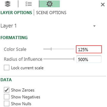
Figure 14-17. The Task Panel Settings view
The map should look like Figure 14-18.
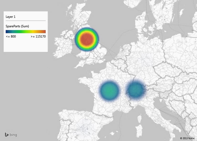
Figure 14-18. A heat map after adjusting some of the available options
![]() Note You can switch to the Settings view from both the Geography and the Metrics panes.
Note You can switch to the Settings view from both the Geography and the Metrics panes.
Now that you have seen the principles, it is probably easiest to outline the options for each map type rather than give examples for each variation on a theme. As there are certain common options, I will begin with those first. Any shared settings are given in Table 14-5.
Table 14-5. Common Map Settings
|
Option |
Explanation |
|---|---|
|
Show Zeroes |
Displays attributes even when the value is zero |
|
Show Negatives |
Displays attributes even when the value is a negative number |
|
Show Nulls |
Displays attributes even when the value is null |
|
Lock Current Scale |
Freezes the current scale |
Bubble maps allow you to tweak the settings outlined in Table 14-6.
Table 14-6. Bubble Map Settings
|
Option |
Explanation |
|---|---|
|
Size |
Sets the size of the bubble or pie. |
|
Color |
For a bubble map without categories or multiple metrics, this option lets you choose the color of each data point. |
|
Thickness |
For a bubble map with categories or multiple metrics, this option gives the pie a slight 3-D effect. |
Column maps allow you to alter the options given in Table 14-7.
Table 14-7. Column Map Settings
|
Option |
Explanation |
|---|---|
|
Height |
Sets the height of the column. |
|
Thickness |
Sets the width of the column. |
|
Color |
Lets you select each metric from the popup list and attribute the color that you choose from the color palette. |
Column Shapes
If you are changing the settings for a Column map, then you may find one specific option useful. This is the choice of the shape of the actual column. So, assuming that you have created a Column map (such as the one in Figure 14-14), here is how you can alter the shape of the columns:
- Click the Shapes button in the Power Map ribbon. The Shapes popup will appear.
- Click on the shape you want to use. The selected shape will be applied to all the columns.
The available shapes are described in Figure 14-19.
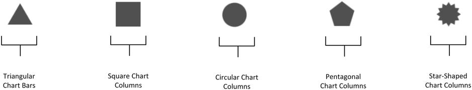
Figure 14-19. Column shapes
![]() Note The Shape settings apply equally well to clustered columns as to stacked columns.
Note The Shape settings apply equally well to clustered columns as to stacked columns.
Region maps allow you to tweak the options shown in Table 14-8.
Table 14-8. Region Map Settings
|
Option |
Explanation |
|---|---|
|
Color |
Lets you choose the color used for the shading. |
Heat Map Settings
Heat maps allow you to adjust the options outlined in Table 14-9.
Table 14-9. Heat Map Settings
|
Option |
Explanation |
|---|---|
|
Color Scale |
This option allows you to adjust the balance (from the center to the periphery) of the color shading. |
|
Radius Of Influence |
Lets you set the size of the heat bubble. |
Power Map Themes
Certain types of data require a different type of geographical presentation. Sometimes you may want a simple political map that shows countries and towns. At other times you may need a satellite image. At still others, you may want to see some physical geography such as forests and rivers in your presentation. This is where Power Map themes come into play. Power Map comes with eight types of map, in both monochrome and color. Some themes contain generic road maps and some contain high fidelity satellite images. The theme that you choose to apply is independent of the way in which data is plotted, so you can consider it as a geographical backdrop, if you prefer. As we saw when creating the bubble map shown in Figure 14-12, applying a theme is as easy as selecting the required theme from the popup that appears when you click the Themes button in the Power Map ribbon. Themes are described in Figure 14-20 and Table 14-10.
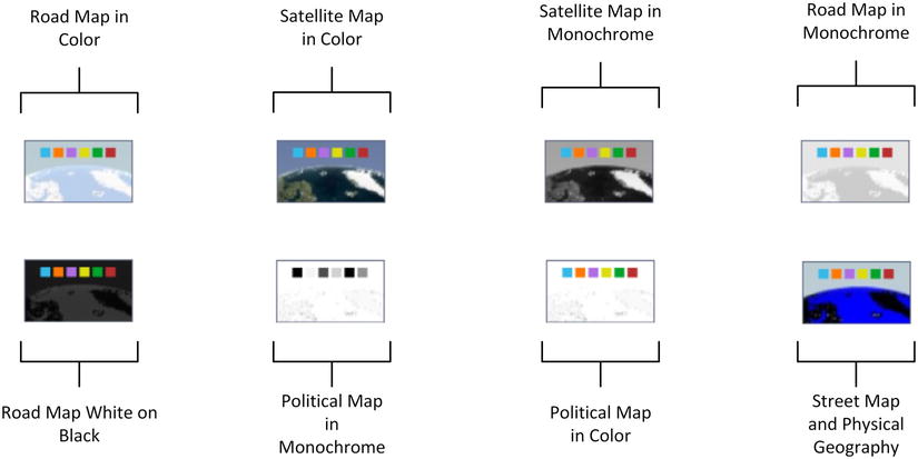
Figure 14-20. Power Map themes
Table 14-10. Power Map Themes explained
|
Theme |
Description |
|---|---|
|
Theme 1 |
Road map in color. |
|
Theme 2 |
Satellite map in color. |
|
Theme 3 |
Satellite map in monochrome. |
|
Theme 4 |
Road map in monochrome. |
|
Theme 5 |
Road map white on Black. |
|
Theme 6 |
Political map in monochrome. |
|
Theme 7 |
Political map in color. |
|
Theme 8 |
Street and physical geography map in color. |
A picture (or even a map) may be worth many words, but on occasion, you still need a few comments to make a point. Consequently (or inevitably) you can add one or more text boxes to your Power Map visualizations to drive home the message. So, let’s suppose you’re the national Sales Manager for the UK and you want to crow about your success. Here is how you might add a text box to Figure 14-14.
- Once you have created the Power Map which displays the data, click the Text Box button in the Power Map ribbon. The Edit Text Box dialog will appear.
- Click inside the TITLE box and enter a title. I will add UK Sales Key To Success! in this example.
- Click inside the DESCRIPTION box and enter a description. I will use More Sales Of More Makes To More Customers! as an example.
- Click inside the TITLE box and select the font, font size, and font attributes that you want to apply. I will choose Tahoma, 20pt, bold.
- Click inside the DESCRIPTION box and select the font, font size, and font attributes that you want to apply. I will choose Andalus, 14, italic. The content preview box will display the text as it will appear. The Edit Text Box dialog should look like Figure 14-21.
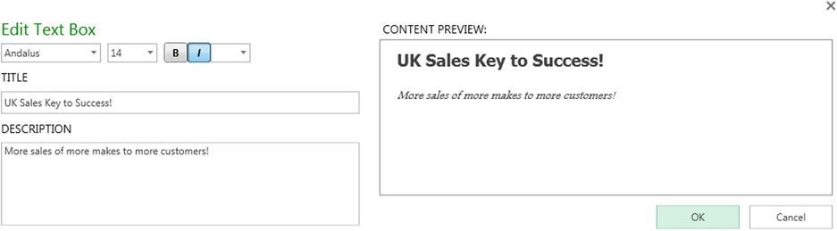
Figure 14-21. The Edit Text Box dialog
- Click OK. The Edit Text Box dialog will close, and the text box will appear on the map.
- Reposition the text box by dragging its title bar (the colored bar that appears when the pointer is placed over the text box).
- Resize the text box by dragging its resize handles (the circles that appear at the top left and bottom right when the pointer is placed over the text box).
- Click on the map to deselect the text box. The text box might look something like Figure 14-22.

Figure 14-22. A text box in Power Map
You can see this text box used in a map in Figure 14-24, a little further on in this chapter. To alter the properties of a text box, all you have to do is right-click on a text box and select Edit from the context menu. The Edit Text Box dialog will be displayed, and you can alter the text of the title and/or the description as well as modify the font attributes.
To remove a text box you can
- Right-click on a text box and select Remove from the context menu.
- Place the cursor over the Text Box so that the title bar and resize handles appear and then click the Close icon in the top right corner of the text box.
The various options available for text boxes are explained in Table 14-11.
Table 14-11. Text Box Options
|
Aggregation |
Description |
|---|---|
|
Font Family |
Lets you choose the font family from those available. |
|
Font Size |
Lets you choose the font size from those available. |
|
Bold |
Makes all the text in the text box appear in boldface. |
|
Italic |
Makes all the text in the text box appear in italics. |
|
Font Color or Shade |
Lets you apply a color or shade of gray (depending on the theme) to the text. |
|
Text |
Enter the text here. |
|
Description |
Add more descriptive text under the text box title. |
|
Bring Forward |
Brings the text box forward relative to other elements in the current layer. |
|
Send Backward |
Sends the text box backward relative to other elements in the current layer. |
|
Bring to Front |
Brings the text box to the top of all other elements in the current layer. |
|
Send to Back |
Sends the text box to the back of all other elements in the current layer. |
Up until now all the metrics that we have seen have been static. They have been a snapshot taken at a specific moment. Power Map, however, can add another dimension to geographic visualization by adding a time element. If the source data contains a time field (or better still, a date table as part of the data model) then you can
- Show the evolution of data over time, both automatically and manually.
- Display the data for a specific date or time in a single click.
This is done by adding a Timeline element to the map that you are creating. Adding a timeline will add a Time decorator, as Power Map calls it, to the visualization. This object allows you to display the exact date and/or time when the data was in a certain state. What is more, you can set the map to display the data changes over a range of dates (or times) that you specify if you want to concentrate on a subset of data. You can also define the playback settings for a timeline to set the duration of the display. This is probably best appreciated through an example, so let’s see first how to add a timeline to a map and then look at some of the cool effects that you can add once you have implemented a timeline.
Adding a Timeline
Rather than add a timeline to an existing map, I prefer to re-create a map so that you can see the whole process. What you do is
- Starting with the PowerMapSample.xlsx file, click Map in the Insert tab to launch Power Map.
- Select the CountryName field from the Countries table.
- Select the Town field from the Clients table.
- Click Next.
- Select CostPrice from the SalesData Table.
- Resize and reposition the legend.
- Select Column as the type from the TYPE popup.
- Add Make to the CATEGORY.
- Click the Stacked Column icon above the CATEGORY box.
- Expand the Date Table, and check the MonthAndYearAbbr field. This will be added to the TIME box in the Task panel. The timeline slider and a Time Decorator will appear on the map.
- Adjust the zoom and panning to get the best effect—focus on the United Kingdom.
- Right-click on the Time Decorator and select Edit. The Edit Time Decorator dialog will appear.
- Select June 2010 (the month and year format) from the Time Format popup. The Edit Time Decorator dialog will look like Figure 14-23.
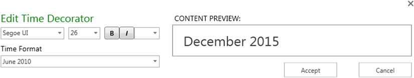
Figure 14-23. The Edit Time Decorator dialog
- Click Accept to close the Edit Time Decorator dialog.
- Add the text box described in the previous section.
- Resize and reposition the Time Decorator just as you learned to do with a Text Box. The map should look something like Figure 14-24.
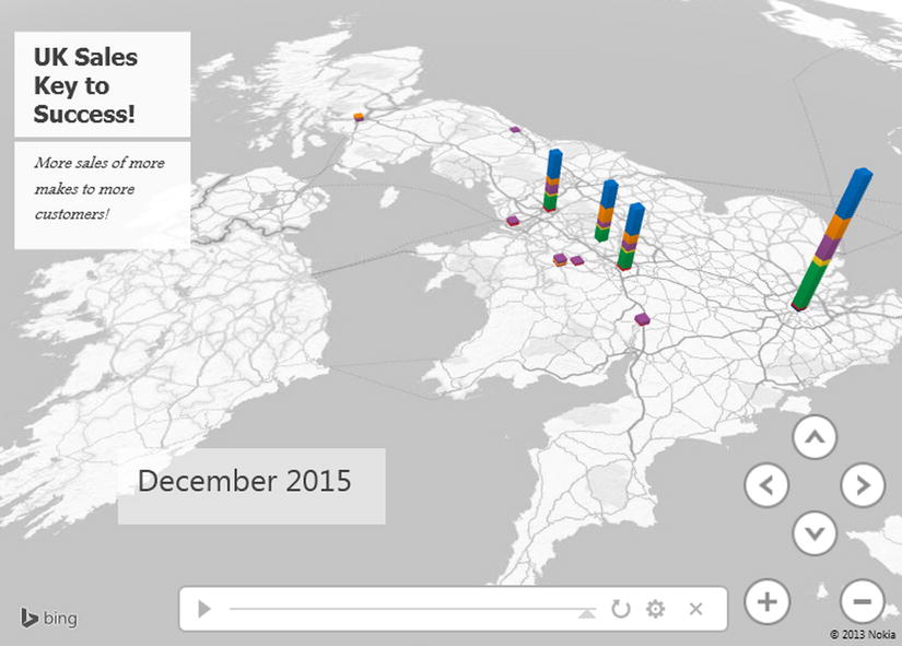
Figure 14-24. A map with a timeline added
And that is it. You have a map that can display the evolution of your data over time. Interestingly, when you add a timeline, the map does not change; this is because a timeline’s default setting is to show the data at the end of the time period. Now, in the next section, we will see how you can use the timeline to enhance your presentation.
![]() Note Modifying the font attributes for a Time Decorator is, to all intents and purposes, identical to tweaking a text box, so I will not repeat the options here, but refer you back to Table 14-9.
Note Modifying the font attributes for a Time Decorator is, to all intents and purposes, identical to tweaking a text box, so I will not repeat the options here, but refer you back to Table 14-9.
Using a Timeline
So, what can we do now that your map has a timeline, and what does it bring to the party? Perhaps the first thing is to understand the timeline itself. Figure 14-25 explains the various parts of a timeline.
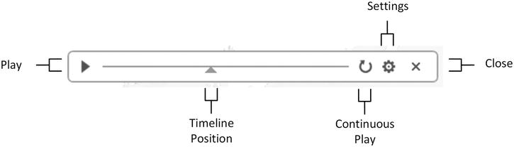
Figure 14-25. Timeline elements
Probably the first thing that you will want to do is see the evolution of your data over time. To do this, click the Play icon in the timeline (the triangle on the left). The data will initially disappear from the map, and then it will reappear, developing progressively over time until the final date is reached. Not only that, but the Time Decorator will scroll through the dates and/or times to show the linear evolution of the data over time.
Pausing the Timeline
When a timeline is playing, the Play icon becomes a Pause icon. Yes, you guessed it, clicking on this will halt the playback so that you can take a closer look at the data.
When a timeline is paused (or even if it is still playing), you can still move around the map as well as zoom and pan. With a little practice, and once you know your data, you can apply these techniques to draw your audience into the heart of what you are communicating.
Selecting Points along the Timeline
Although a timeline is linear, you do not have to apply it in a linear fashion. You can drag the timeline position icon (the triangle under the timeline) to any point along the timeline to show the data at a chosen point in time. As you slide the timeline position icon left and right, the Time Decorator will change to show the exact date and/or time that you have selected.
Figure 14-26 shows you a bird’s eye view of how the timeline used in this example progresses from start to finish.
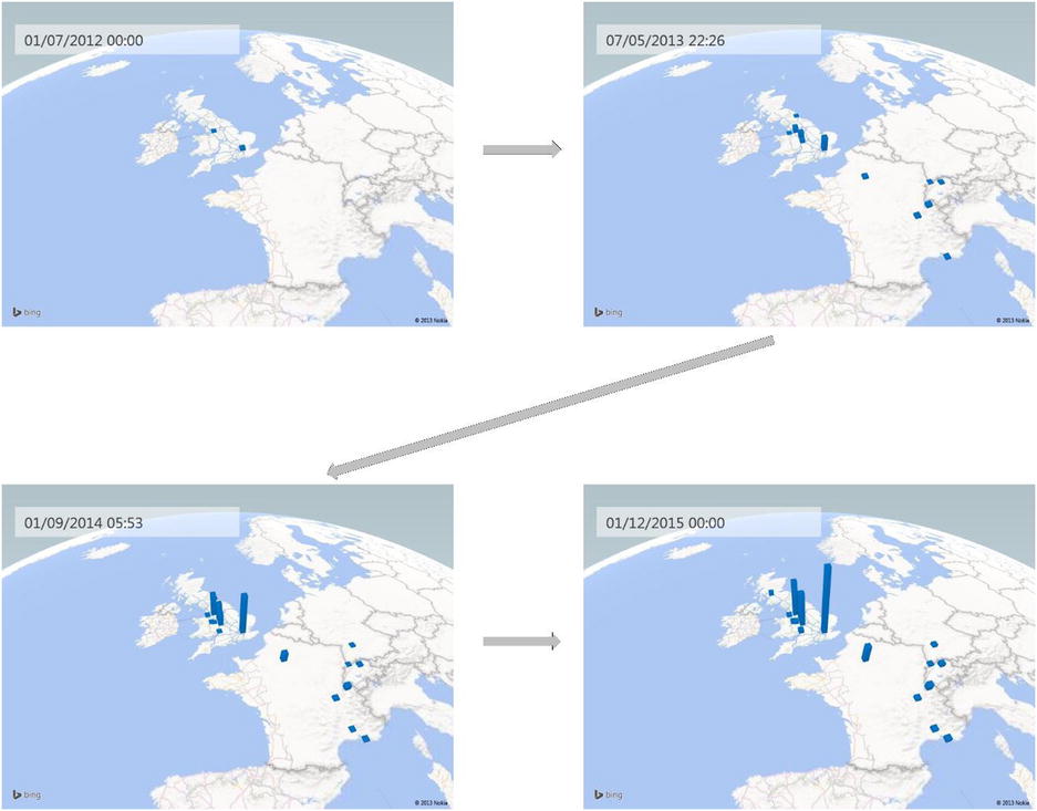
Figure 14-26. Timeline progression
Setting Timeline Duration
I mentioned earlier in passing that you can modify the duration of a timeline. You may find yourself needing to do this since the default is only 6 seconds, which could be much too short in many cases. To do this:
- Click the Settings icon in the timeline (the cog at the right). The Scene Options settings pane of the Task panel will be displayed.
- Enter a scene duration or use the up and down triangles for the Scene Duration box to set a number of seconds for the playback time. I have set 45 seconds in this example, as you can see in Figure 14-27.
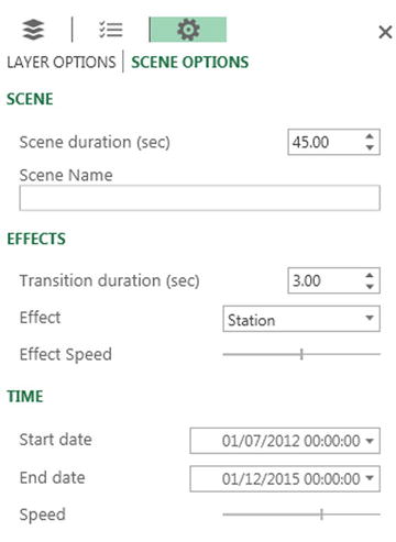
Figure 14-27. Timeline options
That is all that you have to do. When you next play the timeline the display will last for 45 seconds.
![]() Tip If you prefer a more intuitive approach, drag the vertical bar in the Speed section left or right to set the playback speed, which is another way of defining the playback time.
Tip If you prefer a more intuitive approach, drag the vertical bar in the Speed section left or right to set the playback speed, which is another way of defining the playback time.
Hiding the Time Decorator
You can choose one of the following ways to remove a Time Decorator:
- Click the Date And Time button in the Power Map ribbon.
- Right-click on a Time Decorator and select Remove from the context menu.
- Place the cursor over the Time Decorator so that the title bar and resize handles appear; then click the Close icon in the top right corner of the Time Decorator.
Hiding the Timeline
Hiding a timeline is very similar to hiding a Time Decorator. There are two possible techniques:
- Click the Timeline button in the Power Map ribbon.
- Click the Close icon in the right-hand corner of the Timeline.
Setting the Date Range for Playback
A final aspect of a timeline is that it can become a kind of date filter, in that you can set the start and end dates for the display. To do this
- If the Scene Options settings pane of the Task panel is not visible, click the Settings icon in the timeline (the cog at the right).
- Click the popup triangle at the right of the Start Date and select a date.
- Click the popup triangle at the right of the End Date and select a date.
It is really that easy. If you now play back the timeline, you will see that the metrics begin with the Start Date and the timeline progression stops at the End Date.
Date and Time Formats in the Time Decorator
In step 13 of the process where we added a timeline earlier in the chapter, you set a date format to override the default date and time format. Several date and time formats were available. These are explained in Table 14-12.
Table 14-12. Date and Time Formats
|
Description |
Format |
|---|---|
|
Short date and time |
01/04/2015 12:00 |
|
Short date |
01/04/2015 |
|
Long date |
01 April 2015 |
|
Long date and time |
01 12:00 |
|
Long date and time with seconds |
01 April 2015 12:00:10 |
|
Short date and time with seconds |
01 April 2015 12:00:10 |
|
Day and month |
01 April |
|
Short date in ISO format with fractions of a second |
01 April 2015T12:00:10.0000000 |
|
Weekday, short date and time with seconds and time zone reference |
Wed, 01 April 2015 12:00:10 GMT |
|
Short date in ISO format with seconds |
01 April 2015T12:00:10 |
|
Time |
12:00 |
|
Time with seconds |
12:00:10 |
|
Month and year |
April 2015 |
For the remainder of this chapter we will start creating more complex—and I hope more impressive—map-based visualizations. More complex, and consequently more telling, map visualizations use layers in Power Map. Each layer is a separate map that uses different metrics and possibly different geographical elements. However, using multiple layers is merely an extension of the techniques that you have learned so far. As an example, let’s produce a map that uses the following:
- Layer 1—Sales by country
- Layer 2—A heat map of profit per town
- Layer 3—A stacked column of town sales by color
Let’s see this in action. The process is a little long since we are creating three maps in one, but we are essentially revising techniques that we have already used. The result is, I hope you will agree, well worth it:
- Starting with the PowerMapSample.xlsx file, click Map in the Insert tab to launch Power Map.
- Select the CountryName field from the Countries table. Click Next.
- Check the SalePrice field in the SalesData Table.
- Select the Region Map type.
- Place the cursor over the layer name (Layer 1) at the top of the Task panel.
- Click the Rename icon that appears at the right of the layer name (a pencil).
- Enter the name CountrySales and press Enter.
The first layer is now created, and displays sales for each country. The next layer will be a heat map of profit per town.
- Click the Layers icon at the top of the Task panel. The Layers pane is displayed, as shown in Figure 14-28.
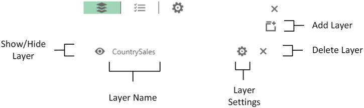
Figure 14-28. The Layers pane of the Task panel
- Click the Add Layer icon.
- Rename the layer ProfitByTown as described in steps 6 and 7.
- Add the Town and CountryName fields, then Click Next.
- Add the GrossProfit field.
- Choose HeatMap as the type.
- Resize and reposition the legend to the left of the map.
The second layer is now created. All that remains is to create a clustered column map of sales by make for the third and final layer and to tweak the presentation.
- Click the Add Layer icon.
- Rename the new layer SalesByMake as described in steps 6 and 7.
- Add the Town and CountryName fields, then Click Next.
- Add the SalePrice and Make fields.
- Choose Column as the type and ensure that the clustered column icon is selected.
- Resize and reposition the legend to the left of the map under the existing legend.
- Zoom, pan, and swivel the map to display the data to best effect.
Now we need to adjust a couple of settings to enhance the readability of the map.
- Click the Settings icon in the Task panel and tweak the height and thickness of the column.
- Click on the popup icon (the downward-facing triangle) to the right of the layer name and select the layer ProfitByTown.
- Tweak the Color Scale and Radius Of Influence settings to make the profit more visible.
That is it. The multilayered map should look something like Figure 14-29.
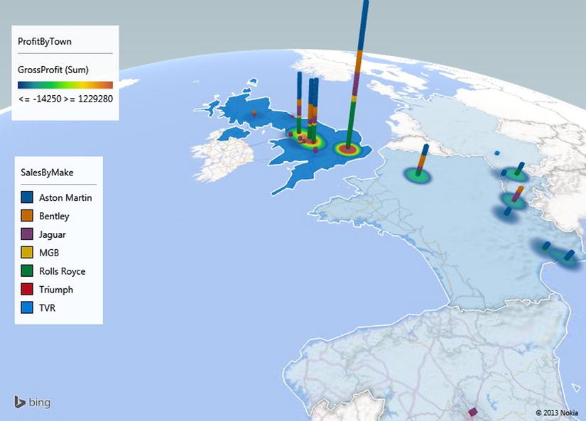
Figure 14-29. A multilayered map
As you have seen, each layer is quite simply a standard Power Map just like all those that you have developed thus far. The trick is to add further maps (in practice they will nearly always be of different types) to get the desired effect.
![]() Note When creating layered maps, I find that it really helps to have an idea of what I want initially. However nothing will stop you from creating different layers and experimenting as you go.
Note When creating layered maps, I find that it really helps to have an idea of what I want initially. However nothing will stop you from creating different layers and experimenting as you go.
I just have a few final comments to make about using layers.
- You can hide, or display, an existing layer by clicking the Show/Hide Layer icon in the Layers pane of the Task panel.
- To delete a layer, simply click the Delete icon in the Layers pane of the Task panel. Power Map will show an alert that warns you that this operation cannot be undone.
- You can also display the settings for a layer from the Layers pane of the Task panel by clicking the Settings icon for the relevant layer.
![]() Tip You can adjust the map presentation by zooming and panning at any time. However, Power Map will always create a new layer from a global map, so I find it easier to adjust the map display right at the end of the process, once and for all.
Tip You can adjust the map presentation by zooming and panning at any time. However, Power Map will always create a new layer from a global map, so I find it easier to adjust the map display right at the end of the process, once and for all.
In some cases you may want to enhance a purely geographical representation of data with a more classic visualization. Power Map can let you do this, without distracting from its core aim, by letting you add a two-dimensional chart to a map. This chart will apply to an existing layer of that map and will use the data that the selected layer already represents on the map.
As an example, when shading is used, such as in the case of Region maps, I find that a chart can give a more accurate grasp of the underlying figures. So, let’s see how to add a 2-D chart to a map that contains two layers:
- A Region map of sales by country
- A Stacked Bar map of sales by town and make
Here is the way to go about creating such a visualization:
- Follow steps 1-8 and 15-22 from the procedure in the “Using Layers” section to create a two-layer map of
- sales by country
- sales by town and make
- Select the SalesByCountry layer.
- Click the 2-D Chart button in the Power Map ribbon. A chart will be added.
- Select the Horizontal chart type from the popup list of available chart types at the right of the chart name.
- Resize the chart and position it so that the country data is not obscured.
The map should now look like Figure 14-30.
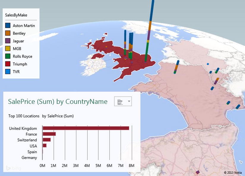
Figure 14-30. A map with a 2-D chart superimposed
2-D Chart Types
There are only four available 2-D charts:
- Column charts
- Stacked column charts
- Bar charts
- Stacked bar charts
As these chart types are identical to the Power View charts described in Chapter 4, I will not describe them again here.
If you really do not want the data to appear in the map at all, but you do want it to show in a chart, then there is a trick that will allow this. It is a fudge, I admit, but a useful one!
- Create the map shown in Figure 14-30.
- Select the SalesByMake layer, and click the Settings icon.
- Click the Color popup for the CostPrice (Sum) field.
- Click More Colors. The Color palette will appear.
- Select a light shade of gray.
- Click OK. This shade will appear in both the chart and as the shading for the countries on the map. The result should look like Figure 14-31.
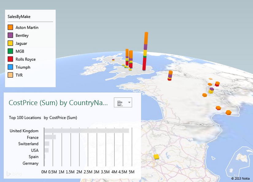
Figure 14-31. Hiding map data
The trick here is to find a shade (it need not be gray) that will scarcely show a difference on the map but will be visible in the 2-D chart.
Power Map Tours
Up until now we have treated each map that we have created as a completely separate entity. Indeed, we have acted as if an Excel workbook could only contain a single map, even if it was composed of multiple layers. Nothing could be further from the truth, because you can add as many separate maps to an Excel workbook as you like. However, you will not see separate worksheets as you did when using Power View; Excel handles maps in a slightly different way. Each map is called a tour, and you can choose which map (or tour) you wish to use when you launch Power Map.
Creating Power Map Tours
To see this in action, we will create (or re-create) a couple of independent maps in a single Excel workbook and see how to manage these elements:
- Starting with the sample file PowerMapSample.xlsx, create the map you first made for Figure 14-3 at the start of this chapter.
- Assuming that the Tour Editor is visible on the left (and if it is not, click the Tour Editor button in the Power Map ribbon to display it), click inside the TOUR NAME box and enter a name. I suggest SalesByRegion.
- Click on FILE
 Close to close Power Map.
 - From inside Excel, click Map in the Insert ribbon. The Launch Power Map dialog will be displayed, as shown in Figure 14-32.
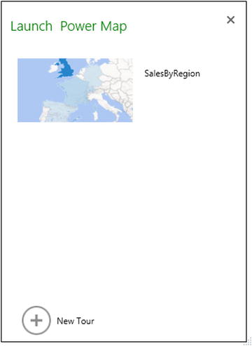
Figure 14-32. The Launch Power Map dialog
- Click the New Tour icon (the plus sign in a circle). A new, blank map will be created.
- Create the map shown in Figure 14-10.
- Name this tour GrossProfit.
- Click on FILE Close to close Power Map.
That is it. You now have two separate maps inside the Excel workbook. Whenever you click the Map button in the Excel Insert ribbon, you will see the existing tours. You can launch a tour directly simply by clicking on the preview of the tour which is visible in the Launch Power Map dialog.
Sometimes you will want to delete a tour. This is how to do so:
- From inside Excel, click Map in the Insert ribbon; the Launch Power Map dialog will be displayed.
- Hover the pointer over one of the tours. An X will appear to the upper right of the map image, as shown in Figure 14-33.
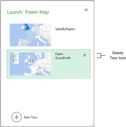
Figure 14-33. Deleting a tour
- Click on the X. Excel will display a confirmation dialog as in Figure 14-34.
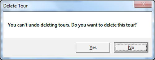
Figure 14-34. Confirm tour deletion
- Click OK. The tour will be deleted.
A final, but extremely impressive, Power Map function is the way that you can create and replay “movies” of geographical data. This technique can extend maps (with or without layers and timelines) to create a sequence of views of the data that can be played back either from within Power Map, or as separate multimedia files. A multimedia file created by Power Map does not even need Excel to work.
A Power Map movie is a Power Map tour that can contain several scenes. Each scene is a copy of an existing scene that is then modified to display a different visualization. You can also add transition effects so that each scene flows into the following scene. As always, this is best visualized by using an example. Let’s imagine that you want to begin with an initial map of European sales and then take a closer look at UK sales. Our example Power Map movie will only have two scenes, whereas in reality, you can create much more complex scenarios. Here is how to do it:
- Create a map of Country Sales as you did at the start of this chapter (you can see this in Figure 14-3).
- Set the map type to Flat Map in the Power Map ribbon.
- Add a timeline using the MonthAndYear field from the Date table and tweak the Time Decorator for best effect.
- Click the Settings icon in the Task panel and select Scene Options.
- Enter a scene name in the Scene Name box and press Enter. I suggest European Sales as the name.
- In the Scene Duration (sec) box, set the duration to 10.
- Set the Effect to Circle from the effects popup list.
You have finished the first scene. Now we will add a second scene.
- In the Power Map ribbon, click Add Scene. A second scene thumbnail will appear in the Tour Editor on the left. This scene will be a copy of the initial scene (or the selected scene if there are already several scenes in the movie).
- Ensure that the second scene is selected, and rename it UK Sales by Make.
- Set the scene duration to 30 seconds.
- Remove the MonthAndYear field from the data to delete the timeline.
- Add the Town field to the geographical data.
- Add the Make field to the metric data.
- Zoom in on the UK only.
- Remove the legend.
- Click the Settings icon in the Task panel and select Scene Options.
- Set the duration to 20 seconds.
- Set the effect to Push In.
- Set the map type to Curved (Not Flat) Map.
- Click Play Tour in the Power Map ribbon.
Power Map will play the two scenes and run one into the other. It will play the timeline from the first scene and then remove the legend and timeline as well as change the map type and the data displayed to show the second scene.
This movie was only a tiny sample of what you can do with Power Map to create fluid and extremely impressive automated visualizations. You can create movies containing as many scenes as you want. Set the following for each one:
- A duration in seconds
- A transition effect
- The map type and data
- A timeline
- Multiple map layers
As always, it is your data and the points that you want to emphasize that will make or break a good Power Map movie. Just remember that less is frequently more when creating effects, and that you can add and remove legends and text boxes to each separate scene if you want to clarify certain aspects of the data. You can even use text boxes to create your very own silent movie.
You can pause a movie at any time by clicking the Pause icon that appears in the status bar at the bottom of a movie. Clicking this icon again (it will have become a Play icon) will continue with the playback. You can jump from scene to scene by clicking the Next and Previous icons in the movie status bar. Pressing the Esc key will cancel a movie and return you to Power Map.
When creating this example, you tried out a couple of transitions. A transition is always the visual effect that introduces a scene—and that will link a scene to its predecessor. The available transitions are explained in Table 14-13. You can alter the speed of a transition using the Effect Speed slider.
Table 14-13. Transition Options
|
Aggregation |
Description |
|---|---|
|
Circle |
The map will pivot around a central axis for the duration of the scene. |
|
Dolly |
The map will move to the center of the frame. |
|
Figure 8 |
The map will move its central point around an imaginary horizontal figure eight, as if tracing an infinity symbol. |
|
Fly Over |
The map will move from top to bottom as if a camera were flying over the map. |
|
Push In |
The map will zoom in progressively. |
|
Station |
The map will not move. |
Exporting a Movie
Once you have created and perfected a movie, you are not limited to using Power Map to display your artwork. You can export a Power Map movie as a Windows multimedia file (in MP4 format) so that it can be played back without a user needing Excel 2013 or Office 356. To create a movie file:
- Create a movie as described earlier.
- Click Create Video from the Power Map toolbar. The Create Video dialog will be displayed, as shown in Figure 14-35.
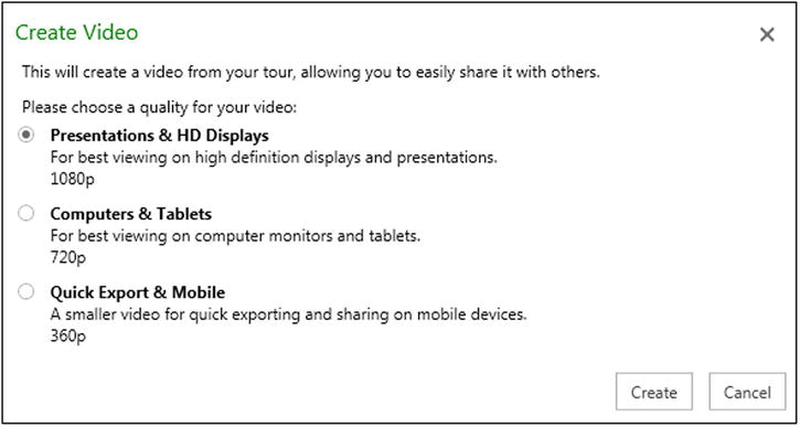
Figure 14-35. The Create Video dialog
- Select the appropriate resolution as a function of the output device that you expect to be used.
- Click Create. The Save Movie dialog will appear.
- Enter a file name, select a destination directory, and click Save.
- The Creating Video message box will appear as in Figure 14-36.
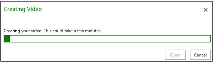
Figure 14-36. Exporting a Power Map movie
- Click Close.
You can now open the Power Map movie file in a multimedia player—or you can double-click on it in Windows Explorer to play back the movie. A version of the movie described here can be found at C:HighImpactDataVisualizationWithPowerBISampleMovie.Mp4, assuming that you have downloaded the sample files from the Apress web site.
Conclusion
This, then, is Power Map. You can now push the creation of geospatial data representation to places that previously you could not achieve without using specialized software. Now, with just Excel, you can achieve some stunning effects and data displays. In this chapter you saw how to create maps, alter map types, and even add multiple varieties of maps and overlay them to produce succinct and clear insight into your data. Finally, you saw how to merge distinct visualizations into a movie that you can export as a file and send to colleagues.
Now all that remains is to pull the pieces together and see how to share your insights and presentations with colleagues in a single place—the cloud. This will be the subject of the next chapter.