
![]()
Interactive Data Selection
In Chapter 3 we saw how to define filters both for Power View reports and for specific visualizations in a report. Filtering data in this way is extremely powerful and is perfectly suited to tweaking your analysis and trying out differing scenarios. However, altering filter elements is not really suitable for the interactive presentations to which Power View lends itself so ideally. When facing your audience you need to be able to deliver your insights in a single click. It probably comes as no surprise to discover that making dynamic selections in a report is part of the DNA of Power View. Learning these approaches is the subject of this chapter.
The other techniques that you can apply above and beyond filters in Power View reports to subset or isolate data have the following characteristics. They are
- Always visible in the Power View report
- Instantly accessible
- Interactive
- Clearly indicate which selections are being applied
So what are the effects that you can add to a Power View report to select and project your data? Essentially they boil down to three main approaches
These interactive elements can be considered to function as a supplementary level of filtering. That is, they take the current filters that are set in the Filter pane (both at report-level and those tailored to a specific visualization) and then provide further fine-grained selection on top of the data set that has been allowed through the existing filters. Each approach has its advantages and limitations, but used appropriately, each gives you the ability not only to discover the essence of your data, but also to make your point clearly and effectively.
We will see how these three approaches work in detail in the rest of this chapter. In any case—and as is so often the case with Power View—it is easier to grasp these ideas by seeing them in practice than by talking about them, so let’s see how tiles, slicers, and highlighting work. This chapter will follow the trend of all the Power View chapters in this book and use the sample file CarSales.xlsx from the folder C:HighImpactDataVisualizationWithPowerBI.
So far we have seen how one or more filters will let you exclude data from an entire Power View report as you make your point about the insights that you have unearthed. Sometimes, however, you may need to provide interactive filtering on the data in a specific visualization (whether it is a table or a chart) without affecting all the other visualizations in a report. This is where tiles come in.
A tile is a filter that applies only to a selected visualization. In fact, tiles are “containers” for the visualization. Not only that, but tiles look really cool and can help you review a set of data, item by item, which can make anomalies and essentials stand out in a clear and telling fashion. There are four main ways to add tiles to a visualization, so I will explain all four; then you can decide which you prefer.
Creating a Tiled Visualization from Scratch
When you want to create a visualization, which exists, so far, only in your mind’s eye, I suggest that you first try and imagine all aspects of the visualization except the tile elements, and build the “core” visualization. Then all you have to do is add the tiles to enable interactive data visualization. As a starting point you could try the following:
- Create a table or chart that displays all the fields that you want to display in your Power View report. In this example, I suggest adding Year and MonthFull from the YearHierarchy in the Date Table, and the fields SalePrice and CostPrice from the SalesData table.
- Drag the ClientName field from the Clients table into the TILE BY box in the Layout section of the Fields List.
That is it; you have a tiled visualization as shown in Figure 6-1.
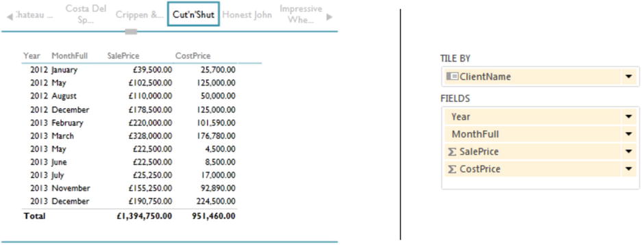
Figure 6-1. Tiles applied to a table
Clicking on any tile will filter the visualization to display only data for the selected tile. I suggest that you try clicking on a few of the client names in the tiles to appreciate just how fast Power View displays only the figures for the selected client. For the moment, admittedly, the tiled visualization may look a little cramped, but you will see how to adjust that in the next section.
![]() Tip When you hover the mouse pointer over the scroll triangle at the left or right of the tile display, it will indicate exactly how many tiles there are and how many are displayed. You may see (2 – 6 / 6) for instance; this tells you that there are six tiles in all, and that you can currently see the second to the sixth.
Tip When you hover the mouse pointer over the scroll triangle at the left or right of the tile display, it will indicate exactly how many tiles there are and how many are displayed. You may see (2 – 6 / 6) for instance; this tells you that there are six tiles in all, and that you can currently see the second to the sixth.
When you add tiles to a visualization, you may not always achieve a perfect display of the data instantly. So be prepared to
- Adjust the dimensions and proportion of the “outer” tile container.
- Adjust the dimensions and proportion of the “inner” visualization.
This is as simple as dragging the handles at the corners or in the middle of the sides of, respectively,
- The outer tile container
- The inner visualization
These elements are outlined in Figure 6-2. As you can see, each has corner and lateral handles and can be resized, and moved, independently.
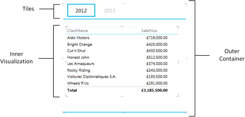
Figure 6-2. A tiled visualization—container and inner visualization
When resizing these visualizations, you will soon notice that it is impossible to make the inner visualization larger than the tile container, so you will always have to resize the tile container first. Then you can adjust the inner visualization as a function of its container. Just to make the point, the inner visualization is a standard Power View visualization, and can be fine-tuned using all the techniques that you would use to modify a table or chart that was not part of a tile view.
Some Variations on Ways of Creating Tiled Visualizations
You just saw one way of creating tiled visualizations. There are, however, several other ways of achieving this objective. Indeed, you have quite a variety of choices. In any case, here are some of the other techniques that you could use, if you so choose.
Creating a Tiled Visualization from Scratch—Another Variant
An alternative to the technique we just discussed is to create a visualization, probably as a simple table, that also contains the field that will be used for the tiles. Providing that the field destined to become the tiles is the first field in the Field List, you can create a tiled visualization with a single click. Assuming, then, that you have created a table with the following fields in this order
- The ClientName field from the Clients table
- The YearHierarchy from the Date Table
- The SalePrice field from the SalesData table
all you have to do is
- Click on the Tile button in the Power View Design ribbon.
This approach will take the first field in the visualization as the tile element and give you a “tiled” visualization using the ClientName field as the basis for the tiles. However, unfortunately, Power View will leave this field in the visualization as well, which makes it redundant in most cases. So, presuming that you do not want to display this information twice,
- Click on the popup menu for the first field in the FIELDS box in the Fields List Layout section (ClientName in this example).
- Select Remove Field.
The field will be removed from the visualization but remain in the tiles above the visualization.
Adding Tiles to an Existing Visualization
If you have created a visualization already, and all that you want to do is add a layer of interactive filtering specific to this visualization, all you have to do is drag the field that will be used for the tiles into the TILE BY box in the Layout (upper) section of the Field List. To see this, let’s extend the use of tiles to charts. Here, we will revise the process of creating a chart and then extend it by adding tiles.
- Create a table using the fields Colour (from the Colours table) and GrossMargin (from the SalesData table).
- Convert this table to a Clustered Bar chart.
- Add the CarAgeBucket field to the TILE BY box in the Design (lower) area of the Field List.
- Resize the chart. This could involve adjusting the size of both the inner chart itself and the outer container that displays the tiles as was explained previously.
The chart will look something like the one in Figure 6-3. If you prefer, an alternative to dragging a field to the TILE BY box is to select the chart, then click on the popup menu for the field that you want to tile by in the Field List, and select Add As Tile By.
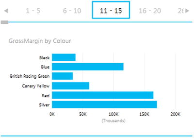
Figure 6-3. Adding tiles to a bar chart
Adding Tiles to an Existing Visualization—Another Variant
If you have created a visualization already that contains the fields that you wish to use for the tiles, then you can
- Drag the field that will be used for the tiles from the ROWS (or possibly COLUMNS) box into the TILE BY box in the Layout section of the Field List.
Once again you have created a tiled visualization, but without the duplicate data this time.
Modifying an Existing Visualization Inside a Tile Container
Once you have added tiles to a visualization, you can alter the inner visualization in any of the ways that you learned in previous chapters. Put simply, you can
- Add and remove data fields
- Switch from table to chart and vice versa
- Change table types from table to matrix to card
- Alter the chart types
- Switch between card styles
All this only goes to show that a tiled visualization is only a standard visualization wrapped inside a selection container.
Re-creating a Visualization Using Existing Tiles
Once you have built a tile-based visualization, you may decide that the tiles are perfect but that the “inner” visualization needs a total revamp. After reaching this conclusion, you may even decide that a complete rebuild of the “inner” visualization is necessary because simply adding or removing a field and altering the visualization type is harder than starting over.
So, to delete and re-create the visualization inside a tile container, simply
- Click on or inside the inner visualization (the chart or table).
- Press the Delete key. You will be left with a disconcertingly empty outer tile container, as seen in Figure 6-4.
Figure 6-4. The outer tile container
- Drag the fields that you want to use as the basis for the new tiled visualization inside the existing tile container.
- Modify the style of visualization as described in previous chapters.
This way you can fill the container with a new visualization.
![]() Tip What is important to remember is that the outer container remains completely independent of the inner visualization. Consequently, you can tweak, or change completely, the inner visualization without altering the outer container.
Tip What is important to remember is that the outer container remains completely independent of the inner visualization. Consequently, you can tweak, or change completely, the inner visualization without altering the outer container.
Re-creating a Visualization Using Existing Tiles—A Simple Variant
Another way to re-create a visualization inside an existing tile container is as follows:
- Ensure that the Tile visualization remains selected.
- Drag the fields on which you want to base your visualization into the FIELDS box in the Design area of the Field List on the right.
- Modify the style of visualization as described in previous chapters.
You will notice that, in the Design area of the Field List on the right, the TILE BY box has remained populated with the choice of tile field. Consequently you do not need to modify this—unless, of course, you decide to alter the field that supplies the data to the tiles themselves.
Removing Tiles from a Visualization
Tiles do not always suit every type for visualization, or indeed every data set. So you may well end up deciding that the tiles that you have applied to a table or chart are just not appropriate and need to be removed, but you want to leave the rest of the visualization in place. To do this
- Select the tile-based visualization from which you want to remove the tiles.
- Display the Field List, unless it is already visible.
- Drag the field currently in the TILE BY box of the Field List Design area out of the Design area and back into the Field List. A cross on the field that you are dragging away will indicate that this tile field is the one that will be deleted.
Once the field used to add the tiles has been removed from the TILE BY box in the Design area, then the tiles will also be removed from the visualization. Remember that if you have made a mistake, a quick Ctrl-Z will restore the tiles to their former glory.
If you attempt to delete tiles by dragging the Tile By field anywhere other than back into the Field area (the upper part of the Field List), then a warning icon, as shown in Figure 6-5, will appear to alert you to the fact that the field cannot be dragged anywhere but to specific areas.
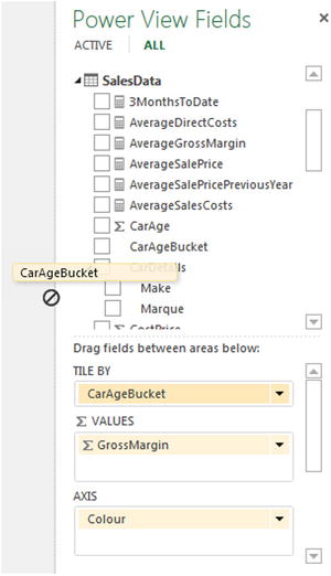
Figure 6-5. The warning icon that appears when you attempt to remove a Tile By field
As an alternative solution, you can click on the popup triangle to the right of the field in the Field List that is used to tile by and select Delete Field. This, too, will remove the tiles from the visualization.
Despite your efforts, it may simply turn out that tiles are not suited to the kind of data, analysis, or presentation that you are making. So you may need to remove a tiled visualization completely (that is both the container and its content):
- Click inside the tiled visualization but outside the inner table or chart (or whatever the visualization is).
- Press the Delete key.
The tile-based visualization will disappear in its entirety—though, of course, a rapid click on Undo in the Power View ribbon (or Control-Z) will restore it instantly.
When you first add tiles to a visualization, the default is to apply a set of tiles above the inner visualization. Power View calls this the Tab Strip tile type. However, there is a second tile type available—Tile Flow. To switch between the two types of tile
- Ensure that a tiled visualization is selected.
- In the Design ribbon, click the Tile Type button and select Tile Flow.
To switch back to the Tab Strip tile type
- Ensure that a tiled visualization is selected.
- In the Design ribbon, click the Tile Type button and select Tab Strip.
The differences between the two types of tile are purely visual, and are described in Table 6-1. An example of a Tile Flow is given in Figure 6-6.
Table 6-1. Tile Types
|
Tile Type |
Position |
Comments |
|---|---|---|
|
Tab Strip |
Top of visualization |
Displays a set of identically sized tiles above the visualization |
|
Tile Flow |
Bottom of visualization |
Displays a carousel of tiles beneath the visualization |
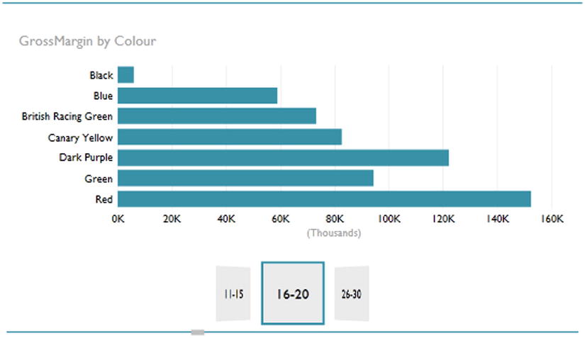
Figure 6-6. Tiles once a filter has been applied
Given that tiles are a selection tool, all you have to do to apply filtering based on a tile is to click on the relevant tile. This tile will then be displayed in boldface, and the data visible in the inner visualization will be filtered so that only data for the selected tile will be displayed.
Unless all the elements in a set of tiles can be displayed at once, you will have to scroll through the tile set. Whatever the tile type (Tab Strip or Tile Flow), you will see a scroll bar at the bottom of the tile set. Sliding this left or right will scroll through the tile set.
A Tab Strip tile set also has scroll icons at the right and left of the tiles. Clicking on these will cause the tile set to scroll in the direction of the scroll icon. You will notice that Power View does not jump from tile to tile, but moves fluidly through the tile set. A Tile Flow tile set, however, does not have scroll icons at the right and left of the tiles. Clicking on any tile will cause that tile to move to the center of the tile set.
![]() Note You cannot select multiple tiles simultaneously, no matter what type of tile you are using.
Note You cannot select multiple tiles simultaneously, no matter what type of tile you are using.
A tiled visualization is essentially just another visualization. Consequently, it too can have a visualization-level filter applied. For instance, suppose that you want to reuse the initial tiled chart from Figure 6-3, earlier in this chapter, but you only want to display some of the car age ranges. Here is how this can be done.
- Click inside the inner (chart) visualization—anywhere except on a bar in the chart.
- Click Chart in the Filters pane.
- In the Design ribbon, click the Tile Type button and select Tile Flow (unless you have already done this).
- Expand the filter CarAgeBucket.
- Select the following elements:
- 11-15
- 16-20
- 26-30
You will see that the tiles also only display the elements that you selected. In most cases this means a reduced number of tiles in the tile set. For this to work, by the way, the option Show Items With No Data described in the following section must not be activated. The result of this process is shown in Figure 6-6.
One point of note is that a tile set will, by default, not contain any elements for which there is no data available. At times you may want tiles to be displayed, even if they have no relevant data, possibly to make the point that nothing was sold. If this is your wish, then you can try out the following example:
- Create a new Power View report.
- Add the following fields:
- ClientName from the Clients table
- SalePrice from the SalesData table
- The Year field from the Date Table
- Drag the Year field from the FIELDS box to the TILE BY box.
- In the Layout section of the Field List, click on the popup option for the Year field in the TILE BY box.
- Select Show Items With No Data.
This will cause the tiles to contain every element to be displayed from the field that you are using to tile by—even if there is no data for this selection. Initially, when you created this visualization, you did not see a tile for 2014. Once Show Items With No Data was selected, the year 2014 appeared in the tiles. The before and after effects of this choice are shown in Figure 6-7.
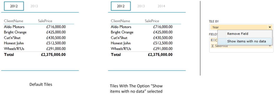
Figure 6-7. The effects of selecting Show items with No Data
![]() Note Remember that the items in the tiles are filtered by any view filters, Table, Matrix, or Chart filters, and Slicers, which are active in the report. So if you modify any of these, you could see the items making up the tiles change dramatically. Indeed, you could remove all the existing tile elements and replace them with a completely different set, if the filters and slicer(s) that you have applied exclude the existing tile items. If this happens (and there are no common tile items shared between the filters that you switch from and the new filters that you apply), then Power View will default to selecting the first tile in the set.
Note Remember that the items in the tiles are filtered by any view filters, Table, Matrix, or Chart filters, and Slicers, which are active in the report. So if you modify any of these, you could see the items making up the tiles change dramatically. Indeed, you could remove all the existing tile elements and replace them with a completely different set, if the filters and slicer(s) that you have applied exclude the existing tile items. If this happens (and there are no common tile items shared between the filters that you switch from and the new filters that you apply), then Power View will default to selecting the first tile in the set.
Changing the Inner Visualization
You can change the visualization that is inside a tile container at any time, just as you would change it if it were a stand-alone visualization. For instance, to switch the chart from a bar chart to a pie chart (using the example that you saw earlier in Figure 6-5), all you have to do is
- Click on the inner chart visualization.
- Click Other Chart, then Pie in the Design ribbon.
As you can see from Figure 6-8, only the chart type has altered and the tiles have remained unchanged. So you can flip between chart and table visualizations and switch chart types independently of the tiles in place.
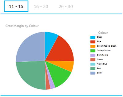
Figure 6-8. Pie chart using tiles
Tiles can be added to any chart as they can to any table. The only restriction is that tiles cannot be added to charts if the chart has horizontal or vertical multiples. You will have to decide which of the two approaches you prefer to use.
Tiles can be a perfect use for images. This, along with other uses for images, is described in Chapter 7.
![]() Tip As a final comment on tiles in Power View, it is interesting to remark that tiled visualizations cannot be popped out, that is, expanded to allow for a more detailed view.
Tip As a final comment on tiles in Power View, it is interesting to remark that tiled visualizations cannot be popped out, that is, expanded to allow for a more detailed view.
Another form of interactive filter is the slicer. This is, to all intents and purposes, a standard multiselect filter, where you can choose one or more elements to filter data in a report. The essential difference is that a slicer remains visible on the Power View report, whereas a filter is normally hidden. So this is an overt rather than a hidden approach to data selection. Moreover, you can add multiple different slicers to a Power View report and consequently slice and dice the data instantaneously and interactively using multiple criteria. Slicers can be text-based, or indeed, they can be simple charts, as you will soon see.
To appreciate all that slicers can do, we need to see one in action. To add a slicer
- From the Power View Fields pane (which you need to display if it is hidden), drag the field name that you want to use as a slicer to an empty part of the report. In this example I am using the CarAgeBucket field from the SalesData table. Power View creates a single column table.
- Click the Slicer button in the Design ribbon. The table becomes a slicer.
- Adjust the size of the slicer to suit your requirements using the corner or lateral handles. Power View will add a vertical scroll bar to indicate that there are further elements available, or a horizontal scroll bar if the text is truncated.
You can recognize a slicer by the small squares to the left of each element in the list. This way you know that it is not just a single-column table. Figure 6-9 shows a slicer using the CarAgeBucket field from the SalesData table.
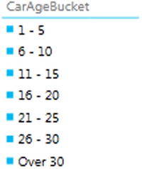
Figure 6-9. A slicer
![]() Note If the Slicer icon is greyed out, then check that the table that you are trying to convert to a slicer only has one column (that is, one field in the FIELDS box of the Layout area of the Field List).
Note If the Slicer icon is greyed out, then check that the table that you are trying to convert to a slicer only has one column (that is, one field in the FIELDS box of the Layout area of the Field List).
You can create multiple slicers for each view. All you have to do is repeat steps 1 through 3 for adding a slicer using a different field as the data for the new slicer.
When you start applying slicers to your Power View reports you will rapidly notice one important aspect of the Power View filter hierarchy. A slicer can only display data that is not specifically excluded by a view-level filter. For instance, if you add a Color filter at view level, and select only certain colors in this filter, you will only be able to create a slicer that also displays this subset of colors. The slicer is, in fact, dynamic, and will reflect the elements selected in a view-level filter. Consequently adding or removing elements in a filter will cause these elements to appear (or disappear) in a slicer that is based on the same field.
![]() Note You cannot, however, apply a filter specifically to a slicer. You can see this if you click on a slicer and then look at the Filters Area. There is no visualization-level filter available (you cannot see Table, Chart, Matrix, or Slicer to the right of the word Filter at the top of the Filter pane). In addition, if you applied a table-level filter to a single column table before you converted it to a slicer, the filter would be removed, and all the field elements would be displayed in the slicer, including those previously removed by the table-level filter.
Note You cannot, however, apply a filter specifically to a slicer. You can see this if you click on a slicer and then look at the Filters Area. There is no visualization-level filter available (you cannot see Table, Chart, Matrix, or Slicer to the right of the word Filter at the top of the Filter pane). In addition, if you applied a table-level filter to a single column table before you converted it to a slicer, the filter would be removed, and all the field elements would be displayed in the slicer, including those previously removed by the table-level filter.
To apply a slicer and use it to filter data in a view
- Click on a single element in the slicer, or Shift-click (or Ctrl-click) on multiple elements.
All the objects in a Power View report will be filtered to reflect the currently selected slicer list. In addition, each element in the slicer list that is active (and consequently used to filter data by that element) now has a small rectangle to its left, indicating that this element is selected. The color of this rectangle is dictated by the Power View theme that is applied, but this is described in more detail in Chapter 7.
Figure 6-10 shows what happens when the slicer defined for Figure 6-8 is applied to the tiled visualization shown in Figure 6-7.
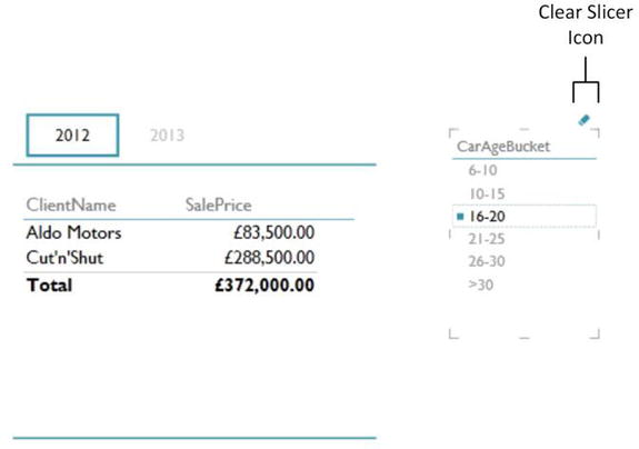
Figure 6-10. Applying a slicer
When you apply a slicer, think filter. That is, if you select a couple of elements from a slicer based on the CountryName field, as well as three elements based on the Color fields, you are forcing the two slicers (filters) to limit all the data displayed in the view to two countries that have any of the three colors that you selected. The core difference between a slicer and a filter is that a slicer is always visible—and that you have to select or unselect elements, not ranges of values.
If you experiment, you will also see that you cannot create a slicer from numeric fields in the source data. A slicer has to be based on a text field. If you need slicers based on ranges of data, then you will need to prepare these ranges in the data model. The CarAgeBucket field is an example of this, and Chapter 7 explains how to add these sorts of fields to a data model.
![]() Tip You can (if you Shift-click or Ctrl-click on all the elements in a slicer) unselect all the data it represents. This will not, however, clear the Power View report. Unselecting everything is the same as selecting everything—despite the fact that the selection squares are no longer visible to the left of each element in the slicer.
Tip You can (if you Shift-click or Ctrl-click on all the elements in a slicer) unselect all the data it represents. This will not, however, clear the Power View report. Unselecting everything is the same as selecting everything—despite the fact that the selection squares are no longer visible to the left of each element in the slicer.
To clear a slicer and stop filtering on the selected data elements in a view
- Click the Clear Filter icon at the top right of the slicer. This icon is pointed out earlier in Figure 6-10.
Any filters applied by the slicer to the view are now removed. You will see that each element in the slicer list now has a small rectangle to its left, indicating that this element is not selected. As this is the same thing as saying that all of the elements are selected, no data is filtered out of the report.
![]() Tip Another technique to clear a slicer completely is to Shift-click (or Ctrl-click) the last remaining active element in a slicer. This will leave all elements active. So, in effect, removing all slicer elements is the same as activating them all.
Tip Another technique to clear a slicer completely is to Shift-click (or Ctrl-click) the last remaining active element in a slicer. This will leave all elements active. So, in effect, removing all slicer elements is the same as activating them all.
To delete a slicer and remove all filters thatwhich it applies for a view
- Select the slicer and press the Delete key.
Any filters applied by the slicer to the view as well as the slicer itself are now removed. Another technique to delete a slicer is to select the slicer and then, in the Power View Fields pane, click on the popup triangle to the right of the field name toward the bottom of the pane. Then select Remove Field, and the slicer will disappear.
You can even copy and paste slicers if you wish. Although, since modifying a slicer is virtually impossible, this is largely only useful when you are copying slicers across different Power View reports.
Note that if you intend to use the field that was the basis for a slicer in a table or chart you do not need to delete the slicer and re-create a table based on the same underlying field. You can merely
- Select the slicer.
- Click on the Table button in the Design ribbon, and select the type of table (table, matrix, or card) to which you want to convert the slicer.
The instant that a slicer becomes a table, it also ceases to subset the data in the Power View report.
If all you want to do is replace the field that is used in a slicer with another field, then it is probably simplest to delete the slicer and re-create it.
![]() Note When you save an Excel workbook containing Power View reports with active slicers, the slicer is reopened in the state in which it was saved.
Note When you save an Excel workbook containing Power View reports with active slicers, the slicer is reopened in the state in which it was saved.
Using Charts as Slicers
We have seen previously how a table can become a Slicer, which is, after all, a kind of filter. Well, charts can also be used as slicers. Knowing how charts can affect the data in a Power View report can even influence the type of chart that you create, or your decision to use a chart to filter data, rather than a standard slicer. Charts can be wonderful tools to grab and hold your audience’s attention—as I am sure you will agree once you have seen the effects that they can produce.
To begin with, let’s see how a chart can be used to act as a slicer for all the visualizations in a Power View report. Initially, let’s assume that we are aiming to produce a report using two objects:
- A table of Net Margin by Color
- A column chart of Net Sales by Make
I will start with the table of Net Margin by Color. This will principally be used to show the effect using a chart as a slicer in a Power View report has on other objects.
- Create a new Power View report. You will need a whole uncluttered report for this example.
- Filter the report to display only data for 2013, as described in the previous chapter.
- Add a table based on the following fields:
- Colour (from the Colors table)
- NetMargin (from the SalesData table)
- Add a bar chart based on the following fields:
- Make (from the SalesData table)
- NetSales (from the SalesData table)
- Adjust the layout of the two visualizations so that it looks something like Figure 6-11. This includes sorting the bar chart by NetSales, in descending order.
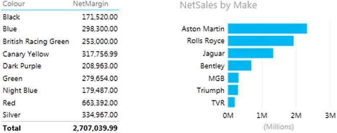
Figure 6-11. Preparing a chart for use as a slicer
Now let’s see how to use a chart as a slicer.
- Click on any column in the chart of NetSales by Make. I will choose Jaguar in this example.
The Power View report will look something like Figure 6-12.
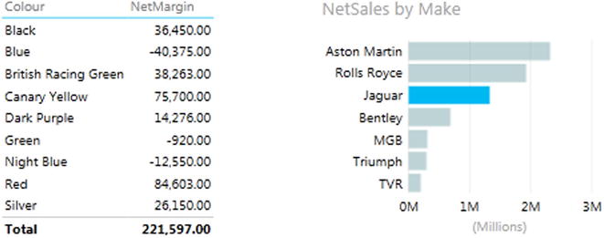
Figure 6-12. Slicing data using a chart
You will see that not only is the make that you selected highlighted in the chart (and the bars for other makes are dimmed), but that the figures in the table also change. They, too, only display the net margin (for each color) for the selected make.
To slice on another make, merely click on the corresponding column in the column chart. To cancel the effect of the chart acting as a slicer, all you have to do is click for a second time on the highlighted column.
Any bar chart, pie chart, or column chart can act like a slicer in this way. The core factor is that for a simple slice effect, you need to use a chart that contains only one axis; that is, there will only be a single axis in the source data and no color or legend. What happens when you use more evolved charts to slice, filter, and highlight data is explained next.
![]() Tip It is perfectly possible to select multiple bars in a chart to highlight data in the same way that you can select multiple elements in a slicer.
Tip It is perfectly possible to select multiple bars in a chart to highlight data in the same way that you can select multiple elements in a slicer.
So far we have seen how a chart can become a slicer for all the visualizations in a report. However, you can also use another aspect of Power View interactivity to make data series in charts stand out from the crowd when you are presenting your findings. This particular aspect of data presentation is called highlighting.
Once again, highlighting is probably best appreciated with a practical example. So, first we will create a stacked bar chart of costs by CountryName; then we will use it to highlight the various costs inside the chart.
- In a new Power View report (so you do not get distracted), create a clustered column chart based on the following fields:
- CountryName
- DeliveryCharge
- SpareParts
- SalesCosts
- LabourCost
- Click on SalesCosts in the legend. All the sales costs will be highlighted (that is, remain the original color) in the column for each country, whereas the other three costs will be grayed out.
The chart, after highlighting has been applied, will look like Figure 6-13.
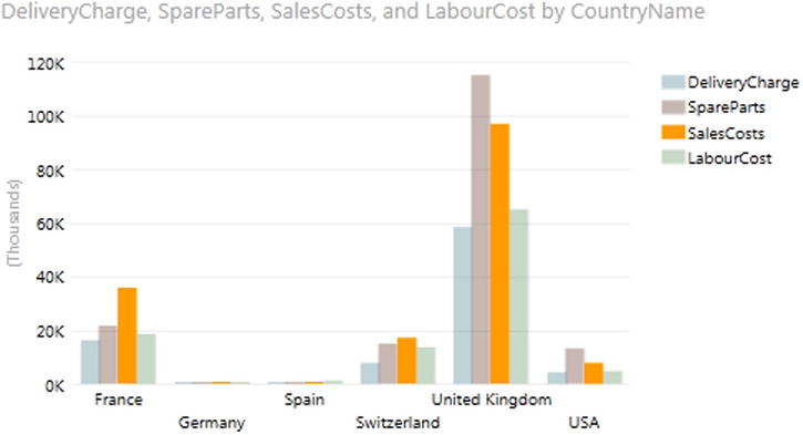
Figure 6-13. Highlighting data inside a chart
To remove the highlighting, all you have to do is click a second time on the same element in the legend. Or, if you prefer, you can click on another legend element to highlight this aspect of the visualization instead. Yet another way to remove highlighting is to click inside the chart, but not on any data element.
Highlighting data in this way should suit any type of bar or column chart as well as line charts. It can also be useful in pie charts where you have added data to both the COLOR and SLICES boxes, which, after all, means you have multiple elements in the chart just as you can have with bar, column and line charts. You might find it less useful with scatter charts.
Cross-chart filtering adds an interesting extra aspect to chart highlighting and filtering. If you use one chart as a filter, the other chart will be updated to reflect the effect of selecting this new filter not only by excluding any elements (slices, bars, or columns) that are filtered out, but also by showing the proportion of data excluded by the filter.
As an example of this, create a pie chart of net sales by color and a column chart of sales costs by vehicle type. We will then cross-filter the two charts and see the results. The steps to follow are
- Create a pie chart using the following fields:
- Colour
- NetSales
- Create a (clustered) column chart using the following fields:
- VehicleType
- SalesCost
For charts that are this simple Power View will automatically attribute the fields to the correct boxes in the Field List once the source tables are converted into charts. The result is shown in Figure 6-14.
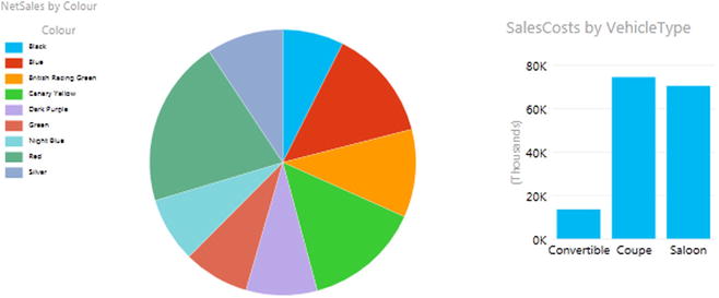
Figure 6-14. Preparing charts for cross-chart highlighting
Now click on the largest slice in the pie chart (or the legend element: Blue). You should see the result given in Figure 6-15.
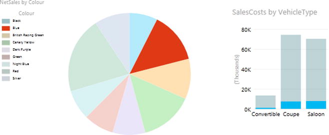
Figure 6-15. Cross-chart highlighting
Not only has the pie chart been updated to show the filter effect that it produces, but the bars in the bar chart have been highlighted to show the proportion of the selected color of the total sales cost per vehicle cost.
Now click on the bar in the bar chart corresponding to the vehicle type Convertible. You are now using the bar chart as a slicer. As you can see (the output is given in Figure 6-16) the pie chart displays the proportion of convertible sales for each color.
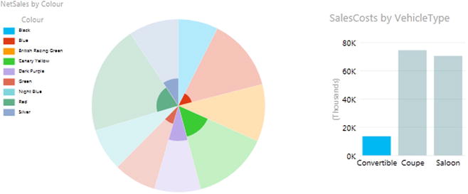
Figure 6-16. Cross-chart highlighting applied to a pie chart
![]() Note When you use a filter you will not highlight a chart but will actually filter the data that feeds into it—and consequently, you will remove elements from the chart.
Note When you use a filter you will not highlight a chart but will actually filter the data that feeds into it—and consequently, you will remove elements from the chart.
Highlighting Data in Bubble Charts
Often when developing a visualization whose main objective, after all, is to help you to see through the fog of data into the sunlit highlands of comprehension, profit, or indeed, whatever is the focus of your analysis, you may feel that you cannot see the forest for the trees. This is where Power View’s ability to highlight data in a chart visualization can be so effective.
Let’s take a visualization that contains a lot of information; in this example, it will be a bubble chart of vehicle types. Indeed, in this example, an audience might think that there is so much data that it is difficult to see the bubbles for specific makes of car, and so analyze the uniqueness for sales data by make. Power View has a solution to isolate a data series in such a chart. To see this in action, and to make the details clearer
- Create a bubble chart using the following elements:
- ∑ X VALUE: RatioNetMargin
- ∑ Y VALUE: SalePrice
- ∑ Y SIZE: NetSales
- DETAILS: Colour
- COLOR: VehicleType
- In the legend for the chart where you wish to highlight the data for one element (the make of car in our example) click on a vehicle type. I will use saloon in this example.
The data for this vehicle type is highlighted in the chart, and the data for all the other vehicle types are dimmed, making one set of information stand out. This is shown in Figure 6-17.
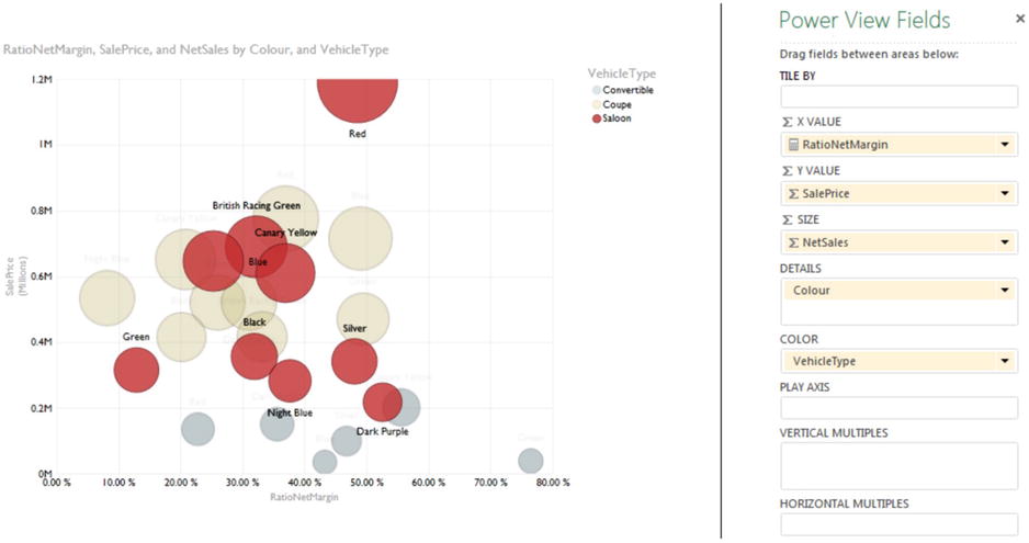
Figure 6-17. Highlighting data in bubble charts
This technique needs a few comments:
- To highlight another data set, merely click on another element in the legend.
- To revert to displaying all the data, click again on the selected element in the legend.
- Highlighting data in this way will also filter data in the entire report. The filter effect is described in detail in Chapter 5.
![]() Tip You can add drill-down to charts and still use chart highlighting in exactly the same way as you would use it normally. The chart will highlight an element at a drill-down sublevel normally as well as apply filtering to the Power View report.
Tip You can add drill-down to charts and still use chart highlighting in exactly the same way as you would use it normally. The chart will highlight an element at a drill-down sublevel normally as well as apply filtering to the Power View report.
Now that you have seen how charts can be used as slicers, let’s take things one step further and see them used as more complex filters. To show this, I will build on the principles shown in the previous example, but add a bubble chart that will filter on two elements at once.
To make this second chart, I
- Build a Power View report which has
- A matrix of net margin by CountryName and Color
- A chart of net sales by Make
- Create a bubble chart using the following data:
- ∑ X VALUE: NetMargin (from the SalesData table)
- ∑ Y VALUE: NetSales (from the SalesData table)
- SIZE: SalePrice (from the SalesData table)
- DETAILS: CountryName (from the Countries table)
- COLOR: Colour (from the Colors table).
- Resize and tweak the bubble chart so that it is displayed under the existing column chart and table.
- Click on one of the bubbles in the bubble chart (Blue in this example). The Power View report should look like Figure 6-18.
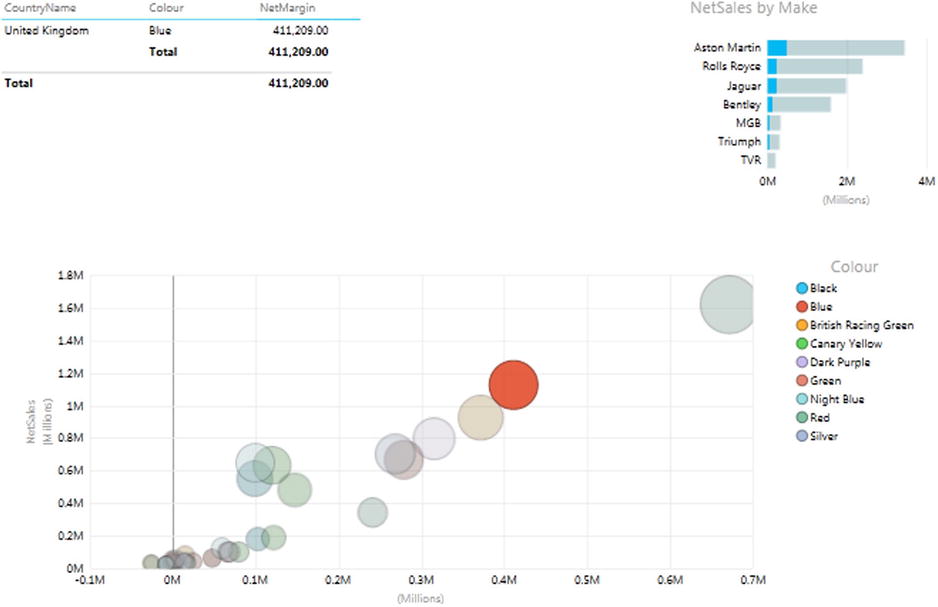
Figure 6-18. Highlighting and filtering using a chart
You can see that the other visualizations are filtered so that both the elements that make up the individual bubble (CountryName and Colour) are used as filters (or double-slicers if you prefer to think of them like that). This means that
- The table only shows colors where there are sales for this country and this color.
- The chart highlights data for this country and this color as a percentage of the total for each make.
As was the case with simple chart slicers, you can cancel the filter effect merely by clicking for a second time on the selected bubble. Or you can switch filters by clicking on another bubble in the bubble chart. You will also see the chart itself has data highlighted, but this is explained a little further on.
Clearly, you do not have to display the fields on which you are filtering and highlighting in all the visualizations in a report. I chose to do it in this example to make the outcome clearer. In the real world, all other visualizations in a report will be filtered on the elements in the DETAILS and COLOR boxes of the bubble chart.
Bubble charts are not, however, the only chart type that lets you apply two simultaneous filters. All chart types will allow this. However, I am of the opinion that some charts are better suited than others to this particular technique. Specifically, I am not convinced that line charts are always suited to being used as filters for a Power View report, and that scatter charts may work—visually, that is—but it is just as likely that they will not.
To show this in action, the following sections give examples of how to use the following as chart filters:
- Scatter charts
- Clustered column charts
- Clustered bar charts
As a scatter chart is virtually identical to a bubble chart (except for the third data value used to add the size of the bubbles), it follows that a scatter chart can also be used as a filter.
To see this in action, it is probably easiest to create the Power View report described earlier with the following three elements:
- A matrix of net margin by Color.
- A bar chart of net sales by Make.
- A scatter chart using the following data:
- ∑ X VALUE: NetMargin (from the SalesData table)
- ∑ Y VALUE: NetSales (from the SalesData table)
- DETAILS: CountryName (from the Countries table)
- COLOR: Colour (from the Colours table)
The net result should look virtually identical to the bubble chart, except that the bubbles are now small points. If you now click on a point in the scatter chart, you will see something like Figure 6-19.
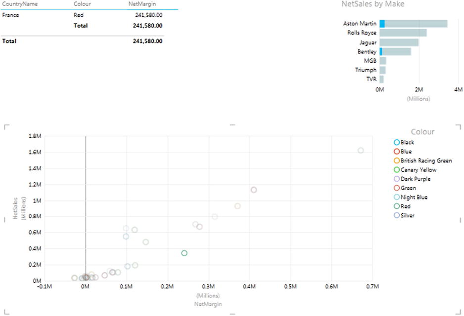
Figure 6-19. Scatter chart filtering
I would suggest that using scatter charts to filter the rest of the report is slightly less intuitive, as it is harder to see exactly what you are filtering on, given that the points are so small that they make the colors hard to distinguish. Nonetheless, it certainly works! Of course, you can always hover the mouse pointer over a data point to see from the popup which elements you will be filtering on.
Column and Bar Charts as Filters
Column charts and bar charts can also be used to filter a Power View report on two elements simultaneously. The only limitation is that you can only have one set of numeric data as the ∑ values for the chart. If the bar or column chart is a stacked bar, then you can click on any of the sections in the stacked bar. In addition, if the chart is a clustered bar or column, you can click on any of the columns in a group to slice by the elements represented in that section.
If this limitation is not a problem, then here is how you can use bar or column charts (whether they are clustered, stacked, or 100% stacked) to apply double filters to a report.
- Create a Power View report with the following two elements:
- A table based on color, country name, net sales, net margin, and cost price.
- A bar chart of net sales by CountryName.
- Then create a stacked column chart using the following data:
- ∑ VALUES: NetMargin (from the SalesData table)
- AXIS: CountryName (from the Countries table)
- LEGEND: CarAgeBucket (from the SalesData table)
Once tweaked to clarify the appearance of the chart, the net result should look like Figure 6-20.
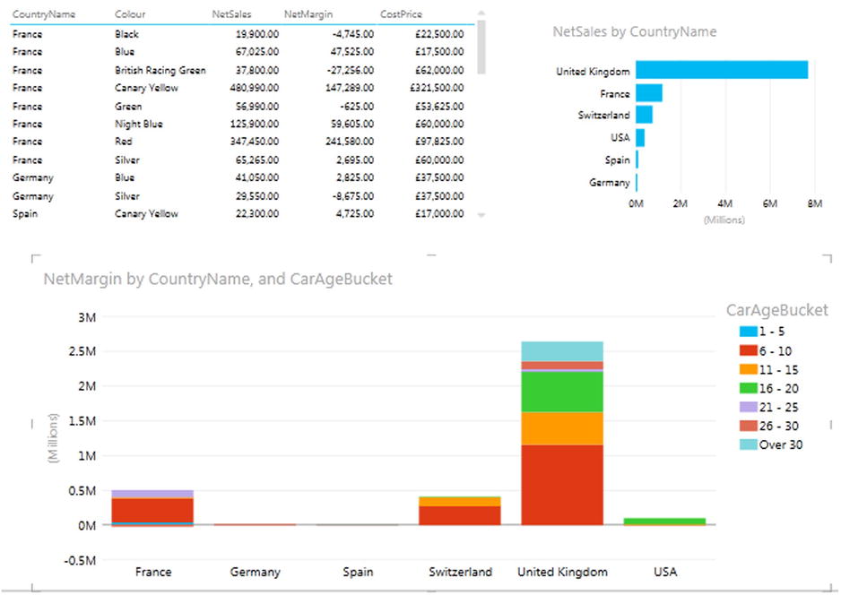
Figure 6-20. A Report ready for chart-based filtering and highlighting
Clicking on any segment of a bar will filter and highlight other visualizations on the same report for that country and car age range. An example of this is given in Figure 6-21, where the car age range of 6-10 has been selected for the United Kingdom bar.
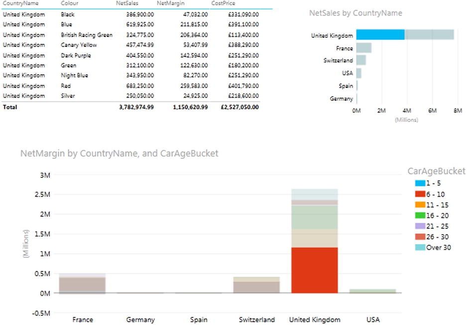
Figure 6-21. Applying filters and highlights
Clicking on any car age range in the legend will filter by car age range only. You can see this in Figure 6-22.
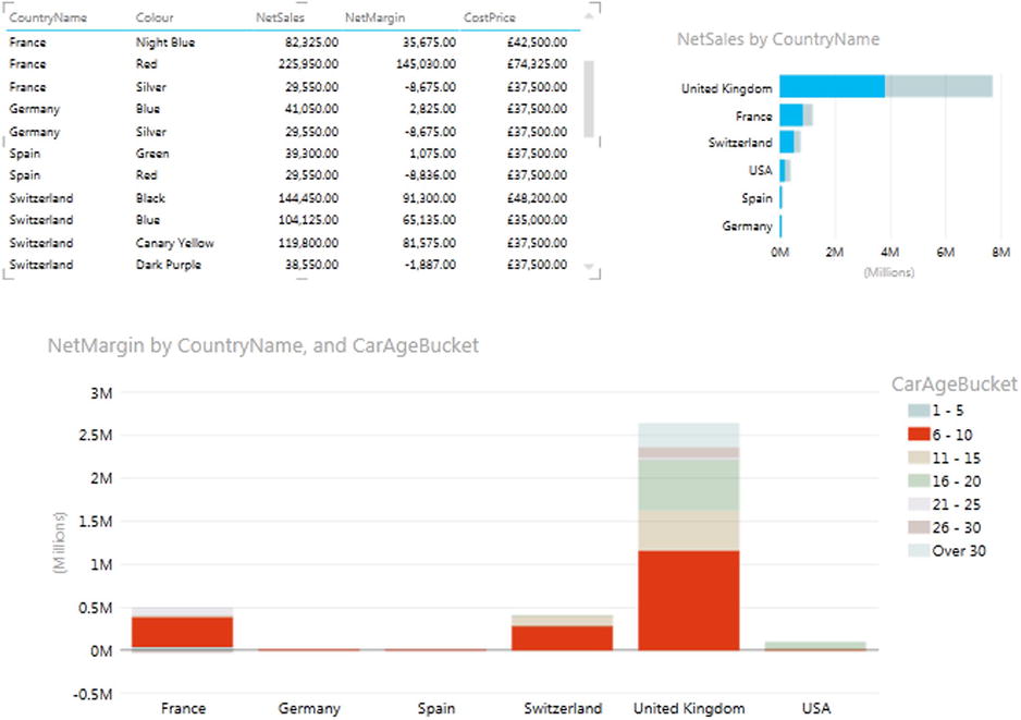
Figure 6-22. Filtering using a legend element
So in fact, you can choose to filter on a single element or multiple elements, depending on whether you use the chart or the legend as the filter source. It is interesting to note, finally, that if you have added tiles to a chart, then the tiles will only filter the chart itself and reduce the available possibilities for further slicing and highlighting. The choice of tile will not affect other visualizations on the same report directly.
![]() Note A line chart will not produce the same effect, however. If you click on a series in a line chart, you are highlighting that series, which is numeric data, and so it cannot be used as a slicer. Similarly if you click on an element in the legend of a column or bar chart, you are selecting data series, and this, too, cannot serve as a slicer (even though it will highlight the series in the chart).
Note A line chart will not produce the same effect, however. If you click on a series in a line chart, you are highlighting that series, which is numeric data, and so it cannot be used as a slicer. Similarly if you click on an element in the legend of a column or bar chart, you are selecting data series, and this, too, cannot serve as a slicer (even though it will highlight the series in the chart).
Choosing the Correct Approach to Interactive Data Selection
Now that you have taken a tour of the interactive options that Power View offers, it is worth remembering that there is a fundamental difference between slicers and chart filters and tiles:
- Slicers and chart filters apply to the entire Power View report.
- Tiles only affect to the visualization to which that are applied.
- Highlighting will only apply to the selected chart, although it will filter data in other tables and highlight the percentage of this element in other charts.
It is worth noting that tiles do not override filters or slicers. They simply apply a further selection at an even lower level of granularity—that of a single visualization. So remember that you could be, in effect, applying the following filters (in the order in which they are given):
- View filter
- Visualization filter
- Slicer
- Tile
This is probably best explained with an example. I propose to create a simple Power View report that will contain all of these elements. It will take a few steps to complete, but if you follow this exercise all the way through, you should certainly not only understand the hierarchy of filtering in Power View, but also be able to handle slicers and tiles with ease.
So, this is what you have to do, beginning with creating the report filter even before adding any visualizations:
- Create a new Power View report by selecting the Insert ribbon in the Excel workbook containing the CarSales data and subsequently clicking Power View (or by clicking Power View in the Power View ribbon).
- Display the Field List by clicking Field List in the Power View ribbon (unless it is already visible).
- In the Field List, expand the Date table.
- In the Date table, expand the Year Hierarchy.
- Drag the Year field into the Filters Area (if this is not visible, click Filters Area to display it).
- Adjust the slider endpoints so that only the years 2012 and 2013 are selected.
We will now create a table that will display costs and sales by client.
- Drag the ClientName field from the Clients table into the Fields section of the Field List.
- Drag the CostPrice and SalePrice fields from the SalesData table into the Fields section of the Field List.
We will now add a filter to the table only.
- Click inside the table which was created in steps 7 through 9.
- In the Filters area, click “Table”.
- Drag the ClientType field from the Clients table into the filter area.
- Select the “Dealer” element. This will only show clients who are dealers.
To prove the points about which filters apply to which elements, we need a visualization that will have no filters applied specifically to it, nor any tiles applied. I suggest a simple column chart of sales by country.
- Click inside the Power View report canvas outside the table that you just created (ensuring that no visualization is selected).
- Drag the CarAgeBucket field from the SalesData table onto the Power View report.
- Drag the CostPrice field onto the list of car age ranges that you just created in step 14.
- In the Design ribbon, click the Column Chart button and select Clustered Column.
The table will become a column chart. Now we will move from filters to interactive selections, adding a slicer first.
- Click inside the Power View report outside the visualizations that you just created (ensuring that no visualization is selected).
- Drag the CountryName field from the Country table onto the Power View report.
- Click Slicer in the Design ribbon. The table of countries becomes a slicer.
Finally we will add tiles to the table of client sales.
- Select (or click inside) the table that you created in steps 7 through 9.
- In the Field List, drag Color from the Colors table to the TILE BY box.
And that is it! At the highest level, you have selected only data for 2012 and 2013. Then you filtered the table so that it will only display dealer data. This filter does not apply to the chart. Then you added a country slicer. Selecting one or more countries will affect both the table and the chart; however, selecting an item from the tiles applied to the table will have no effect on the chart. For a final confirmation of how Power View filters data, try clicking on one of the chart columns, and you will see that this too will filter the data elsewhere in the report, complementing both the filters and the slicer selections.
Assuming that all went well—and after, perhaps, a little tweaking to make things look good in Power View—you should have a report that looks something like Figure 6-23.
Figure 6-23. A filtered report ready for slicing, filtering, and tile-based selection
Now try slicing and highlighting. I will click United Kingdom in the slicer, click the column for the car age range 11-15, and then choose the color Red from the tiles in the table. The result is shown in Figure 6-24.
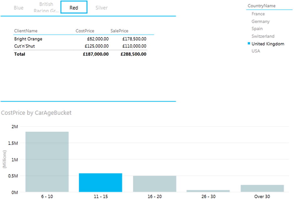
Figure 6-24. Slicing, filtering, highlighting, and tiles applied
Believe me, this is just the start of what you can do. In a single click, you can change the country you are slicing the data on. You can examine each car age range in turn, or out of sequence. Then you can see dealer sales by car color, and then cycle through the colors.
Conclusion
In this chapter you have seen how to use the interactive potential of Power View to enhance the delivery of information to your audience. You saw how to add slicers to a report, and then how to use them to filter out data from the visualizations it contains. Then you saw how to add tiles to any table or chart to select a subset of data with a single click. Finally, you learned how to highlight data in charts and tables using charts to isolate specific elements in a presentation.
So all that remains is for you to start applying these techniques using your own data. Then you can see how you too can impress your audiences using all the interactive possibilities of Power View.