
![]()
Images and Presentation
After spending a little time working with Power View, let’s assume that you have analyzed your data. In fact, I imagine that you have been able to tease out a few extremely interesting trends and telling facts from your deep dive into the figures—and you have created the tables and charts to prove your point. To finish the job, you now want to add the final touches to the look and feel of your work so that it will come across to your audience as polished and professional.
Fortunately Power View is on hand to help you here, too. It can propel your effort onto a higher level of presentation—without you needing to be a graphic artist—so that your audience is captivated. With a few clicks you can
- Add and format a report title.
- Apply a report background.
- Change the color scheme and fonts used in a report (which, taken together, are called the theme of a report).
- Alter the font used in a report.
- Add free-form text and annotations (or text boxes in Power View speak).
- Add images (which Power View calls pictures) to a report.
- Use images in tables.
- Use image-based slicers.
- Apply images to tiles.
This chapter will take you through these various techniques and explain how to use them to add real pizzazz to your analysis. We will use the CarSales.xlsx file as the source data and also the image files, which you can download to the folder C:HighImpactDataVisualizationWithPowerBIImages from the Apress web site, as described in Appendix A.
Let’s begin at the start. You have spent quite a while digging into data and have found effective ways of drawing your audience’s attention to the valuable information that it contains. However, you need the one, final, cherry on the cake—a title for the report.
Adding a title is so easy that it takes longer to describe than to do, but nonetheless, here is how you do it:
- Click in the section at the top of the report with the helpful label Click Here To Add A Title.
- Type in an appropriate title. I have entered 2013 Key Sales Data.
- Click outside the title anywhere in the blank report canvas.
Figure 7-1 shows you a before and after snapshot of a title added to a report. Moreover, should you want to modify a title, it is as easy as clicking inside the title box and altering the existing text. You can find this example in C:HighImpactDataVisualizationWithPowerBIPVPresentation.xlsx.
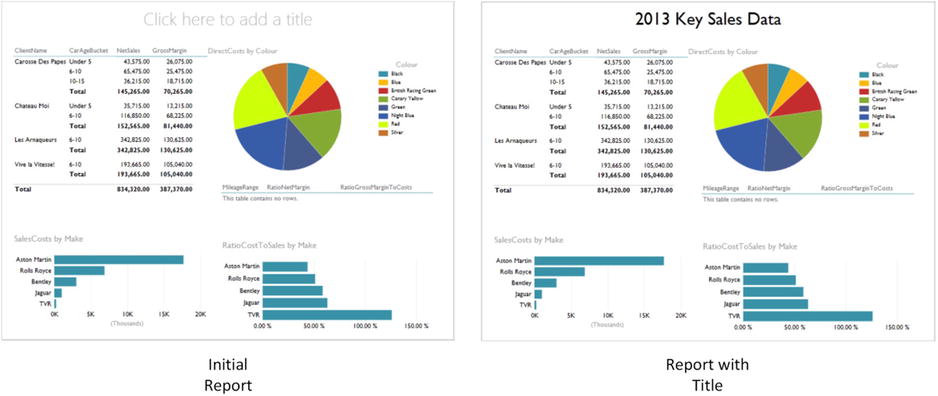
Figure 7-1. Adding a title to a report
Titles are a Power View visualization like any other, and consequently, they can be moved and resized just as if they were a table or a chart. So all you have to do to move a title is to
- Hover the mouse pointer over the title. The corners and centers of the title box will appear.
- Place the mouse pointer over the edges of the title box and drag the title to a new position.
To resize a title (should this ever be necessary)
- Hover the mouse pointer over the title. The corners and centers of the title box will appear.
- Place the mouse pointer over either the corner or lateral central indicators of the title box and drag the mouse to resize the title box.
The title of a Power View report can be formatted specifically so that you can give it the weight and power that you want.
To give the title some emphasis
- Hover the mouse pointer over the title and select the title box (or select the text of the title).
- Activate the text ribbon, unless it is already active.
- Select the text attributes that you wish to modify. These are described in the next section.
The aspects of a title that you can change are
- Font
- Font attribute (bold, underline, italic)
- Font size
- Alignment (horizontal and vertical)
![]() Note If you really do not want a title and you don’t want the Power View prompt Click Here To Add A Title to be visible, then you can delete a title just like you can delete a text box. This is described shortly.
Note If you really do not want a title and you don’t want the Power View prompt Click Here To Add A Title to be visible, then you can delete a title just like you can delete a text box. This is described shortly.
As its name suggests, the text ribbon allows you to modify text display in Power View. It is specifically used with text boxes, such as the title box that we just saw, or free-form text boxes that are explained in the next section.
The buttons available in the text ribbon are described in Figure 7-2.
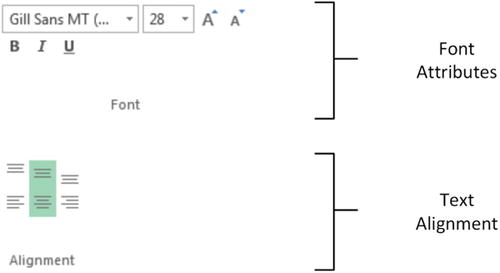
Figure 7-2. The text ribbon
Note that you cannot enter a font size; you have to select a size from those available in the font size popup list. You also cannot change the color of the title. The options available for text modification are described in Table 7-1.
Table 7-1. Text Ribbon Options
|
Text Option |
Description |
|---|---|
|
Font |
Lets you choose the font to apply from those installed on the computer |
|
Font size |
Allows you to select a font size from those in the list |
|
Increase font size |
Increases the font to the size of the next available size in the list of font sizes |
|
Decrease font size |
Decreases the font to the size of the next available size in the list of font sizes |
|
Bold |
Switches the font to boldface |
|
Italic |
Switches the font to italic |
|
Underline |
Underlines the selected text |
|
Align top |
Aligns the text at the top of the text box |
|
Align middle |
Aligns the text in the middle (horizontally) of the text box |
|
Align bottom |
Aligns the text at the bottom of the text box |
|
Align left |
Aligns the text at the left of the text box |
|
Align center |
Aligns the text in the center (vertically) of the text box |
|
Align right |
Aligns the text at the right of the text box |
Adding Text Boxes to Annotate a Report
Now that we have seen how to add and modify a title, it is probably a good time to extend the knowledge acquired to the close relative of the title—the text box. A text box is a floating text entity that you can place anywhere inside a Power View report. They are especially useful for annotating specific parts of a presentation. To add a text box
- Switch to the Power View ribbon, unless it is already active.
- Click on the Text Box button. A new text box is added to the report, and the text cursor will flash inside this box.
- Type in the text you want to add. I entered Clear Market Leader in this example.
- Click outside the text box, preferably in an empty part of the report canvas, to finish.
- Move and resize the text box to produce the effect you are looking for.
Figure 7-3 shows a text box added to a chart visualization.
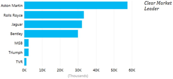
Figure 7-3. Adding a text box
A text box can be moved and resized exactly as a title can. Consequently, I will not explain this again; just go back a couple of pages to the section called “Moving and Resizing Titles.”
The text inside a text box can be formatted as well. Here, too, the steps to take are identical to those you follow when formatting a title. So once again, just flip back a couple of pages, and it is all explained.
![]() Tip Remember that you can highlight only part of the text if you want to format only one or two words. If you select the text box itself, then you will be formatting all the text in the text box.
Tip Remember that you can highlight only part of the text if you want to format only one or two words. If you select the text box itself, then you will be formatting all the text in the text box.
If you want to delete a text box, then be sure to
- Hover the mouse pointer over the text box until you see the corner and lateral handles.
- Select the text box.
- Press the Delete key.
![]() Note Merely selecting and deleting the text inside the text box will not remove the text box itself; so to be sure that you do not leave any unnecessary clutter in a report, delete any unwanted and empty text boxes.
Note Merely selecting and deleting the text inside the text box will not remove the text box itself; so to be sure that you do not leave any unnecessary clutter in a report, delete any unwanted and empty text boxes.
Although we have not mentioned it so far, there is a context menu available when you use Power View. This menu is particularly useful when you are adding the final tweaks to a report, so now is probably a good time to look at what it can do. Right clicking on any visualization, text or image, in a Power View report will display the menu shown in Figure 7-4.
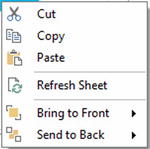
Figure 7-4. The context menu for visualizations
If you click on the canvas of a Power View report (that is outside any existing visualization), you will see a slightly different context menu. This is shown in Figure 7-5.
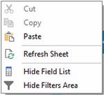
Figure 7-5. The context menu for reports
The two available context menus are largely similar. The available options in the context menus are outlined in Table 7-2.
Table 7-2. Context Menu Options
|
Menu Option |
Context Menu |
Description |
|---|---|---|
|
Cut |
Visualization/Canvas |
Removes the selected visualization, text, or image and places it in the clipboard |
|
Copy |
Visualization/Canvas |
Copies the selected visualization, text, or image to the clipboard |
|
Paste |
Visualization/Canvas |
Adds the selected visualization, text, or image from the clipboard |
|
Refresh sheet |
Visualization/Canvas |
Updates the data for the current Power View report |
|
Bring to front |
Visualization |
Lets you move the selected visualization, text, or image to the top, or forward, above/in front of any others |
|
Send to back |
Visualization |
Lets you move the selected visualization, text, or image to the bottom, or backward, below/behind any others |
|
Hide/show field list |
Canvas |
Hides the Field List if it is visible, displays it if it is not |
|
Hide/show filters area |
Canvas |
Hides the Filters Area if it is visible, displays it if it is not |
![]() Note The Cut, Copy, and Paste options are visible but not accessible in the context menu for the Power View canvas.
Note The Cut, Copy, and Paste options are visible but not accessible in the context menu for the Power View canvas.
Altering the Font Used in a Report
If you work in a corporate environment, then you probably have to follow enterprise guidelines on presentation. Even if this is not the case, you may have preferences when it comes to the choice of fonts that you use. In any case, Power View will let you choose the font used in a presentation. The things that you can change are
- Font Family
- Font Size
Font Family
To change the font used in an entire Power View presentation (that is in every Power View report in an Excel workbook), this is all that you have to do:
- Switch to the Power View tab (unless it is already active).
- Click on the downward-facing triangle to the right of Font in the Themes section.
- Select the font that you wish to apply from those available.
Literally the only thing to remember is that this will affect every Power View report in an Excel workbook. Changing the font this way will not, however, override any font settings made to a specific text box using the font ribbon.
Text Size
You can also change the proportional text size in an entire presentation. Now I really mean proportional. Remember that when we created individual tables and charts we set the size of the text in each visualization—at least relative to the other visualizations since we could not set exact font sizes? Well, this can be overridden at the level of the entire presentation, where you can proportionally increase or decrease the size of the text in every visualization, whether it is a table, a chart, or a text box.
To do this
- Switch to the Power View tab (unless it is already active).
- Click on the downward-facing triangle to the right of Text Size in the Themes section.
- Select the proportional text size from those available.
![]() Note This can produce some quite devastating results and can render a report—or indeed an entire presentation—unreadable. So it is probably best if you use it at an appropriate stage in the creation process, and before you have spent valuable time tweaking individual visualizations to get them to appear exactly the way that you want them.
Note This can produce some quite devastating results and can render a report—or indeed an entire presentation—unreadable. So it is probably best if you use it at an appropriate stage in the creation process, and before you have spent valuable time tweaking individual visualizations to get them to appear exactly the way that you want them.
You cannot enter a specific percentage for the text size and have to restrict your choice to the selection on offer. Currently you can choose between
- 200%
- 175%
- 150%
- 125%
- 100%
- 75%
Altering the Theme of a Report
Power View understands that you may not have a lot of time to spend on the presentation of your report. Consequently, many of the visual aspects of a report work using a few simple, yet sophisticated, preset values. Central to these is the notion of the report theme. Basically, what you do is choose a set of colors and fonts from a palette that Power View offers, and the software does the rest.
Rather than discuss the theory, I propose seeing themes in action. So, to apply a theme to a Power View report, whether it is a blank report or an existing one, this is what you do:
- Click on the Themes button in the Power View ribbon, the available themes will appear in a scrollable list, as shown in Figure 7-6.
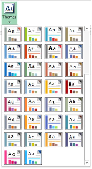
Figure 7-6. The available themes in Power View
- Select a theme by clicking on it.
Yes, it really is as simple as it sounds. However, as the changes can be very subtle, you may not see much change to begin with. What you have probably noticed (assuming that your Power View report has a table, a couple of charts, and a slicer, like the Power View sheet StylesExample in the example workbook entitled PVPresentation.Xlsx) is that the following have changed:
- The font used in the entire report—tables, charts, titles, slicers—everything!
- The color used as a principal highlight. You will see it change in the line under table titles and above totals as well as in the bullets to the left of slicer items, for instance.
- The palette of colors used by charts. This is the basis for bars, columns, pie slices, bubbles, and lines.
- The report background.
As an example, Figure 7-7 shows the Power View sheet StylesExample from the sample workbook with the Concourse theme applied.
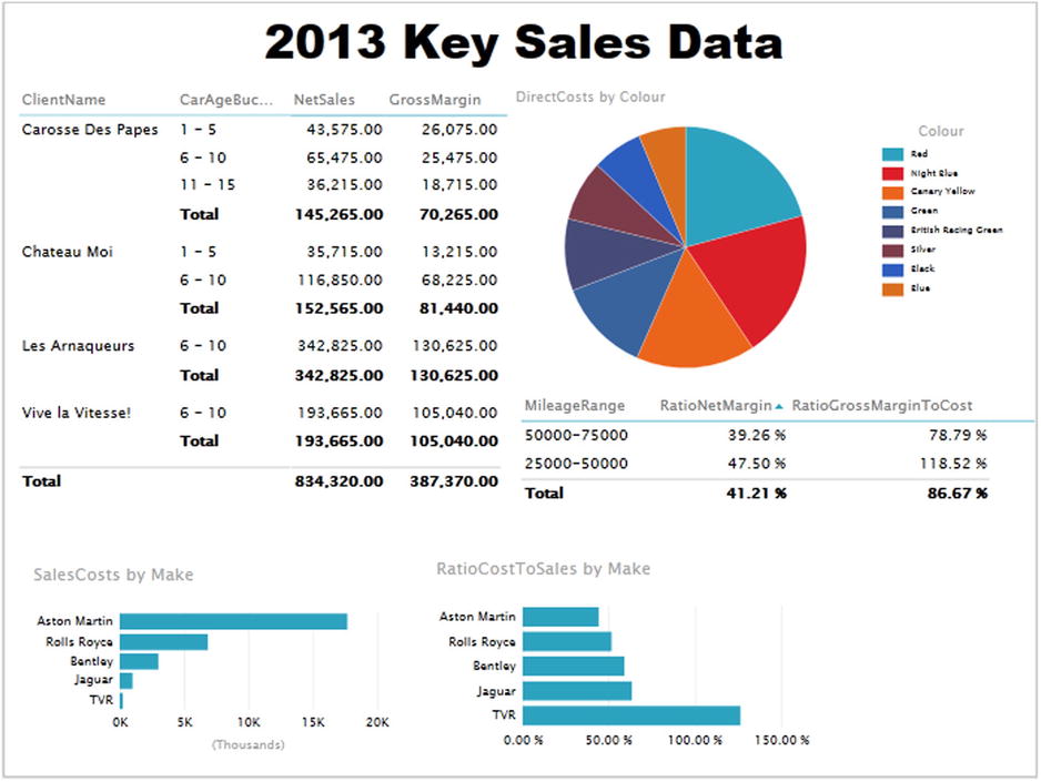
Figure 7-7. The theme Concourse applied to a Power View report
Although the color change is not immediately obvious in a book printed in black and white, the change of font family is clear, as is the modification of the font size. In fact, I had to resize the matrix and pie chart very slightly, as well as the column widths in the matrix and table, to achieve an optimum presentation. So, to avoid lots of last-minute retweaking of your reports, I advise you to to decide on a theme earlier rather than later in your creative cycle.
![]() Note You have 46 presentation styles to choose from, so the best advice that I can give is that you spend some time trying them out. This way you will see which one is best suited to your presentation style and the type of information that you are delivering.
Note You have 46 presentation styles to choose from, so the best advice that I can give is that you spend some time trying them out. This way you will see which one is best suited to your presentation style and the type of information that you are delivering.
Deciphering Themes
Testing out the available themes can be great fun, but it does not have to be a process based entirely on trial and error. This is because each image of a theme in the Themes list is, in fact, a preview of what it contains. Each tiny image of a theme indicates the display elements, which are explained in Table 7-3.
Table 7-3. Themes
|
Theme Element |
Description |
|---|---|
|
Dark Background Color |
The color applied to the canvas if the dark background is selected |
|
Light Background Color |
The color applied to the canvas if the light background is selected |
|
Highlight Color |
The color used as bullets for slicer elements and general highlighting, as well as being the color used when chart highlighting is applied |
|
Font |
The font that will be applied |
|
Chart Color 1 |
The first color in the chart color palette |
|
Chart Color 2 |
The second color in the chart color palette |
|
Chart Color 3 |
The third color in the chart color palette |
Exactly how these elements are contained in a theme image is explained in Figure 7-8.
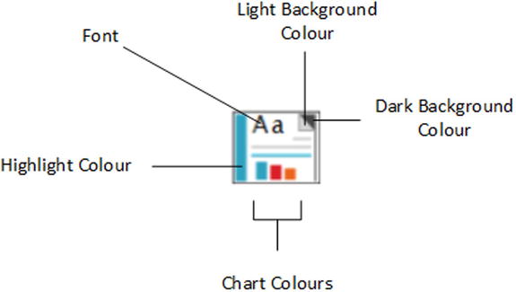
Figure 7-8. Theme Elements
The chart color scheme does not stop with three colors, of course, but the colors given in the theme image give you a pretty good idea of the palette that will be used by the theme you have chosen.
If, or hopefully, when, you become a regular user of Power View, you may find that you frequently want to use the same themes over and over. This can, of course, provide consistency and an impression of coherence to your reports. So rather than having to remember that the last time you used the "second column third row" theme in the popup list of themes, it is probably easier to try and remember the theme name. To see a theme name:
- Hover the mouse pointer over a theme image in the Themes popup, as shown in Figure 7-9.
Figure 7-9. The theme name
- If you cannot remember which theme you used, then look closely at the theme images in the Themes list. An active theme has a subtle border around it to indicate that it is selected. An example of this is shown in Figure 7-10.

Figure 7-10. The active theme
The themes are in alphabetical order in the Themes menu. They flow from left to right, and the first two rows rejoice in the names Theme 1, Theme 2, and so on.
![]() Note If you add a theme to a report containing a slicer, then the slicer will adopt the highlight color from the theme for the square to the left of the slicer element (or the bar if the slicer is an image). However, if you then apply a different theme, the highlight color will not change. If you want to force Power View to apply the new highlight color, you have to switch the slicer back to a table, and then revert back again to a slicer.
Note If you add a theme to a report containing a slicer, then the slicer will adopt the highlight color from the theme for the square to the left of the slicer element (or the bar if the slicer is an image). However, if you then apply a different theme, the highlight color will not change. If you want to force Power View to apply the new highlight color, you have to switch the slicer back to a table, and then revert back again to a slicer.
Applying a Report Background
Power View does not condemn you to presenting every report with a white background. To avoid monotony you can choose from a predefined set of 12 report backgrounds that you can add to every report in a presentation with a couple of clicks.
To apply a background to a report, all you have to do is
- On the Power View menu, click the popup triangle for Background (in the Themes section). The choice of available backgrounds will appear as shown in Figure 7-11.
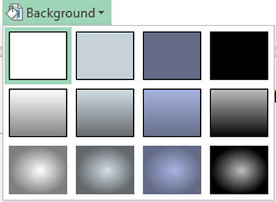
Figure 7-11. The Background popup menu
- Select the background that you want to apply. The sample report that we have been using so far looks like Figure 7-12, if you apply the Dark 1 Solid background (the image on the top right of the set of choices).
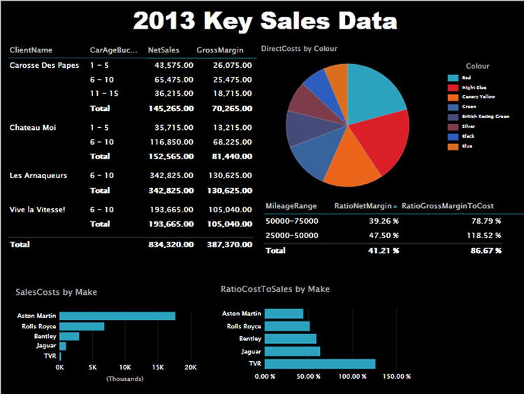
Figure 7-12. Applying a background to a report
There are three families of background available:
- Solid
- Vertical gradient
- Central gradient
One of each of these is essentially light in tone—it is based on predominantly white coloring. Another set is based on black, so it is consequently dark in tone. The two other sets are based on the two background colors defined in the report theme, one light, the other dark. The actual colors are displayed as the two tiny color triangles at the top right of each theme image in the Theme popup menu.
To explain how the backgrounds are set out, take a look at Figure 7-13.
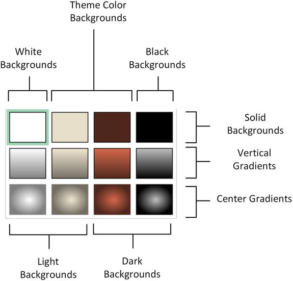
Figure 7-13. The available report backgrounds
If you apply any of the dark backgrounds, then Power View will automatically switch the text to white or a light color. Applying a light background will switch all the text in a presentation to black, or a dark color.
If you want a color-based background, then you will have to choose one of the options available in the two central columns in the Background popup menu. However, to choose a color, you must apply a theme to the presentation. As you will discover, there are only a limited set of background colors available.
You can always see which background has been applied by looking at the images in the Background popup menu. The current background has a subtly thicker line around it. The default background is always the top left hand background called Light 1 Solid, which is, in effect, a clear background.
Images
We all know what a picture is worth. Well, so does Power View. Consequently you can add pictures, or images, as they are generically known, to a Power View report to replace words and enhance your presentation. The images that you insert into a Power View report can come from the web or from a file on a disk—either local or on an available network share. Once an image has been inserted it is not linked to the source file. So if the source image changes, you will have to reinsert it to keep it up to date. So, although you can have images from databases appear in tables via PowerPivot, you cannot place these same images outside a table in Power View.
Some of the uses for images in Power View are
- As a background Image for a report.
- Images in tables instead of text. An example could be to use product images.
- Images in slicers. These could be flags of countries, for instance.
- Images in tiles. These could be flags or products.
- Independent images— a logo, for instance, or a complement to draw the viewer’s attention to a specific point.
Once we have looked at the types of image formats available, we will see how images can be used in all these contexts.
There are a multitude of image formats that exist. Power View, however, will only accept two of them.
- JPEG—pronounced “JayPeg.” This is a venerable standard image file format.
- PNG. This is a standard file format for Internet images.
The former generally have the extension .jpg or .jpeg. The latter generally have the .png extension. Both can deliver reasonable quality images that should certainly suffice for Power View reports.
If you attempt to insert an image that is not in a format that Power View can handle, you will get the alert shown in Figure 7-14.
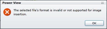
Figure 7-14. Invalid image format alert dialog
![]() Note When you attempt to insert an image from a file, the Open dialog will filter the files so that only files with a .jpeg, .jpg, or .png extension are visible. You can force the dialog to display other file formats, but Power View will not be able to load them.
Note When you attempt to insert an image from a file, the Open dialog will filter the files so that only files with a .jpeg, .jpg, or .png extension are visible. You can force the dialog to display other file formats, but Power View will not be able to load them.
One major, and frequently very striking, use of images is as a background to a Report—and possibly even to a whole series of reports. So, let’s take a look at how to use images for report backgrounds and some of the things that you can do with them.
Before anything else, you need to add a background image. This is, once again, extremely simple:
- In the Power View ribbon, select Set Image from the Set Image button. A classic Windows dialog will appear; it lets you choose the source image, as shown in Figure 7-15.
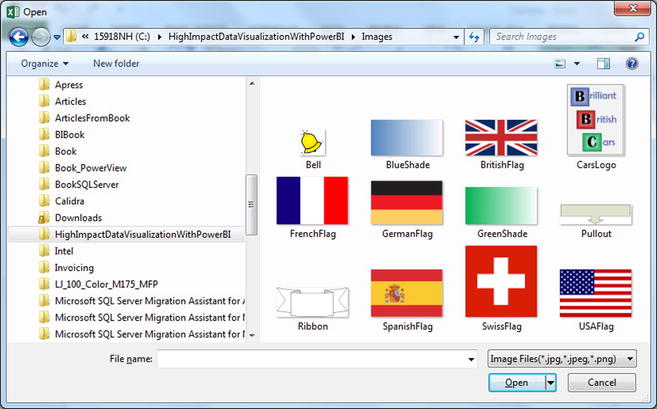
Figure 7-15. Navigating to a background image file
- Navigate to the directory containing the image that you wish to insert. There are several sample images in the folder C:HighImpactDataVisualizationWithPowerBIImages which you can install as described in Appendix A.
- Click on the image file. I will use the example image GreenShade in this example.
- Click Open.
The selected image will be loaded as a report background. By default it will be adjusted proportionally until it covers the width of the report. The Power View report that we have been developing in this chapter (and that you last saw in Figure 7-12) should look like Figure 7-16.
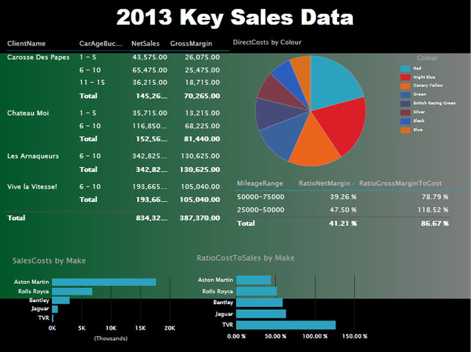
Figure 7-16. An initial background image
Frequently an image can need a little tweaking until it truly enhances a Power View report. To help you control the final display of a background image, Power View offers you several ways to resize the image—both proportionally and non-proportionally—in a report.
For example, to make an image cover an entire report
- In the Power View menu click the Image Position button.
- Select Stretch.
The image will be stretched (and possibly distorted) to fit the entire Power View report canvas. This can be seen in Figure 7-17.
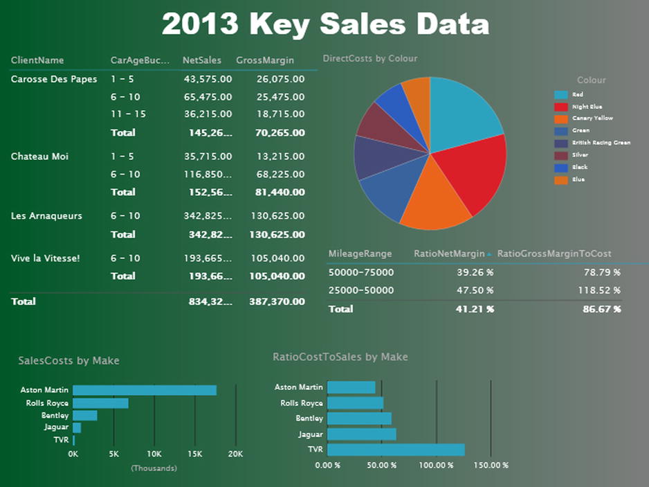
Figure 7-17. A stretched background image
There are other options you can use when fitting an image to a report canvas. These are outlined in Table 7-4.
Table 7-4. Background Image Fit Options
|
Image Option |
Description |
|---|---|
|
Fit |
Enlarges the image proportionally until either the sides or top and bottom of the report canvas are reached |
|
Stretch |
Enlarges the image non-proportionally to cover the entire report canvas |
|
Tile |
Repeats the image (keeping it at its original size) to cover the entire report canvas |
|
Center |
Places the image at the center of the report canvas |
To remove a background image, all you have to do is
- In the Power View ribbon, select Remove Image from the Set Image button.
The existing background image will disappear from the report.
Setting an Image’s Transparency
A background image sits on top of the background of the actual report, assuming that you have applied one. This lets you achieve some interesting effects by combining the image with the background. What Power View lets you do, in the interest of greater readability, is set the transparency of the image. Put simply, a largely transparent image will let the background show through, whereas a completely opaque image will not let any of the background underneath the image be visible in the report.
To make this clearer, I suggest altering the transparency of the image that you added to create Figure 7-17.
- In the Power View button, click Transparency.
- Select a transparency percentage from those available.
Figure 7-18 shows an example of this, using 0% transparency. The image is as close as possible to the original, and it completely hides any background that was set. If you compare this with the report where the default transparency of 50% was applied (in Figure 7-17), you can see that the underlying dark background is now completely hidden by the background image.
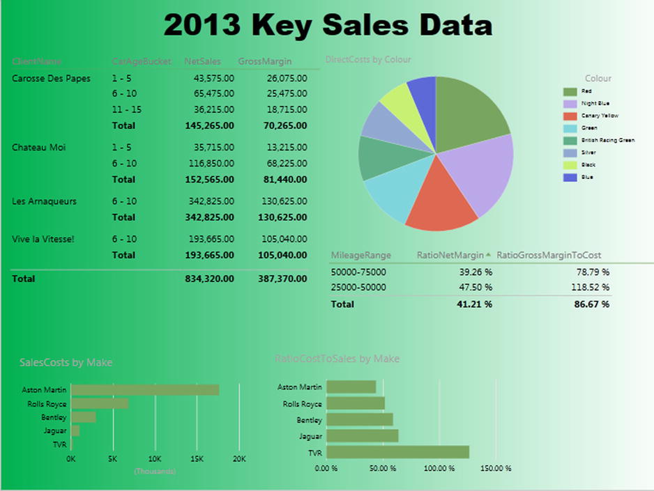
Figure 7-18. Adjusting the transparency of a background image
You cannot choose a transparency setting other than those offered. However, as the selection varies from 0 to 100%, you should always be able to find a setting to suit your needs.
![]() Tip Even if you hide a background completely (as we have done here), it can have an effect. If you select one of the light backgrounds, then the font color will be dark, and if you choose a dark background, the font color is set to a light color. So selecting the appropriate, but invisible, background can change the font color to make the text more readable. This is what has been applied in Figure 7-18.
Tip Even if you hide a background completely (as we have done here), it can have an effect. If you select one of the light backgrounds, then the font color will be dark, and if you choose a dark background, the font color is set to a light color. So selecting the appropriate, but invisible, background can change the font color to make the text more readable. This is what has been applied in Figure 7-18.
The next question that you may be asking is “What purpose can this option possibly serve?” Well, consider the case where you have applied an image over a report where all the presentation’s backgrounds are dark, and so the text is, consequently, white. When you apply a fairly clear image, this could make the text hard to read. So adjusting the image’s transparency could enable you to “darken” the image, making the text readable.
![]() Note It is worth noting that a background image will only be applied to the current report. This is unlike what happens when you set a background, for instance, which will be applied to all reports (Power View worksheets) in an Excel workbook.
Note It is worth noting that a background image will only be applied to the current report. This is unlike what happens when you set a background, for instance, which will be applied to all reports (Power View worksheets) in an Excel workbook.
There could be occasions when you prefer to use an image rather than text in a table. This is a technique that, if not over-used, can add some color and variety to a report. As an example of this, let’s create a list of clients and their home country using the flag of each country to indicate the geographical zone where the sale occurred. The way to do this is
- Create a new Power View report.
- Add a table based on the following three fields:
- ClientName
- CountryFlag
- SalePrice
- Adjust the table size and column widths to get the best result.
The resulting table should look like Figure 7-19.
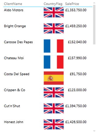
Figure 7-19. Using images in tables
As you can see, the effect is instantaneous—and extremely easy to produce.
Resizing Images Used in Tables
The images that are used in tables can be resized globally, but not individually. To adjust the size of all the images, all you have to do is to increase or decrease the width of the column containing the images. This will not, however, cause the row height to change.
The use of slicers is one area where images can be a really powerful presentation tool. Suppose that you have a report where you want to add a slicer by country. Now consider how it would look if, instead of the country name, you use the country’s flag. Let’s see this in action:
- Choose a report, such as ReadyForSlicer in the sample PVPresentation.xlsx workbook.
- Drag the CountryFlag field onto the report canvas. A table of flags will appear.
- Click Slicer in the Power View ribbon.
The table of flags becomes a slicer as shown in Figures 7-20. If you click on any of the flags, you will filter the report to display only data for that country. The slicer is, to all intents and purposes, an ordinary slicer. Consequently you can slice on multiple elements, clear the selection, and, in fact, use all the slicer techniques explained in Chapter 6.
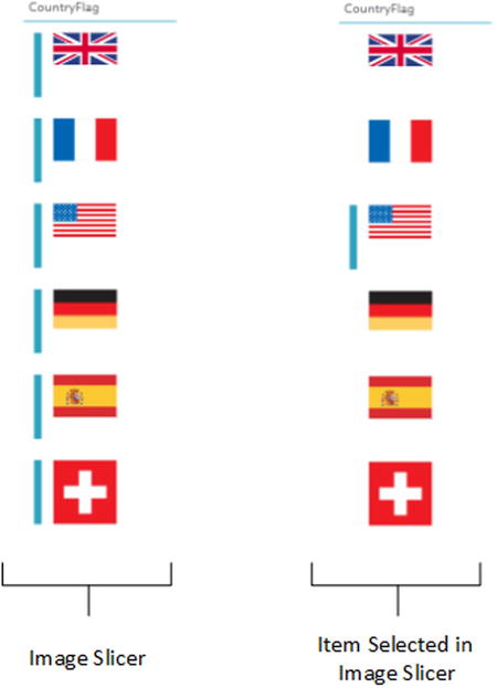
Figure 7-20. Images in slicers
Images in Tiles
As I mentioned in Chapter 6 you can also use images in tiles. This is a selection technique that you can often use to great effect. As an example (which still uses the country flags, since we have images for them), I suggest creating a table of clients showing their sales and net margin tiled by country. To create this visualization:
- In a new or existing Power View report, add a table based on the following fields:
- ClientName
- SalePrice
- NetMargin
- Drag the CountryFlag field to the TILE BY box in the Layout section of the Field List.
The resulting tiled table should look like Figure 7-21 (Switzerland is the selected country). As you can see, tiles with images can be larger than text-based tiles.
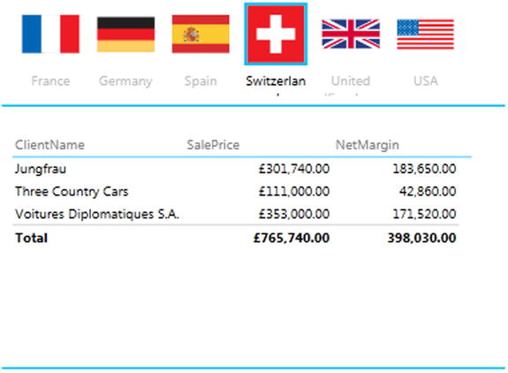
Figure 7-21. Using images in tiles
The tiles act in exactly the same way as tiles based on a text field. You will also notice that, if you use an image in tiles, the tiles will automatically add the name field as a title. Although you cannot make this field disappear, you can reduce its font size if you find it superfluous.
![]() Note If you want a more polished final effect, then spend a little time making sure that all the source images are the same size. This way you will avoid one image setting the height for the other images and having empty space above and below the images.
Note If you want a more polished final effect, then spend a little time making sure that all the source images are the same size. This way you will avoid one image setting the height for the other images and having empty space above and below the images.
Whether you have added a background image or not, you may still want to add completely free-form floating images to a report. However, before getting carried away with all that can be done with images, remember that Power View is not designed as a high-end presentation package. If anything, it is there to help you analyze and present information quickly and cleanly. Inevitably you will find that there are things that you cannot do in Power View that you are used to doing in, say, PowerPoint. Consequently there are many presentation tricks and techniques that you may be tempted to achieve in Power View using images to try and get similar results. Indeed, you can achieve many things in a Power View report by adding images. Yet the question that you must ask yourself is “Am I adding value to my report?” I am a firm believer that less is more in a good presentation. Consequently, although I will be showing you a few tricks using images, many of them go against the grain of fast and efficient Power View report creation and can involve considerable adjustment whenever the data in a visualization changes. So I advise you not to go overboard using images to enhance your presentations unless it is really necessary.
In any case, let’s add a floating, independent image to a Power View report. In this example it will be a company logo—that of Brilliant British Cars, the company whose metrics we are analyzing throughout the course of this book.
- Click the Picture button in the Power View ribbon. The Open dialog will display as a result.
- Navigate to the image file that you want to insert (CarsLogo.png in this example, form the samples in C:HighImpactDataVisualizationWithPowerBIImages).
- Click Open.
- Resize and/or reposition the image.
A Power View report with a logo added is shown in Figure 7-22.
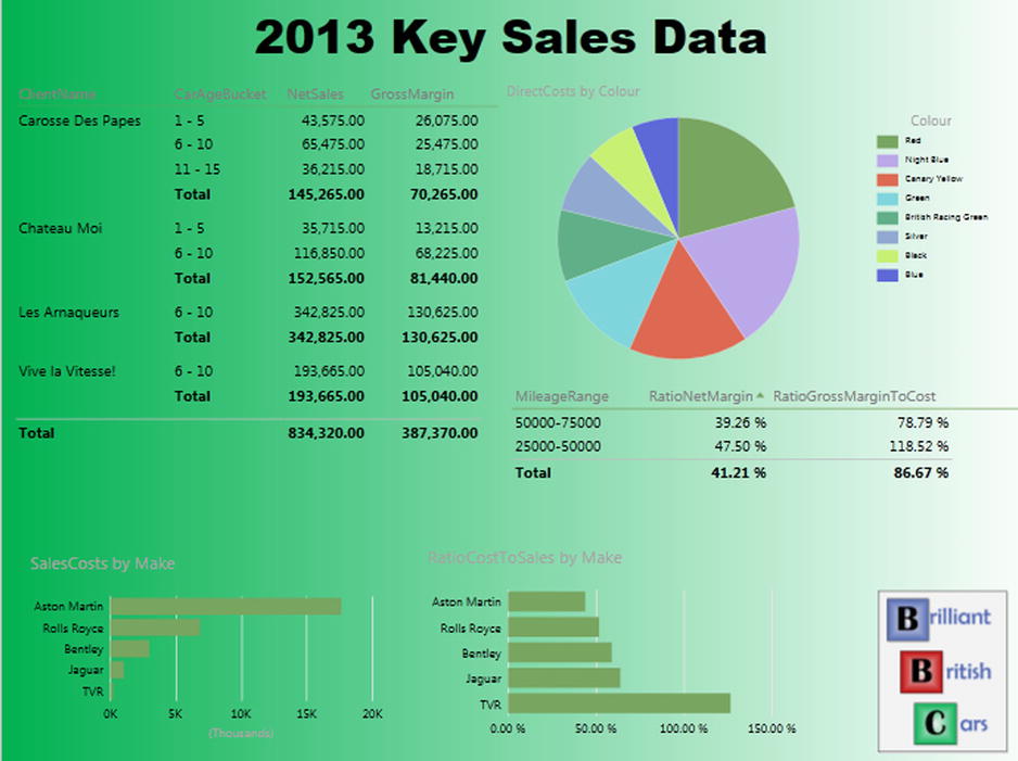
Figure 7-22. Adding a logo
![]() Tip If you use the corner handles to resize an image, you will keep the image in proportion; that is, the height to width ratio will stay the same. Resizing an image using the lateral handles will distort the image.
Tip If you use the corner handles to resize an image, you will keep the image in proportion; that is, the height to width ratio will stay the same. Resizing an image using the lateral handles will distort the image.
As a report gets more complex, you will inevitably need to arrange the elements that it contains not only side by side, but also one on top of the other. Power View lets you do this simply and efficiently.
As an example of this, let’s create a chart with another chart superposed on it.
- Create a bar chart using the following two fields:
- Make
- RatioCostToSales
- Order the bar chart by RatioCostToSales, in ascending order.
- Create a pie chart using the following two fields:
- SaleCosts
- CountryName
- Reduce the size of the font in the pie chart, and set the legend to appear on the right.
- Place the pie chart in the top right-hand corner of the bar chart.
- With the pie chart selected, choose Arrange
 Bring To Front from the Power View ribbon.
Your composite chart should look like Figure 7-23. If you had not set the pie chart to be at the front (in the topmost layer), the vertical lines of the bar chart would have overlaid the pie chart, making it harder to appreciate.
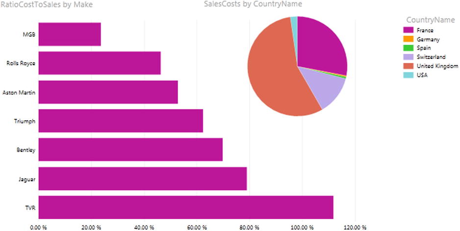
Figure 7-23. Layering charts
This technique is particularly useful when you are adding independent images as was described in the previous section. It is also handy when you are combining elements such as images and text boxes, as you will see in the next section.
Some Uses for Independent Images
The limits of what images can do to a report are only those of your imagination, so it is impossible to give a comprehensive list of suggestions. Nonetheless, a few uses that I have found for free-form images include these:
- Company logos, as we have just seen.
- Images added for a purely decorative effect. I would hesitate, however, before doing this at all, as it can distract from the analysis rather than enhance it. Nonetheless, at times, this may be precisely what you want to do (to turn attention away from some catastrophic sales figures, for instance). So add decoration if you must, but please use sparingly!
- To enhance the text in a text box by providing shading that is in clear relief to the underlying image or background.
- As a background to a specific column in a table. Be warned, however, that the image cannot be made to move with a column if it is resized.
- Pullout arrows.
Several of these techniques are shown in Figure 7-24. This example will hopefully clearly indicate the limits of such techniques, as they detract (considerably, in my opinion) from the simplicity and style of an uncluttered Power View report, as well as make it extremely laborious to make any modifications. Nonetheless, it is possible to achieve certain presentation effects using images. So if your boss insists, you can push the boundaries between added effects and visual overload.
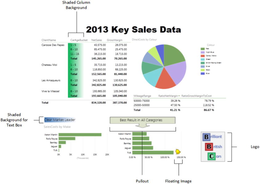
Figure 7-24. A Power View report somewhat overloaded with images
![]() Tip When adding images to a Power View report, you should avoid shaded backgrounds or you may end up spending a lot of time manipulating your images in an attempt to make them conform to the Power View shading.
Tip When adding images to a Power View report, you should avoid shaded backgrounds or you may end up spending a lot of time manipulating your images in an attempt to make them conform to the Power View shading.
Earlier in this chapter I mentioned that Power View can only accept two image formats. This is, however, not the limitation that it sounds like it could be, as changing the format of an image file is usually easy.
So—and without going too far off on a tangent about the subject of image file formats—here is a simple technique to try in order to adapt a file to the .png format.
Let’s assume that you have received the file for a client logo that you have to include in your Power View presentation. This file has the .gif extension and Power View has refused to load it. Now, if your PC or laptop has a fairly standard Windows installation, you should have Microsoft Paint installed. As there have been many versions of Paint over the years, the instructions given here are fairly generic. So, to create a copy of the client logo file in the .png file format
- Open Microsoft Paint (for instance, open the Windows menu, enter Paint in the search/run box, and press Enter).
- In Paint, open the original .gif file.
- Choose Save As from the File menu. Depending on the version of Paint that you are using you may need to select Save As followed by PNG Picture in the submenu.
- Ensure that Save As type is set to PNG (*.Png).
- Modify the file name is you need to and select the appropriate directory.
- Click Save.
You can now insert the file that you received into a Power View report.
As I stressed earlier, it is easy to try to use images to produce effects that Power View does not provide out of the box. So, even if this may take a disproportionate amount of time compared to producing your analysis, at times, you simply have to add some visual effects. In other words, here are a few suggestions for those moments when the boss can’t spell “overkill.”
- For backgrounds, especially if you want a good shading effect, take a look at one of the free graphic design programs that are around. I have a weakness for Pixlr, which I used for many of the sample images that accompany this book.
- If you need to resize an image, remember that there is a Resize option in Paint, and that Pixlr (or several other web sites and free products) can do this too.
- Take a look at the many, many web sites that offer royalty-free stock images. There are so many that I suggest using your favorite search engine for this. Then you can convert them to .png or .jpg as described previously (if this is necessary).
- As you are using Excel, then you could well be a PowerPoint user. Remember that PowerPoint has a vast image library, and that you can export selected images in .png format.
- If your company uses Microsoft Visio, then you may find lots of images to use from among the shapes that come with the product. To export a shape as a .png file, just select it, choose File
 Save As, and select Save As Type Portable Network Graphics. You may recognize one or two of the images used in this chapter as coming from Visio, if you look carefully!
Conclusion
In this chapter you have seen how to push the envelope when using Power View to deliver especially compelling presentations. This covers not only the general aspect of a report, such as its background and color scheme, but also the enhancements that you can add by tweaking the font attributes for individual elements.
Finally, you saw how adding images can turbo charge the impression that your analysis can give when you add graphic elements to tables, slicers, and tiles. And, used sparingly, images and free-form text elements can draw your audience’s attention to the most salient features of your presentation. So now it is up to you to use these powerful Power View features to deliver some really compelling interactive analyses to your audience.