
![]()
Advanced Charting with Power View
Now that you have mastered the core skills required to create simple but powerful charts with Power View, the time has come to extend your knowledge and discover some of the more advanced charting possibilities that are open to you. The techniques that we will look at in this chapter are
These more advanced charting techniques are well worth learning, in my opinion, as they allow you to make your point with greater subtlety and originality. Used effectively, they can enhance considerably the clarity of a presentation and can make your analysis stand out in the crowd.
In this chapter, too, we will be using the sample file CarSales.xlsx from the folder C:HighImpactDataVisualizationWithPowerBI. How to download the contents of this folder is explained in Appendix A.
Multiple Charts
Teasing out real meaning from a mass of data occasionally requires an approach that goes beyond the traditional charts that you may be used to using. Power View comes to your aid in this area by giving you the possibility of creating multiple charts simultaneously, which can allow you to see individual details and trends as well as comparative distinctions. These types of visualization are also known as trellis or lattice charts.
Multiple chart visualizations, as is the case with single chart visualizations, display and enhance data differently according to the chart type. So, to give you a flavor of what you can achieve using Power View, here are a few examples of multiple chart visualizations using different chart types. This way, you can decide on the type that best suits your data.
Let us assume that you want to see a comparative breakdown of dealer sales compared to wholesaler sales, but you want them split into multiple bar charts (which could just as easily be column charts), one for each car age range. This is how you can do it:
- Insert a new Power View report, or open an uncluttered report, as you will need a certain amount of space for a multiple chart visualization.
- Create a table using the following fields:
- Make (from the CarDetails hierarchy in the SalesData table)
- GrossMargin (from the SalesData table)
- Convert the table to a bar chart (in the Design ribbon, select Bar Chart, then Clustered Bar).
- Drag the Colour field from the Colours table into the VERTICAL MULTIPLES box in the Design area of the Field List.
- Apply a filter to include only data for the year 2013 (as described for the initial chart that you can see in Figure 4-1 in the previous chapter).
- Resize your multiple bar chart visualization, which, as it stands, is probably too small to be really effective.
- Tweak the font sizes if you want to.
Your Power View report should look something like Figure 5-1. This figure includes the Layout section of the Field List so that you can see what it looks like for a multiple chart visualization.
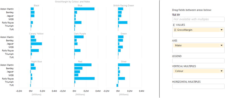
Figure 5-1. Multiple bar charts
You will notice that the title of the visualization is now GrossMargin By Color And Make, which draws the viewer’s attention to the fact that they are looking at the multiple bar charts as a whole, not as a separate set of unconnected analyses. Also, if you chose to resize the visualization, you will have seen that Power View will not only alter the size of the overall chart “container,” but it will also resize the individual charts inside it. However, all the charts inside the outer container will stay the same size.
![]() Tip There is just one point to add specifically about multiple pie charts. Multiple pie charts can contain slices, just as single pie charts can. So if you place the mouse pointer over a bar chart segment (color) or slice, you will get a popup that gives you the exact details of the data you are examining.
Tip There is just one point to add specifically about multiple pie charts. Multiple pie charts can contain slices, just as single pie charts can. So if you place the mouse pointer over a bar chart segment (color) or slice, you will get a popup that gives you the exact details of the data you are examining.
Specifying Vertical and Horizontal Selections
In the previous section you saw how to visualize multiple charts to see how the color and make of a car affected the Gross Margin. Now let’s take this one step further, by adding another element of comparison. Suppose that now you want to extend the analysis by adding the car age range to the mix, in order to see if this can tell you anything about your margins and how to improve them.
To do this
- Click inside the visualization that you made previously (GrossMargin By Color And Make).
- Drag the field CarAgeBucket into the HORIZONTAL MULTIPLES box of the Design area of the Field List.
And that is it! Your visualization now has colors on the vertical axis on the left-hand side and the age range groups on the horizontal axis across the top. Yet each individual bar chart shows you the gross margin by make for each combination of color and car age group. It should look something like Figure 5-2.
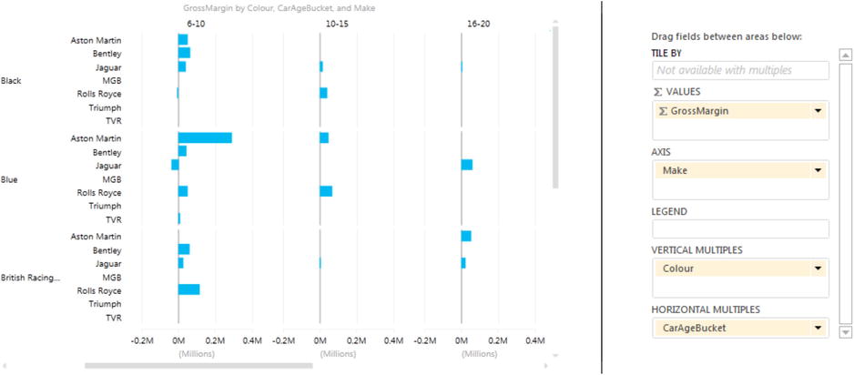
Figure 5-2. Horizontal and vertical multiple charts
Power View has added vertical and horizontal scroll bars to the visualization, so you can scroll through the available charts. You can also define the number of charts that are visible, and this is described in the next section.
Specifying the Layout of Multiple Chart Visualizations
In the first multiple pie chart visualization we created, it was Power View that decided how the charts would be set out together—in two rows of three charts. This layout will change depending on the number of charts that are created, which will depend on the source data—specifically the number of elements in the field that you use to define the vertical multiples. However, you can override the default chart layout so you have the final word as to how your multiple charts are displayed.
Creating Horizontal Multiples
First, be aware that if you choose to place the field where the charts will be expanded into multiple charts into the VERTICAL MULTIPLES box, Power View will distribute the charts as best it can. If you add this field to the HORIZONTAL MULTIPLES box instead, then Power View will place all the separate charts in a single row and add a scroll bar to allow you to scroll through the set of “sub” charts that make up the complete visualization. An example of this layout (with the chart type set to column) is given in Figure 5-3.
Figure 5-3. Default use of horizontal multiples
Depending on the complexity of your individual charts and the density of the information they contain, you may prefer to specify the dimensions of the grid that contains the individual charts in a multiple chart visualization. Put simply, you can set the number of rows and columns that make up the matrix that holds the individual charts. If there are too many charts to be displayed at once, then scroll bars will be displayed to let you navigate, vertically and horizontally, through the set of available charts.
To show you how to define the number of charts that will be displayed at once in each row or column, let us assume that you have created a multiple column chart based on the following data:
- ∑ SIZE: GrossMargin
- LEGEND: ClientType
- VERTICAL MULTIPLES: Colour
This chart should look like that shown in Figure 5-4.
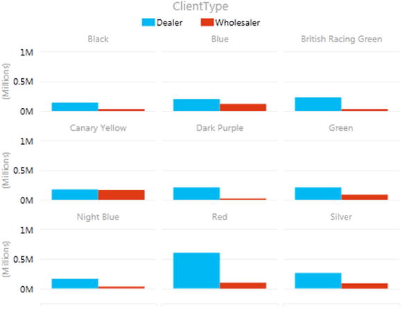
Figure 5-4. Default use of vertical multiples
Now, let’s alter the layout and tell Power View to show the individual column charts in a 2×2 matrix. To do this
- Click inside the multiple chart visualization or select it. Remember not to click on an individual column.
- Switch to the Layout ribbon.
- Click the Grid Height button and choose 2 from the popup.
- Click the Grid Width button and choose 2 from the popup.
The visualization will change, and should look like Figure 5-5. As you can see, a vertical scroll bar has appeared to let you scroll down through the set of charts.
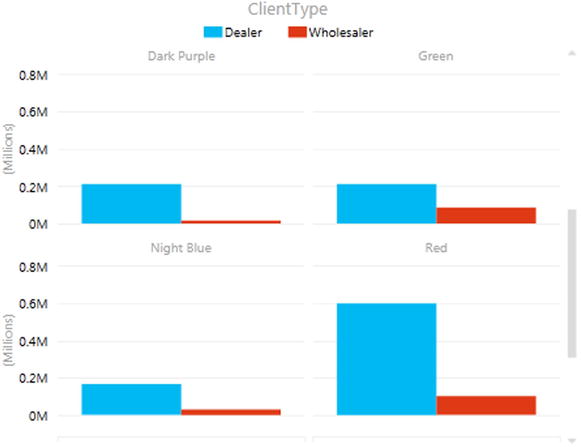
Figure 5-5. Multiple charts with horizontal and vertical multiples grids set
If you resize this visualization it will never display more than a 2×2 matrix of charts. You can, of course, alter the number of charts per row or column at any time by selecting a different grid height or grid width.
![]() Tip An interesting aspect of playing with the grid size for multiple charts is that once you have overridden the default grid and specified the required number of rows and columns, you cannot revert to it later unless you undo the operation immediately. From then on Power View will not automatically try and fit all the charts as best it can in a grid that it decides is best for the number of charts. So once you have “switched to manual,” you will have to make all the decisions yourself.
Tip An interesting aspect of playing with the grid size for multiple charts is that once you have overridden the default grid and specified the required number of rows and columns, you cannot revert to it later unless you undo the operation immediately. From then on Power View will not automatically try and fit all the charts as best it can in a grid that it decides is best for the number of charts. So once you have “switched to manual,” you will have to make all the decisions yourself.
Adding a visualization that displays multiple line charts is virtually identical to displaying multiple bar or column charts. They too can show several data series. However they are particularly suited to showing how data evolves over time, and so that is what I propose to look at in this example. Anyway, now that you have seen how it is done, it might be worth clarifying the principles before creating the visualization. The process follows these steps:
- Create the core chart that displays the data that you want repeated across multiple charts.
- Add the elements that will separate out the charts into multiples—either horizontally, vertically, or both.
- Set the number of charts in the grid, horizontally and vertically.
- Resize the chart, adjust any legend, and tweak the font sizes.
To see this, let’s create a multiple line chart, showing the average SalesCost and average DirectCosts for all the months in the year. To allow us some insights, we will also compare these figures by client type—dealer and wholesaler.
- Delete the existing multiple chart visualization, leaving an empty Power View report, filtered to display only data for the year 2013. Alternatively, create a new report.
- Create a line chart with the following fields:
- ∑ VALUES: AverageSalesCosts and AverageDirectCosts
- AXIS: CarAgeBucket
I won’t repeat all the instructions again, as it is definitely time for you to try on your own. At this point, you should see a chart like Figure 5-6.
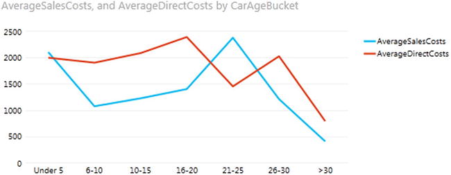
Figure 5-6. A simple line chart ready for multiples
- Drag the MonthFull field from the YearHierarchy in the Date table into the VERTICAL MULTIPLES box.
- Set the Grid Height to 4 and the Grid Width to 3 in the Layout ribbon.
- Resize the visualization, and adjust the font sizes for the best effect.
Your visualization should now look like Figure 5-7.
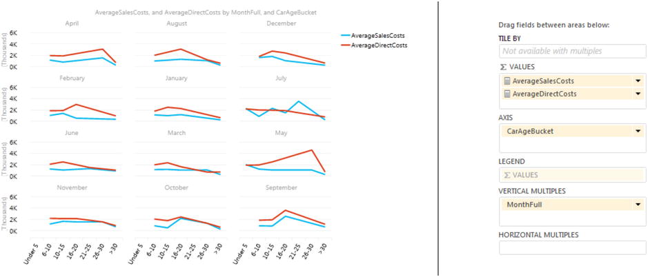
Figure 5-7. Multiple line charts
You can switch between all the available bar and column types (clustered, stacked, 100% stacked) and see which type of visualization best gets your insights across to your audience.
Multiple pie charts are, in their turn, very similar to multiple bar, line, or column charts.
So let’s imagine that you want to look at the cost of spare parts and see if this varies significantly depending on the age of the car; you also want to see these costs in multiple charts by car age group. Here is how it can be done:
- Delete the existing multiple line visualization leaving an empty Power View report.
- Create a pie chart with the following fields:
- ∑ SIZE: AverageSpareParts
- COLOR: QuarterNameAbbr (from the DateHierarchy)
- Set the legend under the chart (select Show Legend At Bottom from the Layout button in the Design ribbon). You should see a chart like Figure 5-8.
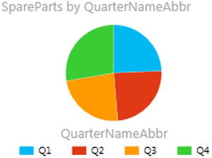
Figure 5-8. A simple pie chart before setting the vertical multiples
- Drag the CarAgeBucket field from the SalesData table into the VERTICAL MULTIPLES box.
- As there are virtually no spare parts sold in the 21-25 bracket, display the Filter pane, and click Chart. Expand CarAgeBucket, check (All), then uncheck 26-30. (This is to remind you about filters; you might not exclude data in such a cavalier fashion in reality).
- Resize the visualization, and adjust the font sizes for the best effect.
Your visualization should look like Figure 5-9.
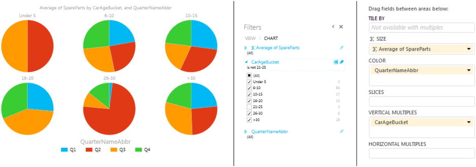
Figure 5-9. Multiple pie charts with a filter
Hopefully these examples will give you ideas of how you can use the power of comparative charts—first to analyze and discover the information hidden in your data, and then to present it clearly to your audience. The type of chart that you use will depend on your data, of course, and some data sets are better suited to certain types of presentation. One thing to remember is that multiple charts are inevitably small, and so I really advise you not to overload them with data or you could end up by hiding rather than clarifying your analysis.
Drilling Down with Multiple Charts
One solution to the problem of data overload is to use drill-down with multiple charts just as you did with single charts in Chapter 4. All you have to do to add a drill-down hierarchy to a multiple chart is to add another descriptive element to fields used. Here is a short example:
- Create the multiple pie chart example given previously.
- Add a VehicleType field to the COLOR box in the Design area of the Field List under the existing QuarterNameAbbr field. The charts in the multiple chart will not change.
- Double-click on any pie slice for (say) the age range 6-10 in one of the charts. You will drill down to the vehicle types for that CarAgeBucket.
Your visualization should look like Figure 5-10.
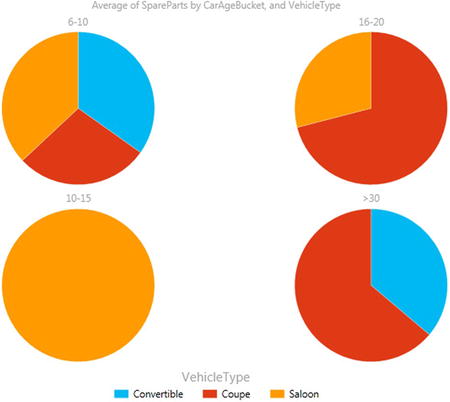
Figure 5-10. Drill down with chart multiples
To return to the previous level of the data (the previous set of multiple charts), just click on the Drill Up icon at the top right of the set of multiple charts. The legend (assuming that you have kept one) will indicate the drill-down level that is currently displayed.
![]() Note A final thing to note with multiple charts is that the Tile By option is not available. This really interesting feature will be covered in Chapter 6.
Note A final thing to note with multiple charts is that the Tile By option is not available. This really interesting feature will be covered in Chapter 6.
We are very near the end of our tour of Power View chart types and charting possibilities. What I want to look at now is the penultimate chart type Power View offers—the scatter chart. A scatter chart is a plot of data values against two numeric axes, and so by definition, you will need two sets of numeric data to create a scatter chart. To appreciate the use of these charts, let’s imagine that you want to see the sales and margin for all the makes and models of car you sold in 2013. Hopefully this will allow you to see where you really made money. Here is how you can do this:
- Create a new Power View report or go to an existing report with plenty of available space.
- Set the report filter to include data only for the year 2013, as described previously.
- Create a table with the following fields from the SalesData table in this order:
- Vehicle
- GrossMargin
- NetSales
- Convert the table to a scatter chart by clicking Other Chart, then Scatter, from the Design ribbon.
- Power View will display a scatter chart that looks like the one shown in Figure 5-11. Resize the chart to suit your taste.
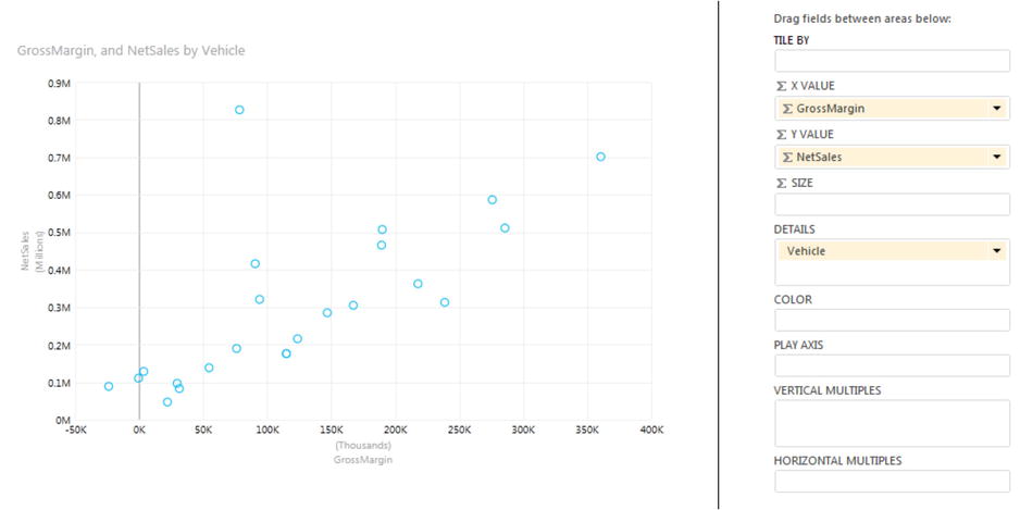
Figure 5-11. A scatter chart
If you look at the Design area of the Fields List (which is also shown in Figure 5-11), you will see that Power View has used the fields that you selected like this:
- Vehicle: Placed in the DETAILS box.
- GrossMargin: Placed in the ∑ X VALUE box. This is the vertical axis.
- NetSales: Placed in the ∑ Y VALUE box. This is the horizontal axis.
If you hover the mouse pointer over one of the points in the scatter chart, you will see, as you are probably expecting by now with Power View, the data for the specific car model.
![]() Note By definition, a scatter chart requires numeric values for both the X and Y axes. So if you add a non-numeric value to either the  X VALUE or  Y VALUE boxes, then Power View will convert the data to a Count aggregation.
Note By definition, a scatter chart requires numeric values for both the X and Y axes. So if you add a non-numeric value to either the  X VALUE or  Y VALUE boxes, then Power View will convert the data to a Count aggregation.
We made this chart by adding all the required fields to the initial table first, and we also made sure that we added them in the right order so the scatter chart would display correctly the first time. In the real world of interactive data visualization, things may not be quite this coherent, so it is good to know that Power View is very forgiving, and it lets you build a scatter chart (just like any other chart) step by step if you prefer. In practice this means that you can start with a table containing just two of the three fields that are required at a minimum for a scatter chart, convert the table to a scatter chart, and then add the remaining data field. Power View will always attribute numeric or time fields to the X and Y axes (in the order in which they appear in the FIELDS box) and place the first descriptive field into the DETAILS box.
Once a scatter chart has been created, you can swap the fields around and replace existing fields with other fields from the tables in the data to your heart’s content.
You can also add data labels to a scatter chart, just as you did for column charts earlier. However, unless you have very few data points (which rather goes against the raison d’être of a scatter chart in the first place), you may find that data labels just clutter up the visualization.
Drilling Down with Scatter Charts
Scatter charts also let you drill down into the data. For example, to add a second level of analysis to the existing chart, and to see sales and margin by color,
- Add the Colour field (from the Colours table) to the DETAILS box, under Vehicle. The scatter chart will not alter.
- Double-click on the data point for Jaguar XK (currently the car achieving the highest sales, and the data point that is near the top of the X axis, above all the others).
The scatter chart will drill down to show the sales and gross margin for this type of vehicle, but by color. This is shown in Figure 5-12.
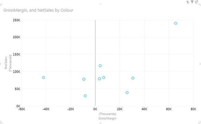
Figure 5-12. A drill-down scatter chart
To return to the root level of the data (the initial chart), all you have to do is to click on the Drill Up icon at the top right of the chart.
Scatter Charts to Display Flattened Hierarchies
Scatter charts generically are designed to show many, many data points. This makes them useful in, paradoxically, avoiding the need to drill down through a predefined hierarchy of data. Let’s see how to display multiple data sets on one level, rather than drilling down for them. For this to happen, of course, the source data must lend itself to the type of analysis that is required. Fortunately the source data has a field named Vehicle that combines the make and model of each car and that suits this kind of analysis. What you have to do is
- Create a new Power Pivot report.
- Add the following fields (in this order) to the Fields List VALUES box:
- Vehicle
- Colour
- GrossMargin
- RatioCostToSales
- Convert the resulting table to a scatter chart (click Other Chart, then Scatter from the Design ribbon, with the table selected).
As you can see in Figure 5-13, every data point appears multiple times, once for every time there is a sale for a different color. Placing the mouse pointer over a data point will let you see exactly which model of vehicle and color is being represented. I have, as you have probably guessed, tweaked the size and display of the chart to show the data in its best light.
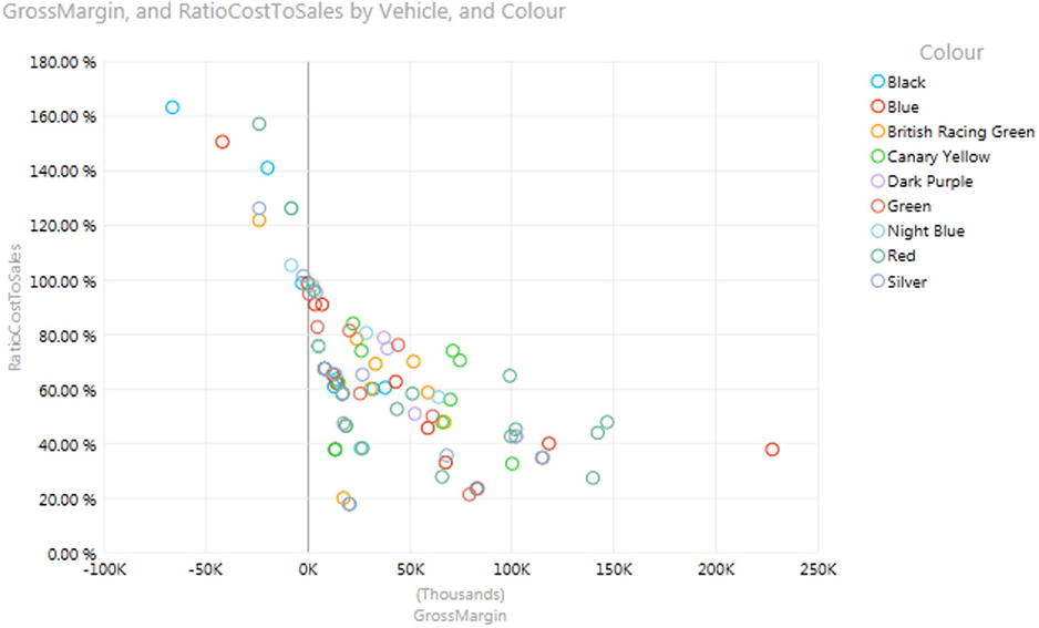
Figure 5-13. Flattened hierarchies in a scatter chart
In the case of some scatter charts this technique can make the chart hard to decipher. However, if your scatter chart contains relatively few data points, this technique can be useful. What is more, Power View has the ability to highlight data by the elements that compose the legend; this is explained in Chapter 6.
Scatter charts, just like bar, column, and pie charts, allow you to display the data as multiple charts. Personally, I do not always find them easy to read, but in the interests of completeness (and because all forms of visualization do, after all, depend on the data as well as each user’s preferences and taste), here is how to display the sales and gross margin by color.
- Select the chart that you made previously.
- In the Design area of the Field List, drag the Colour field from the COLOR box to the VERTICAL MULTIPLES box.
The scatter chart will divide into a series of smaller charts, rather like the example shown in Figure 5-14.
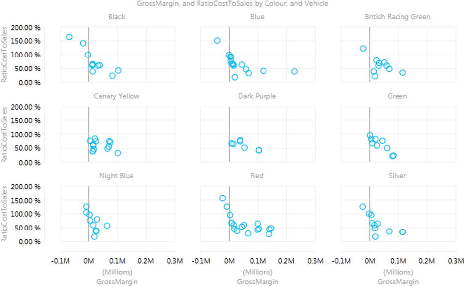
Figure 5-14. Multiple scatter charts
You can tailor the display of the grid—the number of charts shown horizontally and laterally—by selecting the required value from the Grid Height and Grid Width buttons in the Layout toolbar, as was described earlier for pie, column, and bar charts.
The final chart type available to you in Power View is the bubble chart. This is one of my favorite chart types, though of course you cannot over-use it without losing some of its power. A bubble chart is, essentially, a scatter chart with a third piece of data included. So whereas a scatter chart shows you two pieces of data (one on the X axis, one on the Y axis) a bubble chart lets you add a third piece of information, which becomes the size of the point. Consequently, each point becomes a bubble.
The best way to appreciate a bubble chart is to create one. So here we will assume that you want to look at the following for all makes of car sold in a single chart:
- The Net Sales
- The Net Margin Ratio
- The Gross Margin
Here is how a bubble chart can do this for you:
- Create a new Power View report or go to an existing report with plenty of available space.
- Set the report filter to include data only for the year 2013, as described previously.
- Create a table with the following fields from the SalesData table, in this order:
- Make (from the CarDetails hierarchy)
- NetSales
- RatioNetMargin
- GrossMargin
- Convert the table to a bubble chart by clicking Other Chart, then Scatter from the Design ribbon. Yes, a bubble chart is a scatter chart, with a fresh tweak added.
- Power View will display a bubble chart that looks like that shown in Figure 5-15. Resize the chart if you need to.
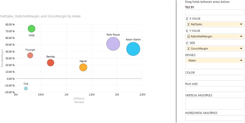
Figure 5-15. An initial bubble chart
If you look at the Design area of the Fields List (also shown in Figure 5-15), you will see that Power View has used the fields that you selected like this:
- Make: Placed in the DETAILS box.
- NetSales: Placed in the ∑ X VALUE box. This is the vertical axis.
- RatioNetMargin: Placed in the ∑ Y VALUE box. This is the horizontal axis.
- GrossMargin: Placed in the SIZE box. This defines the size of the points, which have consequently become bubbles.
If you hover the mouse pointer over one of the points in the bubble chart, you will see all the data that you placed in the Fields List Layout section for each make, including the GrossMargin.
Bubble Chart Data Labels and Legend
Apart from the points becoming bubbles, you will notice that a bubble chart automatically displays the data labels. If this is something you wish to remove, than all you have to do is
- Click in the bubble chart.
- Select None from the options available when you click on the Data Labels button in the Layout ribbon.
If you want to keep the data labels but alter their position relative to each bubble, then instead of None, you can choose one of the other data label options when you click on the Data Labels button in the Layout ribbon.
If you have chosen not to display the data labels but still need an indication of what element each bubble represents, then add a legend to a bubble chart. This is how:
- Select the bubble chart.
- Drag the field used for the DETAILS of the bubble chart to the COLOR box (Make, in this example).
- Power View will add a legend to your visualization. It should look something like Figure 5-16.
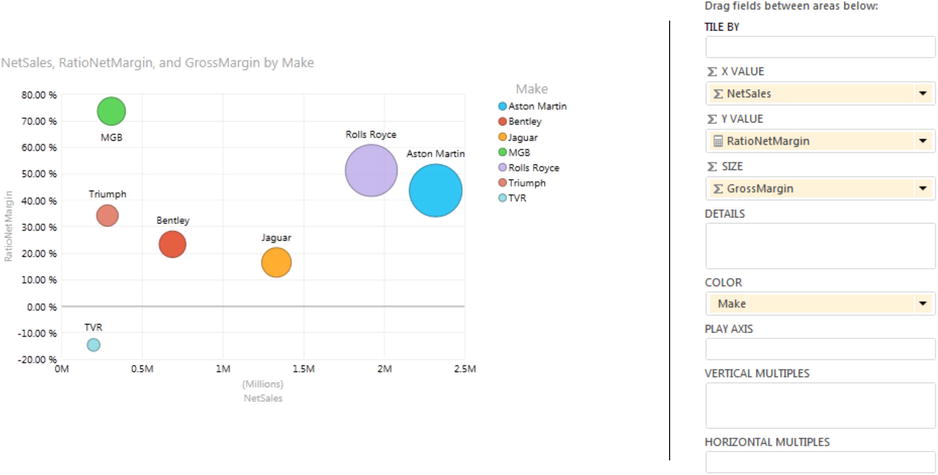
Figure 5-16. A bubble chart with legend added
![]() Note Be careful not to add the field twice to the Fields List in two different boxes. The trap that awaits the unwary here is that the chart will remain apparently the same. Yet, if you hover the mouse pointer over a bubble, you will see the field that appears in both the DETAILS and COLOR boxes twice in the popup.
Note Be careful not to add the field twice to the Fields List in two different boxes. The trap that awaits the unwary here is that the chart will remain apparently the same. Yet, if you hover the mouse pointer over a bubble, you will see the field that appears in both the DETAILS and COLOR boxes twice in the popup.
If you were to add further fields to the DETAILS box (except if it is a field, which is in another box in the Field List as mentioned earlier), then your bubble chart will become a drill-down chart, like any other chart type that we have seen in this chapter. You can double-click on any bubble to drill down and click the Drill Up arrow to return to a previous level, exactly as you have done for other chart types.
Provided that your bubble chart is not already swamped with data points, you may be able to display multiple data elements simultaneously. Imagine that you want to see not only bubbles for each make but also by age range (or age bucket if you prefer) in the same visualization without needing to drill down to a second level in the chart.
This can be done by using a combination of the DETAILS and COLOR boxes in the Layout section of the Fields List. Here is how you can split the existing bubbles into multiple bubbles, while still identifying the make of each car.
- Click inside the bubble chart that you created previously (or create it exactly as described earlier with the Make field placed in the COLOR box).
- Add the CarAgeBucket field to the DETAILS box.
- Click the DataLabels button in the Layout ribbon and select Center.
Your visualization will look like Figure 5-17. As you can see, each bubble has become multiple bubbles, one for each set of cars in each age range. You will see that each car make is always represented in the same color. In this case, a good way to see which age range a bubble represents is to add data labels.
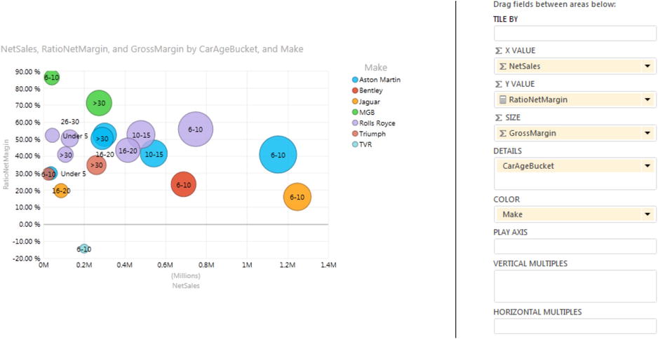
Figure 5-17. Multiple bubble elements in a bubble chart
If all this information clutters up your visualization, you can remove the data labels and the legend and only display the Make and CarAgeBucket when you hover the mouse pointer over a bubble.
To remove all the labels and legend
- Click inside the chart.
- Click on Layout to activate the Layout ribbon (unless this has already been done).
- Select DataLabels, None.
- Select Legend, None.
The bubble chart will look like Figure 5-18 (with a popup visible to show you how to see the details of the data).
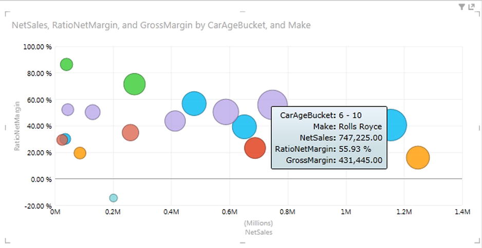
Figure 5-18. A bubble chart without a legend or data labels
Bubble charts can adapt well to multiple chart visualizations. I realize that this has been described earlier in this chapter, but I think that it is worthwhile to look at multiples of bubble charts as a separate topic. This will only take a few seconds, in any case. So, to display multiple bubble charts
- Create (or revert to) the bubble chart as shown in Figure 5-15. This shows
- ∑ X VALUE: NetSales
- ∑ Y VALUE: RatioNetMargin
- SIZE: GrossMargin
- COLOR: Make
- Add CarAgeBucket (also from the SalesData table) to the VERTICAL MULTIPLES box.
- Select None from the Data Labels button in the Layout ribbon.
- Adjust the grid height and the grid width if you want or need to, and possibly alter the placement of the legend. The visualization will look something like Figure 5-19.
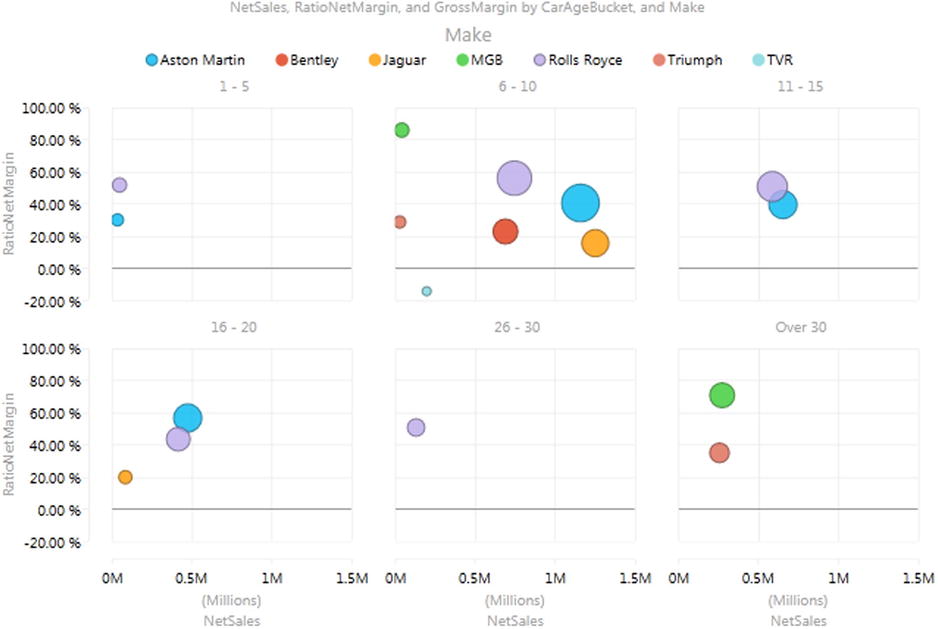
Figure 5-19. Multiple bubble charts
So far in this chapter you have seen various ways of presenting data as charts, and how to select, compare, and drill into the data using a variety of techniques. A final trick with Power View, but one that can be extremely effective at riveting your audience, is to apply a play axis to the visualization. This will animate the chart, and ideally, is suited to showing how data evolves over time. It is, unfortunately, harder to get the “wow” effect using these printed pages, so this really is a technique that you will have to try out for yourself.
You need to know that a play axis can only be applied to scatter or bubble charts. Similarly, adding a play axis will not suit or enhance all types of data. However, if you have a time-dependent element that can be added to your chart as the Y axis (such as sales to date, for instance), then you can produce some powerful and revelatory effects.
To close this chapter, then, here is how to create a bubble chart that shows the net margin ratio for colors of car sold against the sales for the year to date:
- Create a new Power View report, with no report filter this time, so that we can see the years 2012 and 2013.
- Create a table with the following fields from the SalesData table, in this order:
- Colour
- SalesYTD
- RatioNetMargin
- RatioGrossMarginToCost
- Convert the table to a bubble chart by clicking Other Chart, then Scatter from the Design ribbon. You will not see any bubbles yet, as there is no date element—this element is required for the SalesYTD calculation to return a result.
- The data fields will be placed in boxes for a bubble chart, but the default is to place the initial field (Colour) in the DETAILS box. As a legend would be useful, drag the Colour field from the DETAILS box to the COLOR box.
- Adjust the presentation (size, legend placement, data labels, etc.) to obtain the best effect.
- Drag the QuarterAndYear field from the DateTable (after expanding the YearHierarchy) into the PLAY AXIS box.
The visualization will look like that shown in Figure 5-20.
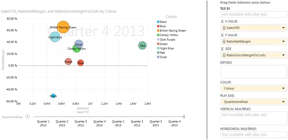
Figure 5-20. The play axis
Click on the Play icon to the left of the play axis, and you will see the bubbles reveal how sales progress throughout the year.
There are a few points worth noting about the play axis while we are discussing it:
- You can pause the automated display by clicking on the Pause icon, which the Play icon has become, while the animation is progressing. You can stop and start as often as you like.
- You can click on any month (or any element) in the play axis to display the data just for that element, without playing the data before that point. This essentially means that you can use the play axis as a filter for your data.
- A play axis need not be time-based. However it can be harder to see any coherence or progression in the data if time is not used as a basis for a play axis. As an example, try using NetSales (instead of NetSalesYTD) and CarAgeBucket as the play axis in the visualization that we just created for a play axis example. The data is still visible, but it is probably less indicative of underlying trends.
- You can use a play axis as another interactive filter for your data, but doing this makes you miss out on a fabulous animation technique!
- You cannot add tiles to a visualization that has a play axis.
You can also apply tiles to any chart type (unless there is a play axis). However, this is described alongside the general use of tiles in Chapter 6.
Conclusion
If you apply the techniques that you saw in this chapter, you should be able to create bubble charts, scatter charts, and also multiple chart visualizations using any of the available chart types. You can even animate certain types of chart using a play axis to show how data evolves over time. With this gamut of possibilities at your fingertips, you can, hopefully, take your analysis and presentation skills to a higher level.